When you’re considering a fresh look for your room, picking the right paint color can be crucial. If you’re thinking about using SW 7038 Tony Taupe by Sherwin Williams, here are a few insights you might find useful.
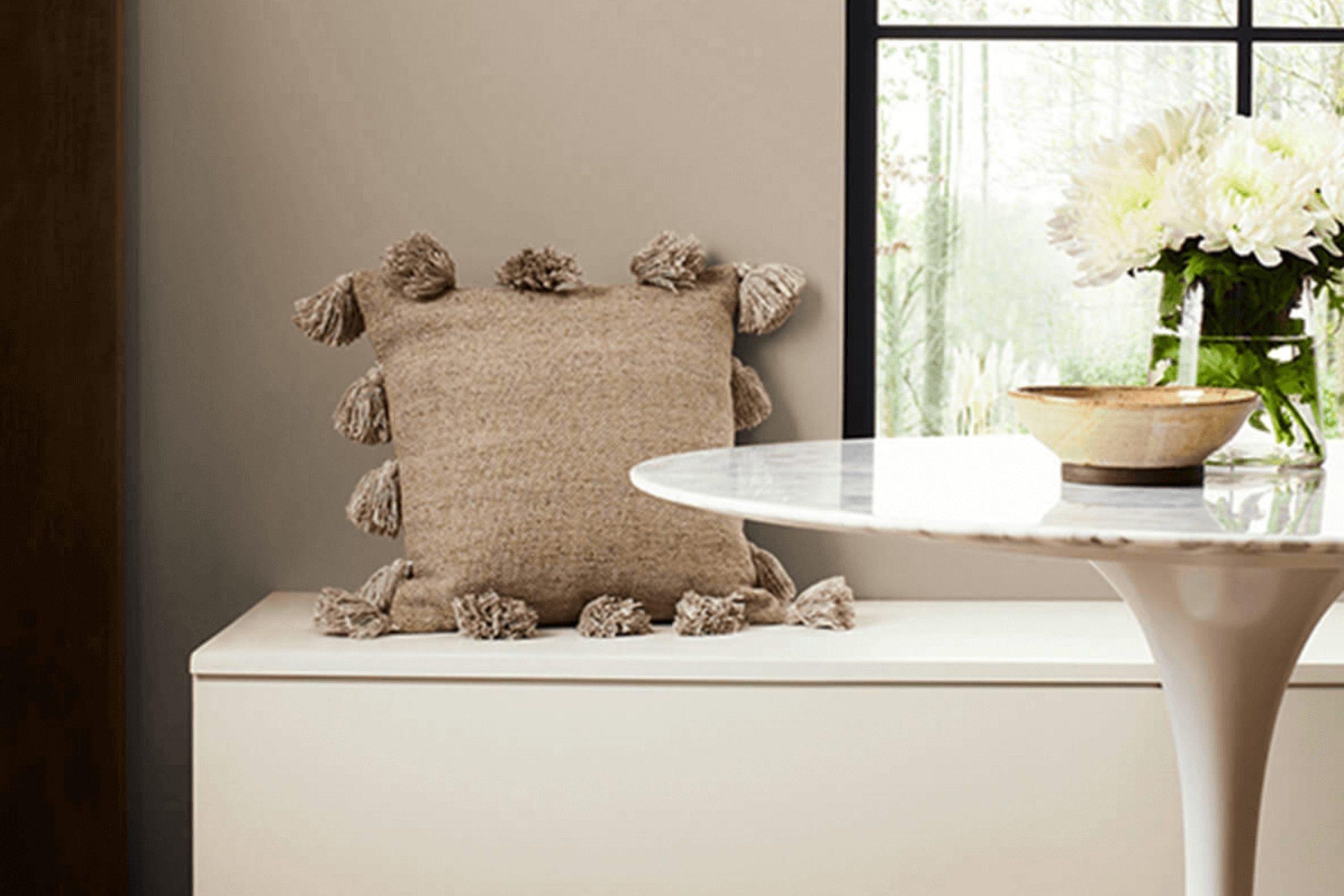
Tony Taupe is one of those flexible colors that can bridge traditional and contemporary styles, with its warm, neutral shade that seems to adapt to various environments. Whether you’re looking to coat a cozy bedroom or give a living room a refined backdrop, this hue offers a balanced blend of gray and brown, giving off a soothing, grounded vibe.
Before you commit to your paint cans and brushes, think about the lighting in your room. Tony Taupe can appear differently depending on natural and artificial light sources. In rooms with a lot of sunlight, it can pull more of its brown tones, making the room feel warmer, while in less lit areas, it might seem more gray, promoting a cooler ambiance.
Considering its adaptability, Tony Taupe works well with a wide range of colors and decor styles. Pairing it with crisp whites can create a sharp, modern contrast, while earthy greens or soft blues can create a more relaxed, organic atmosphere.
If you’re leaning towards a bold look, adding accents like navy or emerald can ground the room further without feeling too strong.
Choosing the right paint is more than just picking a color; it’s about creating a mood that matches your vision for the room. Tony Taupe offers that flexibility, making it a strong contender for your next home update.
Is Tony Taupe SW 7038 Right for My Home?
Tony Taupe is one of those colors that holds a classic appeal, balancing between a gray and a brown. It’s subtle, but it carries enough depth to create a solid statement in a room without feeling too strong next to other elements. I find it particularly flexible—it can adapt easily across different design styles. Whether you’re leaning towards a modern look, rustic vibes, or even something more traditional, this color can handle it all gracefully.
In my experience, Tony Taupe pairs wonderfully with natural materials. In a room with hardwood floors or wooden furniture, it brings a sense of warmth that’s cozy yet very grounded. I love how it works with leather too; think of a beautiful, classic leather sofa against a Tony Taupe wall, and you’ve got a match made in design heaven. The softness of linen or the sleekness of metal also complements this color well, allowing for various textural contrasts that engage the senses and add interest to any room.
When I’ve used Tony Taupe in homes, I’ve appreciated its ability to act as a backdrop to both bold and muted accent colors. It stands confidently behind vibrant blues or soft creams, making it a truly flexible choice for any room looking to achieve balance and harmony without much fuss.
What are the right undertones of Tony Taupe SW 7038 ?
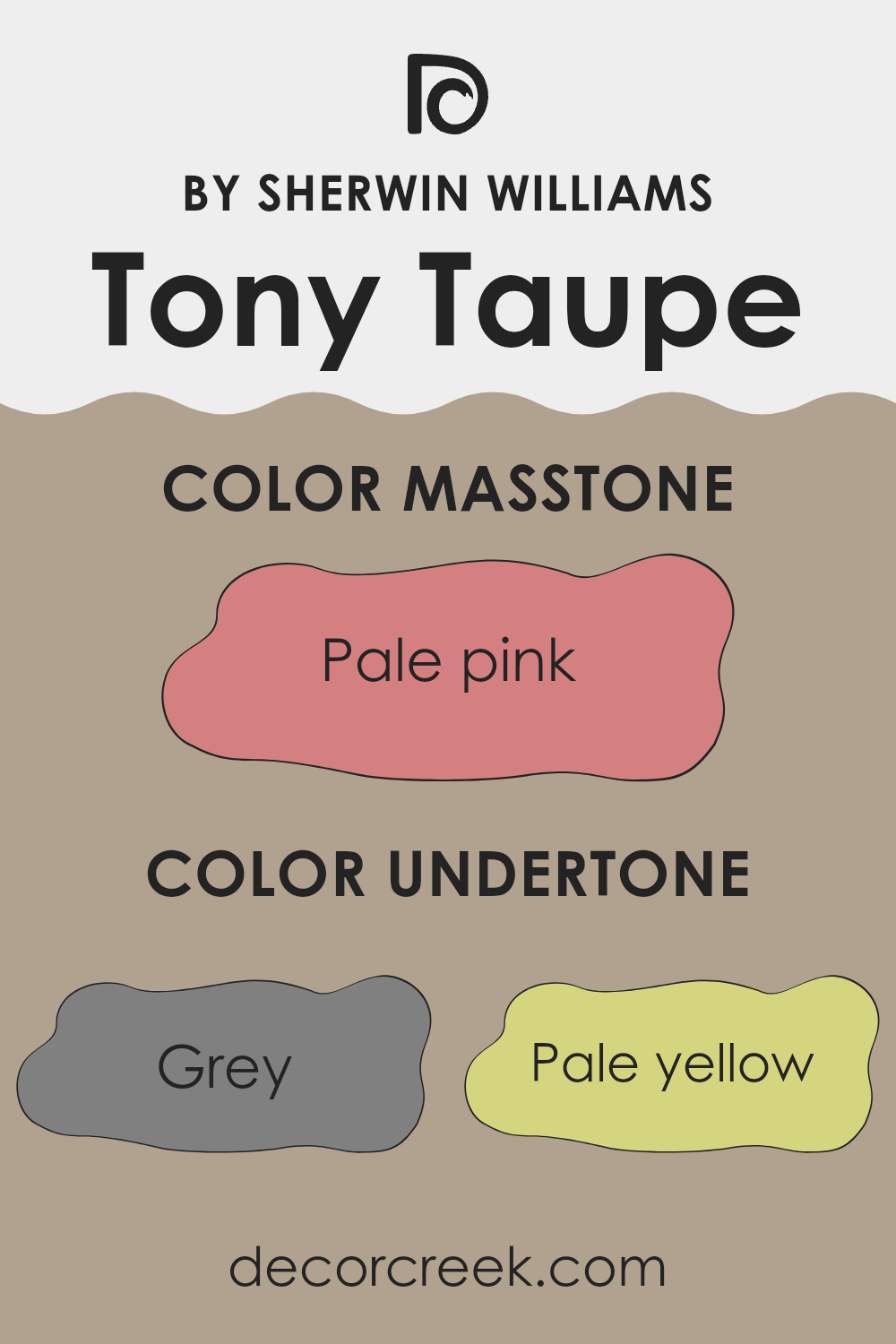
Tony Taupe is a flexible paint color that brings warmth and subtlety to interior areas. Often chosen for its ability to create a cozy atmosphere, this color has a complex blend of undertones that can affect its appearance under different lighting conditions.
Undertones are the hint of color that peeks through the main color when light hits it, affecting how we perceive the main shade. For Tony Taupe, these undertones can range from grey, pale yellow, and orange to lighter tones like light purple and lilac. They play a crucial role in defining the feel and look of the paint once applied to walls.
For example, the grey undertone helps in making areas feel more stable and grounded, while the pale yellow brings a subtle cheerfulness, adding a layer of warmth that can make a room feel more inviting. Light purple and lilac undertones add a gentle splash of color, which can soften the overall look and feel of a room without feeling too strong with brightness.
When used on interior walls, Tony Taupe adapts remarkably well to different styles and decorations. Depending on the lighting, the color can shift from a warm earthy taupe to showing more of its nuanced undertones, making it a flexible choice for many rooms.
This adaptability can help in creating a cohesive look when connecting areas in a home. Whether you are aiming for a cozy bedroom or a welcoming living room, Tony Taupe provides a reliable base that combines both style and earthiness.
decorcreek.com
Best Coordinating Colors to use with Tony Taupe SW 7038 by Sherwin Williams this year.
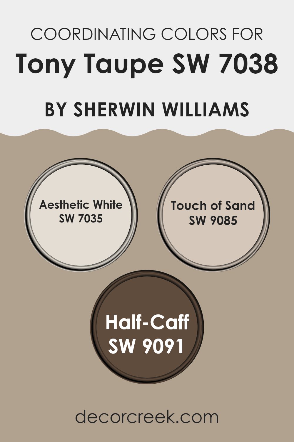
Coordinating colors are those that complement or enhance another primary color, offering balance and visual harmony in a room. When considering Tony Taupe by Sherwin Williams, an array of suitable coordinating colors includes Aesthetic White, Touch of Sand, and Half-Caff.
Each of these shades has unique qualities that work well with the taupe to create inviting and balanced color schemes. These coordinating colors generally share a similar tone or hue that ensures the combination feels seamless and pleasing to the eye.
Aesthetic White is a soft white with a hint of beige, making it perfect for creating a gentle contrast with the deeper tones of taupe while maintaining a warm and inviting atmosphere. It works exceptionally well in areas that aim for a light and airy feel.
Touch of Sand is another complementary color; it carries a subtle warmth that pairs neatly with the earthiness of taupe, providing a gentle, cohesive look. Lastly, Half-Caff is a deeper shade that offers a strong complement to the milder taupe, perfect for accentuating features or creating depth in a room without feeling too much with darkness. These colors together can help achieve a cohesive and grounded look in any interior design.
You can see recommended paint colors below:
- SW 7035 Aesthetic White
- SW 9085 Touch of Sand
- SW 9091 Half-Caff
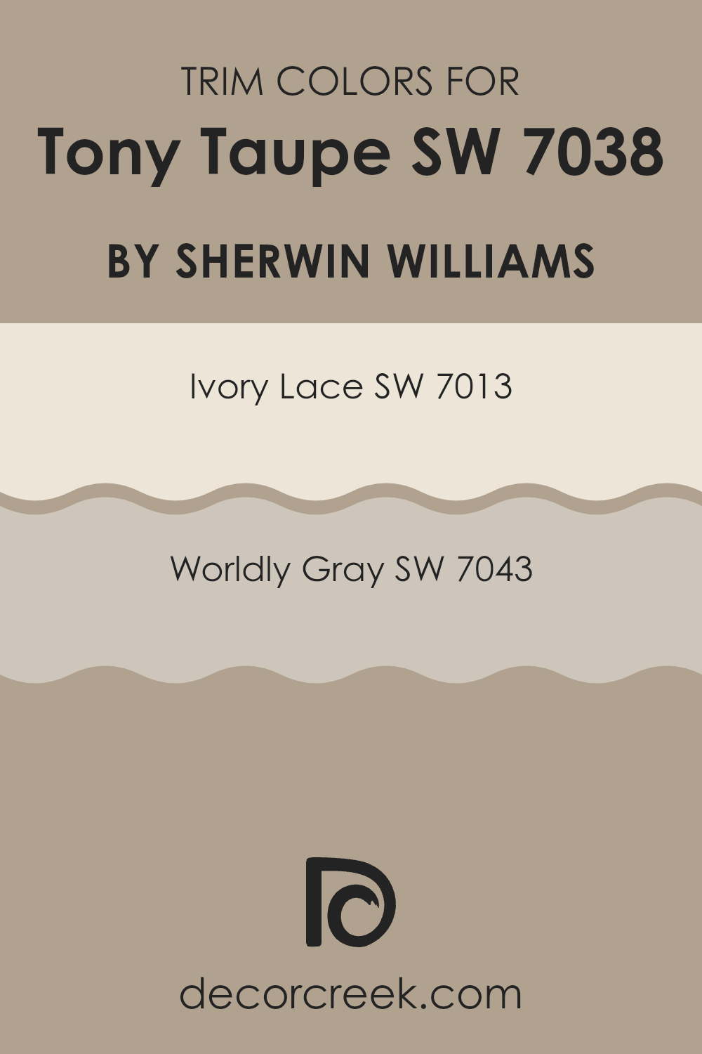
Trendy Trim Colors of Tony Taupe SW 7038 by Sherwin Williams to use this year.
Trim colors are specific shades used to highlight or complement the main color on walls, doors, windows, and other architectural features in interior or exterior design. When considering a flexible neutral like Tony Taupe by Sherwin Williams, choosing the right trim color is crucial for creating a pleasing contrast that improves both the primary wall color and the overall look of the room.
A gently contrasting trim can frame the wall color nicely, making the hues stand out in a complementary way, while also adding a sense of depth and completeness to the design.
Ivory Lace (SW 7013) is a soft, light cream color that offers a gentle contrast to Tony Taupe, providing a subtle highlight to the room’s architectural details without feeling too much next to the main color’s subdued warmth. It’s like a soft whisper along the edges, giving a clean and fresh finish.
On the other hand, Worldly Gray (SW 7043) is a cooler, medium gray that gives a sharper contrast against Tony Taupe, adding a modern edge and visual interest to the room. This shade is perfect for adding a bit of a contemporary feel, helping to define areas clearly and distinctly, while still maintaining a harmonious flow with the main wall color.
You can see recommended paint colors below:
Evergreen Colors Similar to Tony Taupe SW 7038 by Sherwin Williams
Similar colors play a crucial role in creating a cohesive and harmonious look in interior design. These shades, all akin to Tony Taupe by Sherwin Williams, ensure that the visual flow between walls, furniture, and accents is smooth, thereby improving the overall aesthetic appeal. Such colors are particularly useful when aiming for a subtle, yet impactful, thematic consistency in multiple rooms or when incorporating accent features that complement the primary color scheme.
For example, Prairie Grass is a gentle green with earthy undertones that mirror the calmness of nature, while Studio Taupe introduces a slightly richer and warmer variant of taupe likely to warm up any room. Taupe Tone, as the name suggests, gives a deeper taupe shade, adding a touch of depth and gravity to the surroundings.
Perfect Khaki bridges the gap between beige and brown, offering a flexible backdrop that works well with a variety of decor elements. Smoky Beige is a soft beige with a smoky touch that gives a subtle distinction from the typical beige palette. Utterly Beige is a straightforward, clean beige that provides a fresh, airy feel to any room.
Outerbanks has a slightly stormier hue, ideal for adding drama without feeling too much in a room. Mega Greige is another step deeper, mixing grey and beige to create a strong but neutral foundation. Stone Lion leans towards a dusty, stone-like appearance, perfect for elements that require a solid, understated base.
Lastly, Morris Room Grey offers a deeper, more muted grey that supports bold colors or serves well as a main color for a modern, minimalistic look. Each of these colors can significantly alter the perception and feel of a room while maintaining a beautiful aesthetic continuity.
You can see recommended paint colors below:
- SW 7546 Prairie Grass
- SW 7549 Studio Taupe
- SW 7633 Taupe Tone
- SW 9612 Perfect Khaki
- SW 9087 Smoky Beige
- SW 6080 Utterly Beige
- SW 7534 Outerbanks
- SW 7031 Mega Greige
- SW 7507 Stone Lion
- SW 0037 Morris Room Grey
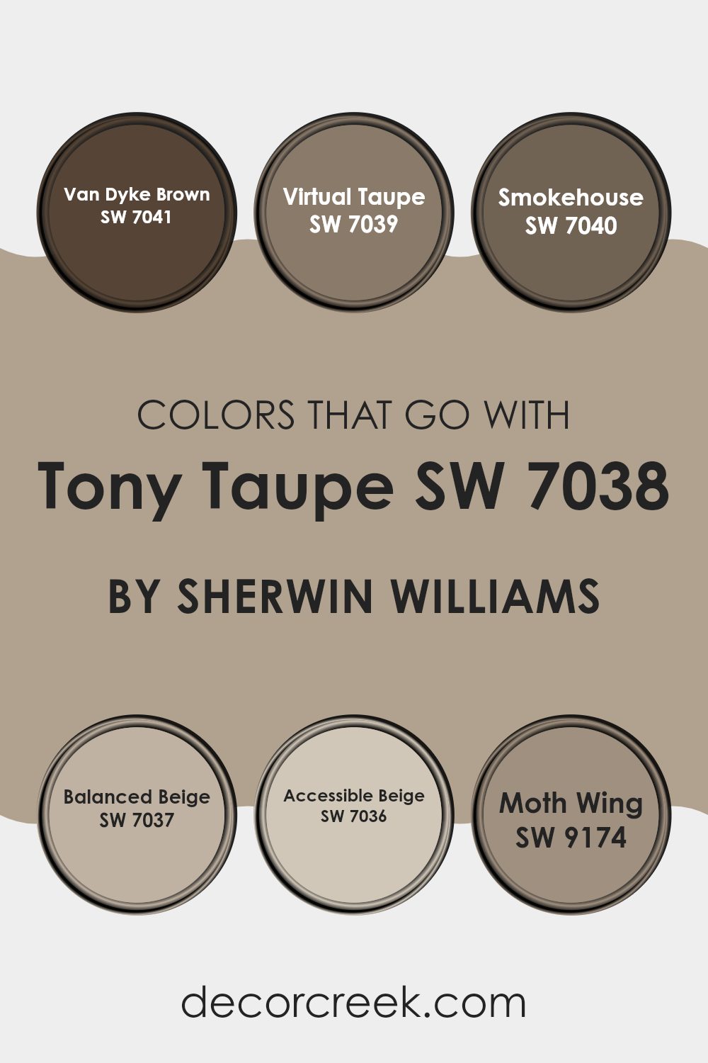
Colors that Go With Tony Taupe SW 7038 by Sherwin Williams
Choosing the right colors to complement Tony Taupe SW 7038 by Sherwin Williams is essential for creating a harmonious and visually appealing room. Colors like Van Dyke Brown SW 7041 and Virtual Taupe SW 7039 add depth and a sense of coziness, ideal for emphasizing comfort in a room.
Van Dyke Brown is a deep, rich brown that brings a warm, grounding effect, making it perfect for accent walls or furniture pieces. Virtual Taupe, a slightly lighter shade, has a soothing presence, enabling it to match a variety of décor while maintaining the room’s warmth.
Smokehouse SW 7040, Balanced Beige SW 7037, and Accessible Beige SW 7036 offer flexible options that work smoothly with Tony Taupe to improve the room’s overall look without feeling too much. Smokehouse is a medium ash brown that offers a subtle contrast, perfect for areas that require a softer touch.
Balanced Beige is a soft, neutral beige that provides a clean and inviting look, ideal for walls in living rooms or bedrooms. Accessible Beige is slightly brighter, promoting a light, airy feel suitable for any area. Lastly, Moth Wing SW 9174 is a unique shade that incorporates elements of gray and brown, offering an understated yet impactful color choice that can refresh an environment in its own way. These colors work together to create rooms that are not only beautiful but also comfortably cohesive.
You can see recommended paint colors below:
- SW 7041 Van Dyke Brown
- SW 7039 Virtual Taupe
- SW 7040 Smokehouse
- SW 7037 Balanced Beige
- SW 7036 Accessible Beige
- SW 9174 Moth Wing
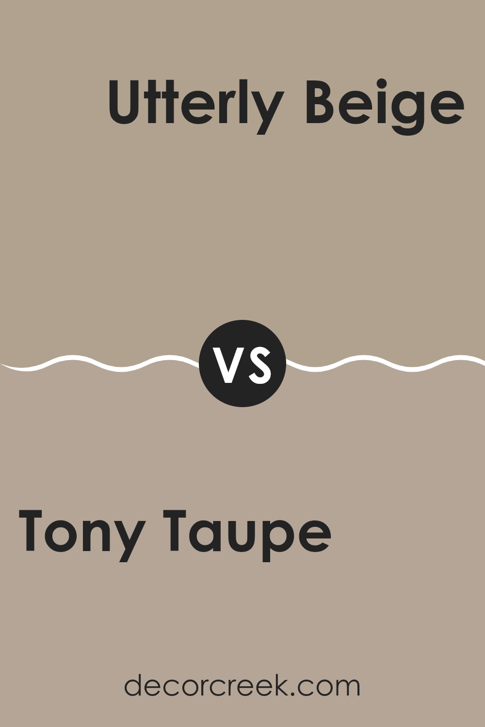
Tony Taupe SW 7038 by Sherwin Williams vs Utterly Beige SW 6080 by Sherwin Williams
Tony Taupe and Utterly Beige are two popular paint colors that both offer a warm and welcoming feel, but they have unique tones. Tony Taupe is a deeper shade that could be described as a mix between gray and brown.
It offers a strong presence in a room and can make the room feel cozy and grounded. On the other hand, Utterly Beige is lighter, leaning more towards a traditional beige that brings softness and lightness to interiors.
It is great for making small rooms appear bigger and brighter. These colors work well together and can be used in various combinations throughout a home to achieve a balanced and harmonious look. Both hues are flexible, but Tony Taupe tends to make a more noticeable statement, whereas Utterly Beige serves as a neutral backdrop.
You can see recommended paint color below:
Tony Taupe SW 7038 by Sherwin Williams vs Taupe Tone SW 7633 by Sherwin Williams
Tony Taupe and Taupe Tone by Sherwin Williams are two neutral shades that offer a subtle variety in the taupe color family. Tony Taupe has a deeper, warmer feel to it which makes it perfect for creating a cozy and inviting atmosphere in a room. It pairs well with rich textures and can anchor a room with its solid earthiness.
On the other hand, Taupe Tone is lighter and slightly cooler. This color works well in areas that aim to feel open and airy. It’s a great choice if you want to brighten a room while maintaining a touch of warmth. Taupe Tone also adapts easily to different lighting, often reflecting varying shades throughout the day.
Both colors provide a practical and flexible backdrop for decorating, allowing other colors to stand out against their subtle hues. Whether you are looking for a solid foundation or a gentle enhancement to your room, these two taupe shades offer great options for various interior styles.
You can see recommended paint color below:
Tony Taupe SW 7038 by Sherwin Williams vs Studio Taupe SW 7549 by Sherwin Williams
Tony Taupe and Studio Taupe by Sherwin Williams are both neutral colors, but they have some distinct differences. Tony Taupe has a deeper, warmer tone, leaning slightly towards brown, which makes it a great choice for creating a cozy and inviting atmosphere in a room.
On the other hand, Studio Taupe is lighter and grayer, offering a more subtle and understated look. This color is excellent for areas that aim for a modern and clean appearance, as it reflects more light and can make rooms seem larger.
Both colors are flexible and can work well with various decor styles, but Tony Taupe tends to add a bit more warmth to the room, while Studio Taupe brings a lighter, airier feel. Depending on the mood you want to set and the natural light in your room, you might choose one over the other.
You can see recommended paint color below:
Tony Taupe SW 7038 by Sherwin Williams vs Morris Room Grey SW 0037 by Sherwin Williams
Tony Taupe and Morris Room Grey are both colors by Sherwin Williams. Tony Taupe is a warm, welcoming shade that blends beige and gray. It’s flexible and fits well in many types of rooms, giving a cozy and soothing vibe without being too dark.
On the other hand, Morris Room Grey is a darker shade that leans more towards a classic gray. This color is excellent for creating a strong, subtle background in a room. It pairs well with brighter colors and can add a feeling of depth to your room.
Both colors are quite neutral, but Tony Taupe has a warmer feel compared to the cooler tones of Morris Room Grey. Whether you choose one over the other could depend on the amount of natural light your room gets or the other colors you plan to use in your decorating scheme.
You can see recommended paint color below:
Tony Taupe SW 7038 by Sherwin Williams vs Smoky Beige SW 9087 by Sherwin Williams
Tony Taupe and Smoky Beige are both popular neutral colors from Sherwin Williams, but they bring different vibes to a room. Tony Taupe has a deeper, warmer feel, making it perfect for cozy, inviting areas like living rooms or bedrooms.
Its earthy tones work well with a range of decorating styles, from rustic to modern. On the other hand, Smoky Beige is lighter and has a cooler undertone. It’s great for smaller areas or rooms that get less natural light, as it helps to brighten them up and make them feel more spacious.
While both colors are flexible and can blend with various furnishings and décor, Tony Taupe offers a bolder statement with its richness, whereas Smoky Beige provides a soft, subtle backdrop, ideal for a calm, gentle environment.
You can see recommended paint color below:
Tony Taupe SW 7038 by Sherwin Williams vs Prairie Grass SW 7546 by Sherwin Williams
Tony Taupe is a warm, medium taupe color that brings a cozy and inviting feel to any room. Its earthy tones make it flexible for many settings, from living rooms to bedrooms. It pairs well with both bright and subdued colors, allowing for flexible design options.
On the other hand, Prairie Grass is a lighter, more subdued green with subtle gray undertones. This color is perfect for creating a calm and welcoming atmosphere. It works especially well in areas that aim for a natural, earthy vibe, such as sunrooms or kitchens.
Both colors are quite neutral, yet each offers a unique ambiance. Tony Taupe is deeper and cozier, making it great for areas where you want to feel grounded and relaxed. Prairie Grass, with its lighter touch, offers a fresh and airy feel, ideal for brightening up a room. Combining these colors can also produce a balanced and harmonious look, with the warmth of taupe and the freshness of green complementing each other beautifully.
You can see recommended paint color below:
Tony Taupe SW 7038 by Sherwin Williams vs Perfect Khaki SW 9612 by Sherwin Williams
Tony Taupe and Perfect Khaki are two popular shades from Sherwin Williams. Tony Taupe is a warmer shade with a comfortable, inviting feel. It’s a mix of brown and gray, giving it a balanced look that’s neither too dark nor too light. This makes it flexible for various areas, whether it’s a cozy living room or a professional office.
On the other hand, Perfect Khaki is lighter and leans more towards a classic beige. This color is very neutral and easy to match with other colors. It’s perfect for someone wanting a simple and clean look in their room. It’s particularly effective in smaller rooms where a light color can make the room appear bigger.
Overall, while both colors provide a neutral palette, Tony Taupe offers a deeper, warmer hue that adds a bit more character to a room, whereas Perfect Khaki brings a softer, more subdued tone that can brighten areas and complement bolder colors.
You can see recommended paint color below:
Tony Taupe SW 7038 by Sherwin Williams vs Stone Lion SW 7507 by Sherwin Williams
Tony Taupe and Stone Lion, both by Sherwin Williams, are two shades that complement natural, earthy palettes but have distinct differences in tone and depth. Tony Taupe is a warm, medium-dark beige with gray undertones, offering a balanced and neutral backdrop.
It’s flexible, making it suitable for many areas, from living rooms to bedrooms. On the other hand, Stone Lion carries a slightly lighter tone, leaning more towards a warm khaki. This color can brighten up a room while maintaining an inviting warmth.
Both colors can work well together, creating a subtle contrast without feeling too much for the senses. Tony Taupe functions effectively as a grounding element, while Stone Lion can be used to highlight features or specific areas within a room. Choosing between these two depends on the desired mood and lighting of the room, with Tony Taupe providing more depth and Stone Lion offering a touch of lightness.
You can see recommended paint color below:
Tony Taupe SW 7038 by Sherwin Williams vs Mega Greige SW 7031 by Sherwin Williams
Tony Taupe and Mega Greige by Sherwin Williams are two appealing neutral paint colors that share some similarities but also have distinct differences. Tony Taupe has a warm, welcoming brown tone that feels cozy and grounding.
It suits areas where a soft, enveloping presence is needed, making rooms feel more intimate. On the other hand, Mega Greige carries a mix of gray and beige, leaning slightly more towards gray, which offers a cool, flexible backdrop that can adapt to various decor styles and colors.
While both colors provide a subtle style to interiors, Tony Taupe tends to create a more robust, earthy feel due to its deeper brown undertones. Mega Greige, with its gray influence, offers a lighter, airier feel, making it ideal for areas that aim to feel open and bright. Both colors work well in many areas of a home, from living rooms to bedrooms, depending on the atmosphere you want to achieve.
You can see recommended paint color below:
Tony Taupe SW 7038 by Sherwin Williams vs Outerbanks SW 7534 by Sherwin Williams
Tony Taupe and Outerbanks, both by Sherwin Williams, are warm, neutral colors that make a room feel inviting. Tony Taupe is a bit deeper and more grayish-brown in tone, creating a cozy and grounded effect. It pairs well with a wide range of decor styles and works beautifully in areas that need a solid, soothing backdrop.
On the other hand, Outerbanks is lighter and has a softer look, with beige undertones that shine through, giving a warmer feel to rooms. It’s excellent for smaller areas or rooms with less natural light, as its lighter shade helps to brighten and expand the perceived room.
Both colors are flexible and work well in many settings, but your choice between them might depend on the mood you want to set and how much natural light your room gets. Tony Taupe works great for a bold, rich vibe, while Outerbanks is preferable for a lighter, airier atmosphere.
You can see recommended paint color below:
In conclusion, SW 7038 Tony Taupe by Sherwin Williams is a really great paint color. It’s like the color of a delicious cup of hot chocolate or warm, cozy soil. This color works well in many different places in a home like living rooms, kitchens, or even bedrooms. It has a friendly feel to it, making rooms look inviting without being too bright or too dark.
Tony Taupe is especially good because it’s not picky about what goes with it. Whether your furniture is light like sandy beaches or dark like the night sky, this color will match. Plus, it does a magic trick by making small rooms appear a bit bigger and cozy areas feel just right.
For anyone thinking about giving their room a new look, Tony Taupe is a smart choice. It’s simple yet beautiful, and it keeps looking good day after day. It stands out softly, without calling for attention, letting everything else in the room shine too. So, if you or your parents are thinking about painting a room, maybe suggest Tony Taupe. It’s like the friendly smile of colors, making everyone feel at home.
decorcreek.com
Ever wished paint sampling was as easy as sticking a sticker? Guess what? Now it is! Discover Samplize's unique Peel & Stick samples.
Get paint samples

