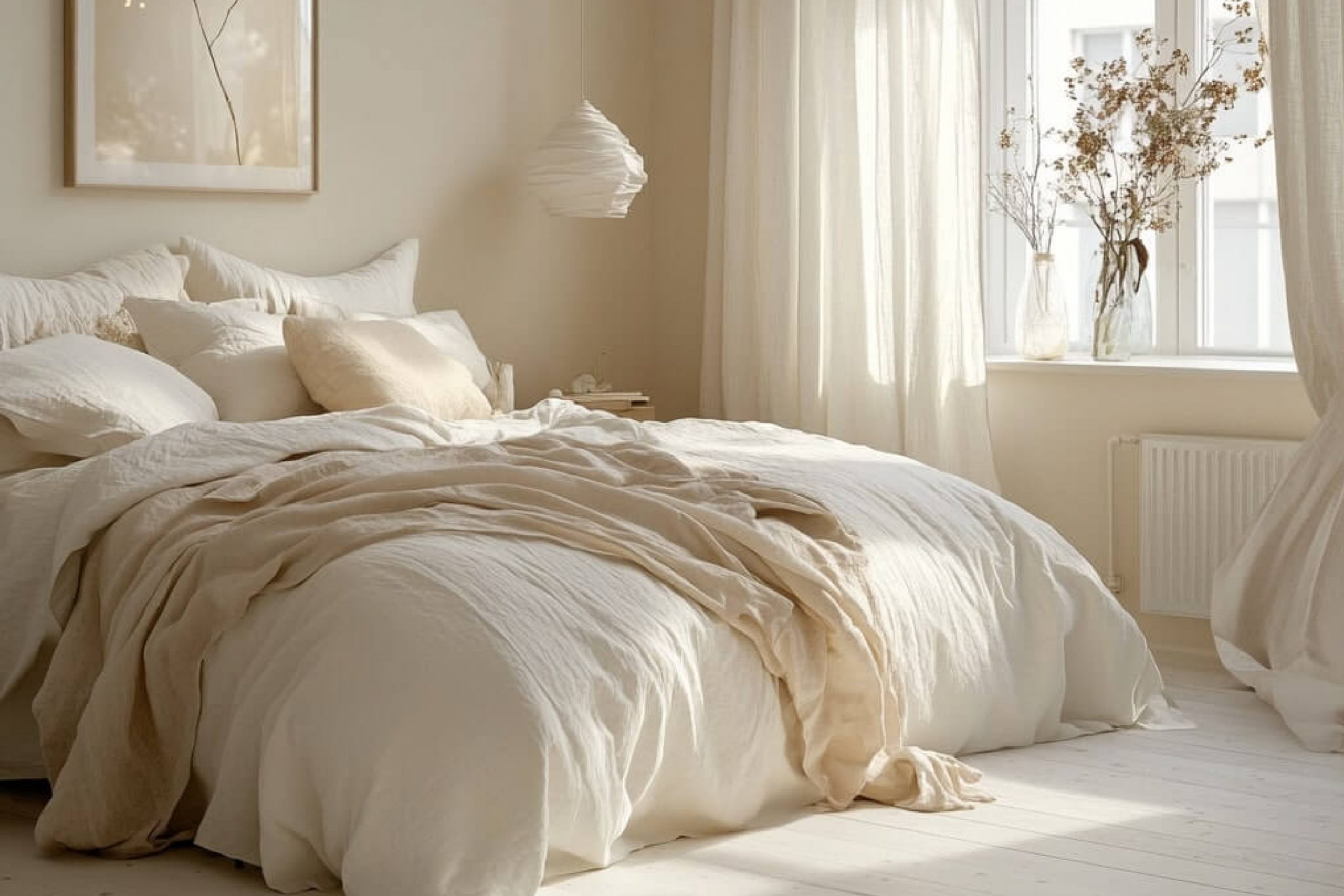
When I design a master bedroom, I always think first about how the colors will make the room feel. Warm shades can create comfort, softness, and a welcoming mood that makes it easy to relax at the end of the day. A master bedroom should never feel cold or plain—it should feel like your own retreat.
The paint color on the walls plays a huge part in this. Choosing a warm tone can make your room glow in natural light and feel cozy at night.
In this article, I’ll share my favorite warm shades from Sherwin-Williams and Benjamin Moore, along with a few farmhouse tones and even some rare blues that feel special in bedrooms.
Why I Believe Warm Colors Create the Best Master Bedrooms
Warm colors always bring a sense of comfort into a bedroom. Soft peach, sandy beige, muted coral, or golden tones can wrap the walls like a gentle blanket. These shades remind me of natural light, wood finishes, and soft fabrics—all the things that make a bedroom feel inviting.
I find that when clients choose warm shades, they often spend more time enjoying their rooms. These colors are also forgiving, pairing well with linens, rugs, and wooden furniture.
A master bedroom painted in warm tones doesn’t just look nice—it feels safe, familiar, and restful.
How I Choose the Perfect Warm Shade for a Master Bedroom
When I choose paint, I first look at how much light the room gets. A south-facing bedroom can carry deeper colors, while a darker room benefits from lighter warm tones. I also think about the furniture—oak and walnut look beautiful with golden or peachy walls, while lighter farmhouse wood pairs well with cream and tan.
I test the paint on the wall and check it during the day and night, because warm tones can shift with the light.
In the end, the right color is the one that makes you smile when you walk into the room and want to stay there longer.
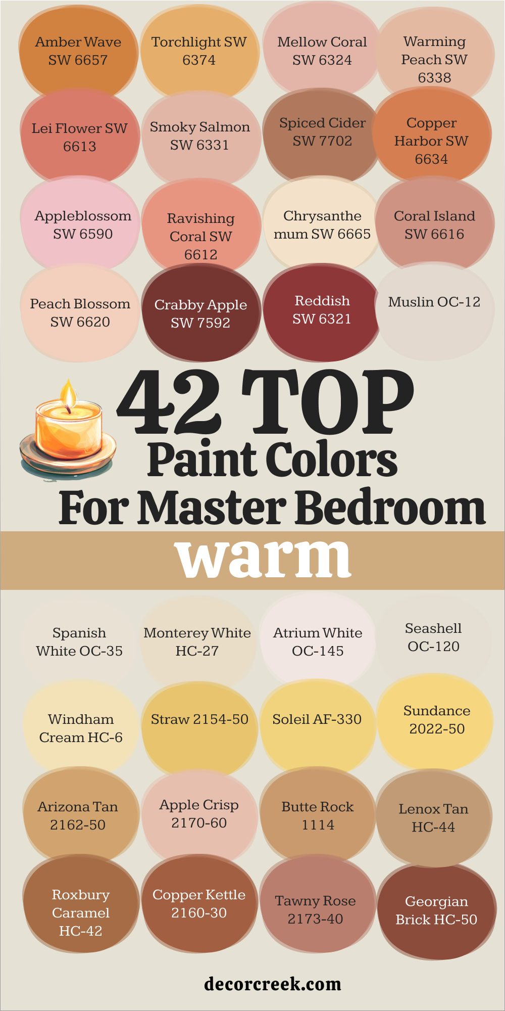
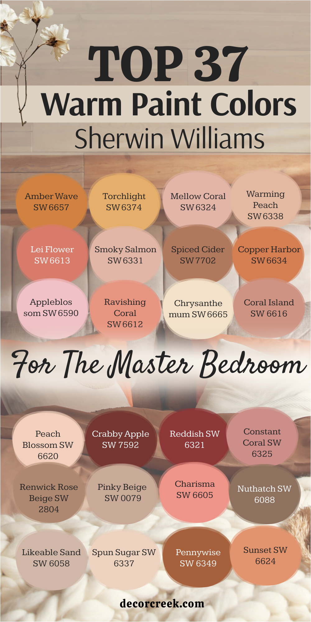
37 Top Warm Master Bedroom Paint Colors from Sherwin Williams
Amber Wave SW 6657
Amber Wave brings the feeling of a late summer sunset into the bedroom. This shade mixes golden yellow with a hint of orange, giving the room a glow that feels both cheerful and restful. I love how it pairs with white bedding, making the walls feel rich but not too dark.
Amber Wave also works beautifully with natural woods, adding warmth without stealing attention. In the evening, the color deepens, creating a cozy cocoon.
If you want your bedroom to feel like it’s always lit by golden hour light, this shade is perfect.
Torchlight SW 6374
Torchlight is a rich orange that feels like firelight against the walls. It makes a large master bedroom feel more intimate and adds an energizing yet comforting vibe. With cream linens and rustic accents, Torchlight feels grounded and warm. I enjoy using it as an accent wall too, bringing drama without making the room too heavy.
It pairs beautifully with warm metals like brass and copper. For a room that feels glowing and alive, Torchlight is a bold but beautiful choice.
Mellow Coral SW 6324
Mellow Coral is soft and rosy with just enough warmth to feel welcoming. It’s one of those colors that instantly makes a bedroom feel cheerful yet calming. I like how it pairs with whites, giving the room a light and airy look without feeling plain. With natural light, it takes on a fresh glow, while at night, it feels cozy and intimate.
This shade is perfect if you want a bedroom that feels gentle and slightly playful.
Warming Peach SW 6338
Warming Peach feels like sunlight captured on the walls. It’s soft, fresh, and welcoming without being too strong. I’ve used it in master bedrooms where the clients wanted something uplifting but still relaxing. It pairs beautifully with light woods and creamy whites, creating a fresh farmhouse style.
The peach undertone feels youthful, but the warmth keeps it grounded. If you want your room to feel cheerful and gentle, Warming Peach is the right choice.
Lei Flower SW 6613
Lei Flower is a bright, rosy coral that brings life into a bedroom. It’s bold yet still cozy, reminding me of tropical flowers and warm breezes. I like pairing this shade with crisp white bedding to let the color shine. Even in a master suite, it feels playful without losing comfort.
Lei Flower works well in rooms with lots of natural light, adding vibrancy without overwhelming the senses.
For a warm, joyful bedroom, this shade is stunning.
🎨 Check out the complete guide to this color right HERE 👈

Smoky Salmon SW 6331
Smoky Salmon is a muted coral with a soft smoky undertone. It feels more refined than a bright pink, perfect for someone who wants warmth without too much boldness. I love using it with beige linens and wooden accents, which let the walls feel cozy and stylish.
In the morning light, it has a gentle glow, while in the evening it creates a warm, intimate mood. Smoky Salmon brings comfort and charm to any master bedroom.
Spiced Cider SW 7702
Spiced Cider is a deep orange-brown that feels like autumn captured indoors. It adds richness to the walls, making the room feel warm and enveloping. I pair it with deep wood tones and off-white fabrics for a cozy farmhouse style. It works especially well in larger bedrooms, where the depth adds character without making the room feel small.
Spiced Cider is a color that feels both strong and comforting, perfect for creating a cocoon-like retreat.
🎨 Check out the complete guide to this color right HERE 👈

Copper Harbor SW 6634
Copper Harbor brings a rustic glow to the bedroom. It blends coppery orange with golden undertones, making the room feel earthy and warm. I like it with iron bed frames and natural linens, which let the color shine without being too heavy. In daylight, it feels bright and cheerful, while at night, it deepens into a cozy warmth.
Copper Harbor makes a master bedroom feel both bold and welcoming.
Appleblossom SW 6590
Appleblossom is a soft pink with a warm, peachy base. It’s delicate but not overly sweet, giving the bedroom a gentle charm. I pair it with light beige and white fabrics for a soft, romantic look. It makes the room feel fresh in the day and cozy at night.
Appleblossom adds a subtle warmth that’s easy to love in a master suite.
Ravishing Coral SW 6612
Ravishing Coral is bold and lively, yet still warm enough for a bedroom. It brings energy while keeping a sense of comfort. I love how it looks with white trim and neutral furniture, making the walls pop with color. It’s a shade that works best for someone who wants their bedroom to feel exciting yet inviting.
With the right lighting, Ravishing Coral feels glowing and dynamic.
Chrysanthemum SW 6665
Chrysanthemum is a golden-orange with floral warmth. It feels rich but still soft enough for a bedroom. I like pairing it with cream and tan for a grounded, nature-inspired look. The color changes beautifully with light, glowing during the day and becoming richer at night.
Chrysanthemum adds a cheerful yet calm presence in the room.
Coral Island SW 6616
Coral Island is a tropical-inspired coral that feels playful and inviting. It’s warmer than pink and softer than red, perfect for creating a bedroom full of personality. I enjoy pairing it with clean whites and warm neutrals for balance.
Coral Island makes the bedroom feel bright, lively, and still comfortable.
Peach Blossom SW 6624
Peach Blossom feels soft and glowing, like a gentle sunrise. It adds warmth without being too bold, giving the bedroom a welcoming charm. I often pair it with natural woods and woven fabrics for a cozy farmhouse touch. Peach Blossom brings just enough color to keep the room cheerful.
🎨 Check out the complete guide to this color right HERE 👈

Crabby Apple SW 7592
Crabby Apple is a rich, red-brown shade that brings depth and warmth. It feels strong and grounding, perfect for creating a cozy cocoon. I like pairing it with cream bedding and rustic furniture.
Crabby Apple adds bold warmth to a master bedroom, making it feel safe and comforting.
Reddish SW 6321
Reddish is a bold coral-red that feels lively and inviting. It’s strong but softened by its warm undertone, making it work beautifully in bedrooms. I pair it with whites and warm woods to balance the intensity.
Reddish adds character and warmth, perfect for someone who loves vibrant colors.
Constant Coral SW 6325
Constant Coral is playful yet soft, with a rosy warmth. It brightens up the room and makes it feel fresh without being overpowering. I pair it with light linens and natural accents for a cheerful mood.
Constant Coral is a great choice if you want a bedroom that feels lighthearted yet cozy.
Renwick Rose Beige SW 2804
Renwick Rose Beige is a muted rosy beige that feels classic and refined. It’s warm but not too bold, making it a versatile bedroom choice. I love how it pairs with both dark and light wood tones.
Renwick Rose Beige makes the room feel cozy while keeping it elegant.
Pinky Beige SW 0079
Pinky Beige is a delicate neutral with a hint of blush. It’s subtle but still adds warmth, perfect for a soft and romantic bedroom. With white trim and natural light, it feels airy and inviting. Pinky Beige gives the bedroom a quiet charm that’s easy to love.
🎨 Check out the complete guide to this color right HERE 👈
Charisma SW 6605
Charisma is a warm coral that feels lively yet cozy. It brings energy into the room without being too loud. I like pairing it with off-whites and woven textures. Charisma makes a bedroom feel cheerful and welcoming.
🎨 Check out the complete guide to this color right HERE 👈

Nuthatch SW 6088
Nuthatch is a soft brown with warm undertones. It feels earthy and grounding, perfect for a restful master bedroom. I often pair it with creams and beiges for balance.
Nuthatch gives the room a natural warmth that feels timeless.
Clay Pot SW 6343
Clay Pot is a terracotta shade that feels rustic and inviting. It reminds me of warm clay tiles in the sun. I pair it with natural woods and cream bedding for a farmhouse look.
Clay Pot makes the bedroom feel grounded and cozy.
Serengeti Grass SW 6611
Serengeti Grass is a warm coral with a touch of orange. It feels lively but still comforting. I love how it pairs with neutral bedding and simple decor.
Serengeti Grass adds a playful warmth that makes the bedroom feel alive.
Likeable Sand SW 6058
Likeable Sand is a soft beige with pink undertones. It feels cozy and welcoming, perfect for a soothing master bedroom. I often pair it with warm woods and white linens. Likeable Sand adds a subtle glow that makes the room feel restful.
Spun Sugar SW 6337
Spun Sugar is a light, peachy pink that feels soft and sweet. It adds a gentle warmth without being too bold. I like it with white trim and soft fabrics. Spun Sugar makes the bedroom feel airy and tender.
🎨 Check out the complete guide to this color right HERE 👈
Smoky Topaz SW 6350
Smoky Topaz is a deeper coral-brown shade with earthy warmth. It feels rich and grounding, perfect for a cozy master bedroom.
I pair it with darker woods and cream bedding. Smoky Topaz creates a warm cocoon-like atmosphere.
Desert Fire SW 7701
Desert Fire is a burnt orange that feels bold and earthy. It adds a rustic warmth to the bedroom, perfect for farmhouse or lodge style. I love it with leather accents and natural wood.
Desert Fire brings strength and coziness at the same time.
Mellow Mauve SW 0034
Mellow Mauve is a soft mauve with warm undertones. It feels romantic and soothing, making the bedroom more personal. I pair it with beige and cream for balance.
Mellow Mauve adds a tender warmth that feels elegant.
Reddened Earth SW 6053
Reddened Earth is an earthy terracotta with red undertones. It brings depth and warmth to the room. I love it with natural fibers and rustic decor. Reddened Earth creates a cozy, grounded mood.
🎨 Check out the complete guide to this color right HERE 👈

Sierra Redwood SW 7598
Sierra Redwood is a deep red-brown that feels strong and earthy. It works beautifully with farmhouse furniture and cream bedding. Sierra Redwood brings a warm strength into the room.
🎨 Check out the complete guide to this color right HERE 👈

Fireweed SW 6328
Fireweed is a deep coral-red with earthy warmth. It feels bold but still cozy. I often use it for accent walls to add character. Fireweed makes a bedroom feel dramatic and inviting.
🎨 Check out the complete guide to this color right HERE 👈

Sun-Dried Tomato SW 7585
Sun-Dried Tomato is a rich, brick-red that feels earthy and warm. It gives the bedroom a cozy, intimate atmosphere.
I pair it with warm neutrals and dark wood. Sun-Dried Tomato is perfect for a cocoon-like retreat.
Sierra Clay SW 6356
Sierra Clay is a muted terracotta that feels rustic and warm. It pairs beautifully with farmhouse decor.
Sierra Clay makes the bedroom feel grounded and natural.
Pennywise SW 6349
Pennywise is a warm coppery red that glows in the light. It feels rich but still welcoming. I pair it with cream and warm woods.
Pennywise gives the bedroom a strong, cozy character.
Fired Brick SW 6331
Fired Brick is a deep red with earthy warmth. It feels bold and grounding, perfect for creating a rich master bedroom.
Fired Brick pairs well with warm neutrals.
Sunset SW 6624
Sunset is a glowing coral-orange that feels cheerful and warm. It makes the bedroom feel alive with color.
Sunset adds brightness without losing comfort.
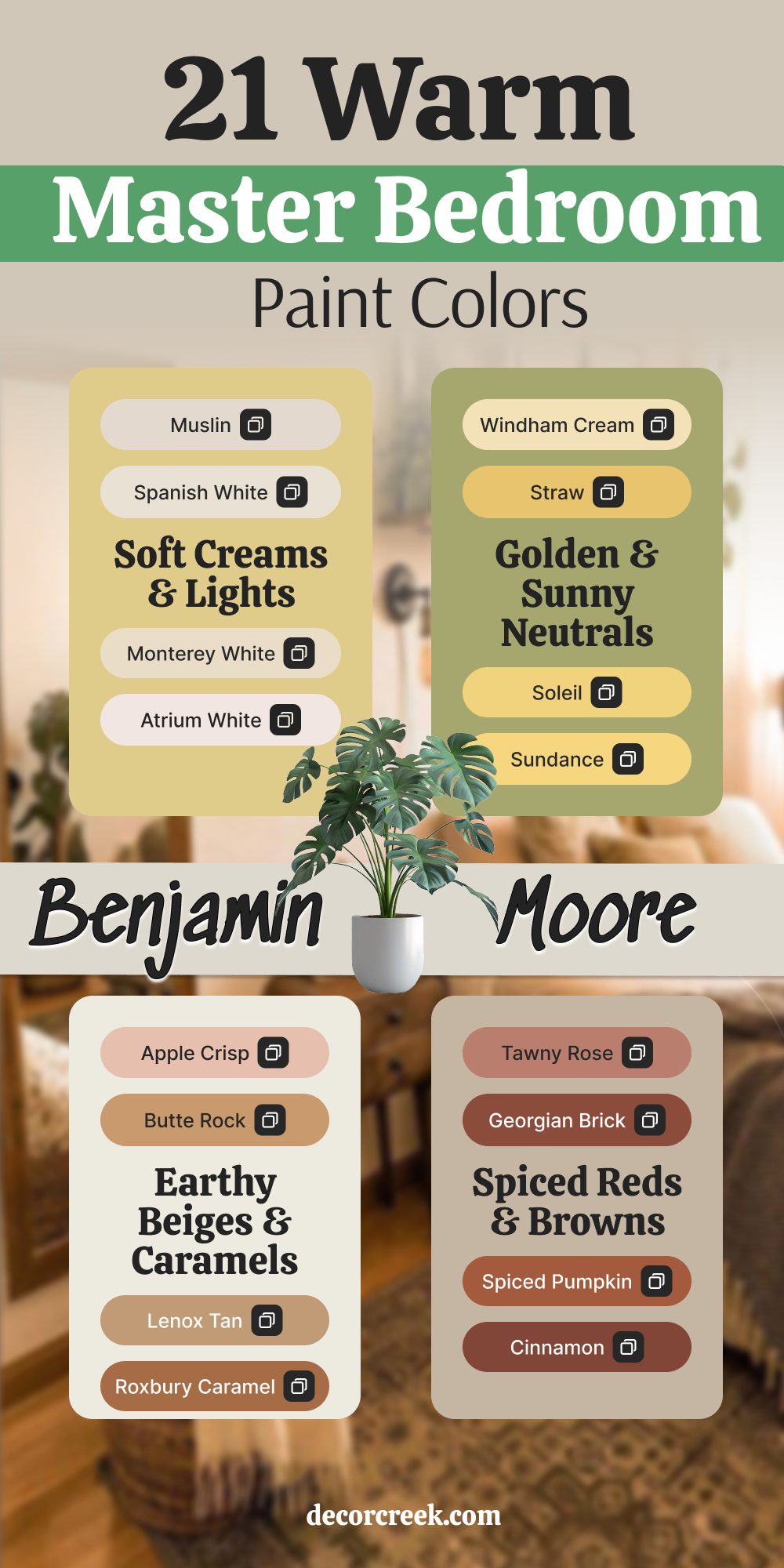
21 Warm Master Bedroom Paint Colors by Benjamin Moore
Muslin OC-12
Muslin is one of those colors that instantly makes a bedroom feel calm and restful. It’s a warm beige with just the right touch of creaminess, giving the room a soft glow without being too yellow. I love using Muslin in master bedrooms with light wood or linen fabrics because it adds to the cozy, lived-in feeling.
This shade works in both bright, sunny rooms and darker spaces where it creates warmth and comfort. It also blends beautifully with natural textures like rattan, cotton, or raw wood.
Muslin is a color that feels safe and welcoming, perfect for a master suite.
Spanish White OC-35
Spanish White carries a gentle warmth that feels natural on bedroom walls. It’s not too bright, yet it brings in a soft golden undertone that lights up the room. I often recommend it for larger master bedrooms because it balances out tall ceilings and wide spaces without feeling heavy. It pairs well with crisp white trim and adds a classic charm when combined with traditional furniture.
Spanish White feels like an easy choice for anyone who wants warmth but still enjoys a light and airy look.
It’s one of those shades that works year-round and never feels out of place.
Monterey White HC-27
Monterey White is a timeless creamy shade with subtle yellow notes that bring warmth to the bedroom. It creates a glow that makes mornings feel brighter and evenings softer. I like to pair this shade with muted pastels or warm woods for a cozy, layered look. In farmhouse-inspired bedrooms, it feels rustic and natural, while in modern rooms it adds gentle warmth without being too bold.
The color shifts beautifully depending on the light, always keeping its soft charm.
Monterey White is a wonderful choice for a welcoming and cozy master bedroom.
Atrium White OC-145
Atrium White has a unique character with its soft, pinkish undertone. This little touch of blush makes a bedroom feel tender and slightly romantic, especially in natural light. I often use it in bedrooms where the goal is to create comfort with a touch of personality. It pairs beautifully with warm woods, beige accents, and crisp linens.
At night, Atrium White softens the room, giving it a dreamy glow.
For anyone looking for a warm white that doesn’t feel plain, this is a lovely choice.
Seashell OC-120
Seashell is a sandy neutral that feels grounded and natural. It adds just enough warmth to make a bedroom feel cozy, yet it stays soft and light. I love pairing Seashell with woven fabrics, rattan details, and creamy bedding for a coastal-inspired bedroom. It has a way of catching light during the day, making the room glow gently.
At night, it deepens slightly, creating a soft cocoon effect. Seashell is perfect for creating a master bedroom that feels connected to nature.
Windham Cream HC-6
Windham Cream brings sunshine to the walls, even on cloudy days. It’s a cheerful buttery yellow that feels warm without being too intense. I often use it in bedrooms where clients want something uplifting but still restful. It pairs beautifully with crisp white trim and creates a charming contrast with darker wood furniture.
During the day, Windham Cream brightens the room, while in the evening it creates a soft golden glow. It’s the kind of shade that makes a bedroom feel joyful and inviting.
Straw 2154-50
Straw is a golden yellow with earthy undertones that add depth to the walls. It feels grounded, natural, and slightly rustic, which makes it perfect for bedrooms with farmhouse or traditional style. I like how it pairs with heavy wood furniture, creating a warm, balanced look. It works especially well in larger bedrooms, where its richness adds character without being overwhelming.
Straw brings a cozy warmth that feels like the glow of a late summer afternoon. It’s an easy way to make the bedroom feel sunny yet restful.
Soleil AF-330
Soleil is bold but comforting, bringing a radiant golden warmth to the bedroom. It feels like sunlight captured indoors, glowing against cream linens and warm wood tones. I’ve used Soleil in bedrooms that needed energy and life, and the result was always cheerful yet cozy. This shade pairs beautifully with both light neutrals and deeper browns, making it versatile.
In daylight, Soleil shines brightly, while at night it deepens into a comforting gold. Soleil is perfect for anyone wanting warmth with a little drama.
🎨 Check out the complete guide to this color right HERE 👈

Sundance 2022-50
Sundance is a happy, fresh yellow that instantly brightens a room. It carries warmth without being too strong, making it suitable for both big and small bedrooms. I like using it with simple, white bedding to let the color bring the energy. With wood accents, it feels earthy and cozy, while with crisp whites, it feels light and clean.
Sundance is playful but still grown-up, giving the bedroom a joyful spirit. It’s the kind of shade that can lift your mood as soon as you walk in.
Arizona Tan 2162-50
Arizona Tan is a sandy, sunbaked shade that feels natural and strong. It reminds me of desert tones, with a golden warmth that makes the room feel grounded. I love pairing Arizona Tan with earthy fabrics like cotton, linen, and leather. It works beautifully with darker woods, adding balance and depth.
This color is perfect for anyone wanting a bedroom that feels warm, earthy, and safe.
Arizona Tan gives the walls character while keeping the room restful.
Apple Crisp 2170-60
Apple Crisp is a cheerful peachy beige that makes the bedroom glow. It’s warm and soft, giving the room an inviting sweetness. I like pairing it with creamy whites and light wood tones for a cozy look. It feels especially nice in rooms with good natural light, where the warmth really shines through.
Apple Crisp is playful yet soft enough for a restful master bedroom. It adds warmth without taking over the space.
Butte Rock 1114
Butte Rock is a warm tan with subtle orange undertones, bringing earthy strength to the walls. It makes a master bedroom feel grounded and rustic, perfect for farmhouse or traditional style. I pair it with simple cream bedding and natural wood to highlight its depth. During the day, it feels sunlit and warm, while at night it becomes deeper and cozier.
Butte Rock has a steady presence that makes a bedroom feel solid and welcoming. It’s a wonderful choice for anyone who wants earthy warmth.
Lenox Tan HC-44
Lenox Tan is a golden tan that has been a favorite for bedrooms for years. It has a rich undertone that pairs beautifully with dark wood furniture and classic designs. I like how it feels both elegant and warm, making the room feel complete. In natural light, it glows, while in dim light it becomes cozy and inviting.
Lenox Tan gives the bedroom a traditional charm without feeling dated. It’s a color that feels steady, comforting, and timeless.
Roxbury Caramel HC-42
Roxbury Caramel is a deep, caramel shade that feels like wrapping the room in warmth. It adds richness and depth to the bedroom without feeling too dark. I love pairing it with cream bedding, which creates balance and keeps the look soft. It’s perfect for those who want their bedroom to feel cozy and luxurious.
Roxbury Caramel is especially striking in the evening, when it glows with a soft golden richness. It’s a shade that makes the master bedroom feel special.
Copper Kettle 2160-30
Copper Kettle is a warm, rustic brown with a glowing orange undertone. It feels earthy and strong, bringing a farmhouse charm to the bedroom. I like pairing it with leather, linen, and wooden furniture for a natural look. This shade works beautifully in larger bedrooms, where its depth feels cozy instead of heavy.
In daylight, it feels lively, and at night it becomes rich and soothing. Copper Kettle is perfect for creating a strong but warm atmosphere.
Tawny Rose 2173-40
Tawny Rose is a warm beige with a gentle rose undertone, giving the bedroom a soft romantic glow. It feels refined yet still cozy, perfect for a master suite. I like pairing it with white bedding and warm lighting to highlight its delicate warmth. It works beautifully in rooms with natural textures like wood and cotton.
Tawny Rose creates a sense of tenderness in the room, making it welcoming and personal. It’s ideal for anyone who wants warmth with a subtle rosy touch.
Georgian Brick HC-50
Georgian Brick is a rich brick red that brings strength and warmth to the bedroom. It feels bold but not overwhelming, especially when paired with creams and soft linens. I use it in bedrooms where the goal is to create a cocoon-like retreat. Georgian Brick adds drama and depth while still keeping the room cozy.
In evening light, it becomes especially rich and inviting. It’s perfect for those who want their bedroom to feel warm, strong, and classic.
Spiced Pumpkin 034
Spiced Pumpkin is a deep orange-brown that feels cozy and rustic. It instantly warms up the bedroom, giving it an autumn-inspired charm. I like pairing it with creamy whites and natural woods to create balance. It feels especially nice in farmhouse or country-inspired bedrooms.
During the day, it feels lively, while at night it becomes rich and soothing. Spiced Pumpkin is perfect for creating a bedroom that feels like a warm retreat.
Cinnamon 2174-20
Cinnamon is a spicy, reddish-brown that adds richness and depth to the bedroom walls. It feels warm and strong, perfect for someone who loves earthy tones. I pair it with simple neutral bedding to let the color take center stage. Cinnamon creates a cocoon-like feeling that’s both cozy and stylish.
In daylight, it glows softly, while at night it feels intimate. This shade makes a bold but comforting statement in any master bedroom.
Maplewood 1137
Maplewood is a golden beige that feels soft and inviting. It brings warmth to the room without being too strong. I like pairing it with white or cream fabrics for a light and cozy look. Maplewood works beautifully in both modern and farmhouse bedrooms, adapting easily to different styles.
It makes the bedroom glow with warmth while keeping it restful. This shade is perfect for creating a bedroom that feels naturally welcoming.
Autumn Cover 2170-30
Autumn Cover is a warm orange-red that instantly makes a bedroom feel cozy. It reminds me of fall evenings and brings a sense of comfort to the walls. I pair it with cream bedding and rustic wood for balance. It’s a bold color, but its warmth makes it feel safe and inviting.
In natural light, it feels lively, while at night it creates a deep, soothing glow. Autumn Cover is perfect for those who want their bedroom to feel warm and full of character.
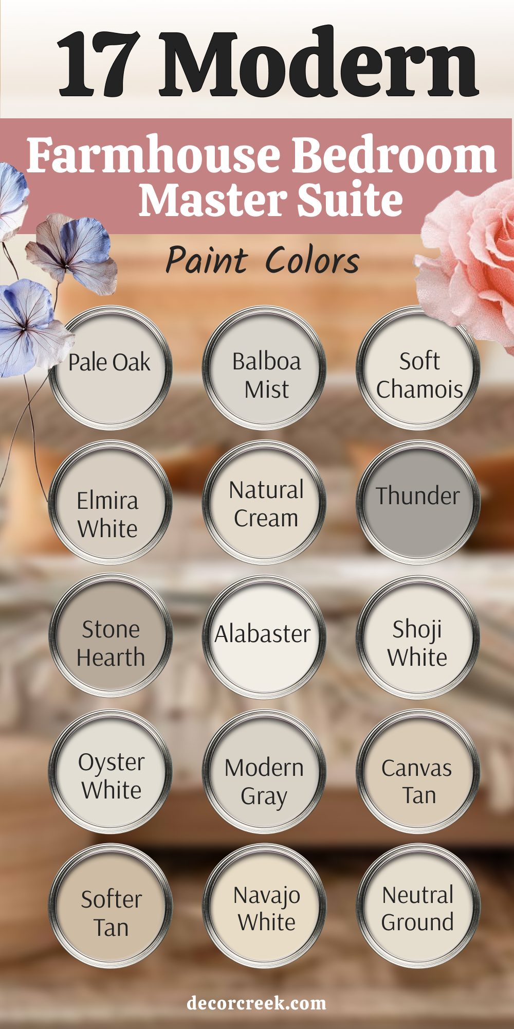
17 Modern Farmhouse Bedroom Master Suite Paint Colors
Pale Oak OC-20 (Benjamin Moore)
Pale Oak is one of those soft greige shades that always feels right in a farmhouse-inspired bedroom. It balances beige and gray in a way that makes the walls feel warm but still airy. I like pairing it with shiplap accents, natural wood beams, and linen bedding for a complete farmhouse look.
This color works in both bright and low-light rooms, always keeping a welcoming glow. Pale Oak feels fresh during the day and cozy at night, giving the master suite a sense of harmony.
It’s the perfect choice for anyone who wants softness with a touch of warmth.
🎨 Check out the complete guide to this color right HERE 👈

Edgecomb Gray HC-173 (Benjamin Moore)
Edgecomb Gray is a warm greige that feels grounded and timeless. It’s soft enough to act as a neutral, yet warm enough to give the bedroom character. I use it often in farmhouse bedrooms where the goal is simplicity with depth. Paired with white trim, it looks crisp and balanced, and with warm woods, it feels rustic and inviting.
Edgecomb Gray changes slightly with the light, sometimes reading more beige, sometimes more gray.
This flexibility makes it a favorite for master suites where comfort is key.
🎨 Check out the complete guide to this color right HERE 👈

Balboa Mist OC-27 (Benjamin Moore)
Balboa Mist is a light warm gray that feels airy and clean in a master bedroom. It has a gentle warmth that softens the space without being heavy. I like to pair it with creamy whites, rustic wood furniture, and woven textiles for a classic farmhouse charm. During the day, Balboa Mist feels fresh and open, while at night it takes on a warmer, cozier tone.
It’s especially good in bedrooms where you want a soft backdrop for natural materials.
Balboa Mist is a shade that feels both stylish and restful.
🎨 Check out the complete guide to this color right HERE 👈

Soft Chamois OC-13 (Benjamin Moore)
Soft Chamois is a creamy off-white that carries just the right touch of warmth. It makes the walls glow gently, perfect for bedrooms where you want light but not starkness. I pair it with farmhouse textures like jute rugs, cotton bedding, and warm oak accents.
In sunny rooms, Soft Chamois feels bright and open, while in darker bedrooms it keeps the space cozy.
It’s a color that adapts beautifully to changing light. Soft Chamois is perfect for a master suite that feels both fresh and comforting.
Elmira White HC-84 (Benjamin Moore)
Elmira White is a warm beige-gray that feels steady and soothing. It’s one of those farmhouse colors that makes the bedroom feel lived-in and natural. I often use it with rustic headboards, simple white linens, and warm lighting.
The shade is soft enough to be versatile but still brings personality to the walls.
During the day, Elmira White feels relaxed and easy, while in the evening it deepens to a cozier tone. It’s perfect for creating a calm, rustic-inspired master suite.
Natural Cream OC-14 (Benjamin Moore)
Natural Cream is exactly what its name suggests—soft, creamy, and warm. It gives the bedroom a glow that feels safe and inviting. I like using it in master suites where the goal is comfort above all else. Paired with farmhouse beams, white bedding, and textured throws, it feels charming and homey.
Natural Cream works well in both small and large bedrooms, adding warmth without closing in the space.
It’s a simple shade that always makes a room feel more welcoming.
🎨 Check out the complete guide to this color right HERE 👈

Thunder AF-685 (Benjamin Moore)
Thunder is a deeper greige with warm undertones that ground the bedroom. It feels strong without being too dark, adding a solid backdrop for farmhouse furnishings. I often use Thunder in larger master bedrooms, where it creates a cozy, cocoon-like feeling.
Paired with cream bedding and rustic wood, it feels balanced and inviting.
During the day, it has a steady presence, and at night it becomes rich and warm. Thunder makes a master suite feel grounded and restful.
Stone Hearth 984 (Benjamin Moore)
Stone Hearth is a taupe shade with warm depth that feels both modern and rustic. It works beautifully in farmhouse bedrooms where you want coziness with a touch of elegance. I like pairing it with darker woods, creamy linens, and soft lighting. The warmth in this color makes the room feel inviting without being too heavy.
In the morning, it feels soft and fresh, and at night it deepens into a rich, cozy tone.
Stone Hearth is a shade that makes the bedroom feel safe and well-balanced.
🎨 Check out the complete guide to this color right HERE 👈

Alabaster SW 7008 (Sherwin-Williams)
Alabaster is a creamy white that never feels cold. It adds softness and light, making the bedroom feel open but still cozy. I love using it with farmhouse shiplap, whitewashed furniture, and layered neutral bedding. The warmth in Alabaster keeps it from feeling stark, which makes it perfect for a restful bedroom.
It adapts easily to different lighting, always keeping a soft glow.
Alabaster is ideal if you want your master suite to feel bright yet inviting.
🎨 Check out the complete guide to this color right HERE 👈

Shoji White SW 7042 (Sherwin-Williams)
Shoji White is a warm off-white with a hint of beige. It feels gentle and welcoming, adding comfort to the master bedroom. I often pair it with light farmhouse woods, soft linens, and woven rugs. In daylight, Shoji White feels fresh and open, while in the evening it softens beautifully.
It’s one of those colors that creates balance, neither too warm nor too cool.
Shoji White is perfect for a farmhouse bedroom that feels natural and cozy.
🎨 Check out the complete guide to this color right HERE 👈

Oyster White SW 7637 (Sherwin-Williams)
Oyster White is a soft greige with subtle warmth. It feels restful, making the bedroom cozy without adding heaviness. I like pairing it with neutral fabrics and wooden accents for a farmhouse-inspired look. The color adapts well to changing light, sometimes reading more gray, sometimes more beige.
It’s perfect for those who want warmth but still like a touch of cool balance.
Oyster White makes the master suite feel soft, simple, and welcoming.
🎨 Check out the complete guide to this color right HERE 👈

Modern Gray SW 7632 (Sherwin-Williams)
Modern Gray is a warm light greige that feels versatile in a bedroom. It works as a backdrop for both rustic and modern farmhouse styles. I often use it with creamy whites, natural linens, and soft wood accents. Modern Gray brings a sense of quiet comfort to the bedroom, glowing warmly in natural light.
At night, it deepens slightly, making the room feel more intimate.
This shade is perfect if you want a bedroom that feels cozy yet stylish.
🎨 Check out the complete guide to this color right HERE 👈

Accessible Beige SW 7036 (Sherwin-Williams)
Accessible Beige is a warm beige-gray that feels soft and grounding. It’s a color that works beautifully with farmhouse decor, from rustic woods to light linens. I love how it balances warmth with neutrality, giving the room character without being bold.
In sunny bedrooms, it glows with warmth, while in darker rooms it creates a restful mood.
Accessible Beige adapts easily to different styles, always feeling natural and cozy. It’s a classic choice for a farmhouse master suite.
🎨 Check out the complete guide to this color right HERE 👈

Neutral Ground SW 7568 (Sherwin-Williams)
Neutral Ground is a soft cream that feels gentle on the walls. It adds warmth without taking over the room, making it easy to pair with farmhouse furniture and fabrics. I like using it in bedrooms where the goal is a light and welcoming feel. With wooden beams or rustic flooring, Neutral Ground creates a beautiful balance.
It feels soft and sunny during the day, while at night it turns into a cozy backdrop.
This color is ideal for simple, restful master suites.
🎨 Check out the complete guide to this color right HERE 👈

Canvas Tan SW 7531 (Sherwin-Williams)
Canvas Tan is a warm beige that feels steady and natural. It brings warmth to the bedroom without being too strong. I love how it pairs with rustic headboards, woven baskets, and soft bedding. Canvas Tan has just enough depth to add character, while staying light enough for comfort.
In the evening, it takes on a deeper, cozier look.
This shade is perfect for a master bedroom that should feel grounded and timeless.
🎨 Check out the complete guide to this color right HERE 👈

Softer Tan SW 6141 (Sherwin-Williams)
Softer Tan is a light tan that carries warmth and comfort. It feels gentle, making the master bedroom cozy without adding weight. I often use it with farmhouse accents like white bedding and natural wood. During the day, it reflects light softly, and at night it becomes warm and inviting.
Softer Tan is a versatile shade that adapts easily to different bedroom styles.
It’s perfect for creating a soft, homey farmhouse master suite.
🎨 Check out the complete guide to this color right HERE 👈

Navajo White SW 6126 (Sherwin-Williams)
Navajo White is a creamy warm white with golden undertones. It feels cheerful yet soft, adding a gentle glow to the bedroom. I like pairing it with rustic farmhouse beams and neutral fabrics for balance. Navajo White works well in both large and small bedrooms, always keeping a sense of comfort.
In daylight, it feels bright, while at night it becomes warm and cozy.
It’s a classic farmhouse shade that makes the master suite feel welcoming.
🎨 Check out the complete guide to this color right HERE 👈

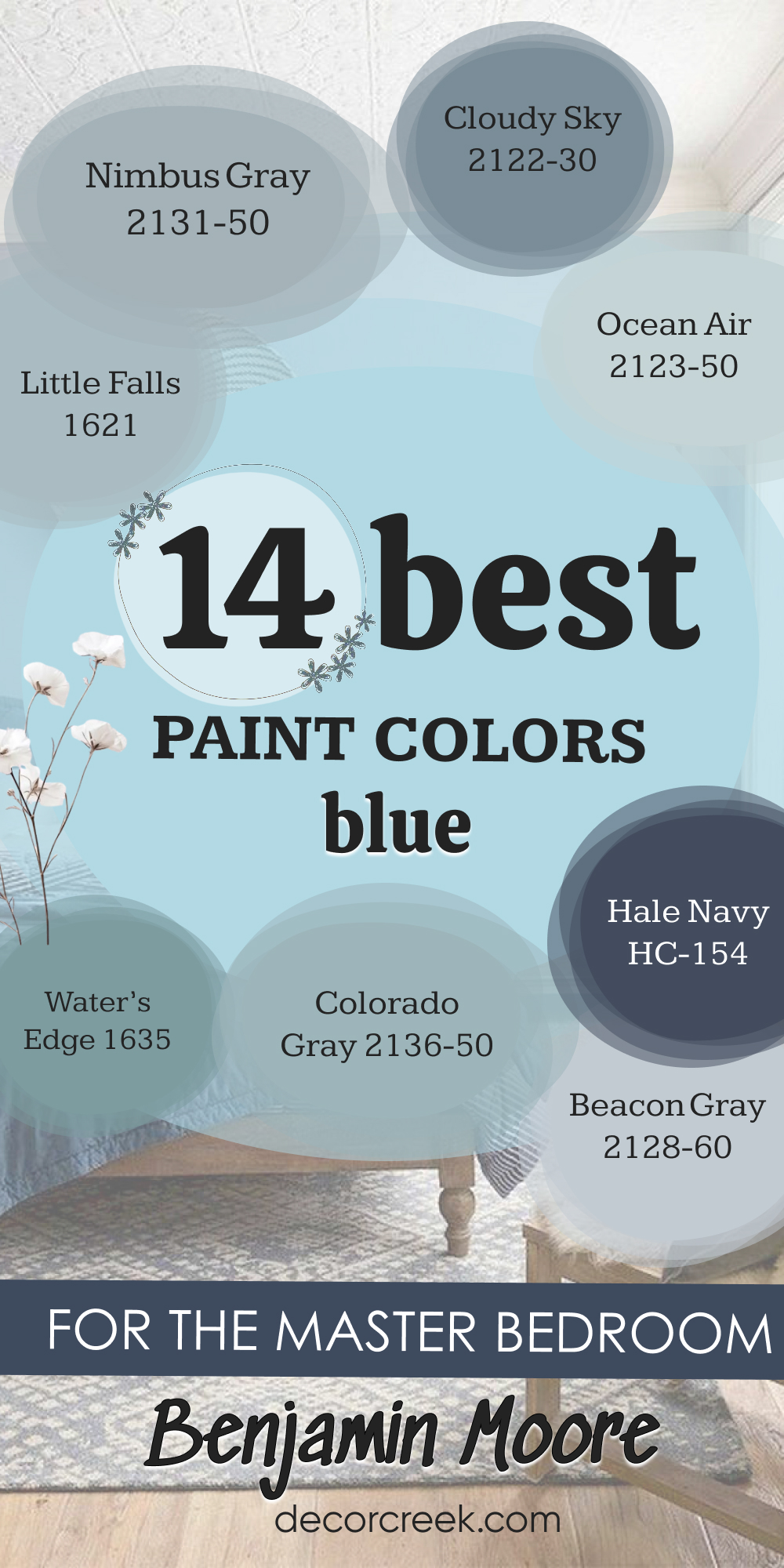
14 Blue Paint Colors for Master Bedroom by Benjamin Moore
Nimbus Gray 2131-50
Nimbus Gray is a muted blue-gray that feels calming but still has warmth. It creates a bedroom that feels balanced, not too cool and not too warm. I like using it with white linens and natural wood accents for a classic, restful look. The gray undertone keeps it from feeling too bright, making it perfect for a master suite.
In natural light, it feels fresh, while in the evening it takes on a cozy depth.
Nimbus Gray gives the bedroom a sense of quiet strength.
Cloudy Sky 2122-30
Cloudy Sky is a dusty blue that carries a soft gray undertone. It feels grounding, perfect for a master bedroom where you want coziness with a hint of color. I love pairing it with cream bedding and warm woods to keep the balance. Cloudy Sky changes beautifully with light, shifting between moody and soft.
During the day, it feels airy, and at night it creates intimacy.
This shade is perfect for a bedroom that should feel cozy but stylish.
Little Falls 1621
Little Falls is a pale blue with warmth tucked inside its softness. It feels light and airy, almost like a soft blanket of sky on the walls. I often use it in bedrooms that need a fresh yet gentle backdrop. Paired with creamy whites and light linens, it feels charming and delicate.
Little Falls works well in small master suites, helping the room feel more open.
It’s a shade that creates comfort with just a hint of cheerfulness.
Colorado Gray 2136-50
Colorado Gray is a dusty blue that leans slightly toward green, adding richness to the walls. It feels soothing and natural, making it ideal for restful master bedrooms. I like to pair it with rustic woods and simple bedding for balance. In daylight, it glows softly, while at night it deepens to create a cozy cocoon.
Colorado Gray is versatile, feeling fresh and modern yet grounded and warm.
It’s a perfect color for a bedroom with personality.
Ocean Air 2123-50
Ocean Air is a soft, airy blue that feels fresh and inviting. It’s light but carries warmth, making it easy to live with in a bedroom. I enjoy pairing it with crisp white bedding and natural textures for a coastal touch. During the day, Ocean Air feels breezy, while at night it creates a soft, cozy backdrop.
It’s gentle enough to be restful but still adds character to the room.
Ocean Air is a lovely choice for a bedroom that feels light and welcoming.
Beacon Gray 2128-60
Beacon Gray is a muted gray-blue that feels delicate and quiet. It’s a perfect shade for bedrooms where you want softness without boldness. I love pairing it with cream bedding, soft lighting, and rustic details. Beacon Gray shifts beautifully in light, sometimes reading more blue, sometimes more gray.
It’s subtle but still full of character.
This shade makes the bedroom feel cozy, calm, and inviting.
Gossamer Blue 2123-40
Gossamer Blue is dreamy and light, with a warmth that keeps it from feeling too icy. It feels gentle on the walls, making the bedroom soft and airy. I often use it with white trim and farmhouse linens for a charming look. During the day, it feels fresh, while at night it turns cozy and soothing.
Gossamer Blue is a color that works beautifully as a backdrop, allowing furniture and fabrics to shine.
It’s perfect for anyone who wants their bedroom to feel like a soft escape.
Water’s Edge 1635
Water’s Edge is a medium blue with subtle green undertones that give it depth. It feels soothing yet still lively, making it perfect for a master suite. I like pairing it with rustic wood and creamy bedding to create warmth. The green touch keeps it from being too cool, making it versatile.
During the day, it feels fresh and airy, while at night it creates a cozy, cocoon-like effect.
Water’s Edge brings personality and warmth to the bedroom.
🎨 Check out the complete guide to this color right HERE 👈

Lucerne AF-530
Lucerne is a bold teal-blue that feels dramatic but still inviting. It adds richness and depth to the master bedroom, creating a cozy, moody atmosphere. I often pair it with brass accents, dark woods, and creamy fabrics for balance. Lucerne works beautifully in larger bedrooms, where its strength feels grounding.
During the day, it has a lively energy, while at night it becomes rich and intimate.
It’s a perfect color for anyone who loves strong, warm blues.
Symphony Blue 2060-10
Symphony Blue is a deep navy that carries energy and strength. It feels elegant in a master bedroom, especially with white linens and dark wood furniture. I love how it creates contrast without making the room feel cold. Symphony Blue works well in spaces with good light, keeping the depth balanced.
In evening light, it becomes even more dramatic and cozy.
This shade is perfect for creating a bold but inviting master suite.
🎨 Check out the complete guide to this color right HERE 👈

Blue Danube 2062-30
Blue Danube is a lively, medium blue that feels cheerful but still restful. It has warmth in its tone, which keeps it from being too bright. I like using it with light woods and cream accents for balance. Blue Danube works well in bedrooms where you want a touch of personality.
In the day, it feels fresh, while at night it becomes more grounding.
This shade brings a joyful energy to the master suite.
Hale Navy HC-154
Hale Navy is a classic deep navy that feels rich and timeless. It brings depth to the bedroom, creating a cozy and intimate atmosphere. I love pairing it with white bedding, brass fixtures, and warm woods. Hale Navy works especially well on accent walls, adding drama without overpowering the room.
During the day, it feels steady and strong, while at night it becomes moody and warm.
It’s a shade that always makes a master bedroom feel elegant and cozy.
🎨 Check out the complete guide to this color right HERE 👈

Blue Note 2129-30
Blue Note is a dark, moody blue with a hint of sophistication. It makes the bedroom feel grounded and dramatic while still inviting. I often use it in master suites where clients want a cozy, cocoon-like vibe. Paired with cream bedding and warm lighting, it feels intimate and stylish.
Blue Note is strong but never harsh, always keeping a sense of comfort.
It’s a perfect choice for those who want depth and warmth in their bedroom.
🎨 Check out the complete guide to this color right HERE 👈

Westcott Navy 1624
Westcott Navy is a softer navy with warmth that makes it easier to live with. It feels rich without being too heavy, perfect for a master bedroom. I like pairing it with creamy whites and rustic accents for balance. Westcott Navy shifts beautifully with light, sometimes bold, sometimes quiet.
At night, it creates a cocoon-like atmosphere that feels restful.
This shade is perfect for adding depth while keeping the bedroom cozy.
Final Thoughts on Warm Master Bedroom Paint Colors
Warm colors are the heart of a restful master bedroom. They bring softness, coziness, and a sense of safety that makes the room inviting. From sandy beiges and creamy whites to rich corals and calming blues, each shade tells a story of comfort. The right color has the power to change the way you feel when you walk into your bedroom—it can make you breathe deeper, rest better, and smile more often.
For me, the best warm bedrooms are the ones that feel like a hug at the end of the day.
When you choose a color that feels like home, you’ve found the perfect shade.