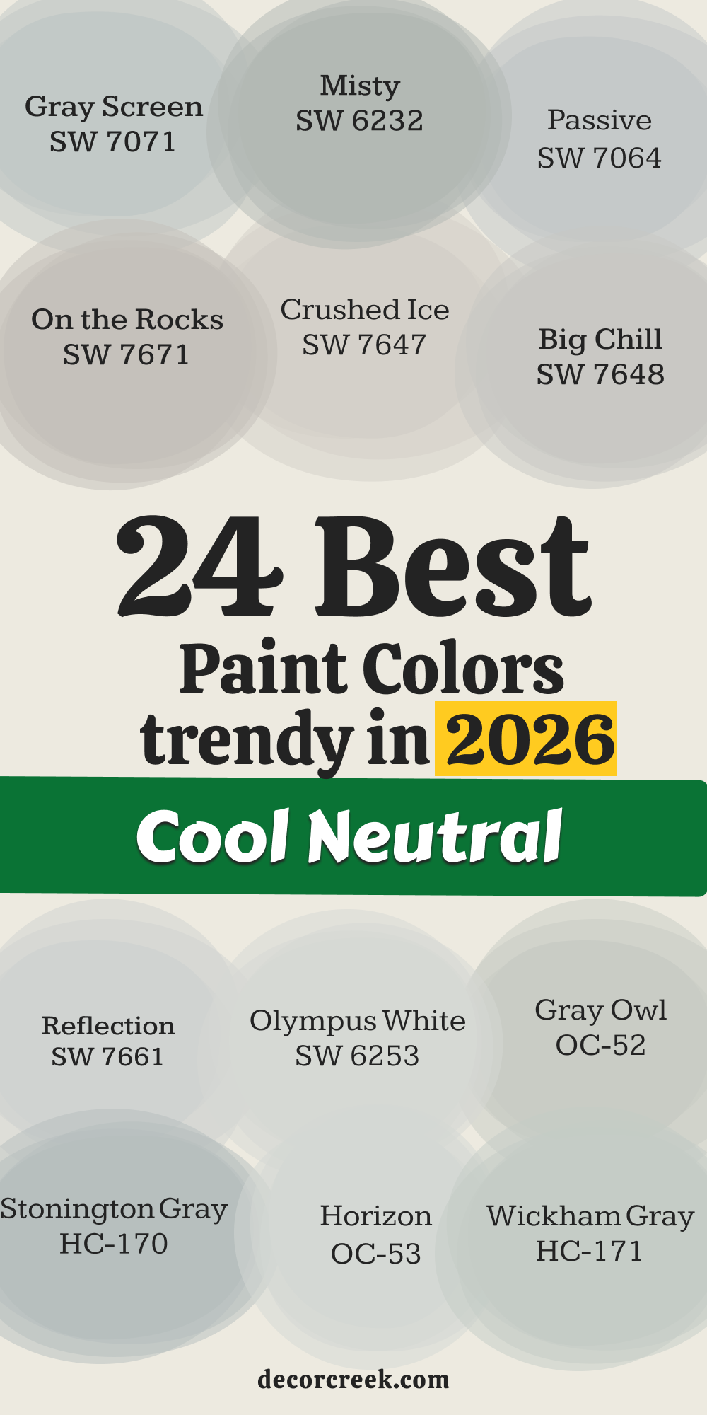
Choosing paint colors can feel like a big puzzle, but I’m here to make it simple! As a home interior designer and staging expert, I know that the right paint can make all the difference in how your home looks and feels. Cool neutrals are my absolute secret weapon. They are those beautiful grays, off-whites, and taupes that have a hint of blue, green, or violet undertone.
These colors are absolutely fantastic because they instantly make a room feel crisp, fresh, and perfectly put-together. They give me a wonderful foundation to build a beautiful and sophisticated design upon, acting like a perfect, non-distracting backdrop for furniture and decorations.
I love how effectively they work with different kinds of light: they look clean and airy in sunny rooms and feel composed and inviting in darker ones, all while maintaining their freshness. Forget about colors that feel too stark or too yellow; these cool neutrals are just right. They create a wonderful sense of order and composure that is so essential in a modern home.
The right choice of such a shade guarantees that your interior will look expensive and thoughtfully designed, which, of course, thrills my clients every time.
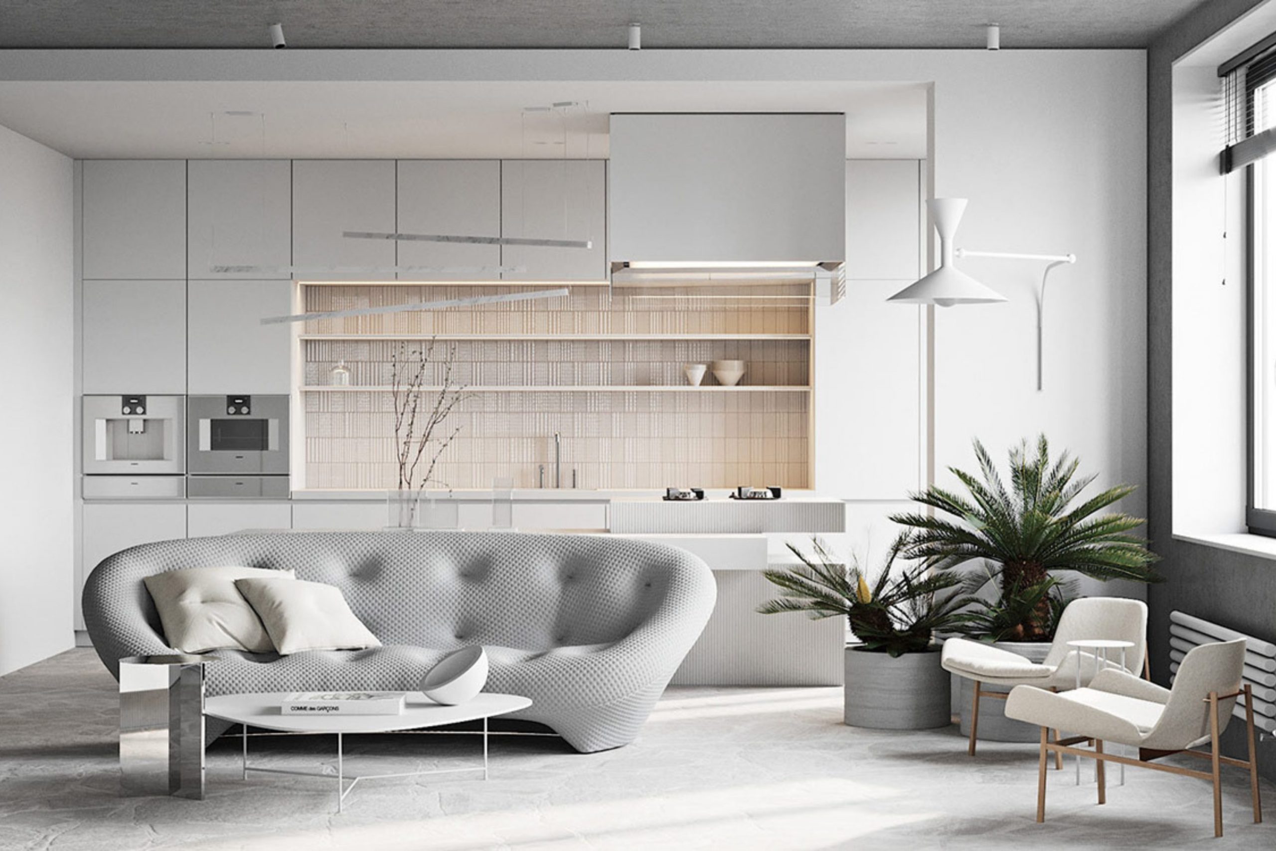
Why I Always Trust Sherwin-Williams and Benjamin Moore for Cool Neutral Paints
When I’m picking paint for a client’s home, I always go straight to Sherwin-Williams and Benjamin Moore. Why? Because these two brands are, without a doubt, the best! They don’t just sell paint; they sell quality and consistency that I can depend on every single time. Their color collections are huge, but more importantly, their formulas are rich and their pigments are fine, which means the paint goes on beautifully, and the color on the wall is precisely what I expected.
For cool neutrals, getting the undertone right is crucial, and these two brands absolutely nail it. I need a gray to look like a true, lovely gray—not suddenly turn purple or swampy green on the wall. With Sherwin-Williams and Benjamin Moore, I know I’m getting deep, lasting color and superior, reliable coverage.
This unwavering reliability saves me an enormous amount of time on site and ensures that my clients are always thrilled with the final result, feeling that their home has received a professional and enduring finish. I simply cannot risk a color mistake, and these two brands are my guarantee of success.
How I Choose the Perfect Cool Neutral Shade for Every Room
Picking the perfect cool neutral is less about guessing and more about a methodical process, especially when you know exactly what to look for. The first thing I always do is look at the light. Is the room sunny and bright, or is it darker with northern exposure? Light changes absolutely everything about how a color is perceived. A bright color might completely wash out in a very sunny room, and a deeper color might feel too heavy in a dark room.
Next, I look closely at the fixed elements—things that cannot be changed easily, like flooring, stone fireplaces, or kitchen countertops. The paint color must look complementary next to those materials. For example, if the tile has a lot of gray-blue in it, I will pick a cool neutral with a similar undertone to make everything flow harmoniously.
I always, always paint a large sample patch directly on the wall—I never just hold up a small chip. I watch that sample throughout the entire day, seeing how it looks in the morning light, the afternoon light, and with the lamps turned on at night.
This detailed process helps me find a cool neutral that not only works well but truly sings in that particular room.
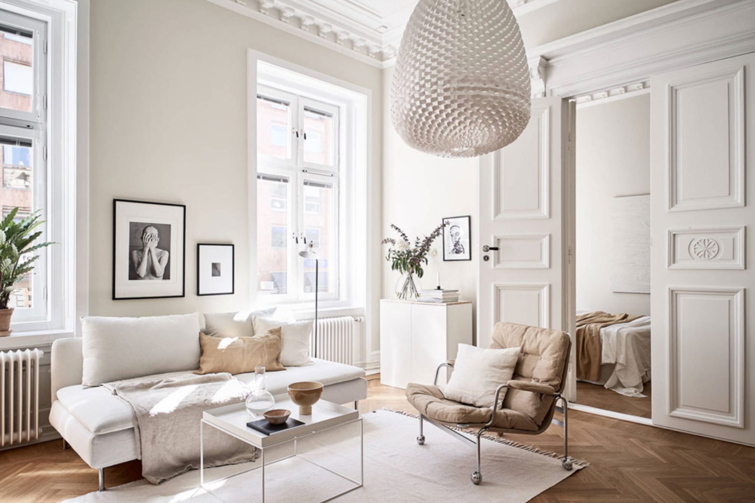
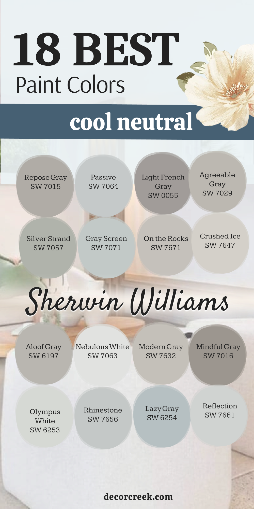
18 Best Cool Neutral Paint Colors by Sherwin-Williams
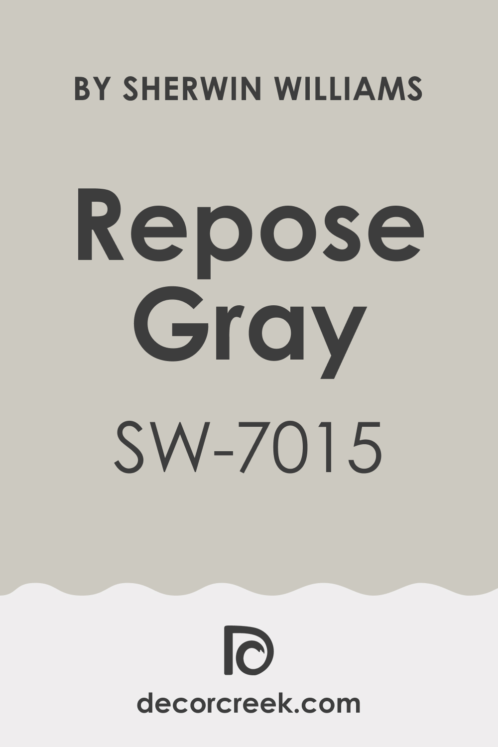
Repose Gray SW 7015
Repose Gray SW 7015 is one of my most-used cool grays and it always delivers beautiful results. Repose Gray is a fantastic medium-light gray with very balanced, cool undertones of both blue and a tiny touch of violet. Repose Gray works exceptionally well in living rooms and kitchens where good natural light can really make it shine.
Repose Gray has an LRV (Light Reflectance Value) of 58, meaning it’s light enough not to feel heavy but still has plenty of body. Repose Gray is considered a true greige by some, but its cool side always wins out on my walls. Repose Gray pairs beautifully with bright white trim and dark wood floors, creating a sophisticated contrast.
Repose Gray is a truly flexible color that adapts well to traditional and modern furnishings alike. Repose Gray can sometimes show a touch of green in north-facing light, so always sample it first in your room. Repose Gray is a go-to color that makes every room feel instantly refreshed and clean. Repose Gray is a sure bet for anyone seeking a lovely, cool neutral that avoids looking icy.
👉 Read the full guide for this color HERE 👈
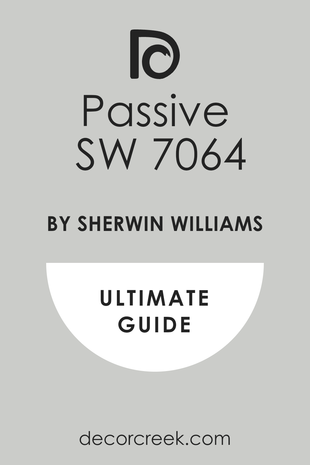
Passive SW 7064
Passive SW 7064 is a delightfully airy and light gray that leans firmly into its cooler characteristics. Passive SW 7064 has beautiful blue-green undertones that give it a fresh, silvery appearance on the wall. Passive SW 7064 is an excellent choice for bedrooms and bathrooms where a relaxing and clean color is desired.
Passive SW 7064 is quite light, with an LRV of 60, making it a great option for brightening up hallways and smaller rooms. Passive SW 7064 works very well with coastal and contemporary design styles because of its breezy feel. Passive SW 7064 looks particularly good when paired with dark charcoal accents or crisp white linens.
Passive SW 7064 is one of those colors that looks like a clean off-white from a distance but reveals its cool gray character up close. Passive SW 7064 is a fantastic option if you want a color that feels very light but still offers clear contrast against white trim. Passive SW 7064 might show more blue in certain lights, so check your samples carefully. Passive SW 7064 is a wonderful, crisp cool gray that I highly recommend for a sophisticated look.
👉 Read the full guide for this color HERE 👈
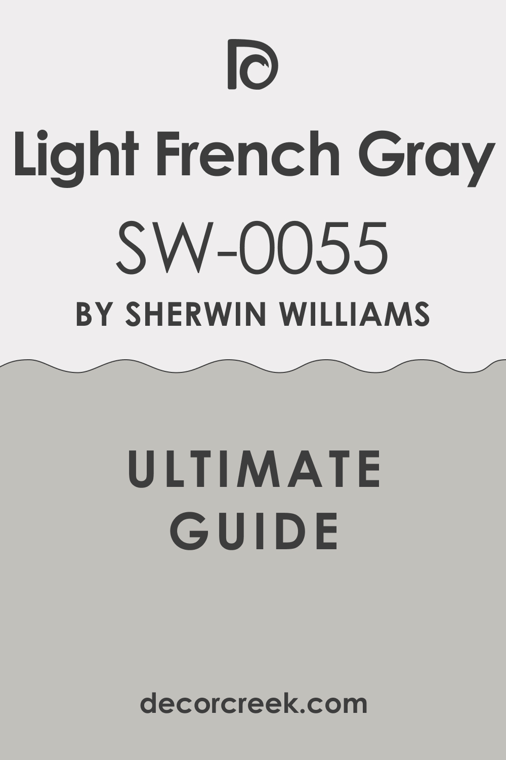
Light French Gray SW 0055
Light French Gray SW 0055 is a rich, medium-toned gray that carries a clear and definite cool undertone. Light French Gray is a sophisticated choice that is dark enough to offer real visual weight without making a room feel small. Light French Gray shows soft blue-violet undertones, giving it a comforting depth that works beautifully in many settings.
Light French Gray is a fabulous color for dining rooms, home offices, or as an accent wall in a living room. Light French Gray has an LRV of 53, placing it right in that sweet spot for a color with presence. Light French Gray works well with both warm and cool wood tones, which is a major advantage for decorating.
Light French Gray looks incredibly refined when used with detailed white crown molding and trim. Light French Gray is a darker cool gray that I often use to make architectural features stand out. Light French Gray holds its color beautifully even in lower light conditions, avoiding the pitfalls of washing out. Light French Gray is a perfect choice if you are looking for a distinctly cool, medium gray that still feels very refined.
👉 Read the full guide for this color HERE 👈
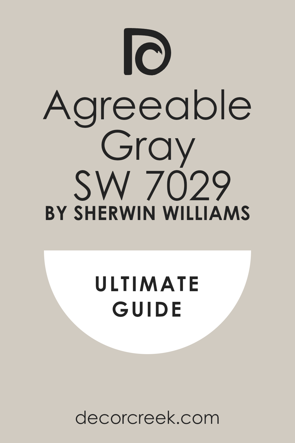
Agreeable Gray SW 7029
Agreeable Gray SW 7029 is popular color, but it’s important to note its very balanced, slightly cool-leaning nature. Agreeable Gray is typically classified as a greige, but its gray side and cool hints of green and violet make it fit the cool neutral category. Agreeable Gray works so well because it avoids strong color commitments, making it excellent for open-concept floor plans.
Agreeable Gray is a perfect choice for main living areas where a light and balanced backdrop is needed. Agreeable Gray has an LRV of 60, which means it brightens a room while still providing a gentle contrast. Agreeable Gray can sometimes appear slightly warmer in very sunny rooms, but it keeps its neutral grounding.
Agreeable Gray is a beautiful foundation color that pairs effortlessly with almost any fabric and wood finish. Agreeable Gray is often used as a whole-house color because of its reliability and ability to transition well from room to room. Agreeable Gray is the kind of color that homeowners consistently love for its adaptable, soothing quality. Agreeable Gray is a solid choice for a light neutral that is just cool enough to feel fresh and clean.
👉 Read the full guide for this color HERE 👈
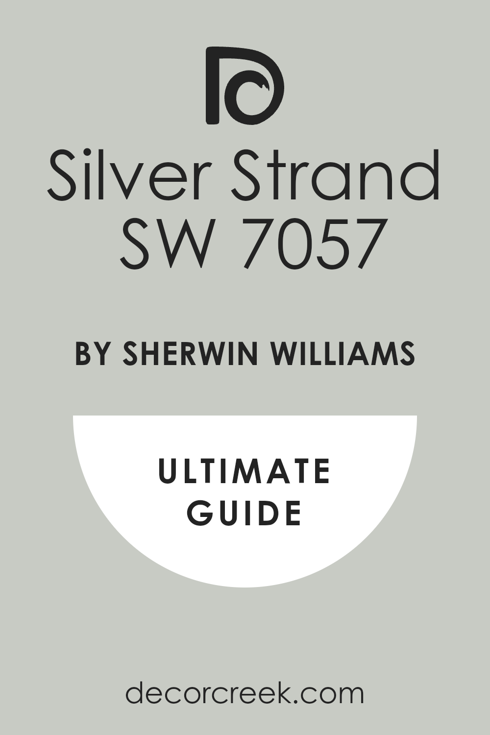
Silver Strand SW 7057
Silver Strand SW 7057 is a gorgeous, atmospheric gray that has unmistakable green and blue cool undertones. Silver Strand is a fantastic color for creating a restful and fresh feeling in a bedroom or a cozy study. Silver Strand has an LRV of 53, which is a medium depth that provides good color on the wall without being too dark. Silver Strand is one of my preferred colors for rooms with a lot of natural wood, as the cool tone balances the warmth.
Silver Strand works particularly well with creamy whites and natural textures like linen and jute. Silver Strand is an incredibly adaptable shade that can feel casual or quite elegant depending on the furnishings. Silver Strand might show more of its green undertone in rooms facing north, which can be quite beautiful.
Silver Strand is perfect for adding a bit of personality without committing to a distinctly colorful paint. Silver Strand is a reliable cool gray that always gives a room a sophisticated and well-designed edge. Silver Strand is a must-try if you appreciate grays with a prominent yet lovely green-blue hint.
👉 Read the full guide for this color HERE 👈
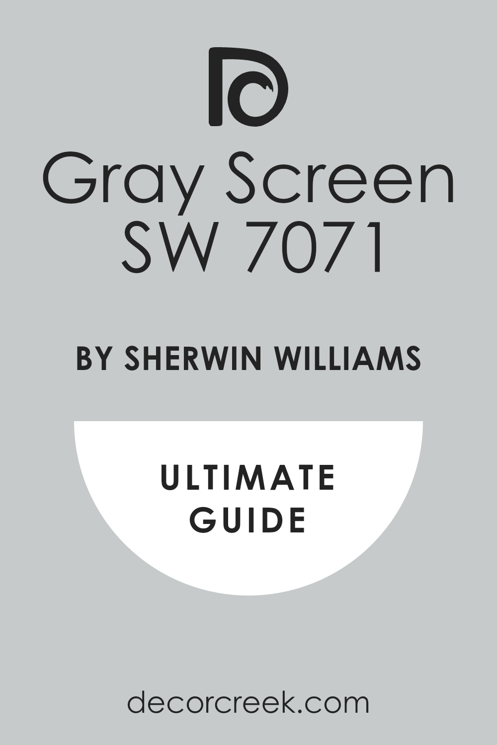
Gray Screen SW 7071
Gray Screen SW 7071 is a light, silvery gray that has a definite, fresh blue undertone, making it perfectly cool. Gray Screen is an excellent choice for a crisp and airy look, working wonderfully in laundry rooms or kitchens. Gray Screen has a higher LRV of 59, which means it reflects a good amount of light and feels very bright on the walls.
Gray Screen looks incredibly clean and sharp when matched with bright white trim and ceiling paint. Gray Screen is a great color to use in a coastal-inspired design or any setting where a breezy feel is desired. Gray Screen is a color that holds its true gray appearance even in brighter sunlight, avoiding washing out too much.
Gray Screen should be sampled carefully, as its blue undertone will be clearly visible in most lighting. Gray Screen is a highly effective cool neutral for achieving a contemporary and simple aesthetic. Gray Screen is perfect for those who want a light gray that reads clearly as gray, not just a dingy white. Gray Screen is one of my favorite options for adding a cool, refreshing touch to a sunny room.
👉 Read the full guide for this color HERE 👈
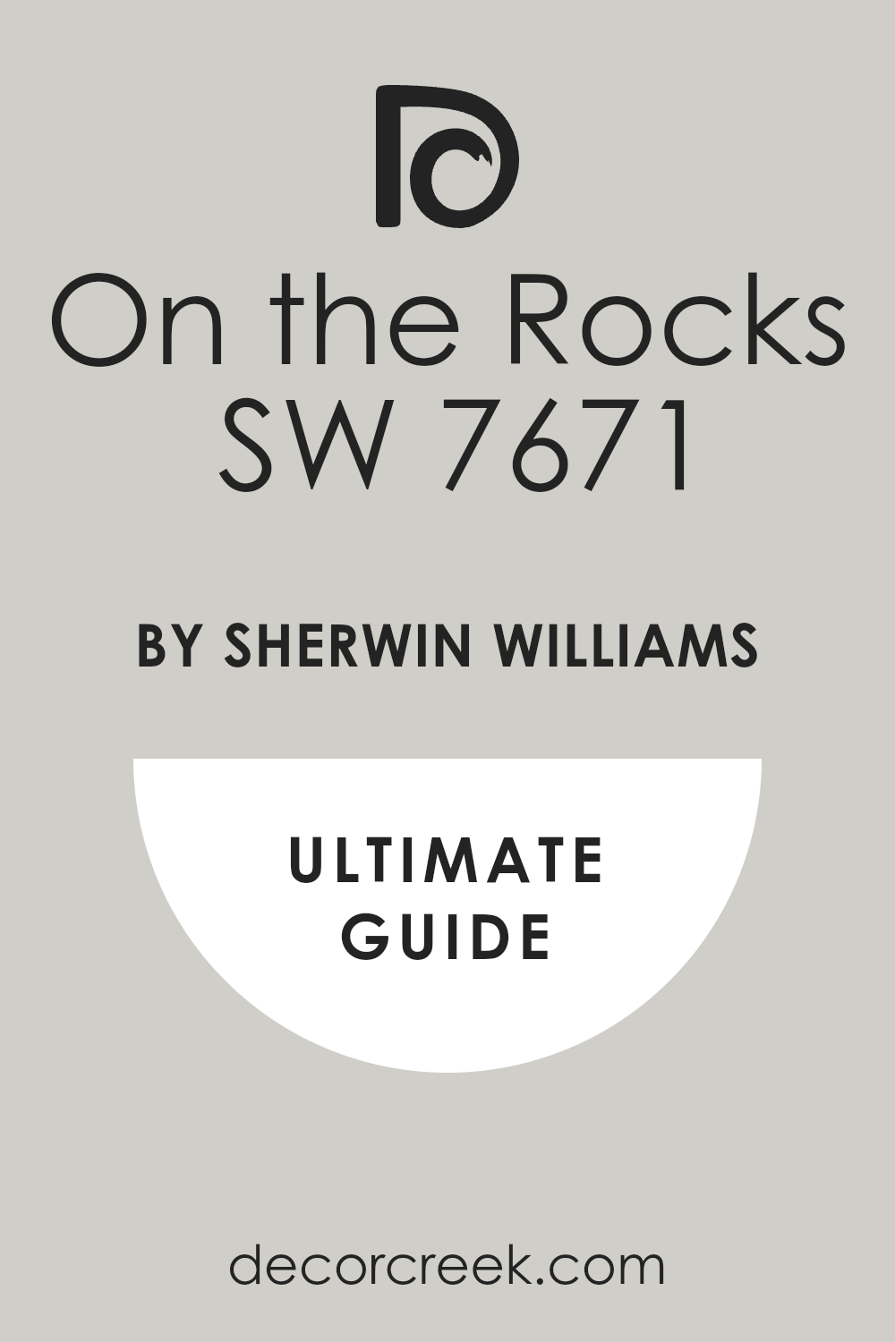
On the Rocks SW 7671
On the Rocks SW 7671 is a beautiful, very light cool gray that offers a soft yet structured feel to a room. On the Rocks is a near-white gray that still offers a subtle amount of pigment to contrast against white trim. On the Rocks has an LRV of 62, making it one of the lighter cool neutrals I recommend, perfect for small apartments.
On the Rocks features very light, gentle undertones of blue and green, keeping it definitely on the cool side. On the Rocks is a great choice for use on ceilings or to lighten up a dimly lit hallway or entryway. On the Rocks looks chic and simple when paired with modern, minimalist furnishings and metallic accents.
On the Rocks is ideal for people who want a neutral that feels very light but avoids looking stark white. On the Rocks is versatile enough to be used in nearly any room where an airy, clean feel is desired. On the Rocks ensures that your walls have color without dominating the furniture and artwork. On the Rocks is a fantastic, versatile, and very light cool neutral that is worth sampling in any home.
👉 Read the full guide for this color HERE 👈
Crushed Ice SW 7647
Crushed Ice SW 7647 is a very light and bright gray that has lovely, subtle cool undertones of blue-green. Crushed Ice is a great option for walls where you want a wash of cool color without too much contrast. Crushed Ice is quite light with an LRV of 66, placing it firmly in the category of a light and airy neutral. Crushed Ice works well in large, open rooms where the light can play off its soft, silvery quality.
Crushed Ice looks sophisticated when paired with rich fabrics like velvet and deeply toned wood furniture. Crushed Ice is a fantastic color for those who tend to prefer a very light palette but want a bit more dimension than pure white. Crushed Ice will definitely show its cool undertone in direct light, making the room feel refreshing and crisp.
Crushed Ice is a reliable choice for creating a cohesive look throughout a home, especially with modern design. Crushed Ice provides a gentle backdrop that allows art and decor to truly stand out and be noticed. Crushed Ice is a beautiful, easy-to-live-with cool gray that I have used successfully in many different homes.
👉 Read the full guide for this color HERE 👈

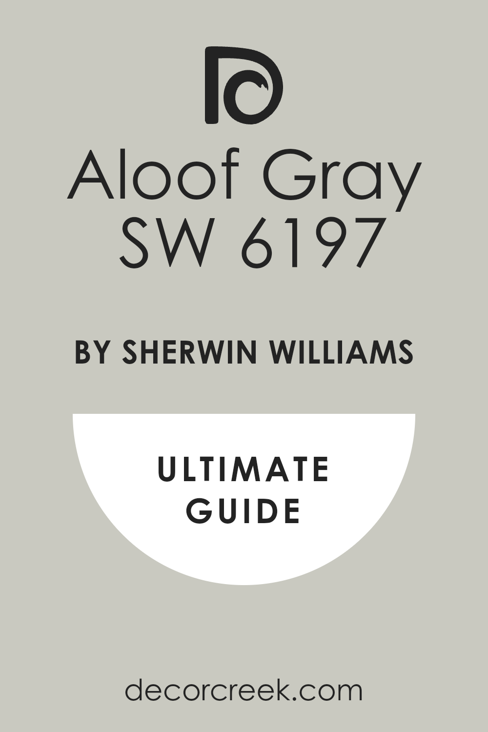
Aloof Gray SW 6197
Aloof Gray SW 6197 is a gorgeous light gray that sits nicely on the edge of the greige family, but its cool side shines through. Aloof Gray features a definite purple-blue undertone that gives it a sophisticated and distinctive cool character. Aloof Gray is excellent for bedrooms and living rooms where a slightly softer, more complex cool tone is desired.
Aloof Gray has a great LRV of 58, meaning it’s a solid mid-range color that holds up well in different lights. Aloof Gray works beautifully with dark wood furniture and warm metal accents like brass or copper. Aloof Gray is a fantastic background for showcasing colorful fabrics and artwork without being dull itself.
Aloof Gray offers more depth than some lighter grays, providing a richness that feels inviting and curated. Aloof Gray is a good choice for someone looking for a cool gray that avoids looking too overtly blue or green. Aloof Gray is a paint color that often gets compliments because of its refined and appealing color mixture. Aloof Gray is a sophisticated cool neutral that is reliable for creating an elegant, composed feel.
👉 Read the full guide for this color HERE 👈
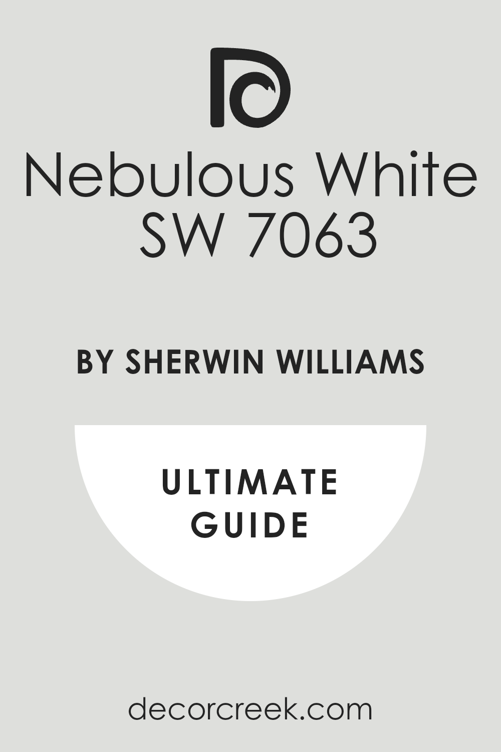
Nebulous White SW 7063
Nebulous White SW 7063 is a beautiful, incredibly pale gray that is almost white but with a distinctly cool, silvery tint. Nebulous White is an excellent choice for a very airy, minimalist aesthetic where you want a hint of color contrast. Nebulous White has a very high LRV of 74, which means it will make a room feel expansive and reflect a lot of light.
Nebulous White has subtle blue-violet cool undertones that stop it from feeling harsh or yellow. Nebulous White is perfect for trims, ceilings, and walls in rooms that need a lot of brightness and light. Nebulous White works really well with marble and high-end finishes, lending a refined, gallery-like quality.
Nebulous White is a favorite of mine for updating older homes where the original wood trim is staying. Nebulous White is the perfect non-white white that offers a touch of coolness and dimension to a room. Nebulous White is a great way to introduce a cool neutral without committing to a deeper gray. Nebulous White is a go-to color for a light, bright, and effortlessly cool foundation.
👉 Read the full guide for this color HERE 👈
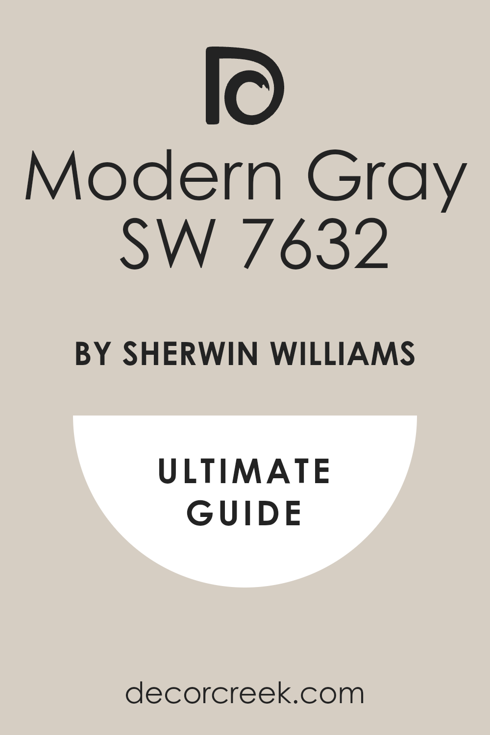
Modern Gray SW 7632
Modern Gray SW 7632 is a lovely light gray that leans slightly toward the greige side but retains a distinct cool, balanced feel. Modern Gray shows gentle, cooling undertones of violet and green, giving it a complex and inviting character. Modern Gray works well in almost any room, acting as a versatile background for various design styles.
Modern Gray has an LRV of 62, making it a wonderful color for brightening spaces without feeling stark. Modern Gray is perfect for open-concept areas where a gentle color transition is required from one area to another. Modern Gray looks elegant when combined with both white and off-white trim, depending on the look you want.
Modern Gray is a fantastic choice for those who want a neutral that is neither too hot nor too cold. Modern Gray avoids the common pitfall of looking overly blue, which is a big benefit for many homeowners. Modern Gray is a reliable color that I often use when I need a gentle, cool touch that feels very grounded. Modern Gray is an easy and beautiful cool neutral that offers a sophisticated and adaptable palette.
👉 Read the full guide for this color HERE 👈
Mindful Gray SW 7016
Mindful Gray SW 7016 is a slightly deeper, more saturated gray that holds a clear, beautiful cool undertone. Mindful Gray is an excellent medium-toned color that is perfect for creating a cozy, defined feeling in a room. Mindful Gray has a respectable LRV of 48, meaning it’s noticeably darker than the lighter grays but still reflects some light.
Mindful Gray features gentle green-blue undertones that keep it feeling firmly cool and composed. Mindful Gray works wonderfully in dining rooms or as an accent wall, providing real depth and drama. Mindful Gray is a fantastic counterpoint to very light furnishings and bright white trim, creating a strong contrast.
Mindful Gray is a color that works well in a variety of lighting situations, holding its own beautifully. Mindful Gray is a strong choice for people who want a clearly defined cool gray, not a wishy-washy one. Mindful Gray is perfect for adding sophistication and a more architectural feel to a room’s structure. Mindful Gray is a gorgeous, dependable medium cool gray that I recommend for a rich, settled look.
👉 Read the full guide for this color HERE 👈

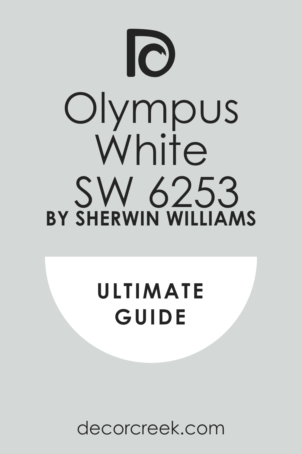
Olympus White SW 6253
Olympus White SW 6253 is an extremely light, near-white gray that offers a crisp, very subtle cool wash of color. Olympus White is an excellent color when you want the brightness of white but with a hint of cooling pigment to ground it. Olympus White has an LRV of 68, placing it on the very bright end of the cool neutral spectrum.
Olympus White features a very slight, refreshing blue-green undertone that gives it a clean, silvery edge. Olympus White is perfect for ceilings and trim, or for walls in rooms that get a lot of direct, warm sunlight. Olympus White pairs beautifully with deep charcoal grays or naval blues for a sharp, tailored appearance.
Olympus White is a great way to avoid the yellowing that can happen with warmer off-whites in some lights. Olympus White is a beautiful color for opening up small, dark hallways or entryways, making them feel much larger. Olympus White is a fantastic choice for a contemporary or minimalist design where clarity and lightness are key. Olympus White is a wonderful, simple, and light cool neutral that acts as a perfect foundation for almost any decor.
👉 Read the full guide for this color HERE 👈
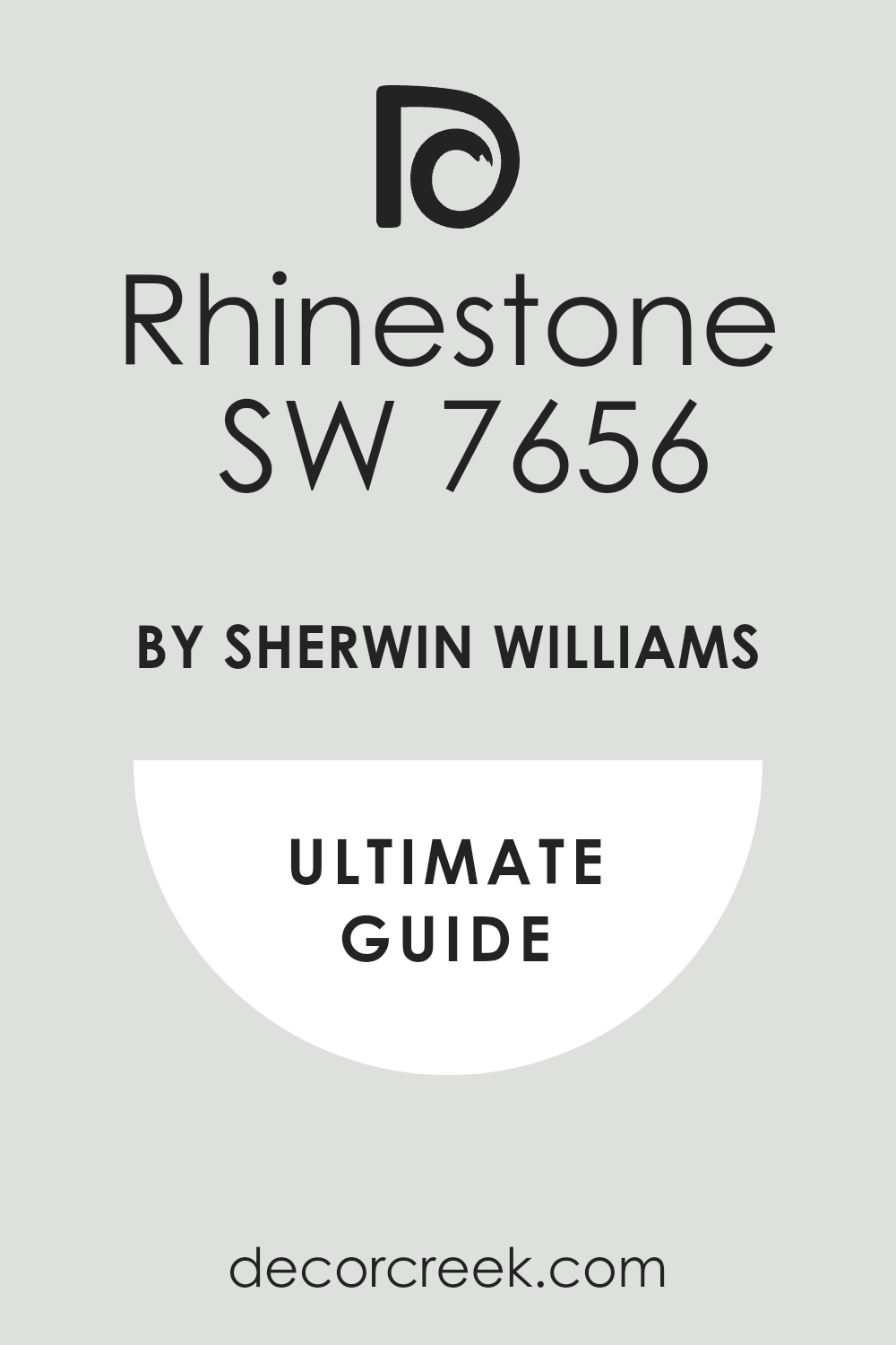
Rhinestone SW 7656
Rhinestone SW 7656 is a very clean, crisp light gray with noticeable, distinct blue undertones, making it reliably cool. Rhinestone is an excellent color for achieving a bright, sharp, and very refreshing aesthetic in any room. Rhinestone has an LRV of 61, offering good light reflection while maintaining a solid, silvery color presence.
Rhinestone works beautifully in bathrooms and laundry rooms, giving a fresh, clean, and almost water-like feel. Rhinestone looks fantastic when paired with chrome fixtures and white porcelain, emphasizing its cool nature. Rhinestone is a great choice for a cool gray that will not be mistaken for a warmer tone or a greige.
Rhinestone can sometimes feel a little cooler in a north-facing room, so be sure to test it out extensively. Rhinestone is a reliable color for creating a tailored and put-together look that is highly refined. Rhinestone is a perfect backdrop for colorful artwork, allowing the art to pop without competition. Rhinestone is a favorite of mine when a light, distinctly cool, and very sharp gray is required for a project.
👉 Read the full guide for this color HERE 👈
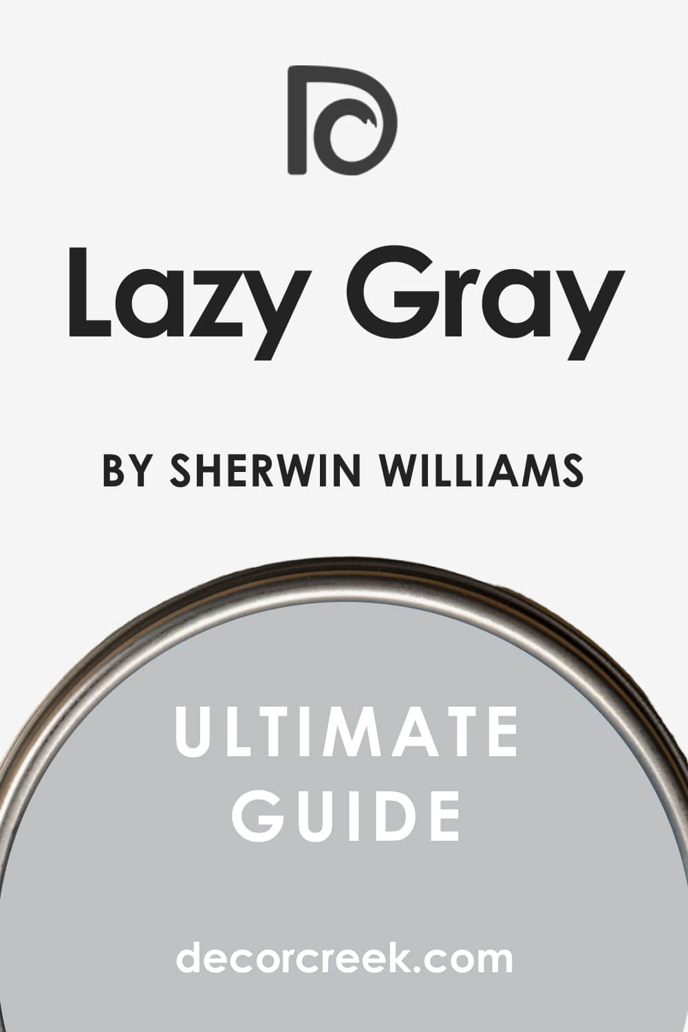
Lazy Gray SW 6254
Lazy Gray SW 6254 is a beautiful, medium-light cool gray that has clear and lovely blue-green undertones. Lazy Gray is an excellent choice for a relaxing bedroom or a tranquil living area where a soft color is needed. Lazy Gray has an LRV of 53, giving it enough depth to read clearly as a color and not simply an off-white.
Lazy Gray is a versatile color that looks gorgeous in both bright sunlight and in more shaded rooms. Lazy Gray pairs wonderfully with natural wood tones, as the cool undertone balances the warmth of the wood perfectly. Lazy Gray is a great choice for people who want a gray with a definite cool side but don’t want it to feel too sharp or icy.
Lazy Gray offers a comforting and sophisticated feel that works well in a variety of home styles. Lazy Gray is a dependable color that creates a cohesive and professional look throughout a main floor. Lazy Gray will offer a slightly more saturated look than some of the lighter grays, providing more visual impact. Lazy Gray is a fantastic, versatile cool gray that I use often for a soft and pretty aesthetic.
👉 Read the full guide for this color HERE 👈
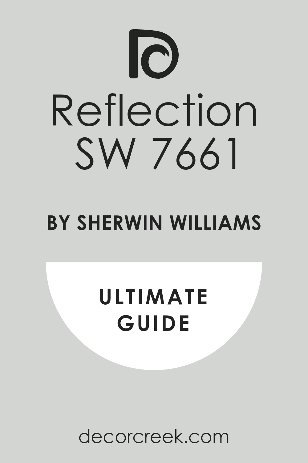
Reflection SW 7661
Reflection SW 7661 is a very light, almost ethereal gray that offers a gentle, truly cool wash of color. Reflection is a perfect choice for walls when you want a color that feels lighter than air but still adds dimension. Reflection has an LRV of 66, placing it high on the light scale, making rooms feel bigger and brighter.
Reflection features very subtle, clean blue undertones that ensure it stays crisp and never looks muddy. Reflection works beautifully as a ceiling color or for walls in rooms that need a serious boost of light. Reflection looks incredible with dark furniture, allowing the contrast to create a sharp and modern design.
Reflection is a fantastic color to use if you are looking for a cool neutral that offers a hint of silvery sophistication. Reflection avoids the starkness of pure white while still delivering an incredibly bright and clean feeling. Reflection is a reliable option for creating an airy and open feel in any area of the home. Reflection is a great, highly versatile cool neutral that is easy to decorate around and always looks fresh.
👉 Read the full guide for this color HERE 👈
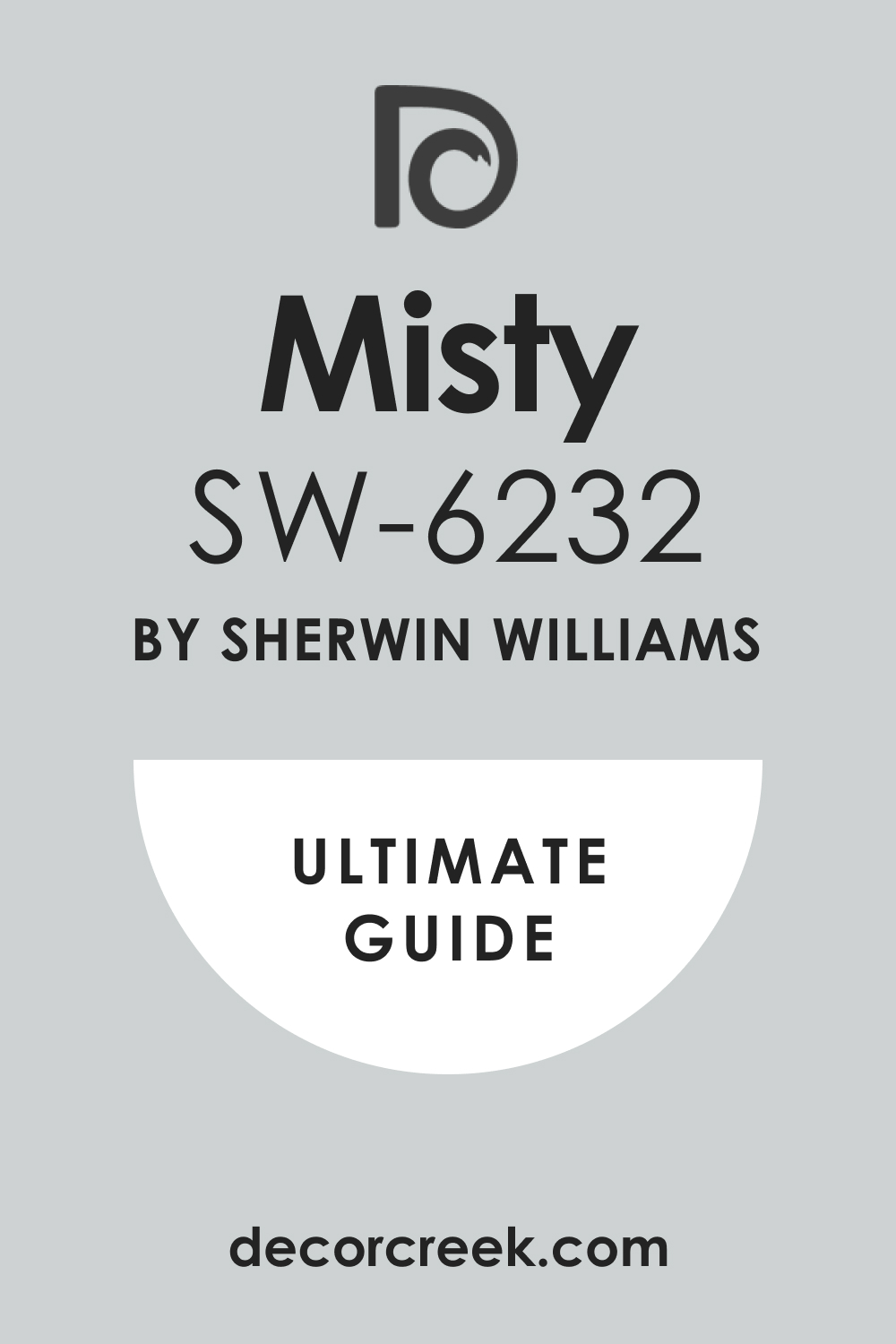
Misty SW 6232
Misty SW 6232 is a beautiful, definite cool gray with clear, lovely green-blue undertones, offering a rich color on the wall. Misty is an excellent choice for a bedroom or bathroom where you want a soothing, watery, and cool ambiance. Misty has an LRV of 56, making it a medium-light color that shows up well without feeling too intense or dark.
Misty works wonderfully in rooms with white wainscoting or paneling, offering a gorgeous, tailored look. Misty looks sophisticated when paired with brass fixtures and dark, moody artwork for a contrasting design. Misty is a fantastic color to consider if you enjoy grays that have a noticeable, defined color presence.
Misty will read as a very pretty light blue-green in certain lights, so it must be sampled on the wall. Misty is a reliable color that gives a room a curated and thoughtful appearance, never looking accidental. Misty is perfect for creating a coastal feel without using a traditional, bright blue or aqua. Misty is a gorgeous, refreshing cool gray that I find works beautifully to create a serene environment.
👉 Read the full guide for this color HERE 👈
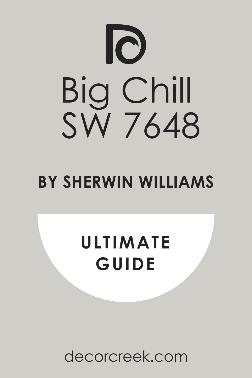
Big Chill SW 7648
Big Chill SW 7648 is a perfect name for this bright, very light cool gray that carries a clean and crisp feel. Big Chill is an excellent paint choice for creating a clean, modern, and highly refreshing aesthetic in any room. Big Chill has an LRV of 63, which means it is a great color for reflecting light and making a room feel expansive.
Big Chill has distinct, very light blue undertones that ensure it is firmly in the cool neutral category. Big Chill works beautifully in sunrooms or rooms with large windows, looking bright and airy all day long. Big Chill is a great alternative to pure white when you want a hint of color that remains super light and bright.
Big Chill looks sharp and elegant when combined with metallic silver or chrome hardware and fixtures. Big Chill is a fantastic color for updating trim and doors, offering a fresh contrast to slightly warmer wall colors. Big Chill is a reliable option for a highly clean and crisp cool gray that is easy to work with and looks great everywhere. Big Chill is one of my go-to colors for a light, bright, and truly cool foundation color.
👉 Read the full guide for this color HERE 👈
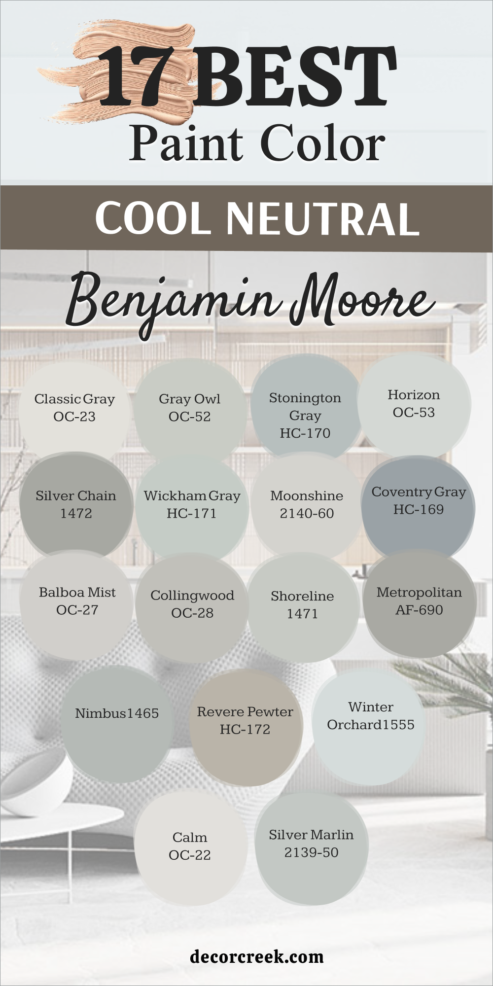
17 Best Cool Neutral Paint Colors by Benjamin Moore
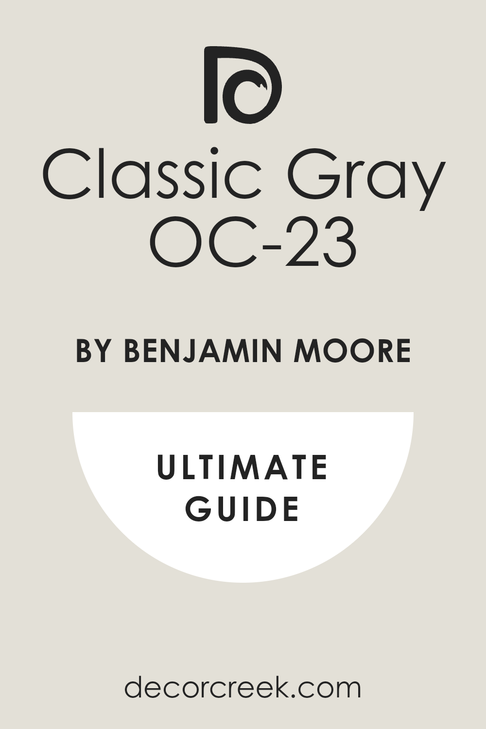
Classic Gray OC-23
Classic Gray OC-23 is a favorite of mine because it is a very light, delicate gray that has a lovely, barely-there coolness. Classic Gray is nearly an off-white, but its subtle gray pigment keeps it from looking stark or yellow in sunlight. Classic Gray has a high LRV of 78, making it an excellent choice for maximizing light in any room, large or small.
Classic Gray has very faint, cool green or violet undertones that shift beautifully depending on the light in the room. Classic Gray works wonderfully as a whole-house color because it is so adaptable and easy on the eyes in every room. Classic Gray pairs beautifully with dark furnishings, allowing the decor to stand out against its gentle backdrop.
Classic Gray is a fantastic color to consider for a crisp, clean trim color when paired with a darker wall paint. Classic Gray is perfect for those who want a neutral that is bright and airy but still offers a subtle touch of color. Classic Gray is a reliable color that I use often when I need an effortlessly elegant and very light neutral. Classic Gray is a beautiful, soft cool neutral that acts as a perfect canvas for sophisticated design.
👉 Read the full guide for this color HERE 👈
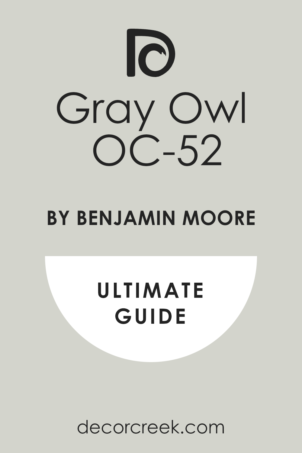
Gray Owl OC-52
Gray Owl OC-52 is an incredibly popular and gorgeous light gray that has a very sophisticated, pronounced cool undertone. Gray Owl is a fantastic color for living rooms, kitchens, and main hallways where a sophisticated gray is desired. Gray Owl has a good LRV of 65, which means it is bright and reflective but still offers a clear color presence.
Gray Owl features distinct green and blue undertones that give it a beautiful, airy quality that changes with the light. Gray Owl works beautifully in contemporary homes, looking fresh and clean with sleek, modern furnishings. Gray Owl is one of those versatile colors that looks just as good in bright sunlight as it does in lower light conditions.
Gray Owl pairs wonderfully with natural wood finishes, as the cool tone balances the warmth of the wood perfectly. Gray Owl is a reliable color that I use often when I need a light cool gray that reads clearly as gray. Gray Owl is a great choice for an open floor plan because it flows so nicely from one area to the next. Gray Owl is a truly beautiful and dependable cool neutral that consistently delivers a refined look.
👉 Read the full guide for this color HERE 👈
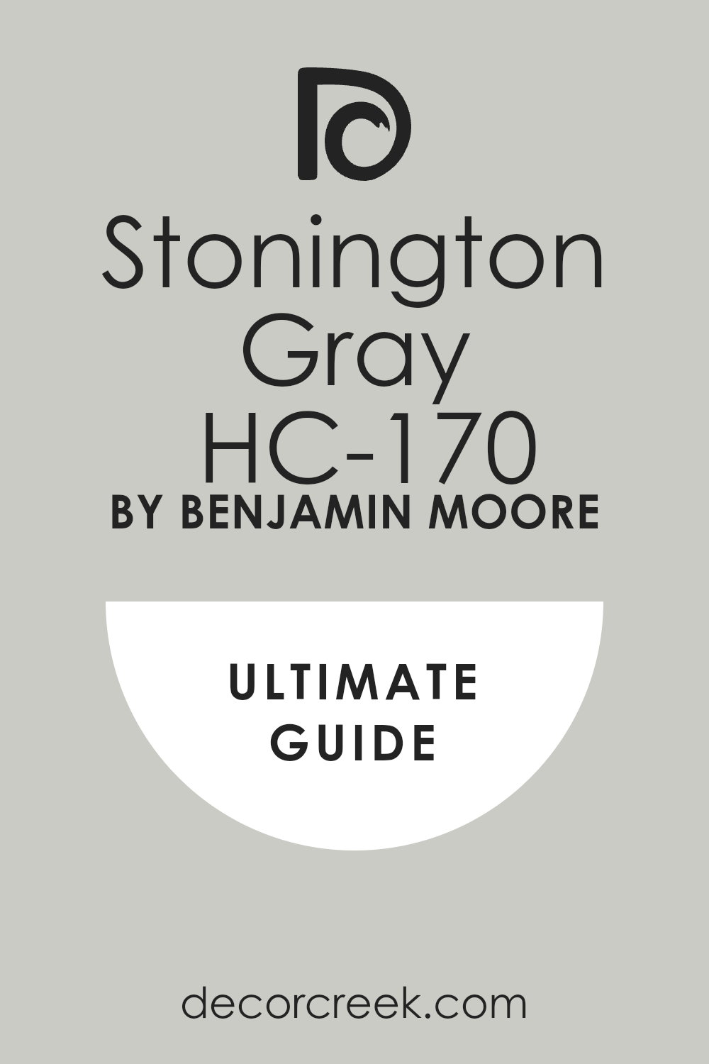
Stonington Gray HC-170
Stonington Gray HC-170 is a rich, true medium gray that holds a clear and defined cool blue undertone, making it a classic. Stonington Gray is an excellent choice for a room where you want a color with real presence and architectural definition. Stonington Gray has an LRV of 59, placing it squarely in the medium range where it provides good color saturation.
Stonington Gray looks sophisticated and tailored, working beautifully in home offices or formal dining rooms. Stonington Gray is a fantastic counterpoint to crisp white trim, making the details of the molding really pop and stand out. Stonington Gray is a wonderful color to use in a sunny room, as its depth helps it avoid washing out completely in bright light.
Stonington Gray is a reliable, traditional cool gray that never goes out of style and always looks perfectly put-together. Stonington Gray is a great option for adding a touch of drama without going too dark or moody in a space. Stonington Gray is a go-to color for a classic, balanced gray that is definitely cool and highly dependable. Stonington Gray is a gorgeous, composed cool neutral that I recommend for a refined and structured design.
👉 Read the full guide for this color HERE 👈
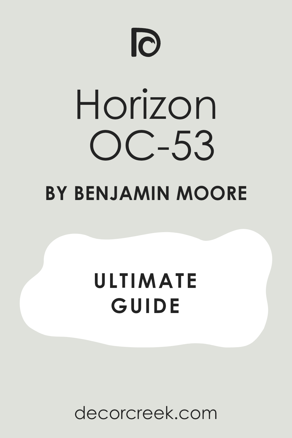
Horizon OC-53
Horizon OC-53 is a truly lovely, soft, and very light gray that offers a gentle, fresh cool hue to a room. Horizon is an excellent color for achieving an airy, open feeling, especially in rooms that don’t get a ton of direct light. Horizon has a high LRV of 74, making it a very bright and reflective color that will feel expansive on the walls.
Horizon has faint blue-green undertones that ensure it reads as a cool gray and not a simple, stark white. Horizon works beautifully as a main wall color, pairing well with darker grays or navy blue accents for contrast. Horizon is a great choice for trim and ceilings when you want a subtle contrast with a slightly deeper wall color.
Horizon is the perfect paint color for anyone seeking a near-white that has just enough cool pigment to make it interesting. Horizon is a reliable neutral that I often use to unify different design elements in a large area. Horizon is a wonderful color for creating a feeling of lightness and sophisticated simplicity in any home. Horizon is a beautiful, easy-to-live-with cool neutral that gives a polished and fresh appearance.
👉 Read the full guide for this color HERE 👈
Silver Chain 1472
Silver Chain 1472 is a beautiful, medium-toned gray that lives up to its name, offering a soft, metallic-like cool sheen. Silver Chain is an excellent choice for adding depth and a more pronounced cool color to a living room or kitchen area. Silver Chain has an LRV of 51, providing a good amount of color saturation without feeling overly heavy on the walls.
Silver Chain features lovely blue and violet undertones, giving it a complex and truly cool and sophisticated presence. Silver Chain works well with both dark and light wood furniture, making it highly adaptable for various decorating needs. Silver Chain is a reliable color that holds up well in different lighting, avoiding drastic color shifts during the day.
Silver Chain looks particularly sharp when used in conjunction with modern lighting fixtures and crisp white trim. Silver Chain is a great color for an accent wall or to define a specific zone within an open-concept living area. Silver Chain is a go-to color for a cool gray that has clear definition and a highly tailored look. Silver Chain is a fantastic, versatile medium cool neutral that always looks intentional and well-chosen.
👉 Read the full guide for this color HERE 👈

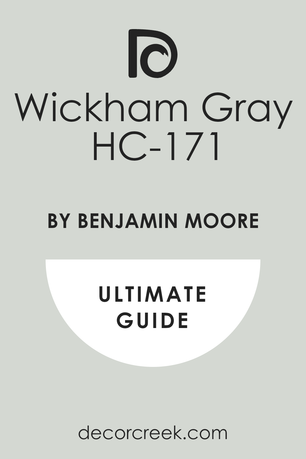
Wickham Gray HC-171
Wickham Gray HC-171 is a truly beautiful, light gray that has a delightful, airy quality due to its gentle cool undertones. Wickham Gray is an excellent choice for a clean, refreshing look, working wonderfully in bathrooms or sunny bedrooms. Wickham Gray has an LRV of 67, placing it on the lighter side, ensuring rooms feel bright and open.
Wickham Gray has clear yet soft blue-green undertones, which can give it a lovely watery feel in certain lights. Wickham Gray pairs beautifully with classic white marble and polished chrome fixtures for a very refined bathroom. Wickham Gray is a great paint color for achieving a high-end, bespoke look without having to choose a complicated color.
Wickham Gray is one of those dependable colors that looks beautiful with both antique and contemporary furnishings. Wickham Gray is a fantastic neutral that avoids the common problem of looking too yellow or beige in bright sun. Wickham Gray is a reliable option for a light, crisp cool gray that I highly recommend for a sophisticated backdrop. Wickham Gray is a wonderful, balanced cool neutral that offers a refreshing and composed feel to any home.
👉 Read the full guide for this color HERE 👈
Moonshine 2140-60
Moonshine 2140-60 is a delicate, very light gray that offers a luminous quality and a soft, airy cool undertone. Moonshine is an excellent choice for a whole-house color where a very light, almost off-white cool neutral is desired. Moonshine has a high LRV of 68, making it a very bright and reflective color, ideal for smaller or darker spaces.
Moonshine features subtle, clean green-blue undertones that give it a refreshing, cool quality without being icy. Moonshine works beautifully when paired with warm woods and natural textures, creating a lovely contrast. Moonshine is a great alternative to white on trim or cabinetry, offering a hint of cool dimension.
Moonshine is a reliable color that consistently reads as a soft, very light gray and avoids looking just like white. Moonshine is a fantastic background color that allows artwork and colorful furniture to be the main focus of a room. Moonshine is one of my preferred cool neutrals for creating a gentle, sophisticated, and light-filled atmosphere. Moonshine is a beautiful, easy, and very bright cool neutral that works well in almost any light condition.
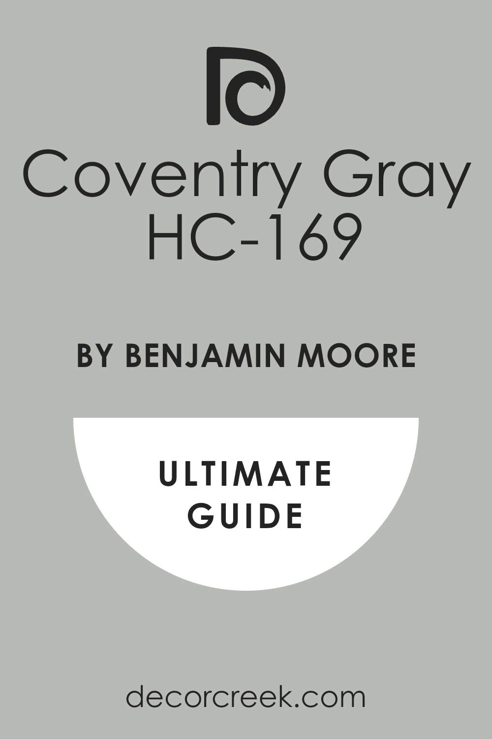
Coventry Gray HC-169
Coventry Gray HC-169 is a rich, truly gorgeous medium-to-dark gray that has a strong, definite cool blue undertone. Coventry Gray is an excellent choice for creating a striking, architectural statement in a home office or a feature wall. Coventry Gray has an LRV of 48, which gives it a substantial amount of depth and color presence on the wall.
Coventry Gray looks incredibly refined and tailored when used with bright white trim and deep, dark wood flooring. Coventry Gray is a fantastic color for adding drama and sophistication, working beautifully in rooms with high ceilings. Coventry Gray is a reliable color that maintains its cool appearance even when subjected to direct sunlight, avoiding any warmth.
Coventry Gray works wonderfully with silver or chrome hardware, enhancing its sophisticated and cool appearance. Coventry Gray is a great choice for people who want a bold, deep cool gray that doesn’t feel overly moody or black. Coventry Gray is perfect for emphasizing built-in shelving or cabinetry, making them a focal point. Coventry Gray is a gorgeous, strong cool neutral that I recommend for a rich, composed, and tailored look.
👉 Read the full guide for this color HERE 👈
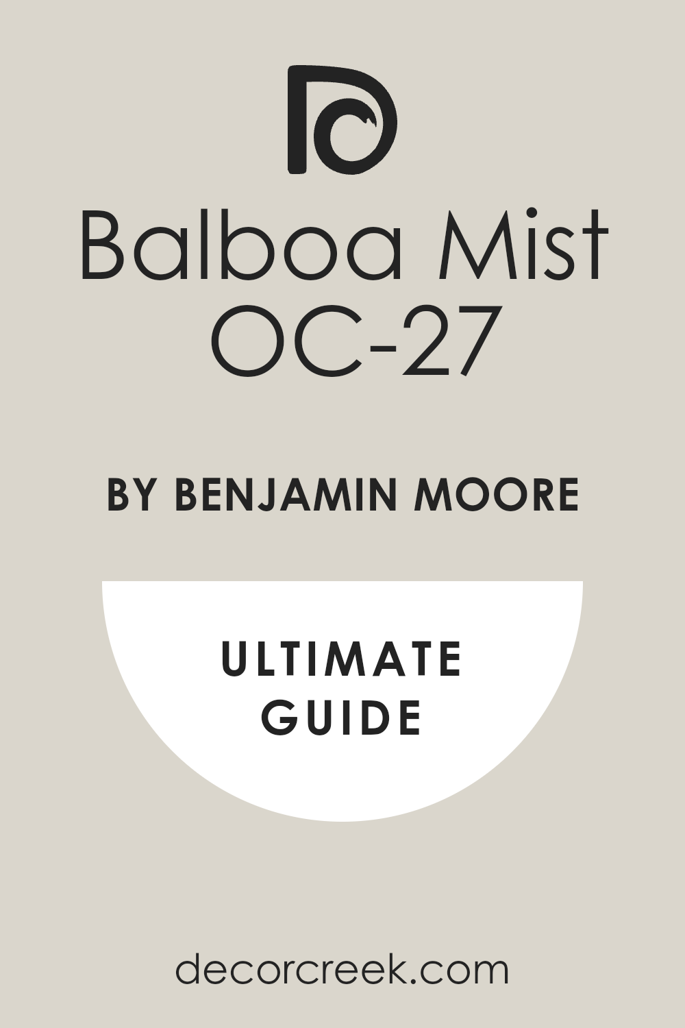
Balboa Mist OC-27
Balboa Mist OC-27 is a very soft, light gray that walks the line of greige but its slight violet undertone keeps it cool and refined. Balboa Mist is an excellent choice for a living room or a bedroom where a gentle, balanced, and sophisticated neutral is needed. Balboa Mist has an LRV of 67, making it a very light, reflective color that ensures rooms feel airy and bright.
Balboa Mist is known for being adaptable, looking fresh and light in brighter rooms and slightly deeper in shaded areas. Balboa Mist pairs well with both warm and cool colors in decor, which makes it a highly versatile choice for decorating. Balboa Mist is a great neutral for open-concept homes because it flows beautifully from one room to the next without feeling stark.
Balboa Mist is a reliable color that consistently looks sophisticated and gentle on the walls, avoiding harshness. Balboa Mist is a perfect color for layering different textures and tones of whites and ivories in a room’s decor. Balboa Mist is a wonderful choice for those who want a light cool neutral that has a touch more softness and depth. Balboa Mist is a gorgeous, adaptable cool gray that I use often for a soft and pretty aesthetic.
👉 Read the full guide for this color HERE 👈
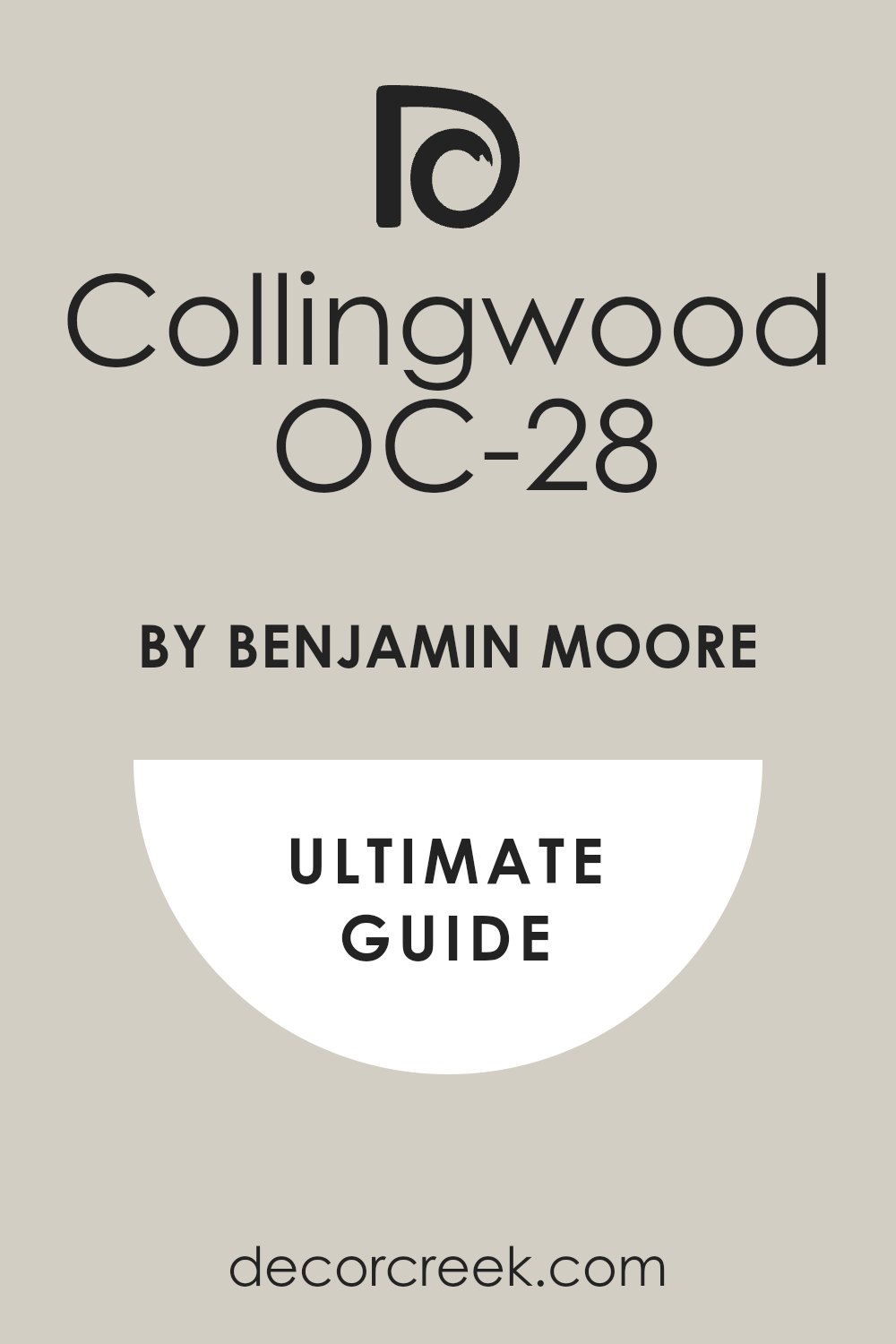
Collingwood OC-28
Collingwood OC-28 is a beautifully balanced, light-to-medium gray that leans cool due to its subtle violet and blue undertones. Collingwood is an excellent choice for main living areas where you want a gray with more substance than an off-white but still light. Collingwood has an LRV of 62, giving it great light reflection while still offering a clear, discernible color on the wall.
Collingwood is a highly versatile color that pairs wonderfully with a wide range of furniture styles, from traditional to modern. Collingwood looks particularly beautiful in rooms with natural stone or marble, as the violet undertone complements these materials. Collingwood is a great color for avoiding the common issue of gray paints looking too stark or too overtly blue or green.
Collingwood is a dependable neutral that works well in different light exposures, maintaining its sophisticated quality throughout the day. Collingwood is a reliable choice for creating a cohesive and polished look throughout an entire home’s main areas. Collingwood is perfect for people who want a substantial cool gray that still feels soft, nuanced, and very inviting. Collingwood is a fantastic, versatile cool neutral that always gives a composed and very appealing appearance.
👉 Read the full guide for this color HERE 👈
Shoreline 1471
Shoreline 1471 is a light, airy gray that offers a fresh, silvery appearance with clear, defined cool undertones. Shoreline is an excellent color for achieving a breezy, light-filled, and very clean look in any area of the home. Shoreline has an LRV of 60, making it a good reflective color that brightens spaces without looking washed out.
Shoreline features lovely blue-green undertones that give it a refreshing, almost coastal quality that is highly appealing. Shoreline works beautifully with natural textures like rattan and linen, creating a sophisticated yet relaxed atmosphere. Shoreline is a great choice for bathrooms and kitchens, providing a clean, crisp backdrop for white cabinetry and tile.
Shoreline is a reliable cool gray that maintains its color identity well, avoiding confusion with simple off-whites. Shoreline looks fantastic when paired with deeper, moody accent colors like a rich charcoal or a deep navy blue. Shoreline is a perfect paint for people who want a clear, light, cool gray that is both refreshing and highly versatile. Shoreline is a gorgeous, dependable cool neutral that I recommend for a light, crisp, and beautifully tailored look.
Metropolitan AF-690
Metropolitan AF-690 is a sophisticated, mid-toned gray that was a Color of the Year, defined by its gentle, composed cool undertone. Metropolitan is an excellent choice for creating an elegant, defined, and somewhat moody feel in a living room or study. Metropolitan has an LRV of 51, providing a solid color presence that feels grounded and substantial on the walls.
Metropolitan has subtle, balanced blue-green undertones that ensure it reads as a rich, classic cool gray. Metropolitan works wonderfully in formal settings, looking luxurious when paired with textured fabrics and refined finishes. Metropolitan is a fantastic color for creating contrast against light wood floors and bright white built-in shelving.
Metropolitan is a reliable gray that offers depth without feeling heavy, making it highly suitable for many different room sizes. Metropolitan is a great choice for people who want a refined, established cool gray that is both current and dependable. Metropolitan is perfect for adding a touch of tailored, architectural detail to a home’s overall design aesthetic. Metropolitan is a beautiful, sophisticated cool neutral that I use when a composed and elegant statement is needed.
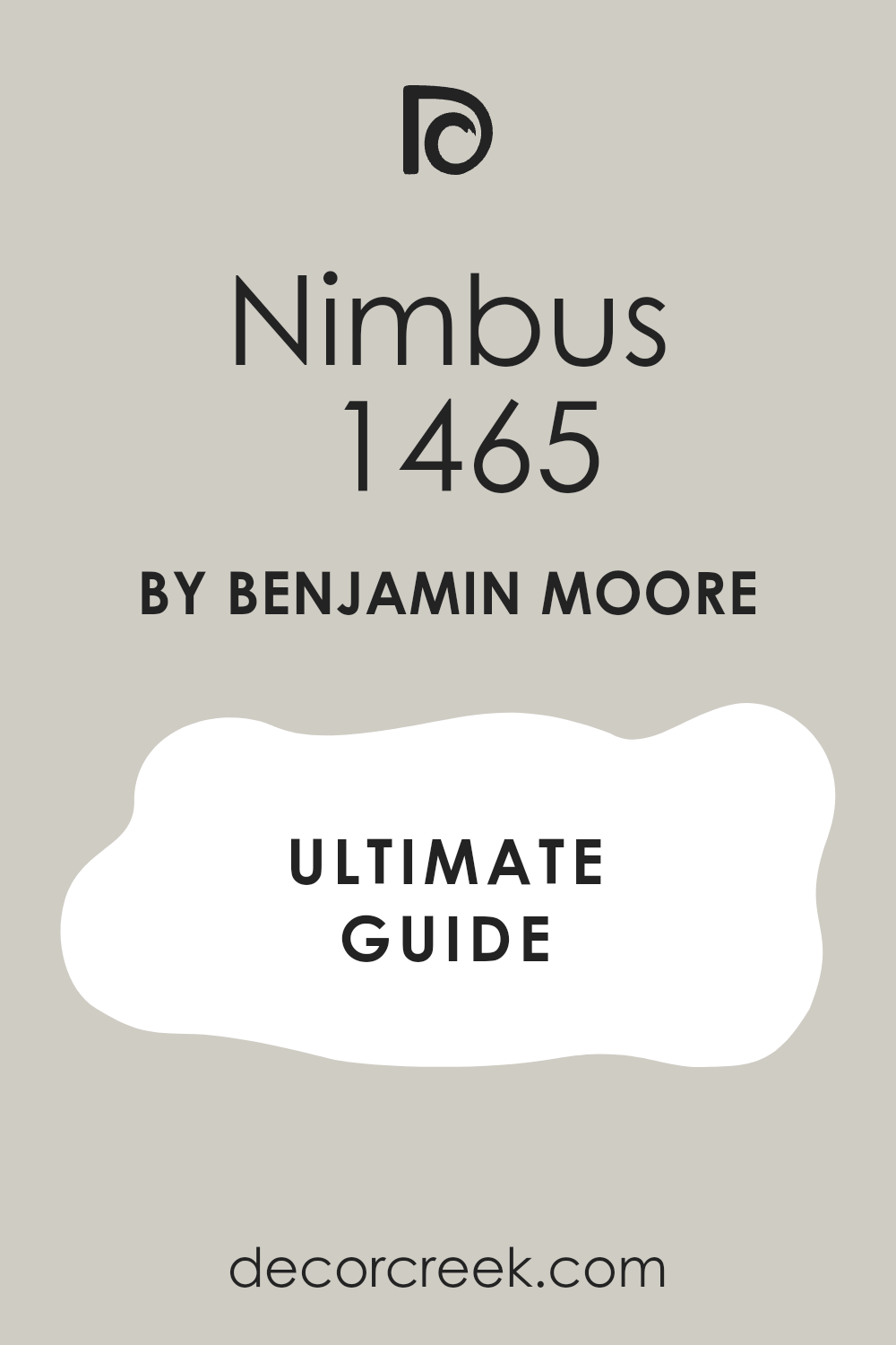
Nimbus 1465
Nimbus 1465 is a beautiful, light-to-medium gray that is distinctly cool, carrying clear and lovely blue-green undertones. Nimbus is an excellent color for a fresh, airy feel, working wonderfully in a sunroom or a bright, open kitchen. Nimbus has an LRV of 57, making it a medium-light color that offers a discernible color on the wall without feeling too heavy.
Nimbus looks gorgeous with white or subway tile in a kitchen, providing a clean, sophisticated contrast. Nimbus is a reliable cool gray that avoids the common problem of looking muddy or too beige in certain lighting conditions. Nimbus is a fantastic choice for those who want a cool gray that has a slight hint of color personality and depth.
Nimbus pairs well with both very dark and very light accent colors, making it highly versatile for decorating. Nimbus is a great color to use on walls when you want the furniture and artwork to be the main visual focus. Nimbus is perfect for adding a touch of silvery sophistication and a breezy feel to any area of the home. Nimbus is a lovely, dependable cool neutral that I often recommend for a sophisticated and light-filled backdrop.
👉 Read the full guide for this color HERE 👈
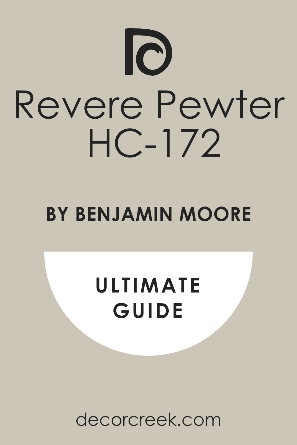
Revere Pewter HC-172
Revere Pewter HC-172 is a very popular color, sitting firmly on the greige line, but its gray side and cool undertones make it a sophisticated cool neutral option. Revere Pewter is an excellent choice for main living areas where a grounded, versatile, and soft color is needed. Revere Pewter has an LRV of 55, which is a perfect mid-range color that holds up well in different light exposures.
Revere Pewter features subtle green and violet undertones that ensure it keeps a refined coolness that prevents it from looking yellow. Revere Pewter works beautifully in open-concept spaces, transitioning gracefully from one room to another without a stark change. Revere Pewter is a fantastic backdrop for displaying natural textures, wood furniture, and varied colors in textiles.
Revere Pewter is a reliable, established neutral that is consistently a favorite among homeowners and designers for its adaptability. Revere Pewter is a great choice for people who want a deeper neutral that is just cool enough to feel clean and fresh. Revere Pewter is perfect for creating a cozy yet refined environment that feels both welcoming and composed. Revere Pewter is a gorgeous, dependable cool neutral that I use when I need a color with depth and flexibility.
👉 Read the full guide for this color HERE 👈
Winter Orchard 1555
Winter Orchard 1555 is a gorgeous light gray that has a definite, crisp cool undertone, leaning slightly toward a clean, cool blue. Winter Orchard is an excellent choice for a room that needs a light, airy, and very clean wash of sophisticated color. Winter Orchard has a high LRV of 70, making it a very bright and light color that maximizes light reflection in a room.
Winter Orchard works beautifully in bathrooms and kitchens, creating a fresh, water-like quality that feels instantly clean. Winter Orchard pairs wonderfully with chrome or silver fixtures, enhancing its bright and cool, silvery appearance. Winter Orchard is a great option for people who want a very light gray that clearly reads as a cool color, not a simple white.
Winter Orchard is a reliable choice for achieving a highly contemporary or minimalist aesthetic with its crisp, simple color. Winter Orchard looks beautiful when combined with deep accent colors like a navy or black, creating a sharp and tailored contrast. Winter Orchard is a fantastic color for opening up smaller rooms or hallways, making them feel much more spacious. Winter Orchard is a beautiful, easy, and very bright cool neutral that I recommend for a refreshing and simple design.
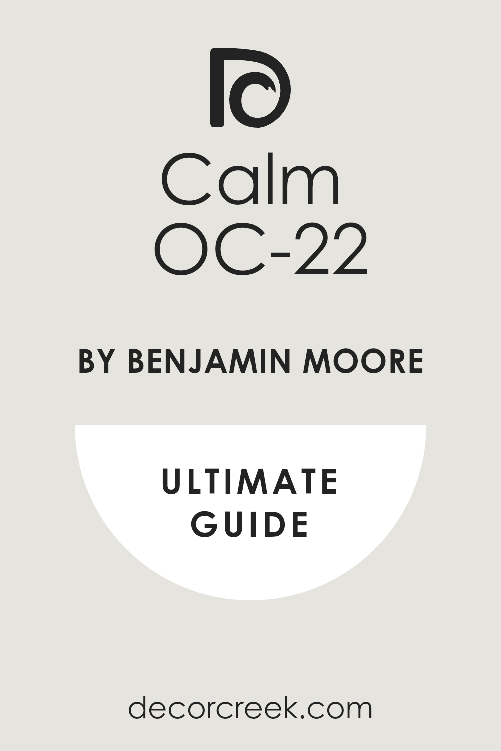
Calm OC-22
Calm OC-22 is a beautiful, very light and ethereal gray that is practically an off-white but with a delicate, cool essence. Calm is an excellent color when you want maximum brightness but with a soft, very subtle contrast to pure white trim. Calm has an extremely high LRV of 79, making it one of the lightest cool neutrals I use, perfect for reflecting light.
Calm has very gentle violet undertones that give it that cool, sophisticated feel without any hint of warmth. Calm works beautifully as a ceiling color, offering a softer alternative to stark white, which can sometimes look flat. Calm is a great choice for painting entire rooms where an airy, minimalist look is the main objective of the design.
Calm is a reliable color that is perfect for showcasing large pieces of colorful artwork or unique furniture pieces. Calm avoids the harshness that can come with some very bright whites, offering a touch more dimension and softness. Calm is a fantastic option for updating older homes where a fresh, light, and very gentle touch is needed. Calm is a gorgeous, simple, and light cool neutral that acts as a perfect, delicate backdrop.
👉 Read the full guide for this color HERE 👈
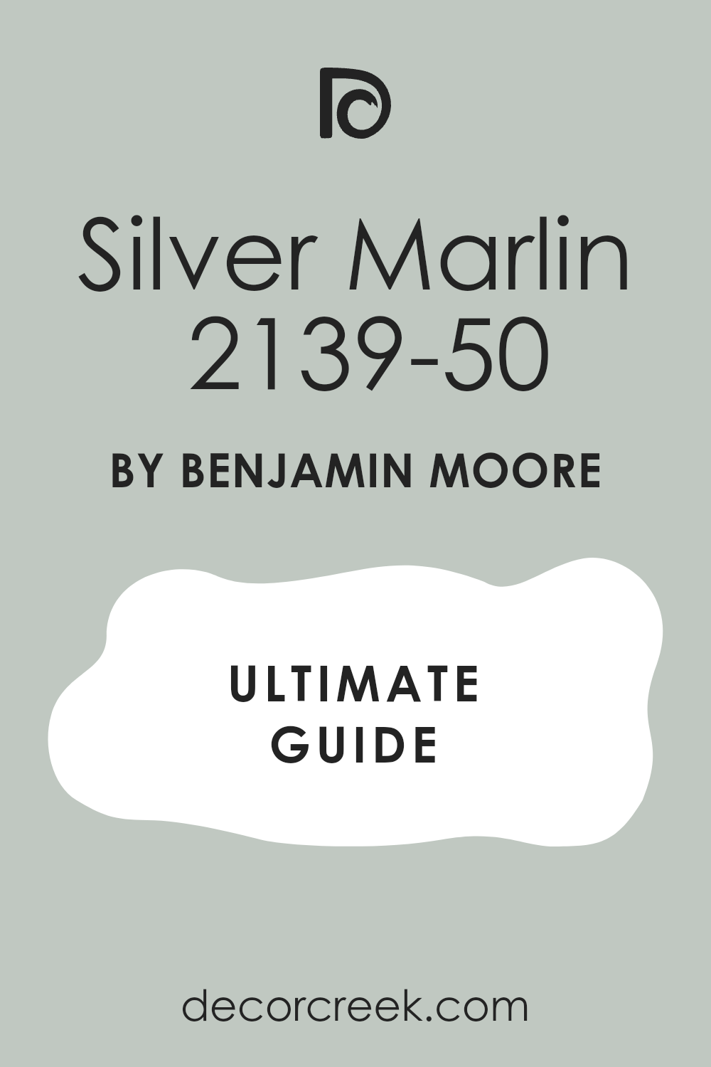
Silver Marlin 2139-50
Silver Marlin 2139-50 is a wonderful light-to-medium gray that is distinctly cool, carrying a lovely, refreshing green-blue undertone. Silver Marlin is an excellent choice for a bedroom or a cozy sitting room where a soothing and layered color is desired. Silver Marlin has an LRV of 60, giving it great light reflection while still offering a clear, noticeable color on the wall.
Silver Marlin works beautifully in rooms that have natural light, where its shifting undertones can be truly appreciated. Silver Marlin pairs wonderfully with light wood floors and soft, natural fabrics like linen and cotton for a casual feel. Silver Marlin is a fantastic color to use if you are trying to create a sophisticated, slightly coastal-inspired aesthetic.
Silver Marlin is a reliable cool gray that avoids looking muddy or overly dark, maintaining a fresh and light quality. Silver Marlin is a great choice for people who want a cool neutral with a definite color personality that still feels very relaxing. Silver Marlin is perfect for adding a touch of serene color without committing to a full, vivid blue or green paint. Silver Marlin is a beautiful, composed cool neutral that I often recommend for a gentle and highly appealing design.
👉 Read the full guide for this color HERE 👈
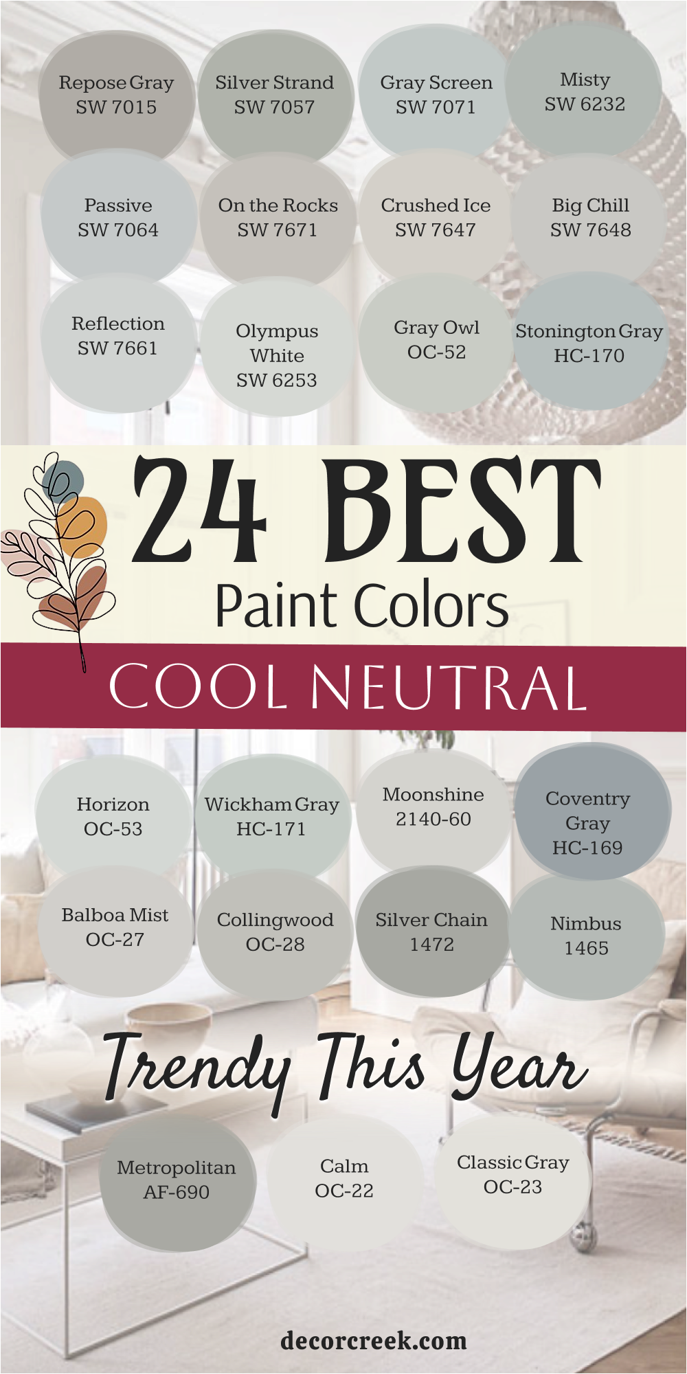
24 Best Cool Neutral Paint Colors Trendy This Year
Repose Gray SW 7015
Repose Gray SW 7015 is a perennial favorite that continues to be highly requested for its perfectly balanced cool greige properties. Repose Gray is a medium-light gray with delicate blue-violet cool undertones that adapt beautifully to different lights. Repose Gray works exceptionally well in living rooms and kitchens, providing a refined, sophisticated backdrop for modern decor.
Repose Gray has an LRV of 58, which keeps it from feeling washed out while still feeling light and airy on the walls. Repose Gray pairs beautifully with bright white trim and deep, rich colors in furnishings, creating a crisp contrast. Repose Gray is a true workhorse color that I rely on for creating a cohesive and elegant look across an entire home.
Repose Gray is incredibly popular because it is complex enough to be interesting but neutral enough to be versatile. Repose Gray is a dependable option that avoids the pitfalls of looking too purple or too green in most lighting conditions. Repose Gray is a perfect choice for those seeking a cool neutral that offers a perfect bridge between gray and a touch of warmth. Repose Gray is a must-have cool gray that consistently provides a high-end, polished finish in any space.
👉 Read the full guide for this color HERE 👈

Silver Strand SW 7057
Silver Strand SW 7057 is a gorgeous, atmospheric gray that is intensely popular right now for its refreshing green-blue cool undertones. Silver Strand is a fantastic color for creating a unique, yet still neutral, backdrop that feels both tranquil and current. Silver Strand has an LRV of 53, giving it a good medium depth that holds its color beautifully in various rooms.
Silver Strand works exceptionally well in bedrooms and offices, offering a restful and highly concentrated cool color. Silver Strand pairs wonderfully with warm wooden furniture and natural fibers, as the cool tone balances the warmth effortlessly. Silver Strand is a reliable color that adds sophistication and a noticeable personality without sacrificing its neutral status.
Silver Strand is perfect for adding a subtle coastal or spa-like feel to a home without resorting to overtly themed colors. Silver Strand should be sampled extensively, as its green undertone will be visible and is part of its beautiful charm. Silver Strand is a go-to cool gray for when a touch of subtle color and deep dimension is desired in a design. Silver Strand is a very trendy and beautifully nuanced cool neutral that always impresses with its subtle depth.
👉 Read the full guide for this color HERE 👈

Gray Screen SW 7071
Gray Screen SW 7071 is highly current for its clean, light, and distinctly blue-cool undertone that looks crisp and modern. Gray Screen is an excellent choice for a contemporary aesthetic, pairing beautifully with sharp lines and minimalist design. Gray Screen has a higher LRV of 59, making it a very light, reflective color that helps brighten up rooms substantially.
Gray Screen works wonderfully in kitchens and bathrooms, providing a clean, silvery backdrop for chrome fixtures and white tile. Gray Screen looks incredibly sharp when paired with a pure, bright white trim, creating a tailored, put-together look. Gray Screen is a reliable cool gray that reads clearly as gray, avoiding the tendency to look like a dingy white on the wall.
Gray Screen is perfect for adding a refreshing, airy quality to any space, making it feel open and very clean. Gray Screen is a great choice for sunnier rooms where its cool tone helps to balance the intensity of the warm light. Gray Screen is one of my preferred light cool grays that provides a solid contrast to white without feeling heavy. Gray Screen is a very popular, crisp cool neutral that delivers a fresh and highly sophisticated finish.
👉 Read the full guide for this color HERE 👈

Misty SW 6232
Misty SW 6232 is a trendy choice for its beautiful, composed cool gray with discernible green-blue undertones, giving it a watery feel. Misty is an excellent color for a bedroom or living room where a layered, soothing, and softly saturated color is desired. Misty has an LRV of 56, giving it enough depth to hold its color well and provide a rich background for decor.
Misty works beautifully with natural elements, such as woven textures and light wood, creating a restful atmosphere. Misty is a reliable color that consistently looks sophisticated and well-chosen, avoiding a temporary or fleeting trend look. Misty looks fantastic with crisp white trim, where the white helps to emphasize the gentle color in the wall paint.
Misty is a great color to consider for adding a touch of subtle, layered color personality without being overtly vivid. Misty is perfect for creating a truly tranquil environment, which is highly sought after in modern home design. Misty is a dependable cool gray that offers a gorgeous, composed backdrop for almost any decorative style. Misty is a wonderful, highly current cool neutral that creates an effortlessly elegant and refined space.
👉 Read the full guide for this color HERE 👈

Passive SW 7064
Passive SW 7064 is a light, airy gray that remains very popular for its clean, silvery quality and fresh blue-green cool undertones. Passive is an excellent choice for a contemporary or coastal-inspired design, providing a breezy and open feeling to a room. Passive has an LRV of 60, making it a very bright and reflective color that helps to make smaller rooms feel larger.
Passive works beautifully in almost any room where a light touch of cool gray is needed to differentiate from pure white. Passive looks particularly chic and tailored when paired with dark, grounding colors in furniture and accents. Passive is a reliable color that is perfect for those who love a light palette but want more dimension than a simple white wall.
Passive is a great paint for updating and refreshing older homes, giving them an instant lift and modern feel. Passive should be sampled to appreciate how its delicate undertones shift throughout the day with the changing light. Passive is one of my most-used light cool grays because it is versatile, clean, and always looks well-chosen. Passive is a very popular, sophisticated cool neutral that acts as a perfect, gentle backdrop.
👉 Read the full guide for this color HERE 👈

On the Rocks SW 7671
On the Rocks SW 7671 is currently very popular as a sophisticated, near-white gray that still offers a subtle cool distinction. On the Rocks is an excellent choice for a minimalist or highly modern aesthetic, where a hint of color is all that is desired. On the Rocks has an LRV of 62, making it a highly reflective and bright color that maximizes the light in any space.
On the Rocks features very light, gentle blue-green cool undertones that keep it feeling crisp and clean on the walls. On the Rocks works beautifully in open-concept areas, serving as a clean, cohesive foundation across different zones. On the Rocks is a reliable color for creating a gallery-like effect, allowing art and furnishings to take center stage.
On the Rocks is a great alternative to stark white, providing a touch more sophistication and depth without feeling heavy. On the Rocks looks chic and composed when paired with textured whites and creams in bedding or seating fabrics. On the Rocks is a perfect cool neutral for those who prefer a very light palette but want a slight contrast to their white trim. On the Rocks is a highly versatile and currently very trendy light cool gray that provides an effortlessly refined look.
👉 Read the full guide for this color HERE 👈

Crushed Ice SW 7647
Crushed Ice SW 7647 is a very light and bright gray that is popular for its subtle blue-green cool undertones and refreshing quality. Crushed Ice is an excellent choice for a light and airy aesthetic, working wonderfully in sunnier rooms and large, open spaces. Crushed Ice has an LRV of 66, making it a highly reflective color that will brighten any area of the home significantly.
Crushed Ice works beautifully as a ceiling color or for walls that require maximum light reflection without being plain white. Crushed Ice looks sophisticated when paired with metallic accents and sleek, modern furniture pieces. Crushed Ice is a reliable cool gray that is perfect for those who want a light, subtle color that still offers clear differentiation from white.
Crushed Ice is a great color for creating a cohesive and simple look throughout a home with a focus on lightness and clarity. Crushed Ice offers a gentle backdrop that allows architectural details and fine finishes to be fully appreciated. Crushed Ice is one of my preferred colors for a light cool neutral that is easy to decorate around and always looks fresh. Crushed Ice is a very popular, bright cool gray that delivers a clean and effortlessly refined finish.
👉 Read the full guide for this color HERE 👈

Big Chill SW 7648
Big Chill SW 7648 is a bright, very light cool gray that is currently popular for its clean and crisp blue undertones. Big Chill is an excellent choice for achieving a highly clean, tailored, and refreshing aesthetic in any room of the house. Big Chill has an LRV of 63, which means it is a highly reflective color that helps to visually expand the size of a room.
Big Chill works beautifully in rooms that get a lot of natural light, holding its cool composure without washing out completely. Big Chill looks sharp and modern when paired with black or deep charcoal accents, creating a high-contrast look. Big Chill is a reliable cool gray that clearly reads as a cool color, making it a great alternative to warmer off-whites.
Big Chill is a fantastic color for updating trim and cabinetry, offering a subtle, sophisticated contrast to slightly warmer wall colors. Big Chill is perfect for people who want a bright, light cool neutral that feels both clean and highly versatile in its use. Big Chill is one of my go-to choices for a light, truly cool foundation color that always looks polished. Big Chill is a very popular, crisp cool gray that is highly dependable for a fresh and tailored design.
👉 Read the full guide for this color HERE 👈

Reflection SW 7661
Reflection SW 7661 is a very light, ethereal gray that is popular for its gentle, almost mist-like cool quality on the walls. Reflection is an excellent choice for creating a soft, airy, and very light-filled environment in a bedroom or hallway. Reflection has an LRV of 66, placing it firmly in the category of highly light and reflective cool neutrals. Reflection features very subtle, clean blue cool undertones that ensure it maintains a crisp and refreshing appearance.
Reflection works beautifully as a ceiling color or for walls where you want to maximize the feeling of height and openness. Reflection looks sophisticated when paired with dark, grounding furniture and high-quality, textured fabric finishes. Reflection is a reliable color that is perfect for achieving an effortless and sophisticated lightness without choosing stark white.
Reflection is a great choice for open-concept areas, flowing seamlessly between different rooms while maintaining a light cohesion. Reflection is a fantastic, highly versatile cool neutral that allows all other elements of the decor to take prominence. Reflection is a very popular, easy-to-live-with light cool gray that creates an elegant and bright backdrop.
👉 Read the full guide for this color HERE 👈

Olympus White SW 6253
Olympus White SW 6253 is a highly requested, extremely light, near-white gray that offers a crisp, cool silver tint. Olympus White is an excellent color when you desire the freshness of white but need a slight, cooling pigment to ground the wall. Olympus White has an LRV of 68, placing it on the very high end of the cool neutral scale for maximum brightness.
Olympus White features a very slight, refreshing blue-green cool undertone that ensures it never looks yellow or dingy. Olympus White works beautifully in rooms that receive intense warm sunlight, as the cool tone balances the warmth effectively. Olympus White is a great choice for trim and doors, offering a subtle, sophisticated contrast to a slightly deeper wall color.
Olympus White is a reliable cool neutral that is perfect for a truly contemporary or minimalist design aesthetic. Olympus White is fantastic for opening up small, dark entryways, making them feel instantly much larger and airier. Olympus White is one of my preferred colors for a non-white white that still delivers a beautifully clean and refined look. Olympus White is a very popular, simple, and light cool neutral that acts as a perfect, crisp foundation.
👉 Read the full guide for this color HERE 👈

Gray Owl OC-52
Gray Owl OC-52 is a consistently popular and gorgeous light gray that has a highly sophisticated, pronounced cool undertone. Gray Owl is a fantastic color for living rooms, kitchens, and main hallways, providing a current and elegant backdrop. Gray Owl has a good LRV of 65, making it highly reflective and bright while still offering a clear color on the wall.
Gray Owl features distinct green and blue undertones that give it an airy, complex quality that looks current and fresh. Gray Owl works beautifully in contemporary homes, looking clean and polished when paired with sleek and modern furnishings. Gray Owl is one of those highly versatile colors that maintains its beautiful appearance in various lighting conditions throughout the day.
Gray Owl pairs wonderfully with natural wood finishes, as the cool tone prevents the wood from looking too yellow or orange. Gray Owl is a reliable color that I use often when I need a light cool gray that reads clearly as a refined, gentle color. Gray Owl is a great choice for an open floor plan because of its adaptable nature and beautiful flow between spaces. Gray Owl is a truly beautiful and dependable cool neutral that consistently delivers a current and refined look.
👉 Read the full guide for this color HERE 👈

Stonington Gray HC-170
Stonington Gray HC-170 is a classic and highly trendy medium gray that holds a clear, definite cool blue undertone. Stonington Gray is an excellent choice for a room where you want a color with real, defined presence and a sophisticated, architectural feel. Stonington Gray has an LRV of 59, placing it perfectly in the medium range for a color that offers good saturation and depth.
Stonington Gray looks incredibly sharp and tailored when used with bright white trim, making all the details stand out perfectly. Stonington Gray is a fantastic color for adding sophistication and a grounded feeling without going too dark or heavy in a room. Stonington Gray is a reliable, traditional cool gray that always looks composed and effortlessly chic in any home style.
Stonington Gray is a great option for emphasizing built-in features or a fireplace, making them a clear focal point. Stonington Gray is one of my go-to colors for a classic, truly cool gray that is highly dependable and always looks custom. Stonington Gray is a gorgeous, composed cool neutral that is very popular for creating a refined and structured design. Stonington Gray is a perennial favorite that remains highly relevant and stylish this year.
👉 Read the full guide for this color HERE 👈

Horizon OC-53
Horizon OC-53 is a beautiful, very soft and light gray that is popular for its gentle, fresh, and highly subtle cool hue. Horizon is an excellent color for achieving a breezy, light-filled, and very open feeling, especially in smaller rooms. Horizon has a high LRV of 74, making it one of the brightest cool neutrals, ideal for maximizing light reflection.
Horizon has faint blue-green cool undertones that ensure it reads as a sophisticated gray and not just a simple, stark white. Horizon works beautifully as a main wall color, effortlessly pairing with deeper grays or navy blue accent colors for a layered look. Horizon is a great choice for trim and ceilings when a subtle contrast to a deeper wall color is desired for a high-end feel.
Horizon is the perfect paint color for anyone seeking a near-white that has just enough cool pigment to feel refined and distinct. Horizon is a reliable neutral that I often use to unify different design elements across a large, open living area effectively. Horizon is a wonderful color for creating a feeling of lightness and sophisticated simplicity that is very much in style. Horizon is a very popular, easy-to-live-with cool neutral that gives a polished and effortlessly fresh appearance.
👉 Read the full guide for this color HERE 👈

Wickham Gray HC-171
Wickham Gray HC-171 is a truly beautiful, light gray that is trending for its delightful, airy quality and gentle cool undertones. Wickham Gray is an excellent choice for a clean, refreshing, and highly sought-after look in bedrooms and sunny living areas. Wickham Gray has an LRV of 67, placing it on the lighter side, ensuring that rooms feel bright and wonderfully open.
Wickham Gray has clear yet soft blue-green undertones, which give it a soothing, subtle color personality. Wickham Gray pairs beautifully with classic white stone finishes, making it a great option for a refined kitchen or bathroom. Wickham Gray is a great paint color for achieving a high-end, bespoke look without the guesswork of a more complex color.
Wickham Gray is one of those dependable colors that looks beautiful with a variety of furniture styles, making it highly versatile. Wickham Gray is a fantastic neutral that avoids the common pitfall of looking overly yellow or warm in bright, direct sunlight. Wickham Gray is a reliable option for a light, crisp cool gray that is very popular for creating a sophisticated backdrop. Wickham Gray is a wonderful, balanced cool neutral that offers a highly current and composed feel to any home.
👉 Read the full guide for this color HERE 👈

Moonshine 2140-60
Moonshine 2140-60 is a delicate, very light gray that is trendy for its luminous quality and soft, airy cool undertone. Moonshine is an excellent choice for a whole-house color where a very light, almost off-white cool neutral foundation is desired. Moonshine has a high LRV of 68, making it a very bright and reflective color, perfect for maximizing light in smaller spaces.
Moonshine features subtle, clean green-blue cool undertones that give it a refreshing, light quality without ever looking icy. Moonshine works beautifully when paired with rich fabrics and dark wood furniture, creating a balanced and sophisticated contrast. Moonshine is a great alternative to white on trim or interior doors, offering a very subtle layer of cool dimension.
Moonshine is a reliable color that consistently reads as a soft, very light gray, successfully differentiating itself from stark white. Moonshine is a fantastic background color that allows bold artwork and colorful accents to truly become the main focal point. Moonshine is one of my preferred cool neutrals for creating a gentle, sophisticated, and light-filled atmosphere this year. Moonshine is a beautiful, easy, and very bright cool neutral that works well in almost any light condition.
Coventry Gray HC-169
Coventry Gray HC-169 is a rich, medium-to-dark gray that is currently very popular for its strong, definite cool blue undertone. Coventry Gray is an excellent choice for creating a striking, architectural statement that feels both current and incredibly tailored. Coventry Gray has an LRV of 48, which gives it a substantial amount of depth and a very commanding color presence on the wall.
Coventry Gray looks incredibly refined and elegant when used with bright white trim and deep, dark flooring for a classic contrast. Coventry Gray is a fantastic color for adding drama and sophistication, working beautifully in rooms that need a sense of grounding. Coventry Gray is a reliable color that maintains its cool appearance perfectly, avoiding any undesirable warm shifts.
Coventry Gray works wonderfully with metallic silver or chrome hardware, which enhances its sophisticated and contemporary appearance. Coventry Gray is a great choice for people who want a bold, deeper cool gray that maintains a clean, composed quality. Coventry Gray is perfect for emphasizing built-in bookcases or a detailed fireplace surround, making them a beautiful focal point. Coventry Gray is a gorgeous, strong cool neutral that is very trendy for creating a rich, composed, and tailored look.
👉 Read the full guide for this color HERE 👈

Balboa Mist OC-27
Balboa Mist OC-27 is a very soft, light gray that is trending for its adaptability and gentle, refined cool violet undertone. Balboa Mist is an excellent choice for a living room or a bedroom where a gentle, balanced, and highly versatile neutral is needed. Balboa Mist has an LRV of 67, making it a very light, reflective color that ensures rooms feel airy and generously bright.
Balboa Mist is known for being incredibly adaptable, looking fresh and light in brighter spaces and slightly richer in shaded areas. Balboa Mist pairs wonderfully with both warm and cool-toned decor elements, making it a highly reliable and popular choice. Balboa Mist is a great neutral for open-concept homes because it transitions smoothly from one room to the next without a harsh visual break.
Balboa Mist is a reliable color that consistently looks sophisticated and soft on the walls, avoiding any severe or stark quality. Balboa Mist is a perfect color for layering different textures and shades of whites and creams for a highly monochromatic look. Balboa Mist is a wonderful choice for those who want a light cool neutral that has a touch more softness and inviting depth. Balboa Mist is a gorgeous, adaptable cool gray that I use often for a soft and current aesthetic.
👉 Read the full guide for this color HERE 👈

Collingwood OC-28
Collingwood OC-28 is a beautifully balanced, light-to-medium gray that is popular for its subtle cool violet and blue undertones. Collingwood is an excellent choice for main living areas where you want a gray with substance but still a light and refined presence. Collingwood has an LRV of 62, giving it great light reflection while still offering a clear, discernible color that looks composed.
Collingwood is a highly versatile color that pairs wonderfully with a wide range of furniture styles, making it an easy choice for decorating. Collingwood looks particularly beautiful in rooms with marble or natural stone features, where its undertone complements the stone. Collingwood is a great color for avoiding the common issue of gray paints looking too aggressively blue or overtly green in certain lights.
Collingwood is a dependable neutral that works well in different light exposures, maintaining its sophisticated and balanced quality throughout the day. Collingwood is a reliable choice for creating a cohesive and polished look throughout an entire home’s primary living areas. Collingwood is perfect for people who want a substantial cool gray that still feels soft, nuanced, and very inviting this year. Collingwood is a fantastic, versatile cool neutral that always gives a composed and very appealing, current appearance.
👉 Read the full guide for this color HERE 👈

Silver Chain 1472
Silver Chain 1472 is a beautiful, medium-toned gray that is trending for its distinct, soft, metallic-like cool sheen on the walls. Silver Chain is an excellent choice for adding depth and a more pronounced cool color to a stylish living room or kitchen area. Silver Chain has an LRV of 51, providing a solid medium color saturation without feeling overly dark or heavy in a room.
Silver Chain features lovely blue and violet cool undertones, giving it a complex, highly sophisticated, and trendy presence. Silver Chain works well with both dark stained woods and lighter furnishings, which makes it incredibly easy to design around. Silver Chain is a reliable color that holds up beautifully in different lighting, avoiding unwanted shifts in color throughout the day.
Silver Chain looks particularly sharp when used in contemporary spaces with modern lighting and crisp white trim. Silver Chain is a great color for an accent wall or to define a specific, highly styled zone within a larger open-concept space. Silver Chain is a go-to cool gray for when a touch of deeper color definition and a highly tailored look are needed. Silver Chain is a fantastic, versatile medium cool neutral that always looks intentional and very current this year.
👉 Read the full guide for this color HERE 👈

Nimbus 1465
Nimbus 1465 is a beautiful, light-to-medium gray that is highly popular for its distinctly cool, lovely blue-green undertones. Nimbus is an excellent color for a fresh, airy feel, working wonderfully in a bright sunroom or a welcoming kitchen. Nimbus has an LRV of 57, making it a medium-light color that offers a good, discernible color on the wall without feeling too intense.
Nimbus looks gorgeous when combined with white or subway tile in a kitchen, providing a clean, contemporary contrast. Nimbus is a reliable cool gray that avoids the pitfall of looking muddy or too beige, maintaining a fresh, clear quality. Nimbus is a fantastic choice for those who want a cool gray that has a slight hint of color personality that feels refined and current.
Nimbus pairs well with both deep accent colors and light-colored furnishings, making it incredibly versatile for styling. Nimbus is a great color to use on walls when the overall objective is to highlight unique furniture and decorative artwork. Nimbus is perfect for adding a touch of silvery sophistication and a breezy, light feel to any area of the home. Nimbus is a lovely, dependable cool neutral that I often recommend for a sophisticated and light-filled backdrop this year.
👉 Read the full guide for this color HERE 👈

Metropolitan AF-690
Metropolitan AF-690 is a sophisticated, mid-toned gray that is incredibly popular for its gentle, composed, and slightly moody cool undertone. Metropolitan is an excellent choice for creating an elegant, defined, and architectural statement in a living room or home office. Metropolitan has an LRV of 51, providing a solid color presence that feels grounded and very substantial on the walls.
Metropolitan has subtle, well-balanced blue-green cool undertones that ensure it reads as a rich, classic, and highly appealing gray. Metropolitan works wonderfully in formal settings, looking luxurious when paired with velvet textures and high-end, refined finishes. Metropolitan is a fantastic color for creating a clear contrast against light wood floors and bright white built-in features.
Metropolitan is a reliable gray that offers depth without feeling overly heavy, making it suitable for a wide range of room sizes. Metropolitan is a great choice for people who want a refined, established cool gray that is both current and highly dependable. Metropolitan is perfect for adding a touch of tailored, structured detail to a home’s overall interior design aesthetic. Metropolitan is a beautiful, sophisticated cool neutral that is highly popular when a composed and elegant statement is needed.
Calm OC-22
Calm OC-22 is a beautiful, very light and ethereal gray that is trending for its delicate, sophisticated cool essence. Calm is an excellent color when you want maximum brightness but with a soft, very subtle contrast to the pure white of your trim. Calm has an extremely high LRV of 79, making it one of the lightest cool neutrals, perfect for light-starved rooms.
Calm has very gentle violet cool undertones that give it that sophisticated, composed feel without any trace of yellow warmth. Calm works beautifully as a ceiling color, offering a softer, more dimensional alternative to a flat, stark white paint. Calm is a great choice for painting large, open rooms where an airy, minimalist look is the main design goal.
Calm is a reliable color that is perfect for showcasing significant pieces of furniture or large, colorful pieces of art effectively. Calm avoids the harshness that can sometimes come with very bright, true whites, offering a touch more softness and subtlety. Calm is a fantastic option for updating and refreshing older homes where a light, very gentle, and current touch is needed. Calm is a gorgeous, simple, and very light cool neutral that acts as a perfect, delicate and popular backdrop.
👉 Read the full guide for this color HERE 👈

Classic Gray OC-23
Classic Gray OC-23 is a favorite that remains highly popular because it is a very light, delicate gray with a lovely, barely-there coolness. Classic Gray is nearly an off-white, but its subtle gray pigment keeps it from looking stark or overly yellow in bright light. Classic Gray has a high LRV of 78, making it an excellent choice for maximizing the available light in any space, large or small.
Classic Gray has very faint, cool green or violet undertones that shift beautifully depending on the light exposure in the room. Classic Gray works wonderfully as a whole-house color because of its extreme adaptability and its easy-to-live-with quality. Classic Gray pairs beautifully with dark furnishings, allowing the decor and accents to stand out against its gentle, pale backdrop.
Classic Gray is a fantastic color to consider for a crisp, clean trim color when paired with a much deeper wall paint. Classic Gray is perfect for those who want a neutral that is very bright and airy but still offers a subtle touch of sophisticated color. Classic Gray is a reliable color that I use often when I need an effortlessly elegant and very light, current neutral. Classic Gray is a beautiful, soft cool neutral that acts as a perfect canvas for sophisticated and light-filled design.
👉 Read the full guide for this color HERE 👈

Silver Marlin 2139-50
Silver Marlin 2139-50 is a wonderful light-to-medium gray that is highly popular for its distinctly cool, refreshing green-blue undertone. Silver Marlin is an excellent choice for a bedroom or a cozy sitting room where a soothing, composed, and layered color is desired. Silver Marlin has an LRV of 60, giving it great light reflection while still offering a clear, noticeable color presence on the wall.
Silver Marlin works beautifully in rooms that receive natural light, where its shifting, watery undertones can be truly appreciated throughout the day. Silver Marlin pairs wonderfully with light wood floors and soft, woven, natural fabrics for a contemporary, relaxed feel. Silver Marlin is a fantastic color to use if you are trying to create a sophisticated, slightly coastal-inspired or spa-like aesthetic.
Silver Marlin is a reliable cool gray that avoids looking muddy or overly dark, maintaining a fresh and light quality. Silver Marlin is a great choice for people who want a cool neutral with a definite color personality that still feels very relaxing and composed. Silver Marlin is perfect for adding a touch of refreshing color without fully committing to a vivid blue or green paint. Silver Marlin is a beautiful, composed cool neutral that I often recommend for a gentle, current, and highly appealing design.
👉 Read the full guide for this color HERE 👈

My Final Thoughts about the Best Cool Neutral Paint Colors
Selecting a cool neutral paint for your home is arguably one of the best and most strategic decisions you can make for creating a beautiful, organized, and modern interior. These colors provide the perfect foundation, acting like a designer’s secret weapon that allows every piece of furniture, artwork, and textile to look its absolute best and most harmonious.
They do not demand attention but, on the contrary, enhance the beauty of everything else in the room.
By choosing a color from Sherwin-Williams or Benjamin Moore, you are guaranteed to be investing in the highest quality, and their extensive palettes offer virtually endless possibilities for finding that single, perfect shade that truly resonates with you.
In closing, I want you to always remember my simple but critically important process: always check the light in the room at different times of the day—morning, afternoon, and evening; carefully look at your existing fixed materials like flooring, tile, or countertops; and most importantly—always test a large sample patch of the paint directly on the wall, rather than just holding up a small chip.
The right cool gray or cool off-white will make your home feel instantly pulled together, refined, and effortlessly stylish.
These 24 colors are the ones I rely on most to achieve that polished, magazine-worthy finish every single time. Trust your instincts, but always allow the light to guide you to the cool neutral that will truly sing in your home, creating a lasting sense of clarity and comfort.
