I have spent many years helping families turn their plain houses into real, cozy homes. Sometimes I walk into a room and it feels a bit cold, empty, or just plain boring to look at. That is the exact moment when I reach for my favorite secret weapon to fix the problem. Coral is a very special mix of pink and orange that brings an instant smile to your face. It acts just like a quick shot of energy for a tired wall that needs some love.
I know that many people feel quite nervous about using such a bright and bold color. You might worry it will be too loud, but I promise it is much easier than you think. This guide will show you exactly how to use these shades to make every corner of your house feel happy. I want your home to look bright and full of life from the front door to the back bedroom.
You do not need to be a famous expert to get this right on your first try.
We are going to look at the very best options available for your walls today. Coral has a way of making a house feel warm even when it is raining or cold outside.
It works like magic to pull a room together and make your old furniture look brand new.
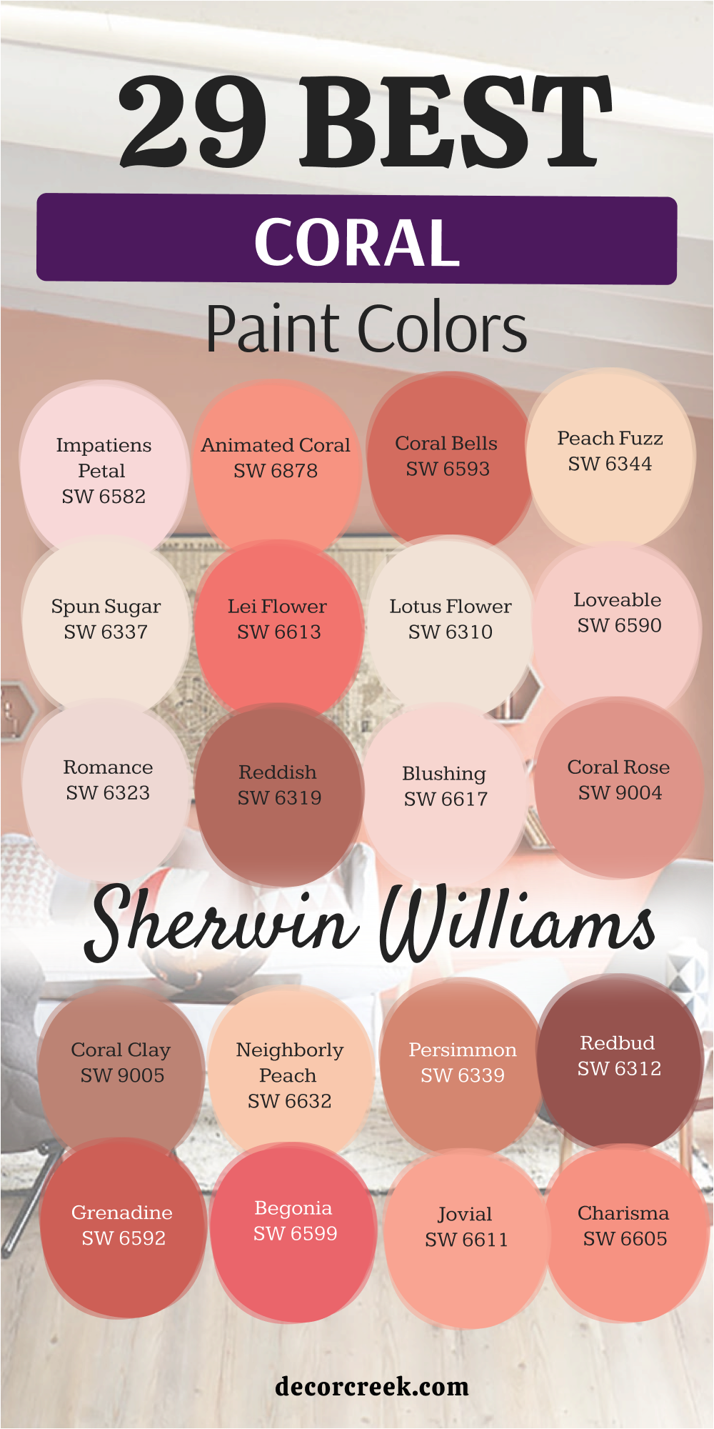
Why I Always Trust Sherwin-Williams and Benjamin Moore for the Best Coral Paint Colors
When I work on a big staging project, I cannot afford to use cheap paint from a random store. Low-quality paint often looks very different on your wall once it finally dries in the sun. I always stick with Sherwin-Williams and Benjamin Moore because their colors stay true and very vibrant. Their coral tones have just the right balance of pigments so they do not look like bubblegum or mud. You want your walls to look high-end and professional, not like a messy art project.
These two famous brands offer a huge variety of shades for every kind of taste. They have everything from very light peachy tones to deep and rich sunset oranges. I know that if I pick a swatch from their collections, the finish will be very smooth. The coverage is excellent, which means you do not have to paint five coats to hide the old color.
This saves me a lot of time and keeps my clients very happy with the final result in their house.
Using good paint is a smart way to make sure your hard work lasts for many years. Cheap paint can fade or look patchy, but these brands hold their color beautifully. I trust them because they have spent a long time making sure their coral shades are perfect. You deserve to have a professional look in your home without the big stress of guessing.
Picking the right brand is the first step to making your dream room a reality.
How I Choose the Perfect Coral Shade for Any Room
Picking the right paint for your house starts with looking at your windows. You need to see how much sun comes inside and where the light hits the walls. If a room gets lots of bright afternoon light, a deep coral might look very intense or hot. For darker rooms that feel a bit gloomy, I often pick a lighter coral to help things feel open. Light colors help a small room breathe and feel much more cheery for the people inside.
I also spend time thinking about the furniture and the floors that are already in the room. Coral looks amazing when you pair it with crisp white trim or very dark wood pieces. It can make a wood floor look golden and warm or make a white sofa look very clean.
You should always paint a small test patch on your wall before you buy the whole gallon. Colors can be tricky, and a small patch helps you see the truth before you commit.
This lets you see how the color changes from the bright morning to the dark night.
A shade that looks peach at noon might look more pink when you turn on your lamps. I always tell my clients to watch the paint for a full day to make sure they love it.
Choosing a color is about how it makes you feel when you are sitting on your couch.
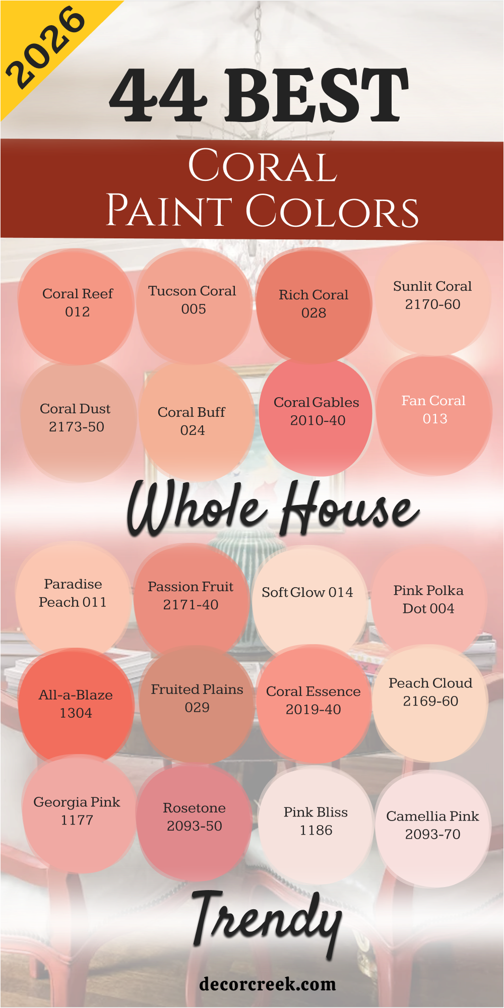
44 Best Coral Paint Colors For The Whole House Trendy in 2026
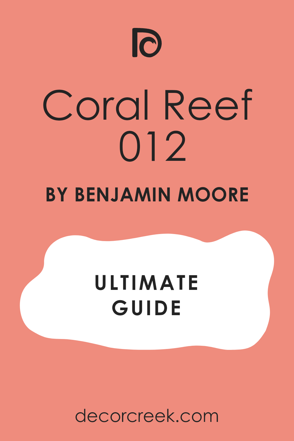
Coral Reef 012
Coral Reef 012 brings a cheerful energy to any wall it touches. This shade reminds me of a tropical vacation right in your own house. It has enough orange to feel warm but enough pink to stay soft and pretty. You will notice how it makes white furniture pop against the background.
I love how it looks when the morning sun hits the surface. It is a bold choice that pays off with a lot of personality. This color makes people feel welcome the moment they walk through the door.
It works well for someone who wants a fun and lively vibe. You can use it to create a focal point that everyone will talk about.
Best used in: entryways, playrooms, laundry rooms, and guest bathrooms
Pairs well with: Simply White OC-117, Navy Blue, gold accents, and light oak floors The key rule of this color for farmhouse style is to use it where you want a splash of sunshine to brighten up your daily chores.
🎨 Check out the complete guide to this color right HERE 👈
Tucson Coral 005
Tucson Coral 005 has a dusty quality that feels very grounded and earthy. This color takes inspiration from the desert and beautiful evening skies. It is not too bright, which makes it very easy to live with every day.
I think it looks very sophisticated in a dining area or a study. The warmth it provides makes a large room feel much more cozy. You will find that it matches perfectly with clay pots and natural textures. It is a great middle-ground for people who want color without too much flash.
Your guests will feel relaxed and happy in a room painted with this shade. It helps create a sense of history and comfort in a new build.
Best used in: dining rooms, home offices, hallways, and accent walls
Pairs well with: Chantilly Lace OC-65, Sage Green, terra cotta tiles, and dark walnut The key rule of this color for farmhouse style is to use it to bring a sense of natural warmth to areas where you gather for meals.
Rich Coral 028
Rich Coral 028 is a deep and confident version of this classic sunset hue. This paint has a lot of pigment which gives it a very expensive look. It stands out beautifully in rooms with high ceilings and plenty of trim.
I suggest using it if you want to make a big statement in a small area. It feels like a warm hug whenever you enter the room. The color stays true even under artificial lights at night.
You can pair it with brass fixtures for a very high-end feeling. It is a favorite for those who enjoy a bit of drama in their design. This shade proves that pink tones can be very grown-up and stylish.
Best used in: powder rooms, dining rooms, front doors, and library nooks
Pairs well with: Revere Pewter HC-172, Charcoal Gray, brass hardware, and cream textiles The key rule of this color for farmhouse style is to use it as a bold backdrop for vintage mirrors and framed family photos.
Sunlit Coral 2170-60
Sunlit Coral 2170-60 is a very pale and airy version of a beachy pink. This color is so light that it almost acts like a neutral with a secret. It makes a small bedroom feel much bigger and more full of light.
I often use this when a client wants just a hint of color on the walls. It creates a very soft look that is perfect for a nursery or a reading spot. You will love how it glows when you have lamps turned on in the evening. It is very forgiving and hides small bumps on the wall well.
This is a safe choice if you are trying coral for the very first time. It brings a gentle cheerfulness to the house without being loud.
Best used in: nurseries, small bedrooms, bathrooms, and ceilings
Pairs well with: White Dove OC-17, Mint Green, light gray rugs, and wicker furniture The key rule of this color for farmhouse style is to use it to make a small, cramped room feel like it has much more breathing room.
Coral Dust 2173-50
Coral Dust 2173-50 has a muted tone that feels very soft to the eye. This shade sits right between a peach and a tan. It is a very smart choice for a kitchen where you want a bit of warmth. I find that it makes wooden cabinets look richer and more polished.
The color is very balanced and does not lean too far into orange or pink. It provides a clean look that still feels very homey. You can use it on all four walls without feeling like it is too much.
It reminds me of the soft glow of a candle in a dim room. This paint is wonderful for creating a friendly atmosphere for your family.
Best used in: kitchens, breakfast nooks, hallways, and mudrooms
Pairs well with: Swiss Coffee OC-45, Slate Blue, butcher block counters, and copper pots The key rule of this color for farmhouse style is to use it to create a soft transition between the indoors and your outdoor garden views.
🎨 Check out the complete guide to this color right HERE 👈
Coral Buff 024
Coral Buff 024 is a creamy shade that feels very lush and smooth. This color has a lot of yellow in it which makes it feel like a summer afternoon. It is bright enough to be noticed but soft enough to be relaxing. I like to use this in rooms that need a little extra energy.
It works very well with traditional furniture and floral patterns. You will notice that it changes beautifully as the sun moves across the sky. It is a very happy color that makes people want to stay and chat.
The finish looks very velvety and high-quality on the wall. This is a great pick for a guest room to make visitors feel special.
Best used in: guest rooms, sunrooms, craft rooms, and hallways
Pairs well with: Hale Navy HC-154, Crisp White, floral fabrics, and pine wood The key rule of this color for farmhouse style is to use it to give a sunny personality to rooms that do not get much natural light.
Coral Gables 2010-40
Coral Gables 2010-40 is a vibrant and punchy pink that grabs your attention. This color is full of life and works best in spaces meant for fun. I love using this on a piece of furniture like a dresser or an island.
It is a very tropical shade that reminds me of flowers in a garden. You should use it if you want to add a splash of excitement to your home. It pairs perfectly with bright whites and crisp greens. The color is very saturated and looks deep and solid.
It is a fantastic choice for a kid’s room or a creative studio. This shade will definitely make your house stand out from the rest of the neighborhood.
Best used in: accent walls, vanity cabinets, kids’ rooms, and shutters
Pairs well with: Decorator’s White CC-20, Emerald Green, black accents, and modern art The key rule of this color for farmhouse style is to use it sparingly as a pop of joy against a mostly white or neutral background.
Fan Coral 013
Fan Coral 013 is a mid-tone shade that feels very classic and balanced. This color has a pinkish-red heart that makes it feel very warm. I think it is one of the most versatile corals in the entire collection.
It works just as well in a modern house as it does in an old cottage. You can use it to make a large living room feel much more intimate. It coordinates well with many different types of flooring.
The color has a certain depth that makes it look different every time you look at it. It is a very comforting shade that never goes out of fashion. This is my go-to choice for a cozy family den.
Best used in: living rooms, dens, family rooms, and master suites
Pairs well with: Edgecomb Gray HC-173, Tan, navy pillows, and medium wood tones The key rule of this color for farmhouse style is to use it to create a cozy heart for the home where everyone feels like sitting down.
Paradise Peach 011
Paradise Peach 011 is a soft and juicy color that feels very fresh. This shade leans more toward the orange side of the coral family. It looks like a ripe fruit and brings a sense of health and vitality to a room.
I find it very helpful for making a bathroom feel like a spa. It makes skin tones look very healthy in the mirror. You can pair it with white tiles for a very clean and bright look.
The color is light enough to use in very small spaces. It provides a cheerful backdrop for your morning routine. This is a very uplifting choice for any part of the house.
Best used in: bathrooms, dressing rooms, kitchens, and laundry areas
Pairs well with: Cloud White OC-130, Turquoise, white marble, and silver fixtures The key rule of this color for farmhouse style is to use it in the bathroom to create a glowing and refreshing start to your morning.
Passion Fruit 2171-40
Passion Fruit 2171-40 is a rich and tropical color that feels very exotic. This shade is quite intense and looks amazing in a sun-drenched room. I like to use it when a client wants their home to feel like a getaway.
It has a high energy level that makes a space feel active. You can use it to highlight architectural details like an archway. It pairs very well with dark green plants and natural wood.
The color is very deep and does not wash out in bright light. It is a daring choice that shows a lot of confidence in your style. This paint will make any room feel like a special destination.
Best used in: sunrooms, patios, dining rooms, and creative spaces
Pairs well with: Swiss Coffee OC-45, Forest Green, rattan, and dark bamboo The key rule of this color for farmhouse style is to use it to bring the feeling of a lush summer garden inside your home.
Soft Glow 014
Soft Glow 014 acts like a gentle candle burning in a quiet room. This shade is one of the lightest corals you can find for your home. I like to use it when a client wants a hint of peach without it being too bright.
It makes a small hallway feel much wider and more welcoming. You will notice that it picks up the light beautifully in the morning. It is a very safe choice for someone who usually only likes white walls. The color has a creamy base that keeps it from looking too orange.
It provides a very sweet backdrop for family photos in black frames. This paint makes every guest feel at ease the moment they enter. You can use it on every wall without it feeling like a heavy color.
Best used in: hallways, nurseries, laundry rooms, and small bathrooms
Pairs well with: Simply White OC-117, Dove Gray, light pine wood, and silver accents The key rule of this color for farmhouse style is to use it where you want the walls to feel like a warm hug rather than a flat surface.
Pink Polka Dot 004
Pink Polka Dot 004 is a playful and sweet shade that leans toward a rosy coral. This color brings a sense of childhood joy into a modern house. I find it works best in spaces where you want to feel a bit of a spark.
It is not a shy color and it definitely wants to be noticed by everyone. You can pair it with crisp white trim to make the pink tones really stand out. It looks wonderful when used on a built-in bookshelf or a desk area.
The warmth of the orange undertone keeps it from feeling like a cold bubblegum pink. It is a fantastic pick for a young girl’s room or a creative craft corner. Your home will feel much more alive with this energetic choice on the walls.
Best used in: bedrooms, playrooms, craft rooms, and accent furniture
Pairs well with: Chantilly Lace OC-65, Mint Green, gold hardware, and white linen The key rule of this color for farmhouse style is to use it as a fun surprise inside a closet or a pantry to make you smile.
All-a-Blaze 1304
All-a-Blaze 1304 is a fiery and intense coral that feels like a summer sunset. This color is packed with orange pigments that make a room feel very hot and active. I suggest using it in a dining room where you want people to talk and laugh.
It is a very confident shade that shows off your bold personality. You should use it if you have high ceilings and lots of dark wood. The color stays very vibrant even when the sun goes down at night.
It acts like a battery for a room that usually feels a bit sleepy. You can match it with navy blue for a very classic and high-end look. This paint is for people who love to be the center of attention.
Best used in: dining rooms, front doors, sunrooms, and accent walls
Pairs well with: Hale Navy HC-154, Cream, dark mahogany, and brass lamps The key rule of this color for farmhouse style is to use it on a front door to give your house a very friendly and bright face.
Fruited Plains 029
Fruited Plains 029 is a dusty coral that feels very natural and harvested from the earth. This shade has a bit of brown in it which makes it very steady and calm. I love how it looks in a kitchen with white cabinets and stone counters.
It reminds me of autumn fruit and warm clay pots in a garden. You will find that it makes a large open space feel much more grounded. It is a very sophisticated version of coral that works for adults.
The color does not change too much when you switch from sun to lamps. It provides a rich feeling without being too loud or distracting. This is a great choice for a house that uses a lot of natural materials.
Best used in: kitchens, living rooms, mudrooms, and home offices
Pairs well with: Revere Pewter HC-172, Sage Green, slate floors, and copper hardware The key rule of this color for farmhouse style is to use it to bring a sense of the outdoors and the harvest into your living areas.
Coral Essence 2007-40
Coral Essence 2007-40 is a bright and clear coral that feels very clean. This color does not have any muddy tones and stays very crisp on the wall. I find it very useful for a bathroom where you want to feel refreshed.
It makes the white of a bathtub or a sink look even whiter. You will enjoy how it makes the room feel like it is glowing from within. It is a very happy shade that works well with modern or old furniture.
The color has a nice balance of pink and orange that feels very trendy. It is a great way to update a house that feels a bit stuck in the past. Your family will love how much energy this paint brings to the home.
Best used in: bathrooms, guest rooms, entryways, and kitchen islands
Pairs well with: Decorator’s White CC-20, Turquoise, black frames, and light oak The key rule of this color for farmhouse style is to use it to make a boring corner feel like a special destination in your house.
Peach Cloud 2169-60
Peach Cloud 2169-60 is a very light and airy shade that feels like a dream. This color is almost a neutral but it has a warm heart that keeps it interesting. I often use this for ceilings to make a room feel taller and more open.
It is a very soft choice for a bedroom where you want to rest your eyes. You will notice that it works perfectly with gray or beige carpets. It is a very forgiving color that makes any wall look smooth and perfect.
The peach tones are very light so they do not take over the whole room. It brings a sense of light and air to a basement or a dark hallway. This is a wonderful pick for a house that needs a bit of a lift.
Best used in: ceilings, bedrooms, nurseries, and small apartments
Pairs well with: Stonington Gray HC-170, White Dove, navy blue pillows, and glass accents The key rule of this color for farmhouse style is to use it on the ceiling to create a soft glow that feels like a summer morning.
Georgia Pink 2092-60
Georgia Pink 2092-60 is a classic coral pink that feels very Southern and charming. This color has a traditional vibe that looks amazing with antique furniture. I think it is the perfect shade for a formal dining room or a parlor.
It has a bit of a peach glow that keeps the pink from being too sugary. You can use it to create a room that feels very elegant and high-quality. The color looks very rich when paired with dark wood floors and white rugs.
It is a very popular choice for people who love a vintage look in their house. This paint makes a room feel like it has many stories to tell. It is a very timeless shade that you will love for many years.
Best used in: dining rooms, master bedrooms, libraries, and parlors
Pairs well with: Swiss Coffee OC-45, Forest Green, walnut wood, and gold mirrors The key rule of this color for farmhouse style is to use it as a background for your favorite antique finds and family heirlooms.
Rosetone 1186
Rosetone 1186 is a deeper coral that has a lot of pink and red in its base. This color feels very warm and a bit heavy in a good way. I like to use it for a cozy den where you watch movies or read books.
It makes a large room feel much smaller and more private for the family. You will see how it creates a very lush look on the walls when it is finished. It is a very dramatic choice that works well with velvet fabrics and soft rugs.
The color is very deep and does not look thin or cheap at all. It provides a sense of luxury that is hard to find with lighter shades. This paint is for a home that wants to feel very fancy and warm.
Best used in: dens, media rooms, bedrooms, and dining areas
Pairs well with: Edgecomb Gray HC-173, Charcoal, cream curtains, and brass fixtures The key rule of this color for farmhouse style is to use it in rooms where you want to shut out the world and feel completely tucked in.
Pink Bliss 2093-70
Pink Bliss 2093-70 is a very pale and sweet coral that feels like a breath of fresh air. This color is so light that it works in any room of the house without any trouble. I find it very helpful for staging a home because it makes everything look clean.
It has just enough peach to keep it from being a cold or boring white. You can use it to make a dark kitchen feel much more open and sunny. It looks wonderful with natural wood and white marble surfaces.
The color is very soft and does not yell at you when you walk in. It is a great choice for someone who wants a very peaceful and light home. Your walls will look like they are blushing in the best way possible.
Best used in: kitchens, bathrooms, laundry rooms, and guest rooms
Pairs well with: White Heron OC-57, Soft Gray, marble counters, and light wood The key rule of this color for farmhouse style is to use it where you want a clean look that still feels very kind and inviting.
🎨 Check out the complete guide to this color right HERE 👈
Camellia Pink 2093-50
Camellia Pink 2093-50 is the lightest shade in this group and it feels very floral. This color is like the petal of a flower and is very delicate. I love using this for a ceiling or a very small powder room to add a bit of magic.
It is a very bright and happy shade that never feels heavy or dark. You will notice how it makes the light bounce around the room in a fun way. It is a very modern take on a pink coral that looks great with black accents.
The color is very clear and does not have any gray or brown in it. It is a fantastic way to add a bit of personality to a rental home. This paint makes every day feel like a spring morning.
Best used in: powder rooms, ceilings, nurseries, and closets
Pairs well with: Black Beauty 2128-10, Bright White, silver mirrors, and modern art The key rule of this color for farmhouse style is to use it as a tiny pop of color in a space that is mostly black and white.
Mesa Peach 1200
Mesa Peach 1200 has a warm and sandy heart that feels like a sunset in the desert. This color is a very smart mix of orange and soft brown tones. I often use it to make a large living area feel more connected and grounded.
It behaves like a neutral but has much more life than a plain tan or beige. You will notice that it creates a very sturdy feeling on the walls. It works beautifully with leather furniture and heavy wooden tables.
The color stays very consistent even when the light changes from morning to night. It is a very reliable choice for a home that sees a lot of daily activity. This paint makes a house feel strong and very well-loved.
Best used in: living rooms, entryways, dens, and mudrooms
Pairs well with: Simply White OC-117, Terracotta, dark leather, and bronze hardware The key rule of this color for farmhouse style is to use it to bring a sense of history and earthiness to your main living areas.
Tropical Fruit CSP-1115
Tropical Fruit CSP-1115 is a juicy and bright coral that feels full of flavor. This shade is part of a special collection that uses extra pigments for a deeper look. I like to use it when a room feels a bit sad and needs a big boost of energy.
It has a very clear and sunny personality that makes people feel happy. You will see how it makes green plants look even more vibrant against the wall. It is a very bold choice that works well for a creative person’s workspace.
The color has a certain glow that makes it look like it is lit from behind. It is a fantastic way to turn a boring room into a place of joy. Your family will love the bright and tropical vibe it brings to the house.
Best used in: home offices, sunrooms, kitchen islands, and craft areas
Pairs well with: Chantilly Lace OC-65, Kelly Green, rattan furniture, and white oak The key rule of this color for farmhouse style is to use it as a vibrant accent that celebrates the colors of a summer garden.
Coral Reef SW 6606
Coral Reef SW 6606 is a very famous and popular shade because it is so balanced. This color is the perfect middle ground between a bright pink and a warm orange. I find that it works in almost any lighting situation without looking too dark.
It brings a lot of personality to a bathroom or a laundry room. You can use it to make a small space feel like a very special destination. It matches perfectly with navy blue and gold for a very preppy and clean look.
The color is very saturated and gives great coverage on the first coat. It is a very energetic choice that keeps the house feeling young and fresh. This is a great pick for someone who wants a classic coral look.
Best used in: bathrooms, laundry rooms, accent walls, and front doors
Pairs well with: Naval SW 6244, Pure White SW 7005, gold mirrors, and gray tiles The key rule of this color for farmhouse style is to use it as a cheerful greeting on your front door or in your entryway.
🎨 Check out the complete guide to this color right HERE 👈
Coral Clay SW 9005
Coral Clay SW 9005 has a muted and earthy tone that feels very sophisticated. This color is a bit deeper and has a touch of red that makes it feel very solid. I love using this in a dining room where you want a cozy and rich atmosphere.
It looks very high-end when paired with white crown molding and dark floors. You will find that it hides fingerprints and scuffs very well in busy areas. It is a very grown-up version of coral that does not feel too sweet or sugary.
The color reminds me of old brick and warm pottery. It provides a very stable backdrop for your favorite pieces of art. This paint is perfect for making a new house feel like it has some soul.
Best used in: dining rooms, hallways, dens, and exterior accents
Pairs well with: Alabaster SW 7008, Urban Bronze SW 7048, cream rugs, and copper The key rule of this color for farmhouse style is to use it to add a sense of weight and importance to your formal rooms.
🎨 Check out the complete guide to this color right HERE 👈
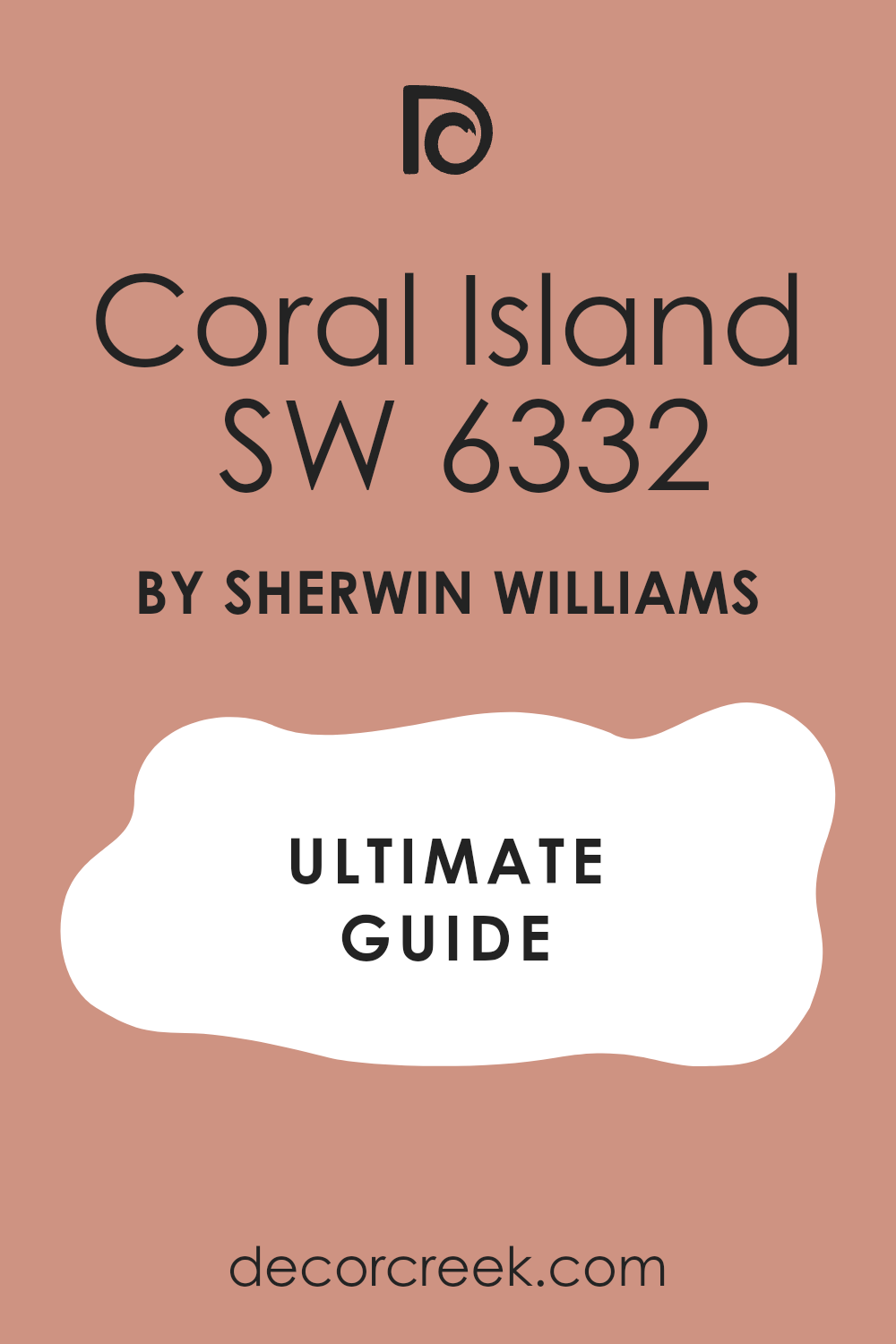
Coral Island SW 6332
Coral Island SW 6332 is a soft and dusty pink that feels very light on the eyes. This shade has a lot of gray in its base which keeps it from being too bright. I often suggest this for a master bedroom where you want a hint of color that is still very relaxing.
It makes the room feel very airy and full of light during the day. You will notice that it goes perfectly with light gray bedding and white curtains. It is a very polite color that does not take over the whole room.
The finish looks very smooth and clean on a large wall. It brings a gentle warmth to a house that usually feels a bit chilly. This is a wonderful choice for creating a very soft and pretty environment.
Best used in: master bedrooms, guest rooms, nurseries, and sitting areas
Pairs well with: Agreeable Gray SW 7029, Extra White SW 7006, silver accents, and linen The key rule of this color for farmhouse style is to use it to make a large bedroom feel light, open, and very welcoming.
🎨 Check out the complete guide to this color right HERE 👈
Ravishing Coral SW 6612
Ravishing Coral SW 6612 is a deep and punchy shade that demands your attention. This color is very vibrant and has a lot of red and orange in the mix. I like to use it as an accent inside a bookshelf or on a small piece of furniture.
It is a very high-energy color that makes a room feel like it is having a party. You should use it if you want to make a big statement in a small part of your home. It looks amazing when the sun hits it and makes the whole room glow.
The color is very rich and stays bright even in rooms that do not have many windows. It is a fun and daring choice for a person who loves color. This paint will definitely make your friends ask what color you used.
Best used in: accent walls, furniture, powder rooms, and shutters
Pairs well with: High Reflective White SW 7757, Black Magic SW 6991, brass, and emerald green The key rule of this color for farmhouse style is to use it to add a tiny bit of drama to a room that is mostly very simple.
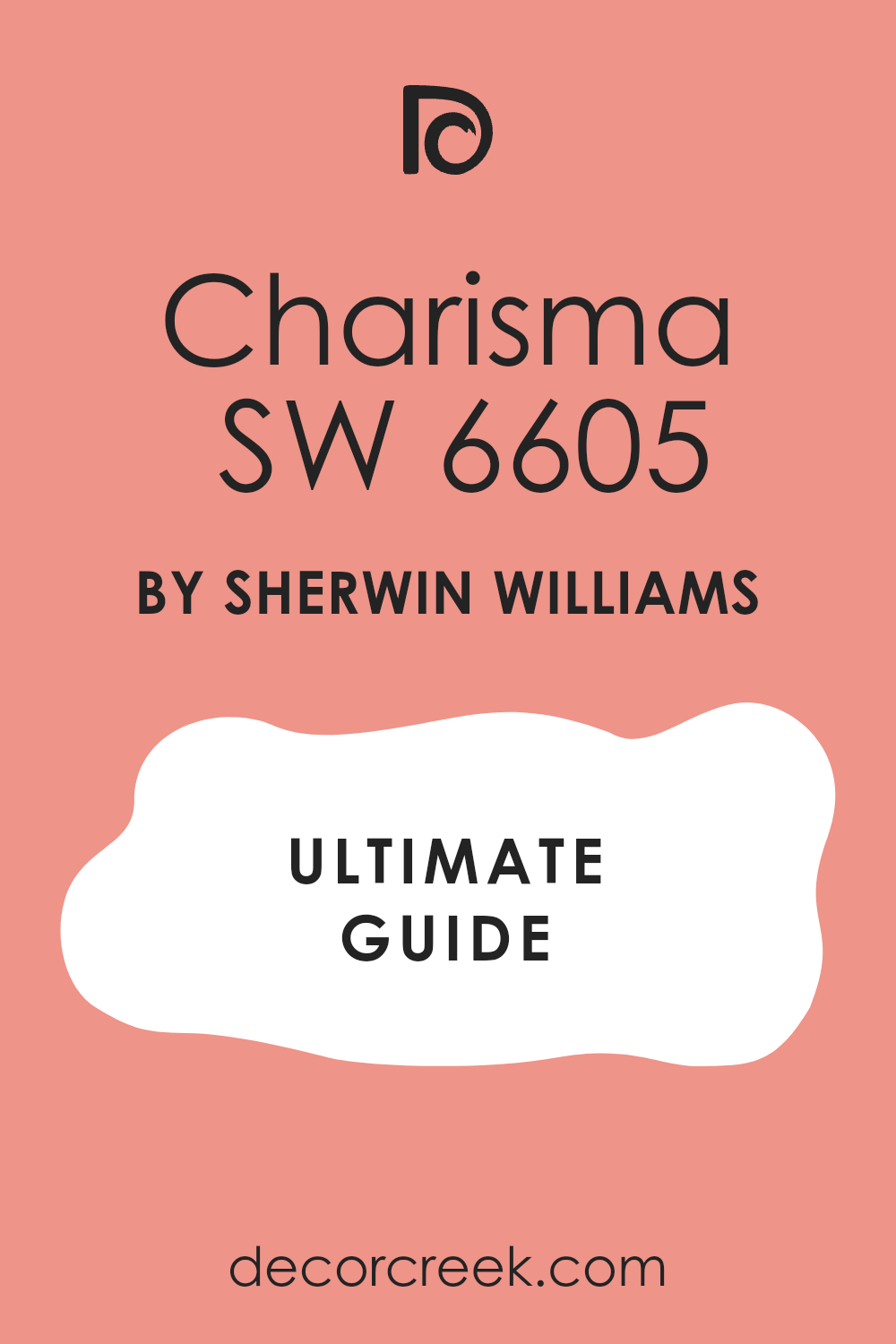
Charisma SW 6605
Charisma SW 6605 is a bright and happy pink coral that feels very outgoing. This color is full of spirit and brings a lot of light to any wall. I find it works best in a kid’s room or a fun playroom for the family.
It is a very clear shade that does not have any muddy or dark undertones. You will love how it makes the room feel like it is always summer. It pairs beautifully with white furniture and bright patterns.
The color is very uplifting and makes people want to be active and play. It provides a very clean look that stays bright for a long time. This is a great choice for adding a splash of personality to a child’s space.
Best used in: kids’ bedrooms, playrooms, laundry rooms, and walk-in closets
Pairs well with: Pure White SW 7005, Mint Green, yellow accents, and light wood The key rule of this color for farmhouse style is to use it to create a sense of wonder and fun in the areas where your children play.
🎨 Check out the complete guide to this color right HERE 👈
Coral Bells SW 6593
Coral Bells SW 6593 is a rich and warm shade that leans toward a deep peach. This color has a lot of depth and feels very expensive once it is on the wall. I like to use it in a guest bathroom to make the space feel more like a luxury hotel.
It has a very smooth and creamy look that is very pleasing to the eye. You will notice that it makes skin tones look very healthy and glowing in the mirror. It works well with both silver and gold fixtures.
The color is dark enough to feel cozy but bright enough to stay cheerful. It is a very balanced shade that feels very high-quality. This paint is perfect for making a small room feel much more important.
Best used in: bathrooms, guest rooms, entryways, and dining nooks
Pairs well with: Alabaster SW 7008, Naval SW 6244, marble, and dark walnut The key rule of this color for farmhouse style is to use it to give a small room a very polished and finished look.
Coral Rose SW 9004
Coral Rose SW 9004 is a soft and pretty shade that feels like a flower in full bloom. This color has a lot of pink in it but stays warm enough to be a true coral. I love using this in a girl’s bedroom or a soft reading corner.
It is a very sweet and kind color that makes everyone feel at home. You will see how it makes a dark corner feel much lighter and more open. It pairs perfectly with white lace and light wooden floors.
The color is very gentle and does not feel too loud or bright. It provides a very beautiful and soft backdrop for your daily life. This is a wonderful pick for a house that needs a bit of softness.
Best used in: bedrooms, nurseries, sitting rooms, and craft spaces
Pairs well with: Extra White SW 7006, Soft Gray, floral fabrics, and light pine The key rule of this color for farmhouse style is to use it to add a feminine and soft touch to a room with lots of hard surfaces.
Constant Coral SW 6325
Constant Coral SW 6325 is a high-energy shade that feels like a flash of light in a dark room. This color has a lot of zest and works perfectly if you want to make a bold statement. I love using it on a kitchen island to make it the star of the whole house.
It is a very saturated tone that does not hide in the corner. You will see how it instantly wakes up a tired entryway. The color has a very modern feel that works well with clean lines and simple furniture.
It is a very brave choice for people who are tired of boring walls. Your friends will notice this color the second they walk through the door. It provides a sense of excitement that is hard to find with other paints. This shade is all about having fun and showing off your bright personality.
Best used in: kitchen islands, front doors, accent walls, and playrooms
Pairs well with: Extra White SW 7006, Tricorn Black SW 6258, gold hardware, and navy blue The key rule of this color for farmhouse style is to use it as a punchy surprise in a room that is mostly neutral.
Coral Reef 012
Coral Reef 012 is a watery and light version of the classic coral look. This color feels like a refreshing dip in the ocean on a very hot day. I like to use it in bathrooms because it makes the whole area feel clean and bright.
It has a very airy quality that helps a small room feel much bigger. You will enjoy how it makes your white towels and tiles look very crisp. It is a very friendly color that works well for a guest room too.
The peach tones are very light so the room stays very open and sunny. It is a great way to bring a beachy feeling into your home no matter where you live. This paint is very easy to live with and never feels too heavy.
Best used in: bathrooms, guest bedrooms, laundry rooms, and nurseries
Pairs well with: Pure White SW 7005, Sea Salt SW 6204, light oak, and silver fixtures The key rule of this color for farmhouse style is to use it to make a small, windowless room feel like it has its own light.
🎨 Check out the complete guide to this color right HERE 👈
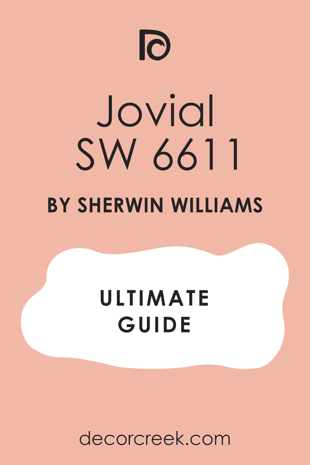
Jovial SW 6611
Jovial SW 6611 is a very happy and outgoing color that lives up to its name. This shade is full of pinkish-orange joy and brings a smile to everyone. I find it works wonders in a craft room or a place where you do your hobbies.
It is a very clear color that helps you feel creative and full of energy. You can use it to highlight a special nook or a window seat in your house. It looks wonderful when matched with light green or blue accents.
The color is very bright but it still feels very cozy and warm. It is a fantastic choice for a home that is always full of people and laughter. This paint makes the walls feel like they are part of the family.
Best used in: craft rooms, kids’ bedrooms, sunrooms, and reading nooks
Pairs well with: Snowbound SW 7004, Mint Green, wicker furniture, and colorful rugs The key rule of this color for farmhouse style is to use it to add a spark of life to a quiet corner of your home.
🎨 Check out the complete guide to this color right HERE 👈
Redbud SW 6312
Redbud SW 6312 is a very deep and earthy coral that looks like a flower in the woods. This color has a lot of red in it which makes it feel very grounded and strong. I love using this on the lower half of a wall with white paneling on top.
It gives a room a very classic and historical feeling that is hard to beat. You will find that it makes old wooden furniture look very rich and expensive. It is a very warm shade that makes a large room feel much more private.
The color is very solid and provides excellent coverage over old paint. It is a great pick for a house that wants to feel very established and sturdy. This paint brings a sense of the forest floor right into your living room.
Best used in: dining rooms, dens, mudrooms, and accent walls
Pairs well with: Dover White SW 6385, Sage Green, dark walnut, and copper accents The key rule of this color for farmhouse style is to use it to ground a room that has very high ceilings or lots of windows.
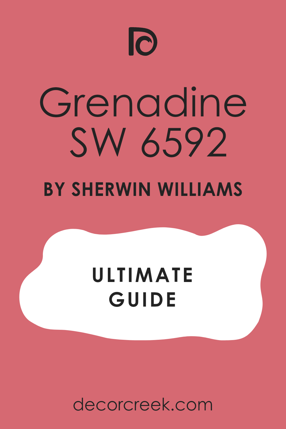
Grenadine SW 6592
Grenadine SW 6592 is a sweet and syrupy shade that is very rich in color. This coral is very warm and reminds me of a cold drink on a summer porch. I find it works best when you want to create a very cozy and small feeling in a room.
It is a very intense shade that looks amazing with dark metal accents like iron. You will see how it makes a small bathroom feel like a tiny jewel box. It is a very confident color that does not need a lot of extra decor to look good.
The warmth of the red tones makes the walls feel very thick and soft. It is a wonderful choice for an accent wall behind a bed. This paint makes your house feel very warm and full of life.
Best used in: powder rooms, bedrooms, back entries, and furniture
Pairs well with: Alabaster SW 7008, Iron Ore SW 7069, brass, and velvet fabrics The key rule of this color for farmhouse style is to use it as a rich backdrop for iron bed frames or dark metal hardware.
🎨 Check out the complete guide to this color right HERE 👈
Loveable SW 6590
Loveable SW 6590 is a very soft and pale pink coral that feels very kind. This color is like a gentle whisper on the walls and is very easy on the eyes. I often use this for a nursery or a very soft guest bedroom.
It has a tiny bit of orange that keeps it from being a cold baby pink. You will notice that it makes the room feel very peaceful and quiet. It is a very light shade that works perfectly with white furniture and soft rugs.
The color is very forgiving and makes any wall look very clean and new. It brings a sense of light and sweetness to a house that needs a gentle touch. This is a very safe pick for anyone who loves a very pretty look.
Best used in: nurseries, guest rooms, bathrooms, and walk-in closets
Pairs well with: High Reflective White SW 7757, Light Gray, floral prints, and silver The key rule of this color for farmhouse style is to use it to create a soft and caring feeling in the rooms where you rest.
Innocence SW 6302
Innocence SW 6302 is a very light and dusty coral that feels very vintage. This shade has a bit of gray in it which makes it look like a color from an old storybook. I like to use it in a house that has a lot of antique pieces and lace.
It is a very quiet color that does not demand much attention from you. You will enjoy how it makes your old wooden floors look very warm and golden. It is a very smart choice for a hallway where you want a bit of color but no drama.
The color stays very consistent and looks good even in low light. It provides a very clean and classic look that never goes out of style. This paint makes a room feel very respectful and calm.
Best used in: hallways, bedrooms, laundry rooms, and parlors
Pairs well with: Antique White SW 6119, Sage Green, lace curtains, and dark wood The key rule of this color for farmhouse style is to use it as a soft background for your favorite vintage finds and old photos.
🎨 Check out the complete guide to this color right HERE 👈
Persimmon SW 6339
Persimmon SW 6339 is a juicy and earthy orange-coral that feels very natural. This color is inspired by the fruit and has a very healthy and active vibe. I find it works perfectly in a kitchen or a dining nook to make the food look great.
It is a very warm shade that makes people feel hungry and ready to talk. You will notice that it makes wooden cabinets look very rich and full of life. It is a very bold choice but it feels very grounded because of the earthy tones.
The color looks amazing when the afternoon sun shines directly on it. It is a fantastic way to add a bit of spice to a room that feels too white. This paint makes a home feel very vibrant and full of energy.
Best used in: kitchens, dining nooks, entryways, and accent walls
Pairs well with: Creamy SW 7012, Slate Blue, butcher block, and copper pots The key rule of this color for farmhouse style is to use it in the kitchen to make the heart of the home feel warm and active.
Foxy SW 6333
Foxy SW 6333 is a mid-tone shade that feels like a hidden beach. This color is very balanced and has a nice mix of pink, orange, and a tiny bit of red. I like to use it in a guest room to make it feel like a vacation spot for visitors.
It is bright enough to be fun but deep enough to feel very solid. You will see how it makes a room feel very complete without needing much art. It pairs very well with navy blue and sandy tan colors.
The color is very rich and has a high-quality look when it is dry. It is a very reliable choice for people who want a real coral color. This paint makes a house feel very friendly and open.
Best used in: guest rooms, bathrooms, home offices, and sunrooms
Pairs well with: Pure White SW 7005, Tan, navy accents, and jute rugs The key rule of this color for farmhouse style is to use it to give a boring room a very distinct and happy personality.
Warm Blush 892
Warm Blush 892 is a very soft and creamy coral that feels like a warm glow. This color is very light and acts as a beautiful neutral with a pink heart. I often use this for staging a living room because it makes the house feel very welcoming.
It has a tiny bit of peach that keeps the room feeling very sunny and bright. You will notice that it makes your furniture look very clean and well-kept. It is a very polite color that goes with almost any other shade in the house.
The finish is very smooth and looks very expensive on the walls. It brings a sense of light and joy to a house that usually feels a bit dark. This is a wonderful pick for a very fresh and clean home.
Best used in: living rooms, hallways, entryways, and bedrooms
Pairs well with: Alabaster SW 7008, Agreeable Gray SW 7029, warm wood, and gold The key rule of this color for farmhouse style is to use it to make your main living areas feel bright and full of kind light.
🎨 Check out the complete guide to this color right HERE 👈
Begonia SW 6599
Begonia SW 6599 is a vibrant and floral coral that feels very feminine and strong. This color is like a bright flower in a garden and it really stands out. I find it works best as an accent color or in a very small room for a big surprise.
It is a very clear and punchy shade that makes you feel very awake. You will love how it makes a dark closet or a pantry look like a special place. It pairs beautifully with bright whites and deep green plants.
The color is very saturated and looks very deep and rich on the wall. It is a fantastic choice for a person who loves flowers and bright colors. This paint makes a room feel very alive and full of spirit.
Best used in: accent walls, pantries, closets, and furniture
Pairs well with: Extra White SW 7006, Forest Green, brass, and black accents The key rule of this color for farmhouse style is to use it as a tiny pop of garden color inside a cabinet or on a shelf.
🎨 Check out the complete guide to this color right HERE 👈
Tanager SW 6601
Tanager SW 6601 is a very bold and reddish-coral that feels like a tropical bird. This color is very intense and brings a lot of heat to a room. I suggest using it in a space where you want to have a lot of energy and movement.
It is a very confident shade that shows you are not afraid of big colors. You will find that it makes a huge impact even if you only paint one wall. It looks amazing with dark metal and very light wood for a modern contrast.
The color is very deep and does not get washed out by bright windows. It is a great choice for a home office where you need to stay focused and active. This paint makes a house feel very brave and stylish.
Best used in: home offices, front doors, dining rooms, and accent walls
Pairs well with: High Reflective White SW 7757, Charcoal, iron hardware, and light oak The key rule of this color for farmhouse style is to use it to make a big statement in a room that needs a lot of energy.
🎨 Check out the complete guide to this color right HERE 👈

29 Best Coral Paint Colors From Sherwin Williams
Coral Reef SW 6606
Coral Reef SW 6606 is a very famous choice because it looks like a perfect summer day. This color has a lot of pink and orange mixed together in a very balanced way. I find that it works wonders in a laundry room to make the chores feel more fun.
It brings a lot of personality to a small bathroom where you want a big change. You will notice how it makes white trim look very sharp and clean. It is a very saturated color so it covers the walls very well.
The warmth it gives off makes the whole house feel much more alive. Many people pick this because it is a classic look that never feels old. It is a fantastic way to add a splash of energy to a dark corner. This paint makes everyone feel like they are on a tropical vacation.
Best used in: laundry rooms, bathrooms, front doors, and accent walls
Pairs well with: Pure White SW 7005, Naval SW 6244, gold accents, and light wood The key rule of this color for farmhouse style is to use it as a cheerful greeting on your front door to welcome your friends.
🎨 Check out the complete guide to this color right HERE 👈
Youthful Coral SW 6604
Youthful Coral SW 6604 is a softer version of a bright pink that feels very fresh. This color is not too loud but it still has a lot of spirit and heart. I like to use it in a girl’s bedroom to create a space that feels very happy.
It has a creamy quality that keeps it from looking like a cheap plastic color. You will love how it glows when you turn on the lamps in the evening. It is a very friendly shade that makes a room feel very open and light.
You can pair it with gray furniture for a very modern and clean look. The color is very easy to live with and does not get tiring to look at. It brings a sense of childhood joy into a very grown-up house. This paint makes the walls feel very soft and kind.
Best used in: bedrooms, playrooms, nurseries, and walk-in closets
Pairs well with: Extra White SW 7006, Agreeable Gray SW 7029, silver hardware, and white linen The key rule of this color for farmhouse style is to use it where you want a touch of sweetness without making the room feel too small.
🎨 Check out the complete guide to this color right HERE 👈
Ravishing Coral SW 6612
Ravishing Coral SW 6612 is a very deep and punchy shade that demands your attention. This color is very vibrant and has a lot of red and orange in the mix. I like to use it as an accent inside a bookshelf or on a small piece of furniture.
It is a very high-energy color that makes a room feel like it is having a party. You should use it if you want to make a big statement in a small part of your home. It looks amazing when the sun hits it and makes the whole room glow.
The color is very rich and stays bright even in rooms that do not have many windows. It is a fun and daring choice for a person who loves color. This paint will definitely make your friends ask what color you used.
Best used in: accent walls, vanity cabinets, powder rooms, and shutters
Pairs well with: High Reflective White SW 7757, Black Magic SW 6991, brass, and emerald green The key rule of this color for farmhouse style is to use it to add a tiny bit of drama to a room that is mostly very simple.
Coral Island SW 6332
Coral Island SW 6332 is a soft and dusty pink that feels very light on the eyes. This shade has a lot of gray in its base which keeps it from being too bright. I often suggest this for a master bedroom where you want a hint of color that is still very relaxing.
It makes the room feel very airy and full of light during the day. You will notice that it goes perfectly with light gray bedding and white curtains. It is a very polite color that does not take over the whole room.
The finish looks very smooth and clean on a large wall. It brings a gentle warmth to a house that usually feels a bit chilly. This is a wonderful choice for creating a very soft and pretty environment.
Best used in: master bedrooms, guest rooms, nurseries, and sitting areas
Pairs well with: Agreeable Gray SW 7029, Extra White SW 7006, silver accents, and linen The key rule of this color for farmhouse style is to use it to make a large bedroom feel light, open, and very welcoming.
🎨 Check out the complete guide to this color right HERE 👈
Faint Coral SW 6329
Faint Coral SW 6329 is the perfect choice for people who are afraid of too much color. This shade is very close to white but has a tiny drop of peach inside. I like to use it in a large living room to make it feel warmer than a plain white.
It makes the light in the room feel very soft and kind throughout the day. You will notice that it works well with almost any color of furniture you already have. It is a very smart way to add a bit of personality to a rental home.
The color is very clean and makes the walls look very smooth and fresh. It brings a tiny bit of sunshine into a house that needs a gentle lift. This paint is very easy to use and always looks very high-end.
Best used in: living rooms, hallways, ceilings, and open floor plans
Pairs well with: Alabaster SW 7008, Urbane Bronze SW 7048, warm wood tones, and tan rugs The key rule of this color for farmhouse style is to use it on all four walls to create a warm and bright backdrop for your life.
🎨 Check out the complete guide to this color right HERE 👈
Mellow Coral SW 6324
Mellow Coral SW 6324 is a very steady and quiet shade of pinkish-orange. This color has a lot of tan in it which makes it feel very grounded and solid. I find that it works best in a dining room or a study where you want to feel relaxed.
It is not a bright color so it does not distract you from your work or your meals. You will see how it makes dark wooden floors look very rich and beautiful. It is a very sophisticated choice for an adult house that wants a bit of warmth.
The color stays the same even when the sun goes behind a cloud. It provides a very cozy feeling that makes you want to stay in the room for a long time. This paint makes a home feel very well-kept and sturdy.
Best used in: dining rooms, home offices, hallways, and entryways
Pairs well with: Snowbound SW 7004, Naval SW 6244, medium wood tones, and brass The key rule of this color for farmhouse style is to use it to give a room a sense of history and quiet comfort.
🎨 Check out the complete guide to this color right HERE 👈
Smoky Salmon SW 6331
Smoky Salmon SW 6331 is a deep and earthy coral that feels very natural. This color has a bit of gray and brown mixed in so it never looks too bright or neon. I love using this in a kitchen with white cabinets to add a lot of warmth.
It reminds me of autumn colors and warm clay pots in a garden. You will notice that it hides scuffs and marks very well in a busy house. It is a very mature shade of coral that feels very expensive on the walls.
The color provides a very rich look that works well with traditional furniture. It brings a sense of the outdoors into your house in a very soft way. This is a great pick for a home that wants to feel very cozy and full of life.
Best used in: kitchens, mudrooms, dens, and accent walls
Pairs well with: Alabaster SW 7008, Sage Green, copper hardware, and slate floors The key rule of this color for farmhouse style is to use it to ground a room that has a lot of bright windows and white trim.
🎨 Check out the complete guide to this color right HERE 👈
Quaint Peche SW 6330
Quaint Peche SW 6330 is a very light and creamy peach that feels like a spring morning. This color is very soft and brings a lot of light into a dark room. I often use this for a ceiling to make a room feel much taller than it really is.
It has a very sweet heart that makes everyone feel welcome and happy. You will love how it makes your white furniture look very bright and clean. It is a very forgiving color that makes any wall look perfect and smooth.
It brings a sense of peace to a house that is usually very busy and loud. This is a wonderful choice for a nursery or a small bathroom. Your walls will look like they are glowing with a very soft light.
Best used in: nurseries, ceilings, small bathrooms, and laundry rooms
Pairs well with: Pure White SW 7005, Soft Gray, light pine wood, and white linen The key rule of this color for farmhouse style is to use it to make a small room feel very airy and full of light.
🎨 Check out the complete guide to this color right HERE 👈
Nearly Peach SW 6336
Nearly Peach SW 6336 is a very pale and airy shade that acts like a warm neutral. This color is so light that you almost don’t notice the orange until you see it next to white. I find it very helpful for making a small apartment feel much larger and more open.
It has a very clean look that works well in a kitchen or a bathroom. You will enjoy how it makes the morning sun feel even brighter on your walls. It is a very safe choice for someone who is trying color for the first time.
The color is very polite and does not take over the whole room. It brings a tiny bit of joy to a house that needs a fresh start. This paint is very easy to match with your favorite rugs and pillows.
Best used in: kitchens, bathrooms, hallways, and small bedrooms
Pairs well with: High Reflective White SW 7757, Tan, navy blue, and silver fixtures The key rule of this color for farmhouse style is to use it where you want a clean look that still feels very friendly and warm.
🎨 Check out the complete guide to this color right HERE 👈
Charisma SW 6605
Charisma SW 6605 is a bright and happy pink coral that feels very outgoing. This color is full of spirit and brings a lot of light to any wall it touches. I find it works best in a kid’s room or a fun playroom for the family.
It is a very clear shade that does not have any muddy or dark undertones. You will love how it makes the room feel like it is always summer. It pairs beautifully with white furniture and bright patterns.
The color is very uplifting and makes people want to be active and play. It provides a very clean look that stays bright for a long time. This is a great choice for adding a splash of personality to a child’s space.
Best used in: kids’ bedrooms, playrooms, laundry rooms, and walk-in closets
Pairs well with: Pure White SW 7005, Mint Green, yellow accents, and light wood The key rule of this color for farmhouse style is to use it to create a sense of wonder and fun in the areas where your children play.
🎨 Check out the complete guide to this color right HERE 👈
Jovial SW 6611
Jovial SW 6611 is a very happy and outgoing color that lives up to its name perfectly. This shade is full of pinkish-orange joy and brings a big smile to everyone who sees it. I find it works wonders in a craft room or a place where you do your favorite hobbies.
It is a very clear color that helps you feel creative and full of bright energy. You can use it to highlight a special nook or a window seat in your house. It looks wonderful when matched with light green or soft blue accents.
The color is very bright but it still feels very cozy and warm inside. It is a fantastic choice for a home that is always full of people and laughter. This paint makes the walls feel like they are a fun part of the family.
Best used in: craft rooms, kids bedrooms, sunrooms, and reading nooks
Pairs well with: Snowbound SW 7004, Mint Green, wicker furniture, and colorful rugs The key rule of this color for farmhouse style is to use it to add a spark of life to a quiet corner of your home.
🎨 Check out the complete guide to this color right HERE 👈
Begonia SW 6599
Begonia SW 6599 is a vibrant and floral coral that feels very feminine and strong at once. This color is like a bright flower in a garden and it really stands out on any wall. I find it works best as an accent color or in a very small room for a surprise.
It is a very clear and punchy shade that makes you feel very awake and ready. You will love how it makes a dark closet or a pantry look like a special place. It pairs beautifully with bright whites and deep green leafy plants.
The color is very saturated and looks very deep and rich when it finally dries. It is a fantastic choice for a person who loves flowers and very bright colors. This paint makes a room feel very alive and full of spirit.
Best used in: accent walls, pantries, closets, and furniture
Pairs well with: Extra White SW 7006, Forest Green, brass, and black accents The key rule of this color for farmhouse style is to use it as a tiny pop of garden color inside a cabinet.
🎨 Check out the complete guide to this color right HERE 👈
Grenadine SW 6592
Grenadine SW 6592 is a sweet and syrupy shade that is very rich in its deep color. This coral is very warm and reminds me of a cold drink on a summer porch. I find it works best when you want to create a very cozy and small feeling.
It is a very intense shade that looks amazing with dark metal accents like heavy iron. You will see how it makes a small bathroom feel like a tiny jewel box for guests. It is a very confident color that does not need a lot of extra decor to look good.
The warmth of the red tones makes the walls feel very thick and soft to the eye. It is a wonderful choice for an accent wall behind a tall bed. This paint makes your house feel very warm and full of life.
Best used in: powder rooms, bedrooms, back entries, and furniture
Pairs well with: Alabaster SW 7008, Iron Ore SW 7069, brass, and velvet fabrics The key rule of this color for farmhouse style is to use it as a rich backdrop for iron bed frames.
🎨 Check out the complete guide to this color right HERE 👈
Redbud SW 6312
Redbud SW 6312 is a very deep and earthy coral that looks like a flower in the woods. This color has a lot of red in it which makes it feel very grounded and strong. I love using this on the lower half of a wall with white paneling on top.
It gives a room a very classic and historical feeling that is very hard to beat. You will find that it makes old wooden furniture look very rich and quite expensive. It is a very warm shade that makes a large room feel much more private and safe.
The color is very solid and provides excellent coverage over any old paint you had. It is a great pick for a house that wants to feel very established and sturdy. This paint brings a sense of the forest floor right into your living room.
Best used in: dining rooms, dens, mudrooms, and accent walls
Pairs well with: Dover White SW 6385, Sage Green, dark walnut, and copper accents The key rule of this color for farmhouse style is to use it to ground a room that has very high ceilings.
Persimmon SW 6339
Persimmon SW 6339 is a juicy and earthy orange-coral that feels very natural to the eye. This color is inspired by the fruit and has a very healthy and active vibe. I find it works perfectly in a kitchen or a dining nook to make food look great.
It is a very warm shade that makes people feel hungry and ready to talk more. You will notice that it makes wooden cabinets look very rich and full of real life. It is a very bold choice but it feels very grounded because of the earthy tones.
The color looks amazing when the afternoon sun shines directly on the flat surface. It is a fantastic way to add a bit of spice to a room that feels white. This paint makes a home feel very vibrant and full of energy.
Best used in: kitchens, dining nooks, entryways, and accent walls
Pairs well with: Creamy SW 7012, Slate Blue, butcher block, and copper pots The key rule of this color for farmhouse style is to use it in the kitchen to make the heart of the home warm.
Neighborly Peach SW 6632
Neighborly Peach SW 6632 is a friendly and soft shade that makes everyone feel right at home. This color has a lot of yellow in it which makes it feel like a sunny morning. I like to use it in an entryway to give guests a very warm and kind welcome.
It is a very cheerful shade that works well with traditional furniture and white trim. You will notice that it makes a dark hallway feel much wider and more full of light. It is a very polite color that does not yell but still gets noticed by everyone.
The finish is very creamy and looks very high-quality on a long and tall wall. It brings a sense of community and kindness to the inside of your house. This paint is perfect for a home that loves to host neighbors.
Best used in: entryways, hallways, kitchens, and breakfast nooks
Pairs well with: Pure White SW 7005, Soft Blue, medium wood, and colorful rugs The key rule of this color for farmhouse style is to use it in the entryway to create a very sunny first impression.
Coral Clay SW 9005
Coral Clay SW 9005 has a muted and earthy tone that feels very sophisticated for an adult. This color is a bit deeper and has a touch of red that makes it feel solid. I love using this in a dining room where you want a cozy and rich atmosphere.
It looks very high-end when paired with white crown molding and very dark floors. You will find that it hides fingerprints and scuffs very well in busy family areas. It is a very grown-up version of coral that does not feel too sweet or sugary.
The color reminds me of old brick and warm pottery found in a garden. It provides a very stable backdrop for your favorite pieces of framed art. This paint is perfect for making a new house feel like it has soul.
Best used in: dining rooms, hallways, dens, and exterior accents
Pairs well with: Alabaster SW 7008, Urban Bronze SW 7048, cream rugs, and copper The key rule of this color for farmhouse style is to use it to add a sense of weight to formal rooms.
🎨 Check out the complete guide to this color right HERE 👈
Coral Rose SW 9004
Coral Rose SW 9004 is a soft and pretty shade that feels like a flower in full bloom. This color has a lot of pink in it but stays warm enough to be true coral. I love using this in a girl’s bedroom or a soft and quiet reading corner.
It is a very sweet and kind color that makes everyone feel very much at home. You will see how it makes a dark corner feel much lighter and more open. It pairs perfectly with white lace and light wooden floors found in older houses.
The color is very gentle and does not feel too loud or too bright for eyes. It provides a very beautiful and soft backdrop for your busy daily life. This is a wonderful pick for a house that needs a bit of softness.
Best used in: bedrooms, nurseries, sitting rooms, and craft spaces
Pairs well with: Extra White SW 7006, Soft Gray, floral fabrics, and light pine The key rule of this color for farmhouse style is to use it to add a feminine touch to hard surfaces.
Blushing SW 6617
Blushing SW 6617 is a very pale and delicate coral that feels like a shy smile. This color is almost like a neutral but it has a warm heart of pink peach. I find it works best in a master bathroom where you want to feel very clean.
It makes the light in the room feel very soft and very pretty on your skin. You will notice that it goes perfectly with white marble and shiny silver faucets. It is a very quiet color that makes a small room feel very open and airy.
The finish is very smooth and makes the walls look very high-quality and fresh. It brings a sense of newness to a house that feels a bit old. This paint is a great way to add color without being too bold.
Best used in: bathrooms, bedrooms, dressing rooms, and ceilings
Pairs well with: Pure White SW 7005, Marble, silver, and light gray textiles The key rule of this color for farmhouse style is to use it to make a small bathroom feel like a bright spa.
🎨 Check out the complete guide to this color right HERE 👈
Reddish SW 6319
Reddish SW 6319 is a deep and warm coral that leans heavily into a rusty red tone. This color feels very strong and provides a lot of heat to a large room. I like to use it in a study or a den to make the space feel very private.
it has a very rich quality that looks amazing with old books and leather chairs. You will find that it creates a very solid and sturdy look on your walls. It is a very brave choice that shows you have a very strong sense of style.
The color stays very deep even when the sun is not shining in the room. It provides a sense of luxury that is very hard to find with lighter shades. This paint makes a home feel very established and very well-loved.
Best used in: studies, dens, dining rooms, and accent walls
Pairs well with: Dover White SW 6385, Navy Blue, leather, and dark wood The key rule of this color for farmhouse style is to use it to create a very cozy and private library feel.
Romance SW 6323
Romance SW 6323 is a very soft and dreamy coral that feels very light and airy. This color is like a soft cloud at sunset and is very easy on the eye. I often use this for a guest bedroom to make it feel very special and sweet.
It has a tiny bit of orange that keeps it from being a cold pink color. You will notice that it makes the room feel very peaceful and very quiet for sleep. It is a very light shade that works perfectly with white furniture and soft rugs.
The color is very forgiving and makes any wall look very clean and very new. It brings a sense of light and sweetness to a house that needs it. This is a very safe pick for anyone who loves a very pretty and soft look.
Best used in: guest rooms, nurseries, bathrooms, and walk-in closets
Pairs well with: High Reflective White SW 7757, Light Gray, floral prints, and silver The key rule of this color for farmhouse style is to use it to create a soft feeling in the rooms where you rest.
🎨 Check out the complete guide to this color right HERE 👈
Loveable SW 6590
Loveable SW 6590 is a very sweet and pale pink coral that feels very kind to everyone. This color is like a gentle whisper on the walls and is very easy to look at. I often use this for a nursery or a very soft and pretty guest bedroom.
It has a tiny bit of orange that keeps it from being a cold baby pink. You will notice that it makes the room feel very peaceful and very quiet. It is a very light shade that works perfectly with white furniture and soft rugs.
The color is very forgiving and makes any wall look very clean and new. It brings a sense of light and sweetness to a house that needs a gentle touch. This is a very safe pick for anyone who loves a very pretty look.
Best used in: nurseries, guest rooms, bathrooms, and walk-in closets
Pairs well with: High Reflective White SW 7757, Light Gray, floral prints, and silver The key rule of this color for farmhouse style is to use it to create a soft and caring feeling in the rooms where you rest.
Lotus Flower SW 6310
Lotus Flower SW 6310 is a very light and creamy coral that feels like a fresh petal. This color has a lot of yellow in it which makes it feel very warm and sunny. I find it works best in a small kitchen to make the room feel much larger.
It is a very bright shade that brings a lot of happy energy to your house. You will love how it makes your morning coffee feel even better in a bright room. It pairs beautifully with light wood and white tile found in many modern homes.
The color is very clear and does not have any dark or muddy tones inside. It is a fantastic way to add a bit of sunshine to a room that is dark. This paint makes every day feel like a bright summer morning.
Best used in: kitchens, bathrooms, laundry rooms, and small bedrooms
Pairs well with: Pure White SW 7005, light oak, yellow accents, and white tile The key rule of this color for farmhouse style is to use it to make a small kitchen feel like a sunny garden.
Lei Flower SW 6613
Lei Flower SW 6613 is a very bright and tropical coral that feels like a vacation. This color is very punchy and brings a lot of island energy to your walls. I like to use it as an accent in a bathroom to make the space feel fun.
It is a very high-energy shade that makes you feel very awake and ready for the day. You should use it if you want to make a big statement in a small area. It looks amazing with bright white trim and shiny gold hardware for a clean look.
The color is very rich and stays very bright even in rooms with no windows. It is a fun and daring choice for a person who loves the beach life. This paint will definitely make your house feel very bright and full of life.
Best used in: bathrooms, accent walls, kids rooms, and front doors
Pairs well with: Extra White SW 7006, Turquoise, gold, and light wood The key rule of this color for farmhouse style is to use it as a fun surprise on the inside of a door.
🎨 Check out the complete guide to this color right HERE 👈
Spun Sugar SW 6337
Spun Sugar SW 6337 is a very light and airy peach that feels like a sweet treat. This color is almost a neutral but it has a warm heart that keeps it fun. I often use this for ceilings to make a room feel taller and more open.
It is a very soft choice for a bedroom where you want to rest your tired eyes. You will notice that it works perfectly with gray or beige carpets on the floor. It is a very forgiving color that makes any wall look smooth and perfect.
The peach tones are very light so they do not take over the whole room. It brings a sense of light and air to a basement or a very dark hallway. This is a wonderful pick for a house that needs a bit of a lift.
Best used in: ceilings, bedrooms, nurseries, and small apartments
Pairs well with: Stonington Gray HC-170, White Dove, navy blue pillows, and glass The key rule of this color for farmhouse style is to use it on the ceiling to create a soft and warm glow.
🎨 Check out the complete guide to this color right HERE 👈
Peach Fuzz SW 6344
Peach Fuzz SW 6344 is a soft and velvety coral that feels very warm to the touch. This color has a lot of orange in it which makes it feel very sunny and happy. I find it works best in a breakfast nook where the morning sun can hit it.
It is a very friendly shade that makes everyone want to sit and stay for a while. You will notice that it makes white dishes and light wood look very beautiful. It is a very cheerful color that brings a lot of life to a kitchen area.
The finish is very creamy and looks very high-quality on a long wall. It brings a sense of comfort and joy to a house that feels a bit cold. This paint makes a room feel very solid and very dependable for families.
Best used in: breakfast nooks, kitchens, hallways, and kids bedrooms
Pairs well with: Snowbound SW 7004, Sage Green, light wood, and copper The key rule of this color for farmhouse style is to use it to create a warm heart for your family.
🎨 Check out the complete guide to this color right HERE 👈
Coral Bells SW 6593
Coral Bells SW 6593 is a rich and warm shade that leans toward a deep and pretty peach. This color has a lot of depth and feels very expensive once it is dry. I like to use it in a guest bathroom to make the space feel very fancy.
It has a very smooth and creamy look that is very pleasing to look at. You will notice that it makes skin tones look very healthy and glowing in the mirror. It works well with both silver and gold fixtures for a high-end look.
The color is dark enough to feel cozy but bright enough to stay cheerful. It is a very balanced shade that feels very high-quality on the wall. This paint is perfect for making a small room feel much more important.
Best used in: bathrooms, guest rooms, entryways, and dining nooks
Pairs well with: Alabaster SW 7008, Naval SW 6244, marble, and dark walnut The key rule of this color for farmhouse style is to use it to give a small room a very polished look.
Animated Coral SW 6878
Animated Coral SW 6878 is a very vibrant and energetic shade that lives up to its name. This color is full of movement and brings a lot of life to a boring wall. I find it works best in a playroom or a kid’s bedroom where fun happens.
It is a very clear shade of coral that does not have any dark or muddy tones. You will love how it makes the room feel like it is always time to play. It pairs beautifully with bright whites and colorful rugs on the floor.
The color is very uplifting and makes people want to be active and happy. It provides a very clean look that stays bright for a long time. This is a great choice for adding a splash of personality to your house.
Best used in: playrooms, kids bedrooms, laundry rooms, and accent walls
Pairs well with: Pure White SW 7005, Mint Green, yellow accents, and light wood The key rule of this color for farmhouse style is to use it to create a sense of fun in play areas.
Impatiens Petal SW 6582
Impatiens Petal SW 6582 is a very soft and floral pink coral that feels very delicate. This color is like a flower in a garden and it is very kind to the eyes. I love using this for a nursery or a very small girl’s bedroom to add magic.
It is a very bright and happy shade that never feels heavy or dark. You will notice how it makes the light bounce around the room in a fun way. It is a very modern take on a pink coral that looks great with white furniture.
The color is very clear and does not have any gray or brown in it at all. It is a fantastic way to add a bit of personality to a house that needs it. This paint makes every day feel like a spring morning in the garden.
Best used in: nurseries, girls bedrooms, bathrooms, and closets
Pairs well with: Extra White SW 7006, Soft Gray, floral fabrics, and silver The key rule of this color for farmhouse style is to use it to add a soft touch to a room with hard surfaces.
🎨 Check out the complete guide to this color right HERE 👈
19 best coral paint colors for the living room
Coral Spice 2170-40
Coral Spice 2170-40 brings a warm and seasoned look to your main gathering area. This color has a deep orange base that makes a large room feel much more inviting. I love how it sits on the wall with a very solid and rich presence.
You will find that it makes white trim and crown molding look very sharp. It reminds me of the warm colors found in a Mediterranean villa. The color provides a very high-end feel without being too dark for the family.
It acts as a great backdrop for neutral sofas and wooden coffee tables. Your guests will notice the warmth the moment they sit down to chat. This shade is perfect for a house that wants to feel very full of life. It makes every evening feel like a special occasion under soft lamplight.
Best used in: living rooms, dining areas, entryways, and accent walls
Pairs well with: White Dove OC-17, Navy Blue, dark walnut wood, and brass fixtures The key rule of this color for farmhouse style is to use it as a warm anchor for a room with very high ceilings.
Coral Glow 026
Coral Glow 026 is a deep and vibrant shade that captures the end of a perfect day. This color is very rich in pigment and makes a very big statement. I like to use it on a single wall to create a very strong focal point.
It has a lot of energy and makes a room feel very active and happy. You will see how it makes green house plants look even more green and healthy. It is a very brave choice that shows off your great taste in color.
The warmth of the red tones makes the wall feel very solid and high-quality. It acts like a battery that gives the whole house a boost of energy. This paint is for a home that wants to be remembered by everyone. It makes a large space feel much more intimate and cozy at night.
Best used in: accent walls, dining rooms, library nooks, and front doors
Pairs well with: Swiss Coffee OC-45, Charcoal, gold frames, and leather furniture The key rule of this color for farmhouse style is to use it to bring a sense of bold life to a quiet corner.
Peach Parfait 2175-70
Peach Parfait 2175-70 is an extremely light and creamy shade of coral. This color is so airy that it feels like a soft breeze through an open window. I find it works perfectly for a living room that does not get much natural light.
It helps the room feel much larger and more full of light than it really is. You will love how it works with almost any furniture you already have in the house. It is a very polite color that stays in the background while making everything look fresh.
The finish is very smooth and makes the walls look very clean and new. It brings a tiny bit of joy to a house that needs a fresh start. This paint is a very safe choice for a very light and bright home.
Best used in: living rooms, ceilings, hallways, and small bathrooms
Pairs well with: Simply White OC-117, Soft Tan, navy blue accents, and glass The key rule of this color for farmhouse style is to use it where you want a clean look that still feels very warm.
Seafoam 2039-60
Seafoam 2039-60 has a dusty and natural quality that feels very grounded. This color is a very smart mix of pink, orange, and a hint of tan. I like to use it in a family room where you want a very relaxed vibe.
It is not a bright color so it does not distract you from your daily life. You will find that it matches perfectly with clay pots and natural wood textures. It is a very sophisticated middle-ground for people who want real color.
The color provides a very homey feeling that makes people want to stay and relax. It helps create a sense of history and comfort in a newer house. Your family will enjoy how the walls feel very soft and steady. This is a great pick for a house that uses many natural materials.
Best used in: family rooms, kitchens, mudrooms, and hallways
Pairs well with: Revere Pewter HC-172, Sage Green, terra cotta, and dark wood The key rule of this color for farmhouse style is to use it to bring an earthy warmth to your main living areas.
Rich Coral 028
Rich Coral 028 is a zesty and bright shade that feels very refreshing. This color is full of life and reminds me of a summer fruit stand. I find it works best in a living room that is meant for fun and activity.
It has a very clear personality that makes the whole house feel much younger. You should use it if you want to add a splash of excitement to your daily routine. It pairs perfectly with crisp white trim and very modern art pieces.
The color is very saturated and looks very solid on the wall. It is a fantastic choice for a creative person who loves bright surroundings. This shade will definitely make your living room stand out from the rest. It makes every day feel a bit more like a celebration.
Best used in: living rooms, playrooms, sunrooms, and furniture
Pairs well with: Decorator’s White CC-20, Mint Green, black accents, and wicker The key rule of this color for farmhouse style is to use it as a punchy accent against a very neutral background.
Peach Melba 078
Peach Melba 078 is a creamy and sweet color that feels very lush. This shade has a lot of yellow in it which makes it feel like a sunny afternoon. I like to use this in rooms that need a little extra warmth and energy.
It works very well with traditional furniture and large floral patterns. You will notice that it changes beautifully as the sun moves across the sky. It is a very happy color that makes people want to sit down and chat.
The finish looks very velvety and high-quality on a tall wall. This is a great pick for a main living area to make guests feel special. It brings a sense of light and joy to a house that feels a bit dark. Your walls will look like they are glowing with a very kind light.
Best used in: living rooms, entryways, breakfast nooks, and hallways
Pairs well with: Hale Navy HC-154, Cream, warm wood tones, and brass lamps The key rule of this color for farmhouse style is to use it to give a sunny personality to a dark room.
Blanched Coral 886
Blanched Coral 886 is a gentle and warm shade that feels very inviting. This color is a very balanced mix of orange and cream tones. I often use it to make a large living room feel more connected and grounded.
It acts like a neutral but has much more life than a plain beige or tan. You will notice that it creates a very sturdy and clean feeling on the walls. It works beautifully with leather furniture and large wooden tables.
The color stays very consistent even when the light changes throughout the day. It is a very reliable choice for a home that sees a lot of family activity. This paint makes a house feel very strong and very well-loved. Your family will enjoy the cozy heart it creates in the home.
Best used in: living rooms, entryways, dens, and mudrooms
Pairs well with: White Dove OC-17, Terracotta, leather, and bronze hardware The key rule of this color for farmhouse style is to use it to bring a sense of natural warmth to your home.
Apricot Ice 2175-70
Apricot Ice 2175-70 is an extremely light and frosty peach that feels very fresh. This color is so pale that it works in any room of the house with ease. I find it very helpful for staging a living room because it makes everything look clean.
It has just enough warmth to keep it from being a cold or boring white. You can use it to make a dark space feel much more open and sunny. It looks wonderful with natural wood and white marble surfaces in the home.
The color is very soft and does not yell at you when you walk in. It is a great choice for someone who wants a very peaceful and light house. Your walls will look very fresh and very modern with this choice.
Best used in: living rooms, kitchens, bathrooms, and laundry rooms
Pairs well with: High Reflective White, Soft Gray, marble, and light wood The key rule of this color for farmhouse style is to use it where you want a clean look that feels very kind.
Warm Sienna 1203
Warm Sienna 1203 is a rich and earthy coral that feels very high-end. This color has a lot of brown and red in its heart which makes it very steady. I love using this in a formal living room to add a lot of drama and style.
It makes the room feel very expensive and very well-designed. You will notice that it creates a very lush look on the walls when it is dry. It is a very dramatic choice that works well with velvet fabrics and soft rugs.
The color is very deep and does not look thin or cheap at all. It provides a sense of luxury that is hard to find with lighter shades. This paint is for a home that wants to feel very fancy and warm. Your guests will be very impressed by the rich color.
Best used in: living rooms, dining rooms, libraries, and entryways
Pairs well with: Edgecomb Gray HC-173, Charcoal, cream curtains, and brass The key rule of this color for farmhouse style is to use it to add a sense of importance to your main rooms.
Malibu Peach 2169-50
Malibu Peach 2169-50 is a bright and happy color that feels like a warm day. This shade is full of orange light and brings a lot of energy to a room. I find it works wonders in a living room where you want to feel active.
It is a very clear color that helps you feel creative and happy. You can use it to make a large room feel much more full of life. It looks wonderful when matched with white trim and colorful rugs.
The color is very bright but it still feels very cozy and warm inside. It is a fantastic choice for a home that is always full of people and music. This paint makes the walls feel like they are part of the summer. Your family will love the bright energy it brings every day.
Best used in: living rooms, sunrooms, playrooms, and kitchens
Pairs well with: Chantilly Lace OC-65, Navy Blue, colorful fabrics, and light wood The key rule of this color for farmhouse style is to use it to add a spark of life to a dark house.
Mango Punch 154
Mango Punch 154 is a very bold and juicy coral that demands your attention. This color is very intense and brings a lot of heat and light to the walls. I suggest using it in a space where you want to have a lot of movement.
It is a very confident shade that shows you love big and bright colors. You will find that it makes a huge impact even on just one accent wall. It looks amazing with dark metal and very light wood for a great contrast.
The color is very deep and does not get washed out by bright windows. It is a great choice for a house that wants to feel very modern and brave. This paint makes a home feel very vibrant and full of personality. Your friends will always remember this color.
Best used in: accent walls, living rooms, entryways, and kitchens
Pairs well with: Decorator’s White CC-20, Black Magic, brass, and emerald green The key rule of this color for farmhouse style is to use it to add a tiny bit of drama to a simple room.
Pink Hibiscus 2172-60
Pink Hibiscus 2172-60 has a dusty and sandy tone that feels very natural. This color is a very smart choice for a living room where you want a bit of warmth. I find that it makes wooden furniture look richer and more polished.
The color is very balanced and does not lean too far into orange or pink. It provides a clean look that still feels very homey and soft. You can use it on all four walls without feeling like it is too much.
It reminds me of the soft glow of the sun on a sandy hill. This paint is wonderful for creating a friendly atmosphere for your whole family. It brings a sense of the outdoors inside in a very gentle way. Your house will feel very steady and well-kept.
Best used in: living rooms, hallways, mudrooms, and entryways
Pairs well with: White Dove OC-17, Sage Green, slate floors, and warm wood The key rule of this color for farmhouse style is to use it to create a soft transition for your eyes.
Tropical Coral 2170-20
Tropical Coral 2170-20 is a very deep and punchy red-coral that feels very strong. This color is the darkest in this group and it really makes a big statement. I like to use it in a formal living room to create a very rich look.
It is a very high-energy color that makes a room feel very important. You should use it if you want to make a big impact in your home. It looks amazing when the light hits it and makes the wall glow.
The color is very rich and stays very deep even in rooms with no windows. It is a fun and daring choice for a person who loves very deep colors. This paint will definitely make your living room feel very high-end and special. Your family will enjoy the luxury it brings.
Best used in: living rooms, dining rooms, library nooks, and front doors
Pairs well with: Simply White OC-117, Gold, charcoal gray, and velvet The key rule of this color for farmhouse style is to use it as a rich backdrop for your favorite art.
Coral Pink 2003-50
Coral Pink 2003-50 is a very light and sweet shade that feels very kind. This color is like a gentle whisper on the walls and is very easy to live with. I often use this for staging a house because it makes every room look fresh.
It has a tiny bit of peach that keeps the room feeling very sunny. You will notice that it makes your furniture look very clean and new. It is a very polite color that goes with almost any other shade in the house.
The finish is very smooth and looks very expensive on a large wall. It brings a sense of light and joy to a house that usually feels a bit dark. This is a wonderful pick for a very fresh and bright home. Your walls will look very pretty and very soft.
Best used in: living rooms, bedrooms, nurseries, and hallways
Pairs well with: Alabaster SW 7008, Soft Gray, light wood, and silver accents The key rule of this color for farmhouse style is to use it to make a large room feel light and open.
Eraser Pink 2174-50
Eraser Pink 2174-50 is a mid-tone coral that has a lot of pink in its base. This color feels very warm and a bit heavy in a very good way. I like to use it for a cozy living room where you like to read books.
It makes a large room feel much smaller and more private for the family. You will see how it creates a very lush look on the walls when it is dry. It is a very dramatic choice that works well with soft rugs and pillows.
The color is very deep and does not look thin or cheap at all. It provides a sense of luxury that is hard to find with lighter shades. This paint is for a home that wants to feel very fancy and warm. Your guests will love the cozy vibe.
Best used in: living rooms, dens, bedrooms, and dining areas
Pairs well with: White Dove OC-17, Charcoal, brass hardware, and cream curtains The key rule of this color for farmhouse style is to use it in rooms where you want to feel tucked in.
Peach Sorbet 2015-40
Peach Sorbet 2015-40 is an extremely light and happy shade that feels like a dream. This color is almost a neutral but it has a warm heart that keeps it interesting. I often use this for living rooms to make them feel taller and more open.
It is a very soft choice for a space where you want to rest your eyes. You will notice that it works perfectly with gray or beige furniture. It is a very forgiving color that makes any wall look smooth and perfect.
The peach tones are very light so they do not take over the whole room. It brings a sense of light and air to a dark house. This is a wonderful pick for a house that needs a bit of a lift. Your home will feel very bright and very clean.
Best used in: living rooms, ceilings, hallways, and small bedrooms
Pairs well with: Stonington Gray HC-170, White Dove, navy blue, and glass The key rule of this color for farmhouse style is to use it on the ceiling to create a warm glow.
Adobe Dust 2175-40
Adobe Dust 2175-40 is a rich and juicy coral that feels very fresh and full of life. This shade is very warm and reminds me of flowers in a garden. I find it works best in a living room where you want a lot of energy.
It is a very clear color that helps you feel creative and happy every day. You can use it to make a large room feel much more full of spirit. It looks wonderful when matched with white trim and dark wood floors.
The color is very bright but it still feels very cozy inside. It is a fantastic choice for a home that is always full of family and laughter. This paint makes the walls feel like they are part of a bright summer day. Your family will love it.
Best used in: living rooms, kitchens, entryways, and accent walls
Pairs well with: Chantilly Lace OC-65, Navy Blue, gold accents, and wood The key rule of this color for farmhouse style is to use it to add a spark of life to a quiet house.
Gentle Butterfly 2173-70
Gentle Butterfly 2173-70 is the lightest shade in this group and it feels very airy. This color is like a soft breath of light and is very delicate on the wall. I love using this for a living room to add a bit of magic and warmth.
It is a very bright and happy shade that never feels heavy or dark. You will notice how it makes the light bounce around the room in a fun way. It is a very modern take on a peach coral that looks great with white furniture.
The color is very clear and does not have any gray or brown in it. It is a fantastic way to add a bit of personality to a house. This paint makes every day feel like a bright and sunny morning. Your walls will look very fresh and very clean.
Best used in: living rooms, ceilings, hallways, and small bathrooms
Pairs well with: Pure White SW 7005, Soft Gray, light pine wood, and linen The key rule of this color for farmhouse style is to use it to make a small room feel very light and open
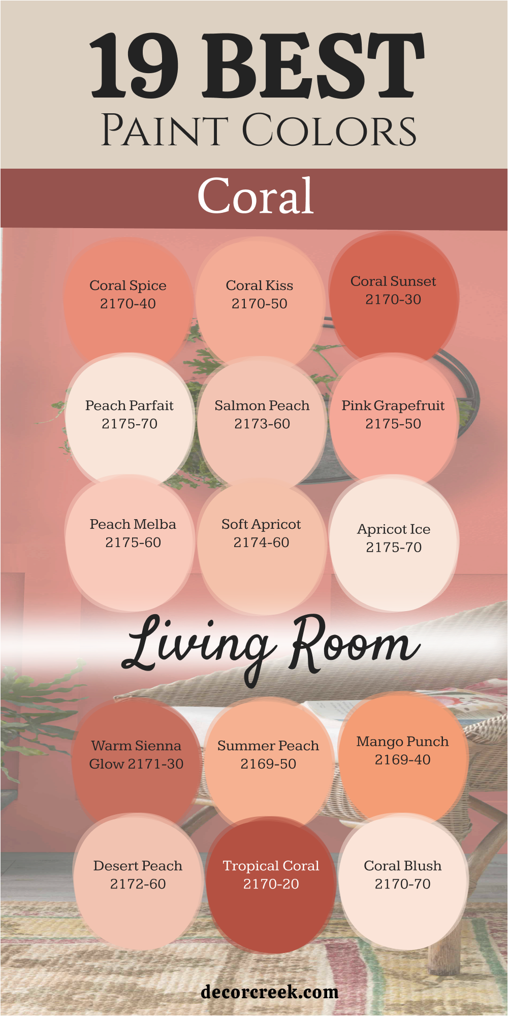
19 Best Coral Paint Colors For The Bedroom
Coral Gables 2010-40
Coral Gables 2010-40 is a vibrant and punchy pink that grabs your attention right away. This color is full of life and works best in a bedroom meant for a fun personality. I love using this on an accent wall behind a white headboard.
It is a very tropical shade that reminds me of bright flowers in a summer garden. You should use it if you want to add a splash of excitement to your morning routine. It pairs perfectly with bright white furniture and crisp green plants.
The color is very saturated and looks deep and solid on the wall surface. It is a fantastic choice for a creative person who wants a bold look. This shade will definitely make your private room feel like a special island getaway. You will wake up feeling energized and ready to take on the whole world.
Best used in: accent walls, bedroom furniture, vanity nooks, and shutters
Pairs well with: Decorator’s White CC-20, Emerald Green, black accents, and modern art The key rule of this color for farmhouse style is to use it sparingly as a pop of joy against a mostly white background.
Coral Dust 2173-50
Coral Dust 2173-50 has a muted tone that feels very soft to the eye. This shade sits right between a peach and a tan for a balanced look. It is a very smart choice for a bedroom where you want a bit of warmth.
I find that it makes wooden bed frames look richer and more polished. The color is very steady and does not lean too far into orange or pink. It provides a clean look that still feels very homey and friendly.
You can use it on all four walls without feeling like it is too much. It reminds me of the soft glow of a candle in a dim room. This paint is wonderful for creating a friendly atmosphere for your rest. You will find that it matches perfectly with many different types of bedding and rugs.
Best used in: master bedrooms, guest rooms, hallways, and mudrooms
Pairs well with: Swiss Coffee OC-45, Slate Blue, butcher block, and copper accents The key rule of this color for farmhouse style is to use it to create a soft transition between your indoors and outdoor views.
🎨 Check out the complete guide to this color right HERE 👈
Sunlit Coral 2170-60
Sunlit Coral 2170-60 is a very pale and airy version of a beachy pink. This color is so light that it almost acts like a neutral with a secret heart. It makes a small bedroom feel much bigger and more full of light.
I often use this when a client wants just a hint of color on the walls. It creates a very soft look that is perfect for a nursery or a reading spot. You will love how it glows when you have lamps turned on in the evening.
It is very forgiving and hides small bumps on the wall very well. This is a safe choice if you are trying coral for the very first time. It brings a gentle cheerfulness to the house without being loud at all. Your family will enjoy the light and open feeling it brings to the space.
Best used in: nurseries, small bedrooms, bathrooms, and ceilings
Pairs well with: White Dove OC-17, Mint Green, light gray rugs, and wicker furniture The key rule of this color for farmhouse style is to use it to make a small, cramped room feel like it has breathing room.
Coral Buff 024
Coral Buff 024 is a creamy shade that feels very lush and smooth to the touch. This color has a lot of yellow in it which makes it feel like a summer afternoon. It is bright enough to be noticed but soft enough to be relaxing for your sleep.
I like to use this in bedrooms that need a little extra energy during the day. It works very well with traditional furniture and large floral patterns. You will notice that it changes beautifully as the sun moves across the sky.
It is a very happy color that makes people want to stay and chat for a while. The finish looks very velvety and high-quality on a large bedroom wall. This is a great pick for a guest room to make visitors feel special. It brings a sense of light and joy to any house.
Best used in: guest rooms, sunrooms, craft rooms, and hallways
Pairs well with: Hale Navy HC-154, Crisp White, floral fabrics, and pine wood The key rule of this color for farmhouse style is to use it to give a sunny personality to rooms without much light.
Rich Coral 028
Rich Coral 028 is a deep and confident version of this classic sunset hue. This paint has a lot of pigment which gives it a very expensive and solid look. It stands out beautifully in bedrooms with high ceilings and plenty of white trim.
I suggest using it if you want to make a big statement in your private area. It feels like a warm hug whenever you enter the room after a long day. The color stays true even under artificial lights in the middle of the night.
You can pair it with brass fixtures for a very high-end and fancy feeling. It is a favorite for those who enjoy a bit of drama in their home design. This shade proves that pink tones can be very grown-up and stylish for adults. You will love the deep warmth it provides.
Best used in: powder rooms, dining rooms, front doors, and master bedroom nooks
Pairs well with: Revere Pewter HC-172, Charcoal Gray, brass hardware, and cream textiles The key rule of this color for farmhouse style is to use it as a bold backdrop for vintage mirrors and family photos.
Fan Coral 013
Fan Coral 013 is a mid-tone shade that feels very classic and balanced for a bedroom. This color has a pinkish-red heart that makes it feel very warm and safe. I think it is one of the most versatile corals in the entire collection for any house.
It works just as well in a modern house as it does in an old cottage. You can use it to make a large bedroom feel much more intimate and cozy. It coordinates well with many different types of flooring and rugs.
The color has a certain depth that makes it look different every time you look. It is a very comforting shade that never goes out of fashion. This is my go-to choice for a cozy family space where you want to relax. You will feel very much at home with this paint on your walls.
Best used in: living rooms, dens, family rooms, and master suites
Pairs well with: Edgecomb Gray HC-173, Tan, navy pillows, and medium wood tones The key rule of this color for farmhouse style is to use it to create a cozy heart where everyone feels like sitting down.
Tucson Coral 005
Tucson Coral 005 has a dusty quality that feels very grounded and earthy to the eye. This color takes inspiration from the desert and beautiful evening skies in the west. It is not too bright which makes it very easy to live with every day.
I think it looks very sophisticated in a bedroom or a small study. The warmth it provides makes a large room feel much more cozy and small. You will find that it matches perfectly with clay pots and natural textures like linen.
It is a great middle-ground for people who want color without too much flash. Your guests will feel relaxed and happy in a room painted with this shade. It helps create a sense of history and comfort in a new house. This paint brings a lot of soul to the walls.
Best used in: dining rooms, home offices, hallways, and bedroom accent walls
Pairs well with: Chantilly Lace OC-65, Sage Green, terra cotta tiles, and dark walnut The key rule of this color for farmhouse style is to use it to bring a sense of natural warmth to the house.
Fruited Plains 029
Fruited Plains 029 is a dusty coral that feels very natural and harvested from the earth. This shade has a bit of brown in it which makes it very steady. I love how it looks in a bedroom with white furniture and soft stone colors.
It reminds me of autumn fruit and warm clay pots in a beautiful garden. You will find that it makes a large open space feel much more grounded. It is a very sophisticated version of coral that works well for adults.
The color does not change too much when you switch from sun to lamps. It provides a rich feeling without being too loud or distracting for your sleep. This is a great choice for a house that uses a lot of natural materials. Your family will love the stable feeling it provides.
Best used in: kitchens, living rooms, mudrooms, and master bedrooms
Pairs well with: Revere Pewter HC-172, Sage Green, slate floors, and copper hardware The key rule of this color for farmhouse style is to use it to bring a sense of the outdoors into your bedroom.
Soft Glow 014
Soft Glow 014 acts like a gentle candle burning in a quiet and peaceful room. This shade is one of the lightest corals you can find for your bedroom walls. I like to use it when a client wants a hint of peach without it being bright.
It makes a small bedroom feel much wider and more welcoming for guests. You will notice that it picks up the light beautifully in the early morning. It is a very safe choice for someone who usually only likes white walls.
The color has a creamy base that keeps it from looking like orange paint. It provides a very sweet backdrop for family photos in black frames. This paint makes everyone feel at ease the moment they enter. You can use it on every wall without it feeling like a heavy color.
Best used in: hallways, nurseries, laundry rooms, and guest bedrooms
Pairs well with: Simply White OC-117, Dove Gray, light pine wood, and silver accents The key rule of this color for farmhouse style is to use it where you want the walls to feel like a warm hug.
Paradise Peach 011
Paradise Peach 011 is a soft and juicy color that feels very fresh for a bedroom. This shade leans more toward the orange side of the coral family. It looks like a ripe fruit and brings a sense of health and vitality.
I find it very helpful for making a bedroom feel like a bright spa. It makes skin tones look very healthy in the mirror every morning. You can pair it with white curtains for a very clean and bright look.
The color is light enough to use in very small spaces without any worry. It provides a cheerful backdrop for your morning routine in the house. This is a very uplifting choice for any part of your private living space. You will enjoy the energy it brings to your daily life.
Best used in: bathrooms, dressing rooms, kitchens, and bedrooms
Pairs well with: Cloud White OC-130, Turquoise, white marble, and silver fixtures The key rule of this color for farmhouse style is to use it in the bedroom to create a glowing start to your day.
Peach Cloud 2169-60
Peach Cloud 2169-60 is a very light and airy shade that feels like a dream. This color is almost a neutral but it has a warm heart that keeps it interesting. I often use this for bedroom ceilings to make a room feel taller.
It is a very soft choice for a bedroom where you want to rest your eyes. You will notice that it works perfectly with gray or beige carpets on the floor. It is a very forgiving color that makes any wall look smooth and perfect.
The peach tones are very light so they do not take over the whole room. It brings a sense of light and air to a dark bedroom or a hallway. This is a wonderful pick for a house that needs a bit of a lift. Your home will feel very bright and very clean with this paint.
Best used in: ceilings, bedrooms, nurseries, and small apartments
Pairs well with: Stonington Gray HC-170, White Dove, navy blue pillows, and glass accents The key rule of this color for farmhouse style is to use it on the ceiling to create a soft glow.
Pink Bliss 1186
Pink Bliss 1186 is a very pale and sweet coral that feels like fresh air. This color is so light that it works in any bedroom without any trouble. I find it very helpful for staging a home because it makes everything look clean.
It has just enough peach to keep it from being a cold or boring white. You can use it to make a dark room feel much more open and sunny. It looks wonderful with natural wood and white marble surfaces in the bedroom.
The color is very soft and does not yell at you when you walk in. It is a great choice for someone who wants a very peaceful and light home. Your walls will look like they are blushing in the best way possible. This is a very safe pick for anyone who loves a pretty look.
Best used in: kitchens, bathrooms, laundry rooms, and guest bedrooms
Pairs well with: White Heron OC-57, Soft Gray, marble counters, and light wood The key rule of this color for farmhouse style is to use it where you want a clean look that feels kind.
Georgia Pink 2092-60
Georgia Pink 2092-60 is a classic coral pink that feels very charming and traditional. This color has a vintage vibe that looks amazing with antique furniture. I think it is the perfect shade for a master bedroom or a guest parlor.
It has a bit of a peach glow that keeps the pink from being sugary. You can use it to create a bedroom that feels very elegant and high-quality. The color looks very rich when paired with dark wood floors and white rugs.
It is a very popular choice for people who love a vintage look in their house. This paint makes a room feel like it has many stories to tell visitors. It is a very stable shade that you will love for many years. Your home will feel very sophisticated and warm with this choice.
Best used in: dining rooms, master bedrooms, libraries, and parlors
Pairs well with: Swiss Coffee OC-45, Forest Green, walnut wood, and gold mirrors The key rule of this color for farmhouse style is to use it as a background for your favorite antique finds.
Rosetone 1186
Rosetone 1186 is a deeper coral that has a lot of pink and red in its base. This color feels very warm and a bit heavy in a very good way. I like to use it for a cozy bedroom where you watch movies or read.
It makes a large room feel much smaller and more private for the family. You will see how it creates a very lush look on the walls when it is dry. It is a very dramatic choice that works well with velvet fabrics and soft rugs.
The color is very deep and does not look thin or cheap at all. It provides a sense of luxury that is hard to find with lighter shades. This paint is for a bedroom that wants to feel very fancy and warm. Your guests will love the rich and cozy feeling it provides.
Best used in: dens, media rooms, bedrooms, and dining areas
Pairs well with: Edgecomb Gray HC-173, Charcoal, cream curtains, and brass fixtures The key rule of this color for farmhouse style is to use it in rooms where you want to feel completely tucked in.
Camellia Pink 2093-50
Camellia Pink 2093-50 is the lightest shade in this group and it feels very floral. This color is like the petal of a flower and is very delicate on the wall. I love using this for a bedroom ceiling to add a bit of magic.
It is a very bright and happy shade that never feels heavy or dark. You will notice how it makes the light bounce around the room in a fun way. It is a very modern take on a pink coral that looks great with black accents.
The color is very clear and does not have any gray or brown in it. It is a fantastic way to add a bit of personality to a bedroom. This paint makes every day feel like a spring morning in the house. Your walls will look very fresh and very clean with this choice.
Best used in: powder rooms, ceilings, nurseries, and bedroom closets
Pairs well with: Black Beauty 2128-10, Bright White, silver mirrors, and modern art The key rule of this color for farmhouse style is to use it as a tiny pop of color in a white space.
Mesa Peach 1200
Mesa Peach 1200 has a warm and sandy heart that feels like a desert sunset. This color is a very smart mix of orange and soft brown tones for a bedroom. I often use it to make a large room feel more connected and grounded.
It behaves like a neutral but has much more life than a plain tan or beige. You will notice that it creates a very sturdy feeling on the walls. It works beautifully with leather furniture and heavy wooden bed frames.
The color stays very consistent even when the light changes from morning to night. It is a very reliable choice for a bedroom that sees a lot of daily use. This paint makes a house feel strong and very well-loved. Your family will enjoy the warm and earthy heart it creates.
Best used in: living rooms, entryways, dens, and bedrooms
Pairs well with: Simply White OC-117, Terracotta, dark leather, and bronze hardware The key rule of this color for farmhouse style is to use it to bring a sense of history and warmth.
Tropical Fruit CSP-1115
Tropical Fruit CSP-1115 is a juicy and bright coral that feels full of flavor. This shade is part of a special collection that uses extra pigments for a deep look. I like to use it when a bedroom feels a bit sad and needs a boost of energy.
It has a very clear and sunny personality that makes people feel happy. You will see how it makes green house plants look even more green against the wall. It is a very bold choice that works well for a person’s creative workspace.
The color has a certain glow that makes it look like it is lit from behind. It is a fantastic way to turn a boring bedroom into a place of joy. Your family will love the bright and tropical vibe it brings to the house.
Best used in: home offices, sunrooms, bedrooms, and craft areas
Pairs well with: Chantilly Lace OC-65, Kelly Green, rattan furniture, and white oak The key rule of this color for farmhouse style is to use it as a vibrant accent that celebrates summer.
Coral Essence 2007-40
Coral Essence 2007-40 is a bright and clear coral that feels very clean on the wall. This color does not have any muddy tones and stays very crisp for your eyes. I find it very useful for a guest bedroom where you want visitors to feel refreshed.
It makes the white of the bedding and curtains look even whiter and cleaner. You will enjoy how it makes the room feel like it is glowing from within. It is a very happy shade that works well with modern or old furniture.
The color has a nice balance of pink and orange that feels very trendy today. It is a great way to update a bedroom that feels a bit stuck in the past. Your family will love how much energy this paint brings to the home.
Best used in: bathrooms, guest rooms, entryways, and bedroom furniture
Pairs well with: Decorator’s White CC-20, Turquoise, black frames, and light oak The key rule of this color for farmhouse style is to use it to make a boring corner feel special.
Pink Polka Dot 004
Pink Polka Dot 004 is a playful and sweet shade that leans toward a rosy coral. This color brings a sense of joy into a modern house and bedroom. I find it works best in spaces where you want to feel a bit of a spark.
It is not a shy color and it definitely wants to be noticed by everyone. You can pair it with white trim to make the pink tones really stand out. It looks wonderful when used on a built-in bookshelf in a bedroom.
The warmth of the orange undertone keeps it from feeling like a cold pink. It is a fantastic pick for a young girl’s bedroom or a creative corner. Your home will feel much more alive with this energetic choice on the walls.
Best used in: bedrooms, playrooms, craft rooms, and accent furniture
Pairs well with: Chantilly Lace OC-65, Mint Green, gold hardware, and white linen The key rule of this color for farmhouse style is to use it as a fun surprise to make you smile.
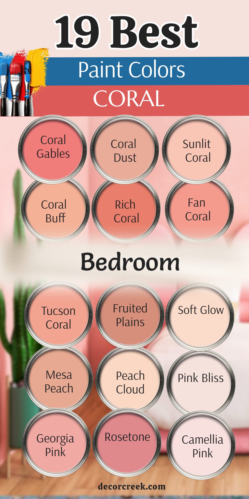
My Final Thoughts about 44 Best Coral Paint Colors and How to Use Them
Coral is a color that brings a unique kind of happiness to any home. Whether you choose a soft peach or a bright sunset pink, you are adding warmth and personality to your bedroom walls. I have seen many times how the right shade can change the feeling of a room.
A deeper coral can make a large bedroom feel more welcoming, while a light peachy coral can help a small room feel open and cheerful. Coral has a gentle glow that works well with wood furniture, white bedding, and soft fabrics.
Another reason I enjoy coral tones is how flexible they are. Some shades lean more pink, others feel closer to orange, and each one tells a slightly different story. A muted coral can feel relaxed and friendly, while a lively coral adds energy and a playful mood.
When I work with clients, I often test two or three coral samples on the wall to see how they look in the morning light, afternoon sun, and evening lamps. This simple step helps you see the real character of the color.