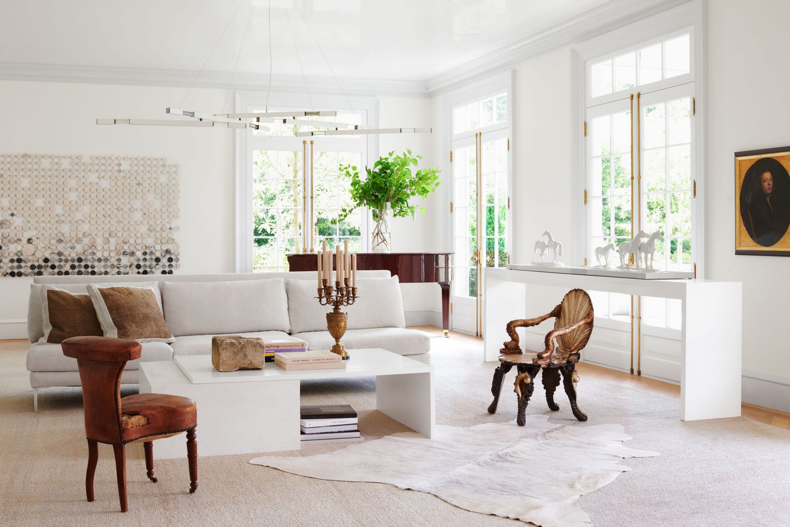
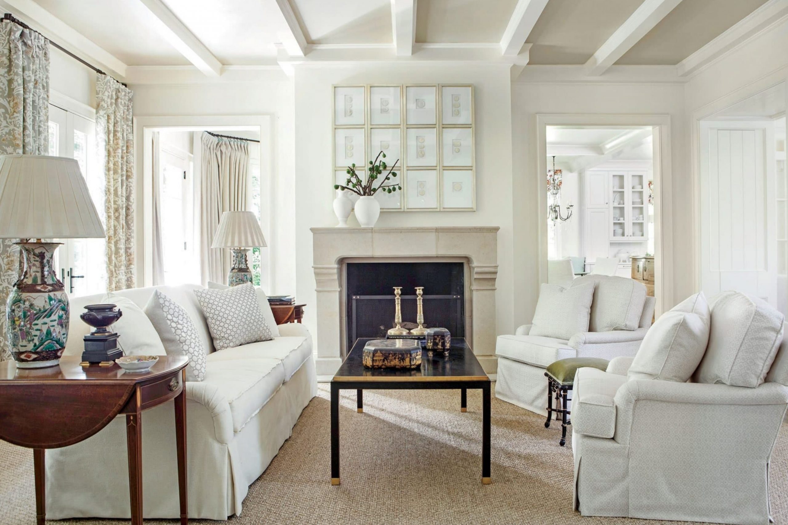
Choosing the perfect paint color for your walls can feel like a huge job, a truly massive decision that stops many people in their tracks, but I promise you, it doesn’t have to be scary! As a design expert, off-white shades are my secret weapon, my most reliable tool in the design world, and for very good reason.
I think of them as the supremely talented background singers that make everything else in the room—your furniture, your artwork, your rugs—look like the absolute star.
They provide a beautifully subtle but necessary foundation. For 2026, I’ve spent time curating my very best, most trusted list of these quiet, beautiful colors that consistently deliver stunning results.
I’m thrilled to be giving you a carefully selected list of 28 essential shades for the coming year—exactly 14 from Sherwin-Williams and 14 from Benjamin Moore—the very same paints that I rely on again and again for high-end projects.
These specific colors are guaranteed to feel wonderfully fresh and clean and will bring a quiet happiness and peaceful atmosphere into your home.
Think of this list as your friendly, professional cheat sheet, designed to take the guesswork out of picking a paint that you will truly love for many years to come. Stop stressing over swatches and get ready to feel totally confident and excited about tackling your next paint project!
Why I Always Trust Sherwin-Williams and Benjamin Moore for Off-White Paints
When I’m working with a client or staging a high-value home, my reputation depends on the quality of my materials. Simply put, I need paint that I can absolutely trust. That’s why, without fail, I stick with Sherwin-Williams and Benjamin Moore—they just make the very best products on the market, hands down.
A critical reason for this loyalty is color fidelity. With off-whites, their colors are always perfectly true to the swatch, which means the beautiful tone you selected is precisely what you get on your walls.
This is immensely important with these near-white shades, because a tiny difference in pigment—a little too much blue or brown—can change the entire mood of a room, taking it from airy to dull. Furthermore, these companies use top-tier, high-quality ingredients. This means the paint goes on smoothly, provides exceptional coverage with fewer coats, and most importantly, lasts a long, long time without fading or yellowing.
Plus, they offer an unparalleled, incredible range of off-whites, each with its own specific feel and undertone.
They fully understand that off-white isn’t just “white”—it’s a carefully crafted feeling, a desired mood, and the essential, durable base for your whole home’s look. Using their paint gives me immense peace of mind, knowing that the foundation of the home’s beauty is solid and reliable.
How I Choose the Right Off-White Shade for Every Room
Picking the perfect off-white shade is all about playing detective and being a careful observer, paying extremely close attention to the light. This step is non-negotiable! The first thing I meticulously analyze is the direction of the natural light. Does the room face North, South, East, or West?
North-facing rooms get cooler, bluer light that can sometimes feel stark. To counteract this chill, I often choose an off-white with a touch of pink, yellow, or a definite warmth to perfectly balance the coolness and make the room feel cozy and inviting.
South-facing rooms, conversely, have bright, warm light all day long, which can easily handle a cooler or cleaner off-white without it making the room feel unintentionally blue.
I also look very closely at what’s already permanently in the room—the color of the flooring, any exposed wood trim, large pieces of furniture, and the core artwork. For example, if you have rich, warm wood floors, you must select an off-white that has a slightly creamier or beige feel to properly harmonize with those natural tones.
Finally, you must always test the paint. I always buy a sample can and paint large swatches (I recommend at least 2′ x 2′) on a minimum of two different walls in the room.
This is crucial because of the light differences. You absolutely must look at the swatches not just once, but in the morning light, the middle of the day, and again at night with your lamps and overhead lights on. Do this over a few days. Then, and only then, trust your gut feeling about what shade genuinely makes your heart feel happy and makes the whole room feel perfectly right.
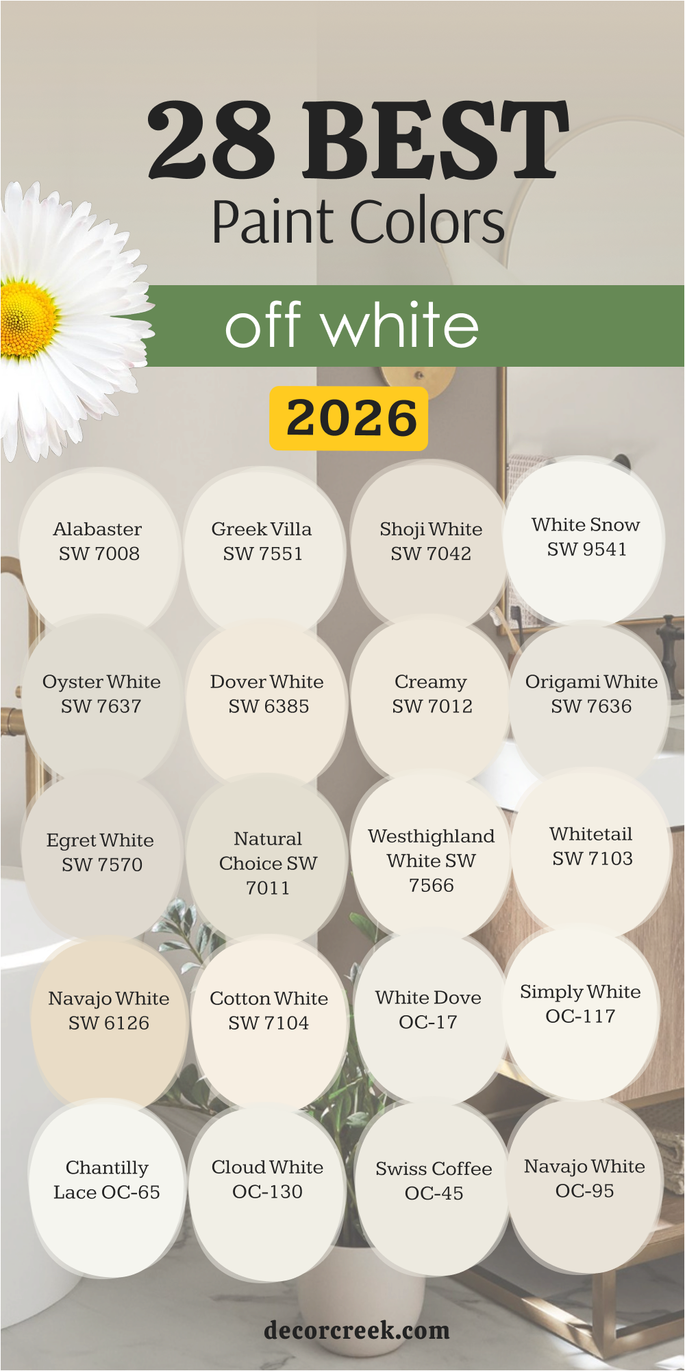
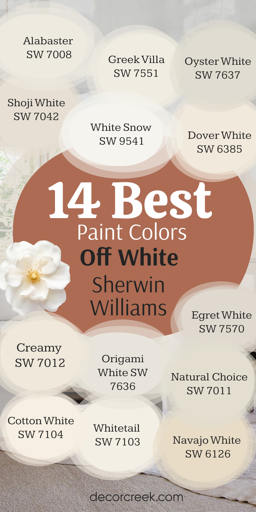
14 Best Off White Paint Colors by Sherwin Williams
Sherwin-Williams is a powerhouse for beautiful, reliable neutrals, and their off-white collection is truly exceptional. I have selected these 14 shades because they cover the full spectrum of possibilities, from soft, creamy warmth to clean, crisp purity.
These are the colors I use most often when I need a guaranteed beautiful result that will make any home feel immediately refreshed.
Every one of these paints provides a stunning backdrop for your life and your furnishings, helping everything in your room look better. I consider this list essential for anyone looking to paint their main living areas, kitchens, or bedrooms in a color they will adore for years.
Alabaster SW 7008
Alabaster is a gentle, creamy off-white that has become a total favorite for so many people. Alabaster is a clean, warm color that is very happy and never feels cold or stark. It works beautifully in family rooms and kitchens where you want a cozy, inviting feeling. This shade has a subtle warmth that prevents it from looking dingy, even in rooms that don’t get a lot of direct sunlight.
I often recommend Alabaster for shiplap or trim because it offers a soft contrast to slightly whiter walls.
It’s perfect if you want a color that feels easy and airy without shouting for attention. Alabaster is truly one of those feel-good paints that makes a house feel like home.
🎨 Check out the complete guide to this color right HERE 👈

Greek Villa SW 7551
Greek Villa is a beautiful, light off-white that has just a touch more warmth than many other popular choices. Greek Villa feels bright and welcoming, almost like sunshine is spilling in, even on a cloudy day. It is a fantastic choice for open floor plans because it flows well from one room to the next without any awkward color shifts.
This color has yellow-beige undertones that keep it soft and prevent it from appearing too sterile or plain.
I find Greek Villa looks amazing paired with darker wood tones or colorful furniture because it gives them a cheerful backdrop. If you are looking for a reliable, happy white that leans toward the warm side, this is an excellent candidate. Greek Villa is a classic for a reason and a wonderful choice for any main living area.
🎨 Check out the complete guide to this color right HERE 👈

Shoji White SW 7042
Shoji White is a deeper, richer off-white that has beautiful beige and gray undertones, making it a very sophisticated color. Shoji White can almost look like a light greige in certain lights, adding a wonderful depth to your walls. This color is perfect for bedrooms or dining rooms where you want a richer, more grounded atmosphere than a pure white can provide.
It pairs exceptionally well with natural textures like linen, wood, and woven baskets. I love how Shoji White can make colorful artwork pop off the wall without competing with it.
It’s the kind of off-white that truly feels like a color and not just a lighter version of white. If you are nervous about a truly white wall, Shoji White is your safe and stylish friend.
🎨 Check out the complete guide to this color right HERE 👈

White Snow SW 9541
White Snow is a crisp, bright off-white that lives up to its name by feeling very clean and pure. White Snow has very little in the way of strong undertones, giving it a very refreshing and honest feel. I often suggest White Snow when a client is looking for a color that feels very contemporary and modern.
It works wonders in bathrooms or laundry rooms because its freshness gives everything a neat, tidy feel. While it’s clean, it’s not too cold, which is a key difference between this and a bright, cold white.
White Snow is a great option for trim and doors, contrasting beautifully with slightly warmer wall colors. It’s a very straightforward, reliable off-white that makes a room feel instantly renewed and happy.
🎨 Check out the complete guide to this color right HERE 👈

Oyster White SW 7637
Oyster White is a wonderfully muted off-white that carries a noticeable gray or greige influence. Oyster White is a fantastic choice for homes that have a lot of natural stone or other earthy materials. It acts as a gentle bridge between a bright white and a true gray, offering softness without losing its presence.
This color works beautifully in entryways or hallways, grounding the first impression of the home. Its gray undertone means it plays well with both warm wood and cooler metal finishes like chrome or nickel.
I find that Oyster White feels very grown-up and relaxed, adding a lovely sense of maturity to any room. If you want an off-white that’s a little moodier and more complex, Oyster White is a brilliant option.
🎨 Check out the complete guide to this color right HERE 👈

Dover White SW 6385
Dover White is a classic, warm off-white that has a definite creamy, buttery undertone, making it incredibly welcoming. Dover White feels like a warm hug for your walls and is a perfect choice for creating a cozy, traditional feel. This color is amazing in rooms with dark furniture or deep-toned fabrics, as it keeps the room from feeling heavy.
Its yellower base makes it pair beautifully with brick or terra-cotta tones in a kitchen or sunroom.
I find it’s one of the best off-whites for older homes or rooms with less intense natural light, as it always looks bright. Dover White is a long-standing favorite that reliably adds cheer and softness to any interior. It’s a happy, sunny color that always feels right.
🎨 Check out the complete guide to this color right HERE 👈

Creamy SW 7012
Creamy is exactly what it sounds like—a smooth, rich off-white with a significant yellow-cream base. Creamy is a luscious, inviting color that works perfectly when you want a strong feeling of warmth and comfort. It looks wonderful in dining rooms, where the candlelight makes the yellow undertones glow beautifully in the evening.
This color provides a wonderful contrast to pure white trim, making the trim look even crisper.
I often suggest Creamy when the goal is a truly cozy and comforting farmhouse or traditional style. It never feels cold and always brings a lovely, gentle sunlight to any room it covers. Creamy is the perfect choice for someone who finds true white too stark but still wants a light color.
🎨 Check out the complete guide to this color right HERE 👈

Origami White SW 7636
Origami White is a beautiful, very light greige that sits comfortably between white and gray, offering a gentle depth. Origami White has a quiet and reserved quality, making it an excellent choice for a restful bedroom or home office. Its gray undertones are gentle enough that they don’t make the room feel heavy or shadowy.
This color provides a sophisticated, almost tailored look when used on all four walls.
I love pairing Origami White with bright pops of accent color in throw pillows or artwork because it’s such a neutral background. It’s a more modern and slightly cooler off-white that still manages to feel quite welcoming and soft. Origami White is a sophisticated and highly dependable color that I use often for a soft, fresh feel.
🎨 Check out the complete guide to this color right HERE 👈

Egret White SW 7570
Egret White is a lovely, highly popular off-white that has subtle but definite beige and gray undertones, making it a very complex color. Egret White is a wonderful choice for people who want a lighter color but are worried about it looking too bright or sterile. This shade carries a beautiful depth that can change slightly depending on the light throughout the day.
I often use Egret White in open living areas because it gives the walls a quiet presence without overpowering the furniture or decor.
It has enough saturation to provide a soft contrast with pure white trim, highlighting the architectural details. Egret White is truly a beautiful neutral that always makes a room feel gentle and thoughtfully designed.
🎨 Check out the complete guide to this color right HERE 👈
Natural Choice SW 7011
Natural Choice is an earthy, creamy off-white that has a slightly more saturated, warmer undertone than a typical pure white. Natural Choice is a fantastic color for creating a warm, organic feel in a sunroom or a kitchen with natural wood cabinetry.
It is a friendly color that makes everything feel immediately more relaxed and inviting. I find that this shade looks particularly wonderful in homes with an abundance of natural materials like stone, wool, or linen.
It is a solid, reliable background color that lets your furnishings and decor take center stage. Natural Choice is a comforting color that really lives up to its name by feeling easy and always right for a cozy home.
🎨 Check out the complete guide to this color right HERE 👈

Westhighland White SW 7566
Westhighland White is a very clean, crisp off-white that has a hint of cool, almost greenish-gray undertones, though they are very subtle. Westhighland White is a great choice if you have a lot of south-facing light and want an off-white that won’t appear too yellow or golden.
It feels very refreshing and airy, perfect for bedrooms or main hallways where you want a clean transition.
This color pairs beautifully with coastal or modern decor because of its sharp, cool edge. I find it’s a brilliant color for trim work because of its clean look, contrasting nicely with slightly deeper wall colors. Westhighland White offers a bright and renewed feeling that is always pleasing to the eye.
🎨 Check out the complete guide to this color right HERE 👈

Whitetail SW 7103
Whitetail is a bright, clear off-white that carries just a smidge of warmth to prevent it from ever looking cold or stark. Whitetail is a beautiful choice for ceilings and trim, as it provides a very pure, refreshing look that contrasts well with most wall colors.
It works wonderfully in well-lit rooms where you want to maintain a bright, open feeling without resorting to a stark, cold white.
This color has just enough creaminess to feel soft and kind to the eye, making a room feel airy and happy. I often use Whitetail when staging a home because it makes every room feel instantly cleaner and more current. Whitetail is a powerhouse off-white that you can rely on for a fresh, beautiful background.
🎨 Check out the complete guide to this color right HERE 👈

Navajo White SW 6126
Navajo White is a decidedly warm off-white, leaning toward a light, gentle tan or deep cream color. Navajo White is a comforting and rich color that is ideal for creating a classic, settled, and traditional feel in a home. It has strong beige and yellow undertones, giving it a depth that a simple white cannot match.
This color looks truly fantastic in spaces with heavier fabrics, dark wooden furniture, and antique pieces.
I recommend Navajo White for cozy reading nooks or dining rooms where you want a warm, candlelit glow at night. It is a beautiful, hearty off-white that brings a welcoming feeling and a genuine sense of history to a room.
🎨 Check out the complete guide to this color right HERE 👈
Cotton White SW 7104
Cotton White is a beautiful, soft, and easy off-white that sits right in the middle—it’s not too warm and not too cool. Cotton White is the perfect middle-ground color when you are unsure if you should go with a warm or a cool shade. It is a safe and highly adaptable choice that looks wonderful in almost any light condition or room.
This color is one of my go-to shades for painting an entire house because it transitions so beautifully from room to room.
I find that Cotton White works well with every style of decor, from modern to traditional and everything in between. It’s a reliable, airy, and gentle off-white that brings a feeling of quiet contentment to your walls.
🎨 Check out the complete guide to this color right HERE 👈

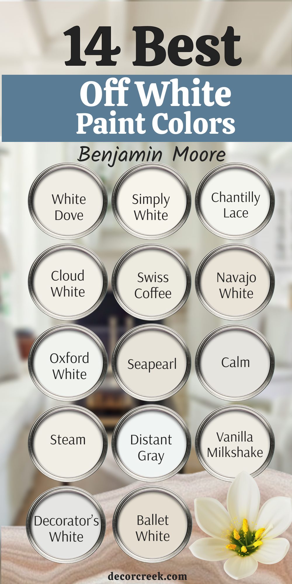
14 Best Off White Paint Colors by Benjamin Moore
Benjamin Moore has an incredible reputation for sophisticated colors with beautiful depth, and their off-whites are no exception. These 14 shades are my go-to selections because of their complex undertones and how beautifully they react to light throughout the day. I find that Benjamin Moore’s colors often have a delicate, cultured feeling that elevates a room immediately.
This list includes everything from the famous creamy shades to the crisper, more architectural whites, ensuring you find the perfect match for your home’s unique personality and existing finishes.
These are truly beautiful colors that will bring a lasting sense of artistry to your walls.
White Dove OC-17
White Dove is perhaps the most famous and adored off-white in the Benjamin Moore collection, and for good reason—it’s amazing. White Dove is an incredibly soft, warm off-white that has a gentle, creamy-gray undertone, giving it a refined quality. It’s a wonderful choice for kitchen cabinets, as it brightens the room but still feels cozy and approachable.
This color has the perfect balance of purity and warmth, making it feel very high-end and sophisticated.
I often use White Dove on both trim and walls for a seamless, continuous, and soft look that feels very luxurious. White Dove is truly a designer favorite that you can pick with total confidence for any room in your home.
🎨 Check out the complete guide to this color right HERE 👈

Simply White OC-117
Simply White is a crisp, bright off-white that won the title of Benjamin Moore’s Color of the Year in 2016 and remains a favorite. Simply White has a very slight yellow undertone, which is just enough to keep it from looking cold or blue in tricky lighting conditions. It feels vibrant and refreshing, making a room instantly appear cheerful and well-lit.
This color is fantastic for modern homes and smaller rooms because its brightness helps the room feel larger and more open.
I often recommend Simply White for trim work because it is a very clean and bright partner to almost any other wall color. Simply White is a happy, clear-cut off-white that brings an immediate sense of light and joy into your home.
🎨 Check out the complete guide to this color right HERE 👈

Chantilly Lace OC-65
Chantilly Lace is Benjamin Moore’s cleanest, brightest off-white, with practically no noticeable undertones, making it a pure, true color. Chantilly Lace is a fantastic choice when you want the highest contrast between your white walls and your furniture or artwork. It feels very crisp and sharp, giving a room a very tailored and modern edge.
This color is especially useful in rooms that receive bright, direct sunlight, as it holds its own without looking washed out.
I often use Chantilly Lace on ceilings to ensure they look as tall and bright as possible. If you are looking for an off-white that is as close to pure white as possible without being stark, this is the one to pick.
🎨 Check out the complete guide to this color right HERE 👈

Cloud White OC-130
Cloud White is a very soft, creamy off-white that lives up to its name by feeling gentle and airy, like a fluffy cloud. Cloud White has warm, yellow-cream undertones that are noticeable but not overwhelming, providing a lovely, comforting light. It’s an exceptional choice for older or traditional homes where a stark white would feel out of place.
This color looks stunning in living rooms and dining rooms, lending a quiet elegance and soft glow to the space.
I find Cloud White is a wonderful base for rooms that have a mix of antique and modern furniture, acting as a gentle anchor. Cloud White is a truly beautiful and gentle off-white that wraps a room in soft, welcoming light.
🎨 Check out the complete guide to this color right HERE 👈

Swiss Coffee OC-45
Swiss Coffee is a beloved, creamy off-white that has a slightly more substantial feel than many lighter shades, with strong warm undertones. Swiss Coffee is a perfect choice for walls when you want a color that definitely looks like a light color but still has a grounded presence. It has subtle green or gray undertones that can surface in certain light, adding to its complex beauty.
This color pairs wonderfully with natural materials like linen, wood, and leather for a very organic and relaxing feel.
I often suggest Swiss Coffee for bedrooms because its warmth makes the room feel incredibly cozy and inviting for rest. Swiss Coffee is a solid, dependable color that brings a lovely, cultured richness to any room.
🎨 Check out the complete guide to this color right HERE 👈

Navajo White OC-95
Navajo White is a deep, warm off-white that leans strongly toward a light cream or beige, carrying significant yellow undertones. Navajo White is an excellent choice when you want a color that feels very grounded, rich, and historically connected to classic home design.
It works wonders in rooms that have very traditional architecture, deep-toned wood trims, or brick fireplaces.
This color is perfect for creating a warm, moody feel in a study, library, or formal dining room. I find that Navajo White is a beautiful backdrop for showcasing dark, ornate picture frames and rich, heavy fabrics. Navajo White is a fantastic option for someone who wants to steer away from the very pale off-whites for a cozier look.
🎨 Check out the complete guide to this color right HERE 👈
Oxford White CC-30
Oxford White is a very crisp, clean off-white that has a very slight cool undertone, making it feel very refreshing and sharp. Oxford White is a wonderful alternative to Chantilly Lace if you want that sharp, clean look but with a fraction more softness. It works brilliantly in contemporary homes where you want the walls to feel clean, bright, and modern.
This color is a perfect choice for trim and doors, contrasting beautifully with deeper, moodier wall colors.
I often recommend Oxford White for kitchens and bathrooms because its bright quality emphasizes cleanliness and light. Oxford White is a highly versatile and dependable white that gives a room an immediately polished and renewed feeling.
Seapearl OC-19
Seapearl is a beautiful, muted off-white that is very close to a light greige, carrying a clear, gentle gray-green undertone. Seapearl is a sophisticated and complex color that feels reserved and elegant in any application. It is a fantastic choice for open living areas because its depth helps define walls without making the room feel enclosed.
This color looks wonderful with coastal decor, as its undertones hint at sand and sea glass without being overtly colored.
I find Seapearl pairs beautifully with brass and brushed nickel finishes, giving a very high-end, tailored look to a home. Seapearl is a truly grown-up and highly adaptable off-white that brings a sense of quiet artistry to your walls.
🎨 Check out the complete guide to this color right HERE 👈

Calm OC-22
Calm is a very gentle, quiet off-white that has a warm, almost beige-gray undertone, making it a wonderful, restful color. Calm is a perfect choice for a bedroom or a cozy reading area where you want a truly peaceful and soft environment. It has just enough depth to contrast gently with a pure white trim, highlighting the woodwork beautifully.
This color works wonderfully in homes that rely on a lot of natural textures and soft, muted fabric colors.
I often suggest Calm when a client wants a color that feels neutral but definitely has a gentle, warm presence. Calm is a beautiful, easy-on-the-eye color that brings a sweet sense of relaxation and softness to your walls.
🎨 Check out the complete guide to this color right HERE 👈
Steam AF-15
Steam is a wonderfully ethereal off-white that carries a subtle, ever-so-slightly pink or taupe undertone, making it very unique and soft. Steam is a beautiful choice for adding a gentle warmth to rooms that are flooded with cooler, northern-facing light. It helps to soften the harshness of direct sun, making the light in the room feel more gentle and diffused.
This color is fantastic for use on painted furniture or cabinets, giving them a very soft, aged, and inviting look.
I find that Steam works beautifully with muted jewel tones in decor, providing a delicate and sophisticated backdrop. Steam is a highly sophisticated and gentle off-white that brings a sense of quiet beauty and thoughtful design to any room.
🎨 Check out the complete guide to this color right HERE 👈

Distant Gray OC-68
Distant Gray is a very light, almost white color that has a definite cool gray undertone, making it one of the coolest off-whites on my list. Distant Gray is a fantastic choice when you are looking for a super clean, bright white but want to avoid any hint of yellow or cream.
It provides a crisp, refreshing, and almost arctic feel that is perfect for very modern or minimalist designs.
This color works brilliantly in homes with lots of glass and metal, reflecting light beautifully and emphasizing sharpness. I often recommend Distant Gray for trim in a room with a darker wall color, creating a striking and beautiful contrast. Distant Gray is a pure, clean color that brings an immediate sense of freshness and clarity to a home.
🎨 Check out the complete guide to this color right HERE 👈

Vanilla Milkshake OC-59
Vanilla Milkshake is a creamy, sweet off-white that has a definite warm, yellow-cream base, making it a very rich and inviting color. Vanilla Milkshake is a beautiful choice for creating a cozy, almost edible feeling in a kitchen or a breakfast nook. It works wonders in rooms that have less natural light, as its warmth always keeps the walls looking bright and cheerful.
This color is perfect for creating a classic, cottage, or traditional feel, pairing wonderfully with floral patterns and soft fabrics.
I often suggest Vanilla Milkshake for bedrooms where you want a deeply relaxing and genuinely comforting feel. Vanilla Milkshake is a warm, happy, and truly beautiful off-white that adds a sunny glow to any interior.
Decorator’s White OC-149
Decorator’s White is a favorite for designers because it is a very clean, neutral white that has a hint of gray, preventing it from feeling stark. Decorator’s White is a reliable, bright, and consistent color that acts as a perfect canvas for colorful artwork and vibrant furniture. It’s a wonderful choice for trim and ceilings because it looks clean and crisp against almost any wall color.
This color is great for maintaining a bright, professional look in a home office or creative studio. I find that Decorator’s White is a fantastic neutral, as it rarely picks up strange colors from its surroundings.
Decorator’s White is a highly functional and beautiful off-white that provides a clear, refreshing structure for your home’s design.
🎨 Check out the complete guide to this color right HERE 👈

Ballet White OC-9
Ballet White is a soft, gentle off-white that carries a warm, slightly creamy beige-pink undertone, making it incredibly delicate and graceful. Ballet White is a stunning choice for creating a gentle, sophisticated, and very feminine atmosphere in a bedroom or dressing area. It works beautifully with natural materials and soft, flowing fabrics, enhancing their texture and softness.
This color has just enough depth to feel grounded without ever looking heavy or too colorful. I often use Ballet White in large, sunny rooms where its quiet warmth can truly shine without being washed out.
Ballet White is a truly elegant and refined off-white that brings a lovely sense of quiet harmony to any wall.
🎨 Check out the complete guide to this color right HERE 👈
My Final Thoughts on Choosing Off-White Paint Colors for 2026
I truly hope that this carefully curated list of 28 incredible off-white paints gives you all the courage and clarity you need to confidently start your next painting project. Stepping up to the counter and picking that final color can be scary, but now you have my most trusted recommendations right here.
Remember this above all else: paint is a deeply emotional thing; the right color should not just look good, it must make you feel happy and settled in your own home every single day.
For the upcoming design season of 2026, the key trend isn’t centered on one particular shade or undertone, but rather on how that chosen color makes you feel when you walk into the room.
Are you searching for the bright, inviting cheerfulness and warmth of a shade like Creamy, or do you crave the quiet, reserved sophistication and depth you find in a color like Seapearl?
Let your personal desire for comfort and mood be your guide. My advice remains the same for every client: do not rush this critical decision.
That little paint chip can be deceiving. You absolutely must get your sample cans, paint those big, generous squares (at least two feet by two feet!), and place them on multiple walls.
Then, spend a few days watching how the natural sun and your artificial lamps change the color throughout the morning, afternoon, and evening. That subtle shift is where the magic—or the mistake—happens.
Take the time to truly listen to your own instincts. The most important, most powerful thing you can do is to pick the shade that truly speaks to your heart and makes your entire home feel like your absolute favorite place to be.
You are the one who lives there, and your happiness is the highest design priority. Trust your own judgment, because with these premium selections from Sherwin-Williams and Benjamin Moore, you have the knowledge and the quality to choose the absolutely perfect off-white color. You’ve got this. Happy painting!