In the vast palette of colors that adorn our living spaces, few hues have the power to invoke a feeling of serene elegance quite like Cliffside Park 579. A color not merely to be seen, but to be experienced, it carries within its pigments the depth and subtlety that can transform an interior from mere living quarters to a statement of style and comfort.
In the following exploration, we dive into the nuances of Cliffside Park 579, a color that is as versatile as it is beautiful, and dissect the layers that make it a preferred choice for those with a discerning eye for interior design.

What Color Is Cliffside Park 579?
Cliffside Park 579 emerges as a captivating hue, a subtle amalgamation of gray with a whisper of blue-green, evoking the graceful aging of coastal cliffs under the relentless caress of the sea. Its muted tone, sophisticated and understated, allows it to stand as both a robust primary color and a complementary backdrop in a multitude of interior styles.
From the sleek lines of modern minimalism to the textural complexity of rustic charm, Cliffside Park 579 adapts with chameleon-like finesse. It pairs exceptionally well with natural materials such as unfinished wood, stone, and linens, where its organic undertones are highlighted, while metals like brushed nickel and aged brass bring out its cooler notes.
In rooms that favor soft velvets and satins, this color maintains its composure, offering a foundation that accentuates the plush textures without overpowering them.

Ever wished paint sampling was as easy as sticking a sticker? Guess what? Now it is! Discover Samplize's unique Peel & Stick samples.
Get paint samples

Is It a Warm Or Cool Color?
Cliffside Park 579 walks a delicate line between warmth and coolness, a balancing act that adds to its versatility. Its foundation in gray gives it a coolness that is sophisticated and calming, but the subtle infusion of blue-green adds an undercurrent of warmth that can make a space feel more inviting. This duality allows it to adapt to different decor styles and preferences, acting as a neutral canvas for bolder accents or as a soothing presence on its own.
In homes, this color can evoke the freshness of a sea breeze when paired with cool whites or the cozy embrace of a foggy morning when matched with warmer woods and textiles. The ability to swing between warm and cool makes Cliffside Park 579 a dynamic player in the color spectrum, adept at harmonizing with a room’s mood.
Undertones of Cliffside Park 579
Understanding the undertones of Cliffside Park 579 is crucial to leveraging its full potential. This color reveals a depth that belies its initial simplicity, displaying an array of undertones that can shift perception. In certain lights, you may catch the faintest hint of a teal whispering through the dominant gray, while other angles may reveal a slate-like stoicism.
These undertones affect the way we see the color, making it a complex character that can play many roles depending on its context. When applied to interior walls, the undertones of Cliffside Park 579 can bring out different elements in a room, from highlighting architectural details to influencing the perceived temperature of the space. This makes the color not just a visual choice, but a strategic design tool.

Coordinating Colors of Cliffside Park 579
Coordinating colors are those that work in harmony with a primary hue, enhancing its beauty and balancing the palette. For Cliffside Park 579, a range of colors serves this purpose, such as BM 855 Cloud Cover, OC-121 Mountain Peak White, BM 1608 Ashland Slate, and OC-104 Antique Lace.
- BM 855 Cloud Cover: A gentle off-white that adds breathability and light to the weightier Cliffside Park 579.
- OC-121 Mountain Peak White: A creamy white, tinged with a touch of warmth, it softens and enriches the coolness of Cliffside Park 579.
- BM 1608 Ashland Slate: A deep gray with green undertones, it echoes the depth of Cliffside Park 579, providing a striking contrast.
- OC-104 Antique Lace: A soft, old-world white with a hint of yellow, it offers a subtle warmth and sophistication.
Expanding the palette, one might consider hues such as BM OC-28 Collingwood, a gray with a warm undertone, HC-170 Stonington Gray, a classic neutral gray, and CC-690 Piedmont Gray, a mid-tone gray with a hint of blue. Each of these colors can create a serene and cohesive look when paired with Cliffside Park 579.

How Does Lighting Affect Cliffside Park 579?
Lighting is the unseen artist’s brush that can dramatically alter the appearance of colors. Cliffside Park 579 is particularly responsive to lighting conditions, exhibiting different facets of its character in the dance between light and shadow. In artificial light, its gray base may become more prominent, offering a stable and consistent hue that anchors a room’s decor.
Natural light, with its shifting intensity and angle, plays with the color, teasing out its blue-green undertones during the day. In north-facing rooms, Cliffside Park 579 can appear more muted and cooler, while in south-facing rooms, it may reveal its warmer side in the abundance of sunlight.
East-facing rooms will enjoy a softening effect in the morning light, and west-facing rooms will capture the color’s full complexity in the evening glow. Understanding these subtleties can inform color placement and room usage, ensuring that Cliffside Park 579 reveals its best self.

LRV of Cliffside Park 579 – LRV is 46
Light Reflectance Value (LRV) measures the percentage of light a color reflects. With an LRV of 46, Cliffside Park 579 sits in the middle of the scale, making it a versatile choice for various lighting conditions. This mid-range LRV means it has the unique ability to absorb and reflect light in equal measure, lending it the capacity to act as a neutral in both well-lit and dimly lit spaces.
The specific LRV of Cliffside Park 579 suggests it will neither overwhelm a space with brightness nor recede into the shadows too readily. It provides a balanced backdrop that works well in rooms of all sizes and functions, maintaining its integrity and color consistency under varying lighting conditions.

LRV – what does it mean? Read This Before Finding Your Perfect Paint Color
Trim Colors of Cliffside Park 579
Trim colors are the finishing touches that frame a room and define its architectural elements. For Cliffside Park 579, trim colors in shades of white can enhance its sophisticated charm. Whites with different undertones can draw out the complexity of this color, giving designers a nuanced control over the mood and style of a room.
- White Dove (OC-17): A soft, warm white with a hint of gray that pairs beautifully with Cliffside Park 579, offering a smooth transition between wall and trim.
- Chantilly Lace (OC-65): A pure, crisp white, it provides a stark contrast that can make Cliffside Park 579 stand out, perfect for a modern, clean look.
- Simply White (OC-117): Balancing warmth and brightness, this white complements Cliffside Park 579, ensuring that spaces feel open and airy.

Colors Similar to Cliffside Park 579
Knowing colors similar to Cliffside Park 579 is vital for creating a coherent color scheme and finding alternatives that maintain a room’s intended atmosphere. Similar colors can provide subtle variations that suit different aspects of a room or offer a slight shift in ambiance.
- BM 2036-40 Meadowlands Green: A lush, verdant green that mimics the freshness of a dewy meadow at dawn.
- BM 586 Northern Lights: This shade captures the mysterious glow of the auroras, blending green and blue in a mesmerizing dance.
- BM 592 Rosamilia Green: A soft, muted green with a touch of gray, it offers a serene and sophisticated feel.
- BM 578 Florida Keys: Radiating tropical vibes, this color is a brighter, more saturated version that takes us to sunny shores and clear waters.

Colors That Go With Cliffside Park 579
Pairing colors thoughtfully ensures a room feels harmoniously designed and aesthetically pleasing. Colors that complement Cliffside Park 579 by Benjamin Moore include:
- Hale Navy (HC-154): A timeless, deep blue that brings a grounding force to the airy Cliffside Park 579.
- Revere Pewter (HC-172): A light gray with warm undertones, it provides a soft transition from the more substantial Cliffside Park 579.
- Palladian Blue (HC-144): A light blue with a hint of green, echoing the subtle undertones in Cliffside Park 579, perfect for a serene environment.
- Edgecomb Gray (HC-173): This color strikes a balance between beige and gray, offering a warm counterpoint to Cliffside Park 579’s coolness.
- Wrought Iron (2124-10): A dark, moody gray with blue undertones, it adds dramatic flair and depth when paired with Cliffside Park 579.
Each of these colors can coexist with Cliffside Park 579 to create a cohesive and inviting space, highlighting the versatility and adaptive nature of this unique hue.

How to Use Cliffside Park 579 In Your Home?
Cliffside Park 579 is a versatile hue that can be utilized in various rooms, whether you aim for a calming bedroom sanctuary or a welcoming living area. Its mid-tone LRV makes it an ideal backdrop for spaces that require both warmth and serenity, such as bedrooms and bathrooms, as well as communal areas like living rooms and kitchens.
This color adapts seamlessly to contemporary, coastal, and even industrial styles, thanks to its balanced blend of gray with subtle blue-green undertones. In minimalist settings, it stands out as a statement wall color, while in more eclectic decors, it can serve as a unifying background that ties disparate elements together.
How to Use Cliffside Park 579 in the Bedroom?
In the bedroom, Cliffside Park 579 promotes tranquility and restfulness. Its soothing qualities can envelop the room in a peaceful ambiance, conducive to relaxation and sleep. This color is effective on all walls for a cocooning effect or on an accent wall behind the headboard for a focal point. Pair it with crisp white linens for a fresh look, or add pops of vibrant colors like coral or mustard for a dynamic contrast.
Complement with natural textures like a jute rug or wooden nightstands to enhance its organic feel, creating a restful retreat.

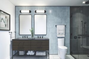
How to Use Cliffside Park 579 in the Bathroom?
Cliffside Park 579 in a bathroom can create a spa-like haven. Its cool undertones offer a crisp, clean appearance, reminiscent of a serene oceanside retreat. It works beautifully with white fixtures and marble countertops, providing a timeless elegance. For a contemporary edge, pair it with matte black hardware or for a touch of luxury, gold or brass fittings.
This color can accommodate both light-filled spaces and those with limited natural light, maintaining its depth and character in various lighting conditions.

How to Use Cliffside Park 579 in the Living Room?
Implementing Cliffside Park 579 in the living room can establish a calming, yet sophisticated atmosphere. This adaptable shade pairs well with a wide range of furnishings, from dark leather sofas to light, textured fabrics. It also serves as an excellent background for artwork and can make bold colors pop.
Use it as an all-over color for a serene, expansive feel, or on a feature wall to highlight architectural details like a fireplace or built-in shelving. Its muted nature allows for easy integration with both modern and traditional decor styles.

How to Use Cliffside Park 579 for an Exterior?
For an exterior, Cliffside Park 579 exudes understated elegance. It can lend a coastal vibe when used on siding, particularly when complemented with white trim and natural wood accents. This shade can withstand different lighting conditions, gracefully transitioning from dawn to dusk.
It’s especially fitting for homes with lush green landscaping, as the green undertones harmonize with the outdoors. For a modern twist, pair it with dark window frames and a colorful front door to make the entrance pop.

How to Use Cliffside Park 579 in the Kitchen?
Cliffside Park 579 in the kitchen can offer a breath of fresh air, blending well with cabinets and countertops alike. Use it on the walls to create a serene backdrop for culinary experiments or on an island base for a subtle pop. This shade is complementary to stainless steel appliances, white quartz countertops, and can also tie together wooden elements for a natural, cohesive look.
It’s a color that can help start the day with a serene energy and provide a calming effect during evening meal preparations.

How to Use Cliffside Park 579 on the Kitchen Cabinets?
When used on kitchen cabinets, Cliffside Park 579 delivers a chic and contemporary vibe, providing a soft contrast to white walls or backsplashes. This color is perfect for creating a focal point within the kitchen without overwhelming the senses. Pair it with brushed nickel hardware for a modern feel, or antique brass for a touch of vintage charm. The color’s versatility makes it suitable for full cabinet sets or as a color for an island, contributing to a kitchen’s dynamic yet cohesive aesthetic.

Comparing Cliffside Park 579 With Other Colors
Comparing different colors is essential in design because it provides a visual framework to understand how colors interact with each other and the feelings they evoke. It helps in determining which hues complement each other, contrast well, or create the desired mood within a space. Comparing colors also aids in visualizing the final look, avoiding costly mistakes, and achieving a cohesive design scheme.
Cliffside Park 579’s unique character can be better appreciated when juxtaposed with other shades, revealing its potential for creating ambiance and its adaptability to various decors and themes.
Cliffside Park 579 vs. BM 575 Tropical Paradise
Cliffside Park 579 and BM 575 Tropical Paradise differ significantly in their vibes and visual impact. While Cliffside Park is a subdued gray with green-blue undertones, Tropical Paradise is a vibrant, saturated blue that’s reminiscent of sunny skies and crystal-clear waters. Tropical Paradise demands attention and is best for spaces seeking a bold statement, whereas Cliffside Park 579 is more understated, suitable for creating a tranquil and sophisticated space.
Cliffside Park 579 works well as a neutral backdrop for various styles, while Tropical Paradise suits a more thematic approach, such as a coastal or tropical-inspired space.

Cliffside Park 579 vs. BM 576 Bahama Waters
Cliffside Park 579, with its muted sophistication, offers a more reserved and flexible approach to color in interior spaces compared to BM 576 Bahama Waters. Bahama Waters is a brighter, more vivid hue that channels the vibrant depths of Caribbean seas. This makes Bahama Waters a great choice for an accent wall or decorative elements within a room, especially when the goal is to energize the space.
In contrast, Cliffside Park 579 can envelop a room in a serene, calming atmosphere, acting as a primary color that is easy to coordinate with a wide range of decor elements.

Cliffside Park 579 vs. BM 577 Mermaid’s Tale
The comparison between Cliffside Park 579 and BM 577 Mermaid’s Tale is one between restraint and whimsy. Mermaid’s Tale is a deeper, more saturated color that leans into the realm of fantasy and depth. It has a jewel-tone quality that is rich and inviting, perfect for creating a statement space or a dramatic accent.
On the other hand, Cliffside Park 579 provides a more neutral canvas, promoting a light and airy feel conducive to relaxation and understated elegance. Both colors share a connection with the aquatic but diverge in their intensity and application.

Cliffside Park 579 vs. BM 581 Floradale Isle
When placed side by side, Cliffside Park 579 and BM 581 Floradale Isle exhibit contrasting levels of boldness and brightness. Floradale Isle is lighter and airier, a hue that can brighten up spaces and imbue them with a breezy, uplifting ambiance. It’s perfect for creating a beachy, coastal look that’s cheerful and inviting.
Cliffside Park 579, with its deeper, more grounded presence, offers a sense of stability and tranquility. It serves well in spaces that require a sophisticated touch without sacrificing warmth and comfort.

Cliffside Park 579 vs. BM 580 Arlington Green
The green undertones of Cliffside Park 579 are subtle and nuanced, especially when compared to BM 580 Arlington Green. Arlington Green is a bold, statement-making hue, leaning more distinctly into the green spectrum with a lively presence. It’s a color that can bring nature indoors, perfect for an accent in a garden room or a main color in a botanically themed space. In contrast, Cliffside Park 579’s subdued quality allows for versatility, serving as a neutral foundation for various design aesthetics from modern to traditional.

Cliffside Park 579 vs. BM 2039-20 Emerald Isle
BM 2039-20 Emerald Isle is a robust and radiant green, embodying the gemstone’s luxurious and vibrant charm. This color can create a regal and opulent feel in a space, especially when used in well-lit areas or as a focal point. Cliffside Park 579, while still carrying a hint of green, is far more restrained and subtle, making it easier to pair with a variety of textures and materials.
It’s more suited for those looking for a color that supports a range of design elements rather than standing in the spotlight.

Conclusion
Exploring Cliffside Park 579 alongside a spectrum of other hues from Benjamin Moore’s offerings illustrates the importance of context in color selection. Each comparison reveals how Cliffside Park 579 serves as a versatile chameleon, capable of adapting to different lighting, styles, and companion colors.
Whether seeking to create a peaceful retreat or a dynamic space, understanding how this color interacts with others guides designers and homeowners to make informed decisions that encapsulate their vision.

Ever wished paint sampling was as easy as sticking a sticker? Guess what? Now it is! Discover Samplize's unique Peel & Stick samples.
Get paint samples