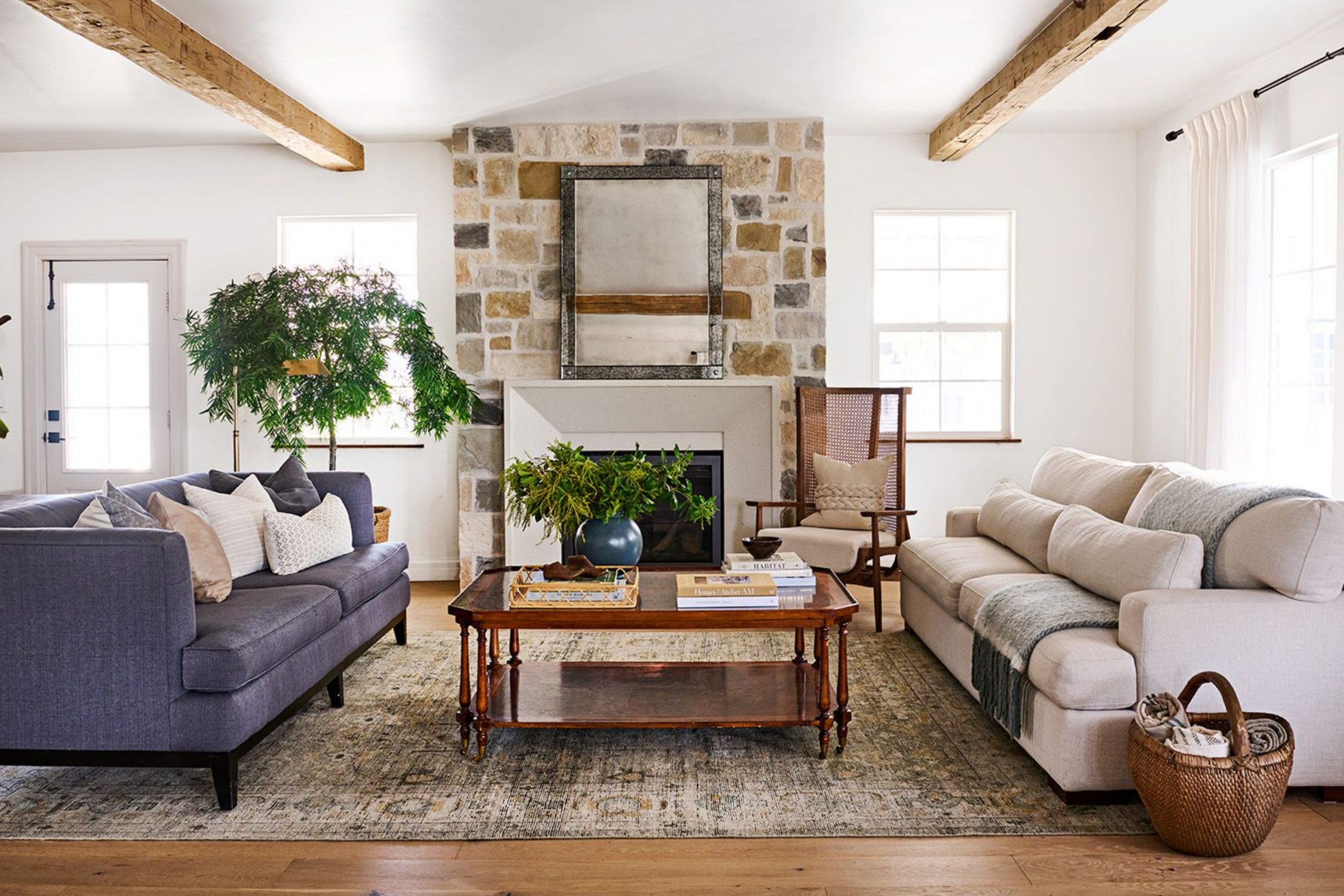
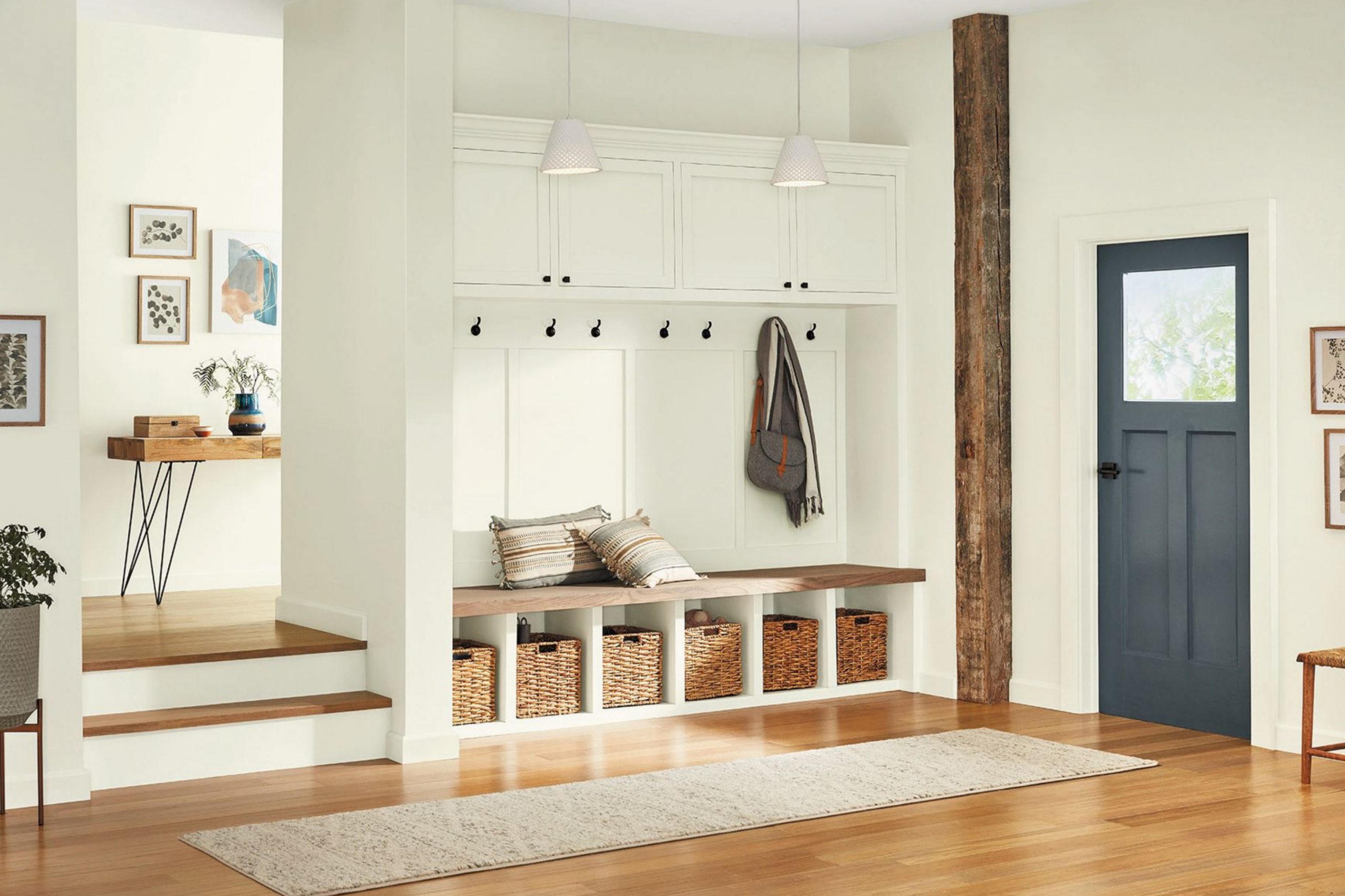
Warm colors can completely change how a house feels. A soft creamy wall can make mornings brighter, while a gentle beige brings a sense of comfort that lasts through the evening. These shades create rooms that feel safe, cozy, and full of welcome. For me, choosing the right color is like choosing the mood of the home—it sets the tone for everything that happens inside.
Over time, I’ve learned that the most loved homes are not always the fanciest ones, but the ones painted in shades that make people feel good. When the walls carry warmth, every piece of furniture, every fabric, and every detail shines more.
That’s why I’ve gathered my favorite 43 warm and cozy paint colors that can help any home feel inviting and full of heart.
Why I Trust Sherwin-Williams for Calming Bedroom Palettes
Bedrooms ask for colors that help us rest, and I often turn to Sherwin-Williams when choosing them. Their range of warm neutrals feels gentle, never too harsh, and works beautifully with natural light during the day or soft lamps at night. I’ve always found their paints easy to live with—they stay fresh, never feeling dull or flat, even after years on the wall.
Another reason I trust them is how well their shades pair with common bedroom details. Creamy whites glow against wood nightstands, sandy tones soften crisp bedding, and muted beige wraps the room with comfort.
Whenever I want a bedroom to feel like a real retreat, Sherwin-Williams offers the shades I can rely on.
My Designer’s Guide to Picking the Right Relaxing Shade
I believe the secret to choosing a good bedroom color is knowing how you want the room to feel. If you want it light and airy, warm whites are perfect. If you prefer cozy evenings, soft beiges or sandy tones bring that feeling right away. Every person has a mood they lean toward, and the paint should match that.
I always paint small test spots before making a choice. A shade that looks pale in the morning might turn richer at night, and that shift can be exactly what makes it feel welcoming.
I also check how it blends with furniture and fabrics. A creamy wall can highlight dark wood, while a soft beige pairs beautifully with linen bedding.
When color, light, and textures all work together, the bedroom becomes a place you truly enjoy coming back to.
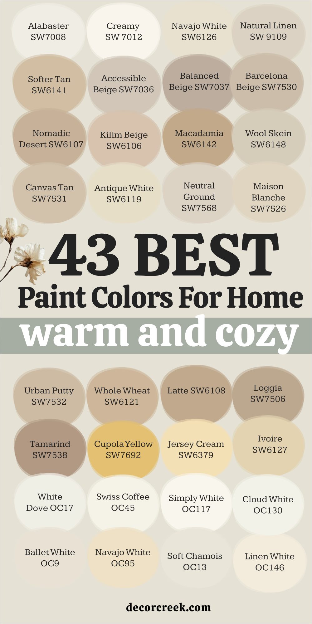
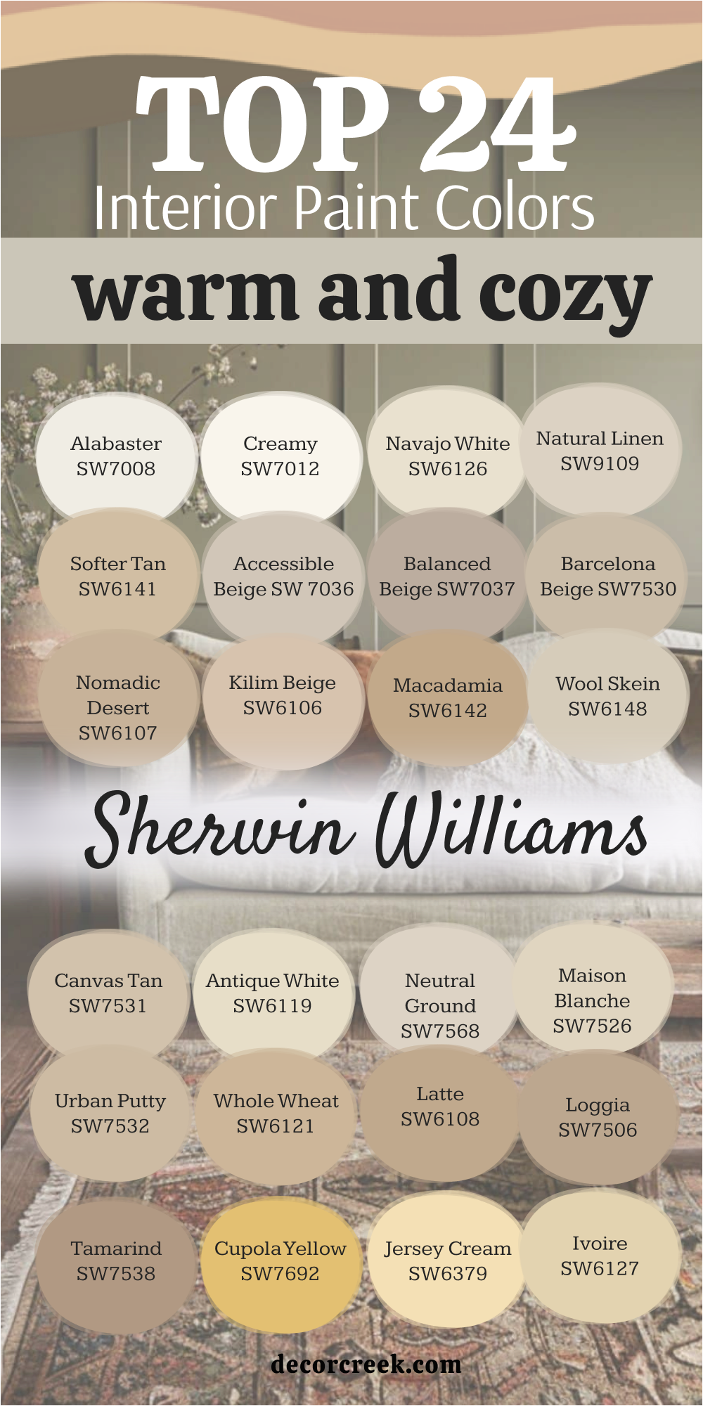
24 Warm and Cozy Interior Paint Colors from Sherwin-Williams
Alabaster – SW 7008
Alabaster feels like a soft glow on the wall, never too bright, never too dull. This shade brings gentle warmth that works in both large living rooms and small bedrooms. I love how it looks during the day, catching natural light in a way that feels inviting. At night, it pairs beautifully with warm lamps, wrapping the room in comfort.
Alabaster also works well with wood furniture, letting the natural tones stand out. It’s a color I often choose when someone wants their home to feel cozy yet fresh.

Creamy – SW 7012
Creamy has a smooth softness that makes every room feel welcoming. I often use it in kitchens and family rooms where people spend the most time. The shade carries a golden undertone that warms up the walls without being too strong. In daylight, it feels bright and cheerful, while in the evening it turns gentle and calming.
Creamy also pairs beautifully with warm woods and natural fabrics. It’s the kind of color that makes a home feel lived-in and loved.

Navajo White – SW 6126
Navajo White is a warm neutral with a touch of golden cream. I like using it in rooms where people gather, like dining areas or cozy sitting rooms. The color feels sunny during the day and comforting in the evening, making it versatile for all times. Navajo White blends easily with earthy shades, patterned fabrics, and soft textures.
It creates a backdrop that doesn’t fight for attention but quietly supports everything in the room. This makes it one of my favorite cozy choices for family homes.

Natural Linen – SW 9109
Natural Linen carries a softness that feels warm without being heavy. It has a beige undertone that reminds me of sunlit fabrics or sandy beaches. I often use it in bedrooms because it brings comfort while still feeling fresh. Natural Linen also works well with whites and creams, giving depth to layered tones.
It is gentle enough for a whole house color, tying rooms together with ease. This shade always makes people feel at home the moment they walk in.

Softer Tan – SW 6141
Softer Tan is a cozy beige that feels grounded and steady. I find it especially lovely in living rooms or hallways where you want a warm welcome. Its tone sits perfectly between light and dark, making it versatile for different styles of furniture. Softer Tan shines with warm woods, woven baskets, and natural fabrics.
During the day, it feels open and inviting, while in the evening it becomes richer and cozier. It’s a shade that makes a home feel warm year-round.

Accessible Beige – SW 7036
Accessible Beige is one of those colors that fits anywhere. It carries a warm undertone that makes it soft but still modern. I often use it in open floor plans because it flows nicely from room to room. The shade pairs beautifully with crisp whites and warm grays, making it easy to design around. In bright light, it feels airy, while in low light, it gains a cozier depth.
Accessible Beige is a true favorite for creating homes that feel both comfortable and stylish.

Balanced Beige – SW 7037
Balanced Beige is a steady and warm color that makes any room feel grounded. I often use it when a space needs comfort without being too dark. It pairs beautifully with white trim, bringing out the gentle contrast. Balanced Beige also works well with stone, wood, and soft fabrics, making it a versatile choice.
In daylight, it feels welcoming and open, while at night it wraps the room in warmth. It’s a favorite shade when I want a home to feel steady and inviting.

Barcelona Beige – SW 7530
Barcelona Beige is a soft and natural shade with a touch of sandy warmth. I like how it feels both classic and easy to live with. This color works especially well in living rooms and bedrooms, where its cozy undertone creates comfort. It pairs nicely with deeper browns and wood furniture, adding harmony to the whole room.
Barcelona Beige also has a gentle glow in sunlight, making it look fresh during the day. At night, it deepens slightly, giving the home a restful atmosphere.

Nomadic Desert – SW 6107
Nomadic Desert brings the feeling of earthy warmth inside. Its rich beige tone reminds me of sunbaked clay and natural stone. I love using it in dining rooms or larger living areas where you want to feel surrounded by warmth. Nomadic Desert pairs well with soft whites and darker accents, creating a balanced palette. In bright daylight, it feels strong yet inviting, while in the evening, it becomes even cozier.
This is the kind of color that makes a house feel grounded and welcoming.

Kilim Beige – SW 6106
Kilim Beige is a trusted favorite for creating soft and cozy rooms. Its warm beige tone feels gentle and friendly, making it perfect for gathering areas. I find it especially beautiful in open floor plans where it flows from one room to another. Kilim Beige pairs nicely with crisp white trim, warm woods, and natural fabrics.
In the sunlight, it glows softly, while in the evening it feels like a warm blanket for the room. It’s one of those shades that never goes out of style in family homes.

Macadamia – SW 6142
Macadamia is a medium beige that carries warmth and depth. I often suggest it for living rooms, dining rooms, or entryways where you want a welcoming presence. Its golden undertone adds richness without being too strong. Macadamia works well with cream accents and natural textures like jute or linen.
It also pairs beautifully with wood tones, making furniture stand out. This shade creates a feeling of comfort that lasts from morning light to evening gatherings.
Wool Skein – SW 6148
Wool Skein is a gentle, light beige with a cozy softness. It reminds me of warm fabrics and natural fibers, which is why I love using it in bedrooms and sitting rooms. Wool Skein works well as a main wall color because it doesn’t overpower but still adds warmth. It pairs beautifully with whites, wood finishes, and earthy accents.
During the day, it feels light and open, while at night it turns richer and more intimate. It’s a perfect choice for a welcoming home.

Canvas Tan – SW 7531
Canvas Tan feels soft and steady, like the background of a cozy painting. I love how it works as a whole-house color because it connects rooms without feeling too heavy. Its gentle beige tone pairs well with both light and dark furniture. Canvas Tan also shines next to natural fabrics like cotton and linen, giving the home a warm, inviting touch.
In the morning, it feels fresh and light, and in the evening, it deepens just enough to feel extra cozy. This shade makes every corner feel cared for.

Antique White – SW 6119
Antique White carries a creamy glow that instantly warms a room. It feels like sunlight captured on the walls, making it perfect for bedrooms, kitchens, or living areas. Antique White works beautifully with traditional wood furniture and soft textiles. It has a richness that adds comfort without being too bold.
During the day, it feels bright but never stark, and at night it glows under warm lighting. I often suggest it for homes that want a touch of softness throughout.

Neutral Ground – SW 7568
Neutral Ground is a balanced shade that sits between beige and cream. I like using it when someone wants warmth without too much depth. This color pairs easily with both cool and warm accents, making it very versatile. Neutral Ground works especially well in living rooms and hallways where a steady backdrop is needed.
It holds its warmth beautifully under different lighting conditions. This shade helps create homes that feel even and welcoming in every corner.

Maison Blanche – SW 7526
Maison Blanche feels gentle and creamy, carrying just enough warmth to feel cozy. I find it lovely in bedrooms, dining rooms, or family spaces. It pairs well with soft whites, golden accents, and natural textures. Maison Blanche has a softness that makes it easy to live with, never feeling too sharp or plain. In daylight, it feels light and cheerful, while in the evening, it takes on a comforting glow.
This color is a quiet favorite for homes that want simple, lasting warmth.
Urban Putty – SW 7532
Urban Putty is a cozy neutral with a grounded feel. It has a slightly deeper undertone that gives walls a warm strength. I like using it in entryways, living rooms, and dining areas where people gather often. Urban Putty works beautifully with wood finishes and stone details, bringing harmony to natural elements.
It also pairs nicely with cream trim, which brightens the overall look. This shade helps rooms feel welcoming and steady from morning to night.
Whole Wheat – SW 6121
Whole Wheat brings a golden warmth that feels cheerful yet grounded. It reminds me of harvest fields, full of richness and life. I often suggest it for kitchens or family rooms where a lively but cozy mood is needed. Whole Wheat pairs well with natural wood tones, creamy whites, and soft fabrics.
In daylight, it glows with energy, and in the evening, it becomes softer and more inviting. It’s a shade that makes a home feel full of warmth and comfort.
Latte – SW 6108
Latte feels rich and smooth, just like its name. This shade carries a warm beige tone with depth, making it perfect for dining rooms or cozy living areas. Latte pairs beautifully with cream trims, golden accents, and warm wood furniture. It feels welcoming in daylight but even richer when paired with evening lighting.
I love how it creates an inviting atmosphere without being too dark. This color always adds comfort to the rooms it touches.

Loggia – SW 7506
Loggia is a medium beige with strength and warmth. It has a grounded quality that works well in family rooms, hallways, or larger gathering spaces. Loggia pairs nicely with stone, brick, and warm wood finishes. During the day, it feels natural and balanced, and in the evening, it becomes deeper and cozier.
I also like using it as an exterior color because of its warmth and strength. Inside or out, Loggia brings a steady comfort that lasts.

Tamarind – SW 7538
Tamarind is a rich, warm shade with earthy undertones. I often suggest it for accent walls or dining rooms where depth and coziness are desired. Tamarind pairs well with lighter neutrals, creating a balanced contrast. It also looks beautiful with wood furniture and natural textures. During the day, it feels grounded and full of character, and at night it becomes deeper and more intimate.
This shade is perfect for adding warmth and personality to a home.
Cupola Yellow – SW 7692
Cupola Yellow carries a cheerful warmth that brightens any room. It reminds me of soft sunlight, never too bold but always uplifting. I like using it in kitchens, breakfast nooks, or cheerful family spaces. Cupola Yellow pairs well with creamy whites and light woods.
In natural light, it feels bright and joyful, while in the evening, it softens into a cozy glow. This shade brings warmth and happiness into everyday living.
Jersey Cream – SW 6379
Jersey Cream is a soft golden beige with a creamy touch. I love how it works in family rooms and bedrooms, adding warmth without being too heavy. Jersey Cream pairs beautifully with wood tones and crisp whites, creating harmony in the home. In sunlight, it glows softly, while in evening light it feels rich and cozy.
It’s versatile enough to use throughout the house, tying spaces together with warmth. Jersey Cream is a shade that feels both welcoming and easy to live with.
Ivoire – SW 6127
Ivoire is a gentle golden shade that feels sunny and comforting. It brings a soft glow to walls without being too strong or overwhelming. I love using it in dining rooms, kitchens, or entryways where you want a welcoming first impression. Ivoire pairs beautifully with white trim, warm woods, and natural fabrics.
In the morning, it feels bright and uplifting, while in the evening, it turns deeper and cozier. This color is perfect for adding warmth that feels both cheerful and inviting.
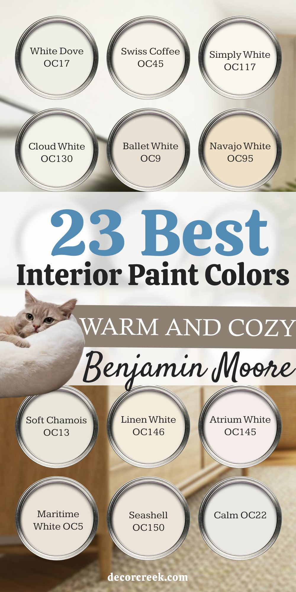
23 Warm and Cozy Interior Paint Colors by Benjamin Moore
White Dove – OC-17
White Dove feels soft and welcoming, perfect for creating gentle backdrops in any room. It has just the right touch of warmth so it never feels cold. I often use it in bedrooms and living rooms where comfort is important. White Dove pairs beautifully with wood tones and natural fabrics, letting other details stand out.
In the morning, it glows softly in natural light, and at night it feels warm under lamps. It’s a trusted favorite for creating cozy, livable homes.

Swiss Coffee – OC-45
Swiss Coffee carries a creamy tone that warms up walls instantly. I love how it makes kitchens and family rooms feel inviting. The color has a glow that works beautifully with both bright daylight and evening lighting. Swiss Coffee pairs nicely with stone, warm woods, and soft textiles.
It feels cheerful but never too bold, making it easy to use throughout a home. This shade has a way of bringing people together in comfort.

Simply White – OC-117
Simply White is bright but never harsh, carrying just enough warmth to feel friendly. I often suggest it for trim and cabinets, but it also works beautifully on full walls. It reflects light well, making small rooms feel open and inviting. Simply White pairs effortlessly with warm beiges and soft wood finishes.
During the day, it feels fresh and clear, while in the evening it softens into a gentle glow. It’s one of the most flexible whites for cozy interiors.

Cloud White – OC-130
Cloud White feels airy yet warm, like sunlight filtering through soft curtains. I love using it in bedrooms, bathrooms, and cozy sitting areas. It works well with both traditional and modern styles, adapting easily to different furnishings. Cloud White pairs beautifully with warm grays, soft beiges, and natural woods.
In daylight, it feels gentle and uplifting, while in the evening, it turns warmer and more soothing. It’s a shade that always makes people feel at ease.

Ballet White – OC-9
Ballet White carries a creamy beige undertone that makes it feel soft and comforting. It’s beautiful in dining rooms and bedrooms where you want warmth without heaviness. Ballet White pairs well with whites, golden tones, and warm woods. I like how it shifts with the light, sometimes looking creamy and sometimes more beige.
During the day, it feels open and inviting, and at night it becomes cozier. This shade brings quiet warmth to every corner.

Navajo White – OC-95
Navajo White is a creamy shade with a soft golden undertone. I like using it in bedrooms and family rooms where comfort matters most. It pairs beautifully with warm woods, natural stone, and light fabrics. In sunlight, Navajo White feels cheerful and inviting, while in evening light it turns warmer and cozier.
This shade has a gentle presence that never feels too plain or too strong. It’s a perfect choice for creating homes that feel welcoming and lived in.

Soft Chamois – OC-13
Soft Chamois feels like a creamy whisper on the walls, gentle but full of warmth. I often use it in open floor plans because it flows beautifully between rooms. The shade pairs well with crisp whites, light wood, and golden accents. In daylight, it feels light and soft, while in the evening, it gains a warmer tone that adds comfort.
Soft Chamois is easy to live with, making furniture and fabrics look even better. It’s one of those shades I can trust in almost any setting.

Linen White – OC-146
Linen White brings a traditional, cozy charm to interiors. It carries a creamy softness that feels warm and inviting, especially in bedrooms and living rooms. This color pairs well with antique furniture, natural fabrics, and soft lighting. In daylight, Linen White feels fresh and welcoming, while at night it takes on a gentle glow.
I often recommend it to clients who want a timeless cozy backdrop for their homes. Linen White has a way of making rooms feel both warm and graceful.

Atrium White – OC-145
Atrium White has a soft blush undertone that gives walls a gentle warmth. I love using it in bedrooms and nurseries for its tender and welcoming feel. It pairs beautifully with crisp trim, light woods, and soft fabrics. In sunlight, Atrium White shows a delicate warmth, while in evening light, it becomes cozier and more intimate.
This shade feels personal and comforting without being too bold. It’s a lovely choice for homes that want a quiet, gentle backdrop.

Maritime White – OC-5
Maritime White is a creamy off-white with a hint of peach warmth. It feels bright but not sharp, which makes it wonderful for kitchens and dining areas. Maritime White pairs well with natural stone, golden accents, and warm wood finishes. In daylight, it looks cheerful and lively, while at night it glows with softness.
I often use it when a home needs both light and coziness together. Maritime White is a shade that makes gatherings feel warm and welcoming.
Seashell – OC-150
Seashell is a warm off-white that carries a hint of beige softness. I like using it in living rooms and bedrooms where the goal is to create a quiet, welcoming feel. Seashell pairs beautifully with cream trim, natural stone, and light wood furniture. During the day, it feels airy and gentle, and at night it gains a richer warmth.
It’s a shade that works especially well in homes that want a soft but cozy backdrop. Seashell never feels too plain, but it stays easy to live with.
Calm – OC-22
Calm is a light neutral with a touch of warmth that feels gentle on the walls. I often suggest it for bedrooms or reading nooks because it carries softness without heaviness. Calm pairs nicely with soft fabrics, creamy trim, and warm wood accents. In sunlight, it feels open and fresh, while in the evening it becomes warmer and more comforting.
This color has a way of blending into the background while still giving a cozy presence. It’s a dependable choice for creating restful interiors.

Pale Oak – OC-20
Pale Oak feels like a soft veil of beige with a touch of gray. It works beautifully in living rooms, dining areas, and open spaces where you want warmth that doesn’t overpower. Pale Oak pairs easily with whites, creams, and wood tones, making it a flexible option. In the morning, it looks light and fresh, while at night it deepens into a warmer shade.
I love how it adds quiet character without taking attention away from furniture or fabrics. Pale Oak is a true favorite for cozy homes.

Edgecomb Gray – HC-173
Edgecomb Gray is a warm gray-beige that feels balanced and inviting. I like using it in open floor plans because it ties rooms together seamlessly. This shade pairs well with crisp whites, warm woods, and natural textures. In daylight, Edgecomb Gray feels light and soft, while in evening light it becomes warmer and cozier.
It’s the kind of shade that never feels too strong but always adds comfort. Edgecomb Gray is a trusted pick when I want a home to feel steady and welcoming.

Balboa Mist – OC-27
Balboa Mist is a warm light gray with soft beige undertones. It has a clean yet cozy feel that works in both modern and traditional homes. I often use it in bedrooms and living rooms where its warmth adds comfort without heaviness. Balboa Mist pairs beautifully with white trim, natural fabrics, and light woods.
In sunlight, it feels bright and gentle, while at night it takes on a deeper, more cozy tone. This shade always brings a touch of warmth to everyday living.

Manchester Tan – HC-81
Manchester Tan is a warm beige with a soft golden undertone. I often use it in living rooms and dining areas because it feels both welcoming and steady. The color pairs well with cream trim, warm woods, and natural fabrics. In daylight, Manchester Tan feels light and open, while in the evening it becomes deeper and more comforting.
It’s a shade that flows easily through a whole house without feeling heavy. Manchester Tan has long been one of my trusted cozy neutrals.

Shaker Beige – HC-45
Shaker Beige carries a warm richness that makes any room feel grounded. I like using it in family rooms or bedrooms where a stronger cozy presence is wanted. It pairs beautifully with whites, golden accents, and wood furniture. In bright light, Shaker Beige feels warm and steady, and at night it grows even richer. This shade works especially well with traditional styles, adding depth and comfort.
Shaker Beige is perfect when a home needs warmth with character.

Muslin – OC-12
Muslin is a light beige that feels soft and airy. I often use it as a whole-house color because it connects rooms with ease. Muslin pairs well with creams, natural fabrics, and lighter wood tones. In the morning, it feels fresh and bright, while in the evening it softens into a cozy glow. It’s easy to decorate around, letting furniture and decor shine.
Muslin is a simple shade that always makes a home feel inviting.
Natural Cream – OC-14
Natural Cream is a cozy off-white with a warm beige undertone. I love how it adds comfort without feeling heavy. This shade works beautifully in bedrooms, living rooms, and even hallways. Natural Cream pairs nicely with crisp whites and soft wood finishes, giving a balanced look.
In daylight, it feels fresh and clean, while at night it deepens slightly to add warmth. It’s a shade that brings a gentle coziness to any home.

Winds Breath – OC-24
Winds Breath is a light beige with a touch of softness that makes walls feel warm but airy. I find it works well in open layouts because it flows gently from one room to another. It pairs beautifully with whites, creams, and natural wood furniture. In the morning, Winds Breath feels bright and open, while in the evening it becomes more intimate and cozy.
This shade creates a sense of quiet warmth that people love. Winds Breath is a flexible choice for many styles of homes.

Clay Beige – OC-11
Clay Beige is a warm, earthy neutral with depth. I like using it in dining rooms, family rooms, or entryways where a richer tone feels welcoming. Clay Beige pairs well with creamy whites and deeper wood finishes, making it versatile to style. In natural light, it feels grounded and cozy, and in evening light, it gains a richer glow.
It’s a great color for adding warmth while still staying neutral. Clay Beige always feels like a steady backdrop for family living.
Monroe Bisque – HC-26
Monroe Bisque is a golden beige with a warm, comforting presence. I love using it in kitchens and living rooms where families gather. This shade pairs nicely with natural stone, creamy trim, and warm wood tones. In the morning, it feels sunny and bright, while at night it takes on a deeper richness.
Monroe Bisque has a way of making a room feel cheerful yet grounded. It’s one of my favorite cozy golden shades.
Bleeker Beige – HC-80
Bleeker Beige is a classic warm neutral that feels steady and reliable. I often recommend it for larger spaces because it carries warmth without being too dark. Bleeker Beige pairs beautifully with whites, creams, and natural fabrics. In daylight, it feels soft and balanced, and at night it grows richer and cozier.
This shade works in both modern and traditional homes, making it easy to decorate around. Bleeker Beige is always a safe, welcoming choice for cozy interiors.
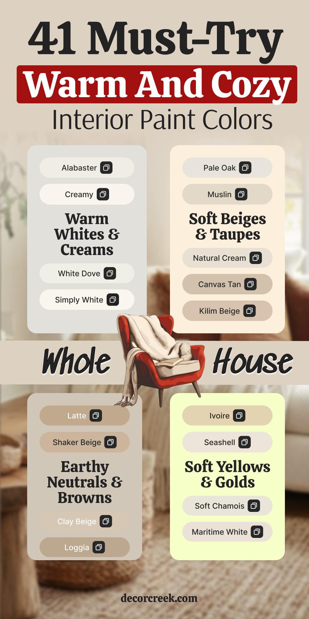
41 Warm and Cozy Interior Paint Colors for the Whole House
Warm Whites & Creams
Warm whites and creams are some of my favorite colors for tying an entire home together. They feel light, soft, and welcoming without being too bright. These shades are easy to decorate around, pairing beautifully with wood, fabric, and stone. I love them in kitchens, bedrooms, and hallways because they bring a quiet warmth that fits everywhere.
Alabaster – SW 7008
Alabaster is a creamy white that feels like soft sunlight on the walls. I like using it throughout the house because it connects spaces in a gentle way. Alabaster pairs beautifully with warm woods, natural fabrics, and soft lighting. In daylight, it feels fresh and open, while in the evening it turns cozy and comforting. This shade is perfect for anyone wanting a welcoming backdrop that works in every room. Alabaster is one of those colors that makes a house feel instantly inviting.
🎨 Check out the complete guide to this color right HERE 👈
Creamy – SW 7012
Creamy carries a buttery warmth that makes walls glow with softness. I often recommend it for kitchens and bedrooms because it feels cozy without being too heavy. Creamy pairs well with crisp trim, light wood, and natural stone. During the day, it feels cheerful and welcoming, and in the evening it becomes even warmer under soft lighting. This color works as a whole-house shade, pulling different rooms together. Creamy is a shade that makes daily life feel a little softer.
🎨 Check out the complete guide to this color right HERE 👈
White Dove – OC-17
White Dove is a trusted warm white that feels gentle and comforting. I love it for living rooms and bedrooms because it never looks cold. White Dove pairs beautifully with warm beiges, golden tones, and natural fabrics. In daylight, it feels light and airy, while at night it glows softly under lamps. This shade also works beautifully as trim, highlighting deeper wall colors. White Dove is one of my go-to choices for a warm yet clean look.
🎨 Check out the complete guide to this color right HERE 👈
Simply White – OC-117
Simply White feels bright but never harsh, making it a favorite for both walls and trim. I often use it in kitchens where light and warmth are equally important. Simply White pairs beautifully with creamy beiges and soft grays, making decorating easy. During the day, it reflects light beautifully, opening up a room. At night, it softens into a cozy glow, perfect for family evenings. This is a color I recommend when someone wants brightness with a touch of warmth.
🎨 Check out the complete guide to this color right HERE 👈
Cloud White – OC-130
Cloud White feels soft and airy with just enough warmth to make it inviting. I love using it in bedrooms and bathrooms where gentle comfort is important. Cloud White pairs beautifully with natural wood, soft fabrics, and golden accents. In daylight, it feels light and fresh, while at night it grows warmer and more comforting. This shade works well as a whole-house neutral, tying rooms together with ease. Cloud White always brings a quiet softness to interiors.
🎨 Check out the complete guide to this color right HERE 👈
Swiss Coffee – OC-45
Swiss Coffee is a warm creamy shade that instantly makes walls feel cozy. I like using it in family rooms and living rooms where people spend time together. Swiss Coffee pairs beautifully with warm woods, stone accents, and cream trims. In daylight, it feels cheerful and open, while in the evening it turns deeper and softer. This shade carries a glow that makes every room feel cared for. Swiss Coffee is perfect for creating a welcoming home.
🎨 Check out the complete guide to this color right HERE 👈
Linen White – OC-146
Linen White has a classic creamy warmth that feels inviting and traditional. I often suggest it for bedrooms, dining rooms, and hallways. Linen White pairs beautifully with antique furniture, natural fabrics, and soft lighting. In the morning, it feels fresh and bright, while in the evening it glows with golden warmth. This shade works well when you want coziness without heaviness. Linen White has been a favorite for creating warm, family-friendly homes.
🎨 Check out the complete guide to this color right HERE 👈
Ballet White – OC-9
Ballet White is a creamy off-white with a soft beige undertone. I like how it works as both a wall color and a whole-house backdrop. Ballet White pairs beautifully with golden tones, creams, and warm wood accents. During the day, it feels fresh and welcoming, while in the evening it becomes softer and richer. This shade gives rooms an elegant warmth without being too strong. Ballet White is one of those quiet colors that always feels inviting.
🎨 Check out the complete guide to this color right HERE 👈
Soft Beiges & Taupes
Soft beiges and taupes are some of the easiest shades to live with. They add warmth to the walls while staying flexible with different styles of furniture and decor. I love how these colors flow from one room to another, making the whole house feel connected.
They are especially beautiful in living rooms, dining areas, and bedrooms where comfort is most important.
Accessible Beige – SW 7036
Accessible Beige feels steady and welcoming with its warm beige undertone. I often use it in open layouts because it flows seamlessly between rooms. This shade pairs beautifully with whites, creams, and natural wood tones. In the morning, it looks airy and soft, while in the evening it gains a deeper, cozier look. Accessible Beige is easy to decorate around, making fabrics and furniture stand out. It’s one of my most trusted colors for whole-house comfort.
🎨 Check out the complete guide to this color right HERE 👈
Balanced Beige – SW 7037
Balanced Beige carries more depth, giving walls a grounded warmth. I like using it in living rooms or dining spaces where you want a stronger presence. It pairs beautifully with white trim and golden accents, creating harmony in the room. Balanced Beige works especially well with natural stone and dark woods. In daylight, it feels open and inviting, and at night it becomes richer and cozier. This shade adds warmth and strength without feeling too heavy.
🎨 Check out the complete guide to this color right HERE 👈
Edgecomb Gray – HC-173
Edgecomb Gray is a soft mix of beige and gray that feels warm and easy to live with. I often recommend it for whole houses because it ties different rooms together beautifully. Edgecomb Gray pairs well with white trim, natural fabrics, and light woods. During the day, it feels light and airy, while in the evening it turns warmer and more inviting. This color adapts well to different styles, from modern to traditional. Edgecomb Gray is always a dependable choice.
🎨 Check out the complete guide to this color right HERE 👈
Pale Oak – OC-20
Pale Oak is a warm neutral that shifts gently with the light. It looks creamy in the morning and slightly richer in the evening. I love using it in bedrooms and family rooms because it creates quiet comfort. Pale Oak pairs beautifully with whites, creams, and golden wood tones. It feels soft but never dull, adding just the right amount of warmth to walls. This shade is perfect when you want cozy walls that still feel light.
🎨 Check out the complete guide to this color right HERE 👈
Muslin – OC-12
Muslin is a soft beige with a light, inviting warmth. I often suggest it for open layouts because it flows smoothly between spaces. Muslin pairs nicely with whites, creams, and soft fabrics. In the morning, it feels bright and fresh, and at night it becomes warmer and cozier. This shade works well in both modern and traditional settings. Muslin is simple, easy, and always welcoming.
Natural Cream – OC-14
Natural Cream is a cozy off-white with a touch of beige. It feels warm without being too dark, which makes it versatile for every room in the house. Natural Cream pairs beautifully with wood tones and crisp trim. In sunlight, it feels fresh and open, while in evening light it turns softer and richer. I often use it in bedrooms and hallways because it gives comfort without drawing too much attention. Natural Cream is a shade that blends easily into everyday life.
🎨 Check out the complete guide to this color right HERE 👈
Neutral Ground – SW 7568
Neutral Ground is a light beige with a soft, steady feel. It works well as a backdrop in living rooms and family spaces. I like how it pairs with warm wood finishes and cream accents. During the day, it looks bright and even, while at night it becomes cozier and more grounded. Neutral Ground flows easily between rooms, making it great as a whole-house color. It’s a gentle shade that supports everything around it.
🎨 Check out the complete guide to this color right HERE 👈
Canvas Tan – SW 7531
Canvas Tan is a soft beige that feels natural and calm. I often suggest it for homes that want warmth without heaviness. This color pairs beautifully with natural fabrics, light woods, and creamy trims. In daylight, it feels bright and welcoming, while in evening light it turns warmer and richer. Canvas Tan also works well as an overall house color, connecting different rooms with ease. It’s a simple shade that always feels inviting.
🎨 Check out the complete guide to this color right HERE 👈
Kilim Beige – SW 6106
Kilim Beige is a warm beige that carries golden undertones. I love using it in family rooms and living areas where coziness is important. Kilim Beige pairs well with white trim, warm woods, and natural fabrics. In the morning, it feels soft and open, while in the evening it takes on a deeper, comforting tone. It’s a shade that never feels dull, always adding a touch of warmth. Kilim Beige is a reliable favorite for cozy interiors.
🎨 Check out the complete guide to this color right HERE 👈
Barcelona Beige – SW 7530
Barcelona Beige is a sandy neutral that feels both warm and easy to live with. I like using it in living rooms and bedrooms where comfort is the goal. Barcelona Beige pairs beautifully with natural woods and soft fabrics. In bright daylight, it feels cheerful and open, while at night it deepens slightly into a cozy backdrop. This shade blends easily with many styles, from modern to traditional. Barcelona Beige is a warm neutral that always feels right at home.
🎨 Check out the complete guide to this color right HERE 👈
Earthy Neutrals & Browns
Earthy neutrals and browns bring depth and comfort into a home. These shades remind me of natural stone, soft sand, and sunbaked clay. I love how they make a room feel grounded, wrapping the walls with warmth. They are perfect for living rooms, dining areas, or anywhere you want a stronger cozy presence.
Nomadic Desert – SW 6107
Nomadic Desert is a warm earthy beige with a touch of depth. I often suggest it for dining rooms or family spaces where you want a welcoming, grounded feel. It pairs beautifully with crisp white trim, natural wood, and stone accents. In daylight, Nomadic Desert feels steady and rich, while in evening light it becomes even cozier. This shade works best when paired with warm lighting that brings out its richness. Nomadic Desert is a trusted color for homes that want a strong yet inviting mood.
🎨 Check out the complete guide to this color right HERE 👈
Latte – SW 6108
Latte feels smooth and cozy, just like its name suggests. I like using it in living rooms and bedrooms where warmth is needed most. Latte pairs well with creamy whites, golden accents, and medium wood finishes. During the day, it feels warm and steady, and at night it deepens into a comforting tone. This color is perfect for creating a relaxed and inviting home atmosphere. Latte always adds a sense of comfort and richness.
🎨 Check out the complete guide to this color right HERE 👈
Shaker Beige – HC-45
Shaker Beige carries a golden beige warmth that feels traditional and welcoming. I love using it in family rooms and dining spaces where people gather. It pairs beautifully with cream trim, natural stone, and warm wood finishes. In daylight, Shaker Beige feels lively and warm, while at night it gains a deeper richness. This shade works especially well in classic homes that need comfort and balance. Shaker Beige is a timeless cozy color that always feels at home.
🎨 Check out the complete guide to this color right HERE 👈
Manchester Tan – HC-81
Manchester Tan is a soft golden beige with a light, welcoming quality. I often use it in hallways, bedrooms, and open layouts because it flows smoothly throughout a home. Manchester Tan pairs nicely with creams, warm woods, and soft fabrics. In the morning, it feels bright and cheerful, and at night it gains warmth and depth. This shade has just enough color to bring coziness without feeling heavy. Manchester Tan is a favorite for whole-house comfort.
🎨 Check out the complete guide to this color right HERE 👈
Bleeker Beige – HC-80
Bleeker Beige is a deeper beige that feels warm and grounded. I like using it in dining rooms or living rooms where a strong cozy presence is wanted. It pairs beautifully with cream trim, natural textures, and golden accents. In daylight, Bleeker Beige feels steady and balanced, while in evening light it becomes richer and more inviting. This color works well with traditional furnishings and classic fabrics. Bleeker Beige adds depth while still keeping a welcoming tone.
Monroe Bisque – HC-26
Monroe Bisque is a golden beige that brings warmth and cheer to interiors. I often use it in kitchens and family rooms where people gather daily. It pairs beautifully with natural stone, warm woods, and creamy trims. During the day, it feels bright and lively, while at night it becomes deeper and cozier. Monroe Bisque is a color that feels both joyful and comfortable. It’s a wonderful choice for creating a welcoming home.
Clay Beige – OC-11
Clay Beige is a warm earthy neutral with a grounded quality. I like using it in dining rooms and larger living spaces where comfort is important. Clay Beige pairs well with creamy whites, natural woods, and soft textiles. In daylight, it feels warm and steady, while at night it takes on a deeper, richer tone. This shade works well in homes that want both coziness and a touch of strength. Clay Beige always adds warmth that feels lived-in and real.
Wool Skein – SW 6148
Wool Skein is a soft beige that reminds me of natural fabric and gentle textures. I often use it in bedrooms or sitting rooms because it carries warmth without being too strong. Wool Skein pairs beautifully with whites, warm wood finishes, and light fabrics. In daylight, it feels fresh and gentle, while at night it gains a richer cozy look. This color is easy to use across an entire home, creating harmony from one room to another. Wool Skein always feels warm and natural.
🎨 Check out the complete guide to this color right HERE 👈
Macadamia – SW 6142
Macadamia is a medium beige with golden undertones that bring richness to walls. I like using it in entryways, dining rooms, or living spaces where warmth is needed. Macadamia pairs beautifully with cream trim, woven fabrics, and natural wood furniture. In the morning, it feels lively and golden, while in the evening it gains a deeper cozy glow. This shade is strong enough to stand out but soft enough to stay welcoming. Macadamia adds warmth and depth to any home.
Loggia – SW 7506
Loggia is a warm beige with a grounded, natural presence. I often suggest it for family rooms, hallways, or larger gathering areas. Loggia pairs well with stone, brick, and warm wood finishes, making it perfect for homes with natural materials. In daylight, it feels balanced and warm, while at night it deepens into a rich, cozy tone. This color also works beautifully as an exterior shade, bringing the same warmth outside. Loggia makes any home feel steady and inviting.
🎨 Check out the complete guide to this color right HERE 👈
Soft Yellows & Golds
Soft yellows and golden shades bring gentle light into a home. They remind me of morning sunshine and cozy kitchens filled with warmth. These colors add cheer while still feeling soft enough for daily living.
I love using them in gathering areas where brightness and comfort are equally important.
Jersey Cream – SW 6379
Jersey Cream is a buttery yellow with a creamy glow. I like using it in family rooms, kitchens, and breakfast nooks where people gather often. Jersey Cream pairs beautifully with white trim, warm woods, and natural fabrics. In daylight, it feels cheerful and sunny, while in the evening it softens into a gentle glow. This shade brightens up a home without being too bold. Jersey Cream is one of those colors that feels happy and welcoming every day.
Cupola Yellow – SW 7692
Cupola Yellow is a golden shade that carries warmth and cheer. I love how it works in kitchens, dining rooms, and entryways. It pairs beautifully with cream trims, golden accents, and natural wood finishes. During the day, Cupola Yellow feels lively and bright, while at night it becomes cozier and deeper. This shade adds a joyful energy that still feels comfortable. Cupola Yellow is perfect for families who want their home to feel warm and inviting.
Ivoire – SW 6127
Ivoire is a soft golden beige that feels sunny without being too strong. I often suggest it for bedrooms, dining rooms, or cozy entryways. Ivoire pairs well with white trim, warm woods, and linen fabrics. In the morning, it feels light and cheerful, while at night it deepens into a warmer, richer tone. This shade is perfect when you want warmth that feels both uplifting and cozy. Ivoire always adds a glow that makes a house feel cared for.
Seashell – OC-150
Seashell is a creamy off-white with a hint of warmth. I like using it in bedrooms and living rooms where a soft cozy backdrop is needed. Seashell pairs beautifully with warm woods, white trim, and golden accents. In daylight, it feels bright and gentle, while in the evening it glows warmly under soft lighting. This shade is flexible and works in both modern and traditional homes. Seashell makes walls feel soft and welcoming without drawing too much attention.
Soft Chamois – OC-13
Soft Chamois feels creamy and smooth, carrying warmth that feels gentle in every room. I often use it in open floor plans because it connects spaces easily. Soft Chamois pairs well with crisp whites, natural stone, and warm wood tones. During the day, it feels airy and light, while in the evening it grows warmer and cozier. This color blends beautifully with both modern and classic interiors. Soft Chamois is a dependable choice for homes that want easy comfort.
🎨 Check out the complete guide to this color right HERE 👈
Maritime White – OC-5
Maritime White is a creamy shade with a touch of peach warmth. I love using it in kitchens, dining areas, and cheerful living spaces. It pairs beautifully with natural stone, cream accents, and warm woods. In the morning, it feels bright and lively, while at night it softens into a cozy glow. Maritime White brings energy without being too bold. It’s a lovely shade for homes that want both brightness and warmth.
Cozy Deeper Accents
Deeper warm shades give rooms a sense of richness and comfort. They work beautifully as accent walls or in spaces where you want a stronger cozy mood. These colors pair well with lighter neutrals, wood finishes, and soft lighting. I love using them when a home needs just a touch more depth and character.
Tamarind – SW 7538
Tamarind is a deep warm beige with earthy undertones. I often suggest it for dining rooms or accent walls where richness feels welcome. Tamarind pairs beautifully with lighter creams, warm woods, and natural fabrics. In daylight, it looks grounded and full of character, while at night it deepens into a cozier shade. This color is strong but still comforting, never feeling too heavy. Tamarind adds warmth and personality wherever it’s used.
Maison Blanche – SW 7526
Maison Blanche is a creamy beige with a slightly deeper glow. I like using it in bedrooms and family rooms where you want warmth with a touch of depth. It pairs well with creams, soft fabrics, and golden accents. During the day, Maison Blanche feels light and soft, while at night it gains a richer tone. This shade makes interiors feel cozy without being dark. Maison Blanche is a lovely choice for a gentle but warm backdrop.
🎨 Check out the complete guide to this color right HERE 👈
Antique White – SW 6119
Antique White carries a soft golden cream that feels traditional and cozy. I love how it works in dining rooms, hallways, or family spaces. Antique White pairs beautifully with natural wood furniture, warm lighting, and cream trim. In daylight, it feels soft and cheerful, while at night it glows warmly. This shade is perfect for homes that want a welcoming touch that lasts over time. Antique White is one of those cozy classics that always works.
🎨 Check out the complete guide to this color right HERE 👈
Calm – OC-22
Calm is a gentle warm neutral that feels soft on the walls. I often use it in bedrooms and sitting rooms where people want comfort and ease. Calm pairs beautifully with white trim, natural woods, and cozy fabrics. In daylight, it looks light and fresh, while in the evening it deepens into a warmer tone. This color has a quiet quality that blends easily with many styles. Calm makes interiors feel relaxed and welcoming.
🎨 Check out the complete guide to this color right HERE 👈
Atrium White – OC-145
Atrium White is a creamy off-white with a delicate blush undertone. I love using it in bedrooms and nurseries where warmth and softness matter most. Atrium White pairs beautifully with light wood furniture and soft fabrics. In the morning, it feels bright and tender, while at night it grows cozier. This shade is subtle but adds charm and warmth wherever it’s used. Atrium White brings a gentle glow to homes that want an extra touch of comfort.
🎨 Check out the complete guide to this color right HERE 👈
Winds Breath – OC-24
Winds Breath is a warm beige with an airy softness. I often recommend it for open layouts because it flows naturally between rooms. Winds Breath pairs beautifully with whites, light woods, and natural fabrics. In daylight, it feels bright and open, while in the evening it deepens into a cozy, lived-in shade. This color works well as a whole-house neutral or as a quiet accent. Winds Breath is easy to live with and always welcoming.
🎨 Check out the complete guide to this color right HERE 👈
A Cozy Ending for the Whole House
When I think about the homes that feel the most welcoming, they all share one thing: the colors on the walls bring warmth and comfort. A creamy white in the kitchen, a soft beige in the bedroom, or a golden tone in the living room can make every part of the house feel connected. These shades don’t shout for attention—they create a backdrop that makes life feel softer, calmer, and more enjoyable.
Choosing a cozy color isn’t just about design—it’s about how you want to feel every day when you walk through the door. Warm tones make mornings brighter, evenings more restful, and gatherings with family and friends more joyful.
Whether you choose a creamy neutral, a sandy beige, or a soft golden yellow, each shade has the power to make a house feel like home.
In the end, it’s not just about paint—it’s about creating a place where comfort lives on every wall. And with these warm and cozy colors, every room can carry that inviting feeling we all love.