When I think about bathrooms, I think about how color can completely change how the room feels. A bathroom should feel clean, fresh, and relaxing — a place where you start your morning with light energy and end your day with quiet comfort. The paint color plays a big part in creating that feeling. In 2026, I see a shift toward soft neutrals, misty blues, and warm whites that make bathrooms feel both inviting and bright.
These colors reflect light beautifully, pair well with tile, and never go out of style.
Over the years, I’ve found that the best bathroom colors balance warmth and clarity. They make small bathrooms feel more open and large ones feel cozy.
Whether you prefer crisp whites or gentle greens, the goal is to create a color that feels like a breath of fresh air every time you walk in.
Why I Trust Sherwin-Williams and Benjamin Moore for Bathroom Paints
In bathrooms, paint has to do more than look good — it has to hold up to moisture, humidity, and constant light changes. That’s why I always trust Sherwin-Williams and Benjamin Moore. Their formulas stay true even in steamy rooms, and their finishes clean easily without losing their beauty. I’ve used both brands for years, and their colors never disappoint.
Sherwin-Williams offers soft, balanced tones that make bathrooms feel open and refreshing. Benjamin Moore has deep, layered colors that bring warmth and personality to small spaces.
Both brands have paints that resist mildew and fading, which makes them perfect for creating long-lasting elegance.
When my clients want their bathrooms to look fresh for years, these are the brands I reach for.
How I Choose the Perfect Paint Color for a Bathroom
Choosing the right color for a bathroom starts with light. I always look at how much natural light the room gets — bright rooms can handle cooler blues and grays, while darker bathrooms need warm whites or beiges to bring them to life. I also think about the materials in the room. Marble, tile, and wood all affect how a color looks once it’s on the wall.
For smaller bathrooms, I lean toward soft shades that reflect light, like pale gray or sea glass green. Larger ones can handle moodier tones, like rich taupe or deep blue-green.
The key is finding balance — a color that feels clean in the morning and cozy at night. Once you find that, everything in the bathroom comes together naturally.
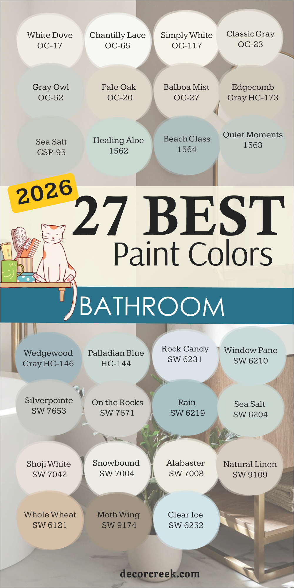
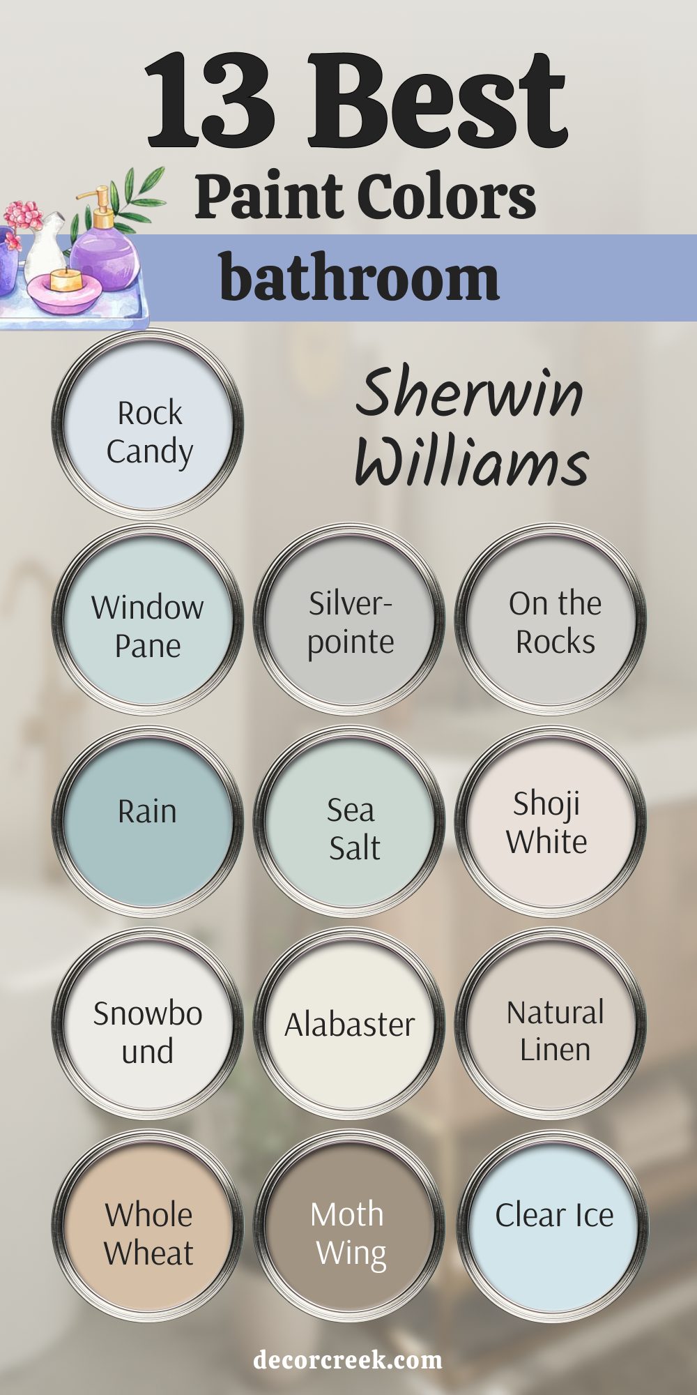
13 Best Bathroom Paint Colors by Sherwin-Williams
Rock Candy SW 6231
Rock Candy SW 6231 feels like a breath of cool air on a warm morning. It’s a soft, icy blue-gray that instantly opens up a bathroom and makes it feel fresh and airy. I love using it in spaces where natural light is limited because it bounces light beautifully and keeps the room feeling open. There’s something about this shade that makes a bathroom look clean without feeling sterile — it has a gentle, graceful energy.
When I pair Rock Candy with crisp white trim or pale marble countertops, it looks elegant and effortless. It also complements silver or chrome fixtures perfectly, giving off a quiet, modern charm.
For clients who want their bathrooms to feel like a calm retreat, this shade always delivers that sense of clarity and freshness. It’s cool enough to feel modern but soft enough to stay inviting. To me, it’s the perfect blend of spa-like comfort and timeless beauty.
🎨 Check out the complete guide to this color right HERE 👈

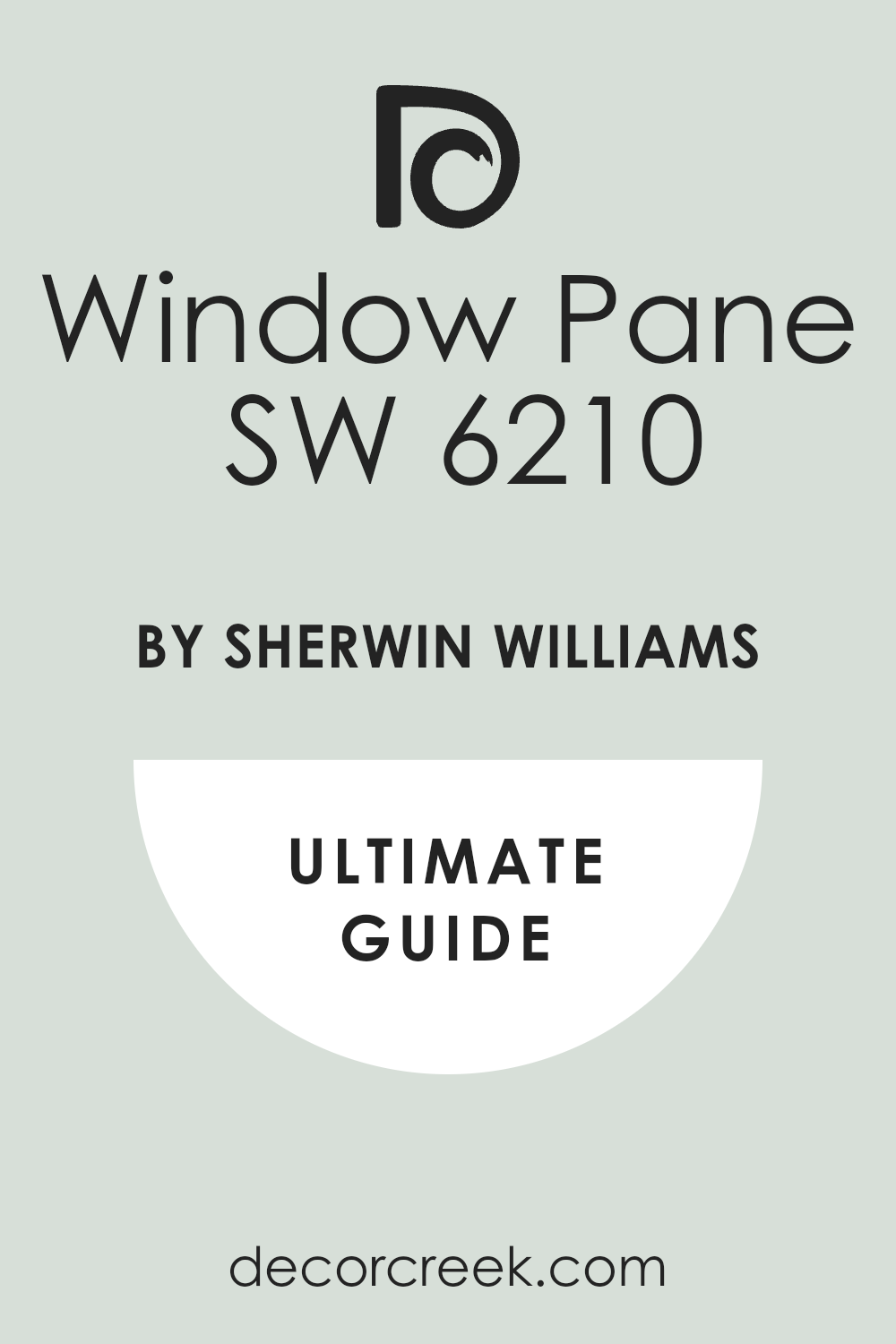
Window Pane SW 6210
Window Pane SW 6210 reminds me of sea glass and early morning light. It’s a delicate, watery blue-green that adds a soft coastal touch without being too bright or bold. I often use this color in small or windowless bathrooms because it reflects light beautifully, making the room feel larger and more open. The balance of blue and green in this shade brings just enough warmth to keep it from feeling cold.
It pairs beautifully with white tile, warm beige flooring, and brushed nickel finishes.
What I love most about Window Pane is how it changes throughout the day — it feels light and breezy in the morning, then soft and comforting under evening light. It works in both modern and traditional homes, adding that subtle hint of nature that makes a bathroom feel like a quiet getaway. This color has a clean, refreshing quality that never feels too polished — just honest and soothing.
🎨 Check out the complete guide to this color right HERE 👈
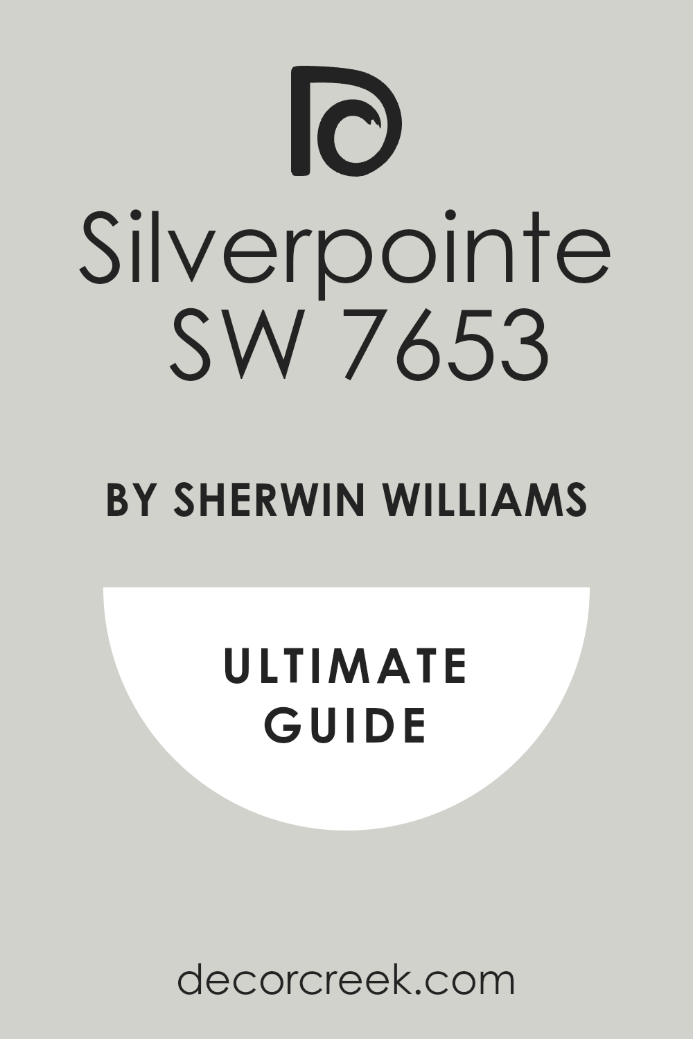
Silverpointe SW 7653
Silverpointe SW 7653 is a cool, pale silver-gray that gives a bathroom a refined, modern edge while still feeling peaceful. It’s one of those colors that always looks expensive — no matter the lighting or the size of the room. I like to use it with marble tiles, glass showers, and black fixtures to create a clean, luxurious feel. It has just enough warmth in its undertone to prevent it from looking flat, which makes it easy to pair with almost any design style.
When the light hits Silverpointe, the walls come alive with a soft, elegant shimmer.
It’s especially lovely in bathrooms that have good natural light because the color subtly shifts with the sun — a quiet play between silver and gray that feels soothing and timeless. I find it especially striking when paired with white cabinets or pale oak vanities, creating a space that feels polished, calm, and balanced.
🎨 Check out the complete guide to this color right HERE 👈
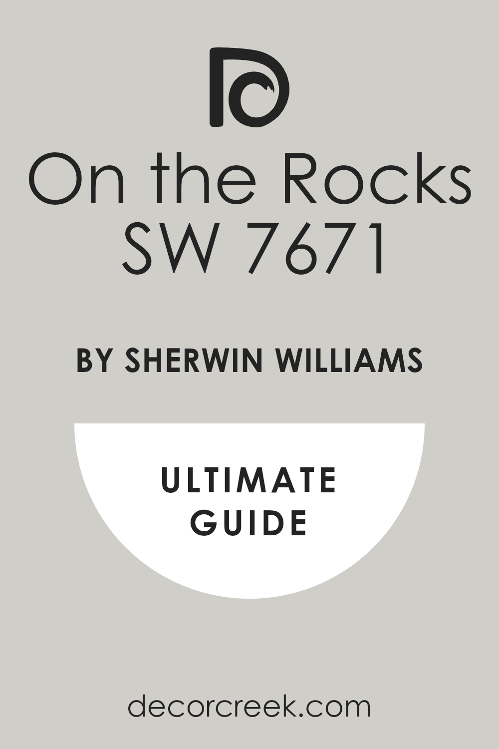
On the Rocks SW 7671
On the Rocks SW 7671 is my favorite soft gray for bathrooms that need quiet structure. It’s cool and balanced, never too blue or beige, which makes it an incredibly reliable neutral. I love how it gives definition to white trim and tile without feeling stark. When used in a bathroom, it creates a spa-like mood — understated but very elegant.
This color pairs beautifully with brushed gold or matte black fixtures for a modern contrast.
It looks stunning with white subway tile or natural stone accents. What makes On the Rocks special is how it behaves under different lighting — in the morning, it feels crisp and fresh, while in the evening, it softens into a cozy gray mist. For me, it’s the ideal color when you want sophistication without effort. It has a quiet confidence that makes the whole bathroom feel put together.
🎨 Check out the complete guide to this color right HERE 👈
Rain SW 6219
Rain SW 6219 captures the feeling of a soft ocean breeze. It’s a gentle blue with a touch of green that creates a refreshing, peaceful mood in any bathroom. I love using it in homes that need a touch of coastal charm without going full beach house. The color feels light and airy but still grounded — the perfect middle ground between sky blue and soft teal.
When paired with white cabinets and polished nickel fixtures, Rain feels crisp and uplifting.
It also looks incredible next to light wood tones or beige tile, creating that natural balance of warmth and coolness. What I adore most about this color is how it makes a bathroom feel like a sanctuary — quiet, fresh, and full of light. It’s the kind of shade that turns a morning routine into a moment of calm.
🎨 Check out the complete guide to this color right HERE 👈

Sea Salt SW 6204
Sea Salt SW 6204 is one of those rare colors that seems to work in every home I’ve designed. It’s a blend of soft green and gray with just a hint of blue, giving it that perfect spa-like touch. This color transforms any bathroom into a soothing retreat. Whether it’s paired with crisp white tile or warm wood vanities, it adapts beautifully.
In bright light, Sea Salt looks airy and cool; in dimmer light, it becomes warmer and more grounded.
I often tell clients this color feels like a deep breath — refreshing yet comforting at the same time. It has a natural connection to water and air, which makes it ideal for bathrooms. Sea Salt also works beautifully with both silver and gold metals, offering endless design flexibility. It’s one of those shades that makes every surface around it look better.
🎨 Check out the complete guide to this color right HERE 👈

Shoji White SW 7042
Shoji White SW 7042 is a soft, creamy white with a hint of warmth that makes bathrooms feel welcoming and timeless. It’s not too bright or yellow — just the right balance to bring a sense of comfort to the space. I use it often in homes where natural light is limited because it reflects beautifully and keeps the room feeling open.
What makes Shoji White stand out is its versatility. It complements warm tones like brass or natural stone just as easily as it pairs with cool grays or blacks.
In the morning light, it glows softly; in the evening, it takes on a warmer, cozier feel. It’s perfect for creating bathrooms that feel fresh but never stark. Shoji White gives that polished, effortless look that feels both current and classic — exactly what every bathroom needs.
🎨 Check out the complete guide to this color right HERE 👈

Snowbound SW 7004
Snowbound SW 7004 is one of those perfect whites that never feels too cold or too warm — it sits beautifully right in the middle. I love using it in bathrooms because it gives that clean, fresh backdrop that makes tile, mirrors, and fixtures stand out. It feels pure but not harsh, adding a touch of sophistication to even the simplest spaces. In natural light, Snowbound glows softly, creating a gentle brightness that feels natural and balanced.
This color pairs effortlessly with cool tones like gray and blue or warm neutrals like beige and brass.
I often use it on walls or cabinetry when I want to keep a bathroom looking airy and organized. It’s especially beautiful with marble counters or brushed nickel finishes. What I appreciate most about Snowbound is how adaptable it is — it never steals the attention but always enhances everything around it. It’s one of those colors that will stay elegant for years without feeling dated.
🎨 Check out the complete guide to this color right HERE 👈

Alabaster SW 7008
Alabaster SW 7008 is my go-to when a bathroom needs warmth and softness. It’s a creamy white with just a hint of beige, making it incredibly inviting. This shade has a gentle glow that makes light bounce around beautifully, especially in rooms that lack big windows. It creates a cozy, relaxed atmosphere — exactly what you want when starting your day slowly or winding down at night.
I love pairing Alabaster with wood vanities, soft gold accents, and white stone.
It feels natural yet refined, and it makes the room feel balanced and alive. Unlike cooler whites, Alabaster adds depth without shadowing, keeping the space open but not stark. It’s a color that looks stunning under both daylight and warm lighting. Every time I use it, the result feels polished but still personal — that effortless blend of comfort and style that works in any home.
🎨 Check out the complete guide to this color right HERE 👈

Natural Linen SW 9109
Natural Linen SW 9109 brings that soft, organic warmth I often look for in modern bathrooms. It’s a light beige with a gentle gray undertone, giving it an elegant, natural character. I love how it complements tile, wood, and stone, making everything feel cohesive and well-curated. This is the kind of color that instantly warms up a space without making it dark.
In bright light, Natural Linen looks smooth and creamy; in softer light, it gains depth and richness.
I often use it with black or bronze fixtures for a modern twist or with white trim for a more traditional look. It feels calm but not flat — like warm sand or oatmeal linen on a summer morning. The beauty of this shade is its flexibility; it works in sleek, modern homes and cozy, classic bathrooms alike.
🎨 Check out the complete guide to this color right HERE 👈

Whole Wheat SW 6121
Whole Wheat SW 6121 is the color I choose when a bathroom needs warmth and personality. It’s a rich beige with golden undertones that instantly adds depth and comfort. This color feels natural and lived-in, the kind that makes a bathroom feel welcoming from the moment you step in. It pairs beautifully with white counters, natural wood, and light stone flooring.
What I love about Whole Wheat is how it shifts with the light. In the morning, it feels soft and creamy, while in the evening, it turns richer and cozier.
It’s perfect for bathrooms that need that touch of golden warmth without being too dark. The tone feels grounded, making it ideal for vintage or rustic-inspired spaces. Every time I use this color, it adds warmth and timeless charm to the home.
🎨 Check out the complete guide to this color right HERE 👈

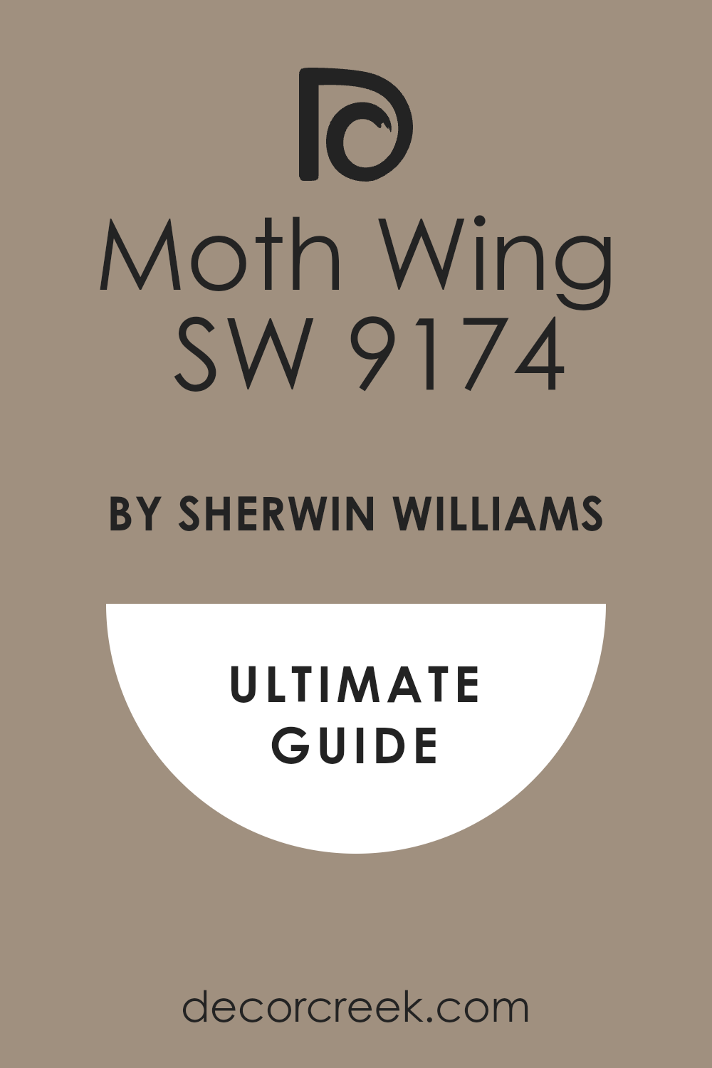
Moth Wing SW 9174
Moth Wing SW 9174 has that understated drama I adore. It’s a deep taupe-gray with a soft brown base, giving it a sophisticated depth that feels luxurious but never heavy. I love using it in bathrooms that need a little mood — where natural light can bring out its richness. It’s the kind of color that feels cozy, confident, and full of quiet elegance.
This shade pairs beautifully with warm white trim, gold or black fixtures, and creamy stone counters.
It adds character without making the room feel closed in. I often use Moth Wing in powder rooms to create that perfect mix of comfort and class. The result always feels modern, layered, and incredibly stylish. It’s not flashy, but it makes a statement — a perfect choice for homeowners who want something different yet refined.
🎨 Check out the complete guide to this color right HERE 👈
Clear Ice SW 6252
Clear Ice SW 6252 feels like morning light after rain — cool, clean, and peaceful. It’s a pale blue-gray that gives bathrooms a fresh, polished look. I love how it instantly brings a sense of clarity to the space, making even the smallest bathrooms feel open and calm. It works beautifully with white trim, chrome fixtures, and frosted glass.
The beauty of Clear Ice is in its simplicity. It’s cool but not cold, refreshing but still inviting.
In sunlight, it reflects a soft shimmer that reminds me of clear water; in low light, it becomes a gentle gray that feels elegant and quiet. It’s perfect for modern bathrooms where lightness and simplicity are the goal. When I use this color, the entire room feels cleaner, brighter, and more peaceful — like a breath of fresh air you never get tired of.
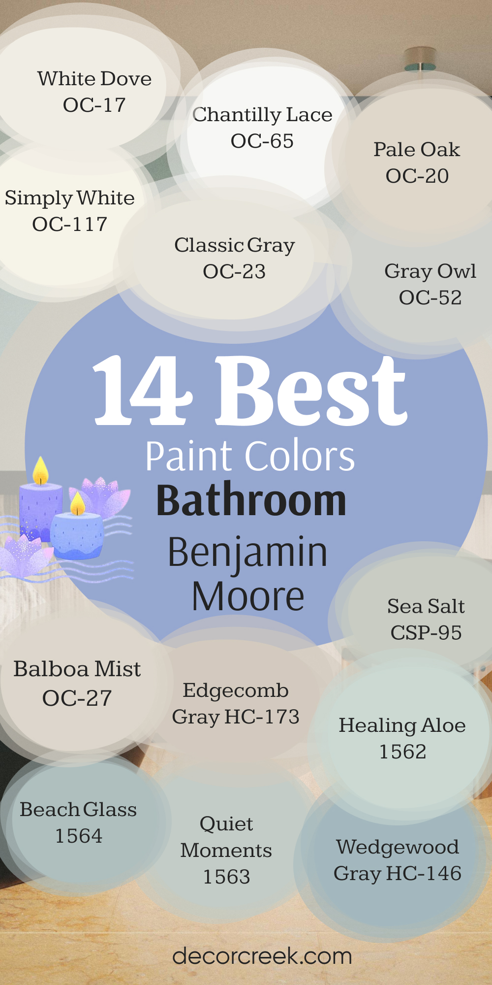
14 Best Bathroom Paint Colors by Benjamin Moore
White Dove OC-17
White Dove OC-17 has been one of my most trusted whites for years, and it never fails me — especially in bathrooms. It’s soft and creamy, but not yellow or dull, which makes it perfect for creating that clean, welcoming glow. I love how it brightens a small bathroom without making it feel cold. It gives walls a gentle, diffused light that looks just as good with marble tile as it does with warm wood accents.
White Dove is one of those rare colors that feels right in any light.
In natural daylight, it looks fresh and pure; under warm bulbs, it turns cozy and comforting. It’s perfect for both modern and traditional bathrooms — timeless but not sterile. I often pair it with gold hardware, woven baskets, and soft linen towels for a layered, inviting feel. It’s the kind of white that makes everything else in the room come alive without demanding attention.
🎨 Check out the complete guide to this color right HERE 👈

Chantilly Lace OC-65
Chantilly Lace OC-65 is the purest, brightest white Benjamin Moore offers, and I reach for it whenever I want a bathroom to feel crisp and polished. It has no strong undertones, so it reflects every bit of light beautifully, making even the smallest bathroom feel more open. I love using it with glossy tiles and sleek fixtures to create a clean, modern look that still feels warm and personal.
In natural light, Chantilly Lace sparkles; in artificial light, it stays clear and true.
It’s perfect for bathrooms with black accents or bold tile designs, where you need a white that doesn’t compete but enhances. It pairs beautifully with silver, chrome, or brass hardware, adapting to any style. When I want a bathroom to feel organized, bright, and truly fresh, Chantilly Lace is my go-to.
🎨 Check out the complete guide to this color right HERE 👈

Simply White OC-117
Simply White OC-117 feels like sunlight bottled up into paint. It’s warm, cheerful, and radiant — perfect for bathrooms that need energy and brightness. Unlike cooler whites, it carries a soft yellow undertone that gives the room a cozy, welcoming feel without being too creamy. I love pairing it with natural materials like oak or rattan to create a fresh yet comfortable design.
This color works beautifully in both small powder rooms and large master baths.
It reflects light evenly and keeps the room feeling happy and airy all day long. Simply White looks stunning next to brass fixtures, white stone counters, and woven textures. It’s that perfect color when you want your bathroom to feel both bright and full of life.
🎨 Check out the complete guide to this color right HERE 👈

Classic Gray OC-23
Classic Gray OC-23 is one of those neutral shades that’s never too much or too little — it sits right in that sweet spot between gray and beige. I love how it adds warmth and depth without feeling heavy. In a bathroom, it feels soft and sophisticated, especially when paired with white trim or marble details. It’s the kind of color that quietly supports everything around it.
What makes Classic Gray so appealing is how it changes with the light.
In the morning, it feels bright and airy; in the evening, it deepens to a warm greige that feels cozy and grounded. It’s perfect for anyone who wants a bathroom that feels timeless and comfortable. Pair it with nickel hardware or soft gold for a gentle glow that makes every morning routine feel calm and organized.
🎨 Check out the complete guide to this color right HERE 👈

Gray Owl OC-52
Gray Owl OC-52 is a soft, silvery gray with just a touch of green that makes bathrooms feel clean but not cold. I love using it in spaces that need that modern, balanced look. It’s especially beautiful with white tile or quartz countertops, where its undertone brings warmth and softness.
This color shifts beautifully throughout the day — light and airy under natural sunlight, richer and moodier in dimmer light.
Gray Owl works perfectly in both contemporary and traditional bathrooms. I often pair it with matte black or brushed brass accents for that striking contrast. It’s the kind of shade that quietly does all the work for you — simple, stylish, and dependable.
🎨 Check out the complete guide to this color right HERE 👈

Pale Oak OC-20
Pale Oak OC-20 is a creamy greige that feels instantly comforting. It has just the right balance of warmth and softness, making bathrooms feel cozy and welcoming. It’s ideal for creating that relaxed, spa-like atmosphere without going too dark or too white. I love how it works with natural textures — light woods, soft towels, and warm metals.
In the morning light, Pale Oak glows with a gentle warmth; in the evening, it feels richer and more grounded.
It’s the kind of color that makes a bathroom feel like a retreat, a place where you can slow down and breathe. Pale Oak pairs perfectly with ivory, taupe, and white finishes, and it always feels elegant without trying too hard.
🎨 Check out the complete guide to this color right HERE 👈

Balboa Mist OC-27
Balboa Mist OC-27 is a color I reach for when I want understated elegance. It’s a soft greige with a light, powdery finish that works beautifully in bathrooms. It brings a sense of warmth while keeping everything airy and fresh. I especially love it in rooms with marble or stone — it complements the texture without overwhelming it.
What makes Balboa Mist so versatile is how it sits perfectly between beige and gray.
It can lean warm or cool depending on the light and the materials around it. It’s perfect for clients who want something modern but still homey. This color makes a bathroom feel polished and thoughtful — clean lines, soft tones, and just enough warmth to feel welcoming.
🎨 Check out the complete guide to this color right HERE 👈

Edgecomb Gray HC-173
Edgecomb Gray HC-173 is one of my all-time favorite neutrals. It’s a soft, earthy gray with just a whisper of beige that makes it adaptable to nearly any bathroom design. It’s perfect for those who want a natural, organic tone that feels grounded but still bright. It gives a bathroom that calm, balanced energy that never goes out of style.
When paired with warm whites, it feels elegant and timeless; with darker accents, it becomes sophisticated and bold.
It’s one of those shades that looks beautiful under any light, shifting gracefully from day to night. I love how Edgecomb Gray adds quiet confidence to a space — it’s not loud, but it has presence.
🎨 Check out the complete guide to this color right HERE 👈

Sea Salt CSP-95
Sea Salt CSP-95 is one of those perfect bathroom shades that instantly creates a sense of balance and freshness. It’s a muted green-gray with soft undertones that make the room feel both light and grounded. I love using this color when I want the space to feel soothing but still lively. It pairs beautifully with white tile, light marble, or wood vanities — anything that adds texture and natural warmth.
What makes Sea Salt so special is how it reacts to light. In bright daylight, it looks airy and almost silvery; under warm lighting, it deepens slightly, becoming cozy and organic.
It gives a bathroom that spa-like character without trying too hard. I find it especially effective in rooms that need a soft connection to nature — it feels like bringing a gentle breeze indoors. It’s one of those colors that makes you take a deep breath every time you walk in.
🎨 Check out the complete guide to this color right HERE 👈
Healing Aloe 1562
Healing Aloe 1562 is a quiet, refreshing mix of blue and green with a touch of gray — the perfect tone for creating a bathroom that feels like a personal retreat. It’s cool but not cold, and it always brings an instant sense of calm and clarity to the space. I often use it in bathrooms with white tile and brushed nickel fixtures, where its soft undertones can shine.
In natural light, Healing Aloe feels fresh and open; at night, it softens into a delicate pastel that wraps the room in calm.
What I love most is its subtle versatility — it works beautifully in modern bathrooms with clean lines or in classic spaces with softer textures. It’s the kind of color that feels pure and comforting, like a breath of fresh air at the start of the day.
🎨 Check out the complete guide to this color right HERE 👈

Beach Glass 1564
Beach Glass 1564 is one of my favorite cool tones for bathrooms. It’s a soft blue-green-gray that captures the feeling of sea mist and sunlight reflected off water. I use it when I want a bathroom to feel clean, airy, and naturally beautiful. It pairs wonderfully with white vanities, silver hardware, and sandy beige accents for that perfect coastal balance.
This color brings a sense of quiet energy to a room. It feels serene but never flat — the blue tones give it freshness, while the gray keeps it sophisticated.
I love how Beach Glass can make even the smallest bathrooms feel bigger and brighter. It’s the kind of color that feels peaceful in the morning and romantic by candlelight at night. For me, it’s the definition of soft coastal elegance.
🎨 Check out the complete guide to this color right HERE 👈

Quiet Moments 1563
Quiet Moments 1563 lives up to its name perfectly. It’s a muted blue-green-gray that feels as calm as a slow morning by the ocean. This color has a softness that makes bathrooms feel instantly comfortable and welcoming. I love using it in homes where the goal is to create a peaceful start and end to the day.
It pairs effortlessly with marble, white trim, and silver or brass accents.
Under natural light, Quiet Moments glows gently; under softer lighting, it deepens just enough to feel cozy. It’s a timeless color that never looks dated, no matter the style of the home. It’s perfect for those who want their bathroom to feel clean but not cold, refined but still inviting. It truly creates that moment of pause we all need.
🎨 Check out the complete guide to this color right HERE 👈

Wedgewood Gray HC-146
Wedgewood Gray HC-146 brings classic charm and quiet sophistication to a bathroom. It’s a medium blue-gray with a touch of green that feels balanced and steady. I love how it gives definition to white fixtures and adds just the right amount of color without overwhelming the space. It’s especially beautiful in larger bathrooms where you want a gentle wash of color that still feels elegant.
This shade is wonderful with both traditional and modern styles.
It pairs well with soft gold, black, or chrome finishes, creating contrast while staying refined. What makes Wedgewood Gray special is its mood — it feels cool and composed during the day, then warm and intimate at night. I find it ideal for homeowners who want sophistication without losing that feeling of comfort.
🎨 Check out the complete guide to this color right HERE 👈
Palladian Blue HC-144
Palladian Blue HC-144 is one of those dreamy shades that feels timeless and refreshing. It’s a light, airy mix of blue and green that instantly lifts the mood of a bathroom. Every time I use this color, it brings a sense of serenity and brightness that makes mornings feel lighter. It’s the perfect choice for coastal-inspired designs or spaces that need a touch of openness and warmth.
This shade pairs beautifully with white beadboard, marble countertops, and silver or polished nickel hardware.
In daylight, it glows with a gentle radiance, while in softer lighting, it turns tranquil and inviting. Palladian Blue has a natural balance that works in any size bathroom — from cozy half-baths to large master suites. It’s soft, elegant, and endlessly pleasant — one of those colors that never fails to make a home feel loved and cared for.
🎨 Check out the complete guide to this color right HERE 👈

My Final Thoughts on Choosing Bathroom Paint Colors for 2026
Bathrooms may be small, but they have one of the biggest impacts on how a home feels. In 2026, paint colors are all about warmth, balance, and light — shades that make you feel refreshed in the morning and relaxed at night. From soft whites and grays to coastal greens and misty blues, each of these tones brings a sense of calm energy that fits beautifully into modern living.
I’ve learned that the best bathroom colors are the ones that reflect your rhythm — how you start your day and how you wind down.
A good bathroom color feels natural, easy, and full of life. It should make you smile every time you walk in. Whether you choose the softness of Alabaster or the gentle glow of Beach Glass, the right color has the power to make your bathroom feel like your own personal retreat.
In the end, it’s about comfort and light — finding that perfect shade that feels fresh, balanced, and true to your home. That’s what makes these 2026 bathroom colors so special.