Black
Black Blue
Blue Brown
Brown Gray
Gray Green
Green Neutral
 Orange
 White
White Yellow
Sea Salt by Sherwin-Williams is one of those paint colors I use again and again because it works beautifully with so many decorating styles and different types of homes. I have used it in cozy beach cottages, modern farmhouse homes, family houses, and even newer modern interiors because it always creates a soft and welcoming feeling.
What makes this color special is its gentle mix of green, gray, and blue undertones that shift naturally throughout the day depending on the lighting. In bright sunlight, it can feel lighter and fresher, while in softer evening light it feels warmer and more relaxed. I love how Sea Salt can make a bathroom feel clean and airy, a living room feel open and comfortable, or an exterior look polished and inviting from the street.
But choosing the right matching colors matters just as much as picking Sea Salt itself. Some shades help warm it up, while others create beautiful contrast or help the color feel brighter and cleaner. The right whites, grays, greens, and navy shades can completely change the mood of the room while still keeping everything balanced. In this guide, I’m sharing the best colors that go with Sea Salt and the combinations I trust most in real homes.
These are the shades I often use while staging houses, helping homeowners update rooms, or creating color palettes that feel connected throughout the home. Every combination in this guide is chosen to help Sea Salt look its very best in real lighting and everyday living.
Why I Always Trust Sherwin-Williams and Benjamin Moore for the Best Sea Salt Color Pairings
When I work with Sea Salt, I almost always choose coordinating colors from Sherwin-Williams and Benjamin Moore because their paint collections blend together beautifully. Over the years, I have learned that these brands create colors with rich undertones and soft depth that work naturally in many lighting conditions.
Some paint brands can look too flat, too sharp, or too cold next to Sea Salt, but Sherwin-Williams and Benjamin Moore usually keep the room feeling balanced and welcoming. That matters a lot when I’m helping homeowners create rooms that feel comfortable every day instead of trendy for only a short time.
I also trust these brands because their whites, grays, earthy greens, warm neutrals, and navy tones work beautifully with wood floors, tile, stone, and natural fabrics. That flexibility makes decorating much easier, especially in open floor plans where colors need to flow from room to room naturally.
How I Choose the Perfect Colors to Pair With Sea Salt by Sherwin-Williams
When I choose colors to pair with Sea Salt, I first think about how the room should feel during the day and how the lighting changes from morning to evening. If a room feels dark or needs more brightness, I usually lean toward warm whites, creamy neutrals, or pale grays because they help Sea Salt feel lighter and softer.
If I want stronger contrast and more depth, I often use navy blues, charcoal shades, earthy greens, or darker wood tones. These richer colors help Sea Salt stand out beautifully while still keeping the room welcoming and balanced.
I also pay close attention to flooring, countertops, furniture, and fabrics because Sea Salt can shift slightly depending on the surrounding finishes. In homes with warm wood floors, I often add creamy whites or soft beige tones to create balance.
18 Best Colors that Goes With Sea Salt for the Bathroom
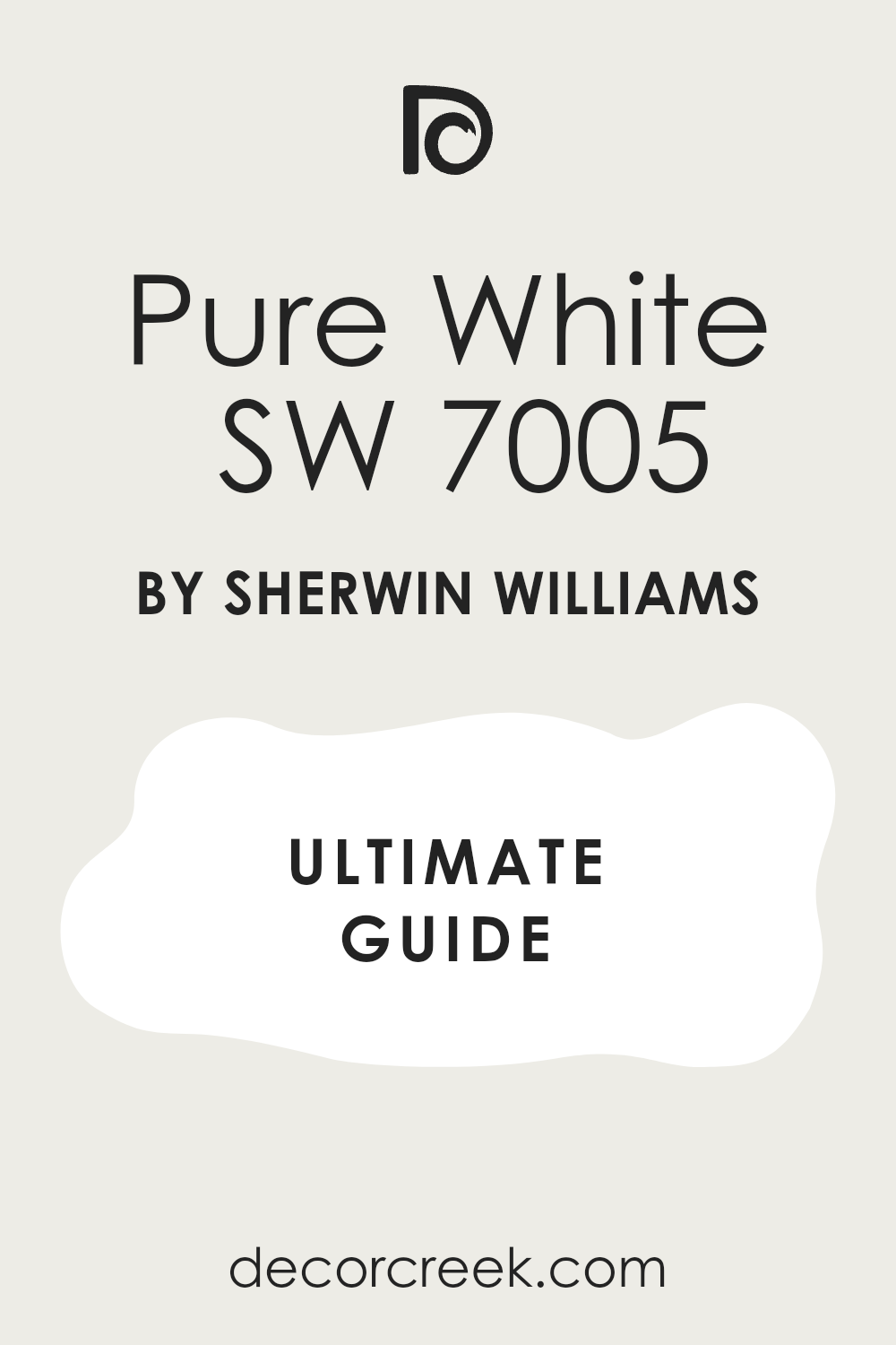
Pure White SW 7005
Pure White SW 7005 is one of my favorite colors to use with Sea Salt in bathrooms because it keeps everything looking fresh and bright without feeling too cold. I often use it on trim, vanities, and ceilings when I want the walls to stand out gently.
The soft white tone helps Sea Salt feel cleaner and lighter, especially in bathrooms with natural light. I also love how this pairing works with marble countertops, brushed nickel hardware, and glass shower doors. In smaller bathrooms, this color combination helps the room feel open and airy.
It also works beautifully with woven baskets, light oak cabinets, and soft white towels. I use this shade often in coastal homes because it gives the bathroom a crisp and relaxed look. Even simple decor pieces look more polished with this pairing. It feels easy to live with and never looks too sharp.
Best used in: bathrooms, powder rooms, laundry rooms, kitchens, and coastal interiors
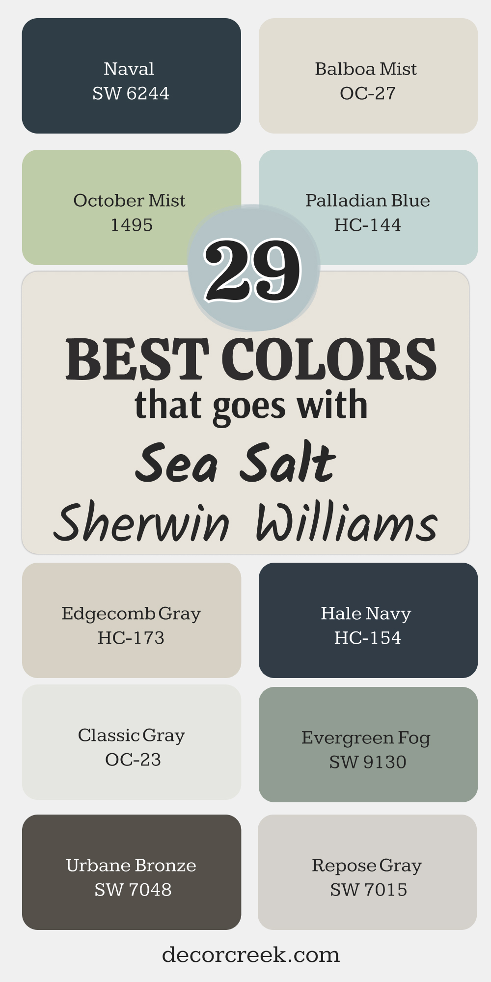
Pairs well with: Sea Salt SW 6204, Drift of Mist SW 9166, Naval SW 6244, light oak wood
The key rule of this color for bathroom style is to use it where you want brightness to feel soft, fresh, and welcoming during the day.
🎨 Check out the complete guide to this color right HERE 👈
Alabaster SW 7008
Alabaster SW 7008 is the color I use when I want Sea Salt to feel warmer and softer inside a bathroom. Unlike bright whites, this creamy shade gives the room a cozy and comfortable feeling that many homeowners love right away.
I often paint bathroom cabinets or trim in this color because it blends beautifully with Sea Salt walls. The creamy undertones also work nicely with brass fixtures, warm wood mirrors, and beige tile flooring. In homes with softer lighting, this pairing helps the bathroom feel balanced instead of too cool.
I also like using fluffy cream towels and woven textures nearby because they make the colors feel richer. This combination works especially well in family bathrooms where people want a welcoming and relaxed feeling. It looks beautiful in farmhouse homes and newer modern homes too. The overall look feels warm without becoming heavy.
Best used in: bathrooms, kitchens, bedrooms, hallways, and farmhouse interiors
Pairs well with: Sea Salt SW 6204, Accessible Beige SW 7036, Iron Ore SW 7069, brass finishes
The key rule of this color for bathroom style is to use it where you want warmth and softness to balance cooler wall colors naturally.
🎨 Check out the complete guide to this color right HERE 👈
Accessible Beige SW 7036
Accessible Beige SW 7036 is one of the safest warm neutrals I pair with Sea Salt when a bathroom feels too cool or plain. I like using this shade on cabinets, nearby hallways, or even bathroom walls next to Sea Salt accents because it adds warmth without looking yellow.
The soft beige tone helps create a balanced look that feels comfortable and easy to decorate around. I often use black hardware and warm wood pieces with this pairing because they help the colors stand out more naturally. In bathrooms with little sunlight, this combination helps everything feel softer and more welcoming.
I also love how pretty it looks with white tile, woven baskets, and creamy shower curtains. This color pairing works especially well in modern farmhouse and transitional homes. It gives the room a relaxed and polished feeling without looking too dark.
Best used in: bathrooms, hallways, laundry rooms, living rooms, and farmhouse interiors
Pairs well with: Sea Salt SW 6204, Alabaster SW 7008, Iron Ore SW 7069, natural wood finishes
The key rule of this color for bathroom style is to use it when you want warm neutral tones to soften cooler paint colors gently.
🎨 Check out the complete guide to this color right HERE 👈

Drift of Mist SW 9166
Drift of Mist SW 9166 is one of the prettiest pale grays I use with Sea Salt because it keeps bathrooms feeling light and clean. I often use this color on trim, vanities, or nearby walls when I want a soft layered look instead of strong contrast.
The gentle gray undertones help Sea Salt feel brighter while still keeping the bathroom cozy and inviting. I especially love this pairing in homes with white tile, marble counters, and brushed nickel fixtures. It also works beautifully with light wood shelves and soft textured towels.
In smaller bathrooms, these colors help the room feel airy without becoming too bright or cold. I use this pairing often in modern homes because it feels polished and simple at the same time. The colors blend together naturally and create a smooth flowing look throughout the room.
Best used in: bathrooms, bedrooms, hallways, laundry rooms, and modern interiors
Pairs well with: Sea Salt SW 6204, Pure White SW 7005, Repose Gray SW 7015, brushed nickel finishes
The key rule of this color for bathroom style is to use it where you want gentle contrast that still feels soft and bright.
🎨 Check out the complete guide to this color right HERE 👈

Naval SW 6244
Naval SW 6244 is the shade I use when a bathroom needs stronger contrast next to Sea Salt. The deep navy tone gives the room richness and helps lighter walls stand out beautifully. I often use this color on bathroom vanities because it looks stunning with gold hardware and white countertops.
The combination feels stylish while still keeping a relaxed coastal feeling. I also like adding woven textures and warm wood mirrors nearby because they soften the darker blue tone. In bathrooms with lots of natural light, this pairing looks especially beautiful during the day.
It creates depth without making the room feel too heavy. I have used this combination in beach homes, modern homes, and even traditional homes because it works with many decorating styles. The darker shade also hides wear nicely on cabinets and furniture pieces.
Best used in: bathrooms, vanities, laundry rooms, accent walls, and coastal interiors
Pairs well with: Sea Salt SW 6204, Pure White SW 7005, Alabaster SW 7008, brass finishes
The key rule of this color for bathroom style is to use it where you want rich contrast that still feels fresh and balanced.
🎨 Check out the complete guide to this color right HERE 👈

Oyster Bay SW 6206
Oyster Bay SW 6206 is one of my favorite green shades to pair with Sea Salt because the colors feel connected without looking too similar. I often use this shade on bathroom cabinets or nearby accent walls when I want the room to feel fresh and earthy.
The muted green tone adds depth while still keeping the bathroom light and comfortable. I love using this combination with white tile, warm wood shelving, and matte black fixtures because the contrast feels rich but relaxed. In bathrooms with natural sunlight, the green undertones look especially beautiful during the afternoon.
This pairing also works nicely with woven textures and soft cream fabrics. I have used these colors together in coastal homes and cottage-style homes many times because they always feel balanced. The overall look feels natural and welcoming without becoming too dark.
Best used in: bathrooms, laundry rooms, mudrooms, coastal interiors, and cottage homes
Pairs well with: Sea Salt SW 6204, Pure White SW 7005, Accessible Beige SW 7036, warm wood tones
The key rule of this color for bathroom style is to use it where earthy green tones can add depth while keeping the room light and welcoming.
🎨 Check out the complete guide to this color right HERE 👈
Evergreen Fog SW 9130
Evergreen Fog SW 9130 is the shade I choose when I want Sea Salt to feel richer and more grounded inside a bathroom. The soft green-gray tone creates a beautiful layered look that feels stylish without trying too hard.
I often use this shade on bathroom vanities or lower walls because it gives the room more depth. It also works beautifully with brass hardware, creamy countertops, and warm wood accents. I especially love this pairing in bathrooms with soft lighting because the colors blend together naturally.
Adding textured rugs and woven baskets nearby helps the room feel even more comfortable. This combination looks expensive while still feeling easy to live with every day. I have used these colors in modern homes, farmhouse homes, and cozy guest bathrooms with great results. The rich undertones help the bathroom feel polished and balanced.
Best used in: bathrooms, vanities, bedrooms, mudrooms, and modern farmhouse interiors
Pairs well with: Sea Salt SW 6204, Alabaster SW 7008, Urbane Bronze SW 7048, brass finishes
The key rule of this color for bathroom style is to use it where deeper earthy tones can balance lighter wall colors softly.
🎨 Check out the complete guide to this color right HERE 👈

Creamy SW 7012
Creamy SW 7012 is one of the warmest whites I pair with Sea Salt when I want a bathroom to feel soft and welcoming. Unlike bright white shades, this creamy color helps the cooler undertones of Sea Salt feel more comfortable and relaxed.
I often use it on trim, ceilings, or bathroom cabinets because it creates a gentle contrast without looking harsh. It works especially well with beige tile, gold hardware, and warm wood furniture pieces. I also love how beautiful fluffy cream towels look with this pairing.
In bathrooms with low natural light, these colors help everything feel brighter and more comfortable. The overall look feels clean while still having warmth. I use this combination often in family homes because it feels cozy and easy to decorate around. Even simple mirrors and decor pieces look more polished with these shades together.
Best used in: bathrooms, kitchens, hallways, bedrooms, and farmhouse interiors
Pairs well with: Sea Salt SW 6204, Accessible Beige SW 7036, Iron Ore SW 7069, warm wood finishes
The key rule of this color for bathroom style is to use it where soft warmth can balance cooler paint tones naturally.
🎨 Check out the complete guide to this color right HERE 👈

Repose Gray SW 7015
Repose Gray SW 7015 is a soft gray that works beautifully with Sea Salt when I want a bathroom to feel polished and balanced. The gentle gray undertones help connect cool and warm finishes without making the room feel flat.
I often use this shade on nearby walls, vanities, or built-in storage because it blends naturally with Sea Salt. It looks especially pretty with white tile, chrome fixtures, and light stone countertops. I also love adding soft gray towels and woven textures nearby because they help the colors feel connected.
In bathrooms with bright natural light, this pairing feels airy and clean throughout the day. The look works well in both modern homes and traditional homes because the colors feel easy to decorate around. This combination also photographs beautifully during home staging projects.
Best used in: bathrooms, bedrooms, living rooms, laundry rooms, and modern interiors
Pairs well with: Sea Salt SW 6204, Pure White SW 7005, Drift of Mist SW 9166, chrome finishes
The key rule of this color for bathroom style is to use it where soft gray tones can create balance without feeling cold.
🎨 Check out the complete guide to this color right HERE 👈
Urbane Bronze SW 7048
Urbane Bronze SW 7048 is the color I use when a bathroom needs stronger contrast next to Sea Salt without feeling too dark or heavy. The rich brown-gray tone gives the room depth and helps lighter walls stand out beautifully.
I often use this shade on vanities, mirrors, or cabinet accents because it looks stunning with brass hardware and white countertops. It also works beautifully with natural wood textures and warm lighting. In bathrooms with large windows, this pairing feels rich and balanced during the day.
I love adding woven baskets and cream towels nearby because they soften the darker tones naturally. This color combination feels modern while still staying comfortable and welcoming. I have used these shades in farmhouse homes, modern homes, and even rustic interiors with beautiful results. The darker tone also hides wear very well on furniture pieces.
Best used in: bathrooms, vanities, mudrooms, accent walls, and modern farmhouse interiors
Pairs well with: Sea Salt SW 6204, Alabaster SW 7008, Creamy SW 7012, warm wood finishes
The key rule of this color for bathroom style is to use it where rich darker tones can create depth without making the room feel heavy.
🎨 Check out the complete guide to this color right HERE 👈

White Dove OC-17
White Dove OC-17 is one of the softest whites I pair with Sea Salt when I want a bathroom to feel bright and welcoming without looking sharp. The creamy undertones help balance the cooler green-blue tones in Sea Salt beautifully.
I often use this shade on trim, ceilings, and bathroom cabinets because it creates a smooth and connected look. It also works wonderfully with marble countertops, brushed gold hardware, and soft beige tile. I especially love this pairing in homes with natural light because the colors look soft throughout the day.
Adding woven textures and fluffy towels nearby makes the room feel even more inviting. This combination works in almost every decorating style, from coastal homes to farmhouse homes. The overall look feels clean while still having warmth and comfort. I use this pairing often when staging bathrooms because buyers usually love it immediately.
Best used in: bathrooms, kitchens, bedrooms, hallways, and coastal interiors
Pairs well with: Sea Salt SW 6204, Hale Navy HC-154, Accessible Beige SW 7036, brushed gold finishes
The key rule of this color for bathroom style is to use it where soft white tones can brighten the room gently without looking cold.
🎨 Check out the complete guide to this color right HERE 👈

Classic Gray OC-23
Classic Gray OC-23 is one of the prettiest pale grays I use with Sea Salt when I want a bathroom to feel soft and airy. The light gray undertones help create gentle contrast while still keeping everything looking smooth and connected.
I often use this shade on walls outside the bathroom or on built-in storage pieces nearby. It looks beautiful with white countertops, chrome fixtures, and light wood flooring. I also love adding linen shower curtains and pale gray towels because they help the room feel balanced.
In smaller bathrooms, this pairing keeps the room feeling open and fresh throughout the day. The overall look feels polished without becoming too formal. I have used these colors together in modern homes and traditional homes many times because they work so naturally together. The soft tones also photograph beautifully during staging projects.
Best used in: bathrooms, hallways, bedrooms, laundry rooms, and modern interiors
Pairs well with: Sea Salt SW 6204, Pure White SW 7005, Repose Gray SW 7015, chrome fixtures
The key rule of this color for bathroom style is to use it where pale gray tones can keep the room feeling light and balanced naturally.
🎨 Check out the complete guide to this color right HERE 👈

Hale Navy HC-154
Hale Navy HC-154 is the shade I choose when I want Sea Salt to stand out with bold contrast inside a bathroom. The deep navy tone gives the room richness while still keeping a fresh coastal feeling. I often use this color on bathroom vanities because it looks beautiful with white walls, gold hardware, and marble counters.
It also pairs nicely with warm wood shelves and woven baskets that soften the darker shade. In bathrooms with natural sunlight, this combination feels rich and stylish without becoming too dark. I love how crisp white towels look against this pairing as well.
The darker blue tone helps the lighter walls feel brighter and cleaner throughout the day. I have used this combination in beach homes, modern homes, and guest bathrooms many times with great results. The overall feeling is elegant but still easy to live with.
Best used in: bathrooms, vanities, accent walls, coastal interiors, and modern homes
Pairs well with: Sea Salt SW 6204, White Dove OC-17, Pure White SW 7005, brass finishes
The key rule of this color for bathroom style is to use it where deep navy contrast can make lighter paint colors stand out beautifully.
🎨 Check out the complete guide to this color right HERE 👈

Edgecomb Gray HC-173
Edgecomb Gray HC-173 is one of my favorite warm gray shades to pair with Sea Salt because it helps bathrooms feel soft and welcoming without looking too beige. The gentle mix of gray and beige works beautifully with Sea Salt’s green-blue undertones and creates a balanced look that feels comfortable every day.
I often use this shade on nearby walls, bathroom cabinets, or even hallway areas outside the bathroom. It looks especially beautiful with brushed gold hardware, creamy tile, and warm wood mirrors. I also love adding woven baskets and textured towels because they make the colors feel richer together.
In bathrooms with limited natural light, this pairing helps everything feel brighter and smoother. The colors blend naturally without creating sharp contrast. I use this combination often in family homes because it feels relaxed and easy to decorate around.
Best used in: bathrooms, hallways, bedrooms, living rooms, and transitional interiors
Pairs well with: Sea Salt SW 6204, White Dove OC-17, Urbane Bronze SW 7048, warm oak finishes
The key rule of this color for bathroom style is to use it where soft warm gray tones can keep cooler colors feeling balanced and welcoming.
🎨 Check out the complete guide to this color right HERE 👈

Palladian Blue HC-144
Palladian Blue HC-144 is a soft blue-green shade that pairs beautifully with Sea Salt when I want a bathroom to feel light and airy. The colors work together naturally because they share similar undertones without blending into each other too much.
I often use this shade on nearby walls, furniture pieces, or decorative accents to create a layered coastal look. It looks especially pretty with white tile, silver hardware, and pale wood finishes. I also love adding white linen curtains and textured rugs nearby because they help soften the cooler tones.
In bathrooms with natural sunlight, this pairing feels bright and refreshing during the day. The overall look feels peaceful without becoming plain. I have used this combination many times in beach homes and guest bathrooms because it always feels clean and welcoming.
Best used in: bathrooms, coastal interiors, guest rooms, laundry rooms, and beach-style homes
Pairs well with: Sea Salt SW 6204, Pure White SW 7005, Classic Gray OC-23, brushed nickel finishes
The key rule of this color for bathroom style is to use it where soft blue-green tones can create a light and airy feeling naturally.
🎨 Check out the complete guide to this color right HERE 👈
October Mist 1495
October Mist 1495 is one of the prettiest earthy greens I pair with Sea Salt when I want a bathroom to feel richer and more connected to nature. The muted green tone adds depth while still keeping the room soft and welcoming.
I often use this color on bathroom cabinets or nearby accent walls because it works beautifully with white countertops and warm brass fixtures. It also pairs nicely with woven textures, stone flooring, and natural wood accents.
In bathrooms with soft lighting, these colors blend together beautifully throughout the day. I love adding plants nearby because the earthy tones help the room feel fresh and comfortable. This combination works especially well in modern farmhouse and organic-style homes. The overall look feels stylish while still staying relaxed and easy to enjoy every day.
Best used in: bathrooms, mudrooms, kitchens, farmhouse interiors, and organic-style homes
Pairs well with: Sea Salt SW 6204, Alabaster SW 7008, Accessible Beige SW 7036, natural wood finishes
The key rule of this color for bathroom style is to use it where earthy green tones can add richness without making the room feel dark.
🎨 Check out the complete guide to this color right HERE 👈

Balboa Mist OC-27
Balboa Mist OC-27 is a soft warm gray that works beautifully with Sea Salt when I want a bathroom to feel polished and airy at the same time. The gentle undertones help balance cool and warm finishes so the room feels connected and comfortable.
I often use this shade on trim, vanities, or nearby walls because it gives Sea Salt a smoother layered look. It pairs beautifully with marble countertops, chrome fixtures, and creamy white tile. I also love adding soft gray towels and light wood decor because they help the colors blend naturally together.
In smaller bathrooms, this pairing helps the room feel open without becoming too bright. The overall feeling is elegant while still feeling relaxed enough for everyday living. I use these colors often during home staging because they photograph beautifully in natural light.
Best used in: bathrooms, bedrooms, hallways, laundry rooms, and modern interiors
Pairs well with: Sea Salt SW 6204, White Dove OC-17, Repose Gray SW 7015, chrome finishes
The key rule of this color for bathroom style is to use it where soft warm gray tones can keep the room feeling airy and balanced.
🎨 Check out the complete guide to this color right HERE 👈
Swiss Coffee OC-45
Swiss Coffee OC-45 is one of the warmest creamy whites I use with Sea Salt when I want a bathroom to feel cozy and welcoming. The rich creamy undertones soften the cooler green-blue tones beautifully and help the room feel more comfortable.
I often use this shade on bathroom cabinets, trim, or ceilings because it creates a gentle contrast without looking too sharp. It works especially well with warm wood flooring, brass hardware, and beige stone tile. I also love adding fluffy cream towels and woven textures nearby because they help the room feel even softer.
In bathrooms with limited sunlight, this pairing helps everything feel brighter and warmer during the day. The overall look feels clean while still keeping warmth and character. I have used this combination in farmhouse homes and coastal homes many times because it always feels inviting.
Best used in: bathrooms, kitchens, hallways, farmhouse interiors, and coastal homes
Pairs well with: Sea Salt SW 6204, Accessible Beige SW 7036, Urbane Bronze SW 7048, brass finishes
The key rule of this color for bathroom style is to use it where creamy warm whites can soften cooler paint colors naturally.
🎨 Check out the complete guide to this color right HERE 👈

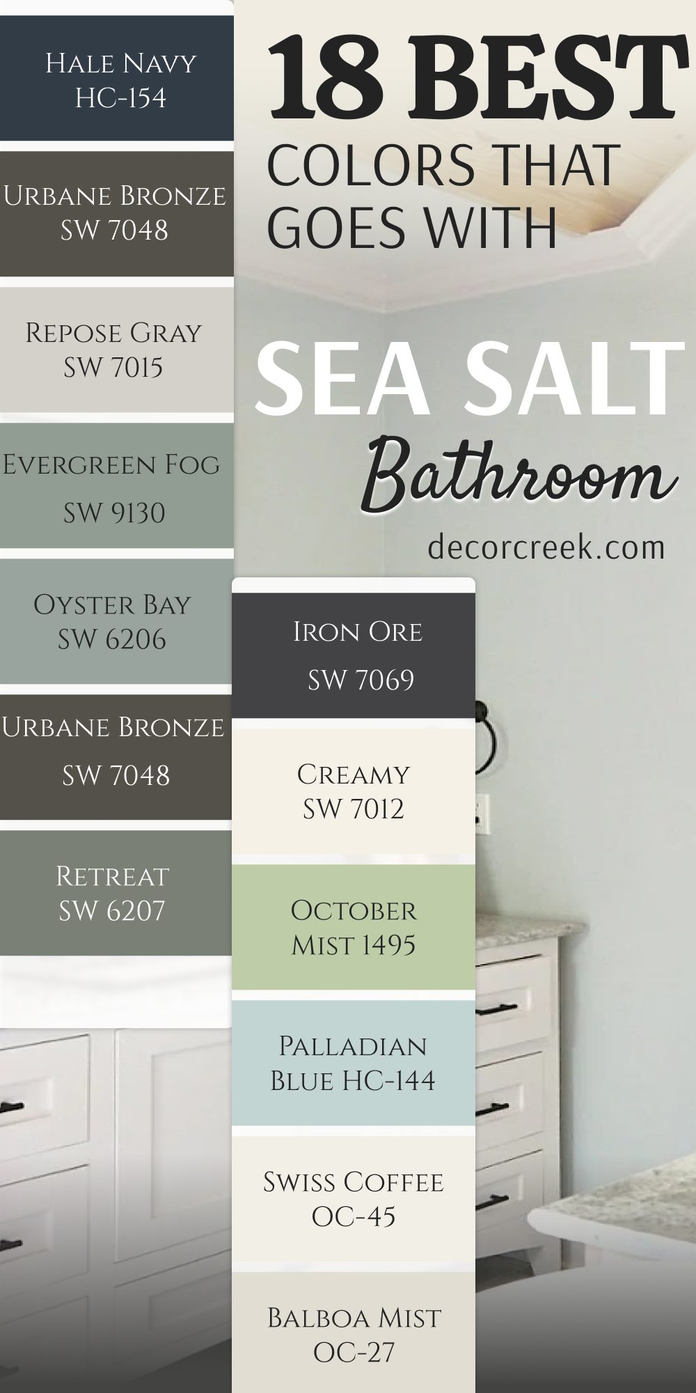
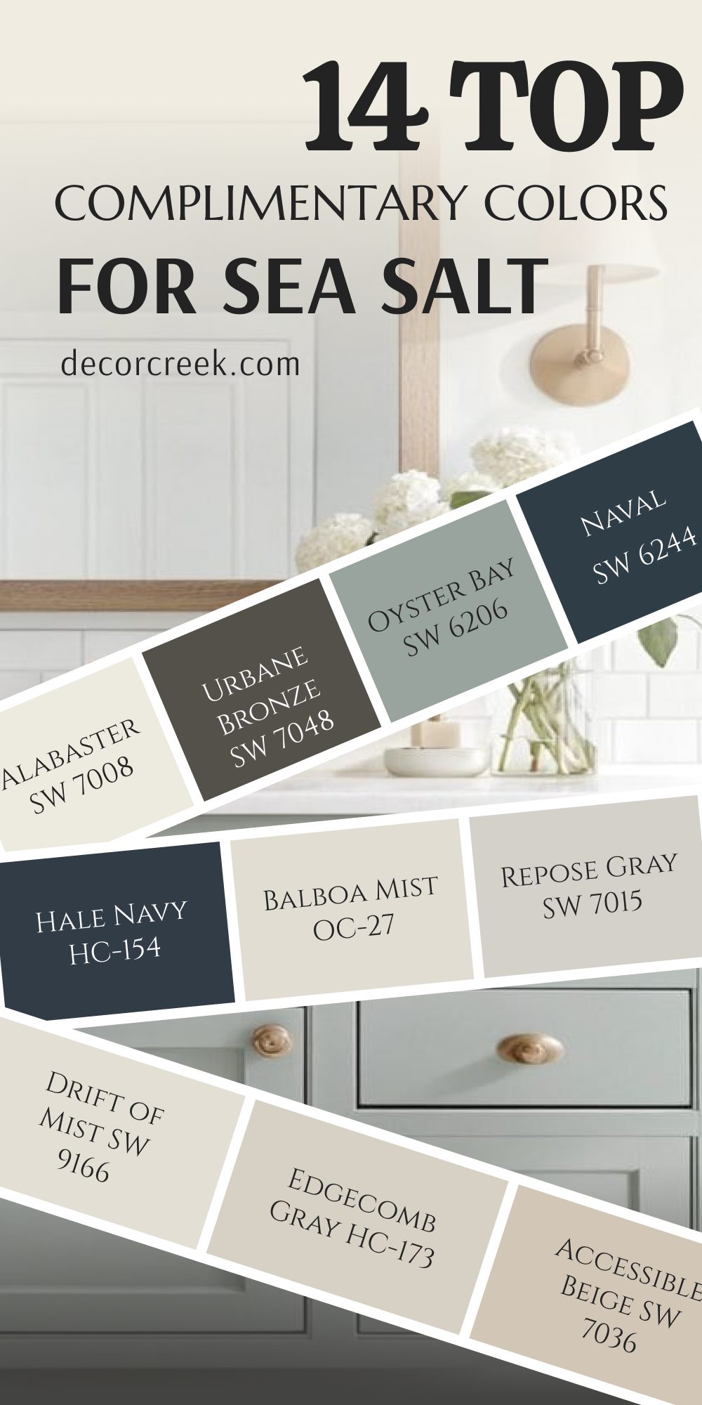
14 Top Complimentary Colors for Sea Salt
Pure White SW 7005
Pure White SW 7005 is one of the easiest colors to pair with Sea Salt because it keeps the entire room looking crisp and fresh. I often use this shade on trim, ceilings, and cabinets when I want Sea Salt walls to feel brighter and cleaner.
The soft white undertones help the green-blue color feel balanced instead of icy. I also love how beautiful this pairing looks with marble countertops, woven baskets, and light oak furniture. In homes with lots of sunlight, these colors look especially airy during the day.
The combination works in coastal homes, modern homes, and even traditional interiors because it feels simple and welcoming. I often suggest this pairing for homeowners who want a safe and beautiful color combination that still feels stylish. The overall look feels polished without becoming too sharp or formal.
Best used in: bathrooms, kitchens, bedrooms, coastal interiors, and modern homes
Pairs well with: Sea Salt SW 6204, Drift of Mist SW 9166, Naval SW 6244, light wood finishes
The key rule of this color for home style is to use it where you want white tones to feel soft, fresh, and clean throughout the day.
🎨 Check out the complete guide to this color right HERE 👈
Alabaster SW 7008
Alabaster SW 7008 is one of my favorite warm whites to pair with Sea Salt because it softens the cooler undertones beautifully. I often use this shade on trim, kitchen cabinets, and nearby walls when I want the room to feel welcoming and comfortable.
The creamy undertones help Sea Salt feel warmer without losing its airy look. I especially love this combination with brass fixtures, beige fabrics, and warm wood floors. In homes with lower natural light, these colors help rooms feel brighter and softer at the same time.
I also use this pairing often during home staging because buyers usually love the warm and inviting feeling it creates. The colors work beautifully together without creating strong contrast. Even simple furniture looks more polished with this combination.
Best used in: living rooms, kitchens, bathrooms, hallways, and farmhouse interiors
Pairs well with: Sea Salt SW 6204, Accessible Beige SW 7036, Iron Ore SW 7069, brass accents
The key rule of this color for home style is to use it where warm creamy whites can soften cooler paint colors naturally.
🎨 Check out the complete guide to this color right HERE 👈
White Dove OC-17
White Dove OC-17 is the shade I choose when I want a softer white next to Sea Salt that still feels bright and clean. The creamy undertones create a smooth and welcoming look that works beautifully in almost every room.
I often use this shade on trim, cabinetry, and ceilings because it blends naturally with Sea Salt walls. It also works beautifully with marble surfaces, warm wood tones, and woven textures. In bright natural light, this pairing looks soft and airy instead of sharp.
I love using these colors together in coastal homes because they feel fresh without looking too cold. This combination also works well in modern farmhouse interiors where homeowners want warmth mixed with lighter paint colors. The overall look feels balanced and easy to decorate around every season.
Best used in: bathrooms, kitchens, bedrooms, coastal interiors, and farmhouse homes
Pairs well with: Sea Salt SW 6204, Hale Navy HC-154, Accessible Beige SW 7036, natural wood finishes
The key rule of this color for home style is to use it where soft white tones can brighten the room gently without harsh contrast.
🎨 Check out the complete guide to this color right HERE 👈
Accessible Beige SW 7036
Accessible Beige SW 7036 is one of the warm neutral shades I trust most with Sea Salt because it helps cooler tones feel balanced and comfortable. I often use this shade on nearby walls or larger open areas connected to Sea Salt rooms.
The warm beige-gray undertones blend naturally with Sea Salt and create a relaxed feeling throughout the home. I especially love this pairing with black hardware, woven rugs, and warm wood finishes. In homes with little natural light, these colors help everything feel softer and brighter.
I also use this combination often in family homes because it feels welcoming without becoming too dark or heavy. The colors work beautifully together in open floor plans where rooms need to feel connected. The overall feeling is warm, polished, and easy to enjoy every day.
Best used in: living rooms, hallways, bathrooms, kitchens, and transitional interiors
Pairs well with: Sea Salt SW 6204, Alabaster SW 7008, Iron Ore SW 7069, warm oak wood
The key rule of this color for home style is to use it where warm neutral tones can soften cooler paint colors naturally.
🎨 Check out the complete guide to this color right HERE 👈
Edgecomb Gray HC-173
Edgecomb Gray HC-173 is one of the warm gray shades I use most with Sea Salt because it keeps the home feeling soft and balanced. The mix of beige and gray undertones works beautifully with Sea Salt’s green-blue color without making the room feel cold.
I often use this shade in nearby hallways, living rooms, or kitchens connected to Sea Salt walls. It looks especially pretty with warm wood flooring, woven textures, and creamy white trim. In homes with natural light, the colors blend together smoothly throughout the day.
I also love how this pairing works with black metal accents and warm brass fixtures. The overall look feels comfortable and polished without trying too hard. I use this combination often when staging homes because it appeals to many decorating styles naturally.
Best used in: living rooms, hallways, kitchens, bathrooms, and transitional interiors
Pairs well with: Sea Salt SW 6204, White Dove OC-17, Urbane Bronze SW 7048, warm oak finishes
The key rule of this color for home style is to use it where warm gray tones can soften cooler colors gently throughout the room.
🎨 Check out the complete guide to this color right HERE 👈
Drift of Mist SW 9166
Drift of Mist SW 9166 is one of my favorite pale grays to pair with Sea Salt because the colors feel soft and airy together. I often use this shade on trim, ceilings, or nearby walls when I want gentle contrast instead of a strong color difference.
The light gray undertones help Sea Salt feel brighter while still keeping the room comfortable and welcoming. I especially love this pairing with white stone countertops, chrome fixtures, and pale wood furniture. In homes with bright natural light, these colors look fresh all day long.
I also use this combination in smaller rooms because it helps everything feel more open. The soft layered tones create a polished look without becoming too formal. This pairing works beautifully in coastal homes and modern interiors alike.
Best used in: bedrooms, bathrooms, hallways, kitchens, and modern homes
Pairs well with: Sea Salt SW 6204, Pure White SW 7005, Repose Gray SW 7015, chrome finishes
The key rule of this color for home style is to use it where soft gray tones can keep lighter paint colors feeling airy and balanced.
🎨 Check out the complete guide to this color right HERE 👈
Repose Gray SW 7015
Repose Gray SW 7015 is the color I choose when I want Sea Salt to feel polished and connected with the rest of the home. The balanced gray undertones work beautifully with both warm and cool finishes, which makes decorating much easier.
I often use this shade in open floor plans where Sea Salt appears nearby in bathrooms, bedrooms, or kitchens. It pairs beautifully with white trim, black accents, and warm wood furniture. I also love how clean this combination looks with stone countertops and textured fabrics.
In rooms with lots of sunlight, the colors stay soft without looking washed out. The pairing feels modern while still remaining welcoming for everyday life. I use these shades often because they create a smooth flow between rooms naturally.
Best used in: living rooms, bedrooms, kitchens, bathrooms, and open floor plans
Pairs well with: Sea Salt SW 6204, Pure White SW 7005, Drift of Mist SW 9166, matte black fixtures
The key rule of this color for home style is to use it where balanced gray tones can connect cool and warm finishes naturally.
🎨 Check out the complete guide to this color right HERE 👈
Balboa Mist OC-27
Balboa Mist OC-27 is one of the prettiest warm grays I pair with Sea Salt because it helps the home feel soft and comfortable without becoming too beige. The warm undertones create gentle contrast while still keeping the look airy and clean.
I often use this shade in bedrooms, hallways, and bathrooms where I want colors to blend together smoothly. It looks especially beautiful with cream fabrics, pale wood tones, and marble surfaces. I also love how pretty this pairing looks in homes with large windows because the colors shift softly during the day.
The overall look feels elegant while still staying relaxed and welcoming. I have used this combination many times during staging projects because it photographs beautifully in natural light. The colors feel polished without becoming too formal.
Best used in: bedrooms, bathrooms, hallways, living rooms, and modern interiors
Pairs well with: Sea Salt SW 6204, White Dove OC-17, Repose Gray SW 7015, warm wood furniture
The key rule of this color for home style is to use it where soft warm gray tones can keep lighter colors feeling smooth and welcoming.
🎨 Check out the complete guide to this color right HERE 👈
Hale Navy HC-154
Hale Navy HC-154 is one of the richest blue shades I pair with Sea Salt when I want stronger contrast in a room. The deep navy tone helps Sea Salt feel brighter and cleaner while also adding depth to the design.
I often use this shade on kitchen islands, bathroom vanities, built-in shelves, or accent walls because it creates a polished and stylish look. It works beautifully with brass hardware, white countertops, and warm wood flooring. I also love adding woven textures and soft cream fabrics nearby because they soften the darker blue naturally.
In homes with natural sunlight, this pairing feels rich without becoming too heavy. The combination works especially well in coastal homes and modern farmhouse interiors. The overall feeling is elegant while still staying comfortable and easy to live with.
Best used in: bathrooms, kitchens, living rooms, accent walls, and coastal interiors
Pairs well with: Sea Salt SW 6204, White Dove OC-17, Pure White SW 7005, brass fixtures
The key rule of this color for home style is to use it where deep navy contrast can make lighter paint colors feel brighter and more polished.
🎨 Check out the complete guide to this color right HERE 👈
Naval SW 6244
Naval SW 6244 is the color I choose when I want Sea Salt to feel dramatic and stylish without losing its soft coastal feeling. The rich navy tone creates beautiful contrast and gives the room a more finished look. I often use this shade on lower cabinets, doors, or furniture pieces because it stands out beautifully against lighter Sea Salt walls.
It also pairs nicely with warm wood accents, marble countertops, and gold hardware. In homes with large windows, these colors feel balanced throughout the day because the natural light softens the darker navy shade.
I love using textured fabrics and woven rugs nearby because they help the room feel comfortable instead of formal. This pairing works in modern homes, beach homes, and traditional homes alike. The overall look feels rich while still staying welcoming.
Best used in: kitchens, bathrooms, living rooms, furniture pieces, and coastal homes
Pairs well with: Sea Salt SW 6204, Pure White SW 7005, Drift of Mist SW 9166, warm wood finishes
The key rule of this color for home style is to use it where rich navy tones can create depth while keeping lighter colors fresh.
🎨 Check out the complete guide to this color right HERE 👈
Evergreen Fog SW 9130
Evergreen Fog SW 9130 is one of my favorite earthy greens to pair with Sea Salt because the colors feel naturally connected. The soft green-gray tone adds richness while still keeping the room feeling light and welcoming.
I often use this shade on cabinets, accent walls, or nearby rooms when I want the home to feel layered and comfortable. It looks especially beautiful with warm brass fixtures, white tile, and natural wood furniture. I also love adding woven baskets and textured fabrics nearby because they help the earthy tones feel softer.
In homes with natural sunlight, this pairing looks rich and balanced during every part of the day. The overall feeling is stylish without becoming too bold. I use these colors together often in farmhouse homes and modern organic interiors.
Best used in: living rooms, kitchens, bathrooms, mudrooms, and farmhouse interiors
Pairs well with: Sea Salt SW 6204, Alabaster SW 7008, Urbane Bronze SW 7048, natural wood tones
The key rule of this color for home style is to use it where earthy green tones can add richness while still feeling soft and welcoming.
🎨 Check out the complete guide to this color right HERE 👈
Oyster Bay SW 6206
Oyster Bay SW 6206 is a muted green shade that works beautifully with Sea Salt because the colors blend together softly without looking flat. I often use this shade in nearby rooms, on cabinets, or as an accent color when I want the home to feel connected and airy.
The gentle green undertones pair naturally with wood textures, woven fabrics, and white finishes. I especially love how pretty this combination looks in coastal homes with natural sunlight. The colors feel fresh and comfortable without becoming too bright.
I also use this pairing often in bathrooms and kitchens because it creates a relaxed layered look. Adding black fixtures or warm brass accents nearby helps the colors stand out more clearly. The overall feeling is soft, natural, and welcoming every day.
Best used in: bathrooms, kitchens, coastal interiors, mudrooms, and cottage homes
Pairs well with: Sea Salt SW 6204, Pure White SW 7005, Accessible Beige SW 7036, woven textures
The key rule of this color for home style is to use it where soft earthy greens can keep the room feeling fresh and balanced naturally.
🎨 Check out the complete guide to this color right HERE 👈
Urbane Bronze SW 7048
Urbane Bronze SW 7048 is the shade I use when Sea Salt needs a stronger grounding color nearby. The deep brown-gray tone adds richness and helps lighter walls feel more balanced and polished. I often use this color on doors, lower cabinets, or furniture pieces because it creates beautiful contrast without looking too harsh.
It works especially well with warm wood finishes, creamy whites, and brass hardware. I also love how pretty this pairing looks with woven textures and stone surfaces because the earthy tones feel connected naturally.
In homes with lots of sunlight, the darker shade still feels soft instead of heavy. This combination works beautifully in modern farmhouse homes and cozy coastal interiors. The overall look feels stylish while still staying warm and welcoming every day.
Best used in: kitchens, bathrooms, living rooms, entryways, and farmhouse interiors
Pairs well with: Sea Salt SW 6204, Alabaster SW 7008, Creamy SW 7012, warm oak finishes
The key rule of this color for home style is to use it where darker earthy tones can create depth while keeping the room welcoming.
🎨 Check out the complete guide to this color right HERE 👈
Palladian Blue HC-144
Palladian Blue HC-144 is one of the prettiest blue-green shades to pair with Sea Salt because the colors feel soft and airy together. I often use this shade in bedrooms, bathrooms, or nearby sitting areas when I want a relaxed coastal feeling.
The gentle undertones blend beautifully with white trim, pale wood furniture, and woven decor pieces. I especially love how this pairing looks with linen fabrics and silver fixtures because everything feels fresh and connected.
In homes with bright natural light, the colors shift softly during the day and create a beautiful layered look. This pairing works wonderfully in beach homes and cottage-style interiors where lighter colors help rooms feel open. I use this combination often because it feels peaceful without becoming plain or boring. The overall look feels light, soft, and welcoming.
Best used in: bathrooms, bedrooms, coastal homes, guest rooms, and cottage interiors
Pairs well with: Sea Salt SW 6204, Pure White SW 7005, Classic Gray OC-23, brushed nickel finishes
The key rule of this color for home style is to use it where soft blue-green tones can keep the room feeling airy and connected naturally.
🎨 Check out the complete guide to this color right HERE 👈
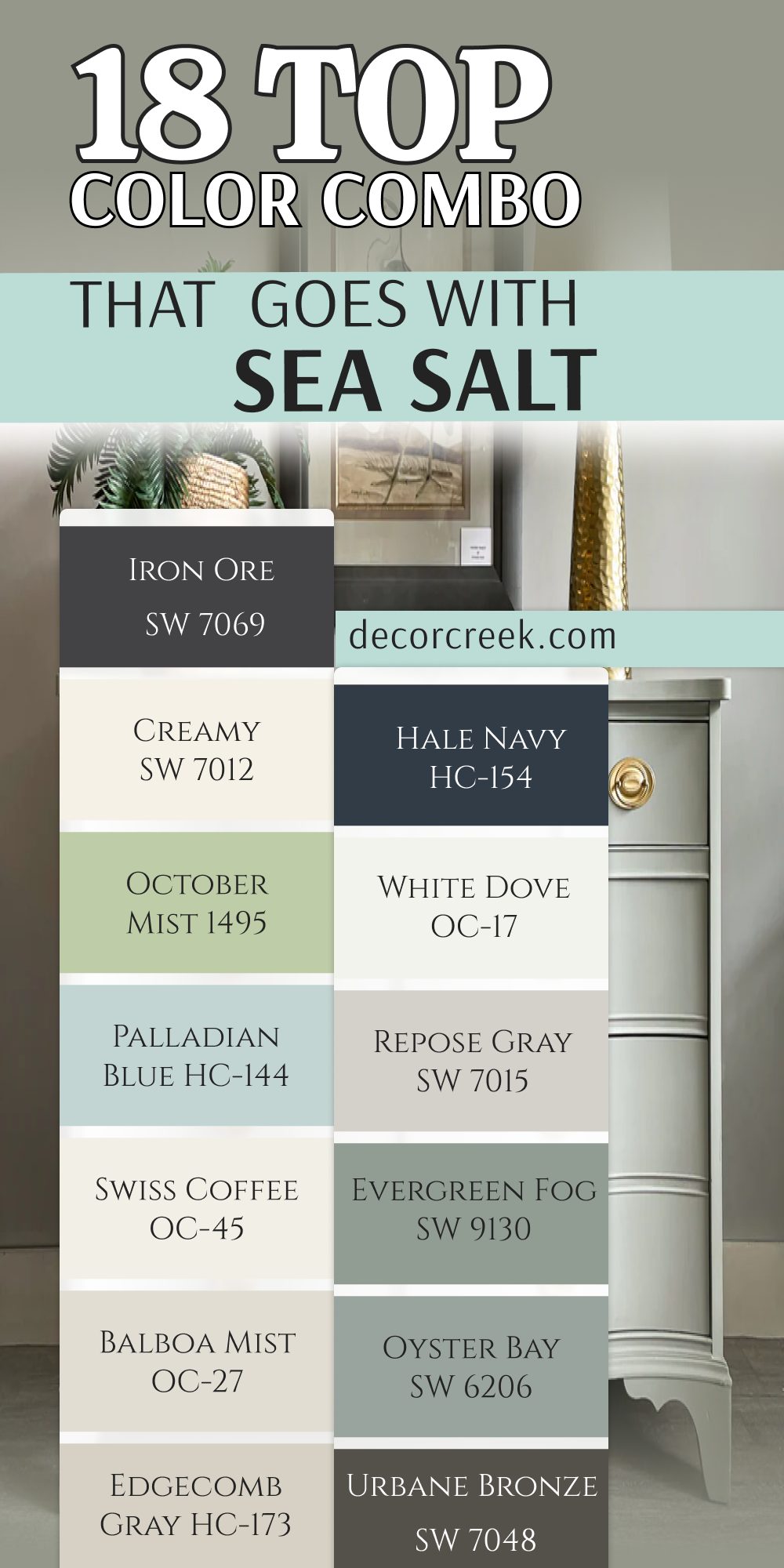
18 Top Color Combo that Goes With Sea Salt Living Room
Sea Salt SW 6204 + Pure White SW 7005
Sea Salt SW 6204 + Pure White SW 7005 is one of the cleanest and freshest living room combinations I use in real homes. The crisp white helps Sea Salt feel brighter while still keeping the room soft and welcoming.
I often use Pure White on trim, ceilings, and built-in shelves because it frames the wall color beautifully without looking too sharp. This pairing works especially well with light oak flooring, woven rugs, and linen furniture.
I also love adding black accents nearby because they help the lighter colors stand out naturally. In homes with large windows, these colors feel airy throughout the day. The overall look feels polished while still staying comfortable enough for everyday family life. This is one of my safest recommendations for homeowners who want a simple but beautiful color palette.
Best used in: living rooms, coastal interiors, open floor plans, modern homes, and beach houses
Pairs well with: light oak wood, black metal accents, woven textures, soft linen fabrics
The key rule of this color combination for living room style is to use it where natural light can keep the room feeling fresh and bright all day.
Sea Salt SW 6204 + Alabaster SW 7008
Sea Salt SW 6204 + Alabaster SW 7008 is the combination I choose when I want a living room to feel warm, soft, and welcoming. The creamy white undertones in Alabaster help soften the cooler green-blue shade beautifully.
I often use Alabaster on trim, fireplaces, and nearby walls because it creates a smooth layered look throughout the room. This pairing works beautifully with warm wood furniture, textured throws, and beige fabrics.
I also love adding brass lighting and woven decor pieces because they help the colors feel richer together. In homes with soft afternoon sunlight, this combination looks especially beautiful and comfortable. The overall feeling is relaxed without becoming too casual. I use this pairing often in farmhouse homes and family homes because it feels easy to live with every day.
Best used in: living rooms, farmhouse interiors, family rooms, coastal homes, and open layouts
Pairs well with: warm wood finishes, brass accents, woven rugs, cream fabrics
The key rule of this color combination for living room style is to use it where warm whites can soften cooler wall colors naturally.
Sea Salt SW 6204 + Accessible Beige SW 7036
Sea Salt SW 6204 + Accessible Beige SW 7036 is one of the best living room combinations when I want the home to feel warm and balanced without becoming too dark. The soft beige-gray undertones help the cooler wall color feel more comfortable and easy to decorate around.
I often use Accessible Beige on nearby walls, larger furniture pieces, or connected hallways because it creates smooth flow throughout the home. This pairing looks beautiful with warm wood floors, cream sofas, and woven textures.
I also love adding black accents and soft lighting nearby because they help the colors stand out naturally. In homes with little natural light, these shades still feel soft and welcoming during the day. The overall feeling is cozy while still staying fresh and polished.
Best used in: living rooms, family rooms, open layouts, farmhouse interiors, and transitional homes
Pairs well with: warm oak wood, cream fabrics, black fixtures, woven rugs
The key rule of this color combination for living room style is to use it where warm neutral tones can soften cooler wall colors naturally.
Sea Salt SW 6204 + Drift of Mist SW 9166
Sea Salt SW 6204 + Drift of Mist SW 9166 is the combination I use when I want a living room to feel soft, airy, and polished. The pale gray undertones help Sea Salt feel brighter while still keeping the room comfortable and welcoming.
I often use Drift of Mist on trim, ceilings, or nearby walls because it creates gentle contrast instead of a strong color break. This pairing looks especially beautiful with linen sofas, light wood furniture, and textured fabrics.
I also love adding silver accents and woven decor because they help the room feel balanced. In bright natural light, these colors shift softly throughout the day and always look fresh. The overall feeling is clean and relaxed without becoming too plain. I use this pairing often in coastal homes and modern interiors because it works so naturally.
Best used in: living rooms, coastal homes, modern interiors, bedrooms, and open floor plans
Pairs well with: pale wood tones, linen fabrics, chrome accents, woven baskets
The key rule of this color combination for living room style is to use it where soft gray tones can keep the room feeling airy and balanced.
Sea Salt SW 6204 + Naval SW 6244
Sea Salt SW 6204 + Naval SW 6244 is one of my favorite combinations when a living room needs stronger contrast and depth. The deep navy tone helps Sea Salt feel brighter and more polished while still keeping a soft coastal feeling.
I often use Naval on built-in shelves, accent walls, or furniture pieces because it adds richness without taking over the room. This pairing looks beautiful with brass lighting, warm wood furniture, and cream fabrics. I also love using textured pillows and woven rugs nearby because they soften the darker blue naturally.
In rooms with large windows, the colors feel balanced throughout the day. The overall look feels stylish and rich while still staying welcoming for family life. This combination works especially well in modern homes and coastal interiors.
Best used in: living rooms, accent walls, coastal homes, modern interiors, and family rooms
Pairs well with: brass fixtures, warm wood tones, cream upholstery, woven textures
The key rule of this color combination for living room style is to use it where deep navy tones can create depth while keeping lighter walls fresh.
Sea Salt SW 6204 + Urbane Bronze SW 7048
Sea Salt SW 6204 + Urbane Bronze SW 7048 is the combination I choose when I want a living room to feel grounded and stylish at the same time. The deep earthy tone creates rich contrast and helps Sea Salt stand out beautifully.
I often use Urbane Bronze on fireplaces, furniture pieces, or accent walls because it gives the room more depth naturally. This pairing works especially well with warm wood floors, textured fabrics, and brass accents.
I also love adding cream pillows and woven decor because they soften the darker shade beautifully. In homes with natural sunlight, these colors feel rich without becoming too heavy. The overall feeling is cozy, polished, and welcoming every day. I use this pairing often in farmhouse homes and modern organic interiors.
Best used in: living rooms, farmhouse interiors, modern homes, accent walls, and cozy interiors
Pairs well with: warm oak wood, brass accents, cream fabrics, woven rugs
The key rule of this color combination for living room style is to use it where rich earthy tones can create depth while keeping the room comfortable.
Sea Salt SW 6204 + Oyster Bay SW 6206
Sea Salt SW 6204 + Oyster Bay SW 6206 is one of the softest green combinations I use when I want a living room to feel fresh and connected to nature. The muted green undertones blend beautifully together without making the room feel too colorful.
I often use Oyster Bay on nearby walls, built-ins, or furniture accents because it adds gentle depth to the room. This pairing looks especially pretty with woven baskets, light wood furniture, and cream fabrics. I also love adding black metal accents because they help the softer colors stand out naturally.
In homes with natural sunlight, the colors shift beautifully during the day and always feel welcoming. The overall look feels relaxed and airy without becoming plain. I use this pairing often in coastal homes and cottage interiors because it creates such a comfortable feeling.
Best used in: living rooms, coastal homes, cottage interiors, family rooms, and open layouts
Pairs well with: woven textures, cream fabrics, light oak wood, matte black fixtures
The key rule of this color combination for living room style is to use it where earthy green tones can keep the room feeling fresh and balanced naturally.
Sea Salt SW 6204 + Evergreen Fog SW 9130
Sea Salt SW 6204 + Evergreen Fog SW 9130 is one of my favorite combinations for creating a richer and more layered living room. The earthy green-gray tone gives the room depth while still keeping the lighter Sea Salt color soft and welcoming.
I often use Evergreen Fog on built-ins, lower cabinets, or accent walls because it creates beautiful contrast without feeling too dark. This pairing works wonderfully with warm wood finishes, brass lighting, and textured fabrics.
I also love adding woven decor pieces because they help the earthy tones feel softer together. In homes with natural light, these colors feel warm and balanced all day long. The overall look feels stylish while still remaining comfortable for everyday living. I use this combination often in farmhouse homes and modern organic interiors.
Best used in: living rooms, farmhouse interiors, modern homes, family rooms, and open layouts
Pairs well with: brass accents, warm wood furniture, woven rugs, cream upholstery
The key rule of this color combination for living room style is to use it where earthy green tones can add richness while still keeping the room welcoming.
Sea Salt SW 6204 + Repose Gray SW 7015
Sea Salt SW 6204 + Repose Gray SW 7015 is one of the most balanced combinations I use for living rooms because the colors work beautifully with both warm and cool finishes. The soft gray tone helps Sea Salt feel cleaner and more polished without making the room feel cold.
I often use Repose Gray in nearby hallways or connected rooms because it creates smooth flow throughout the home. This pairing looks especially beautiful with white trim, stone fireplaces, and warm wood flooring.
I also love adding linen fabrics and black accents because they help the colors feel more modern. In homes with bright natural light, the tones stay soft and airy throughout the day. The overall feeling is relaxed and polished at the same time. I use this combination often during staging projects because it photographs beautifully.
Best used in: living rooms, open floor plans, modern homes, family rooms, and transitional interiors
Pairs well with: white trim, warm oak flooring, black fixtures, linen fabrics
The key rule of this color combination for living room style is to use it where soft gray tones can create balance without making the room feel cold.
Sea Salt SW 6204 + White Dove OC-17
Sea Salt SW 6204 + White Dove OC-17 is one of the prettiest combinations when I want a living room to feel soft, bright, and welcoming. The creamy undertones in White Dove help soften Sea Salt beautifully while still keeping the room airy.
I often use White Dove on trim, ceilings, and built-ins because it creates a smooth layered look without harsh contrast. This pairing looks stunning with beige fabrics, woven rugs, and warm wood furniture. I also love adding soft brass lighting because it gives the room extra warmth.
In homes with large windows, these colors glow beautifully during the day. The overall look feels comfortable and polished without trying too hard. I use this combination often in coastal homes and family homes because it always feels inviting.
Best used in: living rooms, coastal interiors, farmhouse homes, family rooms, and open layouts
Pairs well with: brass fixtures, warm wood tones, cream fabrics, woven baskets
The key rule of this color combination for living room style is to use it where creamy whites can soften cooler wall colors naturally.
Sea Salt SW 6204 + Hale Navy HC-154
Sea Salt SW 6204 + Hale Navy HC-154 is one of the richest living room combinations I use when a home needs stronger contrast. The deep navy shade helps the lighter wall color feel brighter and more polished while still keeping a welcoming coastal feeling.
I often use Hale Navy on built-in shelves, fireplaces, or furniture pieces because it gives the room beautiful depth. This pairing works especially well with brass lighting, warm wood furniture, and cream-colored fabrics.
I also love adding woven baskets and textured rugs nearby because they soften the darker blue naturally. In homes with large windows, these colors feel balanced and stylish during the day. The overall look feels elegant while still staying comfortable for family life. I use this combination often in modern homes and beach-style interiors because it always feels fresh and rich.
Best used in: living rooms, coastal interiors, family rooms, modern homes, and accent walls
Pairs well with: brass fixtures, warm oak wood, cream upholstery, woven textures
The key rule of this color combination for living room style is to use it where deep navy tones can create rich contrast without making the room feel heavy.
Sea Salt SW 6204 + Edgecomb Gray HC-173
Sea Salt SW 6204 + Edgecomb Gray HC-173 is one of the softest and most balanced combinations I use in living rooms. The warm gray-beige undertones help Sea Salt feel more welcoming and comfortable throughout the day.
I often use Edgecomb Gray on nearby walls or connected hallways because it creates smooth flow between rooms. This pairing looks beautiful with natural wood furniture, cream fabrics, and woven textures. I also love using black accents nearby because they help the lighter tones stand out more naturally.
In homes with soft natural light, these colors feel airy and cozy at the same time. The overall look feels polished without becoming too formal. I use this combination often in family homes because it works beautifully with many decorating styles.
Best used in: living rooms, open layouts, transitional interiors, family homes, and hallways
Pairs well with: warm wood finishes, woven rugs, cream fabrics, matte black accents
The key rule of this color combination for living room style is to use it where warm gray tones can soften cooler colors naturally.
Sea Salt SW 6204 + Balboa Mist OC-27
Sea Salt SW 6204 + Balboa Mist OC-27 is the pairing I choose when I want a living room to feel airy and polished without becoming too cool. The soft warm gray undertones help balance the green-blue wall color beautifully.
I often use Balboa Mist on trim, nearby walls, or ceilings because it creates a smooth layered look. This combination works wonderfully with pale wood furniture, linen fabrics, and white stone fireplaces. I also love adding woven textures and soft lighting because they make the room feel even more welcoming.
In homes with natural sunlight, these colors shift softly during the day and always look beautiful. The overall feeling is relaxed while still staying elegant enough for formal spaces. I use this pairing often in modern homes and coastal interiors because it feels light and balanced.
Best used in: living rooms, bedrooms, coastal interiors, modern homes, and open floor plans
Pairs well with: pale oak wood, linen fabrics, chrome accents, woven baskets
The key rule of this color combination for living room style is to use it where soft warm gray tones can keep the room feeling airy and connected.
Sea Salt SW 6204 + Swiss Coffee OC-45
Sea Salt SW 6204 + Swiss Coffee OC-45 is one of my favorite combinations when I want a living room to feel warm and welcoming. The creamy white undertones soften Sea Salt beautifully and create a comfortable layered look.
I often use Swiss Coffee on trim, built-ins, or ceilings because it brightens the room gently without harsh contrast. This pairing looks especially pretty with warm wood floors, textured rugs, and soft beige furniture. I also love adding brass lighting nearby because it gives the room extra warmth and richness.
In homes with lower natural light, these colors help everything feel brighter and softer throughout the day. The overall feeling is cozy while still staying clean and polished. I use this combination often in farmhouse homes and relaxed coastal interiors.
Best used in: living rooms, farmhouse interiors, coastal homes, family rooms, and open layouts
Pairs well with: warm oak wood, brass accents, cream upholstery, woven textures
The key rule of this color combination for living room style is to use it where creamy whites can soften cooler wall colors naturally.
Sea Salt SW 6204 + Palladian Blue HC-144
Sea Salt SW 6204 + Palladian Blue HC-144 is one of the softest color combinations I use when I want a living room to feel airy and relaxed. The blue-green undertones blend beautifully together and create a layered coastal look that feels light throughout the day.
I often use Palladian Blue on nearby walls, accent furniture, or decorative pieces because it adds color gently without becoming too bold. This pairing works especially well with white linen sofas, pale wood furniture, and woven rugs.
I also love adding silver accents nearby because they help the cooler tones feel polished. In homes with natural sunlight, these colors shift beautifully and always feel welcoming. The overall look feels fresh and comfortable without looking plain. I use this combination often in beach homes and cottage interiors because it creates such a soft and airy feeling.
Best used in: living rooms, coastal homes, beach houses, cottage interiors, and family rooms
Pairs well with: white linen fabrics, pale oak wood, silver fixtures, woven textures
The key rule of this color combination for living room style is to use it where soft blue-green tones can keep the room feeling airy and connected naturally.
Sea Salt SW 6204 + October Mist 1495
Sea Salt SW 6204 + October Mist 1495 is the combination I choose when I want a living room to feel earthy and rich without becoming dark. The muted green undertones create a layered natural look that works beautifully with wood finishes and woven textures.
I often use October Mist on accent walls or built-in cabinets because it gives the room extra depth while still keeping a soft feeling. This pairing looks especially pretty with warm brass lighting, cream upholstery, and natural oak furniture.
I also love adding indoor plants nearby because the earthy tones make greenery stand out beautifully. In homes with natural light, these colors feel warm and balanced throughout the day. The overall look feels stylish while still staying comfortable enough for everyday life. I use this combination often in modern organic homes and farmhouse interiors.
Best used in: living rooms, farmhouse homes, modern interiors, family rooms, and open layouts
Pairs well with: warm oak furniture, brass accents, woven rugs, cream fabrics
The key rule of this color combination for living room style is to use it where earthy green tones can add richness while keeping the room soft and welcoming.
Sea Salt SW 6204 + Creamy SW 7012
Sea Salt SW 6204 + Creamy SW 7012 is one of my favorite combinations for making a living room feel warm and welcoming. The creamy undertones soften the cooler wall color beautifully and help the room feel balanced during every season.
I often use Creamy on trim, ceilings, or nearby walls because it brightens the room gently without creating strong contrast. This pairing looks beautiful with beige fabrics, warm wood furniture, and woven decor pieces.
I also love adding brass lamps and textured pillows because they help the room feel richer and more comfortable. In homes with lower natural light, these colors help everything feel softer and brighter throughout the day. The overall look feels cozy while still staying clean and polished. I use this pairing often in family homes because it feels easy to enjoy every day.
Best used in: living rooms, family rooms, farmhouse interiors, coastal homes, and open layouts
Pairs well with: warm wood finishes, brass fixtures, cream upholstery, woven textures
The key rule of this color combination for living room style is to use it where creamy whites can soften cooler paint colors naturally.
Sea Salt SW 6204 + Iron Ore SW 7069
Sea Salt SW 6204 + Iron Ore SW 7069 is one of the boldest combinations I use when a living room needs stronger contrast and depth. The rich charcoal tone helps Sea Salt feel brighter and more polished while still keeping the room welcoming.
I often use Iron Ore on fireplaces, built-ins, or accent walls because it gives the room a modern and grounded feeling. This pairing works beautifully with warm wood furniture, brass lighting, and soft cream fabrics. I also love adding woven rugs nearby because they soften the darker shade naturally.
In homes with natural sunlight, these colors feel balanced instead of heavy. The overall look feels modern while still staying warm enough for everyday living. I use this combination often in modern farmhouse homes and contemporary interiors because it always creates beautiful contrast.
Best used in: living rooms, modern interiors, farmhouse homes, accent walls, and open layouts
Pairs well with: warm oak wood, brass accents, cream fabrics, woven textures
The key rule of this color combination for living room style is to use it where darker charcoal tones can create depth while keeping lighter walls fresh and balanced.

15 Top Color Combo that Goes with Sea Salt Exterior
Sea Salt SW 6204 + Pure White SW 7005
Sea Salt SW 6204 + Pure White SW 7005 is one of the cleanest exterior color combinations I use for homes that need a fresh and welcoming look. The crisp white trim helps the soft green-blue siding stand out beautifully without looking too sharp.
I often recommend this pairing for coastal homes, cottages, and modern farmhouse exteriors because it feels bright and comfortable. The colors also work beautifully with black shutters, light stone accents, and natural wood doors.
In sunlight, the combination looks airy and polished throughout the day. I also love how pretty landscaping and greenery look against these shades because the colors feel connected to nature. This pairing gives the home strong curb appeal while still feeling soft and inviting. It always photographs beautifully for listings and exterior design projects.
Best used in: coastal homes, cottages, farmhouse exteriors, beach houses, and modern homes
Pairs well with: black shutters, natural wood doors, light stone accents, warm outdoor lighting
The key rule of this color combination for exterior style is to use it where crisp white trim can keep softer siding colors feeling fresh and bright.
Sea Salt SW 6204 + Alabaster SW 7008
Sea Salt SW 6204 + Alabaster SW 7008 is one of my favorite exterior combinations when I want a home to feel warm and welcoming. The creamy white trim softens the cooler green-blue siding beautifully and helps the exterior feel balanced.
I often recommend this pairing for farmhouse homes and traditional homes because it works well with brick, stone, and wood accents. It also looks beautiful with brass lighting and dark roofing materials. In natural sunlight, the colors feel soft and comfortable instead of sharp or cold.
I love adding warm wood front doors nearby because they help the creamy undertones stand out naturally. The overall look feels polished without becoming too formal. This combination works especially well in neighborhoods with mature landscaping and natural greenery.
Best used in: farmhouse exteriors, traditional homes, cottages, suburban homes, and coastal houses
Pairs well with: warm wood doors, dark roofing, brass lighting, stone pathways
The key rule of this color combination for exterior style is to use it where creamy whites can soften cooler siding colors naturally.
Sea Salt SW 6204 + Oyster White SW 7637
Sea Salt SW 6204 + Oyster White SW 7637 is a softer exterior combination that creates a relaxed and airy look for the home. The warm off-white undertones help Sea Salt feel balanced and welcoming during every season.
I often use Oyster White for trim and porch railings because it blends beautifully without creating harsh contrast. This pairing works especially well with natural stone, warm brick, and soft gray roofing. I also love how beautiful landscaping looks against these colors because the tones feel earthy and connected.
In homes with lots of sunlight, the exterior feels bright while still staying soft. The overall look feels calm and polished without becoming too plain. I use this combination often in coastal communities and cottage-style homes because it always feels inviting.
Best used in: coastal homes, cottages, traditional exteriors, beach houses, and suburban homes
Pairs well with: warm stone accents, gray roofing, wood shutters, natural landscaping
The key rule of this color combination for exterior style is to use it where soft off-white trim can keep siding colors feeling airy and welcoming.
Sea Salt SW 6204 + Accessible Beige SW 7036
Sea Salt SW 6204 + Accessible Beige SW 7036 is one of the best combinations when I want an exterior to feel warm, soft, and grounded. The beige-gray undertones help the cooler siding color feel more natural and connected to the landscape.
I often recommend Accessible Beige for trim, garage doors, or nearby stonework because it creates smooth contrast without becoming too dark. This pairing works beautifully with warm brick, black shutters, and natural wood accents.
In sunlight, the colors stay soft and welcoming throughout the day. I also love how landscaping and greenery look next to these tones because everything feels balanced together. The overall appearance feels elegant while still staying comfortable and easy to enjoy. This combination works especially well for family homes and farmhouse exteriors.
Best used in: farmhouse homes, suburban exteriors, cottages, traditional homes, and open landscapes
Pairs well with: black shutters, warm brick, natural wood doors, outdoor lantern lighting
The key rule of this color combination for exterior style is to use it where warm neutral tones can soften cooler siding colors naturally.
Sea Salt SW 6204 + Urbane Bronze SW 7048
Sea Salt SW 6204 + Urbane Bronze SW 7048 is one of the richest exterior combinations I use when a home needs stronger contrast and depth. The deep brown-gray shade helps the lighter siding color stand out beautifully while still keeping the exterior welcoming.
I often recommend Urbane Bronze for shutters, front doors, or garage doors because it creates a grounded and polished look. This pairing works especially well with stone accents, warm wood details, and black outdoor lighting.
In natural sunlight, the darker shade feels rich without becoming too heavy. I also love how greenery and landscaping stand out next to these earthy tones. The overall appearance feels stylish while still staying comfortable and inviting. This combination works beautifully for farmhouse homes and modern exteriors alike.
Best used in: farmhouse exteriors, modern homes, cottages, suburban homes, and open landscapes
Pairs well with: stone accents, black lantern lighting, warm wood doors, dark roofing
The key rule of this color combination for exterior style is to use it where rich earthy tones can create depth while keeping the home welcoming.
Sea Salt SW 6204 + Iron Ore SW 7069
Sea Salt SW 6204 + Iron Ore SW 7069 is one of the boldest exterior combinations I recommend when homeowners want modern curb appeal. The deep charcoal tone creates striking contrast and helps the soft siding color feel cleaner and brighter.
I often use Iron Ore on shutters, trim accents, or front doors because it gives the home a sharp and polished appearance. This pairing works beautifully with black windows, warm wood accents, and stone pathways.
In bright sunlight, the colors stay balanced without feeling too dark. I also love how beautiful outdoor greenery looks against this combination because the contrast feels fresh and modern. The overall appearance feels stylish while still staying comfortable enough for family homes. I use this pairing often for modern farmhouse exteriors and contemporary homes.
Best used in: modern homes, farmhouse exteriors, suburban homes, cottages, and new builds
Pairs well with: black windows, natural wood doors, gray stone, modern outdoor lighting
The key rule of this color combination for exterior style is to use it where darker charcoal tones can create strong contrast without making the home feel heavy.
Sea Salt SW 6204 + Naval SW 6244
Sea Salt SW 6204 + Naval SW 6244 is one of my favorite combinations for creating a rich coastal exterior. The deep navy shade adds depth while helping the lighter siding feel fresh and airy.
I often use Naval on shutters, front doors, or porch ceilings because it creates beautiful contrast without looking too harsh. This pairing works wonderfully with white trim, warm wood accents, and natural stone details. I also love adding brass outdoor lighting because it gives the home extra warmth and character.
In sunlight, these colors feel balanced and welcoming during every part of the day. The overall appearance feels elegant while still staying relaxed enough for coastal living. I use this combination often in beach homes and classic farmhouse exteriors.
Best used in: coastal homes, beach houses, farmhouse exteriors, cottages, and suburban homes
Pairs well with: white trim, brass lanterns, warm wood doors, stone walkways
The key rule of this color combination for exterior style is to use it where rich navy accents can keep lighter siding colors feeling fresh and polished.
Sea Salt SW 6204 + Evergreen Fog SW 9130
Sea Salt SW 6204 + Evergreen Fog SW 9130 is the combination I choose when I want an exterior to feel earthy and connected to nature. The muted green-gray shade adds richness while still keeping the home soft and welcoming.
I often recommend Evergreen Fog for shutters, trim accents, or garage doors because it blends naturally with Sea Salt siding. This pairing looks especially beautiful with stone details, warm wood accents, and black outdoor lighting.
I also love how landscaping and greenery look next to these colors because everything feels balanced together. In homes surrounded by trees or natural views, this combination feels especially beautiful throughout the seasons. The overall appearance feels stylish while still staying relaxed and comfortable. I use this pairing often in modern farmhouse and cottage-style homes.
Best used in: cottages, farmhouse homes, suburban exteriors, nature-inspired homes, and coastal houses
Pairs well with: natural stone, black fixtures, warm wood accents, outdoor greenery
The key rule of this color combination for exterior style is to use it where earthy green tones can blend naturally with outdoor surroundings.
Sea Salt SW 6204 + Retreat SW 6207
Sea Salt SW 6204 + Retreat SW 6207 is one of the most beautiful combinations I use when I want an exterior to feel rich and connected to nature. The deeper green tone gives the home extra depth while still keeping the softer siding color airy and welcoming.
I often use Retreat on shutters, front doors, or porch accents because it creates gentle contrast without looking too dark. This pairing works especially well with stone pathways, black lighting fixtures, and natural wood details.
I also love how greenery and landscaping blend naturally with these earthy tones. In sunlight, the colors shift softly throughout the day and always feel balanced. The overall appearance feels cozy while still staying polished and stylish. I use this combination often in cottage homes and farmhouse exteriors because it feels relaxed and natural.
Best used in: cottage homes, farmhouse exteriors, coastal houses, suburban homes, and nature-inspired properties
Pairs well with: black fixtures, warm wood accents, stone pathways, outdoor greenery
The key rule of this color combination for exterior style is to use it where earthy green tones can create depth while blending naturally with the landscape.

Sea Salt SW 6204 + Drift of Mist SW 9166
Sea Salt SW 6204 + Drift of Mist SW 9166 is one of the softest exterior combinations I recommend for homes that need a light and airy appearance. The pale gray undertones help the siding color feel brighter while still keeping the home welcoming and comfortable.
I often use Drift of Mist on trim, porch railings, or garage doors because it creates gentle contrast without harsh lines. This pairing looks especially beautiful with white stone accents, pale wood details, and black windows.
I also love how pretty landscaping looks against these colors because everything feels fresh and balanced together. In homes with lots of sunlight, the tones stay soft and elegant throughout the day. The overall appearance feels polished while still remaining relaxed enough for family homes.
Best used in: coastal homes, cottages, suburban exteriors, modern homes, and beach houses
Pairs well with: pale wood accents, black windows, white stone, outdoor lantern lighting
The key rule of this color combination for exterior style is to use it where soft gray tones can keep siding colors feeling airy and balanced naturally.
Sea Salt SW 6204 + White Dove OC-17
Sea Salt SW 6204 + White Dove OC-17 is the combination I use when I want an exterior to feel bright, soft, and welcoming at the same time. The creamy white trim helps soften the cooler siding color beautifully while still keeping the home fresh.
I often recommend White Dove for trim, porch columns, or railings because it creates a smooth and connected look. This pairing works especially well with warm brick, natural wood doors, and black outdoor fixtures.
I also love how beautiful flowers and greenery look against these colors because the tones feel soft and natural together. In sunlight, the combination glows gently throughout the day without looking too bright. The overall appearance feels polished while still staying comfortable and inviting for everyday living.
Best used in: farmhouse homes, cottages, coastal houses, suburban exteriors, and traditional homes
Pairs well with: warm brick, natural wood doors, black lantern lighting, stone details
The key rule of this color combination for exterior style is to use it where creamy white trim can soften cooler siding colors naturally.
Sea Salt SW 6204 + Edgecomb Gray HC-173
Sea Salt SW 6204 + Edgecomb Gray HC-173 is one of the most balanced exterior combinations I use for homes surrounded by natural landscaping. The warm gray-beige undertones help Sea Salt feel softer and more grounded throughout the seasons.
I often recommend Edgecomb Gray for trim, shutters, or garage doors because it creates gentle contrast without becoming too dark. This pairing looks beautiful with stone accents, warm wood details, and black metal fixtures.
I also love how greenery and flowers stand out against these colors because the tones feel earthy and welcoming together. In natural sunlight, the home feels airy while still keeping warmth and character. The overall appearance feels elegant without becoming too formal. I use this combination often in suburban homes and modern farmhouse exteriors.
Best used in: farmhouse homes, suburban exteriors, cottages, nature-inspired homes, and coastal houses
Pairs well with: stone details, black metal accents, warm wood doors, outdoor greenery
The key rule of this color combination for exterior style is to use it where warm gray tones can soften cooler siding colors naturally.
Sea Salt SW 6204 + Hale Navy HC-154
Sea Salt SW 6204 + Hale Navy HC-154 is one of the richest exterior combinations I recommend when homeowners want strong curb appeal without making the home feel too dark. The deep navy shade gives beautiful contrast while helping the softer siding color feel cleaner and brighter.
I often use Hale Navy on shutters, front doors, or garage doors because it creates a polished coastal look. This pairing works especially well with white trim, brass lighting, and natural wood accents. I also love how landscaping and stone pathways stand out next to these colors because everything feels balanced together.
In natural sunlight, the darker blue still feels soft and welcoming throughout the day. The overall appearance feels elegant while still staying relaxed enough for family homes. I use this combination often in coastal houses and modern farmhouse exteriors.
Best used in: coastal homes, farmhouse exteriors, beach houses, suburban homes, and cottages
Pairs well with: white trim, brass lanterns, natural wood doors, stone pathways
The key rule of this color combination for exterior style is to use it where deep navy accents can create contrast while keeping lighter siding colors fresh.
Sea Salt SW 6204 + Swiss Coffee OC-45
Sea Salt SW 6204 + Swiss Coffee OC-45 is one of my favorite combinations for making an exterior feel warm and welcoming. The creamy white undertones soften the cooler siding color beautifully and help the home feel balanced in every season.
I often recommend Swiss Coffee for trim, porch railings, or columns because it creates gentle contrast without harsh lines. This pairing looks beautiful with warm wood details, black fixtures, and natural stone accents.
I also love how flowers and greenery stand out against these colors because the softer tones feel connected to nature. In sunlight, the home looks airy and polished throughout the day. The overall appearance feels cozy while still staying clean and elegant. I use this combination often in farmhouse homes and relaxed coastal exteriors.
Best used in: farmhouse homes, cottages, coastal houses, suburban exteriors, and traditional homes
Pairs well with: black fixtures, warm wood doors, natural stone, outdoor greenery
The key rule of this color combination for exterior style is to use it where creamy whites can soften cooler siding colors naturally.
Sea Salt SW 6204 + Revere Pewter HC-172
Sea Salt SW 6204 + Revere Pewter HC-172 is one of the most balanced exterior combinations I use when a home needs warmth and softness together. The warm gray undertones help the lighter siding color feel grounded without becoming too dark.
I often use Revere Pewter on shutters, trim, or garage doors because it blends naturally with Sea Salt while still creating depth. This pairing works beautifully with stone pathways, black lantern lighting, and natural wood accents.
I also love how landscaping and mature trees look next to these colors because the earthy tones feel comfortable together. In natural sunlight, the home feels airy while still keeping richness and character. The overall appearance feels polished without becoming too formal. I use this combination often in suburban homes and modern farmhouse exteriors because it works with many architectural styles.
Best used in: suburban homes, farmhouse exteriors, cottages, traditional homes, and open landscapes
Pairs well with: black lanterns, natural wood doors, gray stone, outdoor greenery
The key rule of this color combination for exterior style is to use it where warm gray tones can soften cooler siding colors while adding depth naturally.
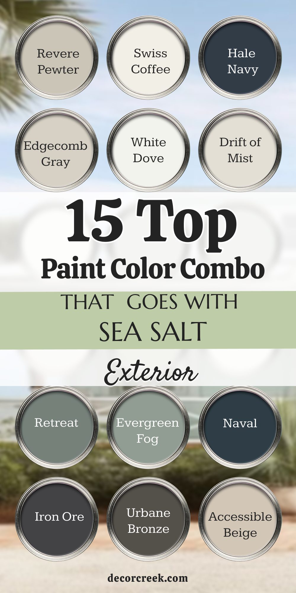
Sea Salt by Sherwin-Williams is one of those paint colors I continue using year after year because it works beautifully in so many homes and decorating styles. I have used it in small cottages near the beach, large family homes, modern farmhouse interiors, and even newer modern builds because it always brings a soft and welcoming feeling. What makes this color so special is how easily it works with many different shades without feeling too busy or difficult to decorate around.
I love pairing it with warm whites, earthy greens, soft grays, creamy neutrals, and deep navy tones depending on the mood homeowners want inside the room. Some combinations help rooms feel brighter and lighter during the day, while others add richness and depth without making the home feel dark or heavy. I always remind homeowners that lighting changes everything with Sea Salt because the color can shift gently throughout the day.
Flooring, countertops, furniture fabrics, and even outdoor landscaping can affect how the color looks inside the home. That is why I always recommend testing samples together before making a final paint decision. A color that looks perfect online may feel completely different once sunlight hits the walls in real life. Taking the time to compare shades side by side usually helps homeowners feel much more confident with their final choice.
What I love most about Sea Salt is how flexible it feels in bathrooms, living rooms, kitchens, bedrooms, laundry rooms, and even exterior designs. Few paint colors can move so easily between coastal homes, farmhouse interiors, modern spaces, and traditional houses while still feeling natural and comfortable. Soft whites like Alabaster, White Dove, and Swiss Coffee help Sea Salt feel warmer and softer, especially in homes with lower natural light.
Richer shades like Naval, Hale Navy, Iron Ore, and Urbane Bronze create stronger contrast and give the home a more polished and stylish feeling. I also love earthy greens like Evergreen Fog, Oyster Bay, Retreat, and October Mist because they create layered color palettes that feel connected to nature. Warm grays and beige tones such as Accessible Beige, Edgecomb Gray, and Revere Pewter help balance the cooler undertones beautifully.