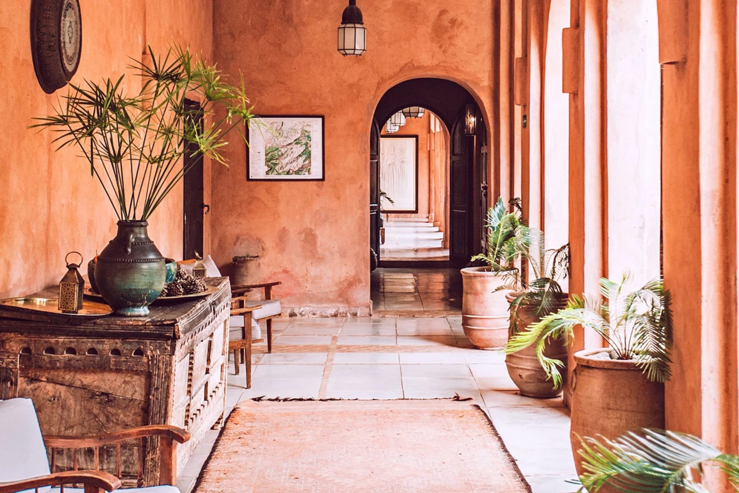
I love how paint changes how a house feels as soon as you walk through the door. Terracotta is one of those colors that makes a room feel like a warm hug. It reminds me of clay pots in a sunny garden or the desert at sunset.
I think these colors bring a special kind of energy into a home that other shades just cannot match. When you see these walls, you feel like you are stepping into a place that has a lot of heart. It is like the house is telling you to sit down and stay for a while.
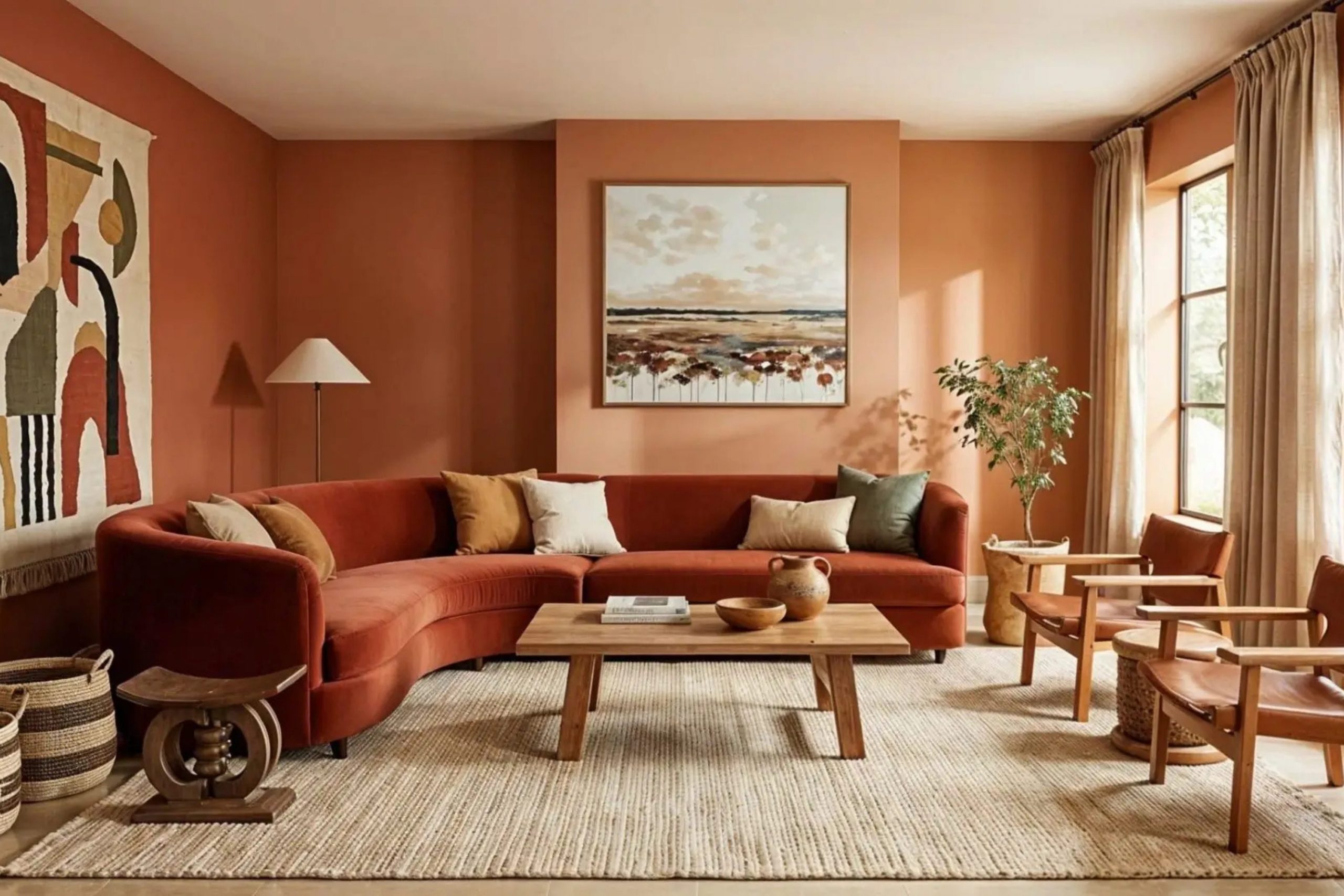
When I help people stage their homes, I look for colors that make people feel happy and safe. These reddish-orange tones are perfect for making a large room feel cozy or a small room feel intentional. You can use these shades to bring a bit of nature inside your own four walls.
I find that people relax much faster when they are surrounded by earth tones that feel real and solid. It makes a house feel like it has deep roots and a lot of character. Adding this color to your walls is a great way to make a house feel like a real home.
Why I Always Trust Sherwin-Williams and Benjamin Moore for the Best Terracotta Paint Colors
I have spent years looking at paint chips and painting sample boards for my clients. Sherwin-Williams and Benjamin Moore are the two brands I go to every single time. Their paint covers the walls well and the colors look exactly like the little paper tags in the store.
I never have to worry about the paint looking patchy or thin when I use these trusted brands. They have spent a long time making sure the pigments are strong enough to look great in one or two coats. This saves a lot of time and money for homeowners who want the job done right.
They also have the best variety of earthy tones that do not look like bright neon orange. When you pick a terracotta from these brands, you know it will look expensive and rich. It is important to use high-quality paint so the color stays bright and beautiful for a long time.
Cheap paint can sometimes look a bit chalky or flat, but these brands always have a nice glow. I want my clients to feel proud of their walls when their friends come over to visit. High-quality paint is the best way to make sure the color looks deep and professional.
How I Choose the Perfect Terracotta Shade for Any Room
Picking the right shade starts with looking at the windows in your room. If you have a lot of sun, a bright terracotta might look very loud. If your room is dark, a deep clay color might make it feel like a cave.
I always think about what time of day the family spends the most time in that specific area. A room used for morning coffee needs a different glow than a room used for watching movies at night. The way the sun moves across the sky changes how the orange and red tones look to your eyes.
I always tell people to paint a big square on the wall before they decide. Watch how the color changes when you turn on your lamps at night. You want a color that makes you smile whether it is morning or evening.
It is very important to see the paint next to your floor and your furniture too. Sometimes a color looks great on a tiny paper card but feels too strong when it covers a whole wall. Taking the time to test the color helps you feel sure that you made the right choice.
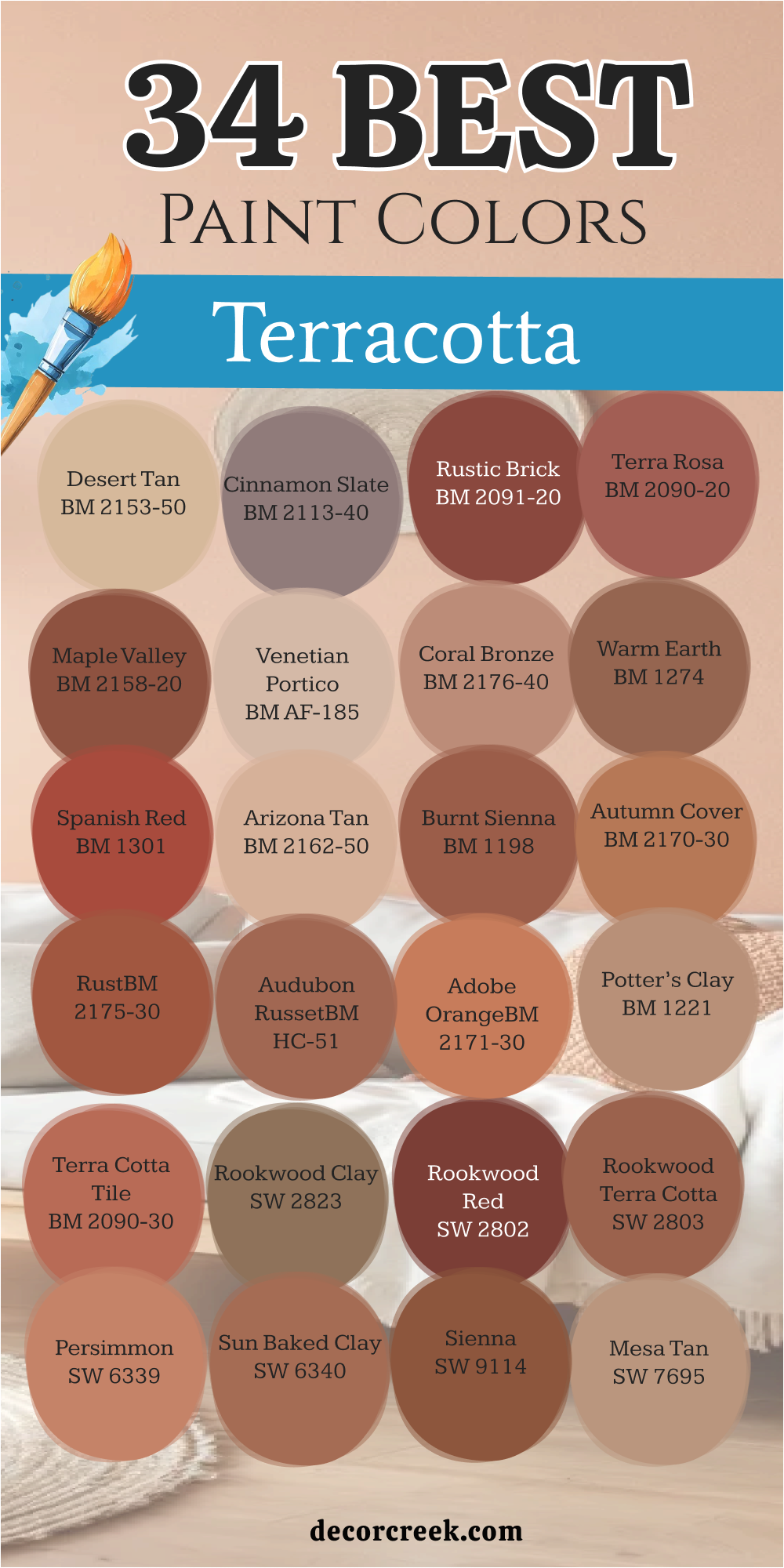
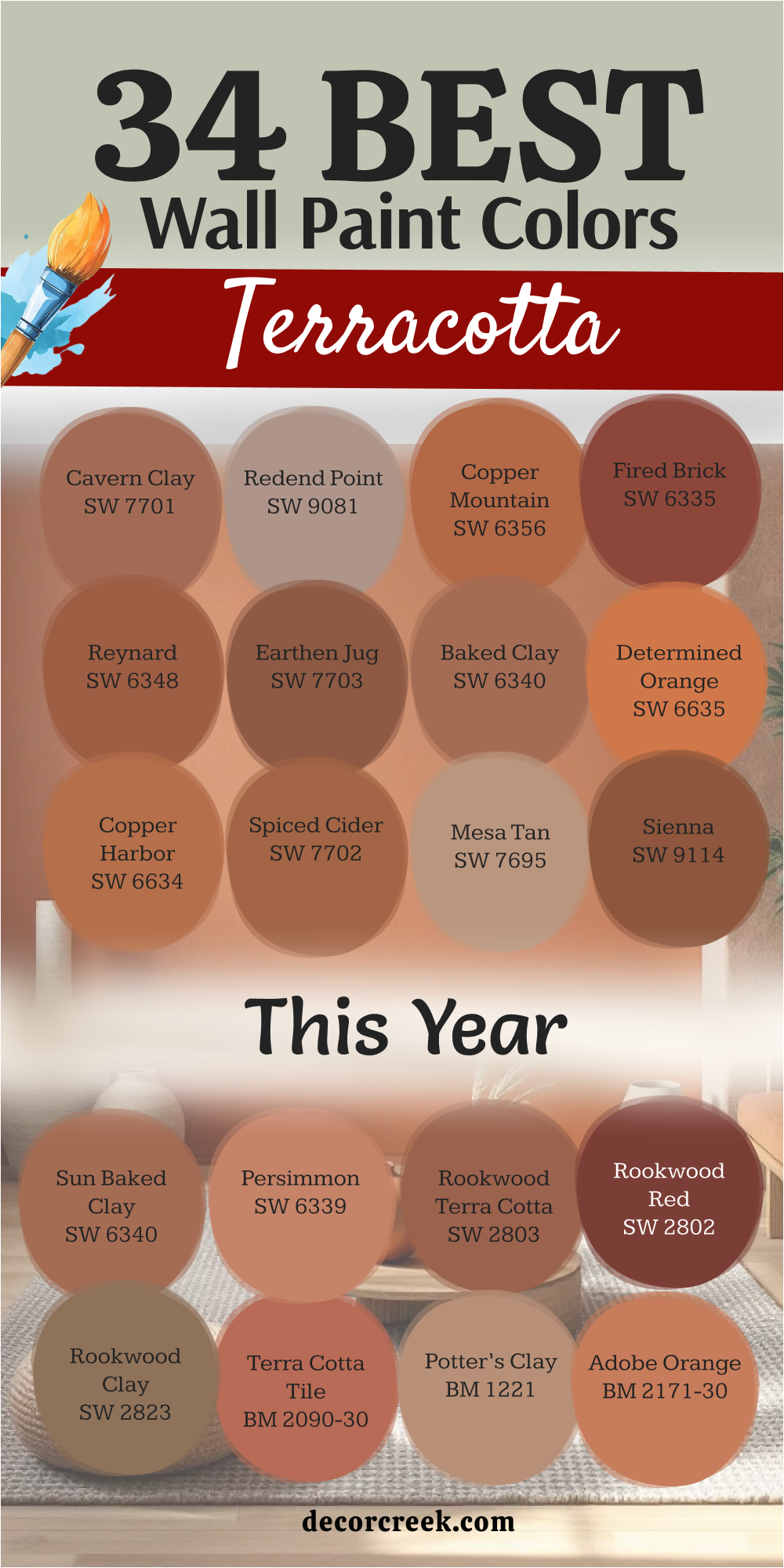
34 Top Terracotta Wall Paint Colors This Year
Cavern Clay SW 7701
Cavern Clay — SW 7701 brings a very grounded feeling to a den or a library. This color looks like the red rocks you might see on a trip to the Southwest. It is a bold choice that works well as an accent wall behind a soft tan sofa.
I think this shade is great because it has a bit of a vintage look. It makes a room feel sturdy and real. Many people like how it sits between orange and brown.
You will notice it looks different when the sun hits it directly. It is a very popular choice for people who want a natural look. Using it in a small bathroom can make the room feel very special.
Best used in: entryways, home offices, accent walls, and dining rooms.
Pairs well with: Distance SW 6243, Haven SW 6437, Origami White SW 7636, and dark wood furniture. The key rule of this color for a grounded style is to use it where you want the earth to feel close and the mood to stay steady.
🎨 Check out the complete guide to this color right HERE 👈

Redend Point — SW 9081
Redend Point — SW 9081 is a very soft and pinkish version of clay. It is not too bright and feels very gentle on the eyes. I use this when a homeowner wants a bit of color but is afraid of anything too dark.
This paint looks wonderful with light wood floors and cream rugs. It makes a bedroom feel very peaceful and quiet. Most people find it very easy to live with for many years.
It acts like a neutral but has much more personality than plain gray. You can put it in a nursery or a guest room for a sweet look. The color stays pretty even when the lights are low.
Best used in: bedrooms, nurseries, sitting rooms, and laundry rooms.
Pairs well with: Foothills SW 7514, Kestrel White SW 7516, Malted Milk SW 6057, and light oak. The key rule of this color for a soft style is to use it where you want to feel relaxed and surrounded by a gentle glow.
🎨 Check out the complete guide to this color right HERE 👈

Copper Mountain — SW 6356
Copper Mountain — SW 6356 is a bright and energetic shade that grabs your attention. It has a lot of orange in it which makes it feel very sunny. This is a great pick for a kitchen where you want people to feel awake and happy.
It looks amazing with white cabinets because the contrast is so sharp. I like using this in a mudroom to start the day with a pop of energy. It reminds me of a shiny new penny or a bright autumn leaf.
Kids often like this color because it feels fun and playful. It is a brave color that shows you have a lot of style. You will find that it makes a hallway feel much shorter and wider.
Best used in: kitchens, breakfast nooks, mudrooms, and accent walls.
Pairs well with: Alabaster SW 7008, Black Magic SW 6991, Naval SW 6244, and brass hardware. The key rule of this color for a high-energy style is to use it in busy spots where the family gathers to talk and eat.
🎨 Check out the complete guide to this color right HERE 👈

Fired Brick — SW 6335
Fired Brick — SW 6335 is a deep and serious red-orange that feels very traditional. It looks like the bricks on an old cozy house in the city. I suggest this for a dining room where you want to have long dinners with friends.
The color is very rich and makes white trim look extra clean. It is dark enough to feel cozy but light enough to see the details of the room. It does not feel like a typical orange because it has a lot of red in it.
This shade is perfect for a house that has a lot of history. It feels very solid and will never go out of fashion. You can use it to make a large room feel much more private and snug.
Best used in: dining rooms, libraries, front doors, and powder rooms.
Pairs well with: Latte SW 6108, Dover White SW 6385, Van Dyke Brown SW 7041, and antique gold. The key rule of this color for a traditional style is to use it where you want history and warmth to meet in a grand way.
Reynard — SW 6348
Reynard — SW 6348 is a medium-toned clay color that feels very balanced. It is not too dark and not too light, which makes it very versatile. I like how it looks in a living room with a lot of green plants.
The name sounds like a fox, and the color is just as clever and quick. It brings a lot of warmth to a room that feels a bit chilly or cold. Many homeowners choose this for their main living area because it is so inviting.
It works well with both modern and old-fashioned furniture. You will see that it creates a very friendly vibe for guests. It is a color that tells people they are welcome to stay a while.
Best used in: living rooms, hallways, dens, and craft rooms.
Pairs well with: Shoji White SW 7042, Iron Ore SW 7069, Svelte Sage SW 6164, and linen fabrics. The key rule of this color for a welcoming style is to use it in the heart of the home where everyone hangs out.
Earthen Jug — SW 7703
Earthen Jug — SW 7703 is a very saturated and muddy terracotta. It feels like real pottery that was just pulled out of a kiln. This color is heavy and deep, so it adds a lot of weight to a room.
I love using this in a room with tall ceilings to bring the height down a bit. It makes a room feel like a secret hideout or a cozy cabin. The brown undertones keep it from looking like a piece of fruit.
It feels very sophisticated and grown-up when you see it on all four walls. You should use it if you want your home to feel very grounded and sturdy. It is a favorite for designers who like a natural look.
Best used in: media rooms, master bedrooms, studies, and basements.
Pairs well with: Pure White SW 7005, Accessible Beige SW 7036, Urbane Bronze SW 7048, and leather chairs. The key rule of this color for a moody style is to use it where you want to curl up with a book and hide from the world.
Baked Clay — SW 6340
Baked Clay — SW 6340 has a very dusty and sun-washed appearance. It looks like it has been sitting in the sun for a long time. I like this for a porch or a sunroom because it blends with the outdoors.
The color is very warm but it is also a bit muted so it is not loud. It reminds me of the tiles on a roof in a warm country. Many people choose this for a guest bedroom to make it feel like a vacation.
It works perfectly with wicker furniture and light blue accents. This shade makes a room feel airy even though it is a warm color. It is a great middle-ground choice for many homes.
Best used in: sunrooms, guest rooms, porches, and kitchens.
Pairs well with: Rain SW 6219, Creamy SW 7012, Peppercorn SW 7674, and natural jute rugs. The key rule of this color for a vacation style is to use it where the light is bright and the furniture is casual.
🎨 Check out the complete guide to this color right HERE 👈
Determined Orange — SW 6635
Determined Orange — SW 6635 is a very brave and bold shade for a home. It is closer to a true orange than many other terracotta colors. This color is for someone who wants their room to stand out and be remembered.
I use this in small doses or in rooms where people need to feel creative. It works very well in an art studio or a kid’s playroom. The color is very bright and can make a dark hallway feel much more alive.
You should be ready for a lot of energy when you paint a room this color. It is a happy shade that feels very confident and strong. It makes a statement that you love color and life.
Best used in: playrooms, art studios, accent walls, and front doors.
Pairs well with: Extra White SW 7006, Tricorn Black SW 6258, Upward SW 6239, and modern art. The key rule of this color for a bold style is to use it in places where you want to feel energetic and full of ideas.
🎨 Check out the complete guide to this color right HERE 👈
Copper Harbor — SW 6634
Copper Harbor — SW 6634 is a rich and glowing color that feels very warm. It has a metallic name because it seems to shine when the light hits it. I like to use this in a kitchen to make the wood cabinets look better.
The color is very deep and has a lot of personality. It is a great choice for a house that has a lot of natural wood trim. It feels very cozy and high-end at the same time.
Many people think it looks like a beautiful sunset over the water. It is a very comforting color to see when you come home after a long day. You will love how it makes your home feel expensive.
Best used in: dining rooms, kitchens, family rooms, and entryways.
Pairs well with: Grecian Ivory SW 7541, Bronze Beauty SW 9107, High Reflective White SW 7757, and walnut wood. The key rule of this color for a rich style is to use it where you want the light to feel warm and the wood to look dark.
🎨 Check out the complete guide to this color right HERE 👈
Spiced Cider — SW 7702
Spiced Cider — SW 7702 is a very yummy color that reminds me of fall. It is a mix of orange, red, and brown that feels very tasty. I love using this in a breakfast nook where people gather in the morning.
The color is very inviting and makes people want to sit and talk. It feels very seasonal but it actually looks good all year long. It is a medium shade that is not too dark for a small room.
I find that it works very well with creamy white colors and dark metal. It gives a room a very rustic and farmhouse feel. This is a top pick for a kitchen that needs a little bit of spice.
Best used in: kitchens, dining areas, mudrooms, and living rooms.
Pairs well with: Swiss Coffee, Black Fox SW 7020, Sea Salt SW 6204, and wrought iron. The key rule of this color for a cozy style is to use it where people eat and drink and spend time together.
🎨 Check out the complete guide to this color right HERE 👈
Mesa Tan — SW 7695
Mesa Tan — SW 7695 is a very light and sandy version of terracotta. It feels more like a neutral tan but with a hidden orange heart. I use this when a client wants a very safe and easy color for the whole house.
The color is very light and makes rooms feel big and open. It is a great choice for a living room that gets a lot of natural light. It reminds me of the sand in a desert canyon.
You can put any color of furniture with this and it will look good. It is a very flexible color that works in any room of the house. Most people find it very helpful for making a home feel clean.
Best used in: living rooms, bedrooms, hallways, and open floor plans.
Pairs well with: Urban Bronze SW 7048, Snowbound SW 7004, Evergreen Fog SW 9130, and tan leather. The key rule of this color for an open style is to use it as a background for your favorite colorful furniture.
Sienna — SW 9114
Sienna — SW 9114 is a very classic earth tone that feels very natural. It is a deep reddish-brown that looks like the soil in a beautiful garden. I like to use this in a study or a home office to make it feel serious.
The color is very warm and makes the walls feel like they are protecting you. It is a great choice for a room with a fireplace and big cozy chairs. It feels very old-fashioned in a good way.
Many people choose this for their exterior to make their house look like a villa. It is a very strong color that does not fade away. You will find that it makes a room feel very private and quiet.
Best used in: home offices, libraries, exteriors, and dens.
Pairs well with: Macadamia SW 6142, Softer Tan SW 6141, Roycroft Copper Red SW 2839, and stone accents. The key rule of this color for a sturdy style is to use it where you want the walls to feel thick and the room to feel quiet.
Sun Baked Clay — SW 6340
Sun Baked Clay — SW 6340 is a color that feels very warm and dry. It looks like the desert under a hot afternoon sun. I use this to make a room feel like it has a lot of history and character.
The color is a soft orange that does not hurt your eyes. It works very well in a laundry room to make a boring chore feel more fun. It is a very cheerful shade that still feels like it belongs in nature.
You will notice it looks very pretty with green plants and white pots. It is a great choice for a house that is near the beach or in the desert. It makes everything feel a bit more relaxed.
Best used in: laundry rooms, bathrooms, sunrooms, and kitchens.
Pairs well with: Pearly White SW 7009, Jasper SW 6216, Watery SW 6478, and light wood. The key rule of this color for a sunny style is to use it in rooms where you want to feel happy and bright.
Persimmon — SW 6339
Persimmon — SW 6339 is a very fruity and fresh shade of terracotta. it has a bit of a glow that makes it feel very modern and new. I love using this in a dining room to make the food look even better.
The color is very bright but it still feels like a natural earth tone. It is a great pick for someone who wants a trendy and stylish home. It makes a room feel very current and up-to-date.
I find that it works very well with gold mirrors and dark blue rugs. This shade is perfect for a small powder room where you can be a bit more daring. It is a very fun and exciting color to use.
Best used in: powder rooms, dining rooms, accent walls, and entryways.
Pairs well with: Cyberspace SW 7076, Westhighland White SW 7566, Silver Strand SW 7057, and gold decor. The key rule of this color for a trendy style is to use it where you want to show off your love for new things.
Rookwood Terra Cotta — SW 2803
Rookwood Terra Cotta — SW 2803 is part of a special collection of historic colors. It looks like the pottery from a long time ago that was made by hand. I use this when I want a room to feel very expensive and timeless.
The color is a deep and dusty orange that feels very elegant. It is a great choice for a formal living room or a fancy dining room. It makes the architecture of a house look very detailed and pretty.
Many people love how this color feels like it has a story to tell. It is a very sophisticated shade that works well with antiques. You will love how it makes your home look like a museum piece.
Best used in: formal dining rooms, living rooms, exteriors, and libraries.
Pairs well with: Renwick Olive SW 2810, Downing Sand SW 2822, Classical White SW 2829, and dark mahogany. The key rule of this color for an elegant style is to use it where you want the history of the house to shine.
Rookwood Red — SW 2802
Rookwood Red — SW 2802 is a very deep and dark reddish-terracotta. It is much more red than orange, which makes it feel very powerful. I like to use this on a front door to give a house a very grand entrance.
The color is very bold and makes a big impression on everyone who sees it. It feels very classic and looks great on old Victorian homes. It is a very thick and rich color that covers the walls beautifully.
I find that it makes a room feel very small and cozy, like a little jewelry box. This is a great choice for a room where you want to feel very pampered. It is a very luxury-feeling color.
Best used in: front doors, dining rooms, libraries, and accent walls.
Pairs well with: Kilim Beige SW 6106, Black Magic SW 6991, Dover White SW 6385, and brass light fixtures. The key rule of this color for a grand style is to use it in small spaces to make them feel very fancy.
🎨 Check out the complete guide to this color right HERE 👈
Rookwood Clay — SW 2823
Rookwood Clay — SW 2823 is a very brownish version of terracotta. It looks like the mud on a riverbank or a piece of old pottery. I use this when a homeowner wants a very natural and earthy feel.
The color is very quiet and does not yell for attention. It works very well as a background for colorful art and pillows. It makes a room feel very steady and calm.
Most people like how it hides dirt and wear, so it is good for busy families. It is a very practical color that still looks very high-end. You will see that it makes a room feel very grounded.
Best used in: mudrooms, hallways, dens, and basements.
Pairs well with: Creamy SW 7012, Urbane Bronze SW 7048, Svelte Sage SW 6164, and natural stone. The key rule of this color for a natural style is to use it in rooms that get a lot of use and need to stay pretty.
🎨 Check out the complete guide to this color right HERE 👈
Terra Cotta Tile — 2090-30
Terra Cotta Tile — 2090-30 is a very iconic color from Benjamin Moore. It looks exactly like the floor tiles you might find in a warm kitchen. I love using this to add a lot of warmth to a room with cold tile floors.
The color is a medium orange-red that feels very classic. It is a great choice for a kitchen or a breakfast nook. It makes the room feel like it is always sunny inside.
I find that it works very well with white trim and dark wood furniture. This shade is a favorite for people who love the Mediterranean look. It is a very happy and inviting color for any home.
Best used in: kitchens, dining rooms, sunrooms, and hallways.
Pairs well with: Simply White OC-117, Hale Navy HC-154, Revere Pewter HC-172, and terracotta pots. The key rule of this color for a classic style is to use it where you want to feel like it is summer all year.
🎨 Check out the complete guide to this color right HERE 👈

Potter’s Clay — 1221
Potter’s Clay — 1221 is a very soft and dusty terracotta. It has a lot of beige in it, which makes it very easy to use on all the walls. I suggest this for a living room where you want a bit of color but nothing too crazy.
The color is very gentle and makes the room feel very soft. It reminds me of the dust in an artist’s studio. Many people choose this because it feels very peaceful and relaxing.
It works perfectly with linen curtains and light gray rugs. This shade is a great middle ground between a tan and an orange. It is a very safe and beautiful choice for any room.
Best used in: living rooms, bedrooms, nurseries, and hallways.
Pairs well with: White Dove OC-17, Edgecomb Gray HC-173, Chelsea Gray HC-168, and soft fabrics. The key rule of this color for a soft style is to use it in rooms where you want to relax and feel at peace.
Adobe Orange — 2171-30
Adobe Orange — 2171-30 is a very bright and sun-filled color. It looks like the walls of a house in a desert town. I use this to make a room feel very warm and full of life.
The color is a strong orange that feels very energetic. It is a great choice for a room that does not get much natural light. It makes the walls feel like they are glowing from the inside.
I find that it works very well with dark blue and green accents. This shade is for people who are not afraid to use a lot of color in their home. It is a very cheerful and bright choice.
Best used in: dark hallways, kitchens, playrooms, and accent walls.
Pairs well with: Van Deusen Blue HC-156, Chantilly Lace OC-65, Saybrook Sage HC-114, and colorful rugs. The key rule of this color for a bright style is to use it in rooms that need a little bit of extra sunshine.
Audubon Russet — HC-51
Audubon Russet — HC-51 is a very elegant and traditional terracotta. It has a lot of brown and red in it, which makes it feel very rich. I love using this in a formal library or a study.
The color is very deep and makes a room feel very cozy and private. It is a great choice for a house with a lot of history and character. It feels very expensive and high-end on the walls.
I find that it works very well with gold frames and leather books. This shade is a classic that will never go out of style. It is a very sophisticated and beautiful choice.
Best used in: libraries, studies, dining rooms, and front doors.
Pairs well with: Stonington Gray HC-170, Swiss Coffee OC-45, Wrought Iron 2124-10, and antique furniture. The key rule of this color for a rich style is to use it where you want to feel very fancy and smart.
🎨 Check out the complete guide to this color right HERE 👈
Rust — 2175-30
Rust — 2175-30 is a very deep and earthy orange-red. It looks like the color of old metal that has been left in the sun. I use this to add a lot of depth and character to a room.
The color is very strong and makes a big statement. It is a great choice for an accent wall or a small powder room. It feels very grounded and natural, like the earth itself.
I find that it works very well with industrial furniture and metal accents. This shade is for people who like a bit of an edge in their home design. It is a very cool and unique choice.
Best used in: accent walls, powder rooms, basements, and dens.
Pairs well with: Gray Owl OC-52, Black 2132-10, Woodmont Cream 204, and metal furniture. The key rule of this color for an industrial style is to use it where you want to feel strong and grounded.
Autumn Cover — 2170-30
Autumn Cover — 2170-30 is a very warm and cozy color that feels like a fall day. It is a mix of orange and brown that is very inviting. I love using this in a family room where everyone gathers to watch movies.
The color is very soft and makes the room feel very snug. It is a great choice for a house in a cold climate to make it feel warmer inside. It feels very friendly and welcoming on the walls.
I find that it works very well with warm wood floors and cream sofas. This shade is a favorite for people who want a very cozy and happy home. It is a very beautiful and easy choice.
Best used in: family rooms, living rooms, bedrooms, and kitchens.
Pairs well with: Simply White OC-117, Shaker Beige HC-45, Newington Gray HC-157, and cozy blankets. The key rule of this color for a cozy style is to use it where you want to feel warm and safe.
Burnt Sienna — 1198
Burnt Sienna — 1198 is a very classic and artistic color. It looks like the paint used by famous artists for hundreds of years. I use this to add a touch of history and class to a room.
The color is a deep reddish-brown that feels very rich and warm. It is a great choice for a dining room or a formal entryway. It feels very sophisticated and timeless on the walls.
I find that it works very well with white trim and dark wood furniture. This shade is a classic that adds a lot of value to a home. It is a very beautiful and elegant choice.
Best used in: dining rooms, entryways, libraries, and accent walls.
Pairs well with: White Dove OC-17, Revere Pewter HC-172, Hale Navy HC-154, and classic art. The key rule of this color for an artistic style is to use it where you want to show off your good taste.
Arizona Tan — 2162-50
Arizona Tan — 2162-50 is a very light and airy terracotta. It has a lot of pink and peach in it, which makes it very soft. I love using this in a bedroom to make it feel very light and pretty.
The color is very gentle and makes the room feel very open and bright. It is a great choice for a small room that needs to feel bigger. It reminds me of the light at sunrise in the desert.
I find that it works very well with white furniture and light blue accents. This shade is a very sweet and beautiful choice for any home. It is a very soft and easy color to live with.
Best used in: bedrooms, nurseries, bathrooms, and small living rooms.
Pairs well with: Chantilly Lace OC-65, Palladian Blue HC-144, Wickham Gray HC-171, and white linens. The key rule of this color for a light style is to use it where you want to feel fresh and happy.
Spanish Red — 1301
Spanish Red — 1301 is a very bold and fiery terracotta. It has a lot of red in it, which makes it feel very passionate and strong. I use this to add a lot of energy and excitement to a room.
The color is very bright and makes a big impression on everyone who sees it. It is a great choice for a kitchen or a dining room where people gather to have fun. It feels very warm and inviting on the walls.
I find that it works very well with black and white accents for a modern look. This shade is for people who love to live life to the fullest. It is a very fun and exciting choice.
Best used in: kitchens, dining rooms, front doors, and accent walls.
Pairs well with: Simply White OC-117, Black 2132-10, Gray Owl OC-52, and modern furniture. The key rule of this color for a bold style is to use it where you want to feel energetic and happy.
Warm Earth — 1274
Warm Earth — 1274 is a very natural and grounded terracotta. It looks like the color of the soil in a rich garden. I love using this to make a room feel very calm and steady.
The color is a deep brownish-orange that feels very warm and inviting. It is a great choice for a den or a home office where you want to focus. It feels very solid and real on the walls.
I find that it works very well with green plants and natural wood accents. This shade is a favorite for people who love the look of nature inside their home. It is a very beautiful and easy choice.
Best used in: dens, home offices, bedrooms, and entryways.
Pairs well with: Swiss Coffee OC-45, Saybrook Sage HC-114, Van Deusen Blue HC-156, and natural wood. The key rule of this color for a natural style is to use it where you want to feel close to the earth.
Coral Bronze — 2176-40
Coral Bronze — 2176-40 is a very unique and pretty terracotta. It has a bit of a pinkish glow that makes it feel very soft and warm. I use this to add a touch of color to a room without it being too much.
The color is very gentle and makes the room feel very cozy and inviting. It is a great choice for a guest room or a bathroom. It feels very fresh and modern on the walls.
I find that it works very well with gold accents and white furniture. This shade is a very sweet and beautiful choice for any home. It is a very soft and easy color to love.
Best used in: guest rooms, bathrooms, laundry rooms, and kitchens.
Pairs well with: White Dove OC-17, Revere Pewter HC-172, Hale Navy HC-154, and gold decor. The key rule of this color for a soft style is to use it where you want to feel pampered and happy.
Venetian Portico — AF-185
Venetian Portico — AF-185 is a very sophisticated and elegant terracotta. It has a lot of beige and gray in it, which makes it very soft and easy to use. I love using this in a formal living room.
The color is very gentle and makes the room feel very open and bright. It is a great choice for a house with a lot of light and big windows. It feels very high-end and expensive on the walls.
I find that it works very well with white trim and dark wood furniture. This shade is a classic that will always look beautiful in any home. It is a very sophisticated and smart choice.
Best used in: formal living rooms, dining rooms, entryways, and bedrooms.
Pairs well with: Simply White OC-117, Hale Navy HC-154, Stonington Gray HC-170, and elegant furniture. The key rule of this color for an elegant style is to use it where you want to show off your style.
🎨 Check out the complete guide to this color right HERE 👈
Maple Valley — 2158-20
Maple Valley — 2158-20 is a very deep and rich terracotta. It looks like the color of the leaves in the fall. I use this to add a lot of warmth and character to a room.
The color is very strong and makes a big statement on the walls. It is a great choice for an accent wall or a dining room. It feels very cozy and inviting, like a warm blanket.
I find that it works very well with warm wood floors and cream sofas. This shade is a favorite for people who love the look of fall all year long. It is a very beautiful and rich choice.
Best used in: dining rooms, accent walls, family rooms, and entryways.
Pairs well with: White Dove OC-17, Shaker Beige HC-45, Newington Gray HC-157, and cozy blankets. The key rule of this color for a cozy style is to use it where you want to feel warm and safe.
Terra Rosa — 2090-20
Terra Rosa — 2090-20 is a very pinkish and soft terracotta. It looks like a dusty rose color that has been mixed with clay. I love using this in a bedroom to make it feel very romantic and sweet.
The color is very gentle and makes the room feel very cozy and inviting. It is a great choice for a nursery or a young girl’s room. It feels very fresh and pretty on the walls.
I find that it works very well with white furniture and light gray accents. This shade is a very sweet and beautiful choice for any home. It is a very soft and easy color to live with.
Best used in: bedrooms, nurseries, bathrooms, and laundry rooms.
Pairs well with: Chantilly Lace OC-65, Wickham Gray HC-171, Palladian Blue HC-144, and white linens. The key rule of this color for a romantic style is to use it where you want to feel loved and happy
Rustic Brick — 2091-20
Rustic Brick — 2091-20 is a very deep and traditional terracotta. It looks like the color of the bricks on a cozy old house. I use this to add a lot of history and character to a room.
The color is very strong and makes a big impression on the walls. It is a great choice for a dining room or a library. It feels very solid and grounded, like it has been there forever.
I find that it works very well with white trim and dark wood furniture. This shade is a classic that will always look beautiful in any home. It is a very rich and elegant choice.
Best used in: dining rooms, libraries, front doors, and accent walls.
Pairs well with: White Dove OC-17, Revere Pewter HC-172, Hale Navy HC-154, and antique furniture. The key rule of this color for a traditional style is to use it where you want to feel warm and safe.
Cinnamon Slate — 2113-40
Cinnamon Slate — 2113-40 is a very unique and modern terracotta. It has a lot of gray and purple in it, which makes it very soft and cool. I love using this in a living room to make it feel very trendy.
The color is very gentle and makes the room feel very open and bright. It is a great choice for a modern home with a lot of light. It feels very fresh and new on the walls.
I find that it works very well with light wood and black accents. This shade is for people who want a very unique and stylish home. It is a very cool and beautiful choice.
Best used in: living rooms, bedrooms, home offices, and hallways.
Pairs well with: Chantilly Lace OC-65, Black 2132-10, Stonington Gray HC-170, and modern art. The key rule of this color for a modern style is to use it where you want to show off your style.
🎨 Check out the complete guide to this color right HERE 👈
Desert Tan 2153-50
Desert Tan — 2153-50 is a very light and airy terracotta. It has a lot of yellow and orange in it, which makes it very warm and happy. I love using this in a kitchen to make it feel very bright.
The color is very gentle and makes the room feel very open and large. It is a great choice for a small house that needs to feel bigger. It reminds me of the sand in the desert under the sun.
I find that it works very well with white cabinets and dark wood floors. This shade is a very happy and beautiful choice for any home. It is a very light and easy color to live with.
Best used in: kitchens, breakfast nooks, hallways, and living rooms.
Pairs well with: Simply White OC-117, Hale Navy HC-154, Revere Pewter HC-172, and natural wood. The key rule of this color for a bright style is to use it where you want to feel happy and warm.
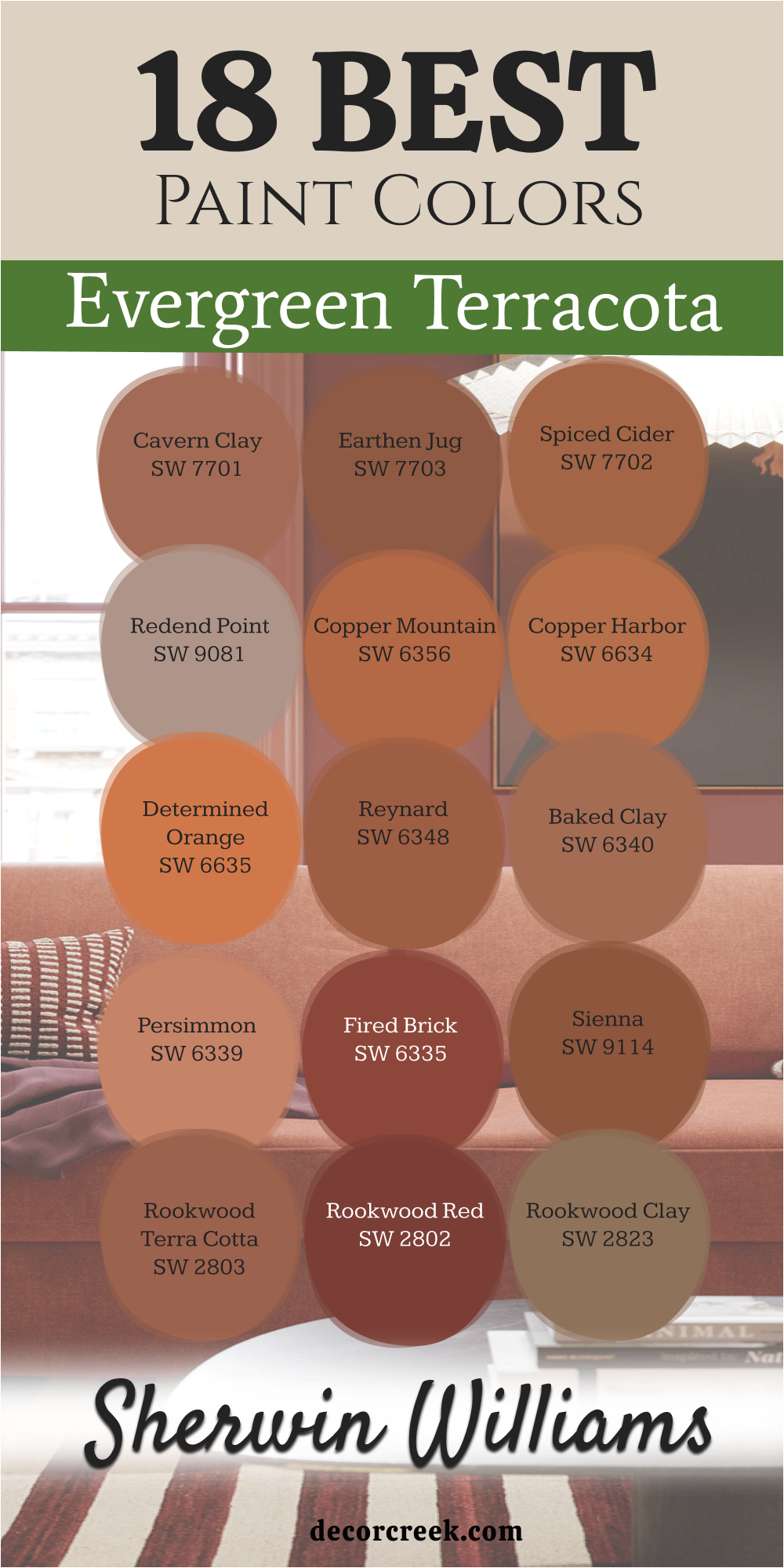
18 Evergreen Terracota Paint Colors From Sherwin Williams
Cavern Clay SW 7701
Cavern Clay — SW 7701 is a very strong and earth-toned color that people love. It reminds me of a warm canyon where the sun hits the rocks just right. This color is great for making a large room feel much smaller and friendlier.
I think this shade is very popular because it feels very grounded and real. It looks like the desert at the end of a long hot day. You will notice that it makes white furniture look very bright and clean.
Many homeowners pick this for a room where they want to feel very focused. It is a bold choice that shows you have a very good sense of style. The color stays rich and deep even when the overhead lights are turned off.
Best used in: family rooms, kitchens, offices, and entryways.
Pairs well with: Naval SW 6244, Origami White SW 7636, Distance SW 6243, and dark wood. The key rule of this color for a grounded style is to use it where you want the earth to feel close and the mood to stay steady.
🎨 Check out the complete guide to this color right HERE 👈
Earthen Jug SW 7703
Earthen Jug — SW 7703 is deep and rich like a piece of heavy pottery. It makes the walls feel solid and very high quality when you walk into the room. I love how it brings a sense of history to a brand new house.
The color is very dark and has a lot of brown in the mix. This keeps it from looking too bright or like a piece of fruit. It feels very sophisticated and grown-up in a study or a library.
You can use it to make a very large room feel much more private and snug. It works very well with leather chairs and old books on the shelf. This is a top pick for people who want a very cozy and serious look.
Best used in: dens, libraries, master bedrooms, and basements.
Pairs well with: Accessible Beige SW 7036, Pure White SW 7005, Urbane Bronze SW 7048, and gold accents. The key rule of this color for a moody style is to use it where you want to curl up with a book and hide from the world.
Spiced Cider SW 7702
Spiced Cider — SW 7702 feels like a warm drink on a cold winter day. It has a lot of orange but it still feels very natural and inviting. I love using this in a kitchen where the family gathers to eat breakfast.
The color is very cheerful and makes people want to sit and talk for a long time. It looks amazing with creamy white cabinets and dark metal hardware. You will find that it makes a room feel very sunny even on a cloudy day.
It is a medium shade that is not too dark for a small mudroom. Many people like how it reminds them of the fall season all year long. It is a very friendly color that makes guests feel welcome right away.
Best used in: kitchens, dining areas, mudrooms, and living rooms.
Pairs well with: Black Fox SW 7020, Sea Salt SW 6204, Swiss Coffee, and wrought iron. The key rule of this color for a cozy style is to use it where people eat and drink and spend time together.
🎨 Check out the complete guide to this color right HERE 👈
Redend Point SW 9081
Redend Point — SW 9081 is very soft and looks almost like a neutral tan. It is perfect for people who want just a little bit of color in their life. I use this when a homeowner wants a room to feel very gentle and quiet.
The color has a pinkish heart that makes it feel very warm and kind. It is very easy to look at and never feels like it is too much. Most people find it very relaxing for a bedroom or a nursery.
It works perfectly with light wood floors and very soft white fabrics. This shade is very popular right now because it is so easy to live with. It makes a room feel very airy and light while still being warm.
Best used in: bedrooms, bathrooms, nurseries, and laundry rooms.
Pairs well with: Foothills SW 7514, Kestrel White SW 7516, Malted Milk SW 6057, and light oak. The key rule of this color for a soft style is to use it where you want to feel relaxed and surrounded by a gentle glow.
🎨 Check out the complete guide to this color right HERE 👈
Copper Mountain SW 6356
Copper Mountain — SW 6356 is bright and shiny like a new penny in the sun. It brings a lot of energy to any room you put it in. I like using this in a playroom to make it feel fun and active for kids.
The color is very bold and grabs your attention as soon as you see it. It looks great as an accent wall behind a desk or a bed. You will notice that it makes a dark corner feel much more alive and bright.
It is a very confident color that shows you love to have fun with your home. Many people like how it glows when the afternoon sun hits the wall. It is a very happy shade that makes everyone smile when they see it.
Best used in: playrooms, craft rooms, kitchens, and accent walls.
Pairs well with: Alabaster SW 7008, Black Magic SW 6991, Naval SW 6244, and brass hardware. The key rule of this color for a high-energy style is to use it in busy spots where the family gathers to talk and eat.
🎨 Check out the complete guide to this color right HERE 👈
Copper Harbor SW 6634
Copper Harbor — SW 6634 is very warm and glowing like a fire in a fireplace. It makes a room feel very expensive and special for the people who live there. I suggest this for a dining room where you have big family dinners.
The color is very rich and has a lot of depth in its reddish-orange base. It makes wood furniture look very high-end and polished. You will love how it creates a very fancy feeling in an entryway.
It feels very sturdy and solid on the walls of a large house. Many people think it looks like a beautiful sunset over a quiet lake. It is a very comforting color that feels very luxurious and warm.
Best used in: dining rooms, entryways, family rooms, and kitchens.
Pairs well with: Bronze Beauty SW 9107, Grecian Ivory SW 7541, High Reflective White SW 7757, and walnut wood. The key rule of this color for a rich style is to use it where you want the light to feel warm and the wood to look dark.
🎨 Check out the complete guide to this color right HERE 👈
Determined Orange SW 6635
Determined Orange — SW 6635 is for people who love very bright and happy colors. It is a strong orange that makes a big statement on any wall. I use this in small doses to add a pop of color to a boring room.
The color is very brave and shows that you are not afraid to be different. It works very well in an art studio where you want to feel very creative. You will find that it makes a room feel very energetic and full of life.
It is a very clear shade that does not have much brown or gray in it. This makes it feel very fresh and very modern for a new home. It is a very fun choice for a front door to welcome your neighbors.
Best used in: accent walls, front doors, playrooms, and art studios.
Pairs well with: Tricorn Black SW 6258, Extra White SW 7006, Upward SW 6239, and modern art. The key rule of this color for a bold style is to use it in places where you want to feel energetic and full of ideas.
🎨 Check out the complete guide to this color right HERE 👈
Reynard SW 6348
Reynard — SW 6348 is a medium clay color that looks very balanced and nice. It works well in almost any room of the house because it is not too loud. I like how it makes a hallway feel much shorter and more friendly.
The color is very inviting and makes people feel like they can relax right away. It reminds me of a clever fox hiding in the autumn leaves. Many homeowners choose this for their main living area because it is so warm.
It works perfectly with green plants and light tan rugs on the floor. You will see that it creates a very natural feeling in your home. It is a very safe choice that still has a lot of personality and heart.
Best used in: living rooms, hallways, dens, and craft rooms.
Pairs well with: Shoji White SW 7042, Iron Ore SW 7069, Svelte Sage SW 6164, and linen fabrics. The key rule of this color for a welcoming style is to use it in the heart of the home where everyone hangs out.
Baked Clay SW 6340
Baked Clay — SW 6340 looks like it has been warmed by the sun for a long time. It is a very dusty and natural-looking orange that feels very soft. I like using this for a sunroom where the light is very bright.
The color is very muted which makes it very easy to look at all day long. It reminds me of the roof tiles on a beautiful villa in a warm country. You will find that it makes a room feel very relaxed and very breezy.
It works very well with wicker furniture and light blue pillows for a beachy look. This shade is a great pick for a guest room to make it feel like a vacation. It is a very beautiful and natural color for any home.
Best used in: sunrooms, porches, guest rooms, and kitchens.
Pairs well with: Rain SW 6219, Creamy SW 7012, Peppercorn SW 7674, and natural jute rugs. The key rule of this color for a vacation style is to use it where the light is bright and the furniture is casual.
🎨 Check out the complete guide to this color right HERE 👈
Persimmon SW 6339
Persimmon — SW 6339 is very fresh and looks like a piece of ripe fruit. It is a modern color that feels very trendy and stylish right now. I love using this in a small powder room to give it a big personality.
The color has a bit of a glow that makes the walls feel very alive. it is a great choice for someone who wants their home to look very current. You will notice that it makes gold mirrors and frames look very fancy.
It is a very happy and exciting color that works well in a dining room too. Many people like how it makes the house feel very new and very fun. It is a very brave shade that looks very high-end when done right.
Best used in: powder rooms, dining rooms, accent walls, and entryways.
Pairs well with: Cyberspace SW 7076, Westhighland White SW 7566, Silver Strand SW 7057, and gold decor. The key rule of this color for a trendy style is to use it where you want to show off your love for new things.
Fired Brick SW 6335
Fired Brick — SW 6335 is deep and red like an old building in a big city. It feels very traditional and very sturdy when you see it on the walls. I suggest this for a room with a fireplace and big cozy chairs.
The color is very rich and makes the room feel very private and very safe. It looks great with white trim because it makes the lines look very sharp. You will love how it makes a dining room feel very grand and special.
It is a very thick and solid color that will never go out of fashion. Many people choose this for a front door to give their house a classic look. It is a very beautiful and strong choice for a traditional home.
Best used in: libraries, studies, dining rooms, and front doors.
Pairs well with: Dover White SW 6385, Latte SW 6108, Van Dyke Brown SW 7041, and antique gold. The key rule of this color for a traditional style is to use it where you want history and warmth to meet in a grand way.
Sienna SW 9114
Sienna — SW 9114 is a very classic earth tone that has been popular for a long time. It looks very natural and grounded like the soil in a garden. I like to use this in a home office to make it feel very calm.
The color is a deep reddish-brown that feels very warm and very inviting. It is a great choice for a house that has a lot of stone or wood outside. You will see that it makes the room feel very steady and very real.
It is a very strong color that does not fade away when the lights are bright. Many people love how it makes a room feel very quiet and very peaceful. It is a very beautiful and natural choice for any room you choose.
Best used in: exteriors, home offices, libraries, and dens.
Pairs well with: Softer Tan SW 6141, Macadamia SW 6142, Roycroft Copper Red SW 2839, and stone accents. The key rule of this color for a sturdy style is to use it where you want the walls to feel thick and the room to feel quiet.
Rookwood Terra Cotta SW 2803
Rookwood Terra Cotta — SW 2803 is part of a special group of historic colors. It feels very elegant and very high-end like a house from a long time ago. I use this when I want a room to look very expensive and timeless.
The color is a dusty orange that looks very sophisticated on the walls. It is a great choice for a formal living room where you greet your guests. You will notice that it makes the house look like it has a great story.
It works perfectly with dark wood furniture and old-fashioned rugs on the floor. This shade is a favorite for people who love the look of a museum. It is a very beautiful and smart choice for a fancy home.
Best used in: formal dining rooms, living rooms, exteriors, and libraries.
Pairs well with: Renwick Olive SW 2810, Downing Sand SW 2822, Classical White SW 2829, and dark mahogany. The key rule of this color for an elegant style is to use it where you want the history of the house to shine.
Rookwood Red SW 2802
Rookwood Red — SW 2802 is very dark and has a lot of red in its base. It makes a room feel very cozy and very private like a little secret. I love using this on a front door to make a very grand entrance.
The color is very bold and makes a big impression on everyone who walks by. It feels very classic and looks great on big old Victorian style houses. You will find that it makes a small room feel very fancy and snug.
It is a very rich and deep color that covers the walls very beautifully. Many people like how it feels very powerful and very strong in a room. It is a very beautiful and luxury-feeling color for your home.
Best used in: front doors, libraries, dining rooms, and accent walls.
Pairs well with: Kilim Beige SW 6106, Black Magic SW 6991, Dover White SW 6385, and brass light fixtures. The key rule of this color for a grand style is to use it in small spaces to make them feel very fancy.
🎨 Check out the complete guide to this color right HERE 👈
Rookwood Clay SW 2823
Rookwood Clay — SW 2823 is more brown than orange and feels very earthy. It is a great color for hiding wear and tear in a busy house. I suggest this for a mudroom where the kids leave their muddy boots.
The color is very quiet and does not yell for attention when you walk in. It works very well as a background for your favorite art and colorful rugs. You will find that it makes a room feel very steady and calm.
It is a very practical color that still looks very high-end and nice. Many people like how it looks like real wet clay from a river bank. It is a very beautiful and grounded choice for a family home.
Best used in: mudrooms, basements, hallways, and dens.
Pairs well with: Urbane Bronze SW 7048, Creamy SW 7012, Svelte Sage SW 6164, and natural stone. The key rule of this color for a natural style is to use it in rooms that get a lot of use and need to stay pretty.
🎨 Check out the complete guide to this color right HERE 👈
Rookwood Antique Gold SW 2809
Rookwood Antique Gold — SW 2809 has a bit of yellow in it along with the clay. It looks very rich and very old-fashioned like a gold coin. I love using this in a dining room to make it feel very warm and bright.
The color is very unique and makes a room look very special and different. it is a great choice for a house that has a lot of antique furniture. You will notice that it makes the room feel very sunny and very expensive.
It works very well with dark green and dark brown accents in the room. This shade is for people who want a very classic and very rich look. It is a very beautiful and glowing choice for any room.
Best used in: dining rooms, kitchens, entryways, and hallways.
Pairs well with: Pewter Green SW 6208, Roycroft Vellum SW 2833, Morris Room Grey SW 0037, and walnut. The key rule of this color for a rich style is to use it where you want the light to feel warm and the wood to look dark.
Autumnal SW 6361
Autumnal — SW 6361 is a medium orange that feels like a bunch of fall leaves. It is very warm and very inviting for anyone who walks through the door. I love using this in a family room where everyone relaxes.
The color is very friendly and makes people feel like they are welcome to stay. It looks great with warm wood floors and cream-colored sofas. You will find that it makes a room feel very happy and very cozy.
It is a very clear color that brings a lot of life to a dark room. Many people like how it reminds them of a sunny afternoon in the forest. It is a very beautiful and easy color to love for a long time.
Best used in: family rooms, entryways, kitchens, and mudrooms.
Pairs well with: Creamy SW 7012, Black Fox SW 7020, Sea Salt SW 6204, and warm blankets. The key rule of this color for a cozy style is to use it where you want to feel warm and safe.
🎨 Check out the complete guide to this color right HERE 👈
Jaipur Pink SW 6577
Jaipur Pink — SW 6577 is a very soft and pinkish terracotta that feels very light. It is a very pretty and feminine color that looks like a flower. I love using this in a nursery to make it feel very sweet and kind.
The color is very gentle and makes the room feel very open and bright. It is a great choice for a small bedroom that needs to feel much larger. You will find that it makes the walls look very soft and very pretty.
It works perfectly with white furniture and light gray accents in the room. This shade is a very happy and beautiful choice for a girl’s room. It is a very soft and easy color to live with every day.
Best used in: bedrooms, nurseries, bathrooms, and laundry rooms.
Pairs well with: Pure White SW 7005, Silver Strand SW 7057, Grayish SW 6001, and white linens. The key rule of this color for a soft style is to use it where you want to feel relaxed and surrounded by a gentle glow.
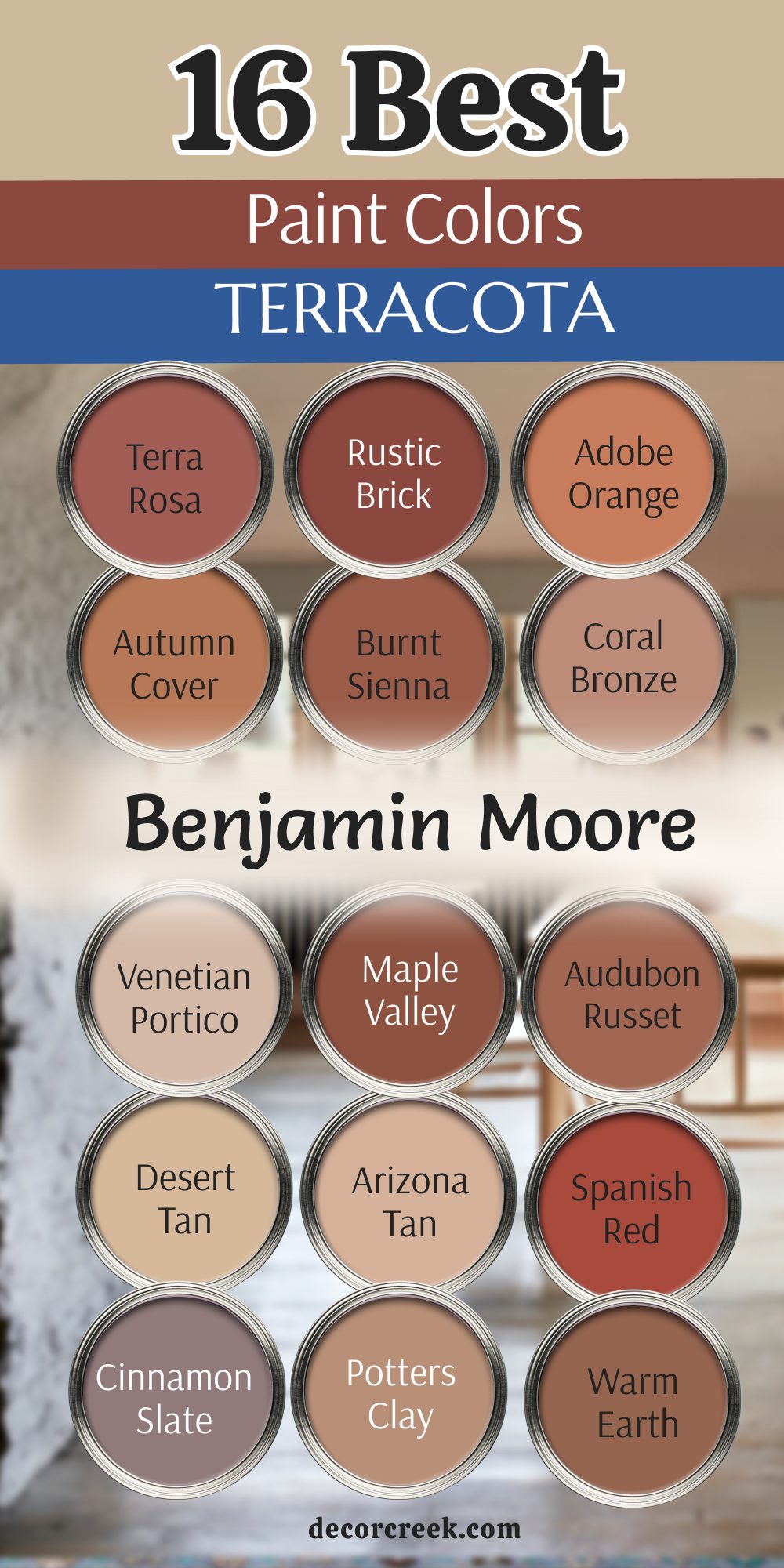
16 Best Terracota Paint Colors From Benjamin Moore
Terra Cotta Tile 2090-30
Terra Cotta Tile — 2090-30 is a very iconic color that looks exactly like the floor tiles you might find in a warm kitchen. I love using this to add a lot of warmth to a room with cold tile floors.
The color is a medium orange-red that feels very classic and high-end. It is a great choice for a kitchen or a breakfast nook where the family eats. It makes the room feel like it is always sunny inside even when it rains.
I find that it works very well with white trim and dark wood furniture. This shade is a favorite for people who love the look of houses by the sea. It is a very happy and inviting color for any home you own.
Best used in: kitchens, dining rooms, sunrooms, and hallways.
Pairs well with: Simply White OC-117, Hale Navy HC-154, Revere Pewter HC-172, and terracotta pots. The key rule of this color for a classic style is to use it where you want to feel like it is summer all year.
🎨 Check out the complete guide to this color right HERE 👈
Terra Rosa 2090-20
Terra Rosa — 2090-20 is a bit darker and has more red in it than the tile color. It feels very romantic and very soft on the walls when you see it. I love using this in a bedroom to make it feel very sweet and kind.
The color is very gentle and makes the room feel very cozy and inviting. It is a great choice for a nursery or a small sitting room for reading. It feels very fresh and pretty on the walls of a new house.
I find that it works very well with white furniture and light gray accents. This shade is a very sweet and beautiful choice for any family home. It is a very soft and easy color to live with every day.
Best used in: bedrooms, nurseries, sitting rooms, and laundry rooms.
Pairs well with: Wickham Gray HC-171, Chantilly Lace OC-65, Palladian Blue HC-144, and white linens. The key rule of this color for a romantic style is to use it where you want to feel loved and happy.
Rustic Brick 2091-20
Rustic Brick — 2091-20 is a deep color that feels very classic and very strong. It looks like a real brick wall in a cozy home that has been there for years. I use this to add a lot of history and character to a room.
The color is very bold and makes a big impression on everyone who sees it. It is a great choice for a dining room or an entryway near the front door. It feels very solid and grounded like it will never change.
I find that it works very well with white trim and dark wood furniture. This shade is a classic that will always look beautiful in any house. It is a very rich and elegant choice for a traditional style.
Best used in: dining rooms, entryways, libraries, and accent walls.
Pairs well with: White Dove OC-17, Revere Pewter HC-172, Hale Navy HC-154, and antique furniture. The key rule of this color for a traditional style is to use it where you want to feel warm and safe.
Adobe Orange 2171-30
Adobe Orange — 2171-30 is very bright and looks like a house in the desert sun. It brings a lot of light to dark rooms that do not have many windows. I use this to make a room feel very warm and full of life.
The color is a strong orange that feels very energetic and happy. It is a great choice for a playroom or a dark hallway in the middle of the house. It makes the walls feel like they are glowing from the inside.
I find that it works very well with dark blue and green accents for a fun look. This shade is for people who are not afraid to use a lot of color. It is a very cheerful and bright choice for a happy home.
Best used in: dark hallways, playrooms, kitchens, and accent walls.
Pairs well with: Van Deusen Blue HC-156, Chantilly Lace OC-65, Saybrook Sage HC-114, and colorful rugs. The key rule of this color for a bright style is to use it in rooms that need a little bit of extra sunshine.
Autumn Cover 2170-30
Autumn Cover — 2170-30 is a very cozy color that feels like a warm hug. It is a mix of orange and brown that is very inviting for your family. I love using this in a family room where everyone watches movies.
The color is very soft and makes the room feel very snug and tight. It is a great choice for a house in a cold place to make it feel warmer. It feels very friendly and welcoming on the walls of a living room.
I find that it works very well with warm wood floors and cream sofas. This shade is a favorite for people who want a very happy home. It is a very beautiful and easy choice for a big room.
Best used in: family rooms, living rooms, bedrooms, and kitchens.
Pairs well with: Simply White OC-117, Shaker Beige HC-45, Newington Gray HC-157, and cozy blankets. The key rule of this color for a cozy style is to use it where you want to feel warm and safe.
Burnt Sienna 1198
Burnt Sienna — 1198 is an artistic color that has a lot of history and style. It looks like the paint used by famous artists for hundreds of years. I use this to add a touch of history and class to a room.
The color is a deep reddish-brown that feels very rich and warm. It is a great choice for a dining room or a formal entryway. It feels very sophisticated and high-end on the walls of your house.
I find that it works very well with white trim and dark wood furniture. This shade is a classic that adds a lot of value to any home. It is a very beautiful and elegant choice for a smart look.
Best used in: dining rooms, entryways, libraries, and accent walls.
Pairs well with: White Dove OC-17, Revere Pewter HC-172, Hale Navy HC-154, and classic art. The key rule of this color for an artistic style is to use it where you want to show off your good taste.
Coral Bronze 2176-40
Coral Bronze — 2176-40 is very soft and has a bit of a pink glow to it. It makes a room feel very pretty and very fresh when you walk inside. I use this to add a touch of color without it being too much.
The color is very gentle and makes the room feel very cozy and inviting. It is a great choice for a guest room or a bathroom for your friends. It feels very fresh and modern on the walls of a new home.
I find that it works very well with gold accents and white furniture. This shade is a very sweet and beautiful choice for any house. It is a very soft and easy color to love for a long time.
Best used in: guest rooms, bathrooms, laundry rooms, and kitchens.
Pairs well with: White Dove OC-17, Edgecomb Gray HC-173, Hale Navy HC-154, and gold decor. The key rule of this color for a soft style is to use it where you want to feel pampered and happy.
Venetian Portico AF-185
Venetian Portico — AF-185 is very light and looks almost like a warm neutral tan. It is very elegant and very easy to live with in any room of the house. I love using this in a formal living room for guests.
The color is very gentle and makes the room feel very open and bright. It is a great choice for a house with a lot of light and big windows. It feels very high-end and expensive on the walls of your home.
I find that it works very well with white trim and dark wood furniture. This shade is a classic that will always look beautiful in any house. It is a very sophisticated and smart choice for a clean look.
Best used in: formal living rooms, dining rooms, entryways, and bedrooms.
Pairs well with: Simply White OC-117, Hale Navy HC-154, Stonington Gray HC-170, and elegant furniture. The key rule of this color for an elegant style is to use it where you want to show off your style.
🎨 Check out the complete guide to this color right HERE 👈
Maple Valley 2158-20
Maple Valley — 2158-20 is deep and rich like the leaves on a tree in the fall. It adds a lot of warmth to any room where you paint it. I use this to add a lot of depth and character to a home.
The color is very strong and makes a big statement on the walls. It is a great choice for an accent wall or a dining room for dinners. It feels very cozy and inviting like a warm blanket on a chair.
I find that it works very well with warm wood floors and cream sofas. This shade is a favorite for people who love the look of fall all year. It is a very beautiful and rich choice for a cozy house.
Best used in: dining rooms, accent walls, family rooms, and entryways.
Pairs well with: Swiss Coffee OC-45, Shaker Beige HC-45, Newington Gray HC-157, and cozy blankets. The key rule of this color for a cozy style is to use it where you want to feel warm and safe.
Audubon Russet HC-51
Audubon Russet — HC-51 is a traditional color that feels very expensive and high-end. It looks very good with old furniture that has been in your family. I love using this in a formal library or a study.
The color is very deep and makes a room feel very cozy and private. It is a great choice for a house with a lot of history and heart. It feels very sophisticated and beautiful on the walls of your house.
I find that it works very well with gold frames and leather books. This shade is a classic that will never go out of fashion for you. It is a very smart and elegant choice for a serious room.
Best used in: libraries, studies, dining rooms, and front doors.
Pairs well with: Stonington Gray HC-170, White Dove OC-17, Wrought Iron 2124-10, and antique furniture. The key rule of this color for a rich style is to use it where you want to feel very fancy and smart.
🎨 Check out the complete guide to this color right HERE 👈
Desert Tan 2153-50
Desert Tan — 2153-50 is very light and feels like the sand in a sunny desert. It makes a room feel very open and bright when the sun comes out. I love using this in a kitchen to make it feel very clean.
The color is very gentle and makes the room feel very open and large. It is a great choice for a small house that needs to feel much bigger. It reminds me of the warm sand under your feet.
I find that it works very well with white cabinets and dark wood floors. This shade is a very happy and beautiful choice for any family. It is a very light and easy color to live with in any room.
Best used in: kitchens, breakfast nooks, hallways, and living rooms.
Pairs well with: Cloud White OC-130, Hale Navy HC-154, Revere Pewter HC-172, and natural wood. The key rule of this color for a bright style is to use it where you want to feel happy and warm.
Arizona Tan 2162-50
Arizona Tan — 2162-50 is a very soft pink-orange that feels very gentle. It is a great choice for a nursery or a small bedroom for a child. I love using this to make a room feel very light and pretty.
The color is very gentle and makes the room feel very open and bright. It is a great choice for a small room that needs more light. It reminds me of the desert hills at the start of the day.
I find that it works very well with white furniture and light blue accents. This shade is a very sweet and beautiful choice for any home. It is a very soft and easy color to live with for years.
Best used in: nurseries, bathrooms, bedrooms, and small living rooms.
Pairs well with: Chantilly Lace OC-65, Palladian Blue HC-144, Wickham Gray HC-171, and white linens. The key rule of this color for a light style is to use it where you want to feel fresh and happy.
Spanish Red 1301
Spanish Red — 1301 is a very bold and fiery color that has a lot of energy. It makes a big statement on any wall where you put it. I use this to add a lot of excitement and fun to a room.
The color is very bright and makes a big impression on everyone who walks in. It is a great choice for a kitchen or a dining room for parties. It feels very warm and inviting on the walls of your home.
I find that it works very well with black and white accents for a cool look. This shade is for people who love to have a lot of fun. It is a very exciting and happy choice for a brave house.
Best used in: kitchens, dining rooms, front doors, and accent walls.
Pairs well with: Simply White OC-117, Black 2132-10, Gray Owl OC-52, and modern furniture. The key rule of this color for a bold style is to use it where you want to feel energetic and happy.
Cinnamon Slate 2113-40
Cinnamon Slate — 2113-40 is a modern and unique color with a lot of gray in it. It feels very trendy and very cool for a new house. I love using this in a living room to make it look very stylish.
The color is very gentle and makes the room feel very open and bright. It is a great choice for a modern home with a lot of big windows. It feels very fresh and new on the walls of any room.
I find that it works very well with light wood and black accents. This shade is for people who want a very unique and pretty home. It is a very cool and beautiful choice for a trendy look.
Best used in: living rooms, bedrooms, home offices, and hallways.
Pairs well with: Gray Owl OC-52, Black 2132-10, Stonington Gray HC-170, and modern art. The key rule of this color for a modern style is to use it where you want to show off your style.
🎨 Check out the complete guide to this color right HERE 👈
Potters Clay 1221
Potters Clay — 1221 is very soft and dusty like the earth in a garden. It is a very peaceful and relaxing color for any room in your house. I suggest this for a living room where you want to rest.
The color is very gentle and makes the room feel very soft and nice. It reminds me of the clay an artist uses to make pretty pots. Many people choose this because it feels very quiet and very good.
It works perfectly with linen curtains and light gray rugs on the floor. This shade is a great middle ground between a tan and an orange. It is a very safe and beautiful choice for your home.
Best used in: bedrooms, living rooms, nurseries, and hallways.
Pairs well with: Chelsea Gray HC-168, White Dove OC-17, Edgecomb Gray HC-173, and soft fabrics. The key rule of this color for a soft style is to use it in rooms where you want to relax and feel at peace.
Warm Earth 1274
Warm Earth — 1274 is a natural and grounded color that feels very solid. It makes a room feel very warm and safe for your family. I love using this to make a room feel very calm and steady.
The color is a deep brownish-orange that feels very warm and inviting. It is a great choice for a den or an entryway near the door. It feels very solid and real on the walls of any house.
I find that it works very well with green plants and natural wood accents. This shade is a favorite for people who love the look of nature. It is a very beautiful and easy choice for a warm home.
Best used in: dens, entryways, bedrooms, and home offices.
Pairs well with: Saybrook Sage HC-114, Swiss Coffee OC-45, Van Deusen Blue HC-156, and natural wood. The key rule of this color for a natural style is to use it where you want to feel close to the earth.
14 Green and Terracotta Paint Color Schemes
Evergreen Fog SW 9130 + Cavern Clay SW 7701
Evergreen Fog — SW 9130 mixed with Cavern Clay — SW 7701 is a very popular choice. The green is soft and the clay is warm, which makes them a perfect pair. I think this duo works because it feels like a forest floor meeting red desert rocks.

The colors balance each other out so neither one feels too strong. You can use the green on most walls and the clay as a special accent. It makes a bedroom feel very cozy and grounded for a good sleep.
Many people like how this combination looks with light wood furniture. It creates a very natural feeling that makes your house feel like a quiet retreat. Using these together shows you have a very modern and stylish eye.
Best used in: living rooms, bedrooms, and home offices.
Pairs well with: light wood, linen fabrics, white trim, and woven baskets. The key rule of this color for a balanced style is to use it where you want the cool green to meet the warm earth.
Clary Sage SW 6178 + Earthen Jug SW 7703
Clary Sage — SW 6178 and Earthen Jug — SW 7703 look like a garden in the forest. The light green makes the dark clay look very rich and very expensive. I love using this in a kitchen to make it feel very fresh.

The green is very soft and the clay is very deep, which creates a nice contrast. It makes the room feel very solid and very well-designed for a family. You will find that these colors make white cabinets stand out beautifully.
I suggest this for people who love a very natural and organic look. It reminds me of herb gardens and old pottery sitting on a wooden table. This is a very friendly and welcoming pair for any home.
Best used in: kitchens, dining rooms, and mudrooms.
Pairs well with: white cabinets, marble countertops, dark metal, and wood floors. The key rule of this color for an organic style is to use it where you want to feel fresh and grounded at once.
Rosemary SW 6187 + Copper Mountain SW 6356
Rosemary — SW 6187 combined with Copper Mountain — SW 6356 is a very bold and dark choice. It feels very cozy and very private for a room where you want to hide. I love how the dark green makes the bright copper glow.

This pair is for people who are brave and love a lot of deep color. It works very well in a library or a study with a lot of books. The room will feel very snug and very special for anyone who enters.
You should use gold hardware or lamps to make the copper tone look even better. It is a very high-end look that makes your house feel very grand. This combination is very strong and very memorable for guests.
Best used in: libraries, dens, and small powder rooms.
Pairs well with: gold hardware, leather chairs, dark wood, and warm lamps. The key rule of this color for a moody style is to use it where you want to feel protected and surrounded by rich tones.
Dried Thyme SW 6186 + Spiced Cider SW 7702
Dried Thyme — SW 6186 and Spiced Cider — SW 7702 feel very organic and natural. They remind me of dried herbs and warm spices used in a kitchen. I love how these colors make a room feel very lived-in and happy.

The green is a bit dusty and the orange is very warm and inviting. They work perfectly together to create a farmhouse look that feels very current. You will find that it makes a laundry room feel much more fun.
I like to use these with terracotta tiles on the floor to match the cider walls. It is a very cozy combination that makes everyone want to stay and chat. This pair is very easy to love for a long time.
Best used in: kitchens, laundry rooms, and breakfast nooks.
Pairs well with: terracotta tiles, cream colors, wood beams, and copper pots. The key rule of this color for a farmhouse style is to use it where the family gathers to do daily work.
Ripe Olive SW 6209 + Baked Clay SW 6340
Ripe Olive — SW 6209 with Baked Clay — SW 6340 is a very strong and moody pair. It makes a room feel very grounded and steady like a big old tree. I use this in media rooms where you want the walls to disappear.
The dark green is very deep and the baked clay is very soft and dusty. This contrast makes the room feel very sophisticated and very grown-up. It is a great choice for a home office where you need to think.
Many people like how it looks with dark leather furniture and heavy rugs. It creates a very private feeling that is perfect for a master bedroom too. This is a very beautiful and sturdy color combination.
Best used in: media rooms, home offices, and master bedrooms.
Pairs well with: leather furniture, wool rugs, brass accents, and dark wood. The key rule of this color for a sturdy style is to use it where you want the walls to feel thick and the room to feel quiet.
Retreat SW 6207 + Persimmon SW 6339
Retreat — SW 6207 and Persimmon — SW 6339 is a very modern and fresh combination. The green is cool and the orange is bright and very happy. I love using this in a bathroom to make it feel very new.

The colors are very clear and bring a lot of energy to a small room. It is a great choice for a nursery because it feels very playful and fun. You will find that it makes white trim look very sharp and clean.
I suggest this for people who want a home that feels very current and trendy. It is a very exciting pair that shows you love to use new colors. This combination makes any room feel very bright and very alive.
Best used in: bathrooms, nurseries, and laundry rooms.
Pairs well with: white trim, modern art, light wood, and silver hardware. The key rule of this color for a trendy style is to use it where you want to show off your love for new things.
Pewter Green SW 6208 + Copper Harbor SW 6634
Pewter Green — SW 6208 plus Copper Harbor — SW 6634 feels very elegant and high-end. It looks like an old-fashioned library in a very large and fancy house. I love how the green looks very deep and the copper looks very rich.

This is a very classic pair that adds a lot of value to your home. It works very well in a dining room where you want to have fancy dinners. The room will feel very warm and very expensive for all your guests.
You should use dark wood furniture to make this combination look its best. It is a very sophisticated look that will never go out of style for you. This pair makes your house feel very solid and very grand.
Best used in: dining rooms, studies, and entryways.
Pairs well with: dark wood, gold mirrors, velvet fabrics, and crystal lights. The key rule of this color for an elegant style is to use it where you want the history of the house to shine.
October Mist 1495 + Terra Cotta Tile 2090-30
October Mist — 1495 and Terra Cotta Tile — 2090-30 are very light and airy. They make a room feel very happy and sun-filled even when it is winter. I love using this in a sunroom where you have lots of plants.

The green is very pale and the clay is very bright and cheerful. They work together to make a small room feel much larger and more open. You will find that it makes the whole house feel very fresh and clean.
I like to use these with cream-colored furniture and light wood floors. It is a very sweet combination that makes everyone feel very relaxed and happy. This pair is very easy to use in any room of the house.
Best used in: sunrooms, kitchens, and hallways.
Pairs well with: cream colors, light wood, green plants, and jute rugs. The key rule of this color for a bright style is to use it in rooms that need a little bit of extra sunshine.
Saybrook Sage HC-114 + Burnt Sienna 1198
Saybrook Sage — HC-114 and Burnt Sienna — 1198 is a very classic and artistic pair. It feels very sophisticated and rich like a beautiful oil painting. I love using this in a formal living room to show off art.

The green is very traditional and the sienna is very deep and warm. They create a look that is very high-end and very smart for a homeowner. You will notice that it makes the house feel very cultured and nice.
I suggest this for people who love the look of classic and timeless design. It works very well with gold frames and antique furniture on the floor. This is a very beautiful and elegant choice for your home.
Best used in: formal living rooms, entryways, and dining rooms.
Pairs well with: oil paintings, gold frames, antique furniture, and silk. The key rule of this color for an artistic style is to use it where you want to show off your good taste.
Carolina Gull 2138-40 + Venetian Portico AF-185
Carolina Gull — 2138-40 combined with Venetian Portico — AF-185 is very soft and light. It is a very easy pair to live with because the colors are so gentle. I love using this in a bedroom to make it feel very quiet.
The green is a bit gray and the clay is a bit tan, which makes them very neutral. They work together to make a room feel very open and very bright for you. You will find that it is a very relaxing combination for a family.
I like to use these with gray accents and soft white fabrics on the bed. It is a very clean look that makes the house feel very organized and pretty. This pair is a safe and beautiful choice for any room.
Best used in: bedrooms, hallways, and living rooms.
Pairs well with: gray accents, white linens, light wood, and silver. The key rule of this color for a soft style is to use it where you want to feel relaxed and surrounded by a gentle glow.
Forest Floor 1498 + Adobe Orange 2171-30
Forest Floor — 1498 and Adobe Orange — 2171-30 is a very energetic and bold choice. It looks like nature in the bright sun and brings a lot of life. I love using this in a playroom where kids like to be active.
The green is very dark and the orange is very bright, which makes a big statement. It is a great choice for a basement that needs a lot of color to feel fun. You will notice that it makes the walls feel very strong.
I suggest this for people who are not afraid to use very strong colors together. It is a very happy pair that makes a big impression on everyone who walks in. This combination is very fun and very exciting for a home.
Best used in: playrooms, basements, and accent walls.
Pairs well with: bright rugs, modern furniture, white trim, and colorful art. The key rule of this color for a bold style is to use it where you want to feel energetic and happy.
Sage Mountain 1488 + Potters Clay 1221
Sage Mountain — 1488 plus Potters Clay — 1221 is very dusty and natural. It feels very peaceful and relaxing on the walls of a cozy house. I love using this in a den where you go to rest and watch TV.
The green and the clay both have a lot of gray in them, which makes them soft. They work together to create a look that is very grounded and very calm. You will find that it makes the room feel very steady and nice.
I like to use these with natural stone and wood accents to bring the outdoors in. It is a very beautiful combination that feels very real and very solid. This pair is a favorite for people who love nature.
Best used in: dens, bedrooms, and home offices.
Pairs well with: natural stone, wood accents, linen, and wool. The key rule of this color for a natural style is to use it where you want to feel close to the earth.
Gloucester Sage HC-100 + Rustic Brick 2091-20
Gloucester Sage — HC-100 and Rustic Brick — 2091-20 is a very traditional and sturdy pair. It looks very good on old houses with a lot of history and heart. I love how it makes a dining room feel very grand and safe.
The green is very dark and the brick is very deep, which feels very classic. This pair is for people who want a home that feels very permanent and strong. You will notice that it makes the house look very high-end.
I suggest this for a room with a fireplace and dark metal accents like iron. It is a very rich look that makes your house feel like a safe castle. This combination is very beautiful and will never go out of style.
Best used in: exteriors, dining rooms, and libraries.
Pairs well with: black metal, dark wood, white trim, and stone. The key rule of this color for a traditional style is to use it where you want history and warmth to meet in a grand way.
Cedar Mountains 706 + Terra Rosa 2090-20
Cedar Mountains — 706 and Terra Rosa — 2090-20 is very soft and pinkish. It feels very romantic and very sweet for a room where you want to relax. I love using this in a guest room to make friends feel welcome.
The green is very light and the rosa is very gentle, which makes a pretty pair. They work together to make a room feel very airy and very kind for everyone. You will find that it makes the walls look very soft and nice.
I like to use these with white furniture and light blue pillows for a soft look. It is a very happy combination that makes the house feel very fresh and pretty. This pair is a very sweet and beautiful choice for any home.
Best used in: nurseries, guest rooms, and bathrooms.
Pairs well with: white furniture, light blue, silver, and soft fabrics. The key rule of this color for a romantic style is to use it where you want to feel loved and happy.
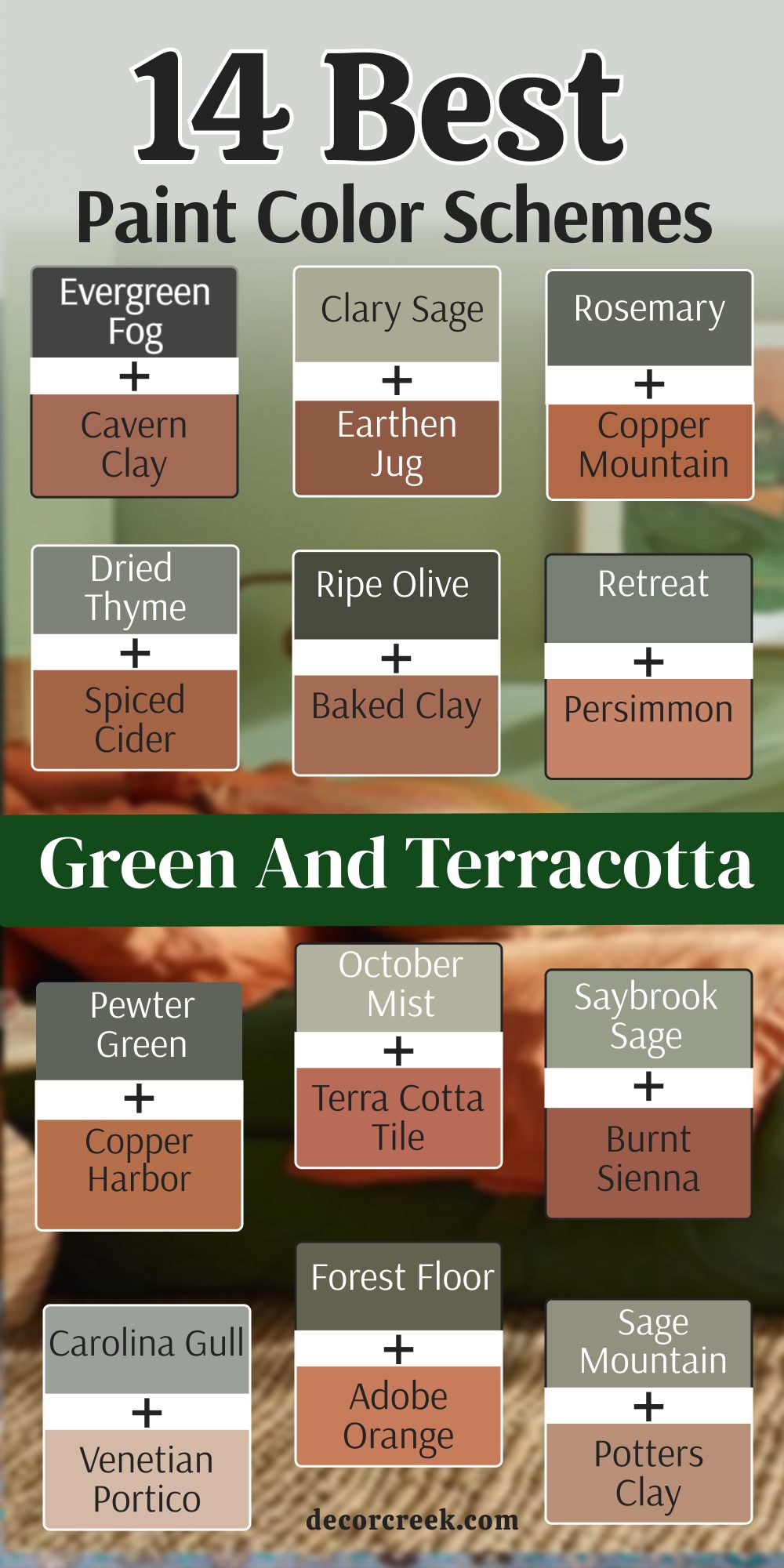
My Final Thoughts about 34 Best Terracotta Paint Colors
I hope this list helps you find the perfect color for your home. Terracotta is a wonderful way to bring warmth and life into any room you choose to paint. It is a color that makes people feel happy and at home as soon as they walk in.
I think picking the right shade is like finding the perfect piece of jewelry for an outfit. It should make everything else in the room look better and more intentional. When you find that perfect match, your whole house will feel like it is glowing with kindness.
Remember to always test your paint colors on the wall before you start the whole project. The way the light hits the color will change how it looks in your house during the day and under your lamps at night. I know you will pick a color that you love for a very long time to come.
I truly believe that your home should be a place that makes you feel safe and proud. Using these earthy tones is a great way to show your personality while keeping things feeling natural and grounded. Your walls are waiting to tell a story of warmth and comfort for your family.