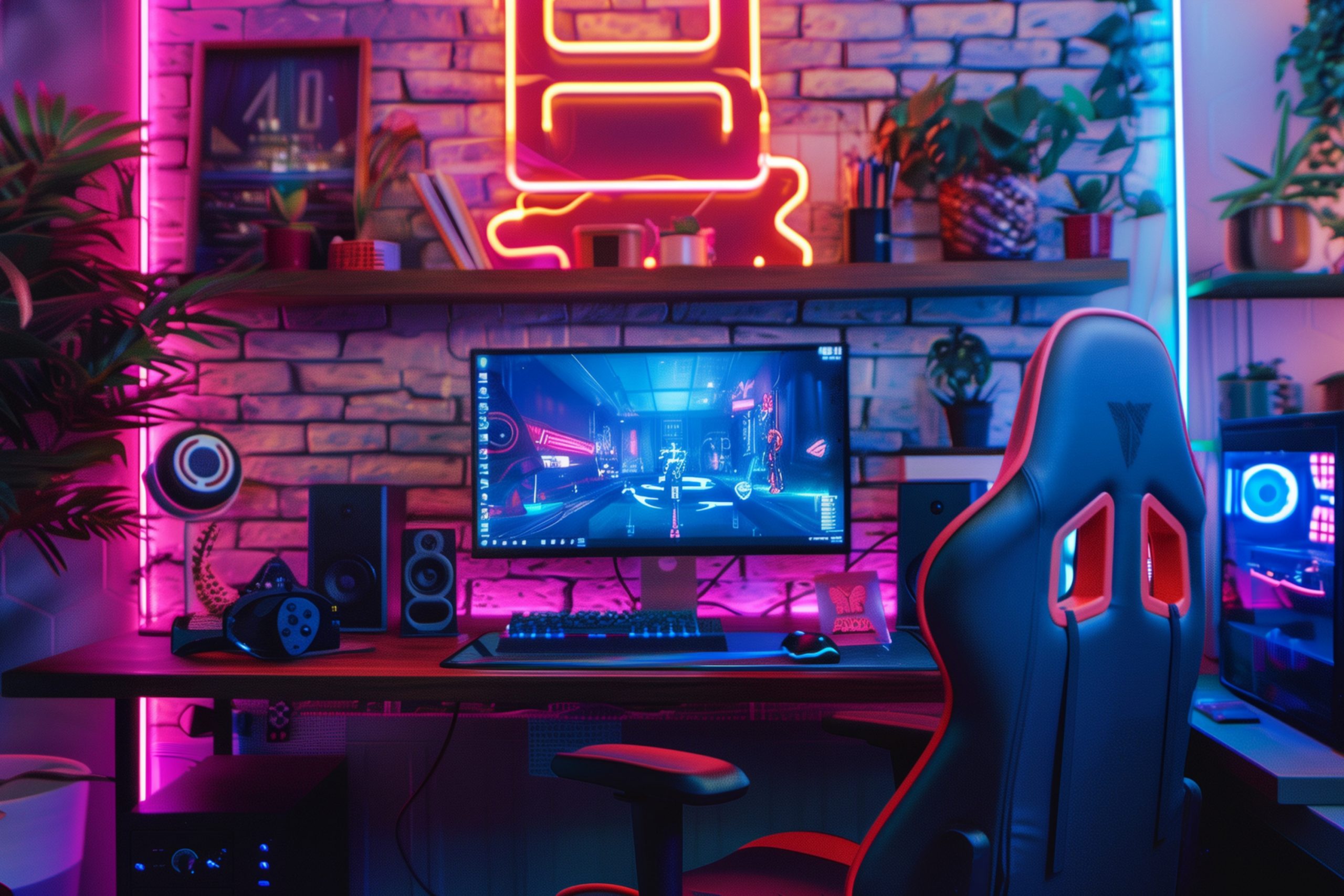
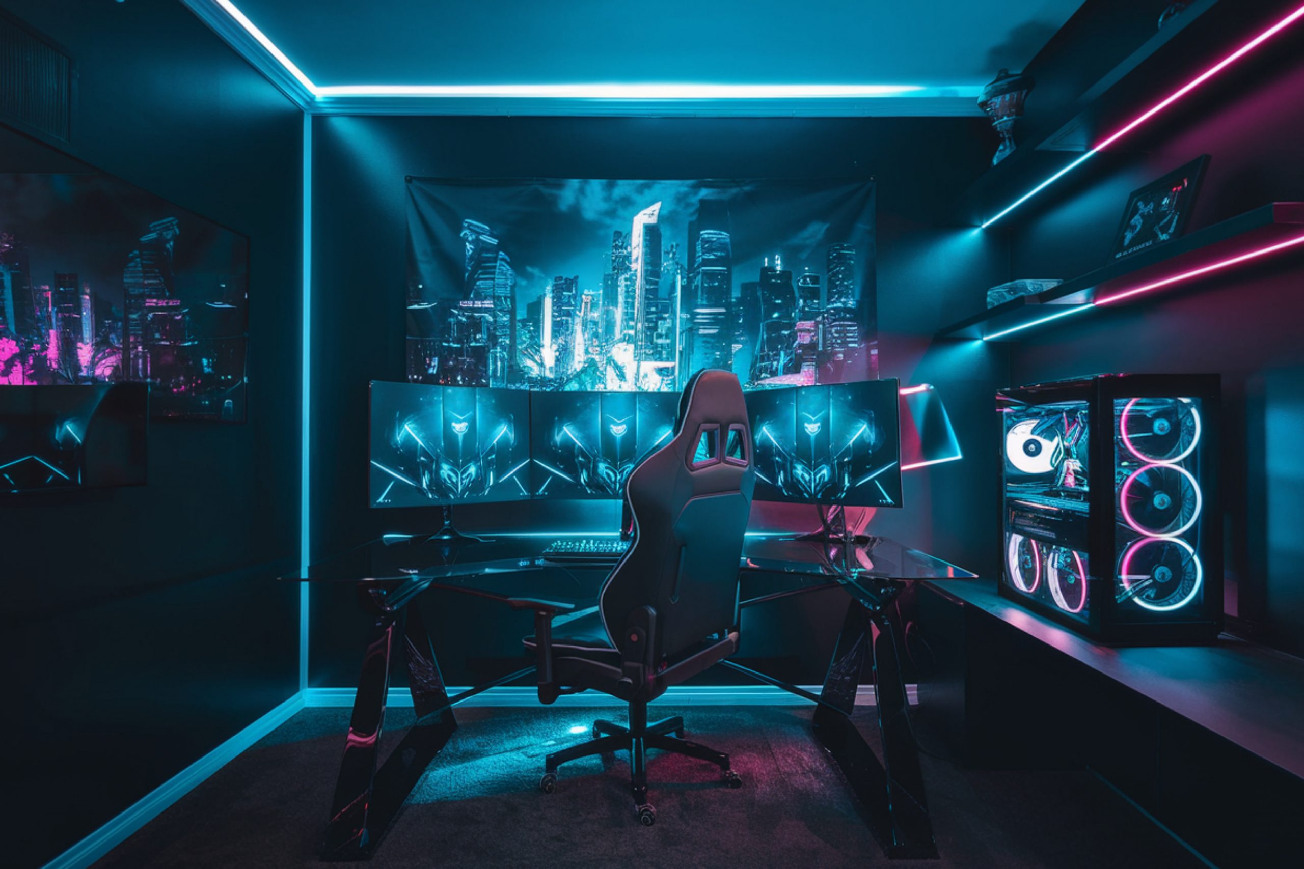
Gaming rooms work best when the wall color helps screens, lights, and gear look sharp. I choose shades that cut glare, hide cords, and make long sessions easy on the eyes. I test chips behind the monitor and near LEDs because color shifts fast with glow strips. I keep the palette focused: a strong main wall, a steady accent, and a clean trim.
I also plan for touch-ups, because controllers, chairs, and headsets bump walls. When the color works with the setup, the whole room feels clear and ready to play. I add felt pads to stands so fresh paint stays safe.
I check sound panels against the wall color so the look stays tidy. I keep cable paths neat so the color can do its job.
Why I Trust Pro Paints for Gaming Rooms
I count on steady coverage, easy touch-ups, and sheens that clean fast. I get sample pots the same day, which lets me test next to screens and LEDs. I like the bonding primers for slick areas and the scuff-resistant finishes for busy corners. I also pull classics from Benjamin Moore and Sherwin Williams when a client already has a fan deck.
I keep both brands in my kit so I can match gear, posters, and trim on the spot.
The goal is simple: fewer surprises, smoother installs, and colors that look right under real gaming light.
I like the store network because pickups are quick on build days. I trust the tint system to match old batches when I need more paint. I appreciate low-odor lines for late-night work in small rooms.
How I Choose the Right Wall Color for a Gaming Room
I start at the desk wall, since that’s where the monitor and camera live. I check how the color behaves with RGB strips, ring lights, and warm bulbs. I use satin or eggshell so smudges wipe off without shiny hotspots. I test three times a day because colors shift a lot from morning to night.
I hold chips near key gear—tower, speakers, and controller rack—to keep the set unified. I pick one bold wall for drama, then use deeper neutrals to frame the rest cleanly.
I check floor tone and rug color so edges don’t look messy. I try the webcam on and off to see how the wall reads on video. I mark stud lines early so mounts and panels land in a clean grid.
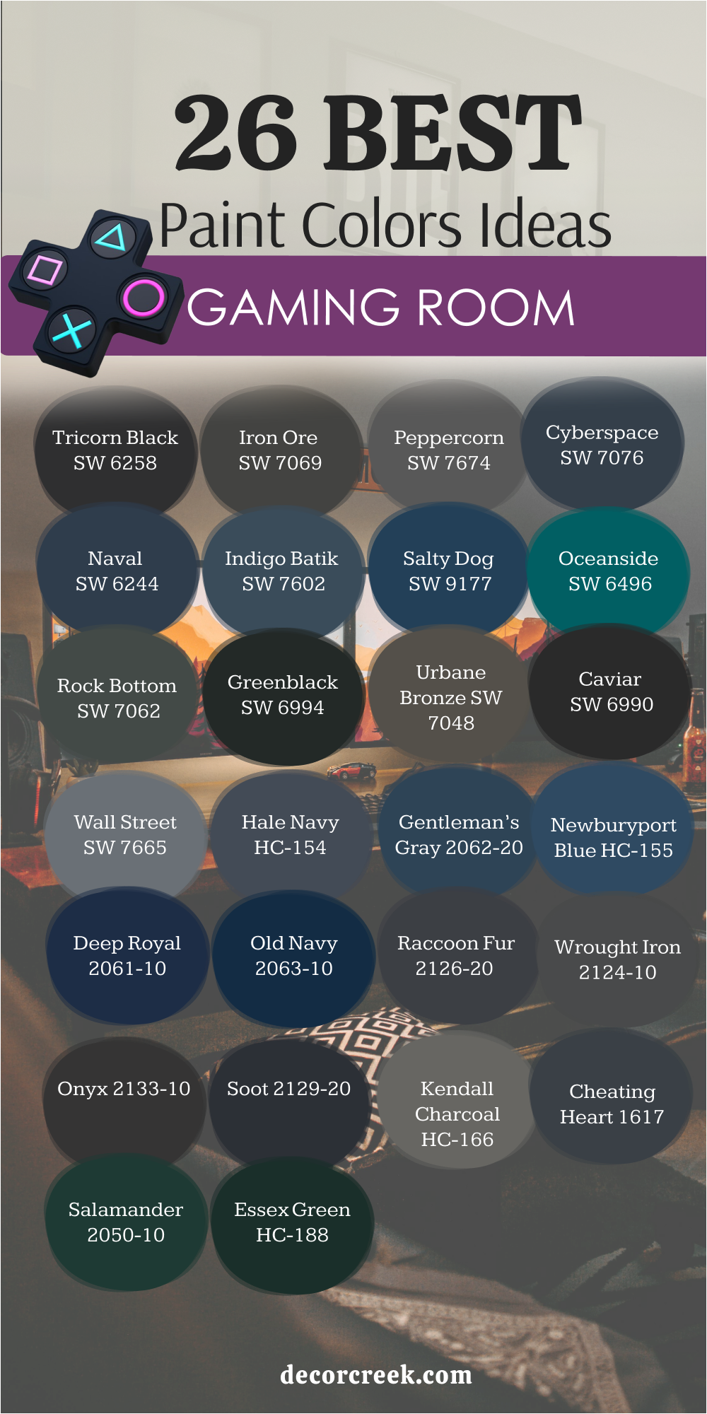
26 Gaming Room wall Paint Ideas
Tricorn Black SW 6258
Tricorn Black SW 6258 makes screens look richer and keeps the background tidy for streams. Tricorn Black SW 6258 cuts light bounce around the monitor so I can track details longer. Tricorn Black SW 6258 pairs with chrome, glass shelves, and black gear for a sharp, pro look.
Tricorn Black SW 6258 needs bonding primer and two thin coats so edges stay smooth. Tricorn Black SW 6258 works best in satin or semi-gloss for easy wipe-downs after long nights. Tricorn Black SW 6258 frames LEDs and posters so the whole setup reads clean and focused.
Tricorn Black SW 6258 supports green screen edges when I need tight keying. Tricorn Black SW 6258 looks strong behind wall art with white mats. Tricorn Black SW 6258 keeps tiny wall dings less visible between matches.
🎨 Check out the complete guide to this color right HERE 👈

Iron Ore SW 7069
Iron Ore SW 7069 gives a near-black charcoal that feels deep but not harsh. Iron Ore SW 7069 softens busy tile and loud prints while keeping strong contrast for gear. Iron Ore SW 7069 plays nicely with warm brass lamps and aged wood desks. Iron Ore SW 7069 hides dust and tiny scuffs better than pure black in heavy-use rooms.
Iron Ore SW 7069 likes satin for fewer streaks and calmer reflections near glass. Iron Ore SW 7069 brings depth that helps neon lines and logos stand out without glare.
Iron Ore SW 7069 supports photo backdrops when I shoot merch at home. Iron Ore SW 7069 looks steady with both warm and cool bulbs over the desk. Iron Ore SW 7069 gives a soft edge to white shelves so they pop.
🎨 Check out the complete guide to this color right HERE 👈

Peppercorn SW 7674
Peppercorn SW 7674 lands in that dark gray lane that supports bright LEDs. Peppercorn SW 7674 tones down wall clutter so shelves and trophies read organized. Peppercorn SW 7674 matches black keyboards while keeping a friendlier edge for long sessions. Peppercorn SW 7674 covers fast over gray primer and keeps corners crisp.
Peppercorn SW 7674 wipes clean in satin, which I use behind chairs and doors. Peppercorn SW 7674 is my pick when black feels too strong and brown feels off.
Peppercorn SW 7674 makes white cable clips fade into the wall. Peppercorn SW 7674 keeps camera auto-exposure from hunting as much. Peppercorn SW 7674 supports colorful LED maps without color shift.
🎨 Check out the complete guide to this color right HERE 👈

Cyberspace SW 7076
Cyberspace SW 7076 brings a deep tech blue-gray that loves metal legs and smoked glass. Cyberspace SW 7076 boosts cool RGB tones and keeps greens looking true on camera. Cyberspace SW 7076 needs careful cut lines around mounts so the wall looks seamless.
Cyberspace SW 7076 works with nickel hardware and graphite shelves for a neat rack look. Cyberspace SW 7076 prefers eggshell or satin to keep light streaks low.
Cyberspace SW 7076 turns the desk wall into a steady backdrop for streaming and rank grinds. Cyberspace SW 7076 pairs with white acoustic panels for clean contrast. Cyberspace SW 7076 keeps game covers and spines easy to read. Cyberspace SW 7076 helps ring lights feel balanced, not harsh.
🎨 Check out the complete guide to this color right HERE 👈

Naval SW 6244
Naval SW 6244 adds classic navy that brings order to bright setups. Naval SW 6244 pairs with white trim and polished nickel for a crisp, tidy frame. Naval SW 6244 holds color in warm bulbs and still reads true under LED strips. Naval SW 6244 benefits from a tinted primer so coverage hits in two coats.
Naval SW 6244 looks best on the main wall behind twin monitors or a projector. Naval SW 6244 gives a confident base that lets posters and trophies shine.
Naval SW 6244 works with oak shelves and tan mats for balance. Naval SW 6244 keeps camera gain lower for cleaner streams. Naval SW 6244 sets a classic tone that feels steady for hours.
🎨 Check out the complete guide to this color right HERE 👈

Indigo Batik SW 7602
Indigo Batik SW 7602 offers rich indigo that feels bold yet friendly to the eyes. Indigo Batik SW 7602 teams with oak desks and tan leather pads for a grounded mix. Indigo Batik SW 7602 keeps whites bright and reds honest on screen captures. Indigo Batik SW 7602 rolls on smooth with a foam sleeve for a clean shell.
Indigo Batik SW 7602 works in satin so fingerprints near switches wipe fast. Indigo Batik SW 7602 turns a bland wall into a clear, steady zone for long play.
Indigo Batik SW 7602 pairs with brass sconces for warm sparkle. Indigo Batik SW 7602 supports navy chairs and gray rugs easily. Indigo Batik SW 7602 holds color under both daylight and soft bulbs.
🎨 Check out the complete guide to this color right HERE 👈

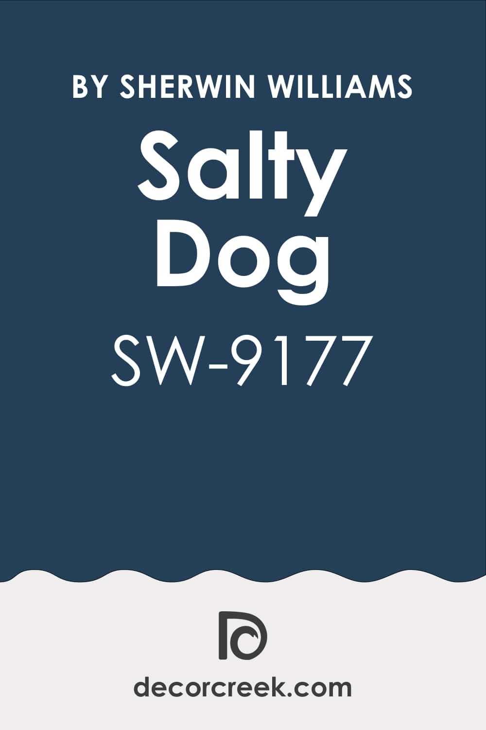
Salty Dog SW 9177
Salty Dog SW 9177 brings lively blue energy without pushing the room too hard. Salty Dog SW 9177 pairs with white beadboard, silver taps, and striped textiles for a fun corner. Salty Dog SW 9177 needs patient edging near glass shelves to keep the line crisp. Salty Dog SW 9177 pops in clips and thumbnails, which helps stream branding.
Salty Dog SW 9177 cleans easily in satin where hands touch near racks. Salty Dog SW 9177 is my cheerful accent when the setup needs a spark.
Salty Dog SW 9177 looks great with rope baskets and light woods. Salty Dog SW 9177 lifts a small nook behind a chair or mic boom. Salty Dog SW 9177 pairs well with white cable sleeves for a clean look.
🎨 Check out the complete guide to this color right HERE 👈
Oceanside SW 6496
Oceanside SW 6496 mixes teal and blue for a punchy, creative wall. Oceanside SW 6496 supports pink, lavender, and aqua LEDs without weird shifts. Oceanside SW 6496 looks great with matte black gear and clear acrylic stands. Oceanside SW 6496 benefits from careful lighting so the hue reads rich, not flashy.
Oceanside SW 6496 handles satin well behind controllers and headset hooks. Oceanside SW 6496 turns a streaming nook into a bold, photogenic backdrop.
Oceanside SW 6496 pairs with gray textiles to keep balance. Oceanside SW 6496 highlights white logos on towers and cases. Oceanside SW 6496 keeps thumbnails bright without washing faces.
Rock Bottom SW 7062
Rock Bottom SW 7062 gives cool graphite that pairs with concrete, brick, and steel. Rock Bottom SW 7062 quiets visual noise so wire runs and shelves feel organized. Rock Bottom SW 7062 looks steady under daylight strips and warm desk lamps. Rock Bottom SW 7062 lays down evenly with a 3/8″ roller and tight cut lines.
Rock Bottom SW 7062 prefers satin to hide chair marks and elbow rubs. Rock Bottom SW 7062 sets a tough, steady wall for marathon play and editing.
Rock Bottom SW 7062 matches dark foam tiles for sound control. Rock Bottom SW 7062 helps bright figurines stand out on shelves. Rock Bottom SW 7062 keeps lens flares lower on wide shots.
🎨 Check out the complete guide to this color right HERE 👈
Greenblack SW 6994
Greenblack SW 6994 adds a dark green-black that syncs with neon green gear. Greenblack SW 6994 keeps whites bright on monitors while softening glare off gloss parts. Greenblack SW 6994 pairs with carbon fiber wraps and black racks for a tight rig look. Greenblack SW 6994 needs bonding primer on smooth drywall for grip.
Greenblack SW 6994 wipes clean fast, which I like near door frames. Greenblack SW 6994 gives drama without the harsh bite of pure black.
Greenblack SW 6994 supports lime keycaps and mouse mats. Greenblack SW 6994 makes chrome desk legs feel crisp. Greenblack SW 6994 reads rich even in low lamp light.
🎨 Check out the complete guide to this color right HERE 👈
Urbane Bronze SW 7048
Urbane Bronze SW 7048 brings warm depth that loves wood, leather, and bronze lamps. Urbane Bronze SW 7048 balances cool screens so the room feels steady for long sessions. Urbane Bronze SW 7048 makes RGB look refined instead of loud. Urbane Bronze SW 7048 rolls best in satin where hands and gear touch often.
Urbane Bronze SW 7048 frames art prints and shelves with a rich outline. Urbane Bronze SW 7048 is my pick for grown-up rigs with real wood desks.
Urbane Bronze SW 7048 pairs with linen shades for soft glow. Urbane Bronze SW 7048 supports tan rugs and dark floors nicely. Urbane Bronze SW 7048 keeps the wall looking warm on camera.
🎨 Check out the complete guide to this color right HERE 👈

Caviar SW 6990
Caviar SW 6990 delivers inky black that turns one wall into a theater backdrop. Caviar SW 6990 deepens contrast so movies and games read crisp from the couch. Caviar SW 6990 pairs with blackout curtains and track lights for late sessions. Caviar SW 6990 needs careful prep and thin coats to keep it sleek.
Caviar SW 6990 likes semi-gloss behind switches for easy cleanup. Caviar SW 6990 makes posters, vinyl sleeves, and awards look gallery-level.
Caviar SW 6990 works with red LED strips for a bold mood. Caviar SW 6990 supports white controllers and light stands. Caviar SW 6990 helps dark bookcases blend into the wall.
🎨 Check out the complete guide to this color right HERE 👈
Wall Street SW 7665
Wall Street SW 7665 offers cool medium gray that steadies bright gear. Wall Street SW 7665 supports blue and purple LEDs without weird color casts. Wall Street SW 7665 looks tidy with white trim and brushed steel mounts. Wall Street SW 7665 covers fast with gray primer and a fine nap roller.
Wall Street SW 7665 wipes clean in satin near desks and doorways. Wall Street SW 7665 is my choice when I want a calm background for fast action on screen.
Wall Street SW 7665 pairs with pale rugs to brighten the floor. Wall Street SW 7665 holds color under both daylight and soft bulbs. Wall Street SW 7665 makes black frames and rails look tidy.
🎨 Check out the complete guide to this color right HERE 👈
Hale Navy HC-154
Hale Navy HC-154 delivers rich navy that reads clear in both warm and cool light. Hale Navy HC-154 pairs with brass pulls and marble tops for a classic desk wall. Hale Navy HC-154 outlines shelves and art so the setup looks intentional. Hale Navy HC-154 likes gray-tinted primer to hit color in two passes.
Hale Navy HC-154 holds up in semi-gloss where hands touch near switches. Hale Navy HC-154 gives a bold, grown-up mood that still keeps focus on the screen.
Hale Navy HC-154 supports gold accents for a sharp mix. Hale Navy HC-154 keeps camera white balance steady. Hale Navy HC-154 looks great with navy chairs and gray mats.
🎨 Check out the complete guide to this color right HERE 👈

Gentleman’s Gray 2062-20
Gentleman’s Gray 2062-20 brings deep blue with a hint of green for smart contrast. Gentleman’s Gray 2062-20 supports chrome legs, smoky glass, and black racks. Gentleman’s Gray 2062-20 keeps skin tones natural on camera beside ring lights. Gentleman’s Gray 2062-20 rolls smooth and levels well with a foam sleeve.
Gentleman’s Gray 2062-20 works in satin to hide tiny lint and wipe fast. Gentleman’s Gray 2062-20 turns a small stream wall into a strong, tidy frame.
Gentleman’s Gray 2062-20 pairs with white shelves for snap. Gentleman’s Gray 2062-20 stays rich next to teal LEDs. Gentleman’s Gray 2062-20 keeps reds from looking muddy.
🎨 Check out the complete guide to this color right HERE 👈

Newburyport Blue HC-155
Newburyport Blue HC-155 gives nautical blue that feels steady behind wide monitors. Newburyport Blue HC-155 pairs with white trim and oak shelves for balance. Newburyport Blue HC-155 keeps bright reds and greens honest on thumbnails. Newburyport Blue HC-155 likes a quality brush for tight edges by mounts.
Newburyport Blue HC-155 holds color in both warm bulbs and cool LEDs. Newburyport Blue HC-155 builds a clean backdrop for focus and long play.
Newburyport Blue HC-155 works with striped textiles for a crisp note. Newburyport Blue HC-155 supports silver mics and stands. Newburyport Blue HC-155 keeps glare lower than lighter blues.
🎨 Check out the complete guide to this color right HERE 👈

Deep Royal 2061-10
Deep Royal 2061-10 adds midnight blue that pushes screens forward without glare. Deep Royal 2061-10 pairs with nickel lamps, black stands, and glass cases. Deep Royal 2061-10 needs a bonding primer and patient coats for depth. Deep Royal 2061-10 prefers satin behind chairs and controller hooks.
Deep Royal 2061-10 photographs beautifully for banners and overlays. Deep Royal 2061-10 turns a plain wall into a rich stage for gear.
Deep Royal 2061-10 supports purple LEDs for a cool vibe. Deep Royal 2061-10 keeps camera noise lower in low light. Deep Royal 2061-10 looks sharp with white frames and racks.
Old Navy 2063-10
Old Navy 2063-10 brings dense navy that tightens up busy corners. Old Navy 2063-10 pairs with bright posters and white shelving for punch. Old Navy 2063-10 keeps eyes fresh in long co-op runs under mixed lighting. Old Navy 2063-10 covers well over tinted primer and cures tough.
Old Navy 2063-10 wipes clean where hands touch near the console dock. Old Navy 2063-10 gives a classic, focused wall that lasts.
Old Navy 2063-10 supports brass lamps for warmth. Old Navy 2063-10 steadies colorful keyboards and mice. Old Navy 2063-10 helps icons pop on wide screens.
🎨 Check out the complete guide to this color right HERE 👈
Raccoon Fur 2126-20
Raccoon Fur 2126-20 reads as charcoal-black with a soft edge. Raccoon Fur 2126-20 eases glare while giving strong contrast to gear logos. Raccoon Fur 2126-20 pairs with pewter, smoked glass, and gray oak. Raccoon Fur 2126-20 rolls flat and hides seams around mounts.
Raccoon Fur 2126-20 resists fingerprints in satin near doors and rails. Raccoon Fur 2126-20 is my fixer when pure black feels too sharp.
Raccoon Fur 2126-20 works with dark floors without closing in the room. Raccoon Fur 2126-20 keeps bright desk mats from looking too loud. Raccoon Fur 2126-20 looks neat with gray sound foam.
Wrought Iron 2124-10
Wrought Iron 2124-10 gives graphite black that looks refined on camera. Wrought Iron 2124-10 pairs with nickel, pewter, and matte black for a tight set. Wrought Iron 2124-10 holds line weight around shelves and cable trays. Wrought Iron 2124-10 likes a fine roller for a smooth shell finish.
Wrought Iron 2124-10 cleans fast with a damp cloth after raids and builds. Wrought Iron 2124-10 brings drama with a softer touch than jet black.
Wrought Iron 2124-10 matches monitor bezels for a seamless edge. Wrought Iron 2124-10 keeps LED strips from color fringing on video. Wrought Iron 2124-10 supports brushed steel legs and mounts.
🎨 Check out the complete guide to this color right HERE 👈

Onyx 2133-10
Onyx 2133-10 delivers deep black that frames a projector wall like a theater. Onyx 2133-10 pairs with velvet curtains and dimmable track lights. Onyx 2133-10 needs careful sanding and thin passes for that sleek feel. Onyx 2133-10 shines in semi-gloss near switches for easy cleanup.
Onyx 2133-10 keeps posters and neon art looking crisp. Onyx 2133-10 is my yes for bold builds that need a strong anchor.
Onyx 2133-10 supports ceiling fans with black blades. Onyx 2133-10 helps white consoles stand out in photos. Onyx 2133-10 looks strong with smoked glass doors.
Soot 2129-20
Soot 2129-20 gives a cool, inky charcoal that supports blue and purple LEDs. Soot 2129-20 balances bright consoles and white cases without stealing focus. Soot 2129-20 lays even with gray primer and tight cut lines. Soot 2129-20 likes satin for low glare near glass and glossy gear.
Soot 2129-20 cleans up fast, which helps in high-traffic setups. Soot 2129-20 turns mixed gear into a neat, unified wall.
Soot 2129-20 pairs with steel racks and cable sleeves. Soot 2129-20 holds color next to light wood floors. Soot 2129-20 steadies bright mouse pads and posters.
Kendall Charcoal HC-166
Kendall Charcoal HC-166 brings deep gray that reads strong but friendly. Kendall Charcoal HC-166 pairs with oil-rubbed bronze, walnut tops, and tan mats. Kendall Charcoal HC-166 steadies colorful LEDs so clips look consistent. Kendall Charcoal HC-166 rolls best with a smooth sleeve to avoid texture.
Kendall Charcoal HC-166 prefers satin on carved trim to keep details crisp. Kendall Charcoal HC-166 anchors big rooms where a pure black would feel too heavy.
Kendall Charcoal HC-166 supports beige runners and cork boards. Kendall Charcoal HC-166 keeps bright art from clashing. Kendall Charcoal HC-166 works well with black mesh chairs.
🎨 Check out the complete guide to this color right HERE 👈

Cheating Heart 1617
Cheating Heart 1617 reads as blue-black with a designer edge. Cheating Heart 1617 pairs with brass sconces and pale rugs for balance. Cheating Heart 1617 treats RGB glow kindly, keeping skin tones natural on stream. Cheating Heart 1617 wants bonding primer for grip on old paint.
Cheating Heart 1617 looks tidy in satin where hands brush past.
Cheating Heart 1617 gives drama, polish, and steady focus for long play. Cheating Heart 1617 fits dark wood frames and shelves. Cheating Heart 1617 keeps camera auto-white balance stable. Cheating Heart 1617 supports teal accents without clashing.
🎨 Check out the complete guide to this color right HERE 👈
Salamander 2050-10
Salamander 2050-10 delivers deep green that loves black gear and walnut. Salamander 2050-10 sets off white keycaps and silver mics with rich contrast. Salamander 2050-10 keeps glare down around glossy monitors. Salamander 2050-10 needs even strokes and thin coats for smooth depth.
Salamander 2050-10 wipes clean in satin behind the chair lane. Salamander 2050-10 makes a bold accent wall that feels grounded and ready.
Salamander 2050-10 pairs with brass for a warm glow. Salamander 2050-10 looks steady under warm bulbs at night. Salamander 2050-10 supports green LEDs without color cast.
🎨 Check out the complete guide to this color right HERE 👈

Essex Green HC-188
Essex Green HC-188 brings forest depth that pairs with leather mats and brass. Essex Green HC-188 supports warm bulbs while keeping blues honest on screen. Essex Green HC-188 rolls well with a fine nap and steady cut lines. Essex Green HC-188 works best in satin to hide touch marks near racks.
Essex Green HC-188 frames oak shelves and black cases with rich contrast. Essex Green HC-188 builds a focused, grown-up gaming wall that lasts. Essex Green HC-188 handles bright posters without stealing attention.
Essex Green HC-188 ties in with plants for a fresh look. Essex Green HC-188 keeps long sessions feeling grounded and steady.
🎨 Check out the complete guide to this color right HERE 👈

Final Tips for Your Gaming Room
I paint the desk wall first, test LEDs on and off, and then decide if I need a bold accent. I keep sheens at satin or eggshell so cleanups are quick after long nights. I mount cable trays, label cords, and slide felt pads under stands before photos. I add dimmers so color stays steady on camera and eyes feel good after raids.
I leave a small jar of touch-up paint in the drawer for quick fixes. I pick the shade that makes you want to sit down, press start, and play one more round.
I set chair height and arm rests so they don’t rub fresh paint. I level shelves with a laser so lines stay crisp against the wall color.
I save paint labels in a zip bag so reorders are easy later.