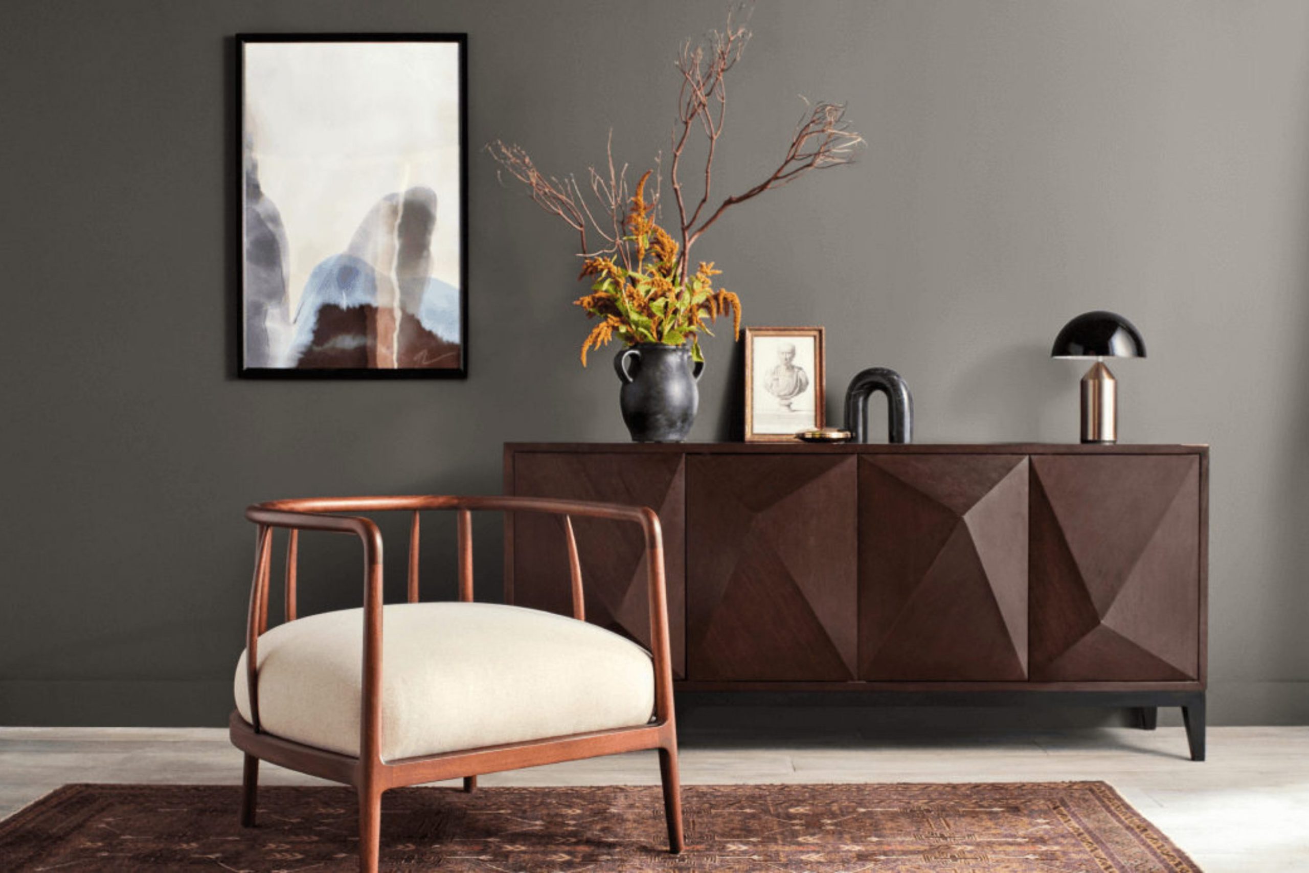
If you’re considering painting your room and seeking a color that adds both refined style and warmth, you might want to consider SW 7048 Urbane Bronze by Sherwin Williams. Before you pick up a paintbrush, here are a few essentials that will help you make an informed decision. Urbane Bronze is a deep, warm gray that borders on being a soft black. The color has brown undertones which provide a cozy feel, perfect for areas where you want some drama without the starkness of a true black.
It’s vital to think about the lighting in your room since Urbane Bronze can appear different depending on natural and artificial light. In well-lit areas, it shows more of its gray and brown nuances, while in dimmer rooms, it might look more like a solid, deep gray. This color pairs beautifully with a variety of textures and materials, such as natural wood, metals, and rich fabrics.
Choosing Urbane Bronze can bring a unique character to your walls, offering a retreat-like atmosphere that’s both modern and classic. So, if you’re looking to create a statement room that feels grounded and calm, Urbane Bronze could be the perfect choice.
Let’s take a closer look at what makes this color a fantastic pick for your next project!
Is Urbane Bronze SW 7048 Right for My Home?
Urbane Bronze is a deep, warm gray that brings a solid and grounded feeling to any room. It’s like the color of wet clay, rich and earthy, with just a hint of brown to soften the gray. I find it incredibly adaptable, which is one of the reasons it’s one of my favorites.
In terms of interior styles, Urbane Bronze really shines in modern, minimalist, and even rustic settings. Its earthy tones provide a beautiful backdrop that complements natural materials wonderfully. I love pairing it with light woods, leather accents, and metallic finishes like brass or copper. It has a natural affinity for stone textures as well, such as marble or slate, which can really highlight its depth.
Fabric-wise, Urbane Bronze works well with soft, plush textures. Think thick, woven throws or velvet cushions that you just want to sink into. This color has a way of making them look even more inviting. Linen also looks fantastic against it, adding a light, airy feel to the strong color.
Overall, Urbane Bronze is a go-to when I want a color that adds character and warmth without feeling too intense. It’s perfect for creating a cozy, welcoming atmosphere in any home.
What are the right undertones of Urbane Bronze SW 7048 ?
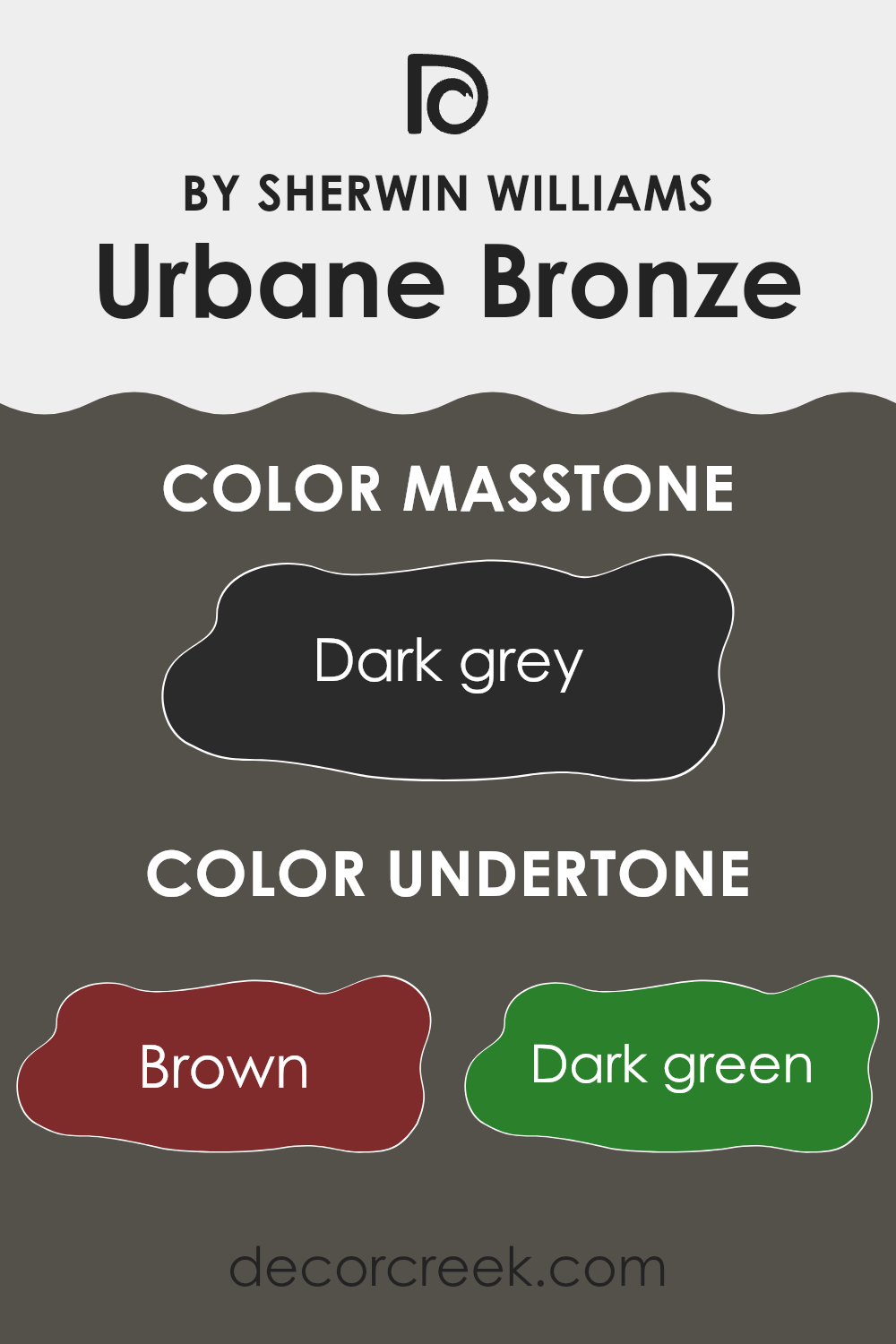
Urbane Bronze is a popular paint color noted for its deep, rich hue which can add depth and warmth to a room. It possesses a range of undertones including brown, dark green, olive, navy, purple, dark turquoise, and grey. These undertones are subtle colors that emerge under different lighting conditions or when paired with other colors. Undertones are significant because they can shift the perceived color, influencing the atmosphere and styling of a room.
For instance, in natural light, Urbane Bronze might show more of its brown or olive undertones, projecting a warm, earthy vibe that makes a room feel cozy and inviting. In artificial lighting, the grey or navy undertones might become more pronounced, lending the walls a cooler, more neutral appearance.
When Urbane Bronze is used on interior walls, these undertones play a crucial role in decorating decisions. The presence of multiple undertones makes it a flexible color choice, allowing it to complement a wide range of furnishings and decor styles. Depending on the surrounding colors and types of light, Urbane Bronze can appear differently, making it important to consider these factors when choosing this color for home interiors. Overall, the dynamic undertones provide depth and complexity, enriching the visual experience of the room.
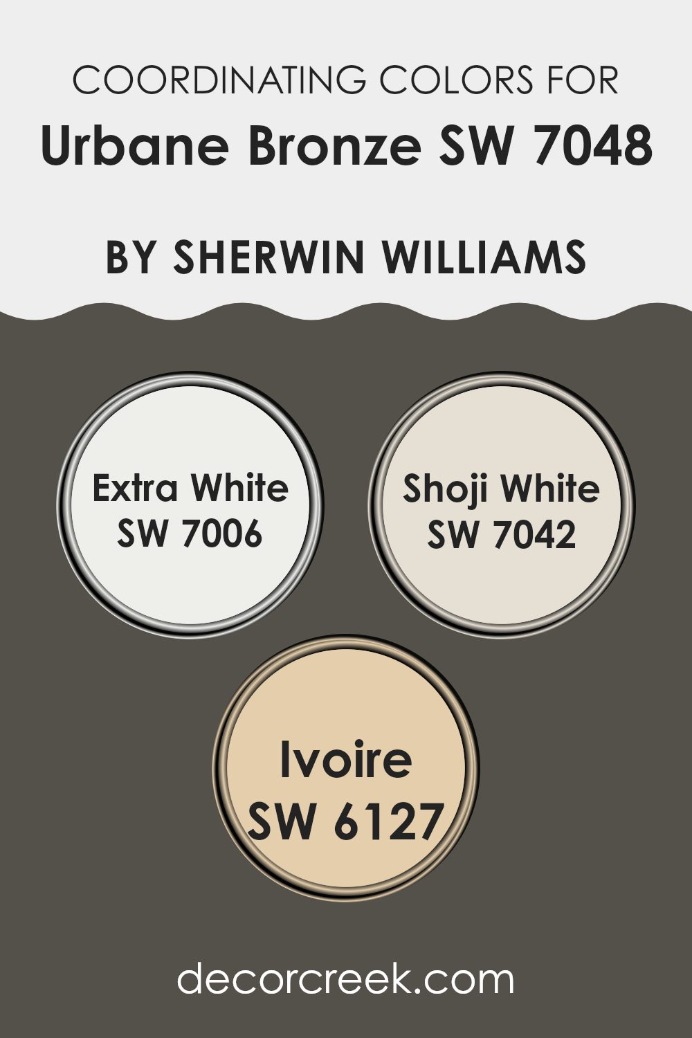
Best Coordinating Colors to use with Urbane Bronze SW 7048 by Sherwin Williams this year.
Coordinating colors are a group of colors that complement each other well when used together in interior decorating or design. They enhance one another and help create a balanced, harmonious look. For instance, when pairing with Urbane Bronze, a deep and moody hue, the chosen coordinating colors should help balance its intensity and bring out its best tones.
A perfect example of a coordinating color is Extra White, which acts as a crisp and clean contrast to darker shades like Urbane Bronze. Its pure brightness can help make any room feel more open and airy, providing a stark yet striking balance. Shoji White is another coordinating color that offers a softer, warmer alternative to the starkness of Extra White.
Its subtle, creamy undertone provides a calming complement, softening the boldness of darker tones and creating a gentle transition between colors. Lastly, Ivoire brings a touch of warmth with its creamy, yellowish hue. It adds a cozy warmth, ideal for creating an inviting vibe when paired with deeper, cooler tones. Using these coordinating colors thoughtfully throughout a room can help achieve a cohesive and appealing aesthetic, ensuring that colors flow beautifully from one room to another.
You can see recommended paint colors below:
- SW 7006 Extra White
- SW 7042 Shoji White
- SW 6127 Ivoire
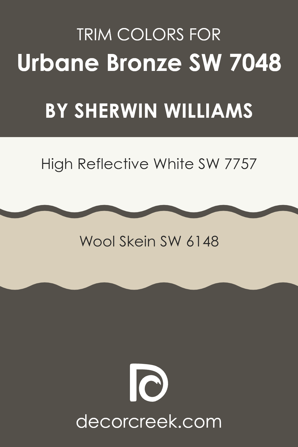
Trendy Trim Colors of Urbane Bronze SW 7048 by Sherwin Williams to use this year.
Trim colors are used to highlight and accentuate the architecture and design features of a room, such as window frames, doors, and baseboards. When choosing trim colors for a wall painted in Urbane Bronze, a rich and warm color, selecting the right shade can significantly enhance the visual appeal and overall aesthetics of the room. High Reflective White and Wool Skein are two excellent options that provide a striking contrast or a subtle complement to Urbane Bronze, making it stand out or blend beautifully within a room.
High Reflective White is a very bright, almost pure white color that brings a crisp and clean look to any room. It’s particularly effective as a trim color for Urbane Bronze because it creates a strong contrast, highlighting the richness of the darker shade and giving a room a fresh, vibrant edge.
On the other hand, Wool Skein is a soft, muted beige with warm undertones that offers a more understated and harmonious transition between the trim and Urbane Bronze. This color is great for creating a cohesive look that is calming and inviting without the stark contrasts that can sometimes feel too intense in a room.
You can see recommended paint colors below:
Evergreen Colors Similar to Urbane Bronze SW 7048 by Sherwin Williams
Using similar colors in a design has its unique advantages, especially when the primary shade is something deep and rich like Urbane Bronze by Sherwin Williams. Similar colors can create a harmonious feel and add depth to a room without feeling too intense with contrast. These shades often belong to the same color family and help in achieving a balanced and cohesive look while providing slight variances to keep things interesting.
For instance, Tungsten and Thunder Gray, with their subtle gray undertones, are excellent for adding a mild, polished flair that complements the boldness of Urbane Bronze. Prelude offers a softer, lighter hue of gray that pairs well with darker colors to provide a balanced visual effect.
Black Fox and Stony Creek bring in darker elements, which are great for accentuating features or for creating a dramatic backdrop that still feels connected to the main color theme.
Muddled Basil and Enduring Bronze are closely tied to natural elements, adding a touch of earthiness which prevents the palette from feeling too stark or cold. Nocturne, Roycroft Bronze Green, and Ironclad further enrich the spectrum with their unique shades of green and dark gray, providing an inspiring contrast that works well within the theme, rounding out the room with a cohesive yet diverse color palette. These variations can help in maintaining a theme without sacrificing visual interest and personality in the design room.
You can see recommended paint colors below:
- SW 9515 Tungsten
- SW 7645 Thunder Gray
- SW 9620 Prelude
- SW 7020 Black Fox
- SW 9610 Stony Creek
- SW 7745 Muddled Basil
- SW 7055 Enduring Bronze
- SW 9520 Nocturne
- SW 2846 Roycroft Bronze Green
- SW 9570 Ironclad
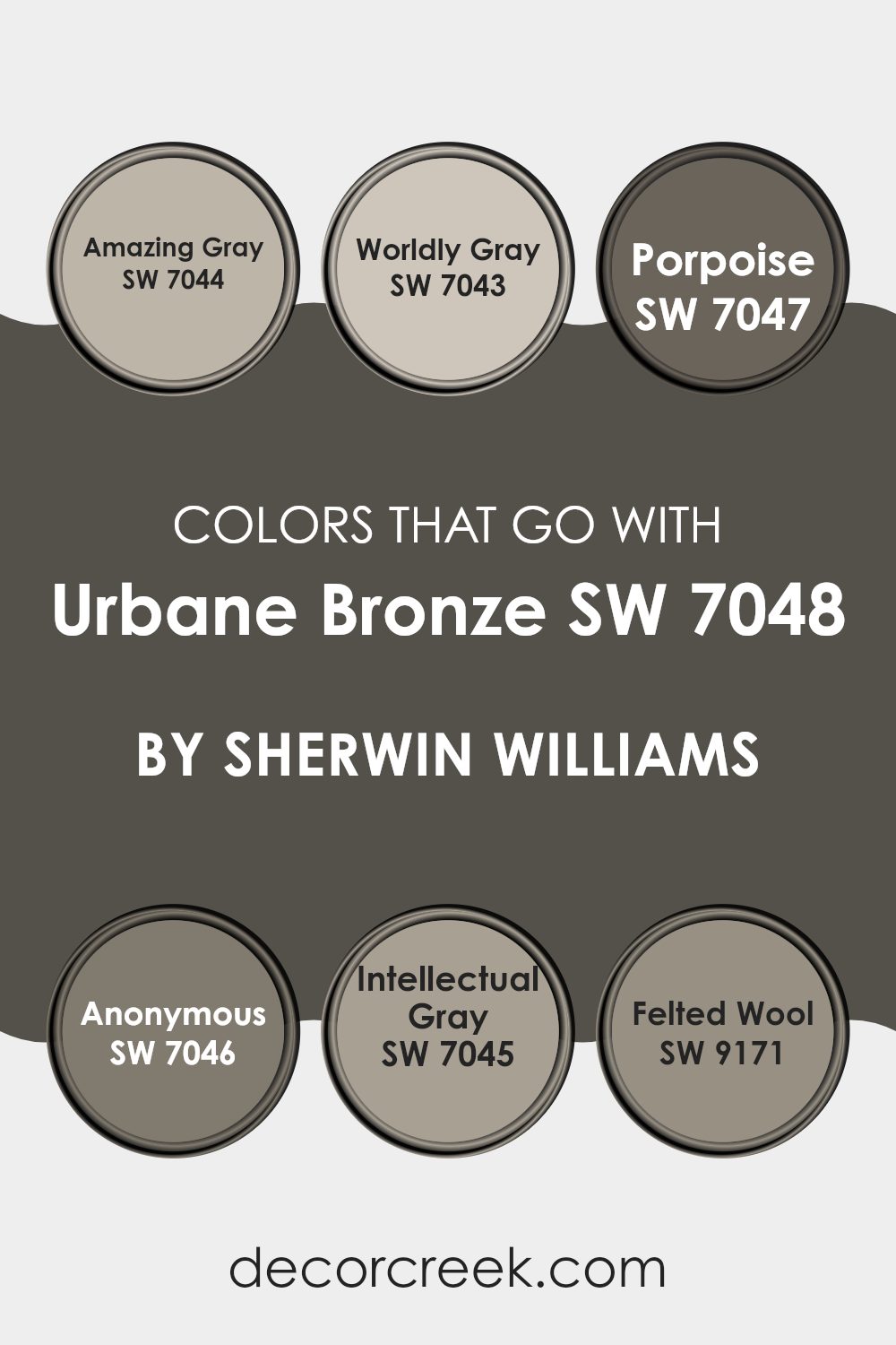
Colors that Go With Urbane Bronze SW 7048 by Sherwin Williams
Choosing the right colors to use with Urbane Bronze SW 7048 by Sherwin Williams is vital because it helps create a cohesive and appealing look in any room. Urbane Bronze is a deep, rich color, perfect as an accent or primary theme in rooms. When paired correctly, the complementary colors enhance the overall aesthetic, adding depth and harmony. Colors like Amazing Gray, Worldly Gray, Porpoise, Anonymous, Intellectual Gray, and Felted Wool are great choices.
Amazing Gray SW 7044 is a warm gray that offers a subtle, inviting palette, making it an excellent backdrop for the bolder Urbane Bronze. Similarly, Worldly Gray SW 7043 provides a slightly cooler tone, yet remains neutral, allowing it to support and balance the stronger presence of Urbane Bronze. Porpoise SW 7047 introduces a darker, smoky gray that contrasts beautifully against the lighter grays and adds visual interest.
Anonymous SW 7046 is another gray but with green undertones, offering a unique twist that pairs well with natural elements in a room. Intellectual Gray SW 7045 leans toward taupe, providing a soft, earthy blend that complements wooded or rustic themes perfectly. Lastly, Felted Wool SW 9171, with its deeper, comforting shade, creates a cozy atmosphere when combined with Urbane Bronze, ideal for creating a snug, inviting environment. Each color has its own character, yet they all blend seamlessly with Urbane Bronze, ensuring a stylish, well-integrated room.
You can see recommended paint colors below:
- SW 7044 Amazing Gray
- SW 7043 Worldly Gray
- SW 7047 Porpoise
- SW 7046 Anonymous
- SW 7045 Intellectual Gray
- SW 9171 Felted Wool
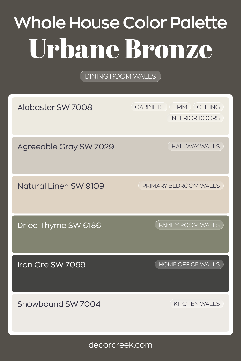
Whole House Paint Color Palette Grounded In Urbane Bronze SW 7048
Urbane Bronze SW 7048 makes a bold statement on the dining room walls, setting a rich foundation for the entire home. Alabaster on cabinets, trim, ceilings, and interior doors keeps the darker tone balanced and crisp. Snowbound in the kitchen adds brightness that offsets the depth of bronze.
Agreeable Gray in the hallway and Natural Linen in the primary bedroom soften the transition between light and dark areas.
Dried Thyme in the family room builds on the earthy mood, adding warmth and character. Iron Ore in the house office deepens the palette even further for a focused, dramatic look.
This combination blends deep browns, fresh whites, and warm neutrals with intention. Each room feels distinct while still tied together by grounded, earthy tones.
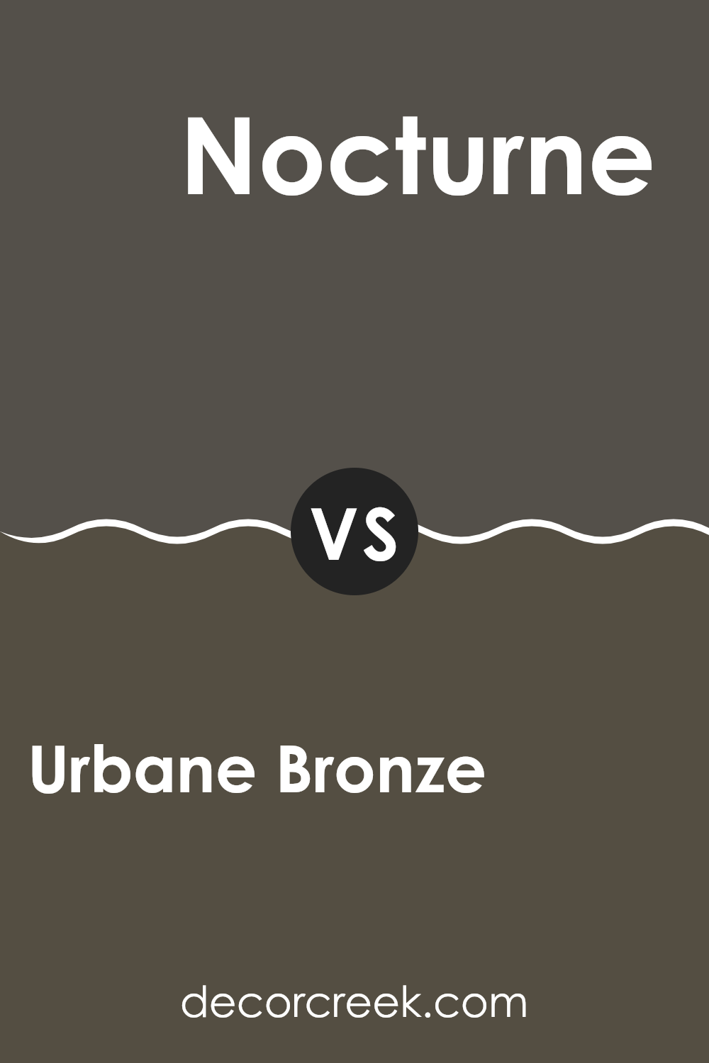
Urbane Bronze SW 7048 by Sherwin Williams vs Nocturne SW 9520 by Sherwin Williams
The main color, Urbane Bronze, is a warm, dark gray with brown undertones. It gives off a cozy and grounded feel, perfect for a comforting room. On the other hand, Nocturne is a deep, intense blue with hints of gray. This shade is bolder and can give a room a more striking appearance.
While Urbane Bronze works well in places where you want a calm and secure atmosphere, Nocturne can make a statement, providing a dramatic look. Both colors can be used to create refined settings, but their effects are quite different.
Urbane Bronze leans more towards a natural, earthy vibe, ideal for creating a welcoming nook, whereas Nocturne offers a richer, more noticeable presence that can define a room distinctly.
You can see recommended paint color below:
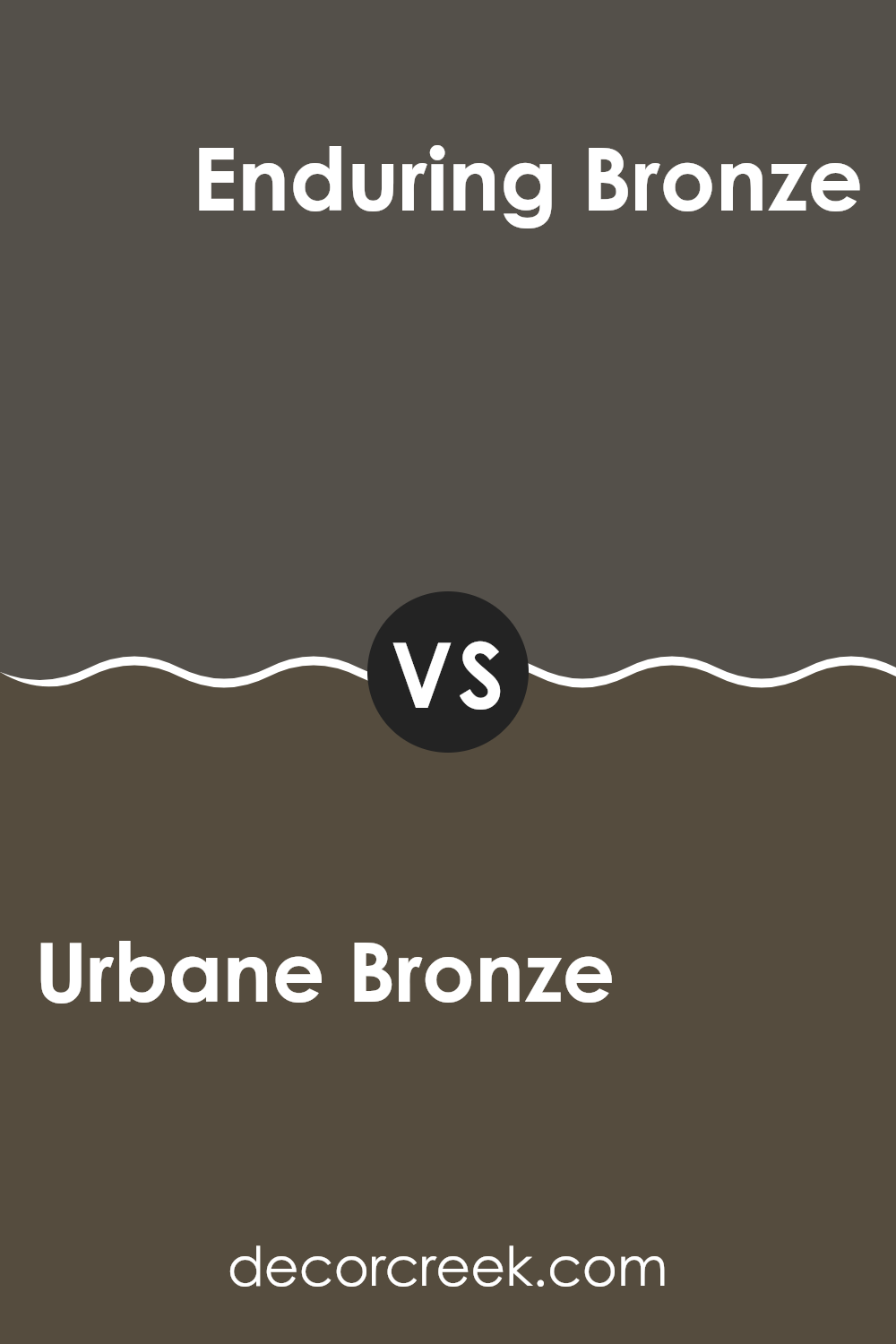
Urbane Bronze SW 7048 by Sherwin Williams vs Enduring Bronze SW 7055 by Sherwin Williams
Urbane Bronze and Enduring Bronze, both by Sherwin Williams, share the common base of a deep, earthy bronze tone. However, each presents unique characteristics. Urbane Bronze, being a darker shade, leans more towards a rich, almost charcoal-like color.
Its deep saturation makes it a strong choice for accent walls or furniture, giving rooms a grounded and solid feel. On the other hand, Enduring Bronze, which is slightly lighter, carries a more subtle brown undertone. This lighter hue offers flexibility, making it easier to blend into various decor settings without feeling too intense in the room.
It’s ideal for larger wall areas or as a base color that complements brighter accents. Together, these two colors offer adaptable options for interior design, catering to different tastes and styles, whether you desire a bold statement or a more understated elegance.
You can see recommended paint color below:
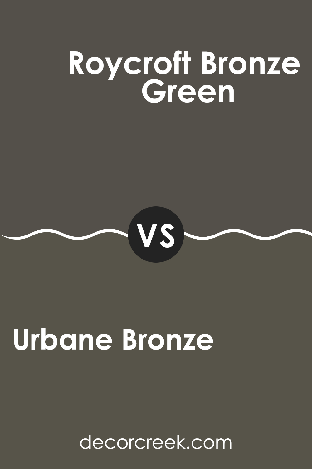
Urbane Bronze SW 7048 by Sherwin Williams vs Roycroft Bronze Green SW 2846 by Sherwin Williams
Urbane Bronze and Roycroft Bronze Green are two distinct shades offered by Sherwin Williams. Urbane Bronze is a deep, dark gray with brown undertones, providing a solid, grounding effect. It’s an adaptable color that works well in many settings, adding a touch of elegance without being overly bold.
On the other hand, Roycroft Bronze Green is a darker shade that leans towards green, giving it an earthy, more natural feel. This color can bring a sense of calm and quiet to rooms, and is particularly good for those wanting to connect with nature.
Both colors are quite dark and can be used effectively to create a cozy, inviting atmosphere. They pair well with a range of other colors and design styles, from modern to rustic. However, the choice between them would depend on whether you prefer the subtle warmth of brown or the deep, rich tones of green.
You can see recommended paint color below:
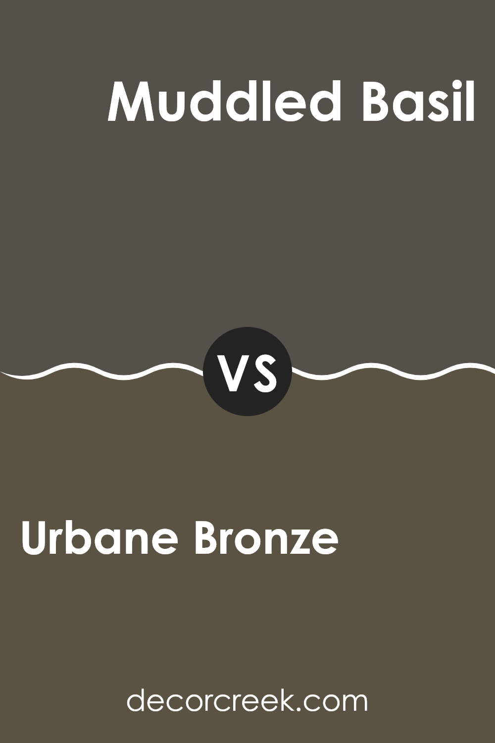
Urbane Bronze SW 7048 by Sherwin Williams vs Muddled Basil SW 7745 by Sherwin Williams
Urbane Bronze and Muddled Basil are two distinct colors from Sherwin Williams. Urbane Bronze offers a dark, comforting shade, resembling a rich blend of gray and brown. This color has an earthy feel, making it a solid choice for a grounded and cozy atmosphere in a room, such as a bedroom or living room. It pairs well with natural materials like wood and stone.
On the other hand, Muddled Basil is a softer green that hints at nature and freshness. The green is muted, which makes it less bold and more adaptable to various decorative styles. This color can bring a touch of calmness and freshness to rooms without being too bright or too intense. It works well in kitchens or bathrooms where a subtle hint of color is desirable.
Overall, while both colors are inspired by natural elements, Urbane Bronze provides a darker, more anchor-like presence, and Muddled Basil offers a lighter, refreshing touch. You can use them together to balance dark and light tones in your home decor.
You can see recommended paint color below:
- SW 7745 Muddled Basil
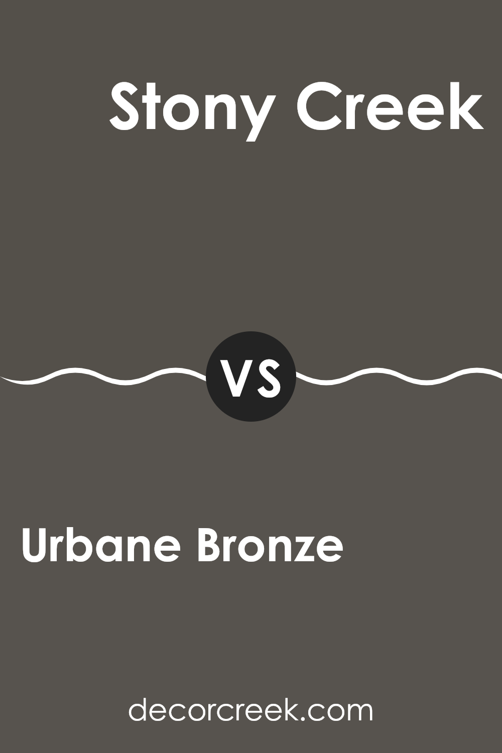
Urbane Bronze SW 7048 by Sherwin Williams vs Stony Creek SW 9610 by Sherwin Williams
Urbane Bronze and Stony Creek are two distinct paint colors by Sherwin Williams, each with its own unique appeal. Urbane Bronze is a deep, rich shade that leans towards a dark gray or soft black with brown undertones. It works well in rooms that need a bold, strong color to create a sense of grounding and warmth. This color is ideal for accents like on cabinets or as a feature wall, adding depth and a touch of drama to a room.
On the other hand, Stony Creek offers a softer, more neutral appearance. It’s a mid-tone gray that carries subtle green undertones, giving it a natural, calm feel. This color is more adaptable and easier to pair with a variety of decor styles and other colors. It’s perfect for living areas and bedrooms where a soothing, inviting atmosphere is desired.
Both colors provide a modern touch to interiors but serve different purposes based on their depth and tone. Urbane Bronze brings weight and definition, while Stony Creek creates a gentle, relaxing environment.
You can see recommended paint color below:
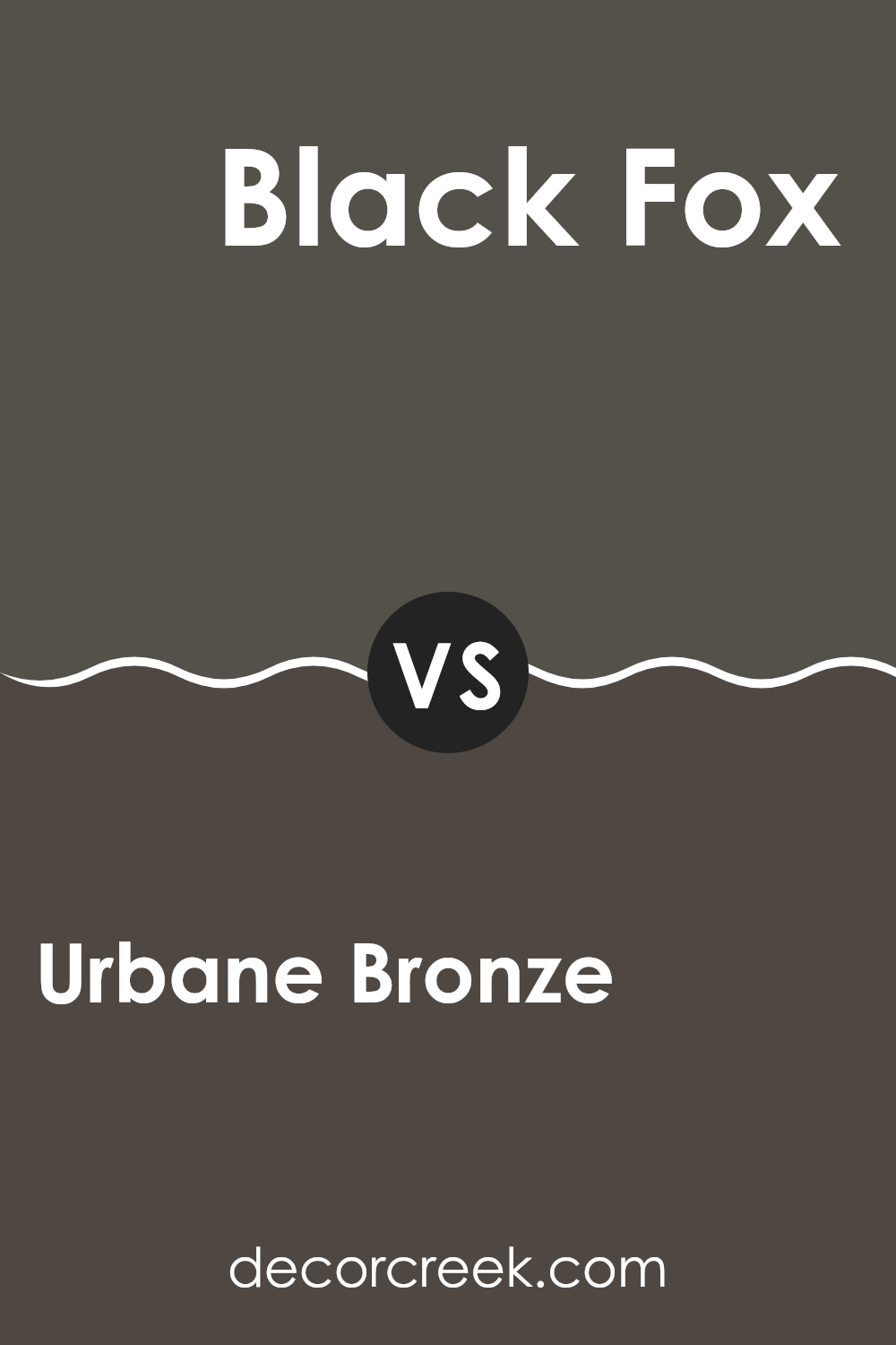
Urbane Bronze SW 7048 by Sherwin Williams vs Black Fox SW 7020 by Sherwin Williams
Urbane Bronze and Black Fox, both by Sherwin Williams, are dark, rich colors, but they serve different moods and styles. Urbane Bronze has a deep, warm tone due to its brown base with gray undertones, making it an excellent choice for creating a cozy and welcoming atmosphere. It reflects an earthy vibe that works well in rooms where you want a touch of nature and softness, despite its darkness.
On the other hand, Black Fox carries a cooler tone because of its black base mixed with a touch of gray. This color is closer to a traditional dark gray or off-black, which gives it a more neutral and adaptable quality. It can add drama and ground rooms without making them feel too heavy, as it does not absorb light as much as a pure black would.
Overall, while both shades are dark, Urbane Bronze leans towards a warmer, earthy palette, and Black Fox offers a crisper, more neutral look. Each brings its own unique character to interiors, depending on what feel you’re aiming for in a room.
You can see recommended paint color below:
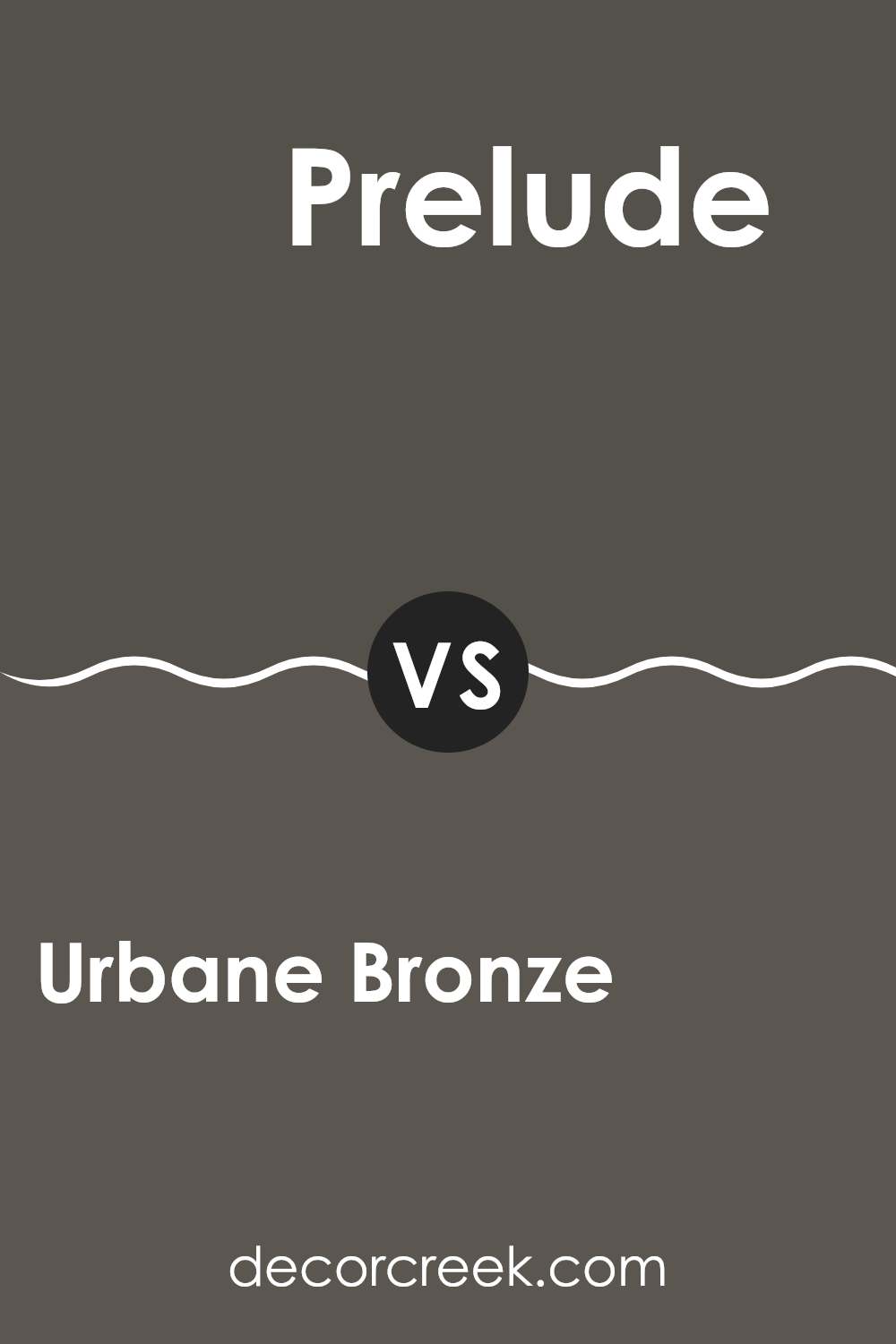
Urbane Bronze SW 7048 by Sherwin Williams vs Prelude SW 9620 by Sherwin Williams
Urbane Bronze and Prelude by Sherwin Williams are both unique paint colors, each displaying its own charm. Urbane Bronze is a deep, warm gray with brown undertones, giving it a rich and grounding feel. It’s a solid choice for creating a cozy and secure atmosphere in a room, lending itself well to rooms meant for relaxation or concentration.
On the other hand, Prelude is much lighter, a subtle gray with blue undertones that brings a calm and gentle vibe to any room. It reflects light beautifully, making it perfect for smaller rooms or areas where you want to promote a sense of openness.
While Urbane Bronze projects a stronger, more enveloping presence, Prelude offers a lighter touch, almost airy. These characteristics make Urbane Bronze suitable for accent walls or furniture, and Prelude ideal for a soothing backdrop in a bedroom or living area. Both colors support different moods and can significantly influence the aesthetic and feel of a room.
You can see recommended paint color below:
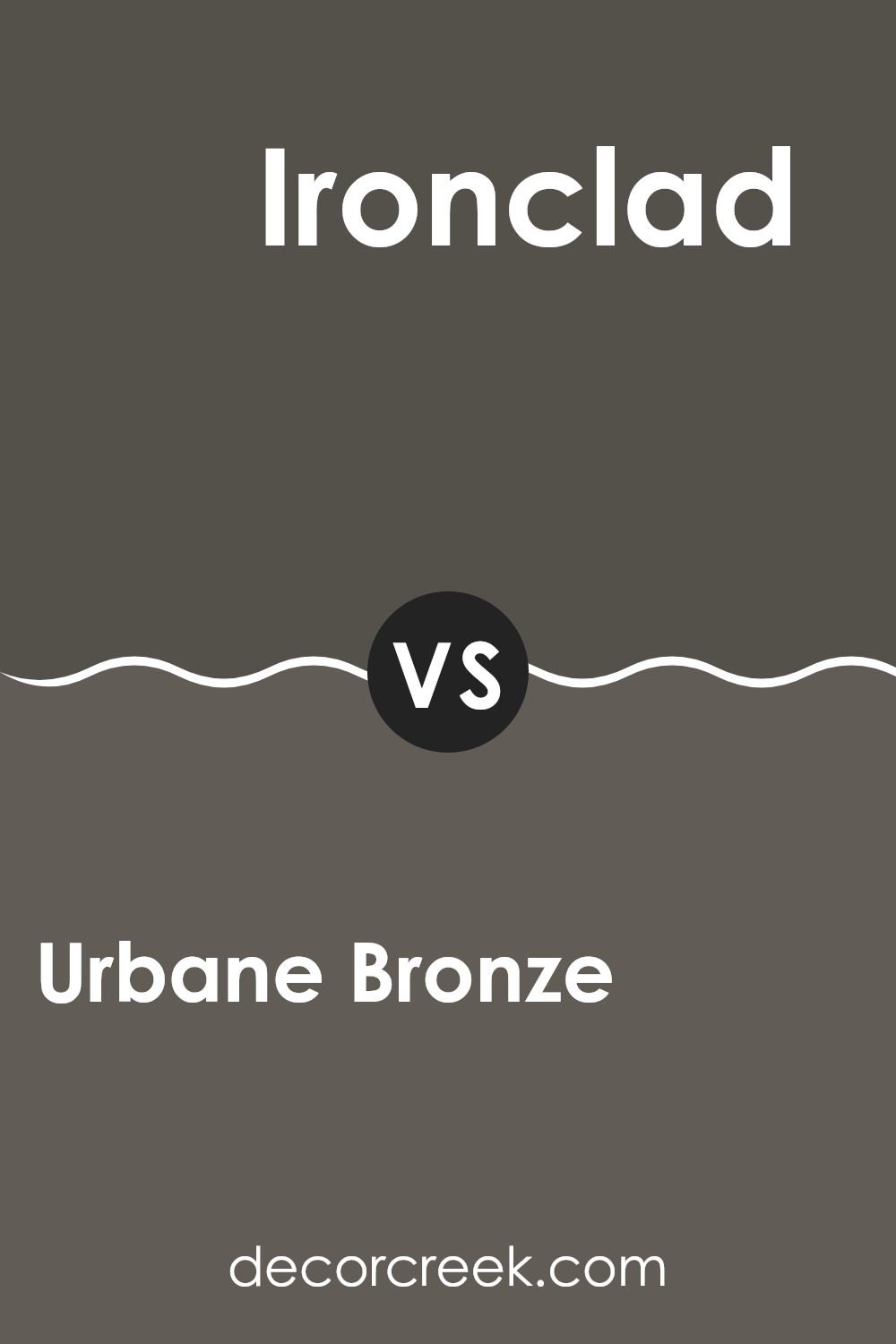
Urbane Bronze SW 7048 by Sherwin Williams vs Ironclad SW 9570 by Sherwin Williams
Urbane Bronze and Ironclad, both by Sherwin Williams, offer distinct yet subtle differences in their color tones. Urbane Bronze presents as a rich, deep gray-brown, giving it a warm, grounding feel. This color is adaptable, pairing well with a range of decorative styles and works beautifully in both indoor and outdoor areas.
On the other hand, Ironclad is a darker shade that leans more towards a true, neutral charcoal. It lacks the warmer brown undertones of Urbane Bronze, offering instead a more consistent, pure gray. This makes Ironclad an excellent choice for a modern look, providing a strong, bold background that complements many contemporary designs.
While both colors are dark and can create a cozy atmosphere, Urbane Bronze would more often warm up a room, whereas Ironclad provides a sleeker, cleaner aesthetic. Depending on what feeling you want in your room, your choice between these two could vary. Urbane Bronze works well where you want warmth and depth, while Ironclad suits rooms that benefit from a cooler, more straightforward gray presence.
You can see recommended paint color below:
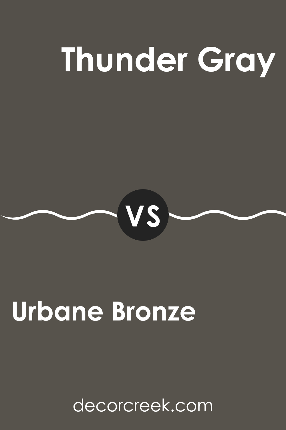
Urbane Bronze SW 7048 by Sherwin Williams vs Thunder Gray SW 7645 by Sherwin Williams
Urbane Bronze and Thunder Gray, both from Sherwin Williams, present a modern vibe but differ greatly in their undertones and overall impact. Urbane Bronze is a deep, almost earthy tone with a solid presence, making it ideal for statement walls or accent pieces. It pulls from a palette of greys and browns, giving it a warm, grounded feel, perfect for cozy, inviting rooms.
Meanwhile, Thunder Gray is lighter compared to Urbane Bronze and carries a cooler, more neutral grey shade. This color works well in various settings, offering an adaptable backdrop that complements brighter colors and elaborate designs. It finds a balance that’s neither too imposing nor too subdued, making it suitable for larger areas without feeling too intense.
In essence, while Urbane Bronze offers warmth and depth, Thunder Gray provides a subtle, flexible base for any room. The choice between them depends on the desired impact and the room’s function.
You can see recommended paint color below:
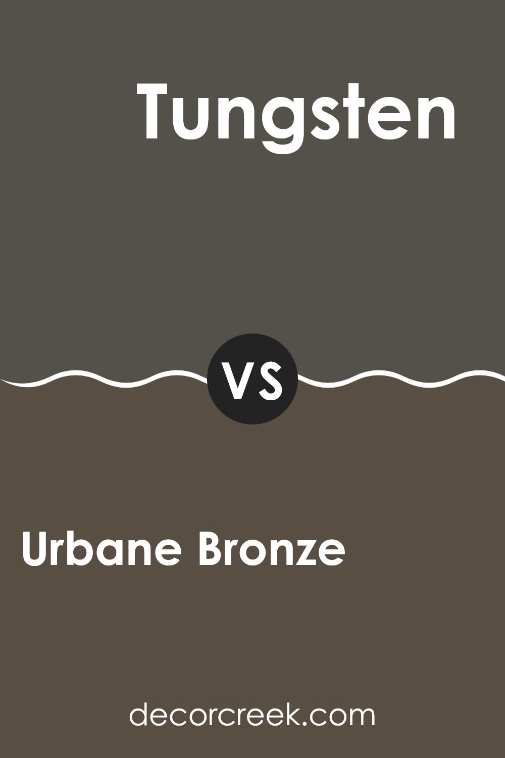
Urbane Bronze SW 7048 by Sherwin Williams vs Tungsten SW 9515 by Sherwin Williams
Urbane Bronze and Tungsten by Sherwin Williams are two unique shades that can change the feel of any room. Urbane Bronze is a deep, dark brown with gray undertones, providing a strong and grounded feeling. This color is perfect for those who want to create a cozy, intimate environment in their rooms. It works well in areas that are meant for relaxation and reflection like living rooms or bedrooms.
On the other hand, Tungsten is a lighter shade compared to Urbane Bronze. It shows a cool gray tone that gives off a cleaner, more open vibe. This color is great for modern rooms and can be used in kitchens, bathrooms, or offices where a fresh and neat appearance is desired.
Combining these two, you could use Tungsten as a base for most of the walls in a room, with an accent wall in Urbane Bronze to add depth and interest. This pairing would balance both the warmth of Urbane Bronze and the coolness of Tungsten effectively.
You can see recommended paint color below:
Wrapping up my thoughts on SW 7048 Urbane Bronze by Sherwin Williams, I must say that this color really stands out! Urbane Bronze is perfect if you’re looking to give your room a cozy, yet strong feeling. What I love most about it is how it pairs so nicely with different colors and materials, like wood and metal. Whether you want to paint a whole room or just add a touch of accent, Urbane Bronze doesn’t disappoint.
It’s not just a pretty color, but it’s also a practical one. It hides smudges and dirt better than lighter shades, making it a great choice for busy areas or households with kids and pets. Plus, this shade makes furniture and decor stand out in a really cool way.
So, if you are looking to give a room some new life, Urbane Bronze could be the perfect pick. It’s like a warm hug for your walls, bringing a strong and cozy vibe that makes any room feel more like home. In conclusion, this paint color by Sherwin Williams is a great choice for anyone wanting to add some personality and warmth to their living room.

Ever wished paint sampling was as easy as sticking a sticker? Guess what? Now it is! Discover Samplize's unique Peel & Stick samples.
Get paint samples

