Antique bedrooms carry a special kind of beauty that never loses its charm. They whisper stories from the past and wrap you in warmth the moment you step in. Every corner feels like it holds a memory — a soft chair by the window, the curve of an old mirror, the glow of a lamp that’s been turned on a thousand times.
When I design these rooms, I think about more than just furniture or color. I think about the way the morning light hits a wooden dresser, or how faded linens can feel like a soft hug after a long day.
These quiet moments are what make an antique bedroom feel so special.
Paint plays a big part in that feeling. It’s the foundation that brings everything together — the texture, the light, and the emotion. The right shade can highlight the details of old wood, make brass handles shimmer, or soften the sharp lines of modern pieces. It creates a harmony between the past and present, letting the room breathe gently instead of shouting for attention.
In this collection, I’ve chosen 38 antique bedroom paint colors that feel graceful, cozy, and full of personality. Each one has its own quiet charm and a warmth that feels genuine, like something that’s been loved for generations.
These colors don’t just decorate your walls — they tell a story you’ll want to live in.
Why Sherwin-Williams and Benjamin Moore Is My Forever Favorite
After years of designing bedrooms, I’ve tried countless brands, but Sherwin-Williams and Benjamin Moore always stay closest to my heart. Both create colors that feel deep and alive, as if they’ve already lived through time. Their antique tones are rich without being bold, and soft without feeling faded.
When I brush their paint onto a wall, I can see how the color reacts to light — it shifts gently throughout the day, just like the textures in an old quilt or the folds in aged velvet. That movement gives rooms a living, breathing quality that’s impossible to fake.
I also appreciate how reliable they are. Their finishes stay beautiful for years, which means the effort you put into creating that antique charm never goes to waste. I’ve used them in rooms filled with family heirlooms, restored furniture, and even new pieces designed to look old — and every time, the results feel authentic. The colors seem inspired by nature, by old crafts, by things made with care. Whether I’m reaching for a creamy beige that glows softly in lamplight or a moody gray that adds quiet drama, I always find what I need in these two brands.
They make it easy to turn any bedroom into a comforting, character-filled retreat.
How I Choose the Perfect Antique Shades for a Bedroom
When I pick antique-inspired colors, I start by imagining how I want the room to feel. I picture walking in at the end of the day, where the light is soft and everything feels calm and familiar. The right color should make you want to slow down, breathe, and stay awhile.
I always look for shades that seem to have a story — colors that don’t feel new or flat, but carry a quiet depth, as if they’ve seen many years go by. That’s what gives antique bedrooms their charm.
Lighting is everything when choosing these tones. I test each color in daylight, afternoon shadow, and evening glow to make sure it still feels warm and inviting. I lean toward muted beiges, faded blues, rosy neutrals, soft yellows, and aged grays — tones that feel gentle but rich in character.
These colors blend beautifully with textures like weathered wood, wrought iron, and linen.
Every element in the room should work together like parts of a memory, creating harmony without trying too hard. When the color is right, it doesn’t just paint the walls — it brings comfort, familiarity, and quiet beauty that lasts for years.
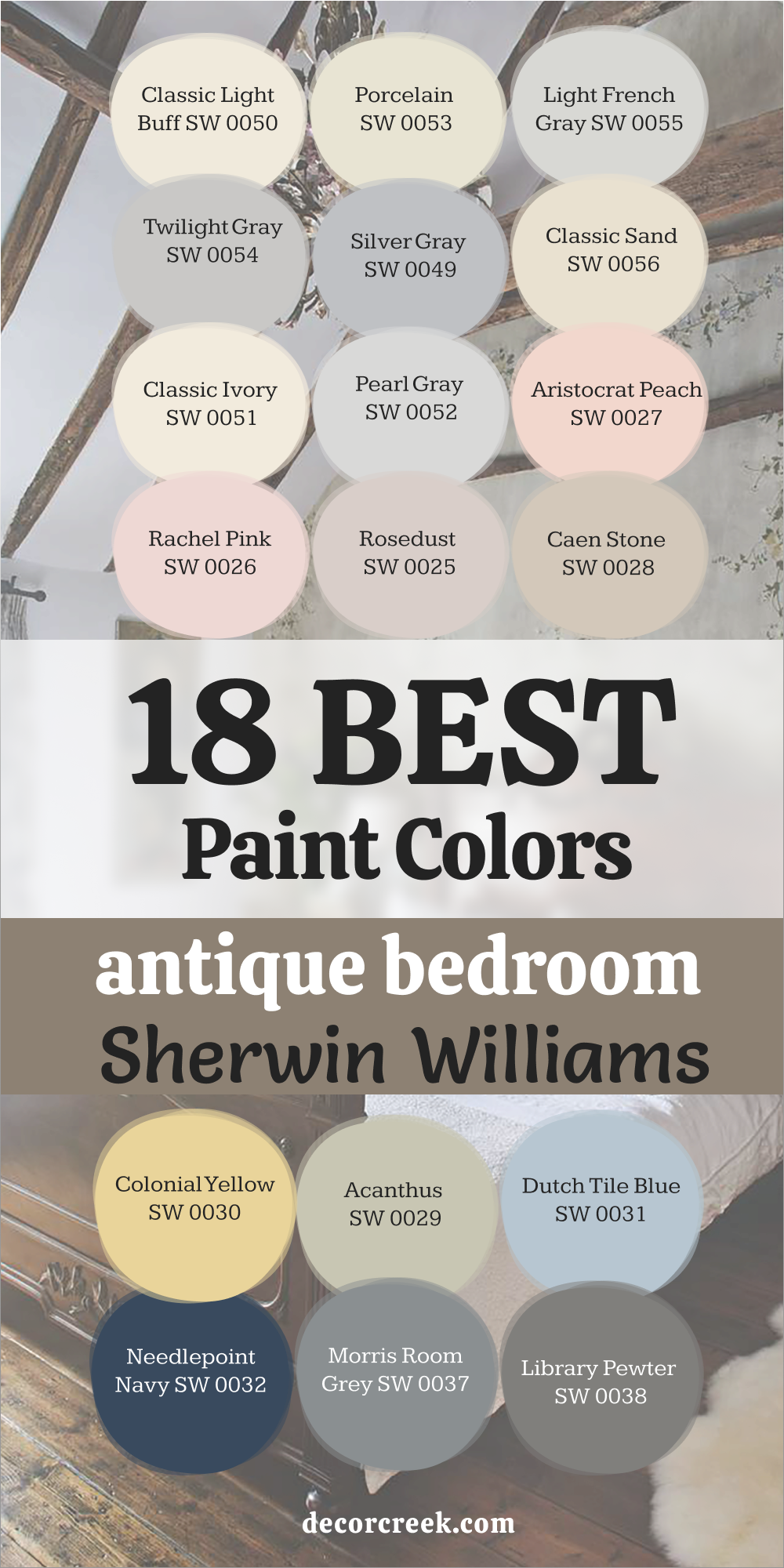
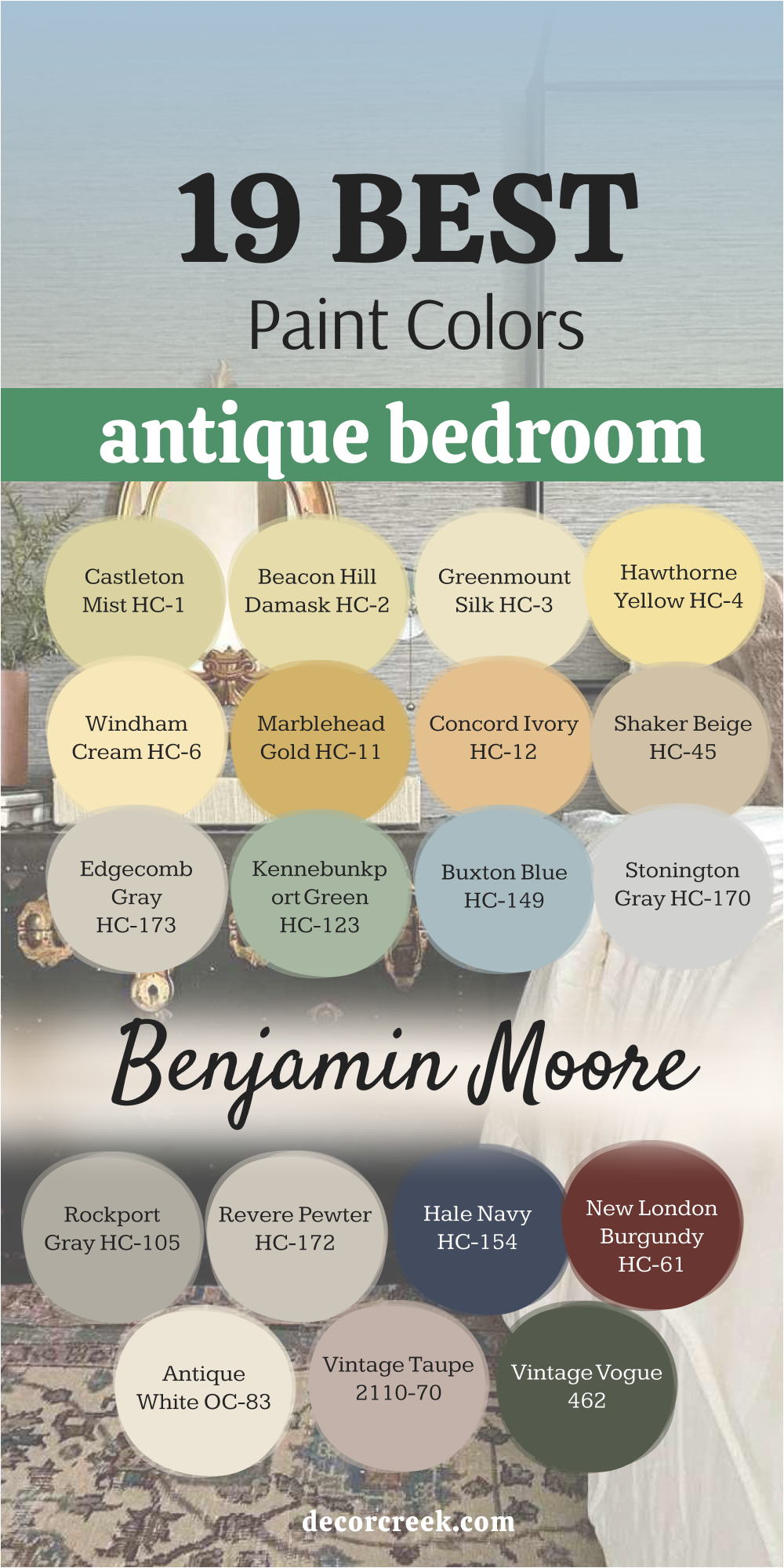
18 Antique Bedroom Paint Colors by Sherwin Williams
Sherwin-Williams has always been my trusted choice for rich, balanced colors that feel lived-in and full of charm. Their antique shades bring warmth and quiet beauty to any bedroom, creating a sense of comfort that feels effortless. Each color in this collection has depth and softness, inspired by the textures and tones of old homes.
From creamy neutrals to faded blues and gentle pinks, these paints help turn simple rooms into inviting retreats filled with history and heart.
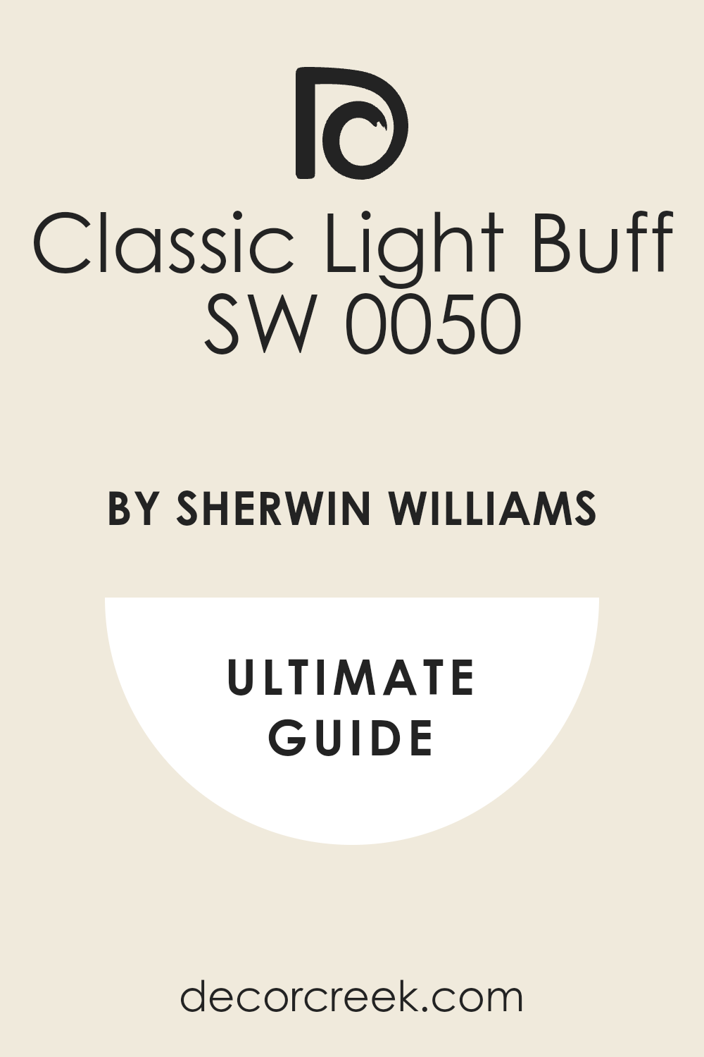
Classic Light Buff SW 0050
Classic Light Buff reminds me of the gentle warmth that fills an old country home at sunset. It has a creamy beige tone with just enough golden undertone to make every room glow naturally. I love how this color highlights carved wood furniture, old mirrors, and brass lamps without overpowering them.
It works beautifully with neutral fabrics, ivory bedding, and faded floral prints. The beauty of Classic Light Buff lies in how it changes with the light — soft and gentle in the morning, rich and glowing at night.
I often choose it for bedrooms where I want a feeling of quiet comfort, a color that hugs the room gently. It pairs perfectly with warm whites and antique metal finishes. When used on all four walls, it gives the space a cozy depth that feels both elegant and lived in. This shade never feels too modern or too pale — it sits perfectly between classic and comforting.
🎨 Check out the complete guide to this color right HERE 👈
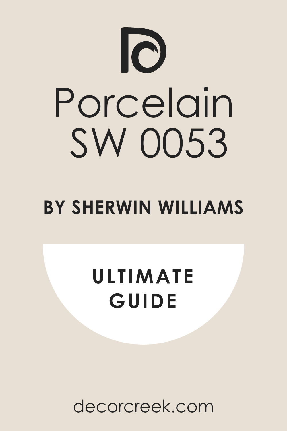
Porcelain SW 0053
Porcelain is one of those shades that instantly reminds me of heirloom china passed through generations. It’s creamy, soft, and endlessly versatile, sitting somewhere between ivory and beige. I often use it when I want the bedroom to feel graceful and familiar without looking polished or formal.
Porcelain captures light beautifully, creating a warm tone that looks equally lovely in natural daylight and lamplight.
It works especially well in rooms with delicate fabrics like lace or cotton. I like pairing it with gold accents or vintage florals for a romantic feel. On the walls, it brings an old-world charm that’s soothing and inviting.
It’s also perfect for smaller rooms, as it makes them feel open but still grounded. Porcelain is one of those shades that makes you want to stay longer in the room — it feels gentle, personal, and quietly beautiful.
🎨 Check out the complete guide to this color right HERE 👈
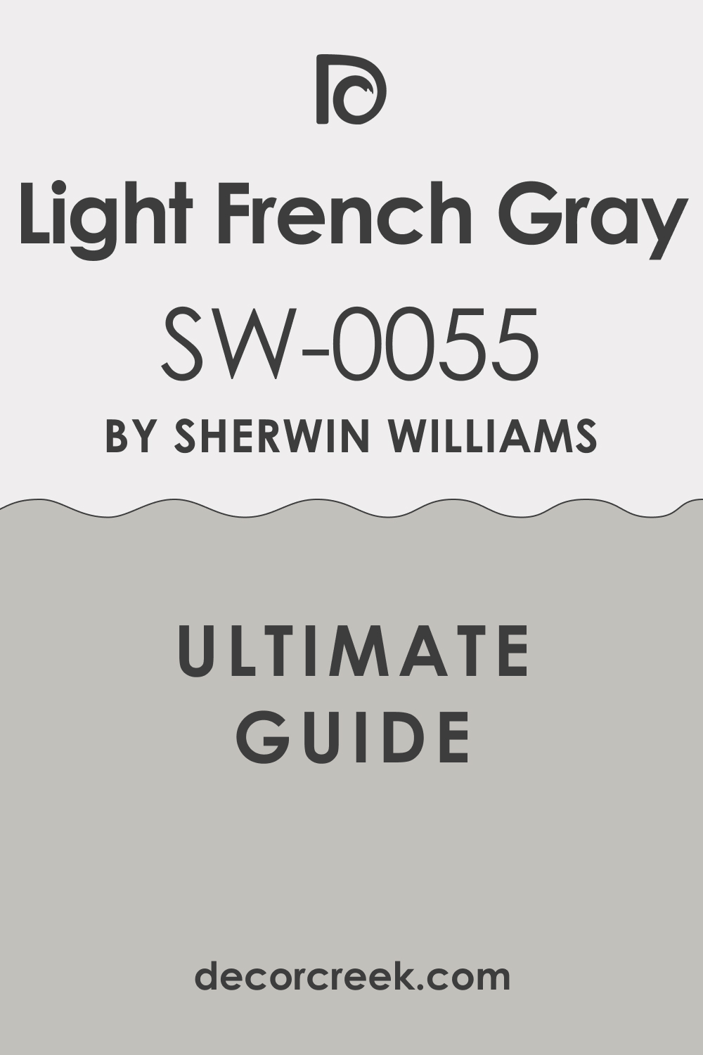
Light French Gray SW 0055
Light French Gray is a graceful, balanced color that works in almost any antique-style bedroom. It carries a soft mix of gray and beige that feels both elegant and familiar. I love using it next to dark-stained wood or old metal details — it enhances their beauty without fighting for attention. During the day, it takes on a smooth, silvery tone, and in the evening, it becomes warmer and richer.
This flexibility makes it perfect for bedrooms that shift from bright to dim lighting.
I often pair it with ivory fabrics, linen curtains, and brushed nickel finishes for a layered, vintage look. What I love most about this color is how it creates harmony between old and new pieces. It feels sophisticated without being distant, simple yet full of quiet character. Every time I use it, the room feels instantly balanced and welcoming.
🎨 Check out the complete guide to this color right HERE 👈
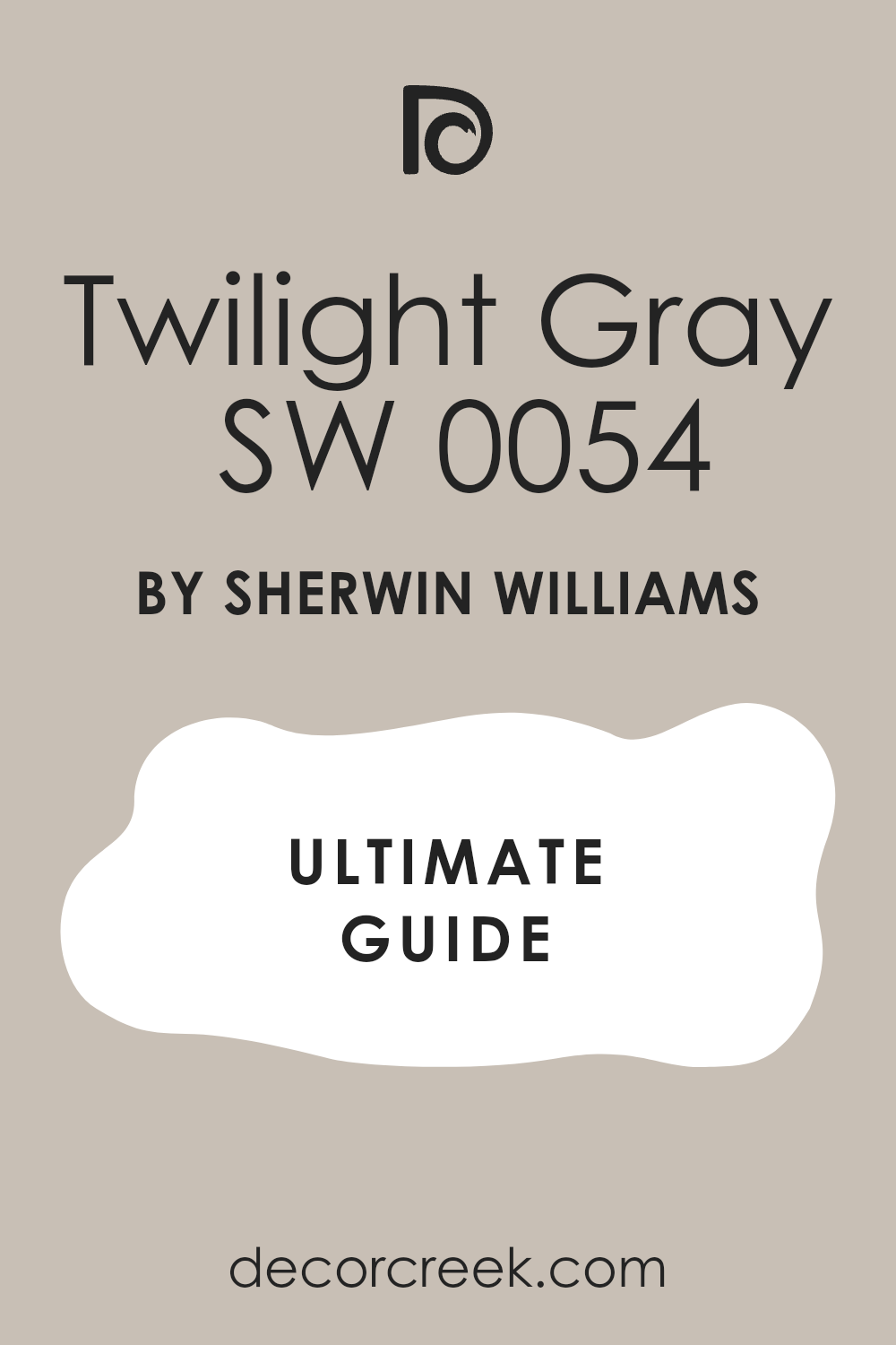
Twilight Gray SW 0054
Twilight Gray reminds me of the soft evening sky when the last bit of daylight fades away. It’s a cool, balanced gray that gives bedrooms an elegant and grounded feeling. I love how it interacts with soft lighting, adding just enough depth to make old furniture and warm metals stand out. It’s ideal for accent walls or for creating a calm, layered look across an entire room.
Twilight Gray pairs beautifully with cream trim, muted blues, or dusty lilacs.
I’ve used it in bedrooms with vintage mirrors, old trunks, and iron bed frames — it always adds a touch of quiet sophistication. The beauty of this color is that it doesn’t feel cold; there’s a hidden warmth beneath its gray surface that feels mature and inviting. It’s the kind of shade that helps every piece in the room tell its own story.
🎨 Check out the complete guide to this color right HERE 👈
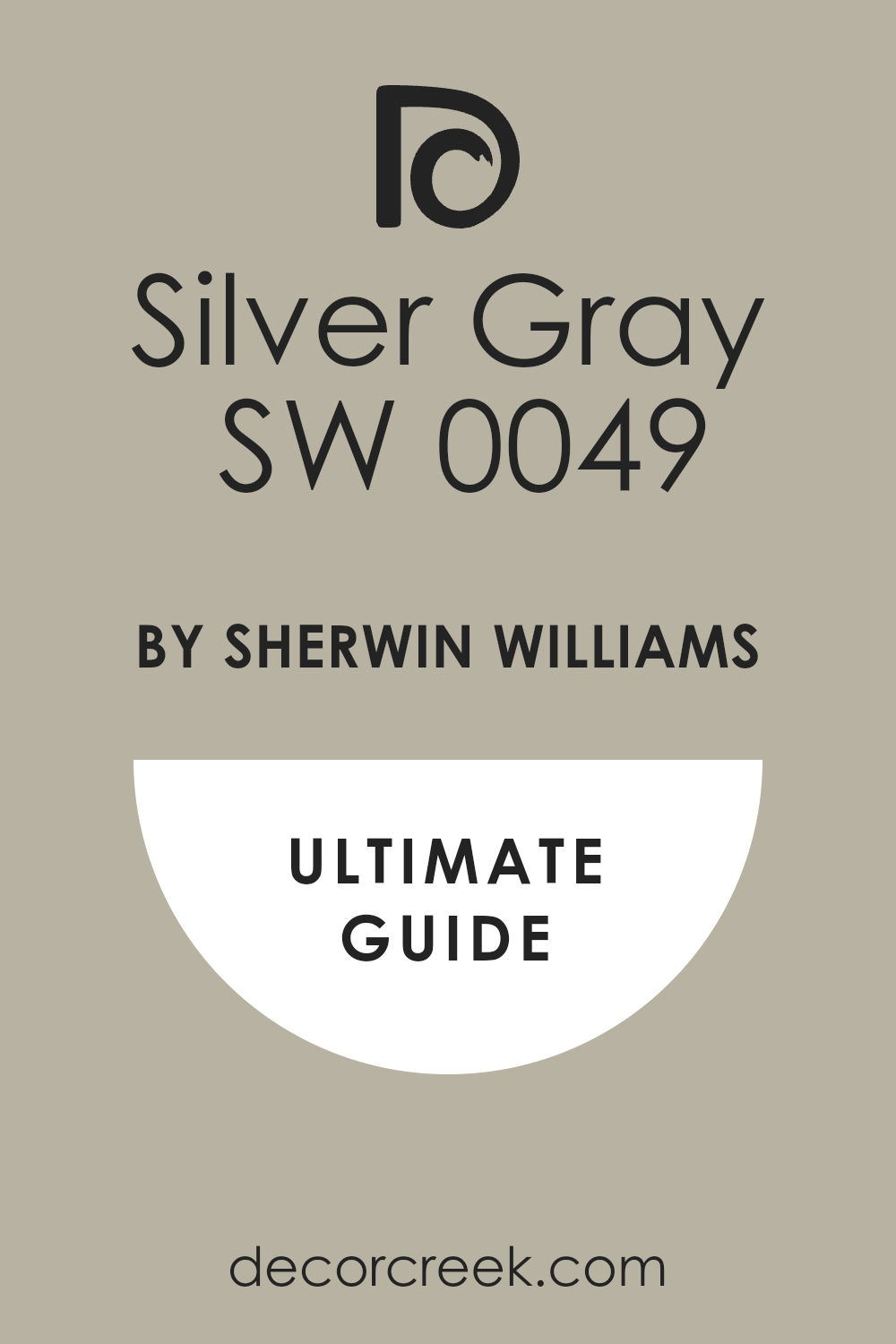
Silver Gray SW 0049
Silver Gray is soft and classic, like the tone of a well-loved antique photograph. It has a faint blue tint that gives it a refined charm, especially when paired with white trim or brass details. I often choose it for bedrooms that need brightness but still want a hint of vintage depth. Silver Gray works beautifully with both warm and cool tones — from aged oak to soft linen.
It reflects natural light gently, giving walls a silvery shimmer that feels airy yet familiar.
I love using it in rooms that get morning sunlight, as it feels fresh and calm without being plain. The color also pairs well with faded floral fabrics or pale gold accents. It’s a quiet, graceful shade that adds depth without heaviness, perfect for antique interiors. Silver Gray always manages to make a room feel balanced, lived-in, and peaceful.
🎨 Check out the complete guide to this color right HERE 👈
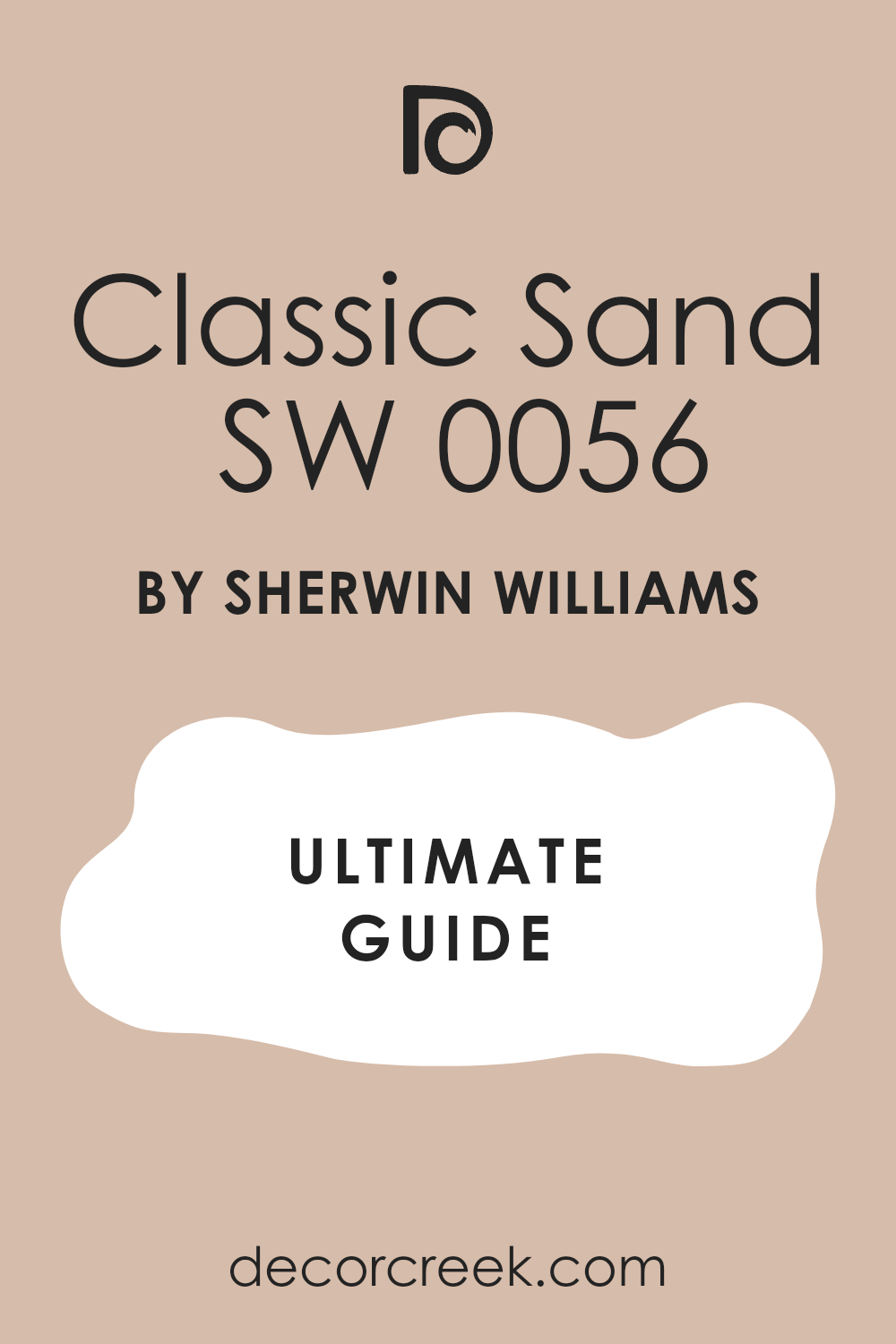
Classic Sand SW 0056
Classic Sand feels like walking into a sunlit farmhouse filled with vintage treasures. It has a warm, sandy tone that brings comfort and charm to any bedroom. I love using it when I want the room to feel welcoming and gently nostalgic. This shade pairs beautifully with aged white trim, brass lamps, and floral quilts. It gives every piece in the room a soft glow, making the atmosphere feel layered and personal.
I especially like Classic Sand in rooms with natural textures — woven rugs, linen curtains, or wicker chairs.
The color works throughout the year, glowing in summer and feeling cozy in winter. It’s a versatile, forgiving tone that hides imperfections while looking graceful on the wall. Classic Sand adds warmth that feels familiar, like something from a cherished memory.
🎨 Check out the complete guide to this color right HERE 👈
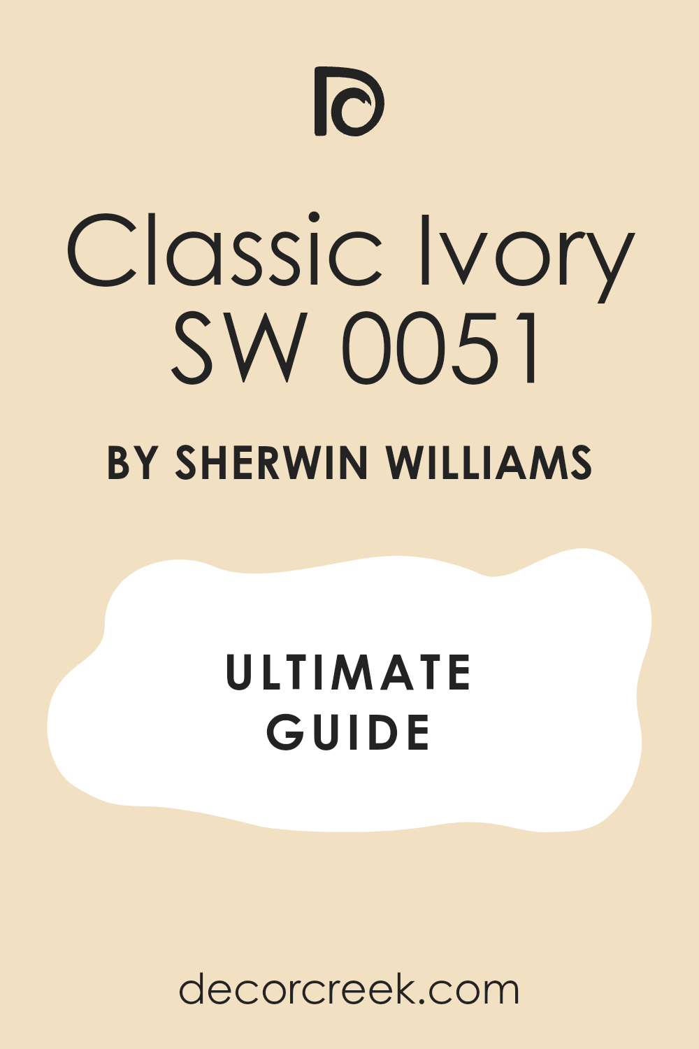
Classic Ivory SW 0051
Classic Ivory carries the feeling of old parchment and antique lace. It’s creamy, soft, and endlessly comforting. I love this color for bedrooms filled with vintage furniture and warm wood tones. It reflects light beautifully, giving the room a natural brightness that feels welcoming. Classic Ivory pairs perfectly with muted greens, dusty blues, or gold accents.
It’s ideal for creating a balanced backdrop that allows other details — like patterned fabrics or brass frames — to shine.
This color never feels too yellow or dull; it sits right in that sweet spot of warmth and grace. I’ve used it in both modern and historical homes, and it always feels right. Classic Ivory makes a bedroom glow softly without feeling artificial or staged.
🎨 Check out the complete guide to this color right HERE 👈
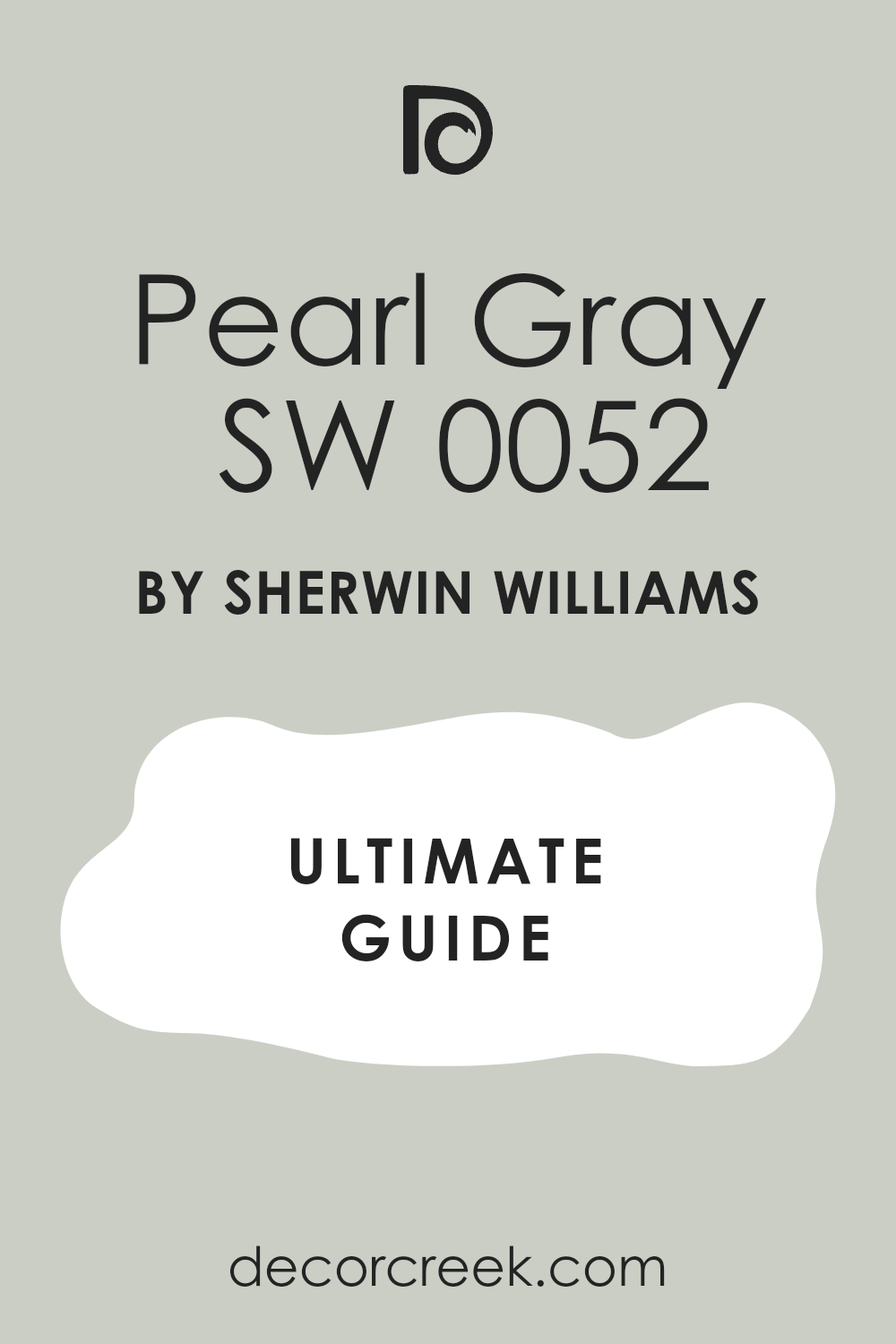
Pearl Gray SW 0052
Pearl Gray is like the first light on a misty morning — soft, cool, and full of charm. It’s a delicate gray with a touch of warmth that keeps it from feeling flat. I love pairing it with old wood, brushed brass, and faded fabrics for that antique, layered look. It works beautifully in bedrooms where you want a clean, balanced color that still carries a sense of history.
Pearl Gray adapts easily to different lighting, turning silvery in daylight and slightly taupe at night.
I’ve used it in small guest rooms and larger master bedrooms, and it always adds quiet refinement. It feels light enough to open the room but rich enough to hold its own next to bolder tones. Pearl Gray makes a perfect backdrop for both vintage art and classic linens.
🎨 Check out the complete guide to this color right HERE 👈
Aristocrat Peach SW 0027
Aristocrat Peach feels like a memory of sunlight filtered through sheer curtains. It’s warm, gentle, and a little romantic. The shade carries a creamy peach tone that softens every surface it touches. I love using it in bedrooms where I want a vintage glow that feels cheerful but calm. It pairs beautifully with ivory furniture, lace details, and gold accents.
This color reminds me of spring mornings — full of warmth and sweetness.
I often combine it with floral prints or aged wood to bring out its character. Aristocrat Peach is perfect for bedrooms that need a touch of softness without becoming overly feminine. It’s timeless, comfortable, and effortlessly charming, making it one of my favorite antique tones.
🎨 Check out the complete guide to this color right HERE 👈

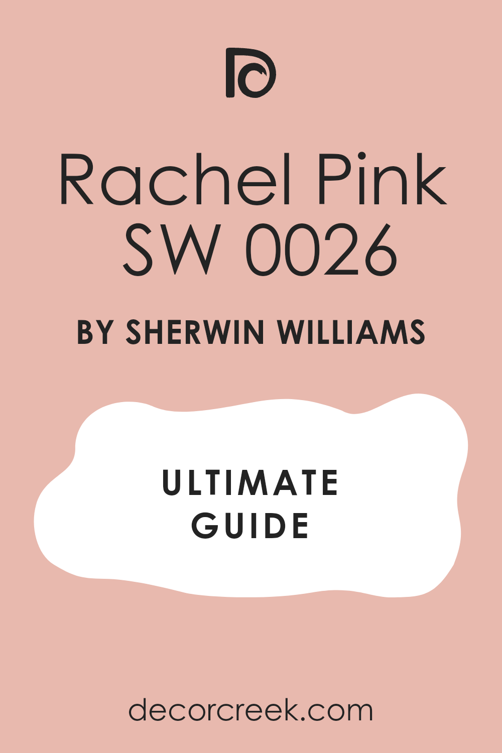
Rachel Pink SW 0026
Rachel Pink has the gentle beauty of faded rose petals tucked between old book pages. It’s a delicate pink that feels nostalgic but still fresh. I love how it adds quiet color without being too bold or too sweet. It pairs beautifully with ivory trim, floral fabrics, and antique gold frames. This shade works wonderfully in vintage-style bedrooms where softness and warmth matter most.
It’s especially pretty under warm lamplight, where it deepens slightly and adds a cozy feeling to the walls.
Rachel Pink is one of those shades that complements both rustic and refined pieces. It feels romantic without trying too hard, making it ideal for bedrooms that tell stories of comfort and care.
🎨 Check out the complete guide to this color right HERE 👈
Rosedust SW 0025
Rosedust is a warm, muted rose with a touch of beige that feels like it’s been faded gently by time. It’s one of those colors that instantly makes a bedroom feel soft and graceful. I love using Rosedust in rooms with old wood, linen bedding, and gold-framed art. The color brings a nostalgic warmth that feels familiar and comforting.
It looks beautiful under both daylight and lamplight, giving off a tender glow that never feels heavy.
I often pair it with ivory or cream trims for a clean, classic look. It’s a perfect shade for creating that cozy, aged effect without leaning too pink. Rosedust adds just enough color to the room to make it interesting, while keeping everything grounded and calm. It’s romantic in the most effortless way.
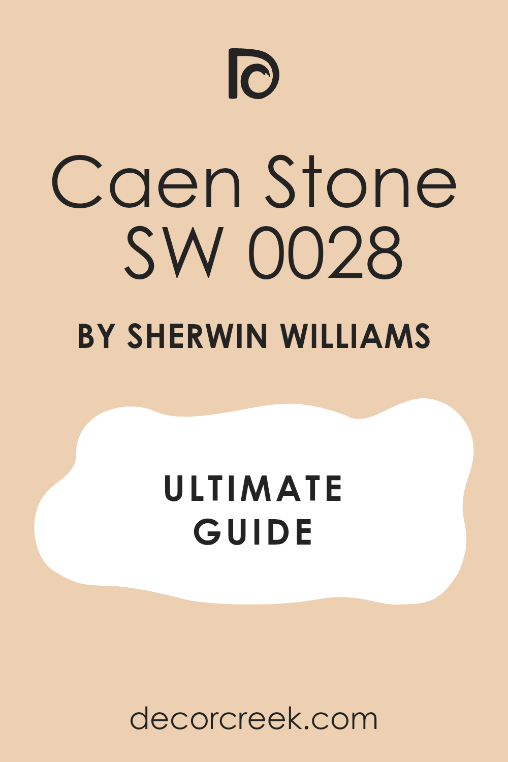
Caen Stone SW 0028
Caen Stone is a soft, sandy neutral that feels inspired by weathered limestone walls from old European homes. It has a mix of beige and gray tones that give it both warmth and structure. I love using Caen Stone when I want a bedroom to feel refined yet inviting. It pairs beautifully with aged wood floors, whitewashed furniture, and woven textures.
The color shifts gently with the light, sometimes feeling warmer, sometimes cooler, depending on the time of day.
It’s an excellent background for antique accents like brass lamps or vintage frames. I often describe Caen Stone as quietly confident — it supports every detail in the room without drawing too much attention. It’s an easy color to live with, one that brings character through simplicity.
🎨 Check out the complete guide to this color right HERE 👈
Colonial Yellow SW 0030
Colonial Yellow carries the brightness of sunshine softened by years of wear. It’s a gentle yellow with golden undertones that gives bedrooms a cheerful, welcoming feeling. I love using it in vintage-style rooms where natural light plays a big role. It pairs beautifully with crisp white trim, floral curtains, or rustic wood furniture.
Colonial Yellow adds warmth to the room without ever feeling too strong or modern.
It’s especially charming in older homes with wide baseboards and tall ceilings. I like to use it to highlight architectural details, as it draws the eye without overpowering the space. The color feels like a happy memory — bright enough to lift the mood, soft enough to stay graceful.
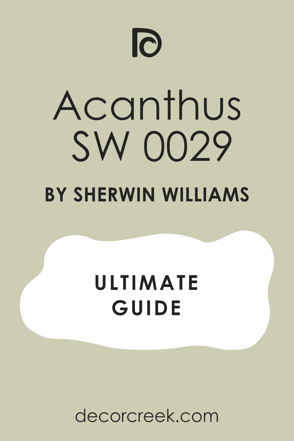
Acanthus SW 0029
Acanthus is a natural, muted green that feels both earthy and refined. It reminds me of vintage botanical prints and the color of aged garden statues. I love using it in bedrooms that mix wood, brass, and floral fabrics. It adds depth while keeping a peaceful atmosphere. The tone works beautifully with ivory, beige, or warm gray accents.
Acanthus feels especially elegant in soft, filtered light, where its green tones become slightly warmer.
I’ve used it on accent walls, headboards, and even furniture — it always feels balanced and full of charm. This color brings the outdoors in, but in a quiet, thoughtful way. It’s one of those antique greens that makes a bedroom feel collected and personal.
🎨 Check out the complete guide to this color right HERE 👈
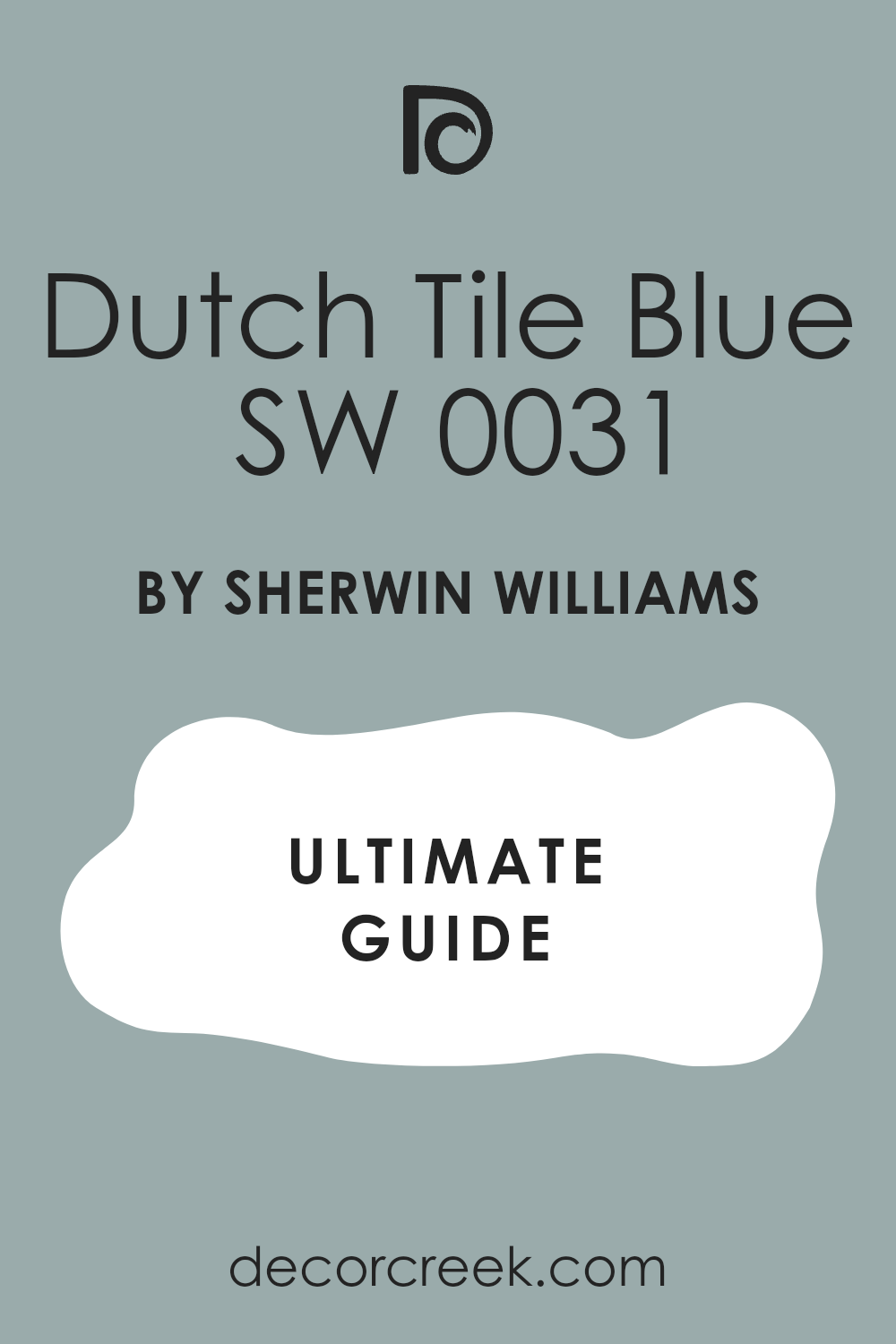
Dutch Tile Blue SW 0031
Dutch Tile Blue reminds me of hand-painted ceramic tiles found in old European kitchens and bedrooms. It’s a dusty blue with a touch of gray, giving it a soft, aged quality. I love using it when I want to add color that feels classic but not overpowering. This shade works wonderfully with white linens, light wood, and brass or gold accents.
It brings a gentle freshness to antique-inspired rooms without feeling too cool.
Under natural light, it appears soft and airy; under lamplight, it deepens beautifully. Dutch Tile Blue is perfect for adding personality to a bedroom while keeping that sense of quiet history. It’s both graceful and comforting, like something you’ve known for years
🎨 Check out the complete guide to this color right HERE 👈
Needlepoint Navy SW 0032
Needlepoint Navy is a deep, traditional blue that adds instant character to antique-style bedrooms. It carries richness and depth without feeling dark or heavy. I love using it on accent walls or behind vintage headboards for a dramatic yet classic look. The color pairs perfectly with crisp white trim, brass details, and light bedding.
It’s the kind of navy that feels timeless — sophisticated but never cold.
In the daylight, it shows its blue undertone clearly; in evening light, it takes on a softer, velvety tone. Needlepoint Navy gives structure and elegance to any room while keeping a sense of warmth. It’s a color that anchors the space and adds quiet strength.
🎨 Check out the complete guide to this color right HERE 👈

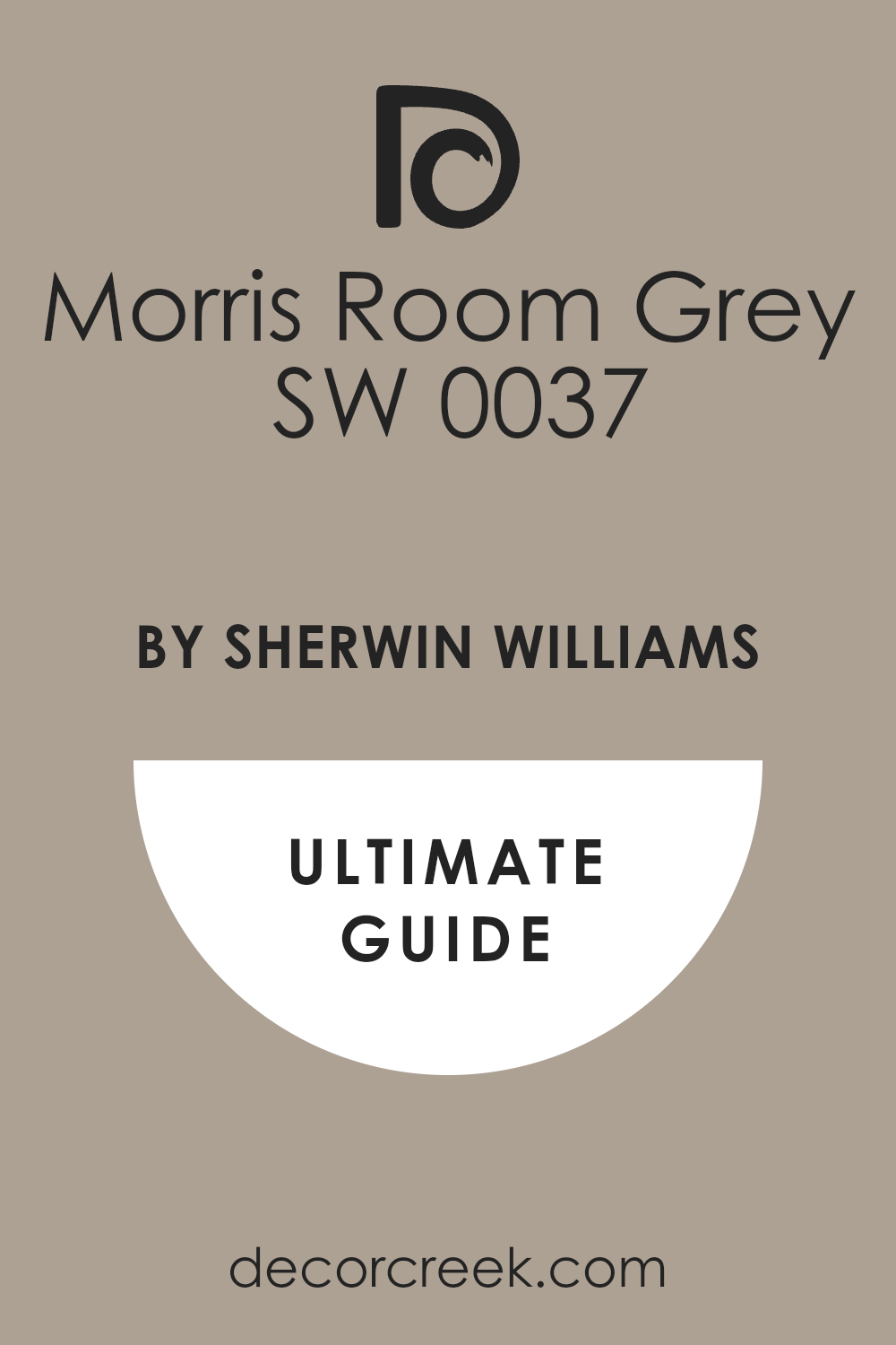
Morris Room Grey SW 0037
Morris Room Grey is a soft, smoky gray that feels grounded and rich with history. It has a hint of green that adds depth and warmth, making it perfect for antique bedrooms filled with natural textures. I love pairing it with dark wood, cream fabrics, and antique brass accents. It creates a cozy, lived-in feeling that feels elegant without effort.
Morris Room Grey looks especially beautiful in low evening light, where it becomes slightly moody and intimate.
It’s the kind of color that works equally well on walls, trim, or even furniture. For me, it captures that perfect balance between sophistication and comfort. This shade is always dependable and beautifully layered.
🎨 Check out the complete guide to this color right HERE 👈
Library Pewter SW 0038
Library Pewter feels like the color of old stone walls and worn pewter dishes. It’s a deep, muted gray with earthy undertones that add warmth and character. I love using it in bedrooms that need a strong, comforting base. It works beautifully with cream linens, aged wood, and soft lighting.
Library Pewter gives the room a grounded, peaceful feeling while still looking rich and stylish. It pairs wonderfully with both cool and warm accent colors — from blues to taupes and even faded rose.
I often use it in rooms with vintage artwork or classic paneling; it brings everything together with quiet strength. This shade feels dependable and full of depth, the perfect finish for a room filled with memories and timeless charm.
🎨 Check out the complete guide to this color right HERE 👈
19 Antique Bedroom Paint Colors by Benjamin Moore
Benjamin Moore has a gift for creating shades that feel both classic and personal. Their antique-inspired colors carry the beauty of time — soft, weathered, and full of quiet character. I often reach for these tones when I want a bedroom to feel rich with memory and warmth. Each color has a story behind it, from gentle creams that brighten a corner to deeper tones that add quiet strength.
What I love most is how these paints bring a sense of history to modern homes without feeling old.
They create rooms that feel welcoming, balanced, and deeply comforting — the kind of places that never lose their charm.
Castleton Mist HC-1
Castleton Mist is a soft green that feels like the color of faded wallpaper from an old countryside home. It carries a touch of warmth, making bedrooms feel cozy but never dull. I love how it reacts to light — gentle and golden in the morning, richer and more grounded in the evening. This color pairs beautifully with cream or ivory trim, adding quiet elegance to antique furniture.
It also works well with brass details and warm wood floors.
I often choose Castleton Mist for bedrooms that need a peaceful glow with a hint of freshness. It reminds me of sunlight reflecting off weathered paint, soft and full of life. This shade feels comforting, like something that’s been part of the home for generations.
Beacon Hill Damask HC-2
Beacon Hill Damask has the warmth of aged parchment touched with a golden undertone. It’s elegant yet soft enough for a restful bedroom. I love using it with cream bedding and warm metallic accents — it gives everything around it a quiet sheen. The color feels like an old embroidered fabric that has aged beautifully over time.
In daylight, it looks light and creamy; at night, it turns slightly deeper and cozier.
Beacon Hill Damask pairs wonderfully with antique white trim and patterned textiles. I often use it when I want to add warmth without brightness. It’s one of those colors that makes every surface feel soft and inviting.
Greenmount Silk HC-3
Greenmount Silk is a gentle green-gray that feels smooth and balanced, much like aged silk curtains in an old manor house. It adds a layer of calm strength to a bedroom, especially when paired with ivory or pale gold tones. I love using it to highlight vintage details such as carved wood and framed art.
The shade changes throughout the day, shifting from a muted sage to a deeper olive tone in low light.
Greenmount Silk has a natural quality that makes a room feel grounded and graceful. It works especially well in rooms with natural textures like linen, wood, or wool. This color carries quiet confidence — strong enough to stand out, yet soft enough to feel completely at home.
Hawthorne Yellow HC-4
Hawthorne Yellow feels like sunshine remembered from childhood mornings. It’s cheerful yet mellow, adding warmth to antique bedrooms without feeling bright or loud. I love using it on walls with white or ivory trim to bring a gentle glow into the room. The color pairs beautifully with brass accents and floral fabrics.
Hawthorne Yellow adds a welcoming charm that works especially well in smaller rooms or spaces that don’t get much natural light.
It has a softness that makes everything feel more personal and lived in. This shade feels like warmth captured on the walls — joyful but calm, classic but never old-fashioned.
🎨 Check out the complete guide to this color right HERE 👈
Windham Cream HC-6
Windham Cream is a buttery soft neutral that brings quiet warmth into a room. It’s one of my go-to shades for antique bedrooms with a romantic touch. The color has enough yellow to feel sunny but still feels gentle and smooth. I love pairing it with rich wood furniture and creamy linens.
Windham Cream catches the light beautifully, creating an atmosphere that feels both refined and cozy.
It blends well with floral or toile patterns, giving the room an old-world charm. When paired with muted gold or bronze accents, it adds richness without feeling heavy. This shade always brings out the best in antique décor, giving every piece a soft, glowing backdrop.
Marblehead Gold HC-11
Marblehead Gold carries a deep golden warmth that feels like candlelight on vintage wallpaper. It’s rich but not overpowering, perfect for creating an intimate, welcoming bedroom. I love how this shade works with antique white trim and natural wood tones. It adds character while keeping the room feeling balanced and lived in.
Marblehead Gold pairs beautifully with deep reds, olives, and browns for a layered vintage palette.
In soft lighting, it looks especially beautiful, glowing gently instead of shining. I often use it in bedrooms that need a sense of warmth and comfort, something that feels familiar and classic.
Concord Ivory HC-12
Concord Ivory feels like golden honey mixed with soft cream — gentle, rich, and endlessly comforting. It has a warmth that flatters antique furniture and textured fabrics. I love how it pairs with aged brass lamps and ivory drapes, creating a balanced and graceful look. This color changes throughout the day, glowing brighter in sunlight and deepening beautifully under warm lamps.
Concord Ivory works well in bedrooms with vintage rugs or floral details. It brings a quiet joy that fills the room without feeling too bold.
It’s perfect for anyone who wants a touch of color that still feels timeless and easy to live with.
Shaker Beige HC-45
Shaker Beige is one of those dependable antique tones that always feels right. It’s a warm, earthy beige with a touch of gray that makes it elegant and relaxed. I love using it in bedrooms filled with soft textures — linen curtains, rattan furniture, and woven rugs. Shaker Beige pairs beautifully with antique wood tones and ivory trims.
It’s the kind of color that brings everything together without demanding attention. In daylight, it feels airy and natural; in evening light, it turns richer and more comforting.
It’s perfect for homes that lean toward a classic or country style. Shaker Beige creates an environment that feels lived in and deeply inviting.
🎨 Check out the complete guide to this color right HERE 👈

Edgecomb Gray HC-173
Edgecomb Gray sits right between gray and beige, creating the perfect soft neutral for antique-inspired bedrooms. It feels elegant and relaxed, ideal for rooms filled with natural light. I love how this color complements both cool and warm tones — it looks wonderful with white trim and vintage wood accents.
Edgecomb Gray reflects light gently, never too bright or too dull. It’s one of those shades that adapts easily, making it a favorite in my projects.
It gives bedrooms a collected look, as if each piece of furniture has been chosen over time. Edgecomb Gray feels timeless, easy, and endlessly comfortable.
🎨 Check out the complete guide to this color right HERE 👈

Kennebunkport Green HC-123
Kennebunkport Green brings the freshness of nature into an antique bedroom without feeling bold. It’s a dusty green with a touch of gray that keeps it soft and balanced. I love pairing it with cream, tan, or aged brass for a cozy, classic look. The color has a calming depth that feels peaceful and grounded.
It reminds me of weathered shutters or painted doors on old seaside homes. Kennebunkport Green changes beautifully with the light — brighter in the morning, moodier in the evening.
It works perfectly for rooms with vintage or coastal-inspired details. It’s a color that feels strong yet comforting, elegant yet relaxed.
🎨 Check out the complete guide to this color right HERE 👈
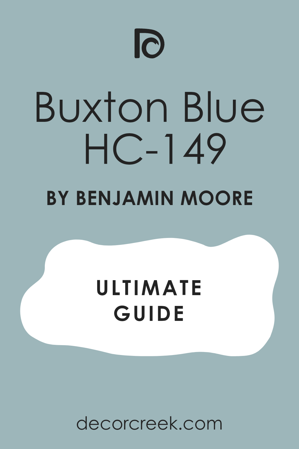
Buxton Blue HC-149
Buxton Blue feels like the color of an old postcard sky — soft, gentle, and full of nostalgia. It carries a mix of blue and gray that works beautifully in antique bedrooms filled with wood and brass. I love how it changes throughout the day, shifting from a silvery tone in morning light to a deeper, cozier blue in the evening.
It’s elegant but never cold, perfect for creating a restful bedroom with a vintage edge. I often pair it with cream trim, warm woods, and floral fabrics.
The color feels like it has history, reminding me of painted doors and aged fabrics that have been loved for years. Buxton Blue brings quiet charm and harmony, turning the room into a calm retreat that feels personal and well-balanced.
🎨 Check out the complete guide to this color right HERE 👈
Stonington Gray HC-170
Stonington Gray is a classic shade that feels polished and grounded. It’s a cool, medium gray with just enough warmth to keep a bedroom from feeling too stark. I love using it when I want an antique style that leans a little modern but still holds a traditional heart. The color pairs perfectly with white trim, silver frames, and muted blue accents.
It works beautifully with both warm and cool light, making it one of the most reliable grays I use.
Stonington Gray highlights the textures of old furniture and fabrics, giving everything a quiet sophistication. It’s the kind of color that feels timeless and easy to live with, perfect for those who want understated beauty in their bedroom.
🎨 Check out the complete guide to this color right HERE 👈

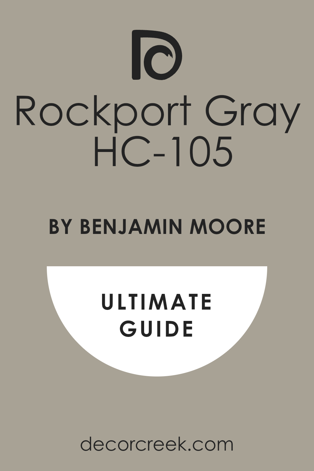
Rockport Gray HC-105
Rockport Gray has the character of an old stone house — sturdy, rich, and welcoming. It’s a warm gray with earthy undertones that give the bedroom a grounded, lived-in feel. I love how it looks beside wood furniture, aged leather, and linen bedding. The color adds depth without feeling dark, perfect for rooms with vintage or rustic charm.
Rockport Gray also works wonderfully with antique brass and muted whites. It makes every texture in the room feel more meaningful.
When I use this shade, I often add soft lighting to bring out its warm undertones. Rockport Gray creates a sense of comfort that feels like home, even in new spaces.
🎨 Check out the complete guide to this color right HERE 👈
Revere Pewter HC-172
Revere Pewter is one of my favorite neutrals for antique-inspired rooms. It sits perfectly between beige and gray, giving walls a warm, soft presence. I love how this color changes with light — in the morning, it feels airy and light; by evening, it deepens and becomes more intimate.
Revere Pewter complements almost everything: vintage woods, linen fabrics, and aged metals. It’s versatile but full of personality.
I often choose it when I want a background that feels warm and familiar but still modern enough to fit any home. This shade creates an inviting feeling that lasts through every season. It’s a quiet classic that never disappoints.
🎨 Check out the complete guide to this color right HERE 👈

Hale Navy HC-154
Hale Navy is a deep, elegant blue that feels confident and rich. It has a timeless quality that fits beautifully in antique bedrooms with classic furniture and gold accents. I love using it on one feature wall or even all four for a cozy, dramatic effect. The color pairs perfectly with crisp white linens, cream trim, and brass lamps.
Hale Navy brings depth without feeling heavy, and it makes every decorative piece stand out. It’s a bold shade, but its balance makes it easy to live with.
The room feels calm, warm, and full of character. This color reminds me of old libraries and candlelit evenings — strong, elegant, and full of quiet charm.
🎨 Check out the complete guide to this color right HERE 👈

New London Burgundy HC-61
New London Burgundy feels like aged wine and vintage velvet combined. It’s deep, rich, and full of warmth, perfect for creating a romantic, antique look. I love using it in bedrooms with gold-framed mirrors and soft lighting. The color adds luxury without being too bold or dark. It pairs beautifully with ivory, beige, and muted pinks for a layered vintage palette.
New London Burgundy changes beautifully throughout the day — rich and elegant in daylight, warm and intimate at night. It’s a great choice for adding drama to traditional bedrooms.
This shade has history and character, like something passed down through generations.
Antique White OC-83
Antique White is one of those colors that never feels out of place in an old-fashioned bedroom. It’s a warm, creamy white that adds light and comfort without harshness. I love using it when I want a soft background that complements vintage furniture and fabrics. It pairs beautifully with muted gold, natural wood, and floral prints.
The color reflects light gently, making the room glow in a way that feels natural and cozy. Antique White has a lived-in beauty that works equally well in modern and historic homes.
It’s perfect for bedrooms that need brightness with warmth, not sharpness. This shade feels familiar, like something that’s always belonged.
Vintage Taupe 2110-70
Vintage Taupe is a soft, balanced neutral that feels refined and soothing. It carries both warm and cool undertones, making it easy to pair with a variety of antique finishes. I love how it looks against wood furniture and linen drapes. The color feels mature without being dull — it adds quiet depth to the room
Vintage Taupe works especially well in low light, where it becomes warmer and cozier. It’s the kind of color that allows every detail in the bedroom to stand out naturally.
For me, this shade feels graceful and calm, a true reflection of classic beauty. It’s subtle but full of character.
🎨 Check out the complete guide to this color right HERE 👈

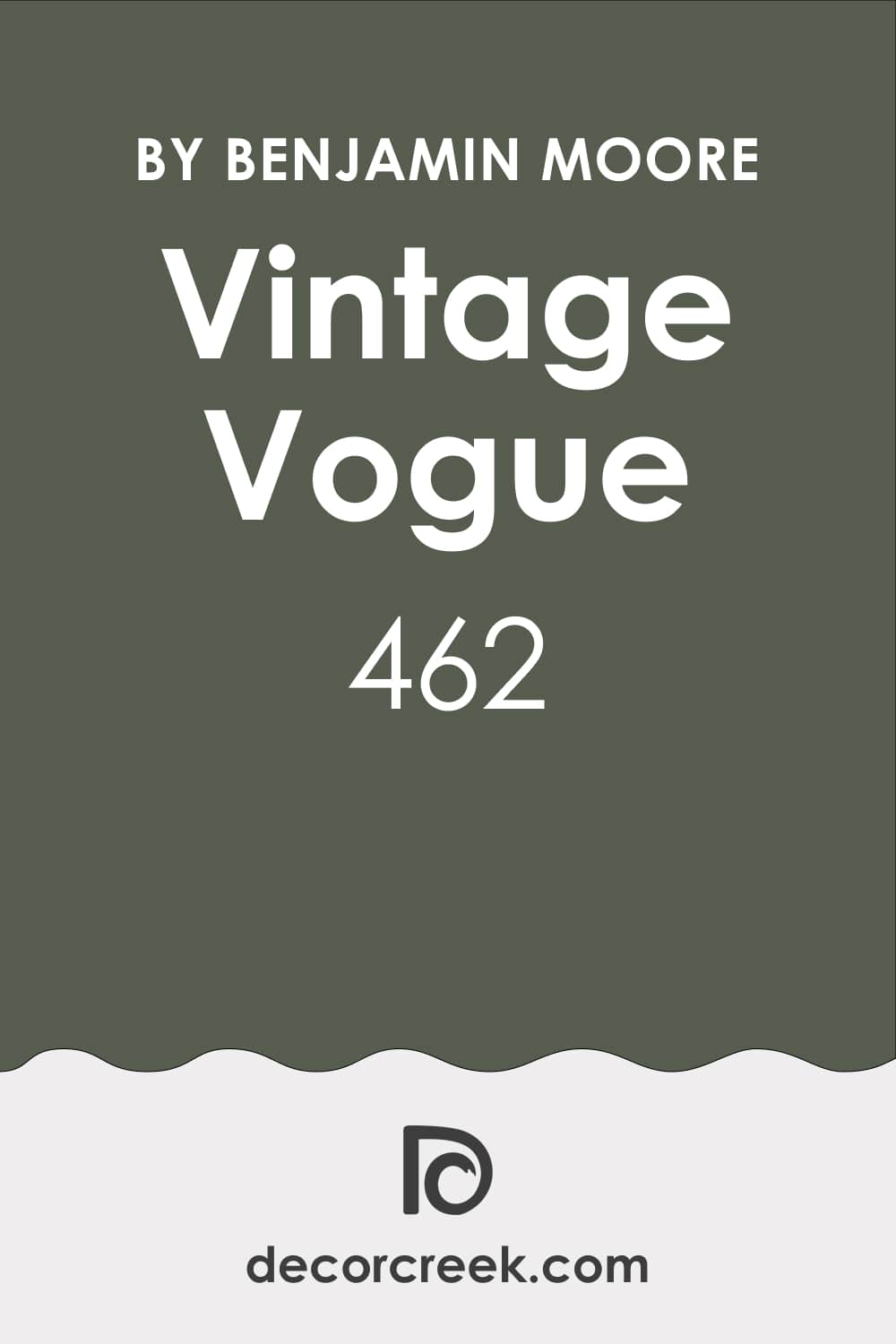
Vintage Vogue 462
Vintage Vogue is a deep green-gray that brings sophistication and comfort into antique bedrooms. It’s rich and dramatic but still approachable. I love using it on accent walls or in rooms with brass and wood accents. The color changes beautifully with the light, appearing more green during the day and more charcoal in the evening.
It pairs perfectly with ivory trim, natural textures, and aged gold. Vintage Vogue feels like a color pulled from an old photograph — bold yet soft, elegant yet relaxed
It’s perfect for bedrooms that need a touch of history and personality. Every time I use it, the result feels layered, classic, and deeply inviting.
🎨 Check out the complete guide to this color right HERE 👈
My Final Thoughts on Choosing Antique Paint Colors for Bedrooms
Choosing antique bedroom paint colors is about finding shades that tell a quiet story, one that feels deeply personal. For me, it’s never just about matching tones or following trends — it’s about emotion, comfort, and connection. When I walk into a room painted in one of these shades, I want it to feel like stepping into a memory.
Each color in this list reminds me of something real and enduring: a piece of worn furniture passed down through family, a faded fabric that still carries the scent of time, or that soft evening light that makes everything look gentle and warm.
I always look for colors that make the room feel like home — not perfect, not staged, but honest. Antique shades have a way of softening hard edges and adding heart to a space. They bring together the past and the present, creating rooms that feel layered and full of meaning.
Whether it’s a creamy ivory that glows by lamplight or a deep navy that anchors the room, the right paint color can do more than change the look — it can change how you feel when you wake up or wind down.
These colors don’t shout or compete; they whisper. They remind you to slow down, breathe, and appreciate the small details — the touch of fabric, the sound of the floorboards, the warmth of the light. That’s the beauty of antique colors. They bring warmth, memory, and charm into your daily life in the quietest, most graceful way.
For me, that’s what design is all about — creating a space that feels loved, lived in, and beautifully your own.