26 Beige Color Palette for the Bedroom – Designer-Approved Warm Neutrals from Sherwin-Williams and Benjamin Moore
Soft Neutrals for Restful and Inviting Bedrooms
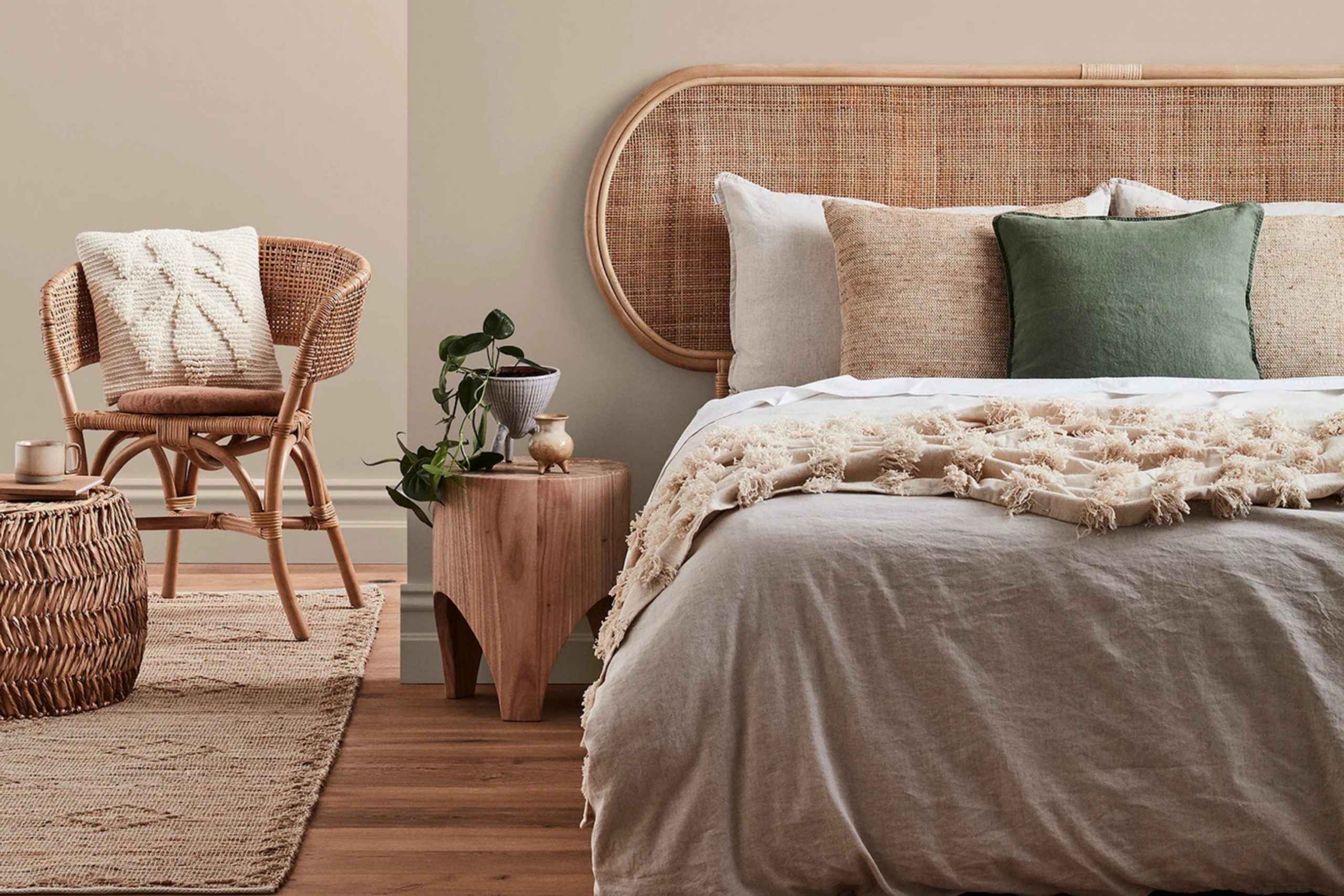
When I think about beige bedrooms, I picture softness, light, and that quiet sense of comfort that makes you want to stay just a little longer. Beige has a beautiful way of wrapping a room in warmth without ever feeling heavy. It carries the calm of early morning light and the coziness of evening glow all in one shade.
I’ve always loved how beige connects everything—wood, fabrics, light, and even the mood of a home—into one peaceful rhythm. Over the years, I’ve noticed that beige isn’t just a background color; it’s the heartbeat of a room.
It can feel airy and open in one home, then gentle and grounded in another. A creamy beige softens sharp edges, while a sandy one brings a touch of natural earthiness.
It’s amazing how one color can shape how we start and end our day. To me, beige represents comfort that never fades—it always feels personal and inviting. It makes a room glow softly in daylight and rest quietly when the lamps come on. I’ve painted countless bedrooms in shades of beige, and each time, the result feels timeless, warm, and effortlessly welcoming.
That’s the quiet power of beige—it doesn’t shout for attention, but it makes every corner feel cared for.
via tukadubai.com
Why I Trust Sherwin-Williams for Bedroom Paints
I’ve used many paint brands throughout my years of designing bedrooms, but Sherwin-Williams has earned my full trust. Their colors always deliver the kind of warmth and quality that turns plain rooms into personal retreats. The beige tones in their collection have a softness that feels almost natural, like sunlight on linen or sand underfoot.
What I appreciate most is the way their colors shift gently through the day. Morning light brings out a warm glow that feels fresh and alive, while evening shadows give the same walls depth and comfort. I’ve never had to worry about Sherwin-Williams colors turning dull or harsh—they always hold their beauty, even after years.
The paint finishes are smooth, easy to clean, and they make walls look polished without feeling overdone.
That’s important for bedrooms, where the goal is comfort and calm. Their color range is also wonderfully balanced; every shade feels thoughtful and designed for real homes, not just showrooms.
I love how their beiges can pair with everything from rustic wood to modern fabrics. Even clients who are unsure about paint always notice how soft and welcoming their colors feel once the room is done.
Sherwin-Williams paints bring not just color, but warmth, reliability, and quiet beauty—qualities every bedroom deserves.
How I Choose the Right Beige Color for a Bedroom
Choosing the right beige for a bedroom is like finding the perfect rhythm—it’s all about balance. The first thing I always study is light. Natural sunlight, warm lamps, and even the direction of windows can change how beige appears. A beige that looks soft gold in daylight might turn cozier and deeper under evening light. I tell clients to live with a few swatches on their walls for a couple of days—it’s the only way to see a color’s true personality.
Then I focus on how the room feels. Do you want a light, breezy atmosphere or something warm and cocooning? Beige has so many moods, from pale linen tones that feel airy to rich sandy hues that feel steady and restful.
Pairing is just as important—soft beiges shine beside white trim, woven fabrics, and natural light. Deeper tones love contrast: dark wood, brass lighting, or cozy textured blankets. I also pay attention to materials because beige loves texture—linen, rattan, cotton, and wool all bring it to life. The magic happens when color, light, and texture start working together.
I always say beige is a mirror—it reflects how you want your room to feel. If you want warmth, it gives warmth. If you want peace, it gives peace.
When you find the right shade, you don’t just see it—you feel it every time you step inside.
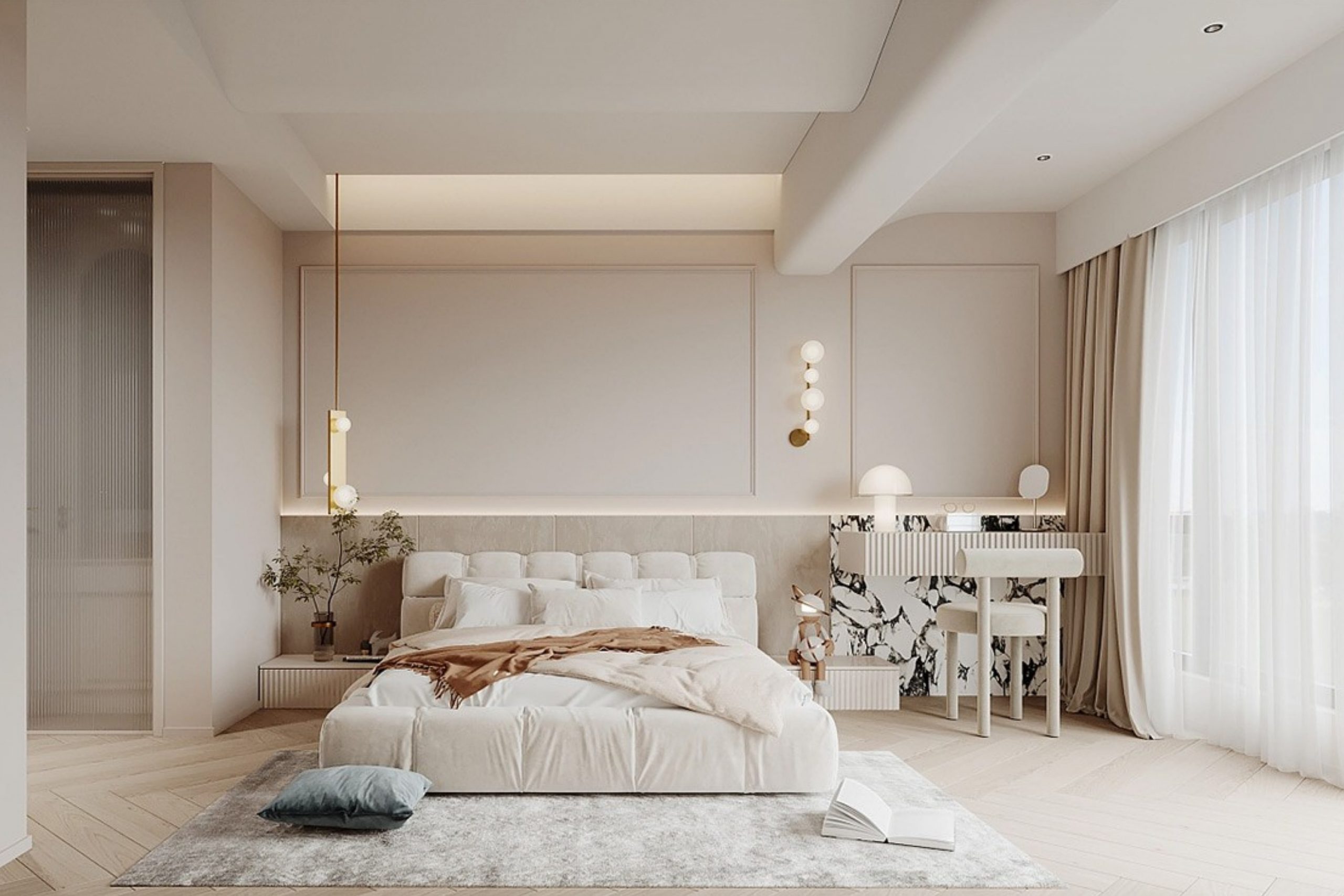
via home-designing.com
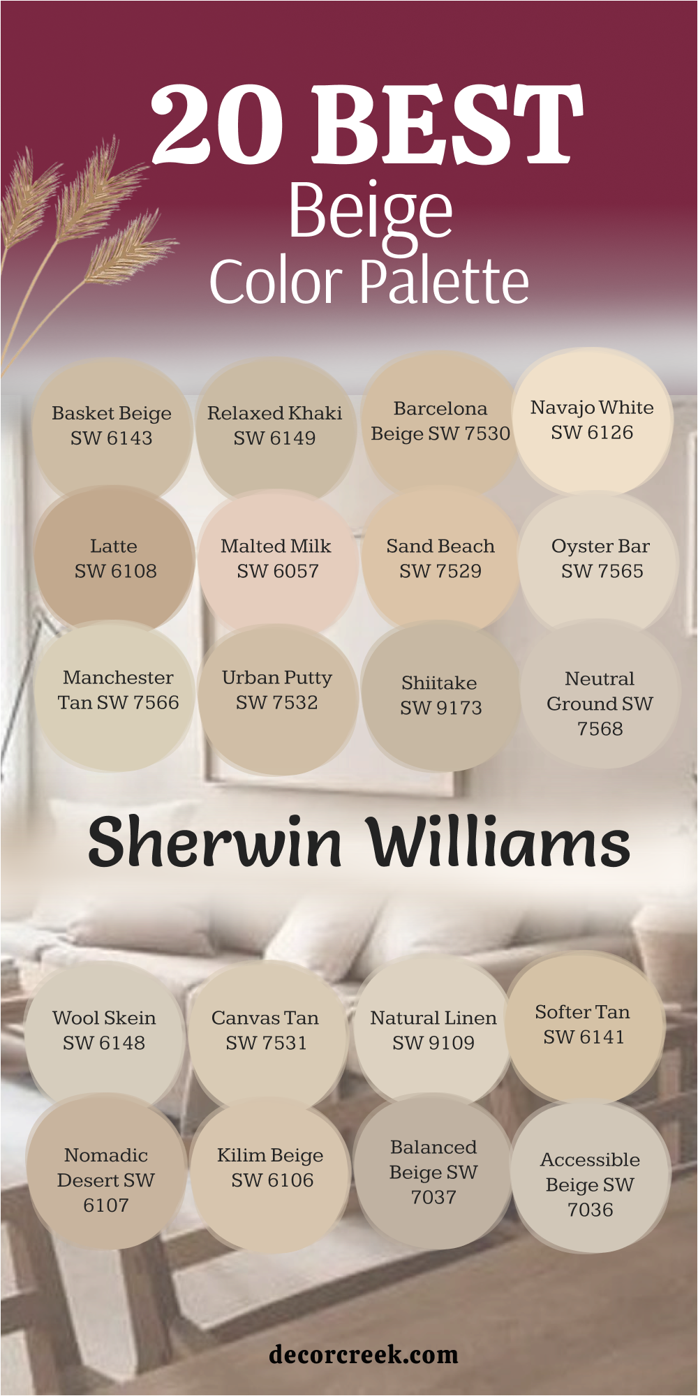
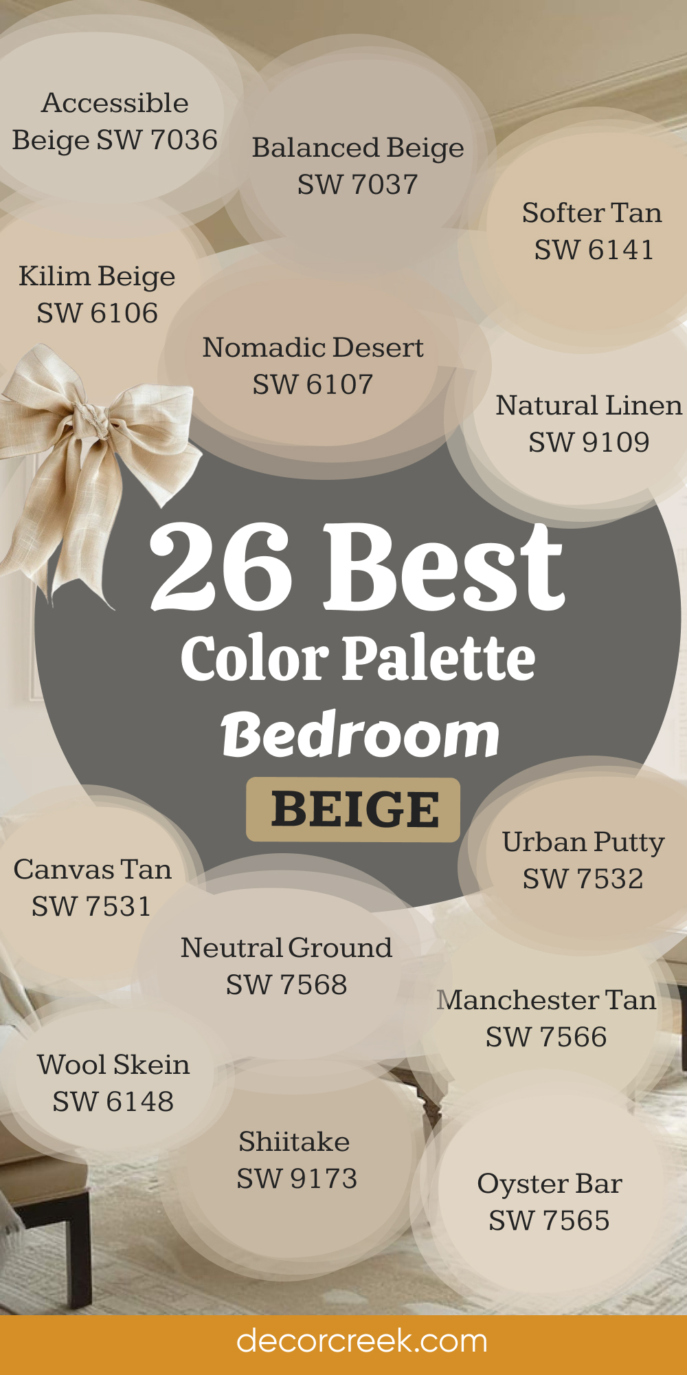
20 Best Beige Color Palette by Sherwin-Williams
Accessible Beige SW 7036
Accessible Beige feels like a soft whisper of warmth across the walls. It carries a perfect mix of gray and beige that creates a gentle, balanced look. I love using it in bedrooms that need lightness without feeling cold. The shade changes beautifully throughout the day—bright and airy in the morning, then cozy and grounded by evening.
It pairs wonderfully with white trim, light wood furniture, and soft linen bedding. Accessible Beige also looks elegant next to brass fixtures or soft gray accents.
The tone helps the room feel restful and connected, a perfect background for both modern and classic decor. It brings comfort without heaviness and brightness without glare. I’ve used it in many homes because it adapts so well to every mood and style. It’s a truly dependable beige that feels natural and deeply peaceful.
🎨 Take a look at the full guide to this color right HERE👈
via decorcreek.com
Balanced Beige SW 7037
Balanced Beige is exactly what its name suggests—perfectly balanced. It holds warmth and depth in equal measure, creating a cozy yet open feeling in a bedroom. I often use it when I want a bit more contrast than a light neutral but still want the room to feel calm. The shade sits beautifully between tan and gray, allowing it to fit any palette.
It pairs well with soft whites, ivory fabrics, and darker wood accents. In daylight, it looks refined and earthy; under warm lamps, it takes on a golden softness.
I love its flexibility—it feels equally at home in a country bedroom or a sleek modern home. Balanced Beige adds quiet structure and helps other colors shine. It’s strong but never loud, elegant but still approachable. When I walk into a Balanced Beige room, it feels exactly right—steady, beautiful, and timeless.
🎨 Take a look at the full guide to this color right HERE👈
via decorcreek.com
Kilim Beige SW 6106
Kilim Beige carries the warmth of late afternoon sunlight. It’s a soft golden beige that adds personality while staying soothing. I often use it in bedrooms that need warmth without looking too yellow. It has a natural brightness that makes the walls glow gently, especially when paired with white trim or cream bedding.
The tone feels friendly and full of life, perfect for rooms that welcome both morning light and evening calm. It also works beautifully with natural woods and tan textiles.
Kilim Beige has a relaxed energy, like a favorite sweater that always fits. It can make small bedrooms feel more inviting and larger ones feel cozier. The color creates a comforting rhythm through the day, changing just enough to stay interesting. Kilim Beige feels warm, welcoming, and easy to love—a beige that fits every season and every mood.
🎨 Take a look at the full guide to this color right HERE👈
via decorcreek.com
Nomadic Desert SW 6107
Nomadic Desert feels like standing in soft sand under golden light. It’s a medium beige with an earthy heart, giving bedrooms a cozy, lived-in feel. I love how it brings depth without feeling heavy. The shade looks beautiful with white trim, warm woods, or woven accents. It pairs well with creamy bedding and textured fabrics like linen and cotton.
When the sun moves across the room, Nomadic Desert glows with gentle richness. It’s a forgiving color—flattering to every wall, every texture, every type of light.
I often choose it for homes that need warmth that feels grounded, not flashy. It also layers beautifully with gold or bronze decor. There’s something calm and honest about this shade—it feels like comfort turned into color. Nomadic Desert is perfect for creating bedrooms that feel personal, warm, and full of quiet charm.
🎨 Take a look at the full guide to this color right HERE👈
via decorcreek.com
Softer Tan SW 6141
Softer Tan feels calm, friendly, and full of light. It’s a warm beige that instantly makes a room feel open and welcoming. I use it often in bedrooms that need warmth but still want to stay airy. The color pairs beautifully with creamy whites, natural wood, and woven textures. During the day, it reflects light softly, keeping the space bright without glare.
In the evening, it deepens into a golden tone that feels relaxing and cozy. Softer Tan has a natural warmth that flatters every kind of decor, from classic to contemporary.
I love layering it with linen bedding and gold accents—it creates an easy sense of harmony. It’s that shade you never get tired of seeing; it always feels right.
Softer Tan brings balance and beauty to bedrooms that deserve both comfort and style.
🎨 Take a look at the full guide to this color right HERE👈
via decorcreek.com
Natural Linen SW 9109
Natural Linen feels like a gentle breeze through open windows—it’s fresh, easy, and endlessly comforting. This beige brings warmth while keeping the room light and airy. I love how it enhances natural materials like rattan, jute, and light oak. The color pairs beautifully with white trim and soft fabrics.
During the day, it reflects sunlight gracefully; at night, it turns into a soothing, creamy tone. Natural Linen works perfectly in bedrooms that need calm and warmth in equal measure.
It’s also one of my favorite colors for creating a layered, neutral palette. It looks elegant next to ivory, taupe, or warm gray.
Every time I use it, the room feels immediately more inviting. It’s simple but not plain, warm but never heavy.
Natural Linen is the color of easy mornings and quiet nights—it just feels like home.
🎨 Take a look at the full guide to this color right HERE👈
via decorcreek.com
Canvas Tan SW 7531
Canvas Tan feels timeless and steady, the kind of beige that always looks good. It’s smooth and natural, like sun-warmed sand or soft stone. I use it in bedrooms that need warmth and order without any heaviness. The color pairs perfectly with white trim, cream fabrics, and golden accents. In sunlight, it glows softly; under warm light, it becomes cozy and elegant.
Canvas Tan makes everything around it look intentional, like the whole room was designed around peace. It works beautifully in both bright and shaded bedrooms, adjusting gracefully to different types of light.
I often recommend it to clients who want their bedroom to feel clean, calm, and effortlessly stylish. The tone is versatile and never demanding—it simply blends into daily life. Canvas Tan is the quiet foundation that lets every detail of the room shine.
🎨 Take a look at the full guide to this color right HERE👈
via decorcreek.com
Wool Skein SW 6148
Wool Skein feels gentle and familiar, like wrapping yourself in a favorite blanket. It’s a soft beige with just a touch of warmth, perfect for bedrooms where you want comfort and calm. The color shifts beautifully through the day—light and airy in the morning, golden and comforting by night. It looks lovely with white bedding, natural textures, and wood accents.
Wool Skein has a natural charm that fits both farmhouse and traditional styles. I often use it in homes where the goal is balance—where warmth and simplicity need to meet in the middle.
The tone pairs beautifully with soft ivory, tan, and even muted greens. It’s subtle but full of character, always enhancing the feeling of the room without overpowering it.
Wool Skein is that color you don’t notice right away but come to love deeply—it feels gentle, real, and truly lived-in.
🎨 Take a look at the full guide to this color right HERE👈
via decorcreek.com
Neutral Ground SW 7568
Neutral Ground feels perfectly named—it’s soft, steady, and endlessly adaptable. It’s a beige that brings calm balance to any bedroom without leaning too warm or cool. I love using it as a foundation for layered, textural spaces. It pairs wonderfully with white trim, natural woods, and muted fabrics.
The color changes slightly with the light, glowing softly in the day and deepening into warmth at night. Neutral Ground works equally well in bright, modern rooms or cozy, traditional homes.
It gives a clean, comfortable look that helps other design elements stand out. I’ve used it for years because it never feels dated—it always holds its quiet beauty. The tone blends seamlessly with linen, rattan, and woven details. Neutral Ground is a reminder that simplicity can still feel rich—it’s beige at its most graceful.
🎨 Take a look at the full guide to this color right HERE👈
via decorcreek.com
Shiitake SW 9173
Shiitake brings warmth and sophistication together in one soft tone. It sits perfectly between beige and greige, creating a versatile color that feels modern yet timeless. I love using it in bedrooms that need a grounded but polished atmosphere. The color glows gently in sunlight and deepens beautifully at night. It pairs well with ivory bedding, woven rugs, and brushed brass or black fixtures.
Shiitake has a cozy, earthy feel that makes every room look styled but not forced. It’s perfect for homes that mix natural materials and soft lighting. The tone feels balanced and refined—warm, but never too brown or yellow.
When used with white trim or light wood, it adds quiet contrast and subtle luxury. Shiitake makes a bedroom feel calm, cared for, and beautifully complete.
🎨 Take a look at the full guide to this color right HERE👈
via decorcreek.com
Urban Putty SW 7532
Urban Putty feels like the gentle warmth of sunbaked clay—soft, earthy, and quietly confident. It’s a beige that brings natural character to a bedroom without stealing attention. I love using it when I want a space to feel peaceful but grounded, a place that feels lived-in and cared for. The color pairs beautifully with warm whites, tans, and light wood accents.
It glows gently under natural light and settles into a calm richness as the day ends. Urban Putty has a way of softening harsh lines and adding warmth to even the simplest decor.
It looks especially elegant with linen curtains, woven textures, and matte finishes. I often use it in homes that blend modern design with rustic touches—it bridges both worlds seamlessly. The tone feels warm yet refined, ideal for creating comfort without clutter.
Urban Putty is one of those shades that makes everything around it look beautiful—it’s quietly graceful and endlessly dependable.
Manchester Tan SW 7566
Manchester Tan is a classic beige that always feels familiar, comfortable, and timeless. It strikes that perfect note between warmth and lightness, making bedrooms feel cozy without closing them in. I often use it in rooms that need a gentle backdrop for layering patterns and textures. It works beautifully with white or ivory trim, soft bedding, and wood accents.
The color has a natural glow that changes subtly with the light—fresh in the morning, cozy at dusk. It’s ideal for bedrooms where calmness and comfort matter most.
Manchester Tan pairs easily with both warm metals and cooler tones, giving you freedom to decorate in any direction. I love its honesty—it feels lived-in and natural, never overdone. The color gives a quiet strength to walls and balances every other element in the room.
Manchester Tan is one of those colors that makes people instantly feel at home; it’s steady, warm, and forever classic.
Oyster Bar SW 7565
Oyster Bar feels soft, creamy, and full of quiet warmth. It’s the kind of beige that fills a bedroom with easy light and softness. I love how it reminds me of smooth beach sand—gentle, natural, and endlessly inviting. The tone works wonderfully with off-white trim, pale woods, and light fabrics. It’s bright enough to open a space but warm enough to feel cozy.
During the day, it glows like soft sunshine; at night, it turns into a gentle golden beige that feels peaceful. Oyster Bar pairs beautifully with woven textiles, beige drapes, and soft lighting.
I’ve used it in bedrooms where the goal is comfort without fuss—it always brings balance. The color feels polished but approachable, simple yet graceful. It’s one of those shades that lets everything else shine while quietly holding the room together. Oyster Bar makes a bedroom feel soft, warm, and perfectly lived in.
🎨 Take a look at the full guide to this color right HERE👈
via decorcreek.com
Sand Beach SW 7529
Sand Beach feels like the color of warm sand at sunrise—soft, golden, and alive with warmth. It brings a feeling of calm joy to any bedroom. I love how it carries just enough brightness to keep the space fresh, yet still feels cozy and grounded. The color pairs beautifully with white trim, linen bedding, and natural woven accents.
It’s especially stunning in rooms with plenty of light, where it reflects a soft golden glow that changes gently throughout the day. Sand Beach works perfectly for coastal-inspired interiors or homes that need a little sunshine inside.
I often use it in rooms that feel too gray or cold—it instantly adds life without overpowering. The tone feels happy, comfortable, and endlessly welcoming. Sand Beach turns any bedroom into a light-filled retreat that feels bright but never harsh. It’s that simple, golden warmth everyone falls in love with.
🎨 Take a look at the full guide to this color right HERE👈
via decorcreek.com
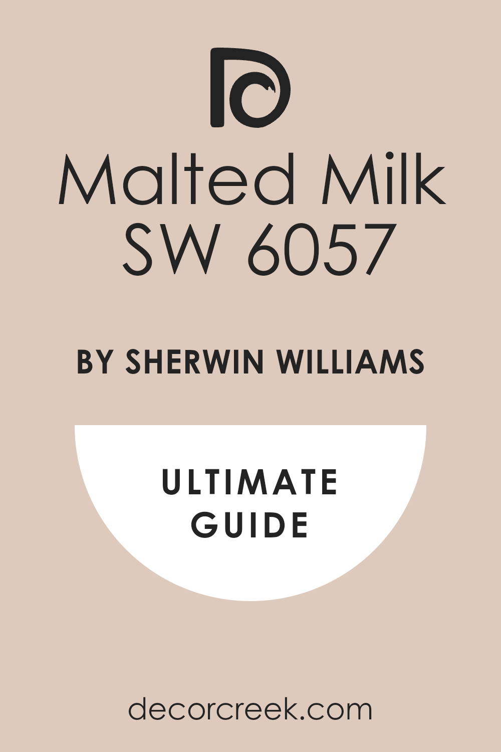
Malted Milk SW 6057
Malted Milk feels warm, creamy, and comforting—just like its name. It’s a light beige with a soft peach undertone that gives bedrooms a touch of warmth and glow. I love how it adds gentle energy to a space without feeling bold. The color works beautifully with white trim, ivory fabrics, and natural materials like rattan or jute.
Under sunlight, Malted Milk shimmers softly; under evening light, it feels cozy and familiar. It’s a beautiful choice for bedrooms that need brightness with a human touch.
I often use it in guest rooms because everyone seems to relax around it. It blends beautifully with both gold and wood accents, creating harmony in every direction. The tone feels soft yet confident, subtle yet rich. Malted Milk adds an emotional warmth to a room—it feels sweet, safe, and beautifully personal.
🎨 Take a look at the full guide to this color right HERE👈
via decorcreek.com
Latte SW 6108
Latte brings richness and comfort into a bedroom like no other beige. It’s deeper than most, with a warm undertone that feels strong but soothing. I love using it to create cozy, grounded spaces that feel elegant and inviting. The color pairs perfectly with crisp white trim, warm wood, and soft beige fabrics.
When the sunlight moves through the room, Latte glows with a gentle golden hue; under lamplight, it feels intimate and warm. It’s wonderful for larger bedrooms that need depth or smaller ones that crave warmth.
I often layer it with linen bedding, woven textures, and brushed brass details for a rich, collected look. Latte also brings beautiful contrast to light flooring or neutral decor. It feels mature, dependable, and full of heart. It’s that shade you turn to when you want your bedroom to feel like a true retreat—stable, warm, and quietly beautiful.
🎨 Take a look at the full guide to this color right HERE👈
via decorcreek.com
Navajo White SW 6126
Navajo White feels like soft sunshine captured on walls. It’s a creamy, warm beige that brightens bedrooms while keeping them cozy and comfortable. I often use it when I want to add light to a space without making it stark white. The color pairs beautifully with ivory bedding, white curtains, and rattan or oak furniture.
It has a cheerful glow in the morning and turns mellow and golden as night falls. Navajo White fits perfectly in both traditional and modern homes—it always feels fresh and timeless.
I’ve used it in small bedrooms where it makes the space feel larger, and in bigger rooms where it adds intimacy. It pairs wonderfully with brass lighting, soft beige textiles, and woven decor. The tone never feels fussy—it’s simple, warm, and endlessly livable. Navajo White is comfort in color form; it makes every room feel lighthearted and loved.
🎨 Take a look at the full guide to this color right HERE👈
via decorcreek.com
Barcelona Beige SW 7530
Barcelona Beige is smooth, soft, and quietly elegant. It’s a true beige with a sunlit undertone that makes bedrooms feel polished yet warm. I love using it in rooms that need subtle sophistication without losing comfort. The color works beautifully with white trim, linen bedding, and warm wooden accents
. Under daylight, it glows with a delicate warmth; by night, it settles into a calm, gentle tone that feels restful. Barcelona Beige is versatile—it fits modern, traditional, and transitional interiors with ease.
I often pair it with gold details, textured fabrics, and soft neutral rugs. The color feels refined but never cold; it creates a sense of balance that instantly calms the eye. I’ve used it often in guest rooms where people immediately feel relaxed. Barcelona Beige makes a space look intentional, graceful, and naturally welcoming.
🎨 Take a look at the full guide to this color right HERE👈
via decorcreek.com
Relaxed Khaki SW 6149
Relaxed Khaki feels like nature indoors—warm, grounded, and endlessly easy to live with. It carries a soft mix of beige and tan with a faint green undertone that adds depth and earthiness. I love using it in bedrooms where I want peace and quiet to take center stage.
It pairs beautifully with off-white trim, light wood, and woven textiles. In sunlight, it feels gentle and natural; at night, it deepens into a cozy, golden tone.
Relaxed Khaki looks especially lovely with warm lighting or brass accents, which highlight its subtle richness. It’s perfect for rustic, coastal, or organic modern styles. The color gives a sense of calm that feels genuine, not staged. Every time I use it, the room feels lived in and balanced, as though it’s always been that way. Relaxed Khaki is a beige that never demands attention—it simply creates peace.
🎨 Take a look at the full guide to this color right HERE👈
via decorcreek.com
Basket Beige SW 6143
Basket Beige feels steady, warm, and beautifully familiar. It’s a medium beige that holds just the right amount of depth to make a bedroom feel cozy without being dark. I love how it works with almost anything—soft whites, gray accents, dark wood, or golden decor. The color has a quiet strength that makes walls feel warm and substantial.
When sunlight hits it, Basket Beige glows softly, adding a golden richness to the room. It’s a color that feels welcoming year-round, equally perfect for summer brightness or winter warmth.
I often pair it with ivory linens, woven baskets, and brass lamps to bring out its depth. Basket Beige gives a bedroom a natural, lived-in charm that never feels forced. It’s comforting, classic, and endlessly reliable—the kind of beige that makes a home feel complete.
via decorcreek.com
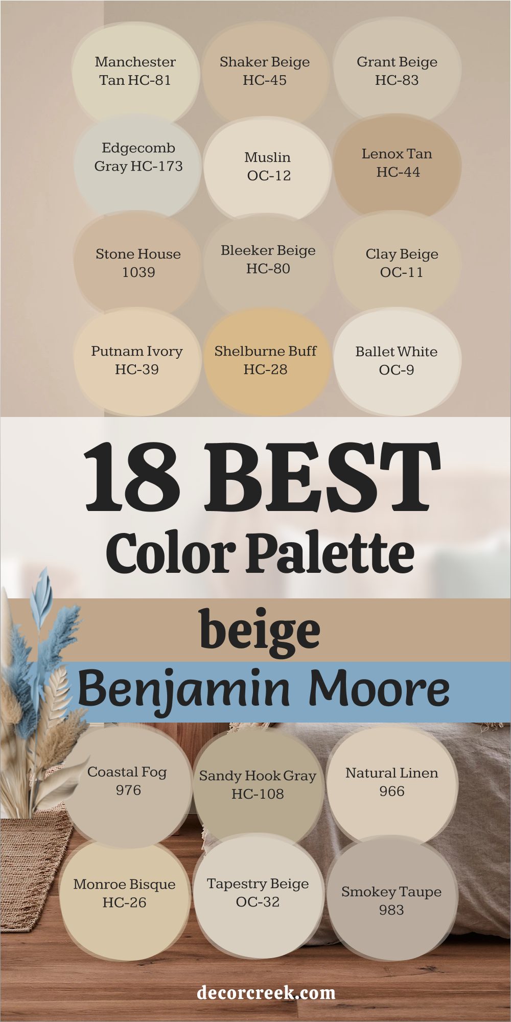
18 Best Beige Color Palette by Benjamin Moore
Manchester Tan HC-81
Manchester Tan feels like soft morning light settling over a cozy room. It’s one of those dependable beige tones that works beautifully in every kind of bedroom. I often use it when I want walls to feel fresh but grounded. The color sits perfectly between cream and warm sand, which makes it flexible with both cool and warm decor.
It pairs wonderfully with off-white trim, natural wood, and soft woven fabrics. In daylight, it glows gently, while in evening light, it deepens just enough to feel relaxing.
I love how it supports everything around it—artwork, bedding, lighting—without stealing attention. It’s the kind of beige that feels comforting without being plain. When used with brass fixtures or soft curtains, it gives off a golden warmth that feels natural and lived in. Manchester Tan also has a subtle richness that makes rooms feel layered.
It’s great for both modern and traditional homes because it adapts so easily. I’ve seen it soften small bedrooms and bring warmth to large ones.
It’s simple, balanced, and full of quiet life. For me, it’s a color that never disappoints.
🎨 Take a look at the full guide to this color right HERE👈
via decorcreek.com
Shaker Beige HC-45
Shaker Beige carries a warm, familiar comfort that instantly feels like home. It has a hint of tan that adds depth and richness without feeling dark. I love using it in bedrooms that need a sense of coziness and warmth. The tone feels friendly, calm, and beautifully classic.
When paired with crisp white trim or creamy bedding, the contrast looks clean but welcoming. I often bring in woven baskets, beige throws, and gold accents to highlight its warmth.
Shaker Beige has that rare quality of looking both timeless and inviting. It works beautifully with natural wood floors and even soft gray decor. The color adapts well in any light—bright mornings or dim evenings—and always feels steady. I’ve used it in family homes where comfort matters most, and it always feels right.
It’s also wonderful in guest rooms, where it creates an instantly restful mood.
Shaker Beige has personality but never feels loud. It’s dependable, like your favorite sweater that fits every season. If you want a color that feels classic and human, this is it.
🎨 Take a look at the full guide to this color right HERE👈
via decorcreek.com
Grant Beige HC-83
Grant Beige is one of those shades that quietly balances everything around it. It’s not too warm or too cool, which makes it an easy favorite in bedrooms where peace matters most. The tone feels refined but never stiff—it brings quiet warmth to walls while still looking fresh. I love pairing it with white bedding, brass lighting, and woven rugs.
It works equally well with gray, tan, or even navy accents. The subtle gray undertone helps it stay calm and grounded in any light. I often use it in homes with open floor plans where colors need to flow naturally.
Grant Beige makes transitions feel effortless between spaces. In the morning, it feels soft and airy; by night, it gains depth and coziness. It has a thoughtful charm that helps rooms feel well-balanced. The shade also photographs beautifully—smooth, warm, and elegant. I’ve seen it elevate simple bedrooms into something polished yet still comforting.
Grant Beige feels like quiet order and comfort all at once.
It’s that “can’t-go-wrong” beige every designer keeps in their back pocket.
🎨 Take a look at the full guide to this color right HERE👈
via decorcreek.com
Edgecomb Gray HC-173
Edgecomb Gray is one of my all-time favorites for bedrooms that need both warmth and balance. It’s not fully gray and not fully beige—it sits right in between, making it beautifully adaptable. The tone feels airy in the morning and mellow by evening, like soft linen shifting with the light. I love using it when I want a neutral that still has personality.
It pairs perfectly with crisp white trim, oak furniture, and neutral bedding. The color’s softness makes it a wonderful backdrop for textured decor like woven blankets or wicker accents.
It brings harmony to both modern and traditional interiors. I often recommend it for people who can’t decide between warm beige and cool gray—it satisfies both. Edgecomb Gray feels like calm order in color form. When paired with natural light, it seems to breathe with the room. It’s beautiful with gold lamps, soft cream drapes, and even darker accent walls. This shade holds a quiet confidence that always feels right. I use it often in homes that value simplicity and softness—it’s a color that never feels forced.
🎨 Take a look at the full guide to this color right HERE👈
via decorcreek.com
Muslin OC-12
Muslin feels like the touch of warm fabric brushed by daylight. It’s a pale beige with a creamy tone that makes bedrooms feel open, soft, and cared for. I love how it gently brightens a space without feeling cold or empty. It works perfectly in rooms with low light, adding that touch of glow that feels comforting. Paired with white trim, it looks crisp yet welcoming.
When matched with woven textures or linen bedding, the result feels natural and peaceful. Muslin pairs nicely with warm metals and rattan accents, adding texture without clutter.
It has a golden undertone that gives off an easy warmth through the day. The color never feels dull—it carries quiet energy that keeps a room alive. I’ve used it in both children’s rooms and master bedrooms, and it works equally well. Muslin is a great way to keep a neutral palette interesting without adding too much color.
It’s dependable but never boring. This shade has a way of turning ordinary rooms into restful, lived-in retreats.
Lenox Tan HC-44
Lenox Tan feels rich, grounded, and full of comfort. It’s a deeper beige with golden undertones that give bedrooms a cozy, sunlit glow. I often choose it when I want to add warmth and depth without going too dark. The color pairs beautifully with white ceilings, ivory fabrics, and medium-toned wood floors.
It brings a lovely contrast that makes the room feel layered and complete. When used with warm lighting, it deepens into a golden tan that’s incredibly inviting.
I like how it makes bedrooms feel full, like the color itself is holding the room together. Lenox Tan looks wonderful with both vintage and modern decor. It has enough character to stand on its own but still works as a neutral base.
The shade brings comfort to quiet spaces and elegance to busy ones. It’s also great in bedrooms with north-facing windows—it adds warmth where light can feel cool.
Lenox Tan has a graceful strength that feels classic and confident. Every time I use it, the room feels alive with warmth.
🎨 Take a look at the full guide to this color right HERE👈
via decorcreek.com
Stone House 1039
Stone House feels natural, familiar, and perfectly balanced. It’s that kind of beige that makes a room feel grounded and full of quiet warmth. The color reminds me of soft clay or sand kissed by sunlight. It has enough depth to create interest but still feels calm. I love pairing it with creamy whites, rattan decor, and warm fabrics.
It’s a great choice for bedrooms with wooden furniture or rustic accents. In natural light, it gains a gentle golden glow that feels inviting.
At night, it settles into a warm, cozy tone that encourages rest. Stone House also complements both warm and cool palettes, which makes it versatile. It’s wonderful in guest rooms where comfort and simplicity matter. I’ve noticed it gives a polished look to any space, no matter the style. When styled with layers of texture, it feels beautifully personal.
Stone House has a natural charm that makes any bedroom feel warm, grounded, and welcoming.
Bleeker Beige HC-80
Bleeker Beige brings quiet confidence to a bedroom. It’s a mid-tone beige with gray undertones, giving it a polished and modern feel. I use it often when I want a neutral that’s cozy but still sophisticated. The color holds up beautifully in both sunlight and lamplight, never looking too yellow or flat. It pairs perfectly with crisp white trim, cream fabrics, and natural wood furniture.
I’ve also seen it work beautifully with soft blues or muted greens for contrast. Bleeker Beige has a steady personality—it’s warm but composed.
I love how it adds structure to a room without stealing its softness. The tone blends perfectly with linen, woven textures, and layered neutrals. It makes bedrooms feel refined yet relaxed, like a calm, grown-up sanctuary. This is a great choice for anyone who wants beige that feels slightly elevated.
Every time I use Bleeker Beige, the room feels instantly balanced and grounded. It’s a timeless neutral with quiet charm
Clay Beige OC-11
Clay Beige feels grounded and natural, like sunbaked earth softened by light. It’s a muted beige with a quiet warmth that gives bedrooms a comfortable, lived-in feel. I love using it when I want walls that bring calm without feeling pale. The tone has a slightly earthy quality, which adds depth to neutral spaces. It pairs beautifully with creamy whites, soft tans, and warm wood accents.
When sunlight hits it, the color glows gently, bringing out a hint of golden warmth. Clay Beige feels especially lovely with linen bedding, rattan decor, or brushed brass lamps.
It’s a great choice for bedrooms that need warmth without heaviness. The shade feels natural—like it’s always belonged there. I’ve used it in both classic and modern interiors, and it fits effortlessly. It’s one of those colors that adapts to light and texture beautifully. Clay Beige gives a quiet, confident charm to bedrooms, making them feel grounded yet graceful. It’s a color that speaks softly but leaves a lasting impression.
Putnam Ivory HC-39
Putnam Ivory feels smooth and soft, like gentle morning light. It’s a creamy beige that leans toward warm ivory, making bedrooms feel fresh and open. I love how it pairs with soft fabrics, light wood tones, and delicate gold details. The color feels cheerful but calm, adding a glow to the room without being too bright.
It’s perfect for smaller bedrooms or those with limited natural light. When used with white trim, it creates a clean, uplifting contrast.
The tone deepens slightly under warm light, creating a soft honey-like glow in the evening. I’ve used it often in cozy cottages or guest rooms where warmth and comfort matter most. Putnam Ivory works well with natural materials like linen, cotton, and woven textures. It’s also beautiful with soft green or blush accents for a layered, romantic look. The shade carries a gentle charm that feels timeless yet personal. Every time I use it, the room feels soft, cared for, and beautifully alive. Putnam Ivory is a color that quietly brightens every corner it touches.
🎨 Take a look at the full guide to this color right HERE👈
via decorcreek.com
Shelburne Buff HC-28
Shelburne Buff feels warm and inviting, like golden sunlight on an old wooden floor. It’s a rich beige with golden undertones that adds energy and life to a bedroom. I love using it when I want a cozy, sunlit feeling that feels natural and lived in. The color works wonderfully with creamy whites, soft browns, and even gentle greens.
In morning light, it glows softly; in evening light, it feels rich and golden. Shelburne Buff brings warmth to rooms that might otherwise feel cool or plain.
It pairs beautifully with rattan, woven textiles, and warm-toned woods. The tone feels cheerful yet balanced—never too strong. I’ve seen it make small bedrooms feel instantly more welcoming.
It’s a color that feels like a quiet smile every time you walk in. Shelburne Buff reminds me of sunlight filtered through soft curtains, always comforting. It’s perfect for homes where warmth and connection matter most.
This shade brings personality without taking over.
🎨 Take a look at the full guide to this color right HERE👈
via decorcreek.com
Ballet White OC-9
Ballet White feels soft and graceful, like fabric moving gently in a breeze. It’s a creamy beige with the faintest gray undertone, giving it a delicate balance. I love using it in bedrooms that need warmth but also lightness. The color looks beautiful with crisp white trim and light wood tones. It gives walls a creamy depth that feels polished yet easy.
Ballet White changes gently throughout the day—brighter in the morning and softer at night. It works beautifully in homes that value simplicity and calm energy.
I often pair it with ivory bedding, brass lamps, and woven details for texture. The tone feels airy but grounded, making any room feel welcoming.
It’s perfect for bedrooms that need brightness without glare. Ballet White gives a natural, soothing atmosphere that feels graceful and personal.
It’s one of my favorite colors for creating a clean yet warm backdrop for everyday living.
🎨 Take a look at the full guide to this color right HERE👈
via decorcreek.com
Coastal Fog 976
Coastal Fog brings the warmth of sand and the softness of sea air into a bedroom. It’s a greige tone—part beige, part gray—that feels balanced and deeply comforting. I use it often when I want to bring calm depth without darkness. The color looks wonderful with white or ivory trim and natural textures. It pairs beautifully with woven baskets, linen bedding, and driftwood tones.
Coastal Fog changes beautifully with the light—it feels warmer in the morning and more muted by evening. It’s great for bedrooms that need a cozy, cocoon-like feeling.
I also love how it complements both cool and warm decor styles. The tone gives off a natural sophistication without trying too hard. When used with warm lighting, it feels almost golden; under daylight, it stays soft and grounded. Coastal Fog always creates a sense of stillness and rest.
It’s perfect for people who want their bedroom to feel calm and deeply comforting.
Sandy Hook Gray HC-108
Sandy Hook Gray is one of those beautiful in-between shades that feels timeless. It leans toward gray but carries warm beige undertones that make bedrooms feel grounded. I love using it for spaces that need depth and warmth at the same time. The color pairs beautifully with creamy whites, natural wood, and brushed metal finishes.
It brings structure to the room while keeping it cozy. Sandy Hook Gray also works well with darker furniture—it balances rich tones with ease.
In daylight, it feels steady and elegant; by night, it becomes rich and soothing. The shade adapts to all kinds of lighting, which makes it wonderfully versatile.
It’s perfect for bedrooms that need personality without boldness. I’ve used it in both city apartments and country homes—it fits every setting. Sandy Hook Gray has quiet strength that feels comforting.
It’s that rare color that feels both classic and fresh at once.
Natural Linen 966
Natural Linen feels soft, comforting, and familiar, like a well-loved fabric. It’s a warm beige with golden undertones that wrap a bedroom in quiet warmth. I love pairing it with white trim, tan fabrics, and light wood for a cozy layered effect. The color glows gently during the day and deepens into a honey-like hue at night.
It feels easy and effortless—perfect for creating a room that welcomes you home. Natural Linen pairs beautifully with woven materials, creamy whites, and warm lighting.
I often use it in guest bedrooms or master suites where I want an easy, timeless look. It’s especially nice in rooms with natural textures like rattan, jute, or linen curtains.
The color holds just enough warmth to feel rich but not heavy. It works in every season, keeping the room bright and restful.
Natural Linen feels like the essence of comfort—it makes you want to linger just a little longer.
🎨 Take a look at the full guide to this color right HERE👈
via decorcreek.com
Monroe Bisque HC-26
Monroe Bisque feels inviting and rich, with a smooth balance between beige and soft gold. It’s one of those tones that instantly makes a bedroom feel lived in and warm. The color has an old-world charm that feels both cozy and elegant. I love pairing it with white trim and off-white fabrics for contrast.
It glows softly in the light, creating a warm, homey atmosphere. Monroe Bisque works beautifully with natural fibers, wooden headboards, and linen bedding.
It also pairs well with soft gray or green accents, adding a bit of depth. The shade feels warm without ever being overpowering. I’ve used it in rooms where connection and warmth are the goal—it always succeeds. The color looks stunning under lamplight, turning into a golden beige that feels luxurious.
Monroe Bisque is a comforting beige that carries quiet personality. It’s the kind of shade that makes every bedroom feel personal and inviting.
Tapestry Beige OC-32
Tapestry Beige feels smooth, graceful, and balanced. It’s a soft beige-gray that adds warmth and polish without overwhelming the room. I often use it in bedrooms that need a calm, thoughtful tone. The color pairs beautifully with white or cream bedding and wood accents.
It has a quiet depth that gives a room character while keeping things light. When the sunlight hits it, it reveals a subtle golden undertone.
I love how it feels both modern and timeless at once. Tapestry Beige works in every style—minimal, rustic, or classic. It complements brushed brass, linen, and natural wood beautifully.
The tone stays calm even under artificial light, keeping the room soft. It’s ideal for homes where you want the walls to feel warm but not too beige.
Tapestry Beige makes bedrooms feel finished, soft, and full of light. It’s a shade that quietly ties everything together.
Smokey Taupe 983
Smokey Taupe feels like warmth and elegance blended perfectly together. It’s a deeper beige-gray tone that adds mood and comfort to a bedroom. I often use it for feature walls or entire rooms that need cozy sophistication. The color works beautifully with ivory trim, warm lighting, and textured fabrics.
It pairs well with linen bedding, dark wood, or brass details. Smokey Taupe shifts gently with the light—cooler in daylight and warmer by lamplight.
It brings a sense of depth and coziness without feeling heavy. I love it for bedrooms that need calm energy with a little richness.
It’s especially striking when paired with lighter bedding or curtains. Smokey Taupe feels thoughtful, layered, and beautifully lived in. The tone gives any space quiet character and charm.
It’s one of those colors that makes you exhale when you walk in. Smokey Taupe turns any bedroom into a gentle retreat.
🎨 Take a look at the full guide to this color right HERE👈
via decorcreek.comvia decorcreek.com
My Final Thoughts on Choosing Beige Paints for Bedrooms
When it comes to beige bedrooms, I’ve learned that the smallest differences can completely change how a room feels. A little more pink can make beige feel romantic and soft, while a touch of gray brings calm balance. A hint of gold can fill a space with warmth that feels like sunlight even on cloudy days.
That’s why I never skip the testing step—paint always surprises you once it’s on the wall. Morning light can make a beige look airy and pale, while evening shadows reveal its cozy side.
I’ve spent years watching how these shades move with the day, and it still amazes me how alive beige can be.
Beige might seem simple, but it quietly controls the mood of a room. A soft, creamy beige makes a bedroom feel open and easy to breathe in, while deeper tones give it warmth and comfort that pull you in.
The secret is choosing the shade that feels like you. The one that calms you in the evening and greets you kindly in the morning.
I always tell my clients: if you feel yourself smiling when you look at it, that’s the right one.
To me, beige is more than just a neutral—it’s the foundation of rest, warmth, and belonging. It gathers everything together: the wood tones, the fabrics, the lighting, the quiet details that make a home feel loved.
When beige is chosen with care, it doesn’t just color a wall; it sets the emotion of the room. It helps you slow down, think clearly, and find comfort in the little moments that make up home life.
Sometimes, the perfect beige doesn’t stand out right away. It waits patiently, blending into your daily routine until you realize it’s been there, making everything feel right.
It’s in the morning sun that hits your pillow, the soft tone behind your favorite lamp, and the background that holds your memories. That’s what makes beige so special—it’s steady, gentle, and endlessly forgiving. When you finally find your perfect shade, you’ll know instantly. It won’t shout for attention; it’ll whisper, “You’re home.”
Maisie is a skilled Home Designer with a passion for color and personalized interiors. Since 2015, she has transformed homes across the U.S. A graduate of Savannah College of Art and Design (SCAD) with a BFA in Interior Design, she continues to build her knowledge through certifications and industry involvement.