When I think about a bedroom, I think about a place that should feel safe, warm, and personal. The color on the walls has a big part in that. Over the years, I’ve noticed how a certain shade can make mornings brighter or evenings feel softer.
Picking the right paint color is not just about looks—it’s about creating a feeling you want to come home to every day.
In this list, I’ve gathered shades that make bedrooms feel inviting, stylish, and full of character.
Why Sherwin-Williams Is My Go-To for Beautiful Shades
Sherwin-Williams has been a brand I trust for years, and not just because their colors look beautiful on a wall. Their paints have a depth and richness that make a room feel finished and intentional. The shades always seem to have the right balance—never too bright, never too dull—and they manage to work in many different styles of bedrooms. I’ve used their colors in cozy cottages, sleek modern homes, and everything in between.
The paint quality is another reason I keep coming back. It covers well, holds its color over time, and is easy to clean, which matters a lot in a lived-in bedroom. I also love that their palette has something for every mood—whether I want a warm and inviting feel for a quiet retreat or something light and airy to start the day on a high note.
Their colors behave beautifully in different lighting conditions, so a shade that looks perfect in the morning still feels just as right when you turn on the bedside lamp at night.
That makes them a safe and reliable choice for bedrooms, where the lighting changes more than in any other room.
My Simple Method for Picking the Perfect Bedroom Color
When I’m choosing a bedroom color, I always begin by thinking about how I want the room to feel. Do I picture it as a bright, cheerful space to start the day, or do I want it to be more relaxed and cozy for winding down at night? Once I know the feeling I’m aiming for, I look closely at the natural light. South-facing rooms can handle cooler colors like soft blues or grays, while north-facing rooms often feel better with warmer tones that add a bit of glow.
I never skip the testing stage. I paint large swatches directly on the wall instead of relying on small samples. Then, I live with them for a few days, watching how the color changes in morning sun, afternoon shadows, and under lamplight.
This step is where the real decision happens—it’s amazing how a shade can shift from day to night.
I also consider how the color will work with what’s already in the room: the wood tone of the bed, the texture of the bedding, the style of the nightstands.
Everything should feel connected, so the color becomes part of the room’s story rather than just paint on the wall.
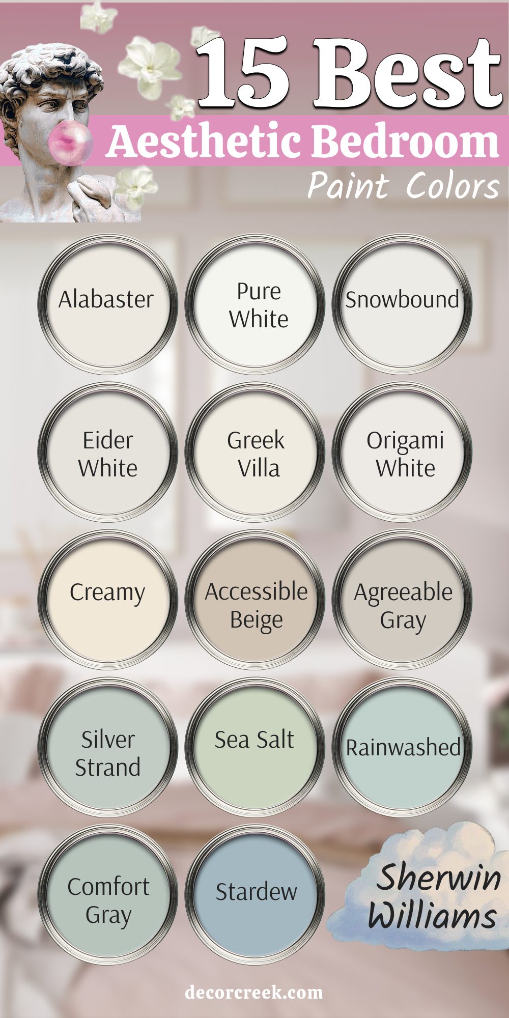
15 Best Aesthetic Bedroom Paint Colors by Sherwin-Williams
Alabaster SW 7008
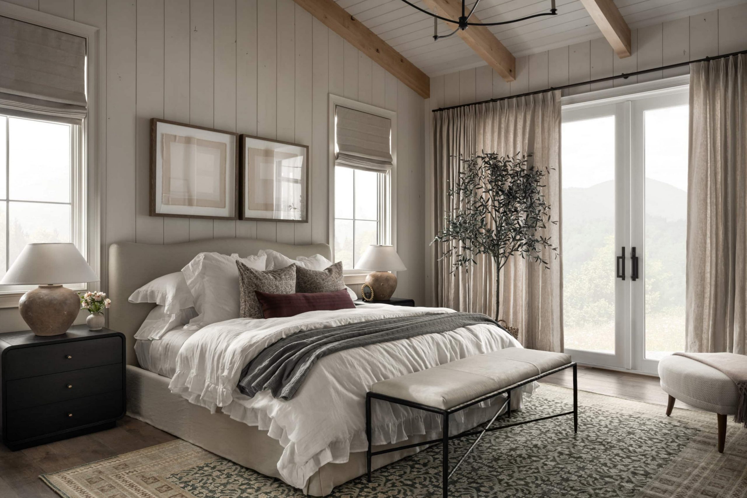
Alabaster feels like a warm hug for the walls. It’s a creamy off-white that makes any bedroom feel bright without feeling stark. I love using it when I want a light base that still feels welcoming. Alabaster works beautifully with wood tones, soft blues, and gentle grays. It’s a color that adapts well to both modern and classic styles.
This shade works best when you want light without coldness.

Pure White SW 7005
Pure White has a freshness that makes a room feel open and airy. It’s clean but not too bright, so it’s easy on the eyes. I often pair it with bold accent pillows or colorful art to make them pop. Pure White plays well with both warm and cool tones, so it’s flexible for many styles. It’s perfect for someone who wants a simple base to build on.
This shade works best when you want a true white that doesn’t feel harsh.

Snowbound SW 7004
Snowbound has a softness that works well for peaceful bedrooms. It’s a white with a gentle gray undertone, which makes it calming and balanced. I like it in rooms with a lot of natural light, where it feels bright yet soothing. It works beautifully with black frames, woven baskets, and light linens. Snowbound has a modern feel without being too cold.
This shade works best when you want a clean but gentle backdrop.

Eider White SW 7014
Eider White has a quiet gray base that gives it a relaxed look. It’s one of my go-to shades for a bedroom that needs a hint of color without going too bold. In morning light, it looks fresh, while at night it feels soft and cozy. It pairs nicely with navy accents, natural wood, and warm metal finishes. I find it especially pretty in rooms with simple, minimal décor.
This shade works best when you want a gentle, airy look.

Greek Villa SW 7551
Greek Villa is a warm white that feels like sunshine on a wall. It adds a gentle glow without being too yellow. I love it in bedrooms with light wood furniture and cream bedding. It makes small rooms feel more open and large rooms feel more inviting. Greek Villa works in both modern and traditional settings.
This shade works best when you want warmth and brightness together.

Origami White SW 7636
Origami White has a graceful, soft quality. It’s a light neutral with just a touch of gray, making it easy to match with many décor styles. I like it for bedrooms where I want a relaxed but polished look. It looks great with sage greens, blush tones, or deep blues. It’s one of those shades that feels effortless but still makes a statement.
This shade works best when you want a balanced and versatile backdrop.

Creamy SW 7012
Creamy is exactly what its name suggests—a soft, buttery white that feels comforting. It has a slight yellow undertone, which makes it feel warm and friendly. I love it in rooms with lots of natural fabrics like linen or cotton. Creamy works well for creating a cozy, inviting atmosphere. It pairs beautifully with browns, greens, and soft blues.
This shade works best when you want a warm and gentle mood.

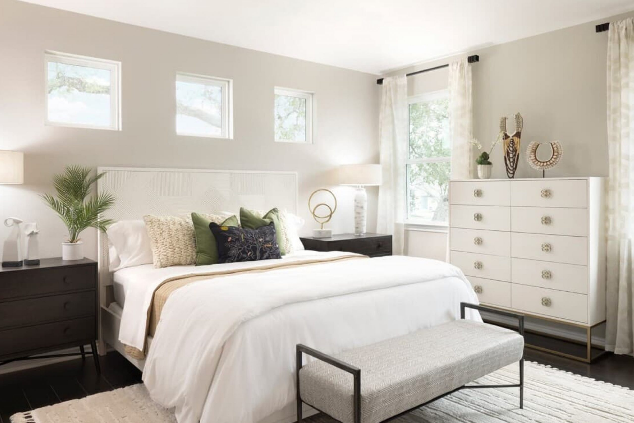
Accessible Beige SW 7036
Accessible Beige is a warm neutral that works like magic in bedrooms. It’s soft, earthy, and has a welcoming presence. I use it when I want something warmer than gray but not as strong as brown. It pairs well with white trim, soft blues, and muted greens. It’s a color that feels grounded without being heavy.
This shade works best when you want a cozy, balanced look.

Agreeable Gray SW 7029
Agreeable Gray is a favorite because it sits right between gray and beige. It’s a safe choice for bedrooms because it works in almost any lighting. I like it with crisp white bedding and dark wood furniture. It has a modern, easy feel that never seems out of style. It also works well as a backdrop for colorful accents.
This shade works best when you want a true neutral.

Silver Strand SW 7057
Silver Strand is a soft gray with a hint of green. It’s refreshing without feeling cold. I love it in bedrooms with beach-inspired or nature-themed décor. It pairs beautifully with white trim, natural woods, and woven textures. It’s especially nice in rooms with plenty of daylight.
This shade works best when you want a cool, airy feel.

Sea Salt SW 6204
Sea Salt is a muted green-blue that feels fresh and easy on the eyes. It changes slightly with the light, sometimes looking more green and sometimes more blue. I use it when I want a color that feels light but still has personality. It pairs beautifully with white bedding and soft beige rugs.
This shade works best when you want a gentle, refreshing look.

Rainwashed SW 6211
Rainwashed is a cool blue-green with a soft, relaxing feel. I love it in coastal or cottage-style bedrooms. It works well with white, sand tones, and driftwood finishes. It’s a color that feels light and breezy without being too bright.
This shade works best when you want a hint of color in a gentle way.

Comfort Gray SW 6205
Comfort Gray is a muted green-gray that feels soothing and balanced. It works well in bedrooms where you want a grounded yet airy feel. I like pairing it with white trim and warm wood floors. It changes beautifully with the light, giving the room different moods throughout the day.
This shade works best when you want a peaceful, fresh atmosphere.

Stardew SW 9138
Stardew is a dusty blue with a soft gray undertone. It feels relaxing but still gives the room some personality. I like it in bedrooms with white or cream bedding and silver or brass accents. It’s a lovely choice for both modern and traditional designs.
This shade works best when you want a touch of color without boldness.

Tradewind SW 6218
Tradewind is a cool, airy blue with a hint of green. It feels fresh and light, making a bedroom feel open and cheerful. I love pairing it with crisp whites and natural woven textures. It works beautifully for coastal styles or simply for a refreshing mood.
This shade works best when you want a lighthearted, breezy feel.

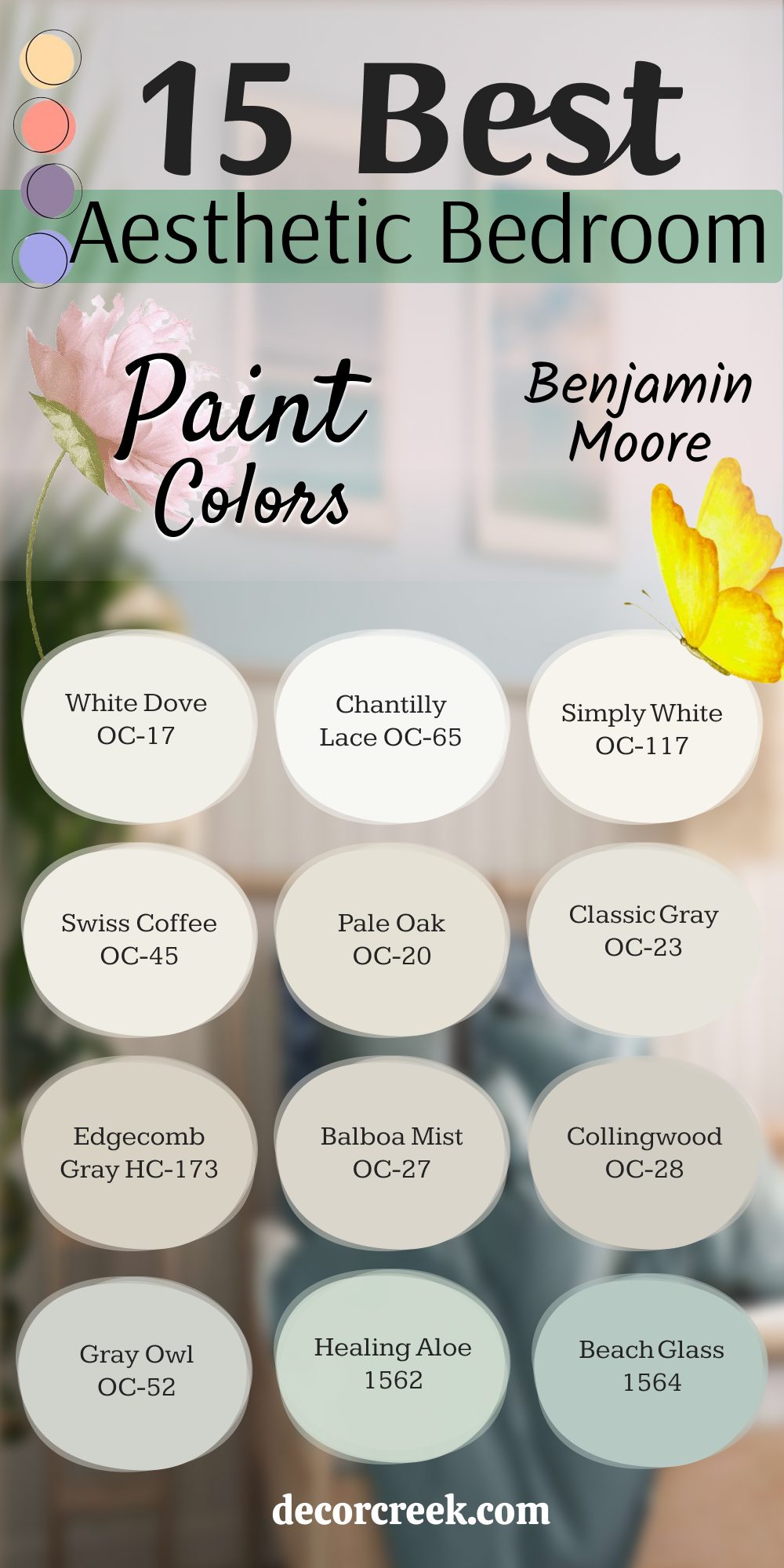
15 Best Aesthetic Bedroom Paint Colors by Benjamin Moore for a Stylish and Inviting Room
White Dove OC-17
White Dove is a warm white that feels soft and inviting without leaning too yellow. It’s one of my favorite choices for bedrooms because it works with almost any style—from classic to modern. In bright light, it feels airy and clean, while in dim lighting, it takes on a cozy, creamy look. I love pairing it with warm wood tones, neutral bedding, and soft textures. It also works beautifully as a backdrop for colorful artwork or patterned pillows.
This shade works best when you want a gentle, welcoming look.

Chantilly Lace OC-65
Chantilly Lace is the clean, crisp white I reach for when I want a room to feel fresh and bright. It reflects light beautifully, making even small bedrooms feel open and cheerful. I love using it with navy accents, natural wood furniture, or soft beige rugs for balance. Its pure tone keeps a space feeling simple but still stylish. It’s perfect for those who want their bedroom to have a fresh, uncluttered feel.
This shade works best when you want a fresh, pure backdrop.

Simply White OC-117
Simply White has a cheerful, sunny quality that makes a bedroom feel full of life. It’s bright without being harsh, which is why I often recommend it to clients who want warmth along with brightness. It pairs wonderfully with soft blues, blush pinks, and earthy neutrals. In natural daylight, it feels light and airy, and under lamplight, it gains a cozy glow. I love how it adapts to different times of day without losing its charm.
This shade works best when you want warmth with brightness.

Swiss Coffee OC-45
Swiss Coffee is a creamy white that adds a sense of comfort and softness to a bedroom. It works well in rooms where you want a warm, relaxed atmosphere. I often style it with linen bedding, textured throws, and woven baskets to enhance that cozy feeling. It’s a great choice for spaces with low natural light, as it reflects warmth without looking too yellow. It also blends easily with both traditional and modern designs.
This shade works best when you want a warm, welcoming atmosphere.

Pale Oak OC-20
Pale Oak is a soft greige that feels airy yet grounded. It has just enough warmth to keep a room from feeling flat while staying neutral enough to match almost any décor. I love using it in bedrooms with crisp white trim and soft blue or green accents. It works especially well in spaces that get plenty of morning sunlight. Its understated elegance makes it a go-to for a calm and polished look.
This shade works best when you want a soft, neutral base.

Classic Gray OC-23
Classic Gray is a pale, warm gray that brings a sense of gentle balance to a bedroom. It’s light enough to keep the room feeling bright but still has depth compared to a plain white. I like pairing it with creamy whites, soft pinks, or natural wood furniture. It works beautifully in both modern and farmhouse-style rooms. This is a great option for anyone who wants a neutral that still feels warm and inviting.
This shade works best when you want a gentle, understated look.

Edgecomb Gray HC-173
Edgecomb Gray is an earthy greige that has an easygoing feel. It’s not too dark or too light, which makes it a reliable choice for almost any bedroom. I often use it with clean white trim for a crisp contrast. It pairs well with warm wood floors and textured fabrics. In the morning light, it feels fresh, while in the evening it becomes soft and cozy.
This shade works best when you want a balanced, cozy feel.

Balboa Mist OC-27
Balboa Mist is a warm gray that looks beautiful in natural light. It’s light enough to keep a bedroom feeling open, yet warm enough to feel inviting. I like to pair it with soft blues, cream bedding, and brushed gold accents for an elegant touch. It’s also versatile enough to work with different furniture styles, from modern to vintage. In darker rooms, it still feels soft rather than dull.
This shade works best when you want a light but warm backdrop.

Collingwood OC-28
Collingwood is a warm gray that feels both clean and inviting. It works well in bedrooms with plenty of natural light but also holds its own in lower-light spaces. I love pairing it with crisp white trim for a fresh, tailored look. Its warmth makes it easy to match with wooden furniture or earthy décor. It’s a great choice for anyone wanting a modern yet cozy bedroom.
This shade works best when you want a balanced, modern look.

Gray Owl OC-52
Gray Owl is a fresh, airy gray with a hint of green that keeps it from feeling cold. It’s one of my favorites for creating a bright yet soft look in a bedroom. It pairs nicely with light wood, woven rugs, and white bedding. The green undertone adds a gentle depth without overpowering the space. It’s perfect for bedrooms that get a lot of daylight.
This shade works best when you want a light, refreshing mood.

Healing Aloe 1562
Healing Aloe is a soft green with just a whisper of blue. It brings a natural, soothing touch to a bedroom without being too bold. I love it with white or beige bedding, woven textures, and plants for a fresh, lived-in look. It’s especially beautiful in rooms with plenty of sunlight, where the color’s softness really shines. This is a color that feels both uplifting and relaxing at the same time.
This shade works best when you want a light, nature-inspired look.

Beach Glass 1564
Beach Glass is a muted blue-green that feels airy and fresh. It’s ideal for creating a relaxed, coastal-inspired bedroom. I often pair it with crisp whites, rattan furniture, and soft sandy neutrals. Its muted tone keeps it from feeling too bright, so it works well even in smaller rooms. It’s the kind of shade that makes you feel like you’re by the water.
This shade works best when you want a fresh, airy feeling.

Wythe Blue HC-143
Wythe Blue is a rich blue-green with a timeless appeal. It feels vibrant yet calming, which makes it great for bedrooms where you want more color but still want to feel relaxed. I like pairing it with bright white trim, dark wood accents, and natural textures. It works beautifully in both modern and traditional designs. The richness of this color makes it a true statement for a bedroom.
This shade works best when you want to add depth with color.

Smoke 2122-40
Smoke is a soft, hazy blue with gray undertones that create a restful look. It’s a wonderful choice for bedrooms where you want to keep things light but still add a touch of color. I like pairing it with white bedding and silver or brushed nickel accents. It feels modern yet comfortable, making it perfect for a relaxing retreat.
This shade works best when you want a cool, modern feel.
Quiet Moments 1563
Quiet Moments is a muted green-blue that feels both fresh and comforting. It changes with the light, sometimes leaning more blue and other times more green. I love it with light wood furniture, cozy throws, and soft beige rugs. It’s especially beautiful in bedrooms that get soft morning sunlight. This is a shade that adds personality without feeling bold.
This shade works best when you want a gentle, restful mood.

Wrapping Up My Bedroom Color Picks
Choosing a bedroom color is more than picking something pretty from a paint chart—it’s about creating a place where you feel completely at ease. The shades I’ve shared from Sherwin-Williams and Benjamin Moore have proven, time and again, to bring warmth, style, and character to a bedroom. Some colors make mornings feel brighter, while others help evenings wind down in comfort.
When I select a color for a bedroom, I think about the light, the furniture, and the mood the homeowner wants to wake up to every day.
Sometimes the right choice is a soft white that blends with everything; other times, it’s a gentle blue-green or warm greige that wraps the room in personality.
If you’re unsure where to start, pick two or three shades from this list and test them in your own room. Watch them change with the light throughout the day—that’s when their true charm shows.
The right bedroom color will not just make your walls look good—it will make you feel good every single time you step inside. And that’s when you know you’ve found the one.