When I start designing a bedroom, I always think about how a color will make someone feel the moment they wake up or wind down at night. Paint has this quiet power — it can soften a room, make light glow differently, and bring comfort before any furniture even arrives. In 2026, bedroom colors are all about warmth, connection, and peace of mind. The tones trending this year aren’t loud or showy; they’re personal, restful, and rich with character.
I’ve noticed that clients want bedrooms that feel more like sanctuaries — soft white walls that feel like morning air, muted greens that calm the eyes, and cozy beiges that hold warmth in every corner.
Whether you love airy neutrals or moody blues, the key is finding a shade that feels natural to you.
That’s what turns a paint color into part of your story, not just part of your walls.
Why I Always Trust Sherwin-Williams and Benjamin Moore for Bedroom Colors
Over the years, I’ve worked with countless paint brands, but Sherwin-Williams and Benjamin Moore always come out on top. Their colors are balanced — never too bright, never too flat — and they age beautifully. Both brands offer paints that glide on smoothly, cover evenly, and reflect light in a way that feels soft but alive.
Sherwin-Williams gives me rich, grounded tones that make a room feel complete, while Benjamin Moore’s neutrals and pastels bring a light, graceful touch.
I also love how both brands create shades that shift beautifully throughout the day — never static, always dynamic.
From pale grays that glow in morning light to warm whites that turn buttery by night, their palettes help me shape homes that feel timeless, cozy, and truly lived in.
How I Pick Bedroom Paint Shades That Feel Personal and Peaceful
Choosing bedroom colors is never just about what’s trending — it’s about feeling. I start by watching how light moves through the room. Morning light needs soft, neutral warmth; afternoon sun loves muted tones that don’t glare; and evening light calls for depth and comfort. Then I think about textures — wood, fabrics, and metals all affect how a color breathes in a room.
I also ask what the room means to the person — is it a cozy retreat, a bright start to the day, or a space to rest and dream?
That answer always leads to the right tone. Bedrooms deserve colors that help the mind slow down. I find myself reaching for soft whites, sandy beiges, and smoky blues — tones that whisper rather than shout.
The right shade makes a room feel balanced, effortless, and deeply personal.
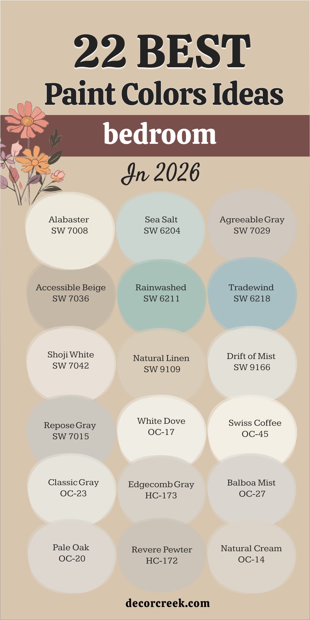
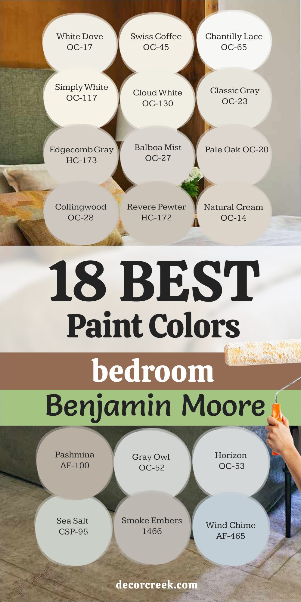
18 Best Bedroom Paint Colors by Benjamin Moore
White Dove OC-17
White Dove OC-17 is a warm, soft white that always feels comforting. It has just enough warmth to keep it from looking harsh and enough brightness to open up a room. I love using it in bedrooms because it reflects light in a gentle way, creating a feeling of ease. It pairs beautifully with natural wood furniture, linen bedding, and brass accents.
What makes White Dove special is how it adapts. In bright daylight, it feels airy and fresh; in the evening, it turns warm and inviting.
It’s perfect for both modern and traditional homes, offering a sense of quiet beauty that lasts. Every time I use it, the room instantly feels calmer and more welcoming — like a deep, relaxing breath.
🎨 Check out the complete guide to this color right HERE 👈

Swiss Coffee OC-45
Swiss Coffee OC-45 is one of my go-to whites when I want a cozy, creamy glow. It has a hint of beige that gives it softness and warmth, making it perfect for bedrooms with limited natural light. I’ve used it in small city apartments and large master suites — it always feels natural.
This color pairs beautifully with warm grays, golden tones, and textured fabrics.
During the day, it looks bright and open; by night, it becomes softly golden and comforting. Swiss Coffee has that rare ability to make a space feel finished without demanding attention. It’s quiet, balanced, and endlessly easy to live with.
🎨 Check out the complete guide to this color right HERE 👈

Chantilly Lace OC-65
Chantilly Lace OC-65 is a crisp, true white that still feels gentle. It’s pure without being cold, which makes it a wonderful choice for bedrooms that need clarity and brightness. I love using it in rooms with lots of natural light because it reflects beautifully, keeping everything light and airy.
It pairs perfectly with soft blues, pale greens, or warm neutrals. This shade gives a room structure while still feeling graceful.
Chantilly Lace makes details stand out — trim, bedding, art — yet never steals the show. It’s a white that feels both clean and comfortable, like fresh sheets on a sunny morning.
🎨 Check out the complete guide to this color right HERE 👈

Simply White OC-117
Simply White OC-117 is one of those colors that feels good everywhere. It’s bright enough to lift a room but carries just enough warmth to keep things cozy. I love it in bedrooms with wood accents or soft beige textiles. It brings balance — light without glare, warmth without heaviness.
It works wonderfully with both modern and vintage décor. In daylight, it glows softly; at night, it becomes rich and calm.
Simply White gives rooms that sense of easy harmony that makes you want to linger. It’s one of those shades that just feels right, no matter the light or style.
🎨 Check out the complete guide to this color right HERE 👈

Cloud White OC-130
Cloud White OC-130 is warm, creamy, and endlessly comforting. It’s not stark or sterile — it’s a color that feels lived in. I love how it wraps a bedroom in a soft glow, creating a feeling of warmth even in cooler light. It’s ideal for traditional or cozy spaces that need light but not sharpness.
Paired with off-white trim or pale taupe, it looks seamless.
Cloud White adds subtle character while keeping the overall look soft and graceful. It’s the kind of white that makes every morning feel gentle and every night relaxing.
🎨 Check out the complete guide to this color right HERE 👈

Classic Gray OC-23
Classic Gray OC-23 is a light, elegant gray that adds quiet sophistication to any bedroom. It’s soft, refined, and incredibly adaptable. I love using it in homes that need warmth without beige or coolness without blue. In daylight, it feels bright and airy; in low light, it turns velvety and intimate.
It pairs beautifully with crisp whites, wood accents, or pale pinks and blues.
Classic Gray is one of those neutrals that gives texture to a space without dominating it. It’s perfect for creating peaceful, balanced bedrooms that never go out of style.
🎨 Check out the complete guide to this color right HERE 👈

Edgecomb Gray HC-173
Edgecomb Gray HC-173 is my definition of balance — a perfect greige that blends warmth and softness. It feels cozy but never heavy, polished but never formal. I often use it in bedrooms where comfort is the goal. It works beautifully with warm whites, creamy linens, and muted green accents.
This color changes beautifully through the day — beige in morning light, gray in the evening.
It’s a quiet chameleon that makes every space feel thoughtfully designed. Edgecomb Gray always brings harmony and warmth, the kind that feels like home.
🎨 Check out the complete guide to this color right HERE 👈

Balboa Mist OC-27
Balboa Mist OC-27 is a versatile soft greige that brings elegance and calm to bedrooms. It’s light enough to feel airy but rich enough to add depth.
I love pairing it with white bedding and brass accents for a fresh, cozy feel.
The beauty of Balboa Mist is how it adapts — in bright rooms, it looks smooth and modern; in darker rooms, it turns warmer and cozier. It’s the perfect color for bedrooms that need balance, blending warmth and sophistication effortlessly.
🎨 Check out the complete guide to this color right HERE 👈

Pale Oak OC-20
Pale Oak OC-20 is one of those shades that instantly feels comfortable. It’s a soft beige-gray that makes a room feel grounded yet open. I use it when I want light walls that still have character.
It pairs wonderfully with creamy whites, soft browns, or muted blues.
This color adds warmth without clutter, making it ideal for minimalist or classic bedrooms alike. It’s the kind of shade that works year-round — cool in summer, warm in winter. Pale Oak makes every bedroom feel balanced, inviting, and easy to love.
🎨 Check out the complete guide to this color right HERE 👈

Collingwood OC-28
Collingwood OC-28 is a beautifully balanced gray-beige that feels calm, polished, and easy to live with. It’s one of my favorite choices when a bedroom needs definition without darkness. In bright daylight, it reads as soft gray; in the evening, its warm beige undertone creates a cozy glow. I often pair it with crisp white trim and natural fabrics like linen or cotton for an effortlessly refined look.
What I love about Collingwood is how adaptable it is — it complements both modern and traditional styles.
It works beautifully with muted blues, greens, and soft wood tones. Whether used in a small guest room or a large primary suite, Collingwood brings subtle sophistication. It’s not flashy; it’s quietly beautiful, creating a sense of comfort that feels just right.
🎨 Check out the complete guide to this color right HERE 👈

Revere Pewter HC-172
Revere Pewter HC-172 is a warm gray that feels timeless and comforting. It’s one of Benjamin Moore’s most-loved shades for a reason — it brings softness without losing depth. I love using it in bedrooms where I want a soothing, grounded feeling. It’s warm enough to complement beige tones yet neutral enough to work with cool accents.
During the day, Revere Pewter looks airy and balanced; at night, it becomes warm and inviting. It pairs beautifully with white trim, warm woods, and textured fabrics.
This color never feels flat — it has quiet character that gives a bedroom subtle depth. It’s a shade that adapts to every mood and always feels natural.
🎨 Check out the complete guide to this color right HERE 👈

Natural Cream OC-14
Natural Cream OC-14 is a gentle, creamy neutral that brings instant warmth to a bedroom. It’s soft, welcoming, and feels like natural light captured in paint. I love using it in rooms that need comfort without heaviness. It pairs beautifully with white bedding, woven rugs, and brass or wood details.
In sunlight, it feels clean and glowing; in the evening, it becomes smooth and cozy.
Natural Cream has that perfect balance — not too beige, not too gray — just a calm, creamy tone that feels personal. It’s a color that wraps a room in quiet warmth, creating a bedroom you’ll always look forward to resting in.🎨 Check out the complete guide to this color right HERE 👈

Pashmina AF-100
Pashmina AF-100 is a rich greige that feels elegant and earthy. It’s slightly deeper than most bedroom neutrals, which makes it perfect for creating a cozy, grounded atmosphere. I love using it on accent walls or in larger bedrooms that can handle depth. Pashmina pairs beautifully with warm whites, tan fabrics, and soft black details.
The tone of Pashmina shifts throughout the day — lighter in morning light, deeper and moodier at night.
It feels like a warm blanket on the walls, giving any bedroom a sense of security and calm. It’s graceful, rich, and endlessly livable.
🎨 Check out the complete guide to this color right HERE 👈

Smoke Embers 1466
Smoke Embers 1466 is a warm, mid-tone gray with a gentle brown undertone. It’s elegant and soothing, the kind of shade that instantly makes a bedroom feel complete. I often use it for accent walls or full-room coverage in larger bedrooms. It pairs perfectly with cream, tan, and warm metallic accents.
In daylight, Smoke Embers looks soft and refined; at night, it deepens into a smooth, cozy tone. It’s one of those colors that makes the room feel tailored but still comfortable.
Smoke Embers adds warmth and sophistication, helping every bedroom feel grounded and peaceful.
Gray Owl OC-52
Gray Owl OC-52 is one of my favorite soft grays for bedrooms because it always feels fresh but never cold. It has a hint of green that adds life and balance. I love using it when a bedroom needs brightness without starkness. Gray Owl works beautifully with white trim, silver accents, and light wood furniture.
In natural light, it looks airy and open; in low light, it turns into a soft, misty gray.
It’s especially lovely in coastal or modern homes where you want a gentle, soothing feel. Gray Owl brings lightness and subtle elegance, making the bedroom feel clean, restful, and quietly beautiful.
🎨 Check out the complete guide to this color right HERE 👈

Horizon OC-53
Horizon OC-53 is a delicate gray with a hint of blue that feels airy and graceful. It reminds me of a clear sky just before sunset — soft, calm, and endlessly relaxing. I love using it in bedrooms where I want to create a cool, balanced atmosphere. Horizon pairs beautifully with white bedding, brushed silver accents, and soft fabrics.
It reflects light beautifully, making even small bedrooms feel more open.
During the day, it feels clean and bright; at night, it turns cozy and tranquil. Horizon is one of those shades that quietly lifts a room’s mood without being noticeable — a perfect example of understated beauty.
🎨 Check out the complete guide to this color right HERE 👈

Wind Chime AF-465
Wind Chime AF-465 is a pale blue-gray that feels light, airy, and soothing. It reminds me of a quiet morning — simple, balanced, and full of calm energy. I love using it in bedrooms that need a touch of color without being overwhelming. It pairs beautifully with white trim, rattan textures, and soft gold accents.
Wind Chime reflects light beautifully, making rooms feel open and restful. It’s especially beautiful with natural fabrics like linen and cotton.
This color gives a bedroom that quiet sense of balance — fresh but never cold, simple but never plain. It’s one of those tones that helps you wake up gently and drift off peacefully at night.
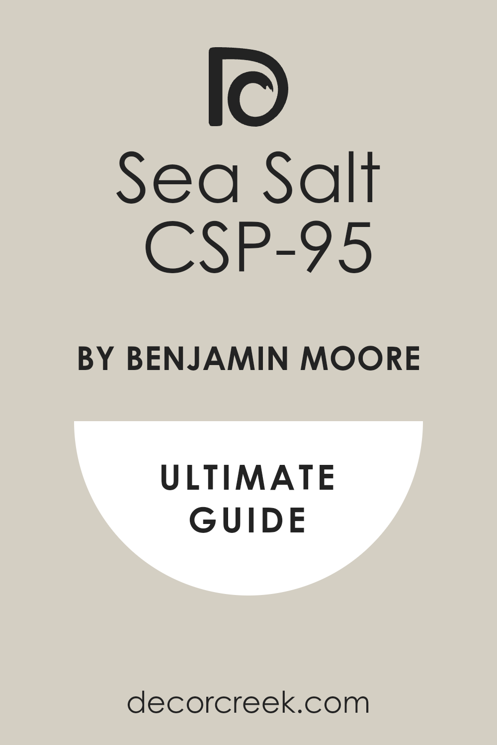
Sea Salt CSP-95
Sea Salt CSP-95 is a muted green-gray that feels natural and grounding. It brings the quiet calm of nature indoors, making it perfect for bedrooms that need peace and balance. I love pairing it with warm wood tones, white bedding, and soft linen curtains. Sea Salt looks fresh in sunlight and turns cozy in evening light.
What makes this shade special is how it bridges warm and cool tones effortlessly.
It fits beautifully into modern, rustic, or classic spaces. Sea Salt gives the bedroom a soft, lived-in feeling that’s both refreshing and restful. It’s one of those colors that helps you breathe a little easier.
🎨 Check out the complete guide to this color right HERE 👈
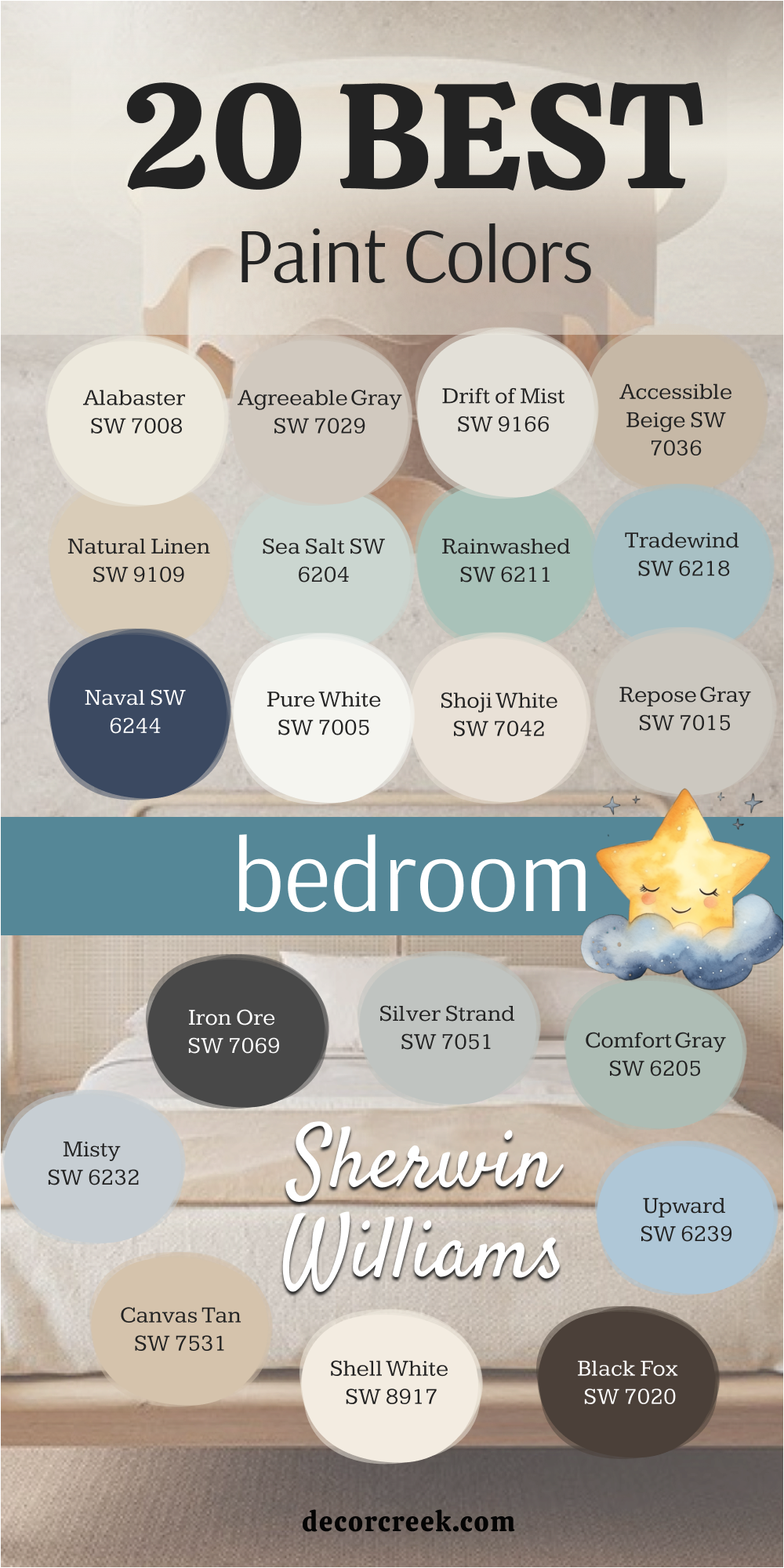
20 Best Bedroom Paint Colors By Sherwin Williams
Alabaster SW 7008
Alabaster SW 7008 is one of my most loved whites because it feels bright and comforting at the same time. It’s not stark — it has a quiet warmth that makes a bedroom glow softly, even on cloudy mornings. I love using it when I want a clean backdrop that still feels cozy. Alabaster pairs beautifully with tan linens, rattan furniture, and brass accents. It’s stunning with natural light and feels calm under soft lamplight.
This shade never feels cold; it wraps a room in light, like sunshine through a curtain.
I often use it for both walls and trim to create a seamless look that feels airy and welcoming. Whether paired with soft gray bedding or warm wood floors, Alabaster always feels balanced. It’s a timeless choice for bedrooms where rest and simplicity matter most.
🎨 Check out the complete guide to this color right HERE 👈

Agreeable Gray SW 7029
Agreeable Gray SW 7029 is one of those perfect in-between colors — a gentle greige that fits every mood. It’s soft enough to feel warm yet light enough to keep the room open. I love how it brings a soothing rhythm to bedrooms, especially when paired with crisp white trim or beige accents. In bright light, it feels smooth and modern; in dim light, it turns cozy and quiet.
This color works beautifully with every design style, from classic to contemporary.
It complements wood tones, brushed metals, and soft pastels equally well. Agreeable Gray feels lived-in and comfortable, the kind of color that helps you unwind at the end of the day. It’s one of my top choices when a room needs warmth and balance without being too beige or too gray.
🎨 Check out the complete guide to this color right HERE 👈

Drift of Mist SW 9166
Drift of Mist SW 9166 is a delicate off-white with a hint of gray that gives bedrooms a clean, graceful glow. It’s a true neutral — soft, easy, and endlessly adaptable. I love using it when I want a calm backdrop for layered textures and natural light. It pairs beautifully with soft woods, black accents, or warm beige décor.
In morning light, Drift of Mist looks airy and fresh; by evening, it settles into a smooth, cozy tone.
It’s perfect for bedrooms that feel too small or dark because it reflects just the right amount of light. This color has a quiet charm — it never shouts, it whispers. It’s that subtle shade that makes everything in the room feel connected and at ease.
🎨 Check out the complete guide to this color right HERE 👈

Accessible Beige SW 7036
Accessible Beige SW 7036 is the shade I turn to when I want to add warmth without heaviness. It’s a soft beige with a gentle gray undertone that makes it modern and versatile. I love using it in bedrooms with wood furniture and white linens; it brings everything together beautifully. It’s warm enough to feel inviting yet balanced enough to stay neutral.
Accessible Beige works perfectly in both natural and artificial light. In bright rooms, it feels open and bright; in low light, it deepens into a comforting tone.
It’s also a perfect base color for layering accent hues like navy, olive, or cream. This shade makes a bedroom feel cozy without feeling dark — simple, grounded, and full of quiet comfort.
🎨 Check out the complete guide to this color right HERE 👈

Natural Linen SW 9109
Natural Linen SW 9109 is a lovely beige with the softness of woven fabric. It feels like sunshine filtered through sheer curtains — warm, gentle, and familiar. I love it for bedrooms where texture plays a big role: linen sheets, wicker chairs, soft rugs. Natural Linen pairs beautifully with creamy whites, brushed gold, and pale wood tones.
It’s a color that carries warmth through every season, keeping the bedroom feeling light in summer and cozy in winter.
In morning light, it’s bright and cheerful; by night, it turns buttery and soothing. Natural Linen gives a homey elegance that feels natural and personal. It’s one of those shades that never looks overdone — just effortlessly inviting.
🎨 Check out the complete guide to this color right HERE 👈

Sea Salt SW 6204
Sea Salt SW 6204 is soft and refreshing, like a breeze from the ocean. It’s a muted blue-green that instantly makes a bedroom feel balanced and calm. I love how it changes with the light — more blue in daylight, more green and cozy at night. Sea Salt pairs beautifully with white bedding, rattan textures, and soft gray accents.
This color works wonders in bedrooms where you want to create a sense of relaxation.
It’s gentle but never dull, airy but still grounded. I often pair it with warm wood floors to bring nature’s softness indoors. Sea Salt always feels easy — a color that settles the mind and helps you rest.
🎨 Check out the complete guide to this color right HERE 👈

Rainwashed SW 6211
Rainwashed SW 6211 is a delicate blue-green that reminds me of morning mist. It’s one of those rare colors that feels both fresh and comforting. I love using it in bedrooms where I want lightness without starkness. Rainwashed pairs beautifully with white trim, sandy beige décor, and woven accents.
In sunlight, it’s crisp and cool; in the evening, it softens into a calm, gentle hue.
It brings freshness without chill — perfect for rooms that need a peaceful touch. Rainwashed helps a home feel grounded and open at the same time. It’s a color that never tires the eyes and always feels relaxing.
🎨 Check out the complete guide to this color right HERE 👈

Tradewind SW 6218
Tradewind SW 6218 is a graceful blend of blue and gray with a hint of green. It’s smooth, balanced, and easy to live with. I love it in bedrooms where I want to add color without overwhelming the space. Tradewind looks beautiful with white trim, pale oak floors, and neutral bedding.
This color feels natural, like the air after light rain. It keeps rooms feeling cool and airy during the day, and warm and inviting under soft lamps.
Tradewind creates a sense of connection and continuity in the home. It’s gentle, timeless, and always in style — a perfect choice for bedrooms with calm energy.
🎨 Check out the complete guide to this color right HERE 👈

Naval SW 6244
Naval SW 6244 is a deep, dramatic navy that brings confidence and depth to a bedroom. It’s rich but not overpowering — just the right amount of bold. I love using it for accent walls or entire rooms with plenty of natural light. Naval pairs beautifully with crisp white, warm brass, and tan leather.
Despite its darkness, it feels surprisingly cozy. In sunlight, its blue tones shimmer softly; in evening light, it becomes rich and velvety.
Naval gives bedrooms a sense of structure and sophistication. It’s one of those shades that makes a room feel elegant yet comfortable, classic yet modern.
🎨 Check out the complete guide to this color right HERE 👈

Pure White SW 7005
Pure White SW 7005 is a clean, balanced white that fits any bedroom style. It’s fresh without being cold, making it perfect for walls, trim, or even ceilings. I love using it to open up small rooms or brighten darker spaces. Pure White works beautifully with both warm and cool tones, blending effortlessly with wood, metal, or stone.
It has just a hint of warmth, so it feels natural and soft rather than stark.
This shade enhances every texture around it, from linen bedding to jute rugs. In daylight, it’s bright and airy; in evening light, it glows gently. Pure White is the kind of color that makes everything else in the room shine quietly.
🎨 Check out the complete guide to this color right HERE 👈

Shoji White SW 7042
Shoji White SW 7042 is a soft, creamy white with a hint of beige that gives bedrooms a welcoming warmth. It’s one of those colors that feels lived-in from the first day you paint it. I love using it in rooms that need a little warmth without losing brightness. Shoji White pairs beautifully with warm wood furniture, woven textures, and soft gray bedding.
It glows beautifully in morning light and feels cozy by evening. This shade is elegant enough for modern homes yet comfortable enough for farmhouse or cottage interiors.
I often recommend it for bedrooms that need a neutral with personality — not flat white, but not too yellow either. Shoji White gives every bedroom a sense of quiet sophistication, wrapping the walls in comfort and softness.
🎨 Check out the complete guide to this color right HERE 👈

Repose Gray SW 7015
Repose Gray SW 7015 is one of the most balanced grays I’ve ever worked with. It has just the right mix of warmth and coolness to fit into any style. I love it for bedrooms because it feels calm and steady, like a color you can live with for years. It pairs beautifully with crisp whites, pale pinks, and soft wood tones.
In natural light, it leans slightly warm; in artificial light, it stays gentle and neutral.
Repose Gray works beautifully with both classic and contemporary décor. It’s perfect for creating that peaceful, polished look that feels effortless. I use it often for clients who want a space that feels refined but still comfortable.
🎨 Check out the complete guide to this color right HERE 👈

Iron Ore SW 7069
Iron Ore SW 7069 is a rich, charcoal-black that brings drama and coziness together. It’s bold, but in the right setting, it feels inviting rather than harsh. I love using it on accent walls or behind upholstered headboards — it makes everything in the room stand out. Iron Ore pairs beautifully with warm woods, linen bedding, and brass lighting.
Despite its depth, it’s never flat. In sunlight, it reveals soft brown undertones; in low light, it turns deep and elegant.
Iron Ore gives bedrooms a grounded, luxurious feeling that instantly adds character. It’s a perfect choice for modern bedrooms that need warmth with a touch of boldness.
🎨 Check out the complete guide to this color right HERE 👈

Rainwashed SW 6211
Rainwashed SW 6211 is one of those colors that makes a bedroom feel like a breath of fresh air. It’s a delicate blue-green that looks soft and clean in every kind of light. I love using it in spaces where relaxation is the goal. It pairs perfectly with white trim, woven furniture, and pale beige accents.
The color shifts gently throughout the day — brighter in sunlight, deeper and softer at night.
Rainwashed gives bedrooms a light, airy personality that never feels too cool. It’s a beautiful choice for anyone who wants color without losing serenity. I’ve used it in coastal homes, modern spaces, and classic rooms — it always fits beautifully.
🎨 Check out the complete guide to this color right HERE 👈
Silver Strand SW 7051
Silver Strand SW 7051 is a refined gray-green that feels natural and balanced. It’s one of my favorites for bedrooms because it creates a sense of calm without feeling dull. In daylight, it leans soft gray; in the evening, its green undertone comes through with warmth. It pairs perfectly with white linens, oak flooring, and muted blues.
Silver Strand has just the right depth to make a room feel cozy but open.
It blends wonderfully with both warm and cool palettes, connecting textures and tones across the home. I love using it for clients who want subtle sophistication — a room that feels elegant but easy to live in. Silver Strand always brings quiet charm to the bedroom.
Drift of Mist SW 9166
Drift of Mist SW 9166 is a beautiful warm gray with just enough beige to make it soft. It’s perfect for bedrooms that need brightness without feeling stark. I love how it reflects natural light in a gentle, flattering way. It pairs beautifully with off-white bedding, wooden furniture, and muted green accents.
This color feels calm and collected, helping the whole room breathe.
In daylight, it feels open and airy; under lamplight, it turns cozy and warm. Drift of Mist works especially well in open-concept homes, creating harmony from room to room. It’s elegant, flexible, and endlessly livable.
🎨 Check out the complete guide to this color right HERE 👈
Comfort Gray SW 6205
Comfort Gray SW 6205 is exactly what its name suggests — comfortable and inviting. It’s a soft gray-green that instantly makes a bedroom feel peaceful. I love how it connects to nature, reflecting the tones of sea glass or eucalyptus leaves. It pairs beautifully with white bedding, woven rugs, and natural wood.
The beauty of Comfort Gray is how it shifts in the light — cooler in the morning, warmer at night.
It’s sophisticated yet relaxed, making it perfect for both modern and traditional interiors. This shade always creates that feeling of quiet relaxation that every bedroom needs. It’s one of my most-loved colors for clients who want their room to feel calm and deeply personal.
🎨 Check out the complete guide to this color right HERE 👈

Black Fox SW 7020
Black Fox SW 7020 is a rich, deep brown with hints of gray and black that bring warmth and depth to a bedroom. It’s bold but grounded, perfect for creating contrast against lighter furniture and fabrics. I love using it on accent walls behind the bed or in rooms with large windows that balance its richness.
It pairs beautifully with cream, tan, or even muted pink tones.
In sunlight, you can see its warm brown base; in the evening, it becomes dark and moody. Black Fox gives bedrooms a sophisticated, intimate feel. It’s perfect for homeowners who want something dramatic yet comforting.
🎨 Check out the complete guide to this color right HERE 👈

Shell White SW 8917
Shell White SW 8917 is a soft ivory-white with a whisper of warmth. It’s a beautiful choice for bedrooms that need a neutral base without looking plain. I love how it makes everything in the room feel fresh and bright. It pairs beautifully with light wood, beige accents, and gold fixtures.
Shell White captures light gently, giving walls a subtle glow.
It feels warm in every season and brings softness to sharp architectural lines. Whether you pair it with earthy textures or delicate fabrics, it always adds quiet grace. Shell White makes a bedroom feel bright, clean, and comfortably elegant.
🎨 Check out the complete guide to this color right HERE 👈

Canvas Tan SW 7531
Canvas Tan SW 7531 is one of those classic beiges that never goes out of style. It’s warm, balanced, and perfect for creating a cozy, timeless bedroom. I love how it adds color without ever feeling heavy. Canvas Tan pairs beautifully with crisp white trim, black accents, and warm wood furniture.
This shade has a comforting presence — like the color of sunlit sand.
In bright light, it feels soft and open; in dim light, it becomes richer and cozier. Canvas Tan works beautifully with layered fabrics and neutral tones. It’s a perfect choice for those who want a warm, inviting space that always feels like home.
🎨 Check out the complete guide to this color right HERE 👈

My Final Thoughts on Choosing Bedroom Paint Colors in 2026
When I think about bedroom design, I always return to one truth — color should feel like comfort. The best shades aren’t the ones that shout for attention but the ones that make you exhale when you walk in. In 2026, bedroom palettes are about emotion — colors that support rest, reflection, and warmth. From gentle whites to smoky greens and deep blues, every shade in this list carries a sense of peace and belonging.
I always tell clients to test colors in different lights. The way morning light hits a soft gray or how evening shadows deepen a beige can completely change the mood.
Both Sherwin-Williams and Benjamin Moore understand how real homes live in light, which is why their palettes always feel natural and grounded.
Whether your perfect bedroom leans bright or moody, the goal is the same — balance.
Paint should pull every texture, finish, and piece of furniture together into a feeling, not just a look.
Choose a shade that makes you feel rested and understood. Because at the end of the day, your bedroom isn’t just where you sleep — it’s where your story quietly begins and ends.