Brown feels different this year. It’s calm but grounded, soft but strong. I’ve used it in bedrooms that needed peace and in living rooms that needed warmth. Sherwin-Williams has so many browns that work — not just one shade that fits all, but a whole range of soft taupes, deep coffee tones and quiet gray-browns.
I’m seeing more people ask for homes that feel real, not just styled. And brown is one of the easiest ways to make that happen.
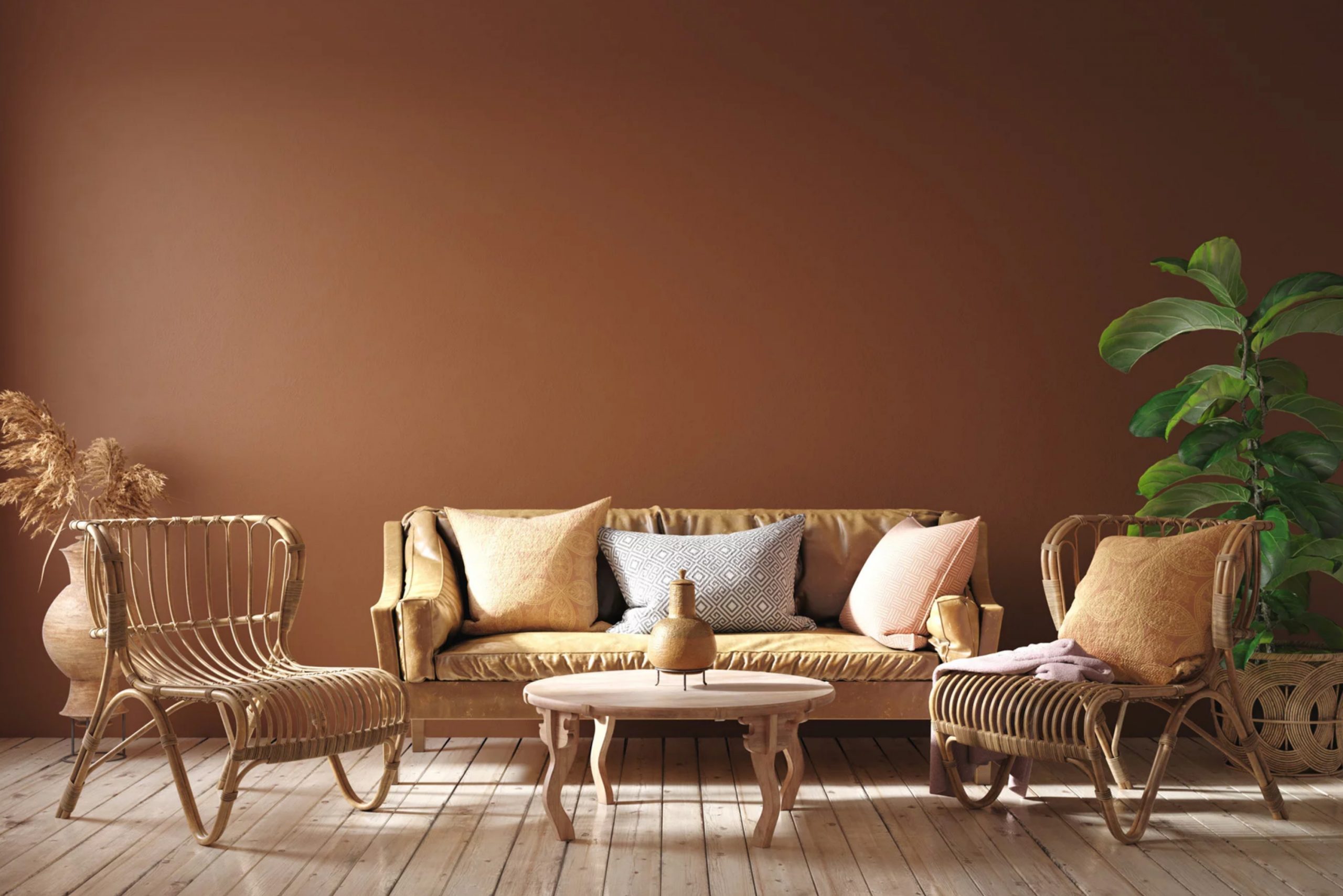
Why Brown Paint Feels So Good Right Now
Something about brown just makes a room feel safe. It reminds us of things we love — like worn leather, fresh soil, or a cozy blanket. Lately, I’ve seen people move away from cold grays and bright whites. They want warmth without going too yellow or red. That’s where brown really shines.
It wraps around the room and makes everything feel more relaxed, even before the furniture goes in.
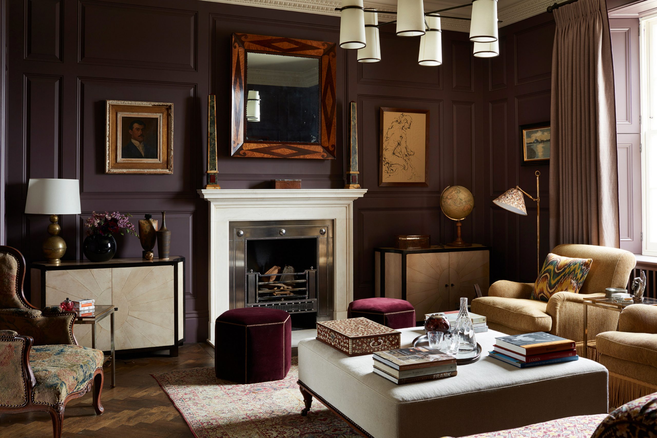
How I Use Brown to Make Homes Feel Warm and Real
I use brown when I want a room to feel lived-in but still fresh. In bedrooms, I’ll pick a soft taupe or a gray-brown that works with natural light. For living rooms, I lean into medium browns with a bit of warmth — not too dark, not too pale.
Kitchens love deeper browns near the island or pantry walls. And on exteriors, brown holds its own through weather and seasons.
It’s a color that listens, not one that shouts — and that’s what makes it special.
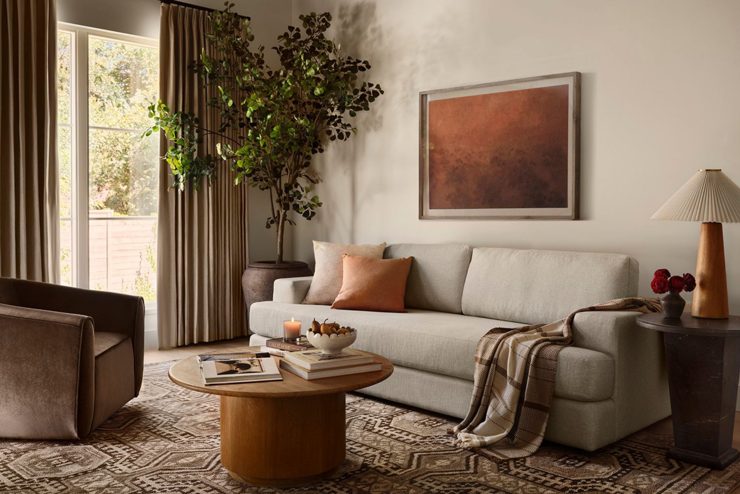
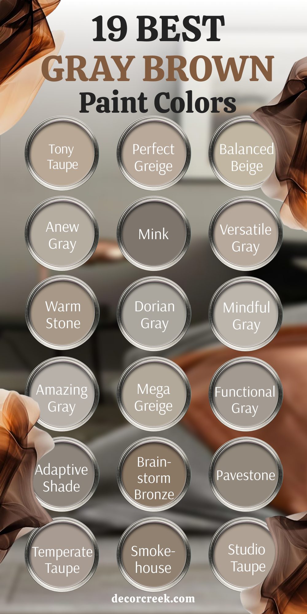
19 Best Gray-Brown Paint Colors from Sherwin-Williams
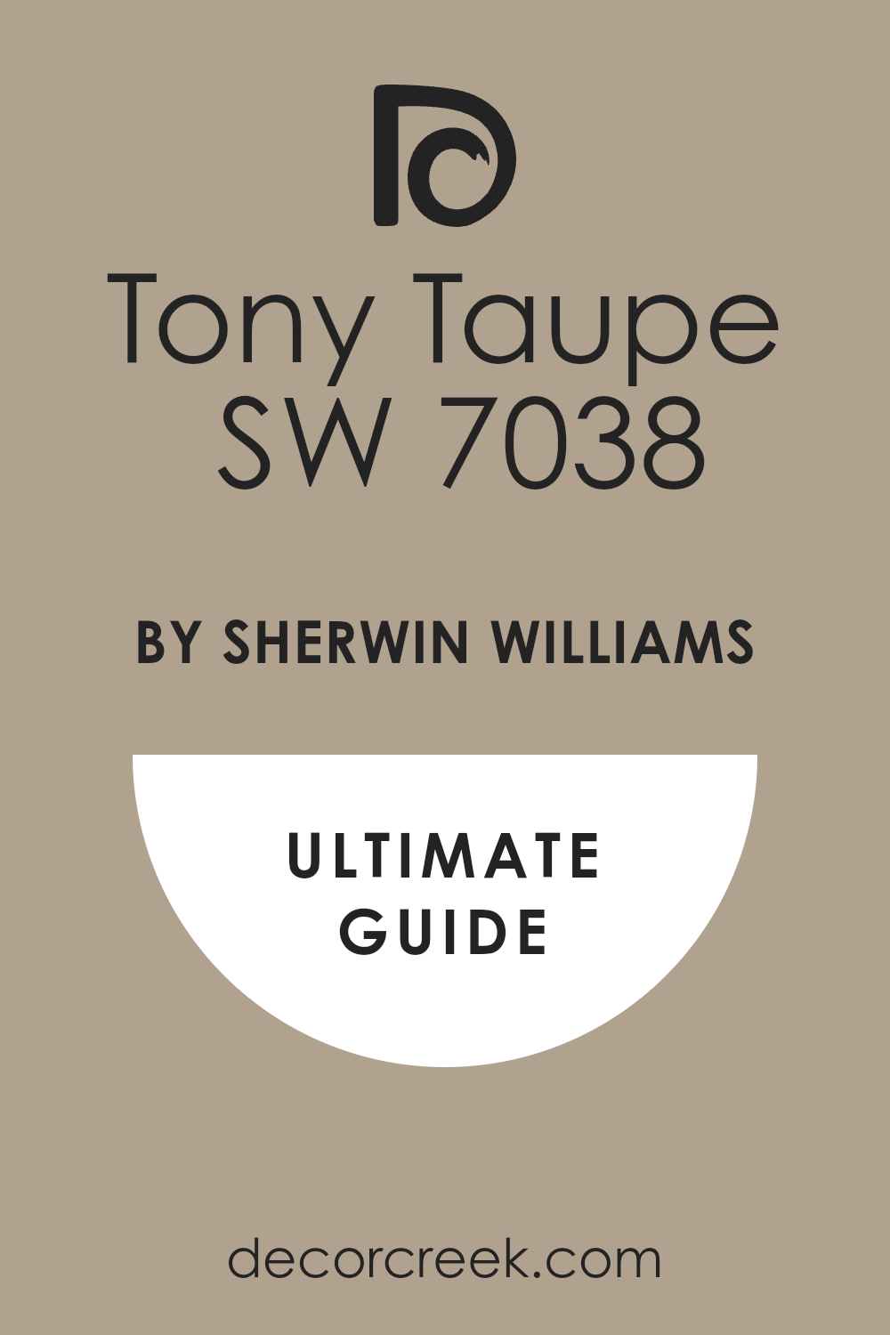
Tony Taupe (SW 7038)
Tony Taupe is one of those shades that brings calm without making the room feel flat. It leans warm but still holds that quiet, gray backbone. I like it most in bedrooms and offices where the goal is peace without coldness. I often match it with natural woods or soft whites to let the warmth peek through. My favorite way to use it is on all four walls — it just settles everything.
This works especially well when the room gets medium natural light and has soft textiles.
Perfect Greige (SW 6073)
Perfect Greige sits right between gray and beige — the name says it all. I turn to this when someone wants warmth but doesn’t want things to feel too creamy or golden. It gives a clean, grounded base to build from, especially in open floor plans. I usually combine it with white trim and matte black or brass hardware. This shade helps pull a whole room together without stealing attention.
This works especially well when there’s a mix of warm and cool light in the room.

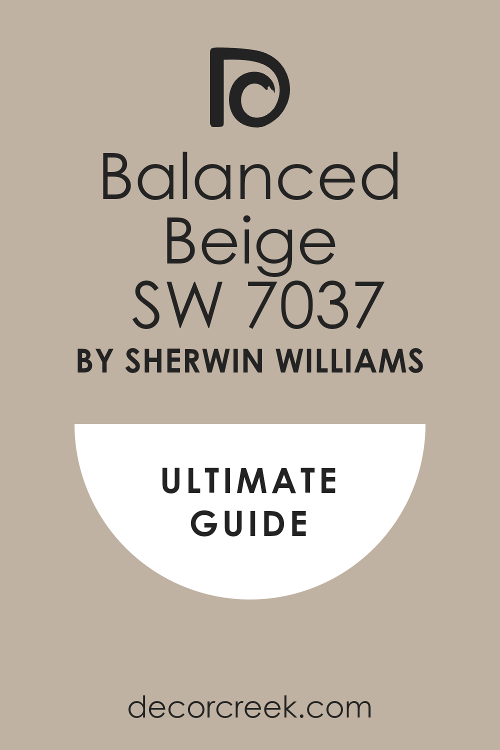
Balanced Beige (SW 7037)
Balanced Beige brings stability — it always feels like a safe place to land. It has just enough gray to make it modern and just enough brown to keep it warm. I use this when the room needs a “middle ground” color that still feels welcoming. Great on big walls with lots of windows. I like it best with soft neutrals and gentle lighting.
This works especially well when you’re blending older wood finishes with newer décor.
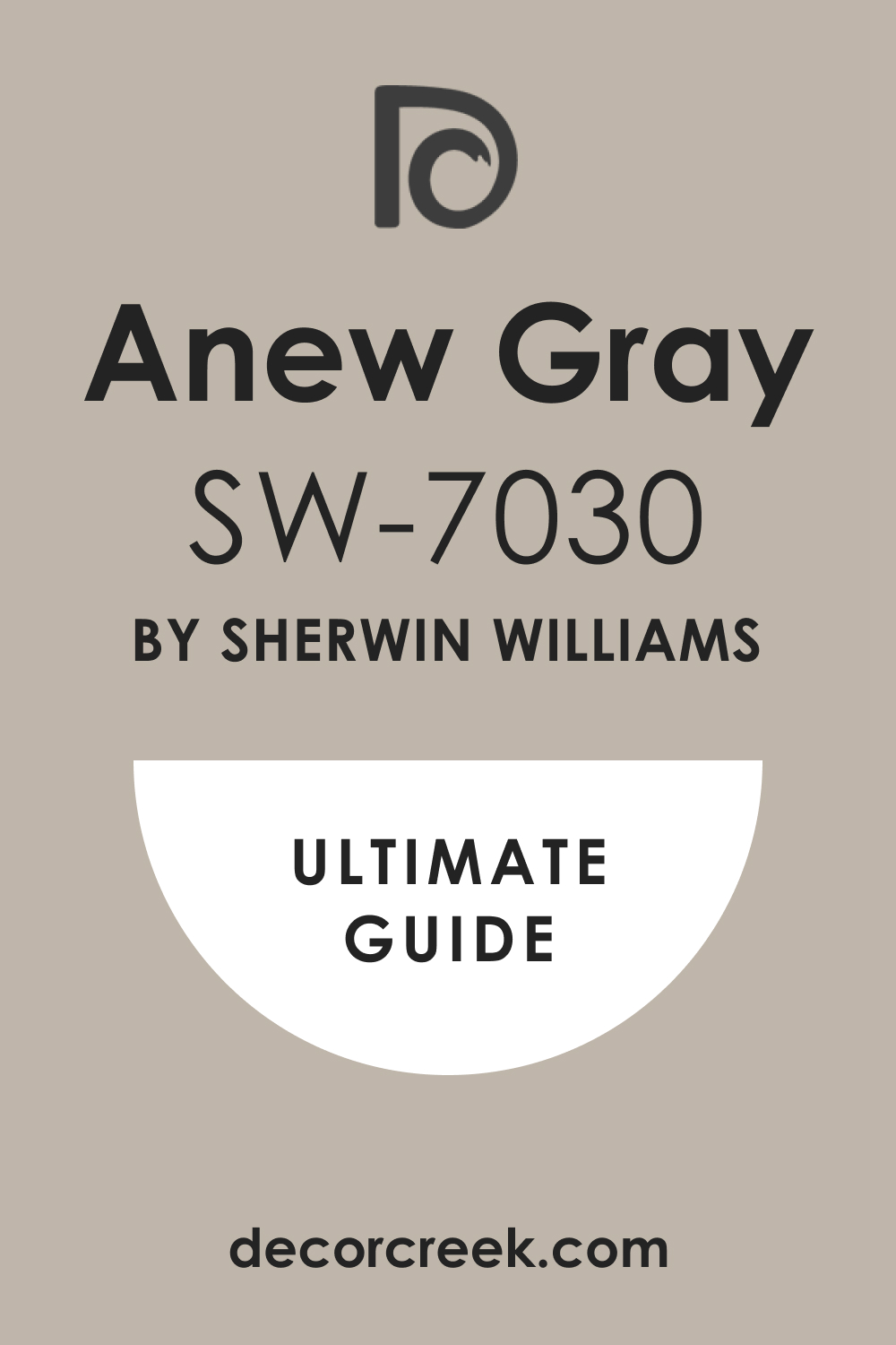
Anew Gray (SW 7030)
Anew Gray is subtle and steady. It’s one of my top picks for living rooms or dining rooms where people want warmth without yellow. This color plays nicely with wood, stone, leather, and brushed metals. I like to use it in homes that shift from daylight to lamplight — it holds its own in both. My usual trick is to pair it with creamy whites or muted greens.
This works especially well when you’re trying to keep one color throughout a large room.
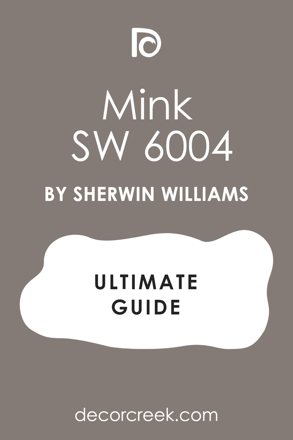
Mink (SW 6004)
Mink has a soft mood to it — a little deeper, a little richer. I love this for cozy guest rooms or studies with bookshelves and low lighting. It has enough gray to feel modern and enough brown to feel warm. This color works best when you want the walls to feel like part of the furniture. I usually balance it with warm wood and off-white textiles.
This works especially well when you want a moody tone without going full dark.
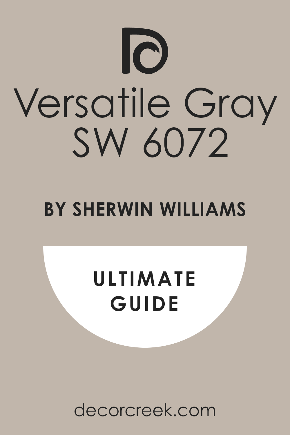
Versatile Gray (SW 6072)
Versatile Gray lives up to its name. I’ve used it in bedrooms, hallways, and even kitchens — it just works. It sits in that perfect neutral spot and pairs beautifully with almost anything: black, brass, wood, cream, you name it. I like using it in rooms that connect to multiple rooms. My usual approach is to let the furniture or art bring in color while this holds the base.
This works especially well when you’re dealing with mixed styles or open layouts.
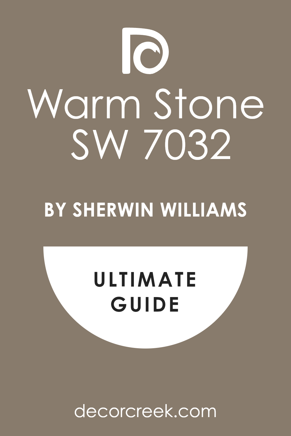
Warm Stone (SW 7032)
Warm Stone feels earthy and strong. It’s definitely more brown than gray, but that gray edge keeps it grounded. I love using it on accent walls in living rooms or behind headboards. It adds depth without making the room feel smaller. I like pairing it with soft whites, linen textures, and aged bronze.
This works especially well when the room has natural stone or wood nearby.
Dorian Gray (SW 7017)
Dorian Gray is a strong neutral with quiet confidence. It reads a little cooler than some others, but there’s enough warmth underneath to stop it from feeling cold. I use it in homes that lean traditional or transitional — it feels steady. I often use it on all the walls and let textures like wool, rattan, and wood bring the softness.
This works especially well when your trim or cabinetry is bright white.

Mindful Gray (SW 7016)
Mindful Gray has an easy, peaceful quality to it. It’s not too dark, not too light — just soft and clean. I’ve used it in bedrooms, home offices, and even powder rooms. I like that it works with both cool and warm accent colors. My tip is to keep everything else simple — this color does enough.
This works especially well when you want a cozy but modern look.

Amazing Gray (SW 7044)
Amazing Gray really is better than expected — every time. It has that magical balance of gray structure and soft brown warmth. I love using this in older homes that need an update but still want charm. It works great with white trim and light oak floors. I tend to use it in rooms where people gather and want to feel at ease.
This works especially well when you need one color to flow across multiple rooms.

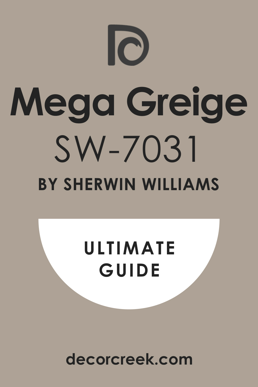
Mega Greige (SW 7031)
Mega Greige gives a little more strength than a soft neutral. It feels rich but clean — like a blanket you want to wrap around the walls. I’ve used this in dining rooms and hallways that needed grounding. It works especially well with brass, wood, and off-white textiles. My go-to move is pairing it with natural woven shades and a big cozy rug.
This works especially well when you want depth without going dark.
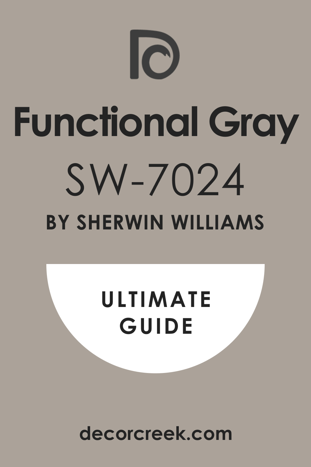
Functional Gray (SW 7024)
Functional Gray has a cool, steady feel that works in any room that needs a little edge. It’s not too brown, not too soft — it just sits confidently. I’ve used this in mudrooms, laundry rooms, and guest baths with great results. It holds up well under artificial lighting too. I usually keep the accents simple: white, slate, or brushed silver.
This works especially well when the room doesn’t get much sunlight.
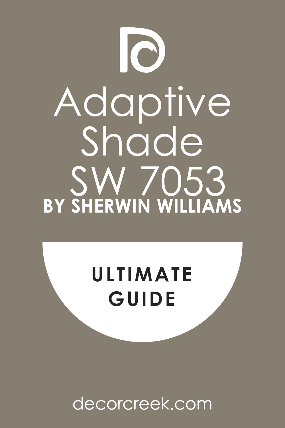
Adaptive Shade (SW 7053)
Adaptive Shade feels quiet and a little moody. It leans darker than a lot of the others on this list, which makes it perfect for accent walls. I’ve used it in bedrooms where you want a restful, cave-like feeling. I always recommend soft lighting and minimal clutter with this one. Add linen curtains and dark wood furniture and you’re set.
This works especially well when you want softness but don’t want it to feel pale.
Brainstorm Bronze (SW 7033)
Brainstorm Bronze has that soft brown glow with just enough depth. It’s warm, inviting, and a little bit refined. I like using this on feature walls, dining areas, or even small powder rooms. It pairs nicely with whites, olive greens, or charcoal accents. It’s a brown that feels grown-up without being harsh.
This works especially well when you’re mixing traditional and modern furniture.

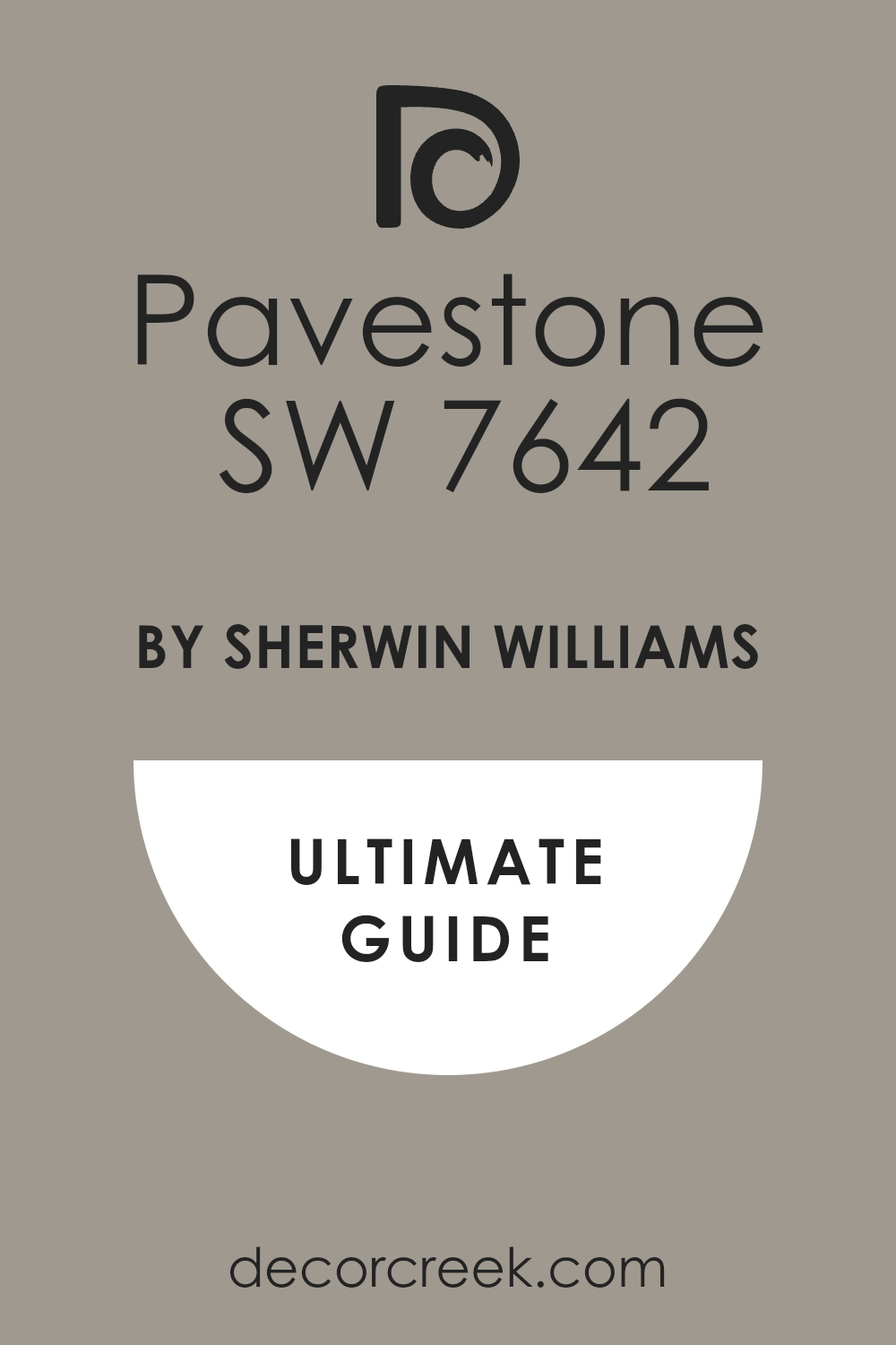
Pavestone (SW 7642)
Pavestone has a grounded, cool feeling — like dry stone under your feet. It doesn’t go too warm, but still has enough softness to keep it calm. I’ve used this in entryways, bedrooms, and even media rooms. It works beautifully with dark floors and crisp trim. I usually keep the décor quiet so the color stays the focus.
This works especially well when the goal is subtle contrast without sharp edges.
Temperate Taupe (SW 6037)
Temperate Taupe is one of those comforting colors that hugs the walls. It sits right between gray, brown, and mauve — soft but never bland. I love using this in homes that feel too white or too plain. It instantly warms everything up. My go-to pairing is white bedding, dusty pinks, or sage green accents.
This works especially well when you’re trying to add comfort without going full beige.

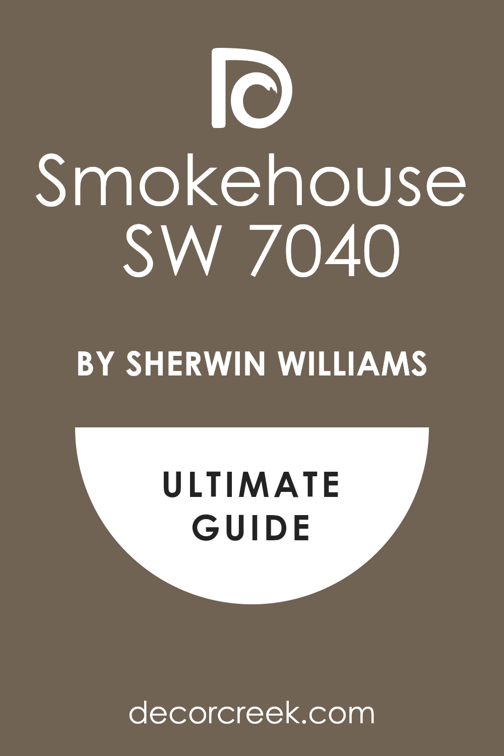
Smokehouse (SW 7040)
Smokehouse leans more brown, but there’s a strong gray base holding it down. It reminds me of weathered barns and aged wood. I like using this in dens, living rooms, or homes with rustic features. It brings a sense of age and calm. I usually mix it with iron accents and natural wood.
This works especially well when you’re trying to make a newer home feel more lived-in.
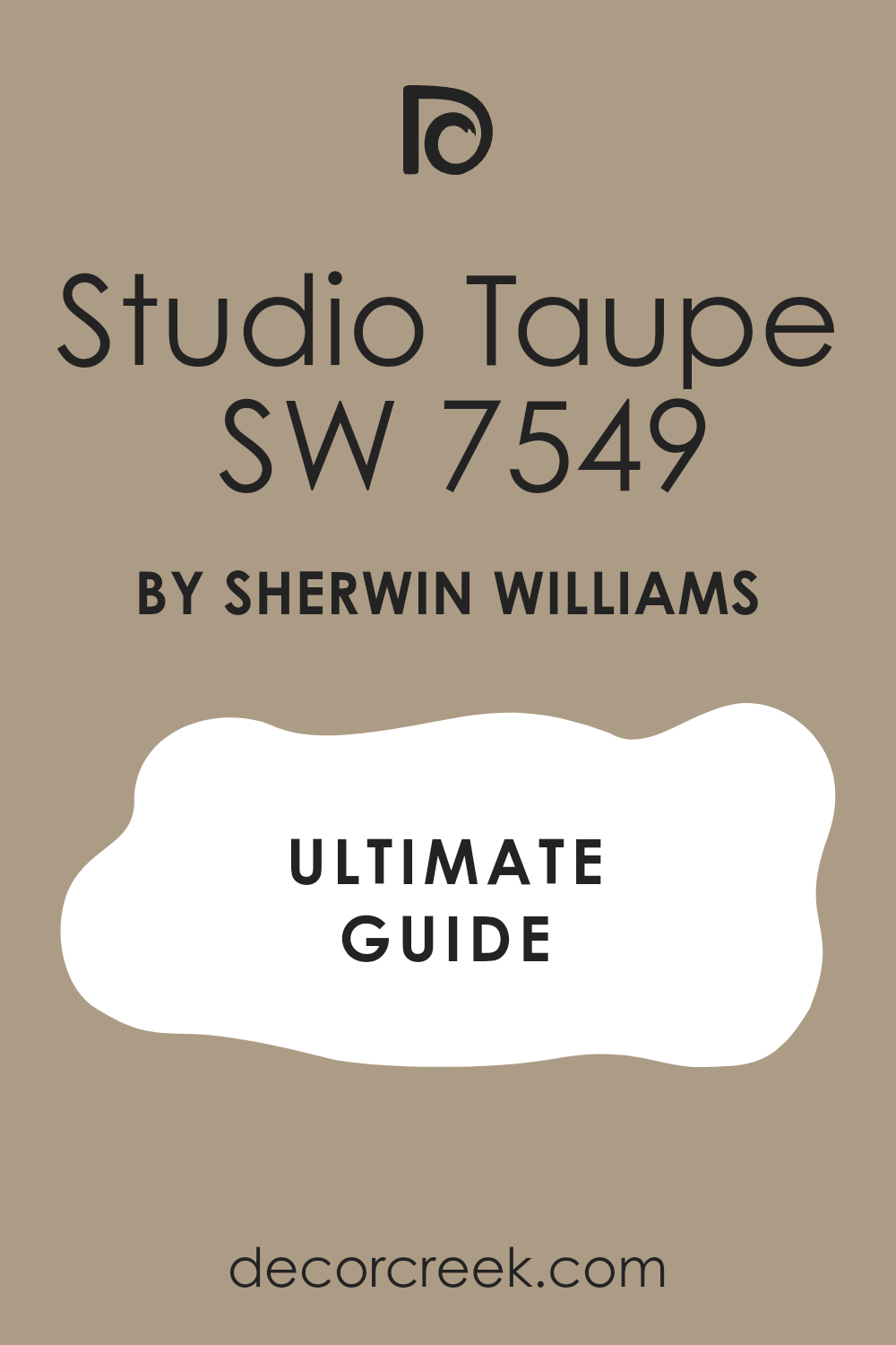
Studio Taupe (SW 7549)
Studio Taupe is calm and collected. It has just enough color to feel finished, but never overdone. I’ve used it in offices, guest rooms, and even bathrooms. It’s one of those colors that helps other things look better — art, textures, lighting. I keep the palette soft when using this one.
This works especially well when you want your wall color to step back and support the rest.
Gravel Gray (SW 7648)
Gravel Gray feels steady and stylish. It’s darker than most on this list, with a serious tone that works best when you want drama. I like using it in bedrooms, media rooms, or studies where calm and depth matter. It works with soft light, soft textures, and strong shapes. My best move is painting it floor-to-ceiling, including trim.
This works especially well when you want the whole room to feel like a retreat.
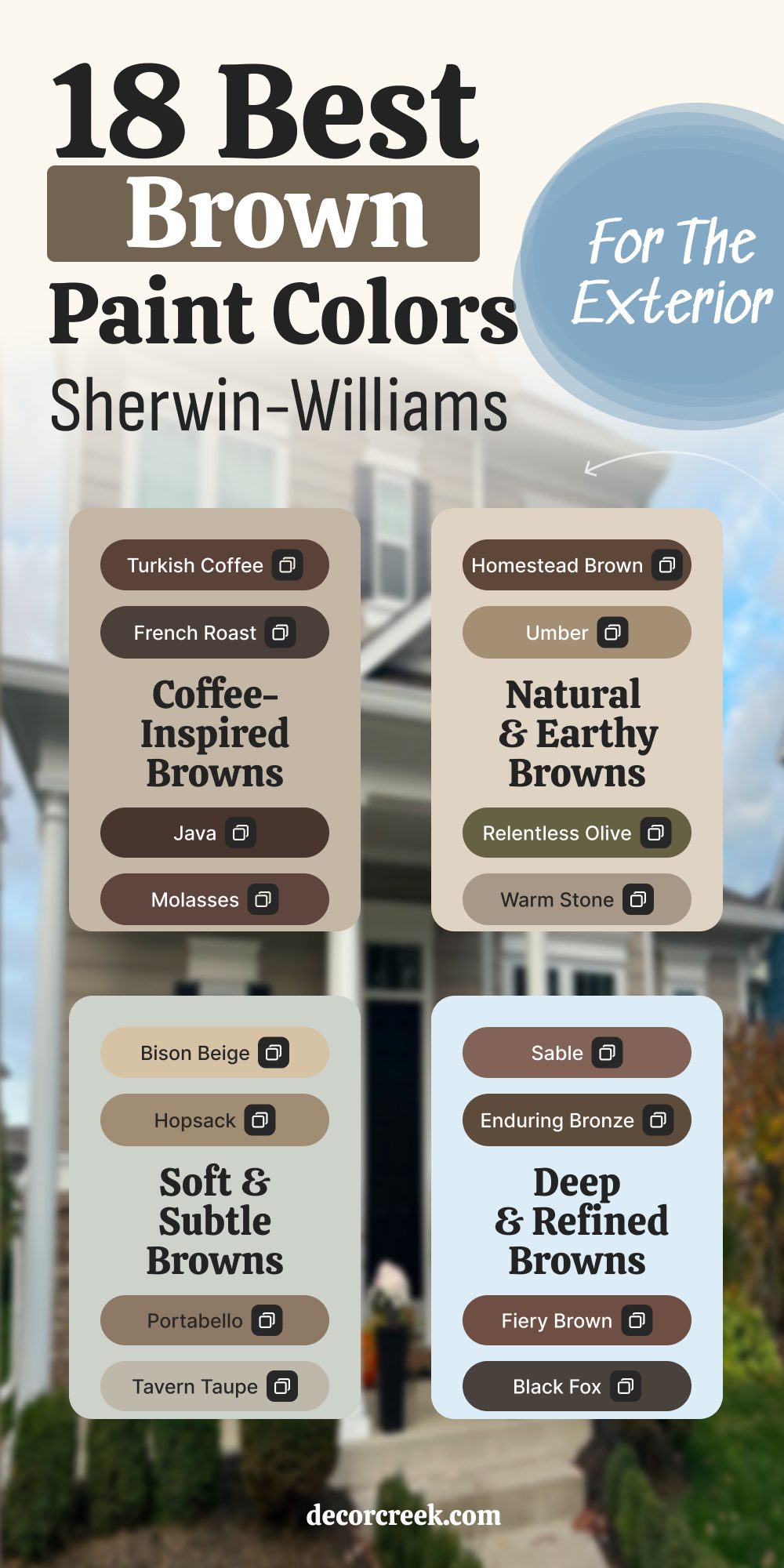
18 Best Sherwin-Williams Brown Paint Colors for the Exterior
Turkish Coffee (SW 6076)
Turkish Coffee is bold and dependable. It adds richness to exteriors without looking too red or too black. I’ve used it on homes with stone details and black windows, and it always holds its own. It gives that “solid and safe” feeling people want in a house. I usually pair it with creamy trim or wood tones to warm it up.
This works especially well when the roof is dark or the landscape has strong contrast.

Homestead Brown (SW 7515)
Homestead Brown feels deep, familiar, and earthy. It works beautifully on Craftsman-style homes or ranch houses. It has enough warmth to glow in the sun, but it also looks solid in the shade. I like to pair it with white or taupe trim to keep the look balanced. It’s one of those shades that just feels right on a big surface.
This works especially well when your siding is natural wood or rough-textured fiber cement.

French Roast (SW 6069)
French Roast reminds me of dark coffee beans — rich and refined. It looks stunning on stucco, board-and-batten, or even brick. I love this color for front doors and shutters too. It adds drama without feeling flashy. The key with this one is keeping the accents soft.
This works especially well when your home gets strong sun and needs a color that won’t wash out.
Bison Beige (SW 6148)
Bison Beige is quiet and steady. It’s lighter than most browns, which makes it perfect for full-body paint without feeling too dark. I use this on single-story homes or siding that needs a softer tone. It pairs well with desert landscaping and pale trim. I like adding black lighting fixtures for contrast.
This works especially well when you want warmth without going fully into taupe or greige.
Sable (SW 6083)
Sable is smooth and deep. It has a cocoa-like softness that feels modern and traditional at the same time. I’ve used this on shutters, trim, and entire garage doors. It pairs beautifully with sandstone or creamy stucco. My favorite combo: sable body with crisp white windows.
This works especially well when you want a dark tone that still feels cozy and not cold.
Umber (SW 6146)
Umber has a natural strength. It feels like the color of tree trunks and rich earth. I love it for homes surrounded by trees or open land — it fits right in. I usually pair it with gray stone, taupe trim, or muted greens. It’s not a trendy brown — and that’s why it works so well.
This works especially well when you’re building something that should age beautifully over time.
Enduring Bronze (SW 7055)
Enduring Bronze leans brown but feels sleek and a little metallic. It’s ideal for modern exteriors with sharp lines and dark windows. I’ve used it on wood slats, cement panels, and metal cladding. It has enough depth to ground the home, but it doesn’t scream for attention. I usually keep everything else simple — let the shape of the house do the work.
This works especially well when your home has a flat roof or strong architecture.

Warm Stone (SW 7032)
Warm Stone is one of my forever colors. It has enough brown to feel grounded and enough gray to feel balanced. I’ve used it on large homes with stone details, and it ties everything together. It’s a great body color if your trim is white or greige. I love it next to wood beams or dark bronze fixtures.
This works especially well when you’re aiming for a classic but not boring exterior.

Fiery Brown (SW 6055)
Fiery Brown adds a soft reddish undertone that makes it feel alive. I like this on Southwest or desert-style homes. It warms up stucco and pops against terracotta tiles. Use it sparingly though — too much and it can feel intense. I recommend pairing it with cream or pale gray.
This works especially well when your home has red brick, clay roof tiles, or copper details.
Java (SW 6090)
Java is deep and dark, but still rich and warm. I use this a lot on garage doors, trim, and fences. It brings instant contrast to pale exteriors. If you want a bold brown that doesn’t fade into the background, this is the one. I usually match it with light siding and simple landscaping.
This works especially well when you want one bold element without painting the whole house dark.
Coconut Husk (SW 6111)
Coconut Husk is soft, natural, and easy to work with. It doesn’t try to stand out — it just settles in and makes everything feel right. I’ve used this color on siding, especially when clients want warmth without drama. It pairs nicely with muted greens, whites, and stone. My favorite look: coconut husk with sage shutters.
This works especially well when your house is surrounded by trees or lots of greenery.
Molasses (SW 6060)
Molasses is bold and moody. It’s almost black in the shade, but the brown comes through in the light. I’ve used it on traditional homes that needed more presence. It looks great with brick, stone, and heavy wood doors. I suggest using it with a satin finish to keep it from feeling flat.
This works especially well when your home has older details that need extra richness.
Smokehouse (SW 7040)
Smokehouse сleans rustic but still feels clean. It’s brown with a bit of smoky gray, which makes it great for farmhouses or cabins. I like it with white trim, wood porches, and dark roofs. It doesn’t call too much attention to itself — it just works. It brings a calm feeling that lasts.
This works especially well when you’re blending wood siding with painted walls.

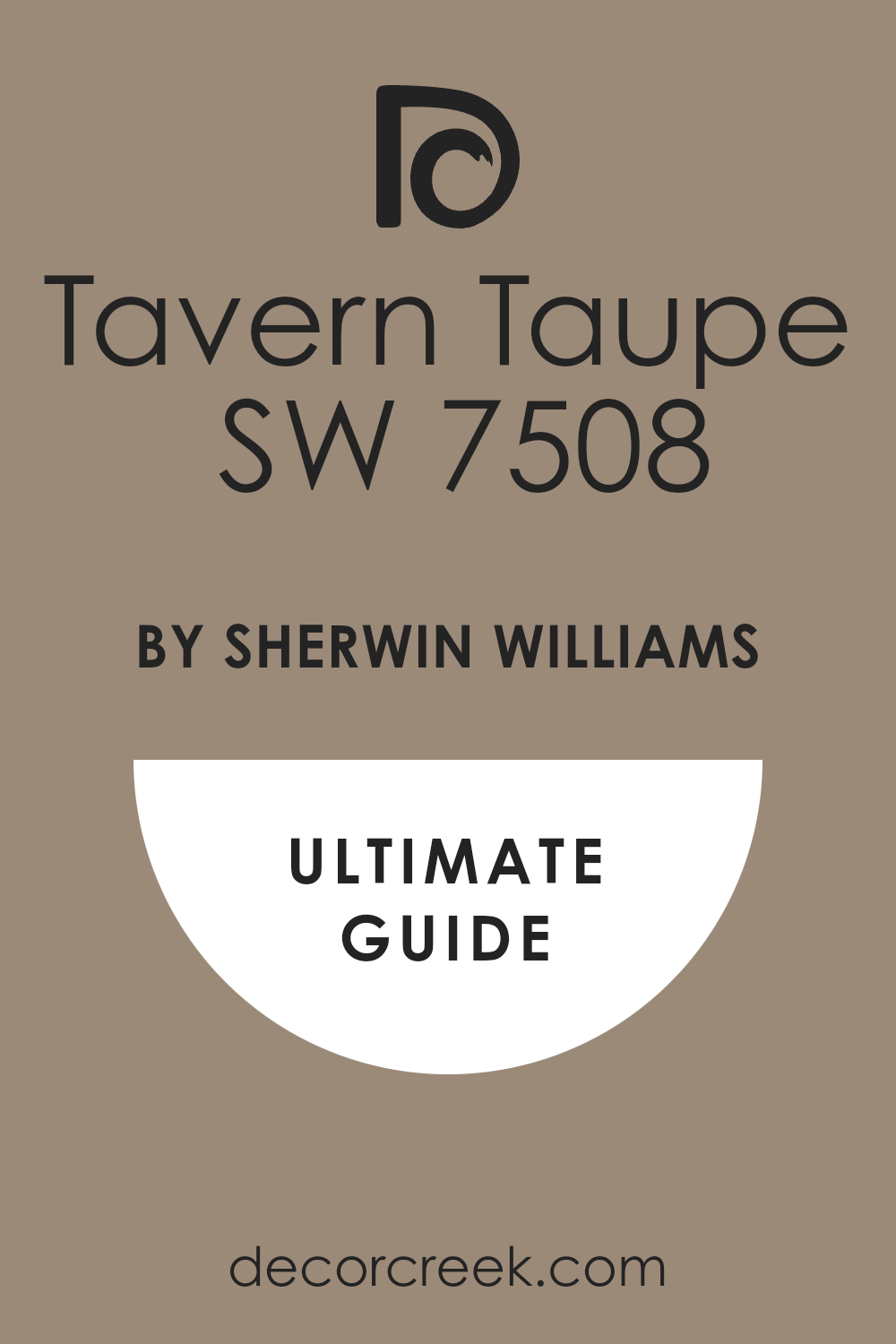
Tavern Taupe (SW 7508)
Tavern Taupe is warm and easygoing. It’s not too dark, not too light — great for full siding or large walls. I’ve used it on homes with natural stone, and it fits right in. This color feels grounded but approachable. I like adding matte black or oil-rubbed bronze fixtures.
This works especially well when you want a slightly modern take on a traditional color.
Hopsack (SW 6109)
Hopsack has a calm, dusty tone that feels lived-in. It’s not flashy — just warm, gentle, and reliable. I use it on bungalows, cottages, and mid-century homes. It pairs well with soft greens, aged brass, and neutral trims. If you want a house that feels like it’s been there forever, this is a good pick.
This works especially well when you’re painting over textured siding or older materials.
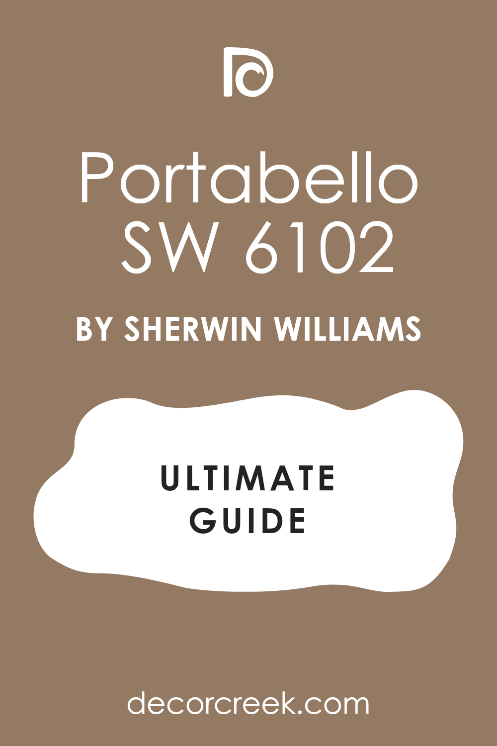
Portabello (SW 6102)
Portabello is earthy and mushroomy — it lives right in that middle brown zone. I love this for homes with curved architecture or soft rooflines. It gives a gentle presence to the house without shouting. I like pairing it with bronze lights, stone steps, or light-colored garage doors.
This works especially well when you’re working with older brick or paver walkways.
Relentless Olive (SW 6425)
Relentless Olive isn’t exactly brown — but it plays like one. There’s enough brown in the green to make it feel warm and rooted. I love this for natural exteriors with a modern edge. It pairs well with raw wood, black trim, and steel fixtures. This is one of those colors that makes the house blend into the landscape.
This works especially well when your home is surrounded by trees or garden beds.
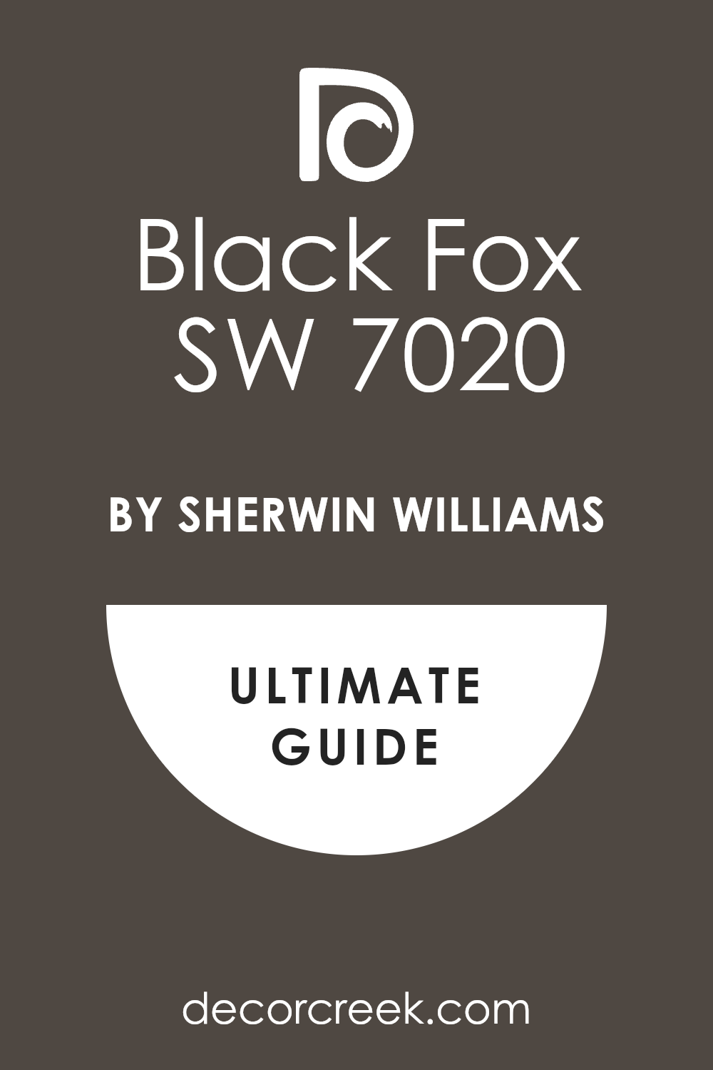
Black Fox (SW 7020)
Black Fox is deep and dramatic. It’s almost black, but the brown keeps it from feeling cold. I’ve used it on full exteriors and on small elements like trim or shutters. It adds elegance, especially with pale stone or warm white siding. I like using it sparingly for maximum impact.
This works especially well when you want your home to feel modern but still warm.
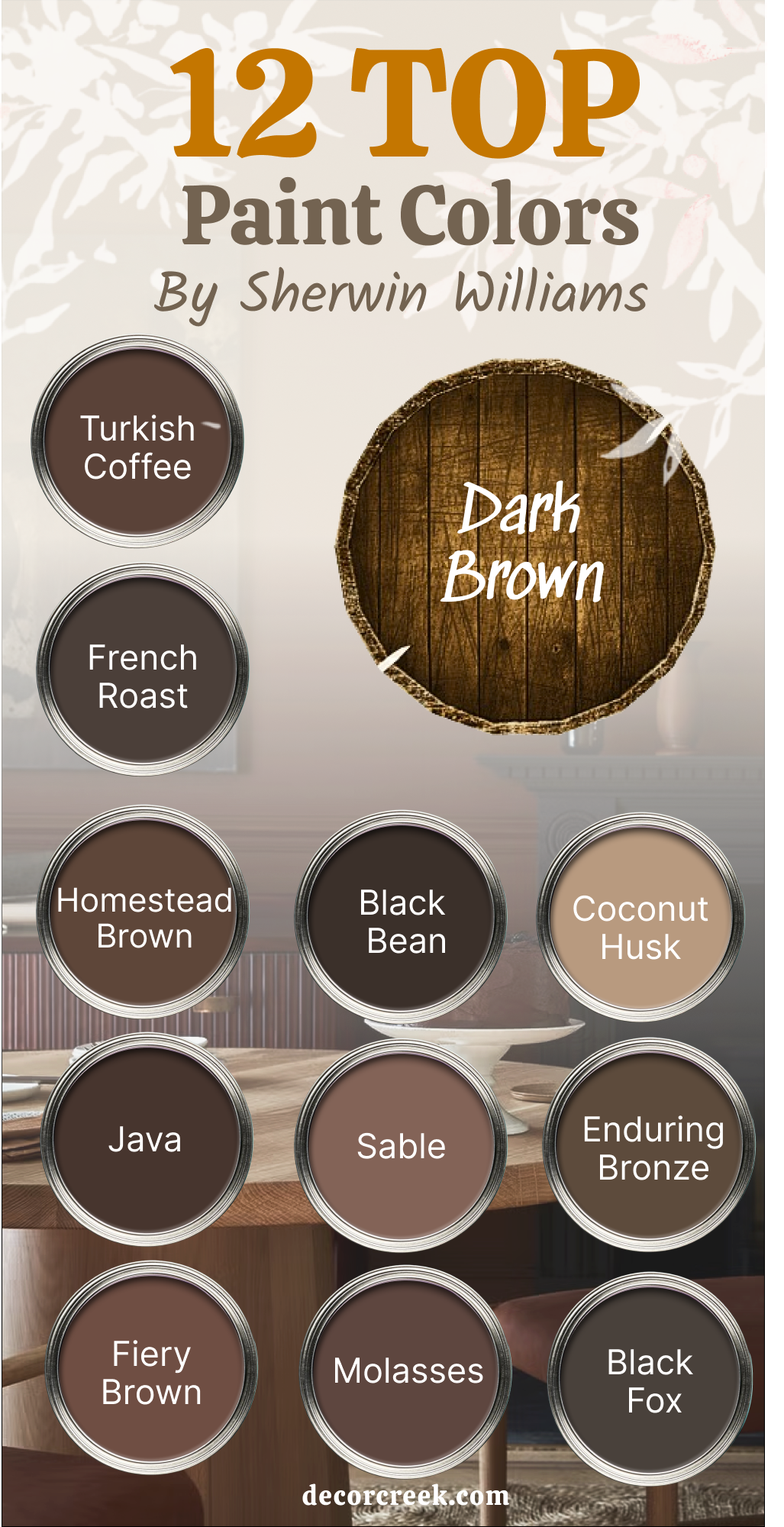
12 Top Dark Brown Paint Colors by Sherwin-Williams
Turkish Coffee (SW 6076)
Turkish Coffee is bold, rich, and grounded. It’s the kind of color that immediately brings warmth and weight to room. I love using it on accent walls in dining rooms, offices, or cozy bedrooms. The depth of this brown makes light fabrics and warm woods feel even more inviting. It’s never too red or too black — it just hits that sweet spot of dark.
This works especially well when you want to make a large room feel more intimate and layered.

French Roast (SW 6069)
French Roast feels deep and dramatic in the best way. It reminds me of rich espresso or polished walnut — strong, but never cold. I like using it in powder rooms or home libraries where you want a little mood. This color also looks amazing on cabinetry or interior doors. The richness brings elegance without feeling stiff.
This works especially well when paired with brass hardware or cream trim.
Homestead Brown (SW 7515)
Homestead Brown has that soft, earthy base that makes it feel real. It’s dark, yes, but it still has that cozy edge that doesn’t overpower room. I love this color for traditional homes and farmhouse-style interiors. Use it on feature walls, built-ins, or anywhere that needs a little weight. My go-to trick: add a lot of texture — like woven rugs, soft curtains, and woodgrain.
This works especially well when natural light is limited and the room needs warmth.

Java (SW 6090)
Java is one of my go-to dark browns when I want impact. It’s strong, warm, and rich without leaning too red or too black. I’ve used this in bedrooms and kitchens, especially on cabinetry and furniture. It makes white walls pop and brings out the detail in molding and trim. When paired with soft lighting, it has that tucked-in feeling people love.
This works especially well when you want a strong foundation for lighter accents.
Fiery Brown (SW 6055)
Fiery Brown carries more warmth than the others — you’ll notice a slight red glow under certain lighting. It’s a lively dark brown that still feels grounded. I love using this in interior that need both energy and calm — like dens or dining areas. The key is balancing it with soft textiles or natural woods. I usually avoid pairing it with cool-toned grays.
This works especially well when the interior has terracotta, oak, or warm brick nearby.
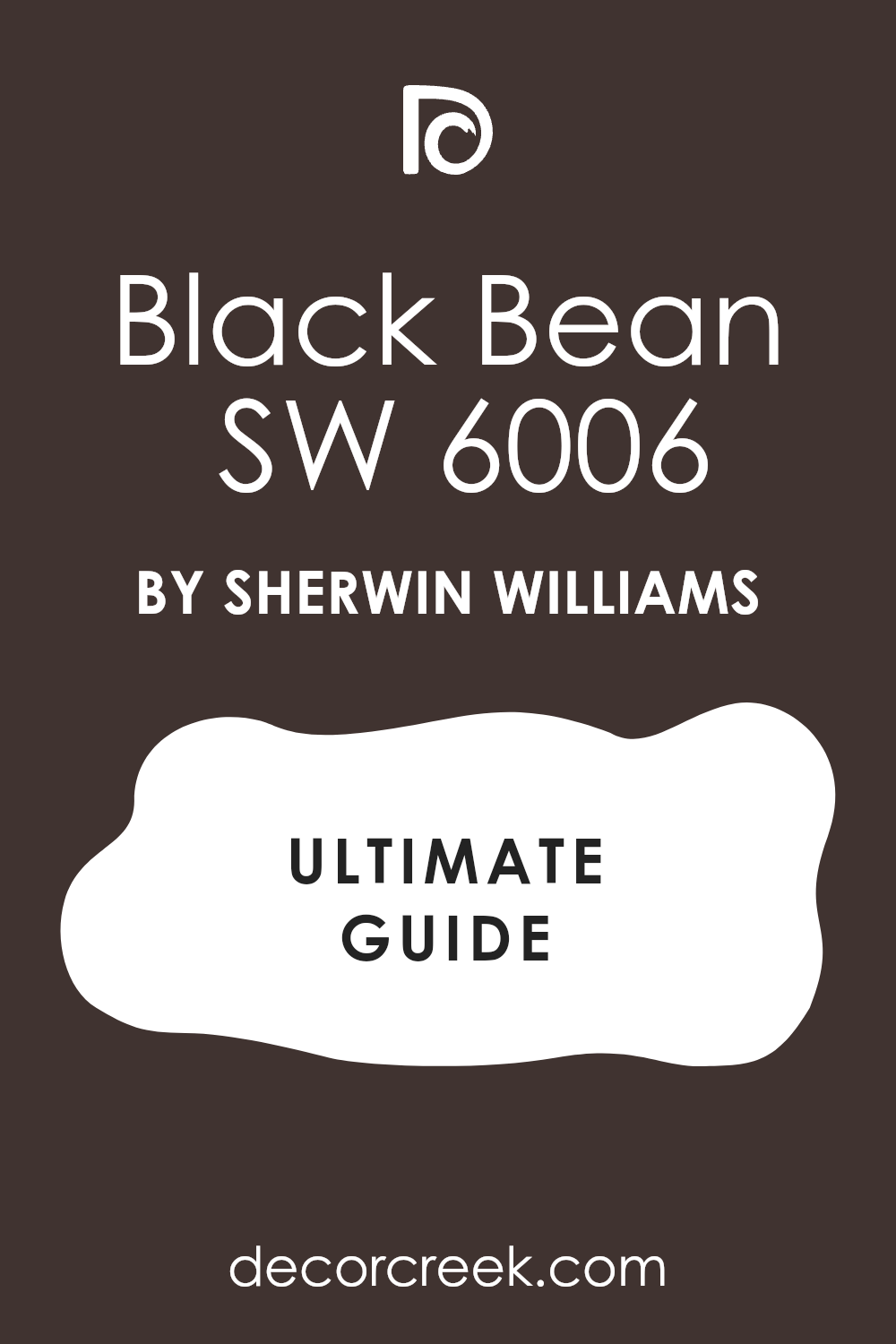
Black Bean (SW 6006)
Black Bean is almost black, but with just enough brown to soften it. It brings a dramatic finish to a room without making it feel harsh. I’ve used this in media rooms, libraries, and even small bathrooms where people want mood and comfort. It also works beautifully on trim or interior doors. I love pairing it with matte finishes and soft lighting.
This works especially well when you want drama but still need a touch of warmth.
Sable (SW 6083)
Sable is deep, warm, and very inviting. It doesn’t lean too red or too cool — it just feels right in almost any setting. I often use this on lower cabinetry or accent walls behind the bed. It pairs beautifully with brass, leather, and off-whites. This is one of those colors that instantly makes the room feel finished.
This works especially well when the rest of the palette is light and textured.
Molasses (SW 6060)
Molasses has a moody richness that feels old-world in the best way. I love using this when I want a color that adds soul to room. It looks amazing in formal dining rooms or paired with antique furniture. I like to soften it with velvet fabrics, warm light, and soft white trim. It has depth and emotion without being over-the-top.
This works especially well when the goal is classic comfort with a bit of drama.
Coconut Husk (SW 6111)
Coconut Husk is a dark brown that still feels calm. It leans slightly warm, but never too red. I often use it in bedrooms, hallways, or reading nooks where people want peace and coziness. It looks great with both rustic and modern materials — wood beams, soft linen, even black metal. It brings just enough depth to feel solid, not heavy.
This works especially well when paired with natural light and soft shadow lines.
Enduring Bronze (SW 7055)
Enduring Bronze is deep and refined — there’s a cool brown base that keeps it sharp. I like this for doors, trim, and even full walls in smaller rooms. It brings elegance without feeling too cold. I’ve paired it with warm woods, soft whites, and brushed metal. The slight sheen in a satin or semi-gloss finish gives it life.
This works especially well when you want a dark neutral that still feels tailored.
Black Fox (SW 7020)
Black Fox is one of those colors that people remember. It looks nearly black, but with warm brown undertones that show up in sunlight. I’ve used this for accent walls, fireplaces, and even entire rooms when clients want something bold. It creates instant contrast with light furniture and white ceilings. I love it with clean lines and natural textures.
This works especially well when the room has strong light and needs a grounding element.

Umber (SW 6146)
Umber is rich, full, and classic. It reminds me of aged wood and deep forest shadows. I’ve used this color on built-ins, study walls, and even kitchen islands. It works beautifully with both warm and cool accents. When paired with natural textures and layered lighting, it brings the whole room together.
This works especially well when you’re blending old-world charm with modern comfort.
Final Thoughts on These Beautiful Browns
Brown has always felt like home to me. It’s the color of things we trust — like strong wood, warm blankets, and quiet mornings. Every time I use brown in a project, I see people relax. It softens a room without washing it out. It adds weight, but never pushes too hard. It works in new builds and older homes, on exteriors and in bedrooms, on kitchen cabinets or behind your favorite chair.
What I’ve learned from all these projects is simple: the right brown makes people feel grounded. That’s something we all want more of lately.
Whether it’s a soft gray-brown that whispers or a bold dark shade that hugs the whole wall — Sherwin-Williams has a brown for that.
I keep coming back to these colors not just because they look good, but because they feel right.
This works especially well when you’re designing for real life — not just for photos.
