Black
Black Blue
Blue Brown
Brown Gray
Gray Green
Green Neutral
 Orange
 White
White Yellow
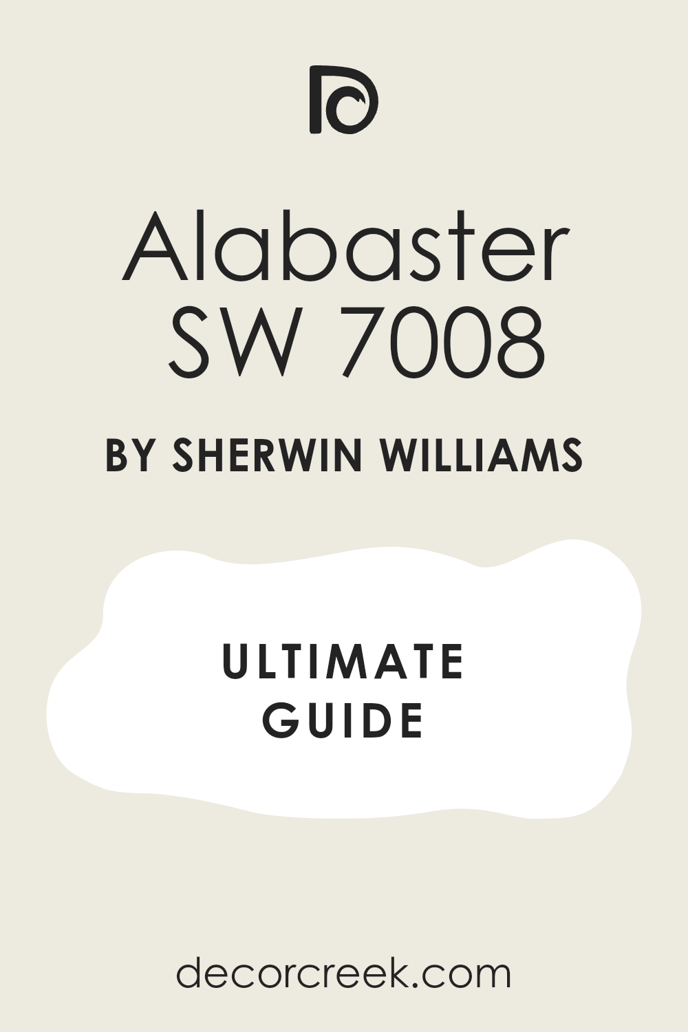
Sherwin-Williams Alabaster is a favorite among homeowners who want a warm, inviting white paint color. It has a tiny bit of yellow and gray in it, which keeps it from looking too bright or like a cold hospital room. People use it on walls, trim, and kitchen cabinets because it looks good in almost every house.
Finding the right colors to go with it can make your home feel very welcoming. There are many ways to mix and match this shade with light grays, warm wood tones, and deep dark colors. Your lighting changes how it looks, so it might seem creamier in the afternoon and a bit gray on a cloudy day. Let us look at the best choices to match with this popular white shade.
This versatile neutral is perfect for open-concept floor plans because it flows seamlessly from room to room without any harsh breaks. It has a unique ability to make tight spaces feel much larger and brighter while still maintaining a cozy atmosphere. Designers love it because it bridges the gap between traditional and modern decor styles with ease.
Whether you are staging a house to sell or updating your personal bedroom, this white provides a clean, professional finish.
Why Alabaster SW 7008 Is One of My Favorite Warm White Paint Colors
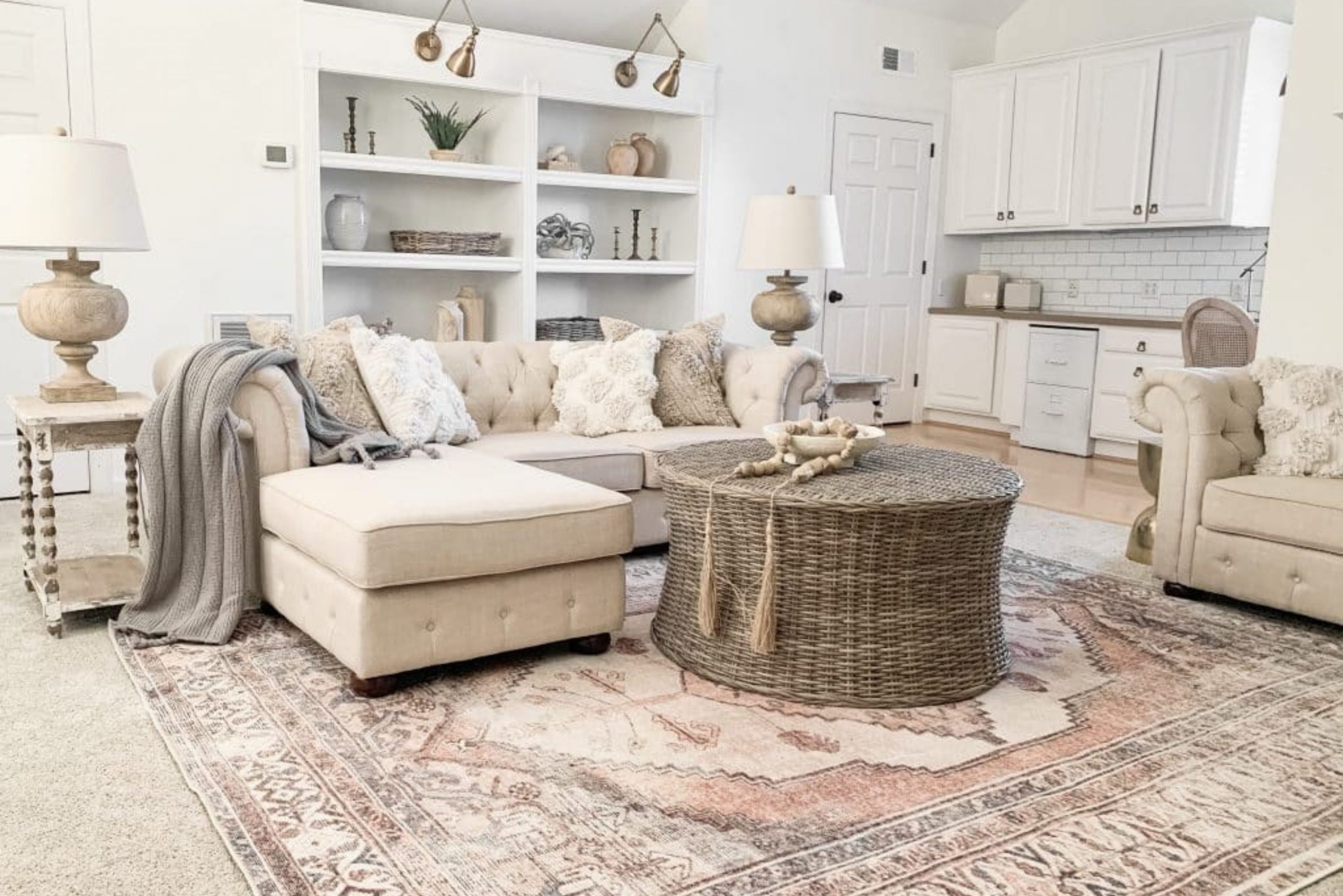
Alabaster SW 7008 is one of those paint colors I keep coming back to because it feels soft, warm, and timeless in almost every home style. Unlike bright whites that can sometimes feel cold or sharp, Alabaster has a creamy warmth that instantly makes a room feel calm and welcoming.
I love how it changes gently throughout the day, looking fresh in natural light while still feeling cozy in the evening.
It also works beautifully with modern, farmhouse, traditional, and transitional interiors, which makes it incredibly versatile.
Another reason I trust Alabaster so much is because it pairs easily with warm neutrals, earthy greens, rich charcoals, and soft grays without feeling overpowering.
Whether I use it on walls, kitchen cabinets, trim, or even exteriors, it always creates a balanced and elegant look that never feels too trendy or outdated.
How I Choose the Best Colors That Go With Alabaster SW 7008
When I choose colors to pair with Alabaster SW 7008, I always focus on keeping the warmth of the paint balanced and natural. Since Alabaster has creamy undertones, I avoid pairing it with whites or grays that feel too icy or blue because they can make the color look dull.
Instead, I love combining it with soft neutrals, earthy greens, warm taupes, muted blues, and deep contrast shades that help bring out its cozy warmth.
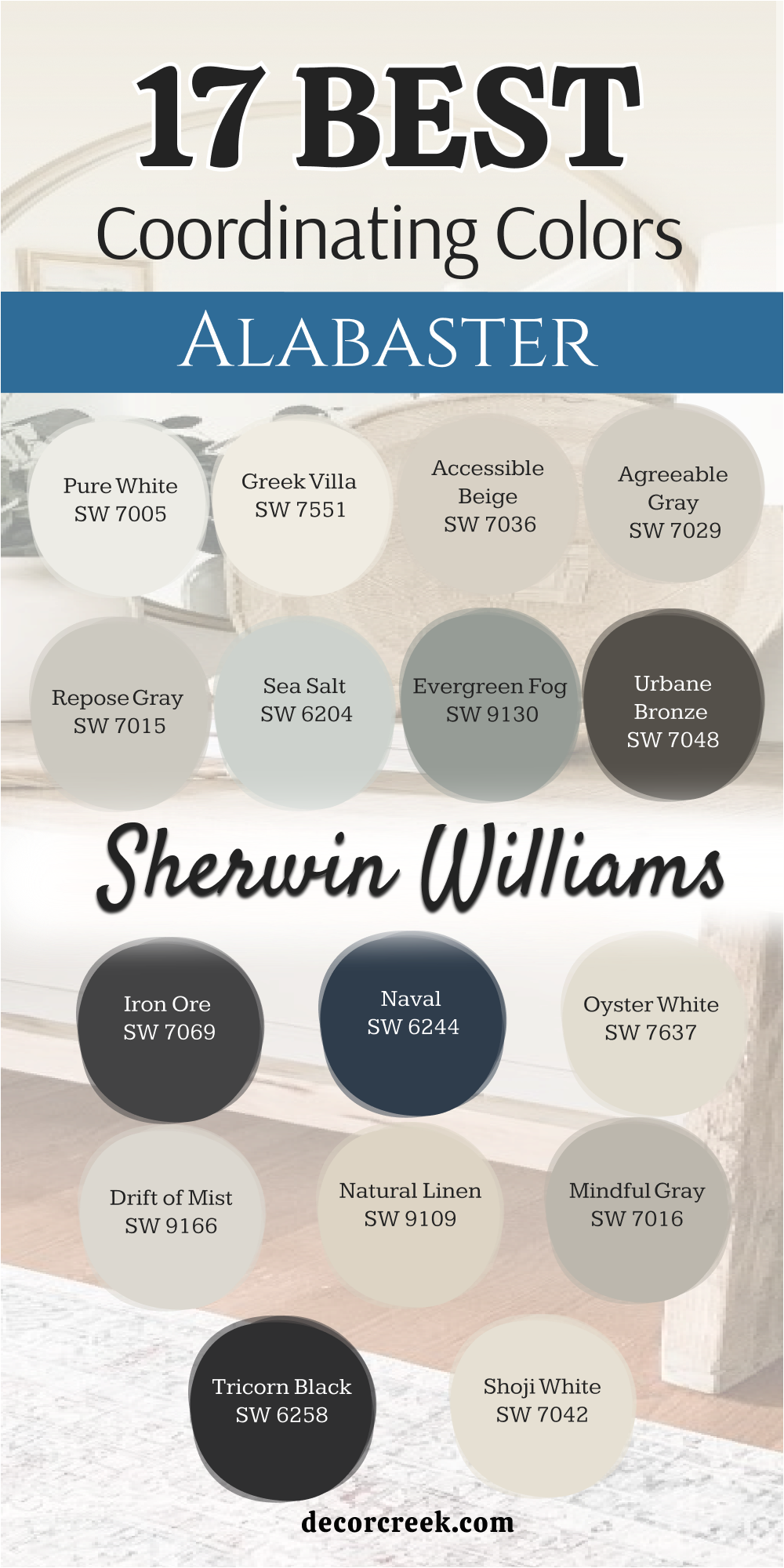
I also think about how much natural light the room gets because Alabaster can look slightly brighter or creamier depending on the space. For modern homes, I often pair it with darker colors like Iron Ore or Urbane Bronze for contrast, while softer shades like Agreeable Gray or Accessible Beige create a calm layered look.
The key is choosing colors that make Alabaster feel connected, relaxed, and timeless throughout the home.
17 Best Coordinating Colors for Alabaster by Sherwin Williams
Alabaster SW 7008
Alabaster SW 7008 is a creamy white paint that has a very soft balance of beige and gray undertones. This specific shade works beautifully on large living room walls because it never looks harsh under bright light bulbs.
It creates a gentle backdrop for colorful furniture pieces and dark metal light fixtures in a family home. Many people choose it for trim and baseboards to give a slight contrast against pure white walls.
It reflects a lot of natural light coming through your windows to make smaller hallways feel larger. You will notice it brings a cozy feeling to open floor plans where rooms connect to each other. It stays popular because it coordinates nicely with both warm tans and cool charcoal shades.
Best used in: living rooms, kitchens, hallways, bedrooms, and farmhouse exteriors
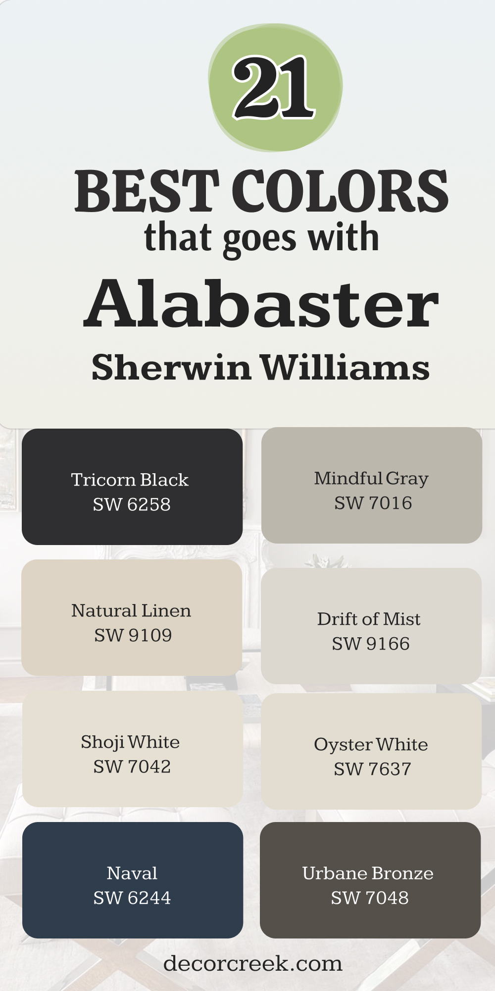
Pairs well with: Iron Ore SW 7069, Agreeable Gray SW 7029, Natural Linen SW 9109, warm wood tones The key rule of this color for farmhouse style is to use it where you want natural light to feel kind, soft, and inviting throughout the day.
🎨 Check out the complete guide to this color right HERE 👈
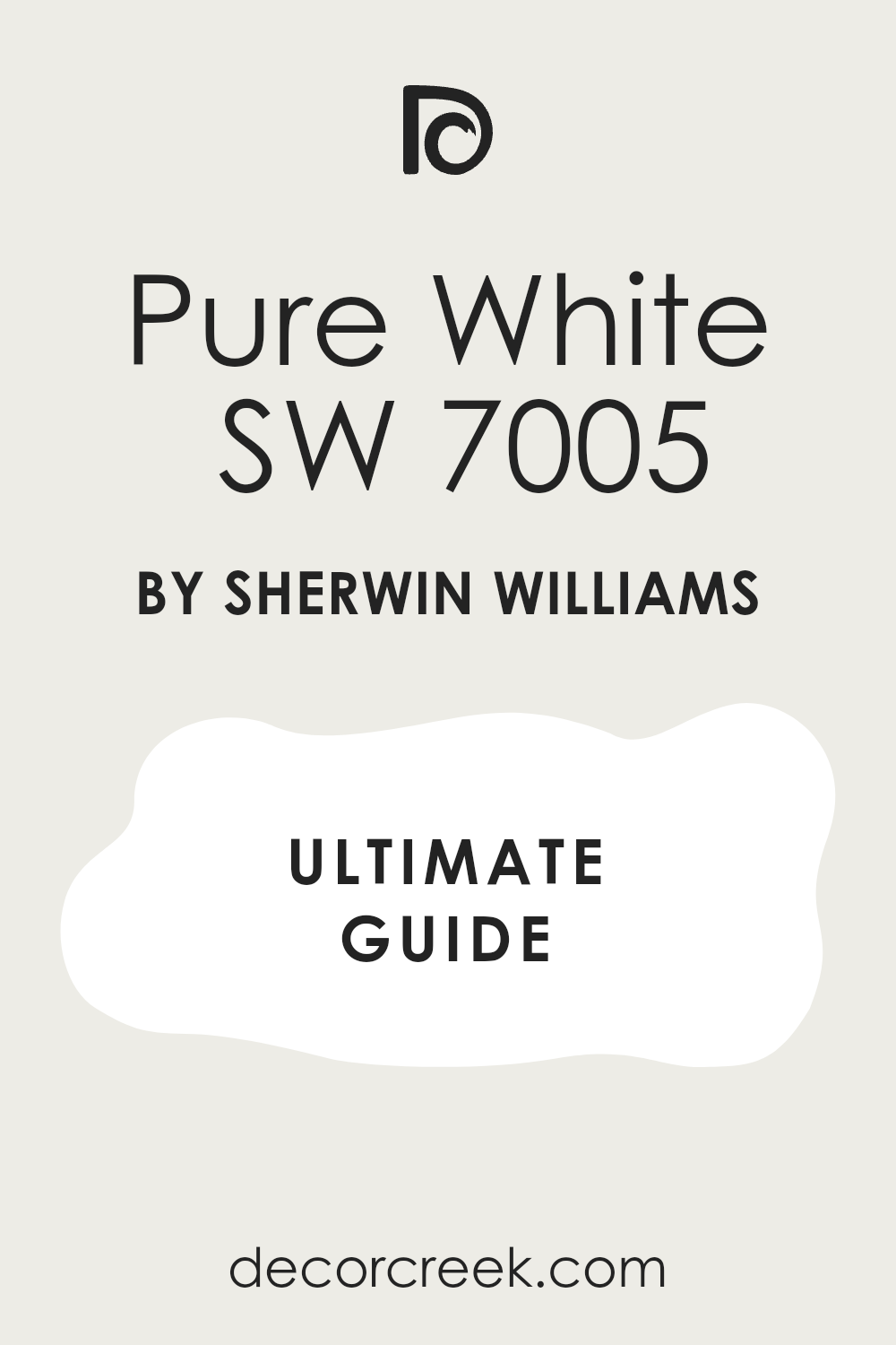
Pure White SW 7005
Pure White SW 7005 acts as a clean partner because it lacks any strong yellow or blue undertones. This crisp shade provides just enough difference when applied to doors and crown molding next to creamier walls.
It keeps your ceilings looking high and neat without creating a stark contrast that hurts your eyes. Many designers use it to brighten up dark corners in basements and laundry rooms. It works well on kitchen cabinets if you want a modern appearance that still feels friendly.
The slight warmth in it prevents the paint from feeling like cold ice on a winter day. It helps other decorative items like framed artwork and colorful rugs stand out more clearly.
Best used in: trim, ceilings, kitchen cabinets, molding, and modern bathrooms
Pairs well with: Alabaster SW 7008, Repose Gray SW 7015, Naval SW 6244, polished chrome fixtures The key rule of this color for modern style is to use it on trim to make your main wall colors look sharp and distinct.
🎨 Check out the complete guide to this color right HERE 👈
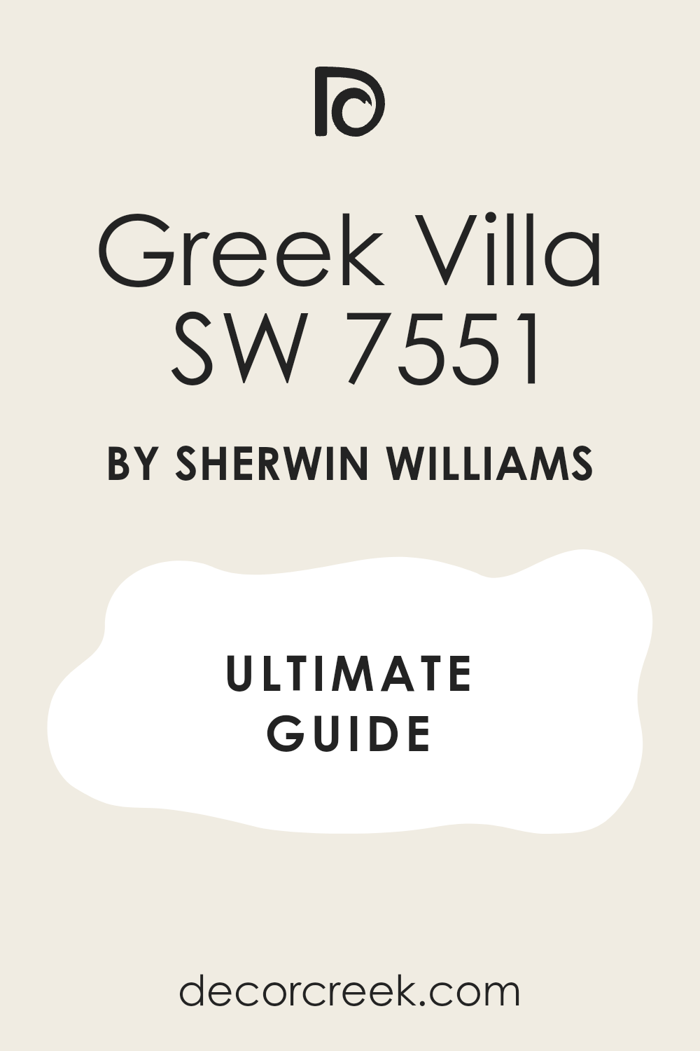
Greek Villa SW 7551
Greek Villa SW 7551 offers a rich appearance because it carries a notable amount of yellow and beige warmth. This paint option looks almost like heavy cream when the afternoon sun hits the surface directly.
It fits nicely in traditional dining rooms where you want a comfortable atmosphere for family meals. It prevents a north-facing bedroom from feeling chilly during the darker months of the year. You can apply it to exterior stucco to get a soft look that does not blind the neighbors.
It bridges the gap between true whites and dark sandy tones in your home decor. The heavy pigment count gives it great hiding power over old, dark paint on your drywall.
Best used in: bedrooms, dining rooms, stuccos, entryways, and traditional living areas
Pairs well with: Urbane Bronze SW 7048, Accessible Beige SW 7036, dark bronze hardware, oak floors The key rule of this color for traditional style is to apply it in sunlit areas to maximize the cozy amber glow.
🎨 Check out the complete guide to this color right HERE 👈
Accessible Beige SW 7036
Accessible Beige SW 7036 remains a top choice because it avoids looking like muddy sand or dark cardboard. This grayish-beige hue brings a solid weight to walls while keeping the room feeling airy and light.
It acts as an excellent mid-tone shade for a cozy study or a main bedroom accent wall. It responds beautifully to warm wood furniture and leather sofas in a traditional family room. The gray part of the blend keeps the beige from turning orange under yellowish lamplight.
It gives a clean look to hallway walls that get high foot traffic from kids and pets. It provides a striking contrast when paired with bright white trim and window frames.
Best used in: living rooms, home offices, entryways, accent walls, and exterior siding
Pairs well with: Alabaster SW 7008, Pure White SW 7005, Tricorn Black SW 6258, dark walnut accents The key rule of this color for balanced style is to use it as a grounding element against brighter white ceilings.
🎨 Check out the complete guide to this color right HERE 👈

Agreeable Gray SW 7029
Agreeable Gray SW 7029 dominates the paint world because it blends warm beige with a cool gray base. This clever mixture means it adapts to whatever furniture or flooring you already have in your house.
It brings a modern feeling to older homes without making them look too industrial or cold. It shines in open-concept living spaces where kitchens blend right into the family sitting area. The hint of warmth prevents it from looking like standard blue-gray primer paint on the drywall.
It works wonderfully for staging houses because buyers appreciate how neutral and clean it appears. It creates a lovely backdrop for silver picture frames and colorful decorative pillows.
Best used in: whole-house painting, open floor plans, kitchens, rental properties, and finished basements
Pairs well with: Alabaster SW 7008, Sea Salt SW 6204, Iron Ore SW 7069, light oak furniture The key rule of this color for staging style is to use it across multiple rooms to create a continuous flow.
🎨 Check out the complete guide to this color right HERE 👈

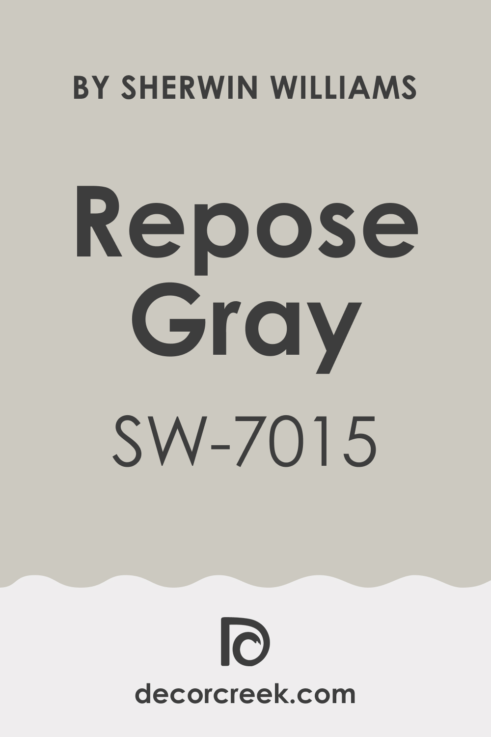
Repose Gray SW 7015
Repose Gray SW 7015 leans a bit cooler than other greige paints but maintains a tiny drop of brown. This specific color choice looks sophisticated in contemporary master bedrooms and upscale guest bathrooms.
It shows off a beautiful silver quality when natural morning light streams through the glass windows. It contrasts sharply with creamy cabinetry to give a kitchen a very upscale appearance. The shade works well with cool metals like brushed nickel and stainless steel kitchen appliances.
It hides minor wall imperfections and smudges better than lighter off-white paint choices do. It brings a tailored look to formal spaces like home libraries and sitting rooms.
Best used in: master bedrooms, guest baths, modern kitchens, formal dining rooms, and trim work
Pairs well with: Alabaster SW 7008, Eider White SW 7014, Naval SW 6244, stainless steel hardware The key rule of this color for upscale style is to pair it with very crisp white accents to highlight its silver undertones.
🎨 Check out the complete guide to this color right HERE 👈
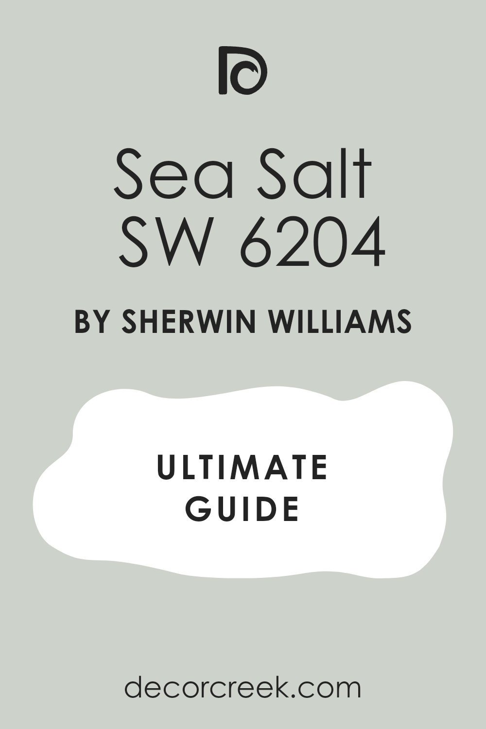
Sea Salt SW 6204
Sea Salt SW 6204 shifts between green, blue, and gray depending on the time of the day. This muted pastel shade brings a refreshing coastal feeling into tight bathrooms and sunny laundry rooms.
It never looks childish or neon because the heavy gray undertone keeps the color very mature. It pairs exceptionally well with light wood tones like white oak and natural pine boards. It makes small spaces feel much larger by creating an airy feeling on the walls.
Many people use it on sunroom ceilings to mimic the look of a soft morning sky. It offers a wonderful break from standard beige and gray colors without being too loud.
Best used in: bathrooms, laundry rooms, sunrooms, nurseries, and beach cottage bedrooms
Pairs well with: Alabaster SW 7008, Greek Villa SW 7551, Mindful Gray SW 7016, natural wicker The key rule of this color for coastal style is to use it in rooms with lots of windows to see the color shift.
🎨 Check out the complete guide to this color right HERE 👈
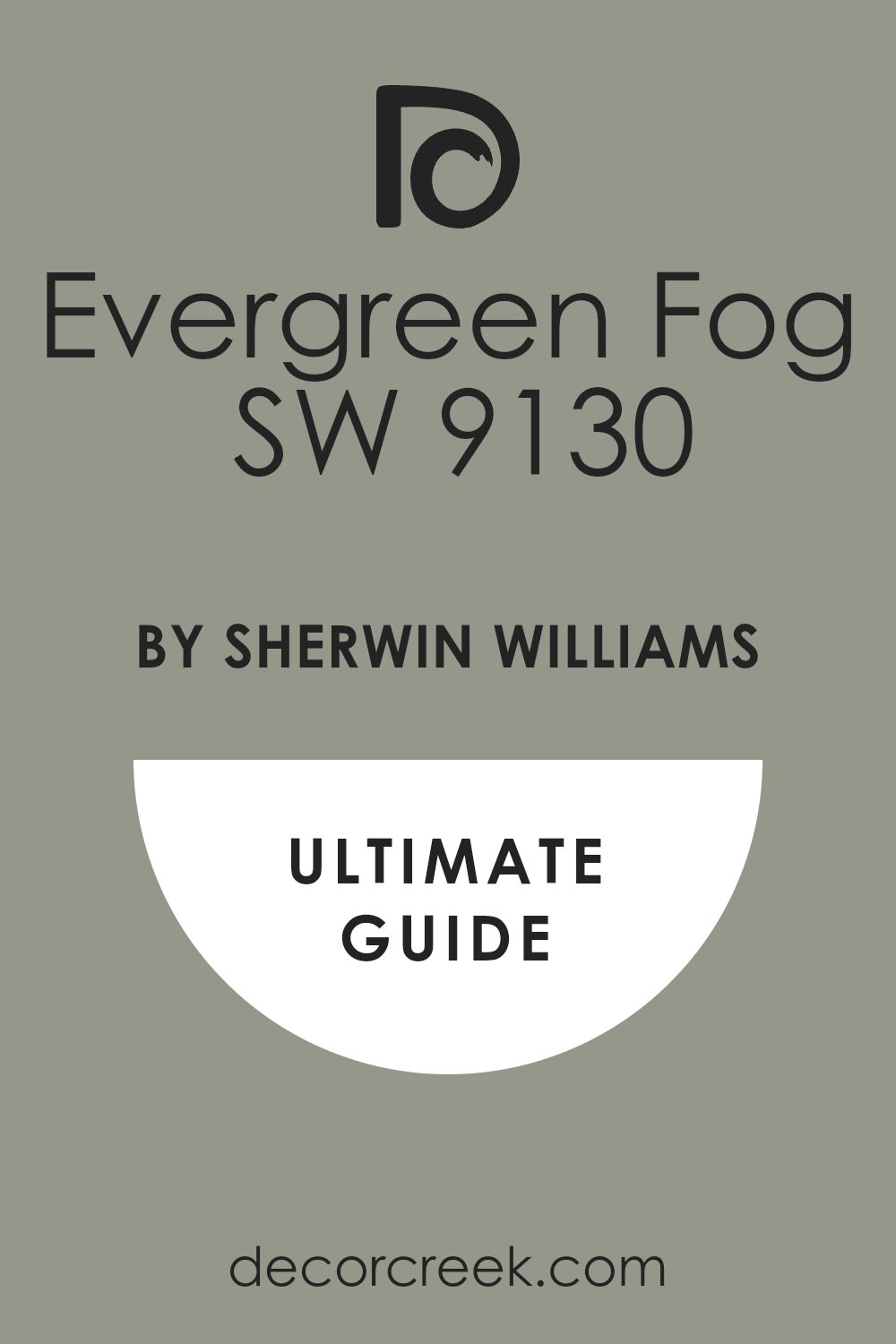
Evergreen Fog SW 9130
Evergreen Fog SW 9130 delivers a rich sage green hue that contains a lot of dark gray. This organic shade brings the feeling of a quiet pine forest right into a modern home.
It works as a bold accent wall behind a bed or around a cozy brick fireplace mantle. It gives kitchen islands a grounded look when the surrounding cabinets are painted a soft white.
The gray foundation prevents the green from looking too bright like fresh spring grass. It matches beautifully with brass hardware and gold light fixtures for a luxurious finish. It provides a cozy atmosphere in dining rooms during evening candlelit dinners.
Best used in: kitchen islands, accent walls, mudrooms, front doors, and exterior shutters
Pairs well with: Alabaster SW 7008, Accessible Beige SW 7036, Urbane Bronze SW 7048, unlacquered brass The key rule of this color for organic style is to combine it with warm wood accents to enhance its natural look.
🎨 Check out the complete guide to this color right HERE 👈
Urbane Bronze SW 7048
Urbane Bronze SW 7048 mixes deep charcoal gray with a rich, warm brown chocolate undertone. This heavy color choice creates an immediate statement when applied to a front door or trim boards.
It brings a grounded feeling to large rooms with high ceilings that feel too empty. It works perfectly on window sashes to frame a beautiful view of your backyard garden. The brown infusion stops it from looking like standard chalkboard paint or cold industrial metal.
It pairs nicely with warm tan leather chairs and rich velvet fabrics in a den. It offers a dramatic look for a small powder bathroom where you want big style.
Best used in: front doors, window trim, powder rooms, exterior siding, and cozy dens
Pairs well with: Alabaster SW 7008, Shoji White SW 7042, Agreeable Gray SW 7029, cognac leather The key rule of this color for dramatic style is to use it on architectural features you want people to notice.
🎨 Check out the complete guide to this color right HERE 👈

Iron Ore SW 7069
Iron Ore SW 7069 stands out as a soft charcoal black that never feels completely stark. This deep shade has a velvety appearance because it contains hints of gray and dark brown.
It works wonderfully for painting old brick fireplaces to give them a rapid modern update. It makes kitchen base cabinets look heavy and expensive when paired with light stone countertops. The lack of blue undertones prevents it from looking like a dark navy blue at night.
It creates an incredible backdrop for bright green houseplants placed on wooden wall shelves. It adds a touch of high-end design to standard interior doors when painted in a semi-gloss finish.
Best used in: fireplaces, accent walls, kitchen base cabinets, interior doors, and modern exteriors
Pairs well with: Alabaster SW 7008, Pure White SW 7005, Repose Gray SW 7015, bright brass knobs The key rule of this color for bold style is to use a satin or semi-gloss sheen to show off its depth.
🎨 Check out the complete guide to this color right HERE 👈

Naval SW 6244
Naval SW 6244 is a classic navy blue paint color that looks deep, royal, and traditional. This rich color choice brings a nautical or preppy vibe to home offices and boy bedrooms.
It avoids looking like a bright purple because it has a solid gray anchor in the mix. It looks stunning on kitchen islands when the rest of the walls are painted a clean white.
The color provides a beautiful contrast against light marble countertops and gold cabinet handles. It works nicely as an exterior color for beach houses or traditional suburban two-story homes. It gives a sense of stability and structure to any wall where it is applied.
Best used in: kitchen islands, home offices, boys bedrooms, accent walls, and front doors
Pairs well with: Alabaster SW 7008, Greek Villa SW 7551, Drift of Mist SW 9166, gold light fixtures The key rule of this color for traditional style is to pair it with bright warm metallic finishes for high contrast.
🎨 Check out the complete guide to this color right HERE 👈

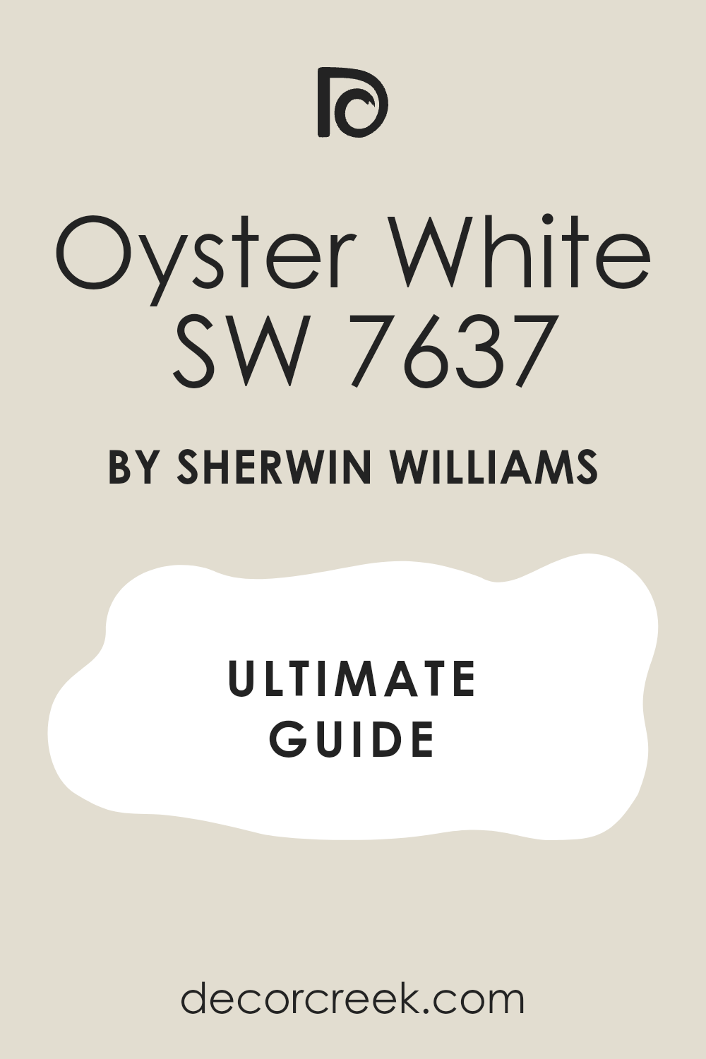
Oyster White SW 7637
Oyster White SW 7637 is a light greige color that can lean toward green depending on your lighting. This pale shade behaves like a chameleon on your walls by shifting between a soft gray and a warm cream.
It provides a gentle look for exterior stucco because it softens harsh afternoon sunlight. It looks great in open living spaces where you want a bit more color than standard white. The hidden green undertone makes it a great match for homes with lots of indoor plants.
It prevents large, empty walls from looking cold or unfinished in a new construction house. It feels very comforting when used in a sun-drenched breakfast nook or dining area.
Best used in: exterior stucco, open living areas, breakfast nooks, entryways, and master suites
Pairs well with: Alabaster SW 7008, Urbane Bronze SW 7048, Mindful Gray SW 7016, natural stone tiles The key rule of this color for soft style is to check it against green foliage outside your windows before painting.
🎨 Check out the complete guide to this color right HERE 👈
Shoji White SW 7042
Shoji White SW 7042 is a very warm cream paint that borders on becoming a light beige. This cozy choice works well for people who find standard white paints too bright for their taste.
It creates a soft look in bedrooms where you want to feel relaxed at the end of the day. It handles shadows well, meaning it will not turn dingy in hallways with no windows.
The balance of gray and beige pigments keeps it from looking like bright yellow butter on the wall. It pairs exceptionally well with dark wood antiques and traditional oriental rugs. It makes a house feel historic and well-loved from the moment you walk inside.
Best used in: historic homes, cozy bedrooms, dark hallways, main living areas, and ceilings
Pairs well with: Alabaster SW 7008, Iron Ore SW 7069, Evergreen Fog SW 9130, dark antique furniture The key rule of this color for historic style is to use it as a whole-room color to embrace its rich warmth.
🎨 Check out the complete guide to this color right HERE 👈

Drift of Mist SW 9166
Drift of Mist SW 9166 is a light, airy gray paint color with a soft green-gray undertone. This pale gray works perfectly for modern farmhouse interiors that need a clean but friendly wall color.
It offers a noticeable difference when placed next to white trim without looking too dark or gloomy. It brightens up smaller rooms by scattering the available natural light across the floor and walls.
The hint of green prevents it from looking like cold concrete or industrial metal sheets. It provides a smooth backdrop for gallery walls filled with black and white family photographs. It works well in kitchens because it coordinates easily with gray stone counter materials.
Best used in: modern farmhouses, gallery walls, kitchens, guest bedrooms, and small bathrooms
Pairs well with: Alabaster SW 7008, Tricorn Black SW 6258, Pewter Green SW 6208, matte black metal The key rule of this color for airy style is to use it in rooms that receive steady daylight throughout the afternoon.
🎨 Check out the complete guide to this color right HERE 👈

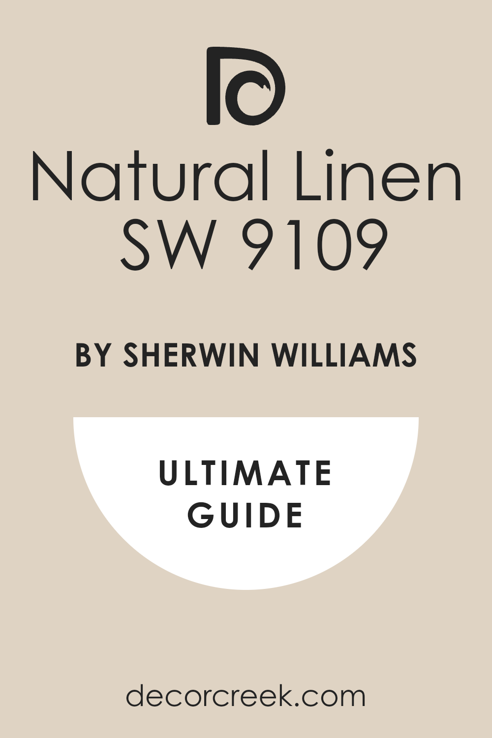
Natural Linen SW 9109
Natural Linen SW 9109 mimics the look of unbleached flax fabric with its warm tan undertones. This comforting shade brings an earthy texture to walls without looking like dark yellow mud.
It works well in rustic living rooms that feature stone fireplaces and exposed wooden ceiling beams. It creates a welcoming feel in an entryway, making guests feel comfortable the second they step inside.
The color does not shift into gray when the sun goes down, holding its warm tone all night long. It offers a beautiful contrast against crisp white painted doors and baseboard molding. It feels substantial and grounding in large rooms that have too much empty space.
Best used in: entryways, rustic living rooms, dining spaces, cozy dens, and staircase walls
Pairs well with: Alabaster SW 7008, Pure White SW 7005, Smoky Blue SW 7604, exposed wood beams The key rule of this color for rustic style is to match it with natural fibers like jute rugs and linen curtains.
🎨 Check out the complete guide to this color right HERE 👈
Mindful Gray SW 7016
Mindful Gray SW 7016 is a versatile mid-tone gray paint that sits right in the middle of warm and cool. This sturdy color choice works beautifully for exterior siding because it stands up well to direct sunlight.
It gives kitchen cabinets a solid appearance that hides daily dirt and sticky fingerprints from kids. The brownish undertone stops the gray from looking like a rainy sky or cold blue steel.
It provides a sharp contrast when paired with creamy white trim around windows and doors. It works well in large basement family rooms that need a color with some visual weight. It coordinates nicely with a wide variety of tile flooring types.
Best used in: exterior siding, kitchen cabinets, basements, formal living rooms, and trim work
Pairs well with: Alabaster SW 7008, Sea Salt SW 6204, Repose Gray SW 7015, dark slate tile The key rule of this color for versatile style is to use it where you need to hide wear and tear in busy areas.
🎨 Check out the complete guide to this color right HERE 👈

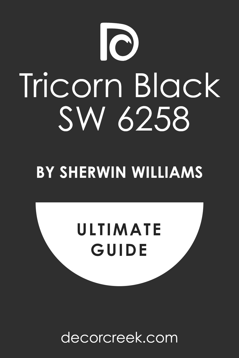
Tricorn Black SW 6258
Tricorn Black SW 6258 is a true black paint color that contains almost no visible undertones. This intense shade does not lean toward blue, green, or brown, making it a reliable black choice.
It brings a sharp modern edge to any home when used on interior doors and window sashes. It creates a dramatic effect when used on a single bedroom wall behind a light-colored bed frame.
The paint looks best in a satin or semi-gloss finish to prevent it from looking completely flat like charcoal. It makes colorful modern art pieces stand out with incredible clarity when hung on the wall. It provides a striking frame for outdoor views when painted on patio door frames.
Best used in: interior doors, window sashes, dramatic accent walls, patio frames, and modern shutters
Pairs well with: Alabaster SW 7008, Pure White SW 7005, Accessible Beige SW 7036, modern brass hardware The key rule of this color for modern design is to use it sparingly as a sharp outline for your rooms.
🎨 Check out the complete guide to this color right HERE 👈
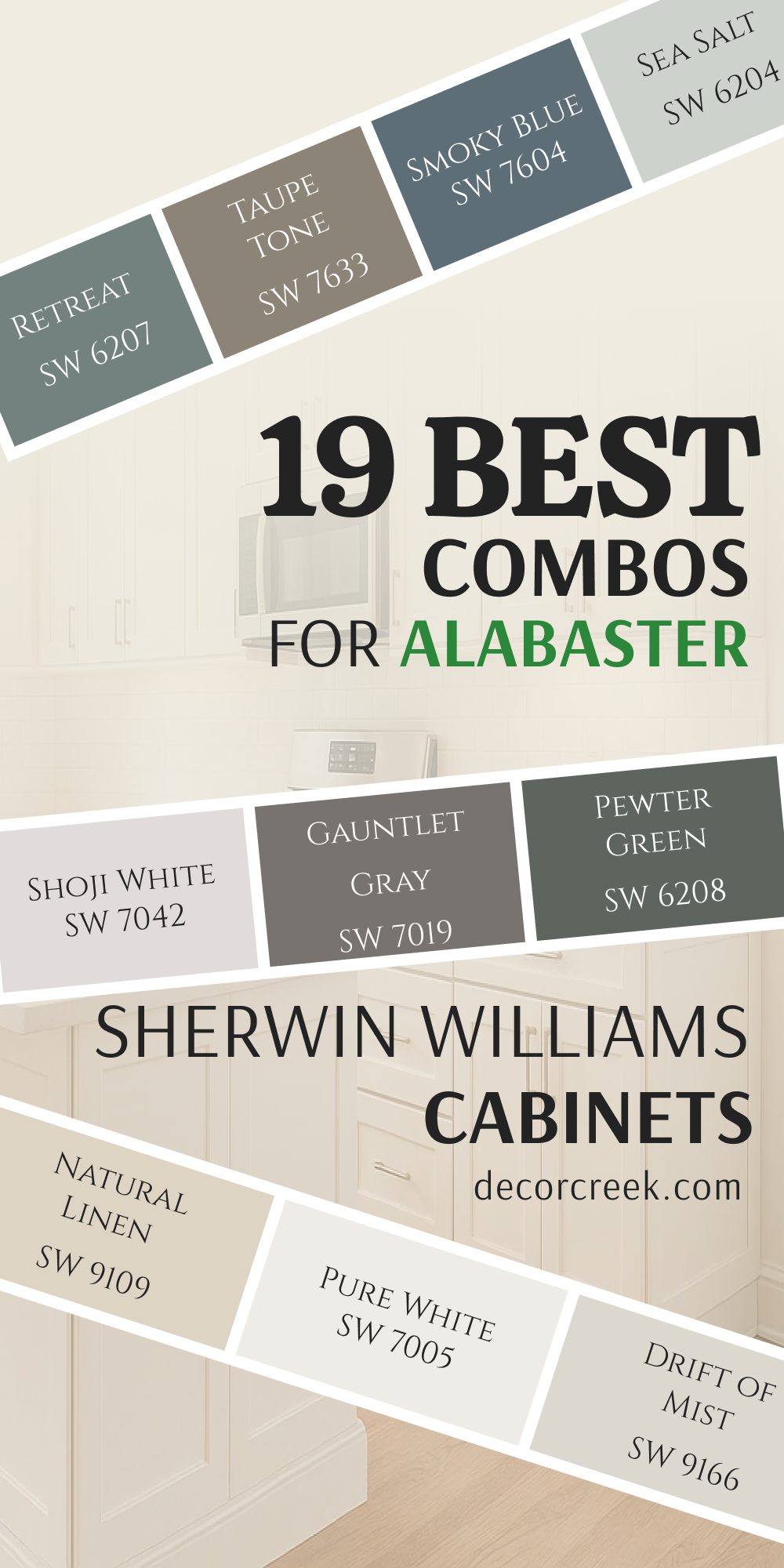
19 Best Combos for Alabaster by Sherwin Williams Cabinets
Alabaster SW 7008 + Iron Ore SW 7069
Alabaster SW 7008 + Iron Ore SW 7069 creates a stark look for modern kitchens. This pairing balances the soft white upper cabinets with deep charcoal lower cabinets to ground the cooking area. It stops the room from looking top-heavy while hiding shoe scuffs along the baseboards.
This specific combination works wonders in open-concept homes where you want a crisp architectural look without losing a sense of warmth. The dark charcoal lower cabinetry acts like a heavy anchor that visually stabilizes the entire cooking workspace.
It provides an incredible backdrop for shiny stainless steel appliances and bright, polished fixture finishes. Upper white cabinets painted in this soft shade help scatter natural light across the ceiling, making the whole room feel much larger.
Best used in: kitchens with high ceilings, open-concept cooking areas, and modern farmhouses
Pairs well with: matte black hardware, white quartz countertops, and light oak hardwood flooring The key rule of this color combo is to keep the dark shade on the bottom to anchor the room.
Alabaster SW 7008 + Naval SW 6244
Alabaster SW 7008 + Naval SW 6244 brings a classic nautical feel to kitchen cabinetry designs. This duo looks beautiful when the rich navy blue color is applied exclusively to a large center island. The white perimeter cabinets keep the cooking area feeling bright and clean during the daytime.
This timeless color marriage injects a sophisticated coastal elegance into traditional or transitional cooking areas. The deep royal blue acts as a gorgeous statement piece that immediately draws the eye to the center of the room.
It contrasts beautifully against white stone countertops, making the natural veining in the stone pop with clarity. Using the soft creamy white on the surrounding wall cabinets ensures the room never feels dark or closed in.
Best used in: coastal homes, traditional kitchens, and large center islands
Pairs well with: brushed gold handles, white marble counters, and classic subway tile backsplashes The key rule of this color combo is to use brass accents to highlight the blue tones.
Alabaster SW 7008 + Accessible Beige SW 7036
Alabaster SW 7008 + Accessible Beige SW 7036 offers a soft contrast that feels very traditional. This combination works well for homeowners who dislike dark colors but want a two-tone kitchen look. The beige lower cabinets add a layer of warmth that feels very welcoming to guests.
This combination creates a gentle, low-contrast transition that makes any kitchen feel instantly cozy and family-friendly. The subtle grayish-beige hue on the base cabinets hides daily dust and fingerprints much better than basic white paint does.
It establishes a soft palette that coordinates perfectly with warm hardwood flooring and natural stone decorative items. The creamy white tone above keeps the ceiling area looking bright, tall, and completely open.
Best used in: small kitchens, traditional breakfast bars, and cottage-style cooking spaces
Pairs well with: oil-rubbed bronze hardware, warm wood cutting boards, and beige stone backsplashes The key rule of this color combo is to use warm light bulbs to emphasize the cozy undertones.
Alabaster SW 7008 + Evergreen Fog SW 9130
Alabaster SW 7008 + Evergreen Fog SW 9130 introduces an organic nature vibe into the heart of your home. This mixture looks stunning when the sage green paint covers the lower cabinets and the pantry door. It creates a beautiful link to outdoor views if your kitchen faces a garden or backyard.
This earthy duo brings a highly sophisticated, muddy green elements into standard kitchen layouts. The sage green base color has a heavy gray undertone that prevents it from looking too bright or tropical in direct sunlight.
It grounds the room with a dusty foliage tone that pairs seamlessly with natural wood elements like open floating shelves. The warm white upper cabinets keep the vibe feeling upscale, fresh, and perfectly balanced.
Best used in: garden-facing kitchens, craftsman homes, and laundry room storage cabinets
Pairs well with: unlacquered brass faucets, soapstone countertops, and natural wood floating shelves The key rule of this color combo is to include indoor plants to match the green cabinetry.
Alabaster SW 7008 + Tricorn Black SW 6258
Alabaster SW 7008 + Tricorn Black SW 6258 delivers a high-contrast style that feels very modern. This bold choice uses true black on the base cabinets to create a clean horizon line in the room. The creamy white upper cabinets ensure that the kitchen still feels open and filled with light.
This striking look is perfect for anyone trying to build a clean, minimalist aesthetic in a modern apartment or house. True black lower cabinets offer zero undertones, meaning they create an incredibly sharp and predictable contrast against the soft white tops.
This setup frames the kitchen space beautifully, turning standard cabinet fronts into sleek architectural elements. The creamy white walls soften the final look just enough to keep it looking liveable and friendly.
Best used in: contemporary apartments, minimalist kitchens, and high-contrast dining spaces
Pairs well with: chrome fixtures, stainless steel appliances, and solid white solid-surface counters The key rule of this color combo is to use flat or matte finishes on the black paint.
Alabaster SW 7008 + Repose Gray SW 7015
Alabaster SW 7008 + Repose Gray SW 7015 provides a cool look that remains popular in new homes. This pairing utilizes a soft gray on the lower cabinets to create a subtle shift from the white walls. It is an excellent choice for keeping a small kitchen looking clean without using bright whites everywhere.
This highly popular blend offers a beautifully balanced greige appearance that bridges the gap between warm and cool styles. The soft gray on the lower cabinets contains a tiny drop of brown, keeping it from looking like cold industrial metal.
It matches perfectly with gray-veined stone countertops and stainless steel cooking appliances for a cohesive look. The warm white upper cabinets maintain a friendly, luminous quality throughout the entire workspace day and night.
Best used in: suburban family homes, small apartment kitchens, and bright laundry rooms
Pairs well with: brushed nickel handles, gray vein marble, and white painted crown molding The key rule of this color combo is to pair it with cool-toned flooring like gray stained wood.
Alabaster SW 7008 + Sea Salt SW 6204
Alabaster SW 7008 + Sea Salt SW 6204 creates a beachy atmosphere that feels very light and breezy. This combination uses a pale green-blue shade on the island or lower cabinets to soften the kitchen design. It works wonders in dark rooms because both colors reflect a massive amount of light.
This breezy combination instantly transforms standard cooking areas into a relaxing, cottage-style sanctuary. The watery green-blue-gray tone on the lower cabinets responds beautifully to changing light, looking green in the morning and blue by evening.
It adds a cheerful splash of muted color without dominating the space or feeling too loud. The soft white cabinets above keep the overall design feeling clean, airy, and full of sunlight.
Best used in: vacation cottage kitchens, small bathrooms, and bright sunroom wet bars
Pairs well with: white ceramic sinks, natural wicker baskets, and light quartz countertops The key rule of this color combo is to stick with natural wood floors to complete the look.
Alabaster SW 7008 + Urbane Bronze SW 7048
Alabaster SW 7008 + Urbane Bronze SW 7048 mixes a warm white color with a rich bronze-gray tone. This pairing brings a lot of luxury to custom kitchen cabinets and built-in living room bookshelves. The dark brown undertone in the bronze paint coordinates well with chocolate wood tones.
This incredibly rich palette targets high-end designs where you want an immediate feeling of depth and warmth. The deep bronze color on the lower elements contains a mixture of gray and brown that feels exceptionally grounded and expensive.
It acts as an amazing coordinate for warm leather barstools and dark stained walnut flooring surfaces. The creamy white upper units prevent this heavy bronze shade from making a smaller kitchen feel like a dark cave.
Best used in: high-end custom kitchens, library bookcases, and open-concept great rooms
Pairs well with: antiqued brass hardware, dark walnut floors, and warm stone backsplashes The key rule of this color combo is to use it in rooms that get lots of sunlight.
Alabaster SW 7008 + Mindful Gray SW 7016
Alabaster SW 7008 + Mindful Gray SW 7016 offers a solid mid-tone gray contrast for busy family kitchens. This duo uses a deeper gray on the bottom cabinetry to hide the mess of everyday cooking activities. The white upper cabinetry keeps the room looking neat, tidy, and spacious from a distance.
This practical combination provides a sturdy, industrial-leaning aesthetic that is ideal for high-traffic family homes. The mid-tone gray on the lower cabinets has enough weight to hide scuffs from busy kids and pets easily.
It pairs wonderfully with concrete-look countertops and dark iron hardware choices for a slightly rustic or modern edge. The creamy white paint above lifts the eye, ensuring the room feels bright and comfortable for cooking.
Best used in: high-traffic family kitchens, pantry storage walls, and utility mudrooms
Pairs well with: industrial iron hardware, concrete look counters, and stainless steel sinks The key rule of this color combo is to use a durable satin finish for easy cleaning.
Alabaster SW 7008 + Natural Linen SW 9109
Alabaster SW 7008 + Natural Linen SW 9109 crafts an organic look based on soft sandy tones. This pairing uses a light tan on the lower cabinets to bring an earthy texture into a white kitchen. It is an ideal setup for people who love a neutral look but hate cold gray shades.
This color match relies on flax and sandy undertones to create a deeply comforting, country-style culinary space. The warm tan on the lower cabinets brings a highly organic quality that perfectly mimics unbleached natural fabrics.
It looks stunning alongside copper kitchen pots, terracotta accessories, and warm oak butcher block countertops. The soft white upper cabinetry adds a clean finish that stops the sandy tones from looking too old-fashioned.
Best used in: country kitchens, rustic lake houses, and relaxed dining area buffets
Pairs well with: copper pots, terra cotta decorative items, and warm oak butcher block counters The key rule of this color combo is to keep all other decorations in warm neutral tones.
Alabaster SW 7008 + Pure White SW 7005
Alabaster SW 7008 + Pure White SW 7005 creates a very soft white-on-white look for clean kitchens. This combination places the slightly brighter white on the trim boards and crown molding for a tiny shift. The creamy white on the main cabinets prevents the large room from feeling blinding.
This delicate layering of two popular white paints creates a subtle, sophisticated texturing within a monochromatic kitchen. The brighter white details highlight architectural molding, while the creamier white cabinets keep the main surfaces feeling soft and inviting.
This strategy keeps an all-white kitchen from looking like a sterile hospital laboratory or a freezing ice cube. It provides an absolute blank canvas for showing off beautiful hardwood floors and colorful accent decor.
Best used in: minimalist modern kitchens, large bright utility rooms, and open pantry spaces
Pairs well with: matte gold fixtures, white tile backsplashes, and light blonde wood floors The key rule of this color combo is to use different textures so the room does not look flat.
Alabaster SW 7008 + Drift of Mist SW 9166
Alabaster SW 7008 + Drift of Mist SW 9166 provides a faint gray contrast that looks beautiful in morning light. This pairing uses a pale mist gray on the cabinets to create a clean, contemporary feel in the house. It works well if you want a gray kitchen that never looks dark or heavy.
This ultra-light color combination is excellent for smaller spaces where heavy dark cabinets would shrink the room. The pale mist gray shade on the lower cabinets offers just enough contrast to prove it is not another white paint.
It reacts beautifully to changing morning sunlight, bringing a soft silver shimmer into your kitchen work zones. The creamy white accents overhead tie the whole space together into an airy, welcoming design.
Best used in: compact apartment kitchens, farmhouse cooking zones, and hallway linen closets
Pairs well with: black iron pull handles, white marble tile, and light ash wood accents The key rule of this color combo is to ensure your kitchen has good overhead light fixtures.
Alabaster SW 7008 + Shoji White SW 7042
Alabaster SW 7008 + Shoji White SW 7042 mixes two different shades of warm white for an old-world feel. This duo relies on the creamier white color to add a sense of history to traditional cabinet doors. It keeps the cooking space looking warm and soft even during dark winter days.
This combination relies on rich, heavily pigmented off-white shades to craft an immediate atmosphere of cozy history. The deeper white on the lower cabinetry borders on a very light beige, which swallows shadows beautifully without looking dirty.
It forms an exceptional match for old antique furniture pieces, pewter hardware handles, and cream-colored stone floors. The slightly brighter white on the upper surfaces keeps the cooking environment feeling fresh, safe, and clean.
Best used in: historic home kitchens, cottage butler pantries, and cozy breakfast bars
Pairs well with: pewter hardware, antique wood cutting boards, and cream-colored stone tile The key rule of this color combo is to avoid using any cool blue decorations nearby.
Alabaster SW 7008 + Gauntlet Gray SW 7019
Alabaster SW 7008 + Gauntlet Gray SW 7019 delivers a deep, smoky gray contrast for a dramatic kitchen design. This combination uses a heavy charcoal shade on the island to make it the main feature of the room. The creamy white walls stop the dark cabinetry from shrinking the size of the room.
This deep gray selection brings a highly industrial, upscale moodiness directly into a modern family kitchen layout. The smoky charcoal color on the island handles daily cooking wear and tear flawlessly while providing a massive pop of color.
It coordinates beautifully with dark slate tiles and modern chrome barstools pulled up to the breakfast counter. The warm white cabinetry surrounding it provides a soft contrast that keeps the space feeling highly balanced.
Best used in: large modern kitchens, urban loft spaces, and basement entertainment bars
Pairs well with: chrome barstools, thick white quartz counters, and dark slate floor tiles The key rule of this color combo is to use bright white lights under the upper cabinets.

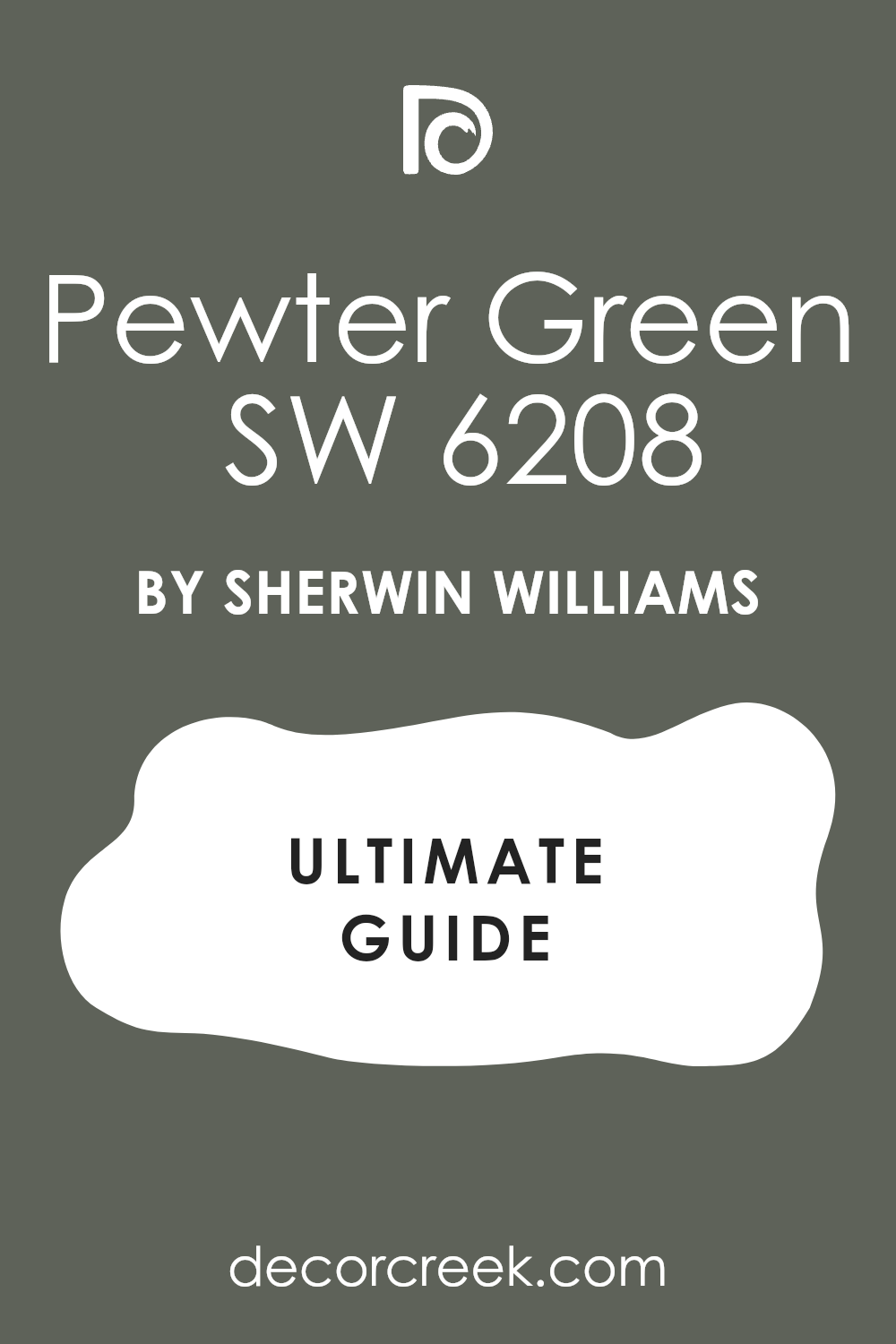
Alabaster SW 7008 + Pewter Green SW 6208
Alabaster SW 7008 + Pewter Green SW 6208 brings a rich, dark olive tone into your kitchen cabinetry plans. This pairing looks incredibly expensive when the deep green shade covers all the base cabinets in the room. The soft white walls provide a clean balance that keeps the space feeling open.
This rich green pairing creates a luxury boutique look that feels completely grounded in natural, organic styling. The deep pewter green has a strong charcoal base that keeps the color looking mature, moody, and deeply sophisticated.
It looks breathtakingly high-end when paired with brushed brass hardware handles and dark wood flooring boards. The creamy white paint above provides a refreshing contrast that keeps the room feeling bright and open.
Best used in: luxury custom kitchens, historic renovations, and wooded cabin cooking areas
Pairs well with: brushed brass hardware, soapstone sinks, and medium oak hardwood floors The key rule of this color combo is to use warm metallic accents to bring out the green richness.
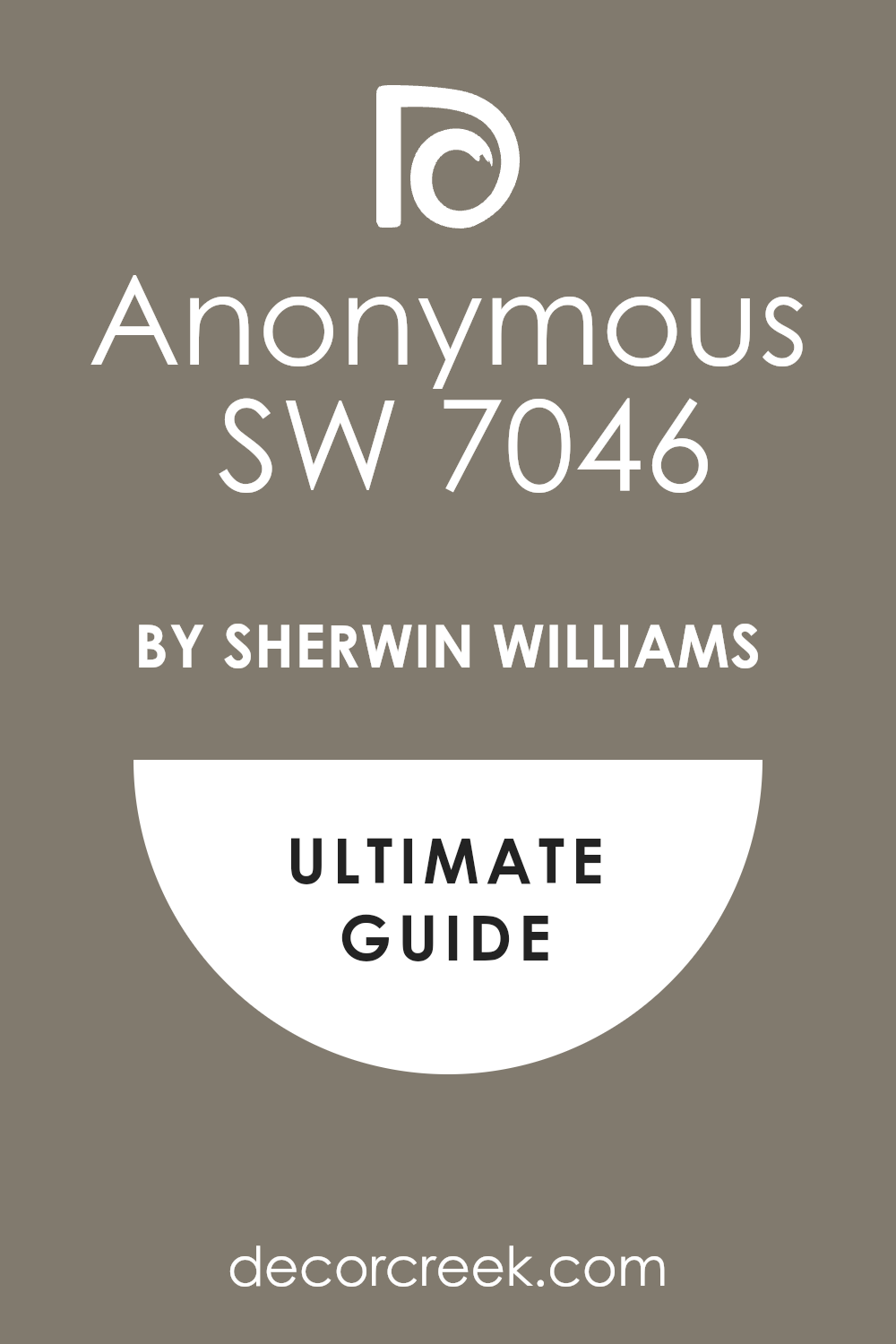
Alabaster SW 7008 + Anonymous SW 7046
Alabaster SW 7008 + Anonymous SW 7046 combines a warm white paint with a deep earthy brown-gray shade. This duo gives your kitchen island a grounded appearance that coordinates well with stone accent walls. It is a smart choice for homes that feature a lot of natural stone elements.
This unique combination targets mountain properties or transitional homes that rely on raw stone textures for style. The deep brown-gray tone on the lower elements acts as an extension of natural granite or dark slate tile work.
It brings a solid, unshakeable presence into the center of the kitchen without feeling cold or modern. The soft creamy white on the surrounding walls and upper cabinets adds a friendly touch that invites people inside.
Best used in: mountain home kitchens, transitional spaces, and large kitchen island bases
Pairs well with: dark bronze hardware, granite countertops, and rustic wooden barstools The key rule of this color combo is to match the dark paint with stone textures in the room.
Alabaster SW 7008 + Smoky Blue SW 7604
Alabaster SW 7008 + Smoky Blue SW 7604 offers a muted navy choice that looks dusty, mature, and soft. This combination avoids the bright look of standard blues by using a shade with lots of gray in it. It gives a beautiful, relaxed look to kitchen lower cabinets and built-in desk areas.
This dusty blue marriage delivers a deeply relaxed, country-manor feeling that avoids looking too loud or overly nautical. The gray infusion in the blue paint ensures it stays quiet, mature, and incredibly easy on the eyes in bright sunlight.
It serves as a beautiful accent color for lower cabinetry runs, home office built-ins, or craft room desks. The warm white cabinetry above keeps the workspace looking cheerful, spacious, and perfectly organized.
Best used in: family home kitchens, home office built-ins, and craft room storage units
Pairs well with: brushed nickel knobs, white subway tile, and light maple wood finishes The key rule of this color combo is to use it where you want a relaxed, colorful accent.

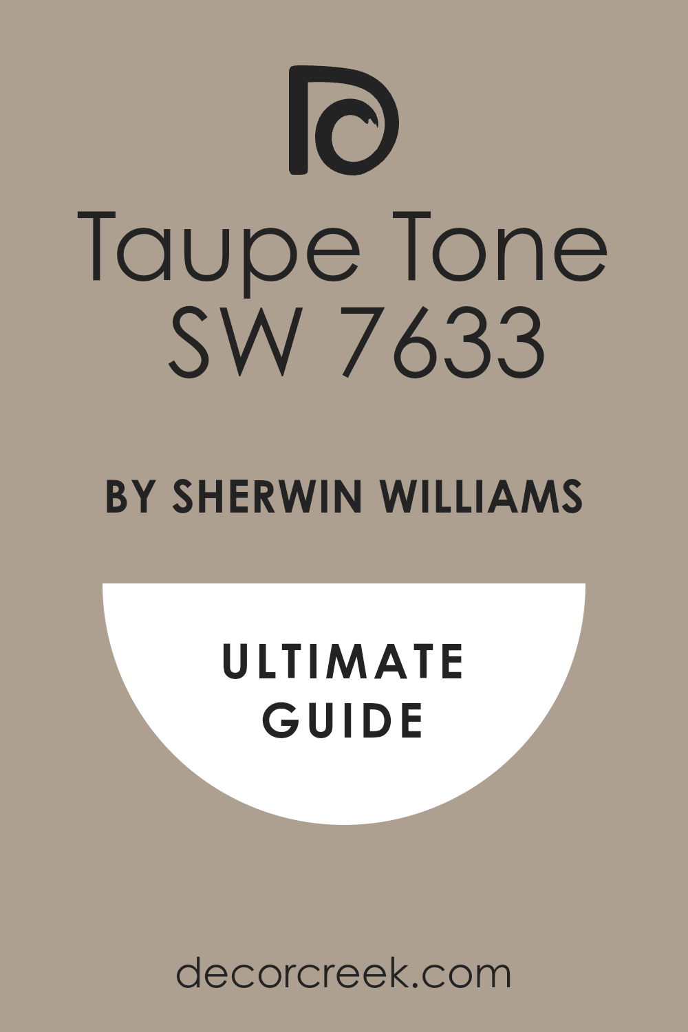
Alabaster SW 7008 + Taupe Tone SW 7633
Alabaster SW 7008 + Taupe Tone SW 7633 blends a creamy white paint with a thick, warm grayish-brown tone. This pairing brings a neutral feeling to kitchen cabinets without relying on standard gray paint options. The taupe color looks very high-end when applied to traditional shaker-style cabinet doors.
This high-end neutral look provides an exceptional alternative for designers who are tired of basic grays and beiges. The rich taupe shade brings a dense blend of gray and brown that feels deeply luxurious on traditional shaker cabinets.
It looks incredible when paired with polished nickel hardware fixtures and dark espresso-colored hardwood floors. The soft white upper cabinets ensure that the entire kitchen layout feels airy, upscale, and completely timeless.
Best used in: upscale suburban kitchens, master bathroom vanities, and formal butler pantries
Pairs well with: polished nickel fixtures, white quartzite counters, and dark espresso floors The key rule of this color combo is to check the taupe shade under your specific night lighting.
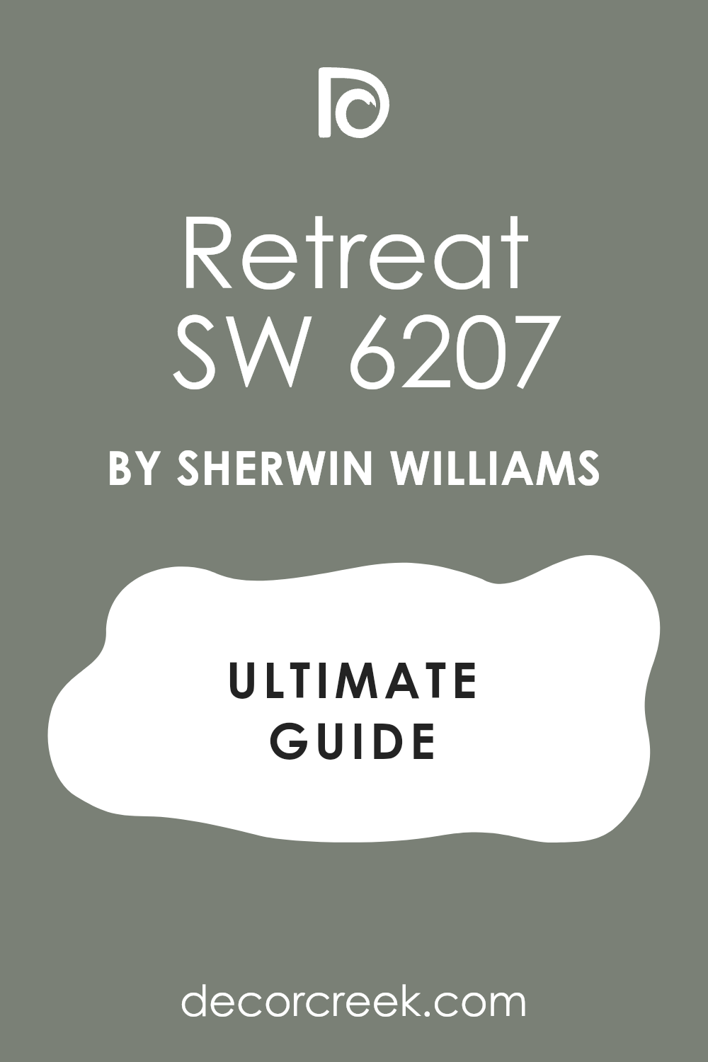
Alabaster SW 7008 + Retreat SW 6207
Alabaster SW 7008 + Retreat SW 6207 joins a soft white color with a misty, medium-toned green-blue paint. This combination brings a tranquil feeling to laundry room cabinets and small kitchen islands. The gray undertone in the green paint keeps it looking sophisticated rather than bright.
This misty green-blue option creates a quiet, spa-like escape within busy laundry rooms or small kitchen areas. The balanced gray undertones stop the color from shifting into a childish or overwhelming pastel green in daylight.
It brings a soft, peaceful touch of color that pairs perfectly with light oak woodworking and black metal hardware handles. The creamy white cabinets overhead maintain a bright, clean, and helpful feeling across all your workspace surfaces.
Best used in: laundry room storage, cottage kitchen islands, and bathroom vanity cabinets
Pairs well with: black metal handles, white porcelain hardware, and light oak woodwork The key rule of this color combo is to use it in rooms that feature plenty of natural daylight.
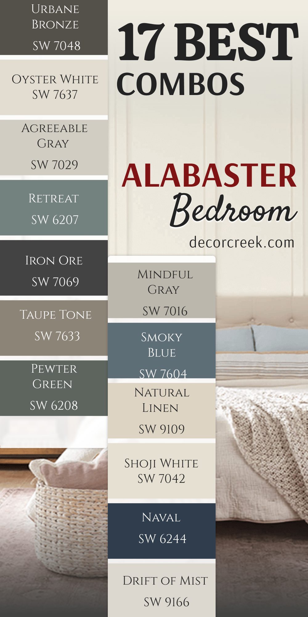
17 Best Combos for Alabaster by SherwinWilliams Bedroom
Alabaster SW 7008 + Sea Salt SW 6204
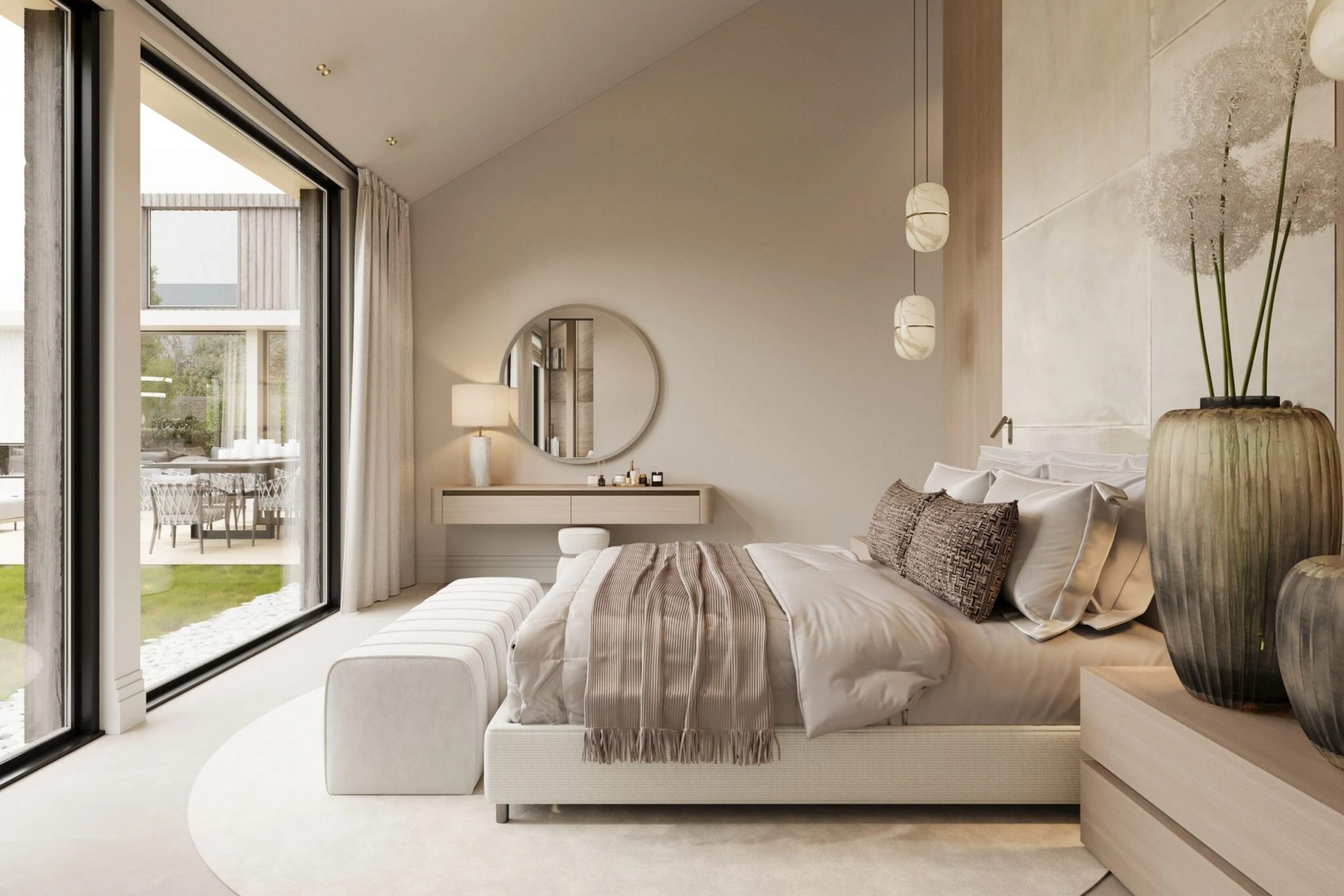
Alabaster SW 7008 + Sea Salt SW 6204 creates a beachy sanctuary on your main bedroom walls. This color pairing involves painting the main walls in the soft green-blue tone while keeping the ceiling and trim white.
It makes the sleeping area feel light and open when the morning sun enters. This gentle mixture feels highly refreshing after a long day at work because it mimics the cool colors of ocean water. The heavy gray undertone in the sea salt shade keeps the green from looking childish or too bright under warm bedside lamps.
It creates a gorgeous background for light cotton textiles, woven wicker hampers, and distressed white wooden furniture pieces. Homeowners choose this combination when they want their bedroom to feel like a quiet holiday house by the coast.
Best used in: master bedrooms, guest rooms, and beach cottage sleeping spaces
Pairs well with: white linen sheets, natural wood headboards, and soft gray wool rugs The key rule of this color combo is to use light wood tones to maintain the breezy cottage feel.
Alabaster SW 7008 + Evergreen Fog SW 9130
Alabaster SW 7008 + Evergreen Fog SW 9130 brings a rich forest tone to a single bedroom accent wall. This duo uses the deep sage green color right behind the headboard to create a striking focal point. The remaining walls stay white to keep the bedroom from looking dark during the daytime.
This organic pairing connects your indoor sleeping space directly to the beauty of the outdoor wood landscape. The green paint has a lot of gray mixed into it, which gives it a dusty look that feels very upscale.
It looks incredibly striking when combined with shiny brass metal light fixtures and dark leather reading chairs. It grounds large master suites that have too much empty space, making the bed feel safely enclosed and incredibly welcoming.
Best used in: modern bedrooms, craftsman homes, and teenagers bedroom accent walls
Pairs well with: brass bedside lamps, dark leather chairs, and cream-colored throw blankets The key rule of this color combo is to place the dark green paint on the wall with the most window light.
Alabaster SW 7008 + Accessible Beige SW 7036
Alabaster SW 7008 + Accessible Beige SW 7036 offers a warm, envelope-like feeling for a cozy bedroom space. This combination involves painting the entire room in the soft beige shade and using the white paint on the trim.
It provides a comfortable backdrop that makes traditional wooden furniture look beautiful. This low-contrast layout wraps the whole bedroom in a gentle layer of sandy warmth that coordinates with any floor type.
The gray foundation inside the beige paint stops it from turning yellow or orange when you turn on your evening light bulbs. It offers an excellent environment for deep rest because there are no harsh color jumps to distract your eyes. It makes smaller guest rooms feel highly luxurious, like a clean room in a historic boutique hotel.
Best used in: traditional bedrooms, guest suites, and rooms with north-facing windows
Pairs well with: dark walnut dressers, white cotton quilts, and antique bronze lamps The key rule of this color combo is to layer different neutral fabrics to build a cozy environment.
Alabaster SW 7008 + Repose Gray SW 7015
Alabaster SW 7008 + Repose Gray SW 7015 delivers a clean, contemporary look for a modern master bedroom. This pairing utilizes a soft gray on the walls to create a crisp contrast against the creamy white doors and molding.
It looks sharp and elegant when paired with simple black metal bed frames. This greige wall color brings a perfectly balanced look to homes that want a modern style without feeling chilly. The tiny hint of brown inside the gray paint helps it coordinate nicely with warm oak hardwood flooring sheets.
It acts like a clean canvas that lets you display colorful abstract paintings or textured woven wall hangings. It remains a top choice for staging houses because buyers always love how clean and organized a gray bedroom looks.
Best used in: modern master suites, urban apartments, and minimalist guest bedrooms
Pairs well with: black iron furniture, silver picture frames, and crisp white duvet covers The key rule of this color combo is to use bright white trim paint to make the gray look intentional.
Alabaster SW 7008 + Drift of Mist SW 9166
Alabaster SW 7008 + Drift of Mist SW 9166 creates a very faint, soft gray look across the bedroom walls. This duo is perfect for homeowners who want a clean white room but need a slight variation on the walls.
The mist gray shade keeps the room looking bright while adding a touch of modern style. This delicate combination relies on a very small color difference to create a highly sophisticated look in morning light.
The walls appear slightly grayish, which makes the creamy white trim look incredibly crisp, straight, and distinct. It prevents a brightly sunlit master bedroom from looking completely blinding or washed out during midday hours. It offers a beautiful, airy feeling that makes small apartment bedrooms feel twice their actual size.
Best used in: modern farmhouses, small guest rooms, and bright sunny bedrooms
Pairs well with: light ash wood furniture, gray woven rugs, and black metal accents The key rule of this color combo is to use it in rooms that receive lots of natural sunlight.
Alabaster SW 7008 + Naval SW 6244
Alabaster SW 7008 + Naval SW 6244 provides a traditional look by using deep navy blue on a bedroom accent wall. This combination creates a striking contrast that looks great behind a light gray fabric headboard.
The white paint on the surrounding walls keeps the sleeping space from feeling small. This royal blue shade brings a strong sense of structure, tradition, and masculine energy into a master suite.
The gray anchor hidden within the navy paint stops it from looking like bright purple under yellowish nighttime lamps. It forms a breathtaking background for gold decorative picture frames, white cotton quilts, and rich mahogany dressers. Using it on a single wall creates a beautiful sense of depth that draws you toward the bed.
Best used in: boys bedrooms, traditional master suites, and coastal guest rooms
Pairs well with: gold decorative items, white crisp bedding, and dark oak flooring The key rule of this color combo is to keep the navy blue restricted to just one single wall.
Alabaster SW 7008 + Shoji White SW 7042
Alabaster SW 7008 + Shoji White SW 7042 blends two warm shades together for a rich bedroom experience. This pairing uses the creamier white paint on the walls to create a historic, historic atmosphere in the room.
It feels very comforting during the evening when warm lamps are lit next to the bed. This rich white color choice contains a large amount of beige and gray pigments that absorb shadows smoothly.
It keeps dark hallways and windows without direct sunlight from looking dingy, cold, or unfinished. It coordinates beautifully with older antique furniture pieces and traditional wool rugs passed down through families. It makes your bedroom feel like a safe, historic haven where you can easily escape the noise of the world.
Best used in: historic homes, cozy guest rooms, and traditional country bedrooms
Pairs well with: antique pine furniture, cream wool blankets, and brass light fixtures The key rule of this color combo is to avoid using any cool or bright blue decorations in the room.
Alabaster SW 7008 + Natural Linen SW 9109
Alabaster SW 7008 + Natural Linen SW 9109 crafts an organic bedroom look based on soft sandy linen tones. This combination uses a light tan on the walls to bring an earthy texture into your private sleeping space.
It provides an excellent backdrop for rustic wooden furniture pieces and woven baskets. This tan color choice holds its warm golden undertone perfectly even after the sun goes completely down.
It mimics the beautiful texture of unbleached linen fabrics to make your walls feel substantial and heavy. It matches wonderfully with natural fiber decorations like large jute rugs and thick woven window curtains. It delivers a deeply grounded look that helps you feel connected to natural elements while resting.
Best used in: rustic lake houses, country bedrooms, and relaxed master suites
Pairs well with: jute area rugs, white linen curtains, and warm oak dressers The key rule of this color combo is to stick with natural fiber decorations to complete the style.
Alabaster SW 7008 + Smoky Blue SW 7604
Alabaster SW 7008 + Smoky Blue SW 7604 offers a muted blue choice that feels very dusty, mature, and soft on walls. This pairing uses a gray-blue tone on the walls to give the bedroom a colorful look without being too bright.
It works nicely with light wood floors and white painted bedroom doors. This dusty blue paint is an exceptional alternative for people who want blue walls but fear a bright look.
The massive amount of gray in the mixture keeps the color quiet, peaceful, and highly sophisticated for an adult bedroom. It looks lovely when framed by creamy white baseboards, making the color appear intentional and well-planned. It coordinates nicely with soft silver lamp bases and light gray bedding sets.
Best used in: guest bedrooms, relaxing master suites, and traditional home designs
Pairs well with: brushed nickel lamps, white cotton sheets, and light maple dressers The key rule of this color combo is to use white curtains to balance the dusty blue walls.
Alabaster SW 7008 + Mindful Gray SW 7016
Alabaster SW 7008 + Mindful Gray SW 7016 provides a solid mid-tone gray option for modern bedroom walls. This duo uses a deeper gray on the walls to create a sharp contrast against white crown molding and baseboards.
It gives the room a grounded, structured feeling that looks very high-end and clean. This mid-tone gray choice leans slightly warm due to a tiny drop of brown pigment hidden inside the base.
It keeps your master bedroom looking sharp and highly tailored, like an upscale hotel room in a big city. It provides a striking background that makes crisp white pillows and duvet covers look extra clean and bright. It works wonders for hiding accidental wall smudges in busy family homes with small children.
Best used in: spacious master bedrooms, teenagers rooms, and contemporary guest suites
Pairs well with: dark slate accents, white bedding sets, and modern iron light fixtures The key rule of this color combo is to use a flat paint finish on the walls to hide bumps.
Alabaster SW 7008 + Pewter Green SW 6208
Alabaster SW 7008 + Pewter Green SW 6208 brings a rich, dark olive green tone onto a bedroom focal wall. This combination looks beautiful when paired with a light-colored wood bed frame and white pillows.
The dark green paint adds a sense of luxury that feels like an upscale boutique hotel room. This moody color selection relies on a heavy charcoal foundation to give the green paint an incredible amount of depth.
It creates a stunning visual frame around your bed, turning the headboard area into a gorgeous design statement. It pairs beautifully with rich dark walnut dressers and bright unlacquered brass bedside reading lamps. The surrounding white walls ensure that the dark green accent never makes the bedroom feel small.
Best used in: luxury master bedrooms, wooded cabin suites, and modern accent walls
Pairs well with: bright brass bedside lights, white duvet covers, and medium oak floors The key rule of this color combo is to ensure the rest of the room stays bright with white walls.
Alabaster SW 7008 + Taupe Tone SW 7633
Alabaster SW 7008 + Taupe Tone SW 7633 blends a creamy white paint with a rich, warm grayish-brown bedroom wall color. This pairing brings a neutral feeling to the room without relying on standard cool gray paint options.
The taupe color looks very expensive when matched with white fabric curtains. This dense mixture of gray and brown creates an incredibly sophisticated look for a formal master bedroom suite.
It behaves beautifully under warm yellow lamplight, turning into a rich chocolate hue during the night. It provides a lovely contrast that makes white painted doors and window trim stand out immediately. It feels highly substantial and grounding in large master bedrooms that have high, empty ceilings.
Best used in: upscale master suites, traditional guest rooms, and formal bedrooms
Pairs well with: polished nickel fixtures, white bedding accessories, and dark espresso furniture The key rule of this color combo is to check the taupe shade under your bedroom lamps at night.
Alabaster SW 7008 + Iron Ore SW 7069
Alabaster SW 7008 + Iron Ore SW 7069 creates a bold look by using a charcoal black accent wall behind the bed. This duo relies on the deep dark paint to make the headboard stand out as the main feature of the space.
The white walls around it prevent the bedroom from looking like a dark cave. This charcoal black shade has a velvety appearance because it contains hints of dark gray and warm brown pigments.
It stops the wall from looking flat or harsh, giving the bedroom a cozy, protective atmosphere at night. It forms an incredible background for bright green houseplants placed on wooden wall shelves above the bed. The stark contrast against the creamy white trim creates an immediate high-end architectural look.
Best used in: modern bedrooms, urban lofts, and dramatic teenage rooms
Pairs well with: bright brass accents, light gray bedding, and modern black frames The key rule of this color combo is to keep the dark accent wall clean and free of clutter.
Alabaster SW 7008 + Retreat SW 6207
Alabaster SW 7008 + Retreat SW 6207 joins a soft white color with a misty, medium-toned green-blue paint on the walls. This combination brings a relaxed feeling to guest bedrooms and small sleeping areas in a house.
The gray undertone in the green paint keeps it looking mature rather than childish. This misty color choice creates a quiet, spa-like environment where you can easily unwind and fall asleep.
It responds beautifully to natural sunlight, shifting its appearance from a soft sage to a light slate blue. It coordinates perfectly with simple matte black lamps and light oak furniture pieces around the room. It offers a wonderful break from basic gray colors while remaining incredibly quiet and easy on the eyes.
Best used in: cottage guest rooms, small bedrooms, and relaxing master spaces
Pairs well with: matte black lamps, white cotton blankets, and natural pine dressers The key rule of this color combo is to use it in bedrooms that receive plenty of afternoon daylight.
Alabaster SW 7008 + Agreeable Gray SW 7029
Alabaster SW 7008 + Agreeable Gray SW 7029 dominates bedroom designs because it blends warm beige with a cool gray wall color. This flexible choice means it adapts easily to whatever bedroom furniture color you already own.
It brings a clean feeling to older homes without making the bedroom look too industrial. This popular greige hue bridges the gap between different decor styles, making it perfect for family guest rooms.
The small hint of warmth prevents the gray paint from looking like rainy weather on your bedroom walls. It looks beautiful alongside silver picture frames, white bedding items, and light blonde oak flooring boards. It helps your private space feel instantly clean, organized, and ready for guests to enjoy.
Best used in: whole-house bedroom painting, rental property rooms, and master suites
Pairs well with: light oak furniture, crisp white sheets, and silver decorative lamps The key rule of this color combo is to use it when you want a neutral room that pleases everyone.
Alabaster SW 7008 + Oyster White SW 7637
Alabaster SW 7008 + Oyster White SW 7637 is a light greige color option that can lean toward green on bedroom walls. This pale shade behaves like a chameleon by shifting between a soft gray and a warm cream as the sun moves.
It looks great in open bedrooms where you want a bit more color than basic white. This light wall option provides a very soft transition that keeps large master suites feeling warm and bright. The hidden green undertone makes the paint an exceptional match for rooms filled with leafy indoor plants.
It prevents large expanse walls from looking cold or empty in houses with high architectural ceilings. It feels incredibly comforting when the afternoon sun hits the painted plaster surfaces directly.
Best used in: bright master suites, open-concept bedrooms, and sunny guest rooms
Pairs well with: natural stone decorations, white linen bedding, and dark bronze accents The key rule of this color combo is to test the paint sample near your windows to watch the green shift.
Alabaster SW 7008 + Urbane Bronze SW 7048
Alabaster SW 7008 + Urbane Bronze SW 7048 mixes a warm white color with a rich bronze-gray tone on a feature wall. This pairing brings a lot of luxury to custom bedroom designs and built-in closet doors.
The dark brown undertone in the bronze paint coordinates well with chocolate wood bed frames. This heavy palette creates an immediate luxury statement that makes a bedroom feel like a rich private den.
The bronze paint contains a wonderful mixture of charcoal and chocolate brown that feels warm and grounding. It coordinates beautifully with cognac leather chairs, antique brass lamps, and thick beige wool area rugs. The creamy white walls provide an essential balance that stops the dark bronze from shrinking the bedroom space.
Best used in: high-end bedrooms, cozy master suites, and large open bedrooms
Pairs well with: antique gold lamps, dark walnut dressers, and warm beige rugs The key rule of this color combo is to use large white area rugs to balance the dark bronze wall.
Sherwin-Williams Alabaster is a wonderful foundation for any home because it balances a clean look with a very friendly warmth. It has a tiny bit of yellow and gray in it, which keeps the paint from looking cold or like a hospital hallway. Choosing the right coordinating colors will change how your rooms feel from morning until night.
Pairing this creamy white with deep shades like Iron Ore or Naval builds a bold contrast that looks instantly modern and expensive. The soft white background stops these dark colors from making your home feel too small or gloomy. It acts as a great outline for kitchen islands, front doors, and large bedroom accent walls.
Mixing Alabaster with gentle nature tones like Sea Salt or Evergreen Fog brings a refreshing outdoor feeling into your house. The warm white walls act like a blank canvas that lets the green and blue undertones look mature and sophisticated. This setup works beautifully in sunny bathrooms and laundry rooms where you want a clean look.
Combining it with soft sandy shades like Accessible Beige or Natural Linen creates a gentle environment with no harsh color jumps. This low-contrast approach wraps your family rooms and guest spaces in a continuous layer of cozy warmth. It allows your wooden furniture, woven baskets, and natural fabrics to become the main focus of your decor.