🎨 Take a look at the full guide to this shade right HERE👈

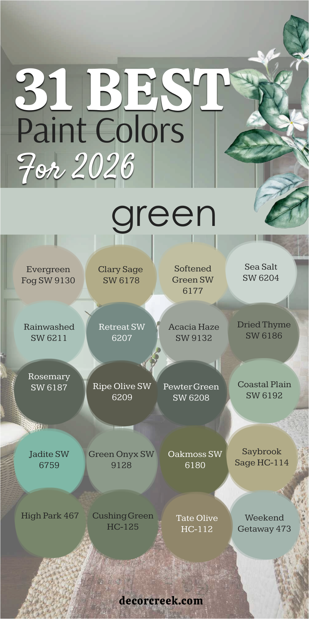
Green has always been one of those colors that feels both timeless and alive. It reminds me of nature, balance, and the quiet strength found in the outdoors. In 2026, green paint colors are taking center stage again — this time with even more warmth, softness, and depth. From muted sage and moss tones to bold olive and deep forest greens, these shades are being used to bring calm and authenticity into modern homes.
What makes green so special is how it shifts throughout the day. Morning light makes it look fresh and open, while evening shadows bring out its richness and depth.
I love that you can find a green for every mood and space — something soft for a bedroom, something bold for a kitchen, something earthy for a living room. Green connects every corner of the home, bringing harmony and renewal.
The colors in this list are my personal favorites from Sherwin-Williams and Benjamin Moore — each one chosen for its natural beauty, balance, and the way it makes a home feel grounded yet full of life.
After years of designing homes, I’ve learned that not all paints are created equal — and when it comes to green, color balance is everything. Sherwin-Williams and Benjamin Moore consistently deliver greens that look natural, layered, and easy to live with. Their palettes capture the true essence of nature — the soft green of new leaves, the richness of moss, or the muted olive of sun-washed landscapes.
Sherwin-Williams tends to create earthy greens that feel calm and timeless, perfect for modern farmhouse or traditional spaces.
Benjamin Moore, on the other hand, is known for elegant, complex greens that shift gently with the light.
Both brands have mastered the art of creating greens that work with wood, stone, brass, and linen — the textures we love in real homes.
What I love most is how these paints hold up over time. Their finishes are smooth, durable, and consistent. Whether you’re painting a large open living area or a small reading nook, their colors feel rich without being overpowering.
Sherwin-Williams and Benjamin Moore greens make rooms feel complete — grounded but alive, fresh but never cold.
Choosing the right green always starts with the light. Natural light changes everything — a soft sage may look pale in bright daylight but deeper and cozier in the evening. In north-facing rooms, I tend to choose warmer olive tones that bring out comfort, while south-facing rooms can handle cooler, crisp greens that balance the brightness.
I also think about the mood I want to create. Sage greens bring peace and softness, perfect for bedrooms and bathrooms.
Olive greens feel warm and grounded — beautiful in living rooms or dining spaces. Deep forest greens add richness and depth to libraries, studies, and accent walls. Every shade of green has its own energy, and finding the right one is about matching that energy to the room’s purpose.
Texture matters too. Natural wood, linen, and woven materials can change how a green feels — some greens become warmer next to beige fabrics, while others come alive beside crisp white trim.
I always test paint on the wall and watch it change through the day. The right green feels alive — it shifts gently, looks effortless, and adds soul to the home. In the end, that’s what good color does — it brings light, warmth, and meaning to the space you live in.
When I think about Sherwin-Williams greens, I think about warmth, balance, and nature captured on the wall. These shades have a way of grounding a room while keeping it open and alive. From soft sage to rich olive, each one brings something unique — a calm morning feel or cozy evening comfort.
I’ve used these greens in every kind of home, and they always deliver that touch of effortless style.
The beauty of Sherwin-Williams is in how natural their greens feel. They pair beautifully with wood, linen, and stone, making them perfect for both modern and classic interiors.
Whether you want a fresh tone for a bright kitchen or a deeper color for a peaceful bedroom, these greens will carry that feeling of connection and comfort into every corner of your home.
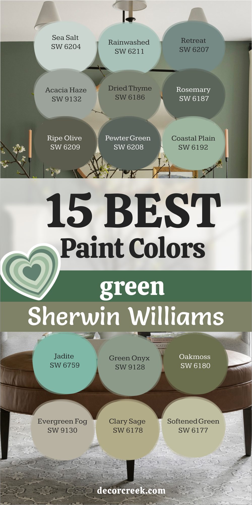
Evergreen Fog SW 9130 feels like a quiet morning in nature. It’s a misty green-gray that brings calm and warmth to any room. I love using it in bedrooms and living rooms where softness matters most. The color has just enough depth to feel grounded without being dark. It pairs beautifully with cream, tan, and brushed gold accents.
In daylight, Evergreen Fog feels fresh and airy, while evening light gives it a cozy, earthy touch. It’s the perfect balance between green and gray — gentle, elegant, and comforting. I’ve used it on walls, trim, and even cabinets, and it never fails to create harmony.
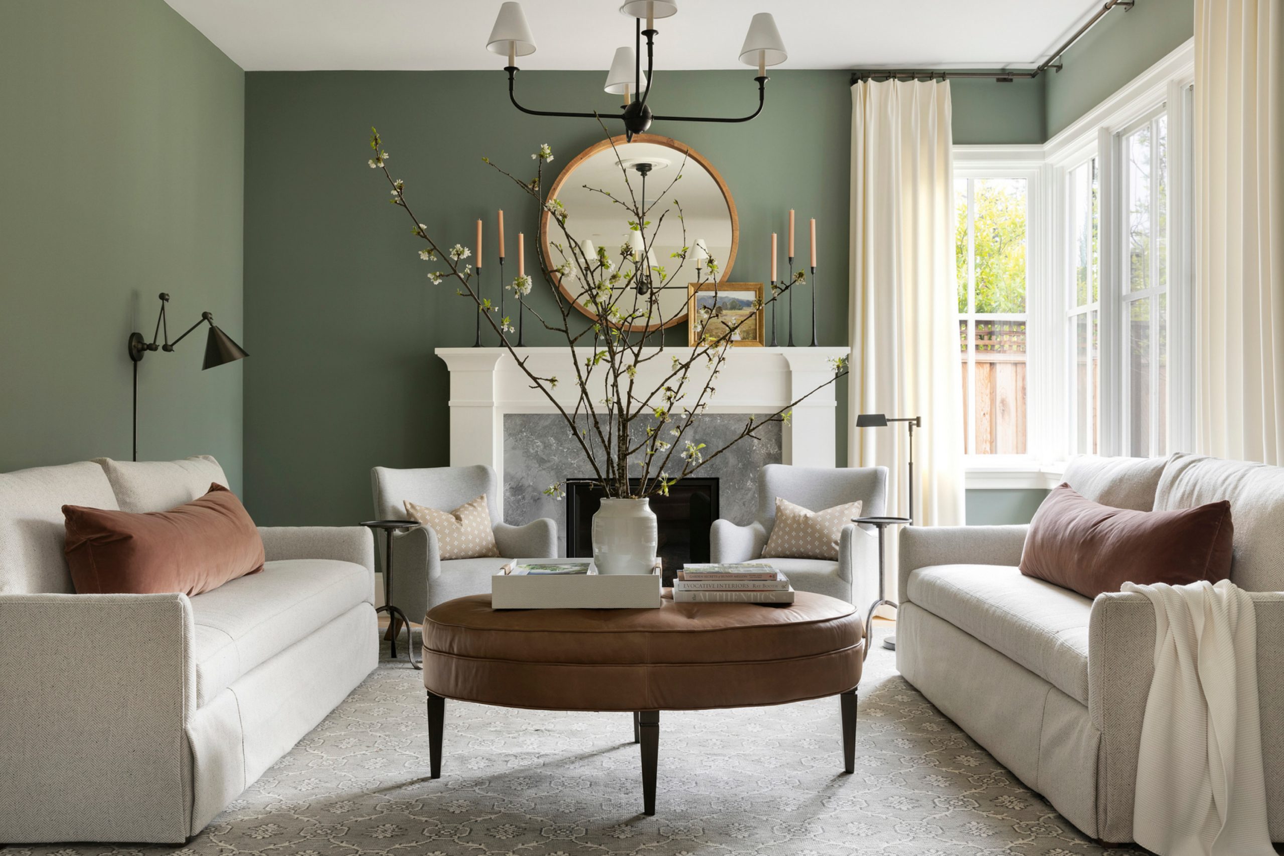
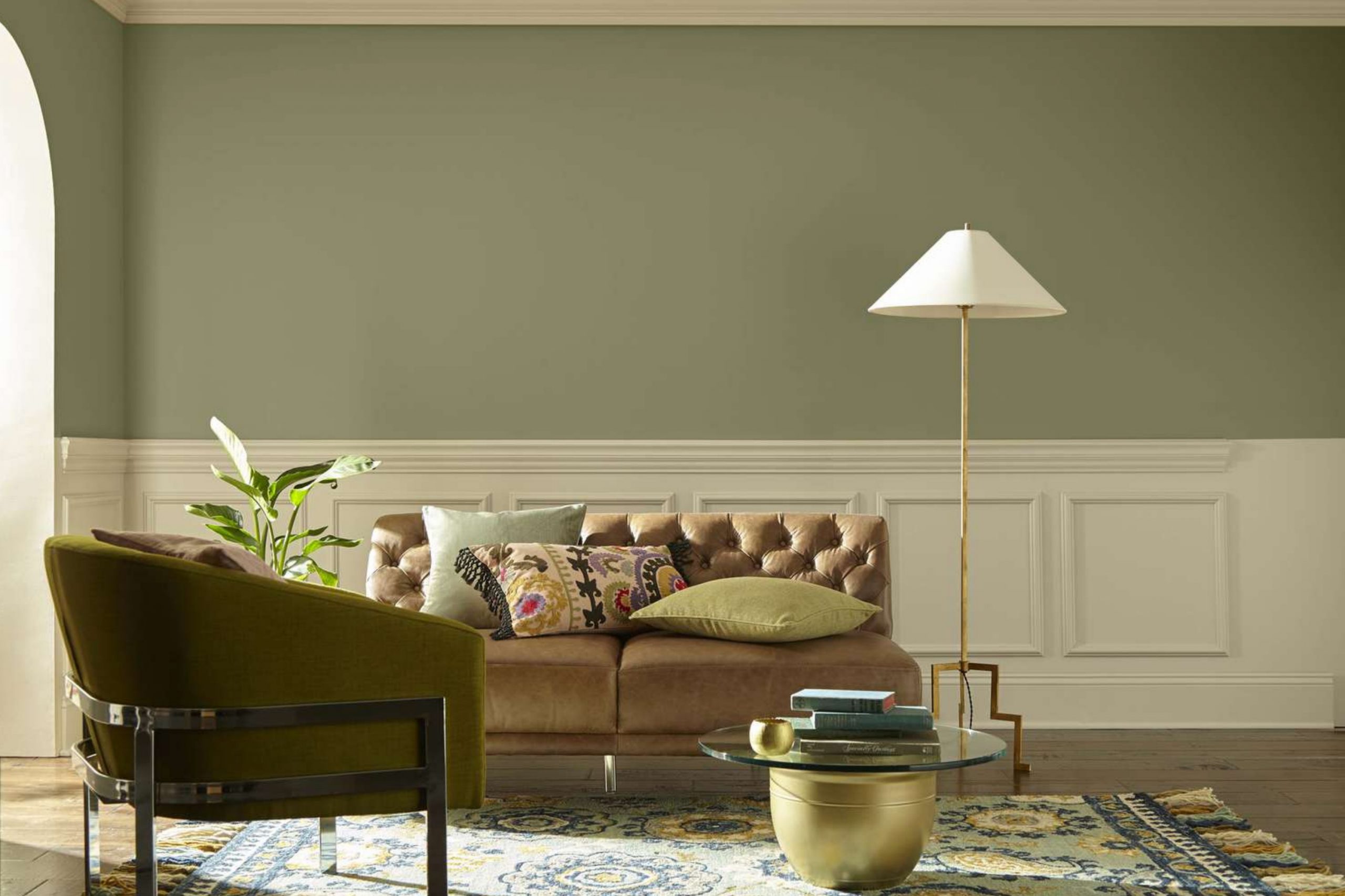
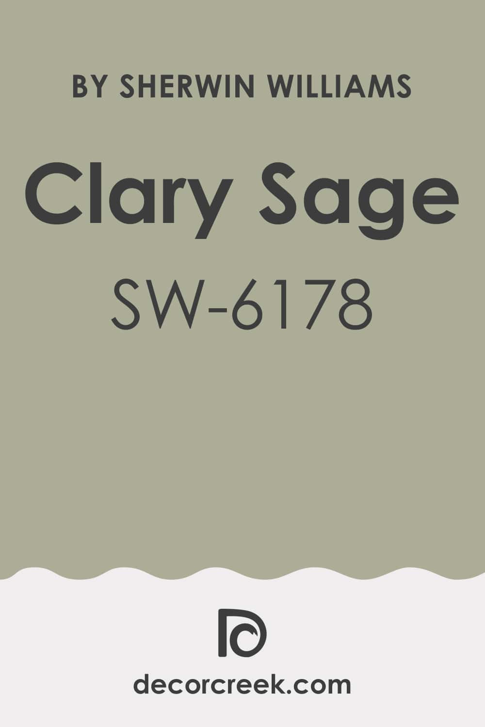
Clary Sage SW 6178 reminds me of a spring garden after rain. It’s a warm, earthy green with a soft olive undertone that feels natural and grounded. I love using it in kitchens and bathrooms because it brings warmth and freshness together. It pairs beautifully with creamy whites and warm metals like brass or copper.
The beauty of Clary Sage is its versatility — it looks just as lovely in modern homes as in traditional spaces. It changes gently with the light, sometimes grayish and sometimes warm, always beautiful. It’s one of those shades that makes a room feel both peaceful and alive.
🎨 Take a look at the full guide to this shade right HERE👈
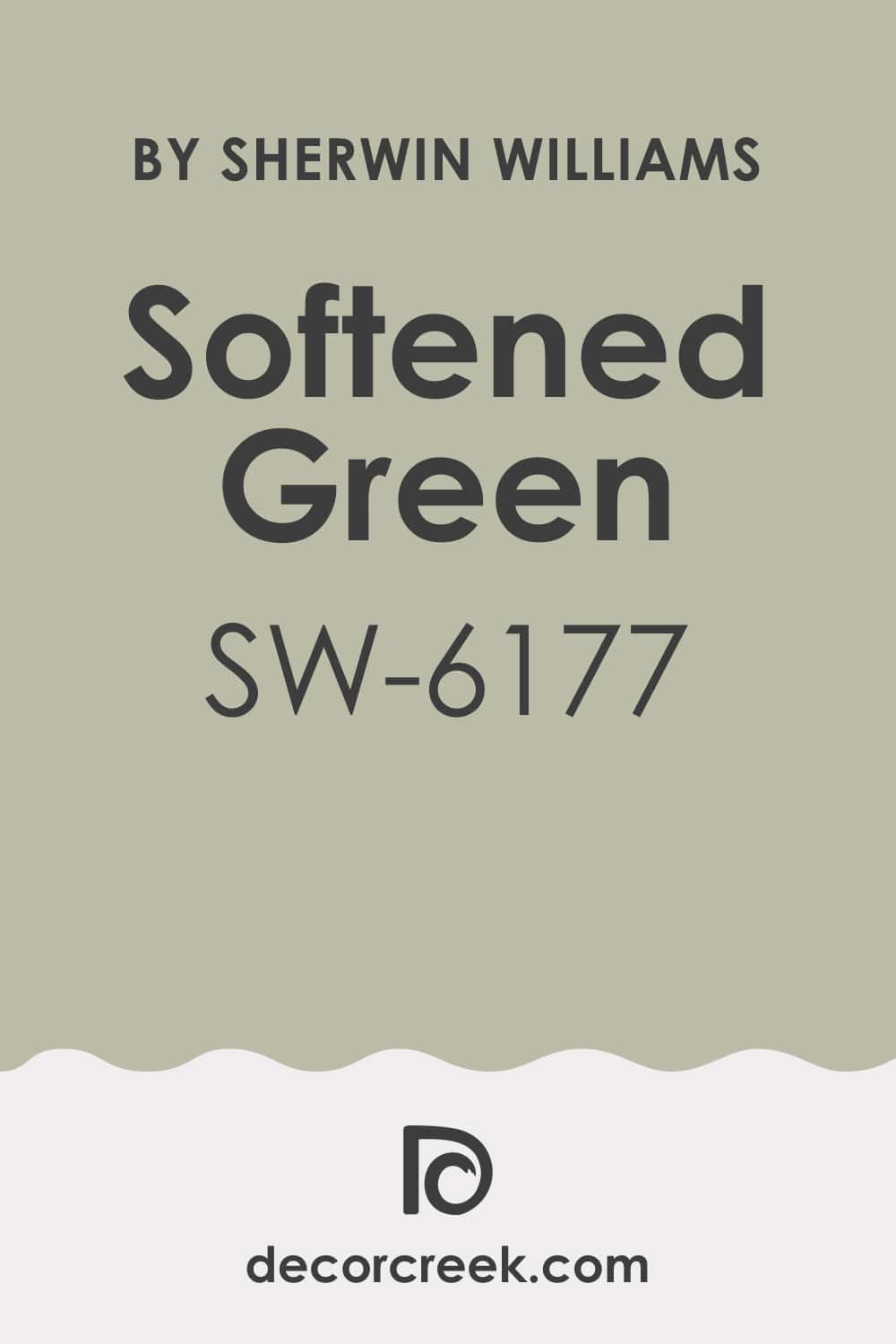
Softened Green SW 6177 is gentle, welcoming, and quietly elegant. It’s a muted sage tone that gives walls a soft glow without feeling heavy. I often use it in bedrooms and hallways because it makes everything feel connected and easy on the eyes. It pairs perfectly with ivory trim and natural textures like jute or linen.
This shade feels refreshing in daylight and soothing at night. It carries just enough gray to stay balanced, yet it never loses its warmth. Softened Green makes every home feel calm and thoughtfully put together.
🎨 Take a look at the full guide to this shade right HERE👈
Sea Salt SW 6204 has a beautiful balance of green, gray, and a hint of blue. It feels light and breezy, perfect for bathrooms, bedrooms, and open living spaces. I love how it reflects natural light — fresh in the morning, soft and romantic by evening.
Sea Salt works beautifully with coastal or minimalist designs. It pairs well with white trim, pale oak, or woven accents. The color has a clean and quiet confidence that instantly makes a home feel open and airy. It’s soothing without being dull — a true favorite for creating balance.
🎨 Take a look at the full guide to this shade right HERE👈

Rainwashed SW 6211 feels like soft mist after a summer shower. It’s light, refreshing, and full of quiet charm. I love using it in bedrooms and bathrooms for that gentle touch of color that feels relaxing but never cold. It pairs perfectly with white, beige, and brushed nickel.
Rainwashed looks stunning in natural light — more green by day, more blue-gray at night. It brings a touch of the outdoors inside and helps any room feel restful and balanced. It’s a shade that feels both modern and timeless.
🎨 Take a look at the full guide to this shade right HERE👈

Retreat SW 6207 is deep, earthy, and full of character. It’s a medium-dark green with gray undertones that make it feel sophisticated and steady. I love using it in dining rooms, offices, and cozy corners where warmth and depth are key. It pairs beautifully with natural wood and matte black accents.
This shade adds richness without overwhelming the room. In bright light, it feels grounded; in dim light, it turns warm and inviting. Retreat gives a space that lived-in comfort that makes you want to stay awhile.
🎨 Take a look at the full guide to this shade right HERE👈

Acacia Haze SW 9132 is a calm, smoky green that feels balanced and refined. It has just a hint of gray that keeps it soft but never dull. I love using it in living rooms and bedrooms where I want a natural yet elegant feel. It pairs beautifully with cream, taupe, and warm brown tones.
In daylight, Acacia Haze feels cool and airy; under warm lighting, it turns richer and more organic. It’s one of those shades that makes every room feel harmonious and complete.
🎨 Take a look at the full guide to this shade right HERE👈

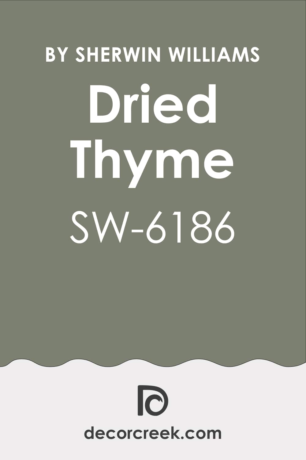
Dried Thyme SW 6186 is rich, earthy, and full of warmth. It reminds me of a walk through a forest at sunset — deep and cozy. I love using it in bedrooms or reading nooks where a little depth feels comforting. It pairs beautifully with creamy whites and aged bronze accents.
This shade feels bold but never heavy. It brings warmth and character to any space, creating an intimate and grounded atmosphere. Dried Thyme gives a home personality while keeping everything perfectly balanced.
🎨 Take a look at the full guide to this shade right HERE👈
Rosemary SW 6187 is elegant, classic, and full of natural charm. It’s a deep herbal green that feels strong yet soothing. I love using it on cabinetry, accent walls, or even exteriors. It pairs beautifully with whites, wood tones, and warm metals.
In daylight, Rosemary feels rich and organic; in the evening, it becomes warm and inviting. It’s perfect for homes that want depth without darkness. Rosemary always brings that touch of refined comfort I look for in every room.
🎨 Take a look at the full guide to this shade right HERE👈

Ripe Olive SW 6209 is bold yet incredibly livable. It’s a deep, earthy green that feels luxurious and grounded at the same time. I love using it in dining rooms, libraries, or cozy living spaces where depth adds comfort. The color pairs beautifully with cream, tan, and brushed gold.
What makes Ripe Olive special is how it reacts to light. In sunlight, it feels rich and organic, while in dim light, it becomes deep and dramatic. It’s a perfect choice for adding character to neutral rooms. Ripe Olive brings quiet strength and timeless warmth to any home.
🎨 Take a look at the full guide to this shade right HERE👈

Pewter Green SW 6208 has a dark, moody tone that feels elegant and sophisticated. It’s not too strong, just deeply calming and full of quiet power. I love using it on cabinetry, accent walls, or entryways where a bit of drama feels right. It pairs perfectly with brass, cream, and natural stone.
Pewter Green feels soft under daylight and cozy under lamplight. It brings a refined warmth to homes, balancing dark richness with earthy undertones. This shade turns a plain room into a place that feels thoughtful and serene.
🎨 Take a look at the full guide to this shade right HERE👈

Coastal Plain SW 6192 feels like a soft breeze through an open window. It’s a gentle green with blue undertones that add freshness and charm. I love using it in kitchens, bathrooms, or hallways where brightness and ease matter most. It pairs beautifully with crisp whites and sandy beige accents.
This shade feels airy and uplifting during the day and comfortably cool by evening. It’s one of those colors that quietly makes a space feel clean and open. Coastal Plain brings the outdoors inside with a touch of grace and softness.
🎨 Take a look at the full guide to this shade right HERE👈

Cooled Blue SW 6759 is lively, refreshing, and full of vintage character. It has a cheerful tone that reminds me of sunlit kitchens and old-fashioned glassware. I love using it on cabinetry, doors, or small bathrooms for a playful but elegant touch. It pairs beautifully with warm whites and natural wood.
Cooled Blue feels joyful in daylight and cozy in warm light. It adds personality without being too bright. This shade is perfect for adding a little spark of life to any room while keeping a relaxed, welcoming mood.
🎨 Take a look at the full guide to this shade right HERE👈

Green Onyx SW 9128 feels deep and soothing — a perfect blend of gray, green, and a hint of blue. It’s sophisticated and modern but still warm enough to feel inviting. I love using it in bedrooms, offices, and dining spaces that need quiet richness. It pairs beautifully with natural wood, beige, and white trim.
The best thing about Green Onyx is how it anchors a room. It feels solid yet soft, and it gives every space a sense of purpose. It’s a confident color that never feels overdone.
🎨 Take a look at the full guide to this shade right HERE👈

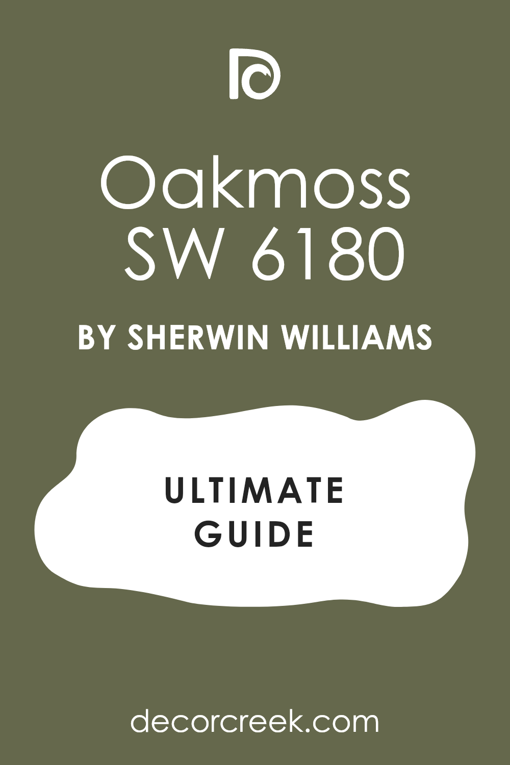
Oakmoss SW 6180 is earthy, rich, and full of depth. It reminds me of the forest floor — lush, grounded, and natural. I love using it in accent walls, studies, and cozy corners that need warmth and texture. It pairs perfectly with ivory, taupe, and rustic wood finishes.
This color feels strong in the daylight and soothing in the evening. It’s perfect for homes that want to feel rooted and organic. Oakmoss adds that deep, comforting tone that makes a space feel alive and full of character.
🎨 Take a look at the full guide to this shade right HERE👈
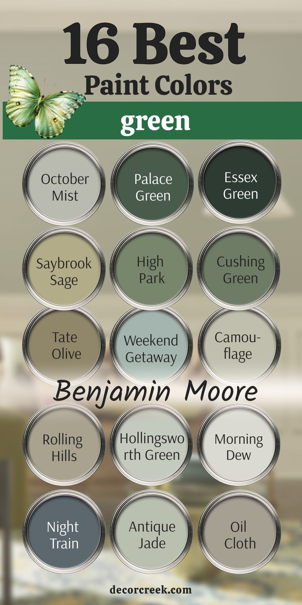
Benjamin Moore greens have a softness and depth that feel like nature translated into paint. These shades capture every tone of the outdoors — from gentle herbs and moss to deep forests and olive leaves. Each one carries a natural warmth that instantly makes a home feel alive. I’ve always loved how Benjamin Moore greens shift beautifully with the light, giving rooms a sense of movement and quiet energy.
These colors bring harmony wherever they’re used. Pale greens make small rooms feel open and fresh, while deeper tones add richness and calm to large spaces.
Whether you’re creating a cozy bedroom, a bright kitchen, or a timeless living room, these greens give you that perfect balance of comfort and sophistication.
They’re the shades I turn to when I want a home to feel grounded, connected, and effortlessly beautiful.
Night Train 1567 is deep, moody, and sophisticated. It’s a gray-green with blue undertones that feels both modern and classic. I love using it on accent walls or cabinetry for dramatic impact. It pairs beautifully with white, gold, and dark wood.
This color adds confidence and depth to a space.
In daylight, it feels strong and grounded; in the evening, it turns intimate and warm. Night Train brings richness without feeling heavy — it’s effortlessly elegant.
🎨 Take a look at the full guide to this shade right HERE👈

October Mist 1495 feels like a gentle whisper of nature. It’s a soft, silvery green that brings a fresh and balanced touch to any room. I love using it in bedrooms or living spaces that need calm energy. It pairs beautifully with white trim, natural wood, and warm metallic accents.
What makes October Mist so special is its versatility — it feels modern yet timeless. In daylight, it looks airy and clean, while in the evening, it takes on a cozy, grounded tone. It’s a color that always feels right, no matter where it’s used.
🎨 Take a look at the full guide to this shade right HERE👈

Weekend Getaway 473 feels clean, refreshing, and effortlessly modern. It’s a light green with a touch of blue-gray that adds brightness without being too strong. I love using it in bathrooms, kitchens, or small spaces that need a lift. It pairs beautifully with white, silver, and light wood.
This shade feels breezy during the day and cozy in softer light. It brings just enough color to make a room interesting while staying calm and easy to live with.
Weekend Getaway has that subtle charm that keeps a home feeling open and fresh.
🎨 Take a look at the full guide to this shade right HERE👈

Saybrook Sage HC-114 is the definition of warmth and comfort. It’s an earthy sage green with golden undertones that make rooms feel lived-in and natural. I love using it in kitchens, entryways, and bedrooms for a gentle, organic look. It pairs perfectly with off-whites and soft beige tones.
Saybrook Sage feels cheerful in morning light and deeply relaxing in the evening. It has that effortless charm that makes a home feel grounded and welcoming. This is one of my go-to shades for creating balance and warmth in any space.
🎨 Take a look at the full guide to this shade right HERE👈

High Park 467 is a rich, natural green that brings depth without feeling dark. It reminds me of leafy trees after rain — fresh and elegant. I love using it in dining rooms, offices, or any place that needs a touch of sophistication. It pairs beautifully with warm woods, white trim, and brass accents.
This color holds beautifully in every light. It feels alive but steady, adding richness without overwhelming the room.
High Park gives homes a sense of refinement while keeping them cozy and approachable.
Cushing Green HC-125 is bold and full of confidence. It’s a deep, classic green that feels timeless and strong. I love using it on cabinetry, accent walls, or front doors to create instant impact. It pairs wonderfully with cream, charcoal, or aged gold.
Cushing Green feels rich in sunlight and more dramatic in evening light. It brings warmth and heritage into modern homes. This shade is perfect for anyone who loves a grounded, traditional feel with modern ease.
🎨 Take a look at the full guide to this shade right HERE👈

Tate Olive HC-112 is one of those perfect olive tones that feel both elegant and relaxed. It’s warm, earthy, and full of quiet charm. I love using it in bedrooms, living rooms, or cozy offices where comfort is key. It pairs beautifully with ivory, deep brown, and warm white.
The beauty of Tate Olive is how it changes throughout the day — golden in sunlight, deep and soft at night.
It has a natural warmth that gives every space a sense of depth and connection.
Camouflage 2143-40 is soft, earthy, and perfectly balanced. It’s that gentle green-beige tone that works anywhere — a true designer favorite. I love using it in open living spaces and hallways for a quiet flow between rooms. It pairs beautifully with whites, browns, and warm neutrals.
This color feels grounded and welcoming. It never demands attention but always feels polished and natural. Camouflage gives a home that lived-in warmth we all crave.
🎨 Take a look at the full guide to this shade right HERE👈

Rolling Hills CC-630 feels cozy and fresh all at once. It’s a muted medium green with a touch of gray that brings balance and depth. I love using it in dining rooms, entryways, or bedrooms that need a soft statement. It pairs beautifully with creamy trim and light wood furniture.
This shade holds its beauty all day — peaceful in daylight and rich under warm lighting.
Rolling Hills creates that perfect blend of modern comfort and natural charm.
Hollingsworth Green HC-141 is light, breezy, and full of gentle character. It has a soft gray undertone that keeps it calm but never dull. I love using it in bedrooms or bathrooms for a touch of airy sophistication. It pairs beautifully with crisp white and sandy beige accents.
It feels like a morning sky on the walls — bright but never harsh. Hollingsworth Green brings freshness to any room, making everything feel clean and harmonious.
🎨 Take a look at the full guide to this shade right HERE👈

Morning Dew OC-140 is pale, quiet, and beautifully understated. It’s a green-gray with just a hint of warmth, perfect for spaces that need softness. I love using it in bedrooms, living rooms, and nurseries for that light, nurturing mood. It pairs perfectly with white trim and soft neutral fabrics.
This shade looks elegant in every light — cool by day and warm by night.
Morning Dew gives rooms a soft, soothing energy that’s easy to love.
🎨 Take a look at the full guide to this shade right HERE👈

Antique Jade 465 feels gentle and balanced, like soft light through trees. It’s a fresh green with warmth that works beautifully in both modern and traditional homes. I love using it in kitchens and bedrooms to bring natural brightness. It pairs perfectly with creamy whites and light woods.
This color feels fresh during the day and mellow by night. Antique Jade adds life to a space without taking over — it’s simply easy to love.
🎨 Take a look at the full guide to this shade right HERE👈

Oil Cloth CSP-760 is a soft olive-gray with the sophistication of natural linen. It’s muted, warm, and comforting. I love using it in living rooms and studies for a relaxed, grounded feel. It pairs beautifully with brass, beige, and white trim.
This color holds its elegance in every light. It’s understated but deeply stylish, making a room feel calm and cohesive. Oil Cloth brings quiet confidence to any design.
🎨 Take a look at the full guide to this shade right HERE👈

Palace Green CW-520 is rich, historic, and full of character. It’s a deep green that feels classic and bold. I love using it in dining rooms or entryways for a touch of tradition. It pairs beautifully with creamy whites and antique finishes.
This color feels warm and stately in daylight and elegant under softer lighting. Palace Green adds instant depth and history to modern homes.
🎨 Take a look at the full guide to this shade right HERE👈

Essex Green HC-188 is the deepest, most dramatic green Benjamin Moore offers. It’s nearly black in low light but glows deep emerald in sunlight. I love using it on doors, cabinetry, and accent walls where drama feels right. It pairs perfectly with gold, cream, and warm wood.
This color feels bold but timeless, rich but never overbearing. Essex Green brings sophistication and warmth that lasts through every season.
🎨 Take a look at the full guide to this shade right HERE👈

Rosemary Sprig 2144-30 feels natural, lively, and full of energy. It’s a soft herbal green that looks beautiful in kitchens, living rooms, and bedrooms. I love how it brings freshness to the home without being too bright. It pairs perfectly with ivory, beige, and natural textures.
This color glows in sunlight and softens beautifully under evening light. Rosemary Sprig feels like a gentle reminder of nature — clean, comforting, and full of quiet life.
🎨 Take a look at the full guide to this shade right HERE👈
via decorcreek.com
Green, to me, is the true heart of nature brought indoors. It has a way of grounding a home while lifting the spirit at the same time. It connects people to something real — to growth, light, and comfort. In 2026, green continues to shape homes into places that feel alive, balanced, and welcoming.
From pale, misty sages that whisper softness to deep forest greens that bring quiet strength, each shade tells its own story.
Green can warm a room or cool it, calm the mind or add subtle energy. It’s a color that always feels fresh, yet deeply familiar.
What I find most beautiful about green is how personal it is. It reacts to every home differently — sunlight makes it glow, shadows make it richer. No two rooms ever show it the same way.
The texture of a rug, the tone of the wood, even the warmth of a lamp can change how green feels. When you find the right one, everything clicks. The room starts to breathe, and suddenly, it feels peaceful, grounded, and full of life.
I always say green is more than just paint — it’s a living element in the home. It’s the color of renewal, balance, and natural beauty.
It reminds us to slow down, to notice small moments, and to create spaces that feel connected to the world outside. In 2026, green continues to be the color that defines comfort and growth — a tone that makes every home feel truly alive and in tune with nature.