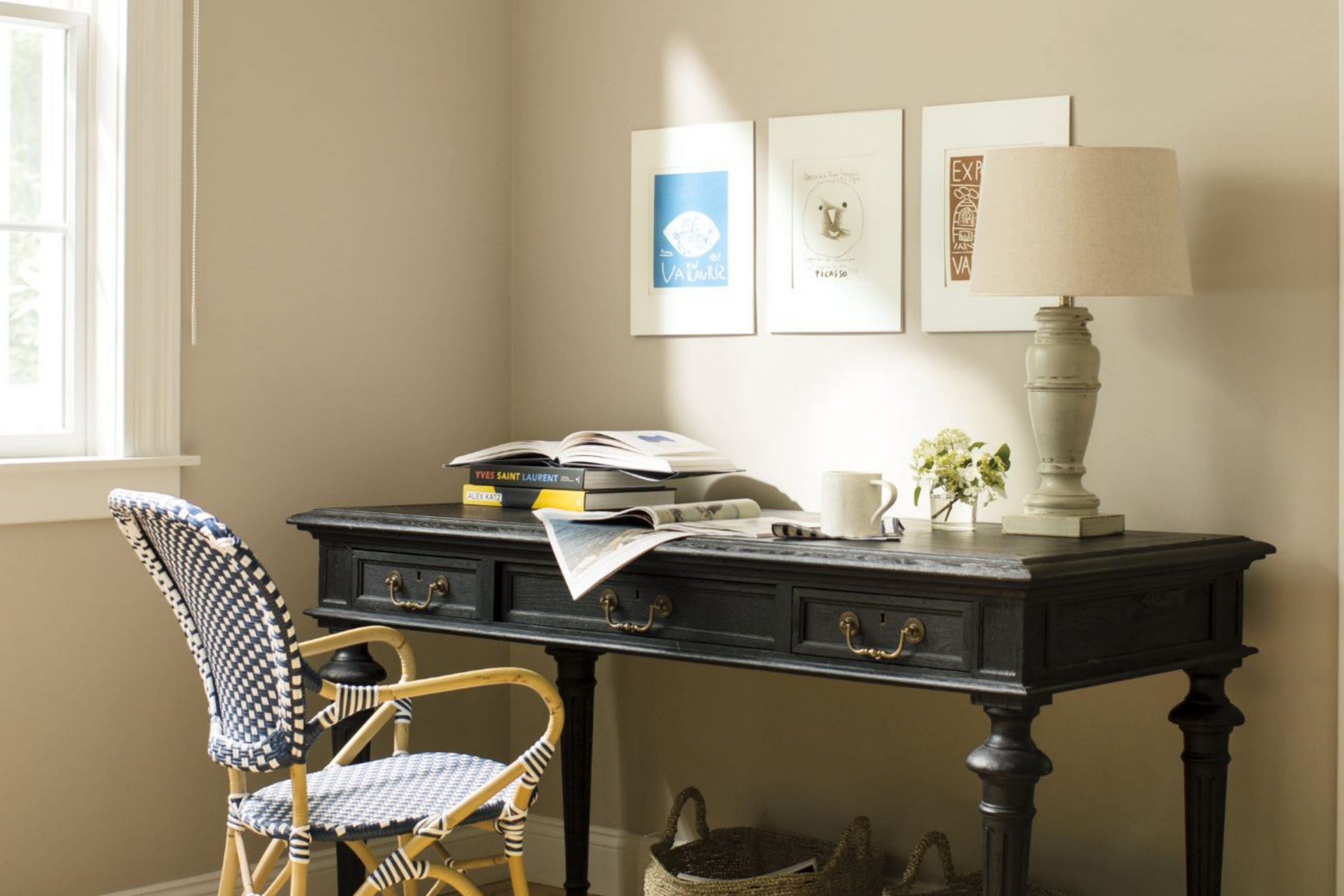
Mushroom paint colors have a charm that’s hard to match. They sit right between beige and gray, with just the right warmth to make any room feel inviting. I’ve seen them bring kitchens to life, make bedrooms cozier, and turn living rooms into places people love to spend time. These shades work beautifully with natural wood, white trim, or even deep, moody colors.
They’re the kind of colors that feel at home in both modern and traditional designs. I’ve used them in so many projects because they simply work — no matter the season.
Why I Trust Sherwin-Williams for Mushroom Paints
When I’m choosing mushroom paint colors, I often look to Sherwin-Williams first. Their shades hold their beauty in any light, whether the sun is streaming in or it’s a rainy afternoon. The color formulas are consistent, so what you see on the swatch is what you’ll get on the wall. I’ve also found their paints to be durable, which matters for busy homes.
From kitchens that get daily use to guest rooms meant for relaxing, these paints last.
And their range of mushroom tones is broad enough that I can always find just the right match.
My Method for Picking the Perfect Mushroom Tone
Choosing the right mushroom shade starts with light. A room with lots of sunlight can handle cooler mushroom tones, while a dim room feels better with warmer ones. I look at the flooring too — wood, tile, or carpet can change how a paint color feels. The furniture matters, because a color that’s perfect with white cabinets might not work with dark wood.
I always try a sample on the wall before making the final choice. Seeing it in the morning, afternoon, and evening light helps me be sure it’s the right one.
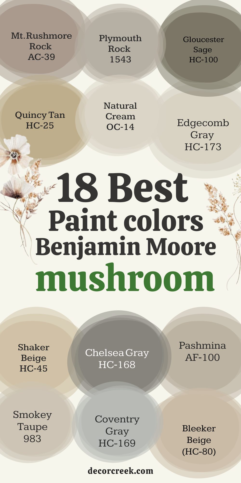
18 Best Mushroom Paint Colors by Benjamin Moore
Mt. Rushmore Rock (AC-39)
Mt. Rushmore Rock feels grounded and steady. It has an earthy warmth that works well in family rooms or kitchens. I’ve paired it with crisp white trim for a fresh, balanced look. In lower light, it deepens just enough to feel cozy without becoming dark. It’s a color that works beautifully with natural textures like linen or wicker.
If you want a mushroom shade that feels welcoming all year, this one is a safe choice.
Plymouth Rock (1543)
Plymouth Rock has a gentle taupe tone that fits well in both modern and traditional homes. I love using it in bedrooms for a warm, restful feel. It pairs nicely with both light and dark furniture, giving flexibility in styling. Under bright light, it shows a soft beige warmth.
In the evening, it leans into a richer, grounded tone. It’s dependable and classic in the best way.
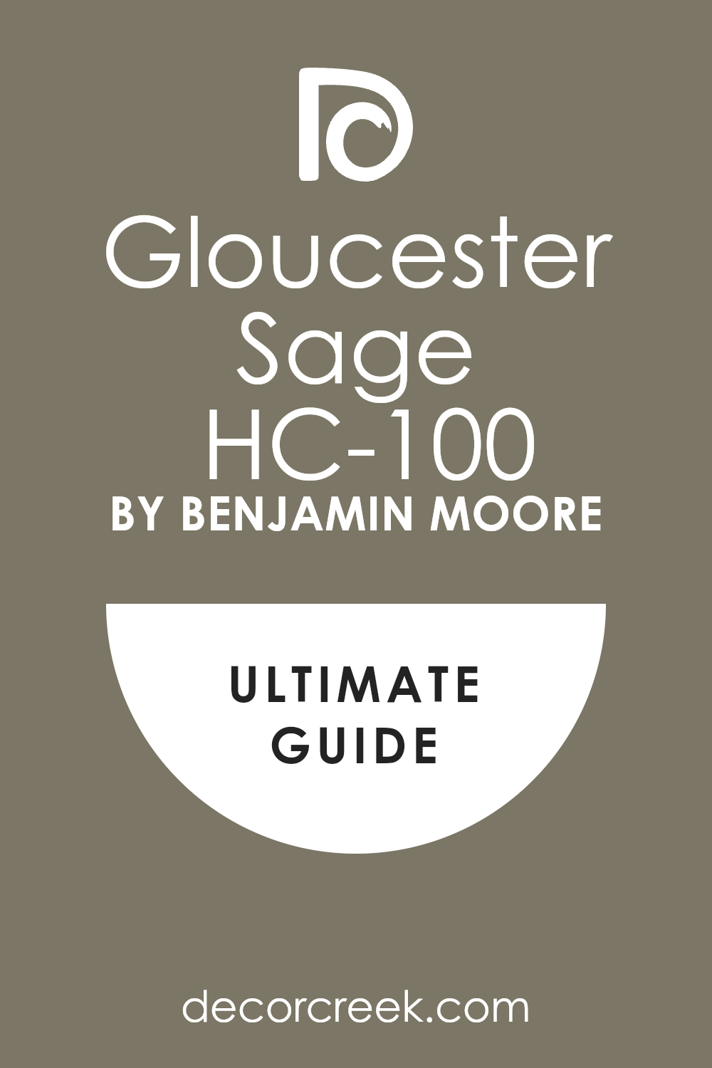
Gloucester Sage (HC-100)
Gloucester Sage carries a green undertone that gives it a natural, organic feel. I’ve seen it shine in dining rooms paired with wood furniture. It has enough depth to add interest without overpowering the room. In natural light, the green note feels more pronounced.
At night, it reads as a soft earthy neutral. This shade works beautifully with plants and botanical prints.
👉See the full guide to this color HERE👈
Quincy Tan (HC-25)
Quincy Tan is warm and full-bodied, perfect for rooms that need a little extra comfort. It pairs wonderfully with warm metals like brass. I’ve used it in kitchens where it made the cabinetry feel custom and inviting. In the afternoon light, it glows softly.
At night, it deepens into a rich, welcoming shade. It’s great for creating a sense of warmth in larger rooms.
Coventry Gray (HC-169)
Coventry Gray has a cool balance that keeps it fresh. It’s ideal for pairing with marble or white stone counters. I like it in bathrooms for its crisp yet comforting feel. In bright sunlight, it reads lighter and airier. As the light fades, it shifts to a calm mushroom-gray. It’s a perfect choice for rooms that need a soft but defined backdrop.
👉See the full guide to this color HERE👈

Natural Cream (OC-14)
Natural Cream is a light mushroom tone that brightens a room without feeling stark. I’ve used it in open-plan rooms to keep everything cohesive. It works equally well with cool or warm accents. Morning light brings out its creamy side, while evening gives it a warm, inviting glow.
It’s a color that makes any room feel more open and friendly.
👉See the full guide to this color HERE👈

Pashmina (AF-100)
Pashmina is a rich mushroom tone with an elegant depth. I’ve used it on accent walls to make a room feel more grounded. It pairs beautifully with matte black or brushed gold fixtures. In natural light, it holds its neutral balance well. Under warm lighting, it takes on a slightly cozier feel. It’s a flexible choice for both walls and cabinetry.
👉See the full guide to this color HERE👈

Bleeker Beige (HC-80)
Bleeker Beige leans warm and earthy, making it great for family rooms. It pairs well with stone fireplaces and rustic wood tones. I’ve seen it make a living room feel instantly more inviting. In bright light, it feels open and airy. At night, it wraps the interior in warmth.
This color is perfect for creating a grounded, homey atmosphere.
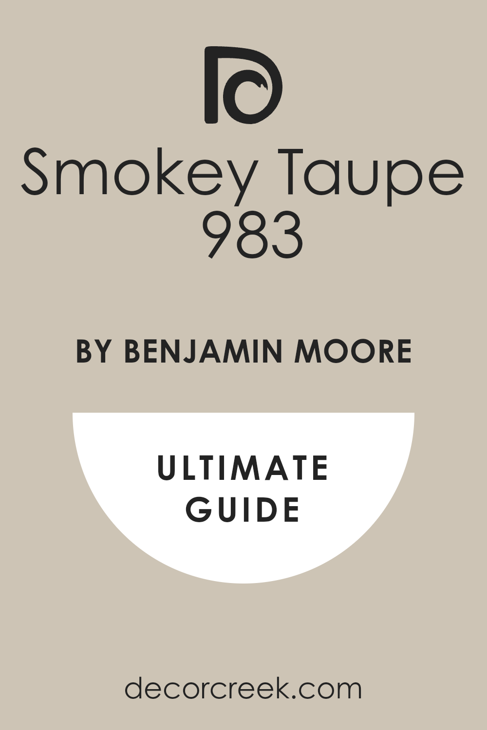
Smokey Taupe (983)
Smokey Taupe is one of those colors that feels instantly comfortable. It’s a balanced mix of beige and gray, fitting into almost any setting. I’ve used it in dining rooms for an elegant yet approachable look. Bright daylight shows its subtle gray side. Evening light brings out a warm, mushroom-like depth.
It’s a dependable choice when you want a neutral with character.
👉See the full guide to this color HERE👈
Edgecomb Gray
Edgecomb Gray is light and airy but still grounded. It works beautifully in kitchens with white or wood cabinets. I’ve seen it make small rooms feel more open without losing warmth. In the morning, it shows a creamy beige undertone. As the day goes on, it shifts toward a soft greige.
It’s a wonderful whole-home color.
👉See the full guide to this color HERE👈

Shaker Beige
Shaker Beige is warm and golden, perfect for sunny rooms. I’ve used it in entryways to give a welcoming first impression. It works well with warm woods and light stone floors. In bright light, it feels cheerful and open. In the evening, it takes on a richer, cozier tone. It’s a classic choice for traditional interiors.
👉See the full guide to this color HERE👈

Chelsea Gray
Chelsea Gray is deep and bold for a mushroom tone. It works beautifully on cabinetry or as an accent wall. I’ve used it in kitchens for a custom, high-end look. Bright light softens it slightly, revealing a subtle warmth. Evening light deepens it into a dramatic, elegant shade.
It’s perfect for adding contrast without going too dark.
👉See the full guide to this color HERE👈
Wild Mushroom (CC-336)
Wild Mushroom has a warm, natural presence. It pairs perfectly with woven textures and rustic elements. I’ve used it in living rooms to create a comfortable backdrop. In bright light, it feels airy and soft. At night, it becomes warmer and richer. It’s a great choice for anyone who loves earthy neutrals.
Shiitake Mushroom (CSP-1040)
Shiitake Mushroom is smooth and flexible. It works beautifully in both modern and farmhouse settings. I’ve used it in kitchens for a warm yet neutral look. Daylight brings out its beige side, while evening light deepens its warm.
It pairs easily with a wide range of colors and materials.
👉See the full guide to this color HERE👈

Porcini (CSP-195)
Porcini is a rich, earthy mushroom shade with depth. I’ve seen it work beautifully in dining rooms for a cozy, grounded feel. In bright light, it reveals a soft gray note. At night, it becomes warmer and more intimate.
It pairs wonderfully with natural wood and soft lighting.
Putnam Ivory
Putnam Ivory is a light, warm neutral perfect for brightening darker rooms. I’ve used it in hallways to make them feel more open. Morning light brings out a soft glow, while evening light gives it a gentle warmth.
It’s an easy color to live with and style around.
Ashen Tan
Ashen Tan has a gentle, grounded warmth. I’ve used it in bedrooms for a comfortable, restful atmosphere. It works well with natural fabrics like cotton and linen. In bright light, it feels open and fresh. In low light, it deepens just enough to add coziness.
Smoked Oyster
Smoked Oyster brings a hint of mauve to its mushroom base, giving it a unique charm. I’ve used it as an accent wall in reading nooks. In daylight, the mauve undertone is soft and inviting.
At night, it feels deeper and more intimate. It’s a color that adds personality without being loud.
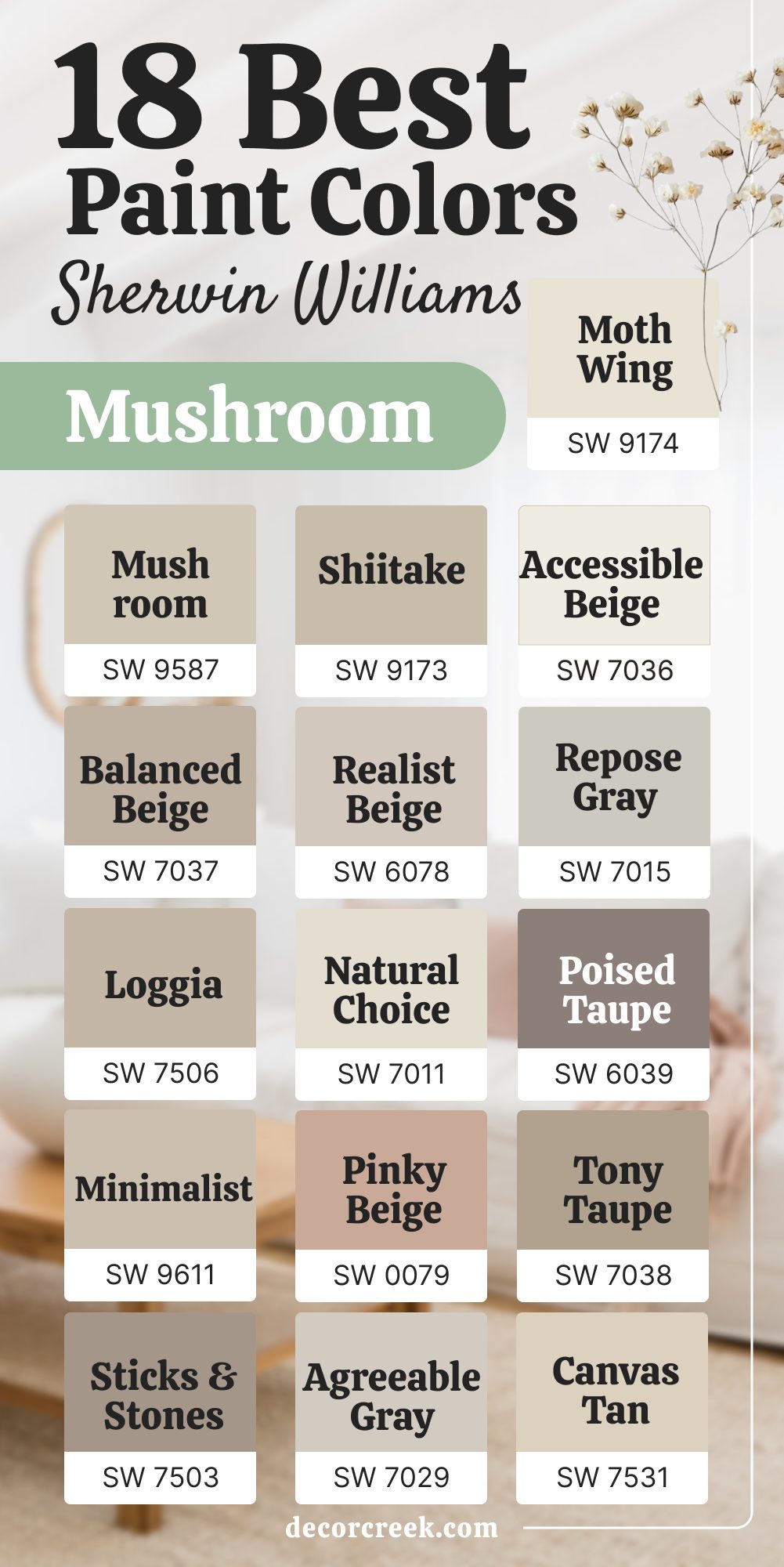
18 Best Mushroom Paint Colors by Sherwin-Williams
SW 9587 Mushroom
SW 9587 Mushroom is a warm, grounded shade that feels instantly welcoming. I’ve used it in kitchens, living rooms, and even on exterior siding for a natural look. In daylight, it shows a soft greige balance that works with nearly any décor. Evening light warms it up, adding depth and comfort.
It pairs beautifully with creamy whites, black accents, and warm wood. This color can easily become the anchor of a whole-home palette.
👉See the full guide to this color HERE👈
SW 7037 Balanced Beige
SW 7037 Balanced Beige is true to its name — perfectly balanced between beige and gray. I love it for open-plan homes where consistency matters. It’s warm enough to feel inviting but neutral enough to work with bold furniture. Bright light keeps it airy, while shadows give it a rich, grounded tone.
It’s one of my favorite go-to mushroom shades for a classic, long-lasting look.
👉See the full guide to this color HERE👈

SW 7506 Loggia
SW 7506 Loggia has a warm, earthy undertone that brings life to any room. I’ve used it for cabinetry to give kitchens a custom feel. In natural light, it feels fresh and modern; under soft evening lighting, it becomes cozy and inviting. It pairs wonderfully with brushed brass or matte black hardware.
This is a color that makes any room feel more pulled together.
👉See the full guide to this color HERE👈

SW 9611 Minimalist
SW 9611 Minimalist is a lighter mushroom tone that brightens rooms without losing warmth. I’ve used it in smaller roomsto make them feel more open. It works equally well with light woods, stone, or crisp whites. Morning light gives it a fresh glow, while evening tones it down to a soft neutral. It’s a perfect choice for bedrooms or airy kitchens.
👉See the full guide to this color HERE👈

SW 7503 Sticks & Stones
SW 7503 Sticks & Stones has a strong earthy presence. I’ve used it in family rooms to create a warm backdrop for gatherings. It works beautifully with leather furniture and natural fabrics. In bright light, it shows more beige; in dimmer light, it leans toward gray.
It’s a grounded shade that makes the room feel connected and lived-in.
👉See the full guide to this color HERE👈
SW 9173 Shiitake
SW 9173 Shiitake has a smooth texture and works well in many settings.I’ve used it in both modern and farmhouse kitchens with great results. Daylight makes it feel fresh, while softer lighting gives it a cozy edge. It blends well with warm woods and white accents. This is one of my most recommended mushroom tones for cabinets and walls.
👉See the full guide to this color HERE👈
SW 6078 Realist Beige
SW 6078 Realist Beige leans slightly warm, making it perfect for rooms that need more comfort. I’ve used it in living rooms to soften the feel of a modern design. In the sun, it shows a creamy warmth; in shadow, it feels richer and more settled.
It’s a wonderful neutral for both walls and built-ins.
👉See the full guide to this color HERE👈
SW 7011 Natural Choice
SW 7011 Natural Choice is a light mushroom tone that works beautifully as a whole-home color. I love it for bright hallways and open living rooms. It pairs easily with warm or cool accents. Morning light gives it a soft, airy feel, while evening deepens it slightly.
It’s a great way to keep a home feeling open and inviting.
👉See the full guide to this color HERE👈

SW 0079 Pinky Beige
SW 0079 Pinky Beige has a faint blush undertone that makes it unique. I’ve used it in bedrooms for a soft, romantic touch. In daylight, the pink undertone is gentle and uplifting. At night, it becomes warmer and more intimate.
It pairs nicely with warm woods and creamy whites.
👉See the full guide to this color HERE👈
SW 7029 Agreeable Gray
SW 7029 Agreeable Gray is a popular greige that fits perfectly into the mushroom family. I’ve seen it work in nearly every room type. In bright light, it leans lighter and fresher; in dim light, it becomes warmer and more grounding.
It’s a safe, beautiful choice for anyone unsure where to start.
👉See the full guide to this color HERE👈

SW 7036 Accessible Beige
SW 7036 Accessible Beige is one of my most trusted colors. It has a gentle warmth that works everywhere, from kitchens to bedrooms. It pairs effortlessly with natural wood, stone, and white trim. In sunlight, it feels open; in evening light, it’s cozy. It’s hard to go wrong with this shade.
👉See the full guide to this color HERE👈

SW 7015 Repose Gray
SW 7015 Repose Gray leans a touch cooler while still feeling warm enough for comfort. I’ve used it in homes with lots of natural light to keep the color from washing out. It pairs beautifully with navy, charcoal, and soft white.
This is a great option for creating a fresh yet grounded look.
👉See the full guide to this color HERE👈
SW 6039 Poised Taupe
SW 6039 Poised Taupe is deeper and richer than many mushroom tones. I love it for accent walls or cabinetry. In bright light, it feels elegant; in low light, it becomes warm and dramatic. It pairs perfectly with metallic accents and warm wood.
👉See the full guide to this color HERE👈
SW 7038 Tony Taupe
SW 7038 Tony Taupe is warm and earthy, ideal for cozy living rooms. It works beautifully with stone fireplaces and rustic finishes. Bright light keeps it soft, while shadows bring out its richness.
This is a go-to for adding warmth without making a room feel smaller.
👉See the full guide to this color HERE👈
SW 7531 Canvas Tan
SW 7531 Canvas Tan is a lighter mushroom tone that feels open and fresh. I’ve used it in entryways to create a welcoming first impression. It pairs nicely with natural fiber rugs and light woods. Morning light gives it a sunny glow; evening light turns it into a warm neutral.
👉See the full guide to this color HERE👈

SW 9174 Moth Wing
SW 9174 Moth Wing is a rich mushroom-brown with depth. I’ve seen it make kitchen cabinets look custom and elegant. In bright light, it shows a warm taupe; in low light, it deepens beautifully.
It pairs well with creamy whites and matte black hardware.
👉See the full guide to this color HERE👈
SW 7017 Dorian Gray
SW 7017 Dorian Gray has a cool greige base that works in modern rooms. It’s especially beautiful with marble countertops or stainless appliances. In daylight, it feels clean and fresh; at night, it takes on a warmer tone. It’s a perfect balance of modern and comfortable.
👉See the full guide to this color HERE👈

SW 7004 Snowbound
SW 7004 Snowbound is a crisp white that works perfectly with mushroom tones. I’ve used it as trim and ceiling color to highlight mushroom walls. It stays fresh in all types of light and creates a clean contrast.
This pairing gives rooms a polished, finished look.
👉See the full guide to this color HERE👈

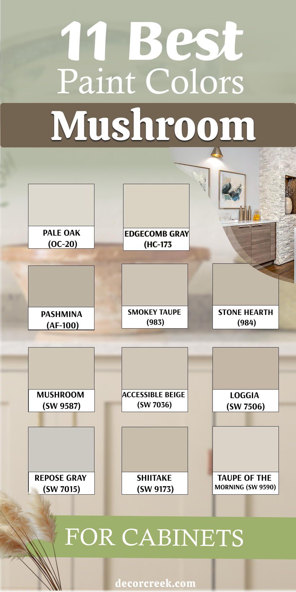
11 Best Mushroom Paint Colors for Cabinets
Sherwin-Williams Mushroom (SW 9587)
Sherwin-Williams Mushroom (SW 9587) has the perfect balance of warmth and depth for cabinets. I’ve used it in kitchens to give a custom, built-in look. In daylight, it feels earthy and rich, while in evening light, it turns cozy and welcoming. It pairs beautifully with gold, black, or brushed nickel hardware. This shade works with both light and dark countertops, making it incredibly flexible.
👉See the full guide to this color HERE👈
Sherwin-Williams Accessible Beige (SW 7036)
Sherwin-Williams Accessible Beige (SW 7036) is soft, warm, and inviting. On cabinets, it gives a gentle, classic feel. Bright light brings out its creamy side, while shadows add a grounded greige tone.
It works beautifully in both modern and farmhouse kitchens. I’ve paired it with white walls for a fresh, airy result.
👉See the full guide to this color HERE👈
Sherwin-Williams Loggia (SW 7506)
Sherwin-Williams Loggia (SW 7506) has a rich warmth that makes cabinets feel expensive and classic. I’ve used it in kitchens with natural stone backsplashes, and the combination feels complete. In natural light, it has an elegant glow; in the evening, it looks rich and full-bodied.
It’s a color that makes cabinetry stand out in the best way.
👉See the full guide to this color HERE👈
Sherwin-Williams Repose Gray (SW 7015)
Sherwin-Williams Repose Gray (SW 7015) leans slightly cooler, making it perfect for kitchens with stainless appliances. On cabinets, it looks clean and modern without feeling cold. In daylight, it stays fresh and balanced; at night, it softens.
It’s a great choice for pairing with marble or quartz counters.
👉See the full guide to this color HERE👈
Sherwin-Williams Taupe of the Morning
Sherwin-Williams Taupe of the Morning has a gentle warmth that’s beautiful for cabinetry. I’ve used it in smaller kitchens to keep things feeling light while still adding character. In sunlight, it feels airy; in shadow, it gains depth.
It pairs easily with wood floors and neutral backsplashes.
👉See the full guide to this color HERE👈
Sherwin-Williams Shiitake
Sherwin-Williams Shiitake is a smooth mushroom tone that suits cabinets beautifully, fitting just as well in modern as in traditional kitchens.Daylight shows its beige side, while evening light makes it richer. I’ve paired it with black hardware for a bold, updated look.
👉See the full guide to this color HERE👈
Benjamin Moore Smokey Taupe
Benjamin Moore Smokey Taupe is warm and approachable. On cabinets, it feels classic and easy to style. It blends beautifully with natural woods and stone counters. In bright light, it’s airy; in shadows, it’s grounded.
This is a color that works year-round without feeling dated.
👉See the full guide to this color HERE👈
Benjamin Moore Stone Hearth
Benjamin Moore Stone Hearth has a slightly deeper warmth, giving cabinets a sense of weight and presence. I love it in kitchens with wood beams or rustic touches. In sunlight, it feels soft; in the evening, it’s rich and comforting.
It’s perfect for adding character without going too dark.
👉See the full guide to this color HERE👈
Benjamin Moore Edgecomb Gray
Benjamin Moore Edgecomb Gray is light and fresh for cabinets, perfect for bright kitchens. It works well with both polished and rustic styles. Morning light brings out a creamy beige undertone; evening light leans slightly greige. It’s a beautiful, easy-to-live-with choice.
👉See the full guide to this color HERE👈
Benjamin Moore Pashmina
Benjamin Moore Pashmina has depth and warmth, making cabinets feel luxurious. I’ve paired it with warm brass pulls for a rich, high-end look. In natural light, it’s balanced; in softer lighting, it becomes cozy.
It’s an excellent option for open-plan kitchens.
👉See the full guide to this color HERE👈
Benjamin Moore Pale Oak
Benjamin Moore Pale Oak is light and graceful, giving cabinets a soft, welcoming look. It pairs wonderfully with white walls and natural stone counters.
In the morning, it feels bright and open; in the evening, it’s warm and gentle. It’s a color that fits seamlessly into many kitchen styles.
👉See the full guide to this color HERE👈

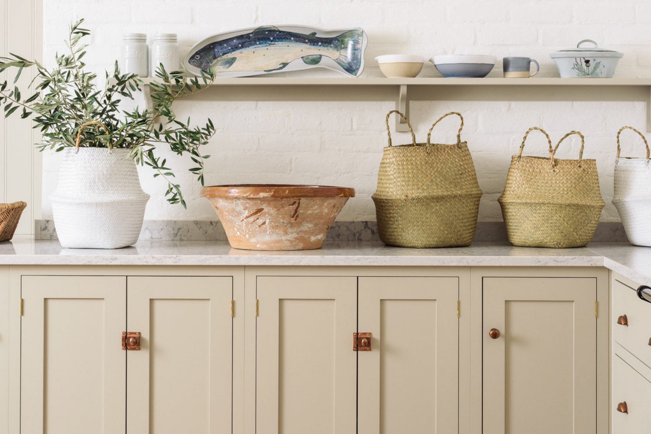
What to Keep in Mind About Mushroom Colors
Mushroom paint colors are all about balance. They sit between gray and beige, offering warmth without being too yellow and depth without feeling heavy. When you’re choosing one, think about the light in your room first — it changes everything. Pairing these tones with the right trim and hardware can bring out their best qualities.
Always test a sample before committing; what looks perfect on a swatch can feel different on a whole wall or cabinet.
Most importantly, pick the shade that makes your home feel the way you want it to — warm, welcoming, and truly yours.
