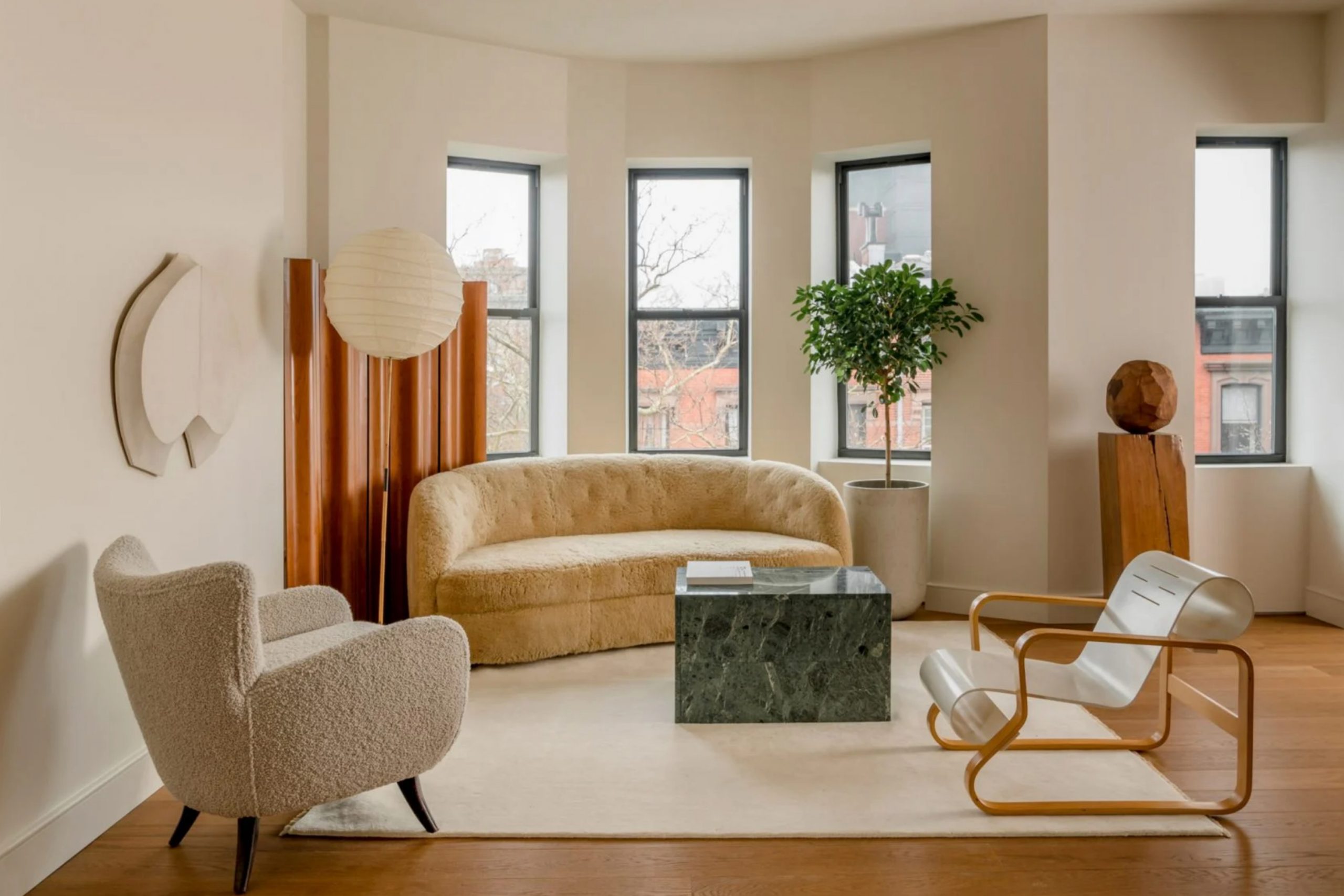
Warm neutrals are my go-to when I want a home to feel welcoming. These colors bring a cozy look that works in every season. This year I’m seeing more people choose these shades to make their homes feel softer, more lived-in, and easy to enjoy. Whether it’s for a full wall, trim, or just a little nook, warm neutrals help everything feel pulled together.
They don’t shout for attention, but they always feel just right. If you’re tired of bright whites or cold grays, this is the year to go warmer.
I’ve worked with so many of these colors lately, and they’ve never let me down. Let me show you my favorites and why they matter.
Why I Always Choose Sherwin-Williams for Cozy Colors
When I want a warm neutral that looks good in every light, I always pick Sherwin-Williams. Their paints never feel too dry, too yellow, or too muddy. The way these colors sit on the wall just feels right, no matter the time of day. They also hold up well through seasons, so what looks good in fall still feels nice in summer. Another thing I love is how easy it is to match these tones with furniture, rugs, and art.
That’s why I trust them again and again, especially when I’m trying to make a room feel like home.
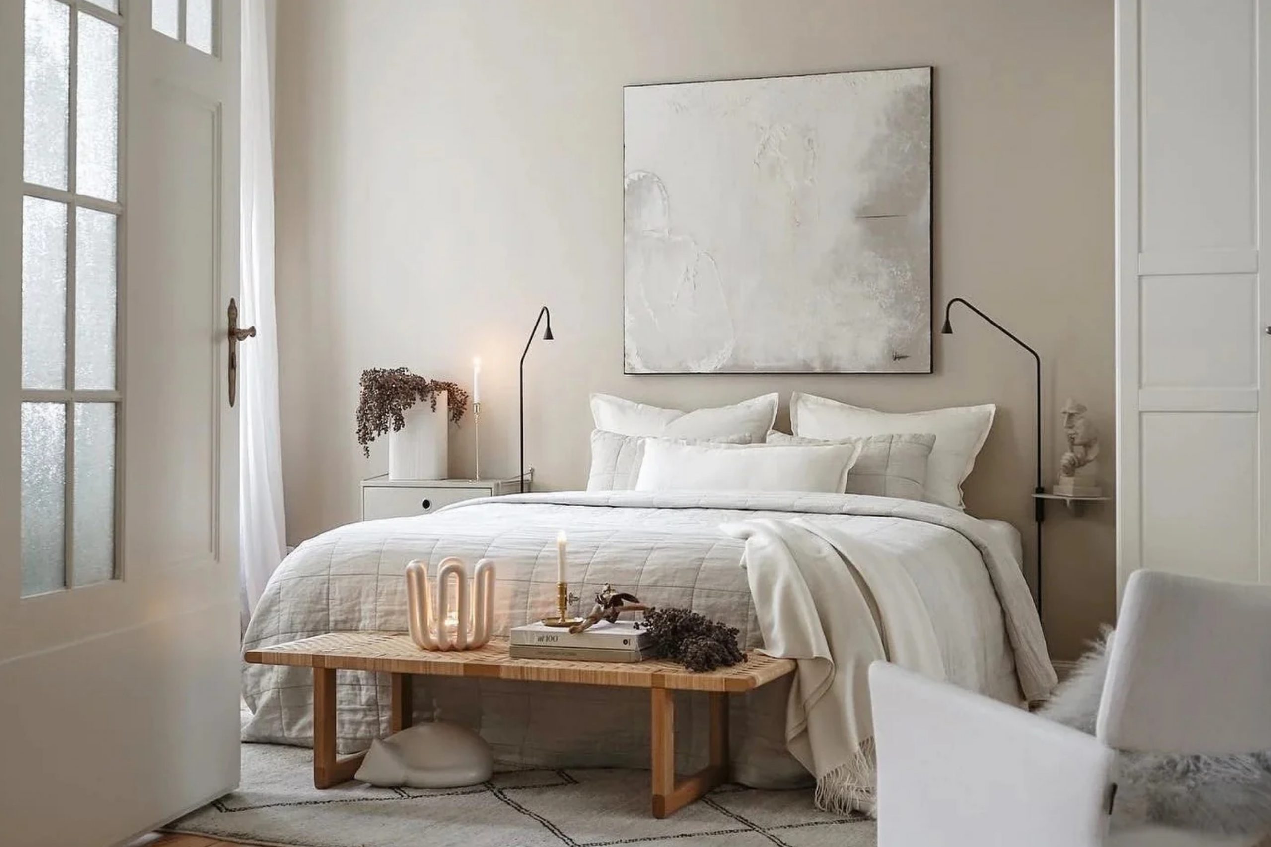
How I Find the Right Warm Neutral for Every Room
I always think about how a room is used before picking a color. A bedroom needs something soft and restful, while a living room can handle a little more warmth. Natural light plays a big part too. I usually bring in big paint swatches and stick them on each wall, then check them morning, noon, and night. Some shades look one way in sunlight and totally different when the lamps are on.
I also think about the floors, ceiling color, and what’s staying in the room. All those little choices help me find the warm neutral that feels just right.
19 Trendy Warm Neutrals in 2025 by Sherwin-Williams
Shiitake SW 9173
Shiitake is the kind of color that works when you want beige but with more depth. Shiitake feels earthy, like it was made from warm sand and soft stone. It brings a natural comfort to walls without feeling too dark. I love using it in living rooms with warm lighting or bedrooms where I want a grounded mood. It pairs beautifully with soft whites and light wood tones.
What I always remember when using Shiitake: don’t mix it with bright, cool grays—it does better with warm friends.

Wool Skein SW 6148
Wool Skein is a gentle beige that brings comfort without standing out too much. Wool Skein feels clean but not cold, soft but not dull. I like using it in kitchens with wooden cabinets or family rooms where people gather. It works great when you’re not sure what color to pick because it plays nicely with almost anything. It always looks soft and even, never sharp.
My favorite tip for Wool Skein: it needs warmth in the room—add gold or wood accents for balance.

Accessible Beige SW 7036
Accessible Beige has saved me so many times. Accessible Beige is one of those shades that feels calm but never boring. I use it in open layouts where I want everything to flow together. It has a bit of gray in it, which helps it feel grounded. But there’s just enough warmth to make a room feel lived in.
Here’s what works best with Accessible Beige: skip harsh whites and stick with creamy trim.

Balanced Beige SW 7037
Balanced Beige adds just a bit more drama than a lighter neutral. Balanced Beige holds up well in bigger rooms where you need some color without going dark. I’ve used it in entryways, home offices, and even mudrooms. It brings warmth but stays polished. It also does great with brass fixtures and rich wood tones.
If you’re thinking about Balanced Beige, just make sure your lighting is soft—it helps the color shine.

Softer Tan SW 6141
Softer Tan brings out a cozy feeling that makes any room feel comfortable. Softer Tan isn’t flashy, but it never feels dull either. I use it in homes where people want warmth without too much color. It works great with soft white trim and sandy-colored rugs. It feels especially nice in homes with lots of wood or natural textures.
When I use Softer Tan, I always add layers like wool throws or soft pillows to keep things cozy.
Barcelona Beige SW 7530
Barcelona Beige is a strong warm neutral that stands out just enough. Barcelona Beige feels more beige than tan, but still warm and full. I use it in hallways or dining rooms that need some weight. It looks great with dark furniture and light floors. It also works well when you want a clean, grown-up color.
Something to keep in mind with Barcelona Beige: skip blue-gray accents—they make it feel too cool.
Kilim Beige SW 6106
Kilim Beige is one of those perfect middle shades. Kilim Beige feels traditional but also fresh, which makes it easy to love. I’ve used it in bedrooms, living rooms, and even bathrooms. It pairs beautifully with whites, browns, and even some soft greens. It doesn’t fight with other colors—it works with them.
What I’ve learned using Kilim Beige: pair it with warm woods or creamy linens for a full look.

Nomadic Desert SW 6107
Nomadic Desert brings a deeper warmth that feels like the color of baked earth. Nomadic Desert works when you want a little more color but still want to stay neutral. I use it in cozy dens or rooms with darker furniture. It brings a strong comfort, like a warm blanket. It also helps large rooms feel a little closer.
One thing I always do with Nomadic Desert: keep the trim light so the room doesn’t get too heavy.

Bungalow Beige SW 7511
Bungalow Beige is an easy beige that fits into older homes or new ones. Bungalow Beige has just the right touch of warmth to make walls feel soft. I like using it in rooms with big windows where light pours in. It never feels too heavy, even in small rooms. It’s friendly with soft pinks, greens, and natural materials.
Here’s how I make Bungalow Beige shine: white bedding or curtains help it stay fresh.
Loggia SW 7506
Loggia has more depth than your basic beige, and I love that. Loggia adds personality without being loud. I’ve used it in entryways and mudrooms, especially when people want a touch of tradition. It pairs really well with iron hardware and warm woods. It makes any room feel grounded.
For Loggia to work its best, don’t forget to bring in texture—baskets and raw wood look great.

Macadamia SW 6142
Macadamia reminds me of warm roasted nuts—it’s rich and cozy. Macadamia brings a golden tone that feels cheerful but grounded. I use it in kitchens, pantries, and breakfast nooks. It lights up when natural light hits it. It also works great with brass, wicker, and terracotta accents.
One thing that helps Macadamia pop: keep the walls simple and let the finishings do the rest.
Panda White SW 6147
Panda White is a creamy soft white with a warm heart. Panda White is great when you want a neutral wall but don’t want it to feel cold. I love using it in bedrooms and nurseries where softness matters most. It also pairs beautifully with deeper beige or tan accents. It never feels too bright or too dark.
If you’re using Panda White, try warm lighting—it helps bring out its gentle side.
Natural Linen SW 9109
Natural Linen is exactly what it sounds like—easy and familiar. Natural Linen has a gentle warmth that feels like a favorite sweater. I use it when someone wants beige but not too much of it. It works well with creamy whites, soft blues, and light wood. It feels clean but still full.
To get the most out of Natural Linen, bring in soft fabrics and simple lines.
Canvas Tan SW 7531
Canvas Tan is a favorite for people who want something really easy to live with. Canvas Tan feels light but warm, like sand on a sunny day. I use it in all kinds of rooms—living, dining, and bedrooms. It works well with nearly any color palette. It never takes over the room, but always makes it feel cozy.
My best advice for using Canvas Tan: layer with neutral textures to keep it feeling complete.

Maison Blanche SW 7526
Maison Blanche is soft, warm, and full of charm. Maison Blanche reminds me of antique linens and sunny mornings. I love using it in vintage-style homes or when I want something that feels personal. It works great with warm woods and soft metals. It never feels too modern or too old.
To make Maison Blanche feel right, mix in something old—like a vintage chair or a worn rug.
Sandbar SW 7547
Sandbar is one of those shades that fits anywhere. Sandbar feels like a warm breeze in paint form. I’ve used it in bathrooms, hallways, and kitchens. It’s got just enough tan in it to feel rich, but not heavy. It works well with off-white trim and natural flooring.
When I pick Sandbar, I love pairing it with shiny or mirrored touches to bounce the light.
Latte SW 6108
Latte brings deep warmth that works best when you want a stronger neutral. Latte feels bold but still soft. I like it in dining rooms or dens where you want some richness. It looks amazing with dark woods and brass lighting. It also feels good in colder climates—it adds comfort.
A little trick I use with Latte: use warm yellow bulbs to bring out the glow in the color.
Tavern Taupe SW 7508
Tavern Taupe is the perfect mix of beige and brown. Tavern Taupe adds a grounded feeling to any room. I love it in rooms where you want a quiet strength. It works well with leather, heavy rugs, and deeper wood tones. It’s not flashy, but it’s always strong.
What makes Tavern Taupe work well: pair it with light trim or ceiling paint for contrast.
Warm Stone SW 7032
Warm Stone gives a rich, grounded base to any color story. Warm Stone feels deeper and a little cooler than other warm neutrals, but still feels like home. I use it in basements, offices, or areas where you want a deeper look. It works well with cream, beige, and muted blues.
To keep Warm Stone from feeling too dark, I always mix in soft cushions or lighter curtains.

21 Best Warm Neutrals for This Fall
Shoji White SW 7042
Shoji White has that soft white look with just enough beige to feel inviting. Shoji White doesn’t glare in the sunlight, and it looks even prettier in the evening glow. I like to use it in bedrooms or living rooms where people want a soft, clean wall that doesn’t feel flat. It pairs really well with natural fabrics, light wood, and warm metals. It’s one of those “safe but pretty” shades.
When I work with Shoji White, I make sure the furniture stays warm-toned to keep everything balanced.

Creamy SW 7012
Creamy feels like the color of warm milk—it’s soft, light, and just cozy enough. Creamy works great in kitchens and bathrooms where you want brightness but not that cold, icy feeling. It has a softness that helps rooms feel restful. I’ve used it with gold hardware and butcher block counters, and it never fails.
What I always pair with Creamy: warm finishes and off-white trim keep it looking its best.

Alabaster SW 7008
Alabaster is one of my all-time favorites because it fits anywhere. Alabaster has just enough warmth to feel soft without looking yellow. I’ve used it in nurseries, living rooms, and even ceilings. It reflects light beautifully and makes everything feel gentle.
One simple way to help Alabaster shine: skip bright whites near it—creamier tones make it glow.

Dover White SW 6385
Dover White feels like morning light—it’s bright but full. Dover White is a great choice for homes that feel too cold or empty. It adds warmth without adding color. I love using it on trim, walls, and ceilings all together. It makes a room feel welcoming right away.
If I’m using Dover White, I always bring in warm lighting to help it feel rich, not plain.

Natural Tan SW 7567
Natural Tan sits right between beige and tan, and that makes it really useful. Natural Tan works especially well in rooms that get strong sunlight. It holds its color and never feels washed out. I like pairing it with dark wood floors or creamy white accents. It’s also lovely with natural stone.
What I’ve found with Natural Tan: it needs contrast nearby—light trim or bright fabric helps it pop.
Wool Skein SW 6148
Wool Skein is so gentle it almost melts into the background—in a good way. Wool Skein works when you want warmth, but barely-there color. I often use it in hallways or quiet bedrooms. It’s the kind of color people don’t notice right away, but feel comfortable around.
A little tip for Wool Skein: mix in warm neutrals like oatmeal or soft taupe for extra depth.
Shiitake SW 9173
Shiitake always adds a natural feel without being too bold. Shiitake carries the feeling of wood and stone, making it easy to pair with rustic elements. I’ve used it in cozy dens and open kitchens. It’s the kind of shade that helps everything feel more grounded.
When working with Shiitake, I like to mix in greenery or plants to play up its earthy tone.
Canvas Tan SW 7531
Canvas Tan always gives me a clean, soft backdrop that feels like a fresh start. Canvas Tan is smooth, easy on the eyes, and pairs with nearly anything. I’ve used it in apartments, homes, and even model houses—it always looks nice.
One trick that works every time with Canvas Tan: add textures like baskets or woven rugs to make it feel more layered.
Nomadic Desert SW 6107
Nomadic Desert brings weight to a room without making it feel too serious. Nomadic Desert adds that earthy comfort that people love in fall. It works best in rooms with lots of natural light. I like to pair it with warm whites or dark browns.
When using Nomadic Desert, I always go for soft drapes or linen to break up the richness.
Softer Tan SW 6141
Softer Tan gives me a lot of flexibility—it’s like a blank canvas, but cozier. Softer Tan plays well with patterns, darker colors, or wood finishes. I’ve used it in rentals and staged homes where I needed something warm but easy.
What I’ve found helpful with Softer Tan: add a pop of soft orange or dusty pink for a seasonal accent.
Barcelona Beige SW 7530
Barcelona Beige keeps things grounded, especially in high-traffic areas. Barcelona Beige has that strong, steady feel that works with bold decor or simple styling. I use it in entryways, hallways, and sometimes dining rooms.
When I want Barcelona Beige to really work, I add dark accents like bronze or walnut wood.
Kilim Beige SW 6106
Kilim Beige has a slightly traditional feel that fits almost anywhere. Kilim Beige doesn’t demand attention but still feels warm and full. I love using it in older homes or when people want something soft and classic.
One way to make Kilim Beige sing: pair it with warm lighting and creamy whites for an easy mix.
Latte SW 6108
Latte is deeper and richer than most on this list—it’s perfect for fall. Latte feels cozy and full without being brown. I like it in family rooms, dens, or even dining areas. It looks great with dark furniture and vintage pieces.
If you’re using Latte, try soft white ceilings and warm fabric to keep it balanced.
Sandbar SW 7547
Sandbar reminds me of late afternoon sunlight—it has that same soft feeling. Sandbar fits beautifully in bathrooms or sunrooms. I’ve even used it in offices for a more relaxing vibe.
What helps Sandbar feel right: clean trim and brushed gold fixtures.
Macadamia SW 6142
Macadamia brings a rich, golden tone to a room. Macadamia feels especially right in kitchens or breakfast areas where you want warmth. It also plays well with wood tones and greenery.
My tip for using Macadamia: lean into warm natural textures—rattan, jute, or clay work great.
Balanced Beige SW 7037
Balanced Beige gives you that extra color when lighter neutrals feel too plain. Balanced Beige is great in homes with high ceilings or open floor plans. It helps bring a room together.
What I often do with Balanced Beige: add bold art or deep wood tones to give it contrast.
Loggia SW 7506
Loggia is a little darker than expected, and that’s why I like it. Loggia brings a strong presence to walls, making everything feel pulled together. It works great in bedrooms or front entries.
My favorite way to use Loggia: add black, bronze, or aged metals for a strong, warm vibe.
Maison Blanche SW 7526
Maison Blanche always gives me that antique feel, like it belongs in a storybook house. Maison Blanche has warmth, charm, and a soft glow. I use it when I want a room to feel like home right away.
When styling around Maison Blanche, I add old books or handmade art to match its look.
Warm Stone SW 7032
Warm Stone brings weight and richness without going full brown. Warm Stone looks great in colder climates where you want the walls to feel warm even in winter. I like it in bedrooms, studies, and quiet corners.
If you’re picking Warm Stone, mix in lighter floors or soft rugs to keep the balance.
Oyster White SW 7637
Oyster White is quiet, soft, and just warm enough. Oyster White works when you want a white that isn’t too bright or cold. I’ve used it in living rooms and bedrooms alike.
Here’s how I treat Oyster White: soft linens and cream-colored decor help it feel relaxed and full.

Panda White SW 6147
Panda White makes a room feel gentle and easy. Panda White isn’t pure white—it has a creamy base that keeps things feeling warm. I love it for trim, ceilings, or even walls in a cozy room.
To keep Panda White looking its best, I skip anything with a blue or gray tone nearby.
Trendy Warm Neutrals I’m Loving This Year
Shiitake SW 9173
Shiitake has become one of those colors I come back to again and again. Shiitake gives off this quiet, earthy feel that makes rooms feel natural and lived-in. I’ve used it in living rooms, bedrooms, even hallways. It always looks like it belongs. It pairs so well with creamy whites, soft leathers, and wood accents.
One thing I always do with Shiitake: avoid anything too shiny—it loves matte finishes.
Wool Skein SW 6148
Wool Skein feels like a soft hug in color form. Wool Skein is light, warm, and really easy to live with. It works best in cozy homes or when people want something that feels easy and calm. I’ve used it in kids’ rooms, breakfast nooks, and long hallways.
Here’s what makes Wool Skein even better: pair it with gentle lighting and soft fabrics.
Balanced Beige SW 7037
Balanced Beige gives you warmth with just a little strength behind it. Balanced Beige doesn’t disappear—it holds its own in large rooms. I use it when I want something cozy but still bold enough to feel structured. It’s great with leather, wood, and dark stone.
My go-to tip with Balanced Beige: use black frames or metal touches to sharpen the whole look.
Nomadic Desert SW 6107
Nomadic Desert reminds me of old stone paths or sun-baked walls. Nomadic Desert feels steady and comforting. I like it in dens, guest rooms, and quiet reading areas. It works best with other earthy textures like linen, jute, or unfinished wood.
When I want Nomadic Desert to shine, I use soft cream curtains to balance the warmth.
Kilim Beige SW 6106
Kilim Beige has this soft, gentle glow that never feels too pale or too dark. Kilim Beige plays well with traditional homes and modern styles. I’ve painted entire rooms with it, and it always feels complete. It’s easy to decorate around.
What I always remember when using Kilim Beige: bring in warm metal finishes—they make everything richer.
Canvas Tan SW 7531
Canvas Tan is a reliable favorite—it’s not too yellow, not too brown. Canvas Tan helps a room feel calm and put together. I’ve used it in open-plan living rooms where I wanted something neutral but not boring.
One thing I do when using Canvas Tan: mix in light wood tones to keep the room feeling soft.
Natural Tan SW 7567
Natural Tan brings a soft, sandy warmth that feels like a day at the beach. Natural Tan is perfect in homes with lots of windows because it looks lovely in the sun. It plays well with white trim and woven accents.
What makes Natural Tan work for me: I add plenty of plants or natural textures to keep the mood grounded.
Sandbar SW 7547
Sandbar has that golden undertone that makes it feel friendly. Sandbar works well in places where people gather—like kitchens or dining rooms. It makes everything feel a little brighter, even when the weather outside isn’t great.
One tip I follow with Sandbar: add brushed brass hardware for extra warmth.
Loggia SW 7506
Loggia is strong without being too dark. Loggia gives me that warm, stable look I love for rooms that need a bit of structure. I’ve used it in foyers and powder rooms where I wanted a little drama but still wanted to stay neutral.
To make Loggia feel complete, I like using off-white trim and soft stone accents.
Macadamia SW 6142
Macadamia is full-bodied and golden, kind of like a warm cookie. Macadamia brings that extra richness some rooms really need. It looks beautiful next to tile, warm woods, or even brick.
Here’s my favorite way to use Macadamia: add vintage pieces or pottery to pull it all together.
Latte SW 6108
Latte is one of those deeper warm neutrals that always makes rooms feel close and cozy. Latte looks stunning in dining rooms, especially with dim lighting and wood furniture. It’s not too dark, but it definitely makes a statement.
When working with Latte, I add contrast with light curtains or rugs.
Warm Stone SW 7032
Warm Stone is a powerful neutral—it brings a grounded feel to a home. Warm Stone works beautifully in studies or bedrooms where you want a calm but rich color. It pairs well with ivory and aged bronze.
What helps Warm Stone shine: soft lighting and pale linens to soften the weight.
Maison Blanche SW 7526
Maison Blanche has an old-world warmth to it that makes it feel very personal. Maison Blanche works great in homes with vintage charm or French-country touches. I love it with dark woods, antique finds, and cozy textiles.
Here’s what I usually add with Maison Blanche: something handmade—it completes the story.
Panda White SW 6147
Panda White gives a creamy softness to any room. Panda White is great when you want a white that doesn’t feel bright or cold. I’ve used it for walls, trim, even furniture.
To keep Panda White feeling warm, I bring in golden or peachy accents—it pairs so well with them.
Alabaster SW 7008
Alabaster always makes a room feel peaceful and easy to be in. Alabaster works in both modern homes and older ones. It’s not too white, not too beige—just right in between.
One trick I’ve learned: use Alabaster on walls and trim together for a soft, clean finish.
My Final Thoughts on Warm Neutrals This Year
Warm neutrals have always been part of my work, but this year, they feel more needed than ever. People want comfort. They want their homes to feel cozy, steady, and safe. These colors help with that. Whether it’s the softness of Wool Skein, the rich feel of Latte, or the quiet beauty of Alabaster, every shade has a purpose. I’ve seen these colors bring out the best in so many rooms—from small rentals to large family homes.
When I’m choosing a warm neutral, I’m not just picking paint—I’m helping shape how someone will feel every day in that room. That’s a big deal to me.
I hope this list gives you some good ideas, maybe even the exact color you’ve been looking for. Trust your eye, test the color in your light, and most of all, choose the one that makes you feel good every time you walk in.
Warm neutrals don’t try too hard—and maybe that’s what makes them feel so right.
