Creating a bedroom that helps you feel rested starts with the right wall color. The shades you surround yourself with can influence how quickly you relax, how deeply you sleep, and how refreshed you feel in the morning. In my work as a designer, I’ve seen the difference the right paint can make — it softens the mood and sets the tone for everything else in the room.
This guide brings together my top color ideas that bring balance, quiet beauty, and a gentle backdrop for daily life.
Every shade here works beautifully with a variety of furniture styles and fabrics, so you can easily find one that feels right for you.
Why Sherwin-Williams Is My Go-To for Peaceful Bedroom Shades
Over the years, I’ve worked with many paint brands, but I always return to Sherwin-Williams for their range of soft, easy-on-the-eye colors. The quality of their paints means smooth application and a finish that looks beautiful for years. Their colors are thoughtfully crafted to work in real homes, not just under showroom lighting.
I also appreciate their balance of cool and warm tones, which makes it easier to match wall colors with bedding, flooring, and decor.
When my clients ask for shades that feel gentle and inviting, I know Sherwin-Williams will have exactly what we need.
My Method for Finding the Perfect Soothing Bedroom Color
When choosing a color, I always start by looking at the light in the room. Cool northern light can make colors look slightly grayer, while southern light adds a warm golden cast. I think about the feeling you want — whether that’s fresh and airy, cozy and grounded, or soft and romantic.
I also look at the undertones in furniture, curtains, and rugs so the wall color works in harmony.
The right choice should make you take a deeper breath the moment you walk in.
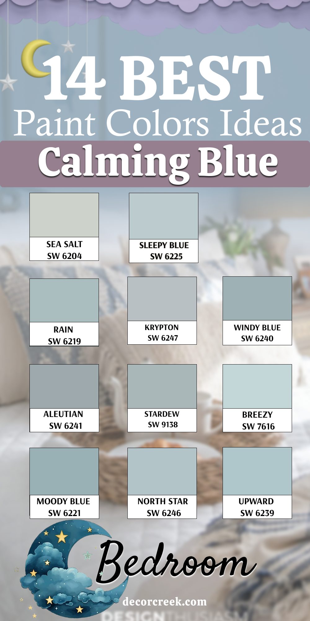
14 Best Calming Blue Bedroom Paint Color Ideas
Sea Salt – SW 6204
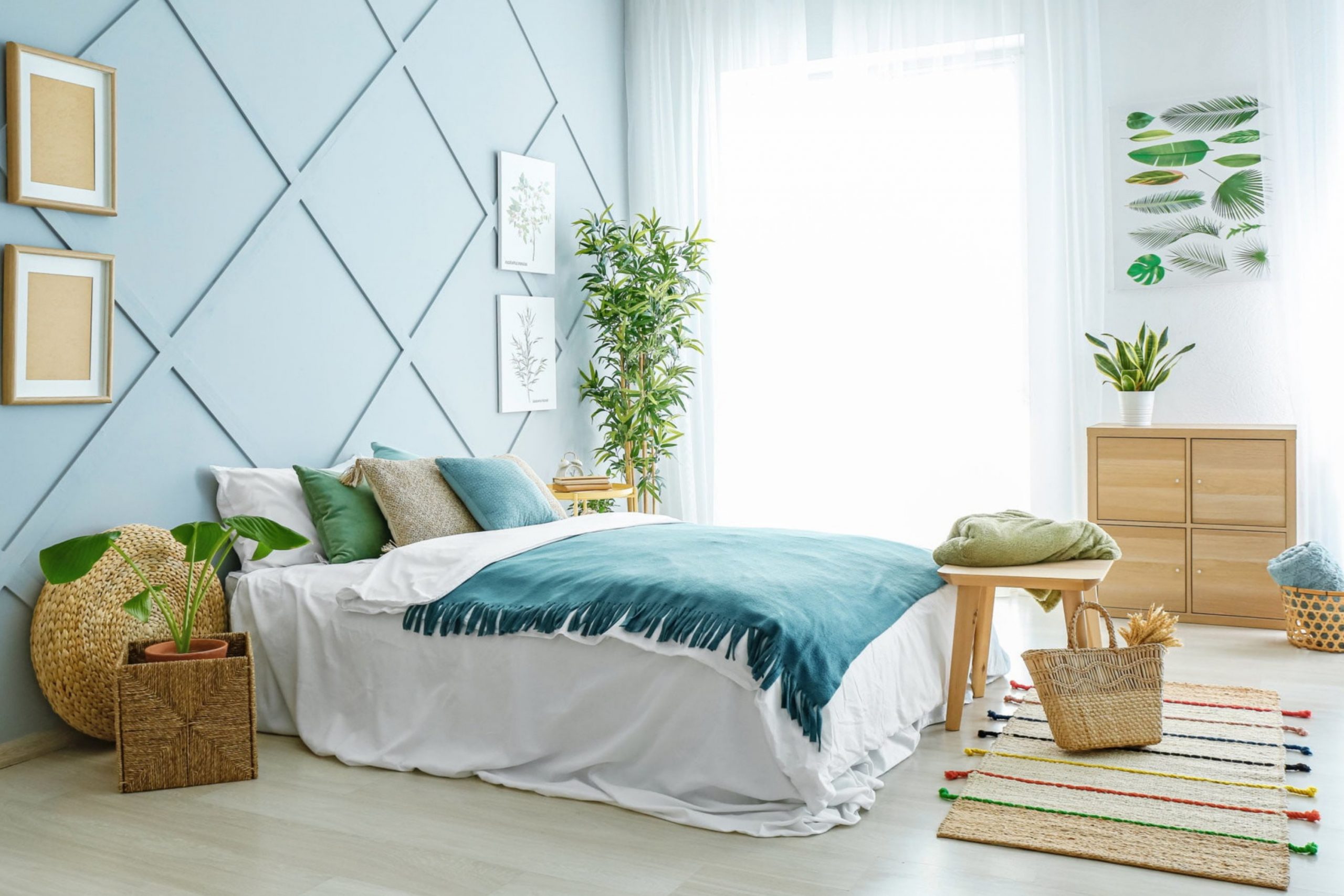
Sea Salt has a gentle mix of blue and green that changes with the light. In morning sunshine, it feels light and fresh, while in the evening it takes on a softer tone. I love using it in bedrooms with white or warm wood furniture because it keeps the room feeling airy. It pairs beautifully with natural fabrics like linen and cotton.
The color has just enough depth to feel interesting without taking over the room.
If you want a shade that feels different at every time of day, Sea Salt is a wonderful choice.

Sleepy Blue – SW 6225
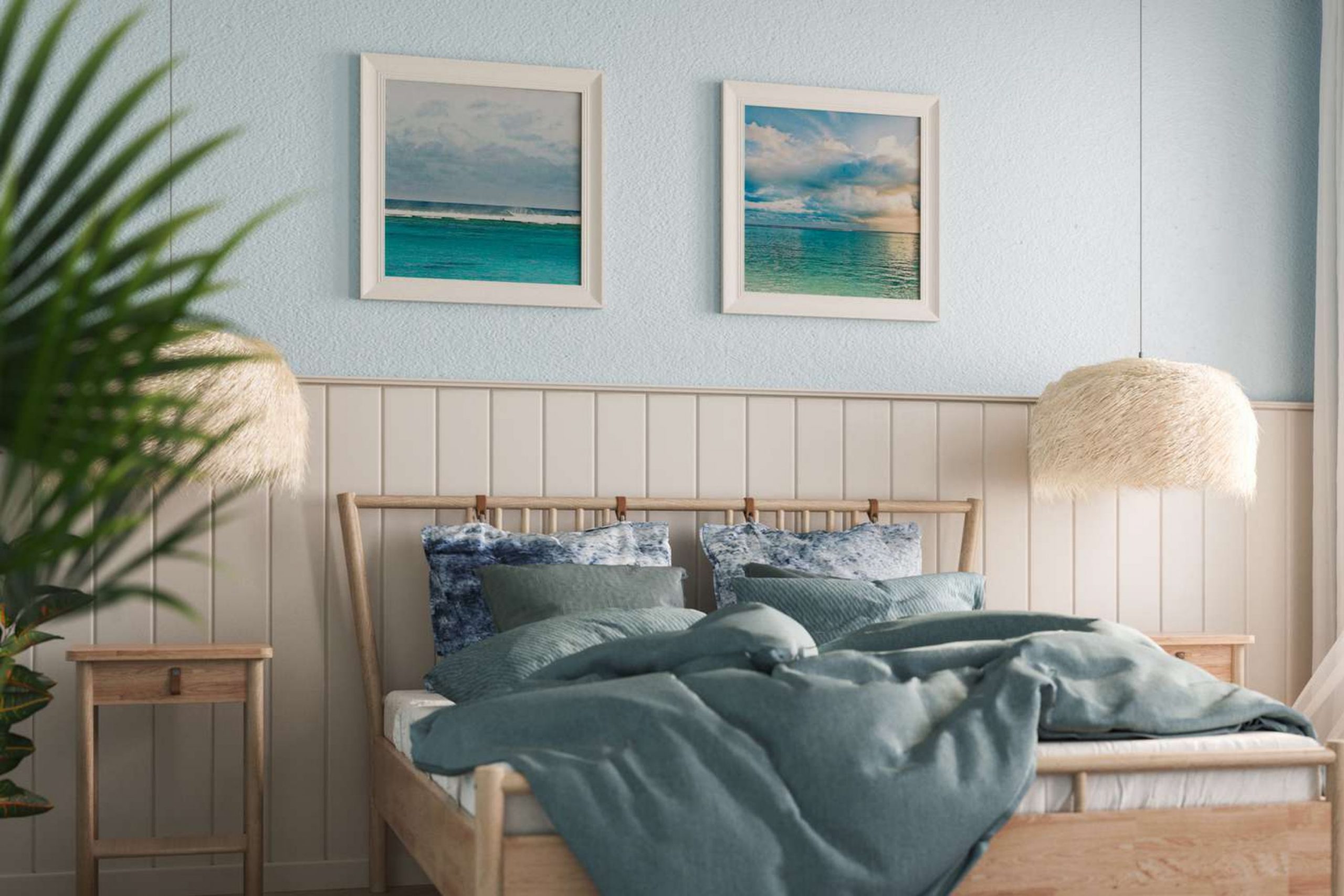
Sleepy Blue is a powdery mid-tone blue that feels easy on the eyes. It works beautifully in rooms where you want a light color that still has personality. I’ve used it in bedrooms with both white trim and darker stained wood, and it complements each style. This shade feels especially good in rooms with good daylight, where it can really show its gentle side.
Pair it with soft bedding in cream or pale gray for a layered look. It’s a color that invites you to slow down and breathe.

Rain – SW 6219
Rain is a medium blue with a hint of green that reminds me of a soft mist after a summer shower. It has a grounding quality, making it perfect for bedrooms where you want a more anchored feeling. I find it works well with wicker, rattan, and other natural textures. In bright daylight, it feels refreshing, and in the evening, it deepens into a richer tone.
It’s a versatile choice for both coastal and modern styles. If you like blue but want something with a touch of uniqueness, Rain is ideal.

Krypton – SW 6247
Krypton is a clean, cool blue that has a slightly modern feel. It works best in bedrooms that get a lot of natural light, where it can show off its crisp tone. I often pair it with white trim and simple furniture to create a fresh, uncluttered look. This shade also looks great with brushed metal accents like nickel or chrome.
It’s perfect for those who like a neat and tailored aesthetic. Krypton makes a room feel open without being too stark.

Windy Blue – SW 6240
Windy Blue has a balanced, gentle tone that works in almost any bedroom style. It’s not too light, not too dark, making it easy to match with other colors. I’ve used it with both modern and traditional furniture, and it always fits in naturally. This blue pairs nicely with warm wood floors and soft ivory bedding.
In low light, it keeps its friendly tone without turning gray. It’s one of those shades that feels dependable year after year.

Aleutian – SW 6241
Aleutian is a blue with a touch of gray that gives it a slightly muted character. It’s perfect if you want color on the walls without it feeling too bold. I’ve used it in guest rooms to create a quiet, welcoming feeling. It works beautifully with pale beige, off-white, and even soft blush accents.
The gray undertone keeps it from feeling too bright, even in sunny rooms. It’s a reliable choice for a restful setting.

Stardew – SW 9138
Stardew is a soft blue that feels like a favorite worn denim. It adds just the right amount of color while still feeling easy to live with. I love pairing it with natural woods and woven baskets for a relaxed look. It also works well with light grays and soft taupes in bedding and curtains.
This color has a lived-in quality that makes it instantly comfortable. It’s great for bedrooms where you want warmth without going into warmer hues.

Breezy – SW 7616
Breezy is a cheerful, light blue that brings a fresh feeling to a room. It works well in spaces that don’t get a lot of natural light because it reflects brightness. I often use it with white trim for a crisp finish. It pairs nicely with sandy beige rugs and light wood furniture. The color feels inviting without being too strong.
Breezy is a simple way to make a bedroom feel brighter.
Moody Blue – SW 6221
Moody Blue is a rich blue with a slight teal influence, giving it depth. It works beautifully in larger bedrooms where you want the walls to feel enveloping. I love using it with brass or gold accents for a hint of elegance. In daylight, it’s vibrant, and in evening light, it feels more intimate.
This color works especially well with neutral bedding so it can shine. Moody Blue brings a strong yet comfortable personality to a room.

North Star – SW 6246
North Star is a light blue with a cool undertone that keeps it feeling crisp. It’s ideal for bedrooms with plenty of sunlight where you want a refreshing atmosphere. I often use it with clean white bedding and minimal decor for a breezy look. It pairs nicely with light woods and simple patterns.
The tone is consistent throughout the day, making it a dependable choice. North Star gives just enough color without feeling heavy.

Upward – SW 6239
Upward is a sky blue that feels open and uplifting. It works especially well in bedrooms with high ceilings or large windows. I like pairing it with soft white and pale beige for a natural balance. In brighter spaces, it can feel airy, while in dimmer rooms, it takes on a cozier quality.
This shade works with both traditional and modern styles. It’s an easy choice for anyone who wants a light, fresh look.

Interesting Aqua – SW 6220
Interesting Aqua blends blue and green for a lively yet soft tone. It’s perfect for bedrooms that need a little boost without going too bold. I often pair it with white or light gray to keep the look balanced. This shade works well in coastal-inspired interiors but also blends into more casual styles.
The color shifts gently with the light, giving it variety. Interesting Aqua adds a quiet cheerfulness to a room.

Blissful Blue – SW 6527
Blissful Blue is a pale, powdery tone that feels gentle from morning to night. It’s an excellent choice for small bedrooms because it doesn’t overwhelm the eye. I love pairing it with white, cream, and soft blush accents for a delicate touch. The shade works beautifully with natural fibers like linen and cotton.
It feels clean without being cold. Blissful Blue is a safe yet beautiful pick for any restful bedroom.

Reflection – SW 7661
Reflection is a cool, silvery blue that feels refined and light. It works especially well in rooms with modern furniture and simple lines. I like pairing it with bright white trim to keep it fresh. The color changes slightly with the light, sometimes feeling more blue, sometimes more gray.
It’s versatile enough for both master bedrooms and guest rooms. Reflection adds a polished backdrop without feeling too formal.

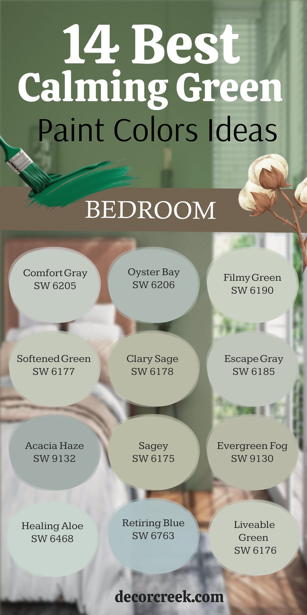
14 Best Calming Green Bedroom Paint Color Ideas
Comfort Gray – SW 6205
Comfort Gray has a balanced mix of green and gray that works beautifully in bedrooms where you want softness without losing color. In bright daylight, it leans more green, while in lower light it takes on a gentle gray tone. I like using it with white trim and light wood furniture for a fresh look. It pairs well with natural fabrics and soft patterned bedding.
This shade feels steady and dependable all year round. Comfort Gray is a choice that works for many different design styles.

Oyster Bay – SW 6206
Oyster Bay is a muted green with a touch of blue, perfect for creating a balanced background. It works beautifully with wicker, linen, and other natural textures. In brighter rooms, it takes on a breezier feel, while in the evening it becomes richer. I often pair it with creamy whites or sandy beige accents.
The color feels grounded without being heavy.
Oyster Bay is a go-to when I want something fresh but not too bright.

Filmy Green – SW 6190
Filmy Green is a light, airy shade that makes a room feel open and gentle. It has just enough color to keep things interesting without demanding attention. I find it works best in bedrooms with lots of natural light. It pairs beautifully with white furniture and delicate fabrics. This shade is especially nice for small rooms, where it helps walls feel more distant.
Filmy Green is a soft backdrop for any restful setting.

Softened Green – SW 6177
Softened Green has a quiet warmth that makes it easy to live with. It works beautifully with warm-toned woods and simple, cozy fabrics. I like using it in bedrooms that get moderate light, where it keeps a steady tone. It pairs well with both white and cream trim. The color feels inviting without being strong. Softened Green is one of those shades that never feels out of place.

Clary Sage – SW 6178
Clary Sage is a warm, herbal green that feels connected to nature. It works perfectly in rooms where you want a grounded, welcoming feeling. I often pair it with off-white bedding and handwoven textiles. In daylight, it has a gentle glow, while in evening light it feels richer.
This shade pairs nicely with rattan, wicker, and other natural materials. Clary Sage brings an earthy balance to a bedroom.

Escape Gray – SW 6185
Escape Gray is a versatile green-gray that works in both modern and classic interiors. It has enough gray to keep it feeling calm, but the green undertone adds warmth. I like pairing it with soft beige and pale blue accents. This shade holds its tone well through the day without big shifts.
It works beautifully in rooms with medium light. Escape Gray feels steady and reliable without being plain.

Acacia Haze – SW 9132
Acacia Haze is a dusty green that brings a quiet richness to walls. It works especially well with mid-tone woods and antique pieces. In brighter rooms, it feels lighter and fresher, while in dimmer spaces it takes on a deeper tone. I love pairing it with linen curtains and handwoven rugs.
The color feels natural and grounded. Acacia Haze is a choice for those who want color with depth.

Sagey – SW 6175
Sagey is a classic muted green that’s easy to work with. It pairs well with warm neutrals, white trim, and natural fabrics. I’ve used it in both guest rooms and primary bedrooms with great results. In bright sunlight, it feels more lively, while in softer light it becomes cozier.
This is a green that works across seasons without feeling out of place. Sagey brings a gentle natural touch to a room.

Evergreen Fog – SW 9130
Evergreen Fog is a modern green-gray with a quiet strength. It pairs beautifully with warm metals like brass or bronze. In brighter rooms, it feels fresh, while in evening light it takes on a deeper tone. I like using it with layered textures like linen, wool, and rattan.
This shade works equally well with light or dark wood furniture.
Evergreen Fog gives a bedroom a grounded but open feeling.

Healing Aloe – SW 6468
Healing Aloe is a very soft green with a hint of blue, giving it a refreshing quality. It’s wonderful in rooms that need a light lift without going bright. I often pair it with clean white bedding and simple wooden furniture. The color shifts gently with the light, keeping it interesting throughout the day.
It works well for both large and small bedrooms. Healing Aloe feels airy but still cozy.
Retiring Blue – SW 6763
Retiring Blue leans toward green-blue, giving it a unique personality. In bright light, it feels fresher, and in the evening it takes on a richer, slightly moody tone. I like pairing it with white or warm beige accents. It works especially well in rooms with woven textures and light woods.
This color gives a soft touch without being overly pale. Retiring Blue adds quiet character to a bedroom.
Liveable Green – SW 6176
Liveable Green is a soft, warm green that feels inviting year-round. It works with nearly any style of furniture. I like pairing it with light-colored bedding and natural wood finishes. In brighter light, it feels lighter and fresher, while in dimmer rooms it becomes more intimate.
This shade has just the right amount of color to feel interesting. Liveable Green is a versatile, easy choice.

Svelte Sage – SW 6164
Svelte Sage is a warm green with a hint of beige, giving it an earthy quality. It works beautifully with natural fabrics and handwoven rugs. I often use it in bedrooms that get morning sun, where it glows softly. It pairs well with creamy whites and muted gold accents.
This shade has a grounding effect without feeling dark. Svelte Sage feels timeless in any setting.

Green Onyx – SW 9128
Green Onyx is a deep yet soft green that brings quiet richness to walls. It pairs well with warm woods, brass accents, and natural linens. In brighter rooms, it feels lighter, while in evening light it deepens. I like using it in bedrooms where you want a slightly cocooned feeling.
The color holds its tone well without looking dull. Green Onyx is a confident but welcoming choice.

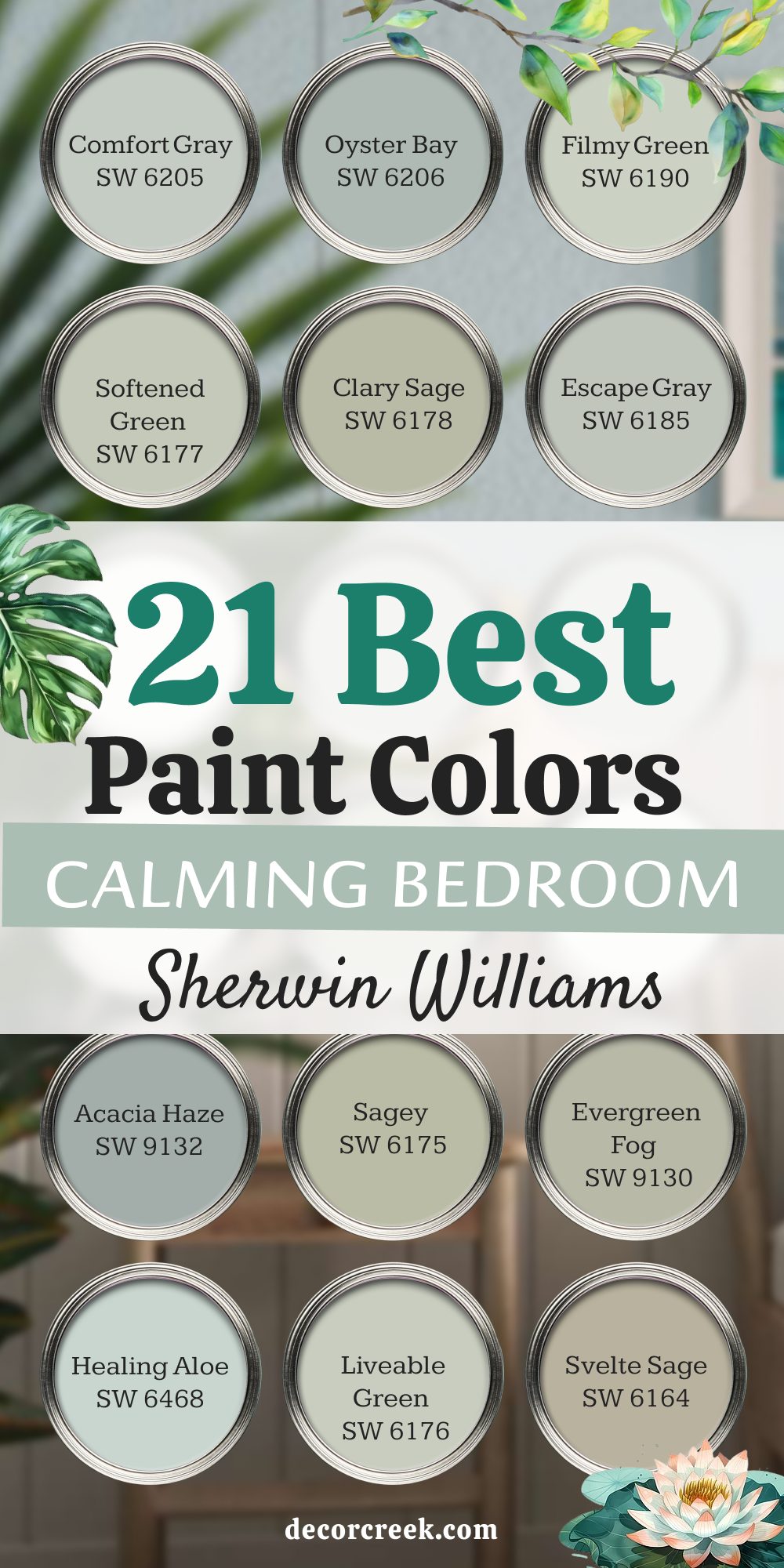
21 Best Calming Bedroom Paint Colors by Sherwin-Williams
Comfort Gray – SW 6205
Comfort Gray blends green and gray in a way that feels steady and gentle. In bright rooms, the green stands out more, while in lower light it leans toward a softer gray. I love pairing it with white bedding and warm wood accents. This shade works beautifully with natural fabrics and simple patterns.
It’s dependable through all seasons and styles. Comfort Gray is a favorite when I want a touch of color without going bold.
Oyster Bay – SW 6206
Oyster Bay is a cool-toned green with just a hint of blue. It works beautifully in both modern and coastal-inspired bedrooms. I like using it with wicker furniture and light fabrics. The color shifts slightly through the day, adding depth without being strong.
It pairs nicely with sandy beige rugs and off-white walls. Oyster Bay gives a bedroom a natural, refreshing feeling.
Filmy Green – SW 6190
Filmy Green is light and airy, making it perfect for smaller bedrooms. It keeps walls feeling open while still adding color. I pair it with soft white trim and light wood finishes. This shade works especially well with linen and cotton bedding. In sunlight, it feels fresh and clean.
Filmy Green is a gentle choice for a background that doesn’t take over.
Softened Green – SW 6177
Softened Green has a warm quality that feels easy to live with. It works beautifully with mid-tone woods and off-white accents. I like using it in bedrooms that need a touch of warmth without losing brightness. In daylight, it’s fresh, and in the evening, it becomes cozier.
This color pairs well with woven fabrics and layered textures. Softened Green is dependable in any style.
Clary Sage – SW 6178
Clary Sage is a warm, herbal green with an inviting nature. It works well in bedrooms that lean toward natural materials and earthy tones. I often pair it with rattan accents and cream bedding. In bright light, it feels lively, while in dim light it takes on a richer tone.
This shade creates a grounded feeling without being heavy. Clary Sage works year-round without losing appeal.
Escape Gray – SW 6185
Escape Gray is a soft green-gray with a balanced tone. It looks beautiful with pale blue or beige accents. I use it in rooms where I want color but need it to stay calm. This shade keeps its character in all types of lighting. It works well with simple bedding and uncluttered decor.
Escape Gray is versatile and easy to match with many styles.
Acacia Haze – SW 9132
Acacia Haze is a dusty green that adds richness to a bedroom. I like using it with antique furniture and natural fibers. In daylight, it feels softer, and in evening light, it deepens beautifully. This shade pairs well with neutral bedding and woven rugs. It works in both traditional and modern rooms.
Acacia Haze is a confident but not overpowering choice.
Sagey – SW 6175
Sagey is a muted green that feels comfortable in any bedroom. It pairs beautifully with warm wood tones and white trim. I’ve used it in both small and large rooms with great results. In sunlight, it feels lighter and fresher, while in lower light it becomes warmer.
This color works for many different design moods. Sagey brings a natural touch that’s never too strong.
Evergreen Fog – SW 9130
Evergreen Fog is a soft green-gray with a modern feel. It pairs well with brass accents and layered textiles. I like using it in rooms with medium to bright light. This shade keeps its depth throughout the day. It works well with both light and dark furniture.
Evergreen Fog adds a balanced, grounded background.
Healing Aloe – SW 6468
Healing Aloe is a pale green with a touch of blue. It feels refreshing without being cold. I often pair it with crisp white bedding and natural wood accents. This shade changes gently with the light, adding interest without boldness. It works beautifully in small rooms.
Healing Aloe keeps a bedroom feeling fresh and light.
Liveable Green – SW 6176
Liveable Green is soft and warm, perfect for making a bedroom feel welcoming. It pairs well with light wood furniture and neutral fabrics. I’ve used it in many homes, and it always adapts to the style. In daylight, it feels bright and open, while at night it becomes cozier.
This color works all year long. Liveable Green is always an easy choice.
Svelte Sage – SW 6164
Svelte Sage is a warm green with earthy undertones. It works beautifully with creamy whites and muted gold accents. I like using it in bedrooms that get morning sun. This shade feels stable and grounded without being dark. It pairs well with handwoven rugs and natural fabrics.
Svelte Sage adds a soft, welcoming background.
Green Onyx – SW 9128
Green Onyx is a deep yet gentle green. It works well in larger bedrooms where you want a more intimate feeling. I often pair it with warm wood furniture and brass details. In bright light, it feels lighter, and in the evening it gains richness. This color holds its tone without looking dull.
Green Onyx adds character and warmth to a room.
Sleepy Blue – SW 6225
Sleepy Blue is a light, powdery blue with a calming quality. It pairs well with white and pale gray bedding. I’ve used it in both coastal and classic bedrooms. In sunlight, it feels brighter, and at night, it becomes more subdued. This shade works for all ages and styles.
Sleepy Blue adds softness without losing personality.
Stardew – SW 9138
Stardew is a faded blue with a comfortable, worn-in feel. It looks beautiful with natural woods and woven baskets. I pair it with light grays and warm neutrals for balance. This shade works in both bright and dim light. It feels approachable and easy to live with.
Stardew is perfect for a bedroom that feels lived-in and warm.
Breezy – SW 7616
Breezy is a fresh blue that lifts the mood of a bedroom. It pairs well with white trim and sandy beige accents. I like using it in rooms that need more brightness. This shade reflects light beautifully. It works with both simple and layered styles.
Breezy adds a friendly energy without feeling too bold.
Moody Blue – SW 6221
Moody Blue is a deep blue with a teal influence. It works best in bedrooms where you want a more dramatic background. I pair it with brass lighting and crisp white bedding. In daylight, it’s vibrant; at night, it becomes more intimate. This shade adds richness to the room.
Moody Blue is for those who want color with depth.
North Star – SW 6246
North Star is a light blue with a crisp, cool undertone. It pairs beautifully with white bedding and minimal patterns. I’ve used it in bright, airy bedrooms with great success. It keeps its tone steady throughout the day. This color works with both wood and painted furniture.
North Star is clean and refreshing without being cold.
Upward – SW 6239
Upward is a soft sky blue that feels open and light. It works well in rooms with high ceilings or big windows. I pair it with pale beige rugs and light wood furniture. In bright light, it feels airy; in dim light, it becomes cozy. This shade adapts easily to different decor styles.
Upward adds brightness without overwhelming the room.
Blissful Blue – SW 6527
Blissful Blue is pale and gentle, perfect for a soft background. It pairs well with creams, whites, and light blush accents. I use it in bedrooms where I want a fresh but delicate look. In sunlight, it feels clean; in low light, it stays soft. This shade works beautifully in small spaces.
Blissful Blue is an easy way to bring lightness into a room.
Reflection – SW 7661
Reflection is a cool, silvery blue with a refined look. It pairs well with bright white trim and simple furniture. I like it in modern and transitional bedrooms. The color shifts slightly between blue and gray, adding interest.
It works equally well in large and small rooms. Reflection gives a bedroom a fresh, polished background.
My Last Notes for a Calm Bedroom
Choosing the right bedroom color is about more than just picking something you like on a sample card. The shade you choose can help you feel more at ease at the end of the day and ready for a new start in the morning. In my work, I’ve seen how soft greens and blues can bring a gentle balance, while light neutrals create a clean background for any style.
Take time to look at how each color appears in your lighting, and imagine how it will feel in every part of the day. The most important thing is that you enjoy being in the room and that it supports the way you rest and recharge.
A well-chosen color becomes part of the comfort you look forward to every night.