As a home interior designer, I know that choosing a paint color for your bedroom can feel like a truly monumental decision. It is the place where you start and end every day, and the wall color must work hard to foster a sense of peace and tranquility. You absolutely want a color that feels deeply restful and sets precisely the right mood for waking up gently and winding down completely.
For many years now, I’ve watched grey maintain its position as the number one favorite for bedrooms in almost every style of home, and for an excellent reason!
It’s an incredibly wonderful, sophisticated foundation for virtually any decorating style you might choose to pursue.
However, and this is crucial, not all greys are created equal in their beauty or their effect on a room. Finding the perfect shade—one that possesses the necessary complexity, and, importantly, doesn’t feel cold, depressing, or sadly flat—is the critical trick. To help you bypass all the common pitfalls, I’ve diligently put together my very best list for 2026, focusing intensely on the greys that really, reliably work and perform beautifully in a real-world bedroom setting.
This definitive list is built entirely on the foundation of what consistently makes my discerning clients happy and what, from a staging perspective, photographs flawlessly and adds tangible value. Let me personally walk you through my absolute, hand-selected favorites from the two professional brands I trust most in the industry, and show you the exact, methodical process of how I meticulously pick the winner every single time.
Get ready to finally find the specific shade of grey that will make your bedroom feel like the ultimate, perfect sanctuary and retreat you deserve.
Why I Always Trust Sherwin-Williams and Benjamin Moore for Grey Bedroom Colors
When it comes to selecting paint, especially for notoriously tricky and nuanced colors like grey, I consistently and exclusively stick to the two powerhouse brands that have simply never, ever let me down: Sherwin-Williams and Benjamin Moore.
Why the unwavering dedication?
Because, quite simply, they consistently formulate and manufacture the best, most reliable paint available.
As a seasoned designer, my professional reputation and the happiness of my clients entirely rests on the perceived quality and the flawless execution of my finished rooms. These companies consistently deliver a rich, beautiful depth, and a color consistency that lesser, cheaper brands just cannot hope to match.
Their professional grey formulations are incredibly sophisticated, multi-pigmented, and complex, meaning they masterfully manage to feel wonderfully neutral without ever appearing flat, muddy, or boring.
They are experts at creating colors that possess a compelling complexity and beautifully change their appearance with the shifting light throughout the day, which is an absolutely essential feature for a bedroom where the lighting dramatically shifts from the bright, direct morning sun to the soft, warm glow of lamplight at night. I know with complete confidence that when I specify one of their premium greys, the result will be undeniably rich, remarkably durable, and will match the exact sophisticated shade I promised my client during the consultation.
For a color as fundamentally essential to the mood as grey in a bedroom, you require and deserve that supreme level of reliability.
Ultimately, choosing these brands is an intelligent investment in your home’s long-term beauty and your personal happiness, and these two names are unquestionably worth every penny for achieving a truly flawless, professional finish that lasts.
How I Choose the Perfect Grey Shade for Any Bedroom
Choosing the absolutely perfect shade of grey is an endeavor I treat much like being a professional detective; you must be highly observant and actively look for all the crucial clues the room is offering you! The single biggest, most frequently made mistake I see people make is impulsively picking a grey from a tiny, postage-stamp-sized swatch without first meticulously thinking about the existing elements and lighting of the rest of the room.
My fundamental first step is always to carefully analyze the natural light exposure. A bedroom that faces North, for instance, naturally receives cooler, more blue-tinged light, so in those cases, I almost always strategically choose a grey that carries a discernible warm undertone—such as beige, or even a soft pinkish cast—to counteract the coolness and keep the room genuinely cozy and inviting.
Conversely, a room that is South-facing is bathed in bright, inherently warm light, which means I can safely use a slightly cooler grey to gently balance out the warmth without any risk of it feeling harsh or icy. Next, I shift my focus to the fixed elements that cannot be changed: the existing carpet color, the tone of the wood floor, or the color of any stone on a fireplace.
If these non-negotiable things have warm, strong red, or yellow undertones, the chosen grey absolutely needs to relate harmoniously to them, or the clash will be immediate and terribly jarring.
Finally, and perhaps most importantly, I consider the desired mood.
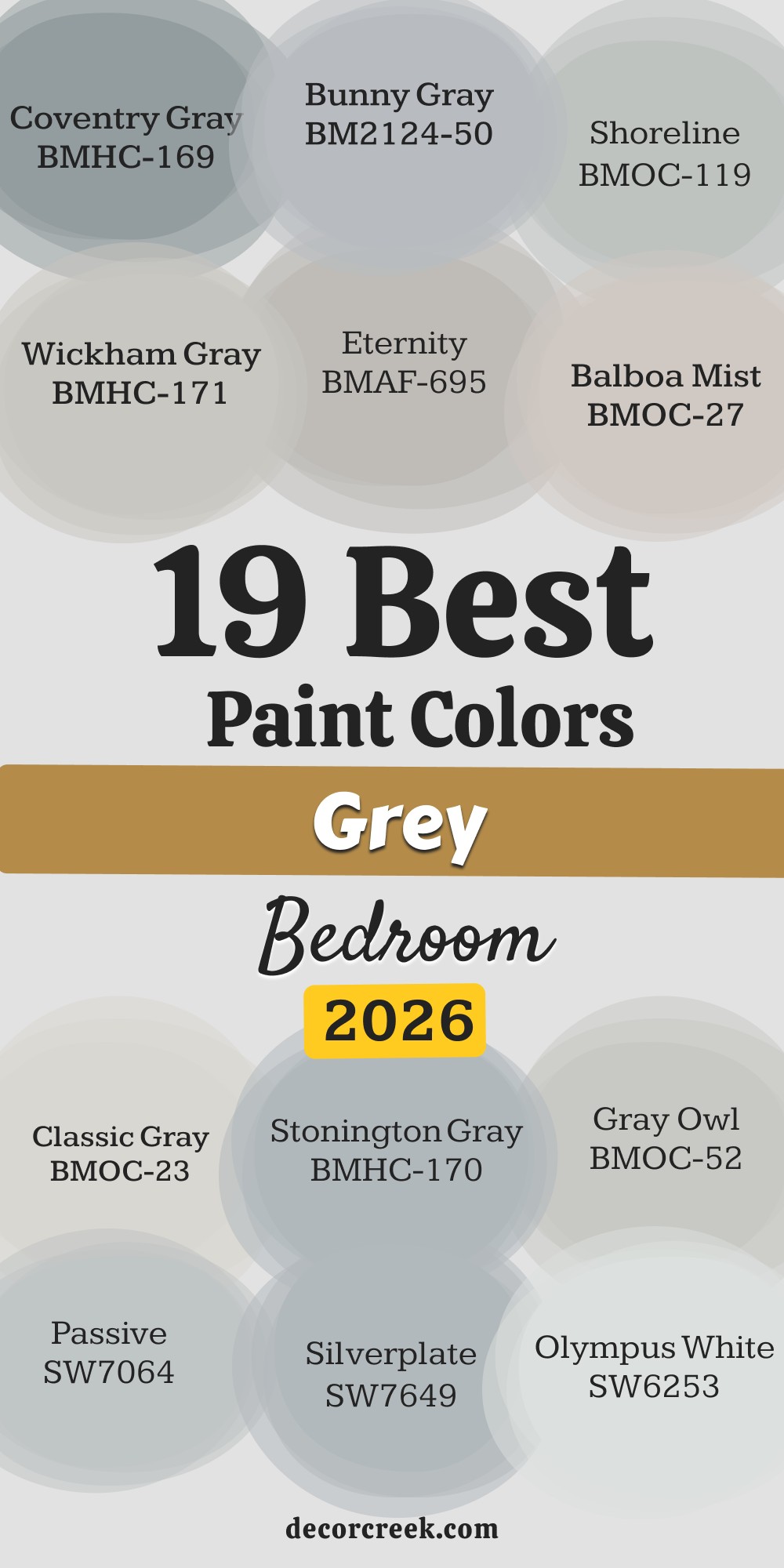
19 Best Grey Paint Colors For Bedroom
Repose Gray SW 7015
Repose Gray is a spectacular, go-to neutral that I have used successfully in countless bedrooms because it hits the perfect balance of warm and cool. Repose Gray is considered a true ‘greige,’ meaning it sits exactly between grey and beige, making it incredibly versatile for pairing with different wood tones and furniture styles.
It has a slight purple or brown undertone that keeps it from looking too cold, especially in cooler light, which is so important for a cozy bedroom feeling. Many clients love that it reads clearly as a grey but avoids any icy blue tones, even on cloudy days. This shade works brilliantly as a whole-room color, providing a relaxed, sophisticated backdrop without drawing too much attention to itself.
I find it works best when the trim is painted in a crisp white to make the color truly pop and define the edges of the room. It’s an easy color to work with and acts like a beautiful, tailored suit for the bedroom walls. It remains one of the top choices year after year because it simply gets the job done right, every single time. It feels both modern and comfortable, which is a rare and desirable combination for a bedroom setting.
🎨 Check out the complete guide to this color right HERE 👈

Agreeable Gray SW 7029
Agreeable Gray is consistently one of my top recommendations because it is the definition of a dependable, warm neutral that looks lovely in almost any light. Agreeable Gray is a slightly lighter greige than Repose Gray, meaning it has a bit more beige in its composition, which makes it feel incredibly inviting and non-committal.
I often choose this color for bedrooms that don’t get a lot of natural light, as the warmth helps prevent the walls from looking shadowed or gloomy. Its main goal is to be a quiet, supporting player in the room, letting the bedding and artwork take center stage. When paired with bright white trim and light-colored furniture, it creates an airy and fresh feeling that is perfect for starting the day.
Unlike some greys that can feel sharp or too industrial, this shade is soft and welcoming, contributing to a truly restful atmosphere. It’s particularly excellent in homes with open floor plans where the bedroom color needs to flow harmoniously with other main living areas. This color truly lives up to its name by being friendly and easy to live with, making it a wonderful choice for any bedroom, big or small.
🎨 Check out the complete guide to this color right HERE 👈

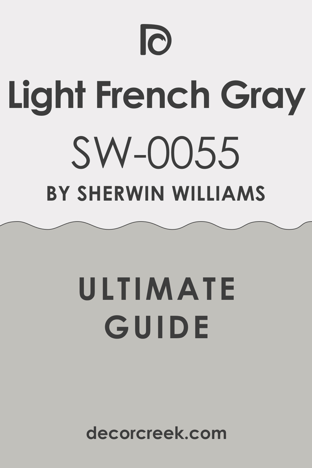
Light French Gray SW 0055
Light French Gray is the shade I turn to when a client wants a true, classic grey that is still bright and airy, without any strong beige undertones. Light French Gray is a sophisticated medium-light grey that holds its own and looks crisp, clean, and quite tailored on the wall. It has a very slight blue undertone, but it is so minimal that the color primarily reads as a beautiful, solid grey, making it a great anchor color.
I use this shade when the bedroom has a lot of bright, natural light because it prevents the light from washing the color out completely. This paint color is fantastic for creating a refined, polished appearance, especially in a primary bedroom or a guest suite where I want to project an upscale feeling.
It pairs beautifully with silver and white accents and provides a cool, yet comfortable contrast to dark wood furniture. You should be careful to test this shade, as in some darker rooms, the blue can become a tiny bit more noticeable, but mostly it remains a crisp, fantastic grey. It’s a favorite of mine for achieving a truly elegant and well-dressed bedroom look that feels permanent and stylish.
🎨 Check out the complete guide to this color right HERE 👈
Crushed Ice SW 7647
Crushed Ice is a wonderful, very light grey that acts almost like a slightly darker, cooler off-white, offering a clean backdrop that makes everything in the room look fresh. Crushed Ice has a very subtle purplish-blue undertone that is just enough to give it a cool edge without making the room feel cold or sterile, which is a fine line to walk in a bedroom.
I often recommend this shade for smaller bedrooms because its brightness helps the walls recede, making the room appear larger than it actually is. This is the perfect color for a coastal-inspired bedroom or any room where a light and breezy feeling is the ultimate goal.
When the light hits it, it truly lives up to its name, reflecting the light with a very light, almost crystalline quality. It pairs exceptionally well with charcoal grey accents or navy blue bedding, allowing those richer colors to stand out and ground the room. It provides just enough contrast against crisp white trim to define the architectural details of the room beautifully. This is a dependable, high-key grey that keeps the atmosphere light and upbeat, suitable for any person’s bedroom.
🎨 Check out the complete guide to this color right HERE 👈

Modern Gray SW 7632
Modern Gray is a unique and increasingly popular shade that brings a beautiful, quiet warmth to a bedroom without leaning too heavily into beige. Modern Gray is what I call a “warm grey,” and its subtle undertones read as a very light taupe or brown, creating a soft, muddy quality that is incredibly cozy.
This color is one of my go-tos for bedrooms where the client is worried about traditional grey looking too cold or stark, especially in older homes with less natural light. It offers a slightly richer color than a basic greige, adding a bit more depth and substance to the walls. I often pair it with creamy off-white trim instead of bright white, as this combination enhances its inherent warmth and creates a very harmonious, soft look.
It works particularly well with wood tones that have a reddish or yellow cast, as it provides a beautiful grounding effect that minimizes clashing. It is a fantastic choice for creating a cozy, almost ‘hygge’ feeling, making the bedroom feel like a comforting nest at the end of the day. This grey proves that a neutral can be modern while still feeling incredibly welcoming and gentle.
🎨 Check out the complete guide to this color right HERE 👈

Mindful Gray SW 7016
Mindful Gray is a reliable mid-toned greige that offers a little more punch than some of the lighter greys, creating a cozy and defined boundary for the bedroom walls. Mindful Gray is a shade darker than its sibling, Repose Gray, and because it has more depth, it also has a slightly more noticeable brown undertone, which truly dials up the warmth.
This color is excellent for primary bedrooms with tall ceilings, as the mid-tone prevents the walls from looking too washed out in the large vertical setting. It provides a more grounding effect than a lighter color and acts as a sophisticated foil for light-colored furniture and bright artwork.
I find it works wonderfully when you want a rich, defined contrast with bright white trim and ceiling paint, making the architectural details stand out sharply. In dimmer light, it can shift to look like a beautiful, soft taupe, maintaining a warm and comforting feeling throughout the evening. This is a very grown-up, tailored grey that brings a sense of permanence and quality to the bedroom design. It’s a straightforward, satisfying color that always looks intentional and well-chosen.
🎨 Check out the complete guide to this color right HERE 👈

Zircon SW 7667
Zircon is an incredibly light, airy grey that is so faint it nearly reads as a slightly cooled-down white, making it perfect for clients who want a gentle touch of color. Zircon is the ideal choice for small bedrooms or rooms where the client wants maximum light reflection to enhance the feeling of openness and size.
It has a very faint blue-green undertone that provides just a hint of color without ever feeling like a blue or a green wall, which is the magic of this particular shade. I often use this color in sunny rooms because the coolness helps to temper the intensity of the bright sunlight, resulting in a nice, soft light quality.
When used with very crisp white trim, the difference is barely noticeable, but the wall still gains that subtle depth and sophistication that a plain white can lack. This is a great color to pair with bold, colorful bedding or artwork because the walls will never compete for attention, acting as a clean, simple canvas. It is a dependable color for a fresh, contemporary feeling and keeps the atmosphere light, breezy, and uncluttered. If you are nervous about going too grey, this is the perfect starting point to introduce color gently.
🎨 Check out the complete guide to this color right HERE 👈

Silverplate SW 7649
Silverplate is a cool, crisp grey that brings a very refined, architectural feeling to a bedroom, making it a great option for a more modern or sleek design. Silverplate is a medium-light grey with a definite blue undertone, giving it a sophisticated edge that is reminiscent of actual polished silver.
I recommend this color for bedrooms that already have warm elements like dark wood floors or bronze fixtures, as the cool wall color provides a beautiful, balancing contrast. This shade works best in rooms with excellent natural light, as it can sometimes look a bit more pronounced in low light, showing off its cool character.
It’s an ideal choice for creating a striking contrast with pops of accent colors like yellow or magenta in the bedding and accessories. Using a bright, clean white on the ceiling and trim is essential with this color to keep the whole look feeling fresh and intentional. It creates a feeling of tailored elegance and a clean, sharp aesthetic that is highly desirable in modern interior design. This is a grey that says, “I am a clean, beautiful grey,” without any hints of warmth or mud.
🎨 Check out the complete guide to this color right HERE 👈

Passive SW 7064
Passive is a gorgeous light-to-mid-toned grey that has a lovely, calming blue-green undertone, making it a wonderful choice for creating a restful environment in a bedroom. Passive is one of those colors that constantly shifts its appearance depending on the light, sometimes looking grey, sometimes showing a hint of pale blue, and occasionally a whisper of green.
I often choose this color for bedrooms that face south, where the warm light can soften the cool undertones, resulting in a beautiful, complex neutral. It pairs exceptionally well with bedding and furniture in oceanic colors like navy, seafoam, or deep teal, enhancing its inherent watery quality.
This shade is light enough to keep the room feeling airy but has enough depth to provide a distinct, noticeable color on the walls. When used with white painted furniture, it creates a cottage or beach-house feeling that is incredibly refreshing and charming. It is a beautiful, complex color that always feels rich and expensive, providing a very high-end backdrop for your bedroom furnishings. Passive is a true designer favorite for its sophistication and its ability to completely alter the mood of a room.
🎨 Check out the complete guide to this color right HERE 👈
Olympus White SW 6253
Olympus White is one of my secret weapon colors—it’s a very, very light grey that is barely there, acting as the perfect step up from pure white without being noticeable. Olympus White is the definition of a whisper of color; its grey pigment is so light that it gives the room a polished, finished quality that plain white often lacks.
It has a very faint blue-green undertone that gives it a crisp and fresh quality, making it a great choice for bathrooms that lead off the primary bedroom, ensuring color continuity. I use this shade when the client wants a mostly white room but doesn’t want the walls to look sterile or flat, giving them just a hint of architectural definition.
It is excellent for showcasing brightly colored furniture, rugs, or artwork, allowing the decor to truly command all the attention. This shade is one of the brightest on my list, so it contributes greatly to the illusion of a much larger and more open bedroom. It works seamlessly with pure white trim, creating a monochromatic but textured look that is very sophisticated and clean. If you are looking for the absolute lightest touch of grey possible, Olympus White is the perfect, nearly invisible solution.
🎨 Check out the complete guide to this color right HERE 👈

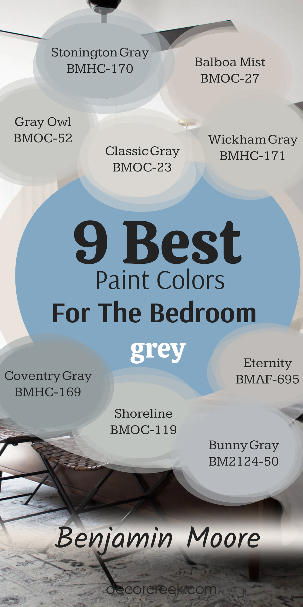
Gray Owl OC-52
Gray Owl is a hugely popular, bright, and refreshing light grey from Benjamin Moore that has a truly delightful, clean quality on the bedroom walls. Gray Owl is famous for its very slight green undertone, which is enough to make the color feel fresh and slightly earthy without ever reading as a true green.
I often recommend this shade for bedrooms that receive plenty of natural light, as it helps to keep the room feeling bright and open throughout the day. It’s a wonderful, versatile color that is neither too warm nor too cool, allowing it to work with a wide range of decorating styles and bedding choices.
It pairs beautifully with both dark, dramatic furniture and light, distressed wood pieces, proving its adaptability in many different settings. This is the perfect grey for creating a contemporary but soft feeling, providing a very clean, crisp backdrop that looks well-maintained and expensive. When using this color, I always suggest a bright white trim to maximize the contrast and really make the grey pop off the wall. Gray Owl is a fantastic, dependable choice that offers a perfect mix of clarity and inviting warmth for any bedroom design.
🎨 Check out the complete guide to this color right HERE 👈

Stonington Gray HC-170
Stonington Gray is a beautiful, solid mid-toned grey that is substantial enough to make a statement while remaining a perfectly comfortable and restful color for a bedroom. Stonington Gray has a pronounced, yet lovely blue undertone, which gives the color a cool and tailored feeling that I adore for creating a truly classic look.
I often choose this color for a primary bedroom where the goal is a more formal, elegant atmosphere that still feels calm and uncluttered. Because of its depth and coolness, it provides a gorgeous contrast to warm-toned wood floors or rich, buttery leather accents in the room’s design.
It works exceptionally well when paired with cool-toned accents like deep navy, sapphire blue, or crisp white, creating a cohesive and sophisticated palette. You should be sure to test this shade in your lighting, as in rooms with very little light, the blue can become quite strong and dominant. It is a classic color that has been around for a long time, and its continued popularity is a testament to its beauty and versatility in different home settings. This is the quintessential, pure, sophisticated grey that many people imagine when they picture a chic grey bedroom.
🎨 Check out the complete guide to this color right HERE 👈

Classic Gray OC-23
Classic Gray is one of the softest, most beautiful light greys that borders on a warm off-white, making it an excellent choice for a gentle, bright bedroom foundation. Classic Gray is famously versatile because it has a very slight, warm beige or pinkish undertone that prevents it from ever looking cold or sterile, even in the weakest northern light.
I often use this shade in guest rooms or children’s rooms because of its comforting warmth and its ability to adapt to almost any color of bedding or decor introduced later. It is the perfect choice for clients who want a sophisticated neutral but are hesitant about committing to a darker or more saturated color on the walls.
When paired with bright white trim, the difference is very slight, but the walls take on a luminous quality that is refined and high-end. This color is excellent for maximizing natural light and making a small bedroom feel as open and airy as possible throughout the day. It truly lives up to its name by being a timeless, elegant, and non-distracting backdrop for a truly restful bedroom design. You can’t go wrong with this gentle, light-filled grey.
🎨 Check out the complete guide to this color right HERE 👈

Balboa Mist OC-27
Balboa Mist is a delicate, pale greige that offers a wonderful sense of warmth and sophisticated lightness, creating an exceptionally cozy and welcoming bedroom atmosphere. Balboa Mist has a slightly stronger beige or taupe undertone than Classic Gray, making it read more as a very light, warm neutral with a soft grey influence.
I often recommend this shade for bedrooms that have a lot of warm wood furniture or floors, as it harmonizes beautifully with these elements without creating any clashing undertones. This color is perfect for creating a very soft, enveloping feeling that makes the bedroom feel like a true retreat from the outside world.
It is light enough to keep the room bright but deep enough to offer a subtle contrast against white trim and molding. When the sun hits it, it almost glows with a gentle warmth, making the room feel happy and relaxed at all times of the day. This is a very popular designer choice because it manages to be modern while still feeling inherently warm and traditional, a truly masterful balance for a paint color. If you are looking for a light, warm grey that leans into the coziness factor, this is a spectacular option.
🎨 Check out the complete guide to this color right HERE 👈

Eternity AF-695
Eternity is a fantastic, mid-to-deep toned grey that provides a beautiful, grounding sense of depth and maturity to a bedroom without going fully dark. Eternity has lovely, complex warm undertones that can sometimes appear slightly brown or even a touch green, depending on the natural light in the room, making it an incredibly rich color.
I often use this shade when I want to create a slightly more masculine or dramatic atmosphere, perfect for a luxurious primary bedroom or a refined den. It works wonderfully as an anchor color, making bright white bedding and crisp artwork truly pop and command attention in the room.
This color is a smart choice for bedrooms with high ceilings, as the depth of the color can visually bring the ceiling down a tiny bit, making the room feel cozier. I recommend pairing it with light-colored furnishings to avoid making the room feel too heavy or closed in when the natural light is dim. Eternity is a gorgeous, saturated grey that has a strong presence, bringing a sense of quality and established style to the walls. It is a powerful, yet completely restful, choice.
Wickham Gray HC-171
Wickham Gray is a beautiful, very light grey that is characterized by its refreshing, almost delicate blue-green undertones, making it a very clean and airy choice for a bedroom. Wickham Gray sits right at the intersection of a pale grey and a washed-out, muted seafoam, giving it a unique coastal or spa-like quality that is very appealing.
I use this shade when the client wants to introduce a tiny bit of color that is still undeniably neutral and sophisticated for a truly soothing effect. It is a fantastic option for a bedroom with plenty of natural light, as the coolness helps temper the brightness while keeping the atmosphere breezy and open.
It pairs beautifully with white, beige, and light wood tones, creating a very harmonious, soft palette that is easy on the eyes. This color is one of my favorites for creating a serene backdrop that enhances relaxation and quiet contemplation in a space intended for rest. Be sure to check this color in your lighting, as the blue-green can become more evident in certain artificial lights. Wickham Gray is a charming, delicate grey that provides an exceptionally fresh and inviting feeling.
🎨 Check out the complete guide to this color right HERE 👈

Shoreline 1471
Shoreline is a dependable, light-to-mid-toned grey that offers a perfect mix of clarity and softness, ensuring the room feels welcoming without being too heavy. Shoreline has a very slight, nearly unnoticeable blue undertone that prevents it from looking muddy or yellowed, maintaining a crisp, clean appearance on the wall.
I often recommend this shade when the bedroom has existing elements, like carpet or curtains, that already have a touch of blue, as this paint color will relate to them beautifully. It is light enough to be used as a whole-room color but has enough saturation to provide a definite color presence and define the architecture.
This is a great choice for bedrooms that receive a lot of afternoon sun, as the slight coolness helps the room feel balanced and not overly warm. When paired with bright, pure white trim, it achieves a very clean and sophisticated look that is perfect for a modern or transitional design aesthetic. Shoreline is an easy, non-fussy grey that gives a great result every time, making it a reliable choice for a high-quality bedroom design.
Bunny Gray 2124-50
Bunny Gray is a lovely, mid-toned grey that offers a touch more depth and personality than some of the lighter neutrals, creating a comfortable and defined bedroom atmosphere. Bunny Gray has a very subtle green undertone that gives it a slightly earthy, grounded feeling that prevents the color from looking cold or too industrial.
I often use this shade in bedrooms that have natural elements, like woven rugs, leather accents, or exposed wood beams, as it complements these materials beautifully. It provides a nice depth of color that works well in contrast to white trim and light-colored ceiling paint, making the room feel taller and more structured.
This is a wonderful option for creating a cozy, almost den-like feeling without going to a dark or charcoal grey on the walls. In rooms with mixed lighting, it maintains a beautiful, rich quality that always feels intentional and well-chosen for the space. It’s a versatile color that can be dressed up with formal furnishings or kept casual with simple, comfortable bedding and minimal decor.
Bunny Gray is a true gem in the grey family, offering depth, warmth, and quiet sophistication.
Coventry Gray HC-169
Coventry Gray is a sophisticated, classic medium-toned grey that delivers a powerful sense of grounded elegance and refinement to any bedroom setting. Coventry Gray is characterized by its distinct, though not overpowering, blue undertone, which gives the color a cool, tailored, and very architectural quality.
I often choose this shade for a primary bedroom where the goal is a luxurious, grown-up aesthetic that feels deeply established and permanent. It offers a beautiful, rich contrast to bright white crown molding and baseboards, allowing those details to really stand out and frame the room.
This color works best in rooms that receive good natural light, as its depth can sometimes make a poorly lit room feel a bit heavier. It pairs exceptionally well with polished chrome, silver fixtures, and deep jewel-toned accents in the room’s decor, enhancing its inherent sophistication. It is a serious, handsome grey that creates a truly restful and enveloping atmosphere, perfect for a true retreat at the end of a long day. If you want a grey that truly commands attention in the best possible way, Coventry Gray is an excellent choice.
🎨 Check out the complete guide to this color right HERE 👈

10 Best Grey Paint Colors For Bedroom From Sherwin Williams
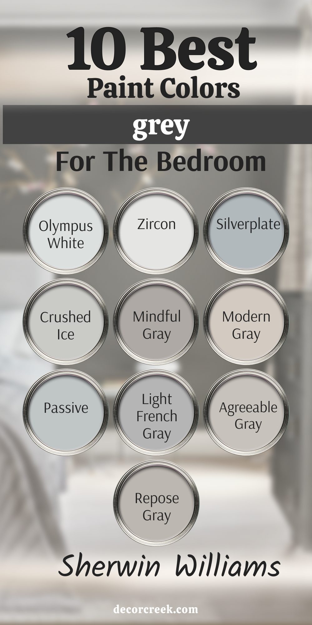
Repose Gray SW 7015
Repose Gray is a spectacular, go-to neutral that I have used successfully in countless bedrooms because it hits the perfect balance of warm and cool. Repose Gray is considered a true ‘greige,’ meaning it sits exactly between grey and beige, making it incredibly versatile for pairing with different wood tones and furniture styles.
It has a slight purple or brown undertone that keeps it from looking too cold, especially in cooler light, which is so important for a cozy bedroom feeling. Many clients love that it reads clearly as a grey but avoids any icy blue tones, even on cloudy days. This shade works brilliantly as a whole-room color, providing a relaxed, sophisticated backdrop without drawing too much attention to itself.
I find it works best when the trim is painted in a crisp white to make the color truly pop and define the edges of the room. It’s an easy color to work with and acts like a beautiful, tailored suit for the bedroom walls. It remains one of the top choices year after year because it simply gets the job done right, every single time. It feels both modern and comfortable, which is a rare and desirable combination for a bedroom setting.
🎨 Check out the complete guide to this color right HERE 👈
Agreeable Gray SW 7029
Agreeable Gray is consistently one of my top recommendations because it is the definition of a dependable, warm neutral that looks lovely in almost any light. Agreeable Gray is a slightly lighter greige than Repose Gray, meaning it has a bit more beige in its composition, which makes it feel incredibly inviting and non-committal.
I often choose this color for bedrooms that don’t get a lot of natural light, as the warmth helps prevent the walls from looking shadowed or gloomy. Its main goal is to be a quiet, supporting player in the room, letting the bedding and artwork take center stage. When paired with bright white trim and light-colored furniture, it creates an airy and fresh feeling that is perfect for starting the day.
Unlike some greys that can feel sharp or too industrial, this shade is soft and welcoming, contributing to a truly restful atmosphere. It’s particularly excellent in homes with open floor plans where the bedroom color needs to flow harmoniously with other main living areas. This color truly lives up to its name by being friendly and easy to live with, making it a wonderful choice for any bedroom, big or small.
🎨 Check out the complete guide to this color right HERE 👈
Light French Gray SW 0055
Light French Gray is the shade I turn to when a client wants a true, classic grey that is still bright and airy, without any strong beige undertones. Light French Gray is a sophisticated medium-light grey that holds its own and looks crisp, clean, and quite tailored on the wall. It has a very slight blue undertone, but it is so minimal that the color primarily reads as a beautiful, solid grey, making it a great anchor color.
I use this shade when the bedroom has a lot of bright, natural light because it prevents the light from washing the color out completely. This paint color is fantastic for creating a refined, polished appearance, especially in a primary bedroom or a guest suite where I want to project an upscale feeling. It pairs beautifully with silver and white accents and provides a cool, yet comfortable contrast to dark wood furniture.
You should be careful to test this shade, as in some darker rooms, the blue can become a tiny bit more noticeable, but mostly it remains a crisp, fantastic grey. It’s a favorite of mine for achieving a truly elegant and well-dressed bedroom look that feels permanent and stylish.
🎨 Check out the complete guide to this color right HERE 👈
Passive SW 7064
Passive is a gorgeous light-to-mid-toned grey that has a lovely, calming blue-green undertone, making it a wonderful choice for creating a restful environment in a bedroom. Passive is one of those colors that constantly shifts its appearance depending on the light, sometimes looking grey, sometimes showing a hint of pale blue, and occasionally a whisper of green.
I often choose this color for bedrooms that face south, where the warm light can soften the cool undertones, resulting in a beautiful, complex neutral. It pairs exceptionally well with bedding and furniture in oceanic colors like navy, seafoam, or deep teal, enhancing its inherent watery quality.
This shade is light enough to keep the room feeling airy but has enough depth to provide a distinct, noticeable color on the walls. When used with white painted furniture, it creates a cottage or beach-house feeling that is incredibly refreshing and charming. It is a beautiful, complex color that always feels rich and expensive, providing a very high-end backdrop for your bedroom furnishings. Passive is a true designer favorite for its sophistication and its ability to completely alter the mood of a room.
🎨 Check out the complete guide to this color right HERE 👈
Modern Gray SW 7632
Modern Gray is a unique and increasingly popular shade that brings a beautiful, quiet warmth to a bedroom without leaning too heavily into beige. Modern Gray is what I call a “warm grey,” and its subtle undertones read as a very light taupe or brown, creating a soft, muddy quality that is incredibly cozy.
This color is one of my go-tos for bedrooms where the client is worried about traditional grey looking too cold or stark, especially in older homes with less natural light. It offers a slightly richer color than a basic greige, adding a bit more depth and substance to the walls. I often pair it with creamy off-white trim instead of bright white, as this combination enhances its inherent warmth and creates a very harmonious, soft look.
It works particularly well with wood tones that have a reddish or yellow cast, as it provides a beautiful grounding effect that minimizes clashing. It is a fantastic choice for creating a cozy, almost ‘hygge’ feeling, making the bedroom feel like a comforting nest at the end of the day. This grey proves that a neutral can be modern while still feeling incredibly welcoming and gentle.
🎨 Check out the complete guide to this color right HERE 👈
Mindful Gray SW 7016
Mindful Gray is a reliable mid-toned greige that offers a little more punch than some of the lighter greys, creating a cozy and defined boundary for the bedroom walls. Mindful Gray is a shade darker than its sibling, Repose Gray, and because it has more depth, it also has a slightly more noticeable brown undertone, which truly dials up the warmth.
This color is excellent for primary bedrooms with tall ceilings, as the mid-tone prevents the walls from looking too washed out in the large vertical setting. It provides a more grounding effect than a lighter color and acts as a sophisticated foil for light-colored furniture and bright artwork.
I find it works wonderfully when you want a rich, defined contrast with bright white trim and ceiling paint, making the architectural details stand out sharply. In dimmer light, it can shift to look like a beautiful, soft taupe, maintaining a warm and comforting feeling throughout the evening. This is a very grown-up, tailored grey that brings a sense of permanence and quality to the bedroom design. It’s a straightforward, satisfying color that always looks intentional and well-chosen.
🎨 Check out the complete guide to this color right HERE 👈
Crushed Ice SW 7647
Crushed Ice is a wonderful, very light grey that acts almost like a slightly darker, cooler off-white, offering a clean backdrop that makes everything in the room look fresh. Crushed Ice has a very subtle purplish-blue undertone that is just enough to give it a cool edge without making the room feel cold or sterile, which is a fine line to walk in a bedroom.
I often recommend this shade for smaller bedrooms because its brightness helps the walls recede, making the room appear larger than it actually is. This is the perfect color for a coastal-inspired bedroom or any room where a light and breezy feeling is the ultimate goal. When the light hits it, it truly lives up to its name, reflecting the light with a very light, almost crystalline quality.
It pairs exceptionally well with charcoal grey accents or navy blue bedding, allowing those richer colors to stand out and ground the room. It provides just enough contrast against crisp white trim to define the architectural details of the room beautifully. This is a dependable, high-key grey that keeps the atmosphere light and upbeat, suitable for any person’s bedroom.
🎨 Check out the complete guide to this color right HERE 👈
Silverplate SW 7649
Silverplate is a cool, crisp grey that brings a very refined, architectural feeling to a bedroom, making it a great option for a more modern or sleek design. Silverplate is a medium-light grey with a definite blue undertone, giving it a sophisticated edge that is reminiscent of actual polished silver.
I recommend this color for bedrooms that already have warm elements like dark wood floors or bronze fixtures, as the cool wall color provides a beautiful, balancing contrast. This shade works best in rooms with excellent natural light, as it can sometimes look a bit more pronounced in low light, showing off its cool character.
It’s an ideal choice for creating a striking contrast with pops of accent colors like yellow or magenta in the bedding and accessories. Using a bright, clean white on the ceiling and trim is essential with this color to keep the whole look feeling fresh and intentional. It creates a feeling of tailored elegance and a clean, sharp aesthetic that is highly desirable in modern interior design. This is a grey that says, “I am a clean, beautiful grey,” without any hints of warmth or mud.
🎨 Check out the complete guide to this color right HERE 👈
Zircon SW 7667
Zircon is an incredibly light, airy grey that is so faint it nearly reads as a slightly cooled-down white, making it perfect for clients who want a gentle touch of color. Zircon is the ideal choice for small bedrooms or rooms where the client wants maximum light reflection to enhance the feeling of openness and size.
It has a very faint blue-green undertone that provides just a hint of color without ever feeling like a blue or a green wall, which is the magic of this particular shade. I often use this color in sunny rooms because the coolness helps to temper the intensity of the bright sunlight, resulting in a nice, soft light quality.
When used with very crisp white trim, the difference is barely noticeable, but the wall still gains that gentle depth and sophistication that a plain white can lack. This is a great color to pair with bold, colorful bedding or artwork because the walls will never compete for attention, acting as a clean, simple canvas. It is a dependable color for a fresh, contemporary feeling and keeps the atmosphere light, breezy, and uncluttered. If you are nervous about going too grey, this is the perfect starting point to introduce color gently.
🎨 Check out the complete guide to this color right HERE 👈
Olympus White SW 6253
Olympus White is one of my secret weapon colors—it’s a very, very light grey that is barely there, acting as the perfect step up from pure white without being noticeable. Olympus White is the definition of a whisper of color; its grey pigment is so light that it gives the room a polished, finished quality that plain white often lacks.
It has a very faint blue-green undertone that gives it a crisp and fresh quality, making it a great choice for bathrooms that lead off the primary bedroom, ensuring color continuity. I use this shade when the client wants a mostly white room but doesn’t want the walls to look sterile or flat, giving them just a hint of architectural definition.
It is excellent for showcasing brightly colored furniture, rugs, or artwork, allowing the decor to truly command all the attention. This shade is one of the brightest on my list, so it contributes greatly to the illusion of a much larger and more open bedroom. It works seamlessly with pure white trim, creating a monochromatic but textured look that is very sophisticated and clean. If you are looking for the absolute lightest touch of grey possible, Olympus White is the perfect, nearly invisible solution.
🎨 Check out the complete guide to this color right HERE 👈
9 Best Grey Paint Colors For Bedroom by Benjamin Moore
Gray Owl OC-52
Gray Owl is a hugely popular, bright, and refreshing light grey from Benjamin Moore that has a truly delightful, clean quality on the bedroom walls. Gray Owl is famous for its very slight green undertone, which is enough to make the color feel fresh and slightly earthy without ever reading as a true green.
I often recommend this shade for bedrooms that receive plenty of natural light, as it helps to keep the room feeling bright and open throughout the day. It’s a wonderful, versatile color that is neither too warm nor too cool, allowing it to work with a wide range of decorating styles and bedding choices.
It pairs beautifully with both dark, dramatic furniture and light, distressed wood pieces, proving its adaptability in many different settings. This is the perfect grey for creating a contemporary but soft feeling, providing a very clean, crisp backdrop that looks well-maintained and expensive. When using this color, I always suggest a bright white trim to maximize the contrast and really make the grey pop off the wall. Gray Owl is a fantastic, dependable choice that offers a perfect mix of clarity and inviting warmth for any bedroom design.
🎨 Check out the complete guide to this color right HERE 👈
Stonington Gray HC-170
Stonington Gray is a beautiful, solid mid-toned grey that is substantial enough to make a statement while remaining a perfectly comfortable and restful color for a bedroom. Stonington Gray has a pronounced, yet lovely blue undertone, which gives the color a cool and tailored feeling that I adore for creating a truly classic look.
I often choose this color for a primary bedroom where the goal is a more formal, elegant atmosphere that still feels quiet and uncluttered. Because of its depth and coolness, it provides a gorgeous contrast to warm-toned wood floors or rich, buttery leather accents in the room’s design.
It works exceptionally well when paired with cool-toned accents like deep navy, sapphire blue, or crisp white, creating a cohesive and sophisticated palette. You should be sure to test this shade in your lighting, as in some darker rooms, the blue can become quite strong and dominant. It is a classic color that has been around for a long time, and its continued popularity is a testament to its beauty and versatility in different home settings. This is the quintessential, pure, sophisticated grey that many people imagine when they picture a chic grey bedroom.
🎨 Check out the complete guide to this color right HERE 👈
Classic Gray OC-23
Classic Gray is one of the softest, most beautiful light greys that borders on a warm off-white, making it an excellent choice for a gentle, bright bedroom foundation. Classic Gray is famously versatile because it has a very slight, warm beige or pinkish undertone that prevents it from ever looking cold or sterile, even in the weakest northern light.
I often use this shade in guest rooms or children’s rooms because of its comforting warmth and its ability to adapt to almost any color of bedding or decor introduced later. It is the perfect choice for clients who want a sophisticated neutral but are hesitant about committing to a darker or more saturated color on the walls.
When paired with bright white trim, the difference is very slight, but the walls take on a luminous quality that is refined and high-end. This color is excellent for maximizing natural light and making a small bedroom feel as open and airy as possible throughout the day. It truly lives up to its name by being an elegant and non-distracting backdrop for a truly restful bedroom design. You can’t go wrong with this gentle, light-filled grey.
🎨 Check out the complete guide to this color right HERE 👈
Balboa Mist OC-27
Balboa Mist is a delicate, pale greige that offers a wonderful sense of warmth and sophisticated lightness, creating an exceptionally cozy and welcoming bedroom atmosphere. Balboa Mist has a slightly stronger beige or taupe undertone than Classic Gray, making it read more as a very light, warm neutral with a soft grey influence.
I often recommend this shade for bedrooms that have a lot of warm wood furniture or floors, as it harmonizes beautifully with these elements without creating any clashing undertones. This color is perfect for creating a very soft, enveloping feeling that makes the bedroom feel like a true retreat from the outside world.
It is light enough to keep the room bright but deep enough to offer a gentle contrast against white trim and molding. When the sun hits it, it almost glows with a gentle warmth, making the room feel happy and relaxed at all times of the day. This is a very popular designer choice because it manages to be modern while still feeling inherently warm and traditional, a truly masterful balance for a paint color. If you are looking for a light, warm grey that leans into the coziness factor, this is a spectacular option.
🎨 Check out the complete guide to this color right HERE 👈
Wickham Gray HC-171
Wickham Gray is a beautiful, very light grey that is characterized by its refreshing, almost delicate blue-green undertones, making it a very clean and airy choice for a bedroom. Wickham Gray sits right at the intersection of a pale grey and a washed-out, muted seafoam, giving it a unique coastal or spa-like quality that is very appealing.
I use this shade when the client wants to introduce a tiny bit of color that is still undeniably neutral and sophisticated for a truly soothing effect. It is a fantastic option for a bedroom with plenty of natural light, as the coolness helps temper the brightness while keeping the atmosphere breezy and open.
It pairs beautifully with white, beige, and light wood tones, creating a very harmonious, soft palette that is easy on the eyes. This color is one of my favorites for creating a gentle backdrop that enhances relaxation and quiet contemplation in a place intended for rest. Be sure to check this color in your lighting, as the blue-green can become more evident in certain artificial lights. Wickham Gray is a charming, delicate grey that provides an exceptionally fresh and inviting feeling.
🎨 Check out the complete guide to this color right HERE 👈
Shoreline 1471
Shoreline is a dependable, light-to-mid-toned grey that offers a perfect mix of clarity and softness, ensuring the room feels welcoming without being too heavy. Shoreline has a very slight, nearly unnoticeable blue undertone that prevents it from looking muddy or yellowed, maintaining a crisp, clean appearance on the wall.
I often recommend this shade when the bedroom has existing elements, like carpet or curtains, that already have a touch of blue, as this paint color will relate to them beautifully. It is light enough to be used as a whole-room color but has enough saturation to provide a definite color presence and define the architecture.
This is a great choice for bedrooms that receive a lot of afternoon sun, as the slight coolness helps the room feel balanced and not overly warm. When paired with bright, pure white trim, it achieves a very clean and sophisticated look that is perfect for a modern or transitional design aesthetic. Shoreline is an easy, non-fussy grey that gives a great result every time, making it a reliable choice for a high-quality bedroom design.
Coventry Gray HC-169
Coventry Gray is a sophisticated, classic medium-toned grey that delivers a powerful sense of grounded elegance and refinement to any bedroom setting. Coventry Gray is characterized by its distinct, though not overpowering, blue undertone, which gives the color a cool, tailored, and very architectural quality.
I often choose this shade for a primary bedroom where the goal is a luxurious, grown-up aesthetic that feels deeply established and permanent. It offers a beautiful, rich contrast to bright white crown molding and baseboards, allowing those details to really stand out and frame the room.
This color works best in rooms that receive good natural light, as its depth can sometimes make a poorly lit room feel a bit heavier. It pairs exceptionally well with polished chrome, silver fixtures, and deep jewel-toned accents in the room’s decor, enhancing its inherent sophistication. It is a serious, handsome grey that creates a truly restful and enveloping atmosphere, perfect for a true retreat at the end of a long day. If you want a grey that truly commands attention in the best possible way, Coventry Gray is an excellent choice.
🎨 Check out the complete guide to this color right HERE 👈
Bunny Gray 2124-50
Bunny Gray is a lovely, mid-toned grey that offers a touch more depth and personality than some of the lighter neutrals, creating a comfortable and defined bedroom atmosphere. Bunny Gray has a very subtle green undertone that gives it a slightly earthy, grounded feeling that prevents the color from looking cold or too industrial.
I often use this shade in bedrooms that have natural elements, like woven rugs, leather accents, or exposed wood beams, as it complements these materials beautifully. It provides a nice depth of color that works well in contrast to white trim and light-colored ceiling paint, making the room feel taller and more structured.
This is a wonderful option for creating a cozy, almost den-like feeling without going to a dark or charcoal grey on the walls. In rooms with mixed lighting, it maintains a beautiful, rich quality that always feels intentional and well-chosen for the space. It’s a versatile color that can be dressed up with formal furnishings or kept casual with simple, comfortable bedding and minimal decor. Bunny Gray is a true gem in the grey family, offering depth, warmth, and quiet sophistication.
Eternity AF-695
Eternity is a fantastic, mid-to-deep toned grey that provides a beautiful, grounding sense of depth and maturity to a bedroom without going fully dark. Eternity has lovely, complex warm undertones that can sometimes appear slightly brown or even a touch green, depending on the natural light in the room, making it an incredibly rich color.
I often use this shade when I want to create a slightly more masculine or dramatic atmosphere, perfect for a luxurious primary bedroom or a refined den. It works wonderfully as an anchor color, making bright white bedding and crisp artwork truly pop and command attention in the room.
This color is a smart choice for bedrooms with high ceilings, as the depth of the color can visually bring the ceiling down a tiny bit, making the room feel cozier. I recommend pairing it with light-colored furnishings to avoid making the room feel too heavy or closed in when the natural light is dim. Eternity is a gorgeous, saturated grey that has a strong presence, bringing a sense of quality and established style to the walls. It is a powerful, yet completely restful, choice.
19 Best Grey Paint Colors For Bedroom To Try This Year
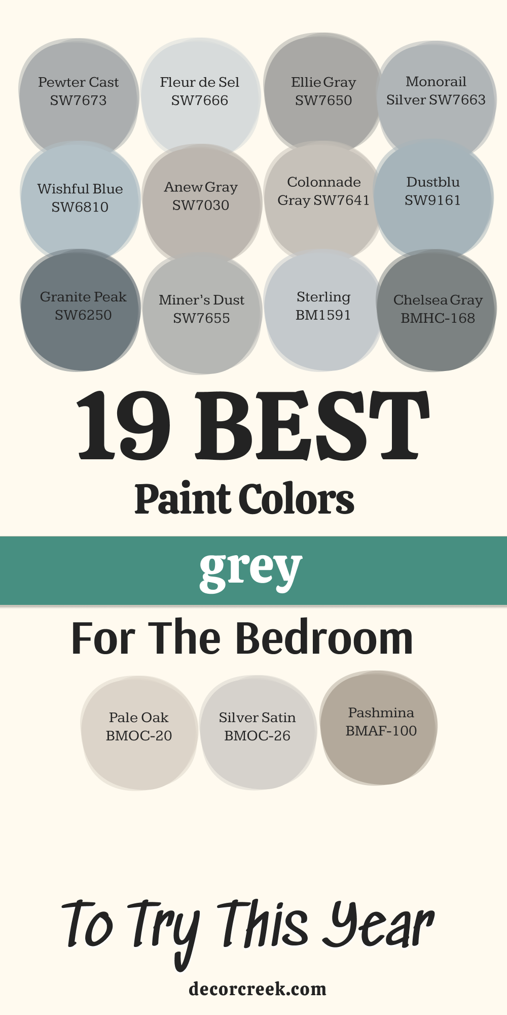
Pewter Cast SW 7673
Pewter Cast is a sophisticated, deeper warm grey that brings a wonderful sense of grounding and depth to a bedroom, feeling like a cozy cocoon. Pewter Cast has lovely brown and violet undertones that keep it incredibly warm and prevent it from ever looking cold or stark, even in shadow.
I often use this color in primary bedrooms where the client wants a dramatic, richly colored wall that still reads as a beautiful, tailored neutral. It is the perfect backdrop for metallic accents, such as silver or gold picture frames, that truly shimmer against the deeper hue. This color works beautifully when contrasted with bright white trim and ceiling paint, which gives the room a crisp, intentional feeling.
Because it is a deeper shade, it’s a good choice for accent walls or rooms with large windows that let in plenty of natural light. It helps absorb some of the light, creating a wonderfully intimate and restful atmosphere for sleeping. This shade provides an elevated and luxurious foundation for a mature and thoughtful bedroom design. Pewter Cast is a warm, enveloping grey that feels like a big, comforting hug.
🎨 Check out the complete guide to this color right HERE 👈

Fleur de Sel SW 7666
Fleur de Sel is a pale, delicate grey that is so light it offers just a whisper of color, making it perfect for a bright, airy bedroom design. Fleur de Sel has a lovely, soft green-blue undertone that gives it a fresh, slightly sea-inspired quality, though it remains firmly in the grey family. I often recommend this shade for smaller bedrooms or rooms that face north, as its brightness helps to maximize the feeling of openness and light.
It’s an excellent choice for creating a gentle, sophisticated backdrop that allows bedding, rugs, and artwork to take center stage. When used with bright white trim, the contrast is very gentle, creating a monochromatic and incredibly refined appearance that looks expensive.
This color is wonderful for achieving a simple, clean aesthetic that feels both modern and completely comfortable for a resting place. It is a very easy-to-live-with grey that never demands attention but always provides a beautiful, polished finish to the walls. Fleur de Sel is a perfect selection for those wanting the lightest touch of cool, refreshing color on their bedroom walls.
🎨 Check out the complete guide to this color right HERE 👈
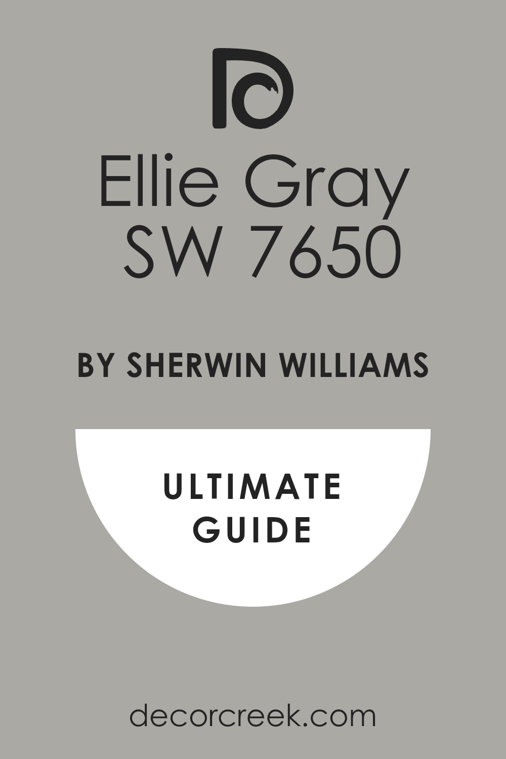
Ellie Gray SW 7650
Ellie Gray is a beautiful, mid-toned grey that offers a surprising amount of warmth for a color that still reads distinctly as a clean, solid grey. Ellie Gray has a noticeable brown undertone that gives it a rich, earthy quality, making it feel grounded and exceptionally cozy in a bedroom setting.
I often turn to this shade when the client wants a grey that will harmonize with natural wood furniture, like oak or walnut, without clashing or looking too stark. It has enough depth to provide a clear contrast to white trim, defining the architectural details beautifully and adding structure to the room.
This color is excellent for primary bedrooms, providing a mature and sophisticated atmosphere that feels tailored and well-appointed. In dimmer light, it can appear as a gorgeous, soft taupe, maintaining its warmth throughout the evening hours. It works wonderfully with creamy off-white accents, which helps to enhance its inviting, brown-tinged character and creates a cohesive, soft palette. Ellie Gray is a reliable and luxurious grey that provides a beautiful, rich foundation for any bedroom decor.
🎨 Check out the complete guide to this color right HERE 👈
Monorail Silver SW 7663
Monorail Silver is a cool, crisp medium grey that brings a very contemporary and clean aesthetic to a bedroom, perfect for a sleek, modern design. Monorail Silver has a distinct blue undertone that gives it a sophisticated, polished quality, reminiscent of metal, but still remains soft enough for a bedroom.
I often recommend this color for rooms with excellent natural light, as the coolness balances out the sun’s warmth, preventing the color from ever looking washed out or flat. It’s an ideal choice for creating a striking contrast with warm wood furniture or bold, colorful bedding and accessories in the room.
This shade is one of the best for pairing with polished chrome or stainless steel fixtures, enhancing its architectural and tailored feeling. Using a bright, pure white on the trim is essential to make the color pop and give the room a defined, crisp edge. It creates a feeling of sharp elegance and a refined aesthetic that is highly desirable in modern, uncluttered bedroom designs. Monorail Silver is a strong, intentional grey that projects sophistication and cleanliness.
🎨 Check out the complete guide to this color right HERE 👈

Wishful Blue SW 6813
Wishful Blue is a gorgeous, soft color that is so heavily influenced by grey that it acts like a very pale, gentle blue-grey, bringing a restful atmosphere to a bedroom. Wishful Blue is perfect for clients who love the idea of a blue bedroom but want a shade that feels highly sophisticated, muted, and completely non-childish.
I often choose this color for rooms where the goal is a calming, water-inspired feeling, as it evokes the gentleness of a misty morning sky. It has just enough color to be noticeable, but the heavy grey influence ensures it remains a quiet and very easy-to-live-with neutral backdrop. It pairs beautifully with white, silver, and natural linen textures, creating a breezy, high-end resort feel in the room’s design.
This color is excellent for rooms with a lot of natural light, as the grey prevents the blue from ever looking too bright or saccharine on the wall. It’s a wonderful option for both a primary bedroom or a guest suite, providing a gentle and deeply inviting atmosphere for all visitors. Wishful Blue is a delicate, charming color that offers a beautiful twist on the classic grey bedroom.
Anew Gray SW 7030
Anew Gray is a dependable, warm mid-toned greige that offers a touch more color depth and substance than its lighter counterparts, creating a lovely, cozy enclosure. Anew Gray is a darker sibling to Agreeable Gray, with its stronger brown undertone making it feel incredibly grounded, rich, and comforting in a bedroom.
I often use this shade when the goal is a slightly more saturated neutral wall color that still harmonizes beautifully with all the home’s warmer wood and stone finishes. It has a beautiful, rich quality that prevents the walls from looking washed out, even in bright overhead lighting or strong sunshine.
This color works wonderfully to create a defined contrast with bright white trim and molding, making the architectural details stand out with clarity. In rooms with cooler light, the warmth of the brown undertones keeps the walls feeling soft and inviting, which is crucial for a restful environment. It’s a very versatile color that can be dressed up with luxurious textiles or kept simple for a clean, tailored look. Anew Gray is a gorgeous, substantial greige that always delivers warmth and quiet sophistication.
🎨 Check out the complete guide to this color right HERE 👈

Colonnade Gray SW 7641
Colonnade Gray is a classic, mid-toned true grey that has a wonderful, reliable balance of warmth and coolness, making it one of my most dependable choices for a bedroom. Colonnade Gray is the shade I choose when a client wants a grey that avoids any strong purple, blue, or green undertones and simply reads as a beautiful, solid grey.
It has a slight brown influence that gives it a gentle warmth, ensuring it doesn’t feel cold, which is often a concern with truer grey shades. This color has the perfect level of saturation to provide a definite color presence on the wall without being too dark, making it an excellent whole-room color.
I find it pairs beautifully with almost any accent color, from sunny yellow to deep coral, acting as the perfect grounding neutral. When paired with white trim, it provides a nice, crisp contrast that defines the room’s edges and adds structure to the design. Colonnade Gray is a straightforward, no-fuss grey that is incredibly successful in creating a tailored, sophisticated, and comfortable bedroom.
🎨 Check out the complete guide to this color right HERE 👈

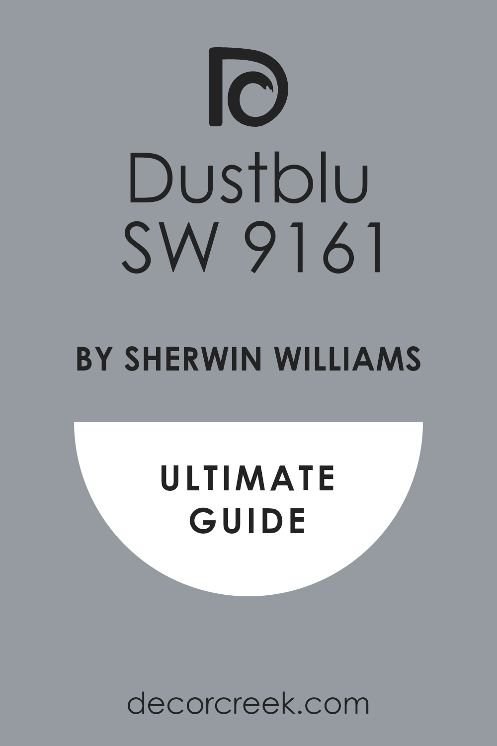
Dustblu SW 9161
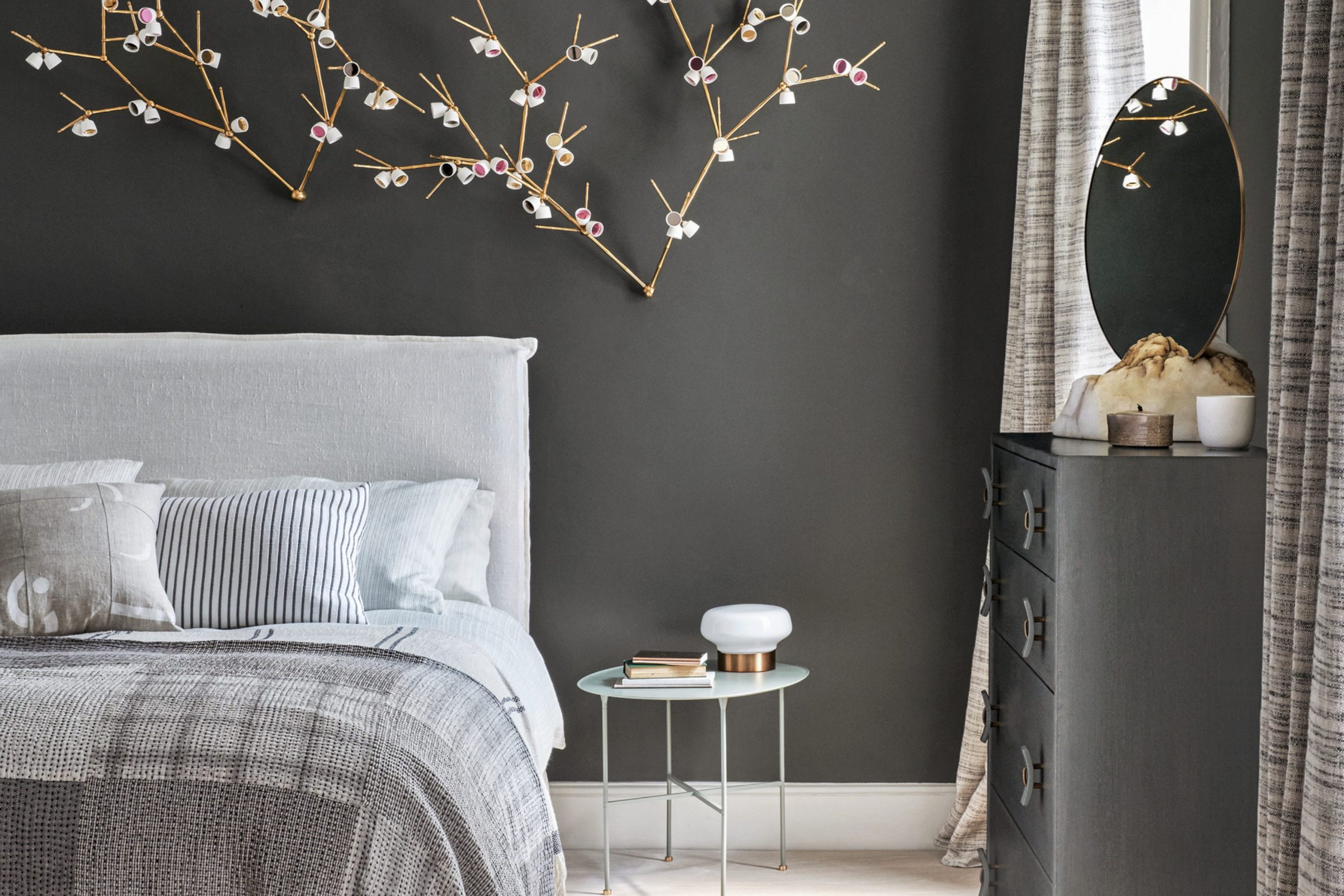
Dustblu is a stunning, deeply saturated, and muted grey-blue that acts like a luxurious velvet fabric on the walls, creating a dramatically intimate bedroom setting. Dustblu is a sophisticated shade where the blue and grey pigments are perfectly balanced, resulting in a color that is restful, moody, and deeply rich, but never feels black or navy.
I often recommend this color for primary bedrooms or media rooms where the goal is to create a true cocoon-like feeling that encourages deep rest and quiet. It works beautifully as a single accent wall color behind the bed or as a whole-room color in a room with a lot of white or light-colored furniture to balance the depth.
This color is fantastic for making artwork and metallic finishes truly shine and stand out with a jewel-like intensity. You must ensure there is enough lighting in the room to keep the depth from feeling too heavy, such as lamps or sconces that cast a gentle, warm light. Dustblu is a brave, beautiful choice that rewards you with an exceptionally rich, tailored, and profoundly restful bedroom environment.
🎨 Check out the complete guide to this color right HERE 👈
Granite Peak SW 6250
Granite Peak is a rich, powerful deep grey that has wonderful, complex blue-green undertones, giving it a rich depth that is incredibly grounding and sophisticated. Granite Peak is a very dark color that I use when the intention is to create a truly enveloping, high-drama bedroom that feels luxurious and intimate, like a fine suit.
I often choose this color for a bedroom with tall ceilings, as the depth of the color can visually bring the ceiling down, making the room feel significantly cozier and more settled. It works beautifully with bright white bedding and light-colored rugs, which provide a sharp, inviting contrast that prevents the room from feeling too heavy.
This shade is one of the best for creating an elegant, masculine atmosphere, pairing beautifully with dark wood, leather, and tailored furniture. Because of its depth, I always recommend using a high-quality paint finish, like a satin or eggshell, to ensure the light catches the complexity of the color. Granite Peak is a bold but highly rewarding choice that results in a beautiful, restful, and deeply sophisticated bedroom design.
🎨 Check out the complete guide to this color right HERE 👈

Stamped Concrete SW 7655
Stamped Concrete t is a gorgeous, warm mid-toned grey that has a strong, earthy character, making it one of the coziest and most inviting greys on my list. Stamped Concrete has a pronounced brown undertone that gives it a rich, taupe-like quality, which ensures the color always feels warm and comfortable, never stark or cold.
I often choose this color for older homes or bedrooms with traditional architectural details, as its warmth harmonizes beautifully with classic wood trims and antique furniture. It provides a nice depth of color that is noticeable on the wall but is still light enough to feel like a very comfortable and non-intrusive backdrop.
This color is excellent for creating a refined, almost European-inspired feeling, pairing beautifully with natural linen, creamy off-white, and other rustic textures. It works wonderfully to provide a defined contrast against bright white trim, ensuring the room’s architecture looks sharp and intentional. Stamped Concrete is a fantastic, reliable grey for anyone who wants to introduce a sophisticated neutral that guarantees a cozy, warmly lit bedroom atmosphere.
🎨 Check out the complete guide to this color right HERE 👈

Sterling 1591
Sterling is a delicate, pale light grey from Benjamin Moore that has a refreshing and very pure quality, acting as a sophisticated alternative to basic white. Sterling is characterized by a very gentle, almost silvery blue undertone that gives the color a crisp and clean edge without it ever feeling icy or cold on the walls.
I often recommend this shade for bedrooms that have a lot of decorative molding or wainscoting, as the light color provides a subtle wash that highlights the architectural details beautifully. It’s an ideal choice for creating a light, airy feeling in a bedroom, maximizing the reflection of natural light and enhancing the perception of size.
This color pairs exceptionally well with cool-toned accents like navy, cobalt, or crisp white, creating a cohesive and beautifully tailored palette. Because it is so light, it provides just a hint of contrast against white trim, offering a polished, monochromatic look that is both modern and refined. Sterling is a dependable, high-key grey that keeps the atmosphere light, fresh, and exceptionally serene for a perfect night’s rest.
Chelsea Gray HC-168
Chelsea Gray is a sophisticated, deeply saturated medium-dark grey from Benjamin Moore that brings a luxurious, grounded, and slightly moody quality to a bedroom. Chelsea Gray has a lovely warm undertone, often reading as a deep, rich greige, which prevents it from ever looking cold or harsh, even in low light.
I often choose this shade for a primary bedroom where the goal is a cozy, intimate, and dramatic atmosphere that feels deeply restful and private. It works wonderfully as a high-contrast backdrop for crisp white bedding, bright artwork, and metallic accents, making all those elements truly pop.
This color is a fantastic option for creating a focal accent wall behind the headboard, providing instant architecture and drama to the room’s design. Because of its depth, it’s a smart choice for bedrooms with abundant natural light, as it helps to temper the brightness and provides a truly restful environment. Chelsea Gray is a classic, designer-favorite grey that brings a serious sense of style and luxurious comfort to any bedroom wall.
🎨 Check out the complete guide to this color right HERE 👈

Pale Oak OC-20
Pale Oak is an incredibly soft, luminous greige from Benjamin Moore that is so light it sits right at the intersection of a barely-there grey and a creamy, warm off-white. Pale Oak is a perfect choice for bedrooms where the client wants a sophisticated neutral that is guaranteed to feel warm, bright, and airy throughout the day.
I often recommend this shade for rooms that lack substantial natural light, as its gentle warmth and high light reflectance help to make the room feel open and inviting. It has a beautiful, very slight pinkish-beige undertone that prevents it from ever looking stark, giving the walls a soft, gentle glow.
This color harmonizes beautifully with natural wood tones, linens, and creamy textures, creating a very cohesive and relaxed, yet high-end, feeling. When paired with bright white trim, the contrast is minimal but noticeable, giving the walls a polished and refined edge that a simple white can’t achieve. Pale Oak is one of my go-to shades for creating a peaceful, light-filled, and incredibly comfortable bedroom foundation.
🎨 Check out the complete guide to this color right HERE 👈

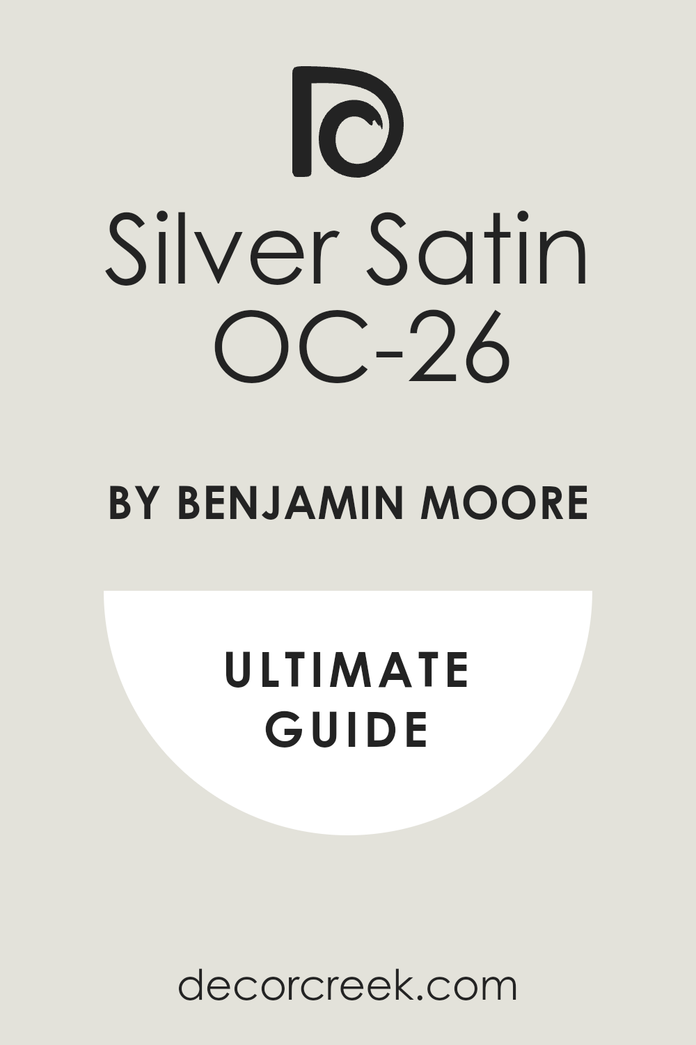
Silver Satin OC-26
Silver Satin is a beautiful, delicate light grey that has a silvery, luminous quality, making the walls appear both soft and incredibly clean in a bedroom setting. Silver Satin is often described as a warm grey, with a subtle pink or violet undertone that prevents the color from looking cold while still firmly reading as a pale grey.
I often choose this color for feminine or classically styled bedrooms, as its gentle warmth and light quality feel delicate and refined on the walls. It is an excellent choice for maximizing natural light and creating a bright, airy feeling that is perfect for a small or dimly lit bedroom.
This color is the perfect backdrop for white, cream, or soft pastel bedding and upholstery, enhancing its inherently gentle and elegant nature. When paired with bright white trim, it provides a gentle, sophisticated contrast that defines the room’s architecture without being too heavy or obvious. Silver Satin is a charming, light-filled grey that offers a perfect mix of sophistication and comforting warmth for a restful sleep environment.
🎨 Check out the complete guide to this color right HERE 👈
Pashmina AF-100
Pashmina is a rich, beautifully saturated mid-toned greige from Benjamin Moore that brings a wonderful sense of depth and enduring warmth to a bedroom wall. Pashmina is characterized by its strong, earthy brown undertones, making it a sophisticated neutral that leans heavily into the cozy and grounded territory.
I often recommend this shade for bedrooms that have an abundance of natural light or for accent walls where a deeper, comforting color is desired for impact. It works wonderfully to harmonize with dark wood furniture, leather accents, and natural textures, creating a very rich and established look in the room.
This color is excellent for providing a definite, noticeable contrast to bright white trim, making the molding and ceiling pop and adding structure. In lower light, it can appear as a gorgeous, deep taupe, maintaining a warm and enveloping atmosphere throughout the evening hours. Pashmina is a luxurious and dependable color that provides a very grown-up, tailored, and exceptionally comfortable foundation for any thoughtful bedroom design.
🎨 Check out the complete guide to this color right HERE 👈

Sparrow AF-720
Sparrow is a spectacular, deep, and heavily saturated grey that is one of the darkest shades on my list, delivering a powerfully dramatic and sophisticated bedroom look. Sparrow has strong brown and violet undertones that prevent it from ever looking like a cold charcoal, giving it an incredibly rich, warm, and comforting depth on the walls.
I often choose this color for a primary bedroom where the goal is a luxurious, modern cocoon that feels intimate, private, and deeply restful for the occupants. It works beautifully as a backdrop for high-contrast items like pure white bedding, metallic accents, and light-colored artwork that truly command all the attention.
This color is a smart choice for making a room with busy architectural features disappear, allowing the furnishings and textiles to become the main focus. You must be sure to balance this depth with plenty of lighting, both natural and artificial, to maintain the room’s sophistication and prevent it from feeling too heavy. Sparrow is a bold, high-impact choice that results in an exceptionally chic, moody, and profoundly comfortable bedroom retreat.
🎨 Check out the complete guide to this color right HERE 👈

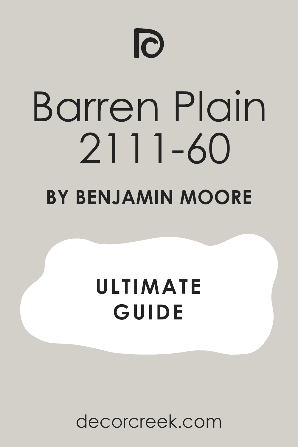
Barren Plain 2111-60
Barren Plain is a gorgeous, soft mid-toned grey that offers a sophisticated and dependable neutral base, perfect for creating a clean and restful bedroom. Barren Plain has a very slight green-blue undertone that provides a lovely complexity, giving the color a fresh and slightly cooler edge without ever feeling truly cold.
I often recommend this shade for bedrooms that have warmer elements like red-toned wood floors, as the coolness provides a much-needed balance to the room’s overall feeling. It’s light enough to be used as a whole-room color but has enough depth to provide a definite color presence and a refined contrast to white trim.
This color works beautifully with both white and light wood furniture, ensuring that the room feels airy and uncluttered while still having a noticeable wall color. In certain lights, the green-blue can become more apparent, giving the walls a beautiful, soft, and watery quality that is very soothing. Barren Plain is a reliable and elegant grey that provides a very clean, sophisticated, and comfortable atmosphere for a great night’s sleep.
🎨 Check out the complete guide to this color right HERE 👈
Storm AF-700
Storm is a rich, mid-to-deep grey that has an incredibly grounding and substantial feeling, perfect for creating a cozy, enveloping environment in a bedroom. Storm is characterized by its lovely, complex blue-green undertones, which are subtle enough to ensure the color remains a true grey but rich enough to provide beautiful depth and sophistication.
I often choose this shade for a bedroom that I want to feel restful, moody, and deeply private, offering a sense of established elegance and comfort. It works beautifully as a sophisticated backdrop for light-colored furniture, white bedding, and bright metallic accessories that truly pop against the rich wall color.
This color is a fantastic choice for an accent wall or for a room that receives plenty of natural light, as the depth helps to temper the brightness effectively. It pairs exceptionally well with polished silver or chrome fixtures, enhancing its refined, tailored, and luxurious quality in the overall design. Storm is a powerful, complex grey that delivers a sense of quality and enduring comfort to the bedroom walls.
🎨 Check out the complete guide to this color right HERE 👈

Cinder AF-705
Cinder is a spectacular, deep, rich grey that has a pronounced, earthy brown undertone, making it one of the warmest and most dramatically cozy dark colors on my list. Cinder is a deeply saturated color that I use when the goal is to create a luxurious, intimate, and profoundly restful bedroom that feels completely removed from the outside world.
I often recommend this shade for a primary bedroom where the client wants a high-impact, statement-making wall color that is still completely sophisticated and neutral. It works wonderfully as a high-contrast foundation for light-colored trim, bright artwork, and creamy white bedding, making all these elements appear incredibly crisp.
This color is a superb choice for creating a visual anchor, especially in rooms with very tall ceilings, bringing a sense of definition and scale to the vertical surfaces. Because of its intense depth, it’s a color that rewards careful lighting design, using lamps to cast gentle, warm pools of light throughout the room. Cinder is a luxurious, bold, and incredibly warm dark grey that provides a truly unique and deeply comforting bedroom environment.
My Final Thoughts about 19 best Grey Paint Colors For Bedroom in 2026
Grey is inherently the epitome of calm and sophistication, making it the ideal foundation for creating a truly restful and highly personalized bedroom. My carefully compiled list for 2026 is full of surefire winners from Sherwin-Williams and Benjamin Moore. I rely exclusively on these brands because I am absolutely confident that these specific colors will perform flawlessly in real-world lighting conditions, showcasing complexity rather than flatness.
No matter your personal preference, I have the perfect options covered. Do you perhaps lean towards the enveloping, incredibly comforting warmth of a greige shade like Agreeable Gray or Balboa Mist, which brings softness and a feeling of grounded ease?
Or do you prefer the crisp, tailored sophistication of a cooler, classic grey like Stonington Gray or Silverplate, which looks fresh and composed? The perfect grey for your style and your specific light is waiting for you within my selections.
Remember this: grey is the ultimate chameleon in design, constantly shifting its mood and tone based on how the light strikes it.
This is why testing a large swatch of paint (at least 2′ x 2′) directly on your wall is the single most important piece of advice I can offer. Don’t be afraid to go a little deeper and richer by selecting a color like Chelsea Gray or Eternity if your goal is to create a true, deeply restful haven for optimal sleep and relaxation.
The ultimate goal is a finished room that feels quiet, perfectly tailored, incredibly sophisticated, and perfectly you.