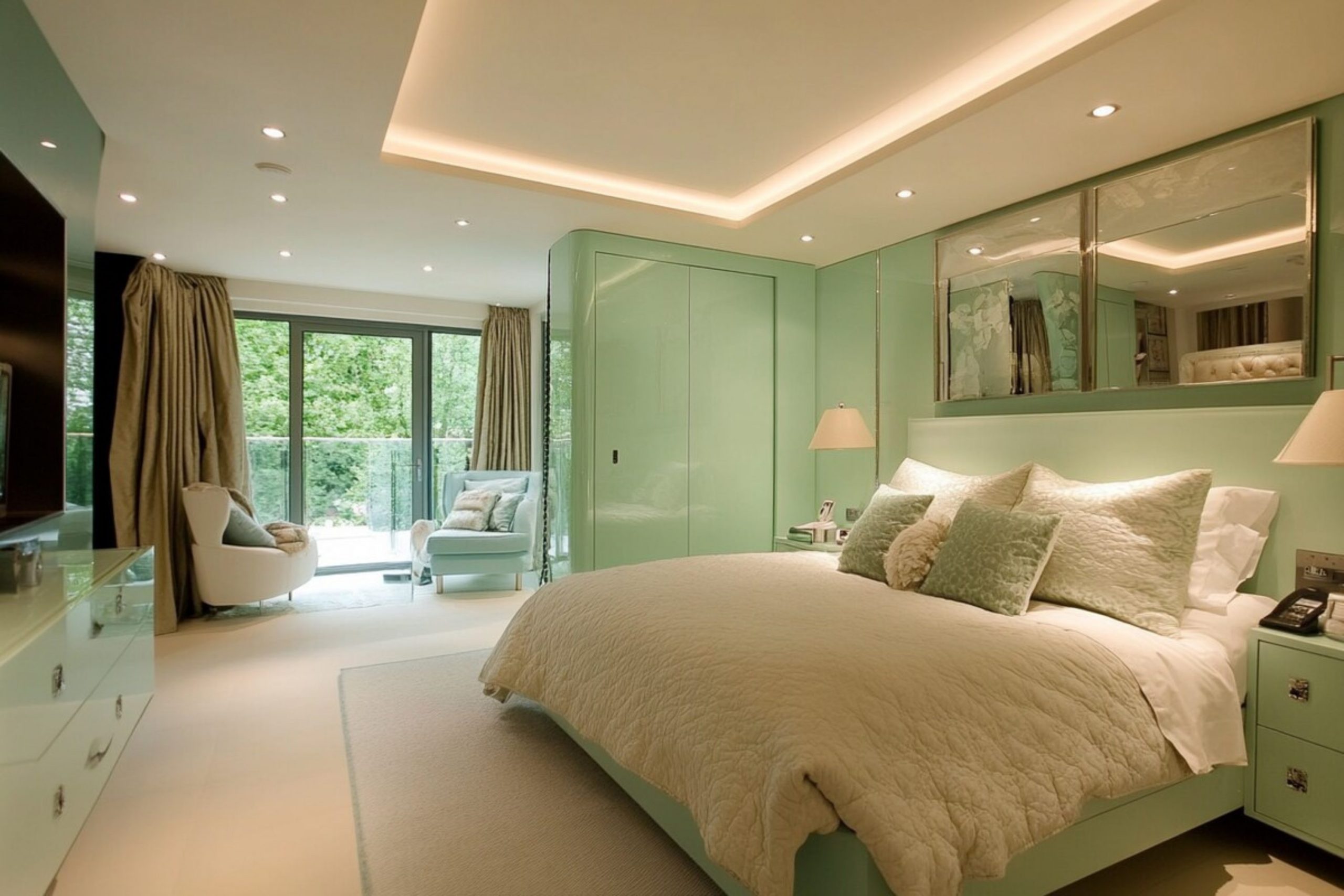
Mint green is a color that makes people feel happy and refreshed as soon as they walk through the door. I have seen how the right shade can make a bedroom feel like a getaway without being too loud. It is a smart choice for anyone who wants their home to feel bright and clean.
Using this color helps a house feel much more modern and full of new life. It acts like a background that makes every piece of furniture look better and more expensive.
Many people worry that green will look too much like a hospital, but the right mint actually feels like a breath of fresh air. I love using this color because it works well with so many different types of furniture. Whether you have dark wood or white modern pieces, mint green ties everything together in a way that feels intentional.
It has a special way of making a small room feel much larger than it really is. I always feel more relaxed when I am surrounded by these soft and natural tones.
Why I Always Trust Sherwin-Williams and Benjamin Moore for the Best Mint Green Bedroom Paint Colors
I have spent years testing different paint brands on all kinds of walls. Sherwin-Williams and Benjamin Moore are my top choices because their colors look the same on your wall as they do on the tiny sample chip. There is nothing worse than picking a soft green and having it turn into a neon lime once it dries.
I have seen many people waste money on cheap paint that does not cover the old color properly. These brands make sure that the pigment is thick and covers the wall in just a few coats.
These two brands offer a huge variety of undertones that help me find the exact mood a homeowner wants. Their paint is also very durable, which is important for bedrooms where people are actually living and moving around. I know that if I pick a shade from their collections, the finish will be smooth and the color will stay true for a long time.
It is easy to wipe away fingerprints or marks without hurting the paint finish. Trusting these professional brands makes the whole project much easier for everyone involved.
How I Choose the Perfect Mint Green Shade for Any Bedroom
Choosing a paint color starts with looking at the windows and seeing how much sun comes inside. If a room gets a lot of bright afternoon sun, I look for a mint that has a little bit of gray in it to keep it from looking too glowing. In a darker room, I go for a very light and crisp mint to help pull in every bit of brightness available.
The way the light hits the wall can change the color from a soft blue to a deep green in just one hour. I always watch how the shadows move across the room before I make a final choice.
I also think about the person sleeping in the room and what makes them feel relaxed. I usually suggest holding a large painted board against the floor and the bed frame to see how the colors talk to each other. It is all about finding a balance where the walls feel like a soft hug rather than a loud shout.
The color of the wood on the floor can make a green paint look very different than it does in the store. I want every person to feel a sense of peace the moment they lay their head down at night.
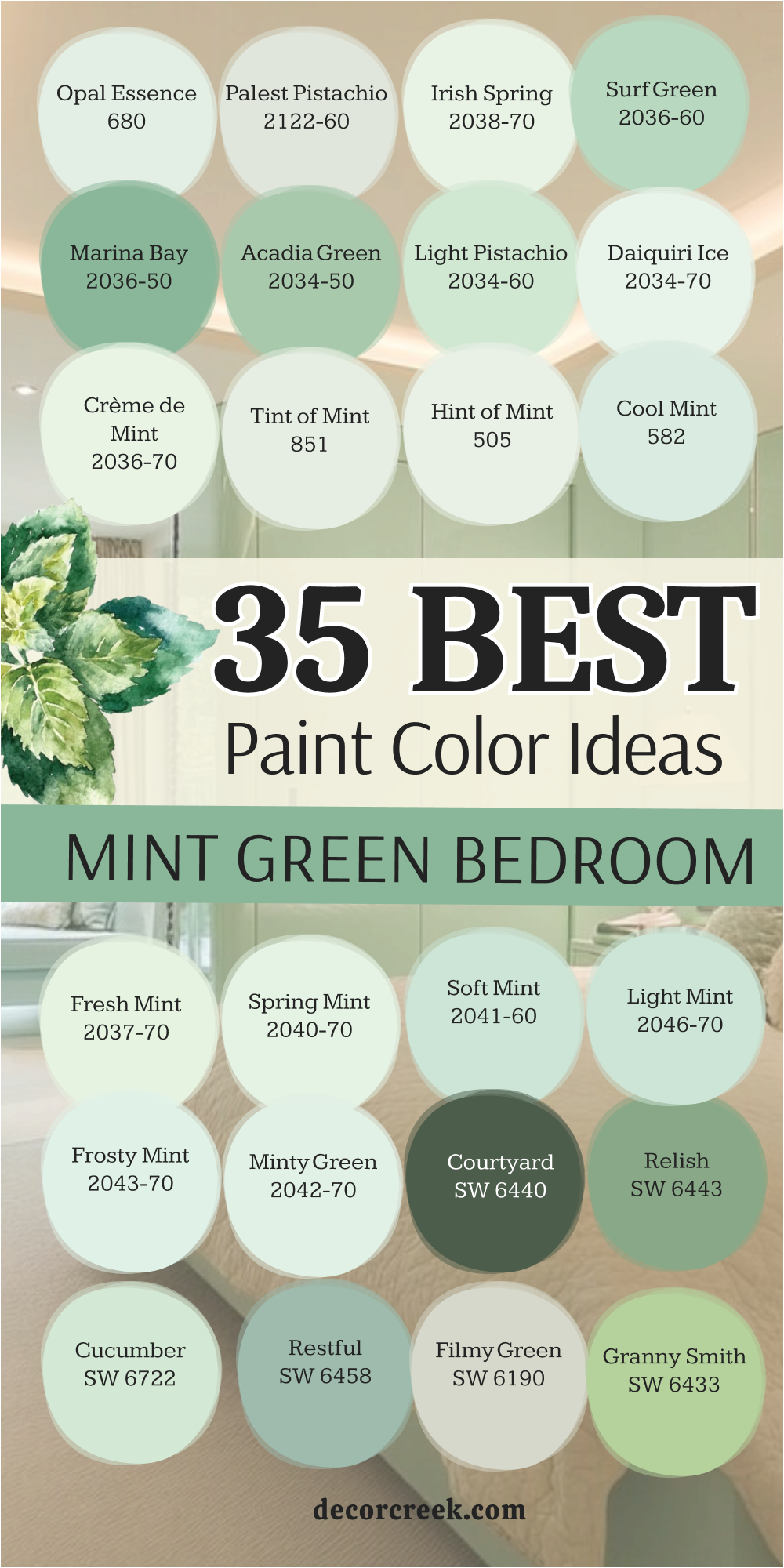
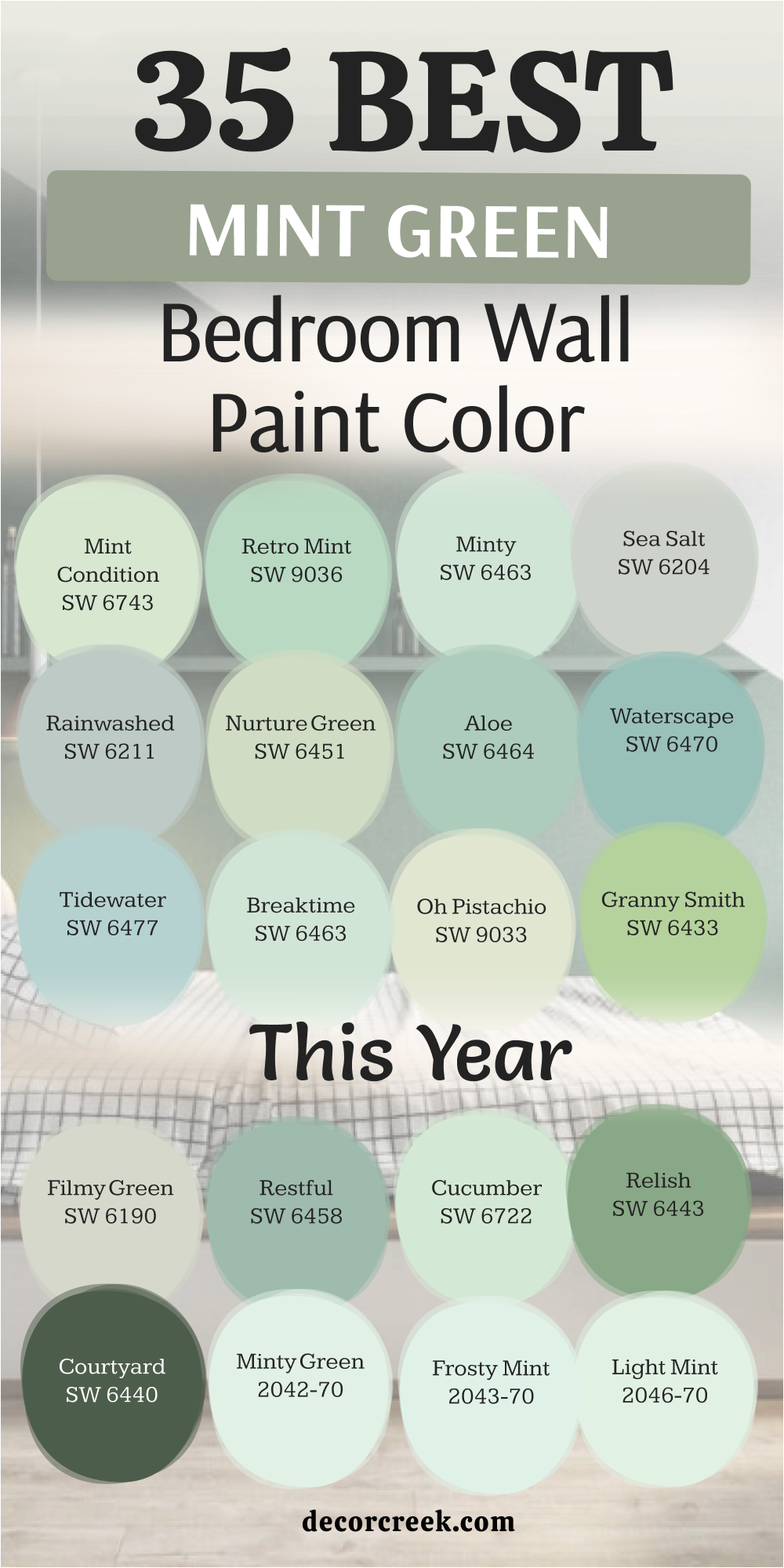
35 Mint Green Bedroom Wall Paint Color For This Year
Mint Condition SW 6743
Mint Condition SW 6743 is a bright and cheerful shade that reminds me of a fresh sprig of peppermint.
This color has a lot of energy and works perfectly in a room that needs a little bit of a wake-up call. I like how it stays looking green even when the sun goes down and the lamps come on. It is a very clean color that does not have any muddy or brown tones hiding inside of it.
You can use this to make a small guest room feel much larger than it really is. It looks very crisp when you pair it with bright white trim and light-colored bedding. Many of my clients choose this when they want a classic look that still feels modern and fun. It is a great pick for a house near the water or a home with a lot of natural wood accents. I think this shade is one of the easiest greens to live with for many years.
Best used in: master bedrooms, guest suites, laundry rooms, and sunrooms.
Pairs well with: High Reflective White SW 7757, Tricorn Black SW 6258, and light oak flooring. The key rule of this color for a fresh style is to use it in rooms with large windows to let the pigment really shine.
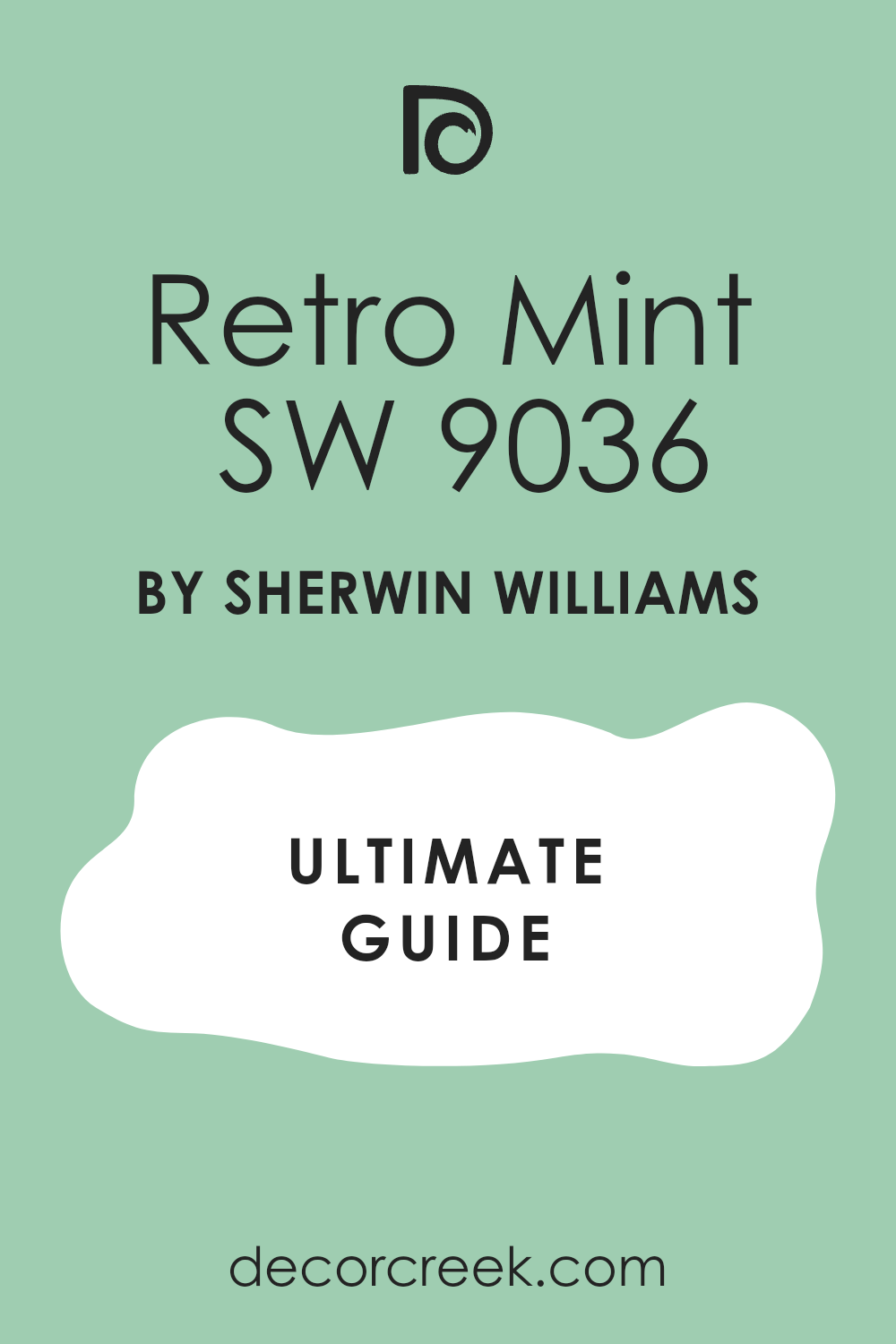
Retro Mint SW 9036
Retro Mint SW 9036 has a nostalgic feel that brings back memories of vintage kitchens and old-fashioned ice cream shops.
It is a bit more saturated than other pastels, which gives the walls a very solid and confident look. I find that this shade works wonders in a bedroom that has a lot of character and unique architectural details. The color is deep enough to provide a nice contrast against white furniture or colorful artwork.
It feels very playful and keeps a bedroom from looking too serious or boring. I often recommend this for people who want their home to have a personality that stands out from the neighbors. You will notice that it looks great with silver or chrome hardware on the doors and cabinets. It is a very friendly color that makes guests feel welcome as soon as they see it. This is a solid choice for a mid-century modern look or a fun eclectic bedroom design.
Best used in: teenager bedrooms, home offices, accent walls, and creative studios.
Pairs well with: Extra White SW 7006, Naval SW 6244, and bright yellow accents. The key rule of this color for a vintage style is to pair it with bold patterns to celebrate its fun and energetic roots.
🎨 Check out the complete guide to this color right HERE 👈
Sea Salt SW 6204
Sea Salt SW 6204 is one of the most famous colors because it changes its look depending on the light outside.
Sometimes it looks like a soft green and other times it looks like a very light blue or gray. I find that it is the perfect choice for a bedroom where you want to feel like you are at the beach. It is very muted and does not demand too much attention, which makes it very easy to decorate around.
The color has a way of making walls look soft and touchable rather than hard and flat. I use this color more than almost any other green because it makes every room look expensive. It works well with both warm gold accents and cool silver ones, giving you lots of choices for lamps. The paint has enough gray in it to keep it from ever looking like a neon light. It is a sophisticated pick for anyone who wants a bedroom that feels grown-up and stylish.
Best used in: primary bedrooms, spa-like bathrooms, kitchens, and entryways.
Pairs well with: Alabaster SW 7008, Heron Plume SW 6070, and dark walnut wood. The key rule of this color for a coastal style is to use it with plenty of natural light to see its blue and green layers.
🎨 Check out the complete guide to this color right HERE 👈

Rainwashed SW 6211
Rainwashed SW 6211 is a bit deeper than sea salt and brings a very lush feeling to a bedroom wall.
It reminds me of the way the world looks right after a big rainstorm when everything is clean and wet. This color has a strong blue undertone that makes it feel very cool and refreshing. I love putting this in a room that gets a lot of afternoon heat because it physically feels like it lowers the temperature.
It is a great middle-ground color because it is not too dark but has enough pigment to stand out. I often suggest this for bedrooms that have high ceilings to help the room feel more grounded. The color looks amazing when you put it next to dark charcoal or navy blue pillows. It is a very reliable shade that makes people stop and ask what the color name is. You will find that it makes white bedding look even whiter and cleaner.
Best used in: master suites, guest rooms, mudrooms, and bedroom ceilings.
Pairs well with: Westhighland White SW 7566, Peppercorn SW 7674, and slate tile. The key rule of this color for a fresh style is to use it alongside dark accents to create a high-contrast and modern look.
🎨 Check out the complete guide to this color right HERE 👈

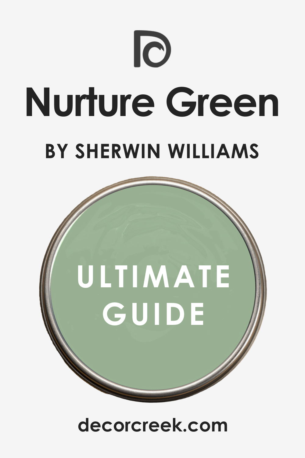
Nurture Green SW 6451
Nurture Green SW 6451 is a soft and earthy mint that feels very connected to the plants in a garden.
It has a tiny bit of yellow in it which makes it feel warmer than some of the other minty shades. I like using this in a bedroom that has a lot of plants because it makes the leaves look very vibrant. It is a very comforting color that feels like a gentle hug when you walk into the room.
The shade is light enough to keep the room feeling open but has enough soul to feel very cozy at night. I think it works best with cream or beige colors rather than stark whites. This is a wonderful choice for a child’s room or a space where you want to encourage a lot of rest. It feels very natural and does not have that artificial look that some bright greens can have. People who love nature often gravitate toward this specific shade of mint.
Best used in: kids’ rooms, cozy bedrooms, kitchens, and sun-drenched corners.
Pairs well with: Creamy SW 7012, Dover White SW 6385, and light maple wood. The key rule of this color for a natural style is to use it with warm wood tones to bring out its hidden warmth.
🎨 Check out the complete guide to this color right HERE 👈
Aloe SW 6464
Aloe SW 6464 is a cool and medicinal green that feels very clean and organized.
It is a very smooth color that looks great on walls with a lot of flat surface area. I find that it has a very modern feel that works well in homes with simple furniture and clean lines. This shade is excellent for helping a busy mind slow down before going to sleep.
It does not have any hidden surprises in different lighting and stays a true mint green all day long. I like to pair it with light gray rugs and silver picture frames to keep the look very sleek. It is a very popular choice for people who want a minimalist bedroom that still has some color. The color is bright enough to make the room feel cheery in the morning but soft enough for the evening. It is a very balanced green that fits into almost any decorating style.
Best used in: modern bedrooms, home gyms, bathrooms, and laundry rooms.
Pairs well with: Snowbound SW 7004, Gauntlet Gray SW 7019, and glass accents. The key rule of this color for a modern style is to keep the room uncluttered so the clean green tone can be the main focus.
🎨 Check out the complete guide to this color right HERE 👈

Waterscape SW 6470
Waterscape SW 6470 is a deep and watery mint that feels like looking into a clear tropical pool.
It has more blue in it than a standard green, which gives it a very refreshing and liquid look. I love using this color as an accent wall behind a headboard to create a big focal point. It is a bold choice that still feels very relaxing because of its cool temperature.
The shade works very well with tropical decor or rooms that have a lot of white wicker furniture. It makes a big statement without being too loud or annoying for the person living there. I find that it looks beautiful when the sunlight hits it and shows off the different blue and green tones. It is a very lush color that makes a bedroom feel like a high-end resort room. You will enjoy how it makes your bedroom feel like a special place that is separate from the rest of the house.
Best used in: accent walls, master bedrooms, coastal homes, and bathroom vanities.
Pairs well with: Greek Villa SW 7551, Salty Fir SW 9133, and gold hardware. The key rule of this color for a resort style is to use it in rooms with plenty of white fabrics to balance the depth of the blue-green.
🎨 Check out the complete guide to this color right HERE 👈

Tidewater SW 6477
Tidewater SW 6477 is a very light and airy blue-green that feels like the foam on top of a wave.
It is a very bright color that can make even a tiny windowless room feel like it has plenty of light. I like to use this for ceilings sometimes to give the feeling of a wide-open sky. It is a very happy color that puts a smile on people’s faces when they enter the room.
The shade is very crisp and works beautifully with coastal or nautical themes. I often suggest this for a vacation home or a bedroom that is used for relaxing on the weekends. It feels very young and fresh, making it a great pick for a first apartment or a dorm room. The color is very easy to coordinate with blue or green pillows and blankets. It is a very versatile mint that leans heavily into the blue side of the family.
Best used in: small bedrooms, ceilings, coastal cottages, and powder rooms.
Pairs well with: Origami White SW 7636, In the Navy SW 9178, and light pine wood. The key rule of this color for an airy style is to use it in small spaces to make the walls feel like they are pushing outward.
🎨 Check out the complete guide to this color right HERE 👈

Breaktime SW 6463
Breaktime SW 6463 is a soft and medium-toned mint that is exactly what the name suggests—a place to rest.
It is a very balanced color that doesn’t feel too blue or too yellow. I find that it has a very steady feeling that makes a bedroom feel very stable and quiet. This is a great color for a person who has a very busy job and needs a place to unplug.
It looks very nice with traditional furniture and heavy wooden bed frames. The color has a bit of a dusty quality that keeps it from looking like a neon sign or a piece of candy. I like how it looks under warm indoor lighting at night because it turns into a very rich and deep green. It is a sophisticated shade that feels very expensive once it is up on the walls. You can use this color to create a classic look that will stay in style for a long time.
Best used in: traditional bedrooms, home libraries, guest rooms, and dining rooms.
Pairs well with: Aesthetic White SW 7035, Urban Bronze SW 7048, and brass fixtures. The key rule of this color for a classic style is to use it with traditional wood furniture to create a grounded and timeless look.
🎨 Check out the complete guide to this color right HERE 👈

Oh Pistachio SW 9033
Oh Pistachio SW 9033 is a creamy and nutty shade of mint that feels very warm and welcoming.
This color is a great middle ground for people who want green but also like the look of a warm tan. I find that it looks very expensive when you use it in a bedroom with tall windows. It is a very soft color that does not feel cold even on a cloudy day.
The yellow undertones make it feel like the sun is always shining just a little bit inside. I like to use this for guest rooms because it feels very friendly and easy for anyone to like. It looks very smart with dark wood furniture or even black metal bed frames. The color stays very consistent and does not turn blue when the sun goes down at night. It is a very cozy choice for someone who wants a bedroom that feels grounded and very comfortable.
Best used in: guest bedrooms, traditional homes, hallways, and cozy reading corners.
Pairs well with: Shoji White SW 7042, Urbane Bronze SW 7048, and warm oak. The key rule of this color for a creamy style is to use it with warm lighting to bring out its nutty and inviting character.
Courtyard SW 6440
Courtyard SW 6440 is a very crisp and tart green that brings a lot of life to a bedroom.
It reminds me of a fresh apple and has a very clean and sharp feeling on the walls. I find that this color is perfect for a bedroom that feels a bit dark or heavy. It has enough brightness to wake up the furniture and make the room feel much more energetic.
The color is very fun and works well for people who have a very bubbly personality. I like to pair it with white trim to make the green pop as much as possible. It is a very brave color that shows you have a lot of confidence in your home design. You will notice that it makes green plants look very lush and healthy when they are in front of it. It is a great pick for a room that serves as both a bedroom and a creative office.
Best used in: home offices, teenager bedrooms, laundry rooms, and accent walls.
Pairs well with: Extra White SW 7006, Tricorn Black SW 6258, and bright citrus accents. The key rule of this color for a crisp style is to use it in rooms with plenty of light to keep the green looking fresh.
Filmy Green SW 6190
Filmy Green SW 6190 is a very pale and dusty mint that feels like a whisper of color.
It is one of the most neutral greens I ever use because it has a lot of gray inside. I find that it is the perfect choice for a master bedroom where you want a very quiet look. It does not demand any attention and lets your beautiful bedding and furniture be the stars.
The color changes slightly throughout the day and can look like a soft gray in the evening light. I like how it creates a very sophisticated and high-end atmosphere without being boring or flat. It works very well with silver hardware and cool-toned wood floors like maple or ash. This is a very safe color for someone who is worried about their room looking too green. It feels very professional and works perfectly in a modern or traditional home alike.
Best used in: master bedrooms, nurseries, large open rooms, and bathrooms.
Pairs well with: Pure White SW 7005, Sea Salt SW 6204, and light gray textiles. The key rule of this color for a quiet style is to use it on all walls to create a soft and seamless background.
🎨 Check out the complete guide to this color right HERE 👈

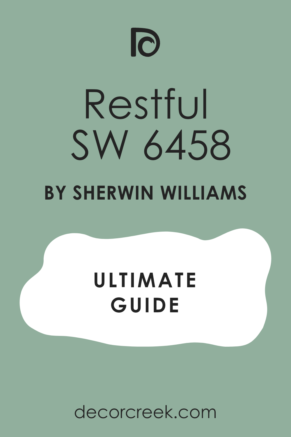
Restful SW 6458
Restful SW 6458 is a medium-toned mint that feels very stable and deep like a forest floor.
It has a bit more pigment than the pastel shades, which makes the bedroom feel very sturdy. I like to use this color when a room has very high ceilings and needs to feel a bit more cozy. It is a very rich shade that makes white picture frames and artwork look absolutely beautiful.
The color has a very soothing quality that really lives up to its name for a bedroom. I find that it works very well with traditional rugs that have bits of red or blue in them. It is a very classic green that feels very connected to nature and the outdoors. You will enjoy how this color makes your bedroom feel like a very private and safe place. It is a great choice for a room where you want to spend a lot of time relaxing.
Best used in: primary bedrooms, libraries, guest suites, and dining rooms.
Pairs well with: Alabaster SW 7008, Naval SW 6244, and dark cherry wood. The key rule of this color for a stable style is to use it with heavy fabrics to enhance the feeling of a cozy retreat.
🎨 Check out the complete guide to this color right HERE 👈
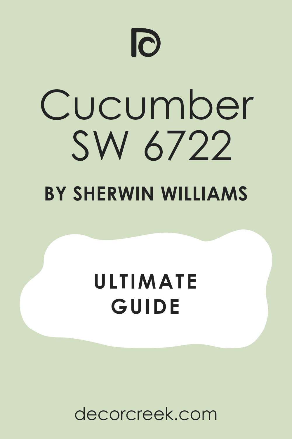
Cucumber SW 6722
Cucumber SW 6722 is a very light and refreshing green that feels like a cool spa treatment.
It is very bright and clean, which makes any bedroom feel like it was just scrubbed and polished. I find that it has a very watery quality that helps people feel very calm and relaxed. This is a great color for a small bathroom or a bedroom that needs to feel more open.
The shade is very cheerful and looks wonderful with light-colored woods and white cotton fabrics. I like to use it for clients who want their home to feel very healthy and full of light. It stays looking very true to its name and does not turn yellow or muddy in the shadows. It is a very friendly color that makes the whole room feel very airy and easy to breathe in. I think it is one of the best greens for creating a very clean and modern look.
Best used in: bathrooms, guest bedrooms, kitchens, and sunrooms.
Pairs well with: Snowbound SW 7004, silver fixtures, and light blue accents. The key rule of this color for a spa style is to use it with plenty of white towels and linens to keep it feeling fresh.
🎨 Check out the complete guide to this color right HERE 👈
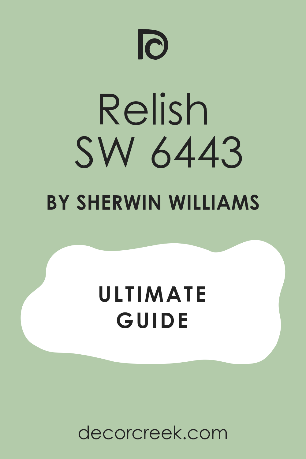
Relish SW 6443
Relish SW 6443 is a deeper mint that has a lot of personality and a bit of a vintage soul.
It is a very strong color that makes a big statement as soon as you walk into the bedroom. I find that it works best in rooms that have a lot of white trim to provide a nice contrast. This color feels very lush and reminds me of a beautiful garden in the middle of summer.
It is a very good choice for an accent wall or for painting a piece of old furniture. The color has a lot of depth and looks very rich when the lights are dimmed at night. I like to pair it with gold lamps and mirrors to give the room a very royal feeling. It is a very fun and confident shade of green that will make your bedroom stand out. People who love color will really appreciate how bold and beautiful this specific mint looks.
Best used in: accent walls, powder rooms, master bedrooms, and furniture pieces.
Pairs well with: Greek Villa SW 7551, gold hardware, and dark charcoal gray. The key rule of this color for a bold style is to use it with bright white accents to keep the deep green from feeling too heavy.
🎨 Check out the complete guide to this color right HERE 👈
Minty Green 2042-70
Minty Green 2042-70 is a very soft and light Benjamin Moore color that feels as light as a cloud.
It is a very pale green that looks almost white in very bright rooms, giving just a hint of color. I find that it is a very good choice for a ceiling if you want something more interesting than plain white. This color is very gentle and makes a bedroom feel very soft and very easy to rest in.
It works beautifully with other pastel colors like light pink or soft blue in the bedding. I like to use this for nurseries because it is so calming and does not overstimulate the baby. The color is very clean and makes the whole room feel very airy and very open. It is a very reliable shade that doesn’t have any harsh or bright tones hiding inside of it. You will enjoy how it makes your bedroom feel like a very peaceful and quiet sanctuary.
Best used in: nurseries, ceilings, small bedrooms, and bright bathrooms
. Pairs well with: Chantilly Lace OC-65, soft gray, and light-colored wood. The key rule of this color for a soft style is to use it in rooms with lots of natural light to see the delicate green tint.
Frosty Mint 2043-70
Frosty Mint 2043-70 has a very cool and icy feeling that is perfect for a room that gets too hot.
It is a very crisp color that reminds me of a winter morning or a fresh piece of ice. I find that it makes a bedroom feel very clean and very well-organized as soon as it is painted. This color has a strong blue undertone that makes it feel very refreshing and very modern.
It looks great with silver hardware and glass furniture pieces that reflect the cool tones of the wall. I like to use this color in guest rooms because it feels very high-end and very professional. The color is bright enough to feel cheerful but cool enough to feel very relaxed at night. It is a very popular choice for people who like a very sleek and very minimalist look in their home. You will love how it makes your white bedding look even brighter and even cleaner than before.
Best used in: modern bedrooms, guest suites, home gyms, and bright kitchens.
Pairs well with: Super White PM-1, navy blue, and silver metal accents. The key rule of this color for a cool style is to pair it with blue accents to highlight its refreshing and icy character.
Light Mint 2046-70
Light Mint 2046-70 is a very classic and balanced mint green that feels very much like a spring garden.
It is a very happy color that makes people feel more positive as soon as they see the walls. I find that it has a very “true green” look that does not lean too far toward blue or yellow. This is a great color for a girl’s room or a playroom where you want a lot of energy.
The color is bright and clear, which helps to make a small bedroom feel much larger and more open. I like to pair it with light wood furniture and colorful rugs to create a very playful look. It is a very durable color that stays looking fresh for many years without looking dated. This shade is very easy to coordinate with many different colors of blankets and pillows. It is a very solid and very dependable choice for any bedroom that needs a boost of happiness.
Best used in: kids’ rooms, playrooms, sunny bedrooms, and craft areas.
Pairs well with: Simply White OC-117, bright pink, and light pine wood. The key rule of this color for a happy style is to use it in rooms with large windows to keep the green looking vibrant.
Soft Mint 2041-60
Soft Mint 2041-60 is a medium-light shade that feels very smooth and very easy on the eyes.
It has a bit more depth than the lightest pastels, giving the walls a very soft and velvety appearance. I find that it is a very relaxing color that helps people transition from a busy day to a quiet night. This color works very well in bedrooms that have a lot of natural light and many white accents.
It feels very fresh and very clean without being too bright or too loud for a sleeping area. I like to use this for master bedrooms because it feels very grown-up and very sophisticated. The color looks beautiful with linen curtains and soft wool rugs that have a bit of texture. It is a very balanced green that fits into many different decorating styles from modern to traditional. You will feel very at peace in a room painted with this very lovely and soft green.
Best used in: master bedrooms, cozy guest rooms, bathrooms, and reading nooks.
Pairs well with: Cloud White OC-130, soft gray, and natural wood tones. The key rule of this color for a soft style is to use it with textured fabrics to create a layered and comfortable look.
Spring Mint 2040-70
Spring Mint 2040-70 is a very light and glowing green that feels like the first leaves of the season.
It has a very youthful and very fresh energy that makes any bedroom feel more alive and happy. I find that this color is perfect for a small room that needs to feel much bigger and brighter. It is a very clean shade that works perfectly with white furniture and bright silver lamps.
The color is very cheerful and makes the morning sun feel even more special when it hits the walls. I like to use this for clients who want a bedroom that feels very optimistic and very full of life. It is a very light color but still has enough green to make a clear statement in the room. This shade is very popular for nurseries and children’s rooms because it is so bright and positive. You will enjoy how it makes your home feel very welcoming and very refreshed every single day.
Best used in: nurseries, small guest rooms, laundry rooms, and sunny corners.
Pairs well with: White Dove OC-17, lavender, and light-colored wicker. The key rule of this color for a spring style is to use it with white accents to keep the room feeling light and airy.
Fresh Mint 2037-70
Fresh Mint 2037-70 is a very bright and clear green that feels very much like a cool breath of air.
It is a very vibrant color that makes a bedroom feel very modern and very well-designed. I find that it has a very high energy level that is great for people who like to wake up early. This color looks very sharp with white trim and black accents for a very high-contrast look.
It is a very bold choice for a mint but it stays very pretty and very clean on the walls. I like to use it in rooms that have simple furniture and not a lot of extra clutter. The color is very strong and makes the walls feel like they are moving forward to greet you. It is a great pick for a bedroom that you want to feel very unique and very memorable for guests. You will love how it makes your home feel very trendy and very updated.
Best used in: teenager bedrooms, home offices, accent walls, and modern bathrooms.
Pairs well with: Decorator’s White CC-20, black metal, and bright yellow. The key rule of this color for a bold style is to keep the rest of the decor simple to let the bright green be the star.
Cool Mint 582
Cool Mint 582 is a very light and watery green that has a lot of blue hiding inside of it.
It feels very much like the ocean on a very calm and very sunny day at the beach. I find that it is a very relaxing color that helps people feel very still and very quiet. This is a perfect choice for a bedroom where you want to escape the noise of the world.
The color is very light and helps to push the walls out to make a room feel very spacious. I like to pair it with coastal decor like sea shells and light-colored wood pieces. It is a very sophisticated shade that works well for both kids and adults in their bedrooms. The color stays very consistent and looks very beautiful under both sun and lamp light. It is a very reliable choice for creating a bedroom that feels very cool and very refreshing.
Best used in: coastal bedrooms, bathrooms, nurseries, and master suites.
Pairs well with: Swiss Coffee OC-45, navy blue, and sandy beige tones. The key rule of this color for a cool style is to use it with light-colored woods to create a breezy and beachy atmosphere.
🎨 Check out the complete guide to this color right HERE 👈

Hint of Mint 505
Hint of Mint 505 is a very subtle green that is just one step away from being a warm white.
It is a very gentle color that provides a tiny bit of character without being at all overwhelming. I find that it is a very good choice for a whole house color if you want something soft. In a bedroom, it creates a very quiet and very clean look that feels very intentional.
The color has a bit of warmth to it that keeps it from looking too cold or too clinical on the walls. I like to use this for clients who are very sensitive to color and want something very light. It works beautifully with all kinds of furniture from dark antiques to modern white pieces. It is a very versatile color that makes a bedroom feel very open and very bright at all times. You will appreciate how it gives your walls a soft glow that feels very kind and very inviting.
Best used in: small bedrooms, hallways, ceilings, and open floor plans.
Pairs well with: Chantilly Lace OC-65, soft tan, and dark walnut wood. The key rule of this color for a subtle style is to use it in rooms with lots of textures to add interest to the light walls.
Tint of Mint 851
Tint of Mint 851 is a very airy and light green that feels very much like a soft spring breeze.
It is a very crisp color that helps to make a bedroom feel very organized and very well-kept. I find that it has a very cooling effect on a room that gets a lot of afternoon sunlight. This color is very easy to coordinate with white bedding and light gray rugs for a modern look.
It is a very pretty shade that makes the whole room feel very cheerful and very positive. I like to use it in guest rooms because it makes people feel very relaxed as soon as they walk in. The color is very light but it still has a clear green identity that you can see easily. It is a very popular choice for people who want a clean look that is not just plain white walls. You will love how it makes your bedroom feel very updated and very full of light.
Best used in: guest bedrooms, nurseries, kitchens, and bright bathrooms.
Pairs well with: Simply White OC-117, light blue, and silver hardware. The key rule of this color for an airy style is to use it with white furniture to maximize the feeling of openness.
Crème de Mint 2036-70
Crème de Mint 2036-70 is a very creamy and soft green that feels very sweet and very inviting.
It has a bit of a yellow undertone that makes it feel very warm and very cozy for a bedroom. I find that it looks like a soft bowl of ice cream on the walls, which is very fun. This color is very popular for kids’ rooms because it feels very playful and very happy.
It is a very light shade that helps to keep a small room feeling very bright and very spacious. I like to pair it with white trim and colorful accents like pink or orange pillows. The color is very cheerful and makes the bedroom feel like a very fun place to be. It stays looking very true and does not turn gray or muddy even in darker corners of the room. This is a very good pick for a bedroom that needs a bit of a personality boost.
Best used in: kids’ bedrooms, playrooms, sunny kitchens, and breakfast nooks.
Pairs well with: Cloud White OC-130, bright pink, and light oak furniture. The key rule of this color for a creamy style is to use it in rooms with warm light to enhance its cozy and sweet character.
Daiquiri Ice 2034-70
Daiquiri Ice 2034-70 is a very light and refreshing mint that feels very cool and very icy.
It has a very sharp and clean look that makes a bedroom feel very modern and very sleek. I find that it is a very good color for people who like a very minimalist and very tidy home. This color has a strong blue undertone that makes it feel very refreshing and very cool.
It looks very good with silver hardware and glass accents that reflect the cool tones of the paint. I like to use this in guest rooms because it feels very high-end and very professional. The color is bright enough to be cheerful but cool enough to be very relaxing at night. It is a very popular choice for people who like a very clean and very updated look in their bedroom. You will love how it makes your white bedding look even brighter and even cleaner.
Best used in: modern bedrooms, guest suites, home gyms, and bright bathrooms.
Pairs well with: Super White PM-1, navy blue, and silver metal accents. The key rule of this color for a cool style is to pair it with blue accents to highlight its refreshing and icy character.
Light Pistachio 2034-60
Light Pistachio 2034-60 is a medium-light green that feels very natural and very earthy.
It has a bit of a nutty quality that makes it feel very grounded and very stable on the walls. I find that it is a very relaxing color that works very well in a main bedroom. This color has enough depth to provide a nice contrast against white furniture and light rugs.
It feels very fresh and very clean without being too bright or too loud for a sleeping space. I like to use this for clients who want a bedroom that feels very connected to nature. The color looks beautiful with wood furniture and natural fabrics like cotton and linen. It is a very balanced green that fits into many different decorating styles from modern to traditional. You will feel very at peace in a room painted with this very lovely and natural green.
Best used in: master bedrooms, cozy guest rooms, kitchens, and reading nooks.
Pairs well with: White Dove OC-17, natural wood tones, and soft tan textiles. The key rule of this color for a natural style is to use it with wood accents to bring out its earthy and grounded character.
Acadia Green 2034-50
Acadia Green 2034-50 is a very rich and deep mint that feels very lush and very vibrant.
It has a lot of pigment which makes the walls look very solid and very confident in a bedroom. I find that it is a very good color for an accent wall or for a room with lots of light. This color feels very tropical and makes the bedroom feel like a very special getaway.
It is a very bold choice for a mint but it stays very pretty and very clean on the walls. I like to use it in rooms that have simple furniture and not a lot of extra clutter. The color is very strong and makes the walls feel like they are a part of a beautiful garden. It is a great pick for a bedroom that you want to feel very unique and very memorable. You will love how it makes your home feel very trendy and very updated and very stylish.
Best used in: accent walls, master bedrooms, modern bathrooms, and furniture pieces.
Pairs well with: Simply White OC-117, dark gray, and gold hardware. The key rule of this color for a bold style is to use it with white accents to keep the deep green from feeling too heavy.
Marina Bay 2036-50
Marina Bay 2036-50 is a deep and watery green that feels very much like a tropical ocean.
It has more blue in it than a standard green which gives it a very refreshing and liquid look. I love using this color as an accent wall behind a headboard to create a big focal point. It is a bold choice that still feels very relaxing because of its cool and steady temperature.
The shade works very well with tropical decor or rooms that have a lot of white furniture. It makes a big statement without being too loud or too annoying for the person living there. I find that it looks beautiful when the sunlight hits it and shows off the blue tones. It is a very lush color that makes a bedroom feel like a high-end and very special resort room. You will enjoy how it makes your bedroom feel like a place that is separate from the world.
Best used in: accent walls, master bedrooms, coastal homes, and bathroom vanities.
Pairs well with: Greek Villa SW 7551, gold hardware, and dark charcoal gray. The key rule of this color for a resort style is to use it with white fabrics to balance the depth of the green.
🎨 Check out the complete guide to this color right HERE 👈

Surf Green 2036-60
Surf Green 2036-60 is a medium-toned mint that feels very energetic and very much like the sea.
It is a very happy color that brings a lot of life and a lot of movement to a bedroom. I find that it is a very good choice for a teenager’s room or a fun guest space. This color has a very clear and very bright identity that makes the walls look very interesting.
It looks very good with white trim and light-colored wood floors for a very fresh and clean look. I like to use this for clients who want a bedroom that feels very active and very positive. The color is strong enough to be noticed but soft enough to still be very easy to live with. It is a very popular choice for coastal homes or for rooms that need a bit of a beachy feel. You will love how it makes your bedroom feel very refreshed and very full of energy.
Best used in: teenager bedrooms, guest rooms, coastal cottages, and playrooms.
Pairs well with: Chantilly Lace OC-65, navy blue, and bright orange accents. The key rule of this color for a beachy style is to use it with nautical decor to highlight its oceanic and fun character.
Irish Spring 2038-70
Irish Spring 2038-70 is a very light and crisp green that feels very much like a fresh morning.
It is a very clean color that helps to make a bedroom feel very organized and very well-kept. I find that it has a very cooling effect on a room that gets a lot of bright sunlight. This color is very easy to coordinate with white bedding and light gray rugs for a modern look.
It is a very pretty shade that makes the whole room feel very cheerful and very positive. I like to use it in guest rooms because it makes people feel very relaxed as soon as they walk in. The color is very light but it still has a clear green identity that you can see. It is a very popular choice for people who want a clean look that is not just plain white walls. You will love how it makes your bedroom feel very updated and very full of light.
Best used in: guest bedrooms, nurseries, kitchens, and bright bathrooms.
Pairs well with: Simply White OC-117, light blue, and silver hardware. The key rule of this color for a fresh style is to use it with white furniture to maximize the feeling of openness.
🎨 Check out the complete guide to this color right HERE 👈

Palest Pistachio 2122-60
Palest Pistachio 2122-60 is a very soft and dusty green that has a lot of gray inside of it.
It is one of the most neutral greens I ever use because it is so quiet and so gentle. I find that it is the perfect choice for a master bedroom where you want a very calm look. It does not demand any attention and lets your beautiful bedding and furniture be the stars of the room.
The color changes slightly throughout the day and can look like a soft gray in the evening light. I like how it creates a very sophisticated and high-end atmosphere without being boring or flat at all. It works very well with silver hardware and cool-toned wood floors like maple or ash or pine. This is a very safe color for someone who is worried about their room looking too green or too bright. It feels very professional and works perfectly in a modern or a traditional home for many years.
Best used in: master bedrooms, nurseries, large open rooms, and bathrooms.
Pairs well with: Pure White SW 7005, soft gray, and light gray textiles. The key rule of this color for a quiet style is to use it on all walls to create a soft and seamless background.
Opal Essence 680
Opal Essence 680 is a very light and glowing green that has a bit of a magical and shimmery feel.
It is a very pretty color that makes a bedroom feel very soft and very special like a jewel box. I find that it is a very good choice for a girl’s room or for a very romantic master bedroom. This color has a very gentle look that pairs beautifully with soft fabrics and plush white rugs.
It is a very light shade but it still has enough green to make a very clear statement on the walls. I like to use this for clients who want a bedroom that feels very airy and very dreamy. The color looks beautiful with silver picture frames and glass lamps that catch the light from the windows. It is a very unique shade of mint that makes a bedroom feel very high-end and very carefully designed. You will love how it gives your walls a soft glow that feels very kind and very peaceful.
Best used in: romantic bedrooms, girl’s rooms, bathrooms, and small guest spaces.
Pairs well with: Chantilly Lace OC-65, soft lavender, and silver metal accents. The key rule of this color for a dreamy style is to use it with soft fabrics like silk or velvet to enhance its special glow.
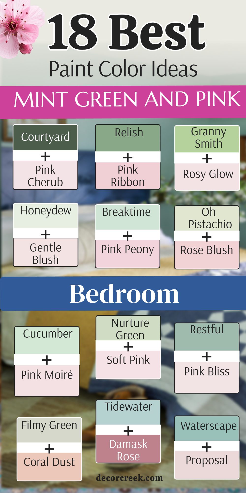
18 Mint Green and Pink Bedroom Paint Color Ideas
Mint Condition SW 6743 + First Light 2102-70
Mint Condition SW 6743 combined with First Light 2102-70 creates a look that is very light and full of energy.
The mint provides a cool base while the pink adds a touch of warmth that feels like a sunrise. I like how these two colors bounce light around the room to make it feel extra large. This pair is perfect for a room where you want to feel cheerful as soon as you wake up.
The pink is very light, so it does not compete with the green for your attention. I usually suggest painting three walls mint and using the pink for the bedding or a small accent wall. It is a very modern way to use two colors that people usually think are just for kids. This combination feels very high-end and designer when you add some gold lamps to the mix. It is a great way to show off a creative personality through your wall colors.
Best used in: creative bedrooms, nurseries, art studios, and sunny guest rooms.
Pairs well with: Chantilly Lace OC-65, gold metal accents, and light gray flooring. The key rule of this color pair for a bright style is to use the pink as the accent to keep the room from feeling too sweet.

Retro Mint SW 9036 + Pink Powderpuff 2008-70
Retro Mint SW 9036 and Pink Powderpuff 2008-70 look like a beautiful vintage postcard from the desert.
The mint is very solid and bold, while the pink is soft and fuzzy like a marshmallow. I love how these two colors sit next to each other because they make each other look more vivid. This is a very stylish choice for a bedroom that uses vintage furniture or old wooden pieces.
It feels very artistic and gives the room a lot of visual interest without needing many decorations. The pink softens the edges of the green and makes the whole room feel more inviting. I think this pair is great for someone who loves the look of the 1950s but wants it to feel new.
You will find that this combination works very well with green plants and copper accessories. It is a very confident color choice that shows you are not afraid of having a little fun.
Best used in: eclectic bedrooms, vintage-themed rooms, vanity areas, and playrooms.
Pairs well with: Simply White OC-117, copper hardware, and dark wood furniture. The key rule of this color pair for a vintage style is to use equal amounts of both colors to create a balanced retro vibe.
Sea Salt SW 6204 + Mellow Pink 2094-70
Sea Salt SW 6204 and Mellow Pink 2094-70 create a very grown-up and sophisticated atmosphere.
The gray in the sea salt makes the pink look very elegant and less like a candy color. I love how the pink brings out the hidden warmth in the green walls. This is a great combination for a main bedroom where two people need to be happy with the decor.
It feels very balanced and calm, making it easy to relax at the end of a long day. The pink is deep enough to provide a nice contrast against the lighter green. I think it looks amazing with dark velvet pillows or a plush gray rug on the floor. It is a very trendy look that still feels like it has a lot of staying power. You will feel very proud to show off this bedroom to your friends and family.
Best used in: primary bedrooms, elegant guest suites, home offices, and formal sitting rooms.
Pairs well with: Eider White SW 7014, charcoal gray, and brass lamps. The key rule of this color pair for an elegant style is to use the pink in small doses like pillows or rugs for a professional look.
Rainwashed SW 6211 + Pink Damask OC-72
Rainwashed SW 6211 and Pink Damask OC-72 feel very fresh and clean like a spring morning.
The mint is a bit more blue here, which makes the very pale pink look almost like a warm white. I like how this pair makes a bedroom feel very crisp and well-put-together. It is a very smart choice for a room that gets a lot of natural light from the sun.
The pink is so light that it acts more like a highlight than a separate color. I find that this combination is very popular for modern farmhouses or cottages near the water. It gives the room a very cheerful personality that is not too loud or overwhelming. You can use a lot of different wood tones with these colors and they will all look great. It is a very flexible pair that lets you change your furniture whenever you want.
Best used in: farmhouse bedrooms, cottage guest rooms, kitchens, and bright hallways.
Pairs well with: White Heron BM OC-57, navy blue, and weathered wood. The key rule of this color pair for a spring style is to use the pink on the ceiling to create a warm and unexpected glow.
Aloe SW 6464 + Touch of Pink 2008-60
Aloe SW 6464 combined with Touch of Pink 2008-60 creates a very clean and clinical look that feels very fresh.
The mint green has a gray base that grounds the room while the pink adds a very small pop of sugar. I find that this pair works best in a bedroom that has a lot of modern metal furniture. It is a very smart way to use color without making the room look like it belongs to a toddler.
The pink is strong enough to be noticed but light enough to keep the room feeling very professional. I like to use this for clients who want a very organized and very tidy atmosphere in their home. This combination stays looking very crisp under bright white light bulbs at night or during the day. It is a very balanced duo that makes a small bedroom feel very efficient and very well-designed. You will notice that it makes silver picture frames look very sharp and very polished on the walls.
Best used in: modern bedrooms, home offices, guest suites, and teen rooms.
Pairs well with: Snowbound SW 7004, charcoal gray, and silver accents. The key rule of this color pair for a clean style is to use the pink in geometric patterns to keep the look modern.
Waterscape SW 6470 + Proposal AF-260
Waterscape SW 6470 and Proposal AF-260 create a very deep and very romantic mood for a main bedroom.
The mint is very blue and very rich which makes the soft pink look like a beautiful flower in the water. I love how these two colors make a room feel like a very expensive and very private resort suite. It is a very bold choice that feels very cozy when you are tucked in bed at night.
The pink has a bit of a dusty quality that keeps it from looking too bright or too loud. I find that this pair works perfectly with dark wood headboards and heavy white linen curtains on the windows. It is a very sophisticated look that shows you have a deep love for rich and pretty colors. The room will feel very lush and very full of life every time you walk through the door. It is a great way to make a bedroom feel like a very special and very hidden getaway.
Best used in: master bedrooms, romantic suites, accent walls, and formal guest rooms.
Pairs well with: Greek Villa SW 7551, dark walnut, and gold lamps. The key rule of this color pair for a resort style is to use the pink in large pillows to balance the depth of the blue-green.
Tidewater SW 6477 + Pink Damask OC-72
Tidewater SW 6477 and Pink Damask OC-72 are a very high-contrast pair that feels very energetic and very fun.
The mint is very light and very airy while the rose pink is deep and very certain of itself. I like to use this combination in a bedroom where you want to feel very awake and very happy. It is a very playful look that works well for a creative person who loves a lot of color.
The deep pink acts as a very strong anchor for the light green walls so the room feels very solid. I find that it looks amazing with white furniture and bright colorful rugs that have both shades in them. This is a very brave choice that makes a big statement about your personality and your home style. The colors stay looking very vivid even when the sun is not shining directly into the bedroom windows. You will love how this pair makes your bedroom feel like a very cheerful and very bright place.
Best used in: creative bedrooms, girl’s rooms, hobby areas, and guest spaces.
Pairs well with: Origami White SW 7636, navy blue, and bright white trim. The key rule of this color pair for an energetic style is to use the rose pink on a single piece of furniture for a bold pop.
Filmy Green SW 6190 + Coral Dust 2173-50
Filmy Green SW 6190 and Coral Dust 2173-50 create a very soft and very earthy feeling that is very natural.
The mint is very gray and very quiet while the coral pink adds a bit of warmth like a sunset. I love how this pair makes a bedroom feel very grounded and very easy to live in for many years. It is a very good choice for a room that has a lot of natural wood and woven baskets.
The coral tone keeps the green from looking too cold or too clinical in the shadows of the room. I find that it creates a very inviting atmosphere that makes guests feel very comfortable and very much at home. This combination is very popular for modern farmhouse styles or for homes near the woods or the beach. It feels very organic and does not have any artificial or neon tones that might bother your eyes. You will enjoy how the walls feel very soft and very touchable with these two lovely and muted colors.
Best used in: farmhouse bedrooms, guest rooms, nurseries, and cozy cottages.
Pairs well with: Pure White SW 7005, warm wood tones, and jute rugs. The key rule of this color pair for a natural style is to use the coral in textiles like blankets to add warmth to the gray-green.
Restful SW 6458 + Pink Bliss 2093-70
Restful SW 6458 and Pink Bliss 2093-70 are a very classic pair that feels very steady and very peaceful.
The mint is a medium shade that provides a lot of color while the pink is a very light and airy highlight. I like how the light pink makes the deeper green look even richer and even more expensive on the walls. This is a very smart combination for a bedroom where you want a very traditional and very polished look.
The pink is so light that it acts like a warm white which keeps the green from feeling too dark. I find that it works very well with heavy wooden furniture and brass lamps that have a lot of shine. It is a very reliable look that feels very high-end and very well-planned for a main bedroom or guest room. The room will feel very stable and very quiet which is perfect for getting a good night of sleep. You will feel very proud of how professional and how clean your bedroom looks with this specific color duo.
Best used in: primary bedrooms, traditional homes, guest suites, and home libraries.
Pairs well with: Alabaster SW 7008, brass fixtures, and dark cherry wood. The key rule of this color pair for a polished style is to use the pink on the ceiling to create a soft and warm glow.
Nurture Green SW 6451 + Damask Rose 2082-50
Nurture Green SW 6451 and Damask Rose 2082-50 feel very much like a fresh garden in the middle of spring.
The mint has a bit of yellow which makes it feel very warm and very friendly for a sleeping area. I love how the soft pink brings out the cheerful side of the green and makes the room feel very sunny. This is a wonderful choice for a child’s room or for a guest space that needs a lot of light.
The colors are both very gentle and do not fight each other for attention when you walk into the room. I find that it looks very pretty with white wicker furniture and floral patterns on the bed or the curtains. This combination is very optimistic and makes the whole home feel very welcoming and very full of life.
It is a very easy pair to decorate around because many different shades of wood and metal look good with it. You will enjoy the happy and very light feeling this bedroom gives you every single morning when you wake up.
Best used in: nurseries, girl’s bedrooms, sunrooms, and guest cottages.
Pairs well with: Creamy SW 7012, light oak, and lavender accents. The key rule of this color pair for a garden style is to use floral prints to tie the green and pink together naturally.
Cucumber SW 6722 + Rose Blush 037
Cucumber SW 6722 and Rose Blush 037 are a very refreshing and very crisp pair that feels very clean.
The mint is very bright and very watery while the pink is very light and has a bit of a cool undertone. I like how this duo makes a bedroom feel like a high-end spa or a very fancy hotel room. It is a very good choice for a small room that needs to feel much larger and much more open.
The pink is very subtle and provides just enough warmth to keep the room from feeling like a cold ice box. I find that it looks very sharp with white trim and silver mirrors that reflect the bright colors of the walls. This combination is very modern and feels very updated for a home that wants a fresh and new look.
The walls will look very smooth and very clear which helps to hide any small bumps or imperfections in the plaster. You will love how clean and how well-organized your bedroom feels with these two very bright and very pretty shades.
Best used in: bathrooms, small bedrooms, guest suites, and modern apartments.
Pairs well with: Snowbound SW 7004, silver hardware, and light blue textiles. The key rule of this color pair for a spa style is to keep the decor very simple and very white to let the colors shine.
Oh Pistachio SW 9033 + Soft Mint 2041-60
Oh Pistachio SW 9033 and Soft Mint 2041-60 create a very warm and very creamy atmosphere that is very cozy.
The mint is very nutty and earthy while the pink is very soft and reminds me of a warm summer evening. I love how these two colors make a bedroom feel very safe and very comfortable for a long night of rest. It is a very good choice for a room that does not get a lot of natural light from the sun.
The pink adds a lot of glow to the warm green and makes the whole room feel like it is giving you a hug. I find that it works very well with beige rugs and dark wood furniture that has a lot of character and history. This combination is very sophisticated and feels very much like a classic designer look from a big city.
The colors are very steady and do not change much when you turn on the lamps at the end of the day. You will appreciate how grounded and how very inviting your bedroom feels with this lovely and warm color pair.
Best used in: guest bedrooms, traditional homes, cozy corners, and master suites.
Pairs well with: Shoji White SW 7042, warm oak, and gold metal accents. The key rule of this color pair for a cozy style is to use warm yellow light bulbs to enhance the creamy tones of the walls.
Breaktime SW 6463 + Newborn Pink 2078-60
Breaktime SW 6463 and Newborn Pink 2078-60 are a very balanced and very stylish pair for a modern bedroom.
The mint is a solid medium tone that feels very stable while the pink peony adds a very fun and very bright pop. I like how the pink makes the green look more modern and less like an old-fashioned color from the past. This is a very good choice for someone who wants a room that feels very trendy and very cool.
The pink is strong enough to be used on an accent wall or on a big piece of furniture like a chair. I find that it looks very high-end with gray accents and silver lamps that have a lot of clean lines and shapes. This combination shows that you are very confident in your style and that you like to have a bit of fun.
The room will feel very refreshed and very full of personality which is great for a creative person living there. You will love showing off this bedroom to your friends because it looks so well-put-together and so very professional.
Best used in: teenager bedrooms, home offices, accent walls, and modern apartments.
Pairs well with: Aesthetic White SW 7035, charcoal gray, and silver hardware. The key rule of this color pair for a trendy style is to use the pink in small and bold spots to keep the room looking neat.
Honeydew SW 6428 + Gentle Blush 2084-70
Honeydew SW 6428 and Gentle Blush 2084-70 are a very sweet and very light pair that feels very delicate.

The mint is very sunny and very bright while the pink is very pale and feels like a soft piece of silk. I love how this combination makes a bedroom feel very airy and very full of light even on a very dark day. It is a very good choice for a nursery or for a girl who loves everything to be very pretty.
The pink is so light that it acts like a highlight which helps the sunny green stand out even more on the walls. I find that it works perfectly with white furniture and soft fluffy rugs that have a lot of texture and comfort. This duo is very happy and makes the morning feel very special every time the sun comes into the room.
The colors are very easy to live with because they are so light and do not make the walls feel heavy or dark. You will enjoy the very peaceful and very cheerful feeling that this bedroom gives to your home every day.
Best used in: nurseries, girl’s bedrooms, small guest rooms, and sunny corners.
Pairs well with: Extra White SW 7006, light pine wood, and lavender accents. The key rule of this color pair for a delicate style is to use white fabrics to keep the room looking very clean and bright.
Spring Mint 2040-70 + Frosty Mint 2043-70
Spring Mint 2040-70 and Frosty Mint 2043-70 are a very energetic and very tart pair that feels very alive.
The mint is very crisp and very green while the pink is very light and adds a bit of sweetness to the mix. I like how this duo makes a bedroom feel very updated and very full of energy for a busy person. It is a very good choice for a room that needs a big boost of color and a big boost of light.
The pink keeps the sharp green from looking too aggressive or too loud for a place where you need to sleep. I find that it looks amazing with white trim and black metal bed frames that provide a lot of contrast and style. This combination is very brave and shows that you love to live with colors that are very bright and very clear.
The room will feel very refreshed and very modern which is great for someone who wants a very unique bedroom design. You will notice that it makes your green plants look very lush and very healthy when they are near the walls.
Best used in: home offices, teenager bedrooms, laundry rooms, and accent walls
.Pairs well with: Extra White SW 7006, Tricorn Black SW 6258, and silver accessories. The key rule of this color pair for an energetic style is to use lots of white to balance the very strong green pigment.
Relish SW 6443 + Pink Ribbon 2085-60
Relish SW 6443 and Pink Ribbon 2085-60 create a very rich and very artistic atmosphere in a bedroom.
The mint is a deep and very solid shade while the pink adds a bit of soft charm that feels very vintage. I love how these two colors look together because they feel very much like a beautiful old garden in the city. It is a very good choice for an accent wall or for a room that has a lot of unique and old furniture.
The pink is deep enough to hold its own against the strong green without getting lost or looking too pale. I find that it works very well with gold frames and velvet pillows that have a lot of texture and a lot of shine. This combination is very sophisticated and makes your bedroom feel like it has a very long and very interesting story.
The colors stay looking very rich and very deep even when the lights are turned down low at the end of the day. You will feel very special and very stylish in a room painted with these two very bold and very pretty colors.
Best used in: accent walls, master bedrooms, powder rooms, and vintage homes.
Pairs well with: Greek Villa SW 7551, gold hardware, and dark charcoal gray. The key rule of this color pair for an artistic style is to use the pink in artwork on the walls to connect the two shades.
Courtyard SW 6440 + Pink Cherub 2079-60
Courtyard SW 6440 and Pink Cherub 2079-60 are a very dramatic and very elegant pair for a stylish adult bedroom.
The mint is very dark and very moody while the pink is very light and acts like a tiny spark of light. I like how the very light pink provides a huge contrast against the very deep green walls to make a big impact. This is a very good choice for someone who wants a bedroom that feels very high-end and very designer.
The pink keeps the dark green from feeling too heavy or too dark for a room where you want to spend time. I find that it looks beautiful with gold accents and leather furniture that adds a bit of warmth and a bit of luxury. This combination is very trendy and shows that you are not afraid to use dark colors in a very smart and pretty way.
The room will feel very private and very safe which is perfect for a main bedroom where you want to relax and unplug. You will love the very dramatic and very sophisticated feeling this color duo gives to your beautiful home.
Best used in: moody bedrooms, accent walls, home offices, and formal dining areas.
Pairs well with: Origami White SW 7636, cognac leather, and warm brass. The key rule of this color pair for a dramatic style is to use the pink in the bedding to break up the dark wall color.
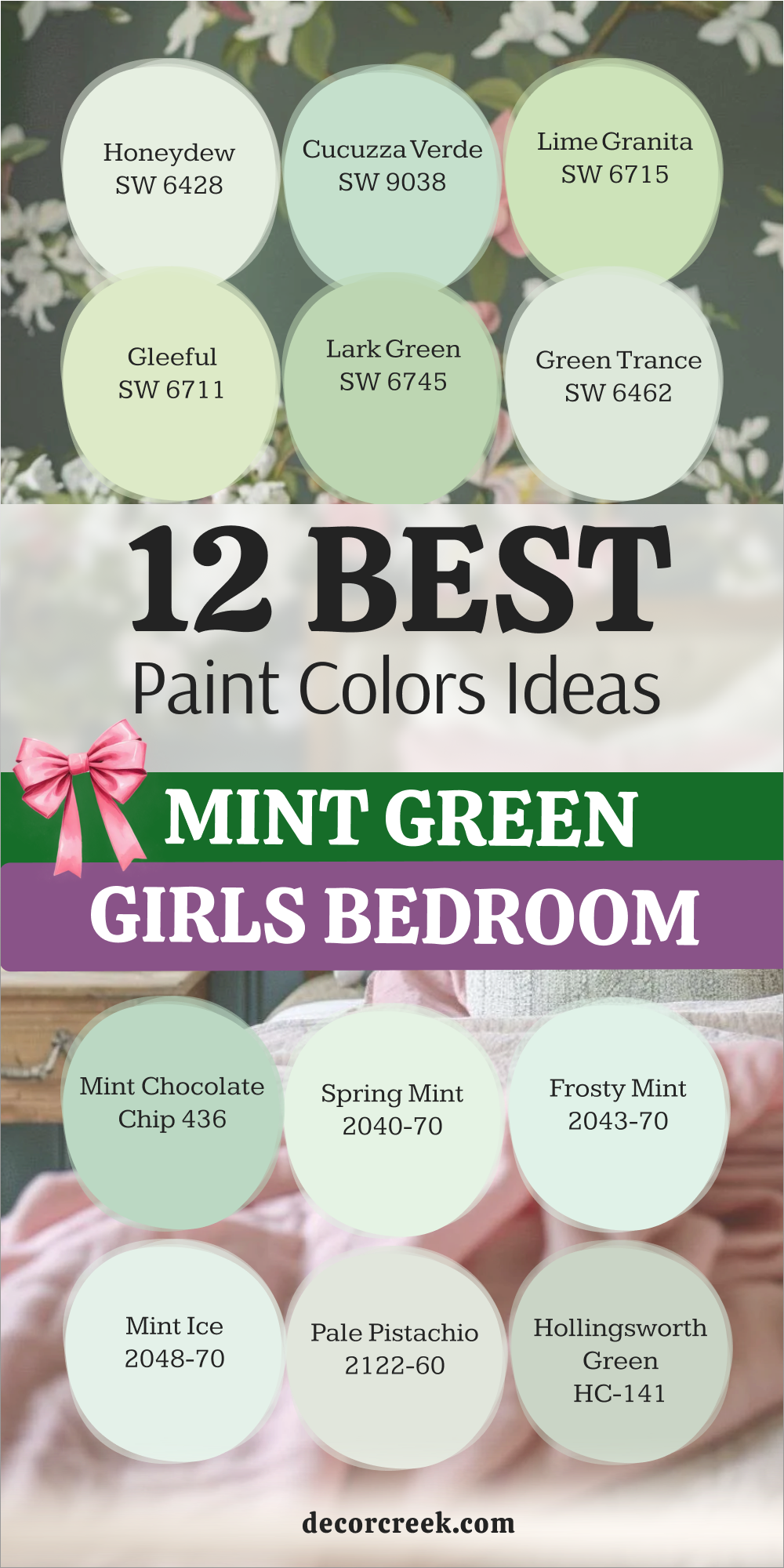
12 Mint Green Girls Bedroom Paint Color Ideas
Honeydew SW 6428
Honeydew SW 6428 is a very sweet and light green that looks just like the inside of the fruit.
It has a lot of yellow in it, which makes it feel very sunny and warm for a child’s room. I find that girls really love this color because it feels like a fairy tale or a magical garden. It is a very bright shade that makes the whole room feel like it is glowing with happiness.
I like to use this color with white furniture to keep the room looking very clean and organized. It is a very fun color that grows with the child as they get older. The shade is light enough that it doesn’t make the room feel small or cluttered. It looks beautiful with floral patterns or polka dot rugs on the floor. I think it is one of the most cheerful greens you can find for a young girl’s bedroom.
Best used in: toddler rooms, playrooms, girl’s bedrooms, and creative corners.
Pairs well with: Extra White SW 7006, bright yellow, and light-colored wood. The key rule of this color for a cheerful style is to use it with white furniture to keep the room feeling bright and open.
🎨 Check out the complete guide to this color right HERE 👈
Cucuzza Verde SW 9038
Cucuzza Verde SW 9038 is a very clear and crisp mint that feels very refreshing and cool.
It is a bit more sophisticated than a basic pastel, which makes it great for a girl who wants a “big kid” room. I like how it looks under both natural light and the soft glow of a nightlight. This color has a very smooth finish that makes the walls look perfectly painted.
It is a very energetic color that encourages a child to be creative and have fun. I find that it looks great with bright pink or purple accents in the bedding and toys. The color is very durable and holds up well against the typical wear and tear of a kid’s room. It provides a great background for hanging posters or displaying artwork from school. You will love how clean and tidy the room looks with this shade on the walls.
Best used in: school-aged girls’ rooms, study areas, bathrooms, and hobby rooms.
Pairs well with: Pure White SW 7005, hot pink, and silver accessories. The key rule of this color for a crisp style is to use it with modern furniture to create a look that feels fresh and new.
Lime Granita SW 6715
Lime Granita SW 6715 is a very bold and zingy mint that is full of life and excitement.
It leans a little bit more toward lime, which gives it a very tropical and punchy feeling. I love using this for an accent wall or for the inside of a built-in bookshelf. It is a very brave color choice that shows off a lot of personality and style.
I find that girls who love sports or being active really enjoy having this color in their space. It makes the room feel very bright even on a cloudy day when there is no sun. You can pair it with navy blue or black for a very modern and cool look. The color is very vivid and keeps the bedroom from ever feeling dull or boring. It is a great way to make a bedroom feel like a destination for fun and games.
Best used in: accent walls, teenage girl rooms, playrooms, and game areas.
Pairs well with: High Reflective White SW 7757, navy blue, and bold orange. The key rule of this color for a bold style is to use it on one wall to prevent the bright pigment from becoming too much for the eye.
🎨 Check out the complete guide to this color right HERE 👈
Gleeful SW 6709
Gleeful SW 6709is a very soft and happy green that feels like a spring day in a meadow.
It is a very light and airy shade that makes a bedroom feel very peaceful for sleeping. I find that it works very well for girls who want a room that feels like a sanctuary. The color has a very gentle look that pairs beautifully with soft fabrics and plush rugs.
It is a very classic mint that will not go out of style as the child gets older and changes her interests. I like to use this color with creamy whites and soft tan colors for a very natural look. It makes a room feel very wide and open, which is great for small floor plans. The color is very soothing and helps a child feel relaxed after a long day at school. It is a very dependable green that always looks good regardless of the furniture style.
Best used in: nurseries, peaceful bedrooms, reading nooks, and craft rooms.
Pairs well with: Alabaster SW 7008, soft lavender, and light-colored wicker. The key rule of this color for a happy style is to pair it with natural textures like wool and cotton for a cozy feeling.
Lark Green SW 6745
Lark Green SW 6745 is a medium-toned mint that feels very solid and grounded on the walls.
It has a bit more depth than the lighter shades, which gives the room a very high-quality look. I love how it creates a strong background for white furniture and colorful wall art. This is a great choice for a girl who wants her room to feel a bit more mature and stylish.
The color is very rich and doesn’t fade into the background like some very light pastels do. I find that it looks especially good with gold or brass picture frames on the wall. It is a very confident shade of green that makes the bedroom feel very special and unique. The paint has a very clean finish that makes the architecture of the room stand out. You will appreciate how it makes the bedroom feel like a very intentional and designed space.
Best used in: bedrooms for older girls, homework stations, closets, and accent walls.
Pairs well with: Snowbound SW 7004, gold accents, and dark wood floors. The key rule of this color for a grounded style is to use it with dark flooring to help the medium green tone feel balanced and rich.
🎨 Check out the complete guide to this color right HERE 👈
Green Trance SW 6462
Green Trance SW 6462 is a very soft and very misty mint that feels very quiet and very gentle for a girl.
It has a bit of a gray undertone which makes it look very sophisticated and very grown-up for a young person. I like how it makes a bedroom feel very calm and very easy to breathe in when you are relaxing. This color is a very good choice for a girl who likes to read or who likes to do quiet crafts.
The shade is very light and helps to make a small room feel like it has much more space and much more light. I find that it looks very pretty with white bedding and with silver lamps that have a very simple and clean design. This combination is very classic and will stay looking good for many years as the child grows up and changes.
The walls will look very soft and very smooth which helps to create a very high-end and designer feeling in the room. You will love the very peaceful and very quiet energy that this specific green gives to your home every single day.
Best used in: nurseries, quiet bedrooms, reading areas, and small guest rooms.
Pairs well with: Pure White SW 7005, soft gray, and light oak furniture. The key rule of this color for a quiet style is to use it on all four walls to create a very seamless and soft look.
🎨 Check out the complete guide to this color right HERE 👈

Mint Chocolate Chip 436
Mint Chocolate Chip 436 is a very fun and very playful green that reminds me of a sweet treat.
It is a very clear and very bright shade that brings a lot of personality to a girl’s bedroom and her play area. I find that children really enjoy this color because it feels very energetic and very much like a big party. It is a very happy green that works perfectly with colorful rugs and with many different kinds of colorful toys.
The color is strong enough to be used on all walls if you have a lot of natural light coming in the windows. I like to pair it with dark brown furniture to create a look that really matches its sweet and fun name. It is a very durable and a very reliable color that stays looking fresh and looking new for a long time.
This shade is a great way to make a bedroom feel like a very exciting and a very special place for a child. You will enjoy the very bright and very cheerful look that it brings to the walls of your daughter’s bedroom.
Best used in: kids’ bedrooms, playrooms, accent walls, and furniture pieces.
Pairs well with: Cloud White OC-130, chocolate brown, and bright pink accents. The key rule of this color for a playful style is to use it with brown accents to highlight its sweet and fun character.
Spring Mint 2040-70
Spring Mint 2040-70 is a very light and very glowing green that feels like the very first day of the season.
It has a very youthful and a very fresh energy that makes any girl’s bedroom feel more alive and more happy. I find that this color is perfect for a small room that needs to feel much bigger and much brighter for the child. It is a very clean shade that works perfectly with white furniture and with bright silver lamps and frames.
The color is very cheerful and makes the morning sun feel even more special when it hits the walls in the bedroom. I like to use this for parents who want a bedroom that feels very optimistic and very full of life for their child. It is a very light color but it still has enough green to make a very clear statement in the room.
This shade is very popular for nurseries and for young children’s rooms because it is so bright and so very positive. You will enjoy how it makes your child’s room feel very welcoming and very refreshed every single morning of the week.
Best used in: nurseries, small guest rooms, laundry rooms, and sunny corners.
Pairs well with: White Dove OC-17, lavender, and light-colored wicker. The key rule of this color for a spring style is to use it with white accents to keep the room feeling light.
Frosty Mint 2043-70
Frosty Mint 2043-70 has a very cool and a very icy feeling that is perfect for a girl who likes modern style.
It is a very crisp color that reminds me of a winter morning or a fresh piece of ice on a very hot day. I find that it makes a bedroom feel very clean and very well-organized as soon as the paint is dry on the walls. This color has a strong blue undertone that makes it feel very refreshing and very cool for a sleeping area.
It looks very good with silver hardware and with glass furniture pieces that reflect the cool tones of the green wall. I like to use this color for girls who want a room that feels very high-end and very professional and very sleek. The color is bright enough to be cheerful but cool enough to help a child feel very relaxed at night.
It is a very popular choice for people who like a very clean and a very minimalist look for their children’s rooms. You will love how it makes the white bedding look even brighter and even cleaner than it did before you painted.
Best used in: modern bedrooms, guest suites, home gyms, and bright kitchens.
Pairs well with: Super White PM-1, navy blue, and silver metal accents. The key rule of this color for a cool style is to pair it with blue accents to highlight its icy character.
Barely Teal 2048-70
Barely Teal 2048-70 is a very light and very refreshing green that feels like a cool glass of water.
It is a very airy shade that helps a bedroom feel very open and very easy to breathe in for a young person. I find that it is a very good choice for a room that gets a lot of natural light because it glows. This color has a very crisp and very modern feel that works well with simple furniture and with clean white rugs.
It is a very happy color that makes the whole room feel very cheerful and very positive for a girl’s daily activities. I like to use this in guest rooms and in nurseries because it makes people feel very relaxed as soon as they walk in. The color is very light but it still has a clear and very pretty identity that you can see.
It is a very popular choice for people who want a clean look that is more interesting than just plain white paint. You will love how it makes your child’s bedroom feel very updated and very full of soft and beautiful light.
Best used in: guest bedrooms, nurseries, kitchens, and bright bathrooms.
Pairs well with: Simply White OC-117, light blue, and silver hardware. The key rule of this color for an airy style is to use it with white furniture to maximize the space
Pale Pistachio 2122-60
Pale Pistachio 2122-60 is a very soft and very dusty green that has a lot of gray hidden inside of it. It is one of the most neutral greens I ever use because it is so quiet and so gentle for a bedroom. I find that it is the perfect choice for a girl’s room where you want a very calm and very sophisticated look. It does not demand any attention and lets the beautiful bedding and the colorful toys be the main stars.
The color changes slightly throughout the day and can look like a soft gray in the evening light before bedtime. I like how it creates a very high-end atmosphere without being boring or flat at all for a young child. It works very well with silver hardware and with light-colored wood floors like maple or like ash or like pine.
This is a very safe color for parents who are worried about their child’s room looking too green or looking too bright. It feels very professional and works perfectly in a modern or in a traditional home for many years to come.
Best used in: master bedrooms, nurseries, large open rooms, and bathrooms.
Pairs well with: Pure White SW 7005, soft gray, and light gray textiles. The key rule of this color for a quiet style is to use it on all walls to create a soft and seamless background.
Hollingsworth Green HC-141
Hollingsworth Green HC-141 is a very classic and very elegant mint that belongs to a very famous collection. It has a bit of blue and a bit of gray which makes it feel very rich and very timeless for a bedroom. I love how this color makes a room feel like it belongs in a very beautiful and very large mansion in the city. It is a very good choice for a girl who wants her room to feel very special and very well-designed.
The color is very balanced and does not feel too bright or too dark for a room where you sleep and study. I find that it looks beautiful with gold accents and with antique wood furniture that has a lot of history and soul. This combination is very sophisticated and makes your daughter’s bedroom feel like a very professional and very pretty place.
The walls will look very smooth and very clear which helps to create a very high-end and very designer feeling in the room. You will love the very stable and very quiet energy that this specific and famous green gives to your beautiful home.
Best used in: master bedrooms, girl’s rooms, formal living rooms, and guest suites.
Pairs well with: White Dove OC-17, gold accents, and dark wood furniture. The key rule of this color for an elegant style is to use it with traditional furniture to highlight its classic character.
🎨 Check out the complete guide to this color right HERE 👈

My Final Thoughts about 35 Mint Green Bedroom Paint Color Ideas
Mint green is a wonderful color because it bridges the gap between being fun and being practical for a home. This specific shade of green has a special way of making a bedroom feel youthful while still looking very professional and well-planned.
Whether you want a room that feels like a tropical vacation or a quiet place to read, there is a mint for you.I have found that the right choice can turn a dark and gloomy corner into a favorite spot for the whole family to enjoy.
I have seen these colors change the way people feel about their homes by making things feel cleaner and brighter.The color works as a backdrop that highlights your favorite furniture pieces and makes your artwork look even more impressive.
Do not be afraid to try a few samples on your wall to see how the light changes them throughout the day.You might notice that a shade looks like a soft sky blue in the morning and a rich grassy green as the sun begins to set.
Your bedroom is your most personal place so it should be a color that makes you feel happy every time you see it.It is the first thing you see when you open your eyes and the last thing you see before you go to sleep at night.These 35 options are the best of the best and I know one of them will be perfect for your next project.