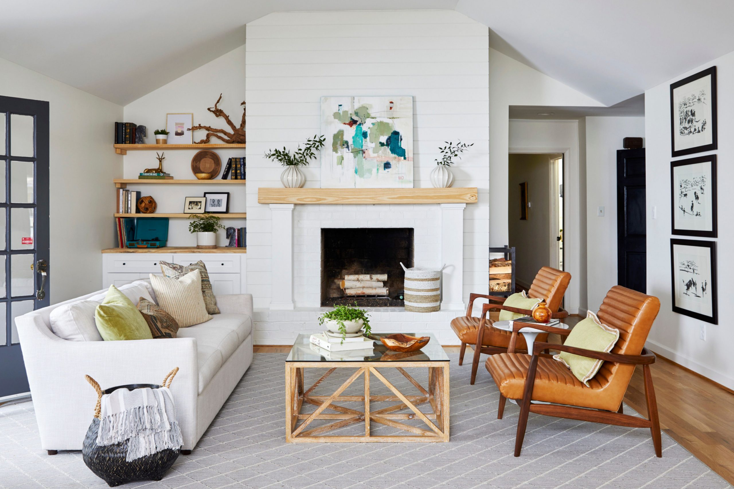
If someone asks me what color I use most often in living rooms, I always say white. It’s simple, but it does so much. It makes small rooms feel bigger. It makes old rooms feel fresh. And it always looks right with every style—cozy, modern, traditional, anything.
I’ve used white in so many homes, and honestly, it’s never let me down.
Why White Is Always a Favorite for Living Rooms
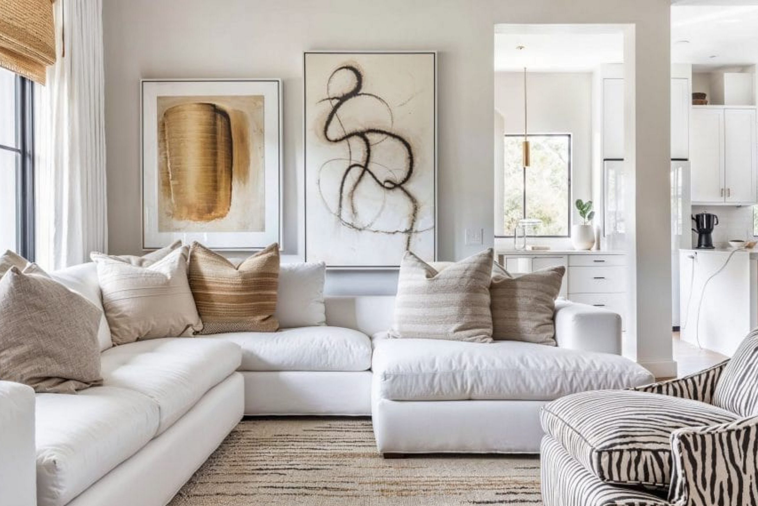
White gives your room a clean start. It helps the furniture and textures shine. If you have big windows, it bounces light around and makes the whole room feel open. If you don’t have much light, the right white can still lift the mood. White works with any other color—soft blues, deep browns, even bold black.
According to a 2023 Houzz survey, nearly half of homeowners choose white for their living room walls because it’s so flexible and peaceful.
How to Choose the Right White Paint for Your Living Room
White might seem easy, but picking the right white takes a little care. Some whites are warm—they have yellow or beige underneath. Others are cool, with hints of gray or blue. Your lighting makes a big difference. If your room faces north, I usually go with a warmer white. South-facing rooms can handle cooler ones.
My recommendation: Always test a few samples right on the wall and check how they look in the morning and at night.
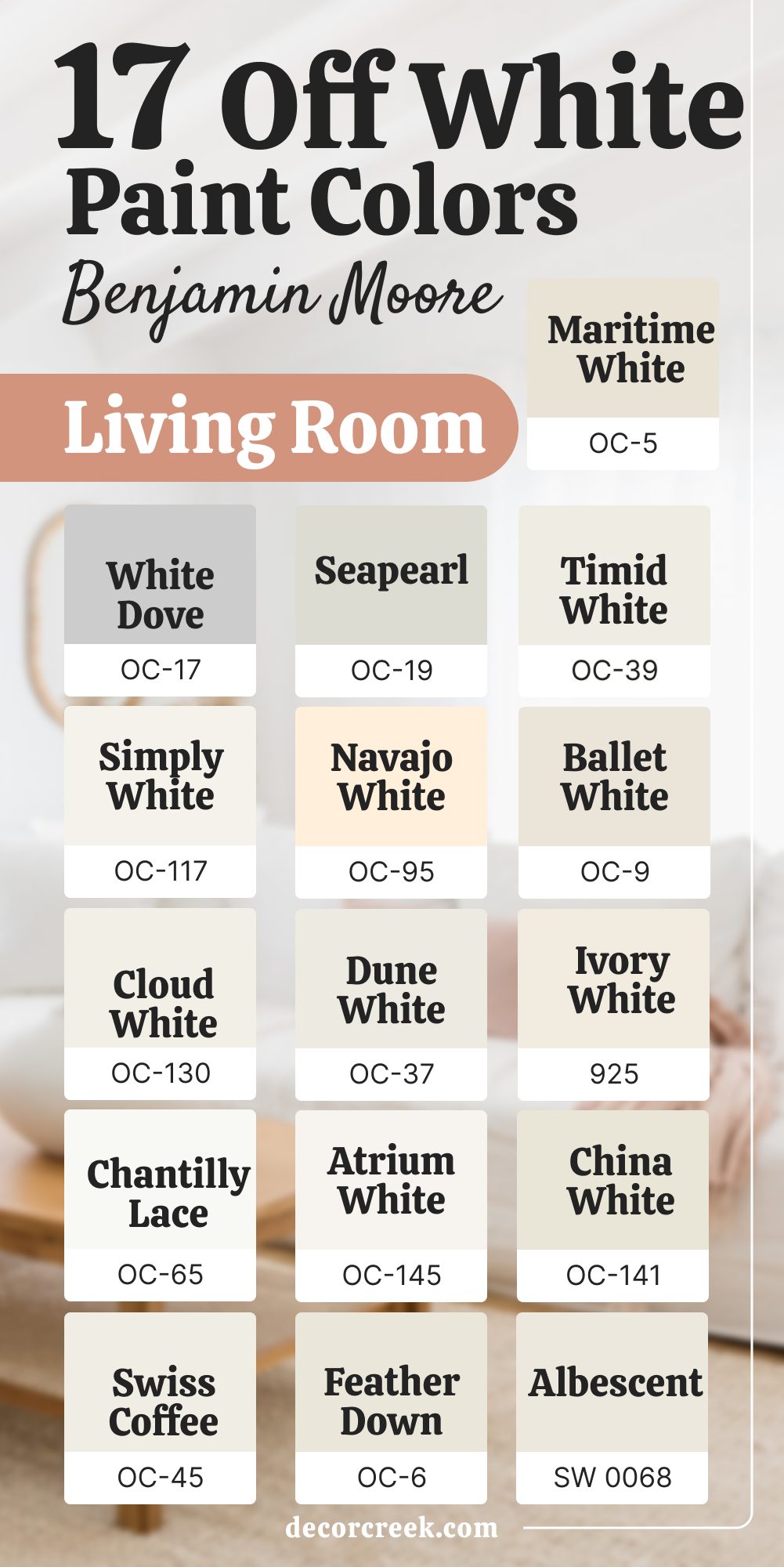
17 Off-White Paint Colors for Living Room by Benjamin Moore
White Dove OC-17
White Dove is one of my most-used whites. It has a warm, creamy feel without looking yellow. I love it for traditional homes and modern ones too. It works with wood, metal, or soft fabrics. It’s not stark, just soft and natural.
My Rule: I reach for White Dove when I want a white that never feels cold—it’s my safe bet for almost any living room.
👉See the full guide to this color HERE👈

Simply White OC-117
Simply White is bright and happy, but not too sharp. It has just a tiny bit of warmth that keeps it from feeling cold. I use it when I want a fresh look that still feels soft. It looks amazing in rooms with good daylight. If you like clean lines and simplicity, this works.
My Rule: I choose Simply White for rooms where I need both brightness and a soft background—it never fights the decor.
👉See the full guide to this color HERE👈

Cloud White OC-130
Cloud White feels gentle, like an early morning. It’s great for older homes with lots of trim. It doesn’t fight for attention—it supports everything else in the room. I’ve used it in both city apartments and country houses. It’s steady and calm.
My Rule: I go with Cloud White when I want a classic look that still feels warm and lived-in.
👉See the full guide to this color HERE👈

Chantilly Lace OC-65
Chantilly Lace is a bright, true white with no weird undertones. When I want something super clean, this is my go-to. It looks great with modern furniture or bold artwork. If you have a lot of natural light, it sparkles. In low light, it still feels crisp.
My Rule: I use Chantilly Lace when I want the white to feel sharp and modern—it gives structure to the whole room.
👉See the full guide to this color HERE👈

Swiss Coffee OC-45
Swiss Coffee is soft, cozy, and easy on the eyes. It has a creamy tone that makes a room feel welcoming. I love it with beige sofas and linen curtains. It’s great in homes where people gather often. It’s not a trendy white—it’s a classic.
My Rule: I bring out Swiss Coffee when I want a warm white that makes people feel at home the minute they walk in.
👉See the full guide to this color HERE👈

Seapearl OC-19
Seapearl is a warm off-white with a hint of gray. It looks great with stone, wood, and cozy textures. I like using it when I want something soft but not too yellow. It gives depth without feeling heavy. I used it once in a beach house—it was perfect.
My Rule: Seapearl is what I use when I want the room to feel soft but grounded, especially with natural textures.
👉See the full guide to this color HERE👈

Navajo White OC-95
Navajo White is a rich, creamy white that reminds me of old-fashioned comfort. It’s been around for years, and for good reason. It looks great with natural light and soft fabrics. It’s warmer than most, which makes it cozy. I’ve used it in homes with antique pieces—it fits beautifully.
My Rule: When I want that “candlelight in the daytime” warmth, Navajo White is always on my list.
👉See the full guide to this color HERE👈
Dune White OC-37
Dune White has a little bit of gray in it. I like it in modern homes where you don’t want something too bright. It adds a cool touch without going cold. I’ve used it in rooms with marble and black metal. It feels clean, but not flat.
My Rule: Dune White is my pick when I want the walls to stay in the background but still feel interesting.
Atrium White OC-145
Atrium White has the tiniest touch of pink. That makes it feel warm, but not beige. It’s nice for north-facing rooms where you want to warm things up. I like it with brass, warm wood, and pale pinks. It has a softness that feels special.
My Rule: I go for Atrium White when I want the room to glow gently without adding too much color.
Feather Down OC-6
Feather Down is quiet and gentle. It has both warmth and a little shadow in it. I use it in rooms where people want comfort and calm. It doesn’t scream “white,” but it still feels bright. I’ve paired it with soft blue rugs and oatmeal-colored sofas.
My Rule: Feather Down is what I use when I want the white to feel like part of the room, not just the background.
Maritime White OC-5
Maritime White is an off-white with a hint of taupe. It works well in coastal homes or places with a relaxed style. I used it once in a living room full of wicker and soft blues—it was lovely. It’s one of those in-between colors that just works.
My Rule: I use Maritime White when I want something that brings warmth and blends effortlessly with sandy tones.
Timid White OC-39
Timid White is soft, creamy, and a little shy—just like the name. It’s perfect for rooms where you don’t want a bold look. I use it when I want the walls to blend in, not stand out. It pairs beautifully with warm wood floors. It makes the whole room feel gentle.
My Rule: I choose Timid White when I want the room to feel quiet, like a pause between bold choices.
Ballet White OC-9
Ballet White is part white, part greige. It has warmth, but also a touch of gray that balances it out. I love using it in older homes. It gives off a refined but homey feeling. It works with whites and darker tones too.
My Rule: Ballet White is my pick when I need a neutral that still feels like a hug.
👉See the full guide to this color HERE👈

Ivory White 925
Ivory White is creamy and soft, like a vintage postcard. It feels warm and a little romantic. I used it once in a living room with gold picture frames and soft velvets. It brought everything together. It’s not for bright, modern looks—but if you love charm, it’s wonderful.
My Rule: I go for Ivory White when I want warmth and nostalgia without going full beige.
👉See the full guide to this color HERE👈
China White OC-141
China White is balanced, not too warm or too cool. It works in almost any style of room. I love it because it looks different in every light—but always good. I’ve used it with green plants, dark woods, and it fits perfectly. It’s easy to live with.
My Rule: I trust China White when I want a solid, reliable base that doesn’t steal the show.
👉See the full guide to this color HERE👈

Albescent OC-40
Albescent is a soft off-white that feels gentle but not boring. It’s great in rooms that need a little more coziness. I like it with tan leather, cream rugs, and pale woods. It brings a feeling of warmth without turning beige. I’ve used it in many homes with success.
My Rule: Albescent is the one I reach for when I want a warm neutral that feels clean and cozy.
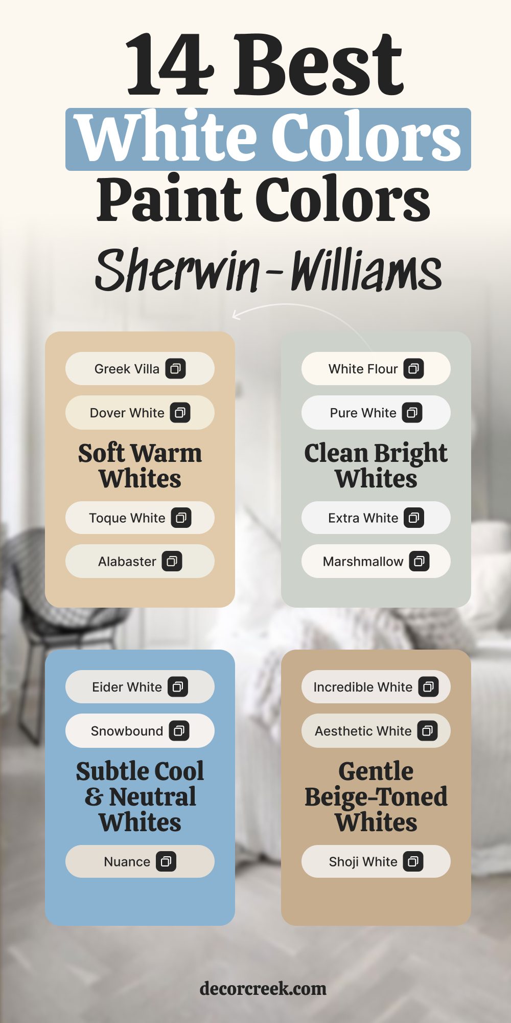
14 White Colors to Expand Your Small Living Room by Sherwin-Williams
Alabaster SW 7008
Alabaster is warm and soft without being too creamy. It always feels welcoming and calm. I use it when I want a room to feel open but not cold. It works beautifully in both small rooms and larger ones. It blends well with wood tones, stone, or light fabrics.
My Rule: I turn to Alabaster when I want a white that makes a small room feel bigger without losing comfort.
👉See the full guide to this color HERE👈

Pure White SW 7005
Pure White is clean and bright with just a touch of warmth. It looks sharp without feeling sterile. I like it in homes with modern furniture and black accents. It works great for trim and walls. It reflects light nicely in small rooms.
My Rule: Pure White is my go-to when I need everything to look fresh and clear—especially in tight living rooms.
👉See the full guide to this color HERE👈

Snowbound SW 7004
Snowbound has soft gray undertones. It feels gentle, airy, and peaceful. I’ve used it in many small rooms that needed brightening. It feels modern without being cold. It’s easy to match with most decor.
My Rule: I pick Snowbound when I want the room to breathe and still feel soft around the edges.
👉See the full guide to this color HERE👈

Extra White SW 7006
Extra White is Sherwin-Williams’ brightest white. It’s super crisp and very clean. I use it when I want contrast with darker furniture. It works well in rooms with lots of natural light. It’s also great for ceilings.
My Rule: Extra White is the one I grab when I want maximum brightness in a small room that needs light help.
👉See the full guide to this color HERE👈

Greek Villa SW 7551
Greek Villa is a soft, creamy white that leans warm. It brings coziness while still looking bright. I love using it with layered textures like linen and wood. It’s beautiful in rooms that need warmth without darkness. It looks rich without being heavy.
My Rule: Greek Villa is perfect when I want a small room to feel comfortable but still open and airy.
👉See the full guide to this color HERE👈

Shoji White SW 7042
Shoji White has subtle beige-gray undertones. It’s great when you want a little depth without going dark. I use it in homes where people love quiet tones. It plays nicely with natural light. It makes small living rooms feel soft and grounded.
My Rule: Shoji White helps me get a peaceful look that doesn’t feel too stark or too warm.
👉See the full guide to this color HERE👈

White Flour SW 7102
White Flour is bright and warm, and it always feels cheerful. It’s great in homes with warm flooring or beige furniture. I use it when I want a sunny, welcoming feeling. It reflects just enough light. It feels clean without being cold.
My Rule: I bring in White Flour when I want the room to feel happy and full without adding strong color.
👉See the full guide to this color HERE👈
Dover White SW 6385
Dover White is rich and creamy, and it adds character to any room. It’s warmer than most whites, but still clean. I use it in living rooms with traditional furniture and lots of fabrics. It gives a soft glow. It’s beautiful with gold or wood accents.
My Rule: Dover White is my choice when I want charm and coziness in a compact room.
👉See the full guide to this color HERE👈

Aesthetic White SW 7035
Aesthetic White is a cool-leaning off-white with gray hints. It’s subtle and quiet. I like it in modern or minimal rooms. It pairs well with soft blacks and taupes. It adds depth without stealing focus.
My Rule: Aesthetic White is what I use when I want the room to feel calm and collected, especially in small areas.
👉See the full guide to this color HERE👈

Eider White SW 7014
Eider White has a touch of purple-gray underneath. It’s light, but not flat. I use it when I want a modern and clean look. It works well with cool color palettes. It gives a little edge to a white room.
My Rule: I go with Eider White when I want a modern white that still feels gentle in smaller rooms.
👉See the full guide to this color HERE👈

Toque White SW 7003
Toque White is creamy and light with a subtle softness. It works well with warm-toned decor. I like using it in smaller living rooms where brighter whites might feel too harsh. It gives a quiet glow. It blends in without being boring.
My Rule: I pick Toque White when I want the walls to feel like part of the furniture—soft, smooth, and easy.
👉See the full guide to this color HERE👈
Marshmallow SW 7001
Marshmallow feels like a soft hug—warm, fluffy, and cozy. It’s not too yellow or too stark. I use it in family rooms where comfort is key. It works great in low light too. It’s flexible and friendly.
My Rule: Marshmallow is my choice when I want a soft, welcoming white that brings people in.
👉See the full guide to this color HERE👈
Incredible White SW 7028
Incredible White is a barely-there off-white with a gray tint. It looks pale and fresh without being too clean. I like using it when the room has cooler tones in decor. It works in modern and transitional homes. It’s peaceful and easy to work with.
My Rule: I use Incredible White when I want a soft wall color that doesn’t compete, just supports the whole look.
👉See the full guide to this color HERE👈

Nuance SW 7049
Nuance is light and smooth with a touch of beige. It’s warmer than gray but not yellow. I’ve used it in smaller rooms with darker furniture—it balances everything. It works well in both morning and evening light.
My Rule: I lean on Nuance when I need a background white that still brings a little warmth and richness.
👉See the full guide to this color HERE👈
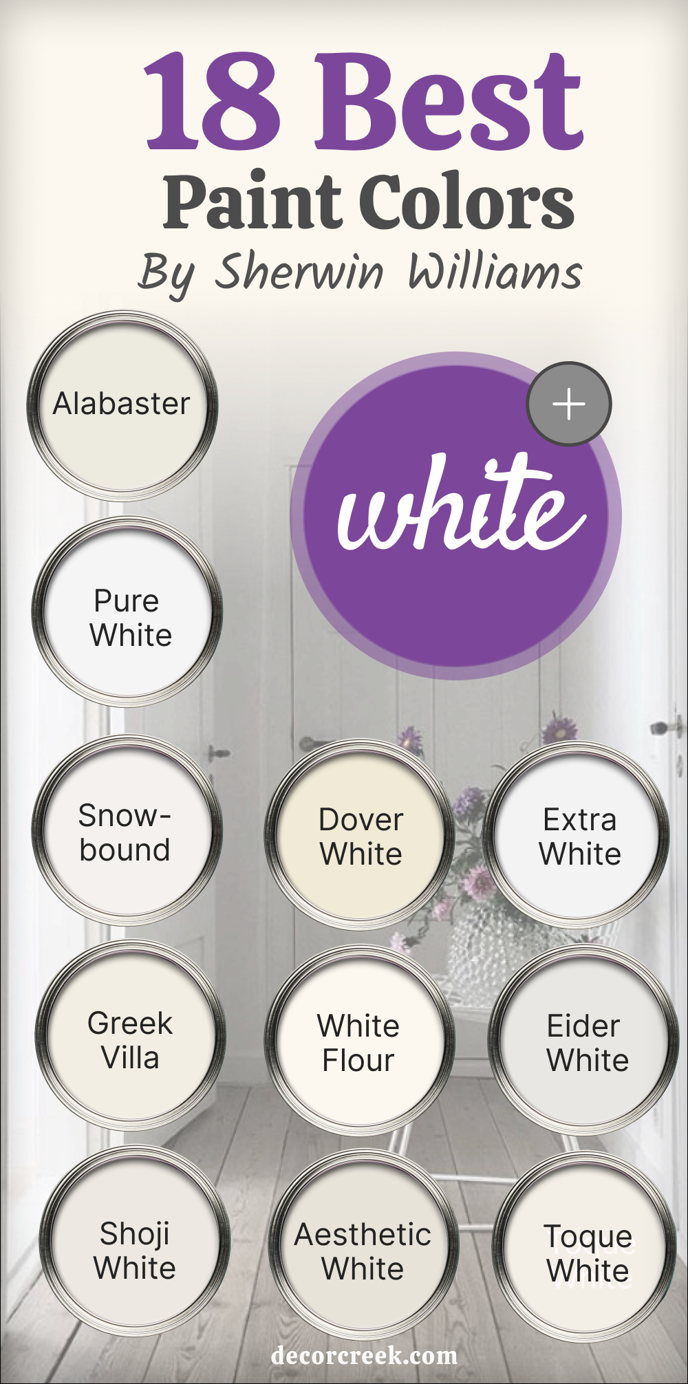
18 Best White Paint Colors from Sherwin-Williams This Year
Alabaster SW 7008
Alabaster is soft and creamy, and it always feels like a gentle touch. It’s warm without being yellow. I use it in all kinds of homes—from modern to farmhouse. It works great with soft textures and wood finishes. It brings calm to any room.
My Rule: I pick Alabaster when I want the room to feel easy, open, and comfortable all day long.
👉See the full guide to this color HERE👈
Pure White SW 7005
Pure White is crisp but not cold, and it’s always reliable. It has just a touch of warmth so it doesn’t feel sterile. I use it when I need something that plays well with both warm and cool accents. Great for trim and walls alike. It makes colors next to it pop.
My Rule: Pure White is my go-to for clean, smooth finishes where I want flexibility and brightness.
👉See the full guide to this color HERE👈
Snowbound SW 7004
Snowbound has soft gray undertones and feels gentle and airy. I’ve used it in rooms with light wood and soft blues. It reflects light in a cozy way. It’s not too sharp and never feels cold. It works in both classic and modern homes.
My Rule: I lean on Snowbound when I want a white that keeps the room light but adds a little softness.
👉See the full guide to this color HERE👈
Greek Villa SW 7551
Greek Villa is warm and welcoming, and perfect for lived-in rooms. It has a creamy base that feels homey. I use it where families gather—it’s great with cozy throws and worn leather. It also works with lots of wood tones.
My Rule: I choose Greek Villa when I want a white that feels both classic and warm, especially in everyday rooms.
👉See the full guide to this color HERE👈
Shoji White SW 7042
Shoji White has taupe-gray undertones that bring softness and subtle depth. I’ve used it with black, terracotta, and light woods. It gives quiet personality without going beige. It’s always calming and balanced.
My Rule: I use Shoji White when I want to connect white walls with warmer, grounded colors in the room.
👉See the full guide to this color HERE👈
Dover White SW 6385
Dover White is creamy and soft with loads of character. It works beautifully in homes with traditional charm. I like it with rich fabrics and older furniture. It glows warmly in afternoon light. It’s not cold, and it’s not flat.
My Rule: I bring out Dover White when I want the white to feel like part of the story, not just the background.
👉See the full guide to this color HERE👈
White Flour SW 7102
White Flour is bright with a buttery warmth, and it always feels cheery. It looks great with soft greens, dusty blues, and beige. I use it in homes with low natural light—it helps open the room. It never feels harsh.
My Rule: I use White Flour when I want to lift a room’s mood while keeping things soft and sunny.
👉See the full guide to this color HERE👈
Aesthetic White SW 7035
Aesthetic White is understated and soft, leaning slightly gray. It pairs well with soft black metals, warm woods, and neutral furniture. It doesn’t try to stand out—it just supports. It’s great in homes that need balance.
My Rule: I pick Aesthetic White when I want walls that feel quiet and cohesive but still pull everything together.
👉See the full guide to this color HERE👈
Extra White SW 7006
Extra White is the brightest white Sherwin-Williams offers. It’s sharp and clean, and I love it for ceilings or modern rooms. It reflects lots of light, especially in sunny rooms. It also adds strong contrast when used with dark trim or floors.
My Rule: I use Extra White when I need maximum light reflection or strong contrast—it’s crisp and modern.
👉See the full guide to this color HERE👈
Eider White SW 7014
Eider White is a pale, cool white with a touch of purple-gray. I use it in modern rooms where I want just a hint of tone. It looks subtle, but has enough pigment to feel interesting. It plays well with cool tones and soft grays.
My Rule: I bring in Eider White when I want the walls to have personality while still reading as a neutral.
👉See the full guide to this color HERE👈
Toque White SW 7003
Toque White is a creamy off-white with soft edges. It brings warmth without yellow. I like it in relaxed rooms with natural finishes. It helps everything feel tied together. It’s peaceful and soft.
My Rule: I use Toque White when I want to soften a bright room without going beige—it’s that in-between tone.
👉See the full guide to this color HERE👈
Marshmallow SW 7001
Marshmallow is light and cozy, and it truly fits its name. It pairs well with plush fabrics, soft lighting, and neutral tones. It doesn’t dominate the room—it melts into the background. I love it in family rooms.
My Rule: I choose Marshmallow when I want a color that wraps the room in a soft, welcoming glow.
👉See the full guide to this color HERE👈
Incredible White SW 7028
Incredible White is barely-there with a touch of gray. It works well with cool-toned décor and soft palettes. It feels calming without being flat. It blends in but still makes the room feel finished.
My Rule: I reach for Incredible White when I want the walls to disappear gently into the rest of the room.
👉See the full guide to this color HERE👈
Nuance SW 7049
Nuance is a soft white with just enough warmth to feel grounded. It never steals attention, but it brings everything together. I use it in homes where people want a soft look that doesn’t change too much in the light. It’s dependable and subtle.
My Rule: I go with Nuance when I need a white that brings a gentle backdrop to everyday living.
👉See the full guide to this color HERE👈
Westhighland White SW 7566
Westhighland White is warm, traditional, and familiar. It fits beautifully with rustic textures or antique furniture. I love it for classic rooms that need soft definition. It keeps things light but cozy.
My Rule: I bring in Westhighland White when I want the room to feel warm, classic, and settled.
👉See the full guide to this color HERE👈

Whitetail SW 7103
Whitetail is bright but soft, and brings a cheerful mood to the room. It works well with warm woods, golden lighting, and cozy corners. It doesn’t feel too crisp or too dull—it’s in the middle.
My Rule: I reach for Whitetail when I want a white that makes the room feel lively but still soft.
👉See the full guide to this color HERE👈

Moderne White SW 6168
Moderne White is sleek and smooth with a hint of beige-gray. It feels clean but also calm. I like it in homes with minimal furniture and strong lines. It brings a subtle polish.
My Rule: I choose Moderne White when I want a soft modern edge that still feels warm and elegant.
👉See the full guide to this color HERE👈
Ceiling Bright White SW 7007
Ceiling Bright White is clean and pure—it lifts ceilings and walls alike. I’ve used it not just overhead, but also on walls in bright modern rooms. It helps reflect light and feels crisp.
My Rule: I use Ceiling Bright White when I want light to move freely and walls to stay clear and bright.
👉See the full guide to this color HERE👈

A Few Words After All These Whites
White might seem like the easiest choice, but honestly, it’s one of the most powerful. I’ve used it in tiny apartments, big open living rooms, old houses with character, and brand-new builds—and every time, it brings something special.
It makes the room feel clean, fresh, and open. But it also leaves room for you—your colors, your furniture, your life.
Some whites feel cozy, some feel cool, and some just quietly support everything around them. That’s why I always say: white isn’t boring. It’s brave in its own way.
My Rule: Never pick white from the sample card alone. Put it on the wall, live with it a few days, and see how it feels in your light.
Because the right white doesn’t just match your sofa. It matches how you want to feel at home.
