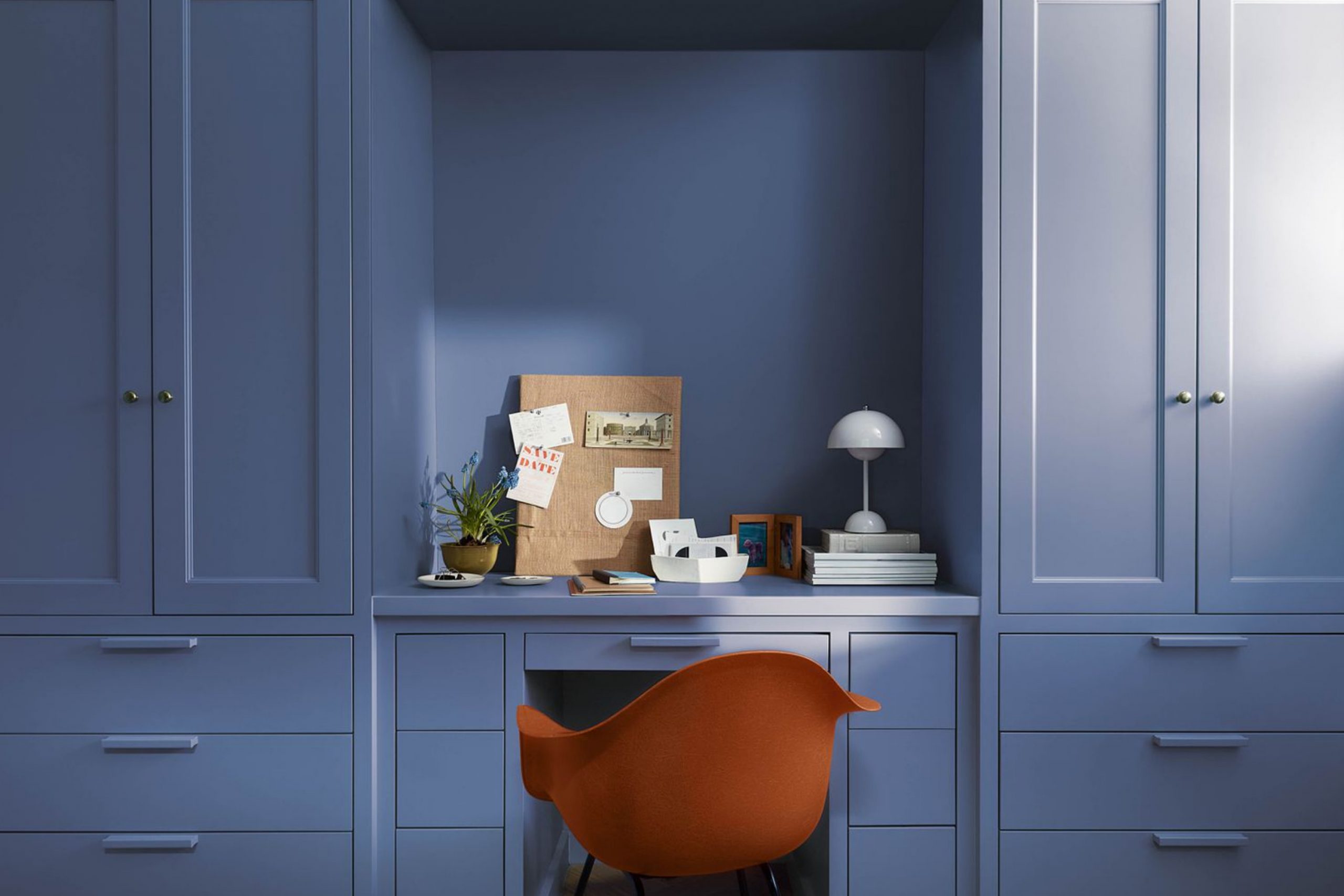
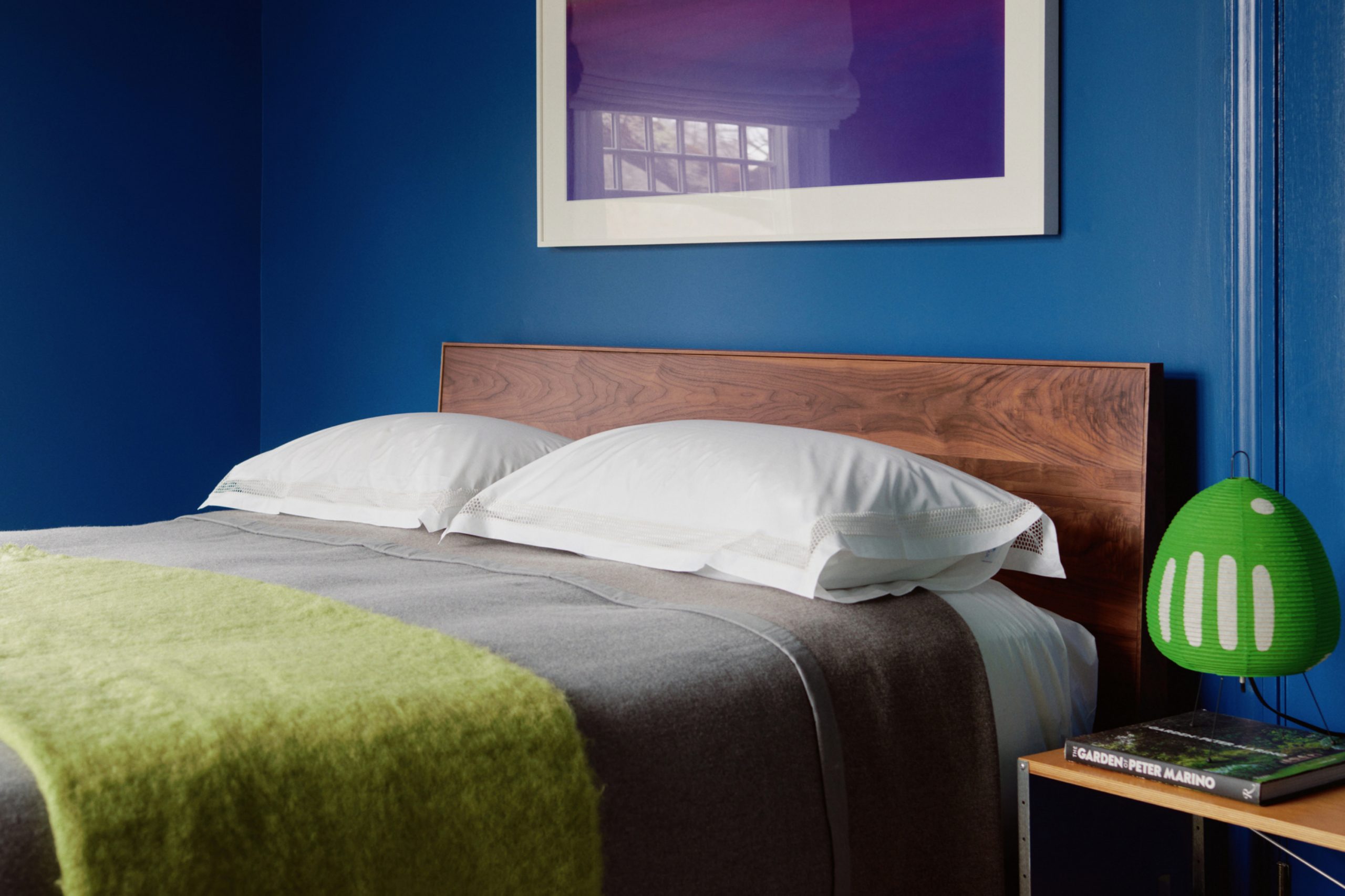
Blue has always been a color that makes me feel at home. It carries both strength and softness, which is why I often turn to it when I want a room to feel inviting yet stylish. With Benjamin Moore’s wide range of blue shades, I can create anything from a light and airy bedroom to a rich and dramatic dining room.
The beauty of blue is that it works in both modern homes and classic ones, pairing easily with neutrals, wood tones, or crisp whites.
I find it easy to guide people toward a blue that suits their lifestyle, because there truly is one for every mood.
Why I Believe Blue Paint Works So Well in a Home
Blue paint brings a special balance to any home. Light blues can open up a room and make it feel fresh, while deeper blues give a cozy, strong character. When paired with white or gray, blue feels clean and bright, but with beige or cream, it feels warm and grounded. I love how it can reflect different feelings depending on the time of day—soft and gentle in the morning, richer in the evening.
Blue also connects us to nature, reminding me of the sky and the sea, which makes it soothing to live with. That’s why I trust blue in so many settings, from kitchens to bedrooms to living rooms.
How I Choose the Right Blue Shade for Each Room
When I pick a blue paint for a room, I think about both light and purpose. A bedroom calls for softer shades that feel restful, while a dining room or office can carry a bolder navy without feeling too heavy. I also look at the furniture and floors—lighter woods love soft blues, while darker finishes can handle stronger tones. If the room doesn’t get much daylight, I might use a lighter blue to brighten it up
. When the sun pours in, a rich shade looks amazing and doesn’t feel too strong. By matching the mood of the room with the right shade, the home feels balanced and thoughtful.
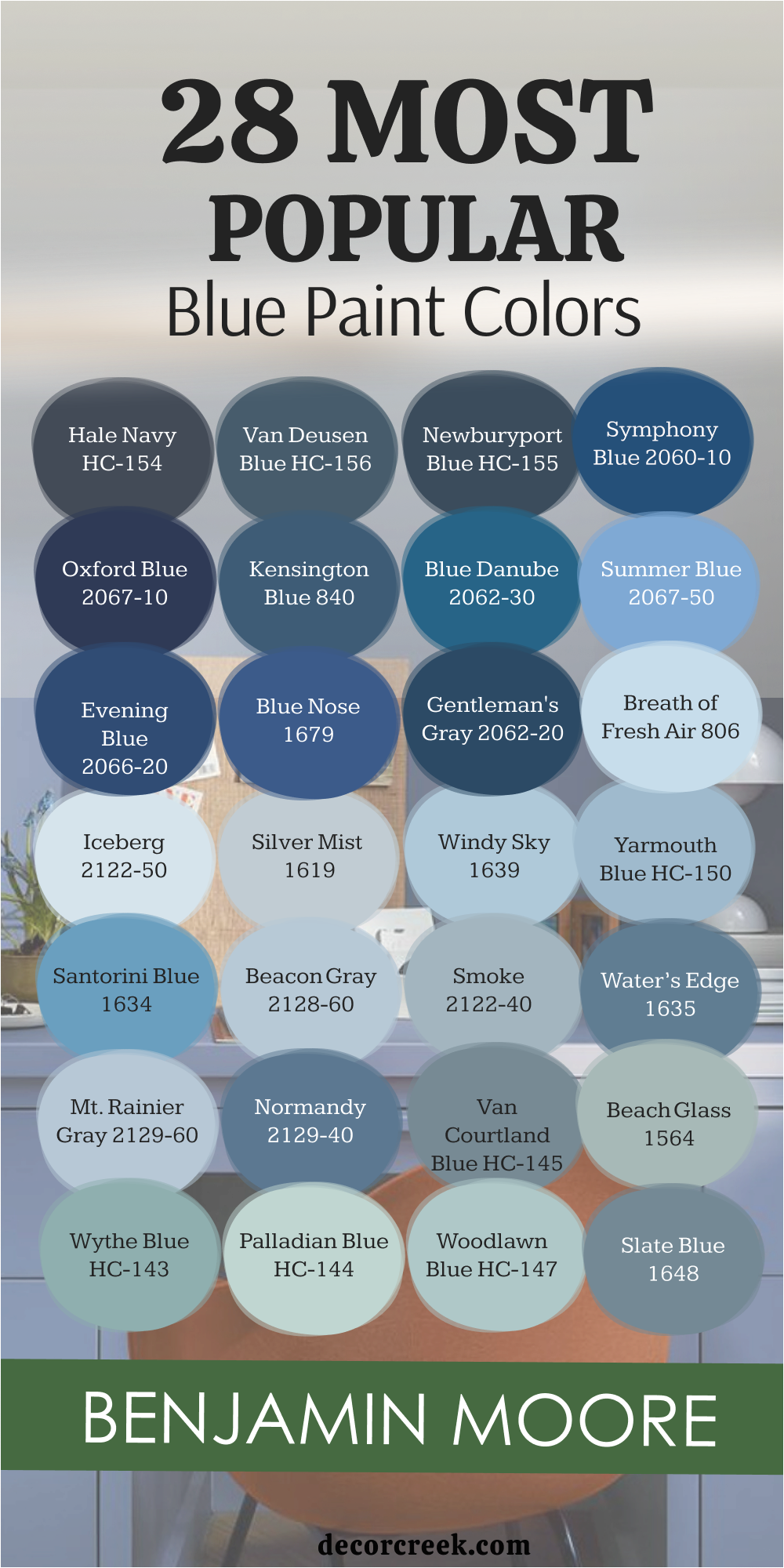
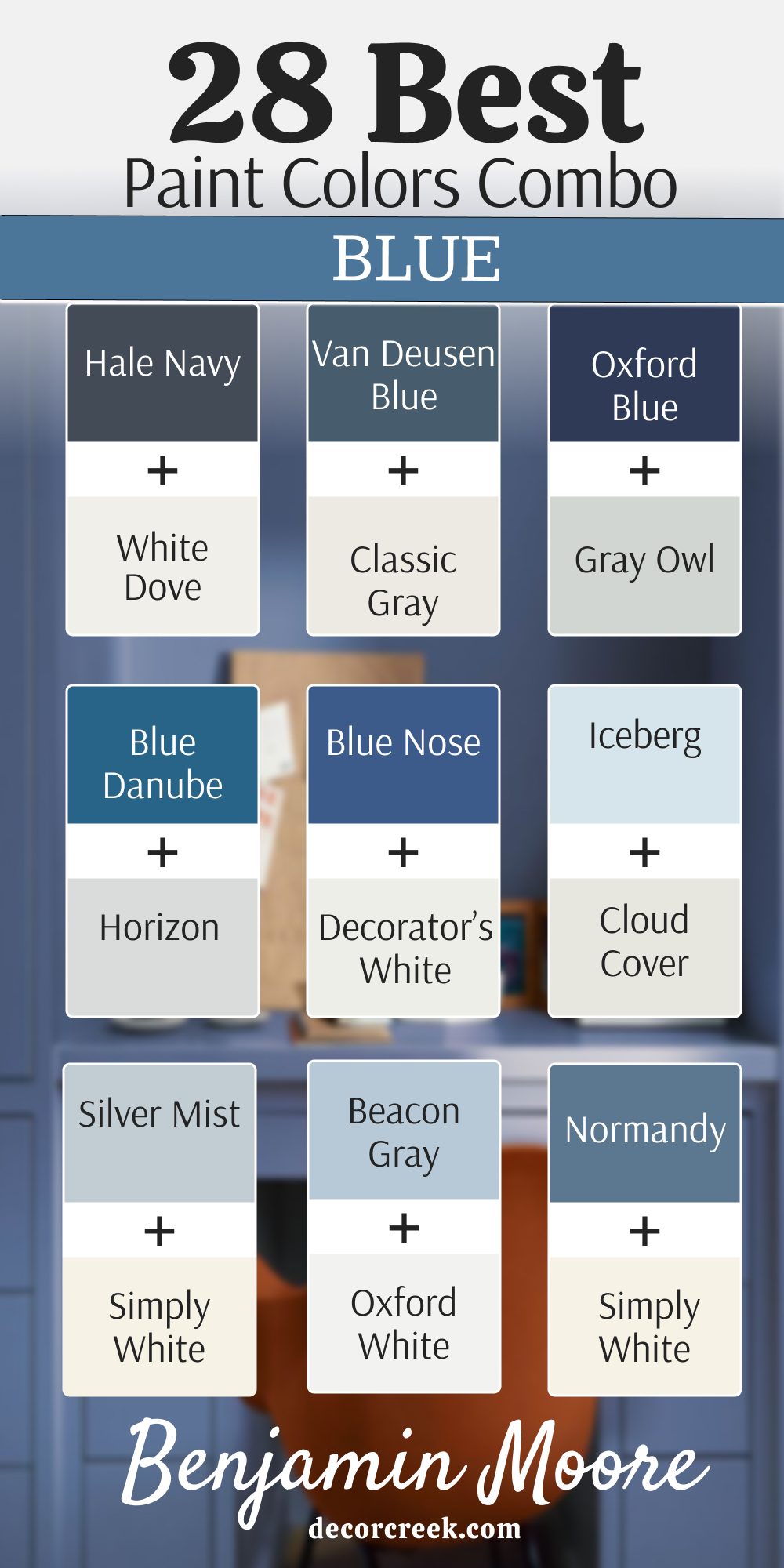
28 Best Benjamin Moore Blue Paint Color Combinations
Hale Navy HC-154 + White Dove OC-17
Hale Navy feels classic and bold, grounding a room with its deep strength. White Dove softens the pairing with a gentle creaminess that never looks stark. Together they create a balance that works beautifully in kitchens with shaker cabinets or living rooms with crisp trim. I’ve used this duo often when I want a polished, timeless feel without being cold.
Hale Navy gives confidence while White Dove keeps everything inviting.

The key rule of this color for bedroom is that it makes the space feel stylish yet comfortable, perfect for both restful nights and bright mornings.

Van Deusen Blue HC-156 + Classic Gray OC-23
Van Deusen Blue carries a richness that feels both strong and inviting.It adds depth to walls without making a room feel heavy, creating balance between boldness and comfort. I love how it pairs with crisp whites, giving a sharp and classic contrast. In kitchens or dining rooms, it brings energy, while in bedrooms it feels steady and grounding.
This shade works beautifully in both traditional and modern homes, making it one of my most trusted blues.

Paired with Classic Gray, it softens into a look that’s elegant but never too sharp. I love using this pair for a study or dining room, where depth matters but light balance is still important.
Classic Gray keeps the mood airy, letting Van Deusen Blue shine without feeling heavy.

It’s a combination that feels steady, clean, and welcoming.
The key rule of this color for bedroom is that it creates a grounded yet cozy setting that adapts to both day and night moods.
Newburyport Blue HC-155 + Simply White OC-117
Newburyport Blue has a nautical charm that feels both traditional and fresh. Simply White adds brightness, giving the pairing a crisp energy. I’ve often used this mix for coastal-inspired spaces where I want that breezy, clean feeling. Newburyport Blue holds the weight, while Simply White keeps the room from feeling dark.
This duo looks wonderful in bedrooms and kitchens with white cabinets.

The key rule of this color for bedroom is that it brings a refreshing coastal calm that feels both classic and easy to live with.

Symphony Blue 2060-10 + Chantilly Lace OC-65
Symphony Blue feels dramatic and expressive, perfect when I want a color that makes a statement. Chantilly Lace brings in a bright, pure white that highlights Symphony’s depth beautifully. I enjoy using this pairing in living rooms or hallways where the blue can shine against simple trim.
Symphony Blue has a strong presence, but the clear white balance keeps it approachable. It’s bold without being too much.

The key rule of this color for bedroom is that it creates a rich backdrop that feels both stylish and livable.

Oxford Blue 2067-10 + Gray Owl OC-52
Oxford Blue feels powerful, a shade that anchors any room with a sense of confidence. Gray Owl steps in as a soft partner, adding a misty lightness that balances the boldness. Together they create a cool, fresh pairing that feels modern but still inviting. I like this mix for bedrooms or entryways where I want contrast without harshness. Oxford Blue commands attention while Gray Owl keeps the mood gentle.
The key rule of this color for bedroom is that it gives depth while allowing a softer side to shine.

Kensington Blue 840 + Cloud White OC-130
Kensington Blue feels regal and balanced, strong enough to stand out but not too dark. Cloud White pairs seamlessly, bringing a clean warmth that softens the contrast. This mix works beautifully in living rooms or stairways where I want something classic but not too formal. Kensington Blue carries presence, while Cloud White makes the pairing friendly and versatile. I often use this in homes where the owners want elegance without stiffness.
The key rule of this color for bedroom is that it creates a look that feels refined yet easy to relax in.

Blue Danube 2062-30 + Horizon OC-53
Blue Danube feels lively and expressive, a mid-tone blue that sparks energy. Horizon softens it with a calm, gray undertone that brings a light balance. I’ve used this combination in kids’ rooms or kitchens where brightness and cheer are welcome.
Blue Danube gives color without feeling too bold, while Horizon adds just enough softness. This duo is playful but still grown-up.
The key rule of this color for bedroom is that it creates a setting filled with joy and comfort, ideal for active family life.
Summer Blue 2067-50 + Cotton Balls OC-122
Summer Blue feels fresh and airy, reminding me of clear skies. Cotton Balls pairs perfectly, offering a creamy brightness that complements the cheerful tone. Together, they create a pairing that feels lighthearted and easy to live with. I’ve used this in bathrooms and bedrooms where brightness is key.
Summer Blue has charm without being loud, while Cotton Balls makes the combination soft and approachable.
The key rule of this color for bedroom is that it builds an uplifting, gentle mood where mornings feel light and inviting.
Evening Blue 2066-20 + Balboa Mist OC-27
Evening Blue feels rich and grounding, a shade that carries depth without being too dark. Balboa Mist softens it with a light, greige touch that warms the look. I love this mix for bedrooms and living rooms where I want sophistication but not coldness. Evening Blue gives the strength, while Balboa Mist adds warmth and balance. It feels both modern and classic, fitting easily into many styles.
The key rule of this color for bedroom is that it builds a comforting, stylish setting that feels easy to settle into.

Blue Nose 1678 + Decorator’s White OC-149
Blue Nose feels strong and vibrant, a shade with personality that stands out. Decorator’s White pairs beautifully, keeping the look sharp and clean. I like using this duo in bathrooms or offices where a fresh contrast works well. Blue Nose has a cheerful edge, while the white ensures it doesn’t overwhelm the room. It feels crisp and lively at the same time.
The key rule of this color for bedroom is that it sets an energetic but balanced tone, perfect for spaces that need life.

St. John Blue 2043-40 + Pale Oak OC-20
St. John Blue feels artistic and charming, with a touch of green that adds character. Pale Oak brings warmth and neutrality, grounding the playful tone of the blue. Together, they create a pairing that feels stylish yet soft. I love this mix in reading nooks or family rooms where personality matters. St. John Blue shines without being loud, thanks to Pale Oak’s quiet strength.
The key rule of this color for bedroom is that it creates a warm, expressive backdrop that still feels restful.

Patriot Blue 2064-20 + White Heron OC-57
Patriot Blue feels bold and noble, a shade that makes a confident statement. White Heron pairs with it beautifully, adding a clean brightness that keeps the look crisp. I’ve used this in dining rooms and offices where I want strength without heaviness. Patriot Blue stands tall, while White Heron keeps the energy lively. It’s a pairing that feels classic yet fresh.
The key rule of this color for bedroom is that it brings dignity and calm strength while remaining welcoming.
Bachelor Blue 1629 + Collingwood OC-28
Bachelor Blue feels smooth and stylish, a muted blue that blends well with many tones. Collingwood balances it with a warm, gray-beige softness. This combination works wonderfully in living rooms or bedrooms where comfort is key. Bachelor Blue never feels too strong, and Collingwood makes it even more livable. It’s one of those pairings that adapts to many homes.
The key rule of this color for bedroom is that it creates a balanced, easygoing feel that works for everyday living.

Delphinium 2063-40 + Linen White OC-146
Delphinium feels bright and cheerful, bringing a pop of energy to a room. Linen White softens it with a creamy, warm background that makes the pairing inviting. I like this mix for kitchens and bathrooms where light and freshness are welcome. Delphinium has personality, while Linen White keeps it approachable. Together they feel playful but grounded.
The key rule of this color for bedroom is that it creates a lively setting that still feels comfortable and warm.

Prussian Blue CW-625 + Sea Pearl OC-19
Prussian Blue feels historic and deep, a shade that holds weight and character. Sea Pearl balances it with a soft, gray-white tone that makes the pair timeless. I enjoy using this duo in formal dining rooms or classic living rooms where elegance matters. Prussian Blue gives the strength, while Sea Pearl ensures harmony. It feels rich but never too stiff.
The key rule of this color for bedroom is that it creates a classic backdrop that feels strong yet livable.

Slate Blue 1648 + White Dove OC-17
Slate Blue feels soft yet steady, a shade with a gentle richness. White Dove complements it with warmth and balance, creating an inviting look. I like using this pairing in bedrooms or bathrooms where a restful tone is needed. Slate Blue never feels too dark, and White Dove adds just enough brightness. It’s a simple but beautiful mix.
The key rule of this color for bedroom is that it creates a soothing and steady environment that supports relaxation.
Water’s Edge 1635 + Distant Gray OC-68
Water’s Edge feels artistic and layered, a mix of blue and gray that adds personality. Distant Gray pairs as a clean backdrop, letting Water’s Edge stand out. I’ve used this combination in kitchens and laundry rooms where freshness and charm are needed. Water’s Edge gives character without feeling too bold, while Distant Gray makes it crisp. It feels cheerful yet polished.

The key rule of this color for bedroom is that it creates a fresh, uplifting setting where mornings feel bright.
Labrador Blue 1670 + Snow White OC-118
Labrador Blue feels steady and grounded, a mid-tone shade that works in many rooms. Snow White adds brightness, keeping the mix crisp and easy to live with. I like using this duo in family rooms or kitchens where comfort is important. Labrador Blue feels friendly, while Snow White makes the pairing clean and fresh. It’s versatile but never boring.
The key rule of this color for bedroom is that it creates a friendly, balanced backdrop for daily life.
Gossamer Blue 2123-40 + Gray Cashmere 2138-60
Gossamer Blue feels airy and soft, a gentle shade with charm. Gray Cashmere balances it with a cool, muted tone that deepens the pairing. This mix is wonderful for bedrooms or offices where lightness is key. Gossamer Blue adds freshness, while Gray Cashmere grounds the look. Together they create an elegant softness.
The key rule of this color for bedroom is that it makes the space feel fresh, calm, and welcoming.

Bird’s Egg 2051-60 + Chantilly Lace OC-65
Bird’s Egg feels playful and light, a pastel blue that carries cheer. Chantilly Lace sharpens the look with its clean, bright white. I enjoy using this mix in bathrooms and nurseries where freshness matters. Bird’s Egg brings sweetness, while Chantilly Lace keeps it clear and crisp. It feels joyful but never too sweet.
The key rule of this color for bedroom is that it creates a bright, gentle environment that feels open and happy.
Covington Blue HC-138 + Cloud Cover OC-25
Covington Blue feels classic, a medium tone with steady charm. Cloud Cover pairs as a soft white with warmth, making the look approachable. This duo works well in kitchens, bedrooms, or offices where comfort is important. Covington Blue gives the color, while Cloud Cover ensures balance. It’s one of those pairings that always feels right.
The key rule of this color for bedroom is that it creates a comfortable, steady atmosphere that feels balanced and stylish.

Palest Pistachio 2122-60 + Beach Glass 1564
Palest Pistachio feels light and airy, almost a whisper of blue with a touch of green. Beach Glass complements it with a soft, muted tone that adds depth. Together, they create a pairing that feels fresh and unexpected. I love this mix in bathrooms or bedrooms where lightness is welcome. Palest Pistachio gives a gentle touch, while Beach Glass adds character.
The key rule of this color for bedroom is that it makes the space feel airy, light, and softly colored.

Breath of Fresh Air 806 + Simply White OC-117
Breath of Fresh Air feels delicate and uplifting, the kind of blue that makes a room feel happy. Simply White pairs perfectly, keeping the look bright and clear. I use this duo in bedrooms and kitchens where I want freshness without fuss. Breath of Fresh Air feels playful but still grown-up, while Simply White gives balance. It’s always a cheerful mix.
The key rule of this color for bedroom is that it creates a joyful, inviting setting that feels light and welcoming.
Wythe Blue HC-143 + White Dove OC-17
Wythe Blue feels vintage and charming, with soft green undertones that add character. White Dove balances it with warmth, making the look both stylish and livable. I enjoy this pairing in entryways and kitchens where a bit of personality makes the room shine. Wythe Blue carries nostalgia, while White Dove ensures balance. It feels unique but easy.

The key rule of this color for bedroom is that it creates a soft, stylish setting that feels both classic and warm.
Yarmouth Blue HC-150 + Soft Chamois OC-13
Yarmouth Blue feels cheerful and steady, a shade that brings comfort without being too strong. Soft Chamois warms the look, making it approachable and balanced. This mix works beautifully in bedrooms, living rooms, and even kitchens. Yarmouth Blue brings the energy, while Soft Chamois softens it. Together they feel grounded and friendly.
The key rule of this color for bedroom is that it creates a cheerful yet gentle look that fits many lifestyles.

Palladian Blue HC-144 + Horizon OC-53
Palladian Blue feels airy and charming, a soft shade with just the right mix of blue and green. Horizon pairs with it perfectly, adding a quiet gray tone that balances the brightness. I love this pairing in bedrooms or bathrooms where relaxation is key. Palladian Blue shines softly, while Horizon keeps it grounded. The mix feels classic but fresh.

The key rule of this color for bedroom is that it builds a soft, gentle environment that feels both stylish and comforting.
Woodlawn Blue HC-147 + Swiss Coffee OC-45
Woodlawn Blue feels friendly and light, carrying a cheerful softness. Swiss Coffee balances it with warmth, making the pairing inviting and homey. I’ve used this in family rooms and kitchens where a gentle mood is needed. Woodlawn Blue adds freshness, while Swiss Coffee gives comfort. It’s a pairing that feels relaxed but not plain.

The key rule of this color for bedroom is that it creates a soft, happy backdrop where life feels easy.

Harbor Fog 2062-70 + Iceberg 2122-50
Harbor Fog feels light and misty, a blue with a fresh, airy quality. Iceberg deepens the combination with a cooler, brighter edge that sharpens the look. Together, they create a soft but refreshing feel that’s great for bedrooms or bathrooms. Harbor Fog brings lightness, while Iceberg adds sparkle. The result is cheerful without being too bold.
The key rule of this color for bedroom is that it builds a crisp, fresh mood where mornings feel bright.
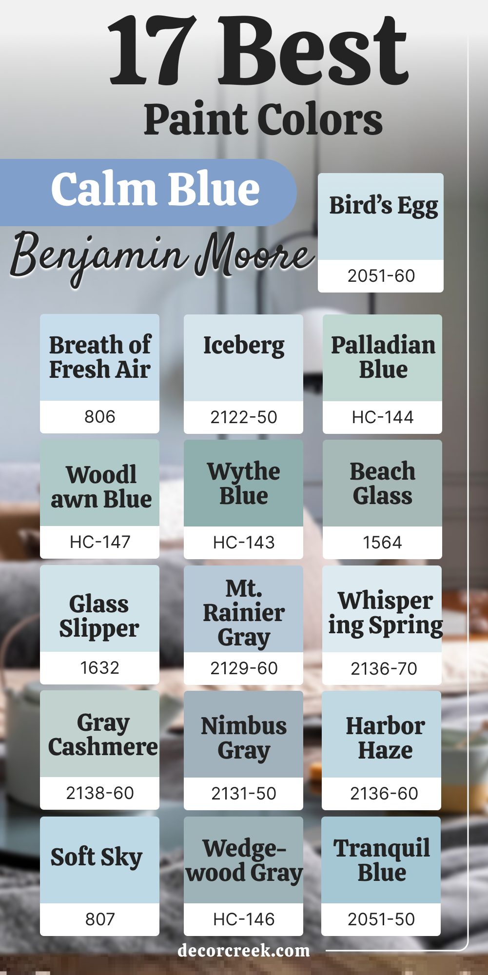
17 Calm Blue Paint Colors from Benjamin Moore
Breath of Fresh Air 806
Breath of Fresh Air feels like a gentle breeze, adding a soft cheer to any room. It’s light enough to act almost like a neutral, making it easy to live with. I’ve used it in bedrooms and nurseries where I want a peaceful, uplifting tone. This shade brightens naturally without being loud. It carries joy in a soft way, making daily life feel lighter.
The key rule of this color for bedroom is that it builds a fresh, happy environment perfect for rest and play.
Iceberg 2122-50
Iceberg feels cool and clear, with a brightness that adds energy to a room. It’s light enough to feel open but strong enough to carry its own character. I love it in kitchens and bathrooms where a crisp finish is important. Iceberg makes small rooms feel larger and cleaner. It always feels fresh, like a clear morning sky.
The key rule of this color for bedroom is that it creates a cool, uplifting setting that feels modern yet soft.
Harbor Fog 2062-70
Harbor Fog feels misty and gentle, a blue that reminds me of soft clouds. It has a calming effect that works well in bedrooms and hallways. This shade pairs easily with whites and soft grays, keeping the look light and balanced. Harbor Fog brings a sense of clarity to a room without being too bold. It works beautifully where quiet comfort is needed.
The key rule of this color for bedroom is that it creates a light, restful backdrop that feels welcoming.
Glass Slipper 1632
Glass Slipper feels airy and graceful, with just enough blue to give a room personality. I like using it in bathrooms or small bedrooms where light is limited. This shade brightens without being sharp, making it a favorite for cozy homes. Glass Slipper pairs well with whites and pale grays. It’s a color that feels easy to live with every day.
The key rule of this color for bedroom is that it brings a soft, gentle light that supports relaxation.
Palladian Blue HC-144
Palladian Blue feels soft and charming, blending blue and green with a touch of gray. It works beautifully in bedrooms, living rooms, and even kitchens. I love how it feels vintage yet modern, depending on how it’s styled. Palladian Blue always feels friendly and approachable. It creates balance while adding a gentle personality.
The key rule of this color for bedroom is that it builds a soft, restful look that feels welcoming.
🎨 Check out the complete guide to this color right HERE 👈
Woodlawn Blue HC-147
Woodlawn Blue feels cheerful and light, a shade that adds brightness to any home. It pairs beautifully with creams and soft whites, keeping the look warm. I often use it in kitchens and family rooms where comfort is important. Woodlawn Blue feels friendly and never too strong. It’s a color that makes rooms feel happy.
The key rule of this color for bedroom is that it creates a fresh, welcoming mood perfect for daily living.
🎨 Check out the complete guide to this color right HERE 👈
Wythe Blue HC-143
Wythe Blue feels vintage and charming, with just enough green to make it unique. It works beautifully in entryways, kitchens, and bedrooms where character is desired. I love how it feels both stylish and easy. Wythe Blue adds depth without being too dark. It’s a color that always feels warm and thoughtful.
The key rule of this color for bedroom is that it builds a character-rich, welcoming backdrop that feels personal.
🎨 Check out the complete guide to this color right HERE 👈
Beacon Gray 2128-60
Beacon Gray feels airy and soft, a blue-gray that looks polished without effort. I’ve used it in living rooms and bedrooms where calmness is needed. This shade pairs well with bright whites and wood tones. Beacon Gray keeps a room feeling fresh but never boring. It’s one of those colors that adapts well to different styles.
The key rule of this color for bedroom is that it creates a balanced, restful mood that feels timeless.
Tranquil Blue 2051-50
Tranquil Blue feels fresh and cheerful, a color that brings light energy to a room. It works well in kitchens, laundry rooms, or kids’ bedrooms where brightness is welcome. This shade never feels too strong, keeping the mood easy and relaxed. Tranquil Blue pairs beautifully with soft whites. It feels like a breath of lightness in daily living.
The key rule of this color for bedroom is that it creates a bright, happy setting that feels refreshing.
Gossamer Blue 2123-40
Gossamer Blue feels soft and graceful, with a lightness that makes a room feel bigger. I enjoy using it in bedrooms and hallways where brightness is needed. This shade pairs well with both whites and muted greens. Gossamer Blue has a natural charm that always feels right. It adds just enough color without taking over.
The key rule of this color for bedroom is that it builds a gentle, airy setting that feels welcoming.
Water’s Edge 1635
Water’s Edge feels layered and expressive, a blue with hints of gray that adds character. It works beautifully in kitchens, dining rooms, and bedrooms where charm is desired. This shade pairs well with both light and dark tones. Water’s Edge always adds personality without being too strong. It has a unique depth that makes rooms feel special.
The key rule of this color for bedroom is that it creates a stylish, expressive mood that feels personal.
🎨 Check out the complete guide to this color right HERE 👈
Ocean Air 2123-50
Ocean Air feels fresh and breezy, like a soft reminder of the sea. It works perfectly in bathrooms and bedrooms where lightness matters. This shade pairs easily with whites and sandy neutrals. Ocean Air feels uplifting but never sharp. It’s a color that carries peace into everyday life.
The key rule of this color for bedroom is that it creates a light, airy mood that feels comforting.
Blue Lace 1625
Blue Lace feels delicate and soft, with just enough color to bring life to a room. I like using it in nurseries or bedrooms where a gentle mood is wanted. This shade pairs well with bright whites, keeping the look fresh. Blue Lace feels joyful but never overwhelming. It’s a shade that adapts beautifully to many settings.
The key rule of this color for bedroom is that it builds a soft, bright mood where relaxation comes naturally.
Covington Blue HC-138
Covington Blue feels steady and graceful, a blue with classic character. I use it in dining rooms and bedrooms where charm and warmth matter. This shade pairs well with creams and muted grays. Covington Blue feels polished yet approachable. It’s a color that blends tradition with comfort.
The key rule of this color for bedroom is that it creates a classic, inviting mood that feels balanced.
Brittany Blue 1633
Brittany Blue feels cheerful and bright, a color that adds a happy touch to a room. I like using it in kitchens and kids’ rooms where energy is welcome. This shade pairs easily with whites and soft yellows. Brittany Blue feels friendly and warm. It never feels too bold but still carries presence.
The key rule of this color for bedroom is that it builds a cheerful, welcoming mood that feels lighthearted.
Bird’s Egg 2051-60
Bird’s Egg feels playful and delicate, a pastel blue that carries charm. I enjoy using it in bathrooms and bedrooms where freshness is important. This shade pairs well with bright whites, keeping the look crisp. Bird’s Egg has sweetness without being too soft. It always feels joyful and clear.
The key rule of this color for bedroom is that it creates a bright, cheerful mood that feels uplifting.
Yarmouth Blue HC-150
Yarmouth Blue feels balanced and friendly, a medium blue that suits many homes. I like using it in kitchens, bedrooms, and family rooms where comfort matters. This shade pairs well with soft creams and whites. Yarmouth Blue feels cheerful without being too bold. It has just the right mix of energy and softness.
The key rule of this color for bedroom is that it builds a balanced, friendly mood that works in many styles.
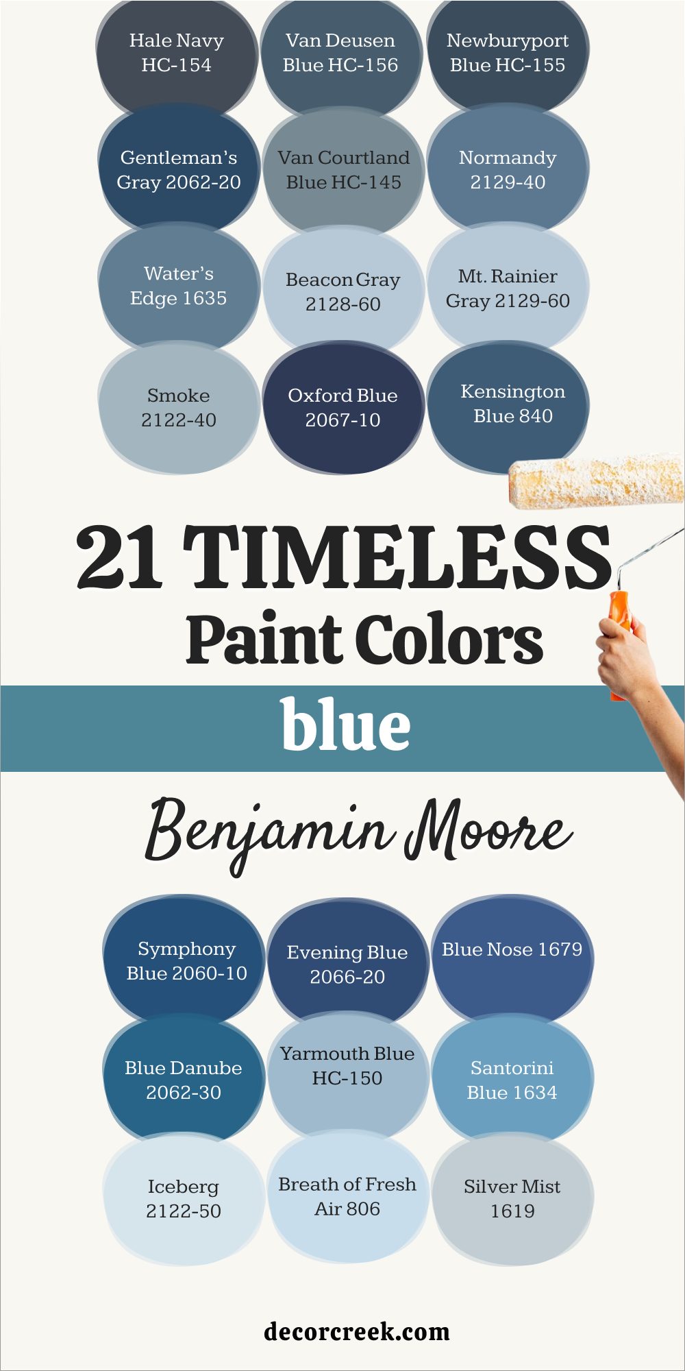
21 Benjamin Moore Blue Paint Colors That Always Work
Hale Navy HC-154
Hale Navy feels classic and bold, giving a room depth and character. It pairs beautifully with whites, creams, and even soft grays. I’ve used it in dining rooms and bedrooms where I want elegance without coldness. Hale Navy never fails to look polished. It feels rich but still welcoming.
The key rule of this color for bedroom is that it creates a confident, stylish mood that feels grounded.
🎨 Check out the complete guide to this color right HERE 👈
Mysterious AF-565
Mysterious feels deep and moody, with a modern edge that works well in stylish homes. It pairs easily with soft whites and muted tones. I love using it in bedrooms and offices where character matters. Mysterious always adds drama without being harsh. It feels sleek and polished.
The key rule of this color for bedroom is that it builds a rich, bold mood that feels modern.
Lucerne AF-530
Lucerne feels deep and luxurious, a shade with energy and depth. It pairs beautifully with creams and soft grays for balance. I like using it in living rooms and dining rooms where sophistication is needed. Lucerne feels confident and bold. It brings personality to a room.
The key rule of this color for bedroom is that it creates a dramatic, stylish setting that feels rich.
Van Deusen Blue HC-156
Van Deusen Blue feels rich and balanced, offering strength without being too dark. It works well in offices, bedrooms, and entryways where impact is needed. This shade pairs easily with crisp whites or soft neutrals. Van Deusen Blue always looks clean and dependable. It has a strength that never feels harsh. The key rule of this color for bedroom is that it builds a balanced, inviting mood with steady charm.
🎨 Check out the complete guide to this color right HERE 👈
Normandy 2129-40
Normandy feels classic and steady, a blue that blends warmth with strength. It pairs well with whites, grays, and natural wood tones. I’ve used it in family rooms and bedrooms where comfort is needed. Normandy feels polished but not too formal. It always feels inviting.
The key rule of this color for bedroom is that it builds a steady, welcoming mood that feels balanced.
Hudson Bay 1680
Hudson Bay feels bright and strong, with an energetic quality that sparks life into a room. It pairs well with crisp whites and sandy tones. I enjoy it in kitchens and entryways where brightness matters. Hudson Bay feels bold but not overpowering. It has a cheerful strength that makes homes feel alive.
The key rule of this color for bedroom is that it creates a lively, stylish setting that feels fresh.
Newburyport Blue HC-155
Newburyport Blue feels nautical and fresh, bringing a coastal charm to any room. It pairs well with whites and sandy tones, making it easy to use in many homes. I enjoy it in bedrooms and kitchens where a breezy feeling is desired. Newburyport Blue feels both classic and lively. It carries tradition with a cheerful spirit. The key rule of this color for bedroom is that it creates a refreshing, clean mood that feels comfortable.
🎨 Check out the complete guide to this color right HERE 👈
Polo Blue 2062-10
Polo Blue feels deep and polished, a navy with strength and character. It pairs beautifully with whites and cool neutrals. I like using it in dining rooms and offices where formality is welcome. Polo Blue feels classic yet approachable. It has a dependable presence.
The key rule of this color for bedroom is that it builds a rich, classic backdrop that feels steady.
Marine Blue 2059-10
Marine Blue feels bold and expressive, a deep shade that brings life into a room. It pairs well with bright whites and muted grays. I’ve used it in bedrooms and kitchens where color is needed. Marine Blue feels strong but playful. It always makes a room feel alive.
The key rule of this color for bedroom is that it creates a bold, energetic mood that feels stylish.
Gentleman’s Gray 2062-20
Gentleman’s Gray feels strong and moody, with hints of green that add depth. It works beautifully in dining rooms, libraries, or bedrooms where richness is welcome. This shade pairs well with creamy whites and warm woods. Gentleman’s Gray feels confident and layered. It adds a stylish edge to any room. The key rule of this color for bedroom is that it creates a rich, bold mood that feels warm and thoughtful.
🎨 Check out the complete guide to this color right HERE 👈

Kensington Blue 840

Kensington Blue feels steady and bold, offering presence without being too dark. It pairs beautifully with soft whites and natural wood tones. I like using it in stairways or bedrooms where classic style matters. Kensington Blue feels elegant but not stiff. It carries a strong yet inviting look.
The key rule of this color for bedroom is that it builds a rich, steady mood that feels stylish.
Champion Cobalt 2061-20
Champion Cobalt feels vibrant and lively, a blue that sparks energy. It pairs well with pure whites and light neutrals for a clean finish. I like using it in bathrooms or kitchens where brightness is needed. Champion Cobalt feels strong but playful. It brings personality to a room.
The key rule of this color for bedroom is that it creates a cheerful, bold backdrop that feels fresh.
Westcott Navy CW-585
Westcott Navy feels deep and classic, a blue that carries tradition. It pairs well with warm whites and beige tones for a balanced look. I love using it in dining rooms or offices where elegance matters. Westcott Navy always feels steady and strong. It never goes out of style.
The key rule of this color for bedroom is that it builds a classic, elegant mood that feels confident.
Blue Danube 2062-30
Blue Danube feels lively and bright, bringing joy into a room. It pairs well with whites and soft grays, making it versatile. I enjoy it in kitchens and kids’ bedrooms where cheer is welcome. Blue Danube feels friendly and energetic. It never feels too serious.
The key rule of this color for bedroom is that it creates a cheerful, uplifting mood that feels fun.
Old Navy 2063-10
Old Navy feels bold and polished, a deep blue with timeless character. It pairs beautifully with clean whites and cool grays. I love using this shade in kitchens and dining rooms where impact is needed. Old Navy feels classic but never dull. It always stands strong in any room. The key rule of this color for bedroom is that it creates a bold, elegant mood that feels confident.
🎨 Check out the complete guide to this color right HERE 👈

Evening Dove 2128-30
Evening Dove feels deep and cozy, a shade that adds warmth without being too dark. It pairs well with creams and soft grays, keeping the look balanced. I’ve used it in bedrooms and family rooms where comfort is needed. Evening Dove feels rich and inviting. It carries a softness that makes it easy to live with.
The key rule of this color for bedroom is that it builds a cozy, stylish mood that feels warm.
Patriot Blue 2064-20
Patriot Blue feels strong and noble, a shade that gives confidence to any room. It pairs easily with crisp whites or soft neutrals. I enjoy using it in offices and bedrooms where depth is welcome. Patriot Blue feels rich and polished. It has a character that never fades.
The key rule of this color for bedroom is that it builds a confident, stylish mood that feels steady.
Prussian Blue CW-625
Prussian Blue feels historic and classic, with depth that adds weight to a room. It pairs well with creamy whites and muted grays. I love using it in dining rooms and studies where tradition matters. Prussian Blue always feels elegant but approachable. It has a timeless quality that fits many homes.
The key rule of this color for bedroom is that it creates a strong, classic backdrop that feels grounded.
Symphony Blue 2060-10
Symphony Blue feels bold and artistic, with a vibrancy that adds character. It pairs beautifully with bright whites for a dramatic effect. I like using it in living rooms and hallways where a statement matters. Symphony Blue never feels plain—it always adds spark. The key rule of this color for bedroom is that it creates a bold, stylish backdrop that feels lively.
🎨 Check out the complete guide to this color right HERE 👈
Oxford Blue 2067-10
Oxford Blue feels bold and commanding, a shade that creates instant drama. It pairs well with soft grays and crisp whites. I’ve used it in bedrooms and entryways where impact is needed. Oxford Blue always makes a statement without being harsh. It feels rich and polished.
The key rule of this color for bedroom is that it builds a bold, stylish mood that feels confident.
Deep Royal 2061-10
Deep Royal feels bold and dramatic, a strong shade that carries weight. It pairs beautifully with crisp whites and soft neutrals. I like using it in dining rooms and bedrooms where statement colors shine. Deep Royal feels confident and polished. It adds instant richness to any room.
The key rule of this color for bedroom is that it creates a bold, stylish mood that feels strong.
Final Thoughts on Using Blue Paint in the Home
Blue is a color I return to again and again because of how it makes a home feel. From light and airy shades that brighten mornings to deep, rich tones that ground a dining room, there’s always a blue that fits. What I love most is how it connects with both heart and home—it reminds me of nature while also adding style. Whether paired with crisp whites, soft grays, or warm neutrals, blue adapts with ease.
When chosen thoughtfully, blue paints create homes that feel personal, welcoming, and beautiful every single day.