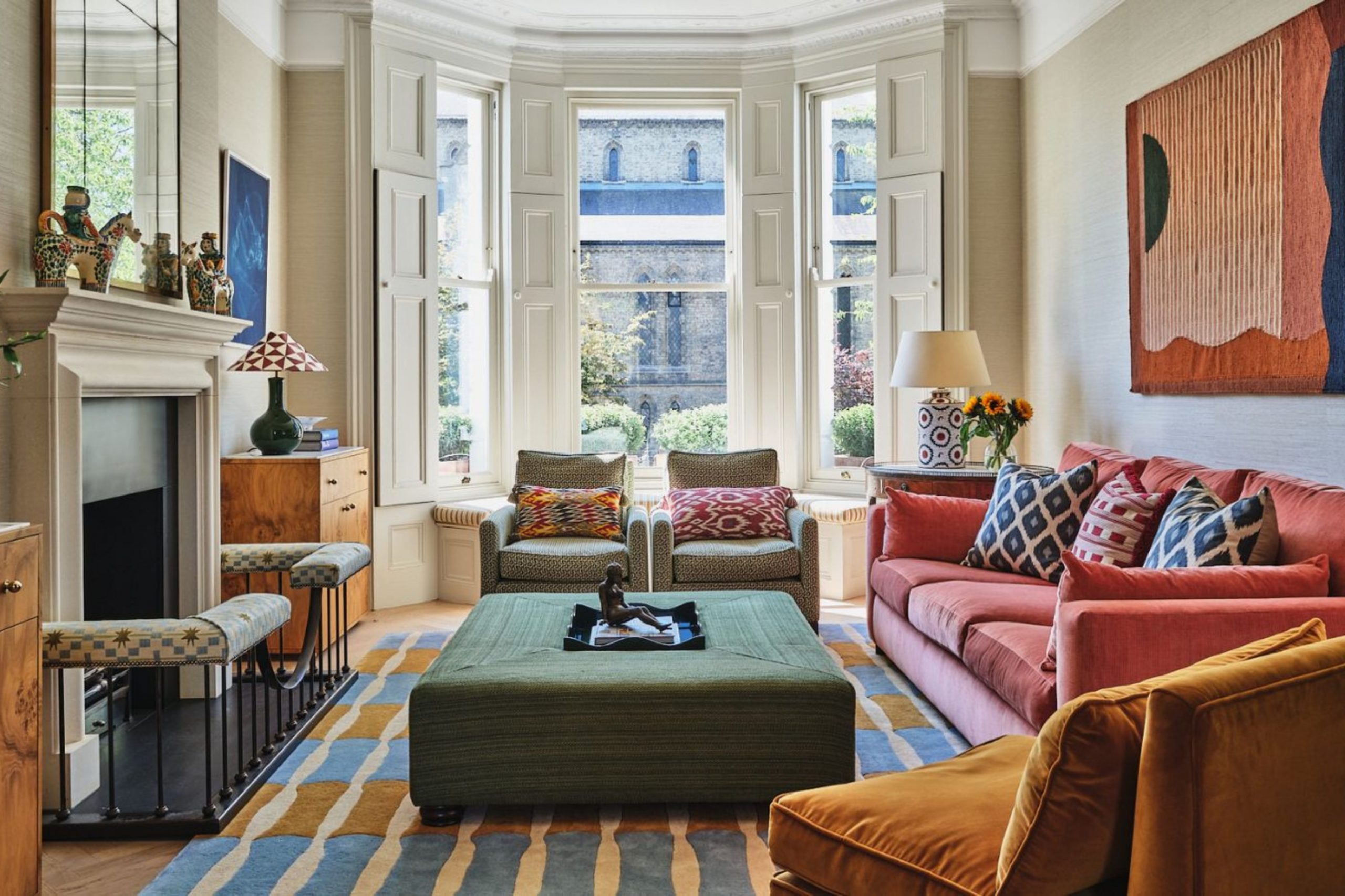
I am profoundly convinced that your home should make you feel genuinely happy, inspired, and empowered every single time you cross the threshold and walk through the door after a long day. Dopamine Decor is far more than a passing trend; it is a dedicated philosophy of using bright, bold, and incredibly saturated colors that act as a catalyst for joy and a powerful battery for energy in your daily life. It is time to permanently forget about those boring, restrictive rules or the pressure to play it safe with lifeless gray walls that make your interior look like a never-ending rainy day.
My goal is to help you select specific shades that act like a double shot of intense espresso for your mood and your walls, instantly awakening your senses and your spirit. We are making a decisive move away from quiet, invisible designs and moving toward rooms that actually possess a vivid personality, a soul, and a unique charisma.
This courageous style allows you to show off exactly who you are through vibrant, pulsating reds, sunny and radiant yellows, and deep, life-giving greens. It is time to stop worrying about what is considered “trendy” in a magazine and start picking colors that make you personally smile from ear to ear.
Your house is your private playground, your sanctuary, and your creative canvas—and it should look the part: bold, daring, and celebratory.
Why I Always Trust Sherwin-Williams and Benjamin Moore for the Best Art Deco Paint Colors
I rely exclusively on Sherwin-Williams and Benjamin Moore because they offer the most vivid, deep, and incredibly saturated pigments available on the global market today. When I am working on a creative project that needs a massive punch of excitement and visual delight, these brands deliver a level of consistency and purity that other paints simply cannot match. Their expansive color catalogs include high-energy tones that stay bright, lush, and intense even under heavy, direct sunlight, resisting fading over time.
I know with total certainty that when I pick a specific swatch from their fan decks, the final result on the wall will look exactly like that little paper sample we discussed. These companies have perfected the art of creating paint formulas that make bold colors look expensive, sophisticated, and luxurious rather than cheap or tacky.
I need a paint that provides exceptional coverage and hides minor wall imperfections while offering a rich, velvety finish that truly stands out. Quality matters immensely when you are using intense shades because you want the depth of the color to feel intentional, professional, and multi-dimensional.
Using these trusted brands ensures that my clients receive a durable finish that keeps its cheer and high-energy vibration for many years of active living.
How I Choose Feel-Good Paint Colors for Dopamine Decor Interiors
I begin my process by asking my clients deep questions about which specific colors naturally make them feel excited, energetic, or euphoric when they encounter them in the world. I look for those unique shades that remind people of their absolute favorite childhood memories, their most cherished summer vacations by the sea, or the sight of bright, exotic flowers in a sun-drenched garden. Choosing a feel-good color means completely ignoring the outdated idea of being modest, blending in, or trying to match the conservative tastes of the neighbors.
I focus strictly on high-saturation tones because they create a tangible sense of movement, life, and rhythm within a room. I often suggest mixing bold, contrasting colors to build a visual melody that keeps the eyes moving and the heart feeling light and uplifted.
It is critically important to think about how natural and artificial light hits a wall throughout the day, ensuring the bright color feels like a warm, welcoming hug instead of a cold or distracting glare. I strictly avoid muddy or “dirty” tones that feel heavy, dusty, or sad, because dopamine decor is centered entirely on uncompromising positivity. My ultimate goal is to create a setting where the walls themselves provide a constant, reliable source of mental stimulation and inspiration.
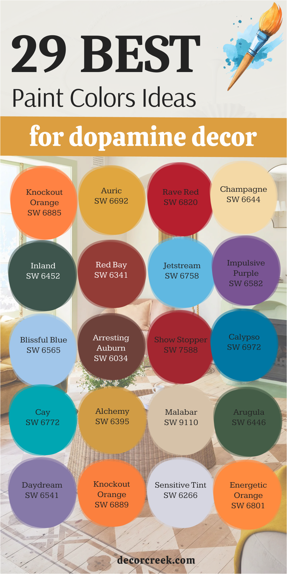
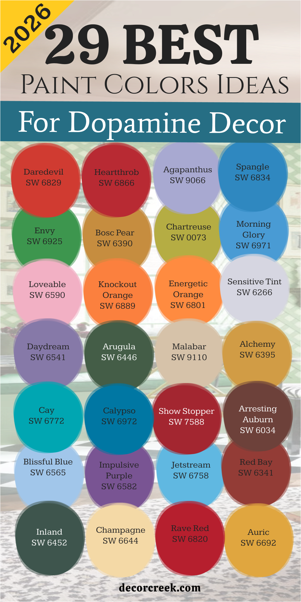
29 Paint Color Ideas For Dopamine Decor In 2026
Daredevil SW 6882
Daredevil SW 6882 acts like a bold statement of confidence on any wall it touches. This bright orange-red shade grabs your attention and never lets go of the excitement. I see this color as the perfect choice for someone who wants to feel brave and full of life.
It creates a focal point that demands you look at it and feel a spark of creativity. You will notice how it makes ordinary furniture look like a piece of art in a gallery. The energy this red provides is enough to get you moving even on a slow Monday morning.
I love how it looks when the sun hits it because it seems to glow from within the drywall. It is a loud color that tells the world you are not afraid to be yourself. This is the ultimate shade for a high-energy lifestyle that refuses to be boring or plain.
Best used in: entryways, dining rooms, accent walls, and creative studios
Pairs well with: Tricorn Black SW 6258, Extra White SW 7006, Requisite Gray SW 7023, gold metal accents The key rule of this color for dopamine decor is to use it where you want to feel a rush of excitement and bold energy every single time you enter.
Heartthrob SW 6866
Heartthrob SW 6866 brings a deep sense of passion and fun into your living environment right away. This red is classic yet it feels completely modern when you put it in a room full of light. I think of it as a friendly greeting that makes everyone feel welcome and lively.
It works wonders for making a large room feel more intimate and full of character. You can use it to highlight architectural details like built-in bookshelves or unique window frames. The richness of the pigment ensures that the color stays true even during the darkest winter months.
It feels like a celebration of life that stays on your walls all year long. I find that it works best when you want to create a sense of drama without being too dark. This shade is a favorite for people who love to entertain guests and throw loud parties.
Best used in: dining areas, front doors, kitchens, and cozy reading nooks
Pairs well with: Alabaster SW 7008, Naval SW 6244, Silver Strand SW 7057, dark wood furniture The key rule of this color for dopamine decor is to apply it in areas where social interaction and high-spirited conversation are the main goals.
🎨 Check out the complete guide to this color right HERE 👈

Agapanthus SW 9066
Agapanthus SW 9066 offers a beautiful purple tone that feels both playful and very sophisticated. This color reminds me of spring flowers blooming in a sunny field after a light rain. I use it when I want to add a touch of whimsy to a room without making it look like a nursery.
It provides a cool energy that helps you feel focused and happy at the same time. The blue undertones keep it from feeling too heavy or making the room feel smaller than it is. It looks fantastic next to white trim because the contrast makes the purple pop with extra clarity.
You will feel a sense of wonder every time you see how this shade changes throughout the day. It is a great pick for someone who wants a unique look that feels personal and fresh. This purple is light enough to cover all four walls without making the room feel closed in.
Best used in: bedrooms, home offices, laundry rooms, and powder rooms
Pairs well with: Sea Salt SW 6204, High Reflective White SW 7757, Agreeable Gray SW 7029, silver hardware The key rule of this color for dopamine decor is to use it in places where you want to feel inspired and mentally refreshed by a pop of color.
🎨 Check out the complete guide to this color right HERE 👈

Spangle SW 6834
Spangle SW 6834 is a bright blue that feels like looking up at a clear summer sky. This color makes a room feel open and full of possibility for any project you have. I love how it adds a crisp feeling to the environment while still being very fun to look at.
It is a very cheerful blue that avoids looking gloomy or like a corporate office building. You can pair it with yellow accents to create a room that feels like a sunny day at the beach. The vibrancy of this shade helps to bounce light around the room and make everything look cleaner.
It is a fantastic choice for a kid’s room or a creative workspace where you need to feel alert. This blue is unapologetic about its brightness and its ability to make people smile instantly. I find that it works exceptionally well in rooms that get a lot of natural window light.
Best used in: playrooms, bathrooms, kitchens, and ceiling accents
Pairs well with: Lemon Twist SW 6909, Pure White SW 7005, Dorian Gray SW 7017, light oak flooring The key rule of this color for dopamine decor is to use it where you want the air to feel light and the mood to stay upbeat and active.
🎨 Check out the complete guide to this color right HERE 👈
Envy SW 6925
Envy SW 6925 is a green that feels lush and full of growth like a tropical forest. This shade brings the outside world into your house with a lot of strength and visual power. I pick this green when a room feels dead and needs a major boost of natural energy.
It is a very saturated color that looks amazing with indoor plants and botanical prints. You will feel more connected to the earth while staying inside your comfortable home. This green is not for the faint of heart because it demands to be the star of the show.
It works well for creating a background that makes colorful art pieces look even better. I love how it adds a sense of luxury to a room without using traditional dark colors. This is a green that feels young, fresh, and totally ready for a new start.
Best used in: living rooms, dens, sunrooms, and basement entertainment areas
Pairs well with: Copper Pot SW 7709, Dover White SW 6385, Mindful Gray SW 7016, terracotta tiles The key rule of this color for dopamine decor is to use it as a backdrop for life and growth to make your indoor world feel like a garden.
Bosc Pear SW 6390
Bosc Pear SW 6390 is a golden yellow that feels warm and very grounded for a happy room. This color reminds me of autumn harvests and the glow of a sunset on a warm evening. I use it when I want to create a cozy feeling that still has a lot of personality and light.
It is a rich shade that feels more sophisticated than a standard primary yellow. You will find that it makes wood furniture look deeper and more interesting than before. It fills a room with a golden light that feels very welcoming to anyone who enters the house.
This color is great for rooms where you want to feel a sense of comfort and joy at the same time. It has enough depth to keep it from looking like a neon sign while remaining very bright. I think it is one of the most versatile shades for creating a happy and stylish home.
Best used in: kitchens, breakfast nooks, hallways, and guest bedrooms
Pairs well with: Urbane Bronze SW 7048, Creamy SW 7012, Repose Gray SW 7015, navy blue textiles The key rule of this color for dopamine decor is to use it to bring a permanent sense of sunshine and warmth into your favorite gathering spots.
🎨 Check out the complete guide to this color right HERE 👈

Chartreuse SW 0073
Chartreuse SW 0073 is a wild mix of green and yellow that screams fun and modern style. This color is perfect for an accent wall that needs to provide a huge punch of visual energy. I love using this shade in small doses to make a room feel current and very artistic.
It is a high-vibration color that keeps the brain active and the mood very high. You will see how it makes every other color in the room look sharper and more defined. It is a daring choice that shows you have a great sense of humor and a love for design.
This shade works well in modern homes with clean lines and lots of glass or metal. It feels like a burst of citrus that cleanses the visual palate of the whole house. I recommend it for anyone who wants their home to feel like a modern art museum.
Best used in: offices, bathrooms, furniture makeovers, and entry halls
Pairs well with: Black Magic SW 6991, Snowbound SW 7004, Gauntlet Gray SW 7019, neon accents The key rule of this color for dopamine decor is to use it as a bold highlight to prove that you are not afraid of standing out.
🎨 Check out the complete guide to this color right HERE 👈

Morning Glory SW 6971
Morning Glory SW 6971 is a vivid blue that feels like a fresh start to a brand new day. This color has a lot of depth but stays bright enough to keep a room feeling very airy. I find that it helps to clear the mind and makes a room feel like a sanctuary of happiness.
It is a very pure blue that does not have any gray or muddy tones hiding inside it. You can use it to create a theme that feels like a coastal vacation right in your suburbs. It looks stunning when paired with bright white linens and light-colored wooden floors.
The color is bold enough to be remembered by every guest who sees your beautiful home. I like how it makes a room feel bigger because the blue seems to recede into the distance. This is a great choice for someone who loves the water and the feeling of a wide-open sky.
Best used in: bedrooms, bathrooms, laundry rooms, and porches
Pairs well with: Coral Reef SW 6606, Extra White SW 7006, On the Rocks SW 7671, rattan furniture The key rule of this color for dopamine decor is to use it where you want to wake up feeling refreshed and ready for an adventure.
🎨 Check out the complete guide to this color right HERE 👈

Loveable SW 6590
Loveable SW 6590 is a soft yet bright pink that feels like a giant bowl of sweet candy. This color is all about kindness and making a room feel like a very happy place to be. I use it to soften the hard edges of a room and add a layer of pure joy to the walls.
It is not a shy pink; it has enough pigment to stand up and be noticed by everyone. You will feel a sense of lightness and playfulness as soon as you walk into a room with this shade. It works perfectly for creating a space where you want to relax and enjoy your favorite hobbies.
The pink has a warm undertone that makes skin tones look great in the reflection of the light. I think it is a wonderful choice for a room that needs a little bit of magic and sweetness. This color proves that pink can be for everyone who wants to feel good in their home.
Best used in: bedrooms, dressing rooms, nurseries, and craft rooms
Pairs well with: Mint Condition SW 6743, Pure White SW 7005, Crushed Ice SW 7647, gold frames The key rule of this color for dopamine decor is to use it to create a soft and happy refuge from the busy outside world.
Knockout Orange SW 6885
Knockout Orange SW 6885 is a powerful color that brings an incredible amount of warmth to any surface. This orange is juicy and full of life, making it a great pick for a high-energy kitchen or dining room.
I love how it makes people feel more talkative and hungry for a good meal and good times. It is a very social color that breaks the ice and makes a house feel like a home. You can use it to warm up a room that feels too cold or faces the north side of the house.
The pigment is very strong, so it looks great even with just one or two coats of high-quality paint. It pairs beautifully with dark blues and greens for a very modern and stylish look. This orange is a bold way to show that your home is a place of activity and fun. It feels like a permanent sunset that never fades away into the darkness.
Best used in: kitchens, dining rooms, mudrooms, and accent walls
Pairs well with: Naval SW 6244, Alabaster SW 7008, Steely Gray SW 7664, dark metal fixtures The key rule of this color for dopamine decor is to use it in the heart of the home where family and friends gather to talk.
Energetic Orange SW 6880
Energetic Orange SW 6880 pulses with a lively spirit that makes any wall feel like it is vibrating with pure joy. This shade is much more than a simple paint choice because it acts like a permanent battery for your home decor. I love how it instantly removes any sense of boredom from a hallway or a windowless room.
Energetic Orange SW 6800 makes a bold statement that life is meant to be lived with a lot of enthusiasm and laughter. You will see how it creates a glowing atmosphere that feels warm even on the coldest winter afternoons. The color is deep enough to feel substantial while remaining bright enough to lift your mood the second you see it.
It works as a fantastic backdrop for a gallery wall filled with family photos and colorful memories. This orange is specifically designed for people who want their house to feel like a high-energy hub of activity. I find that it encourages people to be more creative and outgoing when they spend time in its presence. Using this color is the fastest way to turn a forgettable corner into the most talked-about spot in your entire house.
Best used in: kitchens, home gyms, creative studios, and playful entryways
Pairs well with: Tantalizing Teal SW 6937, High Reflective White SW 7757, Peppercorn SW 7674, natural wood The key rule of this color for dopamine decor is to use it where you want to feel a boost of physical energy and a happy sense of motion.
Sensitive Tint SW 6267
Sensitive Tint SW 6267 provides a delicate purple glow that feels like a quiet moment of happiness in a busy day. This color has a very light touch but it still packs enough of a punch to be considered part of a joyful palette. I think of it as a breath of fresh air for walls that have been stuck with beige for way too long.
Sensitive Tint SW 6267 allows you to play with color without feeling like the room is closing in on your personal space. You will enjoy how it looks under soft lamps because the purple tones become deeper and more magical at night. It is a very friendly color that works well for people who are just starting to experiment with dopamine decor ideas.
The coolness of the tint helps to keep your mind clear while the hint of purple keeps your heart feeling very light. I love using it on ceilings to give a room a hidden surprise that makes people look up and smile. This shade is perfect for creating a bridge between traditional styles and a more modern, colorful outlook on life. It feels like a soft whisper of color that still manages to tell a very happy and bright story.
Best used in: bedrooms, nurseries, guest bathrooms, and reading corners
Pairs well with: Agapanthus SW 9066, Pure White SW 7005, Sea Salt SW 6204, wicker furniture The key rule of this color for dopamine decor is to use it as a gentle foundation that supports your bolder and brighter furniture pieces.
Daydream SW 6541
Daydream SW 6541 is a dreamy purple that feels like a walk through a field of lavender during a summer sunset. This color is saturated enough to feel very intentional and full of personality for any room in your house. I see it as the ultimate choice for someone who wants to feel both relaxed and totally inspired by their surroundings.
Daydream SW 6541 creates a sense of depth that makes your walls look like they have their own history and character. You will notice that it pairs beautifully with bright greens to create a garden-like feel inside your living room or office.
It is a color that rewards you for being bold because it looks better the more you use it across the walls. The balance of blue and red in this purple keeps it from feeling too cold or too aggressive for a daily living environment. I find that it works wonders for making small rooms feel like special jewel boxes filled with light and color. This shade is a favorite for those who want to escape from the ordinary world into a place of beauty. It brings a sophisticated kind of fun that stays interesting no matter how many times you walk past it.
Best used in: master bedrooms, cozy dens, walk-in closets, and craft rooms
Pairs well with: Chartreuse SW 0073, Alabaster SW 7008, Dorian Gray SW 7017, brass hardware The key rule of this color for dopamine decor is to use it where you want to lose yourself in a happy and imaginative state of mind.
🎨 Check out the complete guide to this color right HERE 👈

Arugula SW 6446
Arugula SW 6446 is a deep and leafy green that brings the power of a lush forest directly into your indoor environment. This color feels very healthy and full of life, making it a perfect fit for a dopamine-focused home design plan. I pick this green when I want to create a room that feels very sturdy and full of natural strength and growth.
Arugula SW 6446 acts as a perfect contrast for bright pinks or oranges, making those colors look even more vibrant and alive. You will love how it grounds a room while still providing a huge amount of visual interest and style. It is a very sophisticated green that avoids looking like an old-fashioned office or a boring library from the past.
The richness of the paint ensures that your walls look high-end and very professional even if you do the work yourself. I find that it makes white trim look exceptionally crisp and clean, which adds to the overall feeling of a fresh home. This shade is great for people who love the outdoors and want to feel surrounded by nature even when they are inside. It is a bold choice that pays off by making your home feel like a vibrant and living thing.
Best used in: living rooms, home offices, dining rooms, and kitchen islands
Pairs well with: Loveable SW 6590, Snowbound SW 7004, Bosc Pear SW 6390, leather upholstery The key rule of this color for dopamine decor is to use it to create a rich and organic feeling that makes your other bright colors pop.
🎨 Check out the complete guide to this color right HERE 👈

Malabar SW 9110
Malabar SW 9110 is a warm tan that feels like a sandy beach on a perfectly sunny day without a single cloud. This color provides a happy and stable base for all your wildest dopamine decor ideas and bright furniture pieces. I use it when a room needs a touch of warmth to make the more intense colors feel like they belong together.
Malabar SW 9110 is far from a boring neutral because it has a golden undertone that glows when the sun hits the wall. You will find that it makes your home feel much more expensive and well-thought-out without losing any of the fun energy.
It is a very safe choice for large rooms where you want to feel a sense of harmony and light throughout the day. I love how it complements natural materials like wood and stone while still feeling very modern and updated. This color is like a warm hug that welcomes you home after a long day of work or running errands. It serves as a reminder that even your background colors can be full of joy and light if you pick the right ones. This shade is essential for balancing out a home that is filled with many different and competing bright colors.
Best used in: living rooms, open-plan kitchens, hallways, and exteriors
Pairs well with: Envy SW 6925, Extra White SW 7006, Iron Ore SW 7069, blue accents The key rule of this color for dopamine decor is to use it as a sunny anchor that ties all your other high-energy colors into one cohesive look.
🎨 Check out the complete guide to this color right HERE 👈
Alchemy SW 6395
Alchemy SW 6395 is a metallic-feeling gold that brings a sense of wealth and sunshine into your daily life at home. This color is bold and unapologetic about its desire to be seen and admired by everyone who walks by it. I love how it transforms a simple room into a place that feels very special and full of hidden treasures. Alchemy SW 6395 works like magic to brighten up dark corners that usually feel sad or forgotten in a house.
You will notice that it has a very positive effect on your mood because it mimics the feeling of a bright morning. It is a fantastic choice for an accent wall or for painting a piece of furniture that needs a new life. The color is very saturated and rich, which gives the walls a depth that looks very professional and high-quality.
I find that it looks best when paired with dark greens or deep blues to create a very dramatic and happy look. This gold is not about being quiet; it is about celebrating the light and the beauty of your personal home. Using this shade is a great way to show that you value fun and luxury in your everyday living environment.
Best used in: dining rooms, powder rooms, entryways, and ceiling details
Pairs well with: Arugula SW 6446, Naval SW 6244, Pure White SW 7005, black accents The key rule of this color for dopamine decor is to use it where you want to feel a sense of luxury and permanent sunshine in your home.
Cay SW 6772
Cay SW 6772 is a bright teal that feels like a dip in the clear blue waters of a tropical island resort. This color is an instant mood-lifter that makes a room feel cool and extremely energetic at the same time. I choose this shade when a house feels a bit stagnant and needs a wave of fresh energy to wake it up. Cay SW 6772 is a very bold blue-green that looks amazing with white furniture and bright yellow accents for a beachy vibe.
You will feel a sense of adventure and freedom as soon as you see how this color changes the look of your walls. It is a very clean and crisp shade that makes a room feel much larger than it actually is in reality. I love using it in bathrooms or kitchens where you want the environment to feel very sanitary but also very fun.
This teal is a great way to express a love for the ocean and the outdoors without being too traditional. It is a high-vibration color that keeps your spirits high and your home looking very modern and stylish. This shade is perfect for anyone who wants their living environment to feel like a non-stop summer vacation.
Best used in: bathrooms, kitchens, sunrooms, and bedroom accent walls
Pairs well with: Knockout Orange SW 6889, Extra White SW 7006, Morning Glory SW 6971, light wood The key rule of this color for dopamine decor is to use it in rooms where you want to feel a refreshing splash of tropical energy and joy.
🎨 Check out the complete guide to this color right HERE 👈

Calypso SW 6950
Calypso SW 6950 is a deep and soulful blue that carries a lot of rhythmic energy and fun within its pigment. This color is much more than a standard blue because it has a hidden brightness that comes out under good lighting. I use it to create a sense of mystery and excitement in rooms that are used for entertainment and social gatherings.
Calypso SW 6950 makes a great backdrop for neon signs or bright artwork that needs a strong base to stand against. You will feel a sense of calm confidence when you are surrounded by this rich and beautiful shade of blue. It is a very durable color choice that looks great for many years without feeling like it has gone out of style.
I love how it makes a room feel very cozy at night while still looking bright and happy during the daylight hours. This blue is perfect for people who want a more mature version of dopamine decor that still feels very playful. It is a strong and dependable color that adds a lot of value to the visual weight of your interior design. Using this shade shows that you have a bold personality and a great eye for deep and interesting colors.
Best used in: living rooms, media rooms, bedrooms, and kitchen cabinets
Pairs well with: Alchemy SW 6395, Snowbound SW 7004, Rose Colored SW 6303, gold accents The key rule of this color for dopamine decor is to use it as a powerful foundation for a room that feels both exciting and very grounded.
Show Stopper SW 7588
Show Stopper SW 7588 is a classic and bright red that lives up to its name by being the center of attention. This color is all about theater and making every moment in your home feel like a special event or a party. I recommend this red for people who are not afraid to be loud and show off their great taste in bold colors.
Show Stopper SW 7588 brings an incredible amount of warmth and heat to a room, making it feel very cozy and full of life. You will find that it stimulates the appetite and the conversation, which makes it a perfect choice for a dining area. It is a very traditional color that has been updated to feel fresh and perfect for a modern dopamine-themed house.
I love how it looks with dark wood and gold accents because it creates a very rich and royal feeling in the room. This red is a symbol of energy and power that reminds you to take charge of your own happiness every day. It is a very brave color that transforms a plain wall into a masterpiece of design and personal expression. This shade is the ultimate tool for anyone who wants their home to have a very strong and positive pulse.
Best used in: dining rooms, front doors, hallways, and kitchen accents
Pairs well with: Alabaster SW 7008, Black Magic SW 6991, Repose Gray SW 7015, traditional furniture The key rule of this color for dopamine decor is to use it as a bold highlight that celebrates the passion and energy of your daily life.
🎨 Check out the complete guide to this color right HERE 👈

Dark Auburn SW 6034
Dark Auburn SW 6034 is a warm and earthy reddish-brown that feels like a pile of autumn leaves in the bright sun. This color is perfect for adding a sense of history and comfort to a home that wants to feel very happy and lived-in. I use it when a room needs a dose of natural warmth that feels more organic than a bright primary red or orange.
Dark Auburn SW 6034 works beautifully with greens and yellows to create a color palette that feels like a walk through a park. You will love how it makes your home feel very solid and secure while still being very fun and visually interesting. It is a great color for making a large and cold room feel much more intimate and welcoming to guests and family.
I find that it looks especially good in rooms with a lot of natural wood trim or exposed brick walls in the design. This shade is for the person who wants a dopamine-rich home that also feels very connected to the earth and the changing seasons. It provides a rich and textured look that makes your furniture and decor look much more expensive and stylish. Using this color is a great way to add a layer of cozy joy to your favorite rooms without being too overwhelming.
Best used in: living rooms, dens, entryways, and master bedrooms
Pairs well with: Arugula SW 6446, Creamy SW 7012, Bosc Pear SW 6390, copper fixtures The key rule of this color for dopamine decor is to use it to create a warm and grounded feeling that makes your home feel like a permanent sanctuary.
🎨 Check out the complete guide to this color right HERE 👈

Blissful Blue SW 6527
Blissful Blue SW 6527 feels like a soft breeze on a clear afternoon when the sun is high in the sky. This color offers a pure sense of happiness that makes a room feel open and full of fresh air. I choose this blue when I want to create a space where the mind can wander and find new ideas.
Blissful Blue is bright enough to keep the energy levels up while remaining very friendly and easy on the eyes. You will notice how it makes white ceilings look like they are floating away into a beautiful summer atmosphere. It is a fantastic choice for a room that needs to feel light and airy without losing its sense of fun.
I love how it works with yellow or pink accents to build a palette that feels like a bunch of spring flowers. The pigment is clean and clear, so you never have to worry about the walls looking dark or heavy. This shade is perfect for someone who wants their home to feel like a cheerful escape from the busy world outside. It brings a gentle kind of joy that stays with you all day long.
Best used in: bedrooms, bathrooms, nurseries, and laundry rooms
Pairs well with: Lemon Twist SW 6909, Pure White SW 7005, Loveable SW 6590, light ash wood The key rule of this color for dopamine decor is to use it where you want the mood to stay light, clear, and perfectly happy.
🎨 Check out the complete guide to this color right HERE 👈

Impulsive Purple SW 6832
Impulsive Purple SW 6832 is a daring and rich shade that celebrates the fun of making bold choices in your home. This color has a deep personality that adds a layer of excitement to any wall it covers during the day. I see it as a wonderful way to show off a creative spirit that is not afraid of being the center of attention. Impulsive Purple SW 6582 works like a charm in rooms where you want to feel inspired to try new things or start a hobby.
You will love how it catches the light and reveals different layers of violet and magenta as the sun moves across the sky. It is a very social color that makes guests feel like they are in a place where anything is possible and fun is a priority.
I find that it makes gold and silver decorations look very shiny and important against the deep purple background. This shade is for the person who wants their home to be a reflection of their vibrant and energetic inner life. It turns a boring room into a place of magic and mystery that still feels very welcoming and bright. Using this color is a great way to prove that you live life with a lot of passion and joy.
Best used in: bedrooms, creative studios, powder rooms, and accent walls
Pairs well with: Chartreuse SW 0073, Alabaster SW 7008, Alchemy SW 6395, velvet textiles The key rule of this color for dopamine decor is to use it in your most personal spaces to spark a sense of fun and creativity.
🎨 Check out the complete guide to this color right HERE 👈

Jetstream SW 6492
Jetstream SW 6492 is a high-energy blue that feels like it is moving at the speed of light across your walls. This color is incredibly bright and clean, making it a powerful tool for a modern and happy interior design project. I use it when a room feels a little too quiet and needs a loud shout of color to bring it back to life.
Jetstream reminds me of clear swimming pools and high-tech toys that are built for speed and fun. You will feel a sense of clarity and focus as soon as you step into a room painted with this vivid shade. It is a very refreshing color that makes old furniture look modern and new again with very little effort.
I love how it looks when paired with bright orange or red to create a high-contrast look that screams dopamine decor. The blue is so saturated that it stays looking bright even in rooms that do not have a lot of big windows. This shade is a favorite for people who love technology, speed, and a very clean and bright aesthetic in their house. It is a bold way to make sure your home never feels slow or out of style.
Best used in: home offices, playrooms, kitchens, and modern living rooms
Pairs well with: Knockout Orange SW 6889, High Reflective White SW 7757, Tricorn Black SW 6258, chrome accents The key rule of this color for dopamine decor is to use it to create a fast-paced and energetic vibe that keeps you feeling alert and happy.
Red Bay SW 6321
Red Bay SW 6321 is a deep and spicy red that brings a lot of heat and comfort to a home that loves to be cozy. This color is rich and full of life, reminding me of warm summer berries or a beautiful sunset in the desert. I pick this red when a room needs a strong anchor that still feels very happy and full of positive energy.
Red Bay SW 6341 makes a room feel very substantial and well-decorated, like a high-end hotel that is built for fun. You will find that it creates a very warm and inviting atmosphere that makes people want to sit down and stay for a while. It is a very brave color that shows you have a lot of confidence in your personal style and your home.
I love how it looks with dark greens and gold metals to create a look that is both classic and very energetic. The depth of the red ensures that it never feels too thin or cheap on the walls of your favorite rooms. This shade is perfect for creating a sense of drama that still feels very friendly and welcoming to everyone. It is a bold choice that adds a lot of heart and soul to the design of your interior spaces.
Best used in: dining rooms, dens, library corners, and front entryways
Pairs well with: Arugula SW 6446, Dover White SW 6385, Malabar SW 9110, brass fixtures The key rule of this color for dopamine decor is to use it to create a warm and passionate heart for your home.
🎨 Check out the complete guide to this color right HERE 👈

Inland SW 6452
Inland SW 6452 is a deep forest green that feels like a hidden path through a world of ancient and happy trees. This color brings a sense of life and oxygen into a room, making it feel very fresh and full of natural power. I use this green when I want to create a background that makes all your other bright colors look their very best. Inland SW 6452 is a very strong and dependable shade that adds a lot of visual weight to a room without feeling sad.
You will love how it makes your indoor plants blend into the walls to create a lush and green environment. It is a very sophisticated choice for people who want a dopamine-rich home that still feels very grounded in nature. I find that it looks amazing with leather furniture and bright yellow accents to create a very stylish and happy look.
The color is deep enough to hide minor bumps in the wall while providing a rich finish that looks very expensive. This shade is for the person who wants to feel surrounded by the peace and energy of the woods every single day. It provides a beautiful and living backdrop for a life filled with joy and colorful adventures.
Best used in: living rooms, master bedrooms, home offices, and kitchen islands
Pairs well with: Bosc Pear SW 6390, Pure White SW 7005, Arresting Auburn SW 6034, natural stone The key rule of this color for dopamine decor is to use it to bring the strength and vibrancy of the natural world into your living space.
Champagne SW 6644
Champagne SW 6644 is a bubbly and light yellow that feels like a glass of something special at a great party. This color is all about celebration and keeping the mood light and happy throughout the entire day and night. I use it to brighten up rooms that need a soft glow without being as intense as a primary yellow or orange.
Champagne SW 6644 acts like a warm light bulb that is always turned on and giving off a friendly and welcoming vibe. You will see how it makes a room feel bigger and much more open to guests and new ideas for your home. It is a very versatile color that works well with almost any other bright shade in the dopamine decor palette.
I love how it complements pinks and blues to create a room that feels like a box of colorful macarons. The yellow is very subtle but it still has enough personality to make a statement that your home is a happy place. This shade is perfect for people who want a cheerful house that feels very classy and well-put-together at the same time. It brings a permanent sense of morning sunshine to your walls even when the weather outside is gray and rainy.
Best used in: kitchens, hallways, breakfast nooks, and guest bedrooms
Pairs well with: Blissful Blue SW 6565, Snowbound SW 7004, Rose Colored SW 6303, light oak The key rule of this color for dopamine decor is to use it as a light and bubbly foundation for a home that loves to celebrate small joys.
🎨 Check out the complete guide to this color right HERE 👈

Rave Red SW 6608
Rave Red SW 6608 is a high-vibration color that feels like a beat of music you can see on the walls. This red is incredibly bright and energetic, making it a perfect pick for a room that is all about activity and fun. I recommend this shade for people who want their home to feel like it is always ready for a party or a creative project. Rave Red SW 6608 demands to be noticed and it fills a room with a sense of heat and excitement that never fades away.
You will find that it makes even the most boring room look like a work of modern art that is full of life. It is a very brave choice that shows you have a fun personality and a love for high-energy design ideas. I love using it in small doses or on a single wall to create a massive impact that changes the whole mood.
The pigment is very strong and saturated, which gives the color a lot of depth and power in any light. This shade is for the person who wants their house to be a loud and proud reflection of their inner joy. It is the ultimate dopamine color for people who love to live life at full volume.
Best used in: game rooms, dining areas, accent walls, and front doors
Pairs well with: Tricorn Black SW 6258, Extra White SW 7006, Jetstream SW 6758, modern metal The key rule of this color for dopamine decor is to use it as a bold and rhythmic highlight that brings a sense of fun to your walls.
Auric SW 6692
Auric SW 6692 is a rich and golden yellow that feels like a solid bar of sunshine sitting right on your walls. This color is deep and warm, providing a sense of wealth and happiness that is very hard to ignore for long. I use it when a room needs to feel very special and full of positive energy and light for the family.
Auric SW 6692 makes a fantastic backdrop for dark furniture and colorful books because it makes everything look more interesting. You will love how it glows in the evening when the lamps are turned on and the room feels like a golden cave. It is a very sophisticated yellow that avoids looking like a toy while still being very playful and fun to see.
I find that it works wonders for making cold rooms feel much warmer and more inviting to anyone who enters. The color is very saturated and provides a finish that looks very professional and high-quality for your home. This shade is for the person who wants to feel like they are living in a place of permanent summer and golden light. It adds a layer of luxury and joy to your daily life that is very simple to achieve with a brush.
Best used in: dining rooms, entry halls, kitchen cabinets, and library walls
Pairs well with: Inland SW 6452, Alabaster SW 7008, Naval SW 6244, copper accents The key rule of this color for dopamine decor is to use it where you want to feel a deep sense of warmth and golden happiness.
Knockout Orange SW 6885
Knockout Orange SW 6885 is a punchy and vibrant shade that brings an immediate smile to anyone who sees it on a wall. This orange is juicy and full of personality, making it a great pick for a house that values fun and energy above all. I love how it makes a room feel very social and open to new conversations and good times with friends.
Knockout Orange SW 6885 is not a shy color; it stands up and tells the world that this house is a place of joy. You will notice that it warms up the skin tones of people in the room, making everyone look and feel a little bit better. It is a fantastic choice for a kitchen where you want to start your morning with a huge burst of positive energy and light.
I find that it pairs perfectly with blue and green to create a look that is very modern and full of visual life. The color is very strong and keeps its brightness even if the room does not get a lot of direct sunlight. This shade is the perfect tool for turning a dark and sad room into a bright and happy place to live. It is a bold statement of happiness that stays with you all day long.
Best used in: kitchens, mudrooms, playrooms, and accent walls
Pairs well with: Jetstream SW 6758, Pure White SW 7005, Envy SW 6925, dark metal The key rule of this color for dopamine decor is to use it in the busiest parts of your home to keep the energy levels high and happy.
27 Paint Colors For The Dopamine Bedroom
Daredevil SW 6882
Daredevil SW 6882 wakes up your sleeping area with a massive jolt of red energy that feels like a party. This color turns your bedroom into a high-octane space where you feel ready to conquer any challenge the day brings. I love how it creates a bold backdrop for neutral bedding and makes every piece of furniture look extra sharp.
Daredevil is a brave choice for a bedroom because it keeps the mood exciting and very far from boring. You will feel a sense of warmth and passion every time you walk into the room after a long day. It is a very saturated red that looks expensive and high-end when you apply it with a high-quality finish.
I find that it encourages a sense of adventure and helps you start your morning with a lot of inner strength. This shade is specifically for people who want their private space to feel like a powerful statement of joy. Using it on an accent wall behind the bed creates a stunning focal point that everyone will remember. It is the ultimate dopamine color for those who want to feel alive and energetic in their most personal room.
Best used in: accent walls, bedroom ceilings, walk-in closets, and built-in shelving
Pairs well with: Extra White SW 7006, Tricorn Black SW 6258, Requisite Gray SW 7023, gold accents The key rule of this color for dopamine decor is to use it where you want to feel a rush of bold energy the moment your eyes open.
Loveable SW 6590
Loveable SW 6590 is a sweet and punchy pink that makes your bedroom feel like a soft and happy cloud. This color is all about kindness and creating a space where you can truly feel like your most playful self. I use it to bring a sense of light and sweetness to walls that need a break from traditional and dull colors.
Loveable SW 6590 has enough pigment to stand out without feeling like it belongs only in a very young child’s room. You will enjoy how the pink glow makes the morning light feel warm and very inviting for a slow start. It works perfectly with green or blue accents to create a bedroom that feels like a vibrant summer garden.
The shade is very uplifting and helps to wash away any stress you might have brought home from your work day. I find that it makes people feel more creative and relaxed in a way that is still full of life. This pink is a wonderful choice for anyone who wants to surround themselves with a color that feels like a happy hug. It proves that a bedroom can be both a place of rest and a place of high-energy joy.
Best used in: master bedrooms, guest rooms, dressing areas, and vanity nooks
Pairs well with: Mint Condition SW 6743, Pure White SW 7005, Crushed Ice SW 7647, silver hardware The key rule of this color for dopamine decor is to use it to create a soft sanctuary that is filled with pure and happy vibes.
Heartthrob SW 6866
Heartthrob SW 6866 brings a deep and romantic energy to your bedroom that feels both classic and very exciting. This red is a total showstopper that makes the room feel much more intimate and full of personal character and style. I think of it as a shot of pure joy for your walls because it never lets the room feel cold or empty.
Heartthrob SW 6866 helps to create a cozy atmosphere that is still very high in energy and visual movement throughout the night. You can use it to highlight a beautiful headboard or to make a small bedroom feel like a very special jewel box. The richness of the color provides a sense of luxury that makes your home feel more curated and professional.
I love how it looks when the sun sets and the room takes on a deep and glowing red personality. It is a fantastic pick for anyone who wants to show off their bold side and live with a lot of passion. This shade tells a story of confidence and happiness that makes your private space feel very unique and special. Using this red is the fastest way to add a layer of warmth and excitement to your nightly routine.
Best used in: accent walls, window frames, bedroom doors, and furniture makeovers
Pairs well with: Alabaster SW 7008, Naval SW 6244, Silver Strand SW 7057, dark wood furniture The key rule of this color for dopamine decor is to apply it in areas where you want to feel a strong sense of passion and warmth.
🎨 Check out the complete guide to this color right HERE 👈
Blissful Blue SW 6527
Blissful Blue SW 6524 offers a clear and happy blue that feels like looking out a window at a perfect sky. This color makes your bedroom feel much larger and more open while still providing a lot of cheerful energy for you. I select this shade when a bedroom feels a bit too dark or heavy and needs a burst of fresh air.
Blissful Blue SW 6565 is very clean and does not have any of the sad or gray undertones found in traditional blues. You will feel a sense of mental clarity and happiness every time you spend time in a room with these walls. It is a very friendly color that works wonders for keeping the mood light and focused on the positive side of life.
I love pairing it with white linens and bright yellow pillows to create a look that feels like a beach vacation. The paint covers well and gives the room a very polished and bright appearance that lasts for a long time. This shade is a favorite for those who want a happy home that feels very clean, organized, and full of light. It brings a permanent sense of daytime joy into your bedroom no matter what time it is outside.
Best used in: all four walls, bedroom ceilings, laundry rooms, and closet interiors
Pairs well with: Lemon Twist SW 6909, Pure White SW 7005, Loveable SW 6590, light wood tones The key rule of this color for dopamine decor is to use it to keep the air in your room feeling light, happy, and very fresh.
🎨 Check out the complete guide to this color right HERE 👈
Daydream SW 6541
Daydream SW 6541 is a rich and imaginative purple that turns your bedroom into a place of wonder and creative thoughts. This color has enough depth to feel very sophisticated while remaining a core part of a fun dopamine decor palette. I use it to create a sense of mystery and joy that makes the bedroom feel like a very special retreat.
Daydream SW 6541 works beautifully with metallic accents like gold or brass to create a look that feels very high-end and unique. You will notice how the color changes and becomes more intense as you add more colorful layers of pillows and blankets. It is a very bold choice that rewards you with a room that has a lot of soul and a happy pulse.
I find that it helps people to disconnect from the boring outside world and reconnect with their own happy and playful side. The purple is warm enough to feel cozy at night but bright enough to keep the room feeling very alive during the day. This shade is for the person who wants their home to be a place where they can dream big and feel good. Using this color is a great way to show that you value your own imagination and personal sense of style.
Best used in: master suites, reading nooks, walk-in closets, and accent walls
Pairs well with: Chartreuse SW 0073, Alabaster SW 7008, Dorian Gray SW 7017, brass hardware The key rule of this color for dopamine decor is to use it where you want to spark a sense of fun and creative wonder every day.
🎨 Check out the complete guide to this color right HERE 👈
Morning Glory SW 6971
Morning Glory SW 6971 is a vivid and energetic blue that feels like a splash of cool water on a warm summer morning. This color is perfect for a bedroom that needs to feel very alert and full of happy possibilities for the future. I love how it creates a crisp and clean background that makes all your colorful bedroom decor look even more vibrant.
Morning Glory SW 6971 is a very pure blue that brings a sense of the wide-open sky right into your personal sleeping space. You will feel refreshed and ready to start your day as soon as you see the sun hitting these bright blue walls. It works amazingly well with coral or orange accents to create a high-contrast room that feels very modern and fun.
The color is bold enough to make a statement but light enough to keep the room from feeling small or closed in. I find that it is a great choice for people who love the ocean and want to feel that same sense of freedom. This shade is a powerful tool for building a home that is dedicated to a positive and active lifestyle. It is a bright and happy choice that makes every morning feel like a brand new adventure in your life.
Best used in: bedrooms, bathrooms, sunrooms, and bedroom furniture
Pairs well with: Coral Reef SW 6606, Extra White SW 7006, On the Rocks SW 7671, rattan textures The key rule of this color for dopamine decor is to use it where you want to wake up feeling totally refreshed and full of joy.
🎨 Check out the complete guide to this color right HERE 👈
Cay SW 6772
Cay SW 6772 is a bright and tropical teal that brings the energy of a beautiful island holiday into your bedroom walls. This color is a fantastic mood-booster that makes a room feel both energetic and very happy at the same time for you. I choose this shade when a bedroom feels a bit stuck in the past and needs a big wave of modern color.
Cay SW 6772 looks stunning with white furniture because the contrast makes the teal look even deeper and more exciting to see. You will feel a sense of joy and relaxation that is typical of a sunny day spent by the clear blue water. It is a very clean and bright color that makes your bedroom feel like a very fun place to hang out and relax.
I love how it works with tropical prints and natural wood to create a room that is full of life and style. The teal is strong and saturated, ensuring that your walls look high-quality and very intentional in their design. This shade is perfect for someone who wants their home to feel like a non-stop celebration of the summer season. It brings a lot of personality and a very high level of happiness to any room it touches with paint.
Best used in: accent walls, guest bedrooms, bedroom bathrooms, and shelving
Pairs well with: Knockout Orange SW 6889, Extra White SW 7006, Morning Glory SW 6971, light oak The key rule of this color for dopamine decor is to use it in rooms where you want a refreshing splash of tropical energy every day.
🎨 Check out the complete guide to this color right HERE 👈
Jetstream SW 6492
Jetstream SW 6492 is an intense and electric blue that keeps the energy levels in your bedroom at an all-time high. This color is for the person who loves a modern look and wants their home to feel very fast and full of life. I use it to create a sense of movement and excitement in a room that might otherwise feel a little bit too quiet.
Jetstream SW 6492 is very bright and clear, making it a great choice for people who want to feel alert and happy. You will notice how it makes your favorite art and colorful rugs pop against the vivid blue background of the walls. It is a very refreshing shade that makes your bedroom feel like a high-tech and high-energy hub of personal activity.
I love how it looks when paired with bright red or orange to create a look that is totally dedicated to joy. The color stays looking very bright even when the curtains are closed and the lights are on for the evening. This blue is a bold way to ensure that your home never feels boring or like it is lacking in personality. It is a high-vibration color that helps you stay positive and energetic in your daily life at home.
Best used in: accent walls, bedroom offices, ceiling details, and modern suites
Pairs well with: Knockout Orange SW 6889, High Reflective White SW 7757, Tricorn Black SW 6258, chrome metal The key rule of this color for dopamine decor is to use it to create a fast-paced and energetic vibe that keeps you feeling happy.
Agapanthus SW 9066
Agapanthus SW 9066 is a beautiful and playful purple that brings the feeling of a blooming garden into your bedroom. This color has a light and airy energy that keeps the room feeling very fresh and full of happy thoughts for you. I pick this shade when I want to add a touch of whimsy to a bedroom without it feeling too heavy or dark.
Agapanthus SW 9066 works like a dream with white trim and silver accents to create a look that is very polished and fun. You will feel a sense of lightness and joy every time you see how the purple changes under different types of light. It is a very unique color that shows you have a great sense of style and a love for bright and happy things.
I find that it makes a bedroom feel like a very special place that is hidden away from the rest of the world. The blue undertones in the purple keep it feeling very cool and refreshing for a good night of happy dreams. This shade is a wonderful choice for anyone who wants a bedroom that is full of personality and a soft sense of fun. It is a bright and happy way to show off your love for color and modern interior design.
Best used in: all bedroom walls, vanity areas, nurseries, and walk-in closets
Pairs well with: Sea Salt SW 6204, High Reflective White SW 7757, Agreeable Gray SW 7029, silver hardware The key rule of this color for dopamine decor is to use it where you want to feel inspired and refreshed by a pop of purple.
🎨 Check out the complete guide to this color right HERE 👈
Impulsive Purple SW 6832
Impulsive Purple SW 6832 is a bold and deep violet that adds a layer of excitement and drama to your sleeping quarters. This color is all about following your heart and picking the shades that truly make you feel happy and very alive. I use it to create a focal point in the bedroom that feels very modern and full of high-energy personality for you.
Impulsive Purple SW 6582 is a very strong color that demands your attention and makes the room feel like a work of art. You will love how it provides a rich and textured background for your favorite colorful pillows and soft blankets. It is a very social and fun color that makes the room feel like a place where good things are always happening.
I find that it looks especially good with bright green or yellow accents to build a very high-contrast and happy room. The color is deep and saturated, making the walls look very high-end and very professional in their finish and style. This shade is for the person who wants their home to be a loud and proud reflection of their inner sense of joy. Using this purple is a great way to show that you are not afraid of standing out and being very bold.
Best used in: accent walls, bedroom reading nooks, powder rooms, and furniture
Pairs well with: Chartreuse SW 0073, Alabaster SW 7008, Alchemy SW 6395, velvet textiles The key rule of this color for dopamine decor is to use it to spark a sense of fun and creative energy in your personal space.
🎨 Check out the complete guide to this color right HERE 👈
Sensitive Tint SW 6267
Sensitive Tint SW 6267 is a very soft and light purple that provides a subtle glow of happiness for your bedroom walls. This color is perfect for people who want to start using dopamine decor but are not quite ready for very loud colors. I think of it as a gentle introduction to a more colorful life that still feels very safe and very happy.
Sensitive Tint helps to brighten up a bedroom and make it feel very airy and full of light and positive energy. You will enjoy how it provides a soft backdrop that makes your colorful bedding and art pieces look even more special. It is a very friendly and welcoming color that makes guests feel right at home in your beautiful and stylish house.
I love using it on the ceiling to add a hidden surprise of color that makes people look up and smile with joy. The purple is very light and does not make the room feel small or closed in at any time of the day. This shade is a great way to add a layer of soft joy to your home without it being too much for you. It brings a gentle sense of happiness that makes your bedroom feel like a very peaceful and happy retreat.
Best used in: all four walls, guest bedrooms, nurseries, and bedroom ceilings
Pairs well with: Agapanthus SW 9066, Pure White SW 7005, Sea Salt SW 6204, wicker furniture The key rule of this color for dopamine decor is to use it as a soft foundation that supports your other bright and happy choices.
Enchant SW 6555
Enchant SW 6555 is a magical and airy purple that makes your bedroom feel like a place where dreams really do come true. This color has a very light and bubbly personality that keeps the energy in your room feeling high and happy all day. I love how it adds a soft glow to the walls that reminds me of a beautiful sunset or a field of spring flowers.
Enchant SW 6555 is the perfect choice if you want to move away from boring white walls and try something full of joy. You will see how it makes your furniture look fresh and modern without making the room feel too dark or small. It is a very friendly shade that makes everyone who sees it feel a little bit more lighthearted and ready to smile. I find that it works wonders for making a guest room feel like a special and colorful retreat for your friends.
The paint provides a very clean finish that catches the morning light in a way that feels totally refreshing and new. This purple is a great tool for building a home that is dedicated to a positive and playful way of living. It brings a permanent sense of wonder to your personal space that never gets old or feels tired.
Best used in: guest bedrooms, walk-in closets, bedroom ceilings, and vanity areas
Pairs well with: Loveable SW 6590, Extra White SW 7006, Silver Strand SW 7057, glass decor The key rule of this color for dopamine decor is to use it where you want to feel a light and magical sense of happiness every day.
Chartreuse SW 0073
Chartreuse SW 0073 is a wild and zesty mix of green and yellow that brings a huge burst of life to your bedroom. This color is for the person who wants to wake up feeling like they have just had a big glass of fresh orange juice. I use it to create a room that is full of modern energy and a very strong sense of personal style and fun. Chartreuse SW 0073 acts as a powerful statement that your home is a place where rules are meant to be broken for the sake of joy.
You will love how it makes your favorite art pieces and colorful rugs stand out with incredible clarity and visual power. It is a very high-vibration color that keeps your brain active and your mood very high from the moment you wake up. I find that it looks amazing when paired with dark accents to create a look that is both very edgy and very happy.
The color is so bright that it can turn even the smallest and darkest bedroom into a high-energy hub of creativity. This shade is a favorite for anyone who loves design and wants their house to feel like a modern art gallery. Using it is a bold way to show the world that you are a very happy and energetic person.
Best used in: accent walls, bedroom furniture, shelving units, and creative corners
Pairs well with: Black Magic SW 6991, Snowbound SW 7004, Gauntlet Gray SW 7019, neon lights The key rule of this color for dopamine decor is to use it as a bold highlight to prove you are not afraid of standing out.
🎨 Check out the complete guide to this color right HERE 👈
Bosc Pear SW 6390
Bosc Pear SW 6390 is a warm and golden yellow that feels like a permanent ray of sunshine hitting your bedroom walls. This color provides a deep sense of comfort and happiness that makes your personal space feel very welcoming and very bright. I choose this shade when a bedroom feels a bit too cold and needs a layer of golden light to warm it up.
Bosc Pear SW 6390 makes a wonderful backdrop for wooden furniture and colorful textiles that have a lot of texture and life. You will find that it creates a very cozy atmosphere that still feels very energetic and full of positive vibes for you. It is a very sophisticated yellow that avoids looking like a toy while still being very playful and fun to look at every day.
I love how it glows in the afternoon sun and makes the whole room feel like it is filled with a happy and warm energy. The color is rich and saturated, giving your walls a high-quality finish that looks very professional and very well-planned. This shade is perfect for anyone who wants to feel a sense of sunshine and joy the second they enter their bedroom. It brings a lot of heart and a very high level of happiness to your daily living environment.
Best used in: all four walls, bedroom nooks, closet interiors, and window trims
Pairs well with: Urbane Bronze SW 7048, Creamy SW 7012, Repose Gray SW 7015, navy blue accents The key rule of this color for dopamine decor is to use it to bring a sense of warmth and permanent sunshine into your bedroom.
🎨 Check out the complete guide to this color right HERE 👈
Arugula SW 6446
Arugula SW 6446 is a deep and leafy green that turns your bedroom into a lush and vibrant forest of happy thoughts. This color brings a massive amount of natural energy into your home, making it feel very fresh and full of life for you. I use this green when I want to create a space that feels very sturdy and full of positive growth and visual strength.
Arugula SW 6446 works like a dream as a background for bright pink or yellow decor to create a high-contrast and happy look. You will love how it makes your indoor plants look like they are part of the walls to create a very organic feeling. It is a very sophisticated choice for people who want a dopamine-rich home that still feels very connected to the beauty of nature.
I find that it makes white trim and light-colored furniture look exceptionally clean and sharp in your personal sleeping space. The color is deep enough to hide any small marks on the wall while providing a rich finish that feels very expensive. This shade is for the person who wants to feel surrounded by the peace and energy of the green outdoors every single day. It provides a beautiful and living backdrop for a life that is filled with joy and colorful adventures at home.
Best used in: accent walls, bedroom offices, headboard areas, and built-in cabinets
Pairs well with: Loveable SW 6590, Snowbound SW 7004, Bosc Pear SW 6390, natural wood tones The key rule of this color for dopamine decor is to use it to bring the strength and vibrancy of nature into your private room.
🎨 Check out the complete guide to this color right HERE 👈
Inland SW 6452
Inland SW 6452 is a rich and soulful green that feels like a quiet and happy path through a deep and sunny woods. This color offers a sense of stability and happiness that makes your bedroom feel very solid and full of character for you. I pick this shade when I want to add a layer of natural mystery and joy to a room that needs more personality.
Inland SW 6452 acts as a perfect base for your most colorful pillows and blankets to sit against with a lot of style. You will feel a sense of calm confidence and happiness when you are surrounded by this deep and beautiful shade of green. It is a very durable color choice that looks great for many years without ever feeling like it has gone out of fashion.
I love how it makes a bedroom feel very cozy at night while still looking bright and happy during the sunny daylight hours. This green is perfect for people who want a more mature version of dopamine decor that still feels very playful and fun. It is a strong and dependable color that adds a lot of value to the visual weight of your interior design choices. Using this shade shows that you have a bold personality and a great eye for deep and interesting colors that bring joy.
Best used in: master bedrooms, library corners, bedroom shelving, and accent walls
Pairs well with: Bosc Pear SW 6390, Pure White SW 7005, Arresting Auburn SW 6034, brass fixtures The key rule of this color for dopamine decor is to use it to create a rich and organic feeling that makes your other bright colors pop.
Envy SW 6925
Envy SW 6925 is a bright and juicy green that feels like a tropical plant growing right on the surface of your walls. This color is an instant source of energy and happiness that makes your bedroom feel very fresh and full of life for you. I choose this shade when a house feels a bit slow and needs a big punch of color to wake up the atmosphere.
Envy SW 6925 is a very bold green that looks amazing with white linens and bright orange accents for a very fun look. You will feel a sense of adventure and freedom as soon as you see how this color changes the look of your bedroom. It is a very clean and crisp shade that makes the room feel much larger and more open to new ideas and happy thoughts.
I love using it to create a focal point that tells everyone this home is a place where fun is a top priority. This green is unapologetic about its brightness and its ability to make people feel good and energetic every single day. It is a high-vibration color that keeps your spirits high and your home looking very modern and very stylish for you. This shade is perfect for anyone who wants their bedroom to feel like a non-stop celebration of life and growth.
Best used in: accent walls, bedroom furniture, shelving, and creative studios
Pairs well with: Copper Pot SW 7709, Dover White SW 6385, Mindful Gray SW 7016, terracotta accents The key rule of this color for dopamine decor is to use it to make your indoor world feel like a vibrant and happy garden.
Alchemy SW 6395
Alchemy SW 6395 is a glowing and metallic-style yellow that brings a sense of wealth and permanent sunshine into your bedroom. This color is bold and it wants to be seen by everyone who enters your home to feel the happy energy. I love how it transforms a simple sleeping area into a place that feels very special and full of hidden treasures and joy.
Alchemy SW 6395 works like magic to brighten up any dark corner that usually feels a bit sad or forgotten in your house. You will notice that it has a very positive effect on your mood because it mimics the feeling of a bright and sunny morning.
It is a fantastic choice for an accent wall or for painting a piece of furniture that needs a whole new life. The color is very saturated and rich, which gives the walls a depth that looks very professional and very high-quality. I find that it looks best when paired with deep greens or blues to create a look that is both very dramatic and very happy. This gold is not about being quiet; it is about celebrating the light and the beauty of your personal and happy home. Using this shade is a great way to show that you value fun and luxury in your everyday living environment.
Best used in: accent walls, bedroom ceilings, small nooks, and vanity areas
Pairs well with: Arugula SW 6446, Naval SW 6244, Pure White SW 7005, black metal hardware The key rule of this color for dopamine decor is to use it where you want to feel a sense of luxury and permanent sunshine.
Auric SW 6692
Auric SW 6692 is a deep and warm golden shade that feels like a solid bar of happy light sitting right on your walls. This color provides a sense of value and joy that is very hard to ignore when you walk into your bedroom. I use it when a room needs to feel very special and full of positive energy and light for the whole family to enjoy. Auric SW 6692 makes a fantastic backdrop for dark furniture and colorful books because it makes everything look more interesting and fun.
You will love how it glows in the evening when the lamps are turned on and the room feels like a warm and golden retreat. It is a very sophisticated yellow that avoids looking like a toy while still being very playful and happy to see every day. I find that it works wonders for making cold rooms feel much warmer and more inviting to anyone who comes to visit.
The color is very saturated and provides a finish that looks very professional and high-quality for your stylish and happy home. This shade is for the person who wants to feel like they are living in a place of permanent summer and golden happiness. It adds a layer of luxury and joy to your daily life that is very simple to achieve with a paint brush.
Best used in: all bedroom walls, shelving units, door frames, and bedroom offices
Pairs well with: Inland SW 6452, Alabaster SW 7008, Naval SW 6244, copper metal accents The key rule of this color for dopamine decor is to use it where you want to feel a deep sense of warmth and golden happiness.
Champagne SW 6644
Champagne SW 6644 is a light and bubbly yellow that feels like a happy celebration is happening right on your bedroom walls. This color is all about keeping the mood light and joyful throughout the entire day and night for you and your family. I use it to brighten up a bedroom that needs a soft glow without being as intense as a primary yellow or orange shade.
Champagne SW 6644 acts like a warm light bulb that is always turned on and giving off a very friendly and welcoming vibe. You will see how it makes your bedroom feel bigger and much more open to new ideas and a happy way of living. It is a very versatile color that works well with almost any other bright shade in the dopamine decor palette you choose.
I love how it complements pinks and blues to create a room that feels like a box of colorful and happy treats. The yellow is very subtle but it still has enough personality to make a statement that your home is a happy place. This shade is perfect for people who want a cheerful house that feels very classy and well-put-together at the same time. It brings a permanent sense of morning sunshine to your walls even when the weather outside is gray and cold.
Best used in: all four walls, guest bedrooms, bedroom hallways, and ceiling details
Pairs well with: Blissful Blue SW 6565, Snowbound SW 7004, Rose Colored SW 6303, light wood furniture The key rule of this color for dopamine decor is to use it as a light and bubbly foundation for a home that loves joy.
🎨 Check out the complete guide to this color right HERE 👈
Malabar SW 9110
Malabar SW 9110 is a warm and sandy tan that feels like a sunny day at the beach without a single cloud in the sky. This color provides a happy and stable base for all your wildest dopamine decor ideas and bright pieces of bedroom furniture. I use it when a bedroom needs a touch of warmth to make the more intense colors feel like they belong together.
Malabar SW 9110 is far from a boring neutral because it has a golden undertone that glows when the sun hits the wall. You will find that it makes your home feel much more expensive and well-thought-out without losing any of the fun energy. It is a very safe choice for large bedrooms where you want to feel a sense of harmony and light throughout the day.
I love how it complements natural materials like wood and stone while still feeling very modern and updated for your house. This color is like a warm hug that welcomes you back to your bedroom after a long day of work or play. It serves as a reminder that even your background colors can be full of joy and light if you pick the right ones. This shade is essential for balancing out a home that is filled with many different and competing bright colors.
Best used in: all four walls, master suites, bedroom hallways, and walk-in closets
Pairs well with: Envy SW 6925, Extra White SW 7006, Iron Ore SW 7069, blue textiles The key rule of this color for dopamine decor is to use it as a sunny anchor that ties all your other colors together.
🎨 Check out the complete guide to this color right HERE 👈
Knockout Orange SW 6885
Knockout Orange SW 6885 hits your bedroom with a burst of juicy energy that feels like a giant bowl of fresh fruit. This color is all about being loud and proud of your love for a happy and vibrant life every single day. I pick this orange when I want to turn a boring sleeping area into a high-energy zone that sparks instant creativity.
Knockout Orange makes a wonderful backdrop for dark blue accents and bold white furniture that stands out. You will feel a sense of warmth and excitement as soon as you see how this shade wakes up your walls. It is a very social color that makes your home feel like a place where good things and fun talks happen.
I find that it looks amazing in rooms that get a lot of morning sun because the orange seems to glow. The pigment is very strong and provides a rich finish that hides any small marks on the surface of the wall. This shade is a favorite for people who want to feel a boost of energy the second they wake up. Using this color is a great way to show that your house is a place of activity and joy.
Best used in: accent walls, bedroom furniture, closet doors, and creative nooks
Pairs well with: Naval SW 6244, Alabaster SW 7008, Steely Gray SW 7664, dark metal lamps The key rule of this color for dopamine decor is to use it in your room to create a permanent sense of sunset warmth and energy.
Energetic Orange SW 6880
Energetic Orange SW 6880 lives up to its name by bringing a fast and fun spirit to your personal bedroom walls. This color acts like a battery that keeps the mood in your home feeling high and full of positive vibes. I love how it removes any sense of dullness from a room and replaces it with a bright and happy pulse.
Energetic Orange is a fantastic choice for an accent wall that needs to provide a lot of visual excitement. You will see how it makes your favorite posters and colorful bedding look even more vibrant and full of life. It is a very warm shade that helps to make a cold bedroom feel much more inviting and fun to be in.
I find that it encourages a playful attitude and helps you start your day with a big smile on your face. The color is very saturated and stays looking bright even when the overhead lights are the only source of light. This orange is specifically for people who want their private space to feel like a high-energy hub of happiness. It is a bold way to prove that you are not afraid of using bright and happy colors.
Best used in: accent walls, bedroom offices, shelving units, and entry doors
Pairs well with: Tantalizing Teal SW 6937, High Reflective White SW 7757, Peppercorn SW 7674, light wood The key rule of this color for dopamine decor is to use it where you want to feel a boost of happy motion.
Coral Reef SW 6606
Coral Reef SW 6606 is a beautiful mix of pink and orange that feels like a trip to a sunny tropical beach. This color brings a soft yet very energetic vibe to your bedroom that makes everyone feel instantly more lighthearted and happy. I use it to create a sense of fun and adventure that stays with you from morning until the night.
Coral Reef SW 6606 works perfectly with teal or blue accents to build a room that is full of life and style. You will love how the warm tones make the light in your bedroom feel very kind and very welcoming to you. It is a very trendy color that still feels very personal and unique to your own sense of happy design.
I find that it makes white trim look extra bright and clean, which adds to the overall feeling of a fresh house. The shade is saturated enough to be the star of the show without making the room feel too small. This color is for the person who wants to feel surrounded by the beauty and joy of the ocean. It brings a lot of personality and a very high level of happiness to your favorite room in the house.
Best used in: all four walls, master bedrooms, vanity areas, and bedroom ceilings
Pairs well with: Morning Glory SW 6971, Extra White SW 7006, On the Rocks SW 7671, gold frames The key rule of this color for dopamine decor is to use it to create a vibrant and happy tropical atmosphere.
🎨 Check out the complete guide to this color right HERE 👈

Red Bay SW 6321
Red Bay SW 6321 is a deep and spicy red that adds a layer of warmth and luxury to your bedroom walls. This color is rich and full of life, reminding me of cozy nights spent with a good book and a warm blanket. I pick this red when a room needs a strong sense of heart and a lot of positive and happy energy. Red Bay SW 6341 makes your furniture look very expensive and well-chosen because the color provides such a deep background for them.
You will find that it creates an intimate atmosphere that is still very high in energy and visual movement for you. It is a very brave choice that shows you have a lot of confidence in your style and your happy home. I love how it looks with gold hardware and dark green plants to create a look that is very rich.
The depth of the pigment ensures that the color stays looking great even in the middle of a dark winter. This shade is perfect for someone who wants to feel a sense of passion and joy in their private space. It is a bold and beautiful way to make your bedroom feel like the most important room in the house.
Best used in: accent walls, bedroom libraries, headboard walls, and window treatments
Pairs well with: Arugula SW 6446, Dover White SW 6385, Malabar SW 9110, brass accents The key rule of this color for dopamine decor is to use it to create a warm and passionate heart for your bedroom.
🎨 Check out the complete guide to this color right HERE 👈
Show Stopper SW 7588
Show Stopper SW 7588 is a bright and classic red that demands to be noticed the second you walk into the room. This color is all about theater and making your bedroom feel like a very special and high-energy place to be. I recommend this red for people who want their home to be a reflection of their bold and very happy personality.
Show Stopper SW 7588 brings an incredible amount of heat and excitement to your walls, making the room feel alive. You will find that it makes every morning feel like a celebration of a brand new and happy day in your life. It is a very traditional color that has been updated to feel very modern and perfect for a dopamine decor house.
I love how it looks with black and white accents to create a high-contrast look that is very sharp. The color is very strong and provides a finish that looks very professional and high-quality for your bedroom project. This red is a symbol of energy and power that reminds you to be happy and brave every single day. It is a very bold choice that turns a simple wall into a masterpiece of personal and happy design.
Best used in: accent walls, bedroom doors, furniture pieces, and closet interiors
Pairs well with: Alabaster SW 7008, Black Magic SW 6991, Repose Gray SW 7015, silver metal The key rule of this color for dopamine decor is to use it as a bold highlight that celebrates your energy.
🎨 Check out the complete guide to this color right HERE 👈
Rave Red SW 6608
Rave Red SW 6608 is a high-vibration shade that feels like a burst of pure joy and energy for your bedroom. This red is incredibly bright and fun, making it a perfect pick for a room that is all about activity. I see it as a wonderful way to show off a creative spirit that loves to live life at a fast pace. Rave Red SW 6608 fills a room with a sense of excitement and heat that never fades away into a dull mood.
You will love how it makes your bedroom feel like a place where fun is always the most important goal. It is a very brave choice that shows you have a great sense of humor and a love for bright things. I love using it on a single wall to create a massive impact that changes the whole vibe of the house.
The pigment is very strong and saturated, which gives the color a lot of depth and happy power in any light. This shade is for the person who wants their house to be a loud and proud reflection of their joy. It is the ultimate dopamine red for people who love to feel excited and energetic in their personal space.
Best used in: accent walls, bedroom ceilings, shelving, and modern bedroom suites
Pairs well with: Tricorn Black SW 6258, Extra White SW 7006, Jetstream SW 6758, chrome fixtures The key rule of this color for dopamine decor is to use it as a bold highlight that brings a sense of rhythm to your walls.
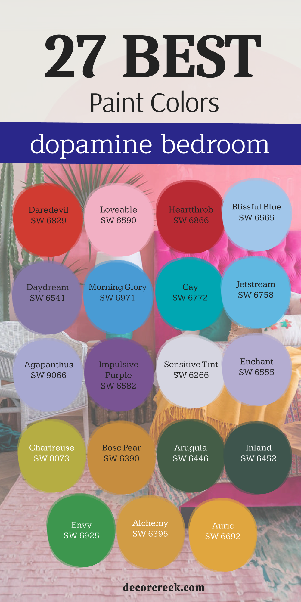
21 Paint Colors For The Dopamine Bathroom
Surf Green SW 6473
Surf Green SW 6473 brings the refreshing and happy feeling of the ocean waves directly into your morning routine in the bathroom. This color is a perfect mix of blue and green that makes a small room feel very open and bright. I choose this shade when I want to create a bathroom that feels like a sunny day at the beach for everyone.
Surf Green SW 6473 acts as an instant mood-lifter that makes you feel ready to start your day with a lot of energy. You will notice how it makes white tile and silver hardware look extra clean and very modern in the light. It is a very friendly color that works wonders for keeping the mood light and focused on happy thoughts.
I love how it looks with bright yellow towels to create a look that is full of life and style. The color is saturated enough to be noticed but light enough to keep the bathroom from feeling small. This shade is a favorite for those who want a happy home that feels very fresh and full of light. It brings a permanent sense of summer joy into your bathroom no matter what the weather is outside.
Best used in: all bathroom walls, vanity cabinets, ceiling accents, and powder rooms
Pairs well with: Optimistic Yellow SW 6900, High Reflective White SW 7757, Spa SW 6203, natural wood The key rule of this color for dopamine decor is to use it to keep your morning routine feeling light, fresh, and happy.
Tantalizing Teal SW 6937
Tantalizing Teal SW 6937 is a deep and vibrant blue-green that adds a layer of excitement and luxury to your bathroom walls. This color is all about being bold and choosing a shade that makes you feel happy and very alive every morning.
I use it to create a focal point in the bathroom that feels very modern and full of high-energy personality. Tantalizing Teal SW 6937 is a very strong color that demands your attention and makes the room feel like a spa. You will love how it provides a rich and textured background for your white towels and bright green plants in the room. It is a very social and fun color that makes the bathroom feel like a place where you can relax and feel good.
I find that it looks especially good with gold or brass hardware to build a very high-contrast and happy look. The color is deep and saturated, making the walls look very high-end and very professional in their finish and style. This shade is for the person who wants their home to be a reflection of their inner sense of joy. Using this teal is a great way to show that you love bright and happy colors in every room.
Best used in: master bathrooms, accent walls, vanity areas, and bathroom shelving
Pairs well with: Energetic Orange SW 6801, Snowbound SW 7004, Alchemy SW 6395, brass hardware The key rule of this color for dopamine decor is to use it to create a rich and high-energy atmosphere in your bathroom.
Nifty Turquoise SW 6941
Nifty Turquoise SW 6941 is a bright and electric blue-green that makes your bathroom feel like a tropical pool. This color is incredibly saturated and brings a huge sense of movement and life to small rooms. I use it when a bathroom feels a bit too quiet and needs a loud shout of energy to wake it up.
Nifty Turquoise SW 6941 reminds me of high-tech water parks and summer vacations where fun is the only goal. You will feel a sense of clarity and speed as you get ready for work in front of these walls. It is a very refreshing shade that makes your morning routine feel like a high-energy event every single day. I love how it looks when paired with bright white tile to create a look that is totally dedicated to joy.
The color stays looking very bright even when you do not have any windows in the bathroom area. This turquoise is a bold way to ensure that your house never feels boring or lacking in personality. It is a high-vibration color that helps you stay positive and happy in your daily life at home.
Best used in: guest bathrooms, powder rooms, vanity cabinets, and shower accent walls
Pairs well with: Rave Red SW 6820, High Reflective White SW 7757, Tricorn Black SW 6258, chrome fixtures The key rule of this color for dopamine decor is to use it to create a fast-paced and energetic vibe that keeps you feeling alert and happy.
Aquaverde SW 9051
Aquaverde SW 9051 is a soft and minty green that feels like a cool drink of water on a very hot day. This color offers a gentle sense of happiness that makes your bathroom feel open and full of fresh air. I choose this shade when I want to create a space where you can feel both energetic and totally lighthearted.
Aquaverde SW 9051 is bright enough to keep the mood up while remaining very friendly and easy on your eyes. You will notice how it makes your bathroom mirror look like it is floating in a beautiful and happy atmosphere. It is a fantastic choice for a room that needs to feel light and airy without losing its sense of color.
I love how it works with pink or yellow accents to build a palette that feels like a bunch of spring flowers. The pigment is clean and clear, so you never have to worry about the bathroom looking dark or heavy. This shade is perfect for someone who wants their home to feel like a cheerful escape from the busy world. It brings a gentle kind of joy that stays with you all morning long as you get ready.
Best used in: all bathroom walls, ceilings, small powder rooms, and bathroom shelving
Pairs well with: Coming up Roses SW 6585, Extra White SW 7006, Champagne SW 6644, white marble The key rule of this color for dopamine decor is to use it where you want the mood to stay light, clear, and perfectly happy.
🎨 Check out the complete guide to this color right HERE 👈

Mint Condition SW 6743
Mint Condition SW 6743 is a zesty and bright green that feels like a burst of fresh peppermint in your home. This color is all about energy and making your bathroom feel like a place where you can truly wake up. I use it to bring a sense of light and health to walls that need a break from traditional and dull tones.
Mint Condition SW 6743 has enough pigment to stand out and make a statement about your love for bright things. You will enjoy how the green glow makes the bathroom light feel warm and very inviting for a happy morning. It works perfectly with coral or navy accents to create a bathroom that feels like a vibrant and modern space.
The shade is very uplifting and helps to wash away any tired feelings you have when you first wake up. I find that it makes people feel more creative and ready to take on the world with a smile. This green is a wonderful choice for anyone who wants to surround themselves with a color that feels like a fresh start. It proves that a bathroom can be a place of high-energy joy and a great way to start your day.
Best used in: master bathrooms, kids’ bathrooms, laundry areas, and vanity nooks
Pairs well with: Coral Reef SW 6606, Pure White SW 7005, Naval SW 6244, silver hardware The key rule of this color for dopamine decor is to use it to create a fresh sanctuary that is filled with happy vibes.
Eco Green SW 6739
Eco Green SW 6739 is a vivid and grassy shade that brings the power of a sunny meadow into your bathroom. This color feels very healthy and full of life, making it a perfect fit for a dopamine-focused home design plan. I pick this green when I want to create a room that feels very sturdy and full of natural strength.
Eco Green SW 6739 acts as a perfect contrast for bright pinks or oranges, making those colors look even more vibrant. You will love how it grounds a room while still providing a huge amount of visual interest and style. It is a very sophisticated green that avoids looking like an old-fashioned office or a boring library.
The richness of the paint ensures that your bathroom walls look high-end and very professional even in a small space. I find that it makes white porcelain look exceptionally crisp and clean, which adds to the overall feeling of a fresh home. This shade is great for people who love the outdoors and want to feel surrounded by nature even in the shower. It is a bold choice that pays off by making your home feel like a vibrant and living thing every day.
Best used in: accent walls, bathroom cabinets, powder rooms, and window frames
Pairs well with: Bravado Pink SW 6874, Snowbound SW 7004, Golden Rule SW 6383, light wood accents The key rule of this color for dopamine decor is to use it to create a rich and organic feeling that makes your other colors pop.
Kale Green SW 6460
Kale Green SW 6460 is a deep and soulful green that feels like a hidden path through a world of happy trees. This color brings a sense of life and oxygen into your bathroom, making it feel very fresh and full of power. I use this green when I want to create a background that makes your colorful towels and soap dispensers look great. Kale Green SW 6460 is a very strong and dependable shade that adds a lot of visual weight without feeling sad.
You will love how it makes your bathroom plants blend into the walls to create a lush and green environment. It is a very sophisticated choice for people who want a dopamine-rich home that still feels very grounded. I find that it looks amazing with gold hardware and bright yellow accents to create a very stylish and happy look.
The color is deep enough to hide minor bumps in the wall while providing a rich finish that looks expensive. This shade is for the person who wants to feel surrounded by the peace and energy of the woods. It provides a beautiful and living backdrop for a life filled with joy and colorful morning adventures.
Best used in: vanity walls, master bathrooms, bathroom shelving, and door frames
Pairs well with: Naples Yellow SW 9021, Alabaster SW 7008, Copper Clay SW 9005, brass fixtures The key rule of this color for dopamine decor is to use it to bring the strength and vibrancy of the natural world into your space.
Vigorous Violet SW 6838
Vigorous Violet SW 6838 is a powerful and deep purple that adds a layer of excitement and drama to your bathroom. This color is all about being brave and picking the shades that truly make you feel happy and very alive. I use it to create a focal point in the bathroom that feels very modern and full of high-energy personality.
Vigorous Violet SW 6830 is a very strong color that demands your attention and makes the room feel like a work of art. You will love how it provides a rich and textured background for your favorite colorful rugs and soft towels. It is a very social and fun color that makes the room feel like a place where good things happen.
I find that it looks especially good with bright green or yellow accents to build a very high-contrast room. The color is deep and saturated, making the walls look very high-end and very professional in their finish. This shade is for the person who wants their home to be a loud and proud reflection of their joy. Using this purple is a great way to show that you are not afraid of standing out and being bold.
Best used in: powder rooms, accent walls, bathroom furniture, and ceiling details
Pairs well with: Chartreuse SW 0073, Pure White SW 7005, Alchemy SW 6395, silver accents The key rule of this color for dopamine decor is to use it to spark a sense of fun and creative energy in your home.
🎨 Check out the complete guide to this color right HERE 👈

Grape Mist SW 6548
Grape Mist SW 6548 is a soft and dreamy purple that feels like a quiet moment of happiness in your busy morning. This color has a very light touch but it still packs enough of a punch to be considered part of a joyful palette. I think of it as a breath of fresh air for bathroom walls that have been stuck with boring white for too long.
Grape Mist SW 6548 allows you to play with color without feeling like the room is closing in on you. You will enjoy how it looks under bright bathroom lights because the purple tones become deeper and more magical. It is a very friendly color that works well for people who are just starting to experiment with dopamine decor.
The coolness of the mist helps to keep your mind clear while the hint of purple keeps your heart feeling very light. I love using it in small bathrooms to give the space a hidden surprise that makes you smile. This shade is perfect for creating a bridge between traditional styles and a more modern, colorful outlook. It feels like a soft whisper of color that still manages to tell a very happy and bright story.
Best used in: all bathroom walls, ceilings, guest bathrooms, and vanity nooks
Pairs well with: Impulsive Purple SW 6582, Snowbound SW 7004, Sea Salt SW 6204, wicker baskets The key rule of this color for dopamine decor is to use it as a gentle foundation that supports your bolder and brighter choices.
🎨 Check out the complete guide to this color right HERE 👈
Amour Pink SW 6595
Amour Pink SW 6595 is a bold and punchy pink that turns your bathroom into a high-energy zone of pure happiness. This color is for the person who wants to start their day with a massive jolt of fun and excitement. I use it to create a room that is full of modern energy and a very strong sense of personal style.
Amour Pink SW 6595 acts as a powerful statement that your home is a place where joy is the most important thing. You will love how it makes your favorite art pieces and colorful towels stand out with incredible visual power. It is a very high-vibration color that keeps your brain active and your mood very high from the moment you step in.
I find that it looks amazing when paired with black or dark green accents to create a look that is very edgy. The color is so bright that it can turn even the smallest and darkest bathroom into a hub of creativity. This shade is a favorite for anyone who loves design and wants their house to feel like a modern gallery. Using it is a bold way to show the world that you are a very happy and energetic person.
Best used in: powder rooms, accent walls, bathroom cabinets, and mirror frames
Pairs well with: Tricorn Black SW 6258, Extra White SW 7006, Envy SW 6925, gold hardware The key rule of this color for dopamine decor is to use it as a bold highlight to prove you are not afraid of standing out.
Rose Colored SW 6303
Rose Colored SW 6303 is a deep and spicy pink that brings a lot of heat and comfort to your daily bathroom routine. This color is rich and full of life, reminding me of warm summer berries or a beautiful sunset. I pick this pink when a bathroom needs a strong sense of heart and a lot of positive and happy energy.
Rose Colored SW 6303 makes your towels and rugs look very expensive and well-chosen because the color is so deep. You will find that it creates an intimate atmosphere that is still very high in energy and movement for you. It is a very brave choice that shows you have a lot of confidence in your personal style and your happy home.
I love how it looks with gold hardware and dark green plants to create a look that is very rich. The depth of the pigment ensures that the color stays looking great even in a room without much light. This shade is perfect for someone who wants to feel a sense of passion and joy in every room. It is a bold and beautiful way to make your bathroom feel like a very important part of the house.
Best used in: master bathrooms, accent walls, vanity areas, and bathroom doors
Pairs well with: Inland SW 6452, Alabaster SW 7008, Malabar SW 9110, brass fixtures The key rule of this color for dopamine decor is to use it to create a warm and passionate heart for your bathroom.
🎨 Check out the complete guide to this color right HERE 👈
Coming up Roses SW 6585
Coming up Roses SW 6585 is a bright and cheerful pink that makes your bathroom feel like a soft and happy garden. This color is all about kindness and creating a space where you can truly feel like your most playful self. I use it to bring a sense of light and sweetness to walls that need a break from dull and boring tones.
Coming up Roses SW 6585 has enough pigment to stand out without feeling like it belongs only in a child’s nursery. You will enjoy how the pink glow makes the morning light feel warm and very inviting for a happy day. It works perfectly with green or blue accents to create a bathroom that feels like a vibrant summer retreat.
The shade is very uplifting and helps to wash away any morning stress you might have before work. I find that it makes people feel more creative and relaxed in a way that is still full of life. This pink is a wonderful choice for anyone who wants to surround themselves with a color that feels like a happy hug. It proves that a bathroom can be both a place of rest and a place of high-energy joy.
Best used in: guest bathrooms, powder rooms, vanity nooks, and all bathroom walls
Pairs well with: Mint Condition SW 6743, Pure White SW 7005, Crushed Ice SW 7647, silver frames The key rule of this color for dopamine decor is to use it to create a soft sanctuary that is filled with happy vibes.
Optimistic Yellow SW 6900
Optimistic Yellow SW 6900 lives up to its name by bringing a fast and fun spirit to your bathroom walls every day. This color acts like a battery that keeps the mood in your home feeling high and full of positive energy. I love how it removes any sense of dullness from a small room and replaces it with a bright pulse.
Optimistic Yellow SW 6900 is a fantastic choice for an accent wall that needs to provide a lot of visual excitement. You will see how it makes your colorful towels and soap dispensers look even more vibrant and full of life. It is a very warm shade that helps to make a cold bathroom feel much more inviting and fun.
I find that it encourages a playful attitude and helps you start your day with a big smile on your face. The color is very saturated and stays looking bright even when the overhead lights are the only source. This yellow is specifically for people who want their home to feel like a high-energy hub of happiness. It is a bold way to prove that you are not afraid of using bright and happy colors in small spaces.
Best used in: kids’ bathrooms, guest powder rooms, vanity areas, and bathroom shelving
Pairs well with: Jetstream SW 6758, High Reflective White SW 7757, Peppercorn SW 7674, light oak The key rule of this color for dopamine decor is to use it where you want to feel a boost of happy motion.
🎨 Check out the complete guide to this color right HERE 👈

Naples Yellow SW 9021
Naples Yellow SW 9021 is a warm and golden yellow that feels like a permanent ray of sunshine hitting your bathroom walls. This color provides a deep sense of comfort and happiness that makes your daily routine feel very welcoming. I choose this shade when a bathroom feels a bit too cold and needs a layer of golden light to warm it up. Naples Yellow SW 9021 makes a wonderful backdrop for wooden cabinets and colorful tiles that have a lot of life.
You will find that it creates a very cozy atmosphere that still feels very energetic and full of positive vibes. It is a very sophisticated yellow that avoids looking like a toy while still being very playful and fun. I love how it glows in the light and makes the whole room feel like it is filled with a happy energy.
The color is rich and saturated, giving your walls a high-quality finish that looks very professional and well-planned. This shade is perfect for anyone who wants to feel a sense of sunshine and joy the second they wake up. It brings a lot of heart and a very high level of happiness to your morning environment.
Best used in: all bathroom walls, vanity cabinets, window trims, and small powder rooms
Pairs well with: Kale Green SW 6460, Alabaster SW 7008, Repose Gray SW 7015, navy blue accents The key rule of this color for dopamine decor is to use it to bring a sense of warmth and permanent sunshine into your bathroom.
Golden Rule SW 6383
Golden Rule SW 6383 acts like a giant bucket of liquid sunshine poured right onto your bathroom walls. This color is deep and rich, giving off a warm glow that makes you feel like you are standing in a field of sunflowers. I pick this shade when a bathroom feels too clinical and needs a heavy dose of personality and light. Golden Rule SW 6383 makes a fantastic partner for dark wood vanities and bright white towels because the contrast is very sharp.
You will love how it warms up your reflection in the mirror, making you feel healthy and ready for the day. It is a very sturdy yellow that feels expensive and intentional rather than just a bright accident. I find that it works wonders in basement bathrooms where there is no natural window light to be found.
The color is very saturated and provides a smooth finish that makes the whole room feel much more high-end. This gold is specifically for people who want their home to be a place of permanent summer and happiness. It brings a sense of wealth and joy to your morning routine that is very easy to achieve with paint.
Best used in: guest bathrooms, vanity walls, powder rooms, and bathroom cabinets
Pairs well with: Inland SW 6452, Alabaster SW 7008, Naval SW 6244, copper metal accents The key rule of this color for dopamine decor is to use it where you want to feel a deep sense of warmth and golden happiness every single day.
🎨 Check out the complete guide to this color right HERE 👈

Charisma SW 6605
Charisma SW 6605 is a vivid and punchy magenta that brings a massive amount of life to your bathroom walls. This color is for the person who wants to start their day with a bold shout of pure energy and fun. I use it to create a room that is full of modern style and a very strong sense of personal joy. Charisma SW 6605 acts as a powerful statement that your house is a place where you are not afraid to be seen.
You will notice how it makes white porcelain and silver fixtures look extra bright and very clean in the light. It is a high-vibration color that keeps your brain active and your mood very high from the moment you step inside. I find that it looks amazing when paired with dark green or black accents to create a very edgy look.
The color is so bright that it can turn even the smallest powder room into a hub of creativity and excitement. This shade is a favorite for anyone who loves design and wants their house to feel like a modern art gallery. Using it is a bold way to show the world that you are a very happy and energetic person.
Best used in: powder rooms, accent walls behind the mirror, bathroom doors, and shelving
Pairs well with: Envy SW 6925, Snowbound SW 7004, Tricorn Black SW 6258, silver hardware The key rule of this color for dopamine decor is to use it as a bold highlight to prove you are not afraid of standing out in your home.
🎨 Check out the complete guide to this color right HERE 👈

Peach Blossom SW 6624
Peach Blossom SW 6624 is a cheerful and fruity shade that makes your bathroom feel like a sunny morning in an orchard. This color offers a soft yet very energetic vibe that makes everyone feel instantly more lighthearted and happy. I use it to create a sense of fun and sweetness that stays with you throughout your entire routine.
Peach Blossom SW 6624 works perfectly with teal or blue accents to build a bathroom that is full of life. You will love how the warm orange tones make the light in your bathroom feel very kind and welcoming. It is a very friendly color that keeps the mood light and focused on positive thoughts while you get ready.
I find that it makes white trim look extra bright and clean, which adds to the overall fresh feeling. The shade is saturated enough to be the star of the show without making the bathroom feel too small. This color is for the person who wants to feel surrounded by the warmth and joy of a summer day. It brings a lot of heart and a very high level of happiness to your favorite morning environment.
Best used in: all bathroom walls, vanity nooks, guest bathrooms, and ceiling accents
Pairs well with: Nifty Turquoise SW 6941, Pure White SW 7005, Malabar SW 9110, gold fixtures The key rule of this color for dopamine decor is to use it to create a vibrant and happy atmosphere that feels soft and sweet.
🎨 Check out the complete guide to this color right HERE 👈

Coral Clay SW 9005
Coral Clay SW 9005 is a warm and earthy reddish-pink that feels like a beautiful sunset over a desert landscape. This color brings a sense of life and comfort into your bathroom, making it feel very fresh and full of power. I pick this shade when a bathroom needs a strong sense of heart and a lot of positive energy for the family. Coral Clay SW 9005 acts as a perfect contrast for bright green plants, making them look even more vibrant and alive.
You will love how it grounds a room while still providing a huge amount of visual interest and style. It is a very sophisticated choice for people who want a dopamine-rich home that still feels connected to nature. I find that it makes white towels and light-colored rugs look exceptionally clean and sharp in your bathroom.
The color is deep enough to hide any small marks on the wall while providing a rich finish that feels expensive. This shade is for the person who wants to feel surrounded by the warmth and energy of the earth. It provides a beautiful and living backdrop for a life that is filled with joy and colorful morning rituals.
Best used in: master bathrooms, accent walls, vanity areas, and bathroom shelving
Pairs well with: Kale Green SW 6460, Alabaster SW 7008, Bosc Pear SW 6390, terracotta tiles The key rule of this color for dopamine decor is to use it to create a warm and grounded feeling that makes your bathroom feel like a sanctuary.
🎨 Check out the complete guide to this color right HERE 👈

Bluebird Feather SW 9062
Bluebird Feather SW 9062 is a bright and happy blue that feels like a clear sky right after a spring rain. This color brings a massive amount of energy into your bathroom, making it feel very fresh and full of life. I use this blue when I want to create a space that feels very open and full of positive possibilities. Bluebird Feather SW 9068 acts like a breath of fresh air for walls that have been stuck with boring white for too long.
You will feel a sense of mental clarity and happiness as soon as you see these bright blue walls in the morning. It is a very friendly color that works wonders for keeping the mood light and energetic as you wake up. I love how it looks with bright yellow or pink towels to create a look that is full of fun.
The pigment is clean and clear, so you never have to worry about the bathroom looking dark or heavy at night. This shade is a favorite for those who want a happy home that feels very clean and full of light. It brings a permanent sense of daytime joy into your bathroom no matter what is happening outside.
Best used in: all bathroom walls, kids’ bathrooms, laundry rooms, and ceiling details
Pairs well with: Optimistic Yellow SW 6900, High Reflective White SW 7757, Coming up Roses SW 6585, white tile The key rule of this color for dopamine decor is to use it to keep your morning routine feeling light, clear, and perfectly happy.
Upward SW 6239
Upward SW 6239 is a very soft and light blue that provides a subtle glow of happiness for your bathroom walls. This color is perfect for people who want to start using dopamine decor but are not ready for very loud tones. I think of it as a gentle introduction to a more colorful life that still feels very safe and happy. Upward SW 6239 helps to brighten up a small bathroom and make it feel very airy and full of light.
You will enjoy how it provides a soft backdrop that makes your colorful shower curtains and art look even more special. It is a very friendly and welcoming color that makes guests feel right at home in your stylish house. I love using it on the ceiling to add a hidden surprise of color that makes you look up and smile.
The blue is very light and does not make the bathroom feel small or closed in at any time. This shade is a great way to add a layer of soft joy to your home without it being too much. It brings a gentle sense of happiness that makes your bathroom feel like a very peaceful and happy retreat.
Best used in: small bathrooms, guest powder rooms, ceilings, and bathroom shelving
Pairs well with: Blissful Blue SW 6565, Pure White SW 7005, Silver Strand SW 7057, chrome hardware The key rule of this color for dopamine decor is to use it as a soft foundation that supports your other bright and happy choices.
🎨 Check out the complete guide to this color right HERE 👈

Spa SW 6765
Spa SW 6765 is a refreshing and light teal that makes your bathroom feel like a high-end resort in a tropical location. This color is a perfect mood-booster that makes a small room feel both energetic and very happy for you. I choose this shade when a bathroom feels a bit stuck in the past and needs a wave of fresh energy. Spa looks stunning with white cabinets because the contrast makes the teal look even more exciting to see.
You will feel a sense of joy and relaxation that is typical of a sunny day spent by clear blue water. It is a very clean and bright color that makes your bathroom feel like a very fun place to hang out. I love how it works with natural wood and bright green plants to create a room that is full of life.
The teal is strong and clear, ensuring that your walls look high-quality and very intentional in their design. This shade is perfect for someone who wants their home to feel like a non-stop celebration of the summer season. It brings a lot of personality and a very high level of happiness to any bathroom it touches with paint.
Best used in: master bathrooms, all bathroom walls, vanity areas, and bathroom shelving
Pairs well with: Surf Green SW 6473, Snowbound SW 7004, Coral Reef SW 6606, natural stone The key rule of this color for dopamine decor is to use it in rooms where you want a refreshing splash of tropical energy every day.
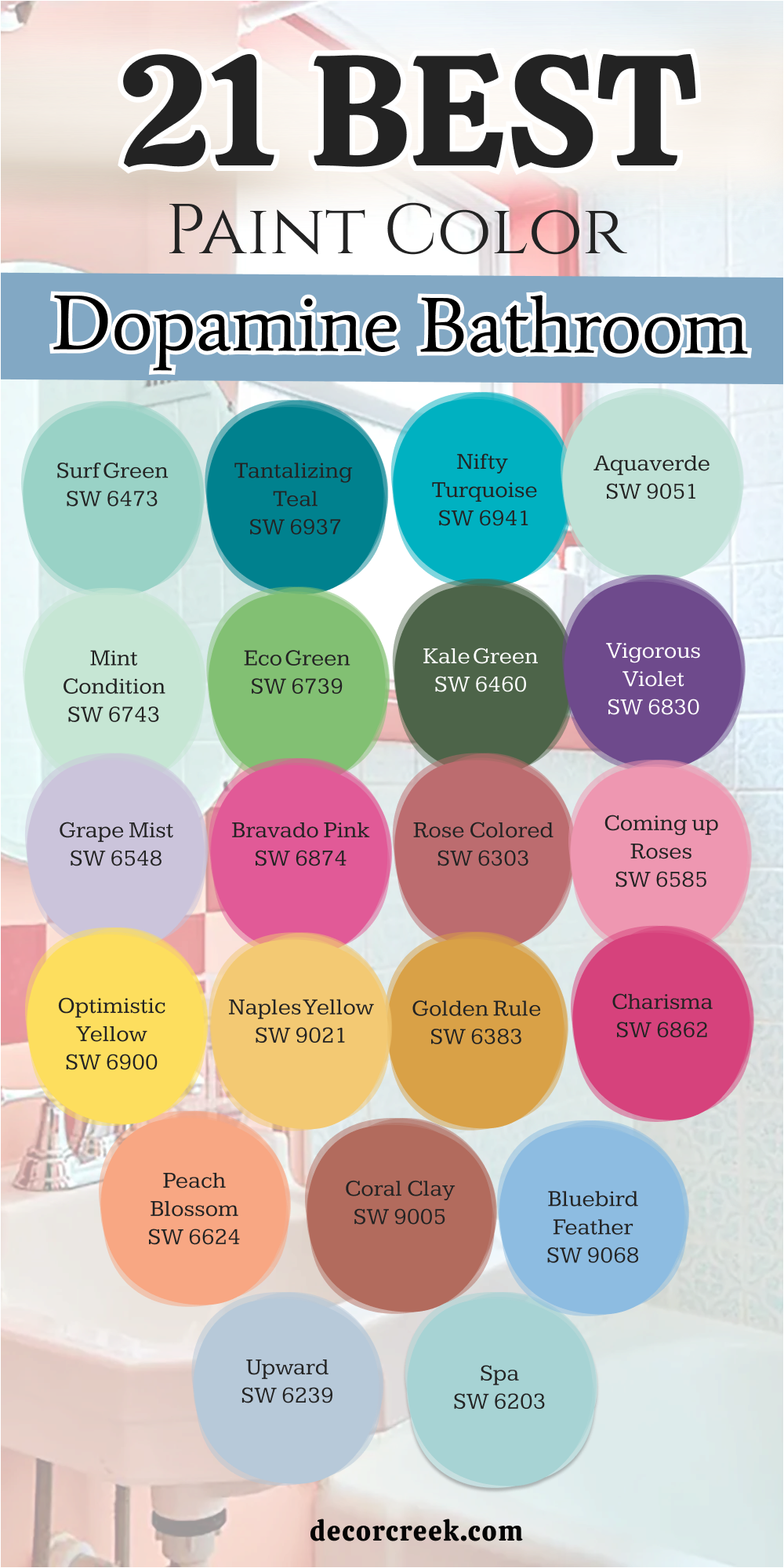
18 Paint Color Ideas For The Dopamine Decor Living Room
Spangle SW 6834
Spangle SW 6834 is a bright and energetic blue that turns your living room into a place of constant fun and laughter. This color makes a room feel open and full of possibility for any party or family gathering you host. I love how it adds a crisp feeling to the environment while still being very playful to look at.
Spangle SW 6834 is a very cheerful blue that avoids looking gloomy or like a boring office building. You can pair it with yellow accents to create a room that feels like a sunny day at the beach. The vibrancy of this shade helps to bounce light around the room and make everything look much cleaner.
It is a fantastic choice for a main living area where you want everyone to feel alert and happy. This blue is unapologetic about its brightness and its ability to make people smile instantly as they enter. I find that it works exceptionally well in living rooms that get a lot of natural window light. Using this color is a great way to show that your home is a place of activity and joy.
Best used in: accent walls, built-in bookshelves, living room ceilings, and window frames
Pairs well with: Lemon Twist SW 6909, Pure White SW 7005, Dorian Gray SW 7017, light oak flooring The key rule of this color for dopamine decor is to use it where you want the air to feel light and the mood to stay upbeat.
🎨 Check out the complete guide to this color right HERE 👈
Calypso SW 6950
Calypso SW 6950 is a deep and rhythmic blue that brings a lot of soulful energy and fun to your living room walls. This color is much more than a standard shade because it has a hidden brightness that comes out under your lamps. I use it to create a sense of mystery and excitement in rooms that are used for social gatherings and movies.
Calypso makes a great backdrop for bright artwork or neon signs that need a strong base to stand against. You will feel a sense of calm confidence and happiness when you are surrounded by this rich and beautiful blue. It is a very durable color choice that looks great for many years without ever feeling like it is out of style.
I love how it makes a living room feel very cozy at night while still looking bright and happy during the day. This blue is perfect for people who want a more mature version of dopamine decor that still feels very playful. It is a strong and dependable color that adds a lot of value to the visual weight of your interior design. Using this shade shows that you have a bold personality and a great eye for deep and interesting colors.
Best used in: all living room walls, media walls, fireplace surrounds, and kitchen-living combos
Pairs well with: Alchemy SW 6395, Snowbound SW 7004, Rose Colored SW 6303, gold accents The key rule of this color for dopamine decor is to use it as a powerful foundation for a room that feels exciting.
Cay SW 6772
Cay SW 6772 turns your living room into a tropical getaway that feels like a non-stop vacation for your family. This color brings a massive splash of bright energy that makes every guest feel instantly happy and relaxed. I love how it creates a background that makes your colorful books and pillows look like a coordinated work of art.
Cay SW 6772 is a very bold choice that tells the world your home is a place for fun and adventure. You will see how it brightens up the darkest corners and makes the whole room feel twice as large. It is a very clean blue-green that never looks muddy or boring even when the sun goes down at night.
I find that it encourages a lively atmosphere where people want to gather and share happy stories together. The pigment is rich and gives your walls a professional look that stays vibrant for many years to come. This shade is specifically for people who want to feel a boost of tropical energy every time they sit on the couch. Using this color is the fastest way to make your main living area feel like a high-energy hub of joy.
Best used in: accent walls, built-in cabinets, fireplace surrounds, and open-plan living areas
Pairs well with: Knockout Orange SW 6889, Extra White SW 7006, Morning Glory SW 6971, light wood furniture The key rule of this color for dopamine decor is to use it in your largest room to create a refreshing and happy tropical vibe.
🎨 Check out the complete guide to this color right HERE 👈
Bluebird Feather SW 9062
Bluebird Feather SW 9062 offers a cheerful and light blue that feels like a breath of fresh air for your walls. This color is all about mental clarity and making your living room feel like a wide-open sky full of happy possibilities. I choose this shade when a room feels a bit too heavy or serious and needs a layer of pure joy.
Bluebird Feather acts as a perfect foundation for a space filled with bright plants and colorful modern furniture. You will enjoy how the morning light bounces off the walls and makes everything look crisp and totally new. It is a very friendly color that keeps the mood in your house light and focused on the bright side.
I love how it looks when paired with sunny yellow accents to build a room that feels like a spring day. The paint provides a very smooth finish that makes your living room look expensive and well-planned for fun. This shade is a favorite for those who want a happy home that feels very clean and organized. It brings a permanent sense of daytime happiness to your favorite gathering spot for family and friends.
Best used in: all living room walls, ceilings, window trims, and hallway connections
Pairs well with: Optimistic Yellow SW 6900, High Reflective White SW 7757, Coming up Roses SW 6585, white linen The key rule of this color for dopamine decor is to use it where you want the air to feel light and the mood perfectly happy.
Daydream SW 6541
Daydream SW 6541 is a rich and soulful purple that brings a sense of wonder and creative magic to your home. This color is saturated enough to feel very intentional while still being a core part of a playful dopamine palette. I see it as the ultimate choice for a living room where you want to feel both cozy and totally inspired.
Daydream SW 6541 creates a sense of depth that makes your walls look like they have a very interesting story to tell. You will notice that it pairs beautifully with bright green accents to create a vibrant garden-like feel inside. It is a color that rewards you for being bold because it looks better the more you use it in the room.
The balance of tones keeps it from feeling too heavy or aggressive for a space where you spend a lot of time. I find that it works wonders for making a standard living room feel like a special jewel box of color. This shade is for the person who wants to escape from the ordinary world into a place of beauty. It brings a sophisticated kind of fun that stays interesting no matter how long you live with it.
Best used in: accent walls, cozy dens, reading nooks, and behind media consoles
Pairs well with: Chartreuse SW 0073, Alabaster SW 7008, Dorian Gray SW 7017, brass metal The key rule of this color for dopamine decor is to use it where you want to spark a sense of fun and creative imagination.
🎨 Check out the complete guide to this color right HERE 👈
Blissful Blue SW 6527
Blissful Blue SW 6527 feels like a soft summer breeze blowing through your living room on a perfectly sunny afternoon. This color offers a pure sense of happiness that makes a large room feel open and full of fresh energy. I pick this blue when I want to create a space where the whole family can relax and find new joy.
Blissful Blue SW 6565 is bright enough to keep the energy levels high while remaining very easy on the eyes. You will notice how it makes your white furniture look like it is floating in a beautiful and clear atmosphere. It is a fantastic choice for a room that needs to feel light and airy without losing its sense of personality.
I love how it works with pink or orange accents to build a palette that feels like a box of candy. The pigment is very clean, so the walls always look fresh and never look dark even on rainy days. This shade is perfect for someone who wants their home to feel like a cheerful escape from the busy world. It brings a gentle kind of joy that stays with you and your guests all evening long.
Best used in: all four walls, open-plan areas, living room ceilings, and entryways
Pairs well with: Lemon Twist SW 6909, Pure White SW 7005, Loveable SW 6590, light wood tones The key rule of this color for dopamine decor is to use it to keep the heart of your home feeling light and happy.
🎨 Check out the complete guide to this color right HERE 👈
Enchant SW 6555
Enchant SW 6555 is a light and magical purple that turns your living room into a place of pure and bubbly happiness. This color has a very playful personality that keeps the energy in your home feeling high and full of life. I love how it adds a soft glow to the walls that reminds me of a beautiful sunrise over a field.
Enchant SW 6555 is the perfect pick if you want to move away from boring gray and try something unique. You will see how it makes your furniture look fresh and modern without making the room feel small or dark. It is a very friendly shade that makes everyone who enters feel a little bit more lighthearted and ready to talk.
I find that it works wonders for making a family room feel like a special and colorful retreat for everyone. The paint provides a very clean finish that catches the light in a way that feels totally refreshing and new. This purple is a great tool for building a house that is dedicated to a positive and fun way of living. It brings a permanent sense of wonder to your personal space that never gets old or feels tired.
Best used in: accent walls, living room offices, built-in shelving, and entry halls
Pairs well with: Loveable SW 6590, Extra White SW 7006, Silver Strand SW 7057, glass coffee tables The key rule of this color for dopamine decor is to use it to create a light and magical sense of happiness.
Impulsive Purple SW 6832
Impulsive Purple SW 6832 is a bold and rich shade that celebrates the pure fun of making a daring choice. This color has a deep personality that adds a layer of excitement to any living room wall it covers today. I see it as a wonderful way to show off a creative spirit that is not afraid of being seen.
Impulsive Purple SW 6582 works like a charm in rooms where you want to feel inspired to try new things. You will love how it catches the light and reveals different layers of violet and magenta throughout the sunny day. It is a very social color that makes guests feel like they are in a place where fun is the priority.
I find that it makes gold and silver decorations look very shiny and important against the deep purple background. This shade is for the person who wants their home to be a reflection of their vibrant and energetic inner life. It turns a boring room into a place of magic and mystery that still feels very welcoming and bright. Using this color is a great way to prove that you live life with a lot of passion.
Best used in: accent walls, fireplace walls, media rooms, and living room furniture
Pairs well with: Chartreuse SW 0073, Alabaster SW 7008, Alchemy SW 6395, velvet sofas The key rule of this color for dopamine decor is to use it to spark a sense of fun and creative energy.
🎨 Check out the complete guide to this color right HERE 👈
Amour Pink SW 6595
Amour Pink SW 6595 is a powerful and punchy pink that turns your living room into a zone of pure joy. This color is for the person who wants their home to start every day with a massive jolt of fun. I use it to create a room that is full of modern energy and a very strong sense of style.
Amour Pink SW 6595 acts as a statement that your house is a place where happiness is the main goal. You will love how it makes your favorite art pieces and colorful rugs stand out with incredible visual power. It is a very high-vibration color that keeps your brain active and your mood very high all the time.
I find that it looks amazing when paired with dark green or black accents to create a very edgy look. The color is so bright that it can turn a standard living room into a hub of creativity and excitement. This shade is a favorite for anyone who loves design and wants their house to feel like a modern gallery. Using it is a bold way to show the world that you are a very happy and energetic person.
Best used in: accent walls, doors, built-in shelving, and creative living spaces
Pairs well with: Tricorn Black SW 6258, Extra White SW 7006, Envy SW 6925, gold hardware The key rule of this color for dopamine decor is to use it as a bold highlight to prove you love standing out.
Rose Colored SW 6303
Rose Colored SW 6303 is a deep and spicy pink that brings a lot of warmth and heart to your home. This color is rich and full of life, reminding me of beautiful sunsets and happy summer evenings with friends. I pick this pink when a living room needs a strong sense of comfort and a lot of positive energy.
Rose Colored SW 6303 makes your furniture look very expensive and well-chosen because the color is so deep and saturated. You will find that it creates an intimate atmosphere that is still very high in energy and visual movement. It is a very brave choice that shows you have a lot of confidence in your personal and happy style.
I love how it looks with gold hardware and dark green plants to create a look that is very rich. The depth of the pigment ensures that the color stays looking great even in a room with very little light. This shade is perfect for someone who wants to feel a sense of passion and joy in every room. It is a bold and beautiful way to make your living room feel like a very important part of the house.
Best used in: all four walls, accent walls, living room nooks, and fireplace surrounds
Pairs well with: Inland SW 6452, Alabaster SW 7008, Malabar SW 9110, brass accents The key rule of this color for dopamine decor is to use it to create a warm and passionate heart for your home.
🎨 Check out the complete guide to this color right HERE 👈
Peach Blossom SW 6624
Peach Blossom SW 6624 is a cheerful and fruity orange-pink that makes your living room feel like a sunny day. This color offers a soft yet very energetic vibe that makes everyone feel instantly more lighthearted and ready to talk. I use it to create a sense of fun and sweetness that stays with you throughout the whole day.
Peach Blossom SW 6624 works perfectly with teal or blue accents to build a room that is full of life. You will love how the warm tones make the light in your living room feel very kind and welcoming. It is a very friendly color that keeps the mood light and focused on positive thoughts for the family.
I find that it makes white trim look extra bright and clean, which adds to the overall fresh feeling. The shade is saturated enough to be the star of the show without making the room feel too small. This color is for the person who wants to feel surrounded by the warmth and joy of a summer afternoon. It brings a lot of heart and a very high level of happiness to your favorite living environment.
Best used in: all living room walls, breakfast nooks, accent walls, and ceiling details
Pairs well with: Nifty Turquoise SW 6941, Pure White SW 7005, Malabar SW 9110, gold fixtures The key rule of this color for dopamine decor is to use it to create a vibrant and happy atmosphere that feels soft.
🎨 Check out the complete guide to this color right HERE 👈
Malabar SW 9110
Malabar SW 9110 is a warm and sandy tan that feels like a sunny day at the beach with no clouds. This color provides a happy and stable base for all your wildest dopamine decor ideas and bright furniture pieces. I use it when a living room needs a touch of warmth to make the more intense colors belong together. Malabar SW 9110 is far from a boring neutral because it has a golden undertone that glows in the bright sun.
You will find that it makes your home feel much more expensive and well-thought-out without losing any of the fun. It is a very safe choice for large living rooms where you want to feel a sense of harmony and light. I love how it complements natural materials like wood and stone while still feeling very modern and updated for you.
This color is like a warm hug that welcomes you back to your home after a long and busy day. It serves as a reminder that even your background colors can be full of joy and light if you pick correctly. This shade is essential for balancing out a home that is filled with many different and competing bright colors.
Best used in: all living room walls, open-plan spaces, hallways, and fireplace walls
Pairs well with: Envy SW 6925, Extra White SW 7006, Iron Ore SW 7069, blue textiles The key rule of this color for dopamine decor is to use it as a sunny anchor that ties all your colors together.
🎨 Check out the complete guide to this color right HERE 👈
Champagne SW 6644
Champagne SW 6644 is a light and bubbly yellow that feels like a happy celebration is happening on your walls. This color is all about keeping the mood light and joyful throughout the entire day and night for the family. I use it to brighten up a living room that needs a soft glow without being as intense as primary yellow.
Champagne SW 6644 acts like a warm light bulb that is always turned on and giving off a friendly vibe. You will see how it makes your living room feel bigger and much more open to new ideas and joy. It is a very versatile color that works well with almost any other bright shade in the dopamine decor palette.
I love how it complements pinks and blues to create a room that feels like a box of happy treats. The yellow is very subtle but it still has enough personality to make a statement that your home is happy. This shade is perfect for people who want a cheerful house that feels very classy and well-put-together. It brings a permanent sense of morning sunshine to your walls even when the weather outside is gray and cold.
Best used in: all living room walls, hallways, ceiling accents, and window trims
Pairs well with: Blissful Blue SW 6565, Snowbound SW 7004, Rose Colored SW 6303, light wood furniture The key rule of this color for dopamine decor is to use it as a light foundation for a home that loves joy.
🎨 Check out the complete guide to this color right HERE 👈
Golden Rule SW 6383
Golden Rule SW 6383 acts like a giant bucket of liquid sunshine poured right onto your living room walls today. This color is deep and rich, giving off a warm glow that makes you feel like you are in a field. I pick this shade when a room feels too cold and needs a heavy dose of personality and light for the family.
Golden Rule SW 6383 makes a fantastic partner for dark wood furniture and bright white rugs because the contrast is sharp. You will love how it warms up the whole atmosphere, making you feel healthy and ready for a good time. It is a very sturdy yellow that feels expensive and intentional rather than just a bright and random accident.
I find that it works wonders in living rooms where there is not enough natural window light to be found. The color is very saturated and provides a smooth finish that makes the whole room feel much more high-end. This gold is specifically for people who want their home to be a place of permanent summer and happiness. It brings a sense of wealth and joy to your daily life that is very easy to achieve with paint.
Best used in: accent walls, fireplace surrounds, built-in shelving, and living room cabinets
Pairs well with: Inland SW 6452, Alabaster SW 7008, Naval SW 6244, copper metal accents The key rule of this color for dopamine decor is to use it where you want a deep sense of warmth and happiness.
🎨 Check out the complete guide to this color right HERE 👈
Auric SW 6692
Auric SW 6692 is a deep and warm golden shade that feels like a solid bar of happy light on your walls. This color provides a sense of value and joy that is very hard to ignore when you enter the room. I use it when a living room needs to feel very special and full of positive energy and light.
Auric SW 6692 makes a fantastic backdrop for dark furniture and colorful books because it makes everything look more interesting. You will love how it glows in the evening when the lamps are turned on and the room feels warm. It is a very sophisticated yellow that avoids looking like a toy while still being very playful and happy.
I find that it works wonders for making large rooms feel much warmer and more inviting to anyone who visits. The color is very saturated and provides a finish that looks very professional and high-quality for your stylish house. This shade is for the person who wants to feel like they are living in a place of permanent golden light. It adds a layer of luxury and joy to your daily life that is very simple to achieve with a brush.
Best used in: all living room walls, library walls, entry halls, and dining connections
Pairs well with: Inland SW 6452, Alabaster SW 7008, Naval SW 6244, copper metal accents The key rule of this color for dopamine decor is to use it where you want a deep sense of golden happiness.
Arugula SW 6446
Arugula SW 6446 is a deep and leafy green that turns your living room into a lush and vibrant forest. This color brings a massive amount of natural energy into your home, making it feel very fresh and full of life. I use this green when I want to create a space that feels very sturdy and full of positive growth.
Arugula SW 6446 works like a dream as a background for bright pink or yellow decor to create a happy look. You will love how it makes your indoor plants look like they are part of the walls for a fresh feeling. It is a very sophisticated choice for people who want a dopamine-rich home that still feels connected to nature.
I find that it makes white trim and light-colored furniture look exceptionally clean and sharp in your living room. The color is deep enough to hide any small marks on the wall while providing a rich finish that feels expensive. This shade is for the person who wants to feel surrounded by the peace and energy of the green outdoors. It provides a beautiful and living backdrop for a life that is filled with joy and colorful adventures.
Best used in: accent walls, fireplace walls, built-in cabinets, and living room offices
Pairs well with: Loveable SW 6590, Snowbound SW 7004, Bosc Pear SW 6390, natural wood tones The key rule of this color for dopamine decor is to use it to bring the vibrancy of nature into your home.
🎨 Check out the complete guide to this color right HERE 👈
Kale Green SW 6460
Kale Green SW 6460 is a deep and soulful green that feels like a path through a world of happy trees. This color brings a sense of life and oxygen into your living room, making it feel very fresh and full of power. I use this green when I want to create a background that makes your colorful rugs and art look great.
Kale Green SW 6460 is a very strong and dependable shade that adds visual weight without feeling sad or heavy. You will love how it makes your indoor plants blend into the walls to create a lush and green environment. It is a very sophisticated choice for people who want a dopamine-rich home that still feels very grounded.
I find that it looks amazing with gold hardware and bright yellow accents to create a very stylish and happy look. The color is deep enough to hide minor bumps in the wall while providing a rich finish that looks expensive. This shade is for the person who wants to feel surrounded by the peace and energy of the deep woods. It provides a beautiful and living backdrop for a life filled with joy and colorful daily adventures.
Best used in: accent walls, fireplace surrounds, built-in shelving, and window frames
Pairs well with: Naples Yellow SW 9021, Alabaster SW 7008, Coral Clay SW 9005, brass fixtures The key rule of this color for dopamine decor is to use it to bring the strength of the natural world inside.
Eco Green SW 6739
Eco Green SW 6739 is a vivid and grassy shade that brings the power of a sunny meadow into your home. This color feels very healthy and full of life, making it a perfect fit for a dopamine-focused design plan. I pick this green when I want to create a room that feels very sturdy and full of natural strength. Eco Green SW 6739 acts as a contrast for bright pinks or oranges, making those colors look even more vibrant.
You will love how it grounds a room while still providing a huge amount of visual interest and style. It is a very sophisticated green that avoids looking like an old-fashioned office or a boring and dusty library. The richness of the paint ensures that your living room walls look high-end and very professional in any light.
I find that it makes white furniture look exceptionally crisp and clean, which adds to the overall feeling of a fresh house. This shade is great for people who love the outdoors and want to feel surrounded by nature even when sitting inside. It is a bold choice that pays off by making your home feel like a vibrant and living thing.
Best used in: all living room walls, accent walls, door frames, and built-in cabinets
Pairs well with: Bravado Pink SW 6874, Snowbound SW 7004, Golden Rule SW 6383, light wood accents The key rule of this color for dopamine decor is to use it to create an organic feeling that makes colors pop.
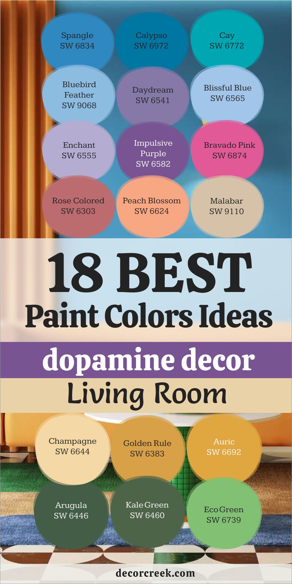
My Final Thoughts About 29 Paint Color Ideas for Dopamine Decor
I am convinced that a home filled with these bright and happy colors can change the way you live for the better. We spend so much time indoors that it only makes sense to surround ourselves with shades that spark a smile and keep us feeling alive.
These 29 paint ideas are your starting point for building a life that is full of joy and personal expression. Do not let the old rules of design stop you from picking the red, purple, or green that makes your heart beat faster. Every room in your house is a chance to tell a happy story and show off your unique and energetic spirit.
Remember that paint is the easiest way to add a layer of excitement to your environment without needing a huge budget. Your home is your personal world, and it should be as colorful and vibrant as you are. Pick a color that you love and start painting your way to a much happier and more energetic daily life.
Do not let the old, restrictive rules of traditional design stop you from picking the daring red, the royal purple, or the electric green that makes your heart beat faster every time you walk by. Every single room in your house, from the smallest hallway to the largest living area, represents a golden chance to tell a happy story and show off your unique and energetic spirit to everyone who enters. Your walls are a canvas for your happiness, and they should never be silenced by the fear of being “too much.”
Remember that paint is the fastest and most effective way to add a massive layer of excitement to your environment without needing a huge budget or a complete structural renovation. It is the most accessible tool you have to transform a drab space into a vibrant sanctuary. Your home is your private, personal world—a sanctuary from the gray outside—and it should be every bit as colorful and vibrant as the person you are on the inside.
Do not settle for “safe” when you can have “spectacular.” By choosing a dopamine-rich palette, you aren’t just decorating a house; you are investing in your own well-being and creating a legacy of joy that resonates through every corner of your living space.