🎨 Take a closer look at the full guide to this shade right HERE👈

As a home interior designer and staging expert, my entire professional life revolves around understanding how color affects human emotion and perception. I spend countless hours thinking about color and how it makes people truly feel the moment they walk into a room.
I know that a fresh coat of paint is the single biggest, most impactful factor in setting the mood of your home, and it dictates the entire energy of the residence.
It’s the silent background for all your treasured memories, and it is crucial whether you are getting ready to sell for the best price or simply planning a personal refresh for yourself and your family.
For 2026, the clear trends I see moving forward are less about shocking, fleeting new shades and far more about celebrating what makes a house feel inherently comfortable—a truly cherished home.
People are seeking colors that feel grounding and authentic, shades that provide a deep sense of well-being and permanence. Because of this focus on enduring quality and reliable performance, I’ve curated this definitive list.
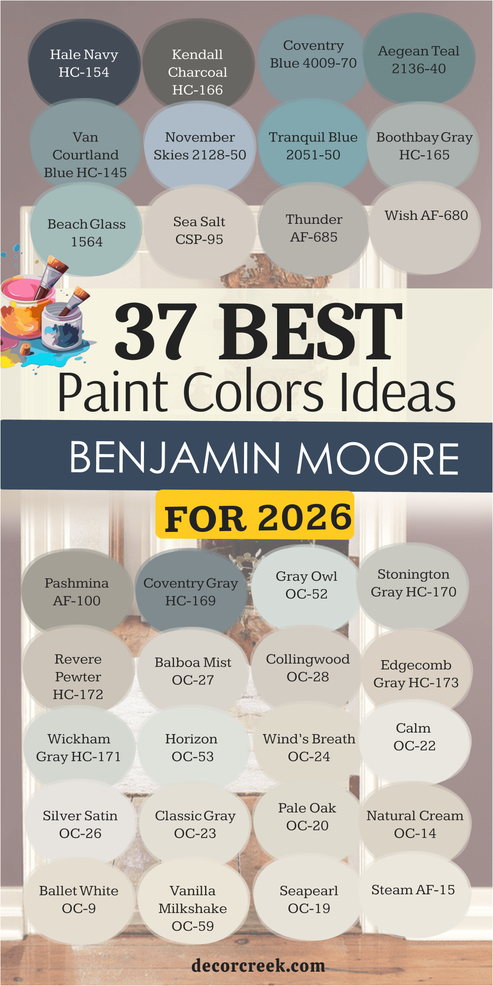
I’ve put together 37 Benjamin Moore colors—a powerful mix of trusted, old favorites and promising newer contenders—that I believe will be the most sought-after and successful shades for the year ahead.
These colors are not mere fleeting trends; they are the reliable foundation for any truly beautiful interior, offering unmatched quality and style for every kind of homeowner looking to create a perfect setting.
When I select a paint color for a client, I’m not just picking a pretty chip; I’m choosing a product that has to perform flawlessly. This is why, time and again, I turn to Benjamin Moore. Their quality is truly unmatched, and that makes all the difference, especially when you are looking for those perfectly balanced neutral tones.
Their paints have a legendary richness and depth of color because they use premium ingredients and proprietary colorant systems, guaranteeing a fantastic result every time.
Unlike other brands where a shade might look dull or flat once applied, Benjamin Moore colors truly hold their hue, even in tricky lighting conditions or after years of being on the wall.
For my staging work, this fidelity is crucial because I need the color I choose to look its best both in person and in listing photographs, securing a strong first impression.
Homeowners who plan to live with the color for years also appreciate that the paint is incredibly durable and washable, standing up to the demands of real life. Investing in this quality means less worrying about future touch-ups and more enjoying a beautifully consistent, lasting finish that adds noticeable value to your property.
Picking paint is like dressing a person—the same outfit won’t work for every occasion! When I choose a shade, I look at the whole picture: the natural light available, the existing furniture and architectural details, and, most importantly, the exact mood we want to create for the people using the room.
For rooms that face north, which tend to have cooler, blue-ish light, I recommend warmer whites and greiges to counteract the chill, bringing in a much-needed feeling of warmth.
South-facing rooms, flooded with warm yellow light, can easily handle cooler grays or true whites that will beautifully maintain their clean look without appearing too yellow or creamy.
I always consider the function of the room and who will be using it most. Bedrooms should feel restful, making muted colors and soft neutrals a great choice for encouraging relaxation. Kitchens and laundry rooms can handle crisp whites or a punch of a bolder color on cabinetry for a lively, energetic feel.
Crucially, I pay close attention to the undertones in the fixed elements of the house—things like permanent flooring, countertops, and backsplash tile.
The right paint should harmonize with these existing colors, not clash with them. By choosing a shade that complements those permanent fixtures, you instantly make the whole house feel polished, intentional, and beautifully cohesive, which is the undeniable secret to great design.
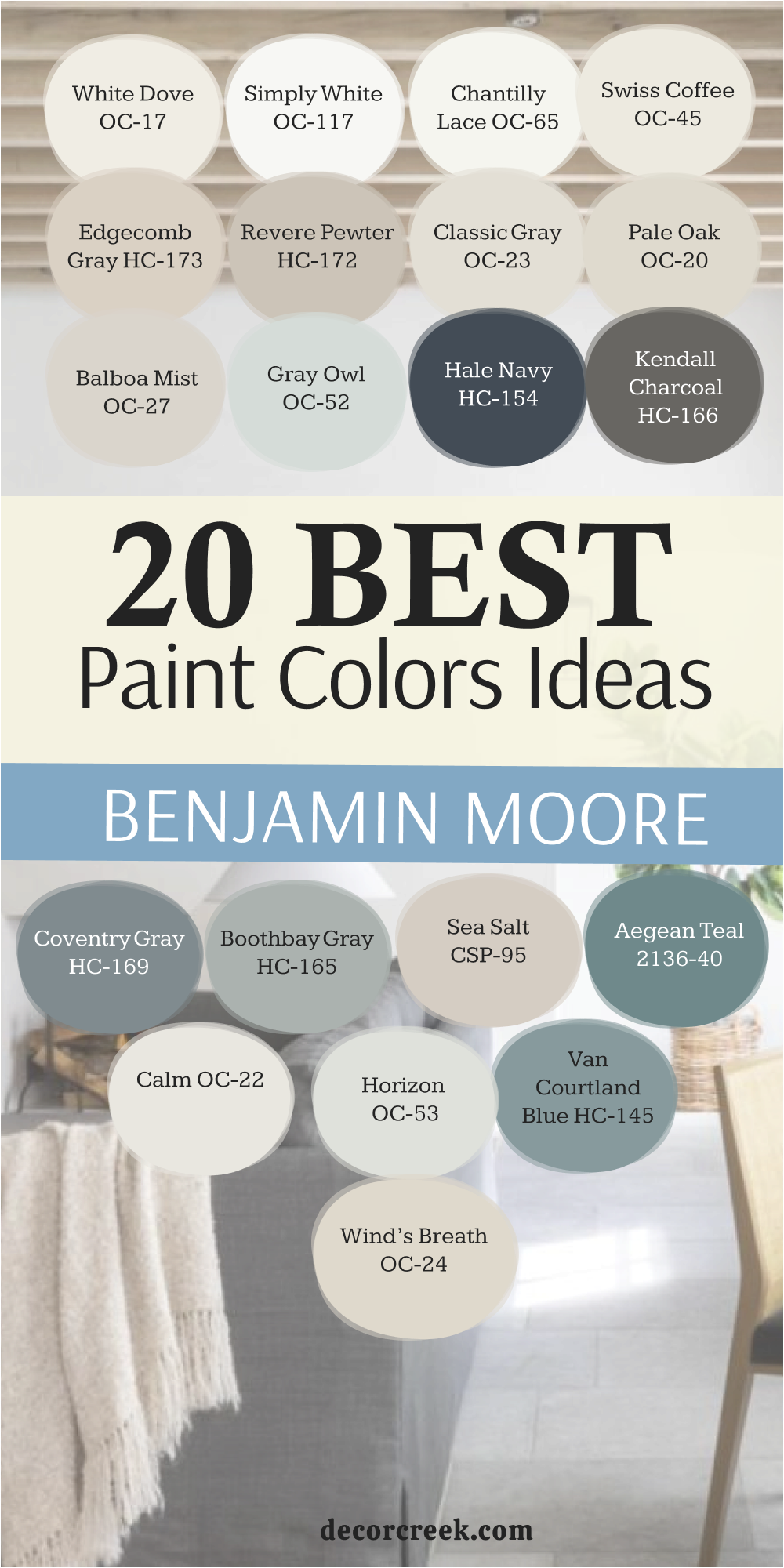
White Dove is my absolute go-to, the classic creamy white that home buyers and designers consistently adore for its versatility and warmth. This color avoids feeling stark or cold because it carries a perfect, gentle hint of yellow-grey warmth that keeps it feeling instantly inviting, welcoming everyone who enters.
It is fantastic for trim, doors, and millwork, contrasting just beautifully with almost any wall color you can imagine, from deep blues to light grays.
White Dove is wonderfully versatile; I use it successfully in kitchens for cabinetry, on walls in living rooms, and even on ceilings, tying spaces together seamlessly.
I believe it is one of the most dependable and successful whites for creating a bright, yet softly painted atmosphere in a home that feels lived-in and loved.
In homes with a lot of natural wood finishes or substantial stone elements, it acts as a perfect, gentle backdrop, never pulling focus but always looking clean and fresh.
Simply White is a reliably crisp, bright white that has just enough warmth, stemming from a tiny touch of yellow, to stop it from feeling icy or sterile in a room. It was once a Benjamin Moore Color of the Year, and its enduring popularity continues because it truly brightens up and refreshes any area it touches, instantly lifting the mood.
I love using this paint on ceilings and trim, as it makes the wall color stand out beautifully and gives the entire interior a noticeably crisp, professional, and finished look.
If you have a room that feels a little dark or small, a generous coat of Simply White instantly makes the area feel more expansive and airy, maximizing the natural light. It is a very clean, straightforward white, making it a fantastic favorite for modern aesthetics or anywhere you want a gallery-like feeling that allows furniture and art to be the star.
🎨 Take a closer look at the full guide to this shade right HERE👈

Chantilly Lace is often called Benjamin Moore’s cleanest, purest white, and it is a wonderful choice for achieving a truly crisp, no-fuss look with maximum brightness. It has virtually no noticeable undertones—no yellow, no pink, no blue—making it a remarkably neutral white that plays well with a full rainbow of accent colors and fabrics.
I often recommend it for hardworking areas like bathrooms and laundry rooms where you want a sparkling, fresh, and exceptionally clean feeling that holds up beautifully.
For those who love contemporary or Scandinavian design, this paint provides the perfect stark contrast against black or deep charcoal wood furniture and fixtures. Be aware that it may feel a bit cool in deeply shaded, north-facing rooms, but it’s utterly stunning and radiant when bathed in sunlight, achieving a look of pure, clean light.
🎨 Take a closer look at the full guide to this shade right HERE👈

Swiss Coffee is a wonderfully soft, warm off-white that feels like a big, cozy blanket on the walls, instantly making a room feel comfortable and relaxing. It has a beautiful creaminess to it without looking noticeably yellow, which makes it exceptionally appealing to most people who enter a home and provides a sense of history.
I love how this paint color acts as a beautiful, grounding neutral that allows your colored furniture, artwork, and textured rugs to really shine and take center stage.
It is another favorite for kitchen cabinets because its gentle warmth keeps the busy, hardworking area from feeling sterile or clinical, providing a gentle counterpoint to cold stainless steel.
Swiss Coffee is a deeply popular, highly dependable shade that works successfully across many different design styles, from cozy traditional to laid-back modern, always lending a welcoming hand.
🎨 Take a closer look at the full guide to this shade right HERE👈

Edgecomb Gray is a cherished “greige,” meaning it’s a perfect, balanced mix of gray and beige that makes it feel exceptionally warm and incredibly versatile. I find that this shade is a real chameleon; sometimes it looks more beige and earthy, and other times it looks more gray and grounded, depending on the light and the time of day in the room.
This wonderful adaptability is its superpower, which is why it works so well as a successful whole-house color in almost any home, regardless of flooring or trim color.
It creates an immediate feeling of gentle sophistication and makes any room instantly feel more welcoming and perfectly put-together, a huge plus for staging. Edgecomb Gray pairs beautifully with bright white trim for a fresh, classic look that truly stands the test of fleeting trends and retains its enduring charm.
🎨 Take a closer look at the full guide to this shade right HERE👈

Revere Pewter is one of the most famous paint colors out there, known for being a true medium-toned greige that holds a prestigious spot in the Historical Color Collection due to its proven success. This color has slightly stronger undertones than Edgecomb Gray, giving it a bit more weight, saturation, and depth on the wall, making it feel more substantial.
I recommend it when a room needs a color that is grounding and present but still fully neutral, perhaps in a large living room, a formal dining room, or a busy entryway.
It’s a wonderful choice for creating a cozy, yet refined, feeling that home buyers and guests consistently respond very well to and find deeply appealing. It can sometimes show a very slight green undertone in cooler lighting, so always test it in your own light before committing to a gallon to ensure it looks just right.
🎨 Take a closer look at the full guide to this shade right HERE👈

Classic Gray is an incredibly light, airy greige that reads as a very soft, barely-there gray on the wall, acting almost as a tinted off-white. It has a gentle hint of warmth, which prevents it from feeling cold or aloof, making it a fantastic choice for entire main floor areas where you want consistency.
When bright light hits this shade, it almost looks exactly like an off-white, adding brightness while still offering just a touch of soothing, elegant color to define the walls.
I often use this paint in staging work to provide a sophisticated wash of neutral that allows colorful furniture and accessories to pop without competing for attention. It is one of the most versatile neutrals and works wonderfully in bedrooms, bathrooms, and hallways alike, providing a consistent, gentle backdrop everywhere.
🎨 Take a closer look at the full guide to this shade right HERE👈

Pale Oak is an ethereal, warm neutral that is an absolute darling in the design world for its soft, inviting qualities and ability to make a room feel lifted. This lovely shade is officially classified as an off-white but often shows up as a very light greige with delicate pink or violet undertones, adding a unique richness.
I find it’s the perfect choice when you want a wall color that is almost white but has just enough saturation to truly distinguish it beautifully from the crisp white trim.
It casts a beautiful, gentle, and flattering glow in bedrooms and dining rooms, making everything in the room feel more luxurious and higher-end. Pale Oak is a genuinely sophisticated color that creates a subtle, light-filled warmth without ever feeling heavy, dark, or overwhelming to the eye.
🎨 Take a closer look at the full guide to this shade right HERE👈

Balboa Mist is another stunning light greige that has a touch more gray depth than Pale Oak, but still maintains that beautiful, soft, misty quality that everyone loves. It’s a beautifully balanced neutral that reads as a soft, gentle gray with warm, putty-like undertones, making it a true chameleon.
I love using this color in living areas where people gather because it creates an atmosphere that feels instantly welcoming, quiet, and beautifully grounded.
It pairs excellently with bright white trim and dark, rich flooring, giving a home a polished, modern-transitional style that appeals to the masses. Balboa Mist is a sure-fire winner for those who find Revere Pewter too dark or too brown but want more defining color than the very subtle Classic Gray provides.
🎨 Take a closer look at the full guide to this shade right HERE👈

Gray Owl is a very popular, lighter gray that has a lovely clean and crisp quality, making it a top go-to for many modern, transitional, and coastal styles. This shade is a true light gray but has a slight hint of refreshing green and blue in its undertones, which gives it a uniquely bright, airy feeling.
I often choose Gray Owl for areas that receive a lot of direct natural light, as it maintains its cool, beautiful color without looking washed out or disappearing entirely.
It is a fantastic favorite for bathrooms and offices because of its clean look and ability to make a room feel productive, focused, and incredibly fresh. This paint is a superb choice if you are firmly in the gray camp but want a lighter, easily livable shade that doesn’t feel heavy or dated.
🎨 Take a closer look at the full guide to this shade right HERE👈

Hale Navy is a magnificent, deep, true navy blue that I consider the gold standard for accent colors and bold, memorable statements in a home. I absolutely love using this dramatic shade on kitchen island bases, lower cabinet sets in a butler’s pantry, or as a striking, rich powder room color.
Its depth provides amazing contrast against light white walls and trim, adding an immediate sense of gravity, weight, and undeniable high style to any home.
This color makes a room feel instantly refined and utterly memorable, which is fantastic for home staging to give a space a high-impact focal point that photographs well. Hale Navy is powerfully dark and strong, but its subtle warm undertones successfully prevent it from ever feeling too cold or severe on the wall.
🎨 Take a closer look at the full guide to this shade right HERE👈

Kendall Charcoal is a beautiful, deep gray that carries a wonderful, comforting warmth, thanks to its subtle greenish-brown undertones, giving it great complexity. This shade is perfect for making a bold but grounded statement, such as on an accent wall, a majestic fireplace mantel, or on exterior shutters and front doors for curb appeal.
It offers the drama of a very dark color but feels more complex, earthy, and inviting than a simple cold black or a stark charcoal gray.
I often pair it with bright white trim and rich natural wood finishes to highlight its comforting depth and substantial presence.
Kendall Charcoal is a truly sophisticated, grounding color that can give any room a quick, impressive style upgrade that feels current and tailored.
🎨 Take a closer look at the full guide to this shade right HERE👈

Coventry Gray is a gorgeous, dependable medium-to-dark gray that reads as a very honest, true gray without strong, noticeable colorful undertones that might cause issues.
This shade comes from the esteemed Historical Collection, so it carries that classic, established feeling that instantly adds weight and style to a home’s architecture.
I love its middle-ground versatility; it’s dark enough to make a subtle, handsome statement but light enough to still look bright and open in a well-lit room.
It’s a wonderful choice for a formal dining room or a dedicated study, providing a handsome, tailored backdrop that encourages focus and conversation.
Coventry Gray works beautifully with both white trim and dark wood accents for a clean, highly traditional and consistently appealing look.
🎨 Take a closer look at the full guide to this shade right HERE👈

Boothbay Gray is a lovely blue-gray shade that brings a subtle, refreshing touch of watery color into a home without becoming too dominant or childlike.
This paint is light enough to be used generously on all four walls, and its slight blue-green undertone gives it a wonderful coastal or breezy seaside feel that feels relaxing.
I often suggest this shade for guest rooms, secondary bedrooms, or sunny living areas where you want a hint of cheerful, gentle color that feels natural.
It pairs wonderfully with crisp white trim, light-colored upholstery, and natural fiber rugs for a genuinely relaxed, easygoing, and appealing style.
Boothbay Gray is a delightful color that introduces a measured personality without any risk of being too much or too intense for the typical homeowner.
🎨 Take a closer look at the full guide to this shade right HERE👈

Sea Salt is a soft, atmospheric light green-gray with a delicate touch of blue, making it an incredibly gentle and soothing color that promotes relaxation. This paint color is a client favorite for master bathrooms and primary bedrooms because it creates an incredibly restful, spa-like, and refreshing environment to start or end the day.
The color beautifully reflects the light, and its watery undertones make it truly unique and visually interesting, changing subtly throughout the day.
I love how it instantly introduces a hint of nature-inspired color that works perfectly with wood tones, white fixtures, and polished metals.
Sea Salt is a perfect choice when you want a hint of pretty color on the wall that still manages to act fully like a highly versatile neutral.
🎨 Take a closer look at the full guide to this shade right HERE👈
Aegean Teal is a captivating mid-tone blue-green with a healthy dose of gray mixed in, making it both vibrant and incredibly sophisticated for a pop of color. This color was a Benjamin Moore Color of the Year, and its popularity is due to its perfect balance of brightness and deep, satisfying saturation.
I often recommend it for a special piece of built-in cabinetry, an eye-catching accent wall in a hallway, or for a cozy dining room that needs a dramatic, unforgettable flair.
It pairs beautifully with warm wood tones, rich brass hardware, and crisp off-whites like White Dove for a stunning contrast.
Aegean Teal is a warm, rich color that feels wonderfully grounded, full of character, and immediately memorable, making it a true designer favorite for adding life.
🎨 Take a closer look at the full guide to this shade right HERE👈
Calm, despite its straightforward name, is a beautiful, very pale off-white that acts as a beautifully soft and reliably bright backdrop for virtually any room in the house. This color is nearly identical to Classic Gray, but in certain light, it presents as a fractionally softer and slightly warmer off-white with the faintest whisper of greige undertones.
I use it often when staging homes because it provides that clean, sophisticated, fresh feeling that home buyers are consistently searching for and find appealing.
It works wonderfully for walls in any room, but I particularly love it in homes where a soft, continuous color needs to flow seamlessly from room to room.
Calm is a gentle, appealing color that is guaranteed to keep your home feeling light, airy, and consistently well-designed without much effort.
🎨 Take a closer look at the full guide to this shade right HERE👈
Horizon is a light, ethereal gray that is one of my favorite options for a soft, nearly-white neutral that still manages to offer visible depth and distinction from the trim. This shade has very cool, crisp undertones, making it a beautiful and clean choice for a room with warm flooring, terracotta tile, or lots of intense afternoon sunlight.
I love using Horizon in kitchens with marble or white countertops where its cool hue plays beautifully off the stone’s natural veining and pattern.
It is an excellent choice for a clean, contemporary aesthetic, or for coastal properties that want a hint of a bright, fresh gray that mirrors the ocean.
Horizon is a wonderful light-reflecting color that never looks muddy and always feels bright, crisp, and beautifully subtle on the walls.
🎨 Take a closer look at the full guide to this shade right HERE👈

Van Courtland Blue is a beautiful, muted gray-blue that has a classic, almost denim-like quality, giving it an established, sophisticated, and handsome feel. This color is part of the coveted Historical Collection and carries that sense of history and tradition that I adore for formal living or traditional dining rooms.
It’s a perfect mid-tone shade, offering a substantial amount of soothing color without ever feeling heavy, dark, or gloomy in a room, even in the evening.
I love pairing Van Courtland Blue with rich, dark woods and traditional furnishings for a truly refined, tailored look that speaks of quality.
It is a fantastic choice if you love blue but prefer a softer, more grounded and complex version than a bright primary blue or a stark navy.
🎨 Take a closer look at the full guide to this shade right HERE👈
Wind’s Breath is a very light, airy off-white that has a lovely, perceptible soft warmth, making it feel incredibly gentle, easy on the eyes, and non-intrusive. This beautiful neutral is highly versatile and works wonderfully as a cohesive whole-house color because it keeps everything feeling visually connected, bright, and unified.
I often use it on walls when a client wants an off-white but is worried about the color looking too stark, too clinical, or too cool in a more traditionally styled home.
It has subtle beige and greige undertones that ensure it always feels cozy and welcoming, avoiding any hint of coldness.
Wind’s Breath is an excellent choice for a sophisticated, understated neutral background that works flawlessly with any decor style, from antique to highly modern.
🎨 Take a closer look at the full guide to this shade right HERE👈
Oxford White is a very crisp and remarkably clean white that has a slight, almost imperceptible gray undertone, giving it a cool, refreshing purity that feels instantly modern. This paint is one of my top choices for trim, moldings, and ceilings because its exceptional crispness makes the adjacent wall color stand out beautifully and look more saturated.
It works wonderfully in modern homes where you want a very clean, sharp contrast with darker colors or minimalist furniture that relies on hard lines.
In a room with high natural light, Oxford White looks incredibly bright and fresh, instantly giving the entire interior a polished, intentional look.
I believe it is a superb choice for homeowners seeking a true, vibrant white that feels modern, precise, and effortlessly capable of lifting a room’s mood.
Steam is a beautiful, warm off-white that has a lovely creamy softness, making it feel wonderfully inviting and deeply comfortable to be around. This paint is a designer favorite because its gentle, beige-based warmth allows it to pair perfectly and quietly with almost any other color or fabric in a home, acting as a supporting star.
I often recommend it for master bedrooms and family rooms where you want a cozy, nurturing atmosphere without sacrificing a bright, fresh feeling that keeps the room feeling clean.
It is a fantastic option for kitchen cabinets if you want something significantly warmer than a stark white but refuse to have any noticeable yellow or peach tones.
Steam is a highly flexible color that creates a soft, gentle wash of light on any wall, making everything in the room feel subtly better.
🎨 Take a closer look at the full guide to this shade right HERE👈
Seapearl is a truly fantastic off-white that is on the border of being a very light greige, giving it a wonderful complexity, depth, and highly sought-after sophistication. This shade is one of the best choices for a whole-house color because it moves so gently from room to room, always looking slightly different but consistently beautiful and grounded.
I love its versatility; it has enough subtle color to keep a room from looking washed out but is light enough to still feel bright and open, even in lower light.
It pairs especially well with rich, natural materials like warm wood and textured stone, making it a perfect background for organic-inspired elements.
Seapearl is a sophisticated, highly appealing color that always makes a home feel fresh, current, and beautifully curated throughout.
🎨 Take a closer look at the full guide to this shade right HERE👈

Vanilla Milkshake is a delicious, creamy off-white that has a noticeable, but very soft, yellow undertone that makes it wonderfully warm and highly appetizing. This paint is perfect for rooms that feel a little cold or dark, as it casts a sunny, inviting glow that instantly makes the area feel happier and more cheerful.
I often suggest it for older homes or rooms with traditional, dark wood trim where a crisp, stark white might look too jarring or out of place.
It works beautifully in kitchens, giving the cabinets a gentle, warm antique look without appearing overly yellow or dated.
Vanilla Milkshake is a truly comforting color that makes any room feel like a cozy, light-filled haven, bringing a subtle, buttery goodness to the walls.
🎨 Take a closer look at the full guide to this shade right HERE👈
Ballet White is a delicate, creamy off-white that has a definite touch of soft beige, making it feel like a grounding, nurturing, and incredibly soft color. This shade is perfect when you want a white that never, ever feels cold and always gives a room a warm, slightly vintage-inspired sophistication that feels established.
I recommend it often for traditional-style homes or for painting architectural features like wainscoting and paneled walls where you want the details to stand out warmly.
It is a highly versatile neutral that looks stunning with both deep jewel tones and lighter, airy pastels, working beautifully in almost any palette.
Ballet White is a charming, rich color that brings a lovely, gentle light into any interior, making it feel soft, cultivated, and elegant.
🎨 Take a closer look at the full guide to this shade right HERE👈
Natural Cream is a beautiful, soft neutral that sits right between an off-white and a light greige, giving it a wonderfully earthy, authentic, and organic feeling. This paint color is one of my favorite “almost-neutrals” because it provides a wonderful foundation for design that feels connected to the outdoors and nature.
I love how it works in rooms with a lot of natural wood, helping to blend the interior and exterior elements of a home in a cohesive manner.
It is a perfect choice for main living areas and dining rooms where you want a color that is appealing, rich, and present but never distracting or loud.
Natural Cream is a sophisticated, gentle color that makes any room feel well-curated, pleasantly relaxed, and entirely effortless in its beauty.
🎨 Take a closer look at the full guide to this shade right HERE👈

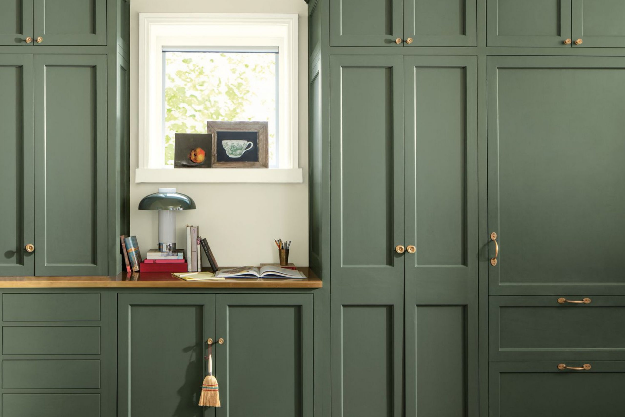
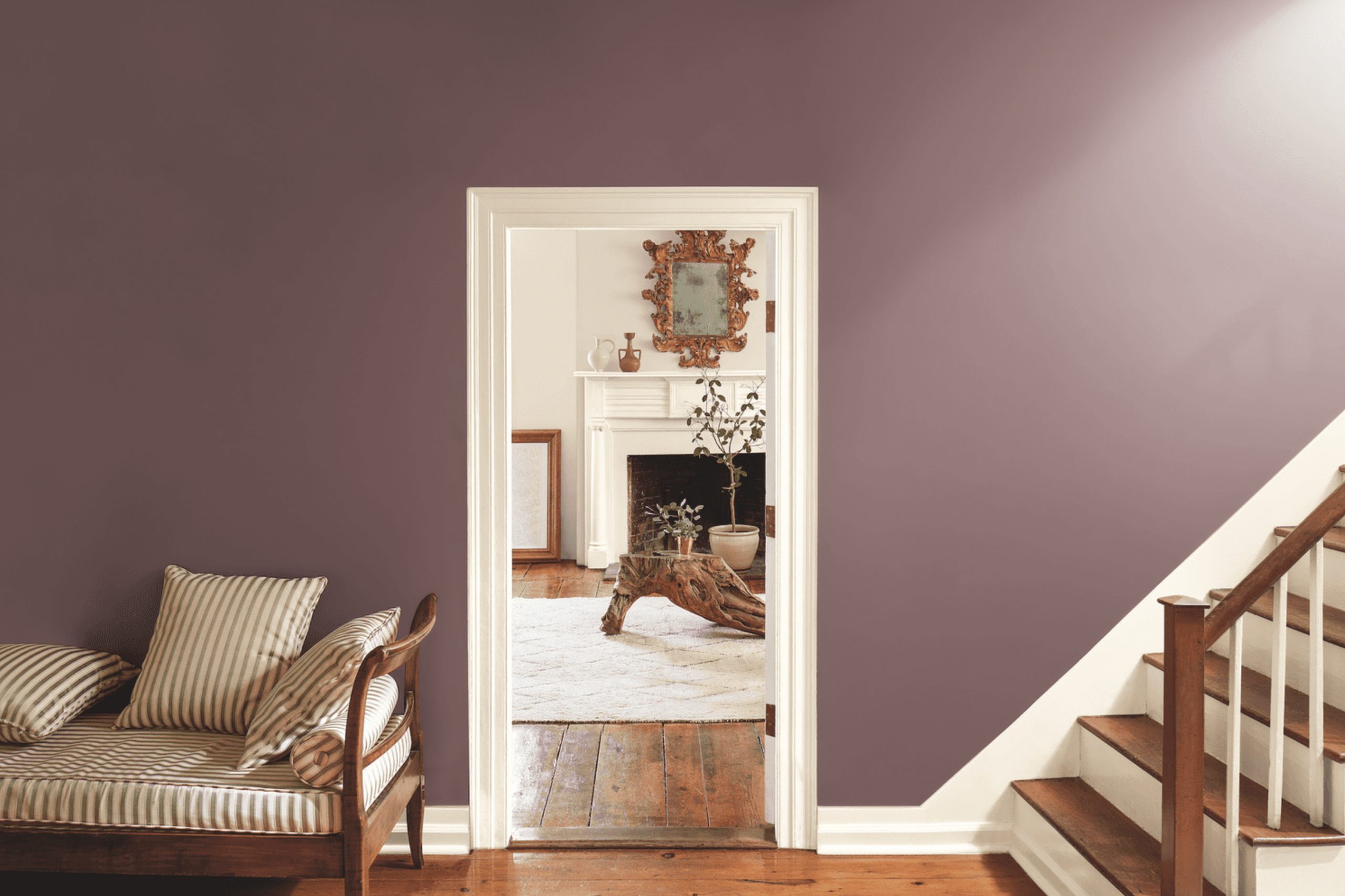
Pashmina is a beautiful, rich mid-tone greige that has deep, complex brown and definite green undertones, giving it a luxurious, substantial, and memorable feel on the wall. This color is perfect for creating a dramatic, yet comforting, atmosphere in a den, a masculine-leaning library, or a formal dining room that needs weight.
I often use it to give a room a sophisticated depth and to make white furniture, light fabrics, and bold artwork really stand out against the rich background.
It pairs exceptionally well with polished wood floors and velvet textures for a truly high-end, cozy, and highly touchable look.
Pashmina is a grounding and elegant color that feels both warm and incredibly refined, adding an immediate sense of richness and style to any home.
🎨 Take a closer look at the full guide to this shade right HERE👈

Wish is a lovely, light gray that has a beautiful, slight purplish-pink undertone, which makes it feel uniquely warm and soft for a gray shade. This paint is a wonderful choice for bedrooms or bathrooms where you want a quiet, delicate hint of color that is still fully neutral and easy to pair with.
I love how it plays with natural light, often looking like a soft, silvery gray that gives the room a gentle, pearlescent glow throughout the day.
It’s a great shade to use when you want a light neutral but find the more common, blue-based pure grays to be a bit too cold for your personal taste and lighting. Wish is a beautiful, gentle color that creates a soft, consistently inviting atmosphere that feels subtly feminine and light.
Thunder is a beautiful, deeper greige that has a strong gray presence but with a pronounced, comforting warmth from its brown undertones, giving it great dimensional depth. This color is perfect for creating a cozy, moody, and intimate atmosphere in a dedicated TV room, a den, or on an impactful accent wall that defines a zone.
I love how substantial it feels on the walls, making the room feel enclosed, private, and wonderfully intimate, which is great for conversation.
It pairs stunningly with crisp white trim and very light-colored furnishings, creating a sharp and sophisticated contrast that keeps the room looking fresh. Thunder is a rich, grounding color that adds an immediate sense of quiet luxury and distinction to any area, making it feel custom and high-end.
🎨 Take a closer look at the full guide to this shade right HERE👈

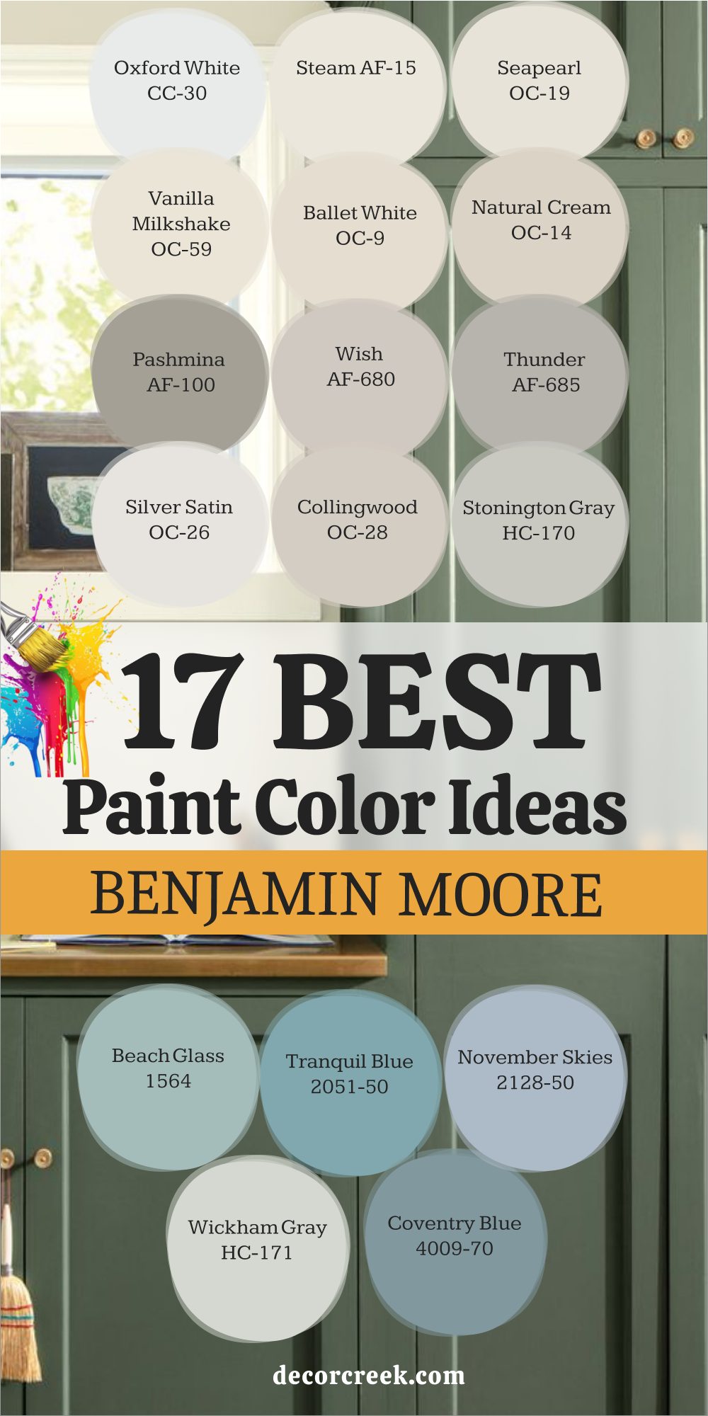
Silver Satin is a very pale, nearly white shade that has a beautiful hint of a soft, silvery-gray, giving it an ethereal, luminous quality that captures the light. This paint is one of my favorites for achieving a high-end, sophisticated neutral look that carefully avoids looking stark, flat, or cold on the walls.
I often recommend it for main living areas and long hallways where you want a color that feels clean, bright, and incredibly airy all at once.
It is a perfect choice for showcasing colorful artwork or interesting architectural details because the wall color recedes and allows the focus to be elsewhere. Silver Satin is a gentle, light-reflecting color that makes a home feel instantly polished, luminous, and wonderfully intentional in its design.
🎨 Take a closer look at the full guide to this shade right HERE👈
Collingwood is a gorgeous, light-to-medium greige that has a beautiful, successful balance, leaning slightly more toward a warm gray than a true beige or cream. This shade is one of the most consistently successful whole-house colors because it looks fantastic in widely different lighting conditions, maintaining its warmth and neutrality.
I love using this paint in open-plan kitchens and living rooms because it provides a perfect, slightly deeper neutral background that is both inviting and incredibly versatile with all furniture colors.
It is a wonderful choice for homeowners who want a neutral with more defining depth than an off-white but without the potential darkness of a shade like Revere Pewter. Collingwood is a dependable, appealing color that adds immediate style and an effortless layer of sophistication to any home’s interior.
🎨 Take a closer look at the full guide to this shade right HERE👈

Stonington Gray is a popular, medium-toned true gray that has a lovely clean, crisp quality with very cool, subtle blue undertones, keeping it looking fresh. This color is perfect for giving a room a very classic, polished, and tailored look, especially when paired with bright, optic white trim and baseboards.
I often use it in homes that have a lot of natural marble stone or white bathroom tile, as its cool tone beautifully complements the natural veining and pattern of the materials.
It is an excellent choice for a dedicated home office, a sleek powder room, or a more formal dining area where you want a handsome, clean look. Stonington Gray is a sophisticated, versatile gray that feels reliably refined, structured, and effortlessly chic, never pulling towards green or purple.
🎨 Take a closer look at the full guide to this shade right HERE👈

Beach Glass is a stunning, muted blue-green-gray that perfectly captures the weathered, aged beauty of sea glass found on a quiet shore. This paint is one of my favorite accent colors for master bedrooms or bathrooms where you want a hint of refreshing, watery color that instantly calms the senses.
I love how this shade changes with the light, sometimes looking more blue and other times showing more green, making it incredibly captivating and dynamic.
It is perfect for bringing a subtle, coastal-inspired cheer to a home that feels relaxed, breezy, and wonderfully welcoming to guests. Beach Glass is a gentle, cheerfully appealing color that makes any room feel like a quiet seaside retreat, promoting an easygoing atmosphere.
🎨 Take a closer look at the full guide to this shade right HERE👈

Tranquil Blue is a delightful, mid-tone blue that has a clean, clear quality without any overly dark or heavy gray undertones to muddy its cheerful spirit. This color is perfect for a child’s bedroom, a lively laundry room, or as a cheerful, unexpected accent in a mudroom or entryway bench.
I love how this shade instantly introduces a feeling of cheerfulness, lightheartedness, and bright energy to a home, making it feel more lively and awake.
It pairs wonderfully with crisp white for a classic, nautical-inspired look that always feels fresh, happy, and never goes out of style. Tranquil Blue is a straightforward, bright color that adds a wonderful pop of refreshing personality and lighthearted fun to a smaller space.
November Skies is a beautiful, rich gray that has deep, cool blue undertones, giving it a gorgeous, stormy, and highly atmospheric feel on the wall. This paint is wonderful for adding immediate depth and sophisticated drama to a room, especially in a living room, a formal dining room, or a bedroom with high ceilings.
I often use it as a grounding, interesting color that allows lighter furniture, white linens, and metallic accents to really pop out and take the spotlight.
It is a fantastic choice for a dramatic accent wall or on cabinetry, instantly giving the room a sense of gravity and tailored sophistication. November Skies is a handsome, rich color that feels wonderfully substantial, well-made, and full of quiet, reserved character.
🎨 Take a closer look at the full guide to this shade right HERE👈

Wickham Gray is a very light, delicate gray that has a noticeable hint of soft blue and a whisper of refreshing green in its undertones, making it very gentle on the eye. This shade is a beautiful choice for a very light gray that never feels heavy and is perfect for main living areas and open-concept kitchens.
I love how its light-reflecting qualities make a room feel bright and continually cheerful, acting as a very soft, barely-there color on the walls.
It is a great alternative to an off-white when you want a little more definition and a sophisticated, tailored coolness on the walls for contrast. Wickham Gray is a soft, appealing color that is guaranteed to keep your home feeling light, consistently refreshing, and beautifully airy all year long.
🎨 Take a closer look at the full guide to this shade right HERE👈

Coventry Gray is a beautiful, medium-toned blue that is slightly more clear and vibrant than Van Courtland Blue, but still maintains a sophisticated, grounded, and adult feeling. This color is an excellent choice for adding a lovely, inviting splash of classic blue to a room, perfect for a lively dining area or a focused, dedicated den.
I love how its cheerful depth pairs wonderfully with both warm natural wood and polished nickel or chrome fixtures for a modern, refined look.
It offers a wonderful balance of being colorful and cheerful while still maintaining a classic, adult elegance on the walls that won’t feel juvenile. Coventry Gray is a wonderfully dependable color that brings a truly versatile and timeless cheer to any home it graces.
🎨 Take a closer look at the full guide to this shade right HERE👈
Choosing paint is an emotional decision, and my job as a designer and stager is to help you pick colors that will make you truly love your home and feel good inside it. The 37 shades listed here are my handpicked selections because they all share a rare quality: they reliably make people feel grounded, happy, and at ease in a space.
Whether you go for the enduring warmth of a classic like White Dove or the deep sophistication of Hale Navy, you are investing in an authentic, lasting feeling.
In 2026, the best interiors will be the ones that feel authentic, welcoming, and deeply personal, and that critically starts with the right color on the walls.
Don’t be afraid to try a few samples—seeing a color in your actual light is the only way to truly know if it’s “the one” for your home.
Trust your gut, pick a shade from this dependable, expert list, and get ready to enjoy the beautiful, styled atmosphere you have created.