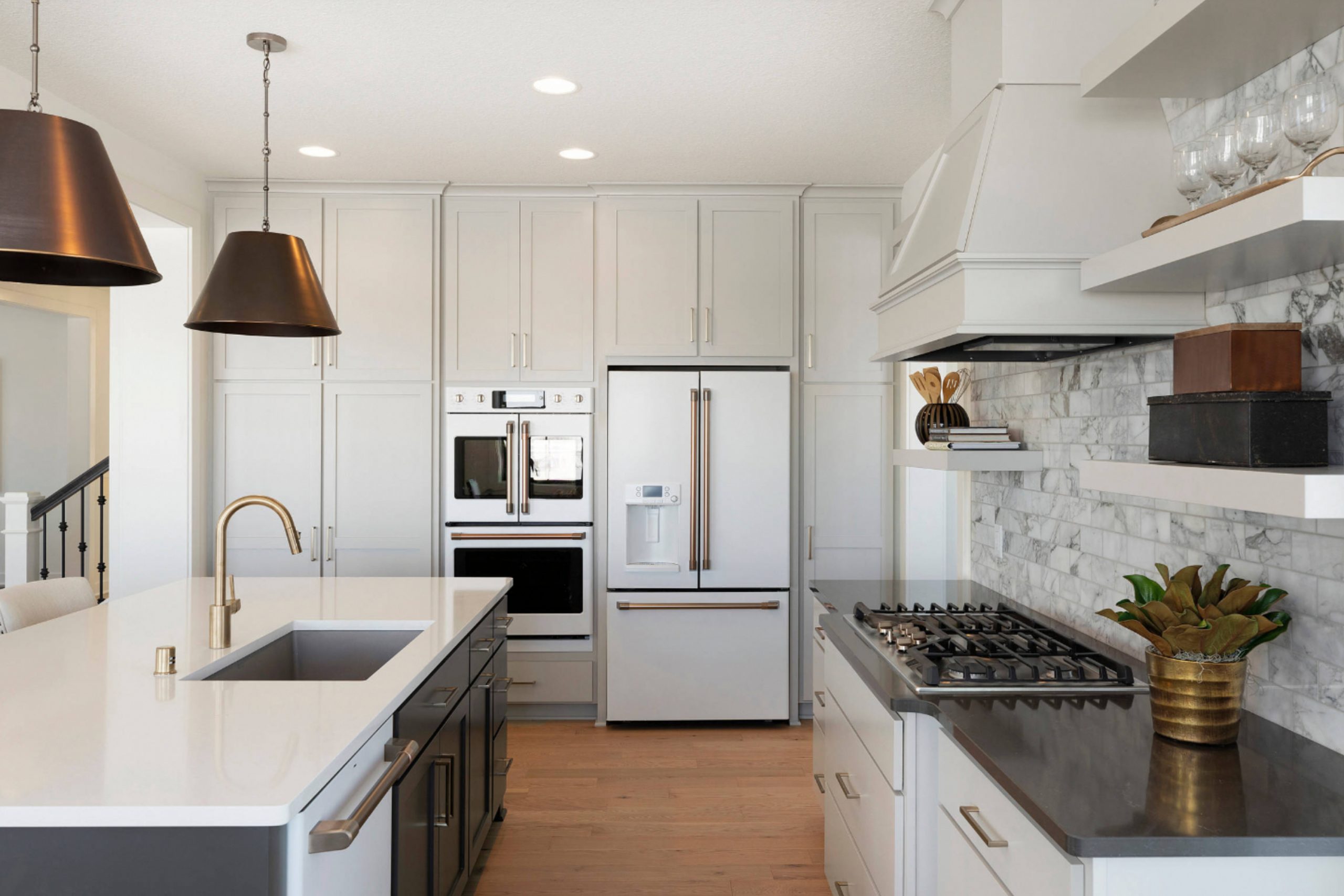
I’ve stood in more kitchens than I can count, and you know what always makes a difference right away? Wall color.
Neutral paint in a kitchen sets the tone. It makes mornings feel calmer, and dinners feel cozier. But neutral doesn’t mean boring. Not anymore.
The best neutrals give your kitchen a feeling of comfort, balance, and warmth. They also make everything else—from cabinets to lighting—look better.
In fact, over 60% of homeowners still choose neutral colors for kitchen walls, according to Houzz’s 2024 Kitchen Trends study.
That’s why I put together this list. These are the colors I keep recommending because they work.
2. Why Neutrals Work So Well in Kitchens
Kitchens are full of noise—visually and literally. Pots, pans, open shelves, tile patterns, appliances—it adds up fast.
Neutral paint helps soften all that. It gives the room a steady backdrop that doesn’t compete for attention.
I’ve staged kitchens where the only change was the wall color—and suddenly it felt brighter, more open, even cleaner. Color changes emotion.
Leatrice Eiseman from the Pantone Color Institute says, “Neutral colors provide a safe harbor and are dependable.” That’s what a kitchen should be: dependable, inviting, lived-in.
3. How to Choose the Right Neutral for Your Kitchen
Choosing a neutral sounds easy—until you see five beiges that all look the same but feel totally different on the wall.
Here’s what I always tell my clients:
- Undertones matter. Is there a hint of yellow? Green? Purple? That changes everything.
- Light shifts color. The same paint can feel warm in the morning and cold at night.
- Always sample. Never trust the chip alone—paint a large patch and check it in real light.
- Think finish. I use eggshell or satin for kitchens because they wipe clean easily.
Designer Shea McGee says it best: “Paint color is the one thing that can completely change how a room feels—but only if you get the undertones right.”
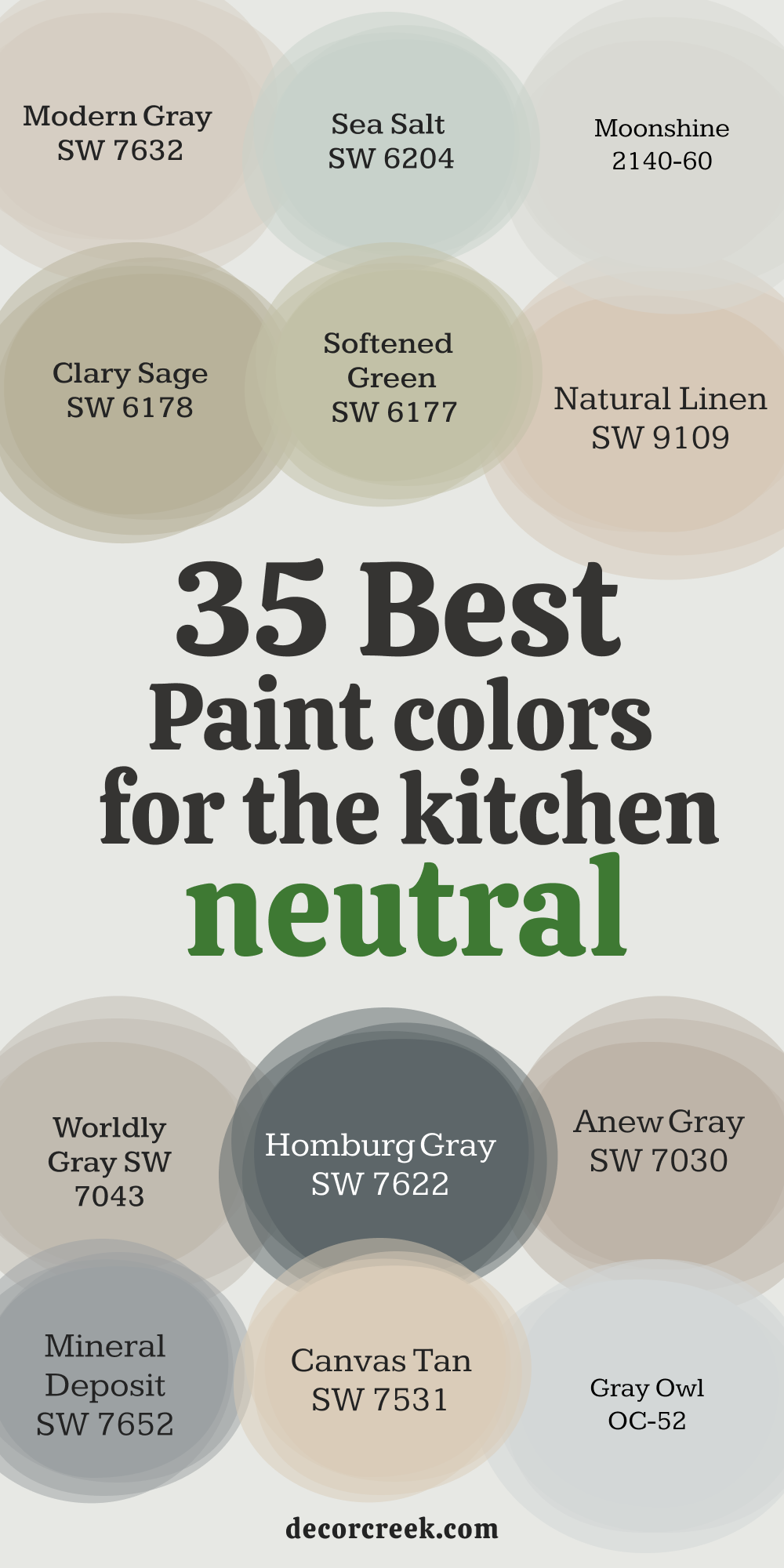
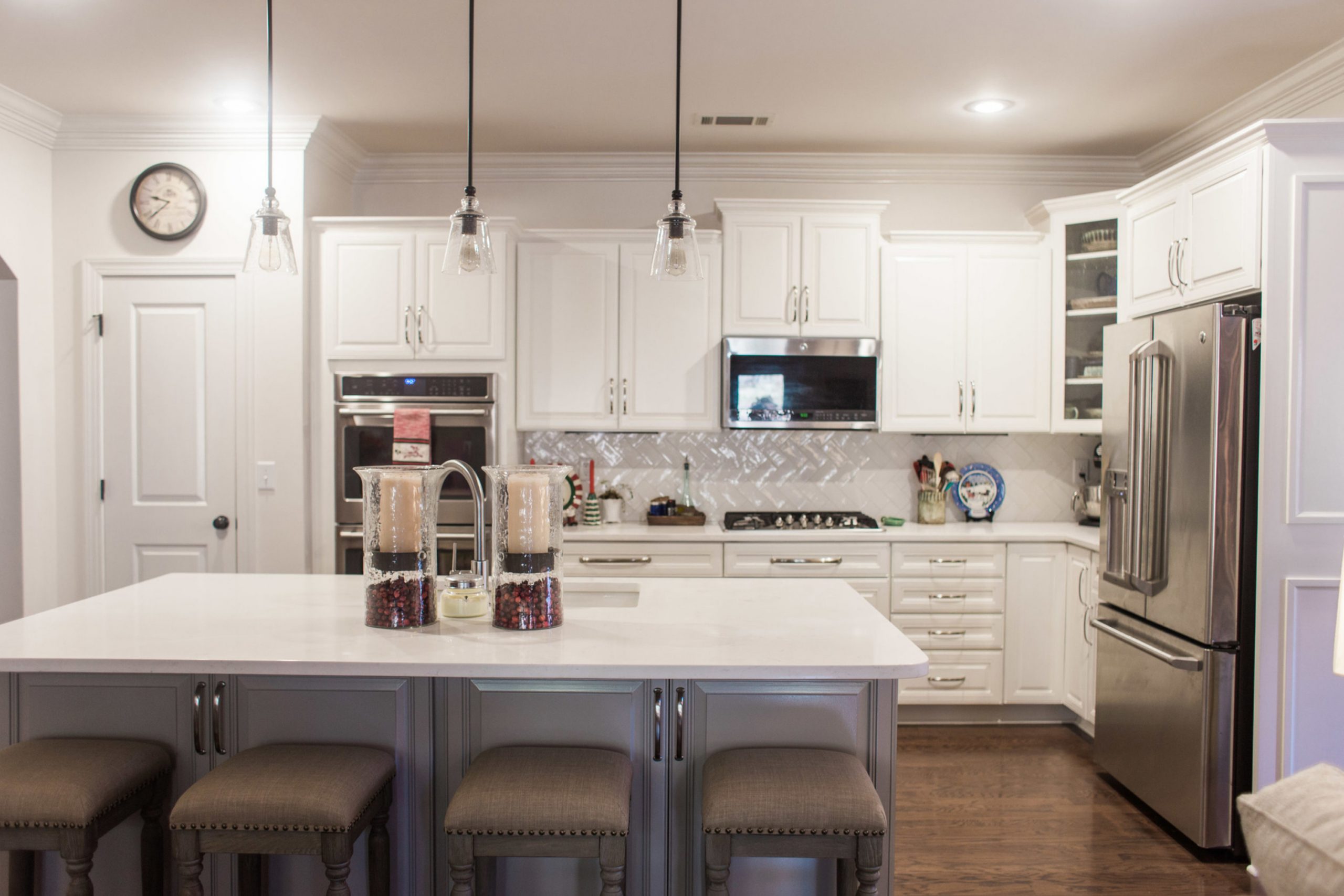
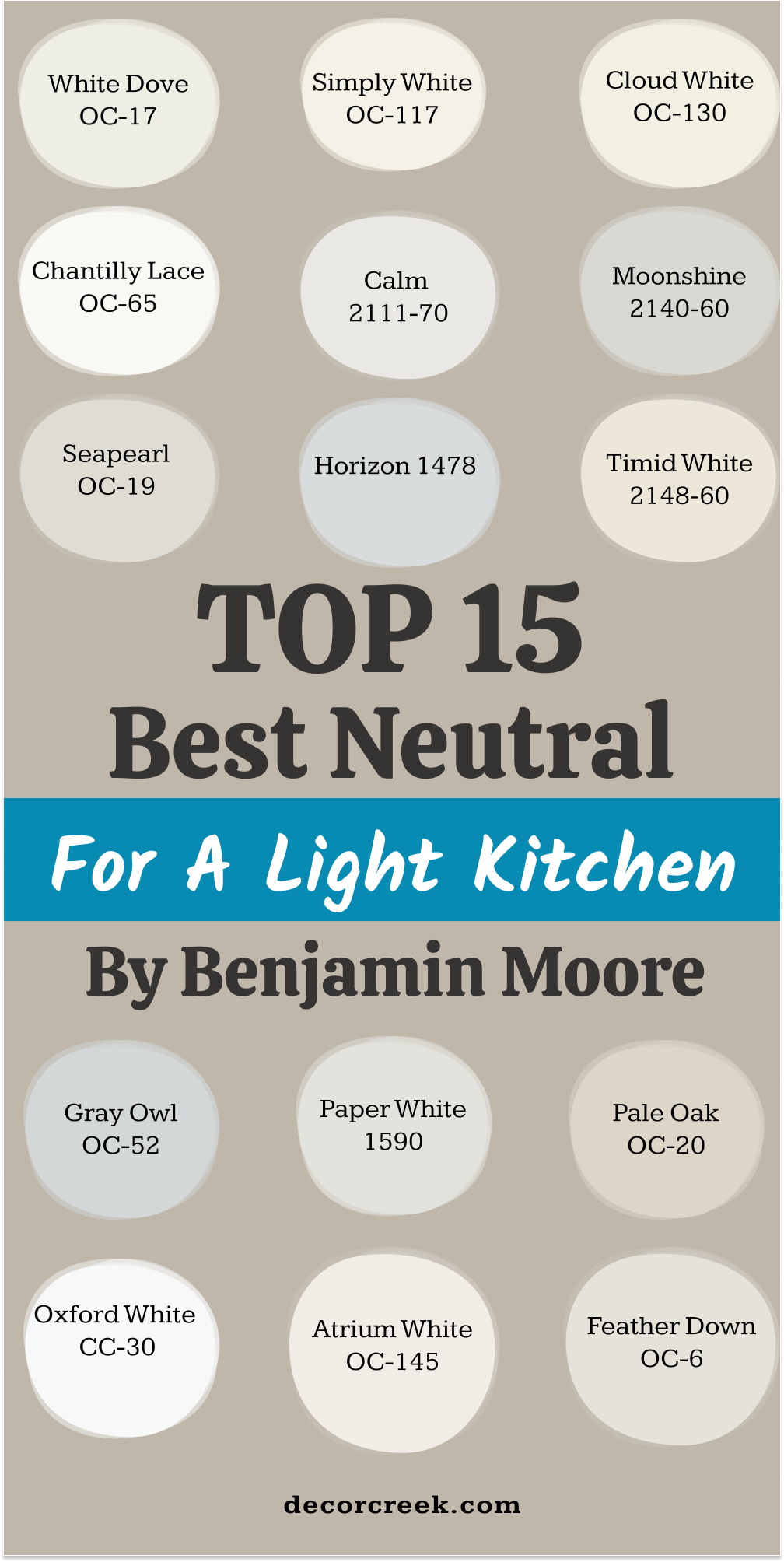
4. Whites, Creams, and Pale Neutrals That Lighten Up the Room from Benjamin Moore This Year
White Dove
White Dove is one of those colors I reach for again and again. It’s not too yellow, not too gray—just that soft, natural white that makes kitchens feel fresh and balanced.
It looks beautiful with white oak cabinets, soft gold hardware, or even simple tile. When the light hits it, it never feels harsh.
It adds just enough warmth without pulling attention from other things in the room.
Great for both old homes and new ones, it has that quiet presence that just works.
My tip: Try it on both walls and trim for a clean, pulled-together look.
👉 Need more? See the full guide for this paint HERE 👈

Simply White
Simply White is a bright white with a bit of warmth that helps it look lively without being too yellow. I like to use it in kitchens that don’t get a ton of sunlight—it brings the room to life.
It reflects light really well, which can make the space feel a little bigger.
This color also plays nicely with stainless steel and white marble, which makes it easy to pair with lots of finishes.
It feels clean but never cold.
My tip: Use this one when you want a fresh look but still want a little softness.
👉 Need more? See the full guide for this paint HERE 👈

Cloud White
Cloud White has just enough creaminess to take the edge off. It’s gentle and cozy, especially in kitchens with warm woods or older finishes. I’ve used this in homes where we wanted things to feel inviting without going full beige.
It pairs beautifully with antique pieces, terracotta tile, or anything with a soft vintage feel.
It won’t turn yellow like some warm whites, but it definitely adds a soft touch.
My tip: Use this when your kitchen has wood floors or beige countertops.
👉 Need more? See the full guide for this paint HERE 👈

Chantilly Lace
Chantilly Lace is as close to a pure white as you can get. It’s sharp, clean, and has no strong undertones, which makes it perfect when you want a crisp look.
I like to use this in modern kitchens or spaces with lots of black, glass, or chrome. It gives the room a bright and clear backdrop.
But be careful—because it’s so clean, it will show contrast with anything creamy nearby.
My tip: This color is best when your trim and cabinetry are also clean whites.
👉 Need more? See the full guide for this paint HERE 👈

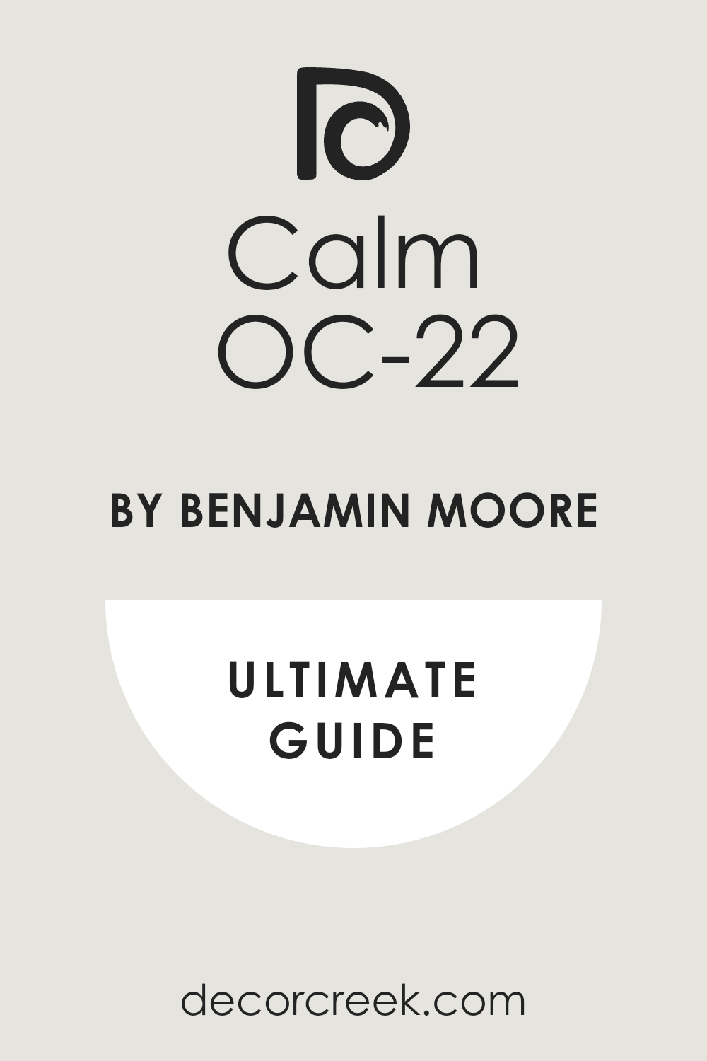
Calm
Calm is a soft off-white with just a hint of lavender-gray. I love using it in open kitchens that connect to living or dining rooms.
It blends in well with both cool and warm tones, so it’s flexible. The color has a quiet feeling without being too gray or too warm.
It also helps blur the edges between different zones in a larger space.
My tip: Try it when you want something between white and gray but still light.
👉 Need more? See the full guide for this paint HERE 👈
Moonshine
Moonshine has a cool, airy feeling with a silvery undertone. It’s perfect in kitchens with a lot of natural light or marble countertops.
This color doesn’t shout, but it gives the whole room a fresh, tidy feel. I’ve used it in homes that needed something lighter than gray but softer than white.
It looks really pretty with nickel hardware or chrome lighting.
My tip: Works well in modern kitchens or spaces with a lot of glass.
Seapearl
Seapearl is a creamy white that feels easy and soft. It has just enough warmth to keep things from feeling cold, and it works really well with wood tones and soft finishes.
I’ve used it in kitchens with open shelves, butcher block counters, and unlacquered brass—it’s a winner.
It feels lived-in and relaxed without being dull.
My tip: Try this if your kitchen has a mix of natural and painted materials.
👉 Need more? See the full guide for this paint HERE 👈

Horizon
Horizon is a very light gray with a fresh, airy feeling. It’s one of my favorites for small kitchens or ones that need a little lift.
It doesn’t overpower the room, and it pairs well with light wood, gray tile, or simple white cabinets.
It has a slight blue undertone, but it’s not icy. I love it in apartments or homes with limited light.
My tip: Use this to make tight kitchens feel more open.
Timid White
Timid White is a soft white with just a whisper of blush. It’s barely there, but it brings a warmth that’s really flattering.
This is a beautiful choice for kitchens that feel a bit cool or flat. It softens everything without being too noticeable.
I like it with light beige stone or soft gray cabinets.
My tip: Try it if your kitchen needs a little warmth without looking pink.
Gray Owl
Gray Owl is a cool-toned gray that reads almost silver in the right light. It’s clean and light, without leaning blue or green.
This one is great for kitchens with white cabinets or brushed nickel hardware. It feels polished without being stiff.
I’ve used it in homes that needed a modern refresh but still wanted to feel cozy.
My tip: Use it in rooms with a lot of daylight—it shines best there.
👉 Need more? See the full guide for this paint HERE 👈

Paper White
Paper White is a cool, light gray that leans toward misty blue. It’s perfect for kitchens that get a lot of sun.
It feels refreshing and works well with glass backsplashes or white countertops.
I like it in contemporary homes that want something softer than white. It brings in that airy, clean feeling.
My tip: Great pick for minimalist or coastal-style kitchens.
Pale Oak
Pale Oak is one of those warm neutrals that can look creamy, beige, or gray depending on the light.
It’s soft, inviting, and easy to pair with wood tones or matte black.
I’ve used it in kitchens where we didn’t want a true gray but still needed some contrast with white. It helps tie everything together.
My tip: A solid choice for open kitchens that flow into living spaces.
👉 Need more? See the full guide for this paint HERE 👈

Oxford White
Oxford White is a crisp white that doesn’t feel too stark. It’s bright and works really well with both warm and cool finishes.
I’ve used this in kitchens with subway tile, oak flooring, and polished chrome—it fit right in.
It’s easy to live with and helps bounce light around.
My tip: This is a good all-over white if you want something clean but not harsh.
👉 Need more? See the full guide for this paint HERE 👈
Atrium White
Atrium White has a soft warmth with a pinkish undertone. It can feel cozy in colder kitchens or homes with little sunlight.
I like it in vintage homes or with off-white cabinetry.
It softens sharp edges and makes everything feel a little more relaxed.
My tip: Use this one in north-facing kitchens that need extra warmth.
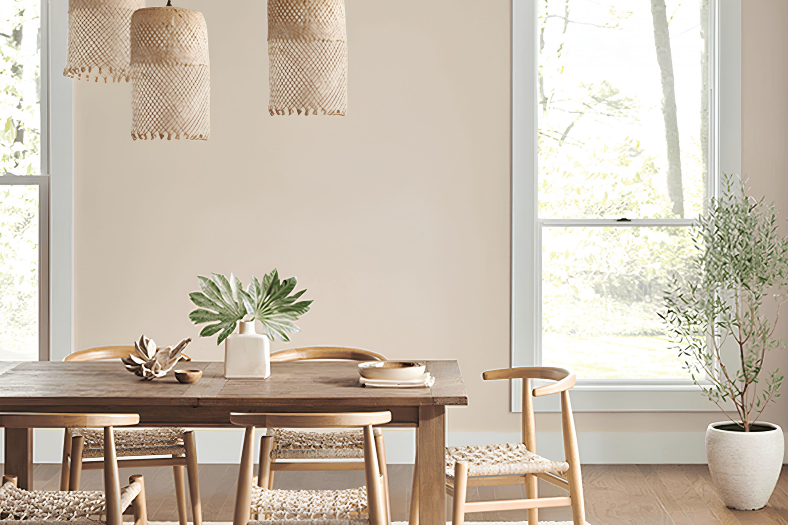
Feather Down
Feather Down sits between beige and ivory. It’s warm, easy, and makes kitchens feel gentle without looking dull.
I’ve used it in homes with terracotta, rustic wood, or aged brass—it pulls everything together.
It won’t fight for attention, but it adds a soft glow.
My tip: Perfect for kitchens with earthy textures or worn-in finishes.
5. Soft Grays, Beiges, and Taupes That Feel Comfortable by Sherwin Williams
Repose Gray SW 7015
Repose Gray is a light gray that feels steady and easy to live with. It works beautifully in both bright and low-light kitchens, never feeling too warm or too cool. This shade blends well with wood cabinets, brushed metals, or natural stone.
It’s soft but still has presence, and I love using it when a kitchen needs some structure without heaviness.
It’s also great in open layouts where the wall color flows into nearby rooms.
My tip: Choose this when you want a go-to gray that plays nice with everything.
👉 Need more? See the full guide for this paint HERE 👈
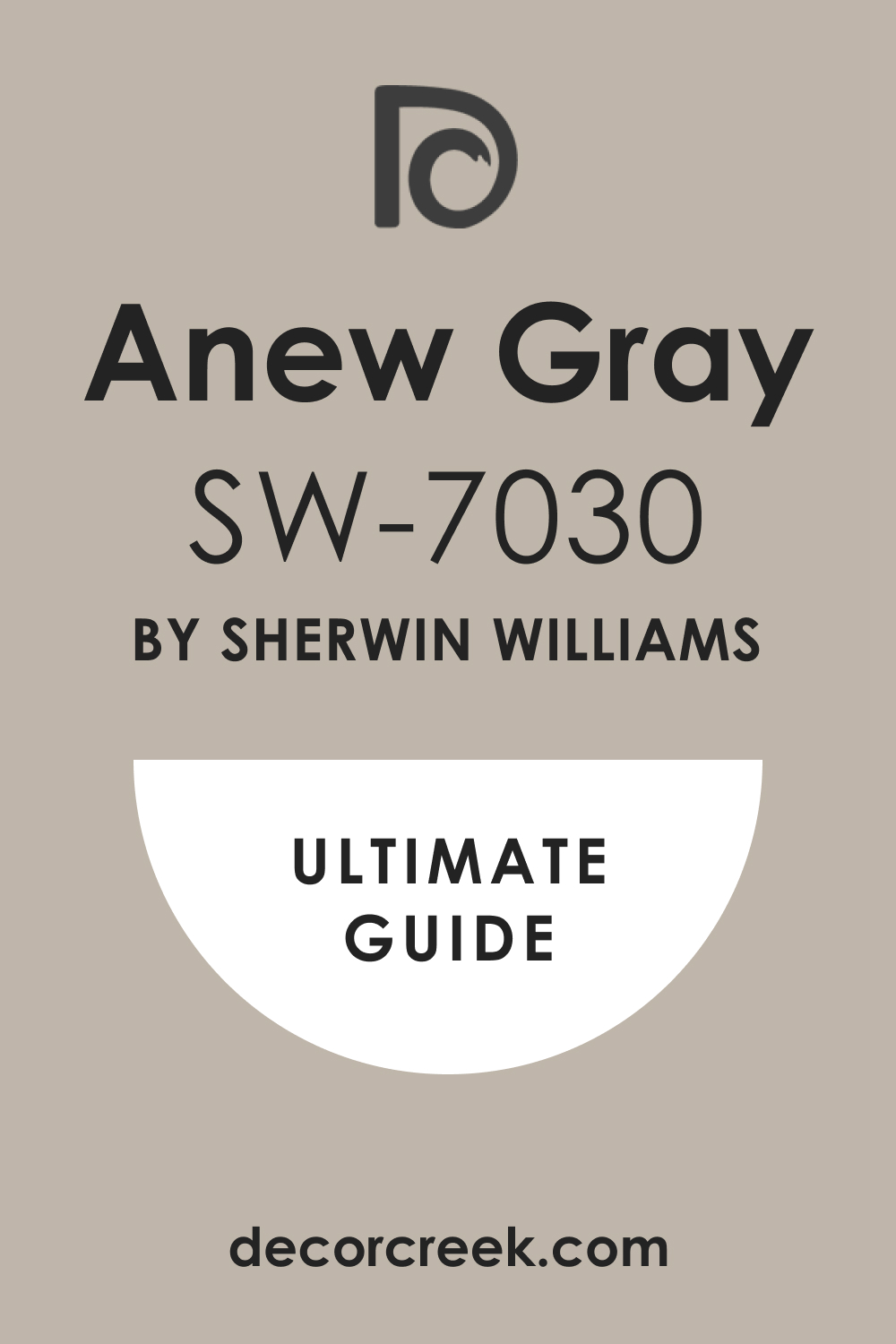
Anew Gray SW 7030
Anew Gray has a quiet richness to it—it’s warmer than true gray but not too beige. I use this when clients want something more grounded than greige, but still soft.
It works well with wood floors, dark islands, or bronze hardware.
This color brings a nice depth without making the kitchen feel smaller.
My tip: Use Anew Gray for a cozy but still fresh feeling in mid-size kitchens.
👉 Need more? See the full guide for this paint HERE 👈
Agreeable Gray SW 7029
Agreeable Gray lives up to its name—it’s easygoing and blends with just about anything. A light warm gray, it works in kitchens with white cabinets, wood tones, or mixed metals.
It’s not too dark, so it won’t close in a room, but it still adds warmth.
This shade is perfect for people who don’t want to make a bold choice but still want a finished look.
My tip: It’s a great safe choice for resale or rental homes too.
👉 Need more? See the full guide for this paint HERE 👈

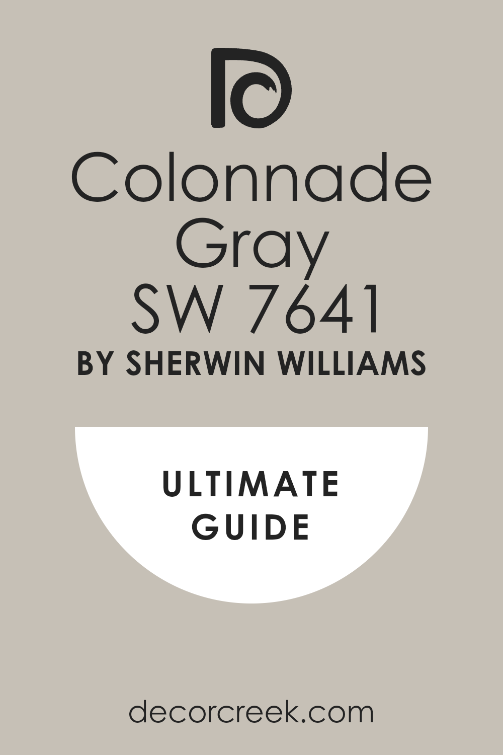
Colonnade Gray SW 7641
Colonnade Gray is a soft taupe-gray that feels balanced and timeless. It works best in kitchens with traditional details, shaker cabinets, or warm wood accents.
I’ve used this in older homes that needed a gentle refresh without feeling too modern.
It feels stable, dependable, and smooth.
My tip: Use it when your kitchen has cream, off-white, or brown tones nearby.
👉 Need more? See the full guide for this paint HERE 👈
Accessible Beige SW 7036
Accessible Beige has a touch of gray in it, which keeps it from being too yellow. It gives kitchens a soft, grounded look while still letting other elements shine.
This shade is great with warm tiles, stone counters, and natural light.
It’s one of those colors that feels welcoming without drawing attention to itself.
My tip: This works well in open kitchens that connect to family or dining rooms.
👉 Need more? See the full guide for this paint HERE 👈

Natural Linen SW 9109
Natural Linen is a sandy beige that reminds me of sun-washed walls. It looks beautiful with terracotta, white oak, or aged brass.
This one’s great for homes with an earthy feel or older kitchens that need a color to bridge different materials.
It warms up the room in a gentle way.
My tip: Try it if you want something warm but not gold or peachy.
👉 Need more? See the full guide for this paint HERE 👈

Canvas Tan SW 7531
Canvas Tan is a clean, soft beige that doesn’t have pink or green undertones. It’s very flexible and works in both bright and low-light kitchens.
I often use it in homes that have busy countertops or colorful backsplashes because it helps balance the rest.
It’s safe, smooth, and works great in traditional homes.
My tip: A smart pick if you’re painting walls but keeping older finishes.
👉 Need more? See the full guide for this paint HERE 👈

Neutral Ground SW 7568
Neutral Ground is a creamy neutral with just a hint of warmth. It acts like a quiet backdrop, perfect when other things in the kitchen—like backsplash or counters—take center stage.
I’ve used this with everything from espresso wood to white cabinets.
It blends easily without adding visual noise.
My tip: Try it when you want your wall color to gently disappear.
👉 Need more? See the full guide for this paint HERE 👈

Drift of Mist SW 9166
Drift of Mist is a pale gray with greenish undertones that gives a kitchen a very airy feel. It’s perfect for smaller kitchens or ones with less natural light.
I like using it when I want the room to feel clean but not sterile.
It’s one of those light grays that plays well with many styles.
My tip: This color does best when paired with crisp whites and light woods.
👉 Need more? See the full guide for this paint HERE 👈

Sweater Weather SW 9548
Sweater Weather is warm, soft, and a little deeper than your usual beige or gray. It’s cozy without being heavy, and it looks especially nice in kitchens with natural textures.
Think leather stools, rough wood, and matte metals.
It has that quiet character that makes a kitchen feel finished.
My tip: This is a favorite for fall or winter homes—it adds gentle depth.
👉 Need more? See the full guide for this paint HERE 👈

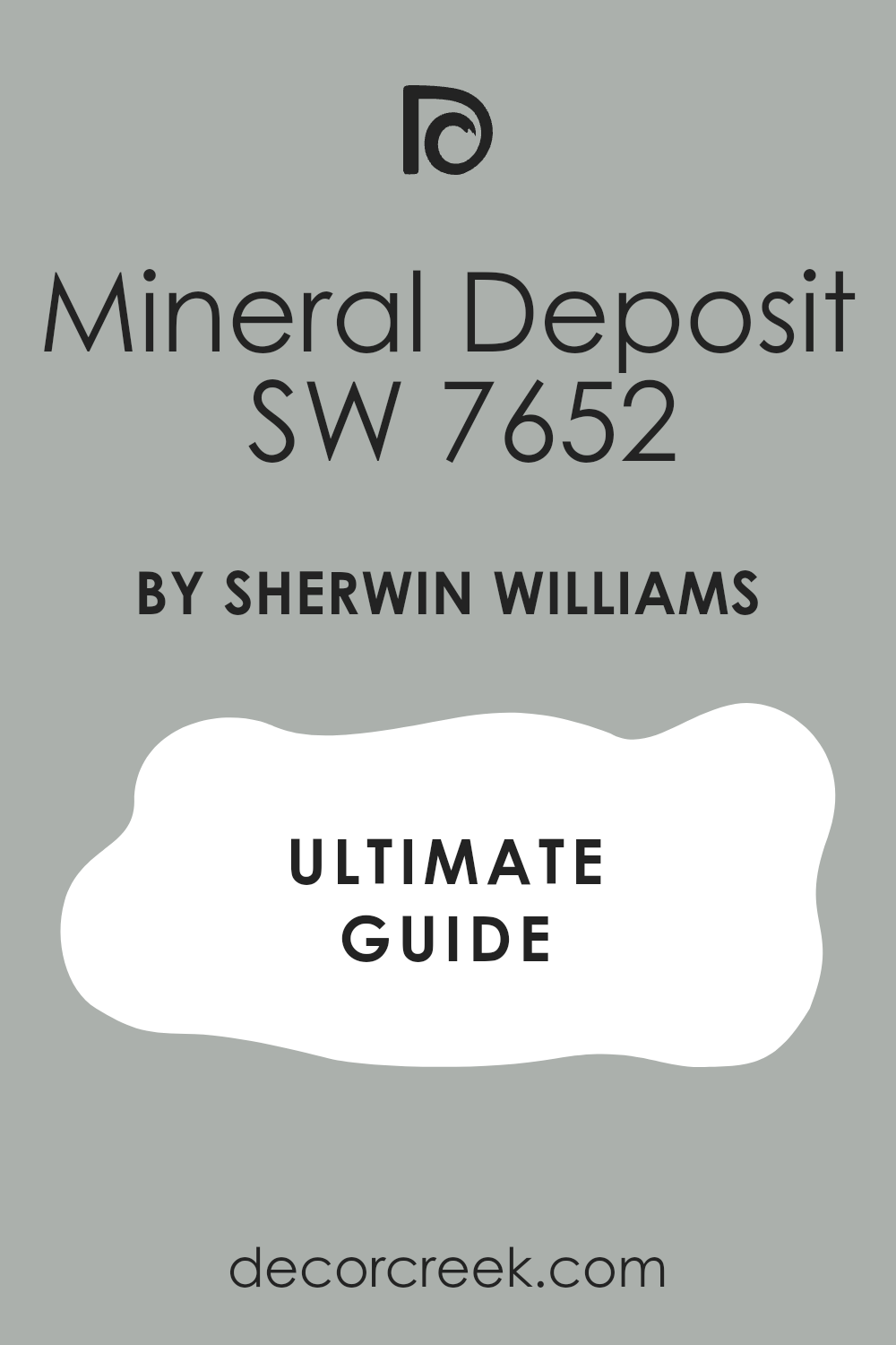
Mineral Deposit SW 7652
Mineral Deposit is a cool gray with a slight blue tone that feels clean and sharp.
It pairs well with white cabinetry, silver fixtures, and glass lighting.
I like using it in kitchens that lean more modern or industrial. It gives structure without taking over.
My tip: Best used when your kitchen has simple lines and cooler tones.
👉 Need more? See the full guide for this paint HERE 👈
Homburg Gray SW 7622
Homburg Gray is deep, dramatic, and has green undertones that add richness. I’ve used it on accent walls or even lower cabinets to bring some boldness without going black.
It works surprisingly well with natural stone, butcher block, or even soft white uppers.
It brings a little drama while still feeling grounded.
My tip: Use it in kitchens that need contrast or a focal point.
👉 Need more? See the full guide for this paint HERE 👈

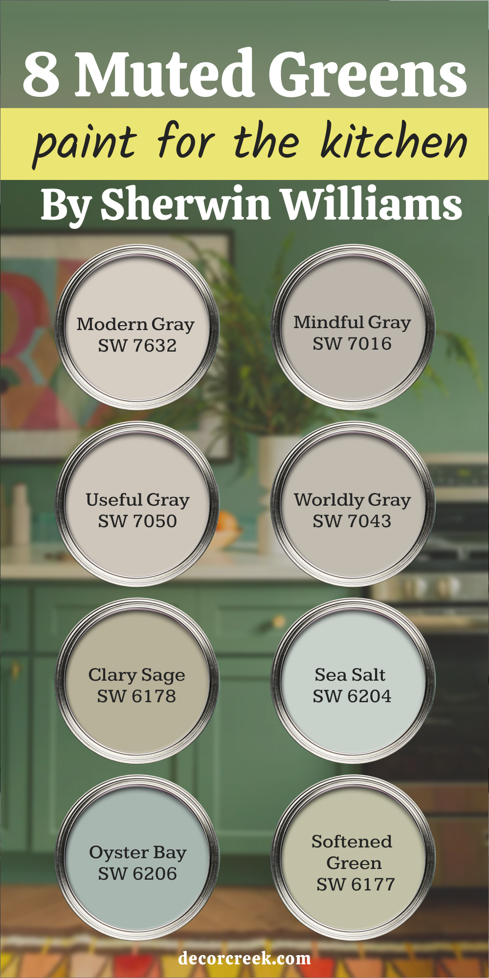
6. Muted Greens and Greiges That Quietly Do the Job (Non–Benjamin Moore)
Modern Gray – Sherwin Williams
Modern Gray is a soft taupe that leans slightly warm with pink undertones. I use it when I want something neutral that still feels welcoming.
It doesn’t read as cold, and it works really well in homes with beige or warm white trim.
It’s also great in kitchens where you’re mixing wood finishes or vintage pieces. It blends quietly without disappearing.
My tip: This shade is helpful when the kitchen connects to warmer-toned rooms.
👉 Need more? See the full guide for this paint HERE 👈

Mindful Gray – Sherwin Williams
Mindful Gray is a true mid-tone gray that stays balanced in most lighting. It has a tiny green undertone, which helps it work with wood cabinets or stone counters.
I like using it when a kitchen needs more depth but not full darkness.
It adds structure to the room while still feeling soft enough for daily life.
My tip: Try this with white uppers and wood lowers for a grounded look.
👉 Need more? See the full guide for this paint HERE 👈

Useful Gray – Sherwin Williams
Useful Gray is a gentle greige with a slight green undertone. It doesn’t stand out too much, which makes it ideal for busy kitchens or ones with patterned tile.
I’ve used this color when clients want something fresh but not white.
It plays nicely with both gold and silver metals.
My tip: A great pick if your kitchen has warm floors but cooler counters.
👉 Need more? See the full guide for this paint HERE 👈
Worldly Gray – Sherwin Williams
Worldly Gray leans soft and earthy, perfect for kitchens that need balance. It has more depth than some lighter neutrals, but it still feels approachable.
I like it in homes with natural textures—wood beams, brick, or stone.
It makes the room feel more put together without being obvious.
My tip: Use it to pull together mismatched finishes or mixed cabinet colors.
👉 Need more? See the full guide for this paint HERE 👈
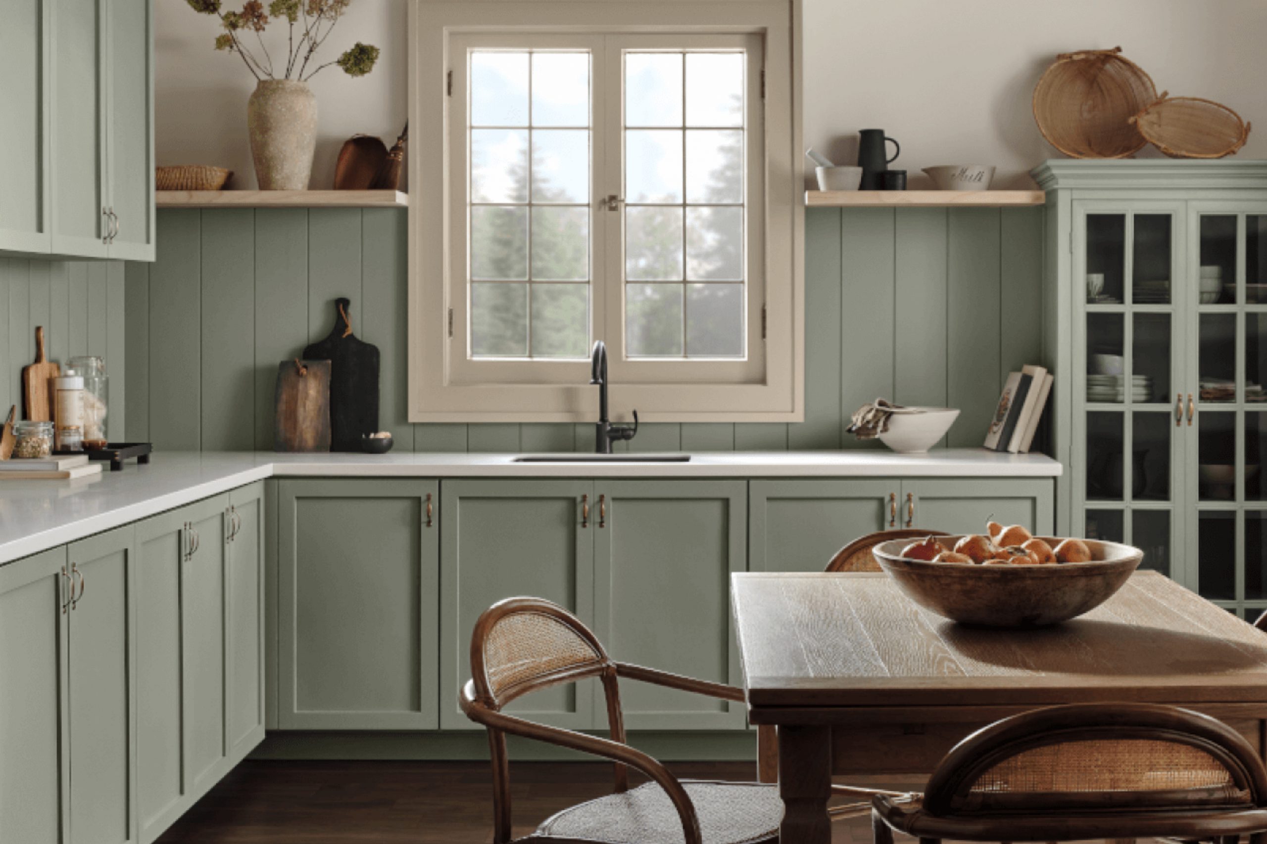
Clary Sage – Sherwin Williams
Clary Sage is a muted green that brings in a quiet natural tone.
It works so well on cabinets, especially when paired with warm wood or antique brass.
I’ve used it in kitchens where we wanted color but not brightness. It always feels grounded and gentle.
My tip: Great for cottage-style kitchens or anything with a farmhouse feel.
👉 Need more? See the full guide for this paint HERE 👈

Sea Salt – Sherwin Williams
Sea Salt is a mix of green and blue that shifts with the light. It’s bright enough to freshen a kitchen, but soft enough not to distract.
I like using it in beachy homes or spaces that want a little life without boldness.
It pairs well with sandy tones, soft woods, and brushed silver.
My tip: Looks best in kitchens with big windows or open layouts.
👉 Need more? See the full guide for this paint HERE 👈

Oyster Bay – Sherwin Williams
Oyster Bay is a cool green-gray that adds a little drama without going dark.
I’ve used it for lower cabinets, islands, or full accent walls.
It has a richness that works with marble, slate, or light wood. It feels modern but still warm.
My tip: Perfect when you want color that feels grown-up, not trendy.
👉 Need more? See the full guide for this paint HERE 👈

Softened Green – Sherwin Williams
Softened Green is like dried sage—quiet, muted, and easy to live with.
It’s light enough for walls but has just enough pigment to feel cozy.
I like this shade in kitchens that already have a lot of white or tile. It adds interest without being too noticeable.
My tip: Try this with white oak cabinets or warm brass for a soft, natural mix.
👉 Need more? See the full guide for this paint HERE 👈
7. Final Thoughts From My Work With Kitchens
I’ve watched kitchens go from “fine” to feel like home just by changing the paint. Neutral colors really do set the mood.
If you’re stuck, sample three shades on your wall. Look at them morning and night—paint changes.
The right color doesn’t need to shout. It just needs to feel right to you.