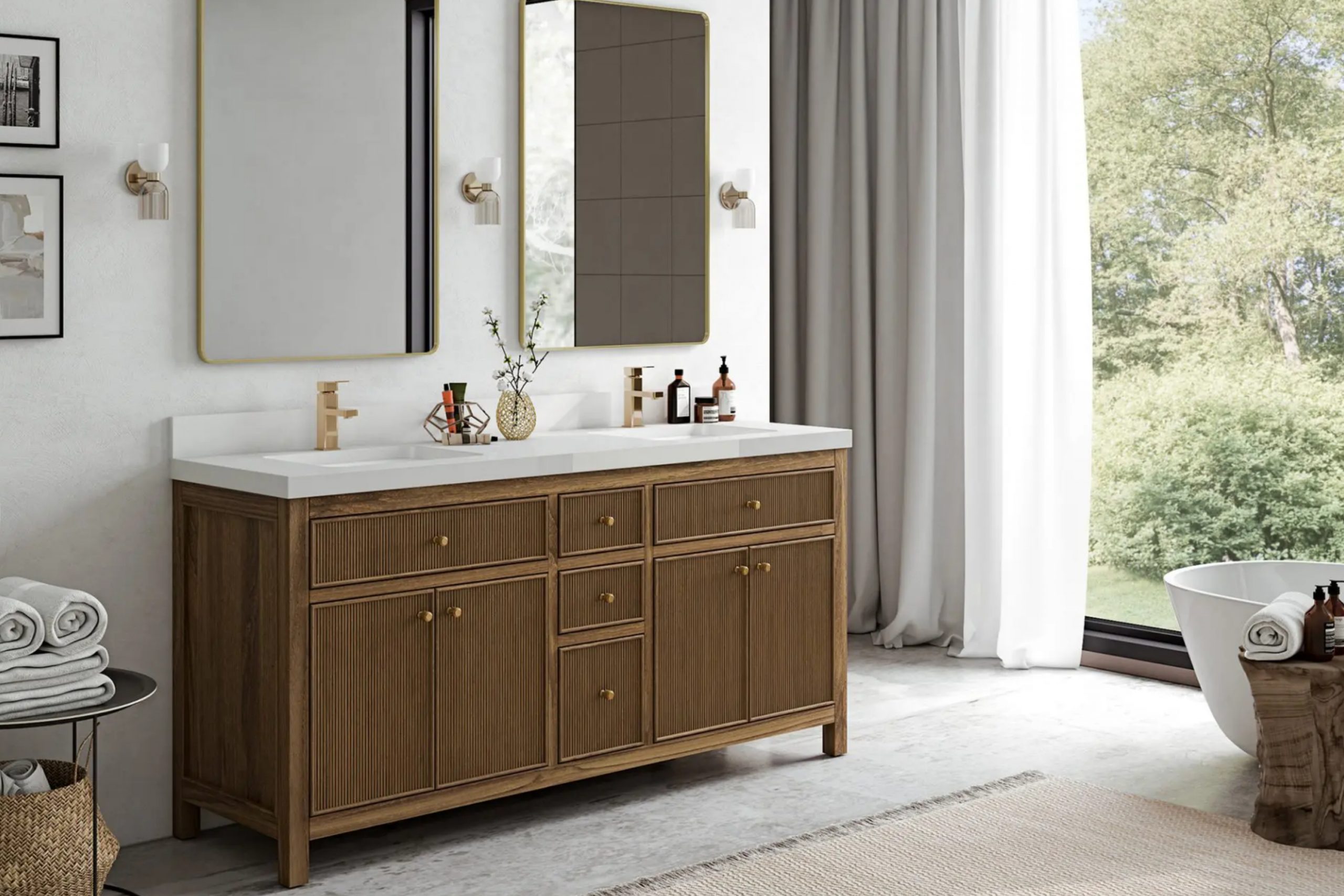
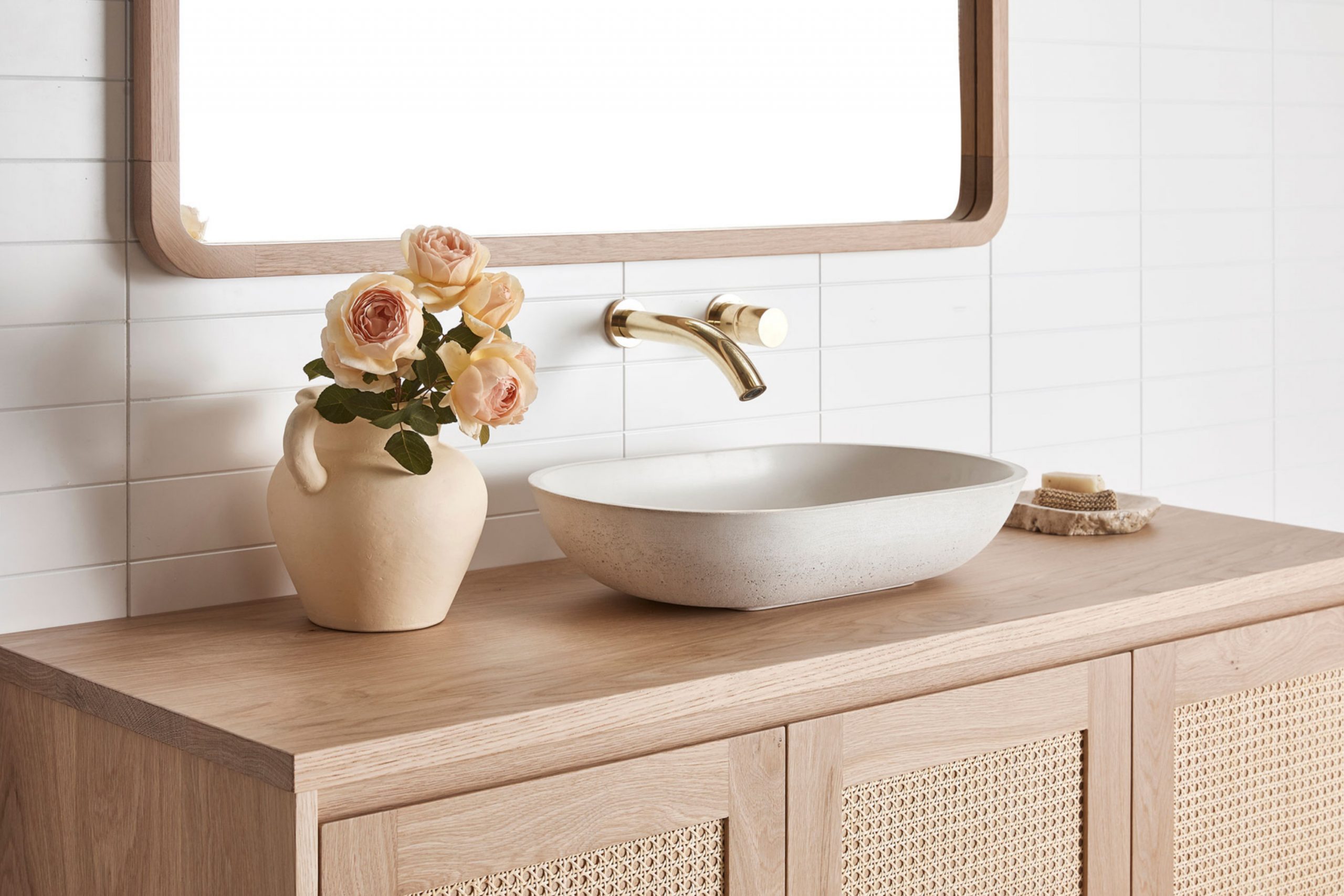
Bathroom vanities are like the centerpiece of the whole room. They’re what people notice right away, and the color you choose can either make your bathroom feel fresh or make it fall flat. I’ve seen how just a coat of paint can bring a tired bathroom back to life. And the best part? You don’t need a big budget. You just need the right color.
I picked these 36 colors because they actually work in real homes. Some are bright, some are bold, but all of them have helped my clients feel proud of their bathrooms.
Whether your room is tiny or wide, dark or full of light, there’s something here that will fit. Let me show you what I’d use and when.
Why Bathroom Vanity Color Matters More Than You Think
The color on your vanity changes how the whole bathroom feels. A good color can make it feel fresh, cozy, or even high-end. A bad one? It can throw everything off. I’ve walked into bathrooms with beautiful tile and nice lighting, but the wrong vanity color made the room feel off.
This is why I always tell people: the vanity color isn’t just decoration. It ties the whole bathroom together. Whether you want something simple or something dramatic, it has to fit with the size, the lighting, and the mood you want in there.
Picking the right color can make the room feel clean and welcoming. That’s what we want, right?
How I Pick the Right Color for a Bathroom Vanity (Even in Tiny or Dark Rooms)
When I choose vanity colors, I look at three things: light, size, and what else is going on in the room. If there’s no window, I stay away from shades that might feel heavy. If it’s a big room, I can play with more dramatic colors. I also look at the floors, the tile, the wall color, and the metal finishes.
Matching warm tones with warm tones always works. Brass looks amazing with creamy colors. Black handles pop on deep green or navy. I also think about how people want to feel in the room.
Fresh and clean? Go light. Cozy and bold? Go dark. The trick is making sure the vanity color fits the whole picture.
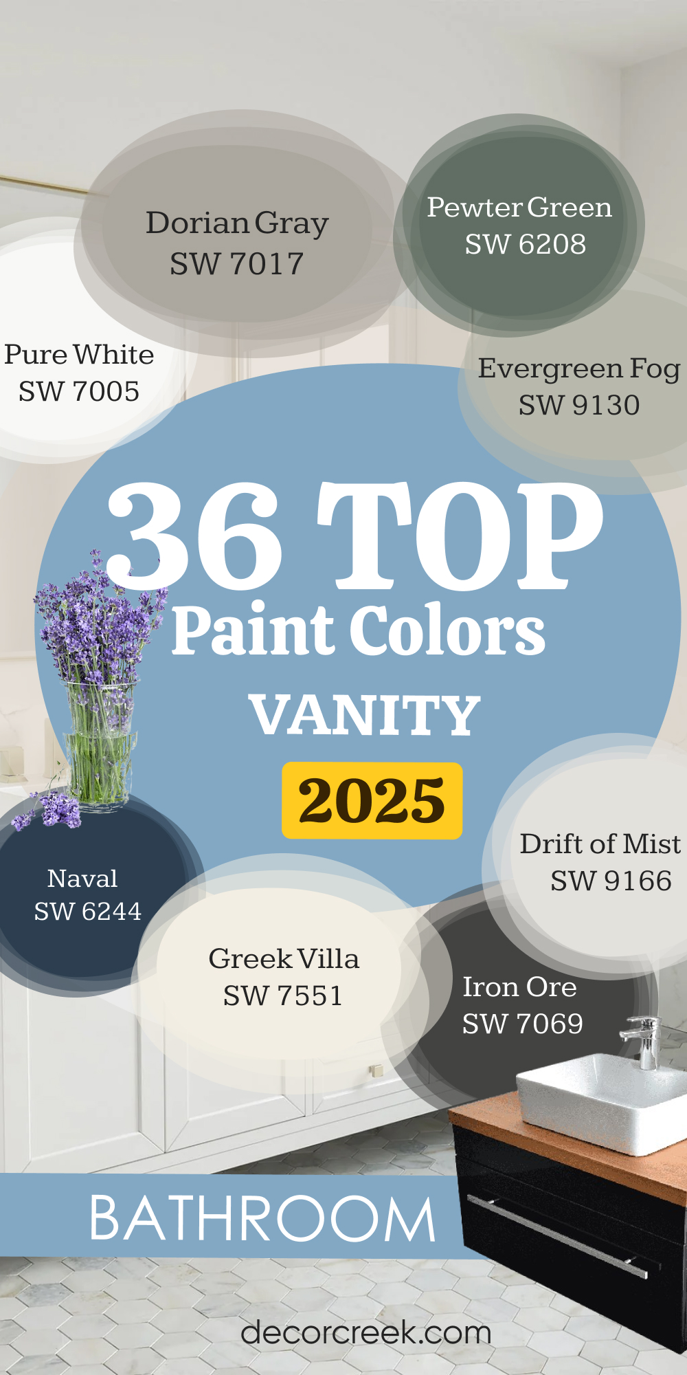
36 Best Bathroom Vanity Paint Colors in 2025
Whites & Light Neutrals
Pure White – SW 7005
Pure White makes everything feel fresh without looking cold. I’ve used it in bathrooms with both brass and chrome fixtures, and it always looks sharp. Pure White has just enough softness so it doesn’t feel harsh, even under bright lights. I like it most for modern vanities with clean lines. Pure White also plays nicely with almost every tile color—gray, beige, or even bold patterned floors. This color works best when you want your bathroom to feel open and tidy.
I like using this color when I want a bright and clean feel that still looks soft.

Alabaster – SW 7008
Alabaster feels warm and welcoming, like a soft blanket. It’s one of those colors that looks white but has a creamy side to it, so it never feels flat. Alabaster works beautifully with wood mirrors or light oak floors. I love it in older homes or bathrooms with warm lighting. Alabaster makes a bathroom feel more lived-in and friendly. This one’s great if you’re nervous about going “too white” but still want things to feel light.
I like using this color when I want the room to feel soft and cozy.

Snowbound – SW 7004
Snowbound is a white with a quiet gray undertone that gives it a grounded look. I’ve used it in bathrooms that have white tile but need something to break up all the brightness. Snowbound adds interest without shouting for attention. It pairs perfectly with polished nickel or soft gray walls. This is a great color for a vanity when you want white but with a little extra something.
I like using this color when I want to keep things clean without being boring.

Greek Villa – SW 7551
Greek Villa feels like a sunny morning. It has a creamy look but still reads as white in most lights. I’ve used Greek Villa in cottages and craftsman homes, and it always fits right in. It brings out the charm in vintage vanities or beadboard cabinets. Greek Villa looks best next to warm metal finishes and natural wood frames. This is a favorite when I want a soft, welcoming feel.
I like using this color when I want a white that feels cheerful.

Shoji White – SW 7042
Shoji White is a warm white with a soft beige undertone. It has a cozy feel that makes bathrooms feel more personal. I’ve used it on vanities where the walls are also neutral, and it adds just enough contrast. Shoji White looks amazing with both black and gold hardware. This one’s for people who want a white that doesn’t feel plain.
I like using this color when I want to warm up a neutral room.

Drift of Mist – SW 9166
Drift of Mist is a pale gray that almost looks like a faded cloud. It’s perfect for those in-between moments when white feels too bright, but gray feels too dark. I love using this one in bathrooms with marble or cool-toned tiles. Drift of Mist works well with brushed nickel and black finishes. It brings a quiet beauty without being boring.
I like using this color when I want something soft that still feels clean.

White Duck – SW 7010
White Duck is a creamy white that leans toward beige, and it’s perfect for a cozy feel. It has a warmth that makes bathrooms feel a little more special. I’ve paired it with darker countertops and it always balances things nicely. White Duck works best with wood floors or warmer-toned tiles. It gives older bathrooms a fresh update without feeling out of place.
I like using this color when I want a lived-in look that still feels fresh.

Oyster White – SW 7637
Oyster White has a unique way of feeling clean and grounded at the same time. It’s like white mixed with a touch of taupe, and it looks amazing with natural stone. I often use it in homes with travertine or tan-colored tiles. Oyster White keeps things light without going cold. This color is great when you want to bring out warmth in the rest of the room.
I like using this color when I want something that feels natural and smooth.

Creamy – SW 7012
Creamy is like vanilla ice cream—it makes everything feel better. It’s not yellow, not beige, just perfectly creamy. I’ve used it in small bathrooms where white would be too stark, and it softens the whole room. Creamy works with both modern and classic styles. It’s one of my go-tos when I want the bathroom to feel gentle.
I like using this color when I want a soft, sweet finish that still looks clean.

Grays & Greige Tones
Agreeable Gray – SW 7029
Agreeable Gray is one of the easiest colors to work with. It’s a soft gray with warm undertones, so it never feels cold or gloomy. I use it a lot when I want something neutral that still feels interesting. Agreeable Gray pairs beautifully with white countertops and brushed nickel hardware. It also looks great with natural wood accents. If your bathroom gets some daylight, this color really shines.
I like using this color when the room needs warmth without going beige.

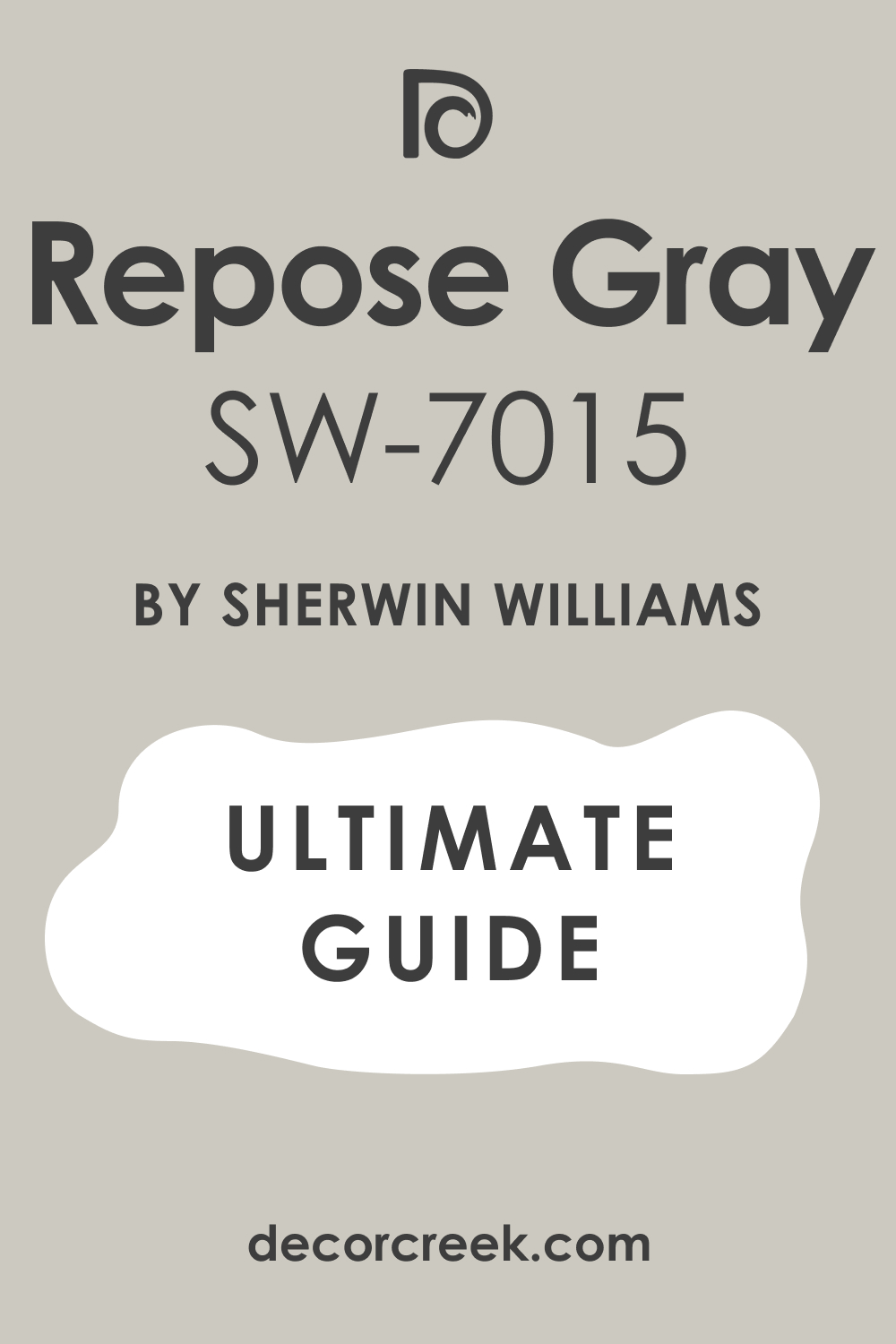
Repose Gray – SW 7015
Repose Gray feels a little cooler than Agreeable Gray, but it still has that softness that makes it feel cozy. I like how it shifts slightly depending on the light—it keeps the room feeling alive. Repose Gray is perfect when you want a vanity color that’s not too light but not too dark either. It works well with matte black, brass, or even chrome. I use it often in both modern and farmhouse-style bathrooms.
I like using this color when I want something quiet but not plain.
Mindful Gray – SW 7016
Mindful Gray brings in a little more depth than some of the lighter grays. It feels thoughtful and balanced—never too warm or too cool. I’ve used it in bathrooms with marble tile, and it pairs perfectly. Mindful Gray looks great with both light and dark floors. It also works beautifully with gold or matte black finishes. This is a smart pick when you want a little contrast but still want things to feel soft.
I like using this color when I want depth without going dark.

Dorian Gray – SW 7017
Dorian Gray is rich without being too bold. It has a strong gray base with just a hint of warmth, which helps it feel grounded. I like to use it on vanities when I want a modern, moody look that still feels homey. Dorian Gray pairs nicely with clean white walls or soft beige tiles. It really stands out with brass pulls or dark bronze fixtures. This one works well in larger bathrooms or powder rooms with dramatic lighting.
I like using this color when I want a bold neutral that still feels familiar.

Worldly Gray – SW 7043
Worldly Gray is a soft, warm greige that fits right into almost any bathroom. It has just enough color to give it personality without making the room feel dark. I use Worldly Gray in homes with warm wood tones or creamy tile. It looks especially nice in natural light. This shade works best when you want your vanity to feel classic and cozy at the same time.
I like using this color when the room already has warm finishes and just needs a gentle touch.

Anew Gray – SW 7030
Anew Gray is one of those shades that walks the line between gray and taupe. It has a quiet strength to it, and I love how it changes with the light. Anew Gray works beautifully with creamy whites and warm metals. I’ve used it in both traditional and modern bathrooms, and it never feels out of place. This is a great pick for anyone who wants a neutral with a little extra personality.
I like using this color when I want warmth with a grounded feel.

Amazing Gray – SW 7044
Amazing Gray is darker than some of the others on this list, but it has so much character. It’s bold without being too loud. I often pair it with bright white counters or light flooring to balance it out. Amazing Gray works best in rooms with good lighting—natural or artificial. It also looks really sharp with matte black fixtures. This is a go-to when I want to make the vanity stand out.
I like using this color when the room needs a little drama that still feels safe.

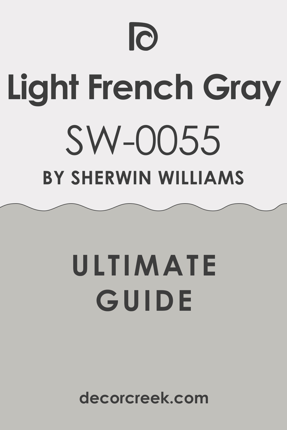
Light French Gray – SW 0055
Light French Gray has a cool, gentle look that’s perfect for bathrooms with silver or chrome accents. It leans cooler than many of the other grays, so it’s great for modern styles. I love using it in bathrooms with lots of light because it keeps the room feeling clean and airy. It also works really well with white tile or marble. This color brings in a crisp, tailored feeling.
I like using this color when I want something neat and simple that still feels stylish.
Colonnade Gray – SW 7641
Colonnade Gray is a beautiful greige that leans just a bit warm, making it very easy to live with. It pairs nicely with almost any kind of flooring—wood, tile, even concrete. I like how it blends in without feeling boring. It works great for people who want something neutral but not too light. Colonnade Gray has a calming presence and looks great in almost any lighting.
I like using this color when I want the vanity to feel like it’s always belonged there.
Warm & Dark Shades
Urbane Bronze – SW 7048
Urbane Bronze is deep and dramatic in the best way. It’s a dark brown with a hint of gray, and it brings so much character to a bathroom. I’ve used it on vanities with white quartz countertops, and the contrast is stunning. Urbane Bronze also looks great with brushed gold or black hardware. It works especially well in bathrooms with good lighting or a window. This color makes the vanity feel bold but still grounded.
I like using this color when I want the vanity to feel like a statement piece.

Iron Ore – SW 7069
Iron Ore is one of the richest colors I use. It’s not quite black—more like the color of charcoal—and it has a smooth look that makes everything around it feel more modern. I’ve paired it with light wood floors, white walls, and soft lighting, and it always pulls the whole room together. Iron Ore also pops beautifully with brass or matte black hardware. It gives a vanity that high-end feel without trying too hard.
I like using this color when I want the bathroom to feel bold and sharp.

Black Fox – SW 7020
Black Fox is like a deep espresso with a hint of gray. It’s not as heavy as black, and that’s why I love using it. I’ve used Black Fox in smaller bathrooms, and it still works because it’s rich without being too much. This color adds warmth and looks amazing with gold or bronze fixtures. Black Fox also brings out the grain in wood countertops or shelves.
I like using this color when I want a dark vanity that feels cozy, not cold.

Sealskin – SW 7675
Sealskin is a very dark brown that feels almost like black, but softer. It has a depth to it that gives vanities a strong, grounded look. I’ve used it in modern bathrooms with clean lines and minimalist fixtures, and it gives the whole room weight. Sealskin works best when paired with light counters and neutral walls. It also looks great with metal hardware in gold or matte black.
I like using this color when I want the vanity to feel rich and strong without going full black.
Black Magic – SW 6991
Black Magic is true black, and sometimes that’s exactly what a bathroom needs. It can feel dramatic and classic at the same time. I’ve used Black Magic in powder rooms with gold mirrors and soft wall colors—it makes the vanity the star. It also pairs really well with high-contrast tile or bold floors. This is not a shy color, but it can look beautiful when used the right way.
I like using this color when I want something bold that still feels elegant.

Warm Stone – SW 7032
Warm Stone is a taupe-gray with a comforting, rich tone. It’s the color I reach for when I want something deeper than beige but not as dark as charcoal. Warm Stone works in both traditional and modern bathrooms. I’ve paired it with cream tiles, wood shelving, and brushed gold fixtures—it looks amazing. It’s a great in-between color for when you’re not sure how dark to go.
I like using this color when I want to ground the vanity without making it feel too heavy.

Backdrop – SW 7025
Backdrop is a deep taupe that brings an earthy, modern feel to any bathroom. It has a brown-gray base that plays well with all kinds of textures. I like using Backdrop in homes with natural finishes—think stone counters or wood accents. It gives just the right amount of contrast without going too dark. This color looks great with brass, black, or even copper fixtures.
I like using this color when I want something that feels warm but still strong.

Status Bronze – SW 7034
Status Bronze is a bold brown that leans toward bronze, just like the name says. It has a soft sheen that makes vanities look polished but not too flashy. I’ve used it in bathrooms with warm lighting and wood mirrors—it fits right in. Status Bronze works really well with beige or tan tiles. It’s a great choice if you want something dark but not black.
I like using this color when I want to add richness without going too dramatic.

Turkish Coffee – SW 6076
Turkish Coffee is a strong, deep brown that brings instant warmth to a bathroom. It has a cozy, coffee-like richness that makes vanities feel grounded and welcoming. I’ve used it with creamy counters and aged brass pulls for a look that feels timeless and charming. Turkish Coffee pairs nicely with warm floors or natural stone. It’s a great pick if you love rich tones that don’t feel too trendy.
I like using this color when I want to bring warmth and personality to the vanity.

Blues & Greens
Naval – SW 6244
Naval is a classic navy that makes a strong but stylish statement. It brings a cool, deep tone that works well in bathrooms of all sizes. I’ve used Naval on vanities with marble counters and gold hardware, and it looks incredible. This color gives off a clean, polished vibe, especially when paired with crisp whites. Naval also works great with coastal or traditional styles.
I like using this color when I want something bold but still familiar.

Indigo Batik – SW 7602
Indigo Batik is a rich denim blue that feels casual but still polished. It has more warmth than true navy, which makes it easier to pair with wood accents or warm metals. I love using it in bathrooms with a bit of personality—patterned floors or fun mirrors. Indigo Batik brings color without feeling wild. It pairs well with soft whites, creams, and even brass.
I like using this color when I want a blue that feels bold and relaxed at the same time.

Blustery Sky – SW 9140
Blustery Sky is a medium blue with a soft gray undertone. It’s a really friendly color that doesn’t scream for attention. I’ve used it in both modern and traditional homes, and it fits either style beautifully. Blustery Sky looks amazing with light countertops and brushed nickel fixtures. It brings a little bit of color to the room while keeping things calm and easy.
I like using this color when I want the vanity to feel gentle but interesting.
Distance – SW 6243
Distance is a smoky blue that adds just the right amount of drama. It has a moody feel but still works in smaller bathrooms. I like pairing it with white or gray counters and silver hardware. Distance also plays nicely with wood tones, especially walnut. It’s a great color when you want to add character without going too dark.
I like using this color when I want something moody that still feels fresh.

Smoky Azurite – SW 9148
Smoky Azurite is a rich, jewel-toned blue that brings energy and style. It’s not as dark as navy, but it still feels bold. I love using it in bathrooms where the walls are kept light, so the vanity becomes the star. Smoky Azurite looks amazing with both polished chrome and aged brass. It adds a punch of color that still feels grown-up.
I like using this color when I want something bold and a little playful.

Evergreen Fog – SW 9130
Evergreen Fog is a soft green-gray that’s gentle and grounding. It brings in a natural feel that works beautifully in modern and rustic bathrooms. I’ve paired it with wood mirrors, stone counters, and black hardware—it always fits in. Evergreen Fog is especially nice in bathrooms with lots of natural light. It feels peaceful without being boring.
I like using this color when I want something soft but still full of character.

Pewter Green – SW 6208
Pewter Green is a deep, dusty green that gives a bathroom so much depth. It has a traditional feel that also works great in modern homes. I’ve used it with gold hardware and creamy counters, and it always looks polished. Pewter Green works especially well in powder rooms where you want to make a statement. It’s one of those colors that makes the whole room feel more special.
I like using this color when I want the vanity to be the star of the room.

Rookwood Sash Green – SW 2810
Rookwood Sash Green is a dark olive that feels earthy and strong. It has an old-world charm that works really well in vintage or farmhouse-style homes. I love pairing it with antique gold, natural wood, or terracotta tiles. This green gives vanities a grounded, almost architectural feel. It’s bold, but not loud.
I like using this color when I want something different that still feels classic.

Coastal Plain – SW 6192
Coastal Plain is a soft, coastal green that brings in just the right touch of freshness. It feels light and airy without going pastel. I’ve used it in bathrooms with white walls and rattan accents—it gives a light beachy vibe. Coastal Plain pairs beautifully with both silver and brass finishes. It’s perfect for a vanity that needs a little lift without being bright.
I like using this color when I want to add color gently and naturally.

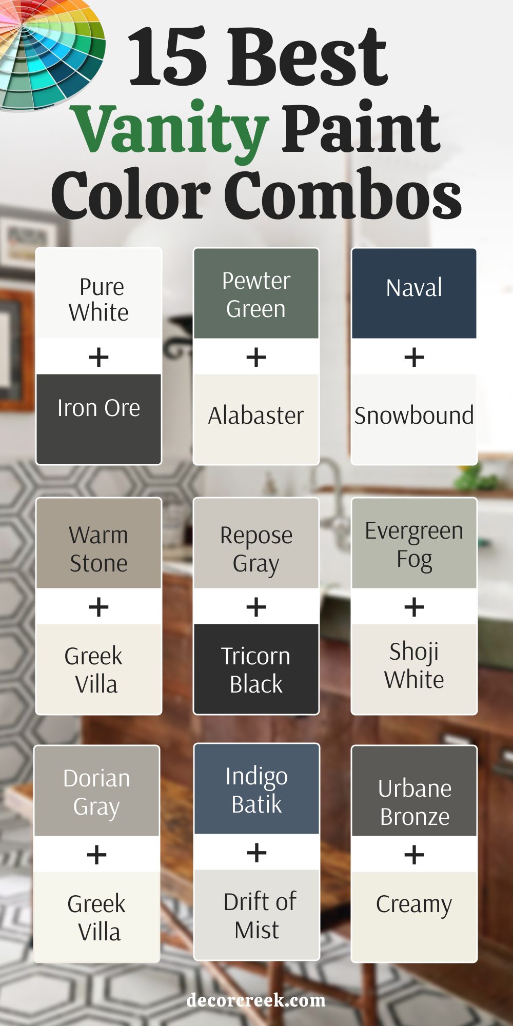
15 Best Vanity Paint Color Combos for 2025
Pure White (SW 7005) + Iron Ore (SW 7069)
Pure White and Iron Ore make a high-contrast combo that feels crisp and modern. I love using Pure White on the walls and Iron Ore on the vanity—it’s bold without being too heavy. This mix works beautifully with black or silver hardware. If you have marble tile or a light floor, it really pops. It’s a great combo for anyone who likes things clean but dramatic.
I like using this colors when I want sharp contrast with a polished look.
Pewter Green (SW 6208) + Alabaster (SW 7008)
Pewter Green and Alabaster are one of my favorite warm-meets-cool pairings. Alabaster softens the room while Pewter Green brings in depth. I usually use Alabaster on the walls and Pewter Green on the vanity. Together, they make the bathroom feel balanced and fresh. This combo works well with gold or black fixtures.
I like using this colors when I want something earthy but still inviting.
Naval (SW 6244) + Snowbound (SW 7004)
Naval with Snowbound creates a classic coastal feel that never goes out of style. I’ve used Naval on vanities and Snowbound on walls or trim for a sharp, clean contrast. This combo works great in bright bathrooms, especially with chrome or nickel accents. It’s strong, but not overpowering.
I like using this colors when I want the room to feel crisp but full of personality.
Warm Stone (SW 7032) + Greek Villa (SW 7551)
Warm Stone paired with Greek Villa creates a soft, cozy feeling that feels like home. I like painting the vanity in Warm Stone and using Greek Villa for the walls or mirror frame. The combo feels warm without being too dark. It looks amazing with warm wood, woven baskets, or creamy counters.
I like using this colors when I want the bathroom to feel inviting and grounded.
Repose Gray (SW 7015) + Tricorn Black (SW 6258)
Repose Gray and Tricorn Black give a modern, sleek look that works in any bathroom. I often use Repose Gray for the vanity and Tricorn Black for accents like the mirror or lighting. This combo makes everything feel polished and current. It’s a favorite for modern homes and apartments.
I like using this colors when I want a modern look that still feels soft.

Evergreen Fog (SW 9130) + Shoji White (SW 7042)
Evergreen Fog with Shoji White brings in a peaceful, natural tone that works great in cozy bathrooms. Shoji White on the walls adds warmth, while Evergreen Fog on the vanity brings the color in softly. It looks beautiful with wood accents and brushed gold fixtures. This is a combo I use when I want a bathroom to feel restful but full of style.
I like using this colorswhen I want a gentle and earthy look.
Dorian Gray (SW 7017) + Greek Villa (SW 7551)
Dorian Gray and Greek Villa make a perfect pair. The deep gray tone brings a strong base, while Greek Villa adds softness and warmth. I usually use Dorian Gray on the vanity and Greek Villa on the walls or trim to lighten things up. This combo works beautifully with cream or white counters and gold or black fixtures.
It feels balanced, polished, and easy to live with.
I like using this colors when I want a vanity that feels tailored and upscale.
Indigo Batik (SW 7602) + Drift of Mist (SW 9166)
Indigo Batik and Drift of Mist feel relaxed but fresh. I use Drift of Mist on the walls and Indigo Batik on the vanity for just the right amount of color. This combo works beautifully with natural wood and light flooring. It feels peaceful but never dull.
I like using this colors when I want soft contrast and a lived-in feel.
Urbane Bronze (SW 7048) + Creamy (SW 7012)
Urbane Bronze and Creamy are a rich and cozy combo. Creamy adds softness to balance out Urbane Bronze’s bold look. I often paint the vanity Urbane Bronze and use Creamy on the walls or trim. This combo looks great in farmhouse or traditional bathrooms.
I like using this colors when I want warmth and richness without going overboard.
Black Fox (SW 7020) + White Duck (SW 7010)
Black Fox with White Duck feels earthy and classic. I usually paint the vanity in Black Fox and keep the rest of the bathroom light with White Duck. It’s perfect when you want depth without using true black. It works with brass, bronze, or black fixtures.
I like using this colors when I want a grounded look that still feels soft.
Blustery Sky (SW 9140) + Oyster White (SW 7637)
Blustery Sky with Oyster White gives a soft and charming look. Blustery Sky brings in cool tones, while Oyster White keeps everything warm and light. I use this combo in traditional bathrooms with antique mirrors or patterned tile. It’s gentle and welcoming.
I like using this colors when I want the room to feel relaxed and pretty.
Anew Gray (SW 7030) + Drift of Mist (SW 9166)
Anew Gray with Drift of Mist makes the whole bathroom feel calm and cool. Anew Gray has just enough warmth to keep things grounded, while Drift of Mist brings in a soft, airy contrast.
I like using Drift of Mist on the walls and Anew Gray on the vanity for a smooth, balanced look. This combo works beautifully in both modern and classic bathrooms. It pairs well with black, silver, or brass finishes.
I like using this color when I want the vanity to feel smooth and balanced.
Light French Gray (SW 0055) + Alabaster (SW 7008)
Light French Gray and Alabaster bring a light, airy feel with just a bit of warmth. I love this combo in modern and transitional bathrooms. The gray keeps everything feeling clean and soft, while Alabaster adds a creamy balance that prevents things from feeling too cool.
I usually paint the vanity in Light French Gray and use Alabaster on the walls or trim. It works especially well with white or marble countertops.
I like using this color when I want the vanity to feel refined without looking cold.
Colonnade Gray (SW 7641) + Snowbound (SW 7004)
Colonnade Gray with Snowbound gives a cool, tailored look that always feels clean and balanced. I like painting the vanity in Colonnade Gray and using Snowbound on the walls or trim for a soft contrast. This combo works beautifully in bathrooms with gray or white tile and keeps everything feeling fresh.
The gray adds depth, while Snowbound brings in a crisp, polished touch.It’s a great mix that feels modern but still easy to live with.
I like using this color when I want a clean, simple style that always works.
Coastal Plain (SW 6192) + Snowbound (SW 7004)
Coastal Plain and Snowbound are fresh and beachy. I love this combo in guest baths or smaller rooms that need a little color. Snowbound keeps things light, and Coastal Plain adds a soft green vibe that feels easy and clean. It looks great with rattan, woven textures, and light wood.
I like using this colors when I want to bring nature into the room.
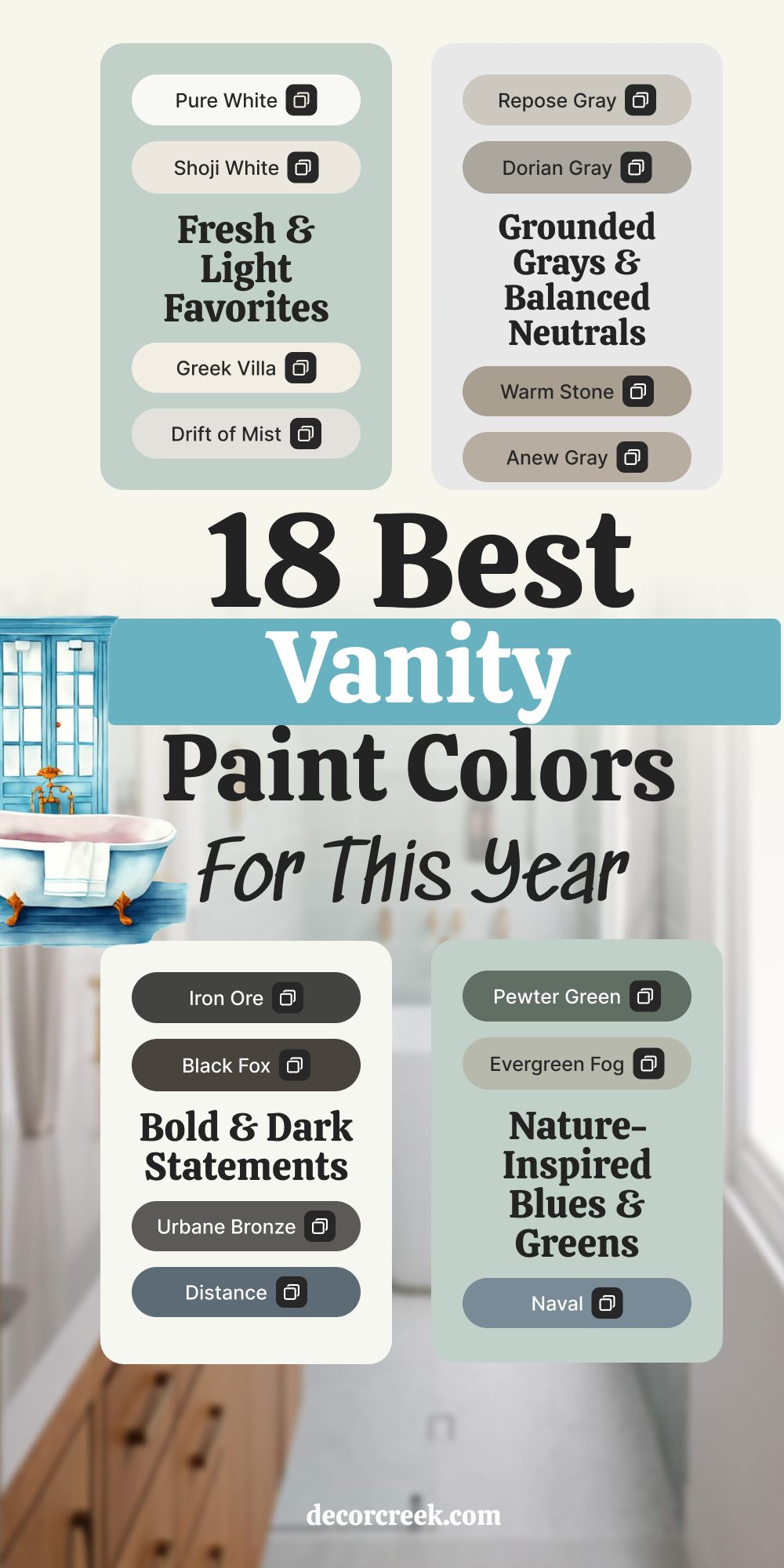
18 Best Vanity Paint Colors for This Year (2025)
Pewter Green – SW 6208
Pewter Green brings so much comfort and character to a bathroom. It’s rich and deep, but it never feels too strong. I’ve seen it work beautifully in both new builds and older homes. This green has just enough gray in it to feel grounded. It pairs well with gold, black, or even brushed nickel.
I like using this color when I want the vanity to feel earthy and special.
Iron Ore – SW 7069
Iron Ore is moody in the best way. It’s bold, dark, and makes everything else look sharper. I love it for vanities in bathrooms with lots of white or natural light. This color works with just about any style—modern, rustic, or even traditional. It adds instant drama without being loud.
I like using this color when I want the vanity to really stand out.
Pure White – SW 7005
Pure White is always a go-to when I want something clean and classic. It feels fresh and crisp without being too cold. I use it a lot for vanities in smaller bathrooms or when I want to keep things feeling light. Pure White goes with everything—tile, metal, mirrors—you name it.
I like using this color when I want a bright, easy choice that always looks neat.
Evergreen Fog – SW 9130
Evergreen Fog has this soft green-gray tone that feels calm but never boring. It works well in modern and rustic bathrooms, and looks amazing with natural finishes like wood and stone. I love pairing it with brass or matte black. This one really shines in daylight.
I like using this color when I want a gentle touch of color that still feels grounded.
Urbane Bronze – SW 7048
Urbane Bronze has a warm, deep feel that makes vanities look rich and bold. It’s perfect for pairing with white walls or creamy counters. I love it with gold hardware—it adds a lot of charm. It’s not too brown or too gray, which is why it works in so many homes.
I like using this color when I want to make a strong but welcoming statement.
Naval – SW 6244
Naval brings out a sense of style that feels polished and classic. It’s a deep navy that never feels too trendy. I love using it in both big and small bathrooms. Naval goes really well with brass, chrome, or even wooden accents. It’s great when you want color that still feels grounded.
I like using this color when I want the vanity to feel sharp and confident.
Dorian Gray – SW 7017
Dorian Gray is a solid, mid-tone gray that makes a vanity look sharp and refined. It’s not too light and not too dark. I’ve used it in both new builds and fixer-uppers—it just works. It pairs great with marble counters, tile floors, and black or silver fixtures.
I like using this color when I want something that feels strong without going too dark.
Shoji White – SW 7042
Shoji White is warm and easy to live with. It has a soft beige tint that keeps it from looking too plain. I like it best in cozy bathrooms or ones with lots of natural light. Shoji White works well with wood, black, or brass. It’s a soft background that lets everything else shine.
I like using this color when I want a white that doesn’t feel cold.
Warm Stone – SW 7032
Warm Stone feels strong and solid, like a cozy sweater in color form. It’s great for grounding a room without going too dark. I love using it in bathrooms with light tile and wood accents. Warm Stone also pairs well with bronze and gold fixtures. It’s a color that makes the vanity feel settled and balanced.
I like using this color when I want quiet warmth with personality.
Indigo Batik – SW 7602
Indigo Batik adds color without going too bold. It’s rich and full of energy, but still works as a neutral. I love how it pairs with both cool and warm accents. It looks especially great with white counters or natural wood. It works in both coastal and city homes.
I like using this color when I want a pop of color that still feels relaxed.
Black Fox – SW 7020
Black Fox is a beautiful in-between of black and brown. It adds drama, but not in a flashy way. I like pairing it with lighter walls and brass hardware. It brings a sense of strength to the vanity. This color also works well with warm tile and soft lighting.
I like using this color when I want something bold, but not quite black.
Drift of Mist – SW 9166
Drift of Mist is light and airy, with a whisper of gray. It helps the bathroom feel soft and open. I love it in rooms that need brightness without the starkness of pure white. Drift of Mist pairs with everything from nickel fixtures to wood shelves. It’s gentle but not boring.
I like using this color when I want a light look with just a touch of mood.
Blustery Sky – SW 9140
Blustery Sky is a dusty blue that brings softness and charm. It has a little gray in it, which keeps it from being too bright. I love using it in family homes and guest baths—it’s friendly and flexible. It works great with silver, white, or even pale wood.
I like using this color when I want a soft blue that feels easy and inviting.
Greek Villa – SW 7551
Greek Villa is a warm white that feels sunny and soft. It’s one of my favorite whites to use when a room needs light but also warmth. Greek Villa looks beautiful with natural finishes and vintage mirrors. It fits well in both classic and modern bathrooms.
I like using this color when I want the vanity to feel light, but not plain.
Distance – SW 6243
Distance is a smoky blue that adds depth and feeling to the room. It’s just the right level of bold—enough to be noticed, but not too loud. I love using it on vanities with white walls and silver or black fixtures. Distance brings a cool, modern feel that works in almost any home.
I like using this color when I want something moody but not too dark.
Repose Gray – SW 7015
Repose Gray is smooth and easygoing. It has just enough warmth to keep it from feeling flat. I’ve used it in all kinds of homes—traditional, modern, rustic—and it always fits. It’s a go-to for soft contrast in a white bathroom. Repose Gray works beautifully with almost any hardware.
I like using this color when I want something soft, steady, and reliable.
Rookwood Sash Green – SW 2810
Rookwood Sash Green is earthy and deep, with a vintage feel. It brings out character in older homes and adds something special to newer builds. I love pairing it with warm metals and natural tile. It adds richness without being too showy.
I like using this color when I want a green that feels timeless and grounded.
Coastal Plain – SW 6192
Coastal Plain is soft and natural, like sea glass. It’s a light green with a gentle look that works well in small or sunny bathrooms. I love it in beachy homes or for anyone who wants a light, airy feel. It pairs well with wood, white, and soft metals.
I like using this color when I want the bathroom to feel fresh but still warm.
Final Thoughts on Choosing the Right Vanity Color in 2025
Picking the right vanity color isn’t just about trends—it’s about how you want to feel in your bathroom every single day. That’s what I always tell my clients. You could go with a clean white that makes everything feel fresh, or something rich and bold that adds personality. What matters most is that the color works with the light in your room, your tile, your counters—and how you want to feel when you walk in.
I always start by asking what people love in a room. Do you want something peaceful?
Try warm whites or soft greens. Want something bold and sharp? Go for deep navy or charcoal. And don’t forget how much your hardware, mirrors, and lighting can change the look of a color.
Your bathroom might be small, but it doesn’t have to feel boring. The vanity is one of the few places where you can bring in style without spending a ton. A can of paint and the right shade can do more than people expect—it can make your bathroom feel like yours.
So take your time, look at the light in your room, and trust your gut. You don’t have to follow every trend. Just pick a color that makes you feel good every day. That’s what I always go for when I help someone choose.
