When I think of a beach house, I picture sunlight, fresh air, and colors that make me feel relaxed and happy. Paint has the power to shape that feeling right away. The right shade can remind me of soft sand, calm waves, or breezy skies. For me, choosing beach house colors is not just about design—it’s about capturing the easy rhythm of coastal living.
In this guide, I’ll share my favorite shades that always work beautifully on both the inside and outside of a beach house.
Why I Trust Coastal Paint Colors for Beach Houses
I’ve worked with coastal paint colors for years, and they never disappoint. They have a wide range of shades that fit every coastal mood, from soft whites to refreshing blues. The quality of their paint means it holds up well, even when a house is close to salty air and strong sunlight.
I love that their colors stay true over time, so my clients enjoy their homes season after season.
For me, Sherwin-Williams is a name I can always count on when designing a beach house.
How I Choose the Right Paint Color for a Beach House
When I choose paint for a beach house, I always think about how light will play with it. Coastal homes often have bright sunshine during the day, so softer shades balance that brightness. I also look at the natural setting—sand, sky, and water all inspire the palette. Another key point is how the color feels emotionally.
A home by the shore should feel welcoming, fresh, and comfortable. That’s why I always pick shades that reflect nature and create harmony with the surroundings.
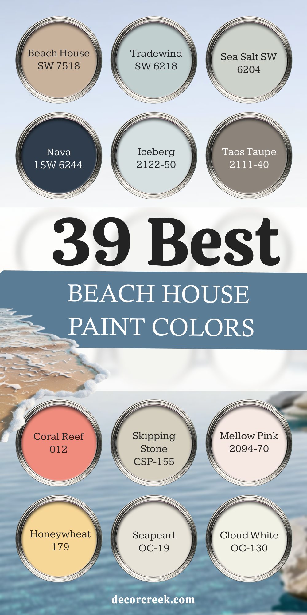
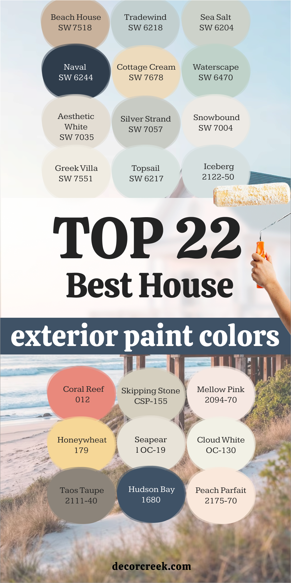
22 Best Beach House Exterior Paint Colors
Sherwin-Williams Beach House SW 7518
Sherwin-Williams Beach House SW 7518 reminds me of warm sand under bare feet. This shade has a soft tan tone that looks inviting and natural. I love how it blends seamlessly with wooden decks and white trim. It feels timeless for coastal architecture while still fresh and bright.
This color makes a home look grounded yet breezy, like it belongs right by the shore.
The key rule of this color for a beach house is to pair it with light accents that keep the look open and airy.
Sherwin-Williams Tradewind SW 6218
Sherwin-Williams Tradewind SW 6218 is one of my favorite soft blues. It carries a touch of gray, which gives it a calming depth. On an exterior, it looks like a perfect summer sky. I love using it with crisp white trim for a clean coastal style. This shade feels cheerful without being too bold. It’s an easy choice when I want a home to feel light and breezy.
The key rule of this color for a beach house is to let it shine on siding while balancing with warm wood or stone details.

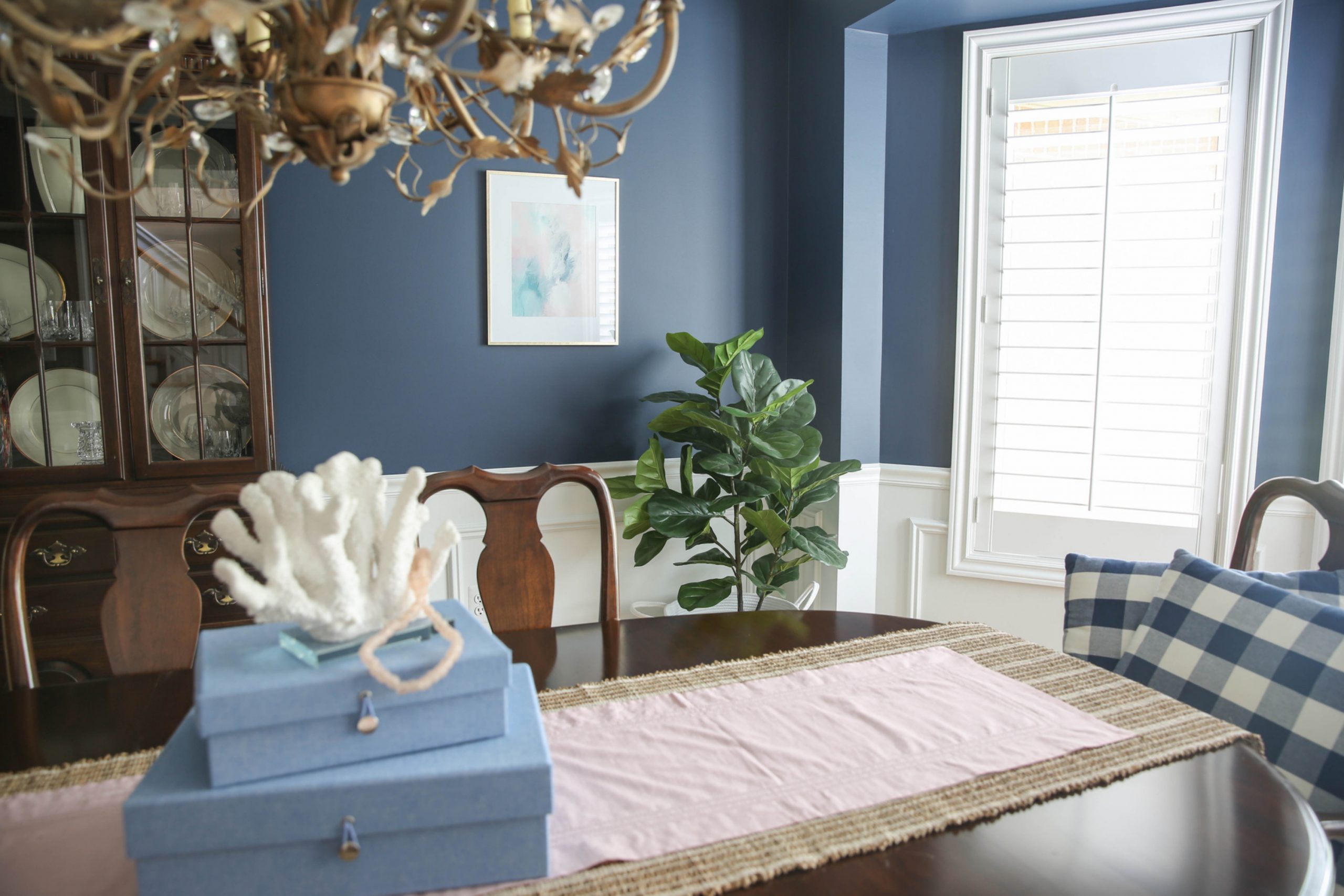
Sherwin-Williams Naval SW 6244
Sherwin-Williams Naval SW 6244 is a deep navy that feels classic and strong. It’s bold enough to make a statement yet soft enough to suit a coastal setting. I find it especially beautiful for shutters, doors, or accent walls. Paired with white trim, it feels crisp and nautical. It also brings a touch of elegance to a casual beach home.
The key rule of this color for a beach house is to use it thoughtfully so the depth of the navy balances with lighter surroundings.

Sherwin-Williams Cottage Cream SW 7678
Sherwin-Williams Cottage Cream SW 7678 feels like sunshine captured in paint. It’s a gentle yellow with warmth that makes a home instantly welcoming. I love how it works on exteriors with lush greenery or sandy backdrops. This shade brings charm and a touch of nostalgia, like a cozy seaside retreat. It pairs beautifully with soft white trim to keep the look fresh.
The key rule of this color for a beach house is to balance its warmth with cool accents for harmony.
Sherwin-Williams Sea Salt SW 6204
Sherwin-Williams Sea Salt SW 6204 is one of the most loved coastal shades. It shifts between green, blue, and gray depending on the light. On a beach house exterior, it feels soft and breezy, almost like sea glass. I love how versatile it is, pairing with both crisp whites and sandy neutrals. This color never feels heavy, always light and inviting.
The key rule of this color for a beach house is to let natural light play with its tones for a fresh result.

Sherwin-Williams Waterscape SW 6470
Sherwin-Williams Waterscape SW 6470 brings the brightness of shallow ocean water to a home. It has a gentle aqua tone that feels playful and refreshing. I love it for cottages near the water because it instantly adds cheer. This color shines when paired with white trim and natural stone. It makes the house look alive, like it’s part of the coastline.
The key rule of this color for a beach house is to use it in open, sunny areas where it can glow.

Sherwin-Williams Aesthetic White SW 7035
Sherwin-Williams Aesthetic White SW 7035 is a soft greige that leans toward warmth. It’s simple yet stylish, making a home look polished without being too formal. I find it a great choice for beach houses with modern lines. It works beautifully with darker shutters or accents. This shade keeps the home looking clean while still cozy.
The key rule of this color for a beach house is to pair it with natural textures for balance.

Sherwin-Williams Silver Strand SW 7057
Sherwin-Williams Silver Strand SW 7057 is a gray with a cool, beachy undertone. It feels smooth and modern while still soft. On an exterior, it reminds me of pebbles by the shore. I love how well it pairs with white trim and muted blues. It creates a look that’s calm but stylish.
The key rule of this color for a beach house is to use it where you want a touch of sophistication without losing that coastal feel.

Sherwin-Williams Snowbound SW 7004
Sherwin-Williams Snowbound SW 7004 is a fresh white that works beautifully for exteriors. It feels clean, airy, and classic for coastal homes. I love how it brightens up siding and trim equally well. It pairs with almost any accent color, from navy to aqua. This white makes a beach house glow in the sunlight.
The key rule of this color for a beach house is to keep accents simple so the brightness remains the focus.

Sherwin-Williams Greek Villa SW 7551
Sherwin-Williams Greek Villa SW 7551 is a warm, creamy white that feels inviting. It adds a gentle softness that pure white sometimes lacks. I love how it works for large exteriors without feeling too stark. It pairs well with natural wood and coastal blues. This shade feels timeless and cozy at the same time.
The key rule of this color for a beach house is to use it when you want warmth without losing freshness.

Sherwin-Williams Topsail SW 6217
Sherwin-Williams Topsail SW 6217 is a pale blue that feels light and breezy. It reminds me of early morning skies by the ocean. On siding, it looks clean and airy, perfect for cottages. I love pairing it with white trim for a fresh look. This shade feels cheerful but never too bold.
The key rule of this color for a beach house is to let it flow across wide exteriors for a refreshing result.

Benjamin Moore Iceberg 2122-50
Benjamin Moore Iceberg 2122-50 is a delicate blue with a cool undertone. It feels crisp and modern while still coastal. On a beach house, it mirrors the clear horizon. I love how soft it looks against white trim. This shade adds lightness and charm without overpowering.
The key rule of this color for a beach house is to use it in well-lit areas where its clarity shines.
Benjamin Moore Coral Reef 012
Benjamin Moore Coral Reef 012 brings warmth and fun to an exterior. It’s a lively coral that feels inspired by sunset skies. I love it for doors, shutters, or small accent walls. This shade adds a cheerful, welcoming touch to a home. It pairs well with whites and sandy neutrals.
The key rule of this color for a beach house is to use it in moderation to highlight details.
Benjamin Moore Skipping Stone CSP-155
Benjamin Moore Skipping Stone CSP-155 is a soft gray with sandy undertones. It feels grounded and natural, just like stones by the shore. I love how it balances modern style with coastal charm. It pairs well with navy and white accents. This color makes a home look calm and polished.
The key rule of this color for a beach house is to use it for a neutral base that still feels coastal.
Benjamin Moore Mellow Pink 2094-70
Benjamin Moore Mellow Pink 2094-70 is a gentle blush with a warm glow. It feels lighthearted and fresh, perfect for beach cottages. I love it for exteriors that want a hint of playfulness. This shade pairs beautifully with creamy whites. It adds charm without being too strong.
The key rule of this color for a beach house is to let it shine on smaller homes or accent details.
Benjamin Moore Honeywheat 179
Benjamin Moore Honeywheat 179 is a sunny golden shade that feels warm and happy. It looks beautiful with coastal light bouncing off it. I love how it creates an inviting atmosphere. This shade works well on siding or accents with crisp white trim. It brings an instant cheerful mood to a beach house.
The key rule of this color for a beach house is to balance it with soft neutrals so it doesn’t overwhelm.
Benjamin Moore Seapearl OC-19
Benjamin Moore Seapearl OC-19 is a gentle off-white with a cool base. It feels sophisticated yet breezy. I love it on exteriors that need a neutral but not stark look. It pairs perfectly with navy or aqua accents. This shade keeps a home light and modern.
The key rule of this color for a beach house is to let it act as a backdrop for bolder details.

Benjamin Moore Cloud White OC-130
Benjamin Moore Cloud White OC-130 is a warm white that never feels harsh. It adds softness to an exterior while staying fresh. I love using it on traditional coastal homes. It works beautifully with blues, greens, and sandy shades. This white feels natural, like light clouds in the sky.
The key rule of this color for a beach house is to use it when you want a gentle white with warmth.

Benjamin Moore Taos Taupe 2111-40
Benjamin Moore Taos Taupe 2111-40 is a sandy taupe that feels earthy and grounded. It’s a great choice for a beach house that wants a more natural look. I love how it blends into coastal landscapes. It works well with white trim and darker shutters. This color makes a home feel welcoming without being too bright.
The key rule of this color for a beach house is to pair it with soft whites for balance.
Benjamin Moore Hudson Bay 1680
Benjamin Moore Hudson Bay 1680 is a rich blue that feels strong and lively. It’s inspired by deep ocean waters. I love it for shutters, doors, or bold exteriors. This shade pairs beautifully with crisp white trim. It makes a house stand out while still fitting a coastal theme.
The key rule of this color for a beach house is to use it where you want bold contrast.
Benjamin Moore Peach Parfait 2175-70
Benjamin Moore Peach Parfait 2175-70 is a soft peach that feels sweet and uplifting. It reminds me of seashells and summer sunsets. I love it for cottages that want a playful touch. It pairs with white trim for a crisp look. This shade feels charming without being too loud.
The key rule of this color for a beach house is to use it in moderation for a cheerful vibe.
Benjamin Moore Athens Blue 797
Benjamin Moore Athens Blue 797 is a Mediterranean blue full of energy. It feels crisp, cool, and perfect for a beach setting. I love it for accents that make a house stand out. This shade looks stunning against white siding. It brings a splash of joy to any coastal home.
The key rule of this color for a beach house is to use it where you want a lively, bold statement.
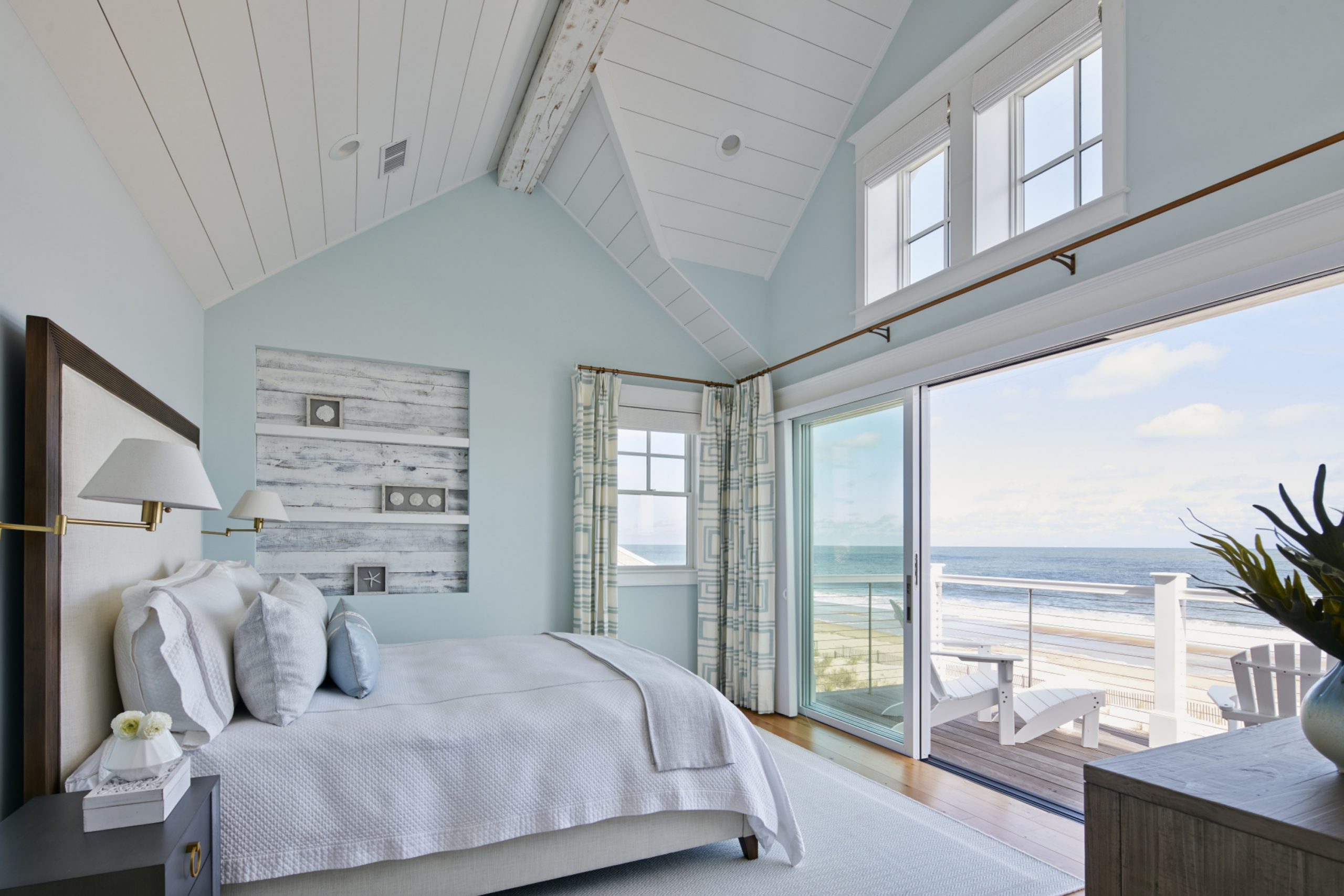
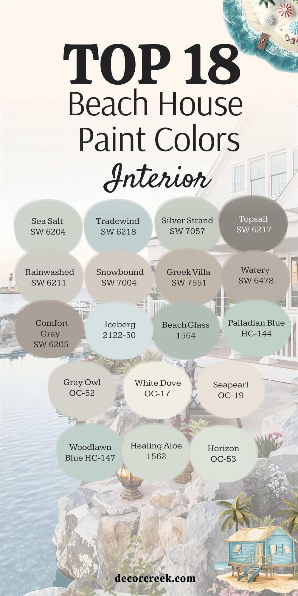
18 Top Beach House Interior Paint Colors
Sherwin-Williams Sea Salt SW 6204
Sherwin-Williams Sea Salt SW 6204 always feels right inside a beach house. Its shifting tones of green, blue, and gray bring the ocean indoors. I love how it works in bedrooms and living rooms alike. It feels restful yet fresh. Paired with white trim, it brightens up any room.
The key rule of this color for a beach house interior is to let it carry natural light through the space.
Sherwin-Williams Tradewind SW 6218
Sherwin-Williams Tradewind SW 6218 is a clear blue with a hint of gray. Indoors, it feels like open skies. I love it for kitchens and bathrooms because it feels airy and clean. This shade never overwhelms a room, instead it adds brightness. With white cabinetry, it feels especially crisp.
The key rule of this color for a beach house interior is to use it in rooms where you want freshness.
Sherwin-Williams Silver Strand SW 7057
Sherwin-Williams Silver Strand SW 7057 is a light gray with coastal character. Indoors, it feels soft and sophisticated. I love how it pairs with natural wood and woven textures. It creates balance in spaces with a lot of sunlight. This shade brings a quiet elegance to interiors.
The key rule of this color for a beach house is to let it ground brighter accents.
Sherwin-Williams Topsail SW 6217
Sherwin-Williams Topsail SW 6217 brings a gentle, breezy blue indoors. It feels refreshing in bedrooms or sunrooms. I love its clean look against white trim. This shade makes rooms feel larger and lighter. It adds a cheerful touch without being too bold.
The key rule of this color for a beach house interior is to use it in spaces where you want lightness.
Sherwin-Williams Rainwashed SW 6211
Sherwin-Williams Rainwashed SW 6211 carries both green and blue in its base. It feels calm and cool inside a beach home. I love it for bathrooms or guest rooms that need a soothing vibe. This shade pairs beautifully with whites and sandy tones. It brings the feeling of sea breezes indoors.
The key rule of this color for a beach house interior is to let it bring softness to small rooms.

Sherwin-Williams Snowbound SW 7004
Sherwin-Williams Snowbound SW 7004 is crisp white for interiors. It brightens up walls and trim with ease. I love how it works in kitchens and hallways to keep everything light. This white feels clean without being cold. It’s flexible with all coastal colors.
The key rule of this color for a beach house interior is to use it as a backdrop for colorful accents.
Sherwin-Williams Greek Villa SW 7551
Sherwin-Williams Greek Villa SW 7551 is a warm white with a creamy base. Indoors, it makes rooms feel cozy yet fresh. I love it for living areas where warmth is welcome. It pairs well with natural textures like jute and rattan. This shade is perfect when pure white feels too stark.
The key rule of this color for a beach house is to bring balance between comfort and light.
Sherwin-Williams Watery SW 6478
Sherwin-Williams Watery SW 6478 is a soft aqua with cheerfulness built in. It feels playful inside a beach home, especially in bathrooms or children’s rooms. I love how it brings in the spirit of coastal fun. This shade pairs well with bright white trim. It feels like summer indoors all year long.
The key rule of this color for a beach house is to use it for energy and lightheartedness.

Sherwin-Williams Comfort Gray SW 6205
Sherwin-Williams Comfort Gray SW 6205 is a muted green-gray that feels soothing. Inside, it creates a grounded atmosphere. I love it for bedrooms or studies where calmness matters. This shade feels coastal without being too bright. It pairs beautifully with creams and whites.
The key rule of this color for a beach house interior is to use it for relaxation.

Benjamin Moore Iceberg 2122-50
Benjamin Moore Iceberg 2122-50 is light and airy blue. Inside, it mirrors the sky outside the windows. I love how fresh it feels in bathrooms and kitchens. This shade pairs perfectly with white cabinetry. It adds a crisp finish to any room.
The key rule of this color for a beach house interior is to use it where you want clarity and openness.
Benjamin Moore Beach Glass 1564
Benjamin Moore Beach Glass 1564 carries blue, green, and gray in harmony. Indoors, it feels like looking at ocean water on a sunny day. I love it for living rooms or dining rooms. This shade blends beautifully with sandy neutrals. It makes interiors feel coastal without trying too hard.
The key rule of this color for a beach house is to let it anchor the palette.

Benjamin Moore Palladian Blue HC-144
Benjamin Moore Palladian Blue HC-144 is a soft, dreamy blue-green. Inside, it feels uplifting and breezy. I love it for bedrooms that need a refreshing tone. This shade looks beautiful with white trim. It creates a restful yet joyful mood.
The key rule of this color for a beach house interior is to let it flow in rooms filled with sunlight.

Benjamin Moore Gray Owl OC-52
Benjamin Moore Gray Owl OC-52 is a light gray that leans slightly cool. Indoors, it feels modern and crisp. I love it for open floor plans because it works with many accents. This shade balances whites, blues, and woods easily. It’s a versatile backdrop for coastal interiors.
The key rule of this color for a beach house is to use it as a base color across multiple rooms.

Benjamin Moore White Dove OC-17
Benjamin Moore White Dove OC-17 is one of the most trusted whites. Inside, it feels warm and gentle without losing brightness. I love it for trim, walls, and ceilings. This shade pairs well with all coastal tones. It creates a welcoming feel in any room.
The key rule of this color for a beach house interior is to use it when you want flexibility with accents.

Benjamin Moore Seapearl OC-19
Benjamin Moore Seapearl OC-19 is soft and refined. Indoors, it makes a room feel open without being stark. I love it for living rooms and entryways. This shade complements both bold and neutral tones. It’s a great choice for coastal balance.
The key rule of this color for a beach house interior is to use it as a neutral anchor.
Benjamin Moore Woodlawn Blue HC-147
Benjamin Moore Woodlawn Blue HC-147 is a gentle blue with a historic touch. Indoors, it feels like ocean air drifting through the room. I love it for bedrooms and hallways. This shade brings calm and freshness together. It pairs beautifully with white trim.
The key rule of this color for a beach house interior is to use it in restful areas.

Benjamin Moore Healing Aloe 1562
Benjamin Moore Healing Aloe 1562 is a light green-gray that feels soothing. Inside, it creates a natural, fresh environment. I love it for bathrooms or quiet nooks. This shade feels soft and uplifting. It blends well with whites and sandy beiges.
The key rule of this color for a beach house is to use it where you want a hint of greenery indoors.

Benjamin Moore Horizon OC-53
Benjamin Moore Horizon OC-53 is a pale gray with a cool undertone. Indoors, it feels airy and soft. I love it for living spaces that need brightness without starkness. This shade pairs well with blues and whites. It gives a polished finish to interiors.
The key rule of this color for a beach house is to let it act as a subtle backdrop.
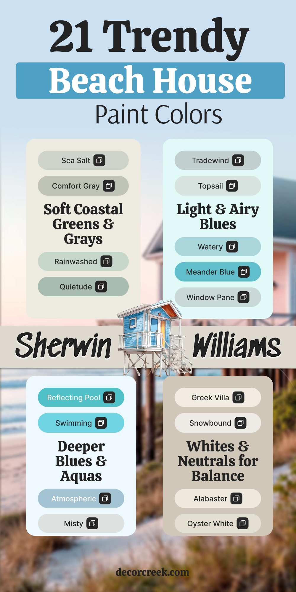
21 Trendy Beach House Paint Colors from Sherwin-Williams
Sherwin-Williams Sea Salt SW 6204
Sherwin-Williams Sea Salt SW 6204 is one of my all-time favorites for a beach house. This shade changes with the light, sometimes looking soft green, sometimes gray, and sometimes blue. I love how it feels like a reflection of sea glass, natural and calming. On walls, it makes a room feel fresh, while outside, it blends seamlessly with sand and sky.
It pairs beautifully with crisp whites for trim and light wood accents.
The key rule of this color for a beach house is to let the natural light bring out its shifting tones.
Sherwin-Williams Tradewind SW 6218
Sherwin-Williams Tradewind SW 6218 feels just like the name suggests—like an ocean breeze. It has a delicate blue base with a hint of gray that keeps it soft and inviting. I love it for bedrooms and living rooms where light is abundant. Outside, it creates a clean and coastal look that feels airy but never cold. This color works beautifully with both sandy neutrals and bright whites.
The key rule of this color for a beach house is to use it when you want brightness with a gentle touch.
Sherwin-Williams Rainwashed SW 6211
Sherwin-Williams Rainwashed SW 6211 feels like soft water rolling over the shore. It carries both green and blue tones, making it versatile in different rooms. I love it in bathrooms and guest rooms, where it adds a peaceful and welcoming touch. On the exterior, it feels cheerful but balanced, like a cottage by the sea. It works well with white, cream, or even navy accents.
The key rule of this color for a beach house is to use it in spaces where you want a hint of ocean calm.
Sherwin-Williams Silver Strand SW 7057
Sherwin-Williams Silver Strand SW 7057 is one of those colors that always looks refined. It’s a gray with a cool undertone that reminds me of smooth pebbles on the beach. I love it for open interiors because it feels modern but not stark. On the outside of a house, it adds a polished look while still staying soft. This shade pairs well with white trim and muted blues for accents.
The key rule of this color for a beach house is to use it where you want elegance that still feels coastal.
Sherwin-Williams Topsail SW 6217
Sherwin-Williams Topsail SW 6217 feels breezy and cheerful, just like a clear morning sky. It’s a pale blue that works especially well in sunrooms and exteriors. I love how it creates a lighthearted and uplifting mood without ever feeling too bold. When paired with bright white trim, it looks crisp and refreshing. This shade keeps a home looking bright and friendly throughout the year.
The key rule of this color for a beach house is to use it generously for an open, inviting feel.
Sherwin-Williams Watery SW 6478
Sherwin-Williams Watery SW 6478 is one of the most playful aquas I’ve used. It brings instant energy into a room, making it perfect for family spaces or bathrooms. On exteriors, it feels fun and fresh, like a splash of ocean waves. I love it for accents like shutters or a front door to add personality to a home. This shade pairs beautifully with crisp whites and sandy tones.
The key rule of this color for a beach house is to let it bring a joyful pop where you want life and light.
Sherwin-Williams Comfort Gray SW 6205
Sherwin-Williams Comfort Gray SW 6205 is a soothing blend of gray and green. It feels grounded, like the natural tones of the coastline. I love it for bedrooms, living rooms, or even kitchens where a restful mood matters. Outside, it blends beautifully with natural wood and stone, making the home feel settled in its surroundings. It pairs well with both warm and cool accents.
The key rule of this color for a beach house is to use it when you want calmness wrapped in warmth.
Sherwin-Williams Quietude SW 6212
Sherwin-Williams Quietude SW 6212 feels exactly like its name—quiet and gentle. It’s a greenish blue with a muted finish that feels natural, like sea grass swaying in the breeze. I love using it for exteriors where I want a house to feel in harmony with the shoreline. Inside, it feels restful but still fresh, perfect for a bedroom retreat. This shade works with whites, soft grays, and sandy neutrals.
The key rule of this color for a beach house is to use it where you want balance and softness.

Sherwin-Williams Meander Blue SW 6484
Sherwin-Williams Meander Blue SW 6484 feels lively and full of charm. It’s a bright aqua that immediately reminds me of tropical water. I love it as a statement color for shutters or an accent wall. Used on siding, it makes a cottage look cheerful and welcoming. This shade works best when paired with crisp white trim to keep it balanced.
The key rule of this color for a beach house is to let it shine in accents or playful details.
Sherwin-Williams Reflecting Pool SW 6486
Sherwin-Williams Reflecting Pool SW 6486 feels like looking at bright ocean water. It has an aqua tone that feels vibrant and refreshing. I love it for front doors, porch ceilings, or even an exterior accent wall. This shade instantly makes a home feel alive and full of energy. It pairs beautifully with classic whites and sandy neutrals.
The key rule of this color for a beach house is to use it in small doses to add sparkle and personality.

Sherwin-Williams Swimming SW 6764
Sherwin-Williams Swimming SW 6764 is a playful light blue that always makes me smile. It feels bright and cheerful, like a perfect summer day. I love it for family rooms or outdoor spaces that need a fun touch. On an exterior, it looks best with white trim and natural wood. This shade adds character without ever feeling too strong.
The key rule of this color for a beach house is to let it bring energy to places where family gathers.

Sherwin-Williams Open Air SW 6491
Sherwin-Williams Open Air SW 6491 is as fresh as a coastal breeze. It’s a soft, airy blue that feels open and light in any setting. I love it for bedrooms, sunrooms, or exteriors where brightness is key. This shade pairs beautifully with sandy beige or crisp white. It makes any space feel larger and more open.
The key rule of this color for a beach house is to use it where you want clarity and brightness.
Sherwin-Williams Atmospheric SW 6505
Sherwin-Williams Atmospheric SW 6505 is a medium blue with a gentle gray undertone. It feels rich but not overpowering, like a sky with light clouds. I love it for accent walls or shutters that need depth. On exteriors, it adds a polished look while still feeling coastal. It pairs well with white and stone finishes.
The key rule of this color for a beach house is to use it where you want depth without losing softness.

Sherwin-Williams Misty SW 6232
Sherwin-Williams Misty SW 6232 is one of my favorite pale grays with a hint of blue. It feels soothing indoors, like a soft morning fog. I love it for bedrooms, bathrooms, or light-filled living spaces. On the exterior, it pairs beautifully with navy or aqua accents. This color creates a soft background that allows bolder colors to shine.
The key rule of this color for a beach house is to use it where you want a gentle, versatile base.

Sherwin-Williams Passive SW 7064
Sherwin-Williams Passive SW 7064 is a cool, modern gray that feels clean and stylish. It works as a neutral that still has coastal personality. I love it in kitchens or open floor plans where I want a fresh base. On exteriors, it looks sleek with white or navy trim. This shade brings a sense of order and lightness.
The key rule of this color for a beach house is to use it as a strong base for layering other shades.

Sherwin-Williams Drift of Mist SW 9166
Sherwin-Williams Drift of Mist SW 9166 is a soft off-white with a warm edge. It feels inviting indoors and outdoors alike. I love it for exteriors when a pure white might feel too stark. This shade works perfectly as a main color with darker shutters. Indoors, it balances both cool and warm accents.
The key rule of this color for a beach house is to use it when you want neutrality with a hint of warmth.

Sherwin-Williams Greek Villa SW 7551
Sherwin-Williams Greek Villa SW 7551 is creamy and elegant. It feels warm without being heavy, making it perfect for coastal homes. I love it for open living areas or full house exteriors. This shade works with natural materials like rattan, wood, and stone. It pairs beautifully with navy or aqua details.
The key rule of this color for a beach house is to use it when you want a welcoming but light foundation.
Sherwin-Williams Snowbound SW 7004
Sherwin-Williams Snowbound SW 7004 is crisp, clear, and bright. It feels like fresh linen drying in the sun. I love it for trim, cabinetry, or entire exteriors. This shade makes every room feel larger and fresher. It’s flexible with all the coastal blues and greens.
The key rule of this color for a beach house is to use it where you want maximum brightness.
Sherwin-Williams Alabaster SW 7008
Sherwin-Williams Alabaster SW 7008 is one of my most trusted whites. It feels warm and inviting without losing brightness. I love it for interiors that need a touch of softness. On an exterior, it glows in natural sunlight. This shade is timeless in coastal design.
The key rule of this color for a beach house is to use it where comfort and light need to meet.

Sherwin-Williams Oyster White SW 7637
Sherwin-Williams Oyster White SW 7637 is a greige with sandy tones. It feels natural, like weathered driftwood. I love it for exteriors because it blends into coastal landscapes. Indoors, it creates a warm, cozy base. This shade pairs well with navy or aqua accents.
The key rule of this color for a beach house is to use it when you want a soft, grounding neutral.

Sherwin-Williams Window Pane SW 6210
Sherwin-Williams Window Pane SW 6210 is a pale aqua that feels fresh and airy. Indoors, it makes small rooms feel larger. I love it for bathrooms, bedrooms, and even accent walls. On exteriors, it looks crisp and coastal. This shade pairs perfectly with bright white trim.
The key rule of this color for a beach house is to use it where you want freshness and lightness.

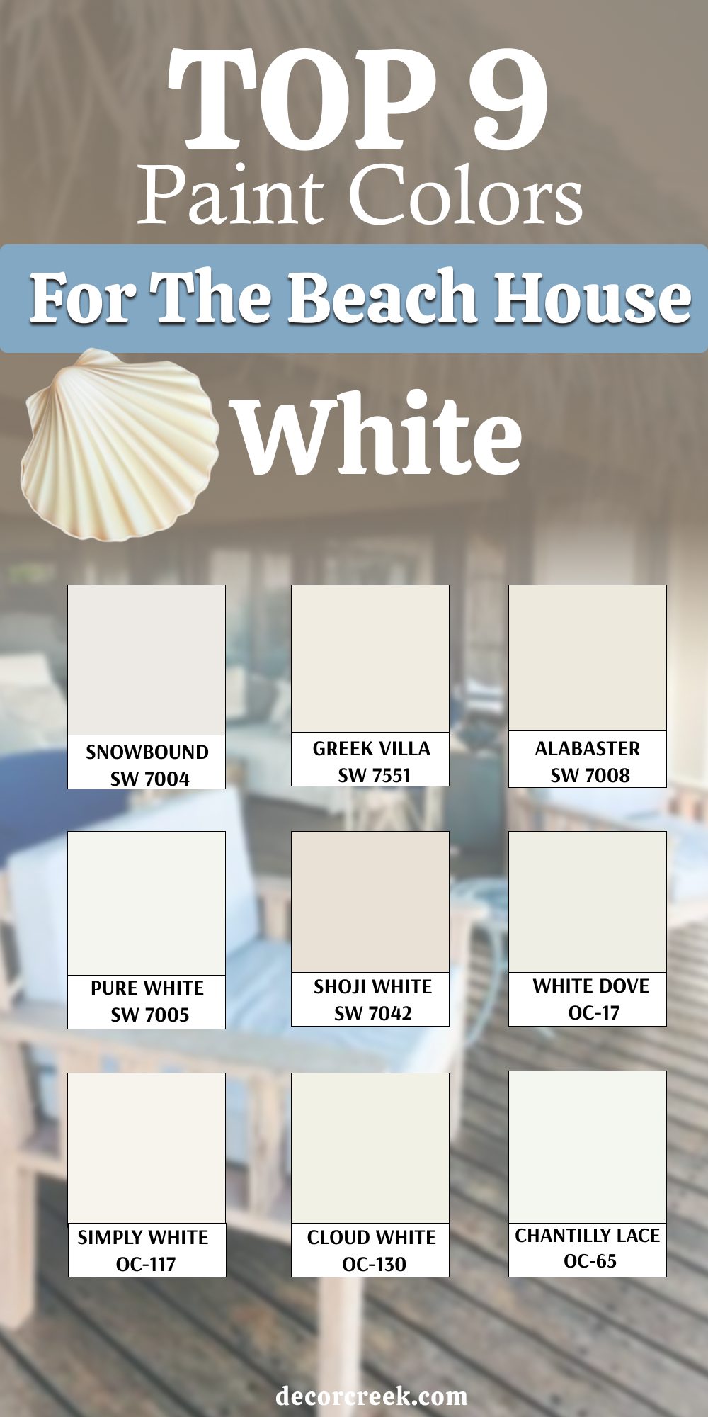
9 Top White Colors for the Beach House
Sherwin-Williams Snowbound SW 7004
Sherwin-Williams Snowbound SW 7004 is one of my most trusted whites for a coastal home. It has a crisp look that feels fresh without being too sharp. I love how it works on both interiors and exteriors, instantly brightening any surface. On a beach house, this white makes siding glow under the sunlight while keeping trim neat and clean.
It also pairs beautifully with soft blues and sandy neutrals, letting other colors stand out.
The key rule of this color for a beach house is to use it where you want brightness and clarity.
Sherwin-Williams Greek Villa SW 7551
Sherwin-Williams Greek Villa SW 7551 brings a warm, creamy white that feels inviting and soft. Unlike colder whites, this shade adds comfort to a coastal palette without losing freshness. I love how it balances perfectly with natural textures like wicker, rattan, and light woods. On exteriors, it gives a subtle glow that makes a home look elegant yet relaxed.
Indoors, it feels cozy in living rooms and bedrooms, giving warmth without heaviness.
The key rule of this color for a beach house is to use it when you want softness wrapped in light.
Sherwin-Williams Alabaster SW 7008
Sherwin-Williams Alabaster SW 7008 is a warm white that always feels timeless and easy to live with. It’s bright enough to keep a space open but gentle enough to feel welcoming. I love how it creates balance in large coastal rooms filled with sunlight. Outdoors, it looks radiant on siding, especially paired with navy or aqua shutters.
Indoors, it adds an inviting backdrop for natural and coastal décor.
The key rule of this color for a beach house is to choose it when you need both warmth and light in equal measure.

Sherwin-Williams Pure White SW 7005
Sherwin-Williams Pure White SW 7005 is clean and sharp without being sterile. It’s a true white that works wonderfully on trim, doors, and cabinetry. I love how it gives contrast to soft coastal shades like Sea Salt or Tradewind. On the exterior, it feels polished and crisp, helping details stand out beautifully. Inside, it makes ceilings feel taller and brighter.
The key rule of this color for a beach house is to use it as a frame that highlights the other colors around it.

Sherwin-Williams Shoji White SW 7042
Sherwin-Williams Shoji White SW 7042 is a warm white with a gentle beige undertone. It feels grounded and natural, perfect for beach houses that want warmth with softness. I love it on exteriors paired with natural stone or wood, where it blends seamlessly with the coastal landscape. Indoors, it works beautifully in living rooms and kitchens, keeping spaces inviting but light. This shade has character without being overpowering.
The key rule of this color for a beach house is to use it when you want warmth that still feels airy.

Benjamin Moore White Dove OC-17
Benjamin Moore White Dove OC-17 is one of the most loved whites in design. It has a slightly creamy base that makes it soft and welcoming. I love using it inside beach homes because it pairs with every coastal shade, from navy blues to sandy taupes. Outdoors, it looks clean but not stark, making it perfect for siding and trim. This color creates a calm, balanced foundation for any home.
The key rule of this color for a beach house is to let it serve as a flexible backdrop for all styles.
Benjamin Moore Simply White OC-117
Benjamin Moore Simply White OC-117 is a cheerful white that feels sunny and bright. It has just enough warmth to avoid looking harsh, which makes it perfect for coastal interiors. I love how it works in kitchens, reflecting natural light and creating an open feel. On exteriors, it glows softly in the sunlight, keeping a house fresh and inviting. This shade matches beautifully with both bold blues and muted neutrals.
The key rule of this color for a beach house is to use it where you want a bright yet friendly mood.

Benjamin Moore Cloud White OC-130
Benjamin Moore Cloud White OC-130 is a creamy white that feels soft and easygoing. It’s the kind of shade that adds comfort to a home without weighing it down. I love it in family rooms and living spaces where warmth matters. On exteriors, it creates a gentle glow that looks natural and timeless. This white is especially pretty with soft aqua and sandy beige accents.
The key rule of this color for a beach house is to choose it when you want warmth wrapped in simplicity.
Benjamin Moore Chantilly Lace OC-65
Benjamin Moore Chantilly Lace OC-65 is a pure, clean white that always feels crisp. It’s the brightest of the whites I use, making it perfect for trim and cabinetry. Indoors, it reflects light beautifully, giving rooms a sharp and modern edge. Outdoors, it makes details pop against deeper coastal shades like navy or aqua. I love it for front doors and shutters when I want contrast.
The key rule of this color for a beach house is to use it to highlight features with clarity and precision.

My Final Thoughts on Choosing Beach House Paint Colors
When I choose colors for a beach house, I want them to feel as natural as the ocean breeze. The shades I’ve shared here all carry that balance of freshness and comfort. Whether it’s a soft aqua, a sandy neutral, or a clean white, each color sets the mood for coastal living.
A beach house should feel like an escape, and paint is the simplest way to create that feeling.
My last thought is simple: trust the light, choose what makes you feel at ease, and let your home reflect the beauty of the shore.