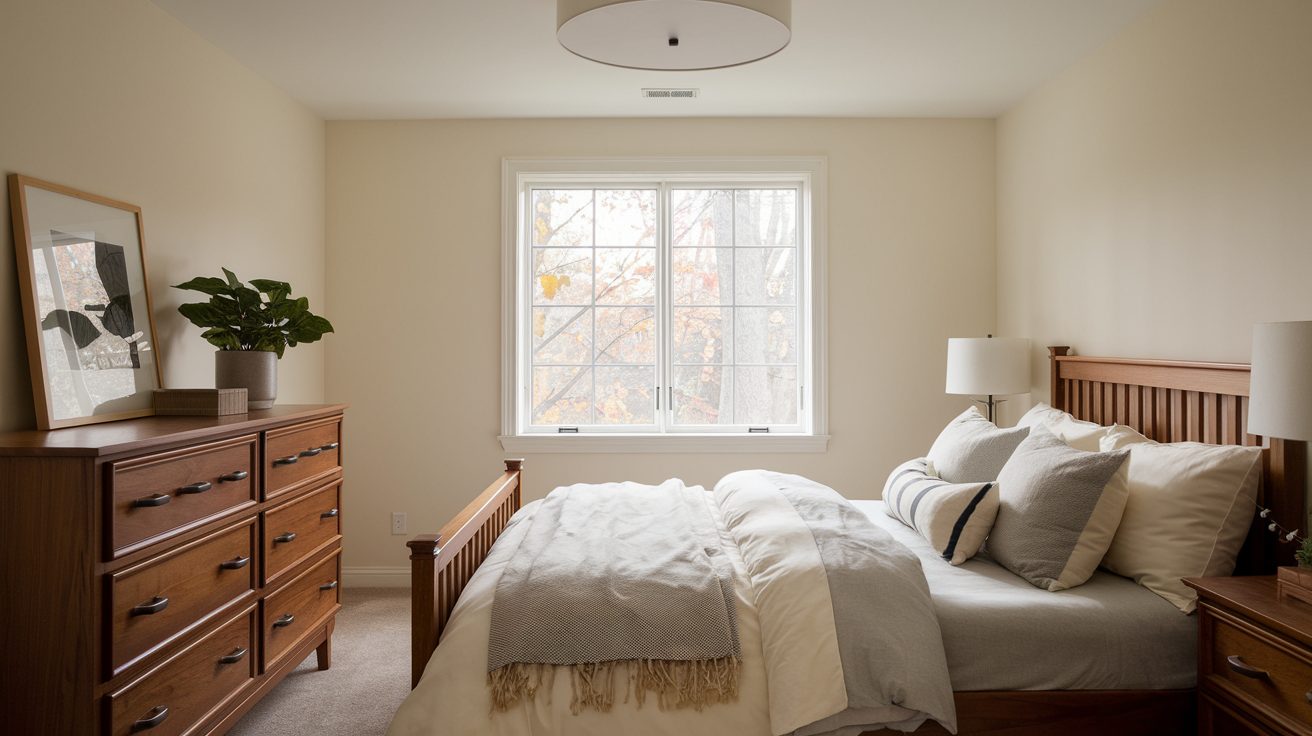
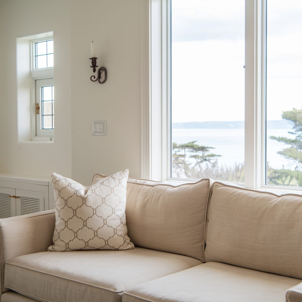
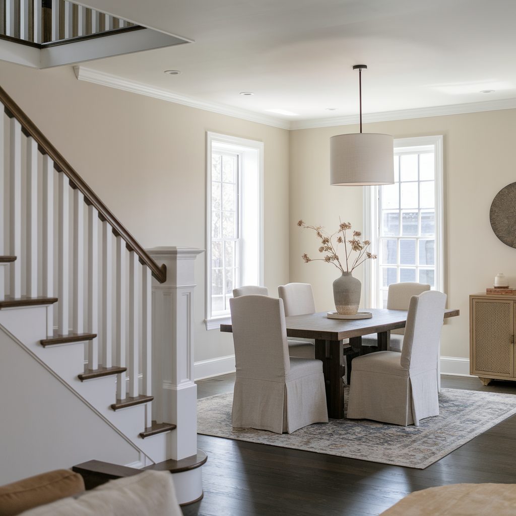
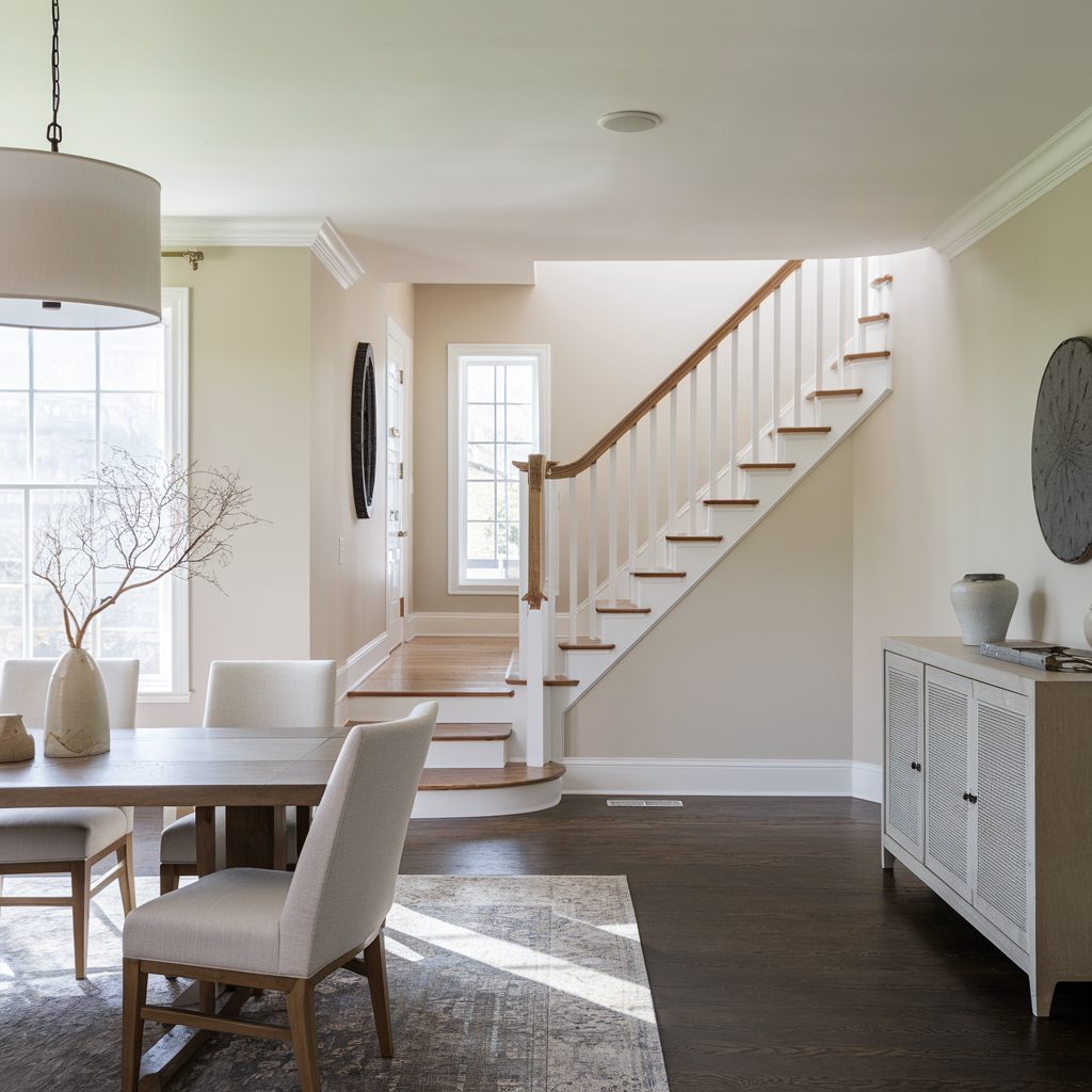
When it comes to creating a cozy and inviting home, warm neutral paint colors are always a winning choice. They’re versatile, soothing, and perfect for nearly any room. This year, Sherwin-Williams has some fantastic options that work beautifully with current trends like natural textures, minimalist decor, and open layouts.
Whether you’re freshening up your living room or giving your kitchen a makeover, finding the right warm neutral is key to setting the tone. I’ve rounded up 18 of the best Sherwin-Williams warm neutrals that I think you’ll love for their flexibility, style, and impact.
Let’s get started by understanding why these colors are such a hit right now.
Why Warm Neutrals are Trending This Year
Warm neutral tones are everywhere in home design this year, and for good reason. They bring comfort without overpowering a space, making them ideal for creating a relaxing atmosphere. Unlike cool tones, which can sometimes feel stark or cold, warm neutrals strike the perfect balance by adding just the right touch of warmth.
According to Sherwin-Williams, shades like Accessible Beige and Alabaster have been among their top-selling colors for years because they work seamlessly in different environments. I’ve also noticed that these hues are especially popular in open-concept homes, where you want a cohesive flow from room to room.
One study even found that neutral colors can make a home feel more welcoming to buyers during staging, with 57% of real estate agents recommending neutral paint as the most effective way to increase appeal (source).
How to Choose the Right Warm Neutral for Your Space
Picking the perfect paint color can feel overwhelming, but it doesn’t have to be. Here’s what I always tell my clients:
- Consider Lighting: Natural light can make a warm neutral look brighter, while artificial lighting may bring out its deeper undertones.
- Match Your Decor: Look at your furniture, flooring, and accessories to find a color that complements your existing palette.
- Test Before You Commit: Always try a sample first! Paint a small section of your wall and observe how it looks at different times of the day.
Warm neutrals range from soft beiges to muted greiges and everything in between. With that in mind, let’s take a closer look at this year’s standout colors.
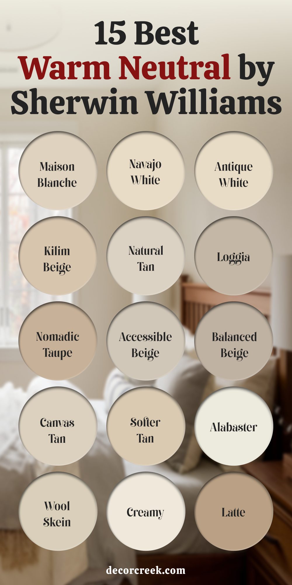
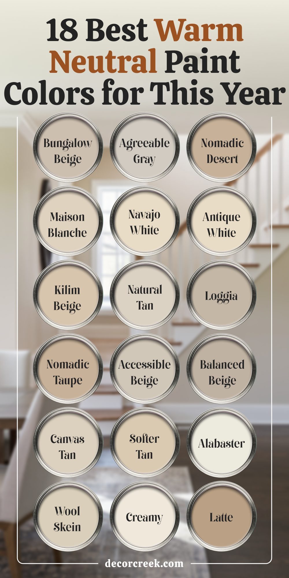
18 Best Sherwin-Williams Warm Neutral Paint Colors
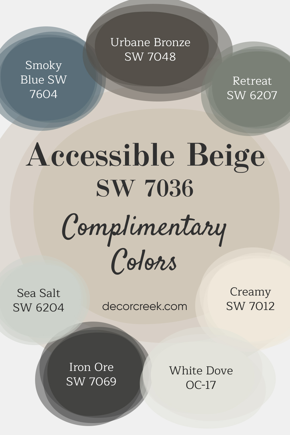
1. Accessible Beige (SW 7036)
Accessible Beige is a modern beige with soft gray undertones that keep it fresh and not overly warm. It’s a great choice for living rooms and open floor plans, where you want a subtle but welcoming feel. Sherwin-Williams Accessible Beige is one of my favorites for creating harmony in spaces with mixed design elements.
Colors that goes with Accessible Beige – Check Big Guides Here👇
- Urbane Bronze SW 7048 – A deep, rich bronze with warm brown and gray undertones, perfect for adding sophistication and depth to accent walls or cabinets.
- Retreat SW 6207 – A muted green with a hint of gray, offering a calming and natural vibe for any room.
- Smoky Blue SW 7604 – A soft, medium-toned blue with gray undertones, creating a serene and soothing atmosphere.
- Sea Salt SW 6204 – A light, cool greenish-blue with soft gray undertones, perfect for coastal or spa-like spaces.
- Iron Ore SW 7069 – A dark charcoal gray with warm undertones, ideal for bold accents or dramatic contrasts.
- Creamy SW 7012 – A soft, warm off-white with yellow undertones, great for creating a bright and inviting look.
- White Dove OC-17 – A classic, warm white with subtle creamy undertones, often used for trim and ceilings.
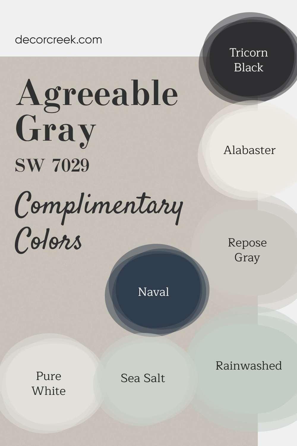
2. Agreeable Gray (SW 7029)
Agreeable Gray is a “greige” shade that perfectly balances gray and beige. It’s a top pick for its adaptability to various lighting conditions, making it a favorite for bedrooms and hallways. Sherwin-Williams Agreeable Gray works beautifully with both warm and cool accent colors.
Colors that goes with Agreeable Gray – Check Big Guides Here👇
- Tricorn Black SW 6258 – A bold, deep black with neutral undertones, perfect for striking accents or trim.
- Alabaster SW 7008 – A soft, creamy white with warm undertones, ideal for walls, ceilings, or trim in a cozy environment.
- Repose Gray SW 7015 – A light gray with a hint of warmth, offering a calm and balanced look for any room.
- Naval SW 6244 – A rich navy blue with classic appeal, great for accent walls or adding depth to a space.
- Pure White SW 7005 – A bright, clean white with neutral undertones, providing a crisp and fresh look for interiors.
- Sea Salt SW 6204 – A light, airy greenish-blue with soft gray undertones, creating a relaxing and serene vibe.
- Rainwashed SW 6211 – A delicate green-blue with a hint of gray, perfect for a fresh, breezy feel.
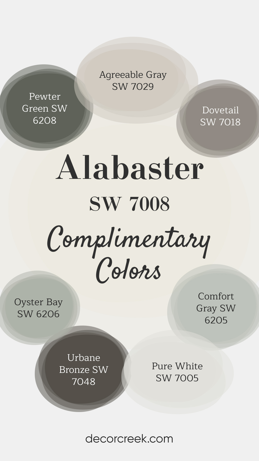
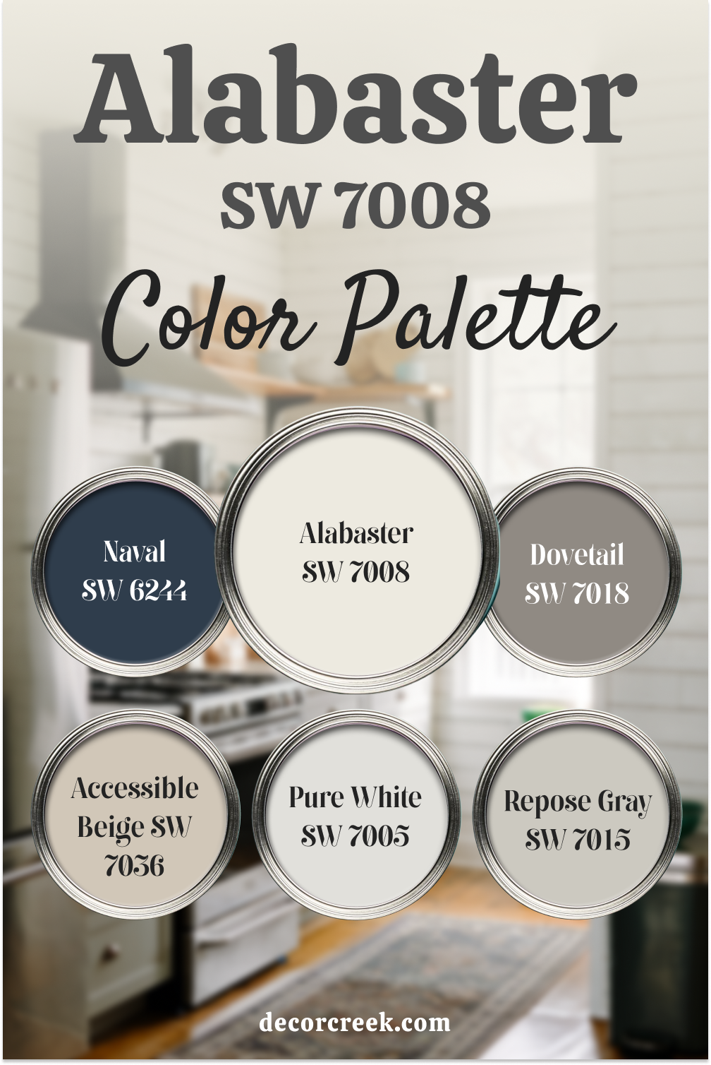
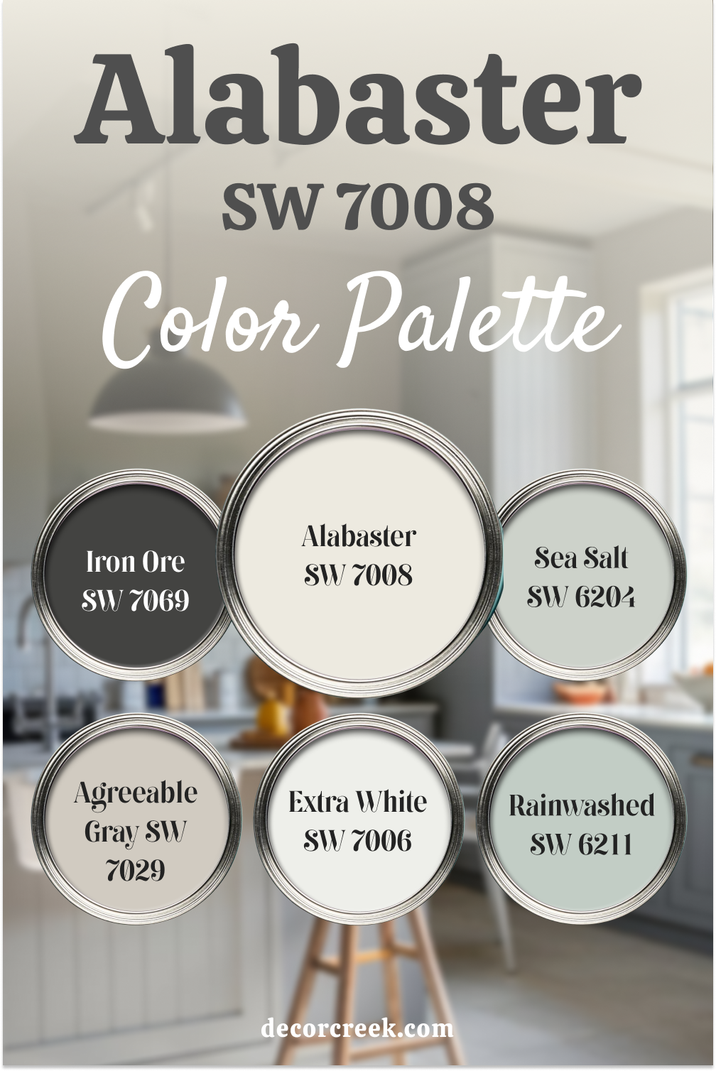
3. Alabaster (SW 7008)
Alabaster is a soft, warm white that brightens spaces without feeling cold or stark. This color works especially well in kitchens and bathrooms where you want a fresh yet cozy atmosphere. Sherwin-Williams Alabaster is also popular for trim and ceilings.
Colors that goes with Alabaster – Check Big Guides Here👇
- Pewter Green SW 6208 – A deep, muted green with gray undertones, perfect for adding a bold yet calming touch to interiors.
- Agreeable Gray SW 7029 – A popular greige with warm undertones, ideal for creating a versatile and neutral backdrop.
- Dovetail SW 7018 – A warm, medium-toned gray with slight brown undertones, great for accent walls or cabinetry.
- Oyster Bay SW 6206 – A soft greenish-gray with cool undertones, evoking a serene and coastal vibe.
- Urbane Bronze SW 7048 – A sophisticated dark bronze with warm gray undertones, excellent for creating a dramatic and modern look.
- Pure White SW 7005 – A crisp, clean white with neutral undertones, suitable for trim, ceilings, or walls needing a bright finish.
- Comfort Gray SW 6205 – A soothing gray-green with blue undertones, providing a tranquil and balanced atmosphere.
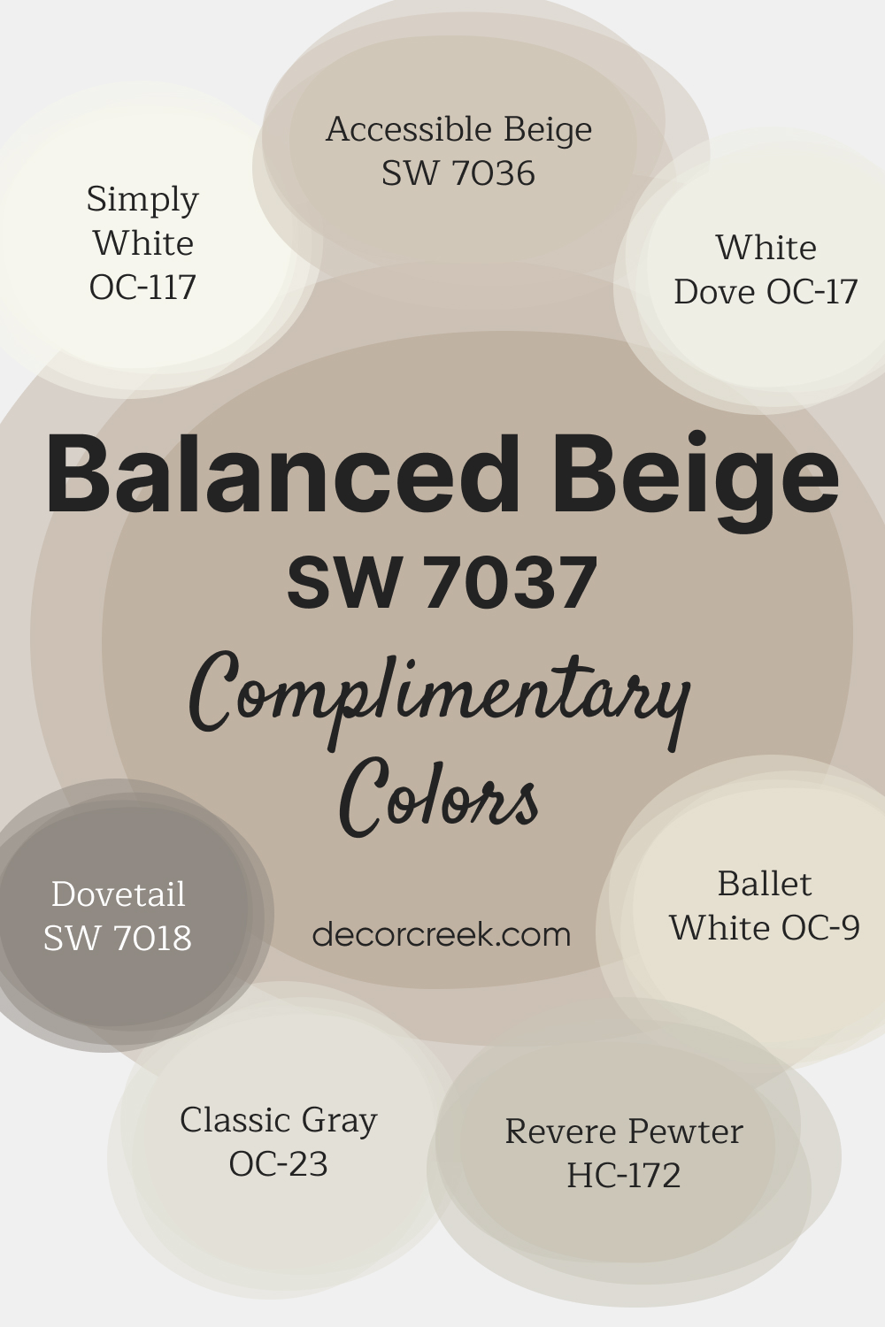
4. Balanced Beige (SW 7037)
Balanced Beige leans slightly darker than Accessible Beige, offering a richer look for spaces like dens or dining rooms. The warmth of Sherwin-Williams Balanced Beige makes it ideal for creating a cozier vibe in areas where you want a grounded, inviting feel.
Colors that goes with Balanced Beige – Check Big Guides Here👇
- Accessible Beige SW 7036 – A versatile beige with soft taupe undertones, ideal for blending with a variety of color schemes.
- Simply White OC-117 – A bright, clean white with soft warmth, perfect for trim or ceilings.
- White Dove OC-17 – A creamy white with subtle warm undertones, often used for walls and trim for a soft look.
- Dovetail SW 7018 – A warm, medium gray with taupe undertones, great for adding depth and contrast to a space.
- Ballet White OC-9 – A soft, off-white with warm beige undertones, providing a gentle, elegant backdrop.
- Classic Gray OC-23 – A light, cool gray with subtle warmth, offering a refined, understated look.
- Revere Pewter HC-172 – A warm, earthy gray with beige undertones, often considered a perfect greige for modern spaces.
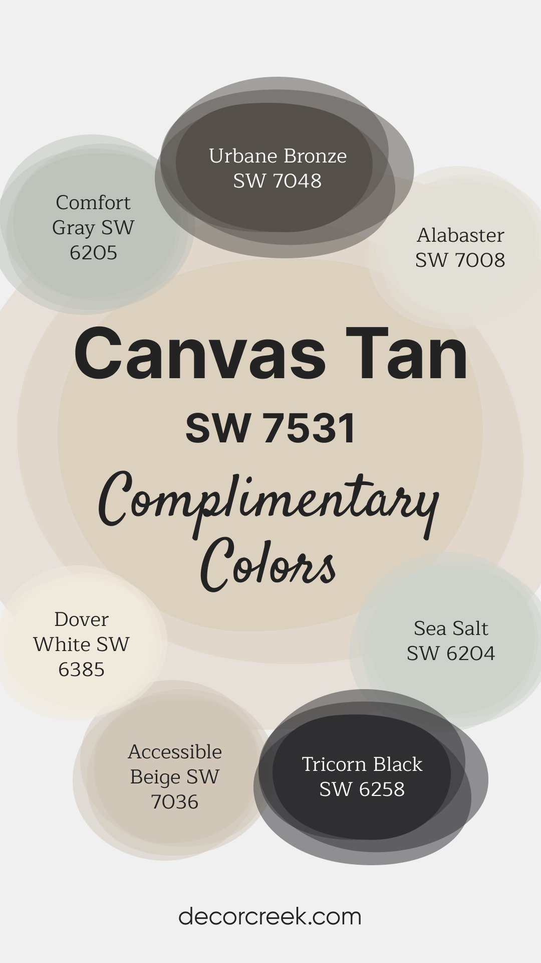
5. Canvas Tan (SW 7531)
Canvas Tan is a creamy tan with soft peach undertones, giving it a hint of warmth that pairs beautifully with natural woods and brass accents. Sherwin-Williams Canvas Tan adds a light, airy feel to spaces without overwhelming them.
Colors That Go with Canvas Tan SW 7531 – Check Big Guides Here 👇
Urbane Bronze SW 7048 – A rich, earthy bronze-gray that provides bold contrast and adds sophistication to any room.
Alabaster SW 7008 – A soft, creamy white with subtle warmth, great for trim, ceilings, or whole-room coverage.
Comfort Gray SW 6205 – A cool green-gray with soothing undertones, perfect for adding a touch of color while keeping a neutral vibe.
Sea Salt SW 6204 – A light, airy greenish-gray with subtle blue hints, ideal for serene, coastal-inspired spaces.
Dover White SW 6385 – A warm, classic white with soft yellow undertones, perfect for creating bright and cheerful spaces.
Accessible Beige SW 7036 – A soft beige with gray undertones, offering versatility and blending beautifully with warm or cool palettes.
Tricorn Black SW 6258 – A bold, true black that makes a statement as an accent or for trim, adding depth and elegance to the overall look.
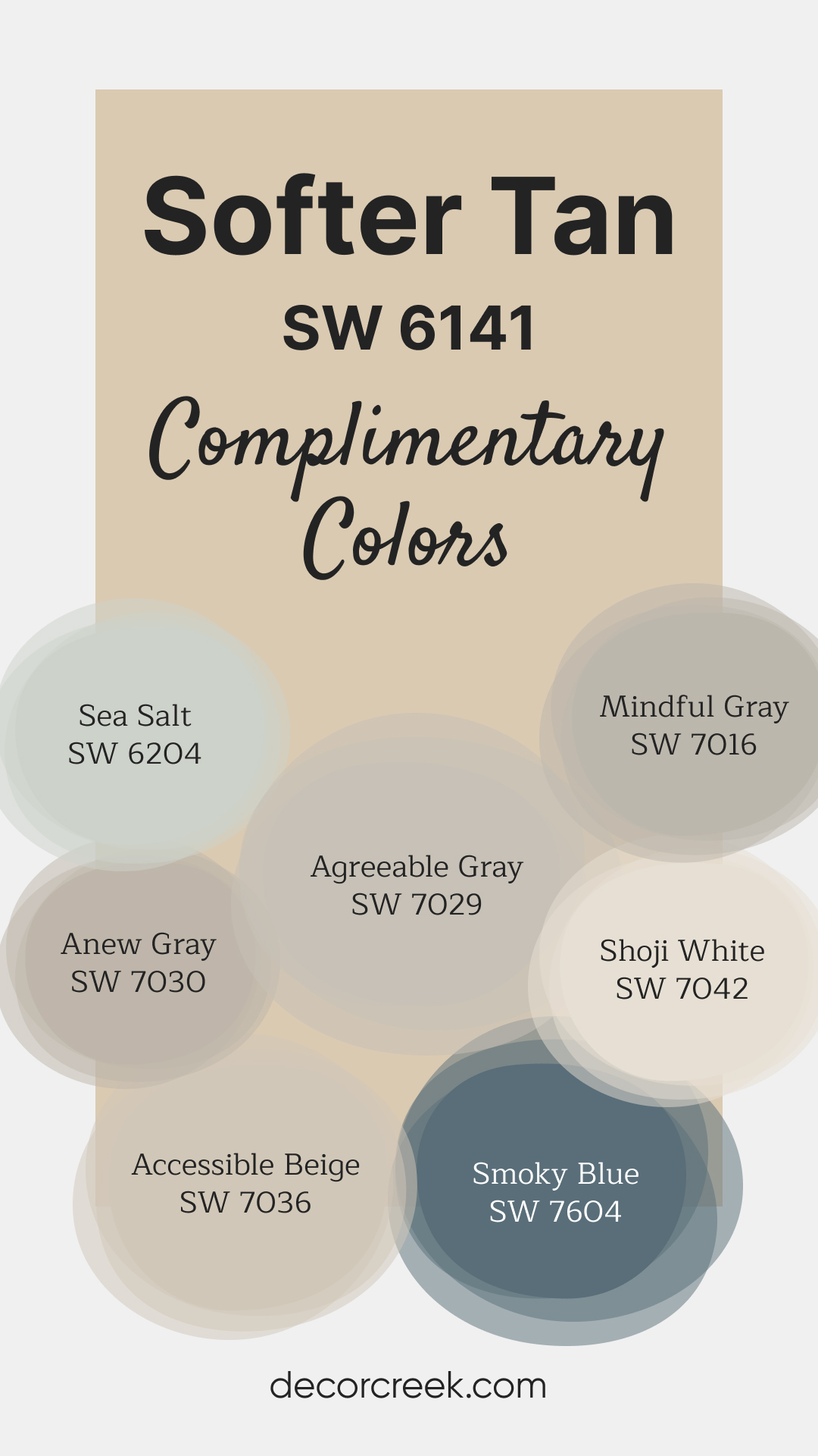
6. Softer Tan (SW 6141)
Softer Tan is a delicate warm neutral that’s perfect for creating a peaceful, understated vibe in bedrooms or offices. Sherwin-Williams Softer Tan has just the right amount of pigment to be noticeable without overpowering.
Colors That Go with Softer Tan SW 6141 – Check Big Guides Here 👇
Sea Salt SW 6204 – A soothing green-gray with blue undertones, ideal for adding a calming, coastal vibe to your space.
Agreeable Gray SW 7029 – A light greige with balanced warm and cool tones, offering versatility and elegance.
Mindful Gray SW 7016 – A medium-toned gray with subtle warm undertones, great for adding depth without feeling too dark.
Anew Gray SW 7030 – A warm greige that works beautifully in both modern and traditional spaces.
Shoji White SW 7042 – A soft, warm white with creamy undertones, perfect for trim, ceilings, or whole-room coverage.
Accessible Beige SW 7036 – A classic beige with soft taupe undertones, blending well with both warm and cool colors.
Smoky Blue SW 7604 – A rich, muted blue with gray undertones, perfect for a bold accent wall or cabinetry.
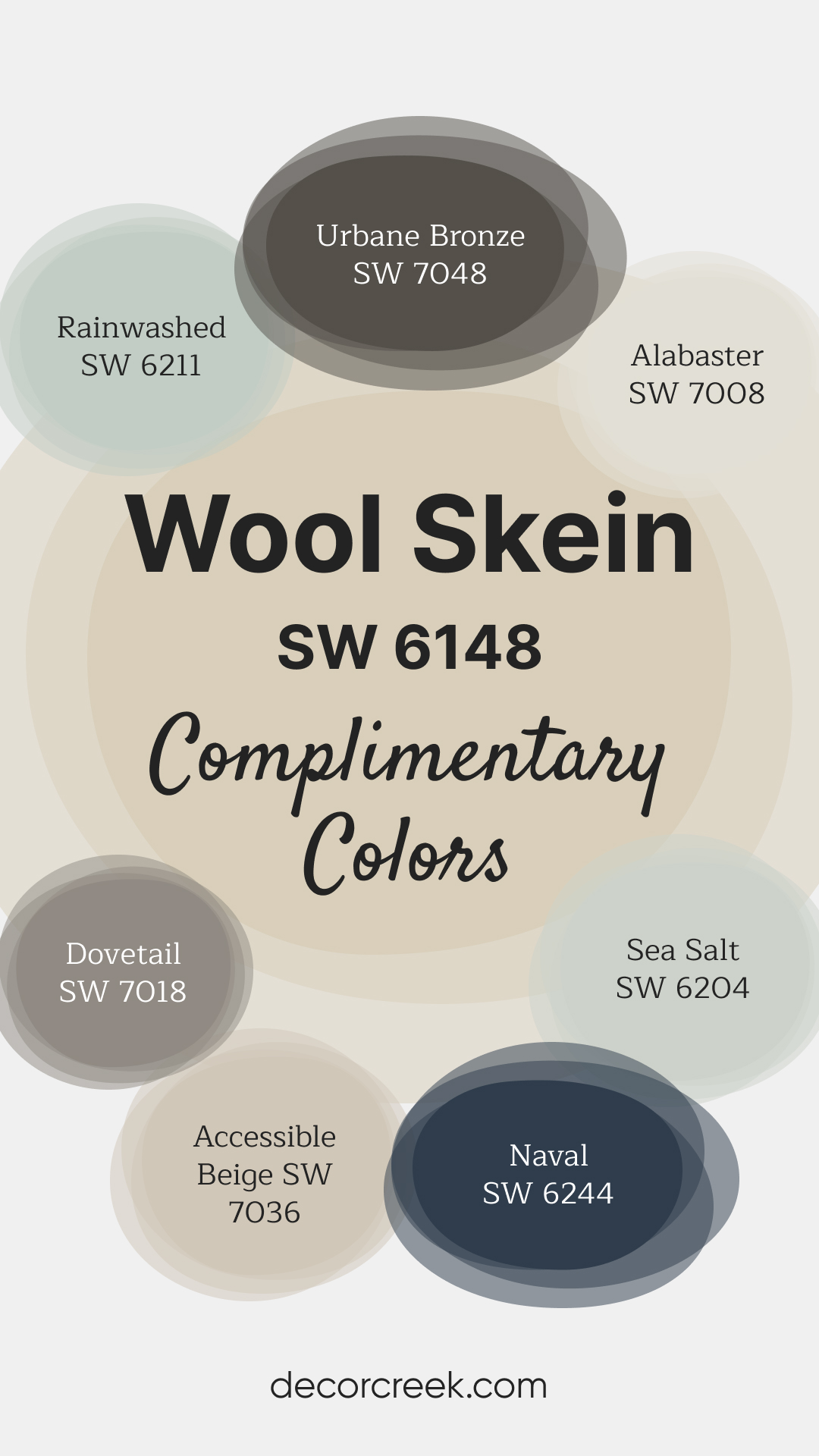
7. Wool Skein (SW 6148)
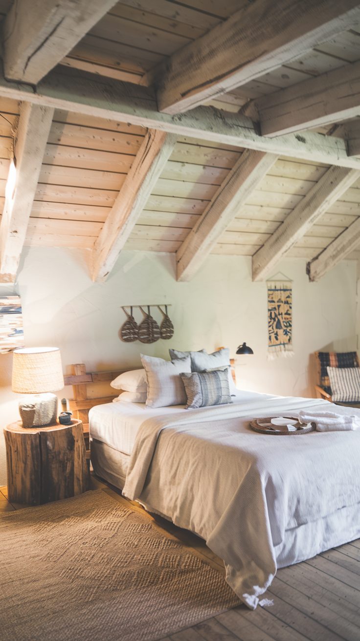
Wool Skein is an earthy neutral with subtle green undertones, making it an excellent choice for traditional or rustic spaces. The natural tone of Sherwin-Williams Wool Skein complements wood beams, stone, and other organic materials beautifully.
Colors That Go with Wool Skein SW 6148 – Check Big Guides Here 👇
Urbane Bronze SW 7048 – A deep, earthy bronze-gray that adds contrast and sophistication to any room.
Alabaster SW 7008 – A creamy white with soft warmth, ideal for trim and ceilings to complement neutral walls.
Rainwashed SW 6211 – A soft, cool green with hints of blue, bringing a fresh and airy feel to the space.
Sea Salt SW 6204 – A light, soothing green-gray with blue undertones, perfect for a serene, coastal-inspired look.
Dovetail SW 7018 – A warm, medium gray with taupe undertones, offering depth and balance to lighter neutrals.
Accessible Beige SW 7036 – A versatile beige with soft taupe undertones, great for whole-house use or pairing with bolder colors.
Naval SW 6244 – A bold, rich navy blue that provides a striking contrast, perfect for accent walls or cabinetry.
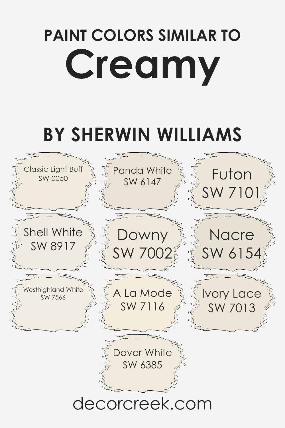
8. Creamy (SW 7012)
Creamy is a warm off-white that’s a staple for trim, ceilings, and walls in bright, open spaces. Sherwin-Williams Creamy pairs seamlessly with both bold colors and other neutrals, making it a highly versatile choice.
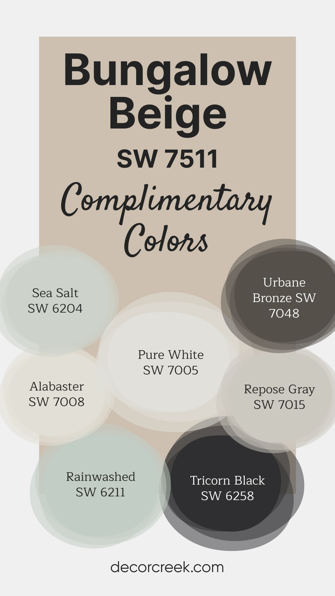
9. Bungalow Beige (SW 7511)
Bungalow Beige is a rich beige with a hint of taupe, adding depth to spaces like dining rooms or entryways. Sherwin-Williams Bungalow Beige works wonderfully with warm wood tones and metallic accents.
Colors That Go with Bungalow Beige SW 7511 – Check Big Guides Here 👇
Sea Salt SW 6204 – A soft green-gray with blue undertones, perfect for adding a fresh, coastal feel to your space.
Alabaster SW 7008 – A warm, creamy white that pairs beautifully with neutral tones, great for trim or ceilings.
Rainwashed SW 6211 – A cool green with subtle hints of blue, offering a light and airy feel to balance the warmth of Bungalow Beige.
Pure White SW 7005 – A clean, crisp white with a soft touch of warmth, making it versatile for both walls and trim.
Urbane Bronze SW 7048 – A bold, deep bronze-gray that adds contrast and depth, great for accent walls or cabinetry.
Repose Gray SW 7015 – A light gray with warm undertones, perfect for creating a balanced, modern look.
Tricorn Black SW 6258 – A true black that provides a striking contrast, ideal for accents, doors, or furniture.
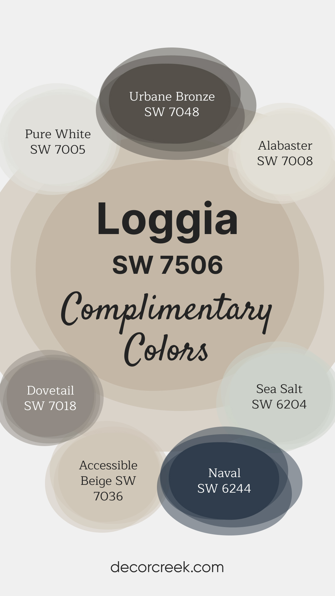
10. Loggia (SW 7506)
Loggia is a warm greige that has a slightly deeper tone, making it perfect for creating contrast in modern spaces. The sophisticated undertones of Sherwin-Williams Loggia make it a popular choice for contemporary furniture and clean lines.
Colors That Go with Loggia SW 7506 – Check Big Guides Here 👇
Urbane Bronze SW 7048 – A bold, earthy bronze-gray that adds depth and contrast, great for accent walls or furniture.
Alabaster SW 7008 – A soft, warm white with a creamy touch, ideal for trim, ceilings, or whole-room coverage.
Pure White SW 7005 – A clean, crisp white with soft warmth, offering versatility for modern or classic spaces.
Sea Salt SW 6204 – A light green-gray with blue undertones, ideal for a fresh, coastal-inspired look.
Dovetail SW 7018 – A warm, medium gray with taupe undertones, providing contrast and balance to lighter tones.
Accessible Beige SW 7036 – A versatile beige with soft gray undertones, perfect for pairing with both warm and cool colors.
Naval SW 6244 – A deep, rich navy blue that creates a bold contrast, great for dramatic accents or cabinetry.
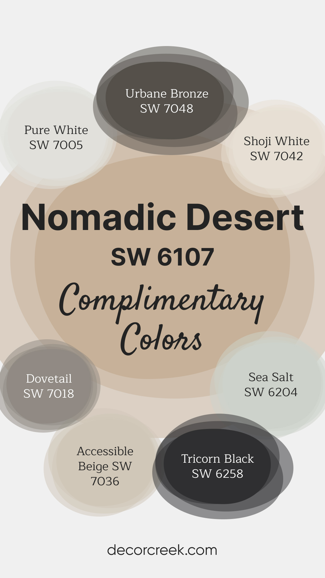
11. Nomadic Desert (SW 6107)
Nomadic Desert is a bold, earthy beige that adds warmth and depth to living rooms and bedrooms. The richness of Sherwin-Williams Nomadic Desert creates a grounded, comforting atmosphere, especially in larger spaces.
Colors That Go with Nomadic Desert SW 6107 – Check Big Guides Here 👇
Urbane Bronze SW 7048 – A bold, deep bronze-gray that adds depth and sophistication, ideal for accent walls or furniture.
Shoji White SW 7042 – A warm white with subtle beige undertones, great for trim or a whole-room neutral.
Pure White SW 7005 – A clean, crisp white with a hint of warmth, perfect for trim, ceilings, or cabinets.
Dovetail SW 7018 – A medium gray with taupe undertones, ideal for adding contrast and a modern feel.
Sea Salt SW 6204 – A light green-gray with soft blue undertones, offering a calm and refreshing contrast.
Accessible Beige SW 7036 – A versatile beige with gray undertones, blending beautifully with both warm and cool tones.
Tricorn Black SW 6258 – A striking true black, perfect for creating bold accents or high-contrast details.
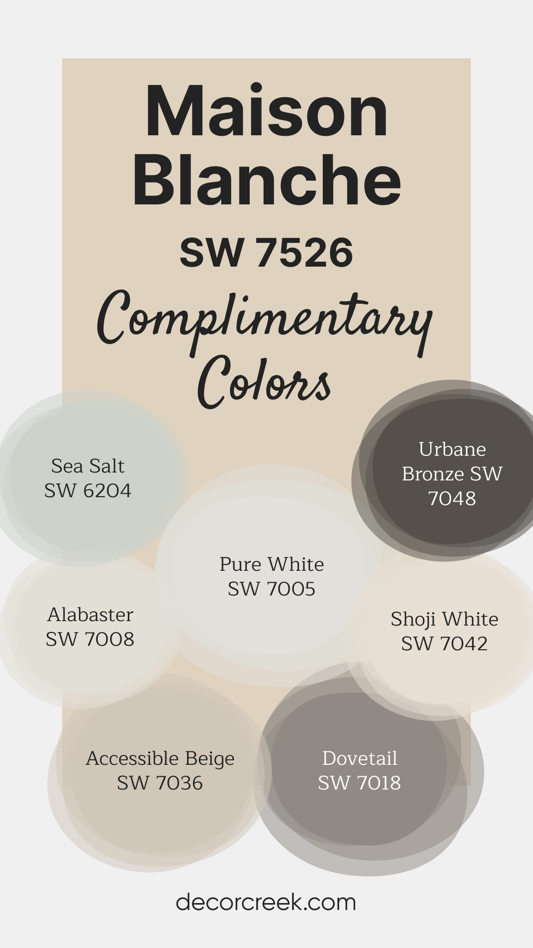
12. Maison Blanche (SW 7526)
Maison Blanche is a soft, muted beige with creamy undertones, ideal for creating a refined yet approachable look. Sherwin-Williams Maison Blanche works well in spaces where you want a light but not stark feel.
Colors That Go with Maison Blanche SW 7526 – Check Big Guides Here 👇
Sea Salt SW 6204 – A light, calming green-gray with blue undertones, ideal for adding a refreshing contrast to warm neutrals.
Alabaster SW 7008 – A warm, creamy white with soft undertones, great for trim, ceilings, or whole-room coverage.
Pure White SW 7005 – A clean white with a hint of warmth, offering a crisp and fresh look for trim or cabinetry.
Shoji White SW 7042 – A soft, warm white with beige undertones, ideal for creating a cohesive and soothing space.
Accessible Beige SW 7036 – A versatile beige with gray undertones, blending beautifully with warm or cool color schemes.
Dovetail SW 7018 – A medium gray with taupe undertones, adding depth and contrast to lighter tones.
Urbane Bronze SW 7048 – A rich, earthy bronze-gray, perfect for accents or bold statement areas.
13. Latte (SW 6108)
Latte is a deeper beige with warm brown undertones that create a cozy, intimate vibe. Sherwin-Williams Latte is perfect for accent walls or rooms where you want a dramatic yet inviting feel.
Colors That Go with Maison Blanche SW 7526 – Check Big Guides Here 👇
Sea Salt SW 6204 – A light, calming green-gray with blue undertones, ideal for adding a refreshing contrast to warm neutrals.
Alabaster SW 7008 – A warm, creamy white with soft undertones, great for trim, ceilings, or whole-room coverage.
Pure White SW 7005 – A clean white with a hint of warmth, offering a crisp and fresh look for trim or cabinetry.
Shoji White SW 7042 – A soft, warm white with beige undertones, ideal for creating a cohesive and soothing space.
Accessible Beige SW 7036 – A versatile beige with gray undertones, blending beautifully with warm or cool color schemes.
Dovetail SW 7018 – A medium gray with taupe undertones, adding depth and contrast to lighter tones.
Urbane Bronze SW 7048 – A rich, earthy bronze-gray, perfect for accents or bold statement areas.

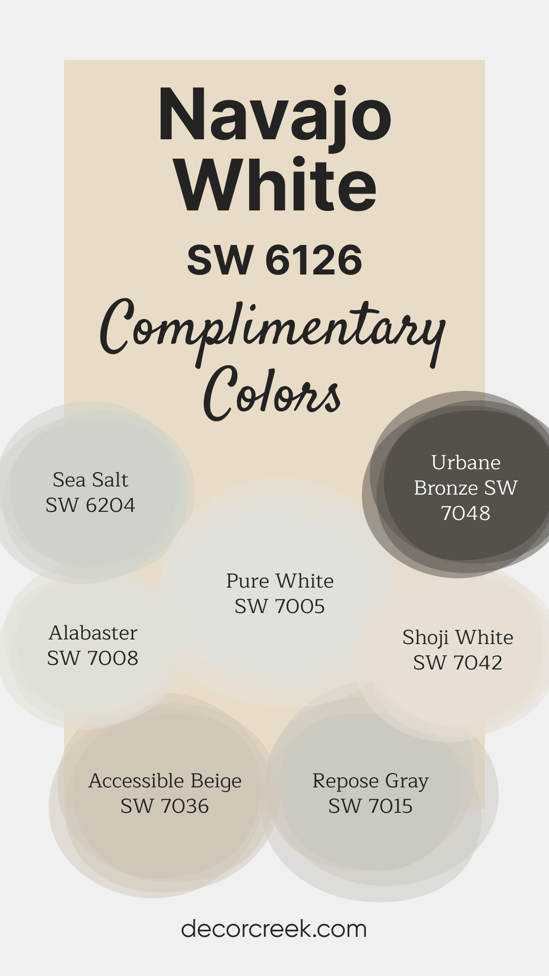
14. Navajo White (SW 6126)
Navajo White is a creamy beige with a slight yellow undertone that brings warmth to kitchens and sunrooms. Sherwin-Williams Navajo White feels sunny and cheerful without being overwhelming.
Colors That Go with Navajo White SW 6126 – Check Big Guides Here 👇
Sea Salt SW 6204 – A soft green-gray with hints of blue, offering a refreshing contrast to warm neutrals.
Alabaster SW 7008 – A warm, creamy white with subtle undertones, perfect for trim, ceilings, or whole-room use.
Pure White SW 7005 – A clean, bright white with a soft touch of warmth, suitable for trim or cabinets in modern and classic spaces.
Shoji White SW 7042 – A soft, warm white with beige undertones, offering a calm and cohesive look.
Accessible Beige SW 7036 – A versatile beige with gray undertones, great for blending warm and cool tones.
Repose Gray SW 7015 – A light gray with warm undertones, perfect for adding depth without overpowering the space.
Urbane Bronze SW 7048 – A bold, deep bronze-gray that adds a dramatic accent or contrast for trim and cabinetry.
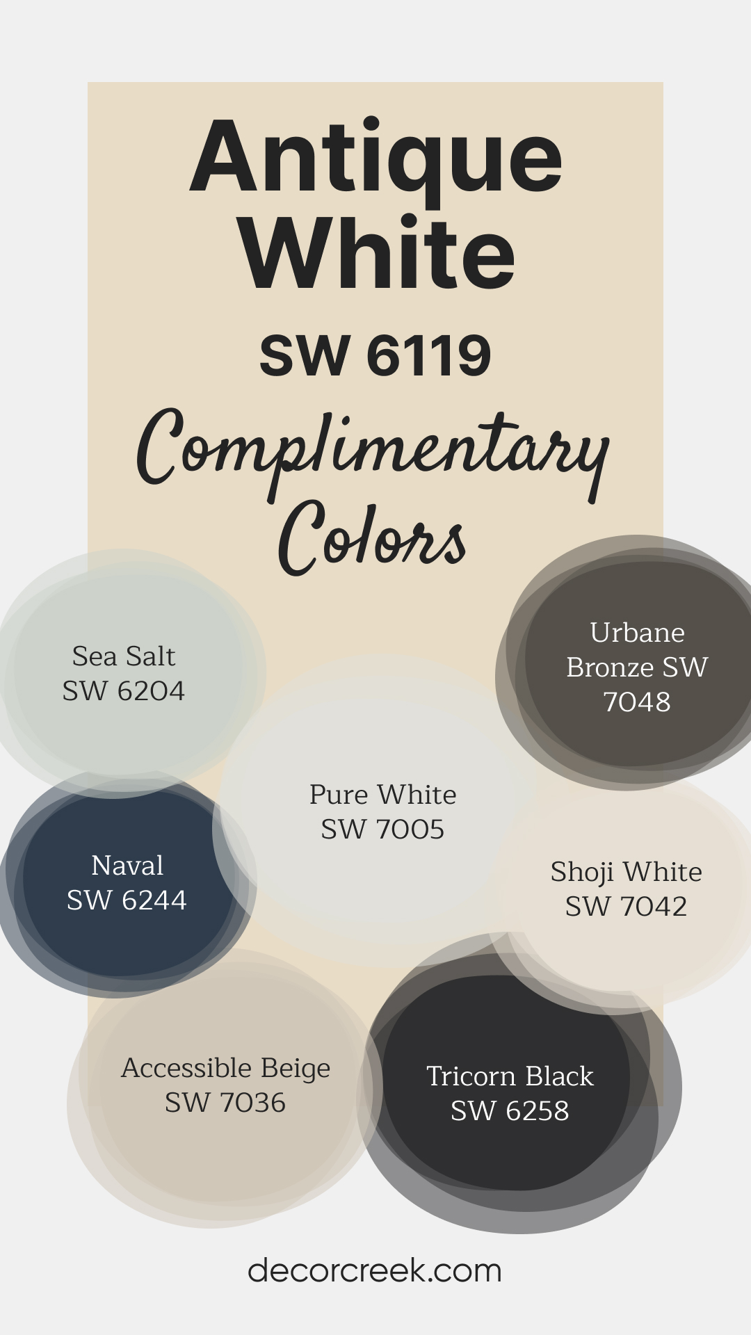
15. Antique White (SW 6119)
Antique White is a timeless, soft beige with a touch of warmth, perfect for vintage or traditional decor styles. Sherwin-Williams Antique White adds an elegant touch to trim and furniture, as well as walls.
Colors That Go with Antique White SW 6119 – Check Big Guides Here 👇
Sea Salt SW 6204 – A light, soothing green-gray with soft blue undertones, adding a refreshing touch to warm neutrals.
Naval SW 6244 – A rich navy blue that creates a bold contrast, ideal for accent walls or cabinetry.
Pure White SW 7005 – A crisp, clean white with subtle warmth, great for trim, ceilings, or doors.
Shoji White SW 7042 – A warm, soft white with beige undertones, offering a cohesive and calming look.
Accessible Beige SW 7036 – A versatile beige with soft gray undertones, blending beautifully with warm color palettes.
Urbane Bronze SW 7048 – A bold, earthy bronze-gray that adds depth and drama, perfect for accent pieces or furniture.
Tricorn Black SW 6258 – A striking true black, excellent for creating bold accents and high-contrast elements in a space.
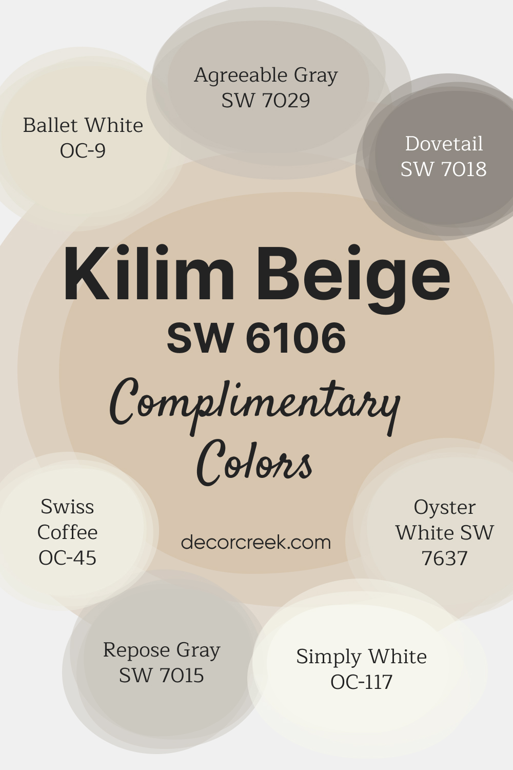
16. Kilim Beige (SW 6106)
Kilim Beige is a warm beige with peach undertones that give it a slightly sunny look. Sherwin-Williams Kilim Beige is an excellent choice for creating a welcoming atmosphere in family rooms and living areas.
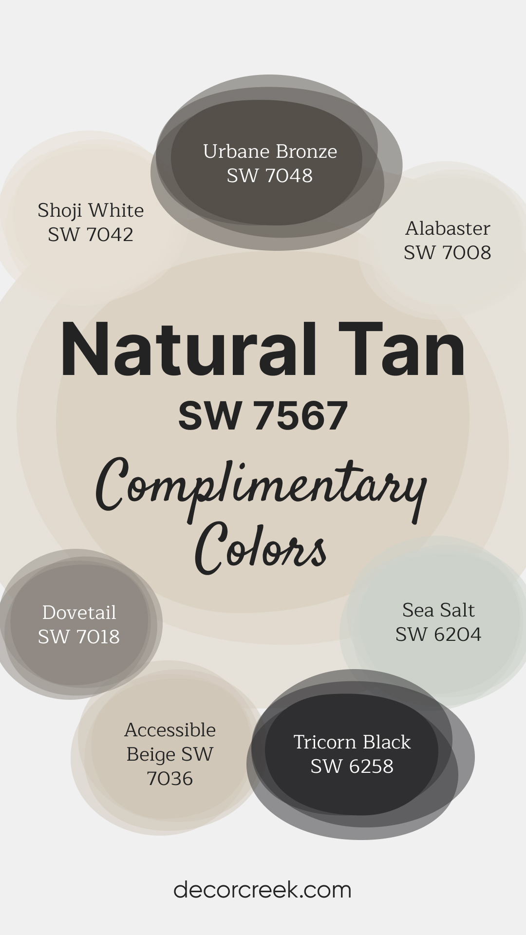
17. Natural Tan (SW 7567)
Natural Tan is a versatile neutral with a light taupe undertone, ideal for creating a calm and balanced environment. Sherwin-Williams Natural Tan is a favorite for modern spaces that need a subtle yet warm backdrop.
Colors That Go with Natural Tan SW 7567 – Check Big Guides Here 👇
Urbane Bronze SW 7048 – A deep, earthy bronze-gray that provides bold contrast and a modern edge to neutral palettes.
Alabaster SW 7008 – A creamy, warm white with soft undertones, great for trim, ceilings, or an overall light and airy feel.
Shoji White SW 7042 – A warm, soft white with beige undertones, offering a subtle and cohesive look when paired with neutrals.
Sea Salt SW 6204 – A calming green-gray with blue undertones, ideal for adding a fresh and serene touch to the space.
Dovetail SW 7018 – A medium taupe-gray, great for creating depth and contrast in a neutral color scheme.
Accessible Beige SW 7036 – A versatile beige with gray undertones, perfect for blending warm and cool tones seamlessly.
Tricorn Black SW 6258 – A bold, true black, excellent for accenting doors, trim, or furniture to create a striking contrast.
18. Nomadic Taupe (SW 7548)
Nomadic Taupe is a deeper taupe with warm, earthy undertones, offering a sophisticated look for accent walls or formal spaces. The richness of Sherwin-Williams Nomadic Taupe makes it perfect for adding depth and contrast to your palette.
Tips for Pairing Warm Neutrals
Once you’ve chosen your paint color, think about how to enhance it:
- Add Depth with Contrasts: Pair light warm neutrals with darker furniture or accessories to create visual interest.
- Use Texture: Incorporate natural elements like woven rugs, linen curtains, or wood accents to complement the paint’s warmth.
- Accent Colors: Soft greens, muted blues, or deep charcoals look stunning alongside warm neutrals.
Questions to Ask Yourself Before Deciding
Before you commit to a color, take a moment to consider:
- Will this color look good with my lighting throughout the day?
- Does it complement my flooring, cabinets, or furniture?
- Is it versatile enough for the style I want to achieve?
The Final Word
Choosing the right warm neutral paint color can completely shift the mood of your home. This year, Sherwin-Williams offers some of the best options for creating spaces that feel welcoming and stylish. Whether you go with a soft beige, a warm greige, or a creamy off-white, you can’t go wrong with any of these top picks.
Take your time, test a few samples, and let your space guide you. The perfect color is out there, and when you find it, your home will feel more like you.