Choosing the right paint color is, without exaggeration, a monumental decision for any homeowner. The colors surrounding you influence your mood, energy levels, and overall sense of well-being every single day you spend in your home. They set the emotional tone for your living space.
The cornerstone of any sophisticated and enduring interior design is the selection of Neutrals—the versatile whites, elegant grays, and comforting beiges. These shades are more than just ‘safe bets’; they are the indispensable backbone of a successful design scheme.
When chosen correctly, they act as the perfect quiet canvas, allowing all other elements of your room—your cherished furniture, dynamic artwork, and unique decorative accents—to truly shine and look their absolute best without competition.
For 2026, the trend has decidedly shifted away from flat, predictable, and frankly boring shades. The most sought-after neutrals are those that are rich, complex, and full of subtle personality.
They possess nuanced undertones—hints of green, purple, or creamy yellow—that allow them to interact beautifully with shifting natural light throughout the day, ensuring the color is never static or dull.
I have meticulously curated a definitive list of my 45 absolute favorite neutral colors, drawing exclusively from the two most respected and highest-quality paint manufacturers in the industry. This is a foolproof guide designed to eliminate guesswork.
If your goal is to create a background that consistently looks expensive, promotes a sense of calm, and makes you feel wonderful the moment you step through the door, this resource is precisely what you need to achieve that elegant, lasting look.
This list is your blueprint for a beautiful home.
The Designer’s Choice: Why I Rely on Sherwin-Williams and Benjamin Moore for Quality Neutrals
When I stage a house or work with a client, I always insist on using the highest quality paint. This is especially true for neutral colors, where the slightest difference in pigment quality is noticeable.
- Superior Finish and Durability: Both Sherwin-Williams and Benjamin Moore make specific paint lines designed to handle daily life—from busy walls to high-moisture rooms. They provide a smooth, tough finish that resists scuffs and cleans up well, keeping your neutral walls looking fresh longer.
- Dependable Color Pigments: The pigments used in these premium paints are complex. Their colors look true and rich no matter the time of day or the kind of light bulb you use. This color accuracy is vital for getting the final look you pictured, ensuring your chosen neutral never looks unexpectedly green or blue.
- High End Appeal: Using these paints instantly gives a room a more polished, luxurious feel. They are the finishing touch that signals a well-designed and cared-for property.
How I Pick the Perfect Neutral Color for Any Room
Picking a neutral shade for any room needs a clear plan. Neutrals are the trickiest colors because their subtle undertones can drastically change under different lights. Here is how I guarantee the color choice is perfect every time:
- Look at the Light: The way light enters a room changes the color on your walls. If your window faces north, the light is cool, so you need a neutral with warmer undertones (yellow, pink) to keep the room cozy. If the window faces south, the light is warm, and you can pick cooler neutrals (blue, green) that will still feel bright.
- Think About the Feeling: Even neutrals can create a strong feeling. Do you want a bright, clean, airy feel or a cozy, comforting one? Lighter colors open up the area, while deeper neutrals feel more defined and luxurious.
- Match the Permanent Stuff: Always match your paint to the fixed items first: the carpet, countertops, and tile. Look closely at their undertones (the slight hint of color you see). Your neutral paint must have a similar undertone to feel harmonious and right.
- Test the Colors Big: Do not decide from a small paint chip! Buy samples and paint large squares, at least one foot by one foot, on a few different walls. Watch the squares in the morning, the afternoon, and at night with the lights on. This is the only way to avoid making an expensive mistake.
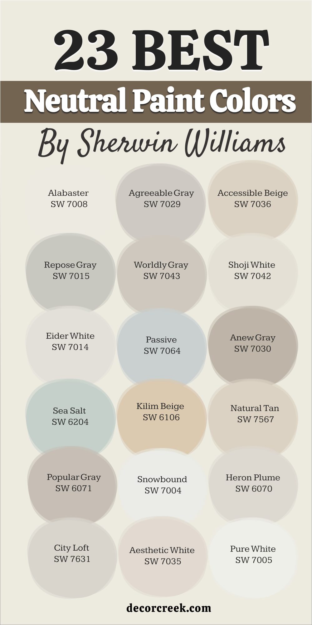
23 Best Neutral Paint Colors by Sherwin-Williams
These 23 neutrals are my most requested and most dependable shades from Sherwin-Williams. They are the industry standard for a beautifully finished home:
Alabaster SW 7008
Alabaster SW 7008 is my favorite white because it is soft and never harsh. This shade has a subtle creamy warmth that feels like a soft hug for your walls. It is perfect for walls that need to look clean but not sterile or cold. This paint color is often chosen to cover both the walls and trim, giving a beautifully seamless look.
It works particularly well in rooms that have natural wood elements you want to highlight. This white manages to look lovely in both bright sunlight and dim artificial light.
It provides a quiet background that makes colorful pillows or artwork really stand out. This is a very popular choice for creating a gentle, inviting mood in any room of the house. It has just enough depth to contrast slightly with bright white ceilings and fixtures. This color is the perfect light shade for making a room feel open and welcoming. It is a fantastic, dependable white that will feel current for many years.
🎨Learn everything about this color by clicking HERE👈

Agreeable Gray SW 7029
Agreeable Gray SW 7029 is a wonderfully balanced shade that sits right between gray and beige (greige). This color is a favorite because it adapts to the lighting, never looking too cool and blue or too warm and yellow. It works perfectly with all kinds of wood and furniture finishes, from light oak to dark walnut.
This paint offers enough pigment to feel cozy without making the room dark or shadowed. It is an excellent choice if you need one neutral color to flow through an entire open-plan house.
This shade looks particularly lovely next to stone or tile that has both gray and tan colors in its pattern. It is a foolproof choice for making your home feel coordinated and professionally decorated. This neutral helps define architectural details like wall paneling or crown molding. It is a highly requested color that consistently delivers a beautiful, sophisticated result. This is a go-to pigment that makes every item in the room look good.
🎨Learn everything about this color by clicking HERE👈

Accessible Beige SW 7036
Accessible Beige SW 7036 is a comforting warm neutral that has just a touch of gray to keep it looking modern. This shade feels like a warm, welcoming blanket for your room, making it feel instantly homey. It is perfect when you want a color that is not white but still feels light and airy.
This paint works beautifully with earth tones, rustic decor, and dark metal fixtures. It is an ideal background for showing off rich textiles or colorful patterned rugs.
This beige keeps its lovely warm pigment even in rooms that get cooler, north-facing light. It provides a soft contrast against bright white trim and ceiling paint. This color is a fantastic way to introduce a feeling of grounded warmth into any area. It is a reliable choice for creating a cozy, gentle atmosphere that people love. This pigment is one of the best for a polished, yet completely comfortable feel.
🎨Learn everything about this color by clicking HERE👈

Repose Gray SW 7015
Repose Gray SW 7015 is a versatile gray that leans slightly warm, which keeps it from feeling cold. This shade has a lovely complexity, sometimes showing a hint of beige and sometimes a slight blue tint, depending on the light. It is a great background for a contemporary look with clean lines and modern art.
This gray is light enough to keep a room bright but dark enough to offer contrast against white woodwork. It is a smart choice for painting lower cabinets or a feature wall to give the room definition.
This pigment works especially well in sunny rooms where the yellow light can bring out its warmth. It provides a sophisticated look that is very popular with home buyers. This gray is very easy to coordinate with almost any other bright or deep accent color. It is a dependable color that always results in a refined, high-quality look.
🎨Learn everything about this color by clicking HERE👈

Worldly Gray SW 7043
Worldly Gray SW 7043 is a perfectly balanced gray-beige that never fails to look good. This shade is a reliable medium neutral, making it one of the easiest colors to pair with existing furniture and tile. It is a fantastic color for open living areas because it is restful and doesn’t demand attention.
This pigment has a grounding quality that makes a room feel settled and cohesive. It shows its beige side more strongly in sunny rooms and its gray side in dimmer corners.
This color is a great option when you are torn between picking a true gray or a true tan. It is a safe choice that stays relevant and avoids any fleeting home trends. This shade provides a gentle contrast that highlights architectural details like window frames. It works perfectly for creating a layered look when paired with different shades of white. This dependable neutral creates a lovely background for daily life.
🎨Learn everything about this color by clicking HERE👈
Shoji White SW 7042
Shoji White SW 7042 is a creamy off-white that has wonderfully warm, pleasing undertones. This shade is a great solution if you feel that a pure white color is too bright or harsh for your living area. It has a gentle warmth that makes it a perfect pairing for natural stone or heavy, rustic wood furniture.
This color acts like a soft, neutral cloud, making the room feel comfortable and inviting. It is an excellent choice for a bedroom or living room where you want a very light but relaxing look.
This pigment ensures that any shadows in the room appear soft gray instead of harsh blue or purple. It is one of the best colors for keeping a room light while adding a layer of depth. This shade works well in both traditional and modern homes because it is so beautifully balanced. It is a color that brings a lovely, gentle light to the walls and trim. This pigment provides the perfect light background without being glaring or cold.
🎨Learn everything about this color by clicking HERE👈

Eider White SW 7014
Eider White SW 7014 is a soft, pale gray-white that has very gentle cool undertones. This shade is a beautiful choice for a bright, airy feel without going to a true, crisp white. It carries just a hint of gray, which makes it feel a little more sophisticated than a plain white wall.
This pigment looks lovely when paired with dark, rich colors like navy blue or deep charcoal furniture. It works very well in sunny rooms where the light can be intense, as the color keeps it soft.
This color is a popular choice for homeowners who love a modern, minimal design look. It provides a soft contrast that allows artwork and vibrant rugs to truly pop. This shade is light enough to make a small room feel much bigger and more open. It is a great way to introduce a feeling of airiness without sacrificing personality. This pigment is a dependable white with a quiet, lovely character.
🎨Learn everything about this color by clicking HERE👈

Passive SW 7064
Passive SW 7064 is a light, airy gray with noticeable cool undertones, like a misty morning sky. This shade is fantastic for creating a calm, soothing atmosphere in a bedroom or main living area. It is a beautiful background for modern furniture and shiny, metallic accent pieces. This gray works well in rooms with high ceilings where you want to keep the feeling open and lifted.
It is best used in well-lit areas, as the blue undertone can become too strong in dark corners. This pigment provides a cool, clean contrast for warm wood flooring or natural stone fireplaces.
It is a popular color for creating a polished, neat, and highly organized look in the home. This shade is great for homeowners who prefer a cool color palette over warm beiges and tans. It helps to define the structure of a room without making a loud color statement. This cool gray is a refined and beautiful choice for walls.
🎨Learn everything about this color by clicking HERE👈
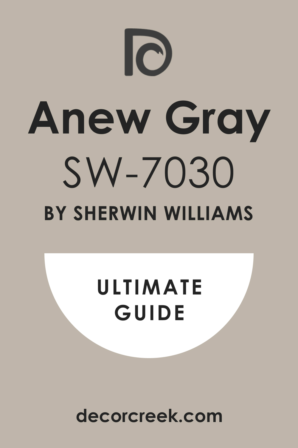
Anew Gray SW 7030
Anew Gray SW 7030 is a mid-tone gray that has wonderfully comforting warm, brown undertones. This shade feels earthy and grounded, making it perfect for a den or a cozy living room. It works well with furniture that has beige, brown, or red tones, as it shares their warmth.
This gray is dark enough to provide a visual anchor for the room without making the whole area feel closed in. It is a reliable color for creating a defined look in a room with standard white trim.
This pigment is often used by staging experts to give a house a feeling of rich quality and comfort. It is a great option for people who are unsure about using a pure gray that might feel too cold. This shade provides a sophisticated background that works beautifully with heavy fabric textures. It is a rich, dependable warm gray that is both stylish and homey.
🎨Learn everything about this color by clicking HERE👈
Sea Salt SW 6204
Sea Salt SW 6204 is light, refreshing color that blends soft green, blue, and gray. This shade is often chosen for areas where you want a gentle wash of color that still feels neutral and restful. It is a popular color for bedrooms and laundry rooms due to its light, clean feeling.
This pigment changes wonderfully with the light, sometimes looking more green, sometimes more blue, and sometimes more gray.
It works beautifully with white trim and natural wood finishes, creating a fresh, airy mood. This is a great choice for adding personality without committing to a strong, saturated color. It provides a lovely, light background that reminds you of the seashore and fresh air. This color is best tested on the wall because its appearance can change so much with your lighting. It is a gentle shade that gives any room a clean, appealing brightness.
🎨Learn everything about this color by clicking HERE👈

Kilim Beige SW 6106
Kilim Beige SW 6106 is a true, traditional warm beige that feels classic and grounded. This shade is perfect for homeowners who love the feeling of comfort and warmth that only a true beige can provide. It works exceptionally well in rooms with a lot of heavy, traditional wood furniture.
This color has a beautiful depth that prevents it from looking washed out, even in very bright sunlight. It is a dependable option for creating a backdrop that feels rich and fully decorated.
This pigment provides a soft contrast against lighter trim and ceiling colors. It is a great choice for creating a cozy, settled atmosphere in a living room or office. This shade looks wonderful with deep accent colors like burgundy, terracotta, and dark green. It is a popular color for traditional designs that need a rich, yet neutral base. This pigment is a classic warm neutral that holds its color beautifully.
🎨Learn everything about this color by clicking HERE👈

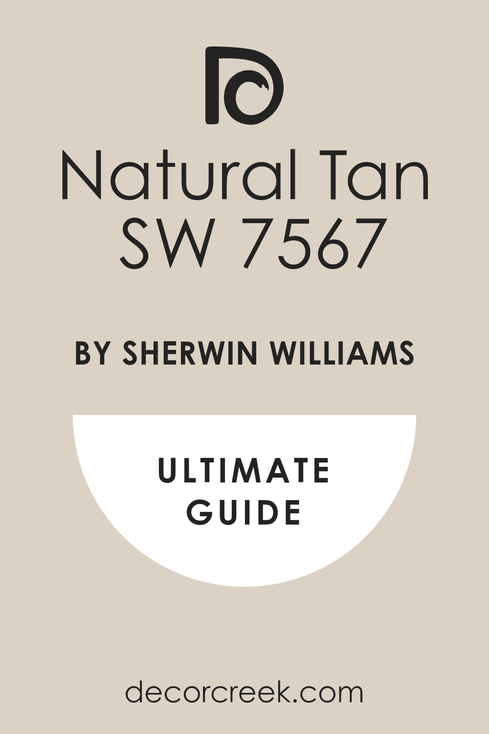
Natural Tan SW 7567
Natural Tan SW 7567 is a dependable, earthy tan that avoids the orange or pink undertones some tans carry. This shade feels like pure, dry sand, giving the room a natural, grounded feeling. It is a wonderful color for rooms with stone fireplaces or exposed wood beams.
This tan is dark enough to provide a nice contrast to white but still feels bright and light on the walls. It works well with both warm wood and metal finishes like brass and bronze.
This pigment is a great option for creating a feeling of easy, comfortable elegance in a main living area. It is a favorite for staging homes because it appeals to almost every buyer’s taste. This color provides a quiet, restful background that lets your furniture and textures be the stars. It is a perfect choice if you want to completely move away from the current gray trend. This is a reliable, beautifully simple natural tan color.
🎨Learn everything about this color by clicking HERE👈
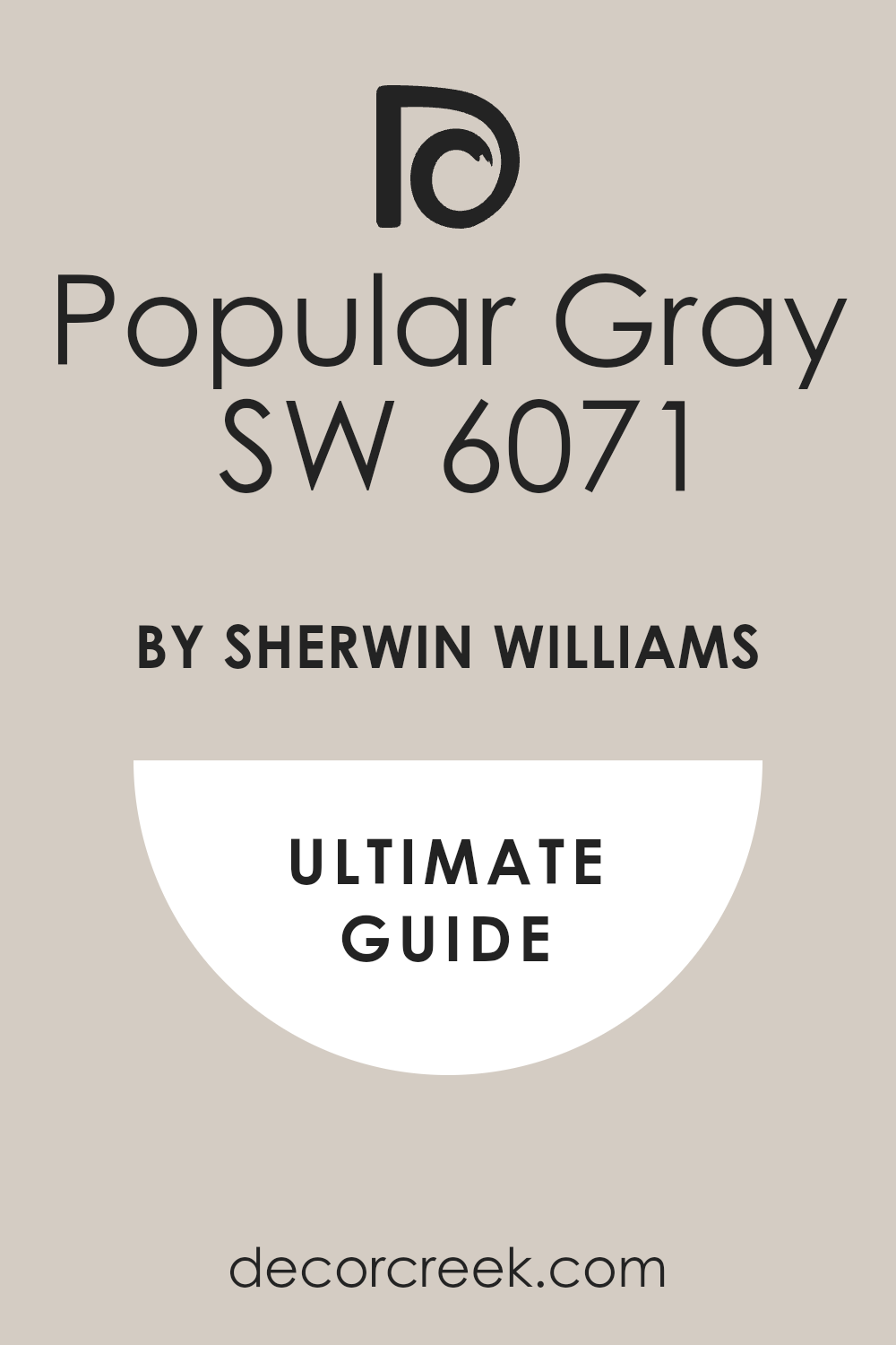
Popular Gray SW 6071
Popular Gray SW 6071 is a pleasant, mid-tone greige that is very well-balanced. This shade is one of the company’s best sellers for a reason: it simply looks good almost everywhere you put it. It carries a little more gray than some other greiges, making it feel very current and up-to-date.
This pigment works well with both cool and warm decor, making it highly versatile for updating a room. It is a great option for a bedroom or hallway where you want a color that is not too distracting.
This shade provides a defined contrast against white trim without making the room feel heavy. It is a fantastic background for showcasing photos in dark frames or colorful art pieces. This color is a dependable neutral that gives a feeling of modern sophistication. It is perfect for homeowners who want a neutral that shows its color but remains restful. This is a very beautiful and easy-to-use greige pigment.
🎨Learn everything about this color by clicking HERE👈
Snowbound SW 7004
Snowbound SW 7004 is a crisp, bright white that has very subtle cool, greige undertones. This shade is a wonderful choice for creating a clean, modern, and very defined look in a home. It works beautifully with dark floors or furniture, creating a stark, pleasing contrast.
This white is often chosen for trim and doors because of its sharp, clean finish. This pigment is great for making small rooms look bigger by maximizing light reflection.
It is an ideal background for a minimalist design that relies on clean lines and simple shapes. This color provides the perfect canvas for showcasing texture, such as woven rugs or linen drapes. It is a favorite for staging because it signals a fresh, updated, and well-maintained property. This shade has a brightness that works well in sunny rooms without feeling too harsh. It is a dependable, pure white with just a hint of sophistication.
🎨Learn everything about this color by clicking HERE👈

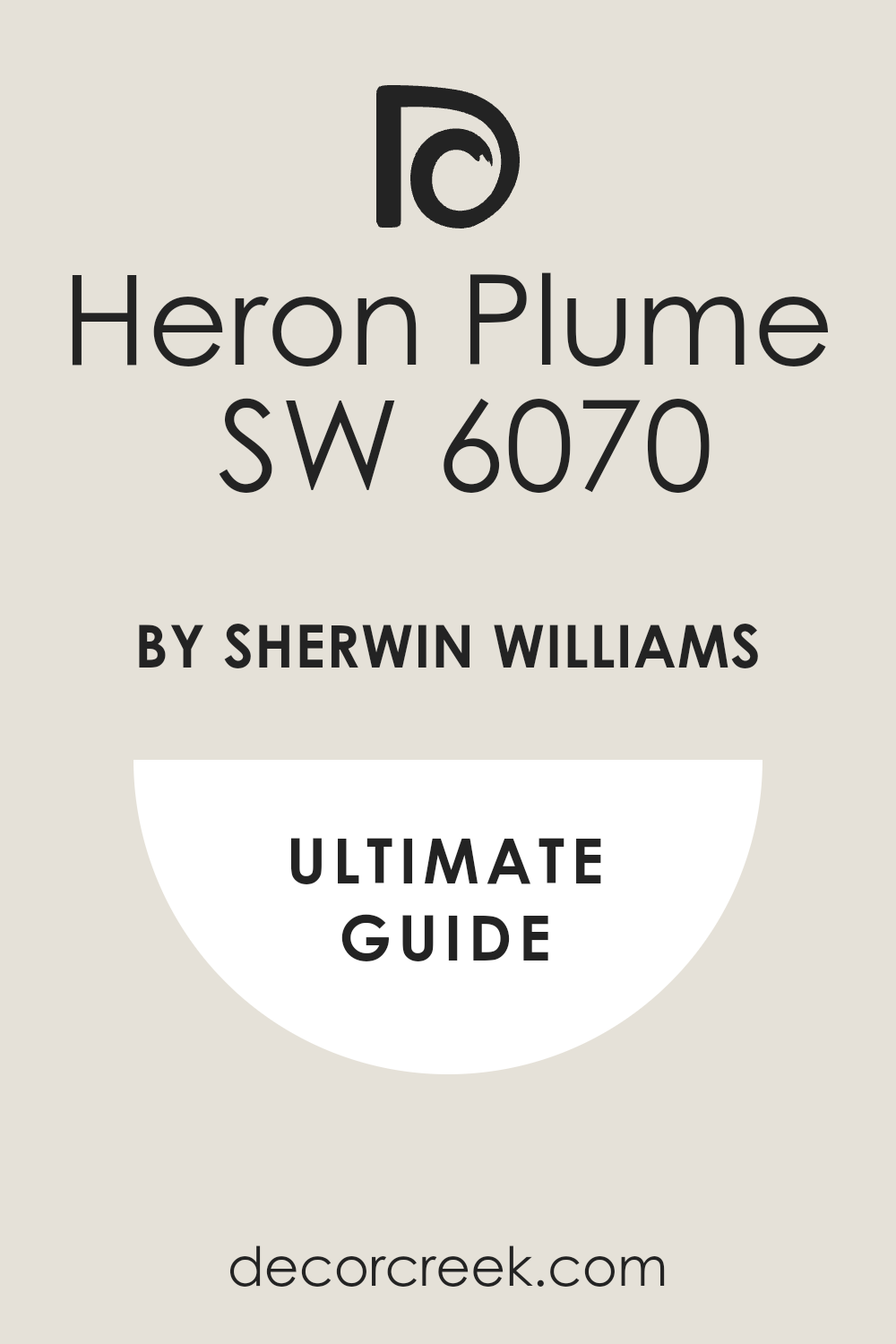
Heron Plume SW 6070
Heron Plume SW 6070 is a light, airy greige that often reads as a very sophisticated off-white. This shade is perfect if you want a color that has a little more depth than white but still feels incredibly light. It has subtle warm undertones that keep it feeling cozy, even in rooms with cool light.
This pigment is a beautiful choice for walls where you want the light to bounce and move around softly. It is a great way to introduce a feeling of refined quality without using a dark color.
This color works well with natural wood accents and creamy upholstery fabrics. This shade provides a gentle contrast against true white trim for a layered, soft look. It is a beautiful background for a master bedroom or a bright, formal living room. This greige is a very dependable, soft neutral that never looks boring.
🎨Learn everything about this color by clicking HERE👈
City Loft SW 7631
City Loft SW 7631 is a very light, pleasing gray that has gentle beige undertones. This shade is a versatile neutral that is a great option for homeowners who still love the look of gray. It works well in rooms with high ceilings where you want to keep the feeling open and lifted.
This pigment provides a clean, modern look without feeling too cold or industrialized. It is a good choice for painting cabinets or built-in shelving in a sunny room.
This color is light enough to keep a small room feeling quite large and airy. It is a sophisticated background that pairs well with both brass and nickel hardware. This shade is one of my favorite colors for creating a polished and neat environment. It is a dependable gray that provides a nice, easy-to-live-with background.
🎨Learn everything about this color by clicking HERE👈

Aesthetic White SW 7035
Aesthetic White SW 7035 is a soft, warm off-white that has a definite beige or tan influence. This shade is a wonderful choice for homeowners who want warmth but find pure beige too strong. It is perfect for walls that you want to feel light and airy but also cozy and welcoming.
This pigment looks beautiful in a sunny room where the light softens its appearance even more. It is a great background for displaying antique furniture or richly patterned fabrics.
This color provides a subtle contrast against bright white trim for a defined look. This shade is a fantastic way to bring a feeling of comfort and ease into any main living area. It is a dependable color that avoids the harshness of pure white while remaining light.
🎨Learn everything about this color by clicking HERE👈

Pure White SW 7005
Pure White SW 7005 is a bright, clean white that has very little color or strong undertone. This shade is a perfect choice for trim and ceilings when you want a crisp, defined line against any other color. It is a very versatile white that works well in almost any light condition without looking yellow or blue.
This pigment is often chosen for walls in modern homes that rely on stark contrast and clean design. It provides the maximum light reflection, helping to brighten rooms that are naturally dark.
This color is the ideal clean canvas that allows all your furnishings to become the stars of the room. This shade is a great way to ensure that your wall color does not clash with your white trim. It is a dependable, straightforward white that gives a feeling of simple perfection.
🎨Learn everything about this color by clicking HERE👈

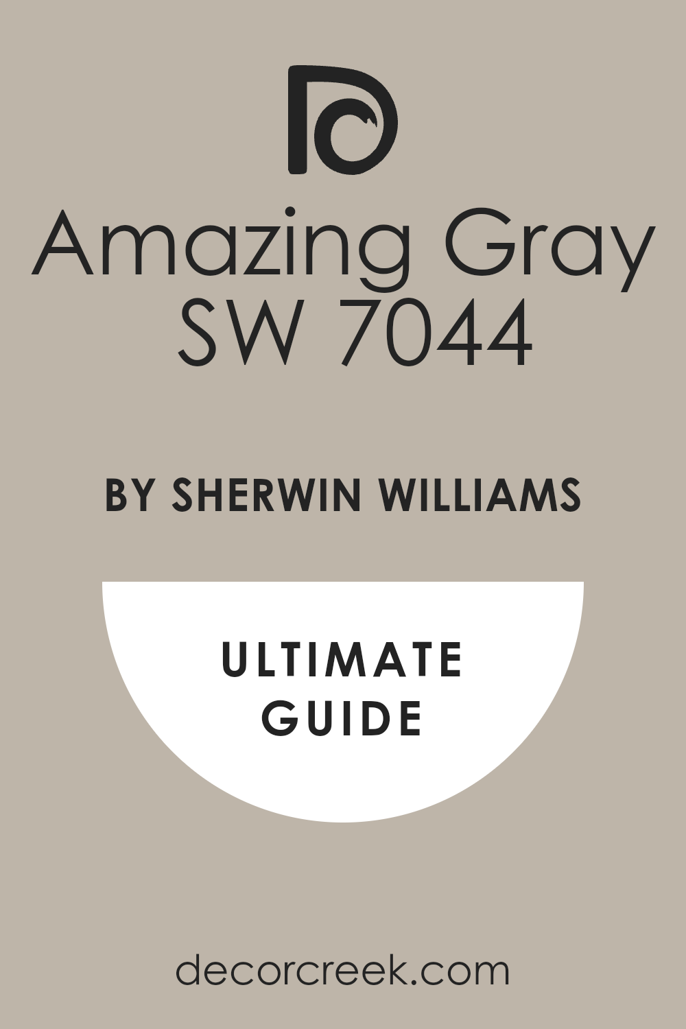
Amazing Gray SW 7044
Amazing Gray SW 7044 is a mid-tone gray that feels grounded and has a strong presence. This shade is a beautiful choice for a dining room or an accent wall where you want a defined look. It has a slight warm, earthy undertone that keeps it from ever feeling stark or metallic.
This pigment works very well with beige furniture and warm wood tones throughout the room. It is a great option for creating a sophisticated, tailored mood in a bedroom or office.
This color provides a strong contrast against white trim that highlights the room’s architecture. This shade is a dependable color that is dark enough to feel cozy but light enough to keep the room open. It is a professional favorite for adding weight and maturity to a design.
🎨Learn everything about this color by clicking HERE👈
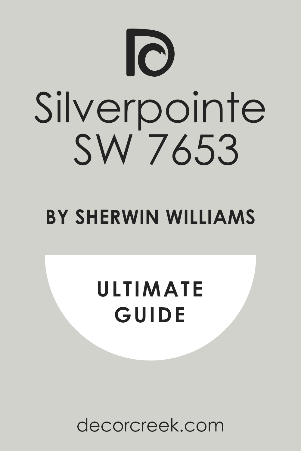
Silverpointe SW 7653
Silverpointe SW 7653 is a light, delicate gray that has noticeable cool, greenish-blue undertones. This shade is a wonderful choice for a bathroom or bedroom where you want a very fresh, airy look. It works beautifully in bright, sunny rooms where the light balances the cool undertone.
This pigment is a great background for light-colored furniture and simple, modern decor. It provides a cool, clean contrast against warm wood floors or beige upholstery.
This color is light enough to keep a small area feeling open and bright. This shade is a dependable cool gray that gives a feeling of polished sophistication. It is a beautiful option for adding a subtle hint of color that still reads as neutral.
🎨Learn everything about this color by clicking HERE👈
Modern Gray SW 7632
Modern Gray SW 7632 is a warm, light gray that has a pleasant brown-beige influence. This shade is a versatile pigment that works well in almost any room where you want a cozy gray feel. It is perfect for walls that you want to look soft and inviting, not cold or clinical.
This color looks beautiful with wood furniture that has warm tones like cherry or maple.
This shade is a great choice for providing a gentle contrast against bright white trim. It is a light enough color to make a room feel open but still has defined personality. This pigment is a dependable warm gray that is popular for creating a homey, updated look.
🎨Learn everything about this color by clicking HERE👈

Oyster White SW 7637
Oyster White SW 7637 is an off-white that sits very close to the greige family with soft, earthy undertones. This shade is an excellent choice if you want a white that never looks stark and always feels rich. It works beautifully with natural elements like linen, stone, and woven furniture.
This color is perfect for walls where you want a lot of light reflection but still need some depth. This shade is a great background for a relaxed, comfortable design style.
It provides a soft contrast against bright white ceilings and woodwork. This pigment is a dependable off-white that makes a room feel instantly settled and expensive.
🎨Learn everything about this color by clicking HERE👈

Crushed Ice SW 7647
Crushed Ice SW 7647 is a very light, cool gray that has a crisp, refreshing look. This shade is perfect for rooms where you want a clean, simple, and modern backdrop. It works best in well-lit areas where the light keeps the color bright and airy. This pigment provides a fantastic contrast against warm wood furniture or deep accent colors.
It is a great option for homeowners who prefer a cool color palette over warm tones. This shade is light enough to keep any room feeling completely open and bright.
It is a dependable, cool gray that gives a feeling of neatness and order.
🎨Learn everything about this color by clicking HERE👈

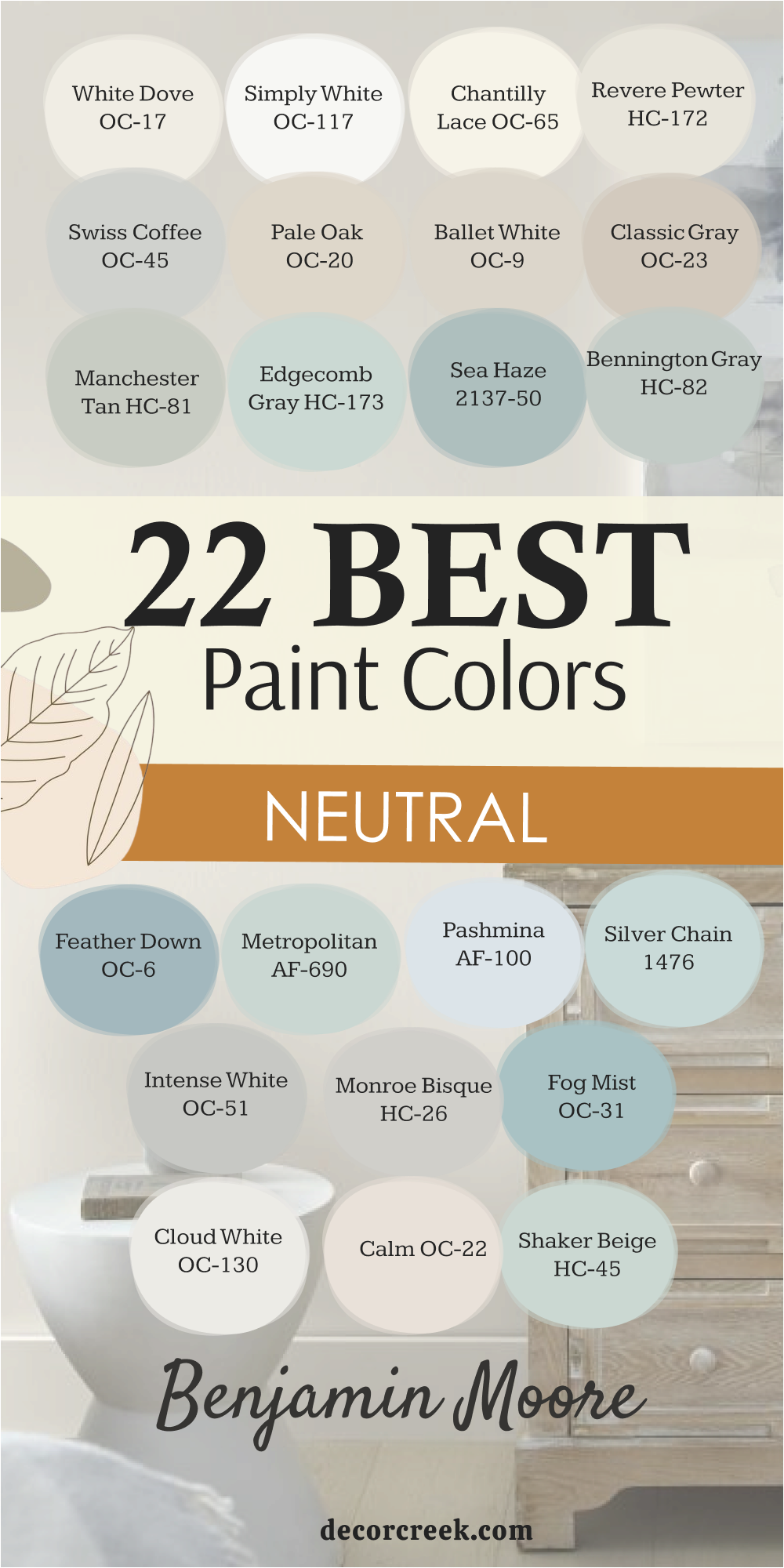
22 Best Neutral Paint Colors by Benjamin Moore
These 22 dependable neutrals from Benjamin Moore are some of the finest pigments available for creating a refined, beautiful home:
White Dove OC-17
White Dove OC-17 is a beloved soft white that carries just a hint of creamy warmth. This is a perfect choice if you want a white that feels cozy rather than cold and sterile. It is incredibly versatile and works well on both the walls and the cabinet in different sheens. This color has a very slight gray undertone that keeps it from ever looking yellow in bright light.
It is the top-selling white for a reason: it simply makes every room look clean and refined. This hue is great for large living rooms where you want the light to bounce everywhere.
It contrasts nicely with dark furniture while still feeling gentle and welcoming. This is a wonderful color to pair with marble that has warmer veining patterns. It provides a beautiful, airy feel that is essential for a relaxing bedroom. This is a high-quality white that is a classic for both modern and traditional styles.
🎨Learn everything about this color by clicking HERE👈

Simply White OC-117
Simply White OC-117 is a clean, crisp white that has a sunny, bright feel. This is the best white for making a small room feel bigger and full of light. It has a slight yellow undertone, which makes it feel incredibly lively and cheerful. This color won the Color of the Year award because it is so dependable and attractive.
It is great for highlighting colorful accessories or artwork on the wall. This shade feels very clean and pure, making it perfect for a modern, uncluttered look.
It is ideal for rooms that don’t get much natural light, as it helps brighten them up. This pigment looks wonderful when used alongside shiny metal fixtures like chrome or polished nickel. It provides a bright background that makes any room look instantly refreshed. This is a truly crisp white that brings pure, beautiful light.
🎨Learn everything about this color by clicking HERE👈

Chantilly Lace OC-65
Chantilly Lace OC-65 is the closest you can get to a true, pure white without any strong undertones. This is an excellent choice for a cool, airy, and very contemporary design. It is often used by designers for trim because of its crisp, clean brightness. This is the brightest white on this list and reflects the most light in a room.
It is great for showcasing pure white or gray marble for a high-end look. This shade is best used in bright, naturally lit rooms to avoid looking too stark.
It makes a beautiful contrast with very dark cabinet colors like navy or black. This color provides a very graphic, defined line when painted next to a wall pigment. It is a fantastic choice for a simple, minimalist design that needs pure color. This brilliant white gives a feeling of pure perfection.
🎨Learn everything about this color by clicking HERE👈

Revere Pewter HC-172
Revere Pewter HC-172 is a classic, light gray-beige that works almost everywhere. This is the original “greige” that designers have relied on for decades due to its perfect balance. It is a perfect choice if you want a neutral that shows off its pigmentation without being too dark.
This color has a wonderful ability to shift its appearance based on the light in the room. It is light enough to keep a small room airy but still rich enough to feel intentional.
This hue is a very popular choice for walls when the cabinet is painted bright white. It is a cozy, warm shade that is never boring or plain. This pigment is a great selection for creating a gentle, flowing feel from room to room. It provides a beautiful, soft look that appeals to almost everyone. This is a famously balanced and dependable neutral color.
🎨Learn everything about this color by clicking HERE👈

Swiss Coffee OC-45
Swiss Coffee OC-45 is a famous creamy white that brings a warm, comforting feel. This is a great choice if you find most bright whites too cold or too glaring for your taste. It has a gentle yellow-beige undertone that makes the room feel soft and inviting.
This shade is excellent for rooms that have dark or rustic wood elements you want to highlight. It is often used on trim and walls to create a soft, layered look with different paint sheens.
This color gives the illusion of candlelight, making the room feel soft and flattering in the evening. It is a top choice for creating a gentle, vintage or traditional look in the home. This white works well with natural textures like linen, wicker, and natural stone. It is a fantastic choice for giving your living area a soft, creamy background. This warm white gives a feeling of rich quality.
🎨Learn everything about this color by clicking HERE👈

Pale Oak OC-20
Pale Oak OC-20 is a very light, airy gray-beige that is incredibly gentle. This is a perfect neutral for walls when you want a pigment that is barely there but still has depth. It has a slight hint of pink-violet undertone that makes it feel warm and welcoming.
This is an excellent choice for a master bedroom or living room where you want a very soft, soothing atmosphere.
This is a truly beautiful and restful color that makes the room feel soft and open. It works beautifully with white trim and fixtures without creating a harsh contrast. This shade is light enough to keep the room airy even if you have no natural light at all. This is a soft background pigment that makes every decorative item look better. It is a favorite among designers for creating a refined, light-filled environment. This perfect gentle color gives a feeling of total relaxation.
🎨Learn everything about this color by clicking HERE👈

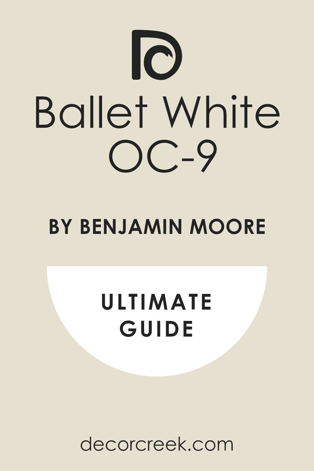
Ballet White OC-9
Ballet White OC-9 is a creamy off-white that has a slightly more saturated beige undertone than White Dove. This shade is a wonderful choice for walls where you want a gentle color that is distinctly not white. It carries a beautiful warmth that prevents a room from ever feeling cold or empty.
This color is often paired with marble or tile that has warm, earthy veining. It is a fantastic color for creating a soft, traditional feel in a home.
This pigment is a great option for darker rooms, as its warmth helps to brighten and lift the atmosphere. It provides a nice contrast against a crisp white trim for a defined, clean look. This shade is a dependable neutral that gives a feeling of sophisticated comfort.
🎨Learn everything about this color by clicking HERE👈
Classic Gray OC-23
Classic Gray OC-23 is an extremely light, elegant gray that is closer to an off-white. This shade is perfect if you want a wash of gray color that is barely visible but still defined. It has subtle warm undertones that keep it from ever reading as blue or icy on the walls.
This pigment is a beautiful choice for walls and ceilings to create a seamless, airy feeling. It is a great background for showcasing bold, dark furniture or very colorful artwork.
This color works beautifully in natural light, where it truly shows its soft sophistication. This shade is a dependable cool neutral that makes a room feel fresh and neat.
🎨Learn everything about this color by clicking HERE👈

Manchester Tan HC-81
Manchester Tan HC-81 is a classic, medium tan that is grounded and warm. This shade is a fantastic choice for a living room or den where you want a feeling of traditional comfort. It has a rich, earthy quality that pairs wonderfully with dark wood and heavy furniture.
This color works well with both warm metal accents like brass and cool ones like chrome.
This pigment provides a dependable backdrop that is very easy to decorate around. It is a great option for creating a settled, professional look in a home office. This shade is a beautiful, classic tan that feels rich and inviting.
🎨Learn everything about this color by clicking HERE👈

Edgecomb Gray HC-173
Edgecomb Gray HC-173 is a very popular greige that is one of Benjamin Moore’s best-selling neutrals. This shade sits perfectly between gray and beige, ensuring it works well with almost any existing decor. It is a wonderful color for walls where you want a balanced, restful background.
This pigment is light enough to keep a room feeling open but has enough color to avoid looking white.
It is a dependable choice for running through an entire open-plan living area for harmony. This shade provides a gentle contrast against bright white trim and woodwork. It is a beautiful, easy-to-use neutral that is always a great choice.
🎨Learn everything about this color by clicking HERE👈

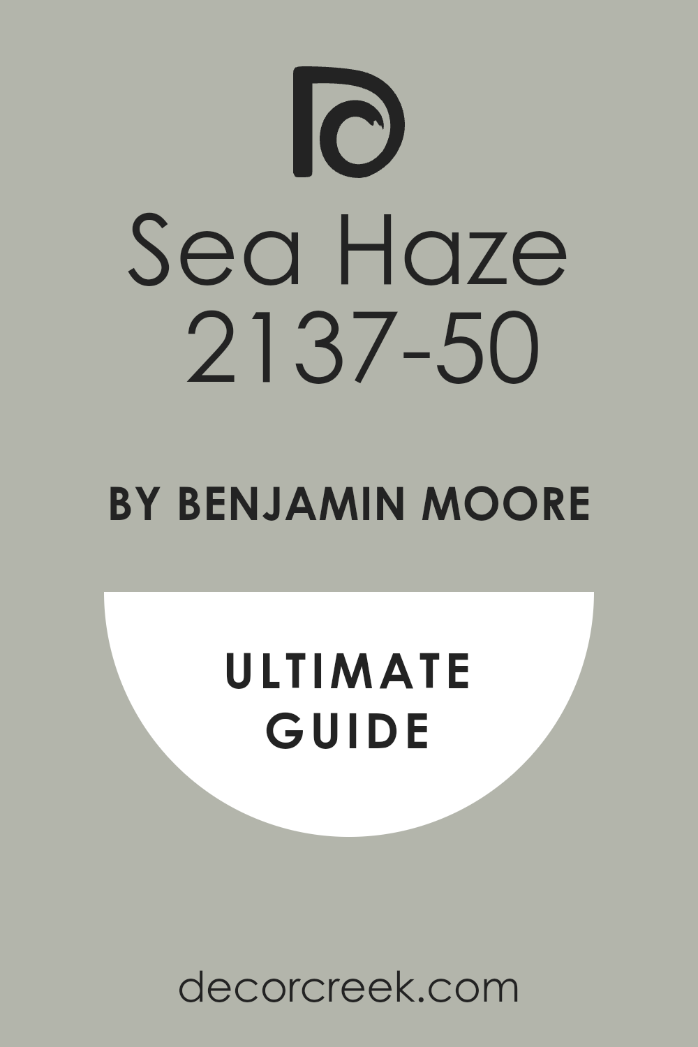
Sea Haze 2137-50
Sea Haze 2137-50 is a muted, complex color that is a mix of gray and a dusty green. This shade is a wonderful option for adding personality while still remaining very restful and nature-inspired. It works beautifully with warm wood tones and creamy white upholstery for an organic feel.
This color has a beautiful depth that prevents it from looking flat, even in dim light. This pigment is great for a bedroom or a cozy reading nook where you want a defined mood.
It is a beautiful background for light wood furniture and linen fabrics. This shade is a dependable color that feels sophisticated and uniquely rich.
🎨Learn everything about this color by clicking HERE👈
Metropolitan AF-690
Metropolitan AF-690 is a popular medium-tone gray that is very balanced and soft. This shade was a former Color of the Year because it is so polished and easy to live with. It is a wonderful choice for walls in a modern living area where you want a defined but soft gray.
This color has a pleasing depth that works well with both light and dark furniture.
This pigment is a great option for an accent wall or cabinets in a sunny kitchen.
It provides a sophisticated background that complements clean lines and modern art. This shade is a dependable, easy gray that works well in most lighting conditions.
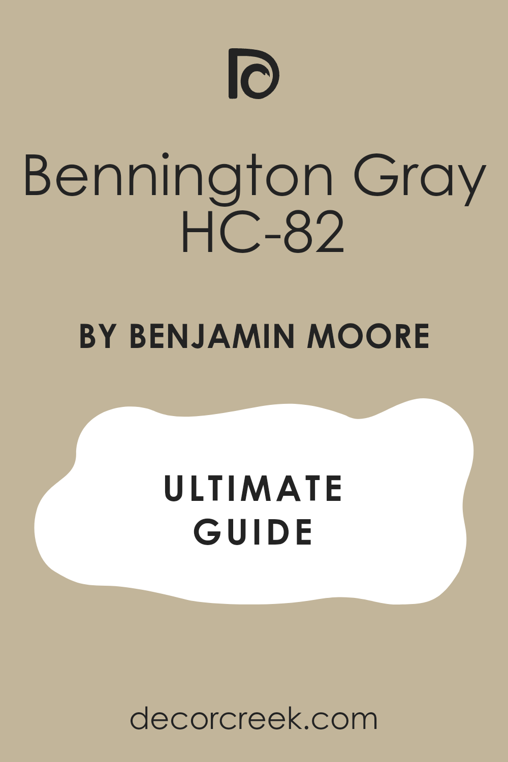
Bennington Gray HC-82
Bennington Gray HC-82 is an earthy, deep neutral that has strong brown and green undertones. This shade is a fantastic choice for a dramatic dining room or a handsome home office. It is a rich, powerful pigment that gives a room a feeling of history and strength.
This color works wonderfully with deep leather furniture and dark wood pieces.
This shade is best used in a room that receives plenty of light to keep the color from feeling too heavy. This pigment provides a defined, sophisticated contrast against white ceiling and trim. It is a dependable warm neutral that feels grounded and full of character.
🎨Learn everything about this color by clicking HERE👈
Feather Down OC-6
Feather Down OC-6 is a soft, pale cream that has a distinct yellow-beige warmth. This shade is perfect if you want a light color that feels incredibly cozy and gentle. It is a wonderful choice for walls in a living room where you want a subtle, quiet background.
This color looks beautiful when paired with gold hardware and warm wood finishes.
This pigment is a great option for rooms that lack natural light, as its warmth helps to brighten them. It provides a soft, minimal contrast against pure white trim.
This shade is a dependable, warm white that feels refined and inviting.
Pashmina AF-100
Pashmina AF-100 is a beautiful warm greige that has noticeable tan and brown influences. This shade feels rich and inviting, like a luxurious, soft blanket for your walls. It is a wonderful choice for a formal living room or a den where you want a cozy feel.
This color works perfectly with dark wood and warm, earthy accent colors. This pigment is a great option for making a large room feel more intimate and comfortable.
It provides a dependable, rich backdrop that is highly sophisticated. This shade is a beautiful warm neutral that always looks expensive.
🎨Learn everything about this color by clicking HERE👈

Silver Chain 1476
Silver Chain 1476 is a medium-light gray that has a clean, cool, and contemporary look. This shade is perfect for rooms where you want a crisp, defined gray color that is not too dark. It works beautifully with white furniture and stainless steel or chrome finishes.
This color has a sharp, polished feeling that is ideal for modern designs. This pigment is a great option for a home office or a kitchen where you want a clean, neat appearance.
It provides a cool contrast against warm wood floors. This shade is a dependable cool gray that gives a feeling of order and neatness.
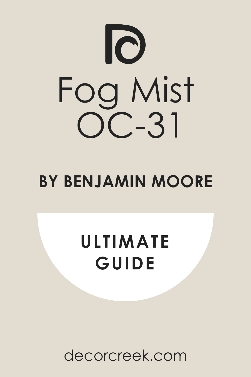
Fog Mist OC-31
Fog Mist OC-31 is a light, clean gray that has a delicate, almost ethereal quality. This shade is perfect for creating a very soft, quiet, and airy atmosphere in a bedroom. It works well in sunny rooms where the light can really make the color glow softly.
This color is a wonderful background for light-colored fabrics and simple, minimal decor.
This pigment is a great option for walls where you want a color that is barely there but feels intentional. It provides a soft, pleasing contrast against white trim. This shade is a dependable light gray that feels fresh and gentle.
🎨Learn everything about this color by clicking HERE👈
Intense White OC-51
Intense White OC-51 is a very light, pale gray that often reads as a white with a soft shadow. This shade is perfect if you want a color that is almost white but has just a little bit of defined depth. It has subtle warm undertones that keep it from ever looking harsh or cold.
This color is a wonderful choice for walls where you want a bright, airy, and open feeling.
This pigment is great for making small rooms look bigger by keeping the walls light. It provides a very minimal, soft contrast against pure white trim. This shade is a dependable light gray that is both gentle and refined.
Shaker Beige HC-45
Shaker Beige HC-45 is a dependable, medium beige that is very balanced and rich. This shade is a classic color that feels sturdy, traditional, and welcoming. It is a wonderful choice for a living room or den where you want a rich, defined neutral.
This color works beautifully with dark wood furniture and deep red or green accent colors.
This pigment provides a rich contrast against white trim that is very polished. It is a great option for creating a feeling of deep, established comfort in a home. This shade is a beautiful, dependable beige that holds its color well.
🎨Learn everything about this color by clicking HERE👈

Monroe Bisque HC-26
Monroe Bisque HC-26 is a rich, medium beige that carries a strong, buttery warmth. This shade is a classic color that feels inviting and strongly traditional in style. It is a wonderful choice for a formal dining room or a main living area where you want warmth.
This color works beautifully with traditional, heavy wood furniture and antique pieces.
This pigment provides a rich background that feels complete and well-designed. It is a great option for rooms that need warmth and definition. This shade is a dependable medium beige that always feels homey and comfortable.
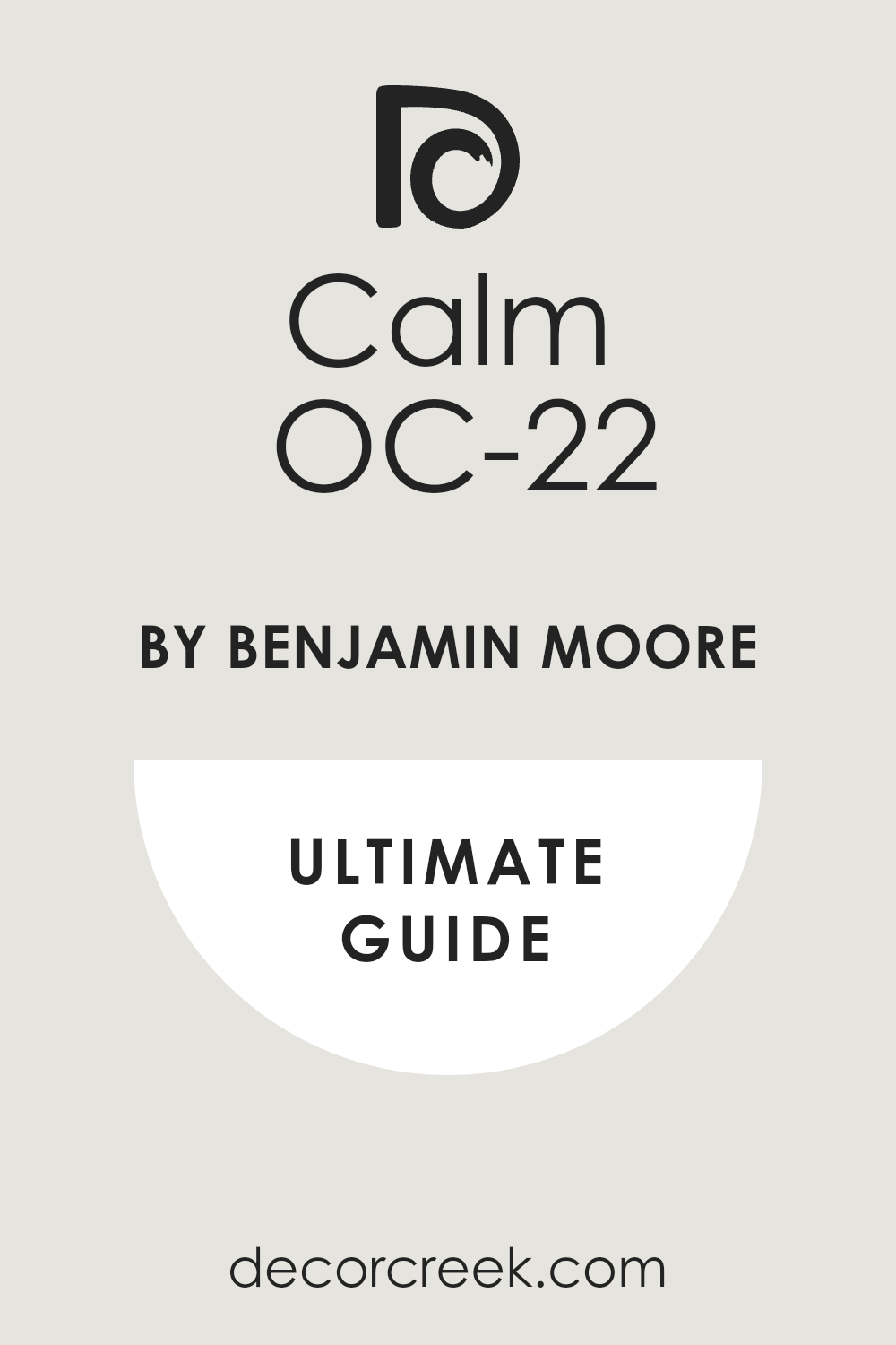
Calm OC-22
Calm OC-22 is a very light greige that is incredibly gentle and highly reflective. This shade is perfect if you want a color that is nearly white but has a beautiful, soft shadow. It has subtle warm undertones that make it feel cozy and not harsh.
This color is a wonderful choice for a large, sunny room where you want a soft, bright feeling.
This pigment is a great option for making a room feel completely open and airy. It provides a very gentle contrast against pure white ceilings. This shade is a dependable, soft neutral that always looks sophisticated.
🎨Learn everything about this color by clicking HERE👈
Cloud White OC-130
Cloud White OC-130 is a soft, gentle off-white that has a slightly creamy, pleasing undertone. This shade is a beautiful white that is often used on trim, ceilings, and walls for a unified look. It works well with almost every color because it is so beautifully balanced and soft.
This color is perfect if you want a white that feels soft and welcoming, not stark or cold.
This pigment is a great option for any room where you want a quiet, light background. It provides a gentle contrast against true white fixtures. This shade is a dependable, soft white that feels luxurious and polished.
🎨Learn everything about this color by clicking HERE👈

My Final Guide: The Ultimate Bathroom Paint Colors for 2026
Picking one of these 45 neutrals is the fastest way to make your home feel polished and expensive. While this list of colors works everywhere, they are particularly fantastic for areas like the bathroom, which needs durability and a gentle feel.
If you love bright and airy rooms, stick to Alabaster SW 7008 or White Dove OC-17. If you prefer a perfect greige that works every time, choose Agreeable Gray SW 7029 or Revere Pewter HC-172. And if you are ready for a rich, warm neutral, you cannot go wrong with Accessible Beige SW 7036 or Manchester Tan HC-81.
Any of these shades will give your bathroom and the rest of your home a sophisticated, fresh look that will last for many years. Which beautiful neutral color will you choose for your home?