Green has always been the shade I turn to when I want a home to feel alive yet steady. It connects naturally with wood, stone, and simple fabrics, so it never feels forced. A pale version can brighten mornings, while deeper tones bring focus and comfort at night. I watch how each shade shifts in different lights before choosing the right trim and finish to match.
My goal is simple: help every room feel welcoming and honest, not staged or stiff. With Benjamin Moore’s wide palette, I can always find the right green to carry that feeling.
I often think of green as a bridge between indoors and outdoors, carrying nature right into a room. Families respond to it with ease because it feels safe, fresh, and human. It works equally well in modern apartments and old country homes. It is one of the most forgiving paint families I know. When in doubt, I turn to green because it rarely lets a room down.
How Green Paint Sets the Mood in Real Rooms
Lighter greens open up small kitchens, baths, and hallways, giving them a sense of freshness. Dusty versions calm bedrooms, helping people rest more easily at the end of the day. Mid-tone shades create balance in living rooms and family spaces where life is busy.
Deeper colors make dining rooms and studies feel grounded, focused, and warm. Olive and moss tones tie homes to nature, blending beautifully with stone, wood, and fabric textures. Each variation changes the way a room is felt, not just how it looks.
In my work, I see how children are calmer with soft greens around them. Kitchens feel more social when the walls carry a gentle, lively tone. Home offices gain focus with darker greens that encourage concentration. Guests often comment on how welcoming green feels compared to cold neutrals. Every shade tells its own small story, guiding people’s moods every day.
How I Choose the Right Benjamin Moore Green for Each Room
I begin by reading the light—north-facing rooms need warmer greens, while south-facing ones can hold cooler tones. Undertones come next, because a touch of gray, blue, or yellow will shift the whole mood. Large boards let me see the true color beside cabinets, rugs, and counters, morning through night.
I always pick trim and ceiling whites that flatter the shade instead of fighting with it. The finish matters too: matte keeps walls soft, eggshell works for daily use, and satin gives cabinets strength. With these steps, the right shade becomes clear and the choice feels easy.
I also listen closely to how people want to feel in a room—rested, inspired, or energized. I think about the story of the house, whether it’s classic, rustic, or new and bright. I test two or three greens side by side so the difference is easy to see. I remind clients to live with samples for a full day before deciding. My method is slow but sure, because the right green becomes part of daily life, not just paint.
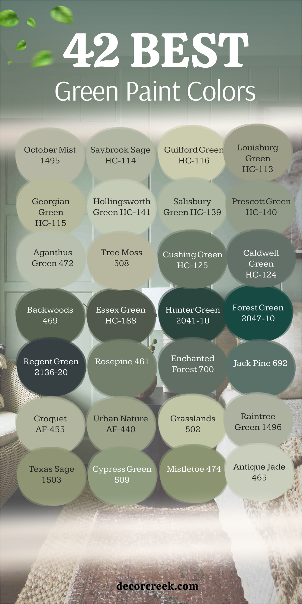
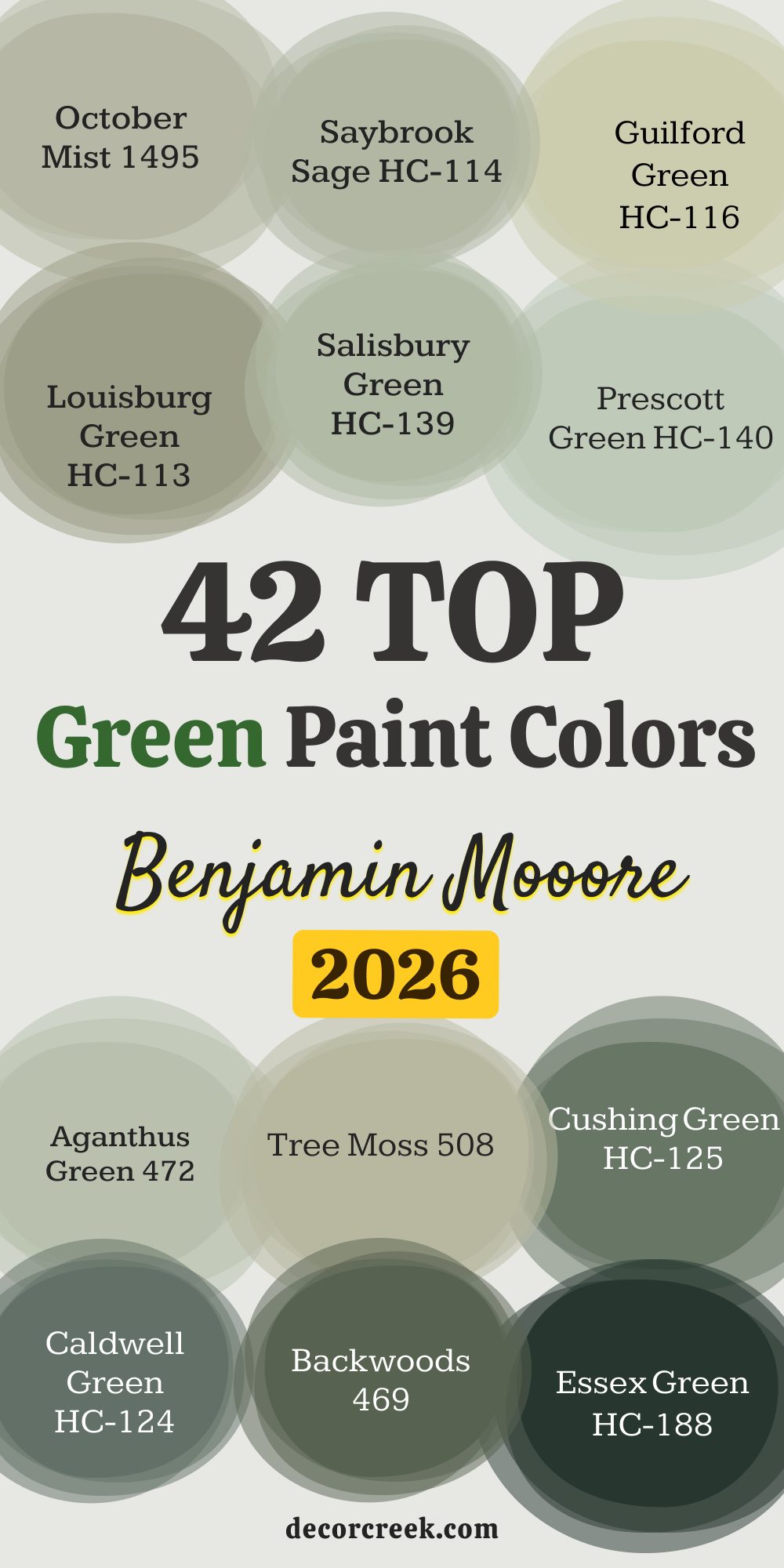
42 Top Benjamin Moore Green Paint Colors for 2026
October Mist 1495
October Mist 1495 feels soft and balanced, close to gray, which makes it easy to pair with wood and linen.
It brightens small corners without being harsh. In daylight it feels fresh, while in the evening it grows warmer. White trim keeps it crisp, while cream softens the edges.
Families love it for nurseries and studies where focus and comfort matter. It holds steady as a backdrop without stealing attention.

Saybrook Sage HC-114
Saybrook Sage HC-114 feels garden-like, steady, and welcoming. It suits entries, hallways, and living rooms where families gather.
Paired with stone or brick, it feels natural and classic. Crisp white trim sharpens it, while off-white makes it cozy.
Even in low light it keeps its fullness. I use it often because it always feels reliable and true.

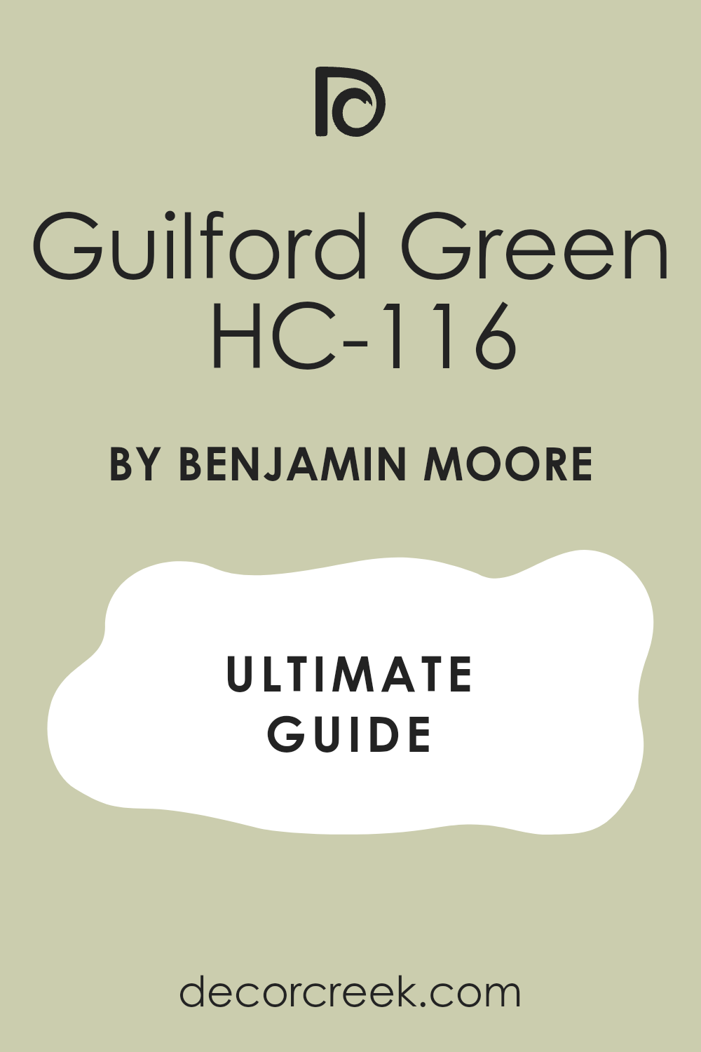
Guilford Green HC-116
Guilford Green HC-116 feels bright and cheerful, adding energy to kitchens and breakfast areas. It carries a golden undertone that keeps it friendly and warm. Against cream cabinets it looks soft, while sharp white adds brightness.
Even on cloudy days, it glows with life. I like it in sunrooms with wicker furniture where light dances across the walls. It makes homes feel instantly more open and welcoming.I often see this shade chosen for children’s playrooms or family corners, where joy and light matter most.
It has a way of making even the smallest kitchen feel alive. Paired with natural stone, it looks stylish but never too formal. On exterior doors, it gives a cheerful greeting without being loud. It’s the kind of green that stays uplifting through every season.
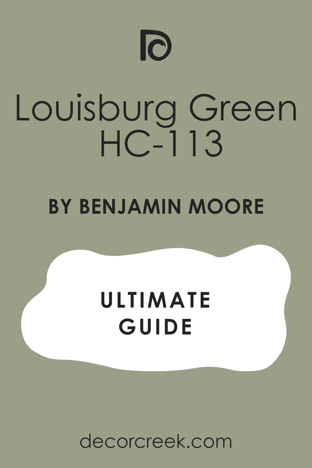
Louisburg Green HC-113
Louisburg Green HC-113 feels vintage and grounded with a soft touch of gray. It shines in dining rooms filled with traditional furniture. Brass accents and dark woods deepen its character. White trim gives a neat look, while cream adds warmth.
It carries history without looking dated. It’s a steady choice for anyone who loves character and depth.I like using it in living rooms with patterned rugs or heirloom pieces. During the day it gives off a gentle glow, and at night it feels more intimate.
It blends beautifully with fabrics like velvet or heavy linen, adding richness. Homes with crown molding or paneled walls look especially strong in this shade. It offers the feeling of heritage without weighing down the room.
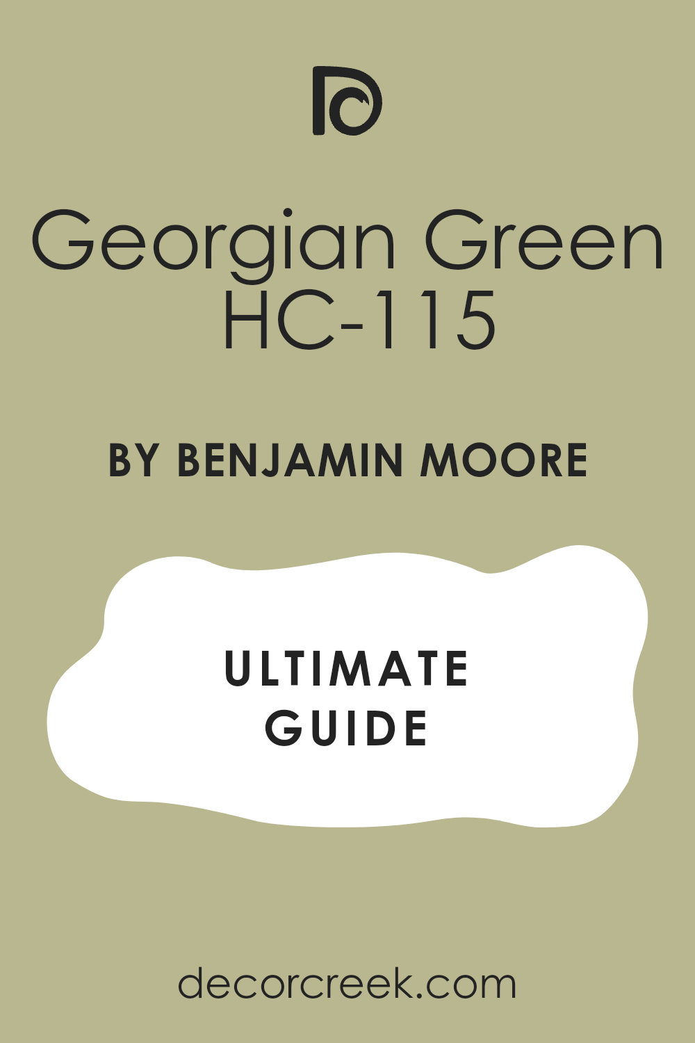
Georgian Green HC-115
Georgian Green HC-115 feels bright yet gentle, perfect for hallways, staircases, and kitchens. Its warm undertone keeps it from looking cold. Creamy whites highlight it beautifully, while black hardware makes it sharp.
Sunlight makes it glow, and in evening light it feels soft. It blends easily with both modern and classic homes. It’s a safe pick for freshness without risk.I’ve often used it for open-plan spaces where continuity is important.
It matches equally well with warm wood floors and cool tile. Even busy family homes feel balanced with it on the walls. In children’s bedrooms, it adds a soft cheer that doesn’t overwhelm. This green creates a gentle lift that supports both daily living and special moments.
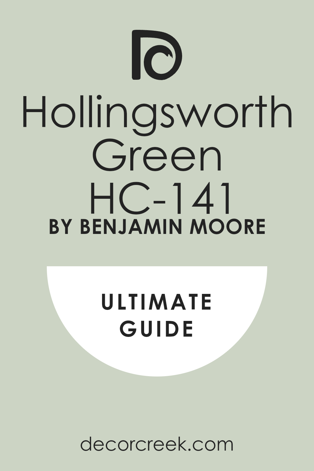
Hollingsworth Green HC-141
Hollingsworth Green HC-141 feels light and airy, with a soft minty tone balanced by gray.
It works beautifully in baths where brightness is needed. In bedrooms it creates a gentle morning mood.
White trim sharpens it, while cream makes it cozy. It stays kind on the eyes and never feels harsh. I like it for homes that want freshness that lasts.
Salisbury Green HC-139
Salisbury Green HC-139 feels earthy and rich, giving kitchens and dining rooms a sense of strength.
With cream trim it feels soft and welcoming, while bright white makes it more structured. Stone and brick look natural beside it.
In evening light it glows warmly, making family dinners feel inviting. Heavy wood furniture feels balanced with it. It adds solid character without being pushy.
Prescott Green HC-140
Prescott Green HC-140 feels cool and clean with a touch of coastal charm. Its blue undertone makes it fresh in sunrooms and kitchens. Paired with rattan, oak, and woven textures, it feels breezy. In daylight it brightens the room, while at night it stays balanced.
White or gray trim works best. It adds a gentle openness even far from the coast.I’ve seen it work beautifully in beach cottages and also in city apartments that want a light, airy touch. It looks lovely beside glass tables and natural woven shades.
Even in small spaces, it creates a sense of lift and freshness. Families who want a neat, polished home often choose this green. It feels graceful but also easy to live with every day.
Aganthus Green 472
Aganthus Green 472 feels soft and powdery with a hint of gray for balance. It works beautifully in nurseries and guest rooms where comfort matters.
Daylight makes it airy, while evening light warms it gently. Warm wood furniture and linen fabrics pair naturally. It blends well with cream curtains and white trim. It’s a lasting choice for tender spaces.
This color has a quiet charm that grows on you with time. It’s flexible enough to work in both modern homes and classic cottages. With woven rugs or light quilts, it feels extra cozy. It creates a safe and comforting backdrop for daily life. Guests always remark how calm and cared-for the room feels when painted in this shade.
Tree Moss 508
Tree Moss 508 feels grounded and natural, adding warmth to dining rooms and gathering spaces. Leather, stone, and heavy wood furniture pair well with it.
With cream trim it feels soft; with white trim it gains sharpness. In low light it grows richer, perfect for evenings. It brings a rustic mood that feels connected to nature. Families love it for its steady comfort.
It looks especially strong in homes with farmhouse or craftsman details. During the day it picks up a warm, earthy glow that never feels flat. At night, under soft lamps, it becomes even more inviting. Wool throws, pottery, and natural textures only add to its charm. It’s the kind of shade that makes a home feel lived-in and welcoming year after year.
Cushing Green HC-125
Cushing Green HC-125 feels rich and bold, perfect for studies and libraries. Walnut wood and brass fixtures look right against it.
In daylight it shows a cool undertone, while at night it warms and feels secure. White trim frames it neatly, while cream softens it.
It supports books, art, and fabrics without overwhelming them. This color adds confidence and lasting style to any room.
Essex Green HC-188
Essex Green HC-188 feels almost black, but with a deep green glow that shows in the right light. On exteriors it looks bold and refined.
Indoors, it feels rich on cabinets or paneling. Brass or gold details make it shine.
In daylight it glows gently; in evening light it feels dramatic. It adds power and confidence without effort.

Hunter Green 2041-10
Hunter Green 2041-10 feels classic and bold, like old libraries or club rooms. It pairs with leather chairs and dark wood furniture. On doors or trim it makes a strong statement. With brass hardware it feels rich, with black accents it feels modern.
It brings weight and tradition wherever it goes. Families choose it for rooms where stability matters most.I often suggest it for kitchens where cabinetry needs presence and strength. It anchors large rooms, giving them a sense of confidence.
Under warm lamps it softens just enough to feel inviting, while daylight keeps it crisp and powerful. This shade works beautifully with plaid fabrics, wool rugs, and vintage artwork. It’s a green that reminds people of history but still feels fresh in today’s homes.

Forest Green 2047-10
Forest Green 2047-10 feels full and lush, perfect for doors, kitchens, and studies. Paired with soft whites it stays balanced and bright. Wood beams and stone look rich beside it. In sunlight it shows depth, while at night it feels steady.
Brass hardware adds polish without fuss. It’s a color that feels welcoming while still holding strength.I’ve seen it transform entryways into bold, inviting welcomes. It creates kitchens that feel rooted yet stylish, especially with marble or butcher block counters.
Even in smaller rooms it doesn’t feel heavy, just grounded. In family studies, it inspires focus while keeping the room warm. It’s a dependable shade for anyone who wants color that carries both energy and tradition.

Regent Green 2136-20
Regent Green 2136-20 feels deep with a quiet blue undertone. It gives dining rooms and formal living spaces a refined presence.
White trim outlines it cleanly, creating a tailored look. Soft lighting makes it cozy and warm. Velvet pillows and framed art sit beautifully against it.
I use it when a room needs elegance that doesn’t feel heavy.
Rosepine 461
Rosepine 461 feels muted and thoughtful, sitting between green and gray. It supports books, furniture, and fabrics without taking the spotlight. Sunlight keeps it open, and lamplight gives it softness. Black accents add a modern edge if needed.
Cream trim blends gently, while white trim sharpens the look. It’s a balanced choice for multipurpose rooms.I find it works beautifully in family rooms that need both comfort and order.
It pairs well with natural fabrics like wool and cotton, making the room feel warm but neat. On built-ins or shelves, it helps collections of books and photos look tidy. Evening lighting softens it, giving a cozy atmosphere for winding down. It’s a dependable green-gray that adapts gracefully to daily life.
Enchanted Forest 700
Enchanted Forest 700 feels bold and dramatic, turning small baths into striking spaces. In dining rooms it creates a special mood with depth and glow.
Gold fixtures and dark stone look striking against it. Daylight shows its layers, while night light gathers it into warmth. A pale ceiling keeps it from feeling too low. It’s perfect when a home needs one strong, confident moment.
This shade works well for accent walls that demand attention. It gives richness to spaces where people gather, creating a sense of occasion. Velvet chairs, patterned rugs, and framed art stand out boldly on its surface. I often suggest it for homes that want one unforgettable room. Even in small doses, it carries elegance and weight.

Jack Pine 692
Jack Pine 692 feels earthy and dark, making bedrooms or media rooms feel restful and secure. Cream trim softens it, while dark trim sharpens it.
It pairs with stone fireplaces, wool throws, and aged wood. Warm bulbs make it cozy; cool bulbs keep it firm. Art and photos stand out clearly against it. It anchors a room with quiet strength.I recommend it for spaces where people want comfort and retreat.
On accent walls it creates intimacy, while full rooms painted in it feel strong and private. With leather chairs or plaid textiles, it carries a rustic charm. Even modern décor looks grounded against it. This is a shade that helps people feel safe in their surroundings.

Croquet AF-455
Croquet AF-455 feels fresh and lively, bringing cheerful energy into kitchens and playrooms. White cabinets keep it neat and crisp, while natural wood adds warmth.
Stone counters and open shelves look balanced beside it. It holds steady through both bright light and shade. Simple lighting helps it stay clean and modern. Families love it because it adds joy that lasts.
It’s especially fun in breakfast areas where mornings need energy. Paired with patterned cushions, it feels playful but never messy. It looks natural in homes with light wood floors and woven blinds. Even rainy days feel brighter with this green on the walls. I often use it when clients want a dose of happiness that feels easy to live with.
Urban Nature AF-440
Urban Nature AF-440 feels soft and modern, a muted tone that supports living rooms with ease. Pale oak, cane chairs, and linen curtains match it naturally.
Warm light gives it glow, while cool bulbs keep it tidy. Black accents add a quiet edge without fuss. It never shouts yet keeps rooms cared for. I use it in open plans where flow matters.This green sits comfortably across different design styles, from minimal to cozy.
It helps connect large rooms without looking heavy. Textured fabrics like linen and cotton highlight its softness. It’s also forgiving of clutter, keeping homes feeling composed. For families who want one shade to carry through the heart of the house, this one works beautifully.

Caldwell Green HC-124
Caldwell Green HC-124 feels deep and earthy, reminding me of pine needles after rain. It looks strong on exteriors, bold accent walls, or kitchen cabinets.
White trim makes it sharp, while dark trim gives drama. Stone and wood blend easily with its grounded tone.
Sunlight reveals depth, and lamplight adds warmth. It’s a shade that brings real character and focus.
Grasslands 502
Grasslands 502 feels natural and friendly, fitting into hallways, family rooms, and kitchens. White trim keeps it light, while wood trim adds warmth.
Through the day it shifts gently but always feels balanced. Stone and rattan add texture beside it. It plays well with both classic and modern styles. I call it a hardworking shade for busy homes.This color makes connecting spaces feel intentional and cared for.
In dining areas, it helps meals feel cheerful and relaxed. With wicker baskets or handmade pottery, it feels rustic yet current. It stays comfortable under both daylight and lamps. Families often choose it because it adapts to so many uses without losing charm.

Raintree Green 1496
Raintree Green 1496 feels balanced with gray, keeping bedrooms and studies steady. Linen bedding and soft throws look natural against it. Daylight makes it fresh; evening light softens it. Soft whites frame it neatly, keeping the look current.
Large walls wear it well without tiring the eye. It helps rooms feel clear and focused.This shade is excellent for home offices where people need calm energy to concentrate.
It pairs well with natural oak desks and simple lighting. In bedrooms, it encourages rest without dullness. Layered with textiles, it builds comfort and depth. It’s a versatile green-gray that feels thoughtful and reliable.
Texas Sage 1503
Texas Sage 1503 feels warm and earthy, with a natural honesty that suits kitchens and dens. Stone counters and bronze hardware bring out its richness.
Dark wood gives it weight, while light trim lifts it. It stays grounded through every season. Patterned rugs look right at home on it. It’s a comforting shade with a touch of grit.I’ve seen it bring balance to busy family rooms where people gather every day.
It works beautifully with terracotta floors and iron fixtures, giving a rustic edge. In lamplight it feels cozy, while in daylight it shows its true warmth. This green thrives in homes that want character but not fuss. It’s steady, simple, and full of life.
Cypress Green 509
Cypress Green 509 feels soft and steady, like late-summer garden leaves. It suits bedrooms and kitchens with equal grace. Cream trim warms it, while white trim keeps it sharp.
Woven fabrics and natural wood pair easily with it. It stays balanced under both warm and cool bulbs. It’s a dependable shade for daily life.I like it in homes that want one green to flow from room to room.
It feels gentle enough for quiet bedrooms but strong enough for active kitchens. It matches with rattan, light oak, and natural linens effortlessly. Even when the house is busy, this shade helps it feel composed. Families often keep it for years because it never grows tiring.
Mistletoe 474
Mistletoe 474 feels cheerful and friendly, adding brightness to dining rooms and family spaces. White trim gives it sparkle, while wood furniture grounds it.
Sun keeps it lively, and shade doesn’t dull it. It offers joy without turning loud. Soft textiles keep it cozy. Families love how it makes rooms feel welcoming.I often suggest it for holiday-ready spaces or lively corners of the home.
With patterned curtains or checkered rugs, it feels playful but balanced. In daylight it looks crisp and energetic, while at night it warms up beautifully. It can turn even small nooks into happy, useful spots. It’s a shade that never loses its charm.
Antique Jade 465
Antique Jade 465 feels light and fresh, softening baths, nurseries, and small bedrooms. White tile and pale wood make a clean pairing. Daylight keeps it airy, and evening light warms it gently. Cream fabrics add softness without dullness.
It never feels harsh or thin. It creates tender, restful rooms with ease.This green has a sweetness that works especially well in children’s rooms. It looks polished with simple cotton bedding or wicker baskets.
In bathrooms, it feels like a gentle lift without being too bold. I’ve noticed it pairs easily with both silver and brass fixtures. It’s a quiet color that quietly supports everyday life.

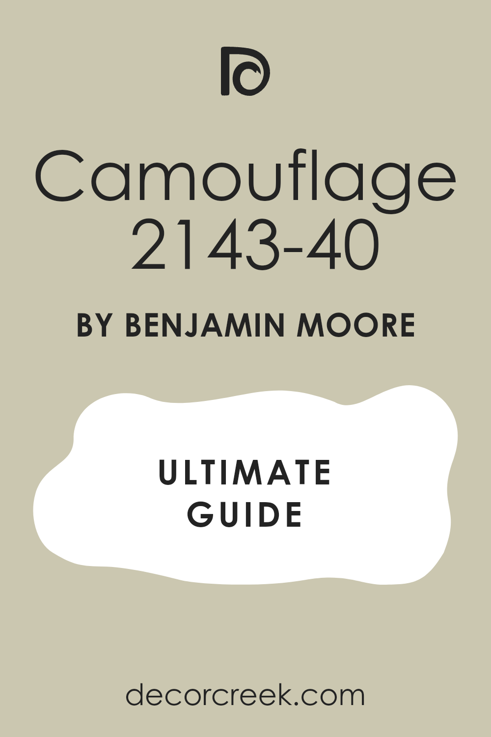
Camouflage 2143-40
Camouflage 2143-40 feels quiet and natural, perfect for open layouts and long views. Beige or cream trim works perfectly. Wood shelves and baskets add warmth, stone balances it.
It holds steady through all times of day. Art and photos sit calmly against it. It ties rooms together without effort.I like it for homes where people want flow without too much contrast. It’s a practical shade that handles clutter and activity with ease.
In kitchens and living rooms, it acts like a soft backdrop that lets furniture shine. It also looks right in hallways that connect one space to another. It’s steady and trustworthy, the kind of green that blends rather than demands.
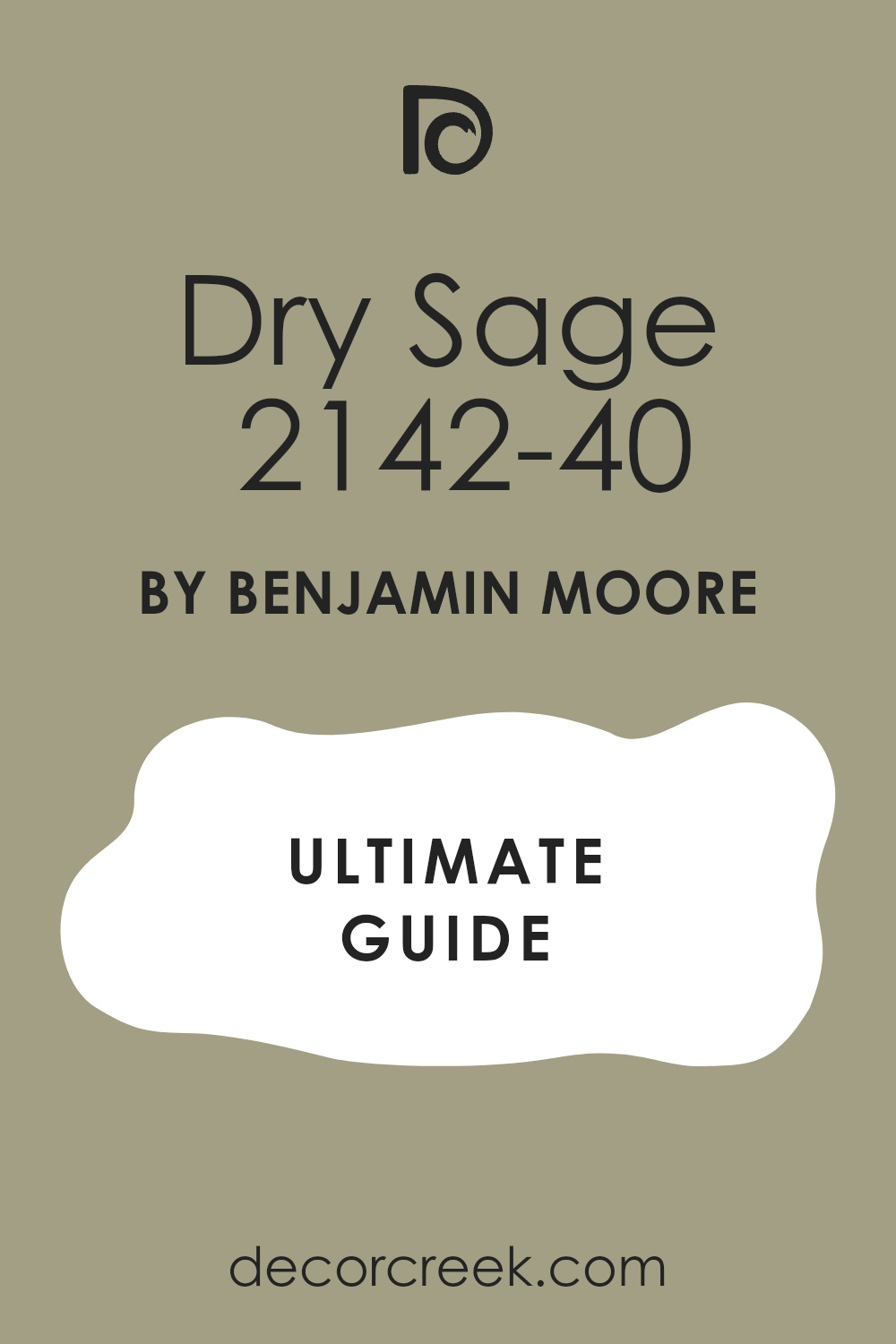
Dry Sage 2142-40
Dry Sage 2142-40 feels grounded and strong, giving kitchens, pantries, and studies presence. Stone counters and brass pulls look handsome beside it. White trim adds classic balance, while cream adds warmth. It stays steady in both warm and cool light.
It never shouts, but it never fades. I rely on it when homes need lasting strength.This shade shines on cabinetry, where it looks both practical and stylish. It works with rustic farmhouse details as well as sleek, modern touches.
Under natural light it shows its depth, while under lamps it feels warm and secure. With woven rugs and pottery, it creates a homey, collected feel. It’s one of those colors that always stands tall.
Backwoods 469
Backwoods 469 feels dark and forest-like, giving bedrooms a sense of rest and safety. It pairs beautifully with soft bedding and woven textures.
In living rooms it creates intimacy and focus. White trim brightens it, while dark trim makes it dramatic.
It holds depth in both warm and cool light. It is strong, steady, and never harsh.

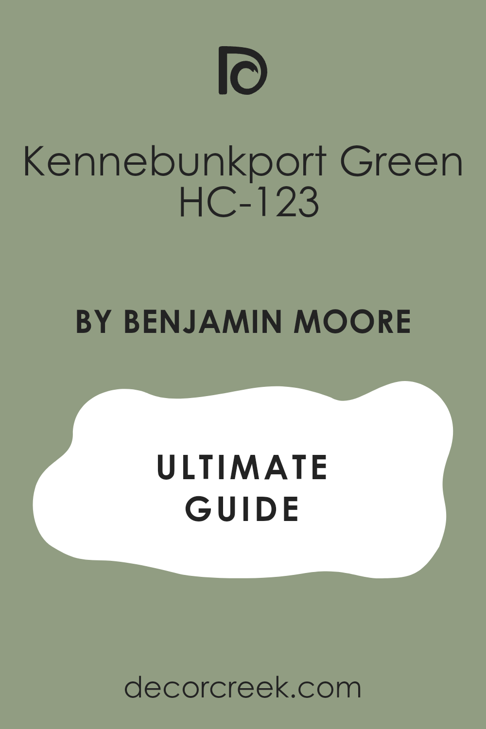
Kennebunkport Green HC-123
Kennebunkport Green HC-123 feels classic and welcoming, with a gentle warmth inside. It works beautifully on exteriors with white trim and interiors with rustic details.
In living rooms it adds weight without heaviness. Stone fireplaces and paneled doors feel at home here. It shifts nicely from sunny afternoons to cozy evenings. It’s a shade that gives houses a steady backbone.
I find it especially charming in historic homes where tradition matters. It pairs well with patterned rugs, heavy drapes, and antique wood furniture. In kitchens, it creates a sense of stability and comfort. On exteriors, it looks timeless against brick or cedar siding. This is a green that families grow with, year after year, because it never feels out of place.
Webster Green HC-130
Webster Green HC-130 feels bold and deep, with a slight blue thread. It adds strength to dining rooms and libraries. White trim frames it neatly, while dark trim makes it dramatic.
On a front door it gives a confident welcome. Velvet, leather, and brass sit beautifully against it. Even a small touch makes a strong mark.I love how it brings a polished feel to formal spaces.
In studies, it inspires focus and creates a grounded atmosphere. Under warm lighting it feels inviting, while daylight keeps it sharp. It works beautifully with vintage artwork and rich fabrics. This is a shade that turns any room into a statement without overpowering.

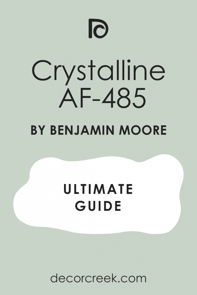
Crystalline AF-485
Crystalline AF-485 feels soft and misty, a light green that refreshes bedrooms and baths. Pale fabrics and wicker complete its easy mood. Daylight makes it glow gently, while night light keeps it relaxed. White trim keeps the edges clean.
It’s soothing in morning routines and calm at night. It’s perfect when a room needs gentle lift.This color is wonderful for homes that need a touch of freshness without heaviness. It pairs with cotton bedding, pale wood floors, and simple curtains.
In bathrooms, it feels like a breath of clean air. It adapts easily to both modern and cottage-style décor. Families love it because it stays light, cheerful, and graceful through all seasons.
Grasshopper AF-415
Grasshopper AF-415 feels playful and bright, great for kitchens, craft rooms, and homework corners. White trim keeps it tidy, while natural wood warms it.
Open shelves and simple tile look lively against it. It holds its color under sun and shade. Families like its cheerful mood for active spaces. It adds pep without becoming too much.I often suggest it for children’s play areas where energy is welcome.
It makes casual kitchens feel lively and social. With checkered rugs or colorful artwork, it becomes even more fun. At night it softens under warm lighting, never losing its charm. This is a green that sparks joy in every corner of the home.

Agave AF-420
Agave AF-420 feels clean and slightly cool, perfect for bathrooms and modern kitchens. Marble, chrome, and glass fit easily beside it. Soft fabrics bring warmth without clutter.
It holds steady under bright bulbs and daylight. Clear edges keep rooms tidy. It works beautifully for homes that want freshness and order.It’s especially striking on cabinetry where sleek lines matter.
In dining areas, it feels polished but not too formal. It balances crisp whites and warm metals with ease. Under sunlight it looks fresh, while in the evening it feels soft and composed. This is a reliable green that suits both city apartments and family homes.

Dill Pickle 2147-40
Dill Pickle 2147-40 feels bold and fun, bringing a smile to breakfast nooks and kids’ rooms. White trim makes it sparkle, while dark accents steady it. It carries energy that brightens mornings. Open shelving and jars look neat against it.
It works in both small accents and full walls. Families enjoy its cheerful push.This shade works wonderfully in kitchens where mornings start early. It pairs with bright ceramics, playful fabrics, and open layouts.
On accent walls, it creates a burst of joy without taking over. Even in cloudy weather, it feels happy and uplifting. It’s one of those colors that simply makes people smile.

Jalapeño Pepper 2147-30
Jalapeño Pepper 2147-30 feels lively and warm, giving islands, cabinets, and doors a bright edge. Light trim highlights its punch, while dark accents blend it in. It fits both traditional and modern rooms. Stone counters and tiled floors balance its strength.
Evening light makes it cozy, yet full of life. It suits homes that enjoy bold, happy color.I like using it in kitchens where families gather and want energy. It pairs beautifully with rustic wood tables and colorful textiles.
Even in small amounts, it delivers personality. On exteriors, it makes a front door stand out with cheer. This is a color that adds courage and happiness to daily living.

Olive Moss 2147-20
Olive Moss 2147-20 feels earthy and classic, working well with brick, stone, and cedar. Indoors it steadies walls and built-ins. White trim lifts it, while dark trim adds drama. It looks true under all kinds of light.
Brass or black hardware suit it equally well. It’s a grounded shade that anchors a room.It blends beautifully with rustic décor and natural textures. I often see it chosen for kitchens where warmth is important.
On exteriors, it feels enduring and tied to the landscape. Paired with creamy textiles, it looks soft and inviting. This shade brings depth without ever feeling overwhelming.
Oregano 2147-10
Oregano 2147-10 feels deep and rich, with a thread of brown inside. It shines on cabinets, paneling, and doors. Stone and bronze finishes look right against it.
On exteriors it feels lasting and strong. Indoors it gives weight and focus. It’s a natural shade that makes a bold statement.I use it in studies or dining rooms where gravitas matters. It balances beautifully with wood paneling and antique brass.
Under soft lighting it feels warm, while daylight highlights its strength. On a front door, it speaks of tradition and stability. This is a green that adds confidence to any home.
Pale Sea Mist 2147-50
Pale Sea Mist 2147-50 feels fresh like sea glass, lifting small kitchens, baths, and laundry rooms. White tile and simple hardware look crisp with it.
Warm woods add friendliness. It stays clear under all light. Open shelves feel neat on this color. It’s a hardworking shade with easy freshness.I recommend it for homes that need brightness without boldness.
In bathrooms, it creates a light and airy retreat. Paired with woven baskets and pale linens, it feels soft but useful. Even small rooms gain a sense of openness. It’s a color that always feels fresh and dependable.
Split Pea 2146-30
Split Pea 2146-30 feels bright and cheerful, giving kitchens and dining rooms harvest energy. Light trim keeps it lively, while darker trim grounds it. Families enjoy its upbeat mood in busy spaces. Pottery and woven rugs look natural against it.
It prevents corners from feeling dull. It’s a happy, useful shade.I find it works especially well in homes where gathering is central. It looks beautiful with warm woods, copper pots, and farmhouse tables.
In daylight it beams with brightness, and in the evening it softens into warmth. It’s a versatile green that encourages joy around meals and conversations. This shade turns simple rooms into lively, welcoming places.
Pale Avocado 2146-40
Pale Avocado 2146-40 feels warm and glowing with a golden touch. It makes bedrooms and kitchens inviting. Cream trim blends it softly; bright white adds spark. It works with cottage, traditional, and modern décor.
Linen, rattan, and light wood fit easily beside it. It’s a friendly shade that feels right all year.I often use it in family kitchens where energy and warmth matter most. It pairs beautifully with farmhouse tables, clay pots, and woven baskets.
In bedrooms, it feels cozy in the evening while still fresh in the morning light. It layers nicely with natural fabrics, adding softness and charm. This shade has a way of making homes feel cheerful and welcoming without effort.
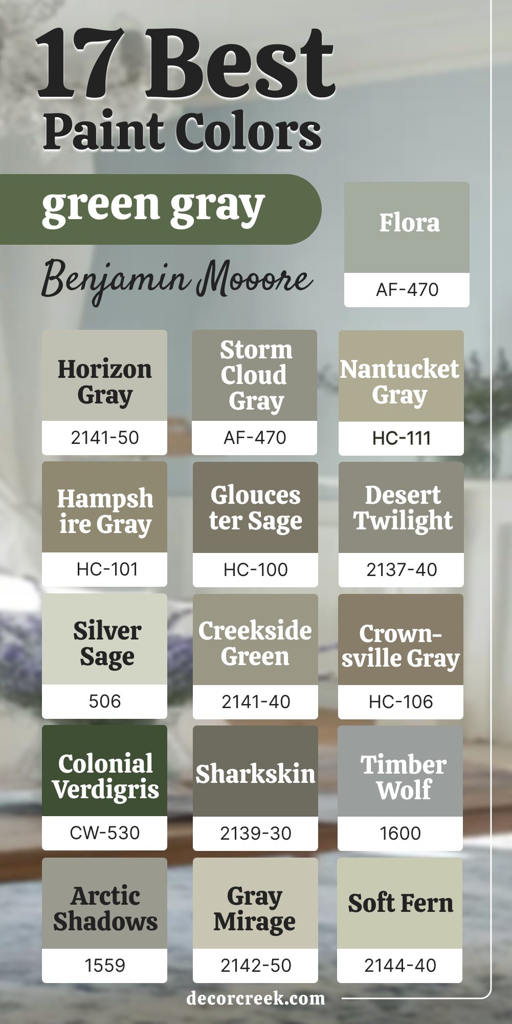
17 Green Gray Paint Colors from Benjamin Moore
Horizon Gray 2141-50
Horizon Gray 2141-50 feels soft and friendly for living rooms and entries. Horizon Gray looks fresh in morning light and warm under lamps at night. Horizon Gray works with white trim for neat lines or cream for a gentle edge. Horizon Gray pairs easily with oak floors, rattan, and linen.
Horizon Gray helps one steady color flow through many rooms. Horizon Gray keeps daily life looking tidy without fuss.Horizon Gray also balances both modern and traditional furniture, making it versatile for any home.
Horizon Gray adapts well to changing seasons, feeling airy in summer and grounded in winter. Horizon Gray hides everyday wear, keeping spaces polished with little effort. Horizon Gray supports bold artwork without clashing. Horizon Gray is a go-to choice for families who want warmth and order together.
Storm Cloud Gray 2140-40
Storm Cloud Gray 2140-40 adds quick mood for dining rooms, libraries, and halls. Storm Cloud Gray makes brass and candlelight glow and lets black frames add polish. Storm Cloud Gray feels dramatic but not heavy. Storm Cloud Gray stays even in daylight and under dimmers.
Storm Cloud Gray keeps busy rooms looking organized. Storm Cloud Gray gives a clear sense of place.Storm Cloud Gray also pairs beautifully with wool rugs and dark wood tables.
Storm Cloud Gray brings focus to home offices and studies where concentration matters. Storm Cloud Gray adapts to both rustic and urban décor with ease. Storm Cloud Gray feels welcoming in large rooms yet cozy in smaller ones. Storm Cloud Gray is a steady pick when a home needs presence without clutter.
Nantucket Gray HC-111
Nantucket Gray HC-111 — Nantucket Gray feels warm and earthy like a favorite sweater.
Nantucket Gray fits cottages, farmhouses, and city flats with ease. Nantucket Gray carries a soft brown note that adds comfort and depth.
Nantucket Gray loves pine floors, beadboard, and checks. Nantucket Gray looks gentle with cream trim and sharper with black details. Nantucket Gray stays fresh in spring and feels cozy in fall.

Hampshire Gray HC-101
Hampshire Gray HC-101 feels grounded and sure for foyers, stairs, and offices. Hampshire Gray welcomes black frames, leather chairs, and wool throws. Hampshire Gray keeps a quiet green thread so it never turns cold. Hampshire Gray brightens with white trim for clean edges. Hampshire Gray makes a strong first impression without weight. Hampshire Gray helps work feel focused and steady.
Hampshire Gray also adapts beautifully to both traditional and modern homes. Hampshire Gray softens in lamplight, giving evening warmth to gathering areas.
Hampshire Gray pairs easily with iron railings and vintage fixtures, creating character. Hampshire Gray looks polished with stone floors and natural fabrics. Hampshire Gray is a reliable shade when a home needs strength and calm in equal measure.
Desert Twilight 2137-40
Desert Twilight 2137-40 feels like evening on the wall: soft and restful. Desert Twilight suits bedrooms and guest rooms that need an easy mood. Desert Twilight loves linen, clay lamps, and woven baskets.
Desert Twilight stays clear in the morning and grows cozy at night Desert Twilight supports wood tones and simple fabrics. Desert Twilight helps people unwind after long days.Desert Twilight also works beautifully in small nooks where calm is needed.
Desert Twilight pairs well with cream bedding and textured rugs. Desert Twilight balances both rustic and modern pieces without fuss. Desert Twilight looks elegant under candlelight or soft lamps. Desert Twilight is the kind of shade that feels timeless in its quiet comfort.
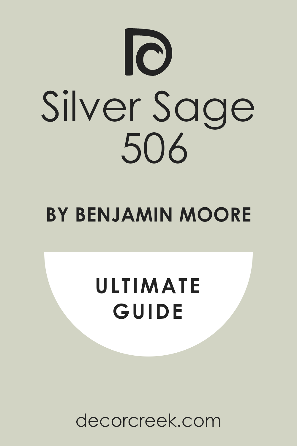
Silver Sage 506
Silver Sage 506 — Silver Sage is bright yet gentle for kitchens and laundry rooms.
Silver Sage works with white tile and simple hardware for a neat look. Silver Sage makes small rooms feel larger without glare.
Silver Sage glows in daylight and stays focused under task lights. Silver Sage keeps busy corners looking clean. Silver Sage brings cheer that lasts.
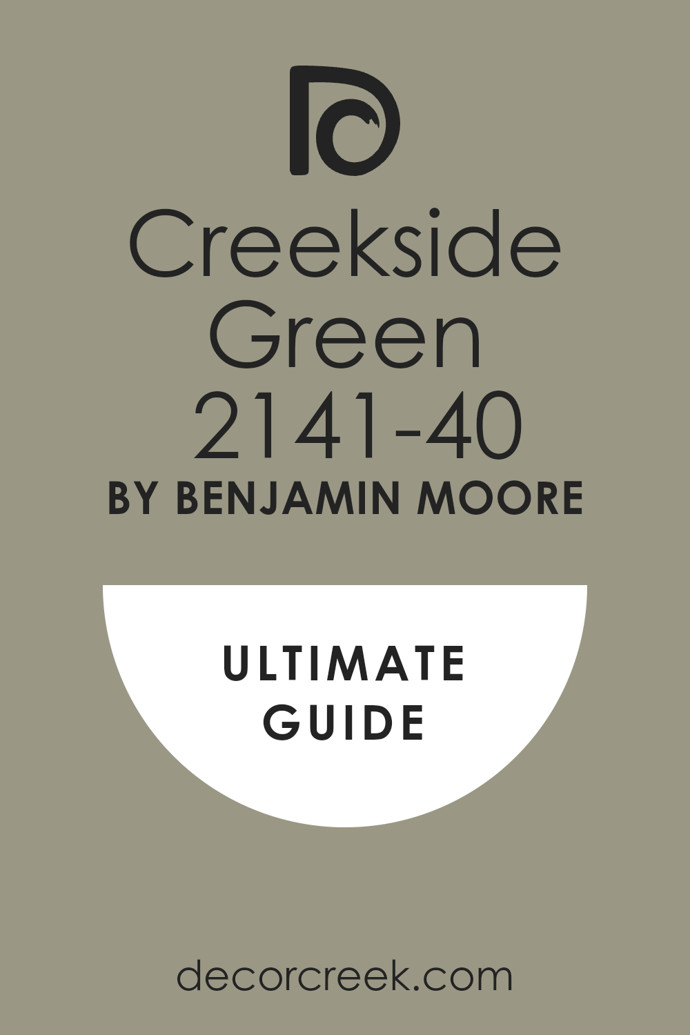
Creekside Green 2141-40
Creekside Green 2141-40 — Creekside Green feels balanced and tidy for living rooms and studies.
Creekside Green lets furniture and fabrics stand out clearly. Creekside Green pairs with oak, cane, and linen naturally.
Creekside Green draws crisp lines with white trim and softer ones with cream. Creekside Green supports work-from-home zones with easy focus. Creekside Green keeps toys and books from clashing.
Crownsville Gray HC-106
Crownsville Gray HC-106 is a deep green-gray that tailors halls and stairs. Crownsville Gray sharpens with white trim and gains richness with brass. Crownsville Gray stays calm in sun and under lamps.
Crownsville Gray makes everyday areas feel important without fuss. Crownsville Gray flatters traditional details and suits modern trim too. Crownsville Gray gives a finished, confident look.Crownsville Gray also works beautifully on built-ins or wainscoting for added depth.
Crownsville Gray adapts well to both classic and transitional homes. Crownsville Gray highlights natural stone and dark wood accents. Crownsville Gray holds its richness through every season. Crownsville Gray creates a sense of structure that lasts.
Colonial Verdigris CW-530
Colonial Verdigris CW-530 brings historic character with quiet strength. Colonial Verdigris suits entries and dining rooms with brick, pine, or plaster. Colonial Verdigris pairs with off-white trim and lantern lights for a true feel. Colonial Verdigris shows depth without shouting.
Colonial Verdigris makes new houses feel rooted. Colonial Verdigris loves antiques yet enriches modern pieces.Colonial Verdigris also gives warmth to staircases and connecting halls.
Colonial Verdigris feels right with pewter, copper, and aged iron accents. Colonial Verdigris holds charm under candlelight or daylight. Colonial Verdigris works for families who value tradition but want flexibility. Colonial Verdigris is a timeless link between old and new.
Sharkskin 2139-30
Sharkskin 2139-30 is a charcoal green-gray for media rooms and mudrooms. Sharkskin works with matte hardware, denim accents, and iron fixtures. Sharkskin keeps depth from crowding the room with a bright ceiling.
Sharkskin makes art and posters pop cleanly. Sharkskin looks bold but livable in bright or dim light. Sharkskin gives crisp contrast and focus.Sharkskin also adapts well to loft-style homes with industrial touches.
Sharkskin keeps family entryways looking neat and stylish. Sharkskin pairs beautifully with concrete, leather, and steel. Sharkskin feels dramatic but still easy to use daily. Sharkskin creates bold edges that make rooms memorable.
Timber Wolf 1600
Timber Wolf 1600 is a calm gray with a soft green thread. Timber Wolf suits whole-home walls when harmony matters. Timber Wolf stays airy with white trim and pale floors. Timber Wolf adds a crisp line in kitchens with black pulls.
Timber Wolf pairs well with natural fiber rugs and linen curtains. Timber Wolf handles daily mess with grace.Timber Wolf also supports both rustic and modern décor styles. Timber Wolf feels soft in bedrooms and polished in dining areas.
Timber Wolf balances large open spaces without feeling heavy. Timber Wolf blends beautifully with wood beams and stone accents. Timber Wolf is steady and forgiving for family life.
Arctic Shadows 1559
Arctic Shadows 1559 feels cool, clear, and orderly for bedrooms and baths. Arctic Shadows makes white bedding and chrome shine. Arctic Shadows warms up with light wood and linen. Arctic Shadows stays balanced under warm and cool bulbs.
Arctic Shadows is fresh without feeling icy. Arctic Shadows is easy to decorate around on busy days.Arctic Shadows also suits modern apartments that need a calm backdrop. Arctic Shadows looks clean with tile and marble finishes.
Arctic Shadows pairs naturally with silver and brushed nickel. Arctic Shadows keeps kids’ rooms bright and composed. Arctic Shadows delivers balance in homes of every style.
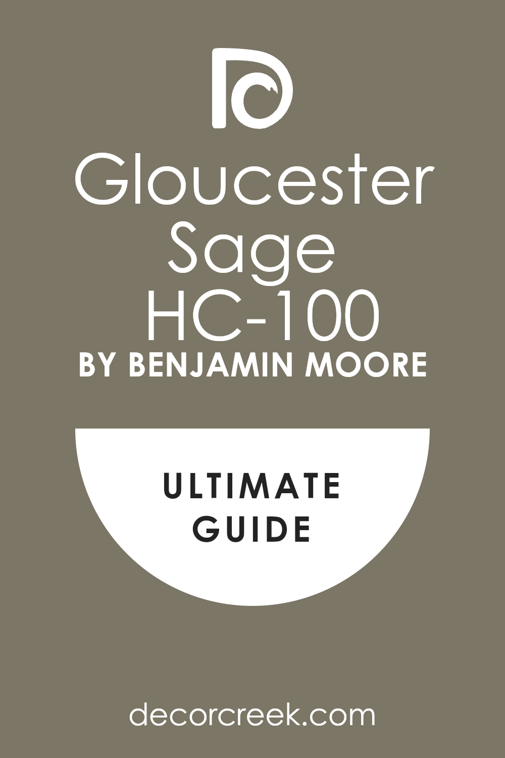
Gloucester Sage HC-100
Gloucester Sage HC-100 — Gloucester Sage is a handsome sage-gray for cabinets, pantries, and dining rooms. Gloucester Sage pairs easily with soapstone and brass. Gloucester Sage keeps structure with white trim and adds warmth with cream. Gloucester Sage looks steady in bright sun and soft lamps.
Gloucester Sage lets furniture and art sit well without shouting. Gloucester Sage feels rooted and ready for family life.
Gray Mirage 2142-50
Gray Mirage 2142-50 flows softly through open layouts. Gray Mirage frames well with white doors and ceilings. Gray Mirage gains structure from slim black frames.
Gray Mirage welcomes linen and jute for texture and warmth. Gray Mirage suits many moods and styles without strain. Gray Mirage quietly helps everything look better.Gray Mirage also adapts to both country homes and city apartments.
Gray Mirage looks complete with soft rugs and woven chairs. Gray Mirage shifts gently through the day, keeping balance. Gray Mirage works with colorful accents without clashing. Gray Mirage is a true bridge color for versatile living.
Soft Fern 2144-40
Soft Fern 2144-40 feels leafy and light for nurseries, guest rooms, and offices. Soft Fern pairs with bamboo shades, cotton bedding, and pale rugs. Soft Fern gets crisp edges with white trim and gentle ones with ivory. Soft Fern stays balanced in sun and lamplight.
Soft Fern brings freshness without noise. Soft Fern grows with a home year after year.Soft Fern also suits family spaces that need quiet energy. Soft Fern blends easily with natural fabrics and unfinished woods.
Soft Fern looks cheerful in spring and warm in autumn. Soft Fern is gentle enough for restful corners. Soft Fern creates homes that feel cared for in every detail.
Flora AF-470
Flora AF-470 is a muted, polished green-gray for refined living rooms. Flora layers beautifully with velvet pillows, oak tables, and linen drapes.
Flora adds glow with warm metals like brass and bronze. Flora behaves well in day and night light. Flora supports bold choices without competing. Flora is a quiet favorite for a finished look.Flora also pairs with both classic and contemporary furniture.
Flora balances dark accents while keeping rooms soft. Flora feels warm in lamplight and steady in sunlight. Flora makes art and fabrics richer. Flora creates a backdrop that feels complete without trying too hard.
Vapor Trails 1556
Vapor Trails 1556 brings fresh clarity to baths, laundry rooms, and kids’ rooms. Vapor Trails looks crisp with white tile and woven bins. Vapor Trails stays calm under any bulb or window.
Vapor Trails gains structure from thin black mirrors and hooks. Vapor Trails helps small rooms feel open and tidy. Vapor Trails delivers simple brightness every day.Vapor Trails also works well in kitchens where brightness matters.
Vapor Trails pairs beautifully with natural wood and stainless steel. Vapor Trails stays reliable through changing daylight. Vapor Trails makes simple fabrics like cotton and linen shine. Vapor Trails gives homes an easy, breathable rhythm.

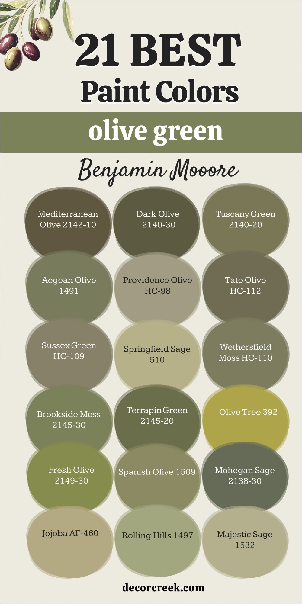
21 Best Olive Green Paint Colors from Benjamin Moore
Mediterranean Olive 2142-10
Mediterranean Olive 2142-10 brings a rich kitchen mood that feels generous and warm. Mediterranean Olive looks balanced on lower cabinets with creamy uppers above. Mediterranean Olive pairs naturally with copper pots, butcher block, and stone counters. Mediterranean Olive stays fresh in morning light and glows under warm lamps at night.
Mediterranean Olive likes a simple white backsplash so the room never feels heavy. Mediterranean Olive turns a busy kitchen into a friendly, character-filled hub.Mediterranean Olive also feels beautiful in dining rooms that need both depth and glow. Mediterranean Olive works with rustic tables, patterned linens, and brass light fixtures.
Mediterranean Olive creates harmony in open layouts, flowing easily into connected living spaces. Mediterranean Olive feels steady in all seasons, giving warmth in winter and freshness in summer. Mediterranean Olive is a dependable green that keeps homes inviting every day.
Dark Olive 2140-30
Dark Olive 2140-30 — Dark Olive makes pantry doors, islands, and built-ins feel strong and sure.
Dark Olive contrasts beautifully with light walls for a classic look. Dark Olive softens next to wood shelves and stone counters.
Dark Olive works with brass for warmth and with black pulls for a modern line. Dark Olive feels confident by day and cozy at night. Dark Olive gives structure without asking for extra details.
Tuscany Green 2140-20
Tuscany Green 2140-20 brings rustic charm that recalls terracotta and iron lanterns. Tuscany Green loves cream trim for softness and black accents for a crisp edge. Tuscany Green feels sunlit in the day and mellow in the evening. Tuscany Green pairs with clay pots, woven shades, and striped wool rugs.
Tuscany Green sits well with light wood benches and handwoven baskets. Tuscany Green tells a warm story in entries and dining rooms.Tuscany Green also feels steady in kitchens where natural textures take the lead. Tuscany Green softens stone counters and makes iron details glow.
Tuscany Green adapts to changing light, keeping a welcoming energy throughout the day. Tuscany Green pairs beautifully with textured plaster or brick. Tuscany Green carries a sense of history, giving even new homes a rooted, lived-in comfort.
Aegean Olive 1491
Aegean Olive 1491 delivers quiet elegance for living rooms and bedrooms. Aegean Olive frames neatly with white trim and softens with linen drapes. Aegean Olive gains a gentle glow from aged brass lamps. Aegean Olive works with oak, walnut, and pine without struggle.
Aegean Olive lets warm-toned art stand out beautifully. Aegean Olive feels collected and thoughtful without weight.Aegean Olive also adapts to modern interiors where balance matters most. Aegean Olive pairs beautifully with pale stone floors and neutral rugs.
Aegean Olive changes slightly with the light, feeling cool by day and warm by evening. Aegean Olive adds grace to built-in shelving or paneled walls. Aegean Olive is a refined green that always feels composed.
Providence Olive HC-98
Providence Olive HC-98 offers classic welcome for entries and dining rooms. Providence Olive stays warm and steady without pushing too hard. Providence Olive brightens with cream beadboard and white ceilings. Providence Olive pairs with Persian rugs, farmhouse tables, and pewter dishes.
Providence Olive sparkles under candlelight during long dinners. Providence Olive makes a house feel like home from day one.Providence Olive also shines in kitchens with painted cabinets and rustic finishes.
Providence Olive fits naturally beside brass pulls and soapstone counters. Providence Olive feels warm in lamplight, keeping family spaces cozy. Providence Olive carries tradition but still adapts to new styles. Providence Olive is a shade that creates a sense of belonging.
Tate Olive HC-112
Tate Olive HC-112 brings confident structure to mantels, doors, and built-ins. Tate Olive keeps rooms open with white ceilings and gains drama with dark trim. Tate Olive loves leather chairs and patterned pillows for warmth. Tate Olive glows under picture lights over shelves and art.
Tate Olive suits libraries and dining rooms that need focus and strength. Tate Olive feels solid and lasting in both classic and modern settings.Tate Olive also works well on exteriors where presence is important.
Tate Olive pairs with stone paths, cedar siding, and black hardware. Tate Olive adapts to both sunlight and shadow, holding depth without looking heavy. Tate Olive gives built-in cabinetry a custom, thoughtful finish. Tate Olive is a green that carries elegance with strength.
Sussex Green HC-109
Sussex Green HC-109 carries a weathered note that fits stone hearths and wide pine floors. Sussex Green stays light with white trim and blends with dark wood naturally. Sussex Green welcomes baskets, pottery, and quilts for texture. Sussex Green pairs well with a simple lantern pendant overhead.
Sussex Green brings honest, lived-in comfort to family spaces. Sussex Green has presence without noise.Sussex Green also adapts well to country homes and modern cottages.
Sussex Green softens with linen curtains and brightens with brass lamps. Sussex Green makes family gathering spaces feel natural and welcoming. Sussex Green fits into homes that value warmth over polish. Sussex Green is a color that lives easily with people, pets, and daily life.
Springfield Sage 510
Springfield Sage 510 keeps breakfast nooks tidy and cheerful. Springfield Sage teams up with white tile and chrome for a clean face. Springfield Sage warms up with wood stools and cutting boards. Springfield Sage invites a small herb garden on the sill.
Springfield Sage feels crisp in the morning and friendly at night. Springfield Sage is practical and charming for busy kitchens.Springfield Sage also fits beautifully in mudrooms and laundry spaces where energy is needed. Springfield Sage balances natural light with utility, keeping areas fresh and bright.
Springfield Sage pairs well with woven baskets, iron hooks, and patterned floor tile. Springfield Sage feels adaptable, giving simple corners charm without effort. Springfield Sage is a hardworking green that brightens routines.
Wethersfield Moss HC-110
Wethersfield Moss HC-110 adds rich depth to dining rooms and family areas. Wethersfield Moss flatters linen cloths, pewter pieces, and polished wood. Wethersfield Moss brightens with white trim for a touch of formality. Wethersfield Moss shapes evening glow with a lamp on the sideboard.
Wethersfield Moss makes warm-toned artwork shine. Wethersfield Moss helps gatherings run long and happy.Wethersfield Moss also adapts to studies or libraries that need presence.
Wethersfield Moss pairs well with leather chairs, tartan throws, and stone fireplaces. Wethersfield Moss feels grounded in large rooms but not heavy. Wethersfield Moss transitions smoothly between formal dinners and casual mornings. Wethersfield Moss is a shade that builds tradition in any home.
Brookside Moss 2145-30
Brookside Moss 2145-30 connects hallways and stairs with a steady line. Brookside Moss keeps passages open when ceilings stay light. Brookside Moss turns family photos into a neat black-frame gallery. Brookside Moss likes a sisal runner for grip and texture.
Brookside Moss welcomes a cane chair or slim console at the landing. Brookside Moss adds weight without closing things in.Brookside Moss also feels fresh in sunrooms or porches with natural wicker. Brookside Moss pairs beautifully with rattan blinds and light linen cushions.
Brookside Moss steadies transitions between rooms, tying different styles together. Brookside Moss looks polished with iron railings and rustic wood accents. Brookside Moss is a versatile color that connects the home gracefully.
Terrapin Green 2145-20
Terrapin Green 2145-20 makes mudrooms and entries look organized and strong. Terrapin Green covers cubbies, beadboard, and doors for a custom feel. Terrapin Green pairs with dark hooks and simple, sturdy tile. Terrapin Green softens with a striped bench cushion and woven baskets.
Terrapin Green feels fresh by day and steady by night. Terrapin Green keeps order while staying warm to the touch.Terrapin Green also brings character to kitchens where structure matters.
Terrapin Green suits cabinets that need depth without darkness. Terrapin Green looks sharp with brushed nickel pulls and warm wood counters. Terrapin Green balances utility with warmth in daily family use. Terrapin Green is the perfect choice for homes that need durability and charm together.
Olive Tree 392
Olive Tree 392 gives front doors a confident, friendly hello. Olive Tree frames cleanly with white trim and shines with brass or black hardware. Olive Tree finishes well with matching planters and a natural doormat. Olive Tree pairs with cedar shingles or brick for a classic entry.
Olive Tree also suits indoor alcoves and built-ins. Olive Tree feels grounded and sure in every season.Olive Tree can also bring warmth to living rooms with paneled walls or built-in shelves. Olive Tree looks steady with rustic beams, stone fireplaces, and aged wood furniture.
Olive Tree pairs beautifully with linen drapes, adding softness to its strong base. Olive Tree adapts well to both traditional homes and newer builds. Olive Tree is a color that feels reliable, polished, and inviting year-round.
Fresh Olive 2149-30
Fresh Olive 2149-30 brings playful energy to breakfast bars and craft tables. Fresh Olive stays tidy with white stools and shelves. Fresh Olive makes jars, baskets, and tools look organized. Fresh Olive works under bright pendants for clear tasks.
Fresh Olive keeps a happy mood in daylight and evening. Fresh Olive gives family spaces a friendly lift.Fresh Olive also works beautifully in children’s playrooms or study corners. Fresh Olive pairs with chalkboards, corkboards, and open shelving for a cheerful, practical setup.
Fresh Olive balances its brightness with wood floors or woven rugs. Fresh Olive keeps energy high without becoming too loud. Fresh Olive feels approachable and fun, perfect for homes full of activity.
Spanish Olive 1509
Spanish Olive 1509 pairs perfectly with terracotta floors and patterned rugs. Spanish Olive softens with cream drapes and deepens with dark wood frames. Spanish Olive glows under brass lamps at night. Spanish Olive cools nicely with marble accents on tables.
Spanish Olive likes linen and cotton textures for easy comfort. Spanish Olive creates a cozy, stylish scene guests notice at once.Spanish Olive also works well in dining rooms where family meals are central. Spanish Olive sets a warm backdrop for pottery, glassware, and seasonal centerpieces.
Spanish Olive balances rustic touches with elegance, making it versatile. Spanish Olive feels steady under both bright mornings and evening glow. Spanish Olive builds an atmosphere of comfort and style that lasts.
Mohegan Sage 2138-30
Mohegan Sage 2138-30 brings a smoky focus to studies and home offices. Mohegan Sage sits well with a leather chair, a wool throw, and a wood tray. Mohegan Sage adds a classic note with a green-shaded desk lamp. Mohegan Sage keeps storage neat with dark pulls and trim. Mohegan Sage looks strong in daylight and cozy under lamps.
Mohegan Sage supports work and rest in equal measure.Mohegan Sage also makes dining rooms feel formal yet warm. Mohegan Sage pairs beautifully with long wooden tables, brass candlesticks, and framed artwork
. Mohegan Sage works across seasons, feeling balanced in both summer brightness and winter evenings. Mohegan Sage grounds a room with a quiet authority. Mohegan Sage is a dependable choice for homes that need focus and warmth together.
Jojoba AF-460
Jojoba AF-460 feels creamy and restful for bedrooms. Jojoba partners with light wood furniture and cotton bedding. Jojoba blends softly with ivory trim around windows and doors. Jojoba gains a clean sparkle from chrome bedside lamps.
Jojoba warms up with a woven rug underfoot. Jojoba repeats beautifully in a small indoor tree by the window.Jojoba also feels right in nurseries or guest rooms where softness matters most. Jojoba pairs with linen curtains and rattan baskets for a warm, inviting touch.
Jojoba stays balanced in both bright mornings and quiet evenings. Jojoba adapts easily to changing styles, lasting through years of updates. Jojoba brings a sense of ease that makes rest come naturally.
Rolling Hills 1497
Rolling Hills 1497 keeps stair halls feeling open and friendly. Rolling Hills sets rhythm with white spindles and a striped runner. Rolling Hills bounces light with a round mirror at the landing. Rolling Hills cuts clutter with a basket for mail and keys.
Rolling Hills tidies walls with slim black frames for art. Rolling Hills works in both modern and traditional houses.Rolling Hills also adds warmth to hallways that connect family spaces. Rolling Hills pairs well with woven rugs, lantern lighting, and natural wood doors.
Rolling Hills makes movement through the home feel easy and welcoming. Rolling Hills adapts beautifully to both large and small homes. Rolling Hills is a steady choice for circulation areas that need comfort and order.
Majestic Sage 1532
Majestic Sage 1532 feels dressy yet friendly for living rooms. Majestic Sage pairs with velvet pillows, lined drapes, and a marble table. Majestic Sage warms with aged brass hardware and lamps. Majestic Sage ties together a palette with framed landscapes.
Majestic Sage keeps seating areas soft with a linen ottoman. Majestic Sage welcomes guests while staying polished.Majestic Sage also suits dining rooms where elegance matters. Majestic Sage glows under chandeliers and candlelight, creating an inviting mood.
Majestic Sage balances well with dark wood sideboards and glass-front cabinets. Majestic Sage looks refined yet never stiff, giving rooms grace and comfort. Majestic Sage is a shade that makes people feel at ease and impressed at the same time.
Mountain Moss 2142-30
Mountain Moss 2142-30 turns libraries and reading rooms into deep, quiet zones. Mountain Moss lifts with a white ceiling and warms with picture lights. Mountain Moss invites long evenings with a tartan throw and leather footstool. Mountain Moss looks custom when built-ins match the wall color.
Mountain Moss supports a green writing desk or felt-topped game table. Mountain Moss feels wise and settled.Mountain Moss also works outdoors, making front doors and shutters feel strong and lasting.
Mountain Moss pairs with stone pathways, cedar siding, and iron railings for a rooted look. Mountain Moss adapts beautifully across seasons, staying steady in bright summers and cool winters. Mountain Moss gives homes a sense of history without feeling dated. Mountain Moss is a shade that carries dignity and warmth everywhere it goes.
Olive Moss 2147-20
Olive Moss 2147-20 grounds both exteriors and interiors with steady, classic strength. Olive Moss looks handsome with stone paths, cedar siding, and brick details. Olive Moss lifts indoors with white trim, while dark trim builds bold contrast.
Olive Moss steadies long walls, paneling, and built-ins without feeling heavy. Olive Moss reads true under all kinds of light, from bright sun to soft lamps. Olive Moss is a shade that ties many rooms into one clear story.
Olive Moss also feels practical for kitchens and dining rooms where family gathers. Olive Moss pairs well with patterned rugs, leather chairs, and rustic wood tables. Olive Moss adapts easily to seasonal changes, feeling fresh in summer and warm in winter. Olive Moss blends modern hardware with traditional fabrics for balance. Olive Moss is often chosen by homeowners who want a dependable green that lasts through the years.
Oregano 2147-10
Oregano 2147-10 makes islands, paneled walls, and front doors bold and confident. Oregano pairs beautifully with stone counters, bronze hardware, and natural wood floors. Oregano feels lasting outdoors, giving shutters and trim a strong anchor.
Oregano works indoors to steady kitchens, libraries, and dining rooms with depth. Oregano stays balanced in both natural daylight and evening lamps. Oregano is a natural choice for homes that need strength and focus.
Oregano also pairs well with patterned tile, woven baskets, and rich wool rugs. Oregano makes cabinetry feel custom and rooted without fuss. Oregano looks sharp under brass or black fixtures, adapting to different styles easily. Oregano carries a warm undertone that keeps it from feeling too dark. Oregano creates confidence in a home, helping every room feel designed and grounded.
Final Thoughts on the 42 Top Benjamin Moore Green Paint Colors
When I look back at these shades, I see how each one can shape the feeling of a home. Light greens bring freshness and lift, mid-tones create balance, and olive tones give depth and strength. I always think about the light in a room first—morning sun, shaded afternoons, or soft lamplight at night—because every color changes with the hours. I also pay attention to textures like wood, stone, and fabric, since they can make the same green feel rustic, refined, or modern.
I believe the best color is the one that feels natural for how you live every day. Kitchens and entries often need energy, while bedrooms and studies deserve quiet strength.
Sometimes a whole home can flow with one shade, and other times each room needs its own voice. What matters most is that the color supports life rather than stealing the spotlight.
For me, these 42 greens are not just paint—they are tools that help a house feel warm, steady, and welcoming. When chosen with care, they tell a story of comfort and character.
My hope is that anyone picking from this list will find a shade that feels like home the moment they see it.