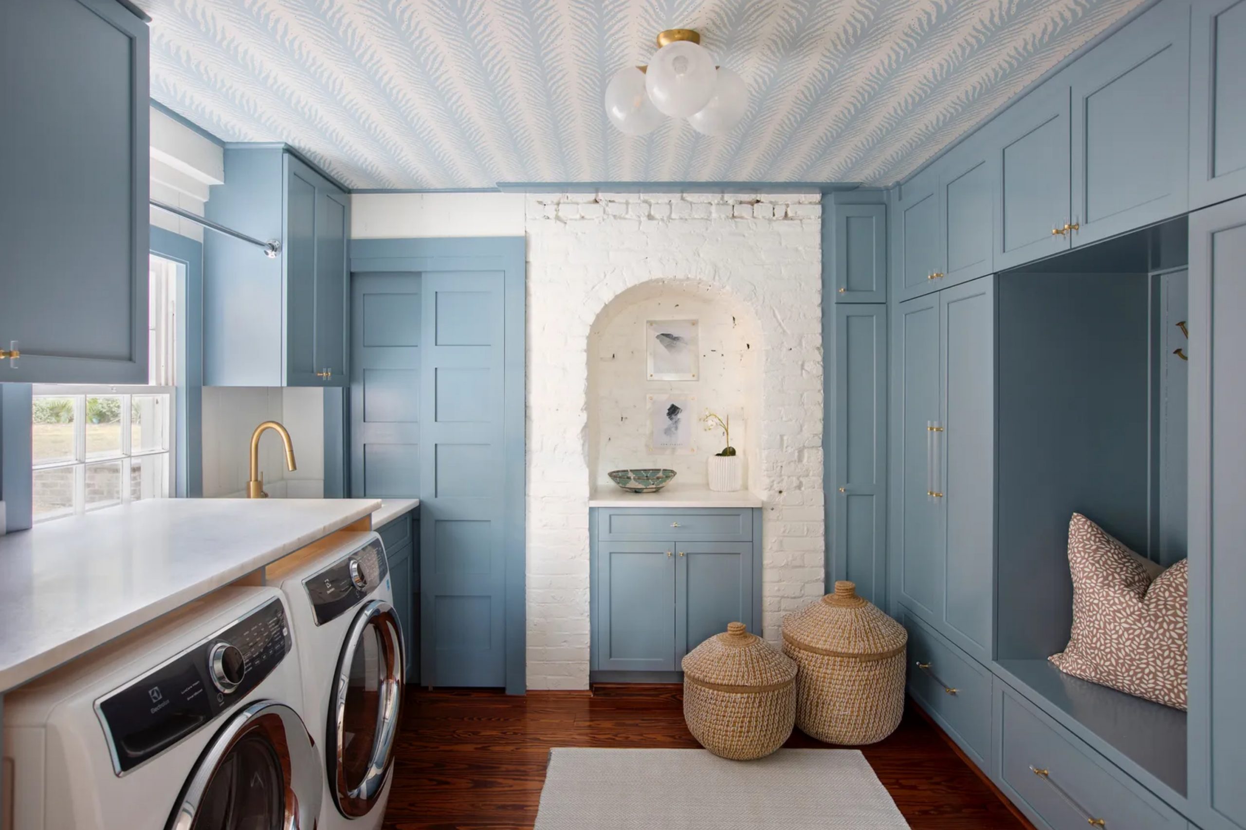
When I walk into a laundry room, I believe the color on the walls sets the mood for the whole task ahead. Doing laundry isn’t the most exciting chore, but the right paint color can change how it feels. I’ve seen rooms that look dull suddenly feel alive just by painting them with a cheerful shade. A laundry room doesn’t need to be bland—it can be as fun, stylish, or refreshing as the rest of your home.
Paint has the power to make folding clothes feel lighter and faster. That’s why choosing the right color matters more than most people realize.
Why I Believe Laundry Room Colors Matter More Than We Think
I always remind myself that the laundry room is one of the most used rooms in the home. Families walk in and out of it daily, sometimes more than the living room. If the color is too flat, it feels like a chore zone instead of part of the house. When the walls are painted with energy or warmth, it brings positivity into a routine job.
A bold color can spark energy, while a softer one can bring comfort. Laundry takes time, and the right shade makes those minutes feel better spent. For me, that’s why these colors matter so much.
How I Choose the Perfect Shade for a Laundry Room
When I pick a paint color for a laundry room, I think about how the family uses it. If the room is small, lighter shades can make it feel brighter. If it’s part of a busy household, cheerful colors can give a burst of energy. I also think about how the light hits the room because natural and artificial light can change the way colors look.
I match the shade to the mood the family wants—fun, relaxing, or modern. I also make sure the color ties in with the rest of the home so it doesn’t feel out of place.
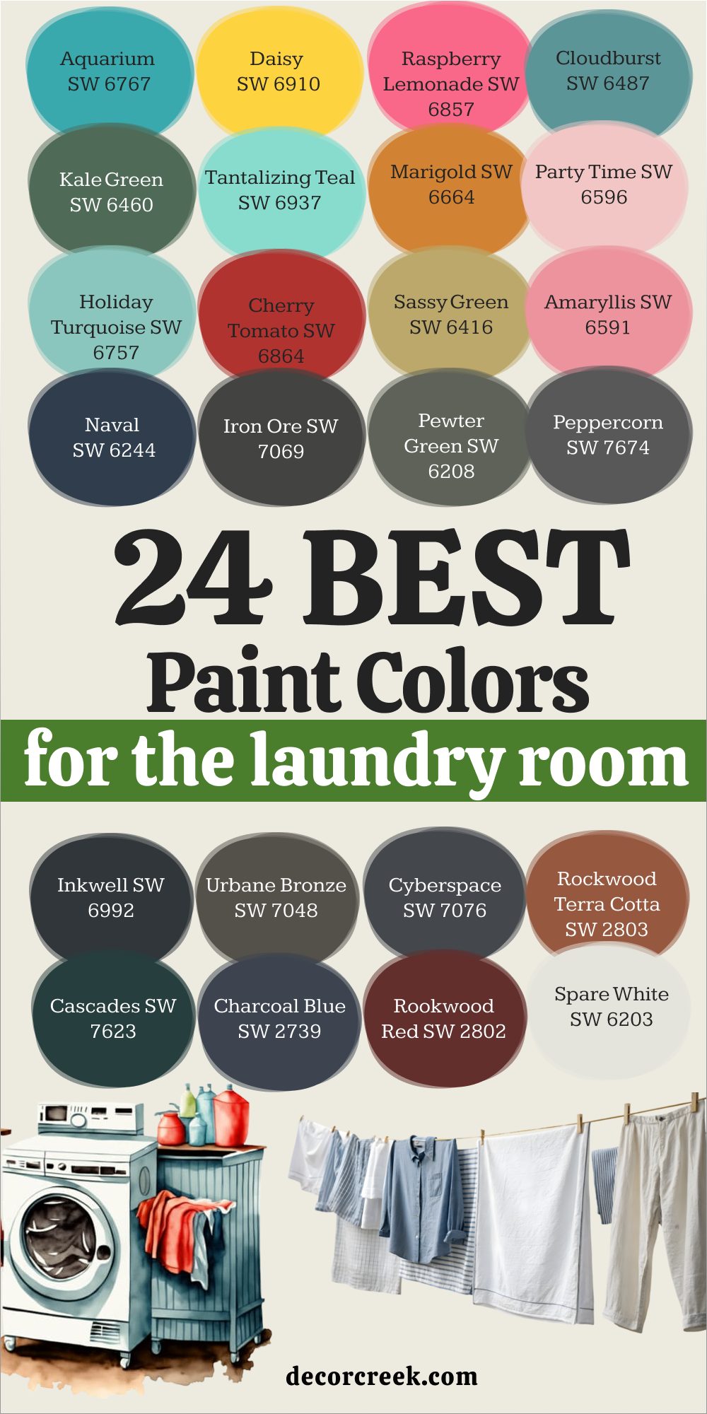
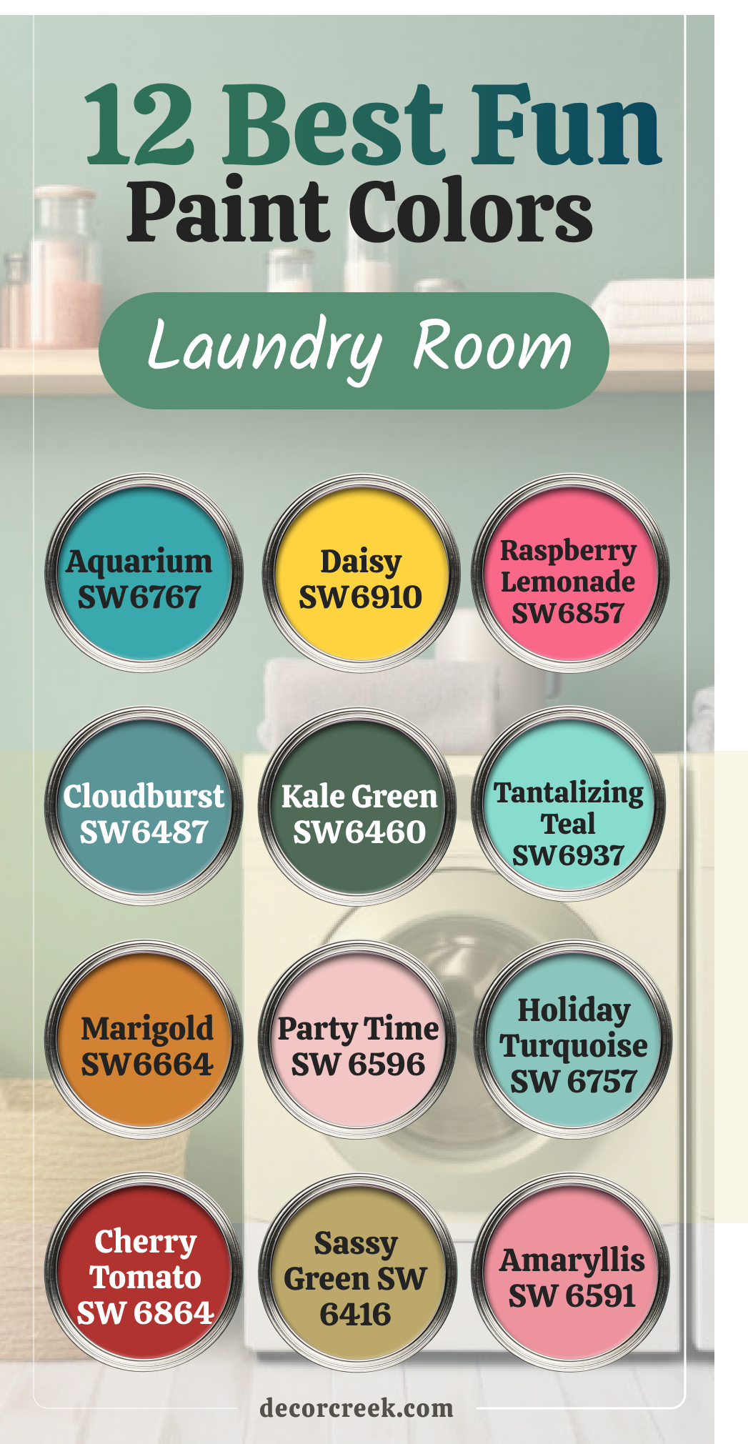
12 Best Fun Laundry Room Paint Colors
Aquarium SW 6767
Aquarium is a lively aqua blue that reminds me of playful water. It brings energy into a laundry room, making the space feel less like work and more like a splash of fun. Aquarium works well in small rooms because its brightness reflects light beautifully. I like using it with white shelves or trim so the room feels crisp and clean.
This shade is perfect for families who want a cheerful touch where chores happen. Aquarium always adds a refreshing look that makes me smile.
Daisy SW 6910
Daisy is a bright sunflower yellow that beams with happiness. It makes a laundry room feel like the sun is shining, even on cloudy days. I’ve used this color in homes where kids help with laundry, and it turns the room into a cheerful spot. Daisy pairs nicely with white baskets and light wood counters, keeping things light and warm.
I think this color is perfect for bringing joy to a daily routine. Daisy always feels like a burst of energy right where you need it.
Raspberry Lemonade SW 6857
Raspberry Lemonade is a sweet pink with a hint of coral that feels playful. This shade brings a pop of color that makes the laundry room lively without being too bold. I’ve paired it with white cabinets and it always looks cheerful and fresh. Raspberry Lemonade has a way of making the routine feel fun, like a hidden treat inside the house.
This shade is perfect for anyone who loves a touch of personality in every room. Raspberry Lemonade creates warmth and charm in an instant.
Cloudburst SW 6487
Cloudburst is a rich teal-blue that feels bold but inviting. I like using it in laundry rooms with lots of natural light because it balances strong color with brightness. Cloudburst makes the room feel stylish, and it pairs beautifully with brass or gold handles. This shade brings energy without being too flashy, so it works for modern homes.
I’ve found that Cloudburst looks especially good with white appliances. Cloudburst gives a laundry room a confident personality.

Kale Green SW 6460
Kale Green is a deep leafy green that brings nature into the laundry room. It feels fresh, as if you’ve stepped into a garden while doing chores. I like to pair it with natural wood shelves for a grounded, earthy feel. Kale Green makes the laundry room feel alive and adds character instantly. It works well in homes where people want to feel closer to the outdoors. Kale Green is bold, but it also feels balanced in a functional space.
Tantalizing Teal SW 6937
Tantalizing Teal is a lively turquoise that makes laundry rooms look bright and fun. This shade stands out but doesn’t feel too heavy. I’ve used it in rooms with white cabinets, and the contrast makes the color pop beautifully. Tantalizing Teal brings energy, so folding clothes feels less like a chore. It works great in both small and large laundry rooms.
Tantalizing Teal always gives me a sense of freshness that I love to see in homes.
Marigold SW 6664
Marigold is a warm golden orange that glows with cheer. It instantly makes a laundry room feel cozy and welcoming. I like pairing Marigold with white trim or patterned tiles for extra charm. This color adds brightness without being too sharp, so it feels balanced. Marigold works beautifully in homes that want warmth in every corner.
I find that it creates a welcoming backdrop for laundry days. Marigold makes the room feel like sunshine is always present.
Party Time SW 6596
Party Time is a bold magenta pink that brings excitement into the laundry room. It’s not a color that hides—it makes the room feel fun right away. I’ve paired Party Time with crisp white trim and it looks stunning. This shade is great for families who love personality in their home.
Party Time makes folding laundry feel less routine and more lively. I always smile when I see this color used well.
Holiday Turquoise SW 6757
Holiday Turquoise is a light, breezy blue-green that feels refreshing. I love how it makes laundry rooms look cheerful without being too bold. Holiday Turquoise pairs beautifully with white cabinets or wicker baskets. This color always reminds me of vacation, even during laundry chores.
It brightens up smaller rooms and keeps the mood light. Holiday Turquoise makes the laundry room a happy stop in the home.
Cherry Tomato SW 6864
Cherry Tomato is a bright, cheerful red that adds spark to a laundry room. It feels bold but not too serious, keeping the mood light. I’ve used this shade in homes with modern design, and it always looks energetic. Cherry Tomato pairs nicely with black or white accents for balance. This color brings energy into the room so chores feel less tiring.
Cherry Tomato makes the laundry area a lively part of the house.
Sassy Green SW 6416
Sassy Green is a playful lime shade that bursts with freshness. It makes a laundry room feel bright and full of life. I’ve seen it paired with white shelves and patterned floors, and it always looks cheerful. Sassy Green has a way of lifting moods during daily tasks. It’s perfect for anyone who wants their laundry room to feel fun.
Sassy Green adds a playful spark that keeps the room interesting.
Amaryllis SW 6591
Amaryllis is a lively pink-red that feels warm and joyful. It makes the laundry room feel like a place with personality, not just utility. I like pairing Amaryllis with white and light gray accents to keep balance. This shade is wonderful for families who want a burst of fun in every corner of their home.
Amaryllis turns laundry from a task into a brighter part of the day. I always find this color brings energy and joy into the room.
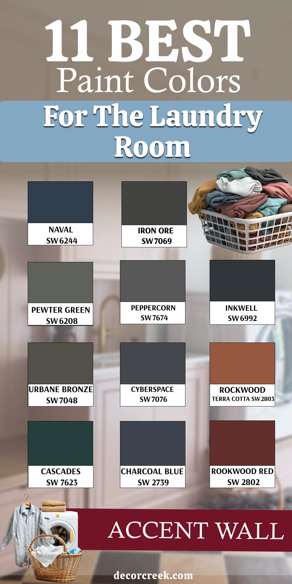
11 Best Paint Colors for the Laundry Room Accent Wall
Naval SW 6244
Naval is a deep navy blue that feels strong and stylish. It adds depth to a laundry room without making it too dark. I love how Naval pairs with brass fixtures or natural wood shelves. This shade is perfect for an accent wall because it balances boldness with elegance. Naval works well in both modern and traditional homes.
Naval gives the room a sense of strength that makes it memorable.

Iron Ore SW 7069
Iron Ore is a deep charcoal that looks bold and modern. It makes a laundry room feel dramatic in the best way. I’ve paired Iron Ore with crisp white cabinets, and the contrast is striking. This color is great for accent walls where you want depth without going pure black. Iron Ore adds personality and style to an ordinary room.
Iron Ore gives the laundry area a sharp and polished look.

Pewter Green SW 6208
Pewter Green is a muted, earthy green that feels grounded. I like using it as an accent wall behind shelves or cabinets. Pewter Green works beautifully with light countertops or wood tones. This shade adds richness without feeling too heavy. I find it perfect for homeowners who love natural touches in their design. Pewter Green brings a comfortable and stylish feeling to the laundry room.

Peppercorn SW 7674
Peppercorn is a soft black with gray undertones that feels sleek. It’s perfect for an accent wall because it brings depth without being too stark. Peppercorn looks stunning with stainless steel appliances or light wood finishes. I like how it adds drama but still feels approachable.
Peppercorn always makes the laundry room look modern and sharp. Peppercorn gives even the smallest laundry area a bold edge.

Inkwell SW 6992
Inkwell is a deep blue-black that feels bold and artistic. It works beautifully as an accent wall, especially behind open shelving. Inkwell pairs well with white, brass, or even pale wood. This shade gives a laundry room a stylish and unique feel. I love how it adds a dramatic touch while still feeling inviting.
Inkwell creates a striking backdrop that makes laundry look less routine.

Urbane Bronze SW 7048
Urbane Bronze is a warm, earthy brown-gray that feels rich. I like it for accent walls because it pairs with so many other shades. Urbane Bronze works beautifully with creamy whites or natural wood shelves. This color makes a laundry room look cozy and stylish at once. It’s bold but still feels connected to nature. Urbane Bronze brings warmth and personality to any laundry setup.

Cyberspace SW 7076
Cyberspace is a bold slate blue that feels modern and dramatic. I often use it on accent walls to add depth and richness. Cyberspace pairs perfectly with white trim and light flooring. This shade makes the laundry room look fresh while still strong. It’s ideal for families who want style even in their utility rooms.
Cyberspace always feels sharp and eye-catching.

Rockwood Terra Cotta SW 2803
Rockwood Terra Cotta is a warm, earthy red-orange that adds personality. I love it on accent walls because it feels both bold and comforting. This color pairs beautifully with neutral baskets and light wood shelves. Rockwood Terra Cotta turns the laundry room into a cozy, stylish corner.
It works best for families who love warm, inviting shades. Rockwood Terra Cotta always makes the room feel welcoming.
Cascades SW 7623
Cascades is a deep green-blue that feels strong and fresh. It looks wonderful as an accent wall paired with lighter shades. I love using it behind open shelving for a bold contrast. Cascades brings both richness and style into the laundry room. It’s perfect for modern homes that want color with character.
Cascades adds depth that makes the room feel more special.
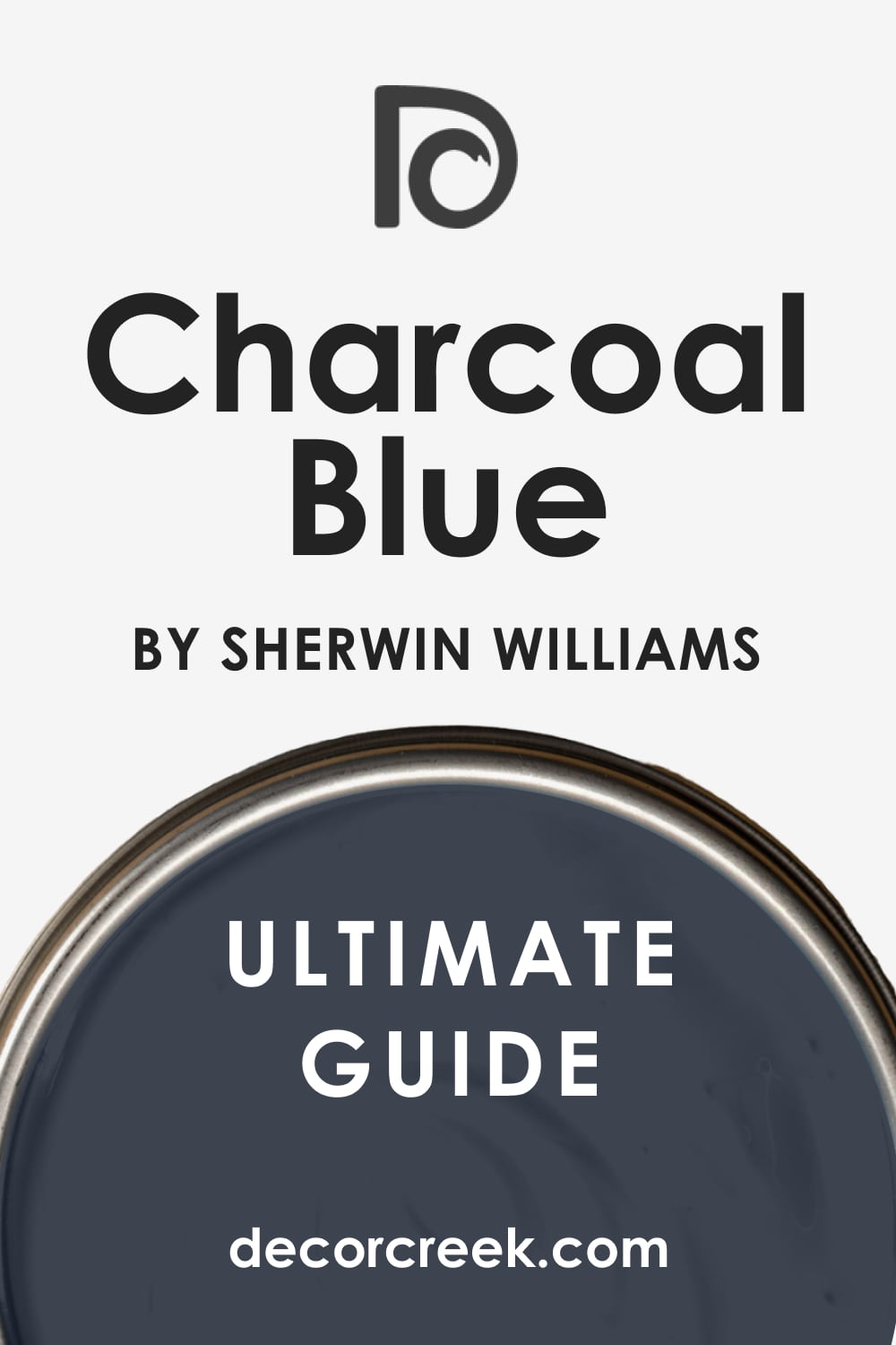
Charcoal Blue SW 2739
Charcoal Blue is a moody blue-gray that feels elegant. It adds sophistication when used on an accent wall. I like pairing Charcoal Blue with light wood floors or crisp white trim. It gives the laundry room a polished and modern feel. This shade works beautifully for families who want a stylish update.
Charcoal Blue brings depth without being too dark.
Rookwood Red SW 2802
Rookwood Red is a warm, rich red that feels bold and inviting. It makes an accent wall look warm and dramatic at once. I love using it with white cabinets or neutral baskets for balance. Rookwood Red brings personality to a laundry room in an instant.
It’s great for families who like strong, warm colors in their home. Rookwood Red always gives the room a welcoming energy.

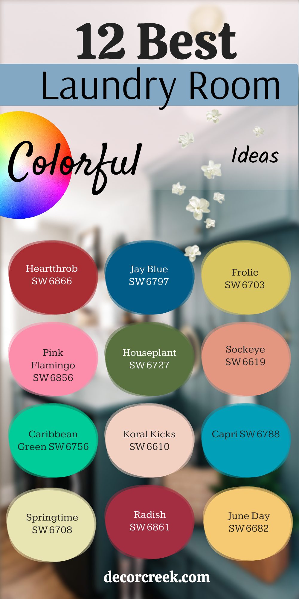
12 Best Colorful Laundry Room Ideas
Heartthrob SW 6866
Heartthrob is a bold red that brings passion and fun into the laundry room. It stands out in a way that makes chores feel lively. I’ve used it with white cabinets and it always looks striking. Heartthrob makes the room feel full of energy, which is great for busy homes. This color never feels boring, even in a small room.
Heartthrob makes the laundry room feel like it has true personality.

Jay Blue SW 6797
Jay Blue is a crisp, bright blue that feels playful. It brings freshness into the laundry room instantly. I like using Jay Blue with light trim or patterned flooring. It’s a color that makes folding laundry feel less of a task. Jay Blue works beautifully in rooms with natural light.
Jay Blue makes the laundry room look lively and modern.

Frolic SW 6703
Frolic is a cheerful lime green that feels fun. It turns the laundry room into a happy place right away. I love pairing Frolic with white baskets and wooden shelves. This color feels full of life and suits families who want joy in every corner. Frolic keeps the mood high while doing chores. Frolic always brings a playful spark to the laundry room.
Pink Flamingo SW 6856
Pink Flamingo is a vibrant pink that feels bright and joyful. It makes laundry rooms feel fresh and cheerful. I like using Pink Flamingo with clean white trim to balance its boldness. This shade is perfect for adding personality to the home. Pink Flamingo creates a sense of fun even during chores.
Pink Flamingo always makes the room look stylish and unique.
Houseplant SW 6727
Houseplant is a leafy green that feels fresh and natural. It brings a lively energy into the laundry room. I’ve used it with light wood accents, and the effect feels balanced. Houseplant works beautifully for families who love bold, earthy colors. It gives the laundry room a refreshing touch.
Houseplant makes chores feel closer to nature.
Sockeye SW 6619
Sockeye is a bright coral red that looks fun and full of life. It makes the laundry room feel like a cheerful part of the home. I’ve paired it with white trim and the contrast always shines. Sockeye works well for those who love warm colors. It keeps the room looking exciting even on busy days.
Sockeye brings a playful warmth that feels inviting.
Caribbean Green SW 6756
Caribbean Green is a vibrant aqua that feels bold and fresh. It makes a laundry room feel lively and upbeat. I like pairing it with light shelving or patterned tile floors. Caribbean Green has a way of lifting moods instantly. It’s great for families who want their home full of cheerful colors. Caribbean Green makes laundry feel less like a task.
Koral Kicks SW 6610
Koral Kicks is a lively coral shade that adds warmth. It brings personality to a laundry room without being too bold. I’ve seen it paired with white walls or baskets and it always looks lovely. Koral Kicks makes the room look cheerful and fun. It works for both small and large rooms.
Koral Kicks is a happy shade for any home.
Capri SW 6788
Capri is a playful bright blue that feels youthful. It brings energy and joy into the laundry room. I love how it pairs with clean white cabinets. Capri makes chores feel less routine and more enjoyable. This shade is perfect for modern families who like bold colors. Capri always adds a lively splash of style.
Springtime SW 6708
Springtime is a soft yellow-green that feels cheerful. It brightens up the laundry room instantly. I’ve used it with white trim, and it looks light and inviting. Springtime makes folding laundry feel like less of a job. This color always makes the room feel uplifting.
Springtime is perfect for families who want cheer at home.

Radish SW 6861
Radish is a strong pink-red that feels bold and fun. It adds excitement to a laundry room without being too heavy. I love pairing Radish with light wood shelves. It’s perfect for homes that like a pop of strong color. Radish makes the room feel warm and lively.
Radish brings personality right into the routine.

June Day SW 6682
June Day is a warm golden yellow that feels cheerful. It makes the laundry room glow with brightness. I like pairing June Day with clean white trim and woven baskets. This color brings sunshine to any corner of the home. June Day feels especially uplifting on gray days.
June Day makes the laundry room feel warm and happy.
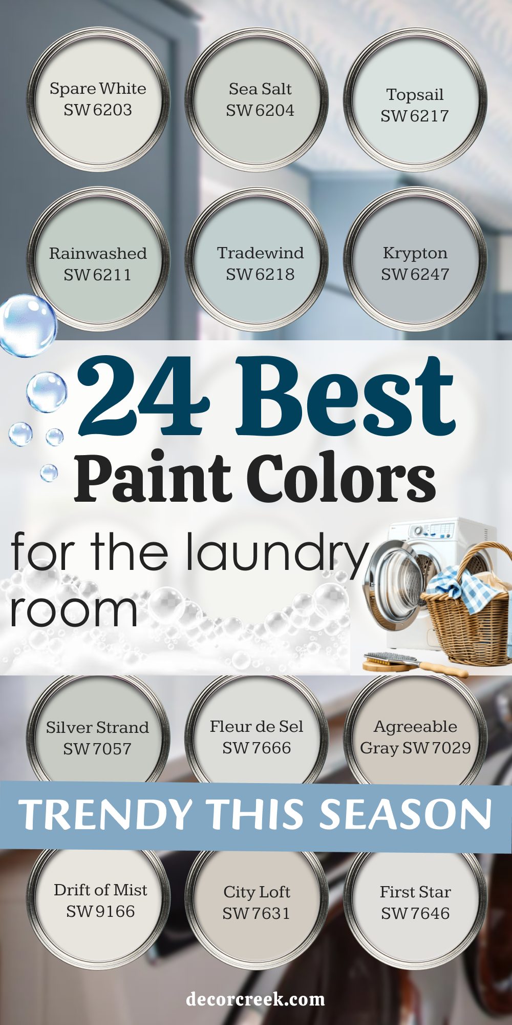
24 Best Paint Colors for the Laundry Room Trendy This Season
Spare White SW 6203
Spare White is a soft, clean shade that brightens the laundry room. It works beautifully with light wood or gray flooring. I love how it keeps the room feeling fresh and simple. Spare White gives the room a crisp look without feeling too sharp. It pairs well with any accent color.
Spare White makes the laundry room a fresh, welcoming spot.
Sea Salt SW 6204
Sea Salt is a soft green-gray that feels fresh. It brings a gentle touch into the laundry room. I love using it with white trim or natural baskets. Sea Salt adds just enough color to keep the room interesting. It always feels balanced and easy on the eyes.
Sea Salt makes laundry time more pleasant.

Topsail SW 6217
Topsail is a breezy blue that keeps the room feeling light. It reminds me of clear skies on a good day. I like using Topsail in laundry rooms with lots of natural light. It pairs beautifully with white cabinets or gray floors. Topsail brings an airy feeling to the routine. Topsail always looks crisp and clean.
Rainwashed SW 6211
Rainwashed is a soft aqua that feels refreshing. It brightens the laundry room with a touch of energy. I love how it pairs with white trim and natural textures. Rainwashed brings a clean and inviting look. It’s perfect for families who like fresh colors in their home.
Rainwashed makes the laundry room feel cheerful.

Tradewind SW 6218
Tradewind is a light blue that feels soft and refreshing. It pairs well with both white and gray cabinets. I’ve used Tradewind in small laundry rooms, and it makes them feel brighter. This shade always feels uplifting. Tradewind adds a cheerful touch without being bold. Tradewind makes laundry tasks feel easier.

Krypton SW 6247
Krypton is a cool gray-blue that looks crisp. It brings a clean and modern touch to the laundry room. I love using Krypton with stainless steel or white accents. This shade works beautifully for families who like modern looks. Krypton feels balanced without being too strong.
Krypton makes the room feel stylish.
Silver Strand SW 7057
Silver Strand is a soft gray with hints of green. It feels clean and refreshing in a laundry room. I like pairing it with natural baskets or white trim. This shade works well for both large and small rooms. Silver Strand keeps the look light but stylish. Silver Strand always feels polished.

Fleur de Sel SW 7666
Fleur de Sel is a pale gray that feels airy. It brightens the laundry room without being too white. I love how it pairs with wood shelves or black accents. Fleur de Sel is perfect for creating a fresh backdrop. It makes the room look clean and modern. Fleur de Sel is a quiet but stylish choice.
Agreeable Gray SW 7029
Agreeable Gray is a warm gray that feels welcoming. It works beautifully with natural wood or white finishes. I love how versatile it is for a laundry room. Agreeable Gray makes the space feel cozy without being too dark.
It’s perfect for a modern yet friendly look. Agreeable Gray brings comfort to chores.

Drift of Mist SW 9166
Drift of Mist is a light gray that feels soft. It brightens the laundry room with a modern touch. I like pairing it with white shelves or light flooring. Drift of Mist keeps the room looking fresh and clean.
It’s perfect for families who prefer lighter shades. Drift of Mist adds quiet style to the laundry room.

City Loft SW 7631
City Loft is a warm neutral that feels inviting. It adds a gentle warmth to the laundry room. I like pairing it with creamy whites or natural wood. City Loft gives the room a modern yet cozy look. It always feels balanced without being too heavy. City Loft keeps the laundry room pleasant.

First Star SW 7646
First Star is a soft gray with a touch of brightness. It feels clean and modern in the laundry room. I love pairing it with darker accent shades for contrast. First Star makes the room feel open and crisp.
It works well in homes that prefer simple colors. First Star adds modern charm to chores.
Lullaby SW 9136
Lullaby is a light baby blue that feels cheerful. It adds sweetness to the laundry room without being too bold. I like pairing it with clean whites for balance. Lullaby works perfectly in small rooms where brightness matters.
This shade makes the room feel refreshing. Lullaby brings a joyful touch to the laundry routine.
Window Pane SW 6210
Window Pane is a soft blue-green that feels airy. It brightens up laundry rooms beautifully. I love using it with wicker baskets and white shelves.
Window Pane keeps the look cheerful and easy. It works well for homes that want light colors throughout. Window Pane always feels uplifting.

Copen Blue SW 0068
Copen Blue is a muted blue with a vintage feel. It gives the laundry room character right away. I like pairing it with white trim and wood details. Copen Blue brings charm without being too bold. It feels both stylish and warm. Copen Blue adds personality to the laundry room.
Open Air SW 6491
Open Air is a bright, light blue that feels cheerful. It keeps the laundry room looking clean and open. I’ve used it with light trim, and it looks beautiful. Open Air works for homes that want color but not heaviness. It always adds a refreshing touch. Open Air makes chores feel lighter.
Oyster Bay SW 6206
Oyster Bay is a soft green-gray that feels natural. It brings a touch of outdoors inside the laundry room. I love using it with white shelves or rustic baskets.
Oyster Bay looks stylish without being too bold. It’s perfect for families who like earthy colors. Oyster Bay gives the room character.

Evergreen Fog SW 9130
Evergreen Fog is a soft gray-green that feels balanced. It brings calm energy to the laundry room. I like pairing it with natural wood or brass fixtures. Evergreen Fog works well in both big and small spaces.
It’s one of those colors that feels stylish yet grounded. Evergreen Fog makes chores feel a little more pleasant.

Escape Gray SW 6185
Escape Gray is a cool gray with a green undertone. It feels modern and fresh in the laundry room. I like using it with white trim or light wood accents. Escape Gray gives the room a polished look.
It works well in homes that want neutral with character. Escape Gray always looks stylish.
Rock Candy SW 6231
Rock Candy is a light gray-blue that feels clean. It brightens the laundry room instantly. I’ve paired it with white shelves, and it looks crisp and fresh. Rock Candy works beautifully for modern homes.
It always keeps the room looking light. Rock Candy makes chores feel easier.

Creamy SW 7012
Creamy is a warm white that feels inviting. It adds a cozy touch to the laundry room. I like pairing Creamy with wood shelves or light baskets. This shade keeps the room soft and welcoming.
It’s perfect for families who like warmth in their home. Creamy makes the laundry room a gentle retreat.

Dover White SW 6385
Dover White is a soft creamy white that feels cheerful. It makes the laundry room glow with warmth. I like using Dover White with natural wood or light trim. This color feels friendly and inviting.
It works beautifully in both modern and traditional homes. Dover White brings warmth into the chores.

Accessible Beige SW 7036
Accessible Beige is a warm beige-gray that feels balanced. It makes the laundry room feel cozy and stylish. I love pairing it with clean white shelves or baskets. Accessible Beige works for homes that want neutral tones with character.
It feels modern without being too cold. Accessible Beige adds comfort to everyday tasks.

Alabaster SW 7008
Alabaster is a soft white that feels light and pure. It brightens the laundry room while keeping it warm. I like pairing it with natural wood or woven baskets. Alabaster makes the laundry room look fresh without being too sharp.
It’s a welcoming shade for any home. Alabaster always brings brightness to chores.

Final Thoughts on a Trendy Laundry Room Palette
When I think about the laundry room, I always believe it deserves just as much attention as any other room. The right paint color can lift the mood, bring energy, and even make chores feel less tiring. From fun shades that burst with personality to trendy neutrals that feel fresh, there’s a perfect match for every home.
I’ve seen how much happier people feel when they enjoy the colors around them, even in a room for chores.
A laundry room painted with care becomes more than just utility—it becomes a bright, cheerful part of daily life.