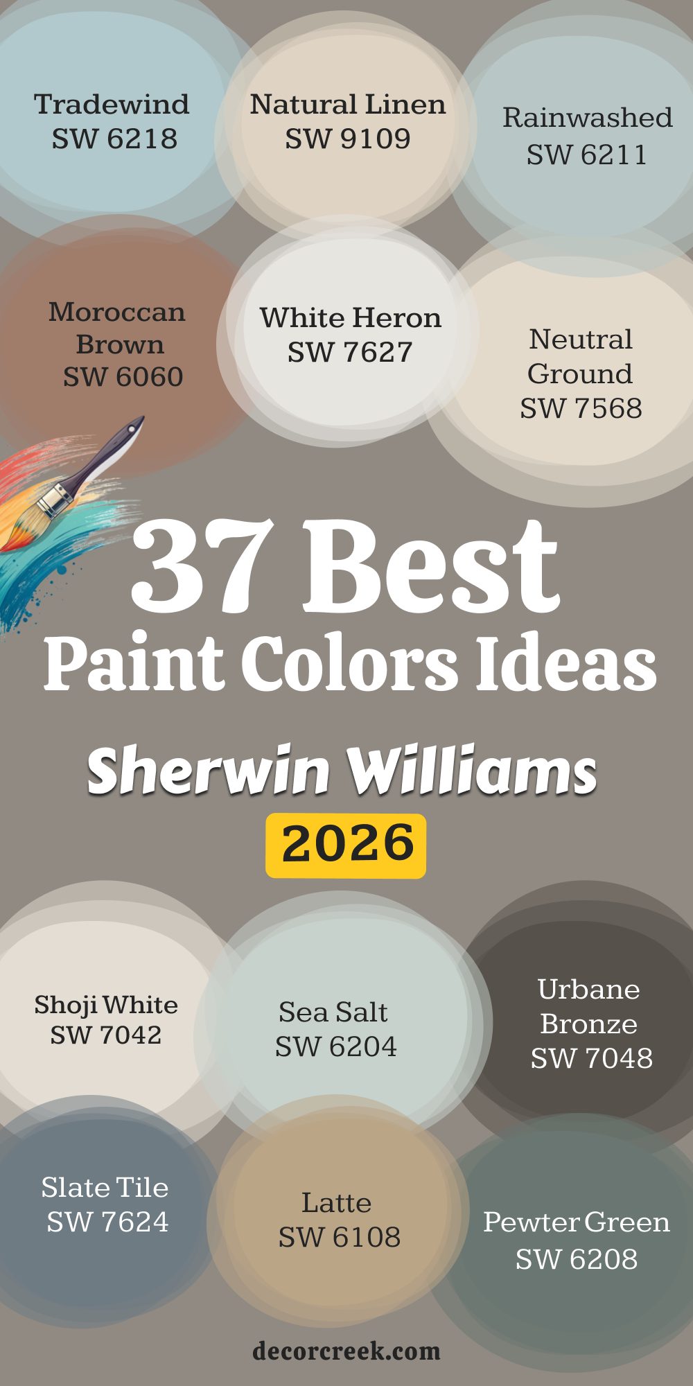
🎨 See the full guide to this color right HERE👈

Color has always been at the heart of everything I do. As someone who designs homes meant to feel warm, inviting, and full of life, I’ve seen how the right shade can completely change the way a room feels. Color has the power to lift a mood, create comfort, and shape the character of a home from the moment you walk through the door.
A fresh coat of paint isn’t just decoration — it’s what sets the tone for the memories made inside.
In 2026, I’m noticing a shift toward shades that feel real, grounding, and lasting. Homeowners are moving away from bold, fast trends and instead choosing colors that bring calm and authenticity to their spaces.
With that in mind, I’ve gathered 37 Sherwin-Williams paint colors that capture this spirit perfectly.
This collection mixes trusted classics with inspiring newer tones that I know will define homes in the year ahead. These aren’t just colors for walls — they’re the foundation for creating rooms that feel connected, beautiful, and genuinely lived in.
When I help a client choose a paint color, I’m not just picking something that looks nice — I’m choosing a shade and a product that must look beautiful, last well, and feel right every single day. That’s why I always come back to Sherwin-Williams. Their colors have a richness and reliability that truly stand out.
Each formula is carefully made to deliver consistent results, which is especially important when working with the soft neutrals and balanced tones that bring a home together.
What I appreciate most about Sherwin-Williams is how their colors stay true. Even after years on the wall or in changing light, the hue doesn’t fade or flatten. For my staging projects, that consistency matters — the color needs to photograph beautifully and look just as inviting in person.
Homeowners who plan to live with their paint for years also love how durable and easy to clean it is.
Choosing this level of quality means fewer worries about wear and more confidence that your home will keep looking polished, warm, and welcoming over time.
Picking paint is like dressing a person—the same outfit won’t work for every occasion! When I choose a shade, I look at the whole picture: the natural light available, the existing furniture and architectural details, and, most importantly, the exact mood we want to create for the people using the room.
For rooms that face north, which tend to have cooler, blue-ish light, I recommend warmer whites and beiges to counteract the chill, bringing in a much-needed feeling of comfort.
South-facing rooms, flooded with warm yellow light, can easily handle cooler grays or true whites that will beautifully maintain their clean look without appearing too yellow or creamy.
I always consider the function of the room and who will be using it most often. Bedrooms should feel restful, making muted colors and soft neutrals a great choice for encouraging relaxation and sweet sleep.
Kitchens and laundry rooms can handle crisp whites or a punch of a bolder color on cabinetry for a lively, energetic feel that helps with morning tasks.
Crucially, I pay close attention to the undertones in the fixed elements of the house—things like permanent flooring, countertops, and backsplash tile.
The right paint should harmonize with these existing colors, not clash with them and cause visual stress.
By choosing a shade that complements those permanent fixtures, you instantly make the whole house feel polished, intentional, and beautifully cohesive, which is the undeniable secret to great design.
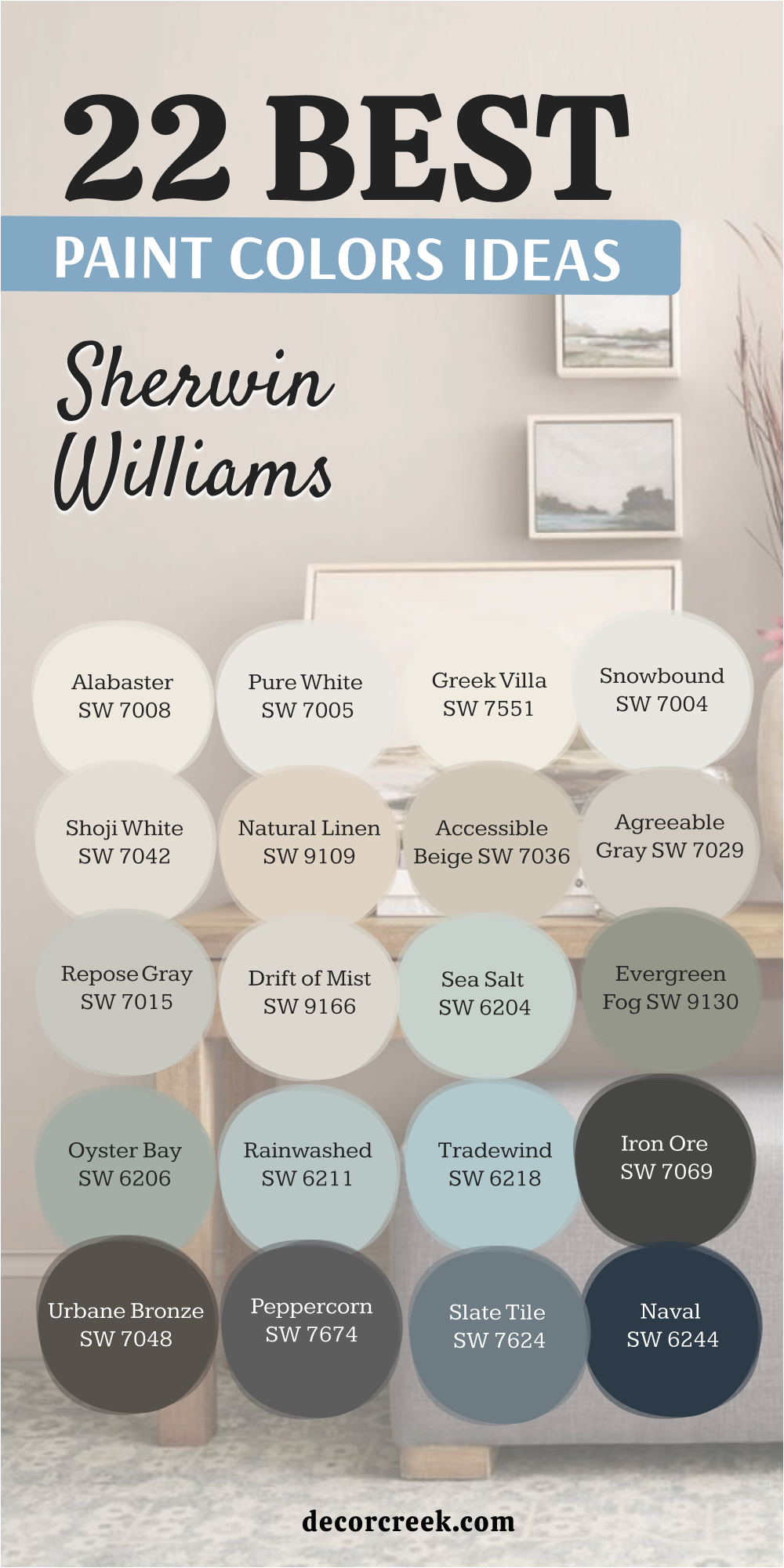
Alabaster is a beloved, creamy off-white that feels instantly gentle and soft, avoiding the starkness of a true white. This paint color was a former Sherwin-Williams Color of the Year, and its popularity continues because it brings a wonderfully inviting warmth to any wall.
I especially love using it on exteriors and interiors alike, as it radiates a gorgeous, welcoming glow that looks authentic and high-end.
It possesses a slight beige undertone that keeps it looking rich and elegant, preventing it from ever feeling cold or empty in a room. Alabaster is an excellent choice for cabinets in a kitchen or on shiplap walls where you want a white that feels cozy and nurturing. I recommend pairing this beautiful shade with natural wood tones and soft, textured fabrics to emphasize its comforting quality in living rooms and bedrooms.
Pure White is a fantastic, crisp white that is very bright and clean, making it a staple for trim, doors, and ceilings in almost every home I work on. This paint is beautifully balanced, carrying just a tiny drop of warmth that keeps it from ever looking icy blue or harshly stark on the walls.
It is a highly versatile shade that works perfectly with both warm greiges and cooler gray tones, acting as a clean, reliable background for every palette.
I frequently use this shade on kitchen cabinets because it looks clean and fresh without feeling too sterile or clinical under bright lights.
Pure White is also wonderful for entire walls when you want a truly bright, airy feeling that makes a room appear larger and more open.
It provides a fantastic, high-contrast look that makes architectural details and bold colors in furniture truly stand out.
🎨 See the full guide to this color right HERE👈

Greek Villa is a gorgeous, light-reflecting off-white that has a lovely soft creaminess, creating an immediately cheerful and bright atmosphere. This paint color has a noticeable, but very soft, yellow-beige undertone, giving it a gentle warmth that makes a room feel inviting and sunny.
I often recommend it for darker rooms or areas that don’t get much natural light, as it acts like a subtle ray of sunshine on the walls.
It is an ideal choice for a whole-house color where you want a consistent, warm white that flows beautifully from one room to the next without any visual jarring.
Greek Villa pairs wonderfully with natural materials and rich wood trim, lending a historic, established feeling to the interior design.
This comforting shade is perfect for living rooms and formal dining areas where you want a friendly, appealing glow.
🎨 See the full guide to this color right HERE👈

Snowbound is a bright, very clean white that carries a tiny, almost imperceptible pink or greige undertone, which gives it a unique, gentle quality. This paint is a fantastic choice for those who want a crisp white on their walls but find Pure White or Chantilly Lace a bit too bright or overwhelming.
I use this shade often in modern or transitional homes because it provides a refined, clean backdrop that still feels very current and intentional.
It is particularly striking when paired with darker colors like navy or charcoal gray, creating a beautiful and sophisticated contrast that draws the eye.
Snowbound works perfectly for trim, but it truly shines when used on all walls to make a statement of quiet, soft purity in bedrooms and offices.
I find this appealing color is an excellent base that lets your colorful artwork and accessories take center stage and look their best.
🎨 See the full guide to this color right HERE👈

Shoji White is a magnificent, warm off-white that sits firmly in the greige family, possessing significant beige-tan undertones that make it wonderfully earthy and grounded. This paint color is an excellent choice for creating a cozy, plaster-like, and highly textured feeling on the walls, giving the room an immediate sense of richness.
I recommend it often for living rooms, hallways, and open-concept areas because it provides a soft, defining color without ever feeling heavy or dark in the large space.
It pairs beautifully with natural wood furnishings, rattan, and linen fabrics, leaning heavily into a warm, organic-inspired aesthetic that is currently quite popular.
Shoji White is a reliable performer in any light, maintaining its warm, beautiful hue without flashing unexpectedly cool or gray.
This shade is a sophisticated alternative to pure white when you want an authentic, light-filled warmth that feels rich and cultivated.
🎨 See the full guide to this color right HERE👈

Natural Linen is a beautiful, light beige that is rich with warm, sunny yellow-gold undertones, making it one of my favorite options for adding a cheerful, buttery glow to a room. This paint color is perfect for combating a north-facing room’s cold light, as it immediately infuses the area with a much-needed sense of warmth and brightness.
I often suggest it for kitchens, breakfast nooks, and mudrooms where you want a happy, lighthearted atmosphere that encourages people to relax and feel good.
It works wonderfully with traditional white trim and rustic wood tones, creating a classic, friendly, and utterly inviting feeling in the home.
Natural Linen is a great choice if you appreciate the look of natural fibers and aged plaster, as this color beautifully mimics those soft, textural qualities.
This is a fantastic, easy-to-live-with color that serves as a friendly and comforting background.
🎨 See the full guide to this color right HERE👈

Accessible Beige is one of Sherwin-Williams’ most famous colors, a highly successful greige that leans beautifully toward the beige side, making it inherently warm and grounding. This paint color works successfully in almost any home and with nearly any flooring, which is why it’s a go-to for designers and stagers across the country.
I rely on it heavily as a whole-house color because its dependable warmth makes every room feel instantly connected, welcoming, and intentionally well-designed.
It carries just enough gray to keep it from looking dated or overly yellow, providing a modern update to traditional beige colors that used to be popular. Accessible Beige is the perfect choice for living rooms, bedrooms, and dining rooms where you want a reliable neutral that is comforting and soft. I suggest pairing it with Pure White trim for a crisp, fresh contrast that highlights its gentle, earthy warmth.
🎨 See the full guide to this color right HERE👈

Agreeable Gray is arguably Sherwin-Williams’ most popular color, a truly perfect greige that leans slightly more toward the gray side than Accessible Beige, giving it a modern sensibility. This paint color is famous for its uncanny ability to adapt to almost any lighting condition, maintaining its appealing neutral quality without flashing unexpected colors.
I recommend it to clients who want a contemporary gray look but are afraid of their walls feeling too cold or too blue, as this shade has a comforting warmth.
It works wonderfully as a whole-house color because its versatility creates a sophisticated, cohesive flow throughout the entire floor plan. Agreeable Gray is a highly sought-after shade for staging because it appeals to the widest range of potential home buyers and their tastes. This fantastic, light-filled neutral is an absolute safe bet for any main living area where you want a refreshing and dependable color.
🎨 See the full guide to this color right HERE👈

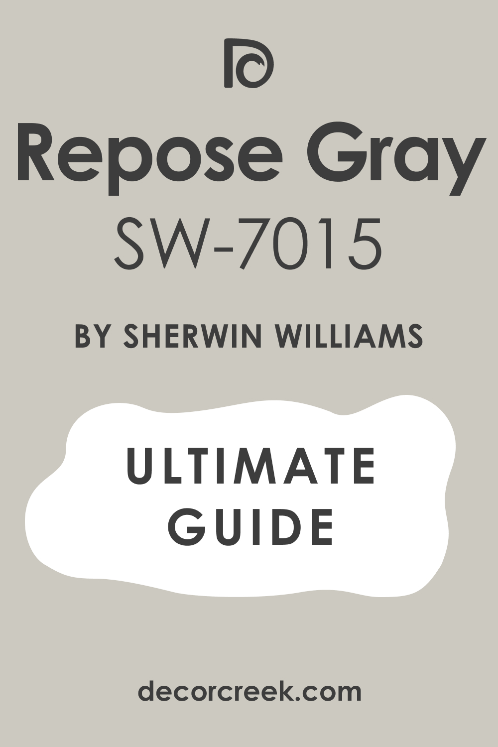
Repose Gray is a slightly deeper, more saturated gray than Agreeable Gray, giving it a more noticeable and grounded presence on the wall with clear cool undertones. This paint color is a wonderful choice for creating a clean, architectural feeling in a room, especially when contrasted against crisp white trim and millwork.
I often use it in homes with high ceilings or in rooms where the furniture is bright and colorful, as it provides a solid, grounding backdrop that allows the items to pop.
It has a noticeable beige undertone that keeps it from reading as a cold silver, making it a perfectly balanced true gray that feels refined. Repose Gray is an excellent option for a dedicated office, a formal dining room, or a master bedroom where you want a tailored and quietly handsome feel. I advise pairing this sophisticated shade with warm wood tones to prevent the overall look from feeling too cool or aloof.
🎨 See the full guide to this color right HERE👈
Drift of Mist is an airy, light-filled greige that is nearly an off-white, offering just the faintest whisper of warm color on the wall for definition. This paint is perfect for rooms where you want a white-washed look but are worried that a true white will look too stark or flat in the low light.
I love using it for walls in bedrooms and bathrooms because its gentle, misty quality creates a soft, very light atmosphere that feels easy and lovely.
It is an ideal color for those seeking a highly sophisticated, barely-there neutral that still provides enough contrast against the trim.
Drift of Mist is a wonderfully versatile shade that reads slightly warmer in dark rooms and slightly cooler in sunny rooms, always looking refined.
I suggest using this shade with lots of natural texture and light wood finishes to highlight its airy, gentle nature.
🎨 See the full guide to this color right HERE👈

Sea Salt is a delightful, famous color, a beautifully soft green-gray with a definite hint of blue, that makes you feel instantly happy and relaxed. This paint is one of my top choices for master bathrooms, bedrooms, and sunrooms because its watery quality brings a refreshing, gentle touch of nature inside.
I often recommend it when a client wants color on their walls but doesn’t want anything too bright or bold, as this shade is muted and dependable.
It changes wonderfully throughout the day, looking more gray in the morning and greener in the afternoon, providing visual interest that never gets boring. Sea Salt pairs beautifully with white tile, chrome fixtures, and plush white towels, creating that desirable, spa-like atmosphere at home. I believe this highly appealing color is a guaranteed winner for creating a lighthearted, beautiful, and slightly coastal-inspired feeling.
🎨 See the full guide to this color right HERE👈

Evergreen Fog is a gorgeous, muted green with a substantial amount of gray, giving it a sophisticated, earthy, and highly grounding feel that promotes quiet focus. This paint color was the Sherwin-Williams Color of the Year for 2022, and it continues to be a fantastic choice for adding rich color that feels natural.
I love using it in dens, dedicated home offices, or on cabinetry because it adds an immediate sense of depth and curated style that feels intentional.
It pairs beautifully with warm leather, dark wood tones, and brass accents, creating a comfortable and handsome aesthetic that feels rich and established. Evergreen Fog is the perfect way to bring the feeling of the outdoors inside without using a bright or overpowering shade of green that might cause fatigue. I suggest using it in a room that gets good light so its beautiful, complex color can truly shine and look its best.
🎨 See the full guide to this color right HERE👈

Oyster Bay is a beautiful, deeper take on the popular Sea Salt color, offering a richer, more saturated green-gray with a noticeable blue undertone. This paint provides a wonderful option for clients who love the feel of Sea Salt but want a color with more presence and depth on the wall to make a stronger statement.
I often use this shade in master bedrooms or coastal-themed dining rooms because its color is so relaxing and evokes the feeling of the sea.
It is perfect for creating a lush, nature-inspired environment that feels mature and beautifully sophisticated, rather than too bright or whimsical. Oyster Bay works beautifully with crisp white trim and darker furniture pieces, allowing the color to really stand out and define the space. I recommend this appealing shade for anyone looking for a rich, calming color that remains beautifully refined.
🎨 See the full guide to this color right HERE👈

Rainwashed is a very refreshing, slightly brighter green-blue-gray that is wonderfully airy and light, providing a feeling of crisp cleanliness. This paint is a fantastic choice for creating a cheerful, spa-like atmosphere in a bathroom or a sunny laundry room that needs a little lift of color.
I love using it in homes where the architecture is very crisp and modern because its light, watery color complements the clean lines beautifully.
It has a great luminosity to it, helping to reflect light around the room and making the area feel larger and more open than it might actually be. Rainwashed is less gray than Sea Salt, making it a more colorful and energetic option for a room where you want a hint of cheerful vibrancy. I suggest pairing it with white subway tile and natural woven baskets for a fresh, clean, and highly appealing look.
🎨 See the full guide to this color right HERE👈

Tradewind is a stunning, clear blue with a healthy dose of gray, giving it a slightly muted and very sophisticated coastal appearance that feels instantly restful. This paint color is an excellent choice for bedrooms, guest rooms, and dining rooms where you want a beautiful, clear blue that still feels grounded and mature.
I often suggest it for creating a relaxed, yet elegant, atmosphere that reminds you of the ocean on a calm, sunny day.
It has enough color saturation to be noticeable and present on the wall but is not so dark that it makes the room feel small or heavy, which is a key balance.
Tradewind pairs perfectly with dark wood furnishings and white linens, creating a classic, tailored look that always feels clean and inviting.
I believe this is one of the most successful, true blue shades that successfully avoids looking either too purple or too aqua on the walls.
🎨 See the full guide to this color right HERE👈

Iron Ore is an incredibly sophisticated, deep charcoal gray that has a slight black depth, making it the perfect choice for a dramatic accent or cabinetry color. This paint is a fantastic way to introduce a grounding, moody feeling to a room without fully committing to a harsh black color that can absorb too much light.
I love using it on kitchen islands, built-in bookshelves, and dramatic accent walls to create a striking focal point that draws immediate attention.
It has subtle, warm-brown undertones that keep it from feeling too cold or severe, making it feel complex and beautifully soft despite its darkness. Iron Ore creates an absolutely gorgeous contrast against light white walls and trim, providing that sharp, high-end look many homeowners desire. I recommend this shade for a den, powder room, or front door to add an instant, powerful injection of tailored style.
🎨 See the full guide to this color right HERE👈

Urbane Bronze is a powerful, deep bronze color that perfectly blends dark brown, charcoal gray, and a subtle touch of olive green, making it incredibly rich and earthy. This paint was the Sherwin-Williams Color of the Year for 2021, and its popularity is due to its strong, yet comforting, presence on the wall.
I often use it for feature walls, cabinetry, or even on all four walls of a dedicated den to create an intimate, cocooning, and highly luxurious feel.
It pairs beautifully with leather, warm metals like copper or brass, and natural stone, emphasizing its strong, grounded, and organic-inspired aesthetic.
Urbane Bronze provides a stunning, modern alternative to black or navy, offering a unique complexity that feels deeply established and high-end.
I suggest using this appealing shade in rooms where you want a sense of architectural weight and quiet sophistication.
🎨 See the full guide to this color right HERE👈

Peppercorn is a wonderful, dark charcoal gray that is a touch lighter and slightly warmer than Iron Ore, making it a very handsome and versatile deep neutral. This paint color is one of my go-to choices for adding drama to an interior without running the risk of it feeling too black or too moody for the average homeowner.
I often suggest it for bathroom vanities, laundry room cabinets, or on walls in a media room where you want a defined and contained atmosphere.
It carries a gentle hint of blue/purple undertone, giving it a complexity that makes it look incredibly sophisticated and refined against white trim. Peppercorn creates a powerful contrast that makes any white trim and millwork pop beautifully, highlighting the architectural details in the room. I recommend this reliable, dark gray for a sophisticated focal point that maintains a polished, clean appearance.
🎨 See the full guide to this color right HERE👈

Slate Tile is a magnificent, deep gray-blue that has a perfect balance of cool tones, mimicking the beautiful color of natural slate stone. This paint color is a more saturated, slightly bolder take on a traditional gray, offering a strong presence that feels tailored and quietly commanding.
I love using it in formal dining rooms, bedrooms, or powder rooms to add a refined, handsome color that feels both deep and wonderfully grounded.
It provides a sophisticated, moody backdrop that allows artwork with yellow or orange tones to truly pop and shine against the cool wall color. Slate Tile works excellently on exterior surfaces as well, providing a highly appealing color for shutters or a front door that adds immediate curb appeal. I suggest pairing this rich shade with polished dark wood and silver or nickel fixtures for a classic, high-end look.
🎨 See the full guide to this color right HERE👈

Naval is an absolutely classic, deep, rich navy blue that is one of Sherwin-Williams’ most famous and beloved colors for its pure, nautical quality. This paint color provides an immediate injection of energy, luxury, and traditional style, making it a favorite for adding a dramatic touch.
I often use it on kitchen islands, built-in cabinets, and accent walls in bedrooms to create a stunning, saturated focal point that commands attention.
It is a highly versatile shade that works beautifully in both traditional and modern homes, providing a strong anchor for any decor style. Naval creates a sharp, eye-catching contrast against crisp white trim and moldings, emphasizing the clean lines of the room’s architecture. I believe this reliable, deep blue is an excellent choice for homeowners looking for a bold, powerful color that is still undeniably classic and enduring.
🎨 See the full guide to this color right HERE👈

Peppery is a vibrant, mid-tone orange-red that is packed with cheerful energy and a strong, earthy warmth, making it an incredibly lively color. This paint is perfect for adding a bright, unexpected pop of saturated color to a smaller area, such as a laundry room or a cozy library bookshelf interior.
I love using it as an accent color in a kitchen or a breakfast nook to bring a feeling of lively warmth and appetite-inducing energy to the area.
It is a bold color, so I recommend using it selectively, perhaps on a single wall or a piece of painted furniture, to avoid it feeling too intense.
Peppery works beautifully with natural beige and creamy white neutrals, allowing its beautiful, spicy color to truly shine without any competition.
I suggest this appealing shade for anyone looking to add a definite, memorable spark of happy color to their home’s palette.
🎨 See the full guide to this color right HERE👈
Dried Thyme is a gorgeous, earthy mid-tone green with a strong, comforting touch of gray and brown, giving it a grounded, historical feeling. This paint color is slightly richer and more pigmented than Evergreen Fog, making it a bolder choice for a room that needs a substantial color.
I love using it in dining rooms or cozy dens because its color feels instantly established, refined, and wonderfully connected to nature’s deep greens.
It pairs exceptionally well with polished wood, metallic accents, and leather furniture, creating a handsome, tailored look that feels sophisticated and custom. Dried Thyme is a fantastic choice for kitchen or bathroom cabinets when you want a color that feels interesting and unique, yet still fully neutral and appealing. I recommend this shade for anyone who wants a substantial, natural green that adds immediate gravity and depth to their interior.
🎨 See the full guide to this color right HERE👈
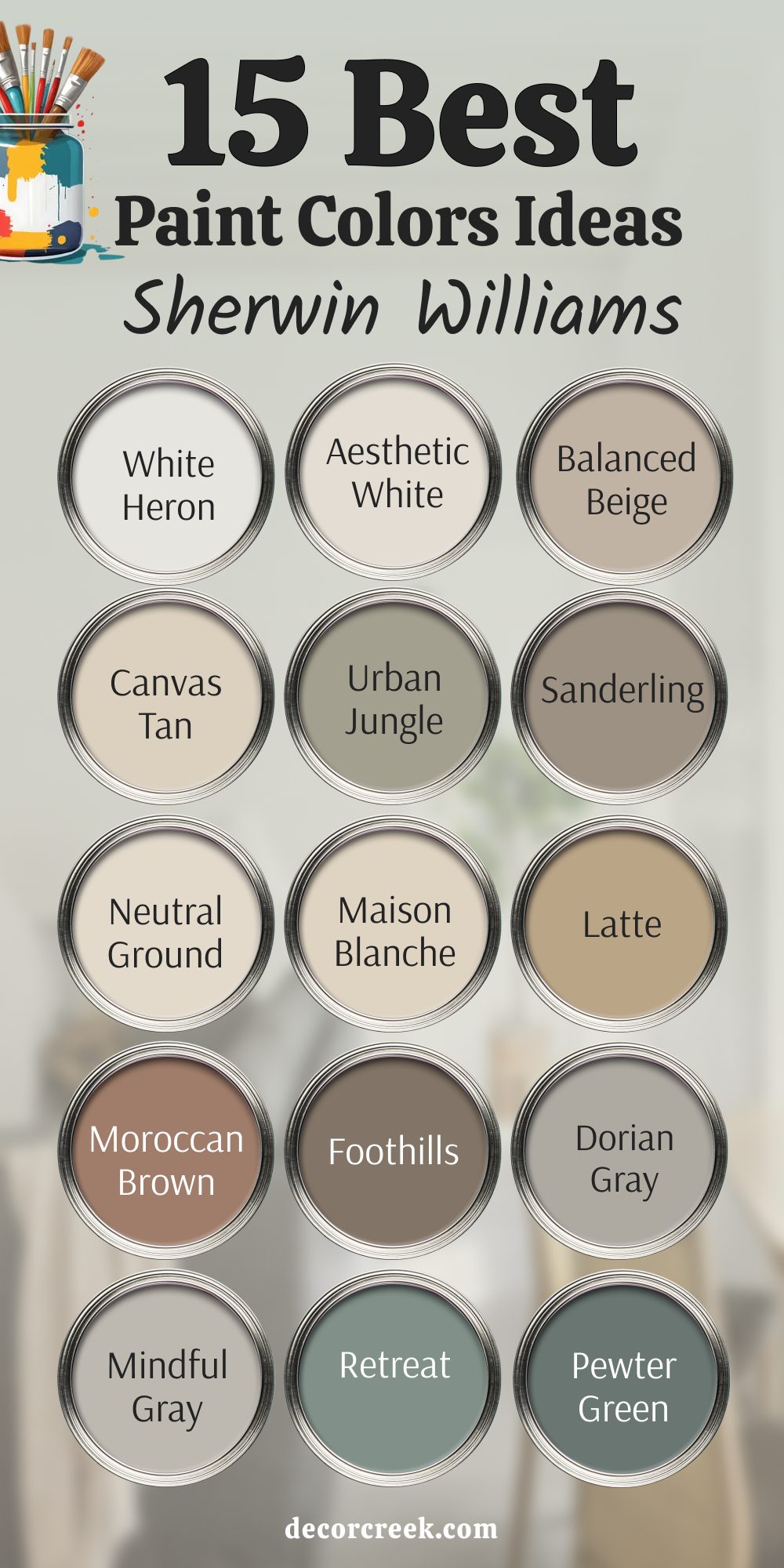
White Heron is a beautifully light, soft white that offers just a hint of creamy beige undertone, making it a perfect, gentle wall color. This paint is slightly warmer than Pure White but cleaner than Alabaster, positioning it as a beautifully balanced choice for many interiors.
I often use it on walls throughout an open-concept living area where a homeowner wants a bright look that never feels cold or too stark.
It works wonderfully as a versatile backdrop, allowing bright furniture and colorful accessories to take the main focus in the room. White Heron is an excellent option for bedrooms, as its soft warmth promotes a very light, airy, and gentle atmosphere that is conducive to relaxation. I suggest pairing this appealing shade with a deeper gray or navy accent color to highlight its clean, refined quality and avoid a washed-out feeling.
🎨 See the full guide to this color right HERE👈
Aesthetic White is a fantastic, highly versatile light greige that leans beautifully toward the beige, giving it a soft, earthy quality that is immediately inviting. This paint color is much warmer than Agreeable Gray and acts almost like a deep off-white that still has a noticeable, rich presence on the walls.
I recommend it to clients who want a neutral that feels very light but still has enough depth to contrast gently against crisp white trim and millwork.
It is a great choice for a whole-house color in a home with lots of natural wood trim or earth-toned flooring, as it brings everything together. Aesthetic White works wonderfully in large living rooms and hallways, providing a consistent feeling of sophisticated warmth that appeals to many tastes. I find this reliably friendly shade is a true crowd-pleaser that makes a home feel both bright and wonderfully cozy.
🎨 See the full guide to this color right HERE👈

Balanced Beige is a perfect, medium-toned greige that sits directly between beige and gray, offering a slightly deeper and more saturated color than Accessible Beige. This paint color is one of my go-to choices when a room needs a neutral with a bit more weight and grounding presence, such as in a formal dining room or a den.
I love how its brown-gray undertones make it feel highly sophisticated and tailored, avoiding the dated look of older, overtly golden beiges.
It is an excellent option for creating a wonderfully cohesive backdrop that works beautifully with both darker furnishings and lighter fabrics for a rich contrast. Balanced Beige works successfully in any light, maintaining its deep, appealing color without flashing unexpected hues or looking muddy. I suggest using this reliable shade with white trim to ensure the color retains a clean, contemporary edge in the room’s design.
🎨 See the full guide to this color right HERE👈

Canvas Tan is a gorgeous, light tan that has a prominent creaminess and a gentle yellow-gold undertone, making it one of the warmest neutrals I use regularly. This paint color is perfect for creating a classic, soft look that feels immediately traditional, cozy, and wonderfully comfortable in any setting.
I often recommend it for homes with Mediterranean, Tuscan, or historic architectural styles where a cool gray would feel completely out of place and jarring.
It works wonderfully to soften sharp edges and create a gentle, inviting glow, especially when used generously on all walls in a family room. Canvas Tan is a much-loved shade for painting kitchen cabinets, giving them a rich, buttery softness that feels custom and very high-end. I believe this beautiful, highly dependable shade is a great alternative to white when you want an authentic, deep warmth on your walls.
🎨 See the full guide to this color right HERE👈

Urban Jungle is a beautiful, muted gray-green that has a definite earthy richness, providing a complex and incredibly sophisticated alternative to a standard gray. This paint color is a unique shade that feels both grounded and wonderfully stylish, making it a fantastic choice for a unique design statement.
I love using it in home offices, studies, or on feature walls because its color provides a feeling of quiet contemplation and organic texture.
It has strong, grounding brown-gray undertones that keep it from looking too bright or too minty, ensuring it always looks refined and mature on the wall. Urban Jungle pairs beautifully with dark wood furniture and natural stone, emphasizing its strong connection to the natural world and rich materials. I suggest this subtly rich shade for anyone looking for a unique color that is still fully neutral and visually appealing.
🎨 See the full guide to this color right HERE👈

Sanderling is a rich, sandy beige that is packed with warmth and gentle yellow-gold undertones, giving it a wonderfully sunny and bright disposition. This paint color is perfect for creating a cheerful, beach-inspired atmosphere that feels lighthearted, airy, and very welcoming to everyone.
I often recommend it for homes in warmer climates or for sunrooms where you want a color that truly mirrors the warmth of the natural light.
It works wonderfully as a main living area color, providing a consistent feeling of cheerful warmth that pairs well with light fabrics and coastal decor elements. Sanderling is a bolder, more saturated beige than Canvas Tan, making it a great choice when you want a more definite color on the walls. I find this highly dependable shade is excellent for creating a bright, breezy, and effortlessly comfortable feeling in your home.
🎨 See the full guide to this color right HERE👈
Neutral Ground is a lovely, creamy off-white that has a definite, gentle beige undertone, making it feel wonderfully soft, warm, and utterly non-intrusive. This paint is a fantastic choice when you want a clean white that you can use everywhere but are worried about it looking too stark or reflecting too much cool light.
I love how this shade works with both modern and traditional styles, providing a consistent feeling of simple elegance that always looks current.
It works wonderfully as a perfect backdrop for displaying colorful artwork and interesting decor, allowing the items to be the star without the wall color fighting them. Neutral Ground is an excellent, versatile option for walls in any room, but especially shines in bedrooms where a soft, light-filled warmth is a priority. I suggest pairing this appealing shade with a crisp white trim like Pure White to make its gentle color truly stand out.
🎨 See the full guide to this color right HERE👈

Maison Blanche is a beautiful, rich off-white that has a slightly more saturated beige undertone than Neutral Ground, giving it a wonderfully substantial, historic feel. This paint color is perfect for creating a soft, slightly antique, or French-country inspired aesthetic that feels instantly cozy and wonderfully sophisticated.
I often recommend it for cabinets or built-ins where you want a white that feels warm and gentle, rather than overly stark or bright.
It works beautifully in formal dining rooms and living areas, casting a gentle, welcoming glow that makes the room feel naturally well-lit and comfortable.
Maison Blanche is a fantastic choice for blending architectural details with wall color, giving a cohesive, plaster-like softness to the entire room.
I find this incredibly rich shade is a wonderful way to add authentic warmth without committing to a full beige or tan color.
🎨 See the full guide to this color right HERE👈
Latte is a beautiful, medium-toned tan that has deep, comforting brown and noticeable red undertones, giving it a warm, rich, and highly traditional quality. This paint color is a great choice for creating a cozy, handsome, and highly grounded atmosphere in a den, study, or master bedroom.
I love how its depth adds a sense of luxury and weight to a room, especially when used generously and paired with rich, dark wood furnishings.
It works beautifully with cream and white accents, allowing the contrast to emphasize the rich, warm color on the walls. Latte is a fantastic shade for painting a feature wall or a set of bookshelves, adding a powerful, defined focus point to the overall design. I suggest using this reliable color in well-lit rooms where its depth can truly shine and look its most sophisticated.
🎨 See the full guide to this color right HERE👈
Moroccan Spice is a deep, rich chocolate brown that carries a strong, dark red undertone, giving it a powerful, luxurious, and highly dramatic feeling. This paint color is perfect for making a bold, sophisticated statement in a dedicated library, a formal dining room, or a cozy, intimate den.
I often recommend it for use in smaller, well-defined areas where you want to create a feeling of private luxury and deep relaxation, like a powder room.
It pairs beautifully with polished brass, highly textured fabrics like velvet, and sharp white trim, creating a truly high-end and memorable aesthetic. Moroccan Spice provides a stunning backdrop for art and photography, allowing the images to pop vividly against the rich, dark color. I believe this intense shade is a fantastic way to add gravity, depth, and unapologetic style to your home.
🎨 See the full guide to this color right HERE👈
Foothills is a beautiful, warm light-to-medium greige that has a strong, welcoming tan undertone, making it a very grounded and earthy neutral choice. This paint color is a great alternative to Accessible Beige, offering a slightly deeper color with more saturation and a stronger, sunny presence on the walls.
I often use it in homes that have stone fireplaces or natural wood beams because its color beautifully complements those fixed, organic architectural details.
It works wonderfully as a consistent color throughout main living areas, providing a sense of comforting continuity and flow.
Foothills is a fantastic shade for creating a classic, traditional look that feels both light-filled and wonderfully established in its design.
I suggest pairing this friendly color with dark brown or black accents to highlight its gentle, beautiful warmth and richness.
🎨 See the full guide to this color right HERE👈
Dorian Gray is a deep, true gray that is a shade darker than Repose Gray, giving it a substantial, grounded, and very serious presence on the wall. This paint color is a perfect choice for creating a clean, architectural feeling, especially in a dedicated den, office, or a formal living room that needs weight.
I love how its depth makes white trim and crown molding truly stand out, highlighting the fine craftsmanship of the home’s features beautifully.
It is an excellent option for an exterior paint color, providing a handsome, tailored look that has strong, sophisticated curb appeal. Dorian Gray is a cool gray, but its complexity keeps it from looking flat or lifeless, making it a truly refined and high-end shade. I recommend pairing this substantial color with warm wood flooring and colorful rugs to ensure the room feels balanced and inviting.
🎨 See the full guide to this color right HERE👈

Mindful Gray is a beautiful, mid-toned gray that is slightly warmer than Repose Gray, carrying a bit more noticeable beige-greige undertone that makes it highly appealing. This paint color is a fantastic choice for those who want a true gray but need a shade that feels a little more inviting and less strictly cool on the walls.
I often use it as a consistent color in main living areas because its depth provides definition without ever making the rooms feel dark or small.
It works wonderfully with modern, clean lines, but also complements traditional furniture styles, making it a highly versatile neutral for any home. Mindful Gray is a great backdrop color that allows accessories and wall art to truly shine without any distraction from the wall. I find this dependable shade is one of the safest and most popular choices for achieving a polished, refined gray look.
🎨 See the full guide to this color right HERE👈

Retreat is a gorgeous, rich olive green with a strong, comforting dose of gray, making it a deeply saturated and wonderfully earthy color. This paint is a fantastic choice for creating a cozy, secluded, and highly sophisticated atmosphere in a dedicated den, library, or a guest bedroom.
I love how its depth adds a sense of quiet drama and established elegance to any room it graces, making the area feel instantly high-end and custom.
It pairs exceptionally well with polished wood, soft leather, and gold or brass fixtures, creating a handsome, layered, and luxurious look. Retreat is a powerful color, so I recommend using it in a room that gets enough natural light to truly showcase its beautiful, complex green-gray quality. I believe this rich, appealing shade is a wonderful way to bring a natural, enduring sophistication into your home’s design.

Pewter Green is a stunning, dark gray-green that is deeper and moodier than Retreat, carrying more gray and less yellow, giving it a highly refined coolness. This paint color is perfect for making a dramatic, grounding statement on kitchen cabinetry, built-in mudroom benches, or a strong accent wall.
I often suggest it for creating an atmosphere of tailored luxury and quiet contemplation, making it a great choice for a master bedroom or a formal study.
It works beautifully with crisp white trim, creating a sharp contrast that makes the green tone feel incredibly fresh and pronounced on the walls. Pewter Green has a strong architectural quality that adds weight and definition to a room, making it feel very custom and intentional in its design. I find this intense shade is one of the most successful dark greens for adding drama while still maintaining a classic, enduring appeal.
🎨 See the full guide to this color right HERE👈
Choosing paint is an emotional decision, and my job as a designer and stager is to help you pick colors that will make you truly love your home and feel good inside it every single day.
The 37 shades listed here are my handpicked selections because they all share a rare quality: they reliably make people feel grounded, happy, and at ease in a space, making them highly desirable.
Whether you go for the enduring light of a classic like Alabaster or the deep sophistication of Naval, you are investing in an authentic, lasting feeling that adds immeasurable value.
In 2026, the best interiors will be the ones that feel authentic, welcoming, and deeply personal, and that critically starts with the right color on the walls.
Don’t be afraid to try a few samples—seeing a color in your actual light is the only way to truly know if it’s “the one” for your home. Trust your gut, pick a shade from this dependable, expert list, and get ready to enjoy the beautiful, styled atmosphere you have created.