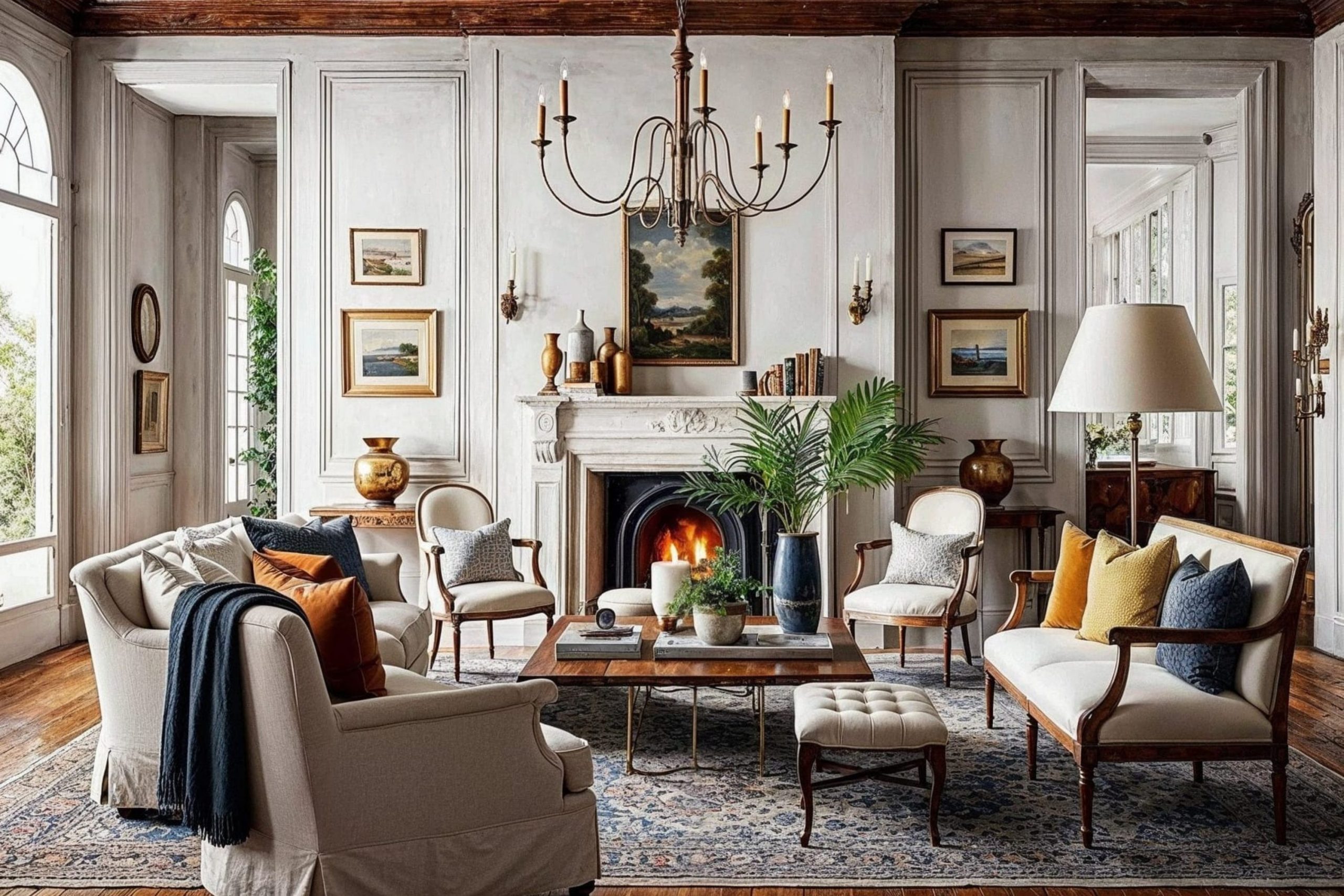
Castlecore, to me, feels like stepping into a storybook — where every room holds warmth, age, and a quiet sense of beauty. This style brings together rich, earthy tones and soft, weathered finishes that remind me of old stone walls, antique wood, and candlelight.
In 2026, Castlecore continues to grow in popularity because people crave comfort mixed with character — homes that feel timeless and full of life.
When I design with this aesthetic, I look for colors that whisper elegance rather than shout for attention.
The beauty of Castlecore lies in its balance: deep greens beside soft creams, warm taupes paired with moody purples.
Each shade works to make the home feel grounded, lived-in, and slightly nostalgic. Whether you live in a modern apartment or a countryside cottage, these paint colors can create that same sense of quiet grandeur — a home that feels both romantic and strong.
Why I Always Trust Sherwin-Williams and Benjamin Moore for Castlecore Paint Colors
When I design a home with a strong aesthetic like Castlecore, I need paint colors that have genuine depth and complexity. That’s why I rely almost exclusively on Sherwin-Williams and Benjamin Moore. They truly understand color.
Their pigments are finely milled, giving their paints a rich, layered quality that cheaper brands just can’t replicate.
In a Castlecore scheme, we often work with moody, complex neutrals and saturated, jewel-toned colors. These hues need to react beautifully to light—sometimes looking grey, sometimes green, or shifting from deep blue to near-black.
Sherwin-Williams and Benjamin Moore formulations have this unique ability to appear luminous and saturated without looking artificial or flat.
For an aesthetic rooted in historical authenticity, the paint must feel high-quality and lasting. Their reputation for coverage, durability, and a consistent color match ensures that the feeling of grandeur I design on paper translates perfectly to your walls. I trust them to provide the backbone for any truly impactful design.
How I Choose the Perfect Castlecore Shade for Every Room
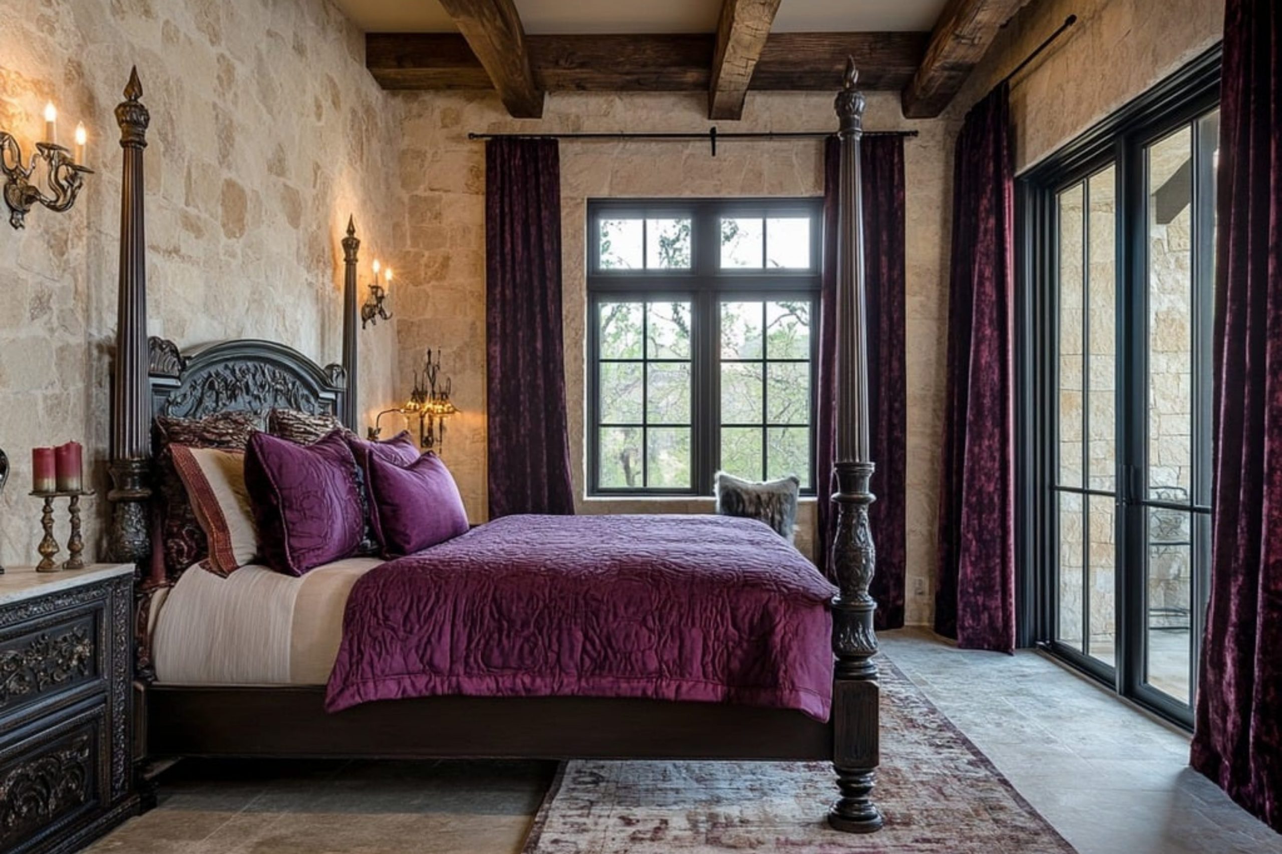
Selecting a paint color is never a guesswork for me; it’s a careful calibration of light, purpose, and mood. For Castlecore, I consider two main categories: the mood-setters and the light-catchers. Mood-setters are your deep, dramatic colors—think the inky greens, the charcoal grays, or the rich burgundies.
I reserve these for rooms where you want a sense of enclosure and intimacy, like a library, a formal dining room, or a dramatic bedroom.
These colors make the walls recede and allow rich textiles and metal accents to take center stage, giving that immediate, powerful castle feeling.
Light-catchers are your softer, historic neutrals—the misty taupes, the off-whites, and the pale, dusty greens.
I use these in transitional areas like hallways, kitchens, or living rooms that get a lot of natural light. These lighter colors keep the historic feel without making the main living areas feel too heavy. They provide a necessary counterpoint to the dramatic rooms, letting the deep colors feel even more special.
The key is balance: pairing the dramatic with the soothing to create an aesthetic that feels layered, ancient, and ultimately, livable.
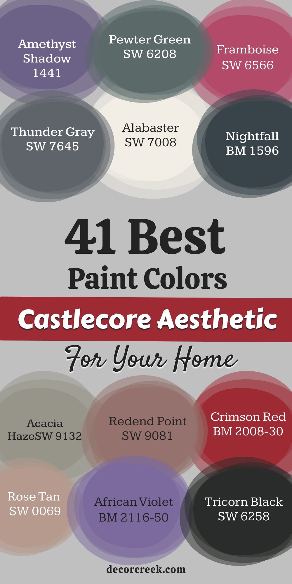
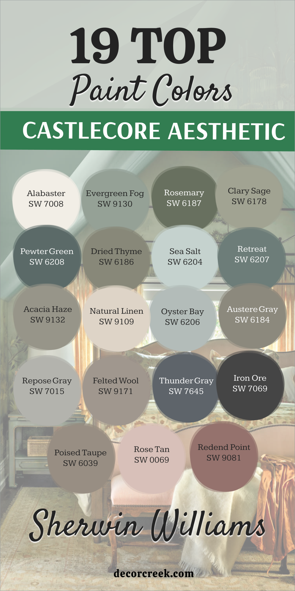
19 Castlecore Aesthetic Paint Colors by Sherwin Williams
Alabaster SW 7008
Alabaster is a perfect creamy white that avoids feeling stark or cold, which is essential for a historical aesthetic. This color has a beautiful softness, like aged plaster or ancient stone that has weathered gracefully over centuries. It’s an ideal trim color that highlights deeper wall colors without being jarring, or it can be a beautiful wall color itself in a sunlit dining hall.
This hue prevents the historical atmosphere from becoming too heavy by offering a necessary moment of brightness and visual rest. It acts as a perfect canvas for displaying rich textures like velvet drapes or dark wood furniture. It carries a sense of old-world warmth, lacking the sterile feeling of modern, crisp whites.
I love using this shade in rooms that feature heavy dark wood beams or wrought iron accents, as it allows those elements to truly pop. This color is the bright whisper of history, suggesting light even on a cloudy day. It is my go-to for creating a welcoming yet foundational castle feel.
🎨 Check out the complete guide to this color right HERE 👈

Evergreen Fog SW 9130
Evergreen Fog is a misty, muted green-gray that perfectly captures the color of ancient moss on castle walls or a damp, storied landscape. This color is wonderfully complex, managing to feel deeply rooted in nature while still acting as a sophisticated, mature neutral.
This hue changes beautifully with the light, sometimes leaning more grey and sometimes showing its calming green undertones. I find it creates an instantly cozy and contemplative environment, perfect for a cozy reading nook or a master bedroom.
It pairs exceptionally well with brass and dark bronze, which mimic the metalwork found in historic settings. This shade is neither too dark nor too light, sitting right in the middle for maximum versatility and historic depth. It evokes the feeling of stepping into a long-forgotten, beautiful garden attached to an old manor. The pigment provides a rich, organic anchor to any room, giving the immediate feeling of quiet endurance.
🎨 Check out the complete guide to this color right HERE 👈

Rosemary SW 6187
Rosemary is a deep, earthy herbaceous green that reminds me of the protected, medicinal gardens and kitchens of an old European estate. This is a wonderfully grounding color, pulling your eye down and making a room feel substantial and securely built.
This hue is deeply saturated, but because it has strong brown undertones, it never feels overwhelmingly bright. It’s a gorgeous color for cabinetry in a kitchen that wants to feel like a centuries-old scullery or for a dramatic accent wall.
This shade pairs beautifully with rustic wood tones, terracotta, and linen textiles to complete the organic, historical texture. It carries the weight of history and the comfort of natural elements within its deep, soothing hue. This is a color of quiet strength, reminiscent of the enduring life force in nature that surrounds a castle. The shade truly captures the feeling of age and respectability within a historic color palette.
🎨 Check out the complete guide to this color right HERE 👈

Clary Sage SW 6178
Clary Sage is a gorgeous, dusty medium green with soft gray undertones that gives it a wonderfully weathered, almost antique appearance. This shade is one of my favorites for creating a gentle, soothing atmosphere that still carries a historic weight.
This hue works exceptionally well in transitional rooms like sunrooms or larger living areas where you want a historical feel without going dramatically dark. It’s the color of dried herbs and faded tapestries, evoking a sense of history that has been well-preserved over time.
The color feels sophisticated and muted, avoiding any hint of brightness that would pull you out of the old-world feeling. It is a fantastic partner for both creamy off-whites and darker, woody brown accents. This shade is the visual equivalent of a gentle sigh, comforting and deeply rooted in the natural world. It is the perfect shade to give a room an ancient, established atmosphere that remains airy.
🎨 Check out the complete guide to this color right HERE 👈
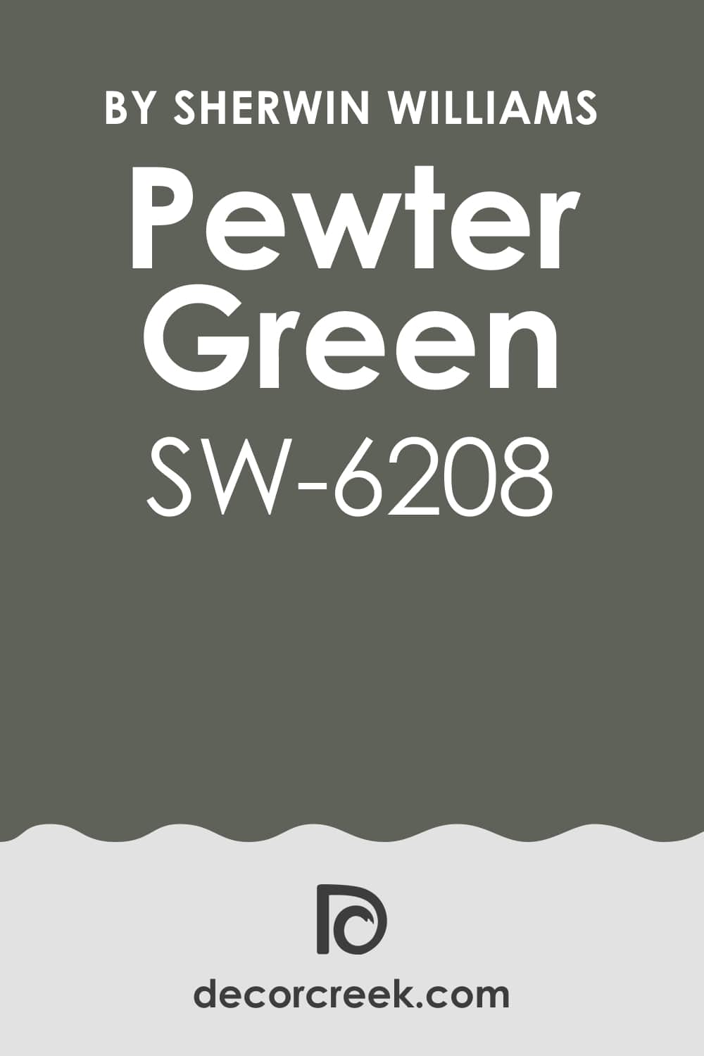
Pewter Green SW 6208
Pewter Green is a richly saturated, moody shade that sits between deep green and a charcoal gray, making it an incredibly sophisticated choice for Castlecore. It has a beautiful depth that truly reacts to light, offering different visual experiences throughout the day.
This color makes a powerful statement without shouting, lending an air of intellectualism and refined taste to a library or office. It looks exceptional when paired with polished dark wood, leather, and antique gold frames, completing the feeling of a respected private study.
This hue is an excellent choice for creating a striking accent wall or painting an entire powder room for intense drama. The color is reminiscent of aged, tarnished metal or the deep forest that often surrounds ancient buildings. This shade provides a comforting enclosure, making large rooms feel more intimate and historically grounded.
🎨 Check out the complete guide to this color right HERE 👈
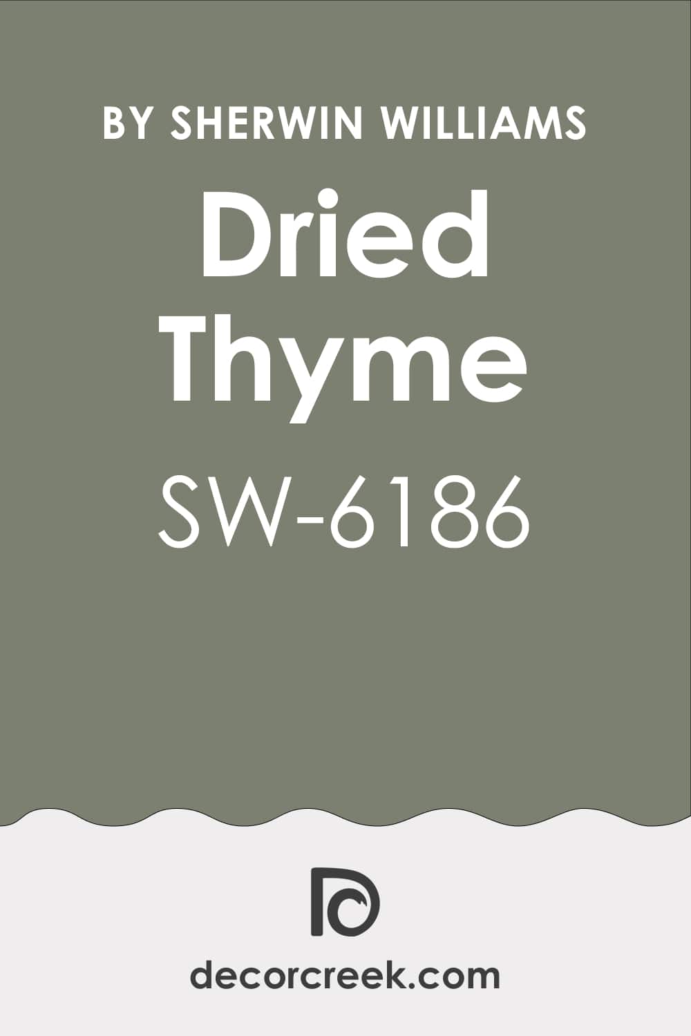
Dried Thyme SW 6186
Dried Thyme is a beautiful, dusty medium-dark green that has noticeable khaki or brown undertones, giving it a truly aged and historic quality. It is less gray than Evergreen Fog and a little more earthy and muted than Rosemary, finding a perfect balance.
This hue is a wonderful color for creating the appearance of faded frescoes or old, respected painted wood paneling. I often use this shade in kitchens, dining rooms, or even on exterior trim to anchor the home in a sense of the past. It pairs wonderfully with natural stone textures, like limestone or rough-cut slate.
This color offers a powerful sense of permanence and warmth, feeling deeply organic and connected to the landscape. It is the color of tradition and quiet strength, evoking the feeling of a well-cared-for, multi-generational home. The shade creates an atmosphere that suggests stories and a long, rich history within its comforting hue.
🎨 Check out the complete guide to this color right HERE 👈
Sea Salt SW 6204
Sea Salt is a beautifully ethereal shade that is a very pale, nearly white color with strong greenish-blue and gray undertones. This color is the perfect example of a light-catcher that still carries a historic, complex personality, avoiding a stark modern feel.
This hue is reminiscent of misty coastal air, ancient sea-washed glass, or the faded color of a very old piece of linen. I use the color in bathrooms or sun-drenched bedrooms where you want a hint of color that feels airy and restful. It prevents a room from feeling too heavy when other parts of the home are painted in very dark, dramatic Castlecore colors.
Its light-reflecting quality makes a room feel larger and brighter while still maintaining that soft, aged quality we are seeking. The shade pairs especially well with wrought iron and dark wood accents that provide contrast and grounding weight. This color is a soft, gentle whisper that keeps the castle atmosphere from becoming oppressive.
🎨 Check out the complete guide to this color right HERE 👈

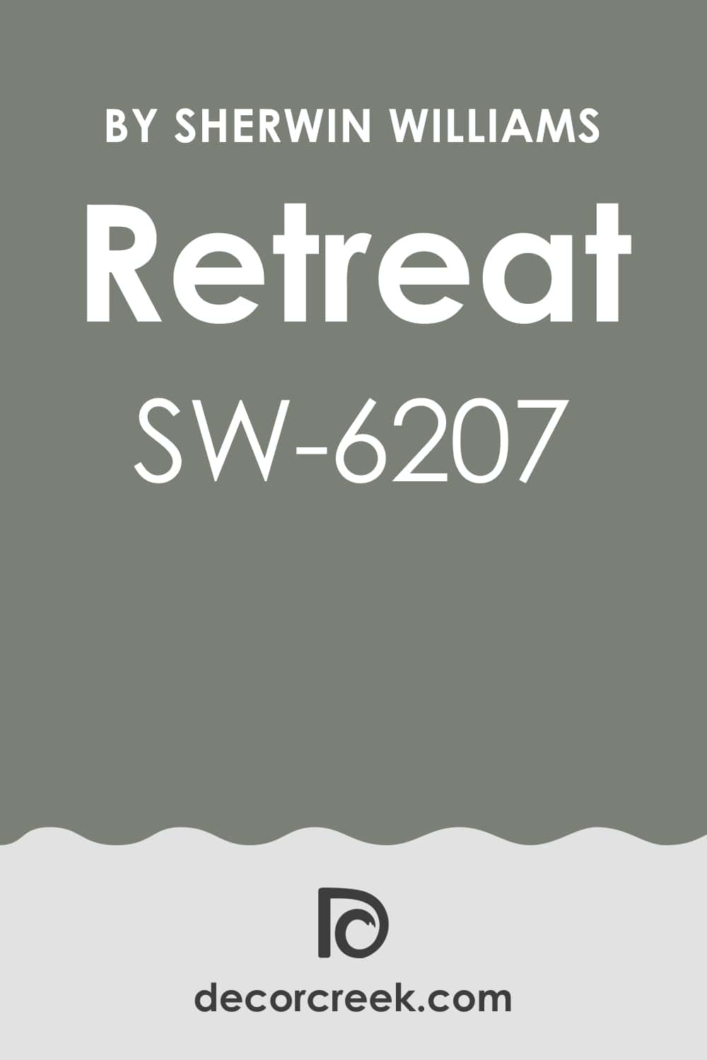
Retreat SW 6207
Retreat is a deep, compelling green-gray that is slightly darker and moodier than Evergreen Fog, providing more dramatic saturation. This shade is perfect for creating an atmosphere of quiet solitude and introspection, true to its name.
The color works wonderfully in a cozy den, a formal living room, or a bedroom where deep sleep is the goal, making the walls feel like a comforting enclosure. The hue has a beautiful grounding effect, connecting the interior of the home to the ancient, wooded grounds of a country estate.
This color pairs beautifully with rich leather furniture, brass accents, and woven natural fiber rugs. It embodies the sense of a hidden sanctuary, a room where the outside world fades away and history remains. The shade offers a perfect depth of color for Castlecore without committing to a near-black shade.
🎨 Check out the complete guide to this color right HERE 👈
Acacia Haze SW 9132
Acacia Haze is a muted, medium-toned color that sits somewhere between a dusty green, a soft gray, and a hint of brown, making it a very sophisticated neutral. This beautiful complexity is exactly what is needed for a successful historical aesthetic, as it avoids any flat or modern appearance.
This color works as a lighter, grounding neutral in living rooms or hallways, acting as a historical backdrop for antique furniture and artwork. It has a beautiful, natural warmth that makes a room feel instantly comfortable and well-established, like a much-loved older home.
The shade pairs effortlessly with both dark wood tones and lighter linen textiles, giving it great versatility in your design scheme. It evokes the color of old parchment or aged architectural plans found in a manor library. This is the quiet, reliable foundation color that allows the bolder elements of Castlecore to shine.
🎨 Check out the complete guide to this color right HERE 👈

Natural Linen SW 9109
Natural Linen is a warm, light neutral that is a perfect off-white with distinct beige and slightly gray undertones, giving it a naturally aged appearance. Unlike a modern white, this color has an inherent richness and warmth, feeling more like woven fabric or aged plasterwork.
I use this hue when I need a light shade that won’t feel stark but still provides a beautiful contrast to darker colors. This is an excellent choice for ceiling paint in rooms with deep wall colors, preventing a harsh cutoff and maintaining historical continuity.
It’s also beautiful on its own in a living room, giving the feeling of a sun-bleached, but elegant, old country manor. The shade provides a gentle, soft background, allowing the architecture and furnishings to tell the story. This color is the essence of quiet, unpretentious history.
🎨 Check out the complete guide to this color right HERE 👈

Oyster Bay SW 6206
Oyster Bay is a stunning light-to-medium green-gray that is slightly richer and more pronounced than Sea Salt but still beautifully soft and airy. This color carries a misty, almost coastal historical feeling, perfect for bedrooms or sun-drenched kitchens.
The shade has a lovely complexity, appearing more green in some lights and leaning more gray in others, which adds significant visual interest. It works as a great complementary color to the darker, earthier greens in the Castlecore palette, offering a moment of visual lightness.
This color is reminiscent of antique pottery or the faded, elegant silk of a well-preserved window treatment. It provides a beautiful, muted color without sacrificing the airiness of a brighter room. The hue helps to keep the historical atmosphere feeling fresh and restorative.
🎨 Check out the complete guide to this color right HERE 👈

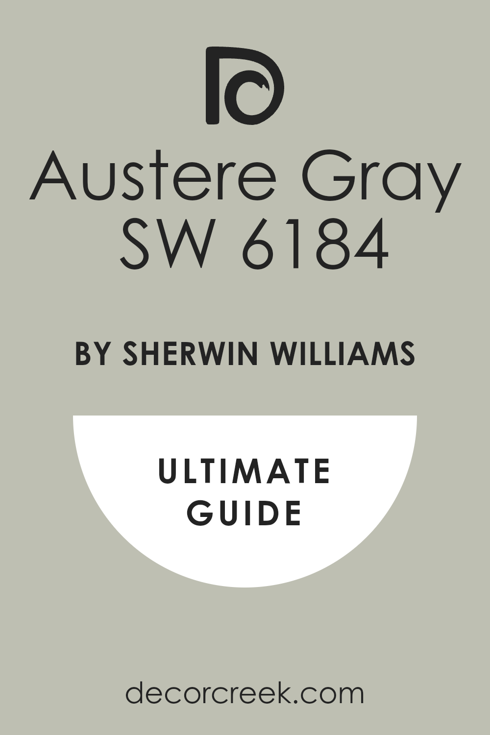
Austere Gray SW 6184
Austere Gray is a complex, medium-toned color that is best described as a warm, muddy blend of grey, green, and a hint of beige, avoiding any cold or sterile feeling. This deep complexity is why it works so well in the Castlecore aesthetic, providing depth that many other grays lack.
The shade is a fantastic neutral for high-traffic areas like hallways or main living rooms where you want a sense of enduring solidity. It evokes the feeling of historic stone structures or the weathered bark of ancient trees found on the property.
This color pairs beautifully with rich wood trims and deep, jewel-toned furnishings, providing a perfect moody backdrop. The hue provides a subtle but powerful grounding element, connecting the interior with the substantial feeling of a centuries-old building. This is a warm, historical anchor for your home.
🎨 Check out the complete guide to this color right HERE 👈
Repose Gray SW 7015
Repose Gray is a popular and versatile light-to-medium gray with delicate warm, taupe undertones that keep it from feeling icy or cold. The subtle warmth is crucial for using a gray in a historical aesthetic like Castlecore, where we are avoiding stark modernity.
This color can act as a wonderful, slightly deeper alternative to an off-white in areas where you want a little more visual weight. It is reminiscent of misty skies over a stone courtyard or the natural color of slightly darkened limestone.
The hue works exceptionally well as a foundational wall color that allows artwork and period furniture to truly stand out with historical importance. It is a highly adaptable neutral that manages to feel simultaneously contemporary and deeply historic in its appeal. This is a trustworthy, foundational color for building your Castlecore atmosphere.
🎨 Check out the complete guide to this color right HERE 👈

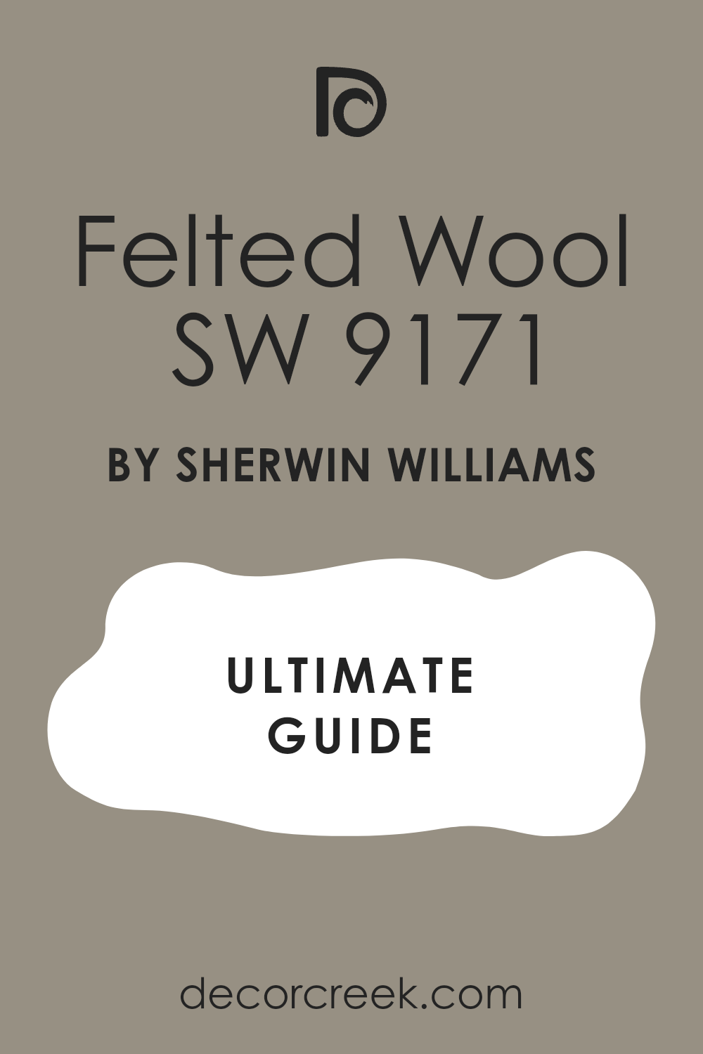
Felted Wool SW 9171
Felted Wool is a beautiful, deeply comforting medium-dark taupe-gray that has a distinct, rich warmth from its brown undertones. This color perfectly captures the cozy, enclosed feeling of historical textiles and the aged materials found within an old manor.
The shade is an excellent choice for a den, a dedicated office, or a master bedroom where you desire an atmosphere of deep relaxation and historic luxury. It pairs wonderfully with creamy white trim, allowing the richness of the wool-like color to feel crisp and defined.
This hue evokes the feeling of aged leather or a substantial, hand-woven blanket draped over a chair. This color provides a beautiful, complex backdrop that is saturated without being overly dramatic. It is a perfect choice for bringing a natural, earthy richness to your Castlecore scheme.
🎨 Check out the complete guide to this color right HERE 👈
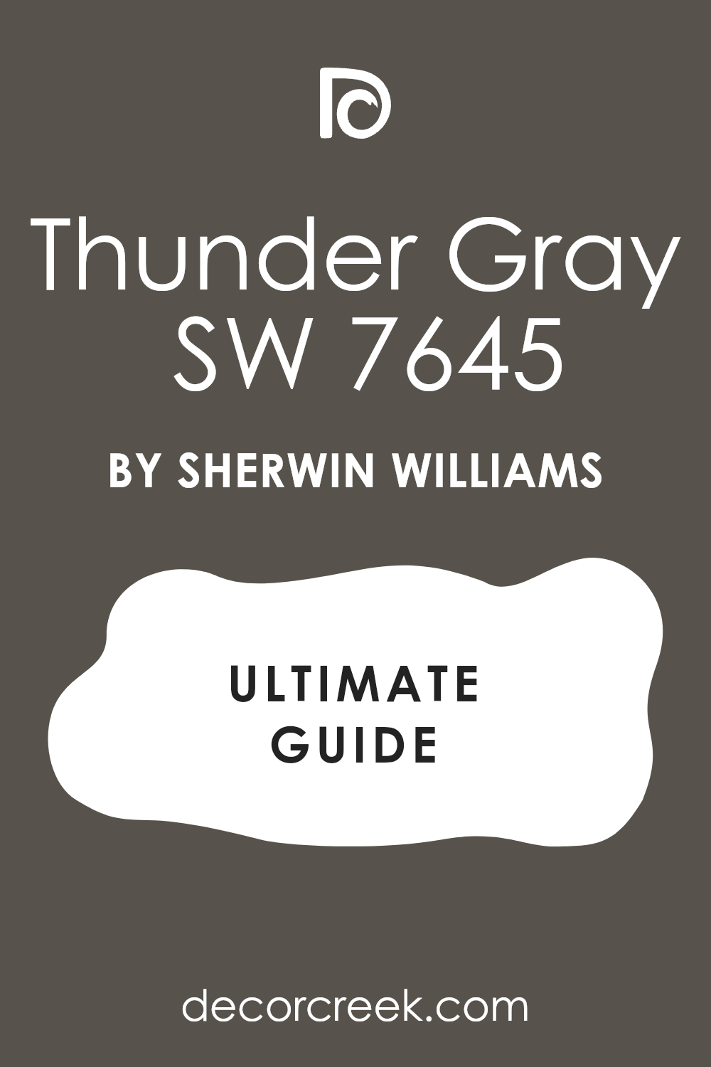
Thunder Gray SW 7645
Thunder Gray is a dark, substantial charcoal gray with subtle, cool blue undertones that give it an air of intense drama and quiet power. This is a perfect color for creating high contrast and emphasizing architectural details like archways or paneling.
The hue works exceptionally well in a dedicated media room, a powder room, or as a powerful accent wall in a library. It is reminiscent of stormy skies over a high tower or the deep shadow cast by heavy stone walls.
This color is one of absolute authority, providing a grounding weight that feels secure and ancient. It looks magnificent when paired with metallic accents like silver or antique brass, adding a layer of sophisticated drama. The shade is an essential moody color for achieving the intense, serious atmosphere of a true fortress.
🎨 Check out the complete guide to this color right HERE 👈
Iron Ore SW 7069
Iron Ore is a sophisticated, near-black color that is softer and more complex than a true black, carrying very deep charcoal or rich brown undertones depending on the light. This shade is one of my go-to colors for creating instant, profound drama and an unshakeable sense of historical weight.
The hue is wonderful for accenting interior doors, mantels, or painting the entire walls of a dramatic dining room or study. It evokes the feeling of ancient wrought iron, blackened stone, or the deep shadows found in a candlelit chamber.
This color pairs perfectly with almost any other shade in the Castlecore palette, acting as a powerful anchor. It is essential for giving a room a feeling of depth and enclosure, necessary for achieving the true fortress aesthetic. The shade is the epitome of grounded, historic drama.
🎨 Check out the complete guide to this color right HERE 👈

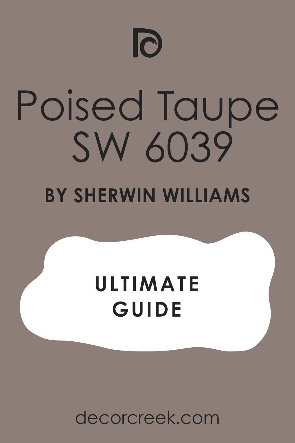
Poised Taupe SW 6039
Poised Taupe is an exceptionally balanced mid-tone color that blends warm brown and cool gray seamlessly, making it a very sophisticated and complex neutral. This color is the perfect expression of an aged historical material, avoiding the flat look of modern beige or gray.
The shade works as a gorgeous, grounding wall color for living rooms, dining rooms, or large open areas where you want a rich, enduring neutral. It has enough warmth to feel welcoming while having enough gray to maintain a refined, serious look.
This hue evokes the color of old leather-bound books or the natural tone of ancient, untreated wooden floors. It is a highly flexible color that can be dressed up with formal furnishings or dressed down with more rustic, organic textiles. The shade is a quintessential old-world neutral that creates immediate depth.
🎨 Check out the complete guide to this color right HERE 👈
Rose Tan SW 0069
Rose Tan is a beautifully dusty, historical color that is a muted, pale pink with significant brown and gray undertones, making it feel more like a faded textile or aged plaster than a sweet modern pink. This shade offers a touch of faded elegance and a softer, unexpected historical atmosphere.
The color works wonderfully in a bedroom, a quiet sitting room, or even a powder room where you want a sense of gentle antiquity. It pairs exceptionally well with deep greens and dark wood, where its faded warmth provides a beautiful contrast.
This hue is reminiscent of a beloved, centuries-old piece of velvet or the pinkish tinge of aged marble. This color is a reminder that historical palettes included soft, romantic hues that have aged gracefully. The shade provides a feminine and gentle historical element to the Castlecore home.
Redend Point SW 9081
Redend Point is a gorgeous, deep earthy terracotta-meets-brown that carries a warm, reddish undertone, giving it a comforting, baked-earth quality. This color is a perfect choice for bringing the warmth of natural materials like clay and ancient brick into your interior scheme.
The shade is an excellent color for an accent wall, a cozy den, or a formal dining room where you want a rich, enveloping warmth. It pairs wonderfully with natural textures like jute, wool, and heavy linen, completing the organic and rustic historical feel.
This hue evokes the feeling of sun setting over a Mediterranean fortress or the color of ancient, fired clay tiles. It provides a powerful sense of grounding and warmth, making a room feel instantly established and secure. The color is a beautiful, saturated shade that avoids any feeling of harshness.
🎨 Check out the complete guide to this color right HERE 👈

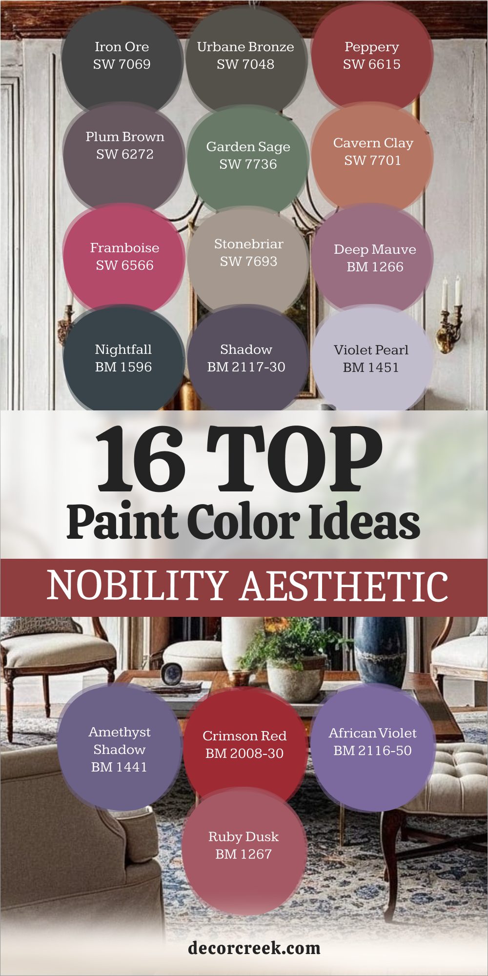
16 Nobility Aesthetic Paint Color Ideas
Iron Ore SW 7069
Iron Ore is a deep, near-black charcoal that acts as the ultimate grounding neutral in any Nobility aesthetic, providing instant, unshakeable drama and weight. This color is the shade of absolute authority, perfect for doors, trim, or entire walls in rooms like a study or formal entry.
It evokes the ancient metalwork, wrought iron gates, and deep shadows of a grand, historic residence. Its slightly soft, near-black finish prevents it from feeling flat, giving it a subtle complexity that adds to its aged appearance.
This hue is exceptional for making lighter elements, like gold picture frames or crystal chandeliers, appear even more luxurious and striking. The shade is my essential choice for creating a feeling of profound, secure establishment within a home.
🎨 Check out the complete guide to this color right HERE 👈
Urbane Bronze SW 7048
Urbane Bronze is a rich, warm, and deeply saturated color that sits between charcoal, dark brown, and a muted bronze, carrying the sophisticated depth needed for a noble interior. It is an excellent choice for creating a feeling of cozy enclosure in a library or a formal sitting room, where its warmth adds a layer of quiet luxury.
The color pairs beautifully with materials like leather, aged brass, and heavy wool, completing the sense of a distinguished, well-appointed home. It is a powerful neutral that commands attention while remaining incredibly sophisticated and restrained.
This hue evokes the color of ancient, slightly tarnished bronze statues or the dark wood paneling of a formal smoking room. The shade provides a powerful, enduring anchor that suggests generations of high-quality maintenance.
🎨 Check out the complete guide to this color right HERE 👈

Peppery SW 6615
Peppery is a saturated, fiery deep red with enough brown undertones to make it feel rich, historic, and incredibly formal, avoiding a modern, bright appearance.
This color is the essence of traditional luxury, reminiscent of formal dining rooms, rich velvet drapes, and the heraldic colors of a noble house. The shade is a challenging color but one that pays off with unmatched drama when used sparingly on an accent wall or within architectural recesses.
It pairs magnificently with dark wood trim and gold accents, heightening the room’s sense of grandeur and historical importance. This hue carries an intensity that makes a room feel active, ceremonial, and deeply respected. The pigment is one of the most powerful tools for creating a sense of aristocracy and centuries of tradition within a room.
🎨 Check out the complete guide to this color right HERE 👈
Plum Brown SW 6272
Plum Brown is a sophisticated, deeply complex color that is a rich brown with strong, dusty purple undertones, giving it a wonderfully unique and historical feel.
This shade avoids being a common brown, instead offering a subtle yet luxurious color shift that adds interest and mystery. The hue is perfect for rooms where you want a moody, intimate atmosphere, such as a formal bedroom or a contemplative study.
It pairs beautifully with dark cherry wood and cream-colored fabrics, allowing its subtle purple depth to truly stand out. This color is reminiscent of aged wine, antique velvet, or the naturally darkening patina on a valuable piece of furniture. The shade is the visual definition of quiet, refined taste and enduring, generational wealth.
🎨 Check out the complete guide to this color right HERE 👈
Garden Sage SW 7736
Garden Sage is a rich, dark, and highly saturated green that has a strong natural earthiness to it, evoking the manicured grounds and hothouses of a large country estate.
This color provides a wonderful sense of organic luxury and formality without feeling overwhelmingly dark or imposing. The shade is excellent for adding a touch of nature’s formality to a kitchen, sunroom, or a bright library.
It looks beautiful when combined with classic checkerboard tile floors and simple, elegant furnishings. This hue is a deeply restorative color, suggesting a retreat into the quiet, protected beauty of a noble landscape. The pigment is perfect for rooms that feel connected to the outdoors while maintaining a polished, architectural quality.
Cavern Clay SW 7701
Cavern Clay is a deeply warm, saturated terracotta with distinct reddish-brown undertones that instantly ground a room in a rich, ancient earthiness. This color is a wonderful alternative to common red, offering a historical and organic warmth that is perfect for a noble aesthetic.
The shade is an excellent choice for a dramatic entry area or a cozy, rustic den where a feeling of permanence and natural material is desired. It pairs beautifully with black wrought iron and natural wood, creating a visual sense of ancient architecture and durable building materials.
This hue evokes the feeling of sun-baked walls or the color of ancient, hand-thrown pottery. The color provides an earthy, secure atmosphere that feels timeless and substantially built.
🎨 Check out the complete guide to this color right HERE 👈

Framboise SW 6566
Framboise is a rich, deep, saturated raspberry color with enough blue undertones to prevent it from feeling too light or too red, giving it a sophisticated and dramatic presence. This color is a beautiful nod to the opulent reds found in royal chambers and formal historical textiles.
The shade is perfect for creating a dramatic accent wall in a luxurious bedroom or for painting an entire powder room for intense, jewel-box drama.
It pairs magnificently with dark wood trim and gold accents, amplifying the room’s sense of grandeur and historical importance. This hue is a color of absolute confidence and luxury, making a powerful statement of noble taste and daring design.
Stonebriar SW 7693
Stonebriar is a lovely, highly complex mid-tone color that blends a warm gray, a soft beige, and a hint of dusty purple, making it a very sophisticated and unexpected neutral.
This shade is the perfect color for walls where you want the hue to feel ancient and slightly mysterious, like an unearthed relic. The pigment works wonderfully in living rooms or hallways as a wall color that provides depth and historical interest without being dark.
It evokes the feeling of aged stone, carved plaster, or the natural patina of an old monument. The shade provides a subtle, refined background, allowing more colorful furnishings and historical details to truly command attention. This color is a beautiful illustration of quiet, enduring elegance.
🎨 Check out the complete guide to this color right HERE 👈
Love Affair 1266
Love Affair is a richly saturated, dusky purple with strong gray and brown undertones that make it feel exceptionally historical, moody, and sophisticated rather than bright or youthful.
This color is the perfect expression of aged elegance, reminiscent of fading silk or a centuries-old velvet chaise lounge. The shade is an excellent choice for a formal sitting room or a dramatic bedroom where you want an atmosphere of intimate, restrained luxury.
It pairs beautifully with antique silver and dark woods, allowing the subtle purple richness to be highlighted. This hue offers a feminine and highly refined touch to the serious Castlecore palette.
Nightfall 1596
Nightfall is an intensely deep, dark navy blue that is almost black, providing an incredible depth of color that suggests infinite historical mystery and power. This shade is my go-to when I want the drama of black but with the subtle, sophisticated addition of a deep, noble color.
The color is perfect for painting an entire room, creating an enveloping, star-lit atmosphere in a den or media room. It pairs beautifully with gold or bronze accents, which stand out sharply against the deep, intense background.
This hue evokes the sense of a grand, dark sky over a fortress at midnight, feeling both vast and intimately enclosed. The shade is a commanding presence that sets a tone of serious, lasting quality.
🎨 Check out the complete guide to this color right HERE 👈
Shadow 2117-30
Shadow is an exceptionally complex, dark, and highly saturated color that is a deep, smoky purple-gray, making it feel brooding, mysterious, and incredibly sophisticated. This shade beautifully captures the depth and formality of the most luxurious and ancient of royal colors.
The hue is a perfect choice for a dramatic accent wall, a jewel-box powder room, or a formal entryway that demands instant gravitas. It looks stunning with creamy off-white trim, allowing the complexity of the purple and gray blend to be fully appreciated.
The color evokes the feeling of a deeply luxurious, shadow-filled chamber where secrets are kept and history is respected. This shade is the very essence of brooding, noble elegance.
🎨 Check out the complete guide to this color right HERE 👈
Violet Pearl 1451
Violet Pearl is a lighter, dusky, and muted purple that has significant gray undertones, making it feel historic, airy, and delicately feminine rather than bright or modern.
This color provides a subtle, ethereal touch of royalty, perfect for rooms that need to feel light but still carry a historic color story. The shade is beautiful in a bedroom, a quiet morning room, or a dressing area where its softness is most welcome.
It pairs well with light wood tones and aged silver, maintaining an atmosphere of refined, quiet luxury. This hue evokes the gentle, faded colors of a centuries-old tapestry or the subtle sheen of an ancient silk gown. The color is the softer, more romantic side of the noble aesthetic.
Amethyst Shadow 1441
Amethyst Shadow is a highly saturated, rich, and intense purple that is deeply complex, carrying strong blue and gray undertones that prevent it from appearing too sweet or bright. This shade perfectly embodies the color of royalty, power, and ancient, inherited luxury.
The hue is an excellent choice for a dramatic focal point, such as a formal dining room or the walls of a grand, formal sitting room.
It looks incredible when paired with dark, polished wood and shimmering metallic accents like gold or copper. The shade is a color of undeniable opulence, demanding respect and establishing a tone of formal, historical importance.
African Violet 2116-50
African Violet is a slightly brighter, but still deeply saturated, rich purple that carries enough blue to give it a regal and somewhat mysterious quality.
This shade is a wonderful choice for a room that needs a feeling of historical luxury but also needs to retain a sense of energy and brightness. The color is beautiful in a lively dining room or a formal guest suite where you want a welcoming but still high-end atmosphere.
It pairs nicely with light gray neutrals and dark wood accents, creating a high-contrast and sophisticated look. This hue is a joyful, yet undeniably formal, expression of the historical color purple.
Ruby Dusk 1267
Ruby Dusk is a stunningly rich, deep jewel-toned red with strong, dusky purple undertones, making it feel intensely sophisticated and profoundly historical.
This color is a luxurious, complex alternative to a simple red, evoking the look of a perfectly cut gemstone or a highly prized, ancient textile. The shade is an excellent choice for a dramatic bedroom or a formal study, where its depth creates an enveloping, intimate atmosphere.
It pairs beautifully with dark wood trim and antique silver accents, intensifying the room’s formal, historic feeling. This hue is a color of genuine, deep opulence and quiet, confident luxury.
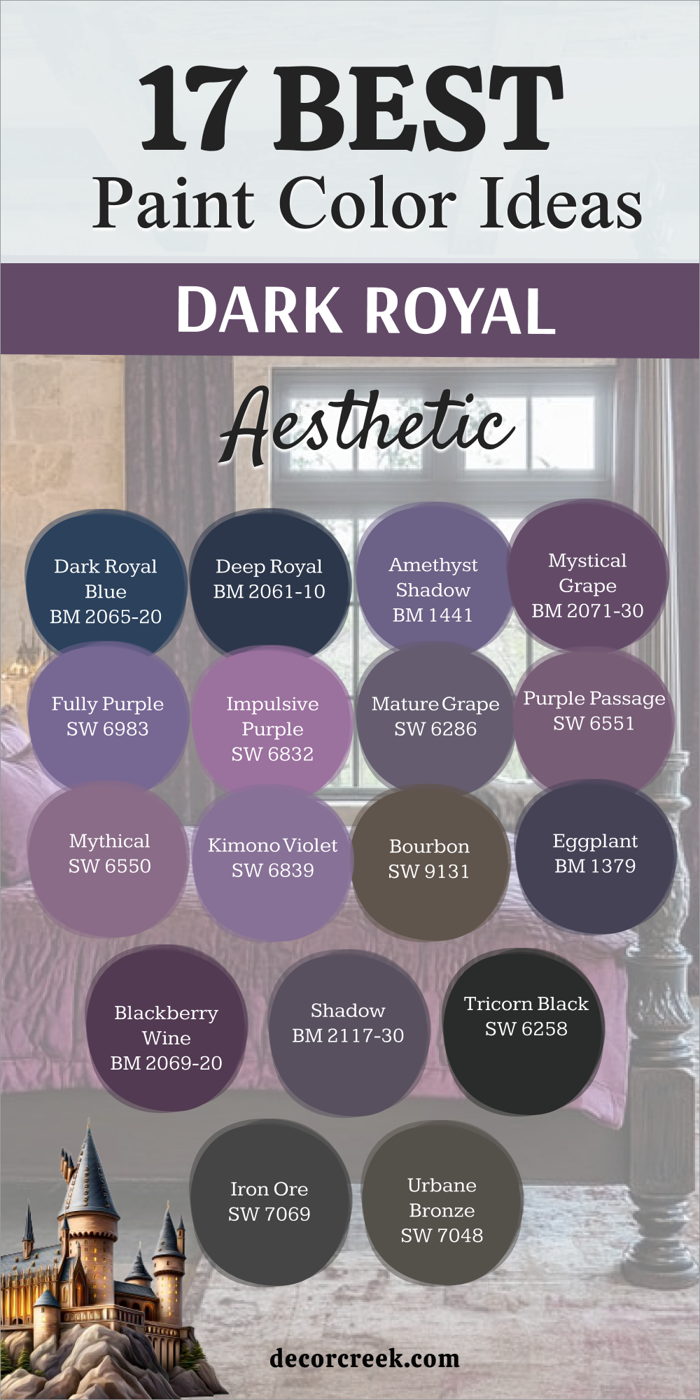
17 Dark Royal Aesthetic Paint Color Ideas
Dark Royal Blue 2065-20
Dark Royal Blue is a rich, intense, and deeply saturated blue that perfectly embodies the color of true, historic royalty and high naval formality.
This color is an exceptional choice for creating a feeling of profound depth and quiet command in a room, making it feel secure and powerful. It looks stunning when used in a formal dining room or a library, where its depth provides an intellectual, enduring backdrop.
The shade pairs beautifully with rich leather, brass details, and creamy white trim, which serve to emphasize its majestic intensity. This color is the absolute definition of authoritative, formal, and historically resonant blue.
Deep Royal 2061-10
Deep Royal is an intensely saturated, almost velvety dark blue that is slightly darker and more dramatic than Dark Royal Blue, carrying an almost near-black intensity.
This color is a shade that commands immediate respect, offering an atmosphere of unshakeable historical gravitas and profound seriousness. I recommend this hue for rooms where the goal is extreme drama and enclosure, such as a media room or a formal, shadow-filled study.
The color is breathtaking when paired with antique gold accents, which appear luminous and rich against the immense depth of the blue. This shade provides a powerful, ancient atmosphere that speaks of long-standing tradition.
🎨 Check out the complete guide to this color right HERE 👈
Amethyst Shadow 1441
Amethyst Shadow is an intensely rich and deeply saturated purple, a complex hue featuring distinct blue and gray undertones, making it the quintessential color to symbolize ancient, ceremonial royalty. This essential color is ideal for forging a formal, high-drama atmosphere within a noble bedroom or an intimate, refined sitting room, where its unique, layered depth can be thoroughly appreciated and showcased.
The shade is a magnificent companion to lush velvet textures and darkly polished wood furniture, significantly enhancing the room’s overarching feeling of historical opulence and undeniable luxury.
This color itself acts as a deep jewel tone, commanding attention without being aggressive, and its presence adds considerable visual weight to any interior scheme. The shade is a color of absolute, undeniable historical prestige and profound, sophisticated visual richness, instantly grounding a room in a sense of enduring aristocratic tradition.
Mystical Grape 2071-30
Mystical Grape is a deep, warm, and highly saturated purple, infused with a rich red undertone that imparts a truly luxurious and slightly enigmatic quality to the color.
This compelling color proves to be an excellent choice for any room intended to feel deeply luxurious and enclosed, such as a formal den, a private study, or a small, dramatic jewel-box powder room.
The hue pairs beautifully with various metallic accents, particularly copper or bronze, which serve to brilliantly complement the inherent warmth and deep saturation of the purple pigment. The shade is a beautiful fusion of tradition and romance, a color that feels both ancient and deeply sensual, thereby adding a captivating layer of sophisticated mystery to the overall dark royal palette. It provides an enveloping comfort, making the space feel both grand and intimately private.
Fully Purple SW 6983
Fully Purple is a highly saturated, rich, and truly unapologetic deep purple that stands as a confident, unreserved statement of regal color and historical opulence.
This confident hue is an undeniably beautiful choice for an important accent piece, a set of dramatic painted interior doors, or a striking accent wall where a powerful, commanding color is needed to instantly establish a formal, majestic tone.
The pigment looks magnificent when intentionally paired with dark, dramatic wood finishes and heavy, formal textile drapes, which enhance its regal severity. The color offers a direct and intense expression of the shade historically associated with kings and queens, making no apologies for its powerful, luxurious presence in your home.
🎨 Check out the complete guide to this color right HERE 👈
Impulsive Purple SW 6832
Impulsive Purple is a vibrant, yet still deeply saturated, purple that carries a strong, lively red undertone, giving the color a feel that is simultaneously luxurious and slightly energetic.
This shade is perfectly suited for a room that requires a formal and historical aesthetic but also needs to retain a sense of sophisticated visual intensity and life, avoiding a heavy, somber atmosphere.
It pairs beautifully with deep charcoal grays and contrasting classic white trim, allowing you to create a bold, clearly defined, and historically-informed color scheme that feels deliberate. The resulting aesthetic feels both traditional and current, and the shade is a daring but ultimately rewarding choice for achieving a dynamic dark royal look.
🎨 Check out the complete guide to this color right HERE 👈
Mature Grape SW 6286
Mature Grape is a deeply complex, beautifully muted purple characterized by strong brown and gray undertones that collectively give the color an incredibly aged, sophisticated, and slightly dusty appearance.
This highly nuanced hue is one of my favorite colors for creating a truly authentic, old-world historical feel, reminiscent of aged, valuable wines and the faded, ancient textiles found in a historic manor.
It works wonderfully in a quiet sitting room, a contemplative library, or a formal entryway, providing deep saturation without being overly bright or demanding attention. The color is a subtle, yet powerful, noble shade that speaks volumes about restrained, enduring good taste.
Purple Passage SW 6551
Purple Passage is a rich, warm, and highly saturated purple that carries distinct red undertones, giving the color a welcoming, deep, and luxurious warmth that is instantly inviting.
This color is an excellent and enveloping choice for a formal dining room or a main living room where you desire the hue to feel entirely encompassing and intensely luxurious, making guests feel like royalty.
It pairs beautifully with deep forest green and classic gold accents, completing a rich, highly opulent color scheme fit for a noble setting. The shade is a confident and deeply enveloping royal color that feels both historically significant and incredibly comforting.
🎨 Check out the complete guide to this color right HERE 👈
Mythical SW 6550
Mythical is a gorgeous, deep, and slightly mysterious purple with well-balanced blue and red undertones, giving it a classic and enigmatic royal appearance that sparks curiosity.
This highly refined hue is a wonderful color for creating an atmosphere of quiet formality and historical reverence in a private bedroom or a cozy den, where its subtle drama can be enjoyed up close.
It pairs well with antique silver accents and dark wood furniture, elements that serve to emphasize its subtle depth and aged, high-quality character. The shade possesses an elegant ambiguity and is a color of enduring, sophisticated historical mystery.
🎨 Check out the complete guide to this color right HERE 👈
Kimono Violet SW 6839
Kimono Violet is a deeply saturated, yet still slightly muted, purple that carries strong blue undertones, lending it a sophisticated and slightly cool historical feeling.
This color is perfect for creating a regal and elegant atmosphere in a highly formal powder room or a refined sitting area where the light is controlled and intentional.
It looks particularly beautiful when paired with a creamy off-white trim, an element that allows its subtle blue richness to be fully showcased and defined. The shade is a dignified, deeply complex, and refined royal color that speaks to inherited taste.
🎨 Check out the complete guide to this color right HERE 👈
Cornwall Slate SW 9131
Cornwall Slate is a deeply rich, warm, and highly complex dark brown that carries subtle red and gold undertones, reminiscent of fine aged liquor and the heavy wooden casks used for its maturation.
This commanding hue is an essential color for creating a feeling of entrenched, old-money luxury and deep historical gravitas, making it perfect for a private library, a formal office, or a study.
It pairs beautifully with textures like rich leather and polished brass, completing the look of a distinguished, traditional, and inherently noble chamber. The color provides a powerful, warm, and secure historical anchor for the entire space, suggesting lasting wealth and tradition.
🎨 Check out the complete guide to this color right HERE 👈
Eggplant 1379
Eggplant is an intensely deep, nearly black purple that is highly saturated and undeniably sophisticated, providing maximum dramatic and profound visual effect.
This color is a shade of unreserved, powerful royalty, making it perfect for creating an unparalleled atmosphere of historical enclosure and high opulence.
I highly recommend this hue for an intense, unyielding accent wall or a small, dramatic room where its profound, light-absorbing depth can be fully utilized and appreciated. The shade is the ultimate, luxurious, and commanding dark royal color, an intentional choice for creating a feeling of magnificent gravity.
Blackberry Wine 2069-20
Blackberry Wine is a highly saturated, profound red-purple that is incredibly rich and dramatic, vividly evoking the color of ancient, deeply stained glass or a prized, vintage port wine.
This complex color is an excellent choice for a formal dining area, where its inherent richness significantly enhances the sense of luxury, ceremony, and warmth during gatherings.
It looks magnificent when contrasted with rich gold accents and dark wood, immediately creating a high-end, historically rich pairing that feels layered and expensive. The shade provides a deep, sophisticated warmth that is instantly grounding and profoundly regal.
Shadow 2117-30
Shadow is an exceptionally complex, dark, and highly saturated purple-gray that is wonderfully moody and incredibly sophisticated, making it a perfect neutral partner for a dark royal aesthetic.
This highly nuanced hue works wonderfully as an enveloping background color that visually recedes, allowing luxurious elements like gilded mirrors, deep velvet furniture, and crystal accents to shine with historical opulence.
It looks stunning when juxtaposed with creamy off-white trim, a pairing that allows the full depth and subtle nuance of the color to be vividly realized. The shade is a masterful blend of charcoal gray and deep purple, capturing an air of powerful, ancient mystery and formality.
🎨 Check out the complete guide to this color right HERE 👈
Tricorn Black SW 6258
Tricorn Black is a true, neutral black that provides the ultimate in high contrast and stark, powerful drama, an essential element for establishing a highly formal royal look.
This color should be used deliberately and with purpose, often on architectural features like doors, window trim, or as a bold accent wall to expertly frame period art and luxurious furnishings.
It instantly creates immediate depth and a profound feeling of historical gravity, making any space feel more substantial and architecturally defined. The shade is the perfect powerful partner for bright white crown molding and shimmering metals, significantly amplifying the feeling of expensive, uncompromising formality.
🎨 Check out the complete guide to this color right HERE 👈

Iron Ore SW 7069
Iron Ore is a sophisticated, near-black color that is distinctly softer and more complex than true black, carrying very deep charcoal or rich brown undertones depending on the light’s direction.
This versatile hue is excellent for providing the drama and intense depth of a black pigment across an entire room without feeling overly harsh or sterile, which perfectly suits the historical Castlecore feel.
It powerfully evokes the permanence of ancient, oxidized metal and stone, giving a space a grounded, secure, and powerful presence. The shade pairs beautifully with highly pigmented colors like Deep Royal or Amethyst Shadow, acting as a powerful neutralizer that allows the jewel tones to truly glitter with historical brilliance.
🎨 Check out the complete guide to this color right HERE 👈
Urbane Bronze SW 7048
Urbane Bronze is a rich, deep, and complex dark brown-gray that carries strong, sophisticated bronze undertones, giving it a warm, earthy weight necessary for a powerful, anchored aesthetic.
This color provides a sophisticated, non-black dark neutral that is deeply grounding and highly luxurious, making it perfect for anchoring a royal palette with its subtle metallic warmth.
It looks magnificent when paired with formal leather upholstery, heavy silk, or dark polished wood, completing the feeling of a distinguished, traditional, and inherently well-appointed chamber. The shade adds a tangible sense of enduring, traditional quality and quiet, lasting luxury to any room.
🎨 Check out the complete guide to this color right HERE 👈
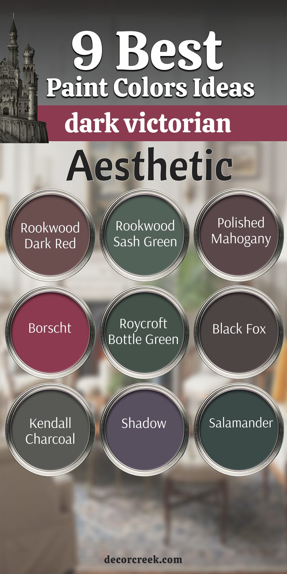
9 Dark Victorian Aesthetic Paint Color Ideas
Rookwood Dark Red SW 2801
Rookwood Dark Red is a deeply saturated and wonderfully complex red that features strong, noticeable brown and burgundy undertones, perfectly capturing the intense, moody formality that defines the Victorian era.
This color is an absolute statement of profound historical gravity, immediately reminiscent of heavy velvet curtains, richly upholstered furniture, and the warm, dark, intimate glow of gaslight interiors.
It is an ideal, enveloping choice for a formal parlor, a secluded drawing room, or a dramatic dining room where a strong sense of intimacy and historical power is desired. The hue pairs beautifully and authentically with dark wood trim, creating a rich, layered, and historically faithful feel. This shade beautifully embodies the deep, comforting, and layered richness of the classic Victorian palette.
🎨 Check out the complete guide to this color right HERE 👈
Rookwood Sash Green SW 2810
Rookwood Sash Green is a rich, highly saturated, and deep green that contains strong blue undertones, giving it a cool, mysterious, and highly formal historical appearance.
This color is a direct nod to the deep, complex greens heavily favored in authentic Victorian homes, often found purposefully used on trim, doors, and wainscoting to provide a sophisticated architectural contrast.
The hue works wonderfully in a private library or a formal entry hall, immediately creating a sense of dignified enclosure and traditional elegance. It pairs magnificently with the dark reds and deep browns common in the period palette, completing a classic, highly structured Victorian look.
🎨 Check out the complete guide to this color right HERE 👈
Polished Mahogany SW 2838
Polished Mahogany is an intensely rich, dark brown with a definite deep red undertone, a color formulation that perfectly mimics the look of prized, finished tropical hardwood favored heavily in Victorian furniture and architectural detailing.
This color provides necessary warmth and profound depth, acting as a sophisticated, period-appropriate alternative to simple brown or black for defining interior doors and elaborate trim.
The shade is wonderful for creating a sense of cozy enclosure and historic weight in a small study or a dedicated reading nook. It looks beautiful when paired with the deep jewel tones of the era, amplifying the feeling of luxury and weighty substance.
Borscht SW 7578
Borscht is a highly dramatic, dark, and deeply saturated magenta-red infused with noticeable purple undertones, lending it a complex, mysterious, and sophisticated historical intensity.
This color is a daring but artistically rewarding choice for a Victorian aesthetic, perfect for a formal powder room or a dramatic, commanding accent wall that needs to instantly draw and hold attention.
The hue vividly evokes the look of luxurious silk or a rich, aged wine, adding a touch of exoticism and complexity to the traditional palette. It pairs well with both very dark browns and creamy off-whites, allowing its profound, jewel-toned depth to truly stand out with historical flair.
Roycroft Bottle Green SW 2847
Roycroft Bottle Green is an intensely dark, nearly black green that carries a deep, formal saturation, giving it the serious, moody depth that is characteristic of the authentic Victorian style.
This color is excellent for trim or for painting a dramatic, enveloping room where you want the color to feel ancient and highly atmospheric, like a hidden, secret sitting room.
The shade is strongly reminiscent of antique glass or the deepest, most shielded shadows in a protected Victorian garden. It pairs wonderfully with the dark wood and heavy, textured textiles typical of the era, creating an effect of enduring, quiet grandeur and historical accuracy.
🎨 Check out the complete guide to this color right HERE 👈
Black Fox SW 7020
Black Fox is a deeply complex, near-black color that is notably softer than a pure neutral black, carrying strong, earthy brown undertones that make it feel more organic and less starkly modern.
This hue is a perfect choice for creating the heavy shadows and dramatic grounding that defines the Dark Victorian aesthetic when used on doors, trim, or entire walls.
The shade immediately evokes the color of heavy coal, aged cast iron, or the deep night outside a formal, closed window. It provides an essential foundation for the high contrast frequently found in period interiors, letting lighter colors and metallics appear brighter and more historically significant.
🎨 Check out the complete guide to this color right HERE 👈

Kendall Charcoal HC-166
Kendall Charcoal is a deep, warm, and highly saturated gray with a strong, comforting brown undertone, establishing it as a very sophisticated and versatile dark neutral.
This color is a wonderful, complex alternative to true black or deep brown, providing a moody, powerful architectural weight that perfectly suits the Victorian focus on structure and enclosure.
The hue works beautifully in hallways or formal living areas, creating a robust backdrop that feels substantial, historic, and incredibly refined. It is reminiscent of aged slate or the soot-darkened, time-worn stone of a historic city building, giving a room instant gravitas.
🎨 Check out the complete guide to this color right HERE 👈

Shadow 2117-30
Shadow is an exceptionally complex, dark, and highly saturated purple-gray that is wonderfully moody and inherently sophisticated, making it a perfect choice for the rich, multi-layered Victorian color scheme.
This nuanced hue can be used to add a quiet, unexpected touch of historical, refined color to a bedroom or a formal study, cleverly moving beyond the more common Victorian reds and greens.
The shade beautifully captures the depth and formality of the most luxurious and ancient textiles of the time. It pairs wonderfully with deep browns and creamy trim, allowing its subtle purple richness to be a sophisticated, understated surprise.
🎨 Check out the complete guide to this color right HERE 👈
Salamander 2050-10
Salamander is a very dark, deeply saturated green that leans intensely toward black, providing a serious, powerful, and mysterious color that is perfect for a highly dramatic Victorian room.
This hue is a commanding color, excellent for a small, atmospheric room like a powder room or a formal den where a sense of intense, jewel-box drama is desired.
The shade evokes the deepest part of a forest or the intense, almost black color of a high-end, period-appropriate lacquer finish. It provides an immediate and profound sense of historical enclosure and sophisticated visual impact.
🎨 Check out the complete guide to this color right HERE 👈

My Final Thoughts about Castlecore Aesthetic Paint Colors for Home
Choosing paint colors for the Castlecore aesthetic is fundamentally about tuning into your emotional reaction to profound depth and the powerful weight of history. These carefully selected colors are not intended to be mere passive backdrops; they are truly the architectural skin of your home, actively telling a silent but compelling story of stability, permanence, and enduring quality that resonates through the centuries.
I consistently emphasize to my clients that the use of rich greens, sophisticated dusty purples, and deep charcoals are powerful, intentional tools specifically for creating a sense of enveloping comfort and deep security, rather than allowing any hint of gloom to enter the space.
The true secret to mastering this aesthetic lies in how strategically you deploy these deep hues: they work to make your cherished furniture, your treasured artwork, and your luxurious textiles feel instantly more precious, substantial, and important—like revered relics carefully displayed within a historically respected space.
For instance, do not, under any circumstances, shy away from using an intensely moody color like Iron Ore in a surprisingly small room; rather than closing it in, the deep saturation will actually make the room feel dramatically cozier, more intimately defined, and incredibly secure, like a private chamber carved into the rock of a fortress.
Conversely, you must use the lighter, more nuanced colors, such as Alabaster or Sea Salt, strategically and intentionally to provide essential visual rest and to brilliantly highlight specific architectural areas that are fortunate enough to receive abundant natural light.
This balance of light and shadow is crucial to the historical atmosphere.