It’s that time of year again—when I begin to look keenly ahead, determining the colors that will truly make a house feel like a cherished home in the coming year. As a home interior designer and staging expert, I witness the incredible power of paint every single day.
The right color doesn’t just act as a mere covering for a wall; it fundamentally changes how you feel the moment you walk into a room.
For 2026, the key trend is crystal clear: warmth is king. We are deliberately moving away from the cold, stark grays that heavily dominated interior design throughout the last decade.
People are profoundly seeking for their homes to feel cozy, genuinely inviting, and like a gentle, comforting hug after a long, strenuous day. If you have been dreaming of a refreshing change that successfully brings lasting comfort and cheer into your space, then this comprehensive guide to the 27 most trendy warm paint colors is precisely what you need right now.
I have meticulously narrowed down the absolute best and most dependable shades from the most reliable paint brands so you can feel completely confident choosing a color you will genuinely love for many years to come.
My objective is to provide you not just with a list, but with a carefully curated palette that guarantees a feeling of well-being, elegance, and enduring style.
Finding the perfect warm shade can be a nuanced task, but by focusing on these leading colors, you are ensuring your home receives an immediate and lasting atmosphere of heartfelt coziness.
Why I Always Trust Sherwin-Williams and Benjamin Moore for Warm Home Paint Colors
When I am actively designing a client’s home or professionally staging a property for sale, my indispensable paint list always begins and reliably ends with Sherwin-Williams and Benjamin Moore.
This practice is far more than just a professional habit; it is an unwavering commitment to the quality, consistency, and predictable performance of color that I have learned to count on throughout the entirety of my career.
These leading companies have utterly perfected the complex art of color formulation.
Their paints possess an incredible depth of pigment, meaning the final color on your walls will never look flat, dull, or one-dimensional. Instead, it interacts beautifully and dynamically with the natural light, subtly and gracefully changing its character throughout the day.
This quality is especially critical for achieving the perfect subtle warm neutrals. A high-quality warm beige or cream needs to look rich and substantial, never muddy, pale, or with a sickly yellow cast, and these two brands nail that perfect balance every single time.
They also consistently offer unmatched pigment quality, so when I select a specific warm tone, I know with certainty that it will retain its beautiful, intended undertones without any unexpected or unwanted pinks or greens suddenly popping up.
For anyone investing their valuable time and money into painting their home, strictly adhering to these brands means you are choosing paint that applies smoothly, holds up exceptionally well over time, and, most importantly, ultimately delivers the exact warm, welcoming, and long-lasting look you are aiming for.
By choosing them, you receive not just paint, but a genuine promise of color that will reliably delight the eye and provide continuous comfort for years.
How I Choose the Right Warm Shade for Any Room
Choosing the absolute perfect warm shade is a meticulous process I undertake with great seriousness because selecting the wrong subtle undertone can completely ruin the desired mood and atmosphere of an entire room.
The single most important principle I teach all my clients is to always pay close attention to the available natural light.
Light is undeniably the secret, defining ingredient in any paint color, and it is the key reason why a color looks dramatically different in the store than it does when applied on your actual wall.
For North-facing rooms, which characteristically receive cooler, often bluish light, I specifically select colors that possess a definite, noticeable yellow or red undertone.
This is crucial for actively counteracting the cool light and successfully making the room feel genuinely sunny and warm. I consistently find that a richer, buttery cream or a beige with strong, pronounced gold notes works absolute wonders in these spaces.
In South-facing rooms, which are flooded with bright, warm light all day long, you certainly have more inherent flexibility in your choices.
However, I often gravitate towards a more perfectly balanced beige or a sophisticated cream with just a subtle touch of gray. This technique helps to expertly keep the room from becoming too intensely warm, potentially looking washed out, or overly yellow under the strong sunlight.
For rooms with East or West exposure, I prioritize considering the specific time of day the room is used the most.
East-facing rooms are best for the start of the day and waking up, so I generally choose a softer, less intense warmth. West-facing rooms beautifully catch the golden, highly flattering afternoon light, so a neutral that can successfully handle that intensity and depth without being overpowered is the key to my selection.
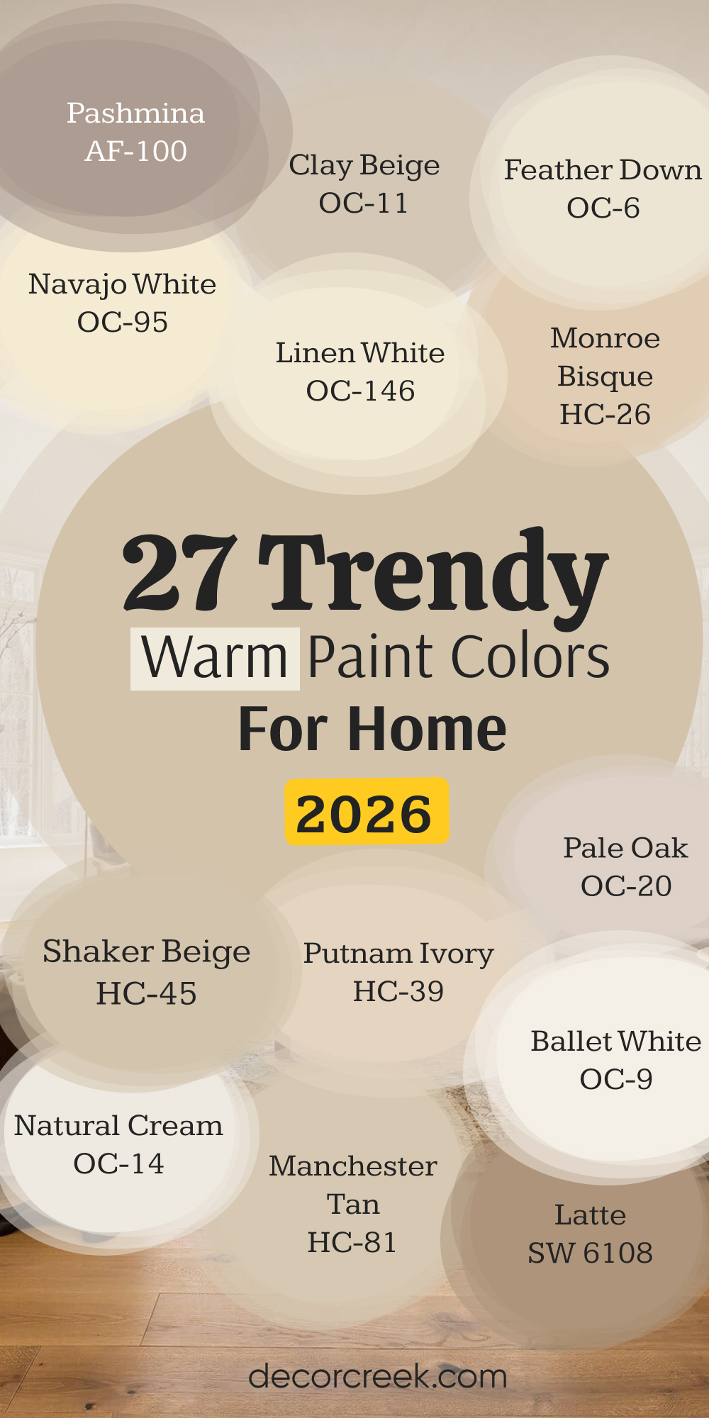
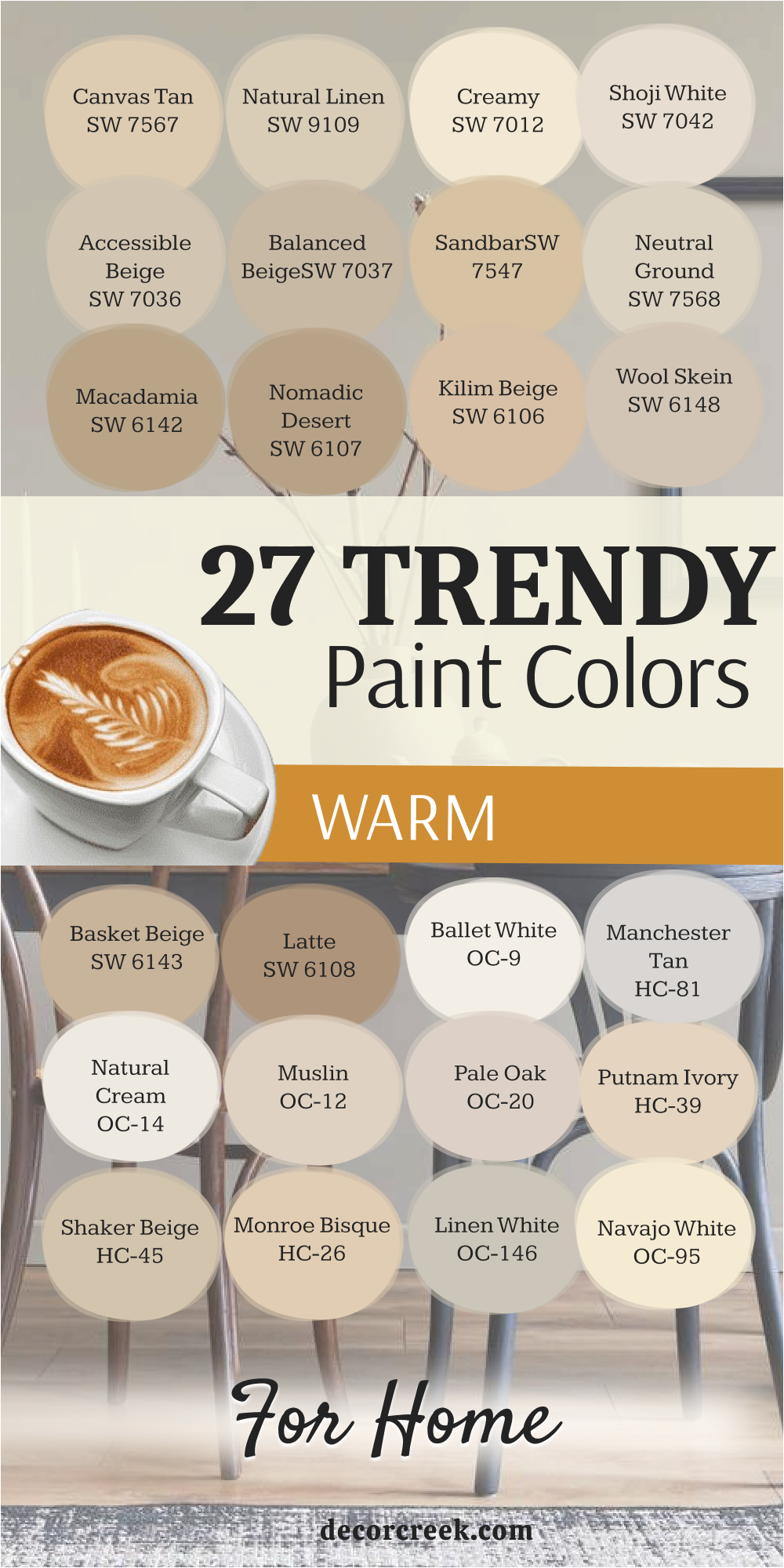
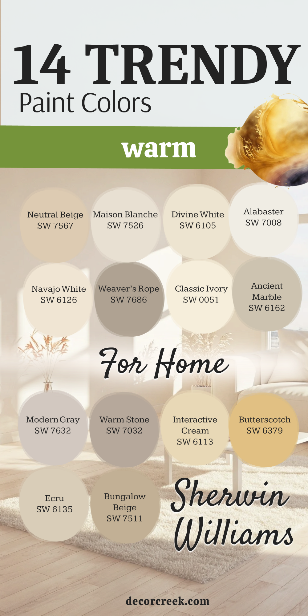
27 Trendy Warm Paint Colors For Home
Canvas Tan SW 7567
Canvas Tan is a beautiful soft beige that feels incredibly sophisticated and never stuffy. Canvas Tan acts as the perfect neutral backdrop, allowing your furniture and artwork to truly shine. Canvas Tan has a gorgeous, creamy undertone that prevents it from ever feeling dull or flat on a wall. Canvas Tan works equally well in sun-drenched living rooms and dimly lit hallways, showing its true versatility.
Canvas Tan is a popular choice for open-concept homes because it ties different rooms together seamlessly. Canvas Tan pairs beautifully with bright white trim for a crisp, clean look that still feels warm. Canvas Tan has enough depth to look rich, yet it’s light enough to keep a room feeling airy and large.
Canvas Tan is the color I suggest when someone wants beige but is worried about it feeling dated, proving it’s very much a modern choice. Canvas Tan is a great option for bedrooms, offering a restful and comforting atmosphere. Canvas Tan’s subtle warmth makes it a friend to both modern and traditional decor styles.
🎨 Check out the complete guide to this color right HERE 👈

Natural Linen SW 9109
Natural Linen is a sophisticated warm beige that brings the feeling of expensive fabric right onto your walls. Natural Linen has a slight gray influence, which keeps it from skewing too yellow or orange, resulting in a perfectly balanced neutral. Natural Linen creates an instant feeling of calm and quality in any room where it is used.
Natural Linen works well with natural wood tones, like oak and walnut, enhancing their organic beauty.1 Natural Linen is one of my go-to colors for dining rooms because it provides an elegant and inviting setting for meals.2 Natural Linen is light enough to be used on all walls but has enough color to offer a nice contrast with white ceilings.
Natural Linen is the ideal color for a study or library, providing a grounding and focused environment. Natural Linen makes white bedding look especially crisp and clean when used in a master bedroom. Natural Linen is a popular choice for selling homes because it appeals to almost everyone’s desire for warmth and neutrality. Natural Linen remains consistently beautiful under different lighting conditions, a hallmark of a great quality paint.

Creamy SW 7012
Creamy is a delightful and soft off-white that has a distinct yellow undertone, making it one of the warmest whites available. Creamy is the color you choose when you want the brightness of white but desperately need to banish cold, stark feelings from your home. Creamy works wonderfully in kitchens where it can brighten the cabinets and walls without looking harsh or industrial.
Creamy pairs beautifully with richer, darker colors like deep green or navy if you want to use it as a contrasting trim color. Creamy is the perfect main color for a coastal-style home, evoking sunshine and sand. Creamy is one of the best choices for North-facing rooms because its inherent warmth counters the cool light.
Creamy prevents shadows from looking gray or dingy, keeping the room feeling light-filled throughout the day. Creamy is a fantastic color for painted furniture, giving pieces a soft, antique-like patina. Creamy is light enough to be barely a color, but its warmth is unmistakable and deeply comforting. Creamy is my suggestion for anyone who finds pure white to be too stark and unwelcoming in their living areas.
🎨 Check out the complete guide to this color right HERE 👈

Shoji White SW 7042
Shoji White is an absolutely stunning, complex off-white that feels like a blend of cream, beige, and a touch of gray. Shoji White is an incredibly popular color because it provides that bright, airy feel while still registering as definitively warm.3 Shoji White is often referred to as a “greige” that leans heavily towards the warmer, creamier side, which is perfect for 2026.4
Shoji White works beautifully with both cool and warm accents, acting as a true bridge color in an open floor plan. Shoji White is the ideal choice for walls when you have bright white trim, creating a soft, subtle contrast that adds visual interest. Shoji White’s delicate nature makes it suitable for almost any room, from bathrooms to formal living rooms.
Shoji White is perfect if you want a white that never looks sterile but always feels rich and inviting. Shoji White is a shade I use often when staging homes because it photographs beautifully and appeals to a wide variety of buyers. Shoji White’s slight gray edge ensures it never looks overly yellow, even in very bright, sunny rooms. Shoji White is a dependable, high-performing color that is guaranteed to bring a trendy, yet lasting warmth to your home.

Accessible Beige SW 7036
Accessible Beige is a true staple in the warm neutral category, known for being one of Sherwin-Williams’ most popular colors for a reason. Accessible Beige sits right in the sweet spot between gray and beige, making it the perfect greige that leans distinctly warm. Accessible Beige is a fantastic color to use when you have furnishings that have both warm and cool tones, helping to unify the entire design. Accessible Beige is a reliable choice for main living areas because it’s neither too dark nor too light, providing a substantial yet airy feel.
Accessible Beige is an incredibly versatile color that works well with all types of wood, from dark cherry to light maple.5 Accessible Beige is a go-to for those who want a neutral that shows its color but isn’t too bold or distracting. Accessible Beige’s light reflectance is excellent, helping to make a room feel open and well-lit without being stark.
Accessible Beige is a safe bet for painting an entire home because it flows nicely from room to room without feeling repetitive. Accessible Beige is the warm neutral I recommend when a client wants a color that is proven to look good just about anywhere. Accessible Beige offers a cozy and grounded feeling that is perfect for creating a relaxing atmosphere in a family room.
🎨 Check out the complete guide to this color right HERE 👈

Balanced Beige SW 7037
Balanced Beige is a beautiful mid-tone beige that is a shade deeper and richer than its counterpart, Accessible Beige. Balanced Beige is the color I reach for when a room needs more depth and a slightly more dramatic, cozy feel. Balanced Beige has subtle gray undertones that provide a beautiful balance, ensuring the color doesn’t look too yellow or muddy.
Balanced Beige works wonderfully as a background color for artwork and large decorative pieces, making them stand out. Balanced Beige is an excellent choice for a master bedroom, creating a sophisticated and enveloping retreat that feels luxurious. Balanced Beige is perfect for a feature wall in a larger room, especially when paired with a lighter warm neutral on the adjacent walls.
Balanced Beige is an ideal color for rooms with a lot of natural light, as it has enough pigment to hold its own against bright sun. Balanced Beige is the perfect choice for a home office, offering a grounding and focused environment without feeling too dark. Balanced Beige holds its warmth beautifully, preventing it from ever looking cold or sterile, even on cloudy days. Balanced Beige provides a lovely foundation for mixing different textures and materials within your decor scheme.
🎨 Check out the complete guide to this color right HERE 👈

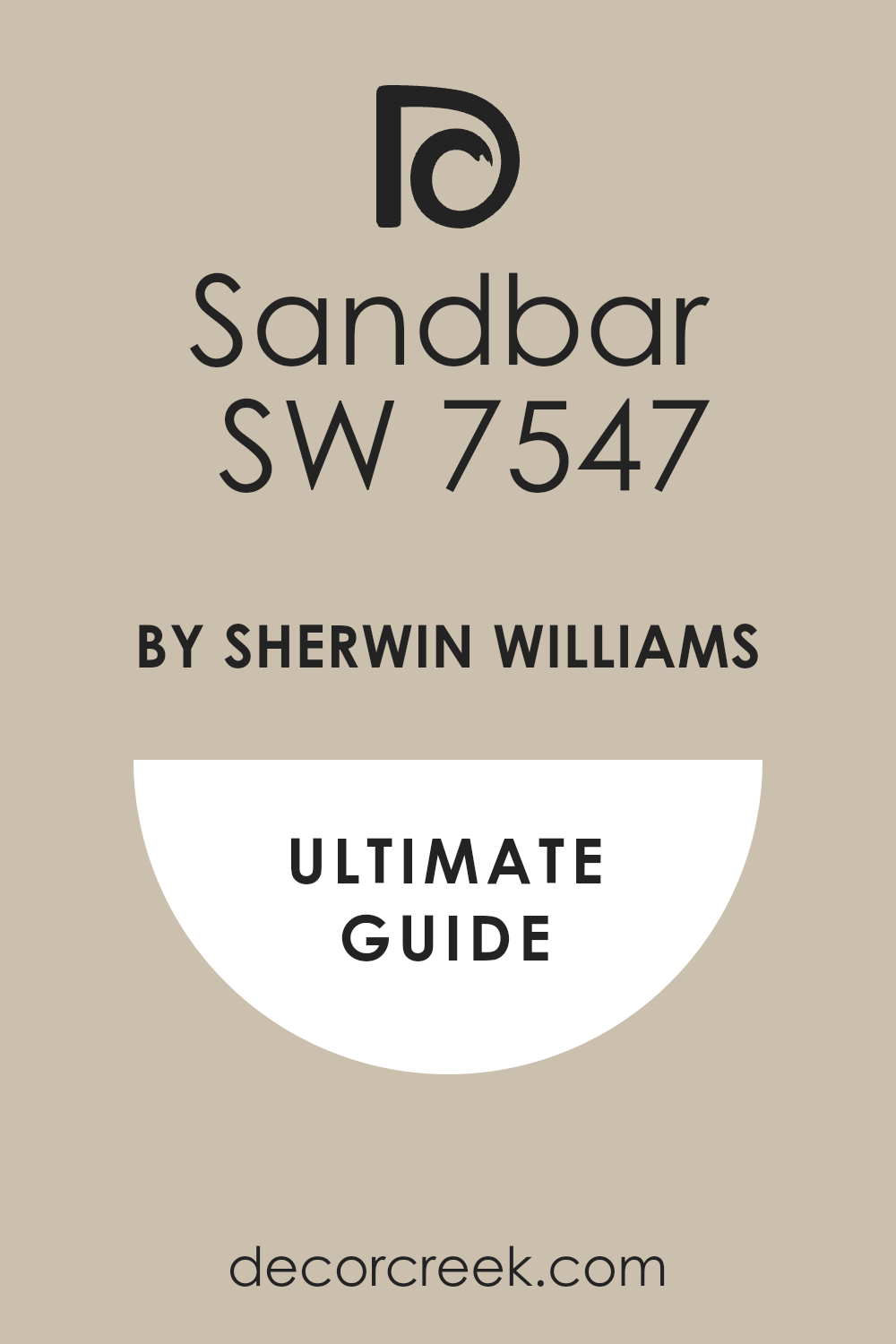
Sandbar SW 7547
Sandbar is a beautiful, true sandy beige that perfectly captures the warm, golden light of the beach. Sandbar is a medium-toned paint color that has strong yellow and gold undertones, making it distinctly warm and cheerful. Sandbar is an excellent choice for a sunroom or a casual living area where a bright, happy atmosphere is desired.
Sandbar pairs beautifully with coastal decor elements, such as woven textures and light blue accents. Sandbar is the color I suggest when a client wants a beige with a bit more life and saturation than a standard neutral. Sandbar works well on the exterior of a home, giving it a bright, inviting, and classic look that stands the test of time.
Sandbar’s golden quality makes it a great choice for North-facing rooms, adding a much-needed injection of sunshine. Sandbar is perfect for spaces where you want a noticeably warm color without going into the territory of dark browns or oranges. Sandbar offers a lovely richness that makes white trim pop and stand out beautifully against the wall. Sandbar is a fantastic choice for a casual dining area, creating an atmosphere that is conducive to lingering conversations and relaxed meals.
🎨 Check out the complete guide to this color right HERE 👈
Neutral Ground SW 7568
Neutral Ground is a light, delicate beige that is a truly beautiful and unassuming background color. Neutral Ground has very slight green-gray undertones, which gives it a sophisticated, earthy feel that makes it look incredibly natural. Neutral Ground is the kind of color that provides a soft, warm wash over a room, ensuring the light feels gentle and pleasant.
Neutral Ground is an ideal choice for hallways and entryways where you want a welcoming color that doesn’t feel heavy or confining. Neutral Ground works perfectly with both natural stone and aged wood accents, enhancing their texture and character. Neutral Ground is a highly versatile color that can successfully bridge the gap between pure cream and a more saturated beige.6
Neutral Ground is a lovely option for a nursery or child’s room because of its soft, calming, and gentle nature. Neutral Ground is my go-to for someone who wants to move away from gray but isn’t ready for a strongly yellow or gold-toned neutral. Neutral Ground has excellent light reflection, which helps to make smaller rooms feel larger and more open. Neutral Ground provides a wonderfully simple yet elegant backdrop that allows your furniture and art to take center stage effortlessly.

Macadamia SW 6142
Macadamia is a deep, rich beige that offers substantial warmth and a cozy, cocoon-like feeling to a room.7 Macadamia has a pleasing earthiness that makes it feel grounded and incredibly natural, like the nut it is named after. Macadamia is a perfect color for a reading nook or a dedicated media room where a sense of intimacy and depth is desired.
Macadamia works beautifully with rich wood tones and textured fabrics like wool or velvet, enhancing the luxury of the decor. Macadamia is a great choice for lower walls in a wainscoting application, paired with a lighter cream above. Macadamia is the color I suggest for creating a dramatic and enveloping feel in a dining room, making it feel very special.
Macadamia’s depth means it holds its color well even in rooms with intense sunlight, never washing out completely. Macadamia is a warm, cozy color that makes a large room feel more inviting and less cavernous. Macadamia is an excellent selection for an accent wall if you want to bring a very definite, warm focal point to your space. Macadamia offers a lovely historic feel that works wonderfully in traditional or craftsman-style homes.
🎨 Check out the complete guide to this color right HERE 👈
Nomadic Desert SW 6107
Nomadic Desert is a captivating medium-to-dark beige with definite gold and bronze undertones, evoking the beautiful colors of a sun-drenched landscape. Nomadic Desert provides a very noticeable and strong layer of warmth, making a room feel instantly cozy and grounded.8 Nomadic Desert is a fantastic choice for a dramatic bedroom or a living room where you want to create an inviting, enveloping mood.
Nomadic Desert pairs beautifully with dark brown leather furniture and woven accents for a rich, textured look.9 Nomadic Desert is a great color to use on an accent wall to contrast with lighter creams or whites on the surrounding walls. Nomadic Desert works incredibly well with terracotta and clay materials, complementing their natural warmth and texture.
Nomadic Desert is one of those colors that feels sophisticated and expensive, adding instant depth and character to a space.10 Nomadic Desert is a substantial color that can handle the vibrancy of colorful artwork without getting lost or overwhelmed. Nomadic Desert is a beautiful option for a study or library, creating a focused and warm atmosphere for work or relaxation. Nomadic Desert is a great selection for exterior doors or shutters to add a punch of warm, earthy color to a home’s façade.

Kilim Beige SW 6106
Kilim Beige is an iconic, time-tested beige that is known for its strong, noticeable warm undertones.11 Kilim Beige has definite pink or red undertones that are subtle enough to keep it from looking like true pink but are key to its comforting warmth. Kilim Beige is a fantastic color for creating a cozy, almost antique feel in a living room or formal dining area.
Kilim Beige works beautifully with dark wood trim and traditional furniture styles, leaning into its classic nature. Kilim Beige is a great choice for bedrooms where you want to feel tucked in and warm, providing a soft and nurturing background. Kilim Beige is the color I suggest when someone wants a true beige that clearly avoids any green or gray leaning whatsoever.
Kilim Beige has enough color saturation to be a strong neutral on its own, not just a pale backdrop. Kilim Beige pairs wonderfully with rich cream-colored fabrics and gold-toned metallic accessories for a luxurious feel. Kilim Beige is a dependable and popular color that consistently delivers a classic and comforting look in any setting. Kilim Beige remains one of the best ways to bring a rich, comforting warmth to your main living areas without going too dark.

Wool Skein SW 6148
Wool Skein is a beautiful, complex warm neutral that sits somewhere between a light beige and a rich cream, with a touch of green-gray. Wool Skein’s unusual undertones give it a unique, earthy sophistication that feels entirely current for 2026. Wool Skein works wonderfully in homes that feature a lot of natural wood and stone, enhancing the organic materials.
Wool Skein is the perfect backdrop for a gallery wall, as its slightly muted tone allows framed art to be the star. Wool Skein is a fantastic choice for main living areas, offering a warm and sophisticated feel that isn’t too saturated. Wool Skein is the color I recommend when a client wants a warm neutral that has a slightly more complex and less straightforward look.
Wool Skein pairs beautifully with deep charcoal or black accents, providing a beautiful, grounding contrast. Wool Skein has a high light reflectance value, which ensures it still feels light and airy despite its underlying depth of color.13 Wool Skein is an excellent choice for a kitchen, giving the walls a fresh, comforting coat that looks great with white cabinets.14 Wool Skein is a lovely, comforting color that manages to feel simultaneously classic and perfectly on trend.

Basket Beige SW 6143
Basket Beige is a deep, rich, and truly warm beige that offers substantial color and character to any room. Basket Beige has strong gold and red undertones, making it a very assertive and cozy choice for a dramatic effect. Basket Beige is a great color for a cozy den or a reading room where a warm, intimate atmosphere is desired.
Basket Beige pairs beautifully with brass or antique gold metals, enhancing the luxurious, warm feeling of the space. Basket Beige is an excellent color for an accent wall, especially one that features a fireplace or architectural detail. Basket Beige is the color I suggest when someone wants a beige that makes a statement without being bright or overwhelming in its saturation.
Basket Beige holds up exceptionally well in brightly lit rooms, maintaining its richness and not washing out in the sun. Basket Beige provides a lovely backdrop for traditional furniture and fabrics with patterns and texture. Basket Beige is perfect for creating a classic, library-like feel in a home office or a sitting room. Basket Beige offers a wonderful, historic quality that feels grounded and immensely comforting in older homes.
Latte SW 6108
Latte is a popular and very rich medium-dark beige that has a deep, comforting brown base with warm undertones. Latte is an incredibly inviting and substantial color that works well in rooms where a cozy, enveloping atmosphere is the goal.15 Latte has enough depth to look sophisticated and luxurious, especially when paired with creamy white trim.
Latte is a fantastic choice for a dedicated movie room or a cozy basement space, adding instant warmth and drama. Latte pairs beautifully with natural stone textures and dark wood finishes, leaning into a refined, earthy look. Latte is the color I recommend when a client wants to make a strong statement with a warm neutral that is far from pale or timid.
Latte holds its color beautifully even in lower light, ensuring the room always feels rich and inviting, never shadowy. Latte is a great option for a feature wall in a bedroom to create a grounded and relaxing backdrop for the headboard. Latte works wonderfully in homes with an Italian or Tuscan influence, matching their traditionally rich and warm color palettes. Latte provides a deep, sophisticated warmth that is absolutely on trend for the cozy and comfortable homes of 2026.
Ballet White OC-9
Ballet White is one of Benjamin Moore’s most adored off-whites, known for its incredible ability to bring warmth without any strong yellow tint.16 Ballet White has a slight, almost undetectable greige undertone that ensures it never looks like a sickly cream, only a beautiful, soft white. Ballet White is the perfect sophisticated neutral for an entire open-concept living area, providing an airy yet cozy feel.
Ballet White is a fantastic choice for trim work, providing a softer, warmer contrast to more saturated wall colors than a stark white would. Ballet White works beautifully in any room of the house, successfully carrying a warm, soft light from one room to the next. Ballet White is the color I suggest when a client wants white walls but needs to ensure the room doesn’t feel cold or institutional.
Ballet White has an excellent light reflective value, helping to maximize the natural light in the room without creating a glare. Ballet White pairs perfectly with natural wood floors and white oak cabinetry, enhancing their inherent warmth. Ballet White is a reliable, high-quality color that gives a home a gentle, welcoming glow that feels very current. Ballet White remains one of the most reliable and beautiful warm whites available from any major paint brand today.
Manchester Tan HC-81
Manchester Tan is a revered classic from Benjamin Moore’s Historical Collection, a warm beige that has stood the test of time.18 Manchester Tan is a perfect mid-tone tan that offers a good amount of color without ever feeling heavy or dark in a room.19 Manchester Tan has subtle green-gray undertones, which gives it a beautiful, sophisticated earthiness and ensures it never looks too yellow.
Manchester Tan is a fantastic neutral for main living areas, providing a comfortable and grounded backdrop for family life. Manchester Tan works wonderfully in a kitchen, giving a soft, inviting color to the walls that looks beautiful next to white cabinets. Manchester Tan is a great color for a home office, creating a focused and traditionally sophisticated atmosphere for work.
Manchester Tan pairs beautifully with dark, rich wood furniture and natural textures like linen and cotton. Manchester Tan is a popular choice for homes with a traditional or colonial architectural style, fitting perfectly with their classic elements. Manchester Tan is the color I recommend when a client wants a true, well-defined tan that avoids any strong pink or peach undertones. Manchester Tan offers a lovely, comforting depth that feels incredibly inviting and makes a room feel instantly settled.20

Natural Cream OC-14
Natural Cream is a beautiful, very pale neutral that sits between a soft off-white and the lightest possible beige. Natural Cream has a delicate, subtle warm undertone that makes it feel much cozier than a typical stark white. Natural Cream is the ideal choice for creating a light and airy feel in a room while still maintaining a definite sense of warmth.
Natural Cream works wonderfully as a main color for an open-concept home, providing a consistent, gentle backdrop throughout. Natural Cream is one of the best options for ceilings, adding a soft glow without the starkness of pure white. Natural Cream is perfect for making smaller rooms feel larger and brighter while still ensuring they don’t look cold or empty.
Natural Cream is the color I suggest when a client wants white walls but needs a guarantee that the room will feel inviting and soft. Natural Cream pairs perfectly with natural fiber rugs and light-colored upholstery, enhancing a serene, modern aesthetic. Natural Cream is a reliable choice for nurseries and bedrooms, offering a restful and gentle environment for relaxation. Natural Cream provides a truly soft, diffused warmth that gives a home a very modern and clean, yet cozy feel.
🎨 Check out the complete guide to this color right HERE 👈

Muslin OC-12
Muslin is a gorgeous light neutral that perfectly mimics the look of unbleached cotton fabric, offering a gentle, creamy warmth. Muslin has a subtle, earthy undertone that gives it a refined character, preventing it from looking like a simple, plain white. Muslin is a fantastic color for creating a soft, lived-in feel in a living room, giving it instant comfort and charm.
Muslin works beautifully with antique or distressed furniture, enhancing the texture and history of the pieces. Muslin is a great choice for bedrooms, providing a restful and nurturing environment that promotes relaxation. Muslin is the perfect main color for a shabby chic or cottage-style interior, leaning into its gentle, fabric-like quality.
Muslin is a light-reflecting color that still holds its warmth, making a room feel both bright and incredibly cozy. Muslin pairs excellently with wrought iron or black metal accents, creating a sharp, grounding contrast against its softness. Muslin is the color I recommend when a client is looking for a warm, creamy off-white that feels exceptionally authentic and comfortable. Muslin offers a beautiful, soft glow to a room that feels sophisticated without being overly formal or fussy in its appearance.
🎨 Check out the complete guide to this color right HERE 👈

Pale Oak OC-20
Pale Oak is an exquisite, highly popular neutral that sits perfectly between a light beige and a soft, warm gray, making it a true greige.21 Pale Oak has a beautiful complexity, with subtle violet or purple undertones that are just enough to make it interesting without being noticeable as actual color. Pale Oak is a fantastic color for open-concept homes because it manages to look warm and inviting in varying light conditions.
Pale Oak works wonderfully with both warm woods and cool stones, acting as an ideal bridge color between different materials. Pale Oak is the color I suggest when a client wants a light, sophisticated neutral that is undeniably warm but has a modern, muted feel. Pale Oak is a perfect choice for entryways and foyers, immediately setting a tone of understated elegance and welcoming warmth.
Pale Oak has a high light reflectance, making it a great option for brightening up darker spaces without resorting to a stark white.22 Pale Oak pairs beautifully with light, creamy white trim, creating a soft, subtle definition on the walls. Pale Oak is a reliable and highly versatile color that continues to be a favorite among designers for its ability to look good everywhere. Pale Oak offers a gentle, sophisticated warmth that is absolutely in line with the high-end, cozy trends of 2026.24

Putnam Ivory HC-39
Putnam Ivory is a classic, rich ivory from the Historical Collection that has a delightful, buttery yellow undertone. Putnam Ivory is the perfect choice for creating a sunny, cheerful, and traditionally warm atmosphere in any room. Putnam Ivory is a fantastic color for North-facing rooms, as its strong yellow base easily counters the cool light, making the room feel bright.
Putnam Ivory works beautifully with traditional wainscoting and crown molding, enhancing their architectural details with a soft glow. Putnam Ivory is the color I suggest when a client truly wants a warm, creamy color that doesn’t shy away from its yellow and gold roots. Putnam Ivory provides a wonderful, historic feeling that works perfectly in older homes with classic charm and detailing.
Putnam Ivory pairs wonderfully with antique furniture and rich tapestry fabrics, creating a very cozy and classic look. Putnam Ivory is a great choice for a dining room where you want a warm, inviting glow that makes everyone look good under the light. Putnam Ivory is an excellent backdrop for showcasing rich wood floors and deep mahogany or cherry furniture pieces. Putnam Ivory offers a truly inviting and comforting warmth that makes a room feel instantly lived-in and loved.26
Shaker Beige HC-45
Shaker Beige is a classic, medium-toned beige that is part of Benjamin Moore’s historical palette and is known for its grounded, earthy quality.27 Shaker Beige has a subtle, ruddy undertone that provides a rich, complex warmth, ensuring it never looks plain or uninspired. Shaker Beige is a fantastic choice for a family room or den, providing a cozy and substantial background for everyday life.
Shaker Beige works beautifully with stone fireplaces and natural fiber area rugs, enhancing a rustic or farmhouse aesthetic. Shaker Beige is the color I recommend when a client wants a beige with more depth and saturation than a pale neutral, but not quite a dark color. Shaker Beige is a great option for a feature wall, especially when paired with a lighter off-white on the surrounding walls to provide contrast.
Shaker Beige holds up well to intense light, maintaining its beautiful richness without washing out or fading in the sun. Shaker Beige is perfect for grounding a room with high ceilings, making the space feel more intimate and warm. Shaker Beige offers a timeless quality that ensures your home will feel sophisticated and cozy for many years to come.28 Shaker Beige provides a wonderfully welcoming and enveloping feel that is perfect for creating a warm, cozy home environment.29

Monroe Bisque HC-26
Monroe Bisque is a lovely, medium-toned beige with a strong, comforting golden-yellow undertone. Monroe Bisque is a wonderful color for creating a cheerful and sunny disposition in any room, regardless of the natural light. Monroe Bisque is a fantastic choice for a kitchen, giving the walls a clean, bright look that feels much warmer than a simple white.
Monroe Bisque works beautifully with dark granite countertops and stainless steel appliances, providing a nice balance to the modern elements. Monroe Bisque is the color I suggest when a client wants a warm neutral that has a definite yellow influence but is still sophisticated and not childish.
Monroe Bisque is a great option for a hallway or entryway, providing an immediate, sunny welcome to anyone entering the home. Monroe Bisque holds its warmth beautifully, making it an excellent choice for rooms that see a lot of use during the evening hours. Monroe Bisque pairs well with traditional wood furniture and rich, patterned fabrics for a cozy, classic look. Monroe Bisque is a dependable color that successfully brings a sophisticated level of sunny warmth into a home. Monroe Bisque provides a cheerful and invigorating warmth that is perfect for breakfast nooks and informal dining areas.
Linen White OC-146
Linen White is a classic off-white that is known for its beautiful, creamy warmth and incredibly gentle quality.31 Linen White has a noticeable yellow undertone that makes it one of the warmest whites available from Benjamin Moore, ensuring it never looks stark.32 Linen White is a fantastic choice for a trim color, providing a soft, welcoming contrast to more saturated colors on the walls.
Linen White works wonderfully as a main color for an open-concept home, creating a bright yet incredibly soft and cozy background. Linen White is the color I recommend when a client wants white walls but needs to ensure the room feels deeply inviting and not cold. Linen White is perfect for making rooms feel light and airy while still maintaining that essential feeling of homey comfort.
Linen White pairs beautifully with natural wood floors and light-colored furniture, enhancing a relaxed, gentle aesthetic. Linen White is a great choice for ceilings, adding a subtle warmth that prevents the overhead surface from feeling stark or separate from the walls. Linen White is a versatile and reliable choice that successfully brings a simple, comforting elegance to any room. Linen White provides a soft, sunny glow that instantly makes a house feel more like a welcoming, warm home.
Navajo White OC-95
Navajo White is a historical and extremely popular off-white color that is characterized by its strong, sunny yellow undertones.33 Navajo White is the perfect choice for instantly brightening a dark room, making it feel filled with constant sunshine and warmth. Navajo White is a fantastic color for North-facing rooms, where its golden base actively combats the cool, blue light to create a cheerful atmosphere.
Navajo White works beautifully in kitchens, providing a clean yet exceptionally warm look to both walls and cabinetry. Navajo White is the color I suggest when a client wants an off-white that leans more yellow than beige, providing a distinct, buttery glow. Navajo White is a great option for trim work, especially in older homes, as it gives a much softer, antique look than a bright white.
Navajo White holds its warmth incredibly well, ensuring the room always feels cozy and inviting, even on a cloudy day. Navajo White pairs perfectly with natural terracotta pots and woven textures, leaning into a warm, southwestern-inspired aesthetic. Navajo White is a dependable and classic color that brings a timeless, comforting warmth and brightness to any space. Navajo White provides a truly generous wash of buttery sunshine, making a room feel instantly happier and more welcoming.
Feather Down OC-6
Feather Down is a gorgeous, soft off-white that has a subtle, gentle creamy-beige undertone, giving it a delicate warmth. Feather Down is the perfect color for walls when you want a neutral that is barely a color but still registers as definitively warm and welcoming. Feather Down is a fantastic choice for bedrooms and nurseries, offering a restful and incredibly peaceful background for relaxation. Feather Down works beautifully as a main wall color when you have a lot of dark, saturated colors in your furniture or artwork, providing balance.
Feather Down is the color I recommend when a client wants a sophisticated white that is guaranteed not to look stark, cold, or institutional. Feather Down has an excellent light reflective quality, helping to maximize the natural light in a room without causing glare. Feather Down pairs wonderfully with both light and dark wood tones, adapting easily to different styles and decor elements.
Feather Down is a great option for a bathroom, providing a clean, fresh look that is much softer and more inviting than a harsh white. Feather Down is a truly versatile and reliable choice that successfully brings a sophisticated, gentle warmth to a home. Feather Down provides a very soft, comforting glow that makes a house feel instantly like a cherished, warm retreat.
Clay Beige OC-11
Clay Beige is a lovely light neutral that has a beautiful, distinct, earthy quality, sitting perfectly between beige and a gentle, warm gray. Clay Beige has subtle green-gray undertones that give it an organic, grounded feel, making it sophisticated and natural. Clay Beige is a fantastic color for creating a clean, modern look while still maintaining an essential level of warmth and coziness.
Clay Beige works beautifully with natural stone surfaces, like slate or limestone, enhancing their texture and inherent color. Clay Beige is the color I suggest when a client wants a sophisticated neutral that feels very current and avoids the typical yellow or pink undertones. Clay Beige is a great option for open-concept homes, as its balanced undertone flows seamlessly between different functional areas.
Clay Beige holds up exceptionally well under different lighting, always maintaining its subtle, complex character without looking dull. Clay Beige pairs perfectly with sleek, dark metal accents, creating a high-contrast look that remains warm and inviting. Clay Beige is a dependable and highly recommended color that brings a muted, earthy sophistication to any interior design. Clay Beige provides a wonderful, grounding warmth that makes a room feel settled and naturally comfortable.
Pashmina AF-100
Pashmina is a rich, luxurious, and beautifully saturated warm neutral that is part of Benjamin Moore’s Affinity Collection.35 Pashmina is a mid-tone taupe-beige that has strong gray and brown influences, resulting in an incredibly cozy and sophisticated color.36 Pashmina is a fantastic choice for creating a cozy, cocoon-like atmosphere in a den, library, or master bedroom.
Pashmina works beautifully with gold-toned accents and creamy white trim, enhancing its depth and making the space feel upscale. Pashmina is the color I suggest when a client wants a sophisticated color that feels substantial and enveloping, a true departure from pale neutrals. Pashmina is a great option for a formal dining room, providing a rich, elegant background for special occasions and dinner parties.
Pashmina holds its color wonderfully in both bright and low light, ensuring the room always feels grounded and warm. Pashmina pairs perfectly with dark wood furniture and natural textures like leather and wool, creating a tactile and comforting space.37 Pashmina is a dependable and popular color that brings a refined, enveloping warmth that is highly desirable in modern, cozy homes. Pashmina offers a deep, sophisticated warmth that makes a room feel instantly curated and incredibly comfortable.38

14 Trendy Warm Paint Colors For Home From Sherwin Williams
Neutral Beige SW 7567
Neutral Beige is a gentle and appealing warm beige that sits perfectly in the middle of the neutral color spectrum. Neutral Beige is the perfect choice for a soft, inviting backdrop that allows your colorful furnishings to take center stage effortlessly. Neutral Beige has a lovely, balanced undertone that ensures it never looks too pink or too yellow, making it incredibly versatile.
Neutral Beige is a fantastic color for open-concept living areas, providing a consistent and comforting flow throughout the home. Neutral Beige works beautifully with natural wood trim and flooring, enhancing their inherent warmth and texture. Neutral Beige is the color I recommend when a client wants a foolproof, medium-light beige that is guaranteed to look good in most settings.
Neutral Beige is a great option for a hallway, providing a light, welcoming path into the main living spaces of the house. Neutral Beige holds its warmth well even in rooms that receive cooler, North-facing light, keeping the atmosphere cozy. Neutral Beige pairs excellently with deep jewel tones, such as emerald green or sapphire blue, providing a beautiful contrast. Neutral Beige is a reliable and popular choice that successfully brings a calm, warm, and sophisticated neutrality to any home.
Maison Blanche SW 7526
Maison Blanche is a beautiful, delicate off-white that has a distinct, soft cream-yellow undertone, leaning heavily toward true warmth. Maison Blanche is the color you choose when you want the brightness of white but absolutely need a guarantee of an inviting, cozy feel. Maison Blanche is a fantastic choice for kitchens and bathrooms, providing a clean yet incredibly soft and welcoming look to the walls.39 Maison Blanche works beautifully with marble and subway tile, ensuring the white elements in the room don’t feel stark or cold.
Maison Blanche is the color I suggest when a client wants an off-white that is guaranteed to look buttery and warm, especially in lower light. Maison Blanche is a great option for bedrooms, offering a restful and incredibly gentle atmosphere that promotes true relaxation.40 Maison Blanche holds its beautiful creamy warmth even when paired with pure white trim, creating a soft, subtle definition.
Maison Blanche pairs perfectly with gold or brass hardware, enhancing the warm, luxurious feeling of the space. Maison Blanche is a dependable and popular color that successfully brings a gentle, historic feeling of warmth to a home. Maison Blanche provides a soft, luminous glow that instantly makes a room feel sunnier and more inviting to all who enter.41
Divine White SW 6105
Divine White is an incredibly popular and well-loved off-white that has a clear, soft, creamy-yellow undertone, making it one of the warmest whites. Divine White is the perfect choice for banishing cold, stark feelings from a room while still maintaining a bright and airy feel. Divine White is a fantastic color for trim and millwork, providing a softer, more traditional contrast to saturated wall colors.
Divine White works beautifully in North-facing rooms, where its inherent warmth actively counteracts the cooler, bluish natural light. Divine White is the color I recommend when a client wants a white that will truly glow and feel cozy, not just bright and plain. Divine White is a great option for an entire home, creating a consistent, gentle warmth that flows easily from room to room.
Divine White holds its creamy color well, ensuring that shadows and corners don’t look muddy or gray on cloudy days. Divine White pairs perfectly with natural linen fabrics and light wood furniture, enhancing a relaxed, comfortable aesthetic.42 Divine White is a reliable and versatile choice that successfully brings a gentle, inviting warmth to any interior design project.43 Divine White provides a beautiful, soft luminosity that instantly makes a house feel more like a cherished, warm home.
Alabaster SW 7008
Alabaster is an immensely popular, award-winning off-white that has a very gentle, understated warm beige undertone.44 Alabaster is the perfect neutral for those who love the clean look of white but require a sophisticated, welcoming softness to their walls. Alabaster is a fantastic choice for a main living area, giving the space an airy feel while still registering as decidedly warm and cozy.
Alabaster works beautifully with every type of wood finish, from rustic reclaimed pieces to sleek, modern cabinetry. Alabaster is the color I suggest when a client wants a current, high-end look that is guaranteed to feel light yet incredibly comforting. Alabaster is a great option for exterior paint, providing a crisp look that is much softer and more welcoming than a stark white.
Alabaster holds its slight beige warmth wonderfully, ensuring that it never looks cold or stark, even in the absence of direct sunlight. Alabaster pairs perfectly with black metal accents and deep-toned artwork, allowing them to truly pop against its softness. Alabaster is a dependable and truly versatile color that is a staple for creating stylish, warm, and bright homes.45 Alabaster provides a beautiful, soft wash of warmth that is both highly modern and immensely comforting in its appearance.

Navajo White SW 6126
Navajo White is a wonderful, soft off-white that has a noticeable warm yellow-gold undertone, making it a very cheerful choice.47 Navajo White is the perfect color for bringing a sense of sunshine and energy into a room, making it feel bright and inviting. Navajo White is a fantastic choice for North-facing rooms, as its yellow base easily combats the cool light to create a consistently warm atmosphere.
Navajo White works beautifully in kitchens, providing a clean yet exceptionally cozy and welcoming look to the walls and cabinets.49 Navajo White is the color I recommend when a client wants a warm white that is undeniably creamy and has a slight buttery quality to it. Navajo White is a great option for trim and millwork in older homes, as it gives a softer, more historic look than a stark modern white.
Navajo White holds its warmth exceptionally well, ensuring the room always feels inviting and bright, regardless of the time of day. Navajo White pairs perfectly with rich, colorful textiles and natural wood accents, creating a warm, layered look. Navajo White is a reliable and classic color that brings a charming, comforting warmth and brightness to any space.50 Navajo White provides a generous, golden glow that instantly makes a room feel happier and more like a cherished home.
Hinoki SW 7686
Hinoki is a lovely, medium-toned beige that has a rustic and grounded feel, evoking the color of natural, woven fibers. Hinoki has a noticeable earthy undertone that gives it a sophisticated quality, ensuring it never looks plain or uninspired. Hinoki is a fantastic choice for a living room, providing a cozy and substantial background for daily life and entertaining.
Hinoki works beautifully with iron hardware and reclaimed wood accents, enhancing a rustic or craftsman design aesthetic. Hinoki is the color I suggest when a client wants a mid-range beige with a definite, natural depth and a subtle organic quality. Weaver’s Rope is a great option for a home office, creating a focused and traditionally warm atmosphere for concentration.
Hinoki holds up well in rooms with a lot of natural light, maintaining its beautiful richness without appearing washed out. Hinoki pairs perfectly with leather furniture and heavy, textured throws, creating a truly warm and tactile space. Hinoki is a dependable color that successfully brings a sophisticated level of earthy, comforting warmth into a home. Hinoki provides a wonderfully grounded and enveloping feel that is perfect for creating a warm, settled home environment.
🎨 Check out the complete guide to this color right HERE 👈
Classic Ivory SW 0051
Classic Ivory is a gorgeous, rich ivory that has a strong, buttery yellow and cream undertone, living up to its traditional name. Classic Ivory is the perfect choice for creating an atmosphere of classic, sunny warmth and elegant charm in a formal room. Classic Ivory is a fantastic color for North-facing rooms, as its powerful yellow base works to neutralize the cool light and bring in simulated sunshine.
Classic Ivory works beautifully with traditional wainscoting, crown molding, and crystal lighting fixtures, enhancing a sense of luxury. Classic Ivory is the color I recommend when a client wants a creamy color that has a definite yellow presence but still maintains a level of sophistication. Classic Ivory is a great option for a dining room, as its golden glow makes people look good and encourages a cozy, lingering atmosphere.
Classic Ivory holds its warmth beautifully, making it an excellent choice for rooms that are used most often during the evening hours. Classic Ivory pairs perfectly with dark, rich mahogany or cherry furniture, creating a striking and historically beautiful contrast. Classic Ivory is a dependable and rich color that brings a timeless, comforting warmth and elegance to any formal living area. Classic Ivory provides a truly luxurious and generous wash of buttery sunshine, making a room feel instantly cherished and warmly refined.
🎨 Check out the complete guide to this color right HERE 👈
Ancient Marble SW 6162
Ancient Marble is an unusual and sophisticated light-to-medium neutral that has a noticeable green-gray undertone on a warm beige base. Ancient Marble is a truly complex and intriguing color that changes beautifully with the light, offering an earthy, grounding feel. Ancient Marble is a fantastic choice for a living room, providing a uniquely sophisticated backdrop that feels both warm and slightly muted. Ancient Marble works beautifully with natural stone textures, like flagstone or granite, enhancing their inherent, cool-warm complexity.
Ancient Marble is the color I suggest when a client wants a warm neutral that is far from boring and has a unique, subtle depth of color. Ancient Marble is a great option for a bathroom or spa area, providing a calm, natural, and subtly warm retreat-like atmosphere.51 Ancient Marble holds its warmth well despite the greenish hint, ensuring the room remains cozy and inviting on a fundamental level.
Ancient Marble pairs perfectly with polished nickel or chrome fixtures, creating a sophisticated and balanced contrast of warm and cool elements. Ancient Marble is a reliable color that successfully brings an organic, muted warmth and a contemporary sophistication to any interior design. Ancient Marble provides a subtle, complex warmth that makes a room feel instantly curated and elegantly comfortable.
Modern Gray SW 7632
Modern Gray is a popular and very light greige that sits directly between a light gray and a pale, warm beige.52 Modern Gray is the perfect choice for someone who wants the fashionable look of gray but requires the color to feel definitely warm and welcoming. Modern Gray is a fantastic color for open-concept homes, providing a consistent, clean, and warm flow throughout all the connected spaces.
Modern Gray works beautifully with both warm-toned wooden furniture and cooler, contemporary metal accents, bridging the two styles. Modern Gray is the color I recommend when a client is hesitant about moving to full beige but knows a stark gray will feel too cold in their home. Modern Gray is a great option for a master bedroom, offering a restful, sophisticated, and incredibly tranquil background for relaxation.
Modern Gray holds its warmth well under different lighting, ensuring it reads as a cozy greige and not a cold, flat gray. Modern Gray pairs perfectly with creamy white trim and bright white ceilings, creating a gentle yet crisp definition. Modern Gray is a dependable and versatile color that brings a current, sophisticated warmth to any interior design project. Modern Gray provides a soft, light wash of comforting greige that feels both incredibly contemporary and genuinely cozy.

Warm Stone SW 7032
Warm Stone is a rich, substantial medium-toned taupe-beige that provides a deep, grounded feeling to a room. Warm Stone is the perfect color for creating a cozy, sophisticated, and deeply enveloping atmosphere in a den or media room. Warm Stone has a pleasant brown-gray undertone that ensures it feels earthy and grounded, not at all muddy or yellow. Warm Stone is a fantastic choice for an accent wall, especially one that anchors a fireplace or built-in shelving unit.
Warm Stone works beautifully with rich, dark wood furniture and natural stone, enhancing a refined, masculine aesthetic. Warm Stone is the color I suggest when a client wants a neutral that makes a definite statement and adds depth and drama to the space. Warm Stone is a great option for a formal dining room, offering a rich, elegant background that encourages lingering and conversation.
Warm Stone holds its beautiful, rich color well, even in high light, ensuring it always looks substantial and never washed out. Warm Stone pairs perfectly with antique brass or bronze accessories, adding a subtle sparkle against the deep, warm tone. Warm Stone is a reliable color that successfully brings an opulent, sophisticated warmth that is absolutely on trend for cozy homes.
🎨 Check out the complete guide to this color right HERE 👈

Interactive Cream SW 6113
Interactive Cream is a deep, saturated cream color that has a strong, welcoming golden-yellow undertone, making it exceptionally warm. Interactive Cream is the perfect choice for bringing a consistent, sunny, and cheerful glow into a room, making it feel bright all day. Interactive Cream is a fantastic color for North-facing rooms, as its deep yellow base works powerfully to counteract the cool, bluish natural light. Interactive Cream works beautifully in children’s playrooms or informal areas where a happy, invigorating atmosphere is desired.
Interactive Cream is the color I recommend when a client wants a cream that is very noticeable and definitely yellow, without being a true pastel color. Interactive Cream is a great option for a kitchen, providing a bright yet deeply cozy look to the walls that looks wonderful with white cabinets.
Interactive Cream holds its deep, buttery warmth exceptionally well, ensuring the room always feels inviting and sunny, even on rainy days. Interactive Cream pairs perfectly with rich, dark wood furniture and colorful, patterned fabrics for a cozy, maximalist look. Interactive Cream is a dependable and vibrant color that brings a cheerful, comforting warmth and brightness to any space. Interactive Cream provides a generous, buttery wash of color that instantly makes a room feel happier and more like a cherished, sunny home.
🎨 Check out the complete guide to this color right HERE 👈

Butterscotch SW 6377
Butterscotch is a deep, rich, and intensely warm gold color with strong yellow and orange undertones, living up to its decadent name. Butterscotch is the perfect choice for creating a cozy, dramatic, and luxurious atmosphere that is full of character and depth. Butterscotch is a fantastic color for a feature wall, especially one that highlights a beautiful piece of art or a significant architectural detail. Butterscotch works beautifully with dark leather, velvet upholstery, and deep jewel-toned accents, creating a high-end, textured look.
Butterscotch is the color I suggest when a client wants a bold, warm color that is sophisticated and deeply comforting, not a simple bright yellow. Butterscotch is a great option for a formal dining room or a cozy study, providing a rich, enveloping background for intimate gatherings.
Butterscotch holds its color wonderfully, even in bright sun, ensuring it maintains its deep, luscious saturation throughout the day. Butterscotch pairs perfectly with natural wood trim and antique furniture, leaning into a classic, traditional aesthetic. Butterscotch is a reliable and substantial color that brings a glamorous, comforting warmth and a real sense of occasion to any room. Butterscotch provides a deep, golden richness that instantly makes a room feel incredibly cozy, luxurious, and warmly inviting.
Ecru SW 6135
Ecru is a classic, light-to-medium warm beige that perfectly captures the color of unbleached silk or fine linen fabric. Ecru is the perfect choice for a sophisticated and soft neutral backdrop that feels organic and incredibly comforting. Ecru has a gentle, refined undertone that ensures it is a true neutral, successfully avoiding any strong yellow or pink leanings. Ecru is a fantastic color for a formal living room, providing a soft, elegant background that allows fine art and furniture to shine.
Ecru works beautifully with natural materials, such as woven rugs, silk drapes, and light wood cabinetry, enhancing a serene aesthetic. Ecru is the color I recommend when a client wants a perfectly balanced, sophisticated beige that offers a consistent, gentle warmth. Ecru is a great option for an entryway, providing an immediate, soft, and very welcoming tone to anyone entering the home.
Ecru holds its gentle warmth well, ensuring the room always feels cozy and inviting, even during overcast weather. Ecru pairs perfectly with crisp white trim, creating a soft, clean contrast that is both classic and perfectly current. Ecru is a reliable and timeless color that successfully brings a simple, comforting elegance and warmth to any interior space.
Bungalow Beige SW 7511
Bungalow Beige is a medium-toned, very warm beige that has a distinctly earthy and grounded feel, perfect for a cozy home.55 Bungalow Beige is the perfect choice for creating a comfortable, lived-in feel that is both traditional and immensely inviting. Bungalow Beige has a gentle, subtle red-gold undertone that gives it a rich, sun-baked quality, evoking warmth and comfort.
Bungalow Beige is a fantastic color for a den or a family room, providing a cozy and substantial background for daily activities. Bungalow Beige works beautifully with dark wood furniture, leather upholstery, and woven textures, enhancing a craftsman or rustic style. Bungalow Beige is the color I suggest when a client wants a warm beige that has definite color saturation and character, not just a pale neutral.
Bungalow Beige is a great option for a feature wall, especially when paired with a lighter cream to create a warm, dimensional look. Bungalow Beige holds its warmth wonderfully, ensuring the room always feels cozy and grounded, even in rooms with cooler light. Bungalow Beige pairs perfectly with creamy white trim, creating a lovely, defined look that feels classic and homey. Bungalow Beige is a dependable and characterful color that successfully brings a deep, comforting warmth and a traditional charm to a home.
13 Trendy Warm Paint Colors For Home By Benjamin Moore
White Dove OC-17
White Dove is an extremely popular, soft, creamy white that has a gentle, warm gray undertone, giving it beautiful sophistication.57 White Dove is the perfect choice for a modern yet cozy look, providing a bright, airy feel without the starkness of pure white.58 White Dove is a fantastic color for kitchen cabinets, providing a clean, fresh look that is much warmer and more inviting than a harsh, bright white.59 White Dove works beautifully with every type of metal finish and countertop material, acting as a truly versatile background.
White Dove is the color I recommend when a client wants a white that will look beautiful in any light and is guaranteed not to feel cold or sterile. White Dove is a great option for trim and molding throughout the entire home, offering a soft contrast to slightly darker wall colors. White Dove holds its subtle, warm undertone consistently, ensuring that shadows never appear blue or dingy, keeping the room bright.
White Dove pairs perfectly with black accents and rich wood tones, creating a classic, high-contrast yet warm aesthetic. White Dove is a dependable and truly versatile color that is a staple for creating stylish, warm, and bright homes in 2026.61 White Dove provides a soft, elegant wash of warmth that is both incredibly current and profoundly comforting in its simplicity.62

Swiss Coffee OC-45
Swiss Coffee is a beloved, creamy off-white that has a distinct, buttery yellow-cream undertone, making it one of the warmest whites.63 Swiss Coffee is the perfect choice for instantly bringing a rich, welcoming warmth to a room while still maintaining a bright, clean look. Swiss Coffee is a fantastic color for walls in a living room or bedroom, where a cozy and enveloping atmosphere is paramount to the design. Swiss Coffee works beautifully with natural fiber rugs and light-colored furniture, enhancing a relaxed, airy, yet deeply cozy aesthetic.
Swiss Coffee is the color I suggest when a client wants an off-white that definitely reads as warm and buttery, not just a plain, pale color. Swiss Coffee is a great option for trim, especially in older homes, as it gives a much softer, more traditional and less harsh look than pure white.
Swiss Coffee holds its deep, creamy warmth consistently, ensuring the room always feels inviting and bright, even on overcast days. Swiss Coffee pairs perfectly with light blue or green accents, providing a beautiful, balanced contrast of cool and warm elements. Swiss Coffee is a reliable and popular color that successfully brings a cheerful, comforting warmth and brightness to any space.65 Swiss Coffee provides a generous, buttery glow that instantly makes a room feel sunnier and more like a cherished, warm home.

Atrium White OC-145
Atrium White is a unique, delicate off-white that has a gentle, pinkish-peach undertone, giving it a soft, rosy glow. Atrium White is the perfect choice for creating a truly romantic and nurturing atmosphere in a bedroom or a formal sitting room. Atrium White is a fantastic color for North-facing rooms, as its subtle red undertone actively counters the cool light, making the room feel genuinely warm. Atrium White works beautifully with silver and gold accents, enhancing its delicate, slightly shimmering quality under the light.
Atrium White is the color I recommend when a client wants an off-white that has an unusual, almost ethereal warmth that feels very special and unique. Atrium White is a great option for a young girl’s room or a formal powder room, offering a feminine and soft touch of color. Atrium White holds its gentle, rosy warmth consistently, ensuring the room always feels soft, inviting, and never stark or cold.
Atrium White pairs perfectly with natural wood tones and creamy white fabrics, enhancing a very soft, layered aesthetic. Atrium White is a reliable color that successfully brings a delicate, truly comforting warmth and a subtle romantic feeling to any interior. Atrium White provides a soft, subtle rosy glow that instantly makes a room feel incredibly gentle and sweetly welcoming.
🎨 Check out the complete guide to this color right HERE 👈
Seashell OC-120
Seashell is a gorgeous, pale off-white that has a very gentle, understated warm beige undertone, mimicking the color of natural beach shells. Seashell is the perfect choice for a sophisticated, light neutral that feels airy and clean while still being definitely warm and inviting. Seashell is a fantastic color for open-concept homes, providing a consistent, clean, and beautifully soft warm flow throughout the entire space.
Seashell works beautifully with coastal decor elements, such as light blue, natural rope, and weathered wood, enhancing a relaxed aesthetic. Seashell is the color I recommend when a client wants a neutral that is barely a color but is guaranteed not to look cold or stark on the walls. Seashell is a great option for a sunny living room, where it can reflect the natural light beautifully without washing out its subtle warmth.
Seashell holds its gentle, creamy warmth consistently, ensuring the room always feels soft, inviting, and peaceful, even on cloudy days. Seashell pairs perfectly with white trim and natural fiber rugs, creating a light, layered, and texturally interesting look. Seashell is a dependable and truly versatile color that successfully brings a soft, sophisticated warmth to any interior design project.66 Seashell provides a subtle, calming wash of warmth that makes a room feel instantly peaceful, clean, and incredibly cozy.
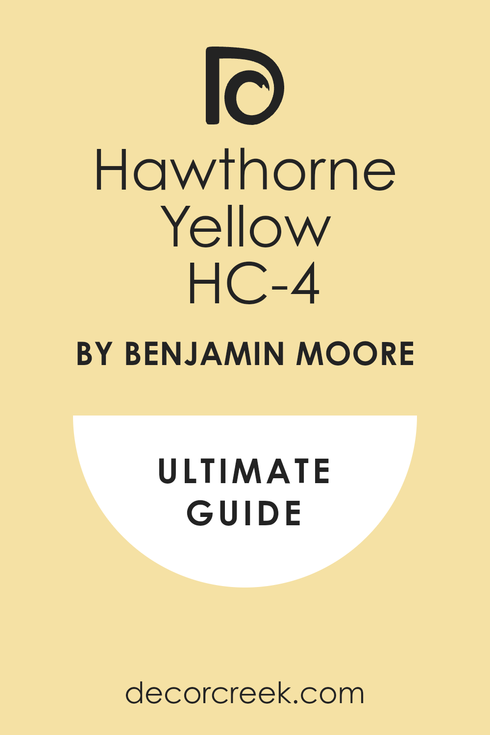
Hawthorne Yellow HC-4
Hawthorne Yellow is a classic, muted, and sophisticated warm yellow that is part of the Historical Collection, known for its enduring charm.67 Hawthorne Yellow is the perfect choice for bringing a strong, sunny, and cheerful disposition into a room, making it feel bright and energized. Hawthorne Yellow is a fantastic color for North-facing rooms, as its strong yellow base is incredibly effective at counteracting the cool, blue natural light.
Hawthorne Yellow works beautifully in a kitchen or a breakfast nook, creating an invigorating and happy atmosphere for morning activities. Hawthorne Yellow is the color I suggest when a client wants a true, happy yellow that is muted enough to feel sophisticated and not childish or overwhelming. Hawthorne Yellow is a great option for a home office, providing a cheerful and stimulating background that is conducive to creative work.
Hawthorne Yellow holds its beautiful, rich yellow warmth consistently, ensuring the room always feels sunny and bright, regardless of the outdoor weather. Hawthorne Yellow pairs perfectly with creamy white trim and deep green accents, creating a classic, harmonious, and very warm look. Hawthorne Yellow is a reliable and characterful color that successfully brings a cheerful, comforting warmth and brightness to any space. Hawthorne Yellow provides a generous, sunny glow that instantly makes a room feel full of joy and warmly welcoming to everyone.
Rich Cream 2153-60
Rich Cream is a deeply saturated, buttery, and incredibly warm cream color that truly lives up to its name. Rich Cream is the perfect choice for creating a cozy, luxurious, and enveloping atmosphere that feels both historic and immensely comfortable. Rich Cream has a strong, welcoming yellow-gold undertone that makes it an exceptional choice for dark rooms needing an injection of simulated light. Rich Cream is a fantastic color for a formal living room or a library, providing a rich, elegant background for fine furniture.
Rich Cream works beautifully with dark wood trim and gold-toned metallic accents, enhancing its deep, opulent warmth. Rich Cream is the color I recommend when a client wants a cream that is very noticeable, sophisticated, and definitely avoids any pale or gray qualities. Rich Cream is a great option for a master bedroom, creating a truly warm and nurturing retreat that feels incredibly luxurious and private.
Rich Cream holds its deep, buttery color exceptionally well, ensuring the room always feels rich and inviting, even in lower light. Rich Cream pairs perfectly with rich, colorful textiles and antique furniture, creating a warm, layered, and historically charming look. Rich Cream provides a deep, luxurious wash of buttery warmth that instantly makes a room feel cherished and wonderfully settled.
Stone House CC-120
Stone House is a deep, earthy, medium-toned beige that has strong, rich brown and gray undertones, giving it a grounding quality. Stone House is the perfect choice for creating a cozy, sophisticated, and deeply rooted atmosphere that feels traditional and secure. Stone House is a fantastic color for a study, den, or library, providing a rich, enveloping background that promotes focus and relaxation. Stone House works beautifully with exposed stone, brick, and dark wood beams, enhancing a rustic or craftsman architectural style.
Stone House is the color I recommend when a client wants a warm neutral that has significant depth and character, moving far beyond a pale or simple beige. Stone House is a great option for a large, airy room with high ceilings, helping to bring the walls in and make the space feel more intimate.
Stone House holds its deep, substantial warmth consistently, ensuring the room always feels rich and inviting, regardless of the lighting conditions. Stone House pairs perfectly with antique gold or bronze accessories, adding a subtle, luxurious shimmer against the deep wall color. Stone House is a reliable and grounding color that successfully brings a deep, substantial warmth and a historic elegance to any home.
Tyler Taupe HC-43
Tyler Taupe is a lovely medium-toned taupe-beige from the Historical Collection that has a beautiful, balanced gray and warm brown undertone.70 Tyler Taupe is the perfect choice for a sophisticated, traditional look that feels grounded, cozy, and never too yellow or orange. Tyler Taupe is a fantastic color for main living areas, providing a substantial, comforting neutral background that is both inviting and refined.
Tyler Taupe works beautifully with rich leather furniture, textured rugs, and dark wood finishes, enhancing a cozy, high-end look. Tyler Taupe is the color I suggest when a client wants a neutral that is truly versatile, balancing warmth and sophistication without strong color leanings.
Tyler Taupe is a great option for a dining room, creating a warm, elegant background that is perfect for entertaining and long conversations. Tyler Taupe holds its beautiful, balanced warmth consistently, ensuring the room always feels cozy and inviting, even on overcast days. Tyler Taupe pairs perfectly with creamy white trim, creating a soft, sophisticated contrast that defines the architectural details beautifully. Tyler Taupe is a dependable and popular color that successfully brings a sophisticated, grounding warmth and elegance to any home.
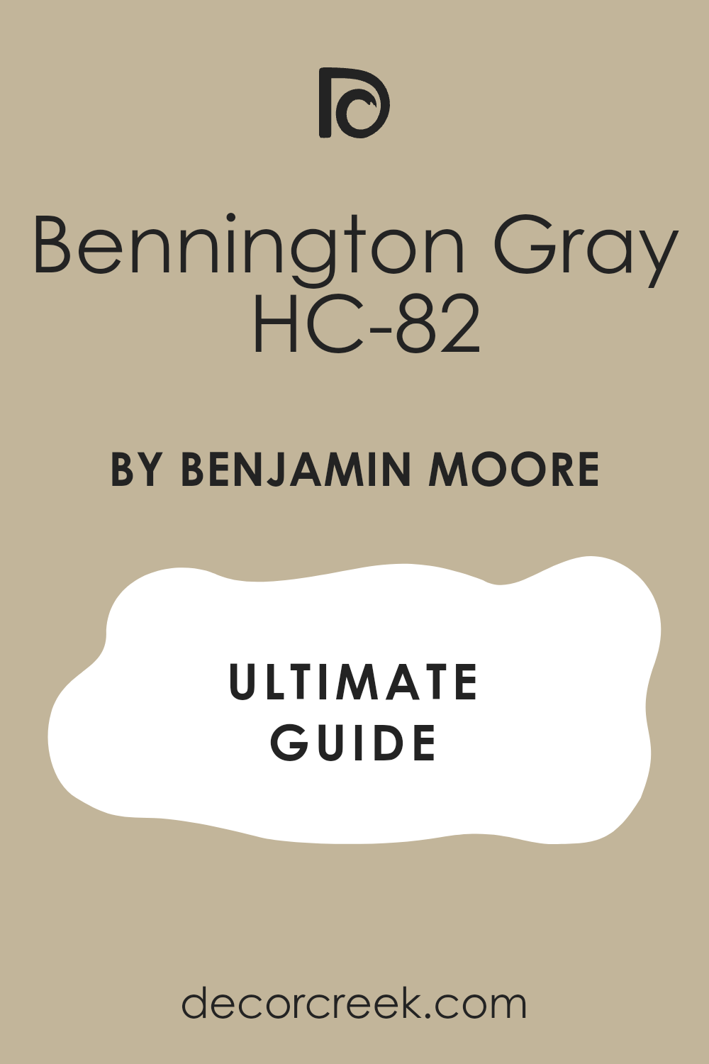
Bennington Gray HC-82
Bennington Gray is a wonderful, complex greige that sits perfectly between a soft, warm gray and a light, earthy tan.71 Bennington Gray is the perfect choice for a modern neutral that provides a sophisticated, muted background while still feeling inherently warm and inviting. Bennington Gray has subtle green undertones that give it an organic, grounded feel, ensuring it avoids the cold look of pure gray. Bennington Gray is a fantastic color for open-concept areas, as its subtle complexity allows it to look beautiful in all parts of the connected space.
Bennington Gray works beautifully with both natural wood and sleek metal elements, making it an excellent bridge between traditional and contemporary styles. Bennington Gray is the color I recommend when a client wants a gray that is absolutely guaranteed to feel warm and comfortable, never stark or harsh.
Bennington Gray is a great option for a master bedroom, offering a restful, sophisticated, and incredibly calming background for sleep.72 Bennington Gray holds its gentle warmth consistently, ensuring the room always feels cozy and inviting, even under difficult lighting conditions. Bennington Gray pairs perfectly with crisp white trim, creating a clean, defined look that remains soft and welcoming to the eye. Bennington Gray is a reliable and subtle color that successfully brings a current, sophisticated warmth and comforting neutrality to any home.73
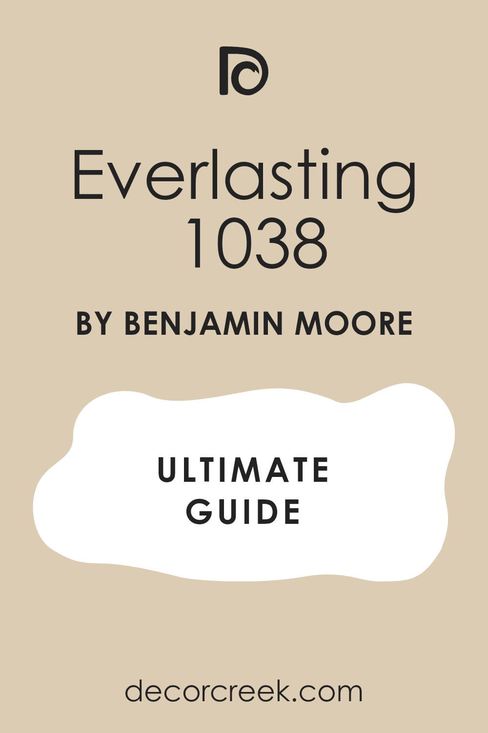
Everlasting 1038
Everlasting is a gorgeous, light-to-medium warm beige that has a beautiful, soft golden-cream undertone, living up to its name.74 Everlasting is the perfect choice for creating a light, sunny, and consistently welcoming atmosphere that feels both airy and incredibly cozy. Everlasting is a fantastic color for a living room, providing a bright yet comfortably warm backdrop for family gatherings and daily life.
Everlasting works beautifully with light wood furniture, natural linen upholstery, and woven baskets, enhancing a soft, organic aesthetic. Everlasting is the color I suggest when a client wants a light beige that has a clear, lovely warmth without being overly saturated or dark in any way.
Everlasting is a great option for an entire home, creating a consistent, gentle warmth that flows easily and connects all the different rooms. Everlasting holds its soft, golden warmth consistently, ensuring the room always feels bright and inviting, even during overcast weather. Everlasting pairs perfectly with creamy white trim and white ceilings, creating a light, beautiful, and subtle definition throughout the space. Everlasting is a dependable and beautiful color that successfully brings a soft, sunny warmth and a comfortable elegance to any interior.
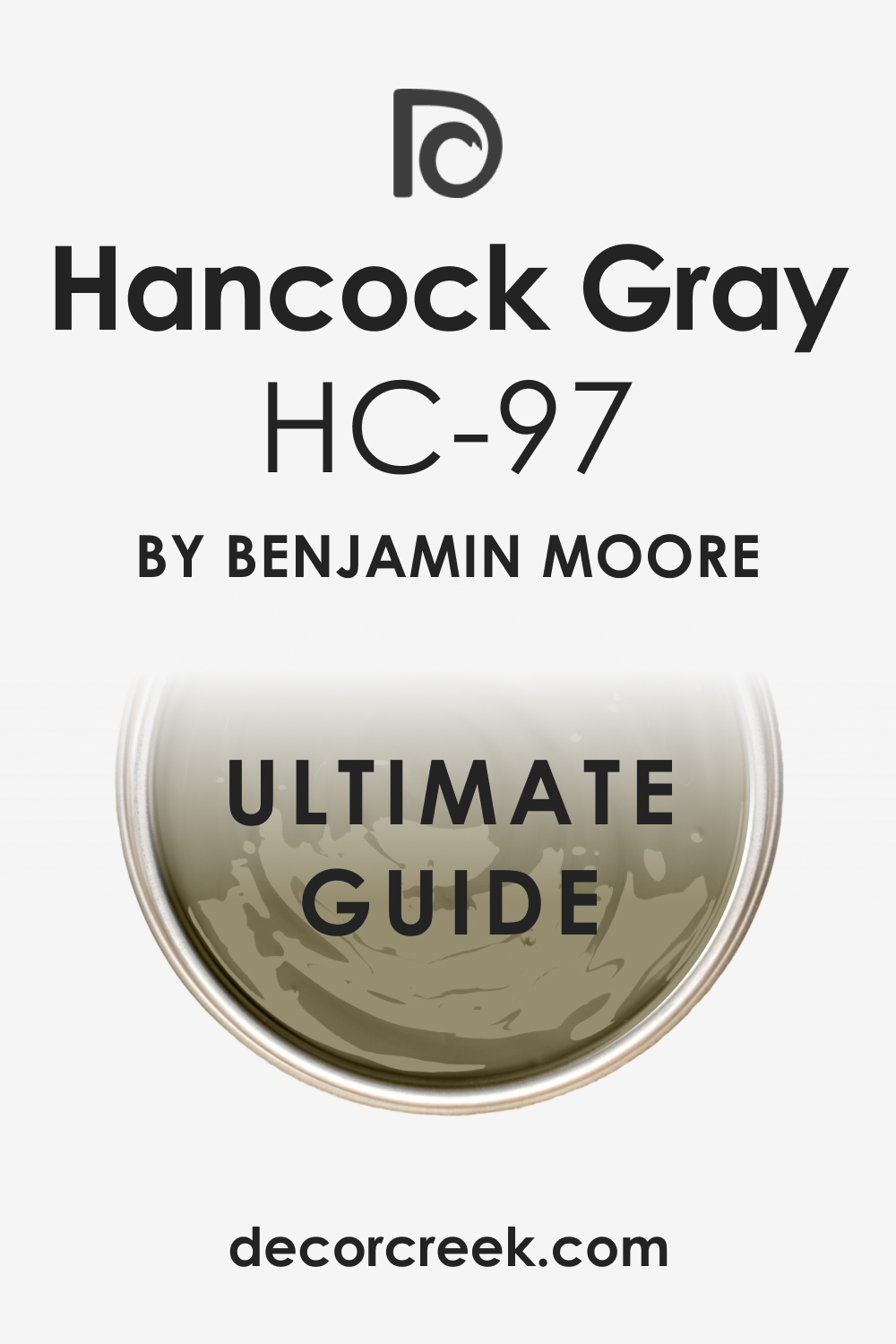
Hancock Gray HC-97
Hancock Gray is a rich, medium-dark taupe-gray from the Historical Collection that has a definite, luxurious warm undertone. Hancock Gray is the perfect choice for creating a sophisticated, deeply comforting, and slightly masculine atmosphere in a den or library. Hancock Gray has a complex brown-beige undertone that prevents it from ever feeling cold, ensuring it always reads as a very warm, grounding color. Hancock Gray is a fantastic color for an accent wall or an entire room where a dramatic, enveloping feeling is desired.
Hancock Gray works beautifully with deep leather furniture, dark wood bookcases, and rich velvet fabrics, enhancing a cozy, high-end look. Hancock Gray is the color I recommend when a client wants a substantial neutral that brings a serious amount of depth and sophistication to the room.
Hancock Gray is a great option for a formal space, offering a rich, elegant background that feels classic and conducive to deep conversation. Hancock Gray holds its beautiful, warm depth consistently, ensuring the room always feels intimate and inviting, regardless of the light. Hancock Gray pairs perfectly with gold or brass accents, which sparkle beautifully against its deep, warm backdrop. Hancock Gray is a dependable color that successfully brings a deep, substantial warmth and a luxurious sophistication that is highly sought after in homes.
🎨 Check out the complete guide to this color right HERE 👈
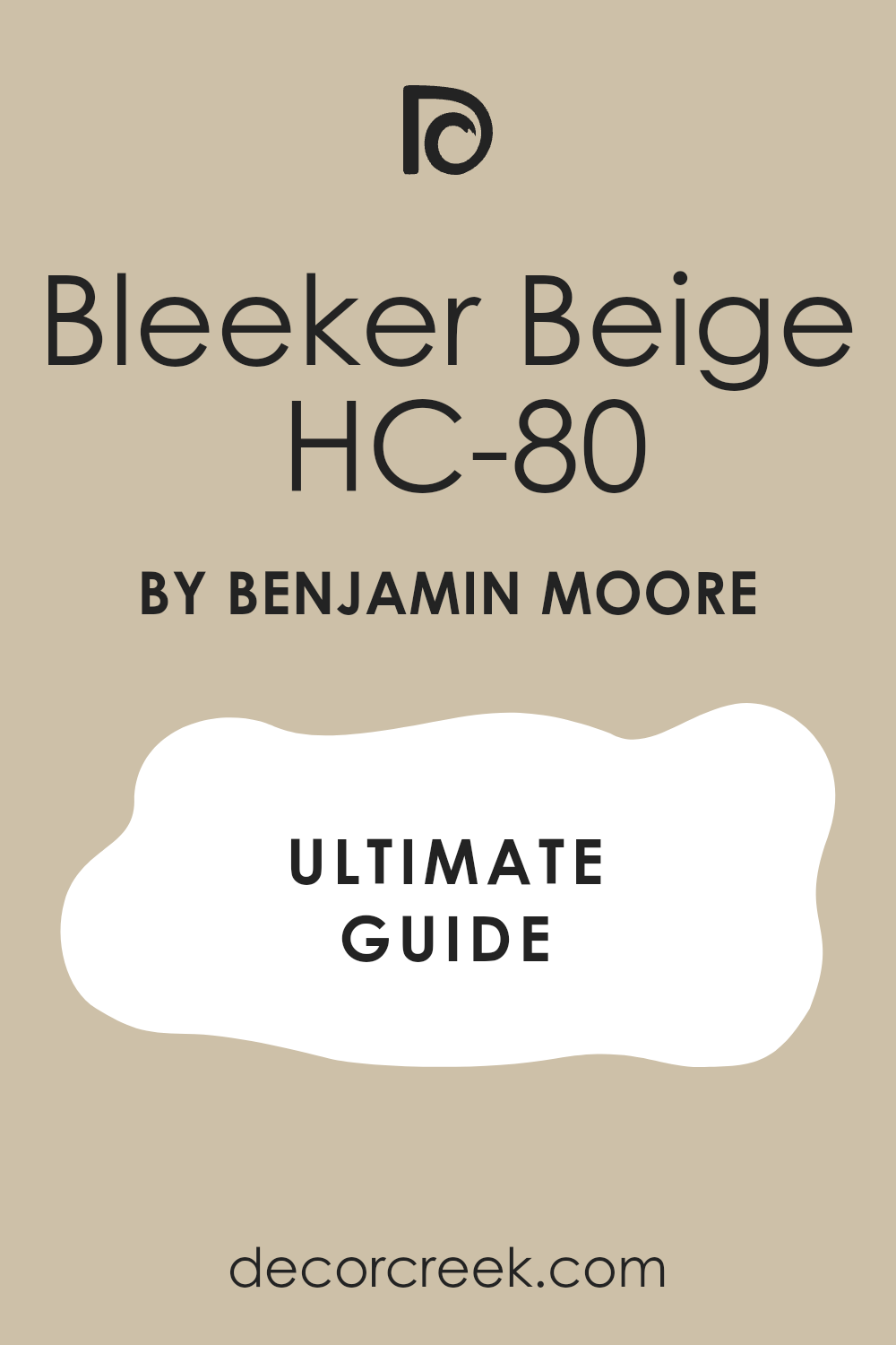
Bleeker Beige HC-80
Bleeker Beige is a sophisticated, medium-toned greige from the Historical Collection that sits between a soft beige and a gentle, warm gray.75 Bleeker Beige is the perfect choice for a contemporary neutral that is both highly versatile and guaranteed to feel comforting and welcoming in any setting. Bleeker Beige has subtle green-gray undertones, which gives it a beautiful, refined earthiness and prevents it from looking too golden or pink.
Bleeker Beige is a fantastic color for a main living area, providing a comfortable, grounded backdrop that successfully complements various decor styles. Bleeker Beige works beautifully with both warm and cool materials, acting as a perfect bridge color in a transitional interior design. Bleeker Beige is the color I suggest when a client wants a warm neutral that has a slightly modern, muted feel without resorting to cold, flat gray.
Bleeker Beige is a great option for kitchens, providing a clean, warm look to the walls that complements white or light wood cabinetry beautifully. Bleeker Beige holds its sophisticated warmth consistently, ensuring the room always feels inviting and well-balanced, even in changing light. Bleeker Beige pairs perfectly with creamy white trim, creating a soft, elegant contrast that adds depth to the walls. Bleeker Beige is a reliable and versatile color that successfully brings a sophisticated, gentle warmth and a current neutrality to any home.
27 Trendy Warm Paint Colors For Home To Try This Year
Canvas Tan SW 7531
Canvas Tan is a truly gorgeous and soft beige that feels incredibly sophisticated and reliably avoids any hint of stuffiness. Canvas Tan acts as the ideal, beautifully refined neutral background, allowing your decorative elements and artwork to truly become the stars. Canvas Tan has a gorgeous, creamy undertone that skillfully prevents it from ever appearing dull or flat on a large wall expanse. Canvas Tan works equally well in living rooms that are flooded with sunlight and in those with more limited, filtered light, showing its true adaptability.
Canvas Tan is a popular choice for homes featuring open-concept layouts because it visually ties different functional areas together seamlessly. Canvas Tan pairs beautifully with crisp, bright white trim for a very clean, defined look that maintains a foundational warmth. Canvas Tan has the perfect amount of depth to look rich and substantial, yet it remains light enough to keep any room feeling airy and suitably large.
Canvas Tan is the precise color I recommend when a client expresses a desire for beige but is concerned about the color feeling outdated, proving its modern relevance. Canvas Tan is an excellent option for bedrooms of all styles, offering a distinctly restful, comforting, and visually nurturing atmosphere.76 Canvas Tan’s undeniable warmth and subtle sophistication make it a friend to both very contemporary and traditionally-styled furniture and decor.
🎨 Check out the complete guide to this color right HERE 👈
Natural Linen SW 9109
Natural Linen is a highly sophisticated warm beige that successfully brings the luxurious, organic feeling of expensive fabric right onto your walls.77 Natural Linen possesses a slight gray influence, a key feature that keeps it from veering into overly yellow or orange territory, resulting in a superb, balanced neutral.78 Natural Linen instantly creates a powerful feeling of calm and quality craftsmanship in virtually any room where it is thoughtfully applied.
Natural Linen works beautifully when paired with all natural wood tones, including light oak and rich walnut, skillfully enhancing their inherent organic beauty. Natural Linen is consistently one of my top choices for elegant dining rooms because it establishes an incredibly inviting and highly sophisticated setting for special meals. Natural Linen is notably light enough to be used comfortably on all walls, but it contains sufficient color to offer a lovely, gentle contrast with bright white ceilings.
Natural Linen is the perfect, subtle color for a dedicated study or home library, naturally providing a very grounding and focused environment. Natural Linen ensures that white bedding and linens look especially crisp and impeccably clean when it is used as the wall color in a master bedroom. Natural Linen is a popular and very safe choice for home staging because it successfully appeals to almost every buyer’s desire for warmth and flexible neutrality. Natural Linen remains consistently beautiful and complex under various lighting conditions, a crucial indicator of a high-quality, dependable paint color.
Creamy SW 7012
Creamy is a delightful and soft off-white that features a distinct and intentional yellow undertone, easily securing its place as one of the warmest whites available. Creamy is the foundational color you select when you absolutely need the familiar brightness of white but must eliminate cold, stark, or unwelcoming feelings from your home. Creamy works wonderfully well in bustling kitchens, where it can successfully brighten cabinets and walls without ever appearing harsh or unpleasantly industrial.
Creamy pairs beautifully with much richer, deeper colors like deep forest green or navy blue if you choose to utilize it as a contrasting trim color. Creamy is the perfect, sunny main color for a home styled with a light coastal aesthetic, gently evoking the feeling of soft sand and perpetual sunshine. Creamy is easily one of the best available choices for North-facing rooms, as its inherent, strong warmth actively counters the cool, direct light.
Creamy works to prevent wall shadows from appearing gray or unpleasantly dingy, consistently keeping the entire room feeling bright and light-filled throughout the day. Creamy is a fantastic color for carefully painted furniture pieces, naturally giving them a soft, appealing, antique-like patina. Creamy is just light enough to be perceived as barely a color, yet its profound warmth is unmistakable, deeply comforting, and immensely welcoming. Creamy is my direct suggestion for anyone who finds the starkness of pure white to be overly severe and generally unwelcoming in their main family living areas.
🎨 Check out the complete guide to this color right HERE 👈
Shoji White SW 7042
Shoji White is an absolutely stunning, complex off-white that elegantly registers as a lovely, soft blend of cream, beige, and the slightest hint of warm gray.79 Shoji White is an incredibly popular and highly sought-after color because it skillfully provides that much-desired bright, airy feel while still being undeniably warm.80 Shoji White is often correctly categorized as a “greige” that clearly leans very heavily towards the warmer, creamier side of the spectrum, making it perfect for 2026’s trends.
Shoji White works beautifully with an array of accents, both cool and warm, successfully acting as an essential bridge color in any open floor plan design. Shoji White is the ideal choice for main walls when you feature bright, crisp white trim, creating a soft, sophisticated, and perfectly subtle contrast. Shoji White’s delicate and balanced nature makes it a suitable and welcome choice for virtually any room, from a small powder room to a grand, formal living room.
Shoji White is perfect if your goal is a white that never, ever looks sterile but always feels rich, elegant, and tremendously inviting to guests. Shoji White is a shade I consistently use when staging homes because it photographs exceptionally well and appeals to the widest range of potential buyers. Shoji White’s slight, subtle gray edge is key, ensuring it never appears overly yellow or sickly, even in the very brightest, sunniest rooms. Shoji White is a dependable, high-performing, and complex color that is absolutely guaranteed to bring a stylish, yet enduring warmth to your beloved home.
🎨 Check out the complete guide to this color right HERE 👈
Accessible Beige SW 7036
Accessible Beige is a true, highly essential staple in the warm neutral category, proudly known as one of Sherwin-Williams’ most continuously popular colors for excellent reason.82 Accessible Beige sits precisely in the sweet, balanced spot between light gray and classic beige, successfully functioning as a quintessential warm greige. Accessible Beige is a fantastic and versatile color to employ when your existing furnishings feature both warm and cool-toned fabrics or wood, helping to beautifully unify the entire design.
Accessible Beige is a highly reliable choice for main family living areas because it is neither too dark nor too light, providing a substantial yet refreshingly airy feel. Accessible Beige is an incredibly flexible color that adapts wonderfully with all varieties of wood, ranging from deep, dark cherry to light, contemporary maple.83 Accessible Beige is my favorite go-to for those who specifically want a neutral that visibly shows its color but avoids being overtly bold, distracting, or overwhelming.
Accessible Beige’s light reflective ability is excellent and very notable, skillfully helping to make any room feel open and exceptionally well-lit without appearing harsh. Accessible Beige is a truly safe and wise choice for painting an entire home because it flows beautifully from one room to the next without feeling monotonous or repetitive. Accessible Beige is the warm neutral I confidently suggest when a client simply wants a color that is consistently proven to look exceptionally good in nearly any conceivable setting. Accessible Beige offers a beautifully cozy and grounded feeling that is utterly perfect for fostering a wonderfully relaxing and welcoming atmosphere in a busy family room.
Balanced Beige SW 7037
Balanced Beige is a beautiful mid-tone beige that is intentionally a shade deeper and distinctly richer than its well-known counterpart, Accessible Beige. Balanced Beige is the particular color I immediately reach for when a specific room desperately needs more visual depth and a slightly more dramatic, cozy, and substantial feel. Balanced Beige features subtle yet important gray undertones that successfully provide a beautiful, sophisticated balance, ensuring the color doesn’t look overly yellow or muddy.
Balanced Beige works wonderfully as a background color for proudly displaying significant pieces of artwork and larger, textural decorative items, ensuring they stand out prominently. Balanced Beige is an excellent choice for a master bedroom suite, expertly creating a sophisticated, luxurious, and truly enveloping retreat-like experience. Balanced Beige is perfect for a designated feature wall in a notably larger room, especially when thoughtfully paired with a much lighter warm neutral on all the adjacent walls.
Balanced Beige is an ideal color for rooms that receive an abundance of direct natural light, as it has more than enough pigment to successfully hold its own against the bright sun. Balanced Beige is the perfect choice for a dedicated home office or study, reliably offering a very grounding and focused environment without feeling excessively dark or dim. Balanced Beige beautifully maintains its inherent warmth, a key trait that prevents it from ever feeling cold or sterile, even notably on overcast or cloudy days. Balanced Beige successfully provides a lovely, stable foundation for expertly mixing different textures, patterns, and materials within your overall interior decor scheme.
🎨 Check out the complete guide to this color right HERE 👈
Sandbar SW 7547
Sandbar is a beautiful, true sandy beige that perfectly and successfully captures the warm, golden-hour light of a quintessential beach setting. Sandbar is a pleasant medium-toned paint color that possesses strong, cheerful yellow and gold undertones, making it very distinctly warm and notably lively. Sandbar is an absolutely excellent choice for a dedicated sunroom or any casual, high-traffic living area where a bright, happy, and light-filled atmosphere is strongly desired.
Sandbar pairs beautifully with classic coastal decor elements, such as light, airy fabrics, woven wicker textures, and subtle light blue-green accents. Sandbar is the color I immediately suggest when a client is looking for a beige with a noticeable amount of life and saturation, more than a standard, paler neutral. Sandbar works wonderfully on a home’s exterior façade, lending it a bright, inviting, classic, and cheerful look that maintains its appeal for years.
Sandbar’s lovely golden quality makes it an especially great choice for North-facing rooms, successfully adding a much-needed, simulated injection of sunshine and warmth. Sandbar is perfect for any space where you specifically desire a noticeably warm color without straying into the territory of dark, heavy browns or reddish-oranges. Sandbar offers a lovely, cheerful richness that consistently makes creamy white trim pop and stand out beautifully against the wall color. Sandbar is a fantastic choice for a casual, intimate dining area, expertly creating an atmosphere that is highly conducive to lingering conversations and comfortably relaxed meals.
🎨 Check out the complete guide to this color right HERE 👈
Neutral Ground SW 7568
Neutral Ground is a light, incredibly delicate beige that serves as a truly beautiful and unassuming, yet highly sophisticated background color. Neutral Ground features very slight, subtle green-gray undertones, which expertly gives it a sophisticated, organic, and earthy feel that makes it look incredibly natural and grounded. Neutral Ground is the specific kind of color that provides a soft, warm wash over an entire room, consistently ensuring the light feels gentle, pleasant, and highly diffused.
Neutral Ground is an ideal and welcoming choice for long hallways and functional entryways where you need a comforting color that doesn’t feel heavy, confined, or oppressive. Neutral Ground works perfectly when combined with natural stone materials and gracefully aged wood accents, skillfully enhancing their inherent texture and rich character. Neutral Ground is a highly versatile and flexible color that can successfully bridge the visual gap between a pure, soft cream and a more saturated, traditional beige.
Neutral Ground is a lovely and gentle option for a nursery or a small child’s room because of its inherently soft, visually calming, and wonderfully nurturing nature. Neutral Ground is my definitive recommendation for anyone who wants to transition away from stark gray but isn’t yet ready for a strongly yellow or overtly gold-toned neutral. Neutral Ground boasts excellent light reflection capabilities, which significantly helps to make smaller rooms appear visually larger and far more open and spacious. Neutral Ground successfully provides a wonderfully simple yet inherently elegant backdrop that allows your cherished furniture and carefully selected art to take center stage effortlessly.
Macadamia SW 6142
Macadamia is a deep, rich beige that readily offers substantial, comforting warmth and a distinct, cozy, cocoon-like feeling to any chosen room.85 Macadamia has a pleasing, earthy, and nutty quality that makes it feel highly grounded and incredibly natural, reminiscent of the actual nut. Macadamia is a perfect and intimate color for a dedicated reading nook, a quiet study, or a media room where a distinct sense of intimacy and visual depth is strongly desired.
Macadamia works beautifully when thoughtfully paired with rich, dark wood tones and textural, luxurious fabrics like velvet or chunky wool, expertly enhancing the high-end feel of the decor. Macadamia is a great choice for application on the lower half of walls in a classic wainscoting design, especially when paired with a much lighter cream above the chair rail. Macadamia is the color I specifically suggest for skillfully creating a dramatically beautiful and deeply enveloping atmosphere in a formal dining room, ensuring it feels very special.
Macadamia’s inherent depth means it successfully holds its color well even in rooms that receive intense, bright sunlight, preventing it from washing out completely. Macadamia is a wonderfully warm, cozy color that makes a large, potentially cavernous room feel instantly more intimate, inviting, and human-scaled. Macadamia is an excellent selection for an intentional accent wall if your goal is to bring a very definite, rich, and warm focal point to your entire space. Macadamia offers a lovely, enduring historic feel that works wonderfully, enhancing the natural charm of both traditional and craftsman-style homes.
Nomadic Desert SW 6107
Nomadic Desert is a captivating medium-to-dark beige that features very definite gold and subtle bronze undertones, beautifully evoking the rich colors of a sun-drenched, sandy landscape. Nomadic Desert successfully provides a very noticeable and strong layer of warmth, making a room feel instantly cozy, deeply grounded, and well-established.86 Nomadic Desert is a fantastic choice for a dramatic and intimate bedroom or a comfortable living room where you specifically want to create an inviting, enveloping mood.
Nomadic Desert pairs beautifully with dark brown leather furniture and woven, natural accents for a rich, beautifully textured, and sophisticated look.87 Nomadic Desert is a great color to employ on an accent wall to create a striking contrast with much lighter creams or delicate off-whites on the surrounding adjacent walls. Nomadic Desert works incredibly well when combined with terracotta and natural clay materials, expertly complementing their inherent, organic warmth and texture.
Nomadic Desert is one of those special colors that inherently feels sophisticated and genuinely expensive, immediately adding instant visual depth and strong character to a chosen space.88 Nomadic Desert is a substantial color that can successfully handle the vibrancy of colorful or busy artwork without becoming visually lost or aesthetically overwhelmed. Nomadic Desert is a beautiful and inspiring option for a study or library, skillfully creating a focused, warm, and highly comfortable atmosphere for working or deep relaxation. Nomadic Desert is a great selection for painting exterior doors or shutters to add a desirable punch of warm, earthy color to a home’s overall façade.
Kilim Beige SW 6106
Kilim Beige is an iconic, widely recognized, and time-tested beige that is specifically known for its strong, noticeable, and comforting warm undertones.89 Kilim Beige features definite pink or very subtle red undertones that are just gentle enough to keep it from looking truly pink but are key to its exceptional, cozy warmth. Kilim Beige is a fantastic color for expertly creating a cozy, almost slightly antique feel in a formal living room or an elegant, traditional dining area.
Kilim Beige works beautifully when thoughtfully combined with dark wood trim and classic, traditional furniture styles, successfully leaning into its enduring nature. Kilim Beige is a great and highly nurturing choice for tranquil bedrooms where the goal is to feel wonderfully tucked in and warm, providing a soft, comforting background. Kilim Beige is the precise color I confidently suggest when someone desires a true, defined beige that absolutely avoids any visual leaning toward green or noticeable gray whatsoever.
Kilim Beige has a sufficient level of color saturation to function as a strong, reliable neutral entirely on its own, not merely as a pale, washed-out backdrop. Kilim Beige pairs wonderfully with rich, creamy white-colored fabrics and elegant gold-toned metallic accessories for achieving a truly luxurious and inviting feel. Kilim Beige is a dependable and continuously popular color that consistently delivers a classic, cozy, and immensely comforting look in virtually any setting.90 Kilim Beige remains one of the best and most reliable ways to bring a rich, comforting, and beautifully traditional warmth to your main family living areas without going excessively dark.
Wool Skein SW 6148
Wool Skein is a beautiful, complex warm neutral that elegantly sits somewhere between a light, pale beige and a slightly richer cream, with a subtle hint of green-gray. Wool Skein’s unusual, slightly muted undertones are the source of its unique, sophisticated earthiness, making it feel entirely current and on-trend for 2026. Wool Skein works wonderfully in homes that intentionally feature a lot of natural, organic wood and stone materials, skillfully enhancing and complementing the inherent raw materials. Wool Skein is the perfect, soft backdrop for an elaborate gallery wall installation, as its slightly muted tone generously allows all framed art to be the absolute star.
Wool Skein is a fantastic choice for main family living areas, offering a warm, gently sophisticated feel that is never overly saturated or intense.91 Wool Skein is the color I strongly recommend when a client wants a warm neutral that has a slightly more complex, less straightforward, and more nuanced look than standard beige. Wool Skein pairs beautifully with deep charcoal gray or classic black accents, successfully providing a beautiful, striking, and strongly grounding contrast.
Wool Skein has a notable high light reflectance value, which is crucial as it ensures the color still feels pleasantly light and airy despite its underlying depth of color. Wool Skein is an excellent choice for a busy kitchen, giving the walls a fresh, comforting coat that looks exceptionally great alongside classic white cabinetry.92 Wool Skein is a lovely, comforting, and nuanced color that manages to feel both wonderfully classic and perfectly on trend for today’s design sensibilities.
Basket Beige SW 6143
Basket Beige is a deep, truly rich, and noticeably warm beige that readily offers substantial color, depth, and character to any room it graces. Basket Beige possesses strong, defined gold and subtle red undertones, making it a very cozy, assertive, and confident choice for achieving a dramatic, comforting effect. Basket Beige is a great, intimate color for a cozy den, a dedicated reading room, or a private study where a warm, intimate, and enveloping atmosphere is strongly desired.
Basket Beige pairs beautifully with brass or antique gold metals, expertly enhancing the luxurious, deep, and warm feeling already present in the space. Basket Beige is an excellent choice for an intentional accent wall, particularly one that features a prominent fireplace or other significant architectural detailing. Basket Beige is the color I specifically suggest when someone wants a defined beige that makes a noticeable statement without being overly bright or visually overwhelming in its saturation.
Basket Beige successfully holds up exceptionally well in brightly lit rooms, consistently maintaining its richness and successfully avoiding washing out completely in direct sunlight. Basket Beige provides a lovely, stable backdrop for showcasing traditional furniture pieces and luxurious fabrics with rich patterns and appealing texture. Basket Beige is perfect for skillfully creating a classic, library-like feel in a comfortable home office or a welcoming sitting room. Basket Beige offers a wonderful, enduring historic quality that feels highly grounded and immensely comforting, especially in beautiful, older, traditional homes.
Latte SW 6108
Latte is a popular and very rich, medium-dark beige that has a deep, comforting brown base with lovely warm undertones, reminiscent of the beloved coffee drink. Latte is an incredibly inviting and substantial color that works exceptionally well in rooms where creating a cozy, enveloping, and intimate atmosphere is the primary goal.93 Latte has sufficient depth to look truly sophisticated and genuinely luxurious, especially when skillfully paired with crisp, creamy white trim.
Latte is a fantastic choice for a dedicated movie room or a cozy, finished basement space, immediately adding instant warmth, depth, and visual drama. Latte pairs beautifully with natural stone textures and deep, dark wood finishes, successfully leaning into a refined, elegant, and earthy look. Latte is the precise color I confidently recommend when a client wishes to make a strong visual statement with a warm neutral that is far from pale or timid.
Latte holds its color beautifully and consistently even in lower light conditions, reliably ensuring the room always feels rich and inviting, never shadowy or dingy. Latte is a great and effective option for a feature wall in a bedroom to expertly create a grounded and truly relaxing backdrop for a prominent headboard. Latte works wonderfully in homes that incorporate an Italian or Tuscan design influence, matching their traditionally rich and warm color palettes flawlessly. Latte successfully provides a deep, sophisticated warmth that is absolutely on trend for the cozy, comfortable, and highly curated homes of 2026.
White Dove OC-17
White Dove is an extremely popular and beloved soft, creamy white that has a gentle, almost imperceptible warm gray undertone, which lends it beautiful sophistication.94 White Dove is the perfect choice for achieving a modern yet distinctly cozy look, successfully providing a bright, airy feel without the cold starkness of pure white.95 White Dove is a fantastic color for kitchen cabinetry, providing a clean, fresh look that is much warmer and significantly more inviting than a harsh, overly bright white.96 White Dove works beautifully with virtually every type of metal finish and counter material, truly acting as a highly versatile, reliable background.
White Dove is the color I confidently recommend when a client desires a white that will look beautiful in any light condition and is absolutely guaranteed not to feel cold or sterile. White Dove is a great option for application on trim and millwork throughout the entire home, offering a soft, elegant contrast to slightly more saturated wall colors.
White Dove consistently holds its subtle, warm undertone, which is crucial as it ensures that shadows never appear blue or dingy, consistently keeping the room bright and welcoming.97 White Dove pairs perfectly with grounding black accents and rich, dark wood tones, expertly creating a classic, high-contrast, yet fundamentally warm aesthetic.98 White Dove is a dependable and truly versatile color that is an essential staple for successfully creating stylish, warm, and bright homes in 2026. White Dove successfully provides a soft, incredibly elegant wash of warmth that is both highly current and profoundly comforting in its beautiful simplicity.99
Swiss Coffee OC-45
Swiss Coffee is a widely beloved, creamy off-white that has a distinct, noticeable buttery yellow-cream undertone, easily securing its place as one of the warmest whites available.100 Swiss Coffee is the perfect choice for instantly bringing a rich, welcoming, and immediate warmth to a room while still impeccably maintaining a bright, refreshingly clean look.
Swiss Coffee is a fantastic color for application on walls in a main living room or a restful bedroom, where a cozy, fully enveloping atmosphere is paramount to the design. Swiss Coffee works beautifully when combined with natural fiber area rugs and light-colored, soft-textured furniture, enhancing a relaxed, airy, yet deeply cozy aesthetic.
Swiss Coffee is the color I specifically suggest when a client desires an off-white that definitely registers as warm and buttery, rather than simply appearing as a plain, pale, and uninspired color. Swiss Coffee is a great option for trim work, particularly in older, historic homes, as it gives a much softer, more traditional, and far less harsh look than stark, pure white.
Swiss Coffee consistently holds its deep, creamy warmth, successfully ensuring the room always feels bright and genuinely inviting, even on the most overcast and gloomy days. Swiss Coffee pairs perfectly with light blue or gentle green accents, expertly providing a beautiful, balanced contrast of thoughtfully combined cool and warm elements.
Swiss Coffee is a reliable and immensely popular color that successfully brings a cheerful, comforting warmth and an effortless brightness to any given space.102 Swiss Coffee provides a generous, beautiful, buttery glow that instantly makes a room feel visibly sunnier and much more like a cherished, warmly welcoming home.
Atrium White OC-145
Atrium White is a unique, incredibly delicate off-white that features a gentle, almost blush-pinkish-peach undertone, which gives it a soft, subtle, rosy glow. Atrium White is the perfect choice for expertly creating a truly romantic, soft, and visually nurturing atmosphere in a tranquil bedroom or an elegant, formal sitting room.
Atrium White is a fantastic choice for North-facing rooms, as its subtle red-pink undertone actively and successfully counters the cool, blue light, making the room feel genuinely warm. Atrium White works beautifully with both silver and gold metallic accents, skillfully enhancing its delicate, slightly shimmering and luminous quality under the light. Atrium White is the color I strongly recommend when a client desires an off-white that has an unusual, almost ethereal warmth that feels very distinct, special, and uniquely personal.
Atrium White is a great option for a young girl’s beautifully decorated room or an elegant, formal powder room, offering a feminine and incredibly soft touch of color. Atrium White consistently holds its gentle, rosy warmth, successfully ensuring the room always feels soft, genuinely inviting, and never harsh or unpleasantly cold. Atrium White pairs perfectly with natural, light wood tones and luxurious, creamy white fabrics, expertly enhancing a very soft, layered, and romantic aesthetic. Atrium White is a reliable and nuanced color that successfully brings a delicate, truly comforting warmth and a subtle romantic feeling to any interior design project. Atrium White provides a soft, subtle rosy glow that instantly makes a room feel incredibly gentle, exquisitely soft, and sweetly welcoming to all.
🎨 Check out the complete guide to this color right HERE 👈
Seashell OC-120
Seashell is a gorgeous, pale off-white that features a very gentle, understated warm beige undertone, beautifully mimicking the soft, muted color of natural beach shells. Seashell is the perfect choice for a sophisticated, very light neutral that feels wonderfully airy and exceptionally clean while still being definitely warm and pleasantly inviting. Seashell is a fantastic color for application in open-concept homes, successfully providing a consistent, clean, and beautifully soft warm flow throughout all the connected, functional spaces.
Seashell works beautifully with classic coastal decor elements, such as light, airy blue accents, natural rope textures, and weathered, light wood, enhancing a relaxed aesthetic. Seashell is the color I confidently recommend when a client wants a neutral that is barely a true color but is absolutely guaranteed not to look cold or stark on the final walls. Seashell is a great option for a sunny living room, where it can reflect the abundance of natural light beautifully without washing out its subtle, underlying warmth.
Seashell consistently holds its gentle, creamy warmth, successfully ensuring the room always feels soft, inviting, and wonderfully peaceful, even on dark, cloudy days. Seashell pairs perfectly with bright white trim and natural fiber area rugs, expertly creating a light, layered, and texturally interesting visual look.
Seashell is a dependable and truly versatile color that successfully brings a soft, sophisticated warmth to any interior design project or home staging effort.
Seashell provides a subtle, calming wash of sophisticated warmth that makes a room feel instantly peaceful, clean, and incredibly cozy and serene.
Hawthorne Yellow HC-4
Hawthorne Yellow is a classic, beautifully muted, and highly sophisticated warm yellow that originates from the Historical Collection, known for its enduring charm and appeal.104 Hawthorne Yellow is the perfect choice for expertly bringing a strong, simulated sunny, and genuinely cheerful disposition into a room, making it feel bright and visually energized. Hawthorne Yellow is a fantastic color for North-facing rooms, as its powerful, underlying yellow base is incredibly effective at actively counteracting the cool, direct blue natural light. Hawthorne Yellow works beautifully in a cozy kitchen or an informal breakfast nook, successfully creating an invigorating, happy, and immensely warm atmosphere for morning activities.
Hawthorne Yellow is the specific color I suggest when a client desires a true, happy yellow that is purposefully muted enough to feel truly sophisticated and not childish or visually overwhelming in its brightness. Hawthorne Yellow is a great option for a home office or a creative studio, successfully providing a cheerful and mentally stimulating background that is conducive to focused work.
Hawthorne Yellow consistently holds its beautiful, rich yellow warmth, successfully ensuring the room always feels genuinely sunny and bright, regardless of the outdoor weather or light conditions. Hawthorne Yellow pairs perfectly with creamy white trim and deep forest green accents, expertly creating a classic, harmonious, and very warm and inviting look. Hawthorne Yellow is a reliable and richly characterful color that successfully brings a cheerful, comforting warmth and brightness to any cherished space. Hawthorne Yellow provides a generous, sunny, golden glow that instantly makes a room feel visibly full of joy and genuinely warmly welcoming to everyone who enters.
Rich Cream 2153-60
Rich Cream is a deeply saturated, deliciously buttery, and incredibly warm cream color that truly and confidently lives up to its descriptive name. Rich Cream is the perfect choice for expertly creating a cozy, truly luxurious, and deeply enveloping atmosphere that feels both classically historic and immensely comfortable. Rich Cream features a strong, immediately welcoming yellow-gold undertone that makes it an exceptional choice for dark rooms that desperately need an intentional injection of simulated light.
Rich Cream is a fantastic color for a formal living room or a dedicated home library, providing a rich, highly elegant background for showcasing fine furniture and curated collections. Rich Cream works beautifully with dark wood trim and gold-toned metallic accents, skillfully enhancing its deep, opulent, and inherent warmth. Rich Cream is the color I precisely recommend when a client desires a cream that is very noticeable, highly sophisticated, and successfully avoids any pale or overly gray qualities.
Rich Cream is a great option for a grand master bedroom, expertly creating a truly warm and visually nurturing retreat that feels incredibly luxurious and wonderfully private. Rich Cream consistently holds its deep, buttery color exceptionally well, reliably ensuring the room always feels rich and inviting, even in the dimmest lower light.
Rich Cream pairs perfectly with rich, colorful textiles and beautiful antique furniture, expertly creating a warm, layered, and historically charming look.
Rich Cream successfully provides a deep, luxurious wash of buttery warmth that instantly makes a room feel genuinely cherished and wonderfully settled and inviting.
Stone House 1039
Stone House is a deep, truly earthy, medium-toned beige that features strong, rich brown and noticeable gray undertones, skillfully giving it a grounding, substantial quality. Stone House is the perfect choice for expertly creating a cozy, sophisticated, and deeply rooted atmosphere that feels wonderfully traditional, secure, and established. Stone House is a fantastic color for a study, a comfortable den, or a dedicated library, successfully providing a rich, fully enveloping background that promotes focus and true relaxation.
Stone House works beautifully when combined with visible exposed stone, natural brick, and dark wood beams, expertly enhancing a rustic or sophisticated craftsman architectural style. Stone House is the color I confidently recommend when a client desires a warm neutral that has significant, undeniable depth and rich character, moving far beyond a pale or simple beige.
Stone House is a great option for a large, potentially overwhelming airy room with high ceilings, skillfully helping to bring the walls in and make the space feel much more intimate. Stone House consistently holds its deep, substantial warmth, successfully ensuring the room always feels rich and inviting, regardless of the various lighting conditions throughout the day. Stone House pairs perfectly with antique gold or subtle bronze accessories, thoughtfully adding a subtle, luxurious shimmer against the deep, warm wall tone.
Stone House is a reliable and highly grounding color that successfully brings a deep, substantial warmth and a classic, historic elegance to any home interior.
Tyler Taupe HC-43
Tyler Taupe is a lovely medium-toned taupe-beige that originates from the Historical Collection and features a beautiful, balanced gray and warm brown undertone.108 Tyler Taupe is the perfect choice for achieving a sophisticated, truly traditional look that feels beautifully grounded, distinctly cozy, and reliably avoids any strong yellow or orange leanings. Tyler Taupe is a fantastic color for main family living areas, successfully providing a substantial, comforting neutral background that is both genuinely inviting and refined in appearance.
Tyler Taupe works beautifully with rich leather furniture, high-texture rugs, and dark wood finishes, expertly enhancing a cozy, high-end, and inviting aesthetic. Tyler Taupe is the specific color I suggest when a client desires a neutral that is truly versatile, successfully balancing warmth and visual sophistication without strong, distracting color leanings. Tyler Taupe is a great option for a dining room, expertly creating a warm, elegant background that is perfect for comfortable entertaining and long, pleasant conversations.
Tyler Taupe consistently holds its beautiful, balanced warmth, successfully ensuring the room always feels cozy and inviting, even during overcast or difficult lighting conditions. Tyler Taupe pairs perfectly with creamy white trim, expertly creating a soft, sophisticated contrast that beautifully defines the architectural details within the room.
Tyler Taupe is a dependable and continuously popular color that successfully brings a sophisticated, grounding warmth and an enduring elegance to any home.
Bennington Gray HC-82
Bennington Gray is a wonderful, complex greige that elegantly sits perfectly between a soft, warm gray and a light, earthy tan. Bennington Gray is the perfect choice for a very modern neutral that successfully provides a sophisticated, beautifully muted background while still feeling inherently warm and highly inviting. Bennington Gray features subtle green undertones that expertly give it an organic, grounded feel, successfully ensuring it avoids the cold, harsh look of pure gray. Bennington Gray is a fantastic color for open-concept areas, as its subtle complexity allows it to consistently look beautiful in all parts of the connected, functional space.
Bennington Gray works beautifully with both natural wood and sleek metal elements, confidently making it an excellent bridge between traditional and more contemporary styles. Bennington Gray is the color I strongly recommend when a client is hesitant about full gray but needs a color that is absolutely guaranteed to feel warm and deeply comfortable, never stark.
Bennington Gray is a great option for a master bedroom, offering a restful, highly sophisticated, and incredibly tranquil background that is conducive to relaxation and sleep.109 Bennington Gray consistently holds its gentle warmth, successfully ensuring the room always feels cozy and inviting, even under challenging or difficult lighting conditions. Bennington Gray pairs perfectly with crisp white trim, expertly creating a clean, well-defined look that remains beautifully soft and genuinely welcoming to the eye. Bennington Gray is a reliable and subtle color that successfully brings a current, highly sophisticated warmth and comforting neutrality to any home interior.110
Everlasting 1038
Everlasting is a gorgeous, light-to-medium warm beige that features a beautiful, soft golden-cream undertone, wonderfully living up to its serene and enduring name. Everlasting is the perfect choice for expertly creating a light, sunny, and consistently welcoming atmosphere that feels both refreshingly airy and incredibly cozy. Everlasting is a fantastic color for a main living room, successfully providing a bright yet comfortably warm backdrop for daily family activities and easy entertaining.
Everlasting works beautifully when thoughtfully combined with light wood furniture, natural linen upholstery, and woven textures, expertly enhancing a soft, organic aesthetic. Everlasting is the specific color I suggest when a client desires a light beige that has a clear, lovely warmth without being overly saturated or appearing dark in any way.
Everlasting is a great option for an entire, cohesive home, successfully creating a consistent, gentle warmth that flows easily and naturally connects all the different rooms. Everlasting consistently holds its soft, golden warmth, successfully ensuring the room always feels bright and genuinely inviting, even during prolonged overcast weather. Everlasting pairs perfectly with creamy white trim and white ceilings, expertly creating a light, beautiful, and subtle definition throughout the entire space. Everlasting is a dependable and beautifully subtle color that successfully brings a soft, sunny warmth and a comfortable elegance to any interior design.111
Hancock Gray HC-97
Hancock Gray is a rich, substantial medium-dark taupe-gray from the Historical Collection that features a definite, luxurious, and strong warm undertone. Hancock Gray is the perfect choice for expertly creating a sophisticated, deeply comforting, and slightly masculine atmosphere in a cozy den or a well-appointed library. Hancock Gray features a complex brown-beige undertone that successfully prevents it from ever feeling cold, reliably ensuring it always registers as a very warm, strongly grounding color. Hancock Gray is a fantastic color for an accent wall or an entire room where a dramatic, highly enveloping, and intimate feeling is strongly desired.
Hancock Gray works beautifully when thoughtfully combined with deep leather furniture, dark wood bookcases, and rich velvet fabrics, expertly enhancing a cozy, high-end, and tactile look. Hancock Gray is the color I confidently recommend when a client desires a substantial neutral that brings a serious amount of depth and undeniable sophistication to the chosen room.
Hancock Gray is a great option for a formal space, offering a rich, truly elegant background that feels classically conducive to deep, relaxed conversation and contemplation. Hancock Gray consistently holds its beautiful, warm depth, successfully ensuring the room always feels intimate and wonderfully inviting, regardless of the light exposure. Hancock Gray pairs perfectly with antique gold or deep brass accents, which visually sparkle beautifully against its deep, warm backdrop. Hancock Gray is a dependable color that successfully brings a deep, substantial warmth and a luxurious sophistication that is highly sought after in modern, cozy homes.
🎨 Check out the complete guide to this color right HERE 👈
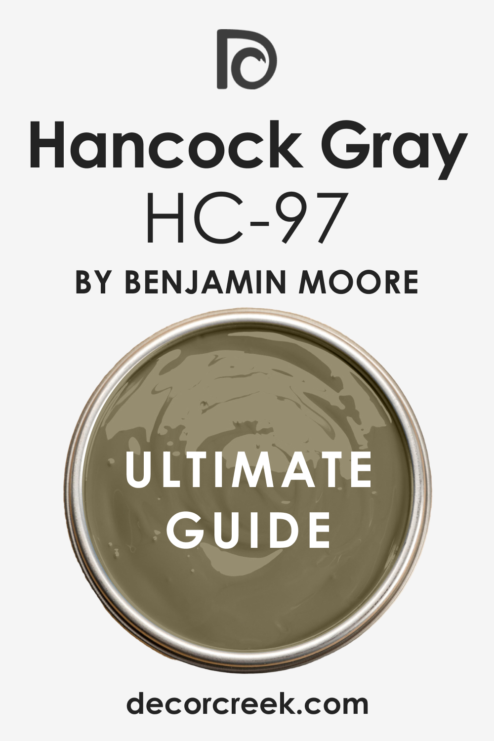
Bleeker Beige HC-80
Bleeker Beige is a sophisticated, lovely medium-toned greige from the Historical Collection that elegantly sits between a soft beige and a gentle, warm gray.112 Bleeker Beige is the perfect choice for a contemporary neutral that is both highly versatile and absolutely guaranteed to feel comforting and welcoming in any setting. Bleeker Beige features subtle green-gray undertones, which expertly gives it a beautiful, refined earthiness and successfully prevents it from looking overly golden or pink.
Bleeker Beige is a fantastic color for a main family living area, successfully providing a comfortable, perfectly grounded backdrop that effortlessly complements various decor styles. Bleeker Beige works beautifully with both naturally warm and deliberately cool materials, successfully acting as an essential bridge color in any transitional interior design. Bleeker Beige is the specific color I suggest when a client desires a warm neutral that has a slightly modern, muted feel without the need to resort to a cold, flat gray color.
Bleeker Beige is a great option for kitchens, successfully providing a clean, warm look to the walls that beautifully complements classic white or light wood cabinetry. Bleeker Beige consistently holds its sophisticated warmth, successfully ensuring the room always feels inviting, well-balanced, and cozy, even in changing light. Bleeker Beige pairs perfectly with creamy white trim, expertly creating a soft, elegant contrast that adds necessary visual depth and definition to the walls. Bleeker Beige is a reliable and truly versatile color that successfully brings a sophisticated, gentle warmth and a current, comforting neutrality to any home.
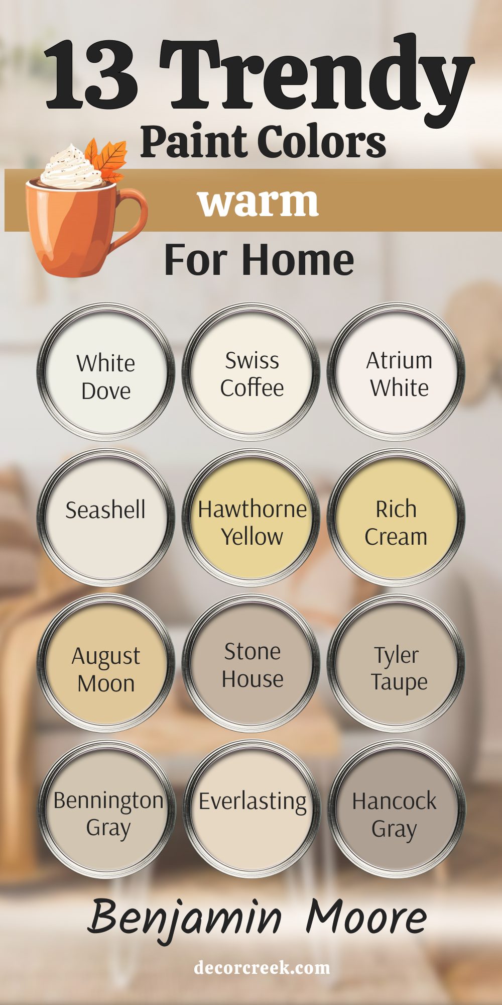
My Final Thoughts About Trendy Warm Paint Colors For Home in 2026
The trend toward warm paint colors for 2026 is so much more than just a temporary style shift or a passing fad; it is a profound reflection of what we truly value and prioritize in our most personal spaces—our homes.
Following an extended period dominated by cool, somewhat stark, and sometimes unwelcoming interiors, people are overwhelmingly yearning for comfort, a sense of security, and a house that genuinely functions and feels like a restorative, nurturing retreat.
The carefully selected colors I’ve highlighted—ranging from the creamy, sophisticated softness of Shoji White and Ballet White to the rich, deeply grounding depths of Latte and Pashmina—all share one absolutely vital, common characteristic: they successfully bring soul, warmth, and beautiful light to a room without ever feeling overly demanding, cluttered, or too visually busy.
My core job as a home designer is not just about aesthetics; it is fundamentally about helping people skillfully create environments that actively support their best lives, their rest, and their happiness, and these foundational warm neutrals are the perfect starting point for that process.
Choosing even one of these trendy, thoughtfully curated warm shades from highly reliable and established brands like Sherwin-Williams and Benjamin Moore is a powerful, yet surprisingly easy, and accessible way to invest meaningfully in your home’s long-term beauty, its enduring appeal, and, perhaps most importantly, your own personal comfort and well-being. Do not hesitate or be afraid to choose a beige that possesses a little more noticeable depth and richness, or a white that confidently features a creamy, delightful buttery undertone. That subtle, sophisticated shift is the exact element that will make your home feel perfectly current, wonderfully cozy, and utterly in line with modern desires for comfort.
The year 2026 is entirely centered on the philosophy of feeling profoundly good and settled right where you live, and these beautiful, inviting colors will certainly help you achieve that essential, comforting feeling. They are the silent foundation of a truly happy home.