Blue paint can do something special in a home. It can feel strong, soft, moody, or fresh—depending on which shade you choose. I’ve used blue in bedrooms, bathrooms, kitchens, and even front doors. And every time, it brings something people stop and notice. Sherwin-Williams has some of the most beautiful blue tones out there, and they’re always updating their collection with just the right mix.
Whether you love something light or bold, this list has the shades that are really working in homes right now.
I’ve picked these from real experience—what looks great on walls, trim, and even cabinets.
Why I Always Recommend Sherwin-Williams for Blue Paints
I’ve tested a lot of paint brands, but Sherwin-Williams is the one I keep going back to for blue. Their colors stay true, even when the light changes throughout the day. That matters more than most people realize. A soft blue that looks perfect in the morning shouldn’t feel cold by dinnertime.
Their samples are helpful, their formulas cover well, and they’re always ahead of trends. I’ve also found their blues are more “livable”—not too bright, not too dull. They get it right.
How I Pick the Right Blue for Each Room
Choosing a blue isn’t just about what looks pretty on a card. I look at the room’s light, how the floors and furniture feel, and what the space is used for. A bedroom might need a blue that helps you rest, while a kitchen needs one that feels fresh. I also think about emotions. Some blues feel thoughtful, others feel fun. And I always test a sample before committing.
A blue that works in my house might not work in yours—and that’s okay. What matters is how it makes you feel every time you walk in.
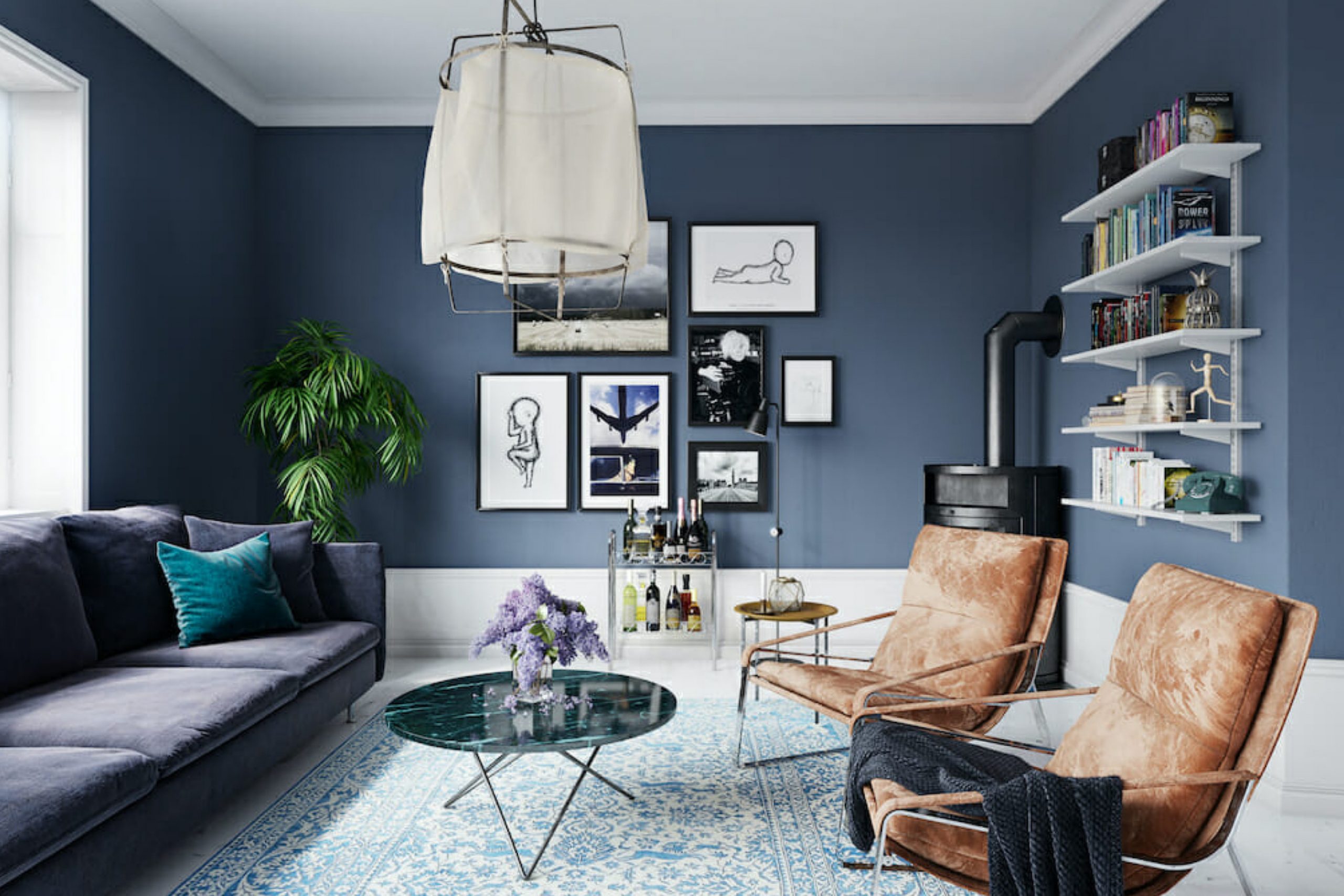
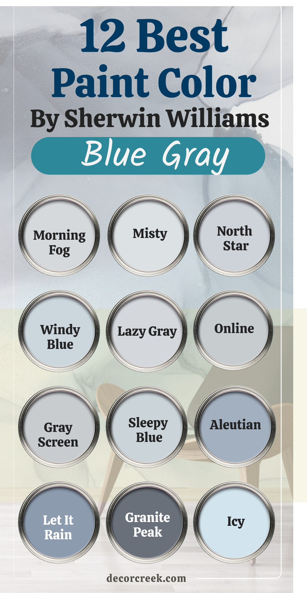
12 Top Sherwin-Williams Blue Gray Paint
Morning Fog (SW 6255)
Morning Fog brings that soft, cloudy feeling I love in quiet bedrooms. It’s a blue gray that doesn’t feel too cool or too flat. Morning Fog works great with warm woods and simple linens, and it helps a room feel pulled together. I like using it in guest rooms or nurseries where I want something soft but not boring. Morning Fog changes gently with the light, which makes it feel natural. My rule is to always pair Morning Fog with warmer elements like beige, rattan, or creamy trim.
My rule: keep it simple and soft—this color doesn’t need busy patterns around it.
Misty (SW 6232)
Misty feels like fresh air after rain. It’s light, but not icy. Misty works well in bathrooms, especially if you want it to feel easy without being too plain. I’ve used it with white subway tile, and it gave just the right balance. Misty also looks beautiful in coastal homes where you want a relaxed color that still feels polished. My rule is to test this one in morning and afternoon light—it shifts in a pretty way.
My rule: don’t mix Misty with bold or heavy furniture; it likes softness.

North Star (SW 6246)
North Star has a quiet coolness that looks especially pretty in rooms with a lot of daylight. It’s gray enough to feel grown-up but blue enough to be noticed. I’ve used it in offices, entryways, and even laundry rooms. North Star plays nicely with dark navy or crisp white. It gives a gentle sense of order. My rule is to use North Star when I want a blue that doesn’t feel sleepy.
My rule: keep your trim crisp and clean—it helps this color stay sharp.

Windy Blue (SW 6240)
Windy Blue reminds me of open skies. It’s light but has enough color to make a room feel happy. I’ve used Windy Blue in kitchens with white cabinets, and it instantly made the room feel fresher. It works well with both gold and silver fixtures, which makes it easy to decorate around. Kids also love it—it feels cheerful without being silly. My rule is to use Windy Blue in places where energy matters, like kitchens or playrooms.
My rule: mix it with fun fabrics or soft textures for a welcoming look.

Lazy Gray (SW 6254)
Lazy Gray is one of those colors that works almost anywhere. It leans blue, but it also plays like a soft gray in certain light. I use it when clients want something peaceful without going full pastel. Lazy Gray looks amazing with matte black hardware and natural oak. It also works as a backdrop for art or bold rugs. My rule is to keep accents bold if I want contrast, or soft if I want it to melt into the background.
My rule: don’t overthink it—this shade fits in easily.
Online (SW 7072)
Online is smart and strong. It’s more of a techy blue gray—great in home offices or modern homes. I’ve used it on lower kitchen cabinets, and it gave the room an updated edge. Online works well with polished nickel and white quartz. It feels clean without being cold. My rule is to pair Online with cool metals and structured furniture.
My rule: skip ornate or frilly details—this shade wants straight lines.
Gray Screen (SW 7071)
Gray Screen feels balanced and easy to live with. It has a strong gray base, but there’s just enough blue to keep it from feeling flat. I like it in bedrooms and hallways—it helps connect spaces without stealing attention. Gray Screen also looks great next to warmer whites and even deep greens. It’s flexible but still has character. My rule is to use this one when I want a quiet color that still holds a little edge.
My rule: use soft lighting—it brings out the blue side beautifully.

Sleepy Blue (SW 6225)
Sleepy Blue feels gentle, like a quiet whisper. I love using it in nurseries or reading nooks. It has a softness that helps people slow down. Sleepy Blue pairs well with whitewashed furniture and cozy textures. It’s not just for kids—adults love how it makes a room feel safe and easy. My rule is to avoid glossy finishes with this color—matte or eggshell works best.
My rule: use it where you want people to feel hugged by the room.
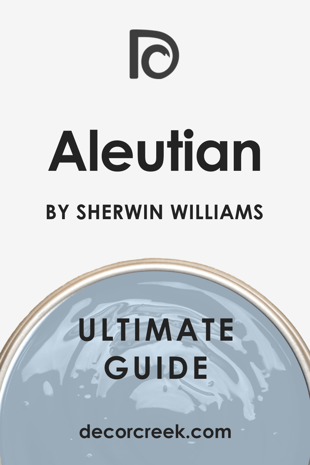
Aleutian (SW 6241)
Aleutian is a beautiful dusty blue that feels strong but not harsh. It looks amazing on walls when you want more impact but still want it to feel homey. I like it in dining rooms with soft lighting and wood furniture. Aleutian changes with the light in a way that always keeps it interesting. It also brings out the warmth in metals like brass or copper. My rule is to use warm finishes around Aleutian to keep it feeling grounded.
My rule: avoid using it next to bright whites—it prefers softer surroundings.
Let It Rain (SW 9152)
Let It Rain has depth without being dark. It reminds me of rainy days when everything feels still. I’ve used this in bedrooms and moody powder rooms. Let It Rain pairs beautifully with soft whites and even plum or tan tones. It brings a little drama but keeps things feeling safe. My rule is to use soft fabrics and warm light—it makes this color glow.
My rule: layer it with texture instead of pattern.
Granite Peak (SW 6250)
Granite Peak is bold and rich. It’s more gray than some blues, but it still gives a cool edge. I’ve used it in modern kitchens and cozy dens. It works especially well with marble, leather, and wood. Granite Peak feels steady and grounded. My rule is to keep furniture shapes simple so the color feels clean, not heavy.
My rule: don’t use too much of it—just one or two walls can make a strong statement.

Icy (SW 6534)
Icy feels bright and clean. It has a gentle blue tone with a cool twist. I love using Icy in laundry rooms, bathrooms, and small bedrooms. It wakes things up without shouting. Icy also looks great with light tile, white trim, and touches of greenery. My rule is to pair Icy with white to keep it crisp.
My rule: avoid mixing it with warmer beiges—it can look off if not balanced right.

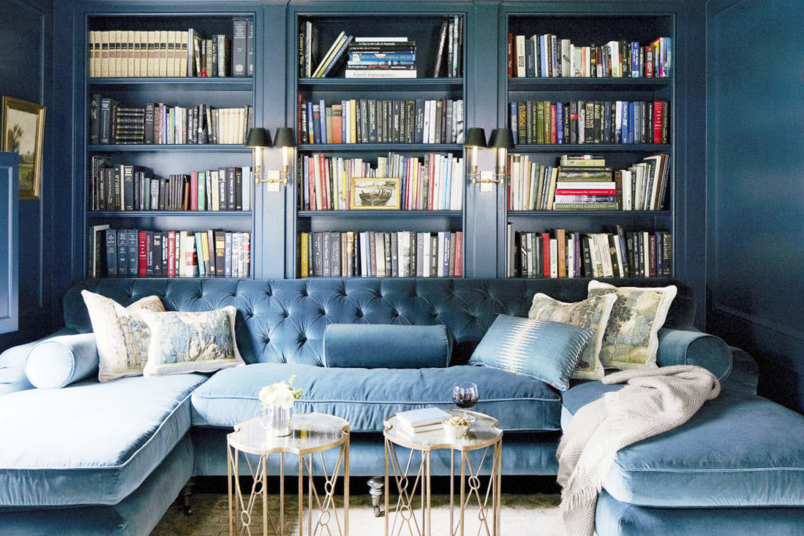
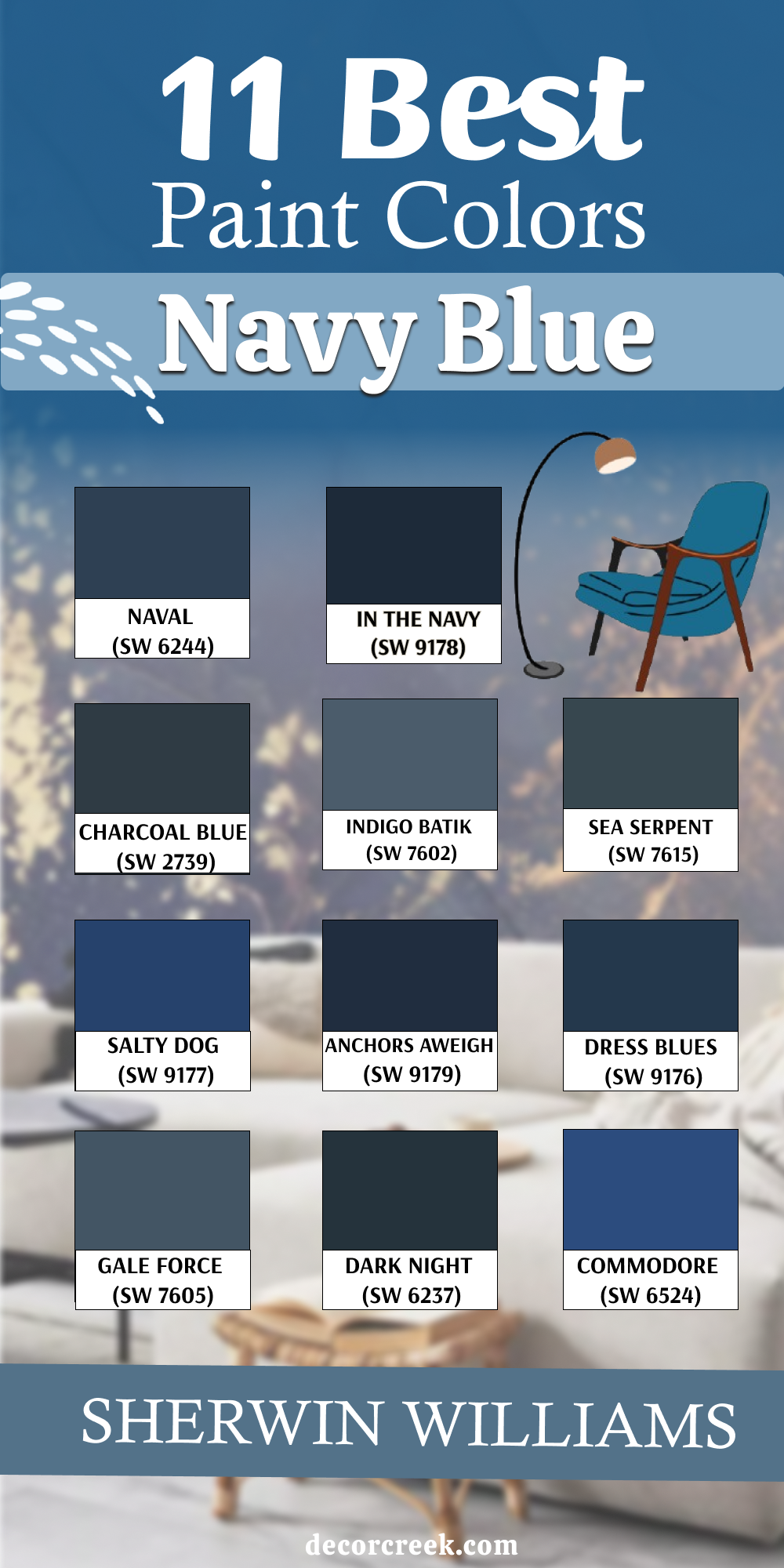
11 Best Sherwin-Williams Navy Blue Paint Colors
Naval (SW 6244)
Naval is deep and full of character. It works beautifully on accent walls, cabinetry, and even full rooms when paired with soft lighting. It brings confidence and warmth, especially when teamed with gold or warm wood. My rule is to always balance Naval with light or creamy trim so it doesn’t feel too closed in.
My rule: use this color in places where you want the room to feel grounded.

In the Navy (SW 9178)
In the Navy feels crisp, classic, and powerful. It’s perfect for dining rooms, front doors, or offices that need a touch of bold style. I’ve used it on ceilings, too—it gives a rich, elegant mood. My rule is to use this color where there’s enough light—it needs breathing room.
My rule: keep surrounding colors simple so the navy becomes the hero.

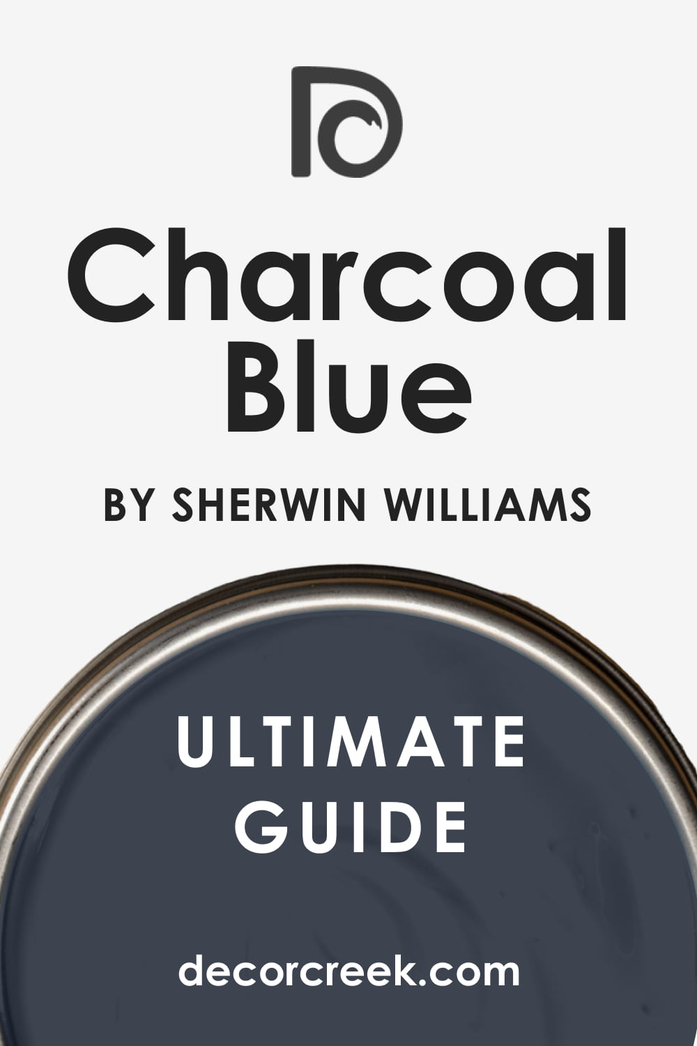
Charcoal Blue (SW 2739)
Charcoal Blue brings navy and gray together in the most natural way. It’s moody but still soft enough to work across full walls. I love it in modern homes where you want deep color without feeling heavy. My rule is to use matte finishes for a softer look.
My rule: skip bright white next to this one—it prefers more muted surroundings.
Indigo Batik (SW 7602)
Indigo Batik has a soft richness that makes it easy to love. It feels polished and calm, and works beautifully with brass, leather, or even pale pink. I use it in bedrooms, powder rooms, and even on dressers or built-ins. My rule is to mix this with warm metallics to bring out its glow.
My rule: let it shine with gentle lighting, not strong overheads.

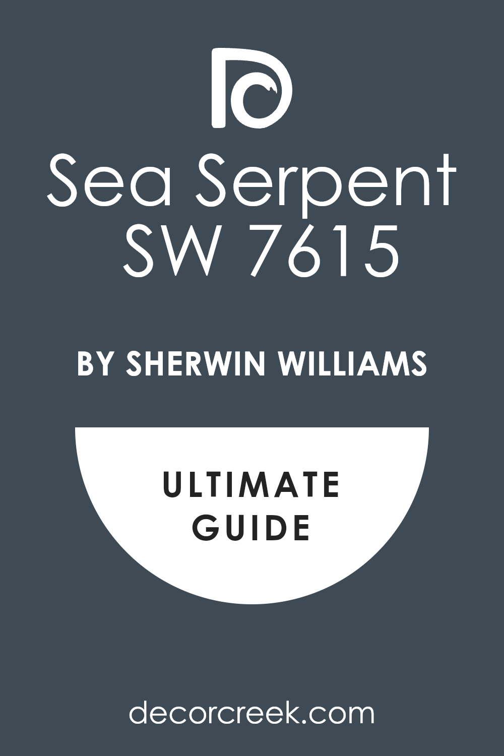
Sea Serpent (SW 7615)
Sea Serpent is a bold navy with a touch of green hidden inside. It feels deep and interesting—great for rooms where you want depth and color at the same time. I’ve used it on kitchen islands and accent walls in cozy living rooms. My rule is to pair this with natural textures like rattan or raw wood.
My rule: don’t crowd it with bright colors—keep the palette soft.
Salty Dog (SW 9177)
Salty Dog is navy, but with more pop—it feels lively and spirited. It’s one of my go-to choices for kids’ spaces or playrooms where you want strong color without too much seriousness. Salty Dog also works great on exterior doors. My rule is to use it when you want a room to feel confident and fun.
My rule: pair with bright whites and even splashes of red or yellow.

Anchors Aweigh (SW 9179)
Anchors Aweigh is dark, rich, and perfectly moody. It brings a sense of stability and focus to any space. I like using it in rooms that need a calm presence, like libraries or dens. My rule is to use it with soft textiles—velvet, wool, or heavy linen—to deepen the feeling.
My rule: this color does best in rooms with soft, warm lighting.

Dress Blues (SW 9176)
Dress Blues is clean, strong, and has a traditional feel. I often use it when clients want navy but don’t want anything too trendy. It’s perfect for accent walls, kitchen cabinets, or paired with vintage art. My rule is to treat it like a suit—it looks best with structure and clean lines.
My rule: white trim is a must—it gives this navy a proper edge.
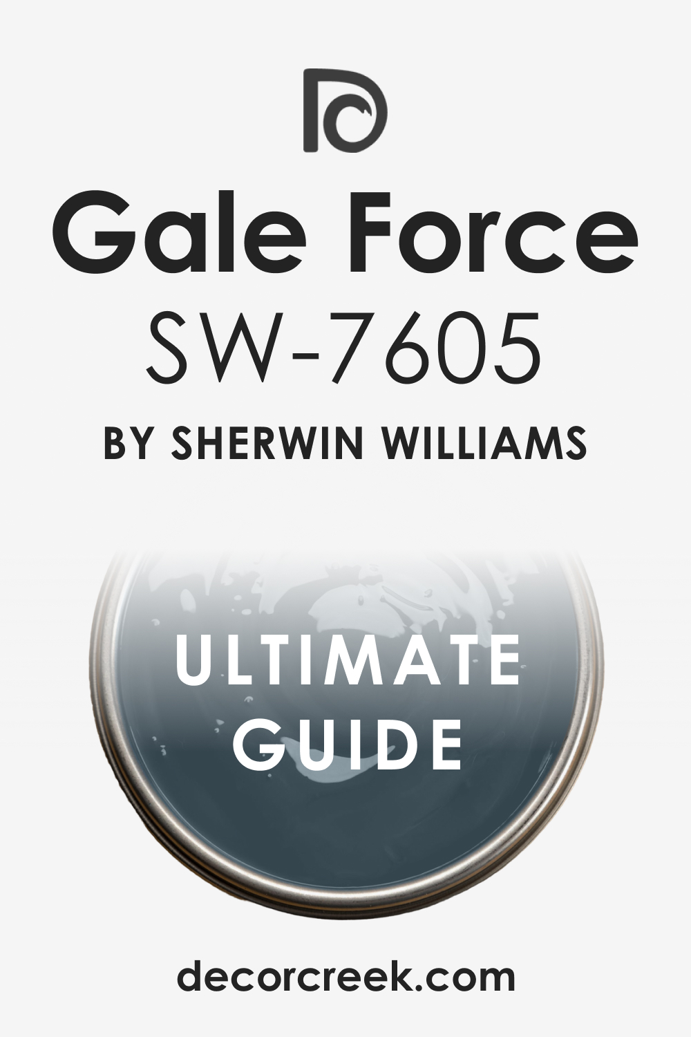
Gale Force (SW 7605)
Gale Force feels dramatic but elegant. It’s deep and complex, with just a hint of softness underneath. I love it for bold powder rooms or small offices that need personality. My rule is to use minimal decor so this color can speak.
My rule: always check lighting—it can look more blue or more gray depending on the time of day.
Dark Night (SW 6237)
Dark Night is navy with a strong green undertone. It’s rich, cozy, and a little unexpected. I love using it in rooms where you want a bold color that doesn’t feel too formal. My rule is to use this one with camel leather or natural oak—it brings the green side forward.
My rule: skip anything shiny nearby—this color looks better matte.
Commodore (SW 6524)
Commodore has a cheerful, fresh navy feel. It reminds me of crisp uniforms and blue skies. I use it when I want a navy that still feels light-hearted, especially in boys’ rooms or casual living spaces. My rule is to use white trim and plenty of daylight with this one.
My rule: mix in simple patterns like stripes—it adds energy.
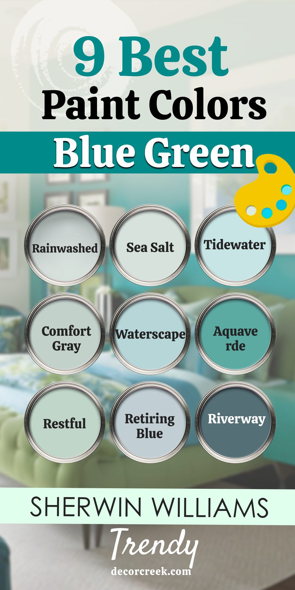
9 Top Sherwin-Williams Blue Green Paint Colors
Rainwashed (SW 6211)
Rainwashed feels light and breezy, with the perfect mix of blue and green. I like using it in bedrooms, bathrooms, and even laundry rooms—it brings a fresh, soft energy. It works especially well in homes with white trim and warm wood floors. My rule is to use Rainwashed in places where natural light is steady—it looks best when it’s not shifting too much.
My rule: pair it with soft textures and whites that aren’t too sharp.

Sea Salt (SW 6204)
Sea Salt is the most-loved blue green for a reason. It changes with the light—looking more blue sometimes, more green at others—but always stays gentle and easy. I use it in kitchens, baths, and hallways where you want something peaceful and friendly. My rule is to try it on two walls before committing—it’s a color that moves around depending on lighting.
My rule: don’t crowd it with bright accents—let it breathe.

Tidewater (SW 6477)
Tidewater brings more color, but still feels relaxed. It’s playful without being loud, and I love it for beach houses, kids’ bathrooms, or craft rooms. It pairs well with white trim and fun prints like stripes or soft florals. My rule is to use this when you want something cheerful but still grown-up.
My rule: use satin or eggshell finish to keep it feeling fresh.

Comfort Gray (SW 6205)
Comfort Gray is like a deeper version of Sea Salt, but with a little more mood. It’s beautiful in living rooms or entryways, especially when you want something soft but not too pale. It works well with natural stone and soft grays. My rule is to choose this when I want a color that feels thoughtful without being too dark.
My rule: pair it with antique brass or soft black for a modern classic mix.

Waterscape (SW 6470)
Waterscape feels cheerful and clean. It’s perfect for a guest bathroom or a laundry room that needs a little life. I love pairing it with white tile and woven baskets—it feels fresh and bright. My rule is to keep things simple and playful when using Waterscape.
My rule: add one natural element—like rattan or bamboo—to make it feel grounded.
Aquaverde (SW 9051)
Aquaverde has more depth and drama, like the color of deep ocean water. It’s bold but still comforting, especially in cozy rooms like dining spaces or offices. It pairs beautifully with gold, deep wood, or even blush tones. My rule is to use it in places where you want to feel wrapped up and focused.
My rule: skip high gloss—this color shines best with a soft finish.
Restful (SW 6458)
Restful leans more green than blue but still has that soft sea-glass feeling. It works well in bedrooms or bathrooms that need a little color but nothing too loud. Restful feels best when it’s paired with soft textures and light wood. My rule is to use this one when the room already gets a lot of natural light.
My rule: keep patterns small and gentle—it’s a peaceful shade.
Retiring Blue (SW 6224)
Retiring Blue has a muted, smoky tone that brings a quiet beauty. It feels like something out of a vintage home, especially when paired with warm whites or aged brass. I love using it in living rooms and cozy bedrooms. My rule is to keep everything soft around it—this color doesn’t like anything too sharp or high contrast.
My rule: lean into the quiet feeling—it works best when the room isn’t trying too hard.
Riverway (SW 6222)
Riverway is one of the boldest blue greens I like to use. It has depth and richness, and brings a strong presence to offices, entryways, or even kitchen islands. It works best with warm woods and soft white trim. My rule is to keep furniture clean-lined and minimal around Riverway—it does a lot of work on its own.
My rule: use warm lightbulbs to bring out the richness in the green.

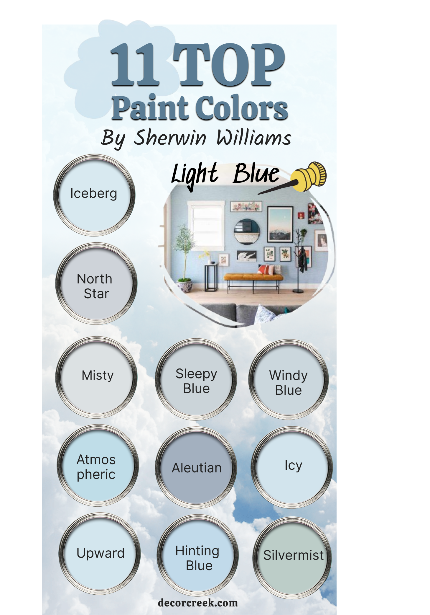
11 Best Sherwin-Williams Light Blue Paint Colors
Iceberg (SW 6798)
Iceberg feels bright, fresh, and full of light. It’s a soft blue that reminds me of clean sheets or morning skies. I love using it in bathrooms, laundry rooms, or even small bedrooms to make them feel open and tidy. My rule is to pair Iceberg with crisp white trim and simple details—it works best when things feel neat.
My rule: use soft, sheer curtains to let the light bounce off the walls.
North Star (SW 6246)
North Star is a cool light blue with a gray side that helps it feel grounded. It works beautifully in modern bedrooms, hallways, or any spot where you want blue without going too bright. It pairs well with white oak and soft linen tones. My rule is to use North Star in rooms with steady natural light—it stays true without looking too cold.
My rule: don’t overdecorate—this color likes room to breathe.
Misty (SW 6232)
Misty always feels like soft morning fog. It’s one of my go-to choices for bathrooms, especially when I want something that feels gentle but not flat. It works with marble, brushed silver, and soft grays. My rule is to use Misty when clients are unsure—it’s a color that rarely disappoints.
My rule: keep lighting soft and layered—it brings out the best in this shade.
Sleepy Blue (SW 6225)
Sleepy Blue brings peace and quiet into any room. It has a calm presence that works perfectly in nurseries or reading corners. I also love it for full bedrooms with cozy bedding and pale wood. My rule is to layer this color with warm textures like chunky knit throws or soft rugs.
My rule: avoid strong contrast—this color does best with nearby softness.
Windy Blue (SW 6240)
Windy Blue feels playful but never loud. It’s a happy kind of light blue that looks great in kitchens or playrooms. I like pairing it with white cabinets and brushed brass for a sweet, gentle touch. My rule is to use Windy Blue in rooms with lots of daylight—it keeps the room feeling fresh.
My rule: keep patterns simple and a little fun—like soft checks or gentle stripes.
Atmospheric (SW 6505)
Atmospheric is a classic baby blue with just a little depth. It’s perfect for ceilings, laundry rooms, or kids’ spaces that need some color. I’ve even used it on porch ceilings for a traditional Southern look. My rule is to use this color high up or in bright rooms—it brings the sky indoors.
My rule: skip dark flooring underneath—it makes the blue feel off.
Aleutian (SW 6241)
Aleutian is more of a dusty blue but still light enough to feel easy. I love it in bedrooms where you want a little mood without going dark. It’s beautiful with brass, oak, and creamy white. My rule is to use it where you want to feel relaxed but not sleepy.
My rule: use accent pillows or rugs in the same family to pull the room together.
Icy (SW 6534)
Icy has a cool, crisp look that feels refreshing. It’s one of my favorite choices for bathrooms and small bedrooms. It works really well with tile, soft gray, and white trim. My rule is to avoid pairing it with beiges—it needs cooler company.
My rule: add plants or light wood for warmth if it starts to feel too cold.
Upward (SW 6239)
Upward feels light and airy with a tiny bit of gray to ground it. It’s lovely in living rooms, guest rooms, or any space that needs to feel open. It looks beautiful with soft whites and simple wood tones.My rule is to avoid anything too bold next to Upward—it likes calm company.
My rule: let natural light work its magic—it gives the color extra depth.

Hinting Blue (SW 6519)
Hinting Blue brings a cheerful, breezy look without being too sweet. I like it in kitchens, sunrooms, or anywhere with lots of windows. It plays well with soft yellows and even greens. My rule is to treat Hinting Blue like a gentle accent—it doesn’t want to lead the room.
My rule: avoid using it in rooms with poor light—it needs brightness to stay happy.
Silvermist (SW 7621)
Silvermist is a smoky blue with a green touch, but it still feels light. It’s great in bedrooms, dining rooms, or calm home offices. It works especially well with natural textures and warm metallics. My rule is to pair Silvermist with soft, earthy pieces—stone, rattan, and linen look amazing here.
My rule: don’t rush the decision—this color shifts a lot with light.
My Go-To Advice for Choosing Blue Shades
Blue is one of those colors that can feel anything—quiet, bold, fresh, or moody. That’s why I use it so often. But picking the right blue isn’t just about grabbing a swatch and going with your favorite. My rule is to always test at least two shades on the wall and check them in the morning, afternoon, and evening light. What looks gentle in a store can feel much stronger at home.
My rule is to think about how you want the room to feel—not just how you want it to look. Do you want it to feel safe, relaxed, focused, or full of life? The answer should guide your choice. Soft blues like Misty or Rainwashed work best in quiet spaces.
Bold shades like Naval or Riverway shine when you want a room to feel strong or important.
And don’t be afraid of going darker than you first planned. My rule is that deeper blues often bring more warmth than pale ones because they give the room weight. When paired with soft light, wood, or gold accents, even a deep navy can feel cozy.
In the end, the best blue is the one that makes you feel something good. If you walk into the room and take a deep breath or smile, you’ve got it right.
That’s the feeling I try to give every client—and you can have it too.
