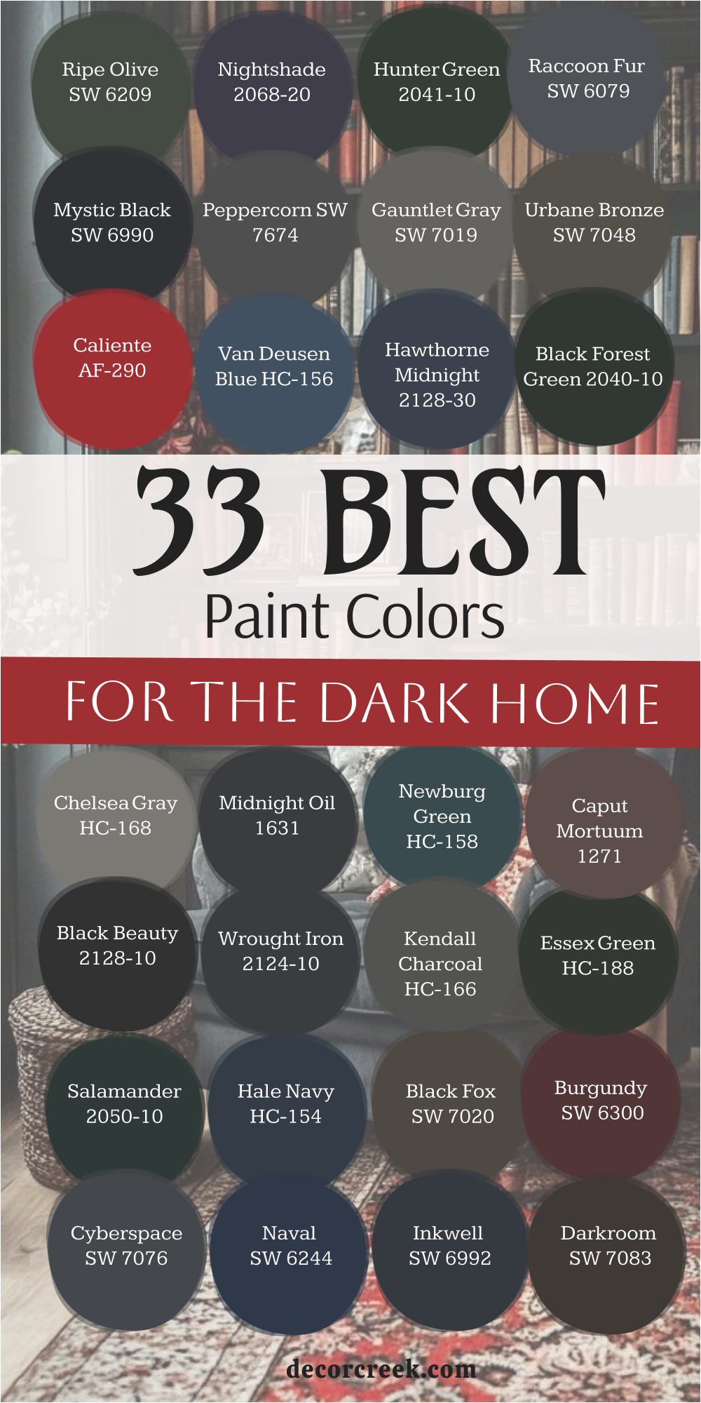


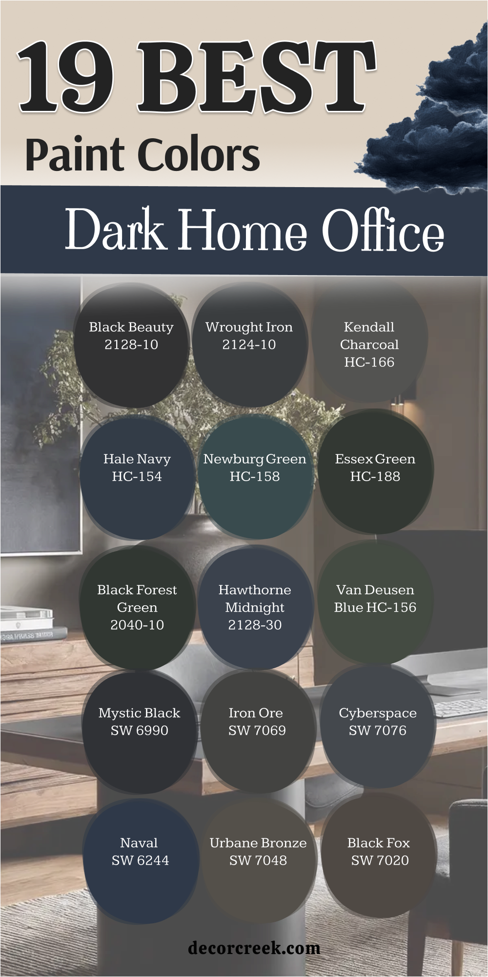
19 Best Dark Home Office Paint Colors
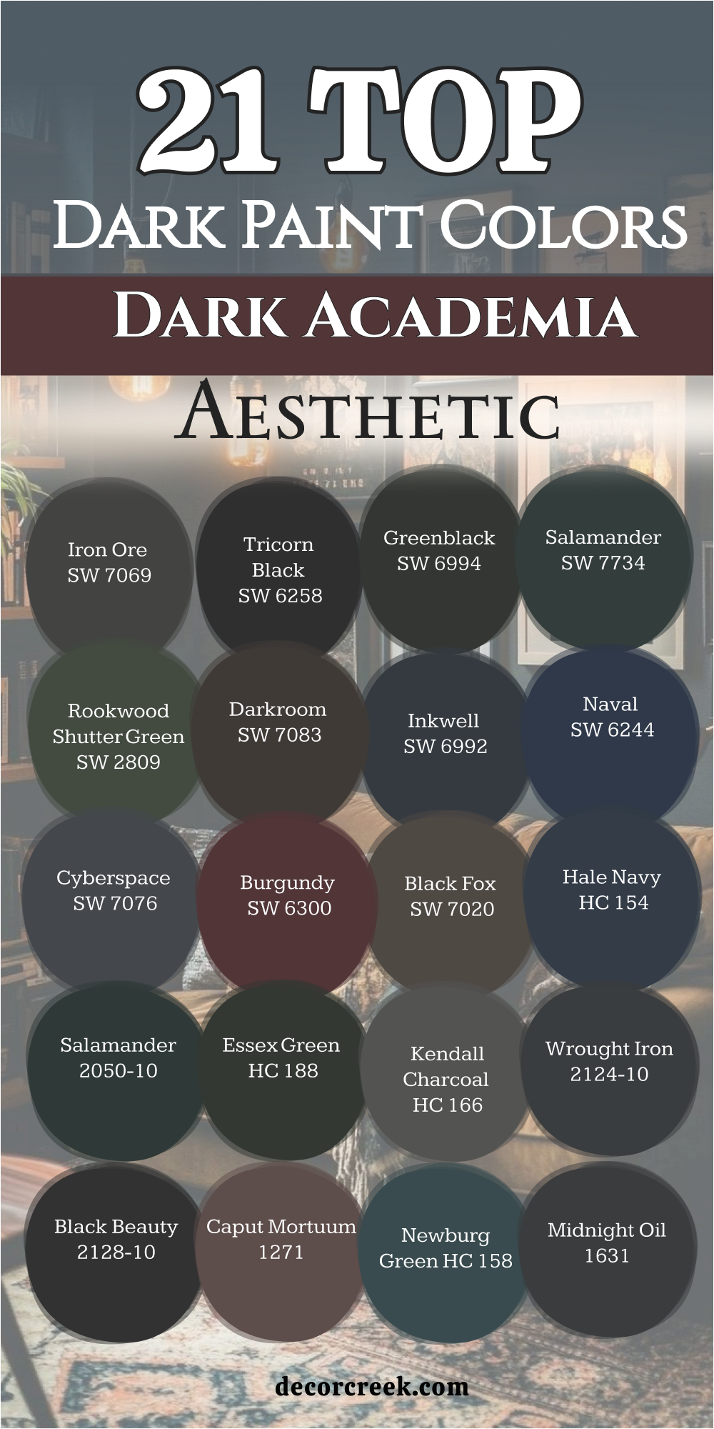
Black Beauty 2128-10
Black Beauty 2128-10 creates a bold and focused mood for a home office. Black Beauty 2128-10 gives the walls a deep, velvety look that feels strong and grounded. I like using it behind a desk to frame the work area. It helps reduce glare from screens.
It makes shelves and books stand out clearly. This shade pairs well with brass desk lamps. It supports dark wood furniture beautifully. It keeps the room feeling intentional. It adds structure without distraction. It builds a serious work setting that encourages focus.
Best used in: home offices, studies, built-ins, and accent walls
Pairs well with: Chantilly Lace OC 65, Kendall Charcoal HC-166, walnut desks, aged brass
The key rule of this color for a dark office is to balance it with warm lighting so the depth supports focus without feeling heavy.
🎨 Check out the complete guide to this color right HERE 👈
Wrought Iron 2124-10
Wrought Iron 2124-10 offers a deep gray-black that feels steady and refined. Wrought Iron 2124-10 brings contrast without harshness. I use it when clients want a bold office that still feels balanced. It hides shadows well in low light.
It makes white trim pop gently. This shade works beautifully with leather chairs. It supports clean-lined furniture. It gives shelves a custom look. It feels professional and mature. It creates a strong backdrop that keeps the mind on work.
Best used in: offices, built-in shelving, libraries, and feature walls
Pairs well with: Simply White OC-117, Hale Navy HC-154, dark oak, brushed brass
The key rule of this color for a dark office is to layer warm textures so the room feels inviting yet focused.
🎨 Check out the complete guide to this color right HERE 👈

Kendall Charcoal HC-166
Kendall Charcoal HC-166 is a deep gray with soft warmth that works beautifully in an office. Kendall Charcoal HC-166 feels rich without going too dark. I often choose it when I want a serious tone that still feels flexible. It handles changing daylight well.
It pairs nicely with black metal accents. This shade supports both modern and classic desks. It gives walls depth without sharp contrast. It makes white ceilings feel brighter. It keeps the room grounded. It creates a productive atmosphere that feels steady and composed.
Best used in: home offices, meeting rooms, bedrooms, and hallways
Pairs well with: White Dove OC-17, Wrought Iron 2124-10, warm wood tones, matte black hardware
The key rule of this color for a dark office is to mix it with warm woods so the gray feels layered and balanced.
🎨 Check out the complete guide to this color right HERE 👈

Hale Navy HC-154
Hale Navy HC-154 gives a home office depth and confidence. Hale Navy HC-154 feels strong but not too sharp, which helps the room feel focused. I like using it when clients want color without going fully black. It works beautifully behind a wooden desk.
It makes white trim look crisp. This shade pairs well with brass desk lamps. It supports leather chairs and dark bookcases. It holds its richness even in low light. It adds contrast without distraction. It builds a steady and thoughtful work setting.
Best used in: home offices, libraries, built-ins, and accent walls
Pairs well with: Chantilly Lace OC-65, Kendall Charcoal HC-166, walnut furniture, aged brass
The key rule of this color for a dark office is to frame it with light trim so the depth feels structured and intentional.
🎨 Check out the complete guide to this color right HERE 👈

Newburg Green HC-158
Newburg Green HC-158 brings a deep blue-green tone that feels rich and balanced. Newburg Green HC-158 adds color while still keeping the office serious. I use it when I want a space that feels creative but focused.
It shifts slightly depending on the light. It makes gold accents glow softly. This shade supports layered textiles like wool rugs. It pairs beautifully with dark wood desks. It keeps the room from feeling flat. It adds depth without harshness. It creates a refined and productive mood.
Best used in: offices, studies, libraries, and accent walls
Pairs well with: Simply White OC-117, Hale Navy HC-154, dark oak, brushed brass
The key rule of this color for a dark office is to balance its richness with warm materials so the room feels energized and steady.
🎨 Check out the complete guide to this color right HERE 👈
Essex Green HC-188
Essex Green HC-188 offers a classic dark green that feels grounded and scholarly. Essex Green HC-188 works beautifully in offices filled with books. I often choose it for clients who love a traditional look. It gives walls a deep and serious tone.
It pairs well with antique-style furniture. This shade makes framed art stand out. It supports brass and bronze finishes. It hides uneven light gracefully. It adds weight to built-ins. It creates a focused office environment with strong character.
Best used in: home offices, libraries, formal studies, and built-ins
Pairs well with: White Dove OC-17, Kendall Charcoal HC-166, mahogany wood, oil-rubbed bronze
The key rule of this color for a dark office is to highlight architectural details so the richness feels intentional and layered.
🎨 Check out the complete guide to this color right HERE 👈

Black Forest Green HC-187
Black Forest Green HC-187 brings a deep forest tone that feels strong and grounded. Black Forest Green 2040-10 adds richness without turning the office too dark. I like using it in rooms with good lamps and layered lighting. It makes wood desks look deeper in color.
It pairs beautifully with leather chairs. This shade supports gold and brass accents. It gives built-ins a custom look. It hides shadows in corners well. It keeps the room feeling serious and steady. It creates a focused office mood that feels mature and confident.
Best used in: home offices, libraries, built-in shelving, and accent walls
Pairs well with: Swiss Coffee OC-45, Wrought Iron 2124-10, walnut furniture, antique brass
The key rule of this color for a dark office is to combine it with warm lighting so the depth feels rich and supportive.
🎨 Check out the complete guide to this color right HERE 👈
Evening Dove 2128-30
Evening Dove 2128-30 offers a smoky blue with gray undertones. Hawthorne Midnight 2128-30 feels deep but not heavy on the walls. I use it when I want a softer alternative to navy. It works beautifully in offices with limited daylight.
It makes white trim stand out gently. This shade pairs well with black metal desks. It supports layered lighting from lamps and sconces. It adds depth without sharp contrast. It keeps the room composed and focused. It builds a work setting that feels thoughtful and calm in tone.
Best used in: offices, bedrooms, studies, and accent walls
Pairs well with: Chantilly Lace OC-65, Kendall Charcoal HC-166, dark oak, brushed nickelThe key rule of this color for a dark office is to pair it with warm woods to balance its cool undertone.
Van Deusen Blue HC-156
Van Deusen Blue HC-156 gives a home office a strong and confident look. Van Deusen Blue HC-156 feels classic and steady on the wall. I often choose it when clients want color that still feels professional. It holds its depth throughout the day.
It looks beautiful with white trim and crown molding. This shade pairs well with brass lamps. It supports dark wood desks and shelves. It adds structure to large walls. It keeps the room from feeling flat. It creates a productive atmosphere with timeless character.
Best used in: home offices, libraries, dining rooms, and built-ins
Pairs well with: Simply White OC-117, Wrought Iron 2124-10, walnut finishes, aged brass
The key rule of this color for a dark office is to frame it with crisp trim so the depth feels clear and intentional.

Caliente AF-290
Caliente AF-290 brings bold energy into a dark home office. Caliente AF-290 is a deep red that feels rich and confident on the wall. I use it when a client wants passion and strength in their work setting. It looks beautiful in evening light.
It makes dark wood furniture appear deeper. This shade pairs well with brass and gold accents. It adds warmth without losing depth. It keeps the room from feeling dull. It supports layered rugs and heavy curtains. It creates a dramatic office mood that feels powerful and focused.
Best used in: home offices, dining rooms, accent walls, and creative studios
Pairs well with: Swiss Coffee OC-45, Black Beauty 2128-10, mahogany wood, antique gold
The key rule of this color for a dark office is to balance its bold tone with warm lighting and classic finishes.
🎨 Check out the complete guide to this color right HERE 👈
Iron Ore SW 7069
Iron Ore SW 7069 gives a home office strong structure and depth. Iron Ore SW 7069 feels almost black but still shows soft warmth. I like using it behind built-in shelving. It makes white trim stand out clearly. It supports leather chairs and wood desks beautifully.
This shade hides uneven light in darker corners. It pairs well with brass desk lamps. It adds contrast without distraction. It keeps the room serious and composed. It builds a focused environment that feels grounded and steady.
Best used in: offices, libraries, built-ins, and feature walls
Pairs well with: Alabaster SW 7008, Urbane Bronze SW 7048, dark walnut, aged brass
The key rule of this color for a dark office is to layer it with warm textures so the depth feels rich and balanced.
🎨 Check out the complete guide to this color right HERE 👈

Cyberspace SW 7076
Cyberspace SW 7076 creates a cool, deep backdrop for focused work. Cyberspace SW 7076 blends charcoal and blue in a smooth way. I often choose it for modern home offices. It works well in rooms with limited daylight. It makes light furniture pop gently.
This shade pairs nicely with black metal accents. It supports clean-lined desks and shelves. It hides glare from screens. It keeps the mood serious but not harsh. It creates a smart and composed office setting.
Best used in: home offices, bedrooms, accent walls, and built-ins
Pairs well with: Extra White SW 7006, Peppercorn SW 7674, brushed nickel, dark oak
The key rule of this color for a dark office is to soften its cool tone with warm wood and layered lighting.

Naval SW 6244
Naval SW 6244 gives a home office depth and quiet strength. Naval SW 6244 feels rich and balanced on the wall. I use it when I want color that still feels professional. It looks beautiful with crisp white trim. It makes brass desk lamps glow warmly.
This shade supports leather chairs and dark bookcases. It holds its tone well in low light. It adds contrast without harsh edges. It keeps the room from feeling flat. It creates a focused office mood that feels confident and steady.
Best used in: home offices, libraries, built-ins, and accent walls
Pairs well with: Pure White SW 7005, Urbane Bronze SW 7048, walnut furniture, aged brass
The key rule of this color for a dark office is to frame it with light trim so its depth feels clean and structured.
🎨 Check out the complete guide to this color right HERE 👈

Urbane Bronze SW 7048
Urbane Bronze SW 7048 brings a deep brown-gray tone that feels grounded. Urbane Bronze SW 7048 adds warmth while still keeping the office serious. I often use it when clients want depth without going fully black. It works well in rooms with layered lighting.
It makes cream textiles feel richer. This shade pairs nicely with matte black hardware. It supports wood desks and shelving. It hides uneven light softly. It adds weight to large walls. It creates a steady and mature work setting.
Best used in: home offices, studies, bedrooms, and accent walls
Pairs well with: Alabaster SW 7008, Iron Ore SW 7069, dark oak, brushed brass
The key rule of this color for a dark office is to combine it with warm textures so the brown undertone feels balanced and inviting.
🎨 Check out the complete guide to this color right HERE 👈

Black Fox SW 7020
Black Fox SW 7020 offers a warm charcoal that feels softer than black. Black Fox SW 7020 works beautifully in offices with limited daylight. I like using it when I want depth with a hint of brown. It makes white trim stand out gently.
It supports leather and wool textures. This shade pairs well with brass accents. It adds contrast without feeling sharp. It keeps the room grounded and composed. It hides shadows naturally. It creates a focused office mood that feels comfortable yet strong.
Best used in: home offices, libraries, built-ins, and feature walls
Pairs well with: Natural Linen SW 9109, Urbane Bronze SW 7048, walnut finishes, aged brass
The key rule of this color for a dark office is to layer it with warm materials so the depth feels rich rather than flat.
🎨 Check out the complete guide to this color right HERE 👈

Gauntlet Gray SW 7019
Gauntlet Gray SW 7019 brings a deep gray-brown tone that feels steady and practical. Gauntlet Gray SW 7019 works well when you want a dark office that still feels warm. I use it in rooms where natural light is limited but not absent.
It makes white trim look clean without sharp contrast. This shade supports wood desks and open shelving. It pairs nicely with black hardware. It hides minor wall flaws well. It adds weight without feeling too heavy. It keeps the room grounded and organized. It creates a work setting that feels reliable and mature.
Best used in: home offices, hallways, studies, and accent walls
Pairs well with: Alabaster SW 7008, Iron Ore SW 7069, medium walnut, matte black accents
The key rule of this color for a dark office is to add warm lighting so the gray-brown undertone feels balanced and steady.
🎨 Check out the complete guide to this color right HERE 👈
Peppercorn SW 7674
Peppercorn SW 7674 delivers a deep charcoal that feels bold and clean. Peppercorn SW 7674 creates strong contrast without looking flat. I like using it behind shelving or a statement desk wall. It makes lighter furniture stand out clearly.
This shade works well with modern office pieces. It pairs beautifully with brushed brass. It supports layered lighting from table lamps. It keeps glare from screens under control. It adds structure to large walls. It builds a focused and sharp office environment.
Best used in: home offices, built-ins, media walls, and accent walls
Pairs well with: Extra White SW 7006, Naval SW 6244, dark oak, brushed brass
The key rule of this color for a dark office is to balance its strong charcoal tone with warm woods and soft textiles.
🎨 Check out the complete guide to this color right HERE 👈
Black Magic SW 6991
Black Magic SW 6991 offers a deep black with a soft blue undertone. Black Magic feels dramatic but still layered. I choose it when I want a bold office that feels intentional. It looks striking with white trim. It makes gold accents glow warmly.
This shade supports sleek desks and modern chairs. It hides shadows gracefully. It adds contrast without harsh glare. It keeps the room feeling structured and focused. It creates a confident and powerful work mood.
Best used in: home offices, studies, libraries, and feature walls
Pairs well with: Pure White SW 7005, Cyberspace SW 7076, walnut wood, aged brass
The key rule of this color for a dark office is to use warm lighting so the depth feels rich rather than stark.
🎨 Check out the complete guide to this color right HERE 👈
Raccoon Fur 2126-20
Raccoon Fur 2126-20 brings a deep brown-black tone that feels warm and grounded. Raccoon Fur 2126-20 works beautifully in offices with wood furniture. I like using it when clients want depth without cool undertones. It makes cream textiles feel cozy.
It pairs nicely with bronze hardware. This shade supports traditional and modern desks alike. It hides uneven light in corners. It adds weight to the walls. It keeps the office from feeling flat. It creates a steady and comfortable work environment that feels mature and balanced.
Best used in: home offices, libraries, bedrooms, and accent walls
Pairs well with: Natural Linen SW 9109, Urbane Bronze SW 7048, dark cherry wood, oil-rubbed bronze
The key rule of this color for a dark office is to layer it with warm finishes so the brown undertone feels rich and supportive.
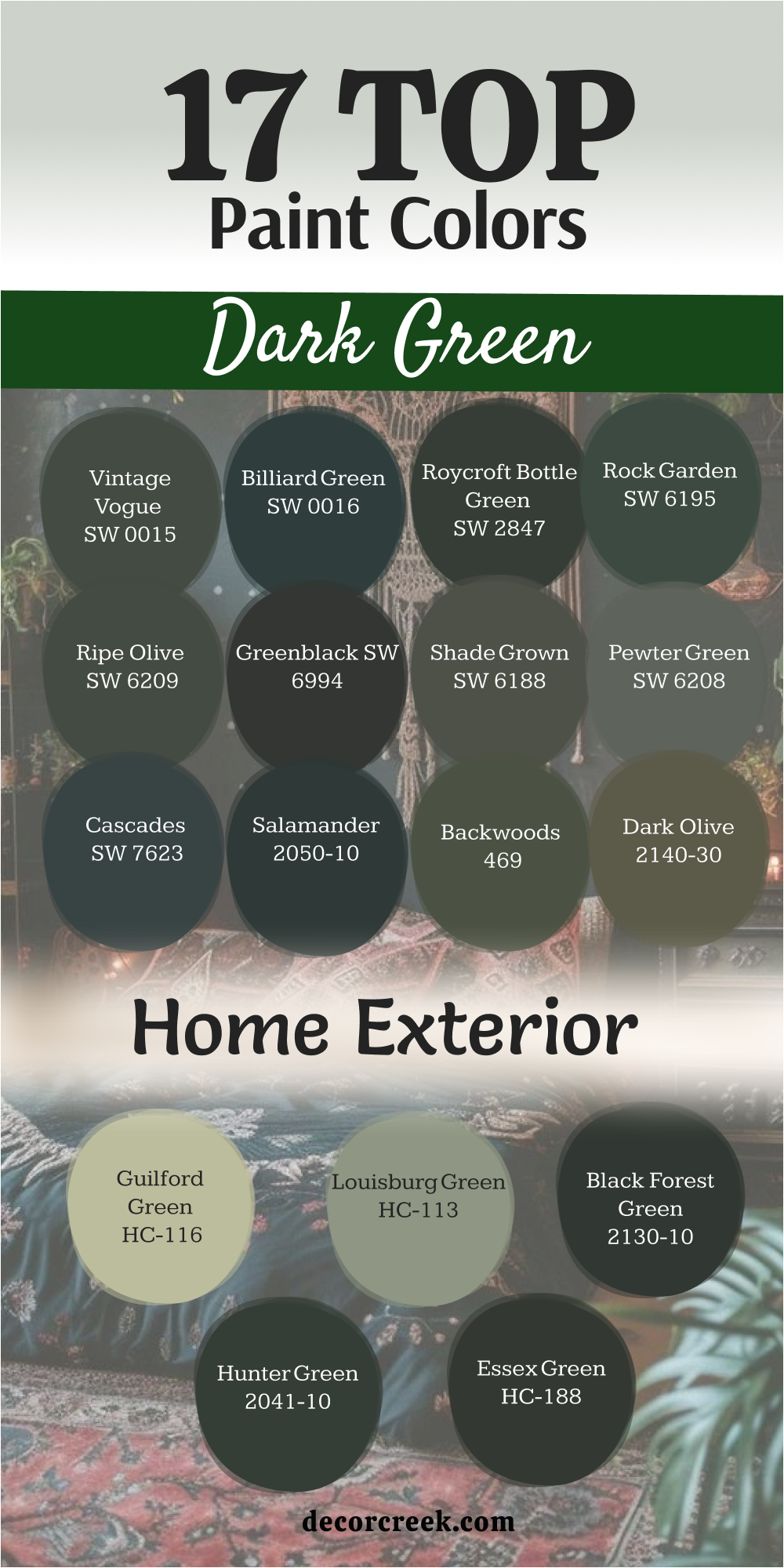
17 Top Dark Green Home Exterior Paint Colors
Hunter Green 2041-10
Hunter Green 2041-10 gives a home exterior a strong and classic look. Hunter Green 2041-10 feels rich and grounded against brick or stone. I often suggest it for traditional houses with detailed trim. It blends beautifully with trees and landscaping.
It makes white trim stand out clearly. This shade supports black shutters and doors. It holds its depth in both sun and shade. It adds character without looking trendy. It works well on large homes with strong roof lines. It creates a confident curb appeal that feels established and welcoming.
Best used in: traditional exteriors, shutters, front doors, and full-body paint
Pairs well with: White Dove OC-17, Wrought Iron 2124-10, natural stone, black hardware
The key rule of this color for exterior style is to frame it with crisp trim so the deep green feels sharp and intentional.
🎨 Check out the complete guide to this color right HERE 👈
Essex Green HC-188
Essex Green HC-188 brings historic charm to an exterior. Essex Green HC-188 feels deep and refined on siding. I like using it on Colonial and craftsman homes. It looks beautiful with white or cream trim. It pairs well with brick foundations.
This shade holds strong color even in bright sunlight. It supports copper and bronze accents. It blends naturally with wooded lots. It adds weight without feeling too dark. It creates a timeless and stately street presence.
Best used in: Colonial homes, craftsman exteriors, shutters, and doors
Pairs well with: Chantilly Lace OC-65, Kendall Charcoal HC-166, brick, copper accents
The key rule of this color for exterior style is to highlight trim and architectural lines so the green feels structured and balanced.
🎨 Check out the complete guide to this color right HERE 👈
Black Forest Green HC-187
Black Forest Green HC-187 offers a near-black green that feels bold and dramatic. Black Forest Green HC-187 works beautifully on modern and farmhouse exteriors. I use it when clients want a dark look that still feels natural. It looks stunning with wood beams.
It pairs well with white trim. This shade supports matte black fixtures. It holds its richness through all seasons. It blends nicely with natural surroundings. It adds depth without looking flat. It creates a striking yet grounded exterior statement.
Best used in: modern homes, farmhouses, shutters, and full-body exteriors
Pairs well with: Simply White OC-117, Iron Ore SW 7069, cedar wood, black metal
The key rule of this color for exterior style is to balance its depth with lighter trim and natural textures.
🎨 Check out the complete guide to this color right HERE 👈
Louisburg Green HC-113
Louisburg Green HC-113 gives an exterior a rich and historic feel. Louisburg Green HC-113 feels deep but still warm in natural light. I often suggest it for traditional homes with classic trim. It looks beautiful next to red brick. It makes cream trim glow softly.
This shade pairs well with black shutters. It supports copper gutters and lanterns. It blends nicely with mature trees. It holds its color through changing seasons. It creates a strong and welcoming curb appeal that feels established and proud.
Best used in: traditional exteriors, shutters, front doors, and brick homes
Pairs well with: White Dove OC-17, Wrought Iron 2124-10, red brick, copper accents
The key rule of this color for exterior style is to frame it with warm trim so the green feels rich and balanced.
🎨 Check out the complete guide to this color right HERE 👈
Guilford Green HC-116
Guilford Green HC-116 offers a deep olive tone that feels classic and grounded. Guilford Green HC-116 works well on craftsman and colonial homes. I like using it when a client wants green with a hint of warmth. It pairs beautifully with cream trim. It looks strong against stone foundations.
This shade supports wood shutters. It holds up well in bright sun. It blends smoothly with natural landscaping. It adds character without looking harsh. It creates a calm and confident exterior presence.
Best used in: craftsman homes, colonials, shutters, and full siding
Pairs well with: Swiss Coffee OC-45, Kendall Charcoal HC-166, natural stone, dark bronze hardware
The key rule of this color for exterior style is to use warm trim and stone details to highlight its olive undertone.
🎨 Check out the complete guide to this color right HERE 👈
Dark Olive 2140-30
Dark Olive 2140-30 brings a strong earthy green to an exterior. Dark Olive 2140-30 feels bold yet natural on siding. I use it when I want a house to blend into wooded surroundings. It looks beautiful with beige or cream trim. It pairs nicely with brown roofs.
This shade supports black window frames. It holds its depth in shade and sun. It adds warmth without feeling too dark. It gives simple homes more character. It creates a grounded curb appeal that feels solid and inviting.
Best used in: wooded homes, cabins, shutters, and full-body paint
Pairs well with: White Dove OC-17, Iron Ore SW 7069, tan stone, bronze hardware
The key rule of this color for exterior style is to soften it with light trim so the deep olive feels balanced and welcoming.
🎨 Check out the complete guide to this color right HERE 👈
Backwoods 469
Backwoods 469 gives an exterior a rich forest tone that feels strong and natural. Backwoods 469 works beautifully on homes surrounded by trees. I often recommend it for cottages and craftsman houses. It blends smoothly with stone and brick.
It makes cream trim stand out clearly. This shade supports wood shutters and beams. It holds depth in bright sunlight. It adds character without looking too bold. It gives simple siding more presence. It creates a grounded curb appeal that feels warm and confident.
Best used in: cottages, craftsman homes, shutters, and full-body exteriors
Pairs well with: Swiss Coffee OC-45, Wrought Iron 2124-10, natural stone, dark wood accents
The key rule of this color for exterior style is to pair it with lighter trim so the deep green feels balanced and defined.
🎨 Check out the complete guide to this color right HERE 👈
Salamander 2050-10
Salamander 2050-10 delivers a near-black green that feels dramatic on an exterior. Salamander 2050-10 creates strong contrast with white trim. I use it when homeowners want a bold look that still feels rooted in nature. It looks stunning on modern farmhouses.
It pairs beautifully with wood doors. This shade supports matte black fixtures. It keeps its richness in both shade and sun. It blends well with landscaped gardens. It adds depth without looking flat. It creates a powerful curb appeal that feels intentional and refined.
Best used in: modern farmhouses, shutters, front doors, and full siding
Pairs well with: Chantilly Lace OC-65, Kendall Charcoal HC-166, cedar wood, black hardware
The key rule of this color for exterior style is to highlight trim and natural textures so the depth feels structured and welcoming.
🎨 Check out the complete guide to this color right HERE 👈

Cascades SW 7623
Cascades SW 7623 offers a deep blue-green that feels bold yet balanced. Cascades SW 7623 works beautifully on homes with clean lines. I often suggest it for modern or transitional exteriors. It pairs well with crisp white trim. It looks striking with natural wood accents.
This shade supports black window frames. It holds its color well through different weather. It blends nicely with green landscaping. It adds contrast without harshness. It creates a strong and polished curb presence.
Best used in: modern homes, shutters, front doors, and siding
Pairs well with: Pure White SW 7005, Iron Ore SW 7069, warm cedar, matte black fixtures
The key rule of this color for exterior style is to frame it with bright trim so the blue-green depth feels sharp and balanced.
🎨 Check out the complete guide to this color right HERE 👈
Pewter Green SW 6208
Pewter Green SW 6208 brings a muted dark green that feels steady and refined. Pewter Green SW 6208 works well on homes that need depth without looking too bold. I like using it on cottages and transitional houses. It pairs beautifully with cream trim.
It looks soft next to stone and brick. This shade supports bronze hardware. It holds its tone in both sun and shade. It blends nicely with gardens and trees. It adds character without sharp contrast. It creates a welcoming curb appeal that feels balanced and thoughtful.
Best used in: cottages, transitional homes, shutters, and full siding
Pairs well with: Alabaster SW 7008, Urbane Bronze SW 7048, natural stone, bronze fixtures
The key rule of this color for exterior style is to frame it with warm trim so the green feels rich and harmonious.
🎨 Check out the complete guide to this color right HERE 👈

Shade Grown SW 6188
Shade Grown SW 6188 offers a deep forest green with strong presence. Shade Grown SW 6188 feels bold and grounded on siding. I often recommend it for homes with large front porches. It looks beautiful with white columns. It pairs well with black shutters.
This shade supports wood doors and beams. It keeps its richness through changing seasons. It blends naturally with wooded lots. It adds depth without looking flat. It creates a strong and confident exterior statement.
Best used in: traditional homes, farmhouses, shutters, and full-body paint
Pairs well with: Pure White SW 7005, Iron Ore SW 7069, cedar wood, black hardware
The key rule of this color for exterior style is to balance its depth with lighter trim and natural materials.
🎨 Check out the complete guide to this color right HERE 👈
Greenblack SW 6994
Greenblack SW 6994 delivers a deep green that almost reads black in shadow. Greenblack SW 6994 creates dramatic contrast on an exterior. I use it when clients want a bold and modern look. It looks striking with bright white trim. It pairs beautifully with warm wood doors.
This shade supports matte black fixtures. It holds up well in both sun and shade. It blends nicely with landscaping. It adds depth without looking muddy. It creates a sharp and confident curb appeal.
Best used in: modern homes, shutters, front doors, and full siding
Pairs well with: Extra White SW 7006, Urbane Bronze SW 7048, warm cedar, black metal
The key rule of this color for exterior style is to use crisp trim so the deep green feels clean and intentional.
🎨 Check out the complete guide to this color right HERE 👈

Ripe Olive SW 6209
Ripe Olive SW 6209 brings a dark earthy green that feels warm and grounded. Ripe Olive SW 6209 works beautifully on homes surrounded by trees. I often suggest it for houses with stone or brick details. It pairs nicely with cream trim. It looks strong with brown or charcoal roofs.
This shade supports bronze and black hardware. It holds its depth through bright sun. It blends naturally with landscaping. It adds character without feeling too bold. It creates a welcoming curb appeal that feels solid and mature.
Best used in: wooded homes, cottages, shutters, and full siding
Pairs well with: Alabaster SW 7008, Iron Ore SW 7069, natural stone, bronze accents
The key rule of this color for exterior style is to soften it with warm trim so the olive undertone feels balanced and inviting.
🎨 Check out the complete guide to this color right HERE 👈

Rock Garden SW 6195
Rock Garden SW 6195 offers a deep green with gray undertones. Rock Garden SW 6195 feels rich yet slightly muted on siding. I like using it when clients want a dark color that still feels gentle. It looks beautiful with crisp white trim. It pairs well with black shutters.
This shade supports wood garage doors. It holds its tone in both shade and sunlight. It blends smoothly with natural landscaping. It adds depth without looking heavy. It creates a polished curb presence that feels composed and steady.
Best used in: traditional homes, transitional exteriors, shutters, and siding
Pairs well with: Pure White SW 7005, Urbane Bronze SW 7048, cedar wood, matte black fixtures
The key rule of this color for exterior style is to highlight trim and natural textures so the green feels layered and refined.
🎨 Check out the complete guide to this color right HERE 👈
Roycroft Bottle Green SW 2847
Roycroft Bottle Green SW 2847 gives an exterior a rich historic tone. Roycroft Bottle Green SW 2847 feels bold and full of character. I often recommend it for craftsman and older homes. It looks stunning with cream trim. It pairs beautifully with stone foundations.
This shade supports bronze lanterns and door hardware. It holds strong color even in bright light. It blends nicely with mature trees. It adds depth without losing warmth. It creates a confident and classic street presence.
Best used in: craftsman homes, historic houses, shutters, and full-body paint
Pairs well with: Swiss Coffee OC-45, Kendall Charcoal HC-166, natural stone, bronze fixtures
The key rule of this color for exterior style is to frame it with lighter trim so the deep green feels structured and welcoming.
🎨 Check out the complete guide to this color right HERE 👈
Billiard Green SW 0016
Billiard Green SW 0016 brings a deep classic green that feels rich and bold. Billiard Green SW 0016 works beautifully on traditional homes with detailed trim. I often suggest it for exteriors that need strong color without looking too dark. It looks stunning with white columns.
It pairs well with black shutters. This shade supports brick and stone foundations. It keeps its depth in bright sunlight. It blends naturally with trees and shrubs. It adds character without feeling trendy. It creates a confident curb appeal that feels proud and established.
Best used in: traditional homes, shutters, front doors, and full siding
Pairs well with: Pure White SW 7005, Iron Ore SW 7069, red brick, black hardware
The key rule of this color for exterior style is to highlight trim so the deep green feels crisp and well defined.
🎨 Check out the complete guide to this color right HERE 👈
Vintage Vogue 462
Vintage Vogue 462 offers a dark mossy green with soft warmth.Vintage Vogue 462 feels natural and grounded on an exterior. I like using it on cottages and craftsman homes. It pairs beautifully with cream trim. It looks lovely with stone paths and wood doors.
This shade supports bronze lanterns and railings. It holds its color well through the seasons. It blends smoothly with landscaping. It adds depth without harsh contrast. It creates a welcoming curb presence that feels balanced and classic.
Best used in: cottages, craftsman homes, shutters, and full-body paint
Pairs well with: Alabaster SW 7008, Urbane Bronze SW 7048, cedar wood, bronze fixtures
The key rule of this color for exterior style is to combine it with warm trim and natural textures so the green feels rich and inviting.
🎨 Check out the complete guide to this color right HERE 👈
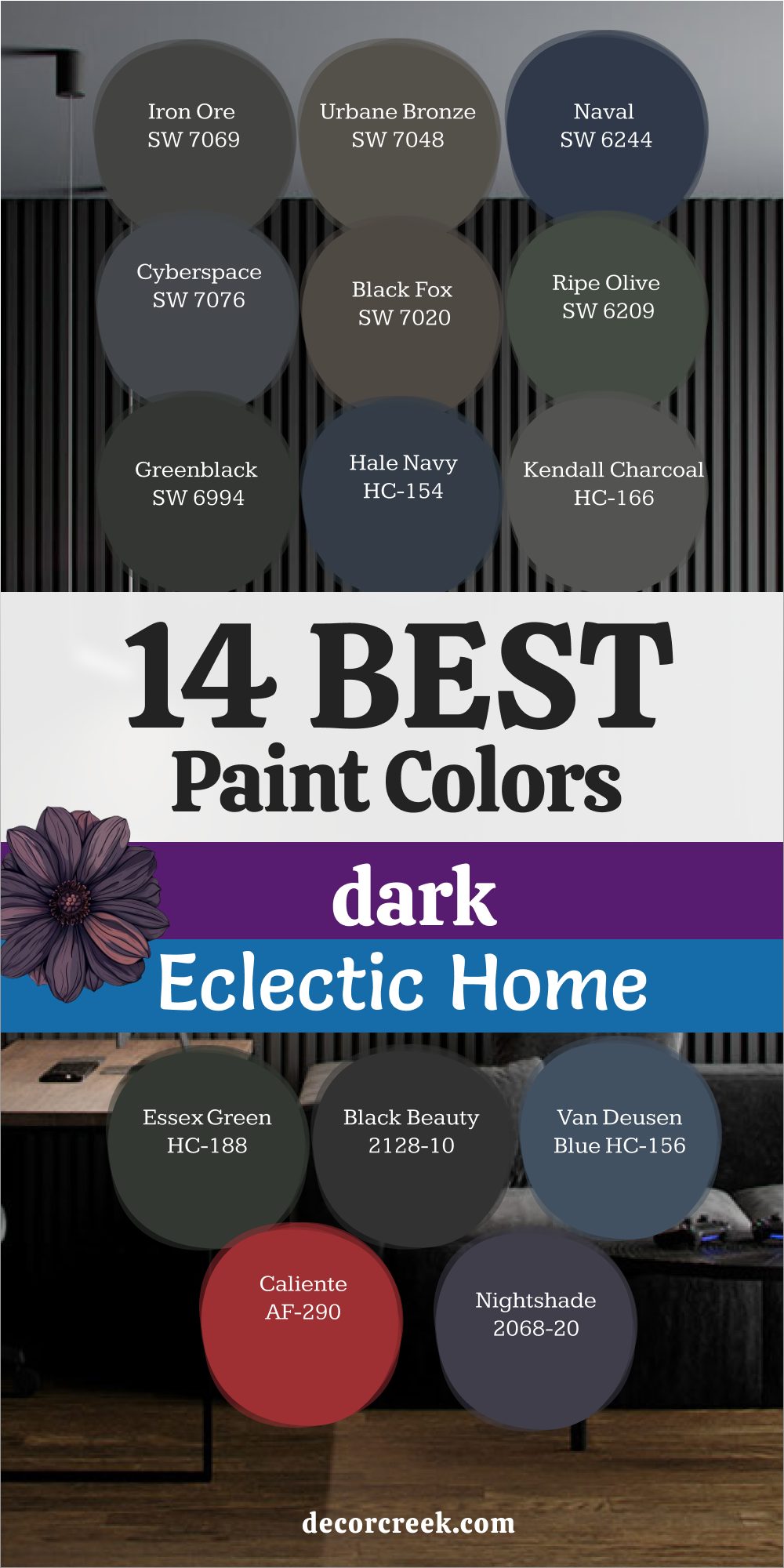
14 Best Paint Colors For The Dark And Eclectic Home
Iron Ore SW 7069
Iron Ore SW 7069 gives an eclectic home a bold and grounded base. Iron Ore SW 7069 feels deep and steady without looking flat. I use it when a client mixes vintage and modern pieces. It makes colorful art stand out. It pairs beautifully with patterned rugs.
This shade supports layered lighting. It hides shadows in darker corners. It adds structure to gallery walls. It keeps bold decor from feeling scattered. It creates a strong and collected interior mood.
Best used in: living rooms, dining rooms, libraries, and accent walls
Pairs well with: Alabaster SW 7008, Ripe Olive SW 6209, dark walnut, aged brass
The key rule of this color for an eclectic home is to balance bold decor with warm textures so the depth feels intentional and layered.
🎨 Check out the complete guide to this color right HERE 👈
Urbane Bronze SW 7048
Urbane Bronze SW 7048 gives a dark and eclectic home warmth with depth. Urbane Bronze SW 7048 blends brown and gray in a way that feels grounded and rich. I use it when a client has mixed metals and layered fabrics. It makes colorful art feel framed and intentional.
It pairs beautifully with leather and velvet. This shade supports wood furniture in many tones. It hides shadows softly. It adds weight without feeling flat. It keeps bold decor from clashing. It creates a collected interior mood that feels thoughtful and strong.
Best used in: living rooms, bedrooms, dining rooms, and accent walls
Pairs well with: Alabaster SW 7008, Iron Ore SW 7069, walnut wood, aged brass
The key rule of this color for an eclectic home is to layer it with warm woods and mixed metals so the undertone feels balanced and rich.
🎨 Check out the complete guide to this color right HERE 👈
Naval SW 6244
Naval SW 6244 brings deep blue strength into an eclectic interior. Naval SW 6244 feels classic yet bold on the wall. I like using it when a room has patterned rugs and vintage finds. It makes white trim stand out clearly. It pairs beautifully with gold frames and mirrors.
This shade supports dark wood floors. It holds its richness in low light. It adds structure to gallery walls. It keeps bright decor grounded. It creates a dramatic yet composed interior atmosphere.
Best used in: living rooms, dining rooms, bedrooms, and built-ins
Pairs well with: Pure White SW 7005, Urbane Bronze SW 7048, dark oak, antique brass
The key rule of this color for an eclectic home is to frame it with crisp trim so bold decor feels curated and intentional.
🎨 Check out the complete guide to this color right HERE 👈
Cyberspace SW 7076
Cyberspace SW 7076 gives an eclectic home a cool and modern edge. Cyberspace SW 7076 blends charcoal with blue for a deep layered look. I use it when a client mixes vintage pieces with sleek furniture. It makes colorful art pop. It pairs well with black metal accents.
This shade supports layered lighting from lamps and sconces. It hides shadows naturally. It adds contrast without harshness. It keeps busy decor from feeling scattered. It creates a smart and grounded interior setting.
Best used in: living rooms, offices, bedrooms, and accent walls
Pairs well with: Extra White SW 7006, Peppercorn SW 7674, brushed nickel, dark walnut
The key rule of this color for an eclectic home is to soften its cool tone with warm woods and textured fabrics.
🎨 Check out the complete guide to this color right HERE 👈
Black Fox SW 7020
Black Fox SW 7020 offers a warm charcoal that feels softer than black. Black Fox SW 7020 works beautifully in homes filled with mixed patterns and art. I often suggest it when clients want depth with warmth. It makes cream textiles look richer.
It pairs nicely with brass and bronze accents. This shade supports vintage furniture and modern pieces alike. It hides uneven light gracefully. It adds structure to large walls. It keeps colorful decor grounded. It creates a balanced and layered interior mood.
Best used in: living rooms, bedrooms, libraries, and feature walls
Pairs well with: Natural Linen SW 9109, Urbane Bronze SW 7048, dark wood, aged brass
The key rule of this color for an eclectic home is to layer it with warm finishes so the brown undertone feels rich and intentional.
Ripe Olive SW 6209
Ripe Olive SW 6209 brings earthy depth into a dark and eclectic home. Ripe Olive SW 6209 feels warm and grounded on the wall. I love using it when a client has global decor and layered textiles. It makes wood furniture look deeper in tone.
It pairs beautifully with brass and copper accents. This shade supports patterned rugs and bold art. It holds its color well in low light. It adds character without looking too sharp. It keeps mixed styles feeling connected. It creates a rich and collected interior mood.
Best used in: living rooms, dining rooms, libraries, and accent walls
Pairs well with: Alabaster SW 7008, Iron Ore SW 7069, walnut wood, antique brass
The key rule of this color for an eclectic home is to combine it with warm metals and natural textures so the olive tone feels balanced and layered.
🎨 Check out the complete guide to this color right HERE 👈
Greenblack SW 6994
Greenblack SW 6994 gives an eclectic interior dramatic depth. Greenblack SW 6994 feels almost black but carries a deep green tone. I use it when bold art and mixed decor need a strong backdrop. It makes bright colors pop clearly. It pairs well with velvet and leather.
This shade supports gold frames and mirrors. It hides shadows in darker corners. It adds structure to gallery walls. It keeps busy patterns from clashing. It creates a moody and thoughtful interior setting.
Best used in: living rooms, bedrooms, libraries, and statement walls
Pairs well with: Creamy SW 7012, Urbane Bronze SW 7048, dark oak, aged brass
The key rule of this color for an eclectic home is to frame it with warm lighting so the depth feels rich and inviting.
🎨 Check out the complete guide to this color right HERE 👈
Hale Navy HC-154
Hale Navy HC-154 brings confident color to a layered interior. Hale Navy HC-154 feels rich and steady without being too dark. I like using it when clients mix vintage art with modern furniture. It makes white trim look crisp. It pairs beautifully with brass lighting.
This shade supports dark wood floors. It holds its tone in changing light. It adds contrast without harsh edges. It keeps bold decor grounded. It creates a collected interior atmosphere that feels refined and balanced.
Best used in: living rooms, dining rooms, offices, and built-ins
Pairs well with: Chantilly Lace OC-65, Kendall Charcoal HC-166, walnut finishes, aged brass
The key rule of this color for an eclectic home is to balance it with layered textures so the blue depth feels intentional and strong.
🎨 Check out the complete guide to this color right HERE 👈
Kendall Charcoal HC-166
Kendall Charcoal HC-166 brings steady depth to a dark and eclectic home. Kendall Charcoal HC-166 feels rich without turning fully black. I use it when a room has many colors and textures that need grounding. It makes white trim stand out softly.
It pairs well with black metal and brass. This shade supports both modern art and vintage finds. It hides uneven light in darker corners. It adds structure to open walls. It keeps bold decor from feeling chaotic. It creates a balanced and thoughtful interior mood.
Best used in: living rooms, offices, bedrooms, and hallways
Pairs well with: White Dove OC-17, Hale Navy HC-154, dark walnut, matte black accents
The key rule of this color for an eclectic home is to layer it with warm woods so the gray tone feels rich and composed.
🎨 Check out the complete guide to this color right HERE 👈
Essex Green HC-188
Essex Green HC-188 offers a classic dark green that feels confident and grounded. Essex Green HC-188 works beautifully in rooms filled with mixed patterns and collected decor. I often suggest it when clients love traditional pieces with bold art. It makes gold frames glow warmly.
It pairs well with cream upholstery. This shade supports dark wood furniture. It holds depth even in low light. It adds weight without harsh contrast. It keeps colorful decor feeling connected. It creates a strong and curated interior atmosphere.
Best used in: living rooms, libraries, dining rooms, and accent walls
Pairs well with: Swiss Coffee OC-45, Kendall Charcoal HC-166, mahogany wood, antique brass
The key rule of this color for an eclectic home is to highlight trim and wood details so the green feels structured and layered.
🎨 Check out the complete guide to this color right HERE 👈
Black Beauty 2128-10
Black Beauty 2128-10 gives an eclectic interior bold drama. Black Beauty 2128-10 feels velvety and deep on the wall. I use it when clients want strong contrast behind colorful art. It makes light furniture stand out clearly. It pairs beautifully with gold and bronze accents.
This shade supports patterned rugs and layered textiles. It hides shadows smoothly. It adds structure to gallery walls. It keeps mixed decor from feeling scattered. It creates a powerful and confident interior mood.
Best used in: living rooms, dining rooms, bedrooms, and statement walls
Pairs well with: Chantilly Lace OC-65, Newburg Green HC-158, walnut wood, aged brass
The key rule of this color for an eclectic home is to soften it with warm lighting so the deep black feels rich and intentional.
🎨 Check out the complete guide to this color right HERE 👈
Van Deusen Blue HC-156
Van Deusen Blue HC-156 brings strong personality into a dark and eclectic home. Van Deusen Blue HC-156 feels deep and classic on the wall. I love using it when a client mixes antiques with modern art. It makes white trim look crisp and clean.
It pairs beautifully with brass lamps and mirrors. This shade supports dark wood floors and layered rugs. It holds its depth in low light. It adds structure without looking harsh. It keeps bold patterns grounded. It creates a confident and collected interior atmosphere.
Best used in: living rooms, dining rooms, offices, and built-ins
Pairs well with: Simply White OC-117, Kendall Charcoal HC-166, walnut finishes, aged brass
The key rule of this color for an eclectic home is to frame it with light trim so the blue depth feels intentional and balanced.
🎨 Check out the complete guide to this color right HERE 👈
Caliente AF-290
Caliente AF-290 adds bold warmth to a dark and eclectic interior. Caliente AF-290 is a deep red that feels rich and full of character. I use it when a room needs energy and drama. It makes dark wood furniture look deeper. It pairs beautifully with gold accents.
This shade supports patterned fabrics and layered textiles. It holds its richness in evening light. It adds color without losing depth. It keeps mixed decor feeling purposeful. It creates a passionate and expressive interior mood.
Best used in: dining rooms, living rooms, accent walls, and creative spaces
Pairs well with: Swiss Coffee OC-45, Black Beauty 2128-10, mahogany wood, antique gold
The key rule of this color for an eclectic home is to balance its bold red tone with warm lighting and classic finishes.
🎨 Check out the complete guide to this color right HERE 👈
Night Shade 2116-10
Night Shade 2116-10 brings dramatic depth with a deep purple-blue tone. Night Shade 2116-10 feels bold yet layered on the wall. I like using it in homes with art, books, and mixed decor. It makes metallic accents shine. It pairs beautifully with dark wood and velvet fabrics.
This shade supports gallery walls and statement pieces. It holds up well in low light. It adds contrast without feeling flat. It keeps bright decor grounded. It creates a rich and artistic interior setting.
Best used in: living rooms, bedrooms, libraries, and feature walls
Pairs well with: Chantilly Lace OC-65, Hale Navy HC-154, dark walnut, aged brass
The key rule of this color for an eclectic home is to soften its dramatic tone with layered textures so the depth feels rich and curated.
Wrought Iron 2124-10
Wrought Iron 2124-10 gives a dark and eclectic home steady structure. Wrought Iron 2124-10 feels like a soft black with depth. I use it when clients want bold walls that still feel layered. It makes colorful art stand out clearly. It pairs beautifully with brass and black accents.
This shade supports mixed furniture styles. It hides shadows gracefully. It adds contrast without harsh glare. It keeps busy decor organized. It creates a strong and grounded interior mood.
Best used in: living rooms, offices, bedrooms, and accent walls
Pairs well with: Simply White OC-117, Kendall Charcoal HC-166, walnut wood, matte black hardware
The key rule of this color for an eclectic home is to combine it with warm materials so the depth feels balanced and intentional.
🎨 Check out the complete guide to this color right HERE 👈
Black Forest Green HC-187
Black Forest Green HC-187 brings deep forest richness into a dark and eclectic home. Black Forest Green HC-187 feels bold yet natural on the wall. I often use it when clients mix vintage finds with modern lighting. It makes brass accents glow warmly.
It pairs beautifully with leather chairs and layered rugs. This shade supports dark wood furniture. It holds its depth in low light. It adds weight without feeling flat. It keeps colorful art grounded. It creates a strong and collected interior mood that feels thoughtful and confident.
Best used in: living rooms, libraries, dining rooms, and accent walls
Pairs well with: Swiss Coffee OC-45, Wrought Iron 2124-10, walnut finishes, aged brass
The key rule of this color for an eclectic home is to layer it with warm woods and mixed metals so the deep green feels rich and intentional.
🎨 Check out the complete guide to this color right HERE 👈
My Final Thoughts about 33 Best Paint Colors For The Dark Home
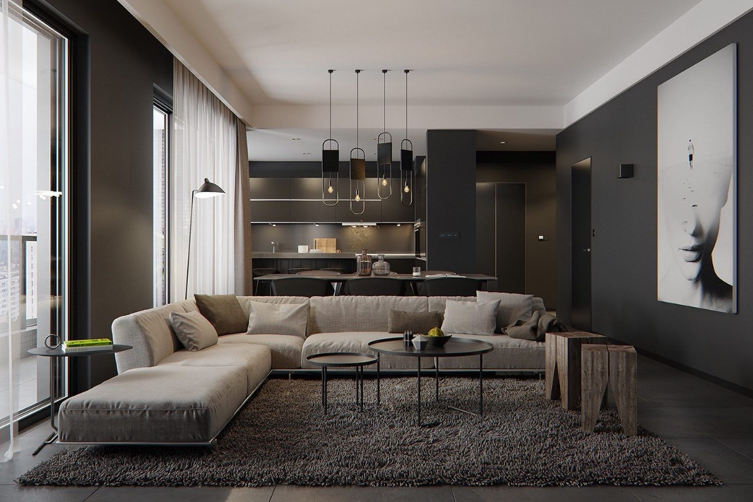
Dark homes do not need to feel dull or heavy. I have seen again and again how the right deep color can give a house strength, comfort, and real personality. When you choose paint with care, shadows stop feeling like a flaw. They start to look soft and natural. They add depth to corners and highlight texture on the walls. Instead of fighting the darkness, you begin to work with it. That shift alone can change how a home feels every single day.
I always remind my clients that dark walls can make art shine brighter and wood look richer. A deep backdrop allows frames, fabrics, and finishes to stand out with more clarity. It can make a simple lamp glow in the evening. It can make a bookshelf feel styled and intentional. Dark color can help a room feel focused and grounded. It can give the home a sense of story and purpose. The key is balance. Warm lighting, layered textures, soft rugs, and thoughtful trim choices truly make all the difference.
If your home feels dark, do not rush to paint everything white. White is not the only answer, and sometimes it makes shadows feel stronger. Rich greens, deep blues, bold charcoals, and warm browns can create a mood that feels intentional and welcoming. These tones add depth while still feeling inviting.
With the right shade, careful lighting, and balanced decor, a dark home can feel powerful, layered, and beautifully designed in a way that feels personal and lasting.