Finding the right paint match can feel like a massive puzzle. You want your home to feel cohesive, bright, and genuinely welcoming. Benjamin Moore Pale Oak is a spectacular shade, but it needs the right partners to really shine. I have spent years helping homeowners fix dull rooms and create beautiful setups. Let us look at how to pair this specific shade to make your home look its absolute best.
Many people feel stuck when staring at hundreds of tiny paper paint samples at the local store. It is completely normal to worry about picking a shade that might look muddy or completely washed out on a large surface.
My goal is to take away that guesswork and give you absolute confidence in your remodeling choices. Together, we will discover exactly how to balance your light fixtures, floors, and furniture with this wonderful backdrop.
Taking the time to plan your palette ensures you will love your home for many years ahead.
Why Pale Oak by Benjamin Moore Is One of My Favorite Neutral Paint Colors
This specific shade is a true chameleon on your walls. It sits perfectly right between a warm gray and a soft beige, which many people call greige. It adapts beautifully to different lighting situations throughout the day.
In bright daylight, it opens up a room and looks clean without feeling cold or clinical. During the evening, it brings a cozy comfort that makes you want to sit down and relax. It does not demand attention, but it holds the room together like a total professional.
I constantly recommend this paint color because it works wonders in both tiny entryways and large open-concept living rooms. It possesses a unique ability to bridge the gap between traditional dark wood furniture and ultra-modern metal fixtures. You will love how it makes your favorite colorful artwork and decorative pillows stand out instead of getting lost in the background.
It provides a steady, high-end feel that makes any property look expertly styled for everyday family life. This balance of warmth and brightness is exactly why it remains a top choice in the design world.
How I Choose Colors That Pair Beautifully With Pale Oak
I always look at the underlying tones before picking companion shades. This paint has slight yellow and pink undertones that react to what is nearby. I pair it with crisp whites to create a clean, sharp boundary line. I also love matching it with deep blues or earthy greens to create a striking visual balance. Testing large swatches on your actual walls is the smartest way to see how the shades interact. Trusting your eyes and your gut will lead you to a combination you love every single day.
When building a complete color scheme, I consider how the main living areas connect visually to the kitchens and bedrooms. I like to choose a primary trim color that stays constant throughout the whole house to keep the design unified. From there, we can introduce deeper accent colors on specific feature walls, built-in shelving units, or front entry doors.
Paying close attention to the flooring materials, like dark slate tiles or light white oak planks, helps narrow down the perfect matching paints. By following these structured steps, you create a beautiful home flow that feels entirely natural and incredibly pleasing to everyone who enters.
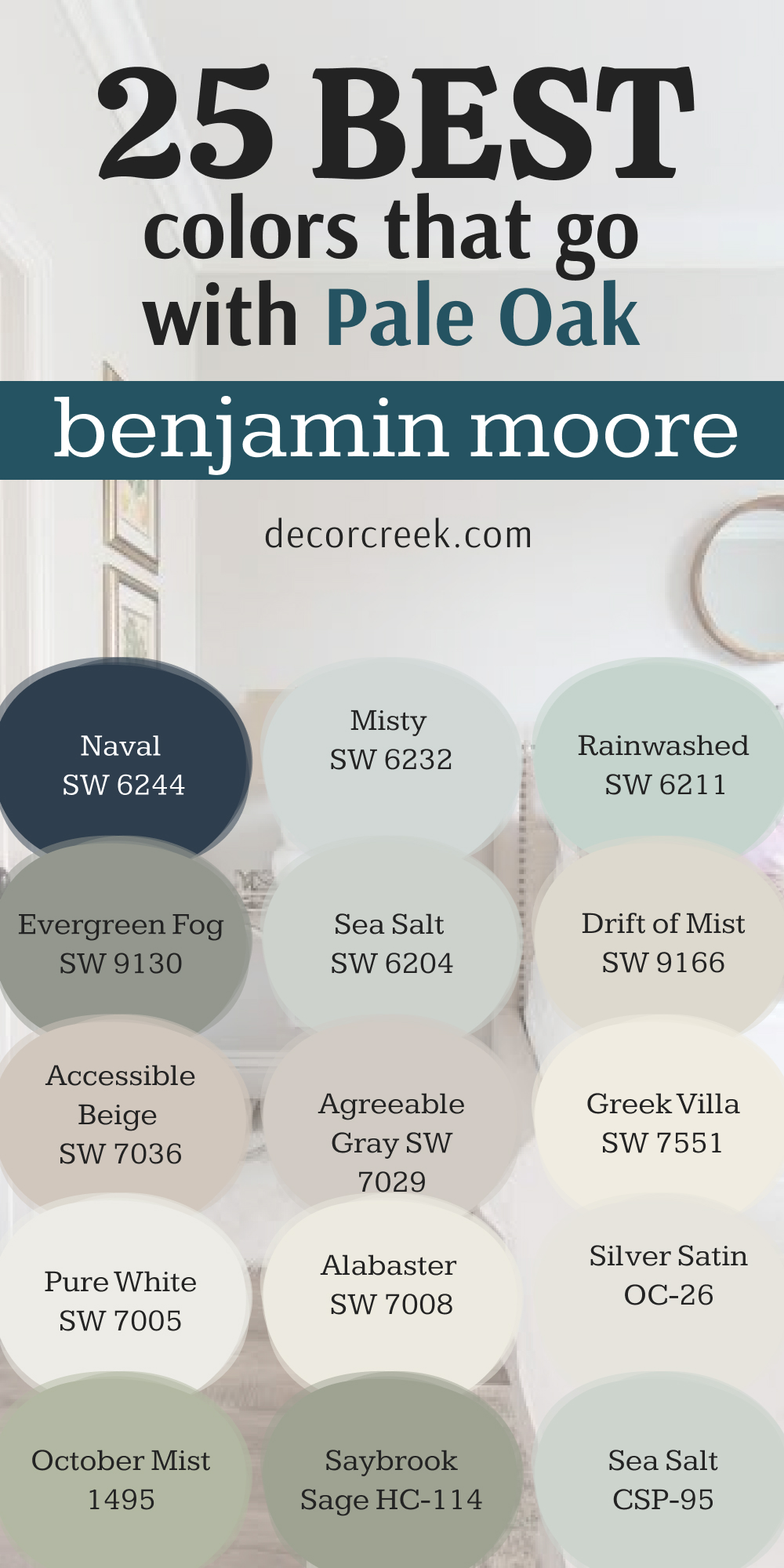
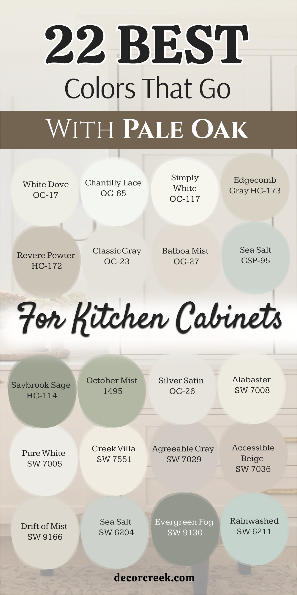
22 Best Colors That Go With Pale Oak Kitchen Cabinets
White Dove OC-17
White Dove OC-17 offers a soft and creamy look that keeps your kitchen feeling warm. It cuts through any harshness without looking yellow. This shade brings out the soft greige notes in your main wall color. It makes your cabinets look clean and freshly washed.
Homeowners love how it softens the hard edges of stone countertops. It works perfectly in traditional setups. Your cooking area will feel bright and cheery every morning. It creates a seamless flow from the cooking area to the dining room. The combination feels clean, grounded, and ready for family meals.
Best used in: living rooms, kitchens, hallways, bedrooms, and farmhouse exteriors.
Pairs well with: Iron Ore SW 7069, Agreeable Gray SW 7029, Natural Linen SW 9109, warm wood tones. The key rule of this color for farmhouse style is to use it where you want natural light to feel kind, soft, and inviting throughout the day.
🎨 Check out the complete guide to this color right HERE 👈

Chantilly Lace OC-65
Chantilly Lace OC-65 stands out as a very bright and pure white option. It has almost no visible undertones to distract your eyes. This choice makes a sharp contrast against the pale oak background.
It makes your cabinet doors pop with a crisp edge. Modern homes benefit greatly from this clean combination. It feels like a fresh sheet of paper against a warm stone. The light bounces around the room with maximum efficiency.
You will notice how clean your kitchen looks even on cloudy days. It gives a sharp finish to crown molding and trim pieces. This pairing creates a bright environment for cooking and entertaining guests.
Best used in: living rooms, kitchens, hallways, bedrooms, and farmhouse exteriors.
Pairs well with: Iron Ore SW 7069, Agreeable Gray SW 7029, Natural Linen SW 9109, warm wood tones. The key rule of this color for farmhouse style is to use it where you want natural light to feel kind, soft, and inviting throughout the day.
🎨 Check out the complete guide to this color right HERE 👈

Simply White OC-117
Simply White OC-117 carries a tiny hint of warmth that keeps it from looking sterile. It behaves like a bright ray of sunshine on your woodwork. This shade makes your kitchen feel larger and much more open. It complements the warm baseline of your greige walls beautifully.
You get a clean look that still feels friendly and cozy. It matches well with brass hardware and natural wood accents. The overall appearance is bright, cheerful, and highly energetic. It brightens up dark corners under your upper cabinets easily.
Families love how clean and tidy it makes the busy cooking area look. Choosing this option guarantees a bright start to your mornings.
Best used in: living rooms, kitchens, hallways, bedrooms, and farmhouse exteriors.
Pairs well with: Iron Ore SW 7069, Agreeable Gray SW 7029, Natural Linen SW 9109, warm wood tones. The key rule of this color for farmhouse style is to use it where you want natural light to feel kind, soft, and inviting throughout the day.
🎨 Check out the complete guide to this color right HERE 👈

Edgecomb Gray HC-173
Edgecomb Gray HC-173 is a slightly darker brother to your main wall paint. It creates a subtle variation that looks rich and deliberate. This tone adds depth to your kitchen island or lower cabinets.
It belongs to the same historical collection, so they talk to each other beautifully. The warmth in this shade prevents the room from feeling chilly. It hides daily fingerprints and kitchen dust surprisingly well. You achieve a high-end look without using high-contrast shades.
It grounds the cabinets and gives them a sturdy weight. This combination makes large kitchens feel much more intimate and connected. It feels like a cozy hug every time you walk in to make coffee.
Best used in: living rooms, kitchens, hallways, bedrooms, and farmhouse exteriors.
Pairs well with: Iron Ore SW 7069, Agreeable Gray SW 7029, Natural Linen SW 9109, warm wood tones. The key rule of this color for farmhouse style is to use it where you want natural light to feel kind, soft, and inviting throughout the day.
🎨 Check out the complete guide to this color right HERE 👈

Revere Pewter HC-172
Revere Pewter HC-172 brings a classic and strong presence to your kitchen woodwork. It is a deeper greige that anchors the entire room safely. This shade creates an elegant contrast with the lighter walls around it. It looks fantastic on large pantry doors and center islands.
The muddy undertones match perfectly with stainless steel appliances. It creates a traditional look that feels sturdy and reliable. Your kitchen will look expensive and well-planned with this choice.
It handles heavy daily use while maintaining its handsome appearance. The balance between the light walls and dark wood is incredibly satisfying. It provides a solid foundation for your overall design scheme.
Best used in: living rooms, kitchens, hallways, bedrooms, and farmhouse exteriors.
Pairs well with: Iron Ore SW 7069, Agreeable Gray SW 7029, Natural Linen SW 9109, warm wood tones. The key rule of this color for farmhouse style is to use it where you want natural light to feel kind, soft, and inviting throughout the day.
🎨 Check out the complete guide to this color right HERE 👈

Classic Gray OC-23
Classic Gray OC-23 acts as a very light, whisper-soft gray on your cabinets. It is lighter than the wall paint, creating an interesting inverted contrast. This shade looks clean and airy in brightly lit kitchens.
It prevents the room from looking completely white-washed. The slight warmth matches the background paint perfectly without clashing. It offers a sophisticated alternative to standard white doors. Your kitchen will feel open, bright, and very breezy.
It reflects a lot of light down onto your countertops. The transition from the wall to the wood is smooth and gentle. It is a safe choice for people who want a bright look with character.
Best used in: living rooms, kitchens, hallways, bedrooms, and farmhouse exteriors.
Pairs well with: Iron Ore SW 7069, Agreeable Gray SW 7029, Natural Linen SW 9109, warm wood tones. The key rule of this color for farmhouse style is to use it where you want natural light to feel kind, soft, and inviting throughout the day.
🎨 Check out the complete guide to this color right HERE 👈

Balboa Mist OC-27
Balboa Mist OC-27 is a beautiful greige that sits close to your wall shade. It has a tiny touch of a purple undertone that shows up in cold light. This option creates a modern look with very little contrast.
It makes the kitchen cabinets blend smoothly with the surrounding surfaces. The result is a very cohesive and unified cooking area. It looks wonderful with polished chrome fixtures and white quartz countertops.
Your room will feel put together by a professional designer. It provides a clean backdrop for colorful dishes and decor items. The subtle shift in tone is pleasing to the eye. It creates a smooth visual flow across the whole room.
Best used in: living rooms, kitchens, hallways, bedrooms, and farmhouse exteriors.
Pairs well with: Iron Ore SW 7069, Agreeable Gray SW 7029, Natural Linen SW 9109, warm wood tones. The key rule of this color for farmhouse style is to use it where you want natural light to feel kind, soft, and inviting throughout the day.
🎨 Check out the complete guide to this color right HERE 👈

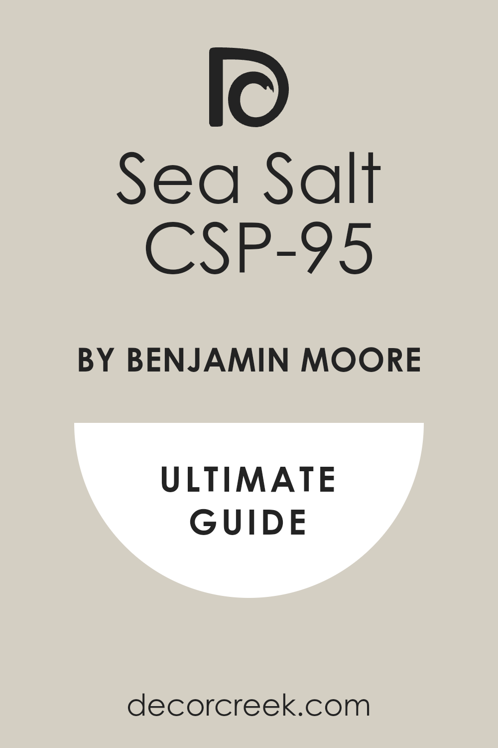
Sea Salt CSP-95
Sea Salt CSP-95 brings a soft and watery look into your cooking environment. It has a delicate mix of gray, green, and blue within it. This shade makes your kitchen feel fresh and breezy like a beach house.
It contrasts beautifully with the warm neutral tones on your walls. The color shifts slightly depending on the weather outside. It adds a cheerful personality without being loud or distracting. Guests will notice the unique and pleasant tint immediately.
It pairs wonderfully with light oak floors and white tile backsplashes. Your morning routine will feel much brighter with this fresh choice. It adds a lovely splash of nature to your indoor cooking area.
Best used in: living rooms, kitchens, hallways, bedrooms, and farmhouse exteriors.
Pairs well with: Iron Ore SW 7069, Agreeable Gray SW 7029, Natural Linen SW 9109, warm wood tones. The key rule of this color for farmhouse style is to use it where you want natural light to feel kind, soft, and inviting throughout the day.
🎨 Check out the complete guide to this color right HERE 👈
Saybrook Sage HC-114
Saybrook Sage HC-114 is a rich and earthy green with strong gray undertones. It brings a grounded, natural feel directly to your kitchen island. This shade creates a stunning contrast against the light greige walls. It reminds people of fresh herbs and outdoor gardens.
The deep tone makes your lower cabinets look sturdy and substantial. It pairs beautifully with warm butcher block countertops or gold hardware. This choice turns your kitchen into the true heart of the home.
It feels traditional yet completely updated for modern living. The green tint brings out the hidden warmth of the wall paint. It makes a bold statement while remaining very friendly to the eyes.
Best used in: living rooms, kitchens, hallways, bedrooms, and farmhouse exteriors.
Pairs well with: Iron Ore SW 7069, Agreeable Gray SW 7029, Natural Linen SW 9109, warm wood tones. The key rule of this color for farmhouse style is to use it where you want natural light to feel kind, soft, and inviting throughout the day.
🎨 Check out the complete guide to this color right HERE 👈

October Mist 1495
October Mist 1495 functions as a soft, silvery sage green option for cabinets. It is a gentle color that does not fight with your walls for attention. This shade introduces a natural element that feels fresh and clean.
It works as a neutral color with a fun twist of green. The light tone keeps your kitchen looking large and spacious. It coordinates wonderfully with natural wood tones and black iron hardware.
Your cooking area will feel peaceful and ready for meal preparation. It softens the entire look of the room instantly. This choice is perfect for a modern cottage style home. It bridges the gap between clean design and natural comfort perfectly.
Best used in: living rooms, kitchens, hallways, bedrooms, and farmhouse exteriors.
Pairs well with: Iron Ore SW 7069, Agreeable Gray SW 7029, Natural Linen SW 9109, warm wood tones.
🎨 Check out the complete guide to this color right HERE 👈

Silver Satin OC-26
Silver Satin OC-26 brings an incredibly airy feel directly to your kitchen cabinetry. It is an ultra-light gray option with a warm baseline that stops it from turning icy. This color choice establishes a very clean look alongside your main greige walls.
It functions as a brilliant alternative to standard bright white trim options. Homeowners enjoy how it reflects daytime light across dark granite or quartz surfaces. It provides an excellent layout for modern and traditional cooking areas alike.
Your kitchen will look completely refreshed and bright throughout the winter months. It maintains its clean character without showing a yellowish tint in sunny situations. The pairing creates a gentle flow from your upper cabinets straight down to the flooring. It delivers a smart look that keeps your kitchen looking highly organized.
Best used in: living rooms, kitchens, hallways, bedrooms, and farmhouse exteriors.
Pairs well with: Iron Ore SW 7069, Agreeable Gray SW 7029, Natural Linen SW 9109, warm wood tones. The key rule of this color for farmhouse style is to use it where you want natural light to feel kind, soft, and inviting throughout the day.
🎨 Check out the complete guide to this color right HERE 👈
Alabaster SW 7008
Alabaster SW 7008 offers a rich and creamy white option for your cabinet doors. It provides a highly welcoming feel that instantly makes your cooking area look friendlier.
This shade matches the warm undertones of your greige walls with absolute perfection. It avoids looking too yellow while steering completely clear of clinical coldness. It creates a beautiful backdrop for morning coffee routines and family gatherings.
You will notice how nicely it softens the look of dark stainless steel hardware. It is a fantastic option for creating a cozy cottage style setup. The daylight catches this paint beautifully to create a bright environment. It establishes a soft boundary line between your walls and your kitchen woodwork. This choice makes large cabinetry setups feel lighter and far less bulky.
Best used in: living rooms, kitchens, hallways, bedrooms, and farmhouse exteriors.
Pairs well with: Iron Ore SW 7069, Agreeable Gray SW 7029, Natural Linen SW 9109, warm wood tones. The key rule of this color for farmhouse style is to use it where you want natural light to feel kind, soft, and inviting throughout the day.
🎨 Check out the complete guide to this color right HERE 👈

Pure White SW 7005
Pure White SW 7005 stands out as a versatile white paint with a drop of warmth. It has a tiny speck of a black undertone that keeps it very stable. This shade creates a clean contrast that makes your kitchen walls look rich.
It ensures your cabinets look crisp without blasting your eyes with extreme brightness. Modern kitchens benefit immensely from this well-balanced and clean option. It looks spectacular when paired with black matte handles and faucet fixtures.
Your cooking area will feel bright, clean, and completely ready for busy meal prep. It reflects outdoor light beautifully to brighten up darker cooking islands. The combination gives a highly polished finish to your entire shelving arrangement. It remains a reliable favorite for creating a bright and clean home environment.
Best used in: living rooms, kitchens, hallways, bedrooms, and farmhouse exteriors.
Pairs well with: Iron Ore SW 7069, Agreeable Gray SW 7029, Natural Linen SW 9109, warm wood tones. The key rule of this color for farmhouse style is to use it where you want natural light to feel kind, soft, and inviting throughout the day.
🎨 Check out the complete guide to this color right HERE 👈

Greek Villa SW 7551
Greek Villa SW 7551 is a rich white option that brings a sunny personality. It carries a subtle yellow undertone that makes your cabinets feel cozy. This color creates a creamy look next to the cool light coming from windows.
It works wonderfully to establish a bright and cheerful cooking environment. You can use it to make small kitchens feel much wider and more breathable. It complements natural oak floors and brass kitchen details effortlessly.
The paint has enough body to stand up well against dark accent pieces. It gives your woodwork a smooth finish that looks expensive and custom-made. Your family will love how bright and positive the room feels at breakfast time. It delivers a clean look without sacrificing an ounce of home comfort.
Best used in: living rooms, kitchens, hallways, bedrooms, and farmhouse exteriors.
Pairs well with: Iron Ore SW 7069, Agreeable Gray SW 7029, Natural Linen SW 9109, warm wood tones. The key rule of this color for farmhouse style is to use it where you want natural light to feel kind, soft, and inviting throughout the day.
🎨 Check out the complete guide to this color right HERE 👈

Agreeable Gray SW 7029
Agreeable Gray SW 7029 brings a balanced greige tone to your kitchen woodwork. It is slightly darker than your main walls to create a pleasing layered effect. This option provides a handsome appearance that grounds your base cabinets securely.
It shifts its look beautifully as the sun moves across the sky. The slight beige warmth prevents your kitchen from feeling like an old office. It hides daily splatters and cooking dust with incredible ease. You get a highly tailored appearance that makes your home look expertly staged.
It coordinates beautifully with busy granite countertops and white tile backsplashes. This choice makes the cooking area feel connected to the rest of the house. It offers a solid look that stands up to heavy daily family activities.
Best used in: living rooms, kitchens, hallways, bedrooms, and farmhouse exteriors.
Pairs well with: Iron Ore SW 7069, Agreeable Gray SW 7029, Natural Linen SW 9109, warm wood tones. The key rule of this color for farmhouse style is to use it where you want natural light to feel kind, soft, and inviting throughout the day.
🎨 Check out the complete guide to this color right HERE 👈

Accessible Beige SW 7036
Accessible Beige SW 7036 introduces a classic tan warmth to your cabinet faces. It does not have the muddy grayish undertones of typical neutral paints. This option makes your kitchen feel sturdy, traditional, and incredibly cozy.
It highlights the lighter qualities of your greige walls by providing a darker frame. Homeowners love this shade for bringing a classic farmhouse feel into the house. It pairs perfectly with warm wood accents and copper pots.
Your kitchen will look rich and completely thought out from top to bottom. It creates a beautiful contrast that feels very intentional and structured. The color handles heavy sunlight without losing its true tan character. It is a fantastic pick for making a large kitchen feel much more intimate.
Best used in: living rooms, kitchens, hallways, bedrooms, and farmhouse exteriors.
Pairs well with: Iron Ore SW 7069, Agreeable Gray SW 7029, Natural Linen SW 9109, warm wood tones. The key rule of this color for farmhouse style is to use it where you want natural light to feel kind, soft, and inviting throughout the day.
🎨 Check out the complete guide to this color right HERE 👈

Drift of Mist SW 9166
Drift of Mist SW 9166 behaves like a light and airy gray on kitchen woodwork. It is a soft shade that keeps your cabinets looking clean and open. This paint creates a low-contrast look that makes the room feel very steady.
It has a slight green-gray undertone that reacts nicely to outdoor trees. You can use it to build a clean backdrop that looks highly sophisticated. It looks wonderful with polished nickel hinges and light gray quartz counters.
The visual flow from the walls to the wood happens without a sharp break. It provides a clean finish that makes your everyday dishes stand out beautifully. Your morning routine will feel bright and pleasant in front of this color. It is an excellent selection for people who want a soft gray look.
Best used in: living rooms, kitchens, hallways, bedrooms, and farmhouse exteriors.
Pairs well with: Iron Ore SW 7069, Agreeable Gray SW 7029, Natural Linen SW 9109, warm wood tones. The key rule of this color for farmhouse style is to use it where you want natural light to feel kind, soft, and inviting throughout the day.
🎨 Check out the complete guide to this color right HERE 👈

Sea Salt SW 6204
Sea Salt SW 6204 delivers a fresh splash of green and blue to cabinets. It has a strong gray base that keeps it looking sophisticated. This shade makes your cooking space feel bright and airy like a sunny morning.
It creates a beautiful contrast against your light greige wall surfaces. The paint changes its look depending on how many windows you have open. It brings an earthy element indoors to connect your kitchen to the garden.
Visitors will love the bright and cheerful personality it gives to the room. It coordinates perfectly with white subway tile and natural wood shelving. Your kitchen will feel like a bright sanctuary for baking and cooking. It provides a unique look while remaining very friendly to the eyes.
Best used in: living rooms, kitchens, hallways, bedrooms, and farmhouse exteriors.
Pairs well with: Iron Ore SW 7069, Agreeable Gray SW 7029, Natural Linen SW 9109, warm wood tones. The key rule of this color for farmhouse style is to use it where you want natural light to feel kind, soft, and inviting throughout the day.
🎨 Check out the complete guide to this color right HERE 👈

Evergreen Fog SW 9130
Evergreen Fog SW 9130 brings a rich and deep gray-green into your house. It establishes a strong and handsome look on your center island or lowers. This color creates a bold statement without looking too bright or wild.
It draws out the lovely warm notes hidden inside your light walls. The muddy green tint looks amazing next to brass lighting fixtures and knobs. It gives your kitchen a custom designer look that feels highly luxurious.
Your cabinets will look heavy, durable, and ready for decades of family life. It anchors the cooking area and makes large rooms feel much more stable. This pairing feels traditional yet entirely modern at the exact same time. It turns your kitchen into a beautiful conversation piece for visiting guests.
Best used in: living rooms, kitchens, hallways, bedrooms, and farmhouse exteriors.
Pairs well with: Iron Ore SW 7069, Agreeable Gray SW 7029, Natural Linen SW 9109, warm wood tones. The key rule of this color for farmhouse style is to use it where you want natural light to feel kind, soft, and inviting throughout the day.
🎨 Check out the complete guide to this color right HERE 👈

Rainwashed SW 6211
Rainwashed SW 6211 is a light and breezy blue-green option for cabinets. It brings a bright and watery look that makes your kitchen feel open. This color provides a cheerful contrast against the warm greige wall paint.
It behaves like a breath of fresh air on your cabinet doors. The shade works excellently in homes that get plenty of natural southern daylight. It matches wonderfully with white porcelain sinks and light wood countertops.
Your cooking environment will feel bright and positive every single day. It adds a splash of fun without making the room look messy or loud. The combination looks highly intentional and brings an airy spirit to your woodwork. It is a fantastic choice for creating a cheerful coastal look indoors.
Best used in: living rooms, kitchens, hallways, bedrooms, and farmhouse exteriors.
Pairs well with: Iron Ore SW 7069, Agreeable Gray SW 7029, Natural Linen SW 9109, warm wood tones. The key rule of this color for farmhouse style is to use it where you want natural light to feel kind, soft, and inviting throughout the day.
🎨 Check out the complete guide to this color right HERE 👈

Misty SW 6232
Misty SW 6232 offers a cool and light gray-blue choice for wood surfaces. It brings a crisp quality that balances the warmth of your walls. This paint looks very clean and smart on large pantry door sections.
It makes your kitchen cabinets look polished and beautifully put together. The cool blue undertone catches the morning light with exceptional clarity. It pairs sharply with dark slate floors or bright white quartz surfaces.
Your cooking area will feel bright, clean, and highly organized with this color. It prevents your woodwork from looking heavy or dark in small layouts. The transition between the walls and cabinets provides a great visual rhythm. It remains an excellent selection for a clean and smart kitchen appearance.
Best used in: living rooms, kitchens, hallways, bedrooms, and farmhouse exteriors.
Pairs well with: Iron Ore SW 7069, Agreeable Gray SW 7029, Natural Linen SW 9109, warm wood tones. The key rule of this color for farmhouse style is to use it where you want natural light to feel kind, soft, and inviting throughout the day.
🎨 Check out the complete guide to this color right HERE 👈

Naval SW 6244
Naval SW 6244 establishes a deep and authoritative navy presence in the room. It creates a stunning high-contrast look on your kitchen cabinetry. This shade provides an elegant look that instantly makes your kitchen look expensive.
It allows the light greige walls to pop with crisp brightness by comparison. The dark blue tint acts like a traditional classic color on your wood surfaces. It looks beautiful when combined with shiny gold handles and white countertops.
Your kitchen island will become the true star of the house with this choice. It hides scuffs and daily wear from pets and kids remarkably well. The deep tone brings a strong feeling of structure and stability to your design. It delivers a rich finish that makes your home look beautifully staged.
Best used in: living rooms, kitchens, hallways, bedrooms, and farmhouse exteriors.
Pairs well with: Iron Ore SW 7069, Agreeable Gray SW 7029, Natural Linen SW 9109, warm wood tones. The key rule of this color for farmhouse style is to use it where you want natural light to feel kind, soft, and inviting throughout the day.
🎨 Check out the complete guide to this color right HERE 👈

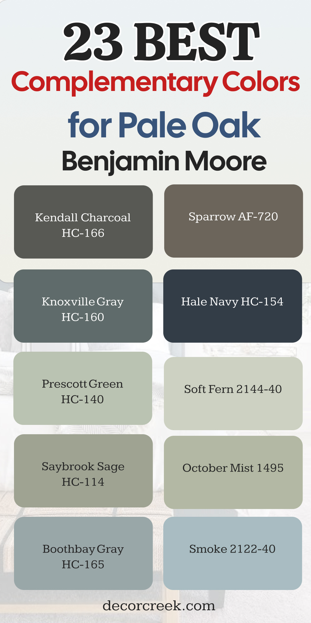
23 Best Complementary Colors for Pale Oak by Benjamin Moore
White Dove OC-17
White Dove OC-17 delivers a warm and creamy finish to your trim or accent walls. It has a tiny drop of grey that prevents it from looking too stark. This color choice looks beautifully rich when painted next to your main greige surfaces.
It acts as a friendly companion that keeps your living spaces bright and open. Homeowners appreciate how it softens the transition between different architectural elements. It creates a great layout for traditional and modern homes alike.
Your rooms will look beautifully refreshed and bright throughout the winter months. It maintains its clean character without showing a harsh yellow tint in sunny situations. The pairing creates a gentle flow from your crown molding straight down to the flooring. It delivers a smart look that keeps your home looking highly organized.
Best used in: living rooms, kitchens, hallways, bedrooms, and farmhouse exteriors.
Pairs well with: Iron Ore SW 7069, Agreeable Gray SW 7029, Natural Linen SW 9109, warm wood tones. The key rule of this color for farmhouse style is to use it where you want natural light to feel kind, soft, and inviting throughout the day.
🎨 Check out the complete guide to this color right HERE 👈
Chantilly Lace OC-65
Chantilly Lace OC-65 acts as a brilliant and pure white option for your woodwork. It has almost no visible undertones to distract your eyes from the main walls. This shade creates a sharp boundary line that makes the greige backdrop pop.
It ensures your baseboards look crisp without blasting your eyes with cold light. Modern homes benefit immensely from this well-balanced and clean option. It looks spectacular when paired with black iron railings and natural wood floors.
Your home will feel bright, clean, and completely ready for daily family activities. It reflects outdoor light beautifully to brighten up darker hallways or corner walls. The combination gives a highly polished finish to your entire shelving arrangement. It remains a reliable favorite for creating a bright and clean home environment.
Best used in: living rooms, kitchens, hallways, bedrooms, and farmhouse exteriors.
Pairs well with: Iron Ore SW 7069, Agreeable Gray SW 7029, Natural Linen SW 9109, warm wood tones. The key rule of this color for farmhouse style is to use it where you want natural light to feel kind, soft, and inviting throughout the day.
🎨 Check out the complete guide to this color right HERE 👈
Simply White OC-117
Simply White OC-117 carries a lovely hint of sunshine that keeps it very friendly. It behaves like a bright accent on your doors and fireplace mantels. This shade makes your living spaces feel larger and much more open.
It complements the warm baseline of your main walls with absolute perfection. You get a clean look that still feels friendly and completely cozy. It matches beautifully with brass hardware and light oak decorative accents.
The overall appearance is bright, cheerful, and highly energetic for family members. It brightens up dark entryways and narrow stairwells quite easily. Families love how clean and tidy it makes the busy common areas look. Choosing this option guarantees a bright start to your mornings at home.
Best used in: living rooms, kitchens, hallways, bedrooms, and farmhouse exteriors.
Pairs well with: Iron Ore SW 7069, Agreeable Gray SW 7029, Natural Linen SW 9109, warm wood tones. The key rule of this color for farmhouse style is to use it where you want natural light to feel kind, soft, and inviting throughout the day.
🎨 Check out the complete guide to this color right HERE 👈
Swiss Coffee OC-45
Swiss Coffee OC-45 is a rich white option that brings a traditional personality. It carries a subtle warm undertone that makes large rooms feel cozy. This color creates a creamy look next to the cool light coming from windows.
It works wonderfully to establish a bright and cheerful home environment. You can use it to make small seating areas feel much wider and more breathable. It complements natural wood floors and bronze light fixtures effortlessly.
The paint has enough body to stand up well against dark accent pieces. It gives your woodwork a smooth finish that looks expensive and custom-made. Your family will love how bright and positive the room feels at breakfast time. It delivers a clean look without sacrificing an ounce of home comfort.
Best used in: living rooms, kitchens, hallways, bedrooms, and farmhouse exteriors.
Pairs well with: Iron Ore SW 7069, Agreeable Gray SW 7029, Natural Linen SW 9109, warm wood tones. The key rule of this color for farmhouse style is to use it where you want natural light to feel kind, soft, and inviting throughout the day.
🎨 Check out the complete guide to this color right HERE 👈

Classic Gray OC-23
Classic Gray OC-23 brings an incredibly light grey presence to adjacent rooms. It acts as a whisper-soft alternative to standard white paint on your walls. This option provides a handsome appearance that keeps your layout feeling open.
It shifts its look beautifully as the sun moves across the sky. The slight warmth prevents your living room from feeling like a cold office. It hides daily smudges and footprints with incredible ease in high-traffic zones.
You get a highly tailored appearance that makes your home look expertly staged. It coordinates beautifully with textured linen fabrics and light wool rugs. This choice makes the entire floor plan feel connected and unified. It offers a solid look that stands up to heavy daily family activities.
Best used in: living rooms, kitchens, hallways, bedrooms, and farmhouse exteriors.
Pairs well with: Iron Ore SW 7069, Agreeable Gray SW 7029, Natural Linen SW 9109, warm wood tones. The key rule of this color for farmhouse style is to use it where you want natural light to feel kind, soft, and inviting throughout the day.
🎨 Check out the complete guide to this color right HERE 👈
Balboa Mist OC-27
Balboa Mist OC-27 introduces a beautiful companion greige tone into your house. It sits very close in weight to your main wall paint for a low-contrast look. This option makes your rooms feel sturdy, traditional, and incredibly balanced.
It highlights the lighter qualities of your trim by providing a steady frame. Homeowners love this shade for bringing a classic modern feel into the home. It pairs perfectly with warm leather furniture and woven wicker baskets.
Your house will look rich and completely thought out from top to bottom. It creates a beautiful layout that feels very intentional and structured. The color handles heavy sunlight without losing its true balanced character. It is a fantastic pick for making a large room feel much more intimate.
Best used in: living rooms, kitchens, hallways, bedrooms, and farmhouse exteriors.
Pairs well with: Iron Ore SW 7069, Agreeable Gray SW 7029, Natural Linen SW 9109, warm wood tones. The key rule of this color for farmhouse style is to use it where you want natural light to feel kind, soft, and inviting throughout the day.
🎨 Check out the complete guide to this color right HERE 👈
Edgecomb Gray HC-173
Edgecomb Gray HC-173 behaves like a slightly deeper brother to your wall surfaces. It is a soft shade that keeps your home looking clean and grounded. This paint creates a beautiful layered effect that makes the room feel very steady.
It has a rich greige undertone that reacts nicely to warm indoor lighting. You can use it to build an accent wall that looks highly sophisticated. It looks wonderful with polished nickel lamps and dark wood dining tables.
The visual flow from room to room happens without a sharp break. It provides a clean finish that makes your everyday decor stand out beautifully. Your family will feel relaxed and comfortable in front of this color. It is an excellent selection for people who want a rich neutral look.
Best used in: living rooms, kitchens, hallways, bedrooms, and farmhouse exteriors.
Pairs well with: Iron Ore SW 7069, Agreeable Gray SW 7029, Natural Linen SW 9109, warm wood tones. The key rule of this color for farmhouse style is to use it where you want natural light to feel kind, soft, and inviting throughout the day.
🎨 Check out the complete guide to this color right HERE 👈
Revere Pewter HC-172
Revere Pewter HC-172 delivers a classic and strong neutral presence to your home. It has a strong historical base that keeps it looking sophisticated. This shade makes your living space feel rich and securely anchored.
It creates a beautiful contrast against your lighter greige wall surfaces. The paint changes its look depending on the weather conditions outside. It brings an earthy element indoors to connect your rooms to the natural world.
Visitors will love the handsome and upscale personality it gives to the room. It coordinates perfectly with stone fireplace surrounds and dark iron light fixtures. Your home will feel like a bright sanctuary for relaxation and entertainment. It provides a unique look while remaining very friendly to the eyes.
Best used in: living rooms, kitchens, hallways, bedrooms, and farmhouse exteriors.
Pairs well with: Iron Ore SW 7069, Agreeable Gray SW 7029, Natural Linen SW 9109, warm wood tones. The key rule of this color for farmhouse style is to use it where you want natural light to feel kind, soft, and inviting throughout the day.
🎨 Check out the complete guide to this color right HERE 👈
Collingwood OC-28
Collingwood OC-28 brings a rich and reliable grey tone into your house. It establishes a strong and handsome look on built-in shelving or doors. This color creates a steady statement without looking too dark or moody.
It draws out the lovely warm notes hidden inside your main walls. The balanced grey tint looks amazing next to silver hardware and frames. It gives your home a custom designer look that feels highly luxurious.
Your walls will look durable, clean, and ready for decades of family life. It anchors the seating area and makes large rooms feel much more stable. This pairing feels traditional yet entirely modern at the exact same time. It turns your living area into a beautiful conversation piece for visiting guests.
Best used in: living rooms, kitchens, hallways, bedrooms, and farmhouse exteriors.
Pairs well with: Iron Ore SW 7069, Agreeable Gray SW 7029, Natural Linen SW 9109, warm wood tones. The key rule of this color for farmhouse style is to use it where you want natural light to feel kind, soft, and inviting throughout the day.
🎨 Check out the complete guide to this color right HERE 👈

Gray Owl OC-52
Gray Owl OC-52 is a light and crisp grey option for adjacent spaces. It brings a bright and clean look that makes rooms feel open. This color provides a cool contrast against the warm greige wall paint. It behaves like a breath of fresh air on your accent walls.
The shade works excellently in homes that get plenty of natural afternoon daylight. It matches wonderfully with white porcelain details and light wood furniture pieces. Your living environment will feel bright and positive every single day.
It adds a splash of character without making the house look messy or loud. The combination looks highly intentional and brings an airy spirit to your home. It is a fantastic choice for creating a cheerful modern look indoors.
Best used in: living rooms, kitchens, hallways, bedrooms, and farmhouse exteriors.
Pairs well with: Iron Ore SW 7069, Agreeable Gray SW 7029, Natural Linen SW 9109, warm wood tones. The key rule of this color for farmhouse style is to use it where you want natural light to feel kind, soft, and inviting throughout the day.
🎨 Check out the complete guide to this color right HERE 👈

Silver Satin OC-26
Silver Satin OC-26 offers a cool and light grey-white choice for wood surfaces. It brings a crisp quality that balances the warmth of your walls. This paint looks very clean and smart on large closet door sections.
It makes your home trim look polished and beautifully put together. The cool undertone catches the morning light with exceptional clarity. It pairs sharply with dark slate floors or bright white quartz surfaces.
Your living area will feel bright, clean, and highly organized with this color. It prevents your woodwork from looking heavy or dark in small layouts. The transition between the walls and trim provides a great visual rhythm. It remains an excellent selection for a clean and smart home appearance.
Best used in: living rooms, kitchens, hallways, bedrooms, and farmhouse exteriors.
Pairs well with: Iron Ore SW 7069, Agreeable Gray SW 7029, Natural Linen SW 9109, warm wood tones. The key rule of this color for farmhouse style is to use it where you want natural light to feel kind, soft, and inviting throughout the day.
🎨 Check out the complete guide to this color right HERE 👈
Stonington Gray HC-170
Stonington Gray HC-170 establishes a deep and authoritative grey presence in the room. It creates a stunning high-contrast look on your accent features. This shade provides an elegant look that instantly makes your home look expensive.
It allows the light greige walls to pop with crisp brightness by comparison. The true grey tint acts like a traditional classic color on your wood surfaces. It looks beautiful when combined with shiny silver handles and white stone details.
Your fireplace wall will become the true star of the house with this choice. It hides scuffs and daily wear from pets and kids remarkably well. The deep tone brings a strong feeling of structure and stability to your design. It delivers a rich finish that makes your home look beautifully staged.
Best used in: living rooms, kitchens, hallways, bedrooms, and farmhouse exteriors.
Pairs well with: Iron Ore SW 7069, Agreeable Gray SW 7029, Natural Linen SW 9109, warm wood tones. The key rule of this color for farmhouse style is to use it where you want natural light to feel kind, soft, and inviting throughout the day.
🎨 Check out the complete guide to this color right HERE 👈

Wickham Gray HC-171
Wickham Gray HC-171 introduces a soft and frosty grey tint to your home layout. It carries a distinct blue-green undertone that feels very cool to the eye. This option makes your rooms look bright, clean, and beautifully updated.
It highlights the hidden warmth of your main walls by acting as a cool partner. Homeowners love this shade for bringing a breezy cottage feel into the house. It pairs perfectly with white linen curtains and light woven rugs.
Your entryways will look rich and completely thought out from top to bottom. It creates a beautiful layout that feels very intentional and structured. The color handles heavy sunlight without losing its true refreshing character. It is a fantastic pick for making a bright room feel much more open.
Best used in: living rooms, kitchens, hallways, bedrooms, and farmhouse exteriors.
Pairs well with: Iron Ore SW 7069, Agreeable Gray SW 7029, Natural Linen SW 9109, warm wood tones. The key rule of this color for farmhouse style is to use it where you want natural light to feel kind, soft, and inviting throughout the day.
🎨 Check out the complete guide to this color right HERE 👈

Smoke 2122-40
Smoke 2122-40 behaves like a beautiful and rich blue-grey on your accent walls. It is a soft shade that keeps your home looking clean and colorful. This paint creates a beautiful focal point that makes the room feel very steady.
It has an elegant smoky undertone that reacts nicely to changing daylight. You can use it to build a backdrop that looks highly sophisticated. It looks wonderful with polished nickel lamps and dark wood dining tables.
The visual flow from the main walls to this blue happens with an interesting contrast. It provides a clean finish that makes your everyday artwork stand out beautifully. Your family will feel relaxed and comfortable in front of this color. It is an excellent selection for people who want a rich blue look.
Best used in: living rooms, kitchens, hallways, bedrooms, and farmhouse exteriors.
Pairs well with: Iron Ore SW 7069, Agreeable Gray SW 7029, Natural Linen SW 9109, warm wood tones. The key rule of this color for farmhouse style is to use it where you want natural light to feel kind, soft, and inviting throughout the day.
🎨 Check out the complete guide to this color right HERE 👈

Boothbay Gray HC-165
Boothbay Gray HC-165 delivers a classic and strong steel blue presence to your home. It has a strong historical base that keeps it looking sophisticated. This shade makes your living space feel rich and securely anchored.
It creates a beautiful contrast against your lighter greige wall surfaces. The paint changes its look depending on the weather conditions outside. It brings an earthy element indoors to connect your rooms to the natural world. Visitors will love the handsome and upscale personality it gives to the room.
It coordinates perfectly with stone fireplace surrounds and dark iron light fixtures. Your home will feel like a bright sanctuary for relaxation and entertainment. It provides a unique look while remaining very friendly to the eyes.
Best used in: living rooms, kitchens, hallways, bedrooms, and farmhouse exteriors.
Pairs well with: Iron Ore SW 7069, Agreeable Gray SW 7029, Natural Linen SW 9109, warm wood tones. The key rule of this color for farmhouse style is to use it where you want natural light to feel kind, soft, and inviting throughout the day.
🎨 Check out the complete guide to this color right HERE 👈

October Mist 1495
October Mist 1495 brings a rich and reliable sage green tone into your house. It establishes a strong and handsome look on doors or accent features. This color creates a steady statement without looking too dark or moody. It draws out the lovely warm notes hidden inside your main walls.
The balanced green tint looks amazing next to brass frames and fixtures. It gives your home a custom designer look that feels highly luxurious. Your walls will look durable, clean, and ready for decades of family life.
It anchors the seating area and makes large rooms feel much more stable. This pairing feels traditional yet entirely modern at the exact same time. It turns your living area into a beautiful conversation piece for visiting guests.
Best used in: living rooms, kitchens, hallways, bedrooms, and farmhouse exteriors.
Pairs well with: Iron Ore SW 7069, Agreeable Gray SW 7029, Natural Linen SW 9109, warm wood tones. The key rule of this color for farmhouse style is to use it where you want natural light to feel kind, soft, and inviting throughout the day.
🎨 Check out the complete guide to this color right HERE 👈
Saybrook Sage HC-114
Saybrook Sage HC-114 is a rich and earthy green option for adjacent spaces. It brings a bright and clean look that makes rooms feel open. This color provides a deep contrast against the warm greige wall paint.
It behaves like a breath of fresh air on your accent walls. The shade works excellently in homes that get plenty of natural afternoon daylight. It matches wonderfully with white porcelain details and light wood furniture pieces. Your living environment will feel bright and positive every single day.
It adds a splash of character without making the house look messy or loud. The combination looks highly intentional and brings an airy spirit to your home. It is a fantastic choice for creating a cheerful modern look indoors.
Best used in: living rooms, kitchens, hallways, bedrooms, and farmhouse exteriors.
Pairs well with: Iron Ore SW 7069, Agreeable Gray SW 7029, Natural Linen SW 9109, warm wood tones. The key rule of this color for farmhouse style is to use it where you want natural light to feel kind, soft, and inviting throughout the day.
🎨 Check out the complete guide to this color right HERE 👈
Soft Fern 2144-40
Soft Fern 2144-40 offers a light and gentle green choice for wall surfaces. It brings a crisp quality that balances the warmth of your walls. This paint looks very clean and smart on large family room sections.
It makes your home trim look polished and beautifully put together. The warm green undertone catches the morning light with exceptional clarity. It pairs sharply with dark slate floors or bright white quartz surfaces. Your living area will feel bright, clean, and highly organized with this color.
It prevents your woodwork from looking heavy or dark in small layouts. The transition between the walls and trim provides a great visual rhythm. It remains an excellent selection for a clean and smart home appearance.
Best used in: living rooms, kitchens, hallways, bedrooms, and farmhouse exteriors.
Pairs well with: Iron Ore SW 7069, Agreeable Gray SW 7029, Natural Linen SW 9109, warm wood tones. The key rule of this color for farmhouse style is to use it where you want natural light to feel kind, soft, and inviting throughout the day.
🎨 Check out the complete guide to this color right HERE 👈
Prescott Green HC-140
Prescott Green HC-140 establishes a deep and authoritative sage presence in the room. It creates a stunning high-contrast look on your accent features. This shade provides an elegant look that instantly makes your home look expensive.
It allows the light greige walls to pop with crisp brightness by comparison. The true green tint acts like a traditional classic color on your wood surfaces. It looks beautiful when combined with shiny gold handles and white stone details.
Your accent wall will become the true star of the house with this choice. It hides scuffs and daily wear from pets and kids remarkably well. The deep tone brings a strong feeling of structure and stability to your design. It delivers a rich finish that makes your home look beautifully staged.
Best used in: living rooms, kitchens, hallways, bedrooms, and farmhouse exteriors.
Pairs well with: Iron Ore SW 7069, Agreeable Gray SW 7029, Natural Linen SW 9109, warm wood tones. The key rule of this color for farmhouse style is to use it where you want natural light to feel kind, soft, and inviting throughout the day.
🎨 Check out the complete guide to this color right HERE 👈
Hale Navy HC-154
Hale Navy HC-154 introduces a classic dark blue statement to your home layout. It carries a heavy dark undertone that feels very solid to the eye. This option makes your rooms look bright, clean, and beautifully updated.
It highlights the hidden warmth of your main walls by acting as a dark partner. Homeowners love this shade for bringing a classic navy feel into the house. It pairs perfectly with white linen curtains and light woven rugs.
Your entryways will look rich and completely thought out from top to bottom. It creates a beautiful layout that feels very intentional and structured. The color handles heavy sunlight without losing its true majestic character. It is a fantastic pick for making a bright room feel much more open.
Best used in: living rooms, kitchens, hallways, bedrooms, and farmhouse exteriors.
Pairs well with: Iron Ore SW 7069, Agreeable Gray SW 7029, Natural Linen SW 9109, warm wood tones. The key rule of this color for farmhouse style is to use it where you want natural light to feel kind, soft, and inviting throughout the day.
🎨 Check out the complete guide to this color right HERE 👈

Knoxville Gray HC-160
Knoxville Gray HC-160 behaves like a beautiful and rich blue-green on your accent walls. It is a dark shade that keeps your home looking clean and colorful. This paint creates a beautiful focal point that makes the room feel very steady.
It has an elegant smoky undertone that reacts nicely to changing daylight. You can use it to build a backdrop that looks highly sophisticated. It looks wonderful with polished nickel lamps and dark wood dining tables.
The visual flow from the main walls to this dark shade happens with an interesting contrast. It provides a clean finish that makes your everyday artwork stand out beautifully. Your family will feel relaxed and comfortable in front of this color. It is an excellent selection for people who want a rich dark look.
Best used in: living rooms, kitchens, hallways, bedrooms, and farmhouse exteriors.
Pairs well with: Iron Ore SW 7069, Agreeable Gray SW 7029, Natural Linen SW 9109, warm wood tones. The key rule of this color for farmhouse style is to use it where you want natural light to feel kind, soft, and inviting throughout the day.
🎨 Check out the complete guide to this color right HERE 👈
Sparrow AF-720
Sparrow AF-720 delivers a classic and strong earthy brown presence to your home. It has a rich muddy base that keeps it looking sophisticated. This shade makes your living space feel rich and securely anchored. It creates a beautiful contrast against your lighter greige wall surfaces.
The paint changes its look depending on the weather conditions outside. It brings an earthy element indoors to connect your rooms to the natural world. Visitors will love the handsome and upscale personality it gives to the room.
It coordinates perfectly with stone fireplace surrounds and dark iron light fixtures. Your home will feel like a bright sanctuary for relaxation and entertainment. It provides a unique look while remaining very friendly to the eyes.
Best used in: living rooms, kitchens, hallways, bedrooms, and farmhouse exteriors.
Pairs well with: Iron Ore SW 7069, Agreeable Gray SW 7029, Natural Linen SW 9109, warm wood tones. The key rule of this color for farmhouse style is to use it where you want natural light to feel kind, soft, and inviting throughout the day.
🎨 Check out the complete guide to this color right HERE 👈
Kendall Charcoal HC-166
Kendall Charcoal HC-166 brings a rich and reliable dark grey tone into your house. It establishes a strong and handsome look on doors or accent features. This color creates a steady statement without looking too dark or moody.
It draws out the lovely warm notes hidden inside your main walls. The balanced dark tint looks amazing next to silver frames and fixtures. It gives your home a custom designer look that feels highly luxurious.
Your walls will look durable, clean, and ready for decades of family life. It anchors the seating area and makes large rooms feel much more stable. This pairing feels traditional yet entirely modern at the exact same time. It turns your living area into a beautiful conversation piece for visiting guests.
Best used in: living rooms, kitchens, hallways, bedrooms, and farmhouse exteriors.
Pairs well with: Iron Ore SW 7069, Agreeable Gray SW 7029, Natural Linen SW 9109, warm wood tones. The key rule of this color for farmhouse style is to use it where you want natural light to feel kind, soft, and inviting throughout the day.
🎨 Check out the complete guide to this color right HERE 👈

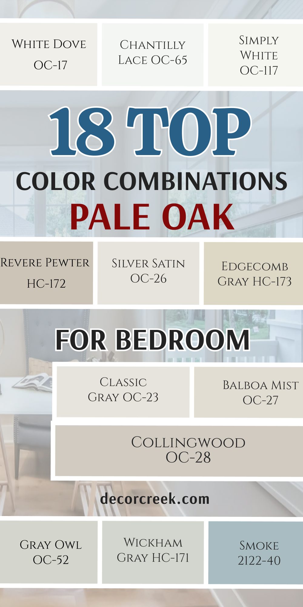
18 Best Pale Oak Color Combinations for Bedroom
Pale Oak OC-20 + White Dove OC-17
Pale Oak OC-20 + White Dove OC-17 creates a cozy environment that makes your sleeping area feel exceptionally inviting. The soft white trim provides a gentle frame for the warm neutral walls without feeling too sharp.This combination catches the morning sun beautifully to give your bedroom a cheerful start. It lets you mix in different fabrics like linen and cotton easily. Homeowners love how this pairing makes small bedrooms look larger and much more open. It maintains a steady balance between clean style and comfortable living.
Your resting space will feel bright and pleasant throughout the entire afternoon. It looks wonderful alongside light oak furniture pieces and brass lamps. The smooth transition between the two shades is very pleasing to your eyes. This duo remains a top pick for creating a friendly and bright bedroom setup.
Best used in: living rooms, kitchens, hallways, bedrooms, and farmhouse exteriors.
Pairs well with: Iron Ore SW 7069, Agreeable Gray SW 7029, Natural Linen SW 9109, warm wood tones. The key rule of this color for farmhouse style is to use it where you want natural light to feel kind, soft, and inviting throughout the day.
Pale Oak OC-20 + Chantilly Lace OC-65
Pale Oak OC-20+ Chantilly Lace OC-65 delivers a crisp and very clean look to your personal sanctuary. The bright white details make the main greige wall color look rich and intentional. This pairing cuts out any sleepy dullness from your walls on dark or cloudy days.
It creates a modern layout that looks highly organized and fresh. Young families appreciate how it makes a modern bedroom feel instantly tidy. It reflects a maximum amount of light into dark closet corners and dressing areas.
The contrast is sharp enough to be noticeable without hurting your eyes. It matches perfectly with dark iron bed frames and minimalist furniture. Your morning routine will feel bright and full of positive energy with this clean choice. It gives a sharp finish to all your doors and crown molding pieces.
Best used in: living rooms, kitchens, hallways, bedrooms, and farmhouse exteriors.
Pairs well with: Iron Ore SW 7069, Agreeable Gray SW 7029, Natural Linen SW 9109, warm wood tones. The key rule of this color for farmhouse style is to use it where you want natural light to feel kind, soft, and inviting throughout the day.
Pale Oak OC-20 + Simply White OC-117
Pale Oak OC-20 + Simply White OC-117 spreads a warm and sunny feeling across your entire bedroom. The bright accent shade carries a hint of warmth that matches the walls perfectly. This duo makes your ceiling feel higher when used on the trim woodwork.
It avoids looking cold or clinical even in northern window light. You get a cheerful setting that makes you feel happy when you wake up. It coordinates wonderfully with natural wicker baskets and light wood decorative pieces.
The overall appearance is bright, energetic, and highly comforting for everyday living. It keeps your sleeping quarters looking fresh and ready for guests. Homeowners choose this option to bring a classic cottage look indoors. It creates a seamless flow that ties your furniture and walls together safely.
Best used in: living rooms, kitchens, hallways, bedrooms, and farmhouse exteriors.
Pairs well with: Iron Ore SW 7069, Agreeable Gray SW 7029, Natural Linen SW 9109, warm wood tones. The key rule of this color for farmhouse style is to use it where you want natural light to feel kind, soft, and inviting throughout the day.
Pale Oak OC-20 + Classic Gray OC-23
Pale Oak OC-20 + Classic Gray OC-23 offers a very soft and low-contrast combination for resting. The two shades sit close together to make your walls blend smoothly. This option creates an airy layout where nothing fights for your attention.
It looks sophisticated and clean under both natural light and warm night lamps. The slight grey undertones keep the room looking smart and updated. It hides daily scuffs on baseboards surprisingly well in busy homes. You achieve a high-end look that feels like an expensive boutique hotel room.
It provides a clean backdrop for colorful pillows and patterned blankets. The transition from wall to trim happens without any harsh visual breaks. It feels like a cozy blanket is wrapping around your entire room.
Best used in: living rooms, kitchens, hallways, bedrooms, and farmhouse exteriors.
Pairs well with: Iron Ore SW 7069, Agreeable Gray SW 7029, Natural Linen SW 9109, warm wood tones. The key rule of this color for farmhouse style is to use it where you want natural light to feel kind, soft, and inviting throughout the day.
Pale Oak OC-20 + Balboa Mist OC-27
Pale Oak OC-20 + Balboa Mist OC-27 functions as a beautiful double-greige setup for your bedroom. The tiny shift in tone adds a layered depth that looks very deliberate. This pairing makes your walls look rich and textured without using bright accent colors.
It behaves like a true neutral base that lets your furniture choices shine. The warmth of the shades prevents the bedroom from looking like an empty office. It handles changing daytime shadows with incredible grace and stability.
Your family will enjoy the balanced and grounded look it brings to the house. It coordinates beautifully with cream carpets and soft knitted blankets. This choice creates a very cohesive look across the whole sleeping area. It offers a steady foundation that makes decorating your room simple and fun.
Best used in: living rooms, kitchens, hallways, bedrooms, and farmhouse exteriors.
Pairs well with: Iron Ore SW 7069, Agreeable Gray SW 7029, Natural Linen SW 9109, warm wood tones. The key rule of this color for farmhouse style is to use it where you want natural light to feel kind, soft, and inviting throughout the day.
Pale Oak OC-20 + Collingwood OC-28
Pale Oak OC-20 + Collingwood OC-28 introduces a slightly cooler grey partner into your resting space. The contrast is subtle but gives the room a very tailored appearance. This duo works excellently to make large master bedrooms feel structured.
It draws out the hidden stone-like quality of your main wall paint. The balanced grey tone looks fantastic next to silver curtain rods and frames. It gives your private room a custom designer look that feels highly luxurious. Your walls will look clean, sturdy, and ready for beautiful furniture pairings.
It anchors the bed area and makes high ceilings feel much more intimate. This match feels traditional yet entirely updated for modern family living. It turns your sleeping quarters into a beautiful showcase of balanced design.
Best used in: living rooms, kitchens, hallways, bedrooms, and farmhouse exteriors.
Pairs well with: Iron Ore SW 7069, Agreeable Gray SW 7029, Natural Linen SW 9109, warm wood tones. The key rule of this color for farmhouse style is to use it where you want natural light to feel kind, soft, and inviting throughout the day.
Pale Oak OC-20 + Edgecomb Gray HC-173
Pale Oak OC-20 + Edgecomb Gray HC-173 builds a rich and warm sanctuary inside your home. The darker greige paint adds a handsome weight to your trim or accent walls. This combination keeps the entire room feeling unified and completely grounded.
It belongs to a historical lineage so the two paints speak to each other beautifully. The underlying beige notes ensure your bedroom never feels chilly or uninviting. It provides a clean finish that makes your headboard stand out with great style. You get a warm look that handles heavy sunlight without washing out.
It makes the sleeping space feel like a safe and protective retreat. Families love how this mix looks both upscale and completely comfortable. It delivers a solid foundation for a deeply relaxing night of rest.
Best used in: living rooms, kitchens, hallways, bedrooms, and farmhouse exteriors.
Pairs well with: Iron Ore SW 7069, Agreeable Gray SW 7029, Natural Linen SW 9109, warm wood tones. The key rule of this color for farmhouse style is to use it where you want natural light to feel kind, soft, and inviting throughout the day.

Pale Oak OC-20 + Revere Pewter HC-172
Pale Oak OC-20+ Revere Pewter HC-172 brings a classic and strong design statement to your bedroom walls. The deeper neutral shade anchors your closet doors or accent panels firmly. This combination creates an elegant contrast that makes the lighter walls pop with life.
It looks magnificent in spacious bedrooms that have plenty of natural daylight. The earthy baseline matches perfectly with textured linen curtains and wool rugs. It gives the room an upscale look that feels sturdy and highly reliable.
Your bedroom will look expensive and beautifully planned with this thoughtful match. It handles daily family activity while keeping its handsome and clean appearance. The balance between light and dark elements is incredibly satisfying to see. It provides a rich look that makes your personal room feel special.
Best used in: living rooms, kitchens, hallways, bedrooms, and farmhouse exteriors.
Pairs well with: Iron Ore SW 7069, Agreeable Gray SW 7029, Natural Linen SW 9109, warm wood tones. The key rule of this color for farmhouse style is to use it where you want natural light to feel kind, soft, and inviting throughout the day.
Pale Oak OC-20 + Silver Satin OC-26
Pale Oak OC-20 + Silver Satin OC-26 creates a whisper-soft look that feels airy and light. The light grey-white trim keeps the bedroom looking crisp and freshly updated. This duo provides a great alternative to standard heavy white paints on woodwork.
It allows daytime light to bounce freely into darker corners of the room. Your sleeping space will look clean, bright, and highly organized with this mix. It cuts out any heavy or dark feeling in smaller guest bedroom layouts.
The transition between the walls and the trim offers a very smooth visual rhythm. It coordinates beautifully with white bedding and light wood nightstands. You will love how bright and positive the room feels when you open your eyes. It remains an excellent selection for a clean and smart bedroom appearance.
Best used in: living rooms, kitchens, hallways, bedrooms, and farmhouse exteriors.
Pairs well with: Iron Ore SW 7069, Agreeable Gray SW 7029, Natural Linen SW 9109, warm wood tones. The key rule of this color for farmhouse style is to use it where you want natural light to feel kind, soft, and inviting throughout the day.
Pale Oak OC-20 + Gray Owl OC-52
Pale Oak OC-20 + Gray Owl OC-52 delivers a crisp and cool grey contrast for your woodwork. It acts as a refreshing touch that balances the warm notes of the walls. This combination works excellently in bedrooms that receive bright afternoon sunshine.
It makes your accent elements look polished and beautifully put together. The light grey tint catches the light with exceptional clarity and neatness. It pairs sharply with dark hardwood floors or soft grey bedroom carpets.
Your resting area will feel bright, clean, and highly sophisticated with this choice. It gives your private room a breezy character that feels very open. The visual match is highly intentional and brings an airy spirit to your walls. It is a fantastic option for a modern and clean bedroom look.
Best used in: living rooms, kitchens, hallways, bedrooms, and farmhouse exteriors.
Pairs well with: Iron Ore SW 7069, Agreeable Gray SW 7029, Natural Linen SW 9109, warm wood tones. The key rule of this color for farmhouse style is to use it where you want natural light to feel kind, soft, and inviting throughout the day.
Pale Oak OC-20 + Wickham Gray HC-171
Pale Oak OC-20 + Wickham Gray HC-171 introduces a soft and frosty grey tint to your sleeping area. The distinct blue-green undertone of the grey paint feels very refreshing to your eyes. This pairing makes your bedroom doors or trim look bright and beautifully updated.
It highlights the hidden warmth of your main walls by acting as a cool partner. Homeowners love this mix for bringing a breezy beach cottage feel into the house. It pairs perfectly with white linen curtains and light woven floor rugs.
Your private room will look rich and completely thought out from top to bottom. It creates a beautiful layout that feels very intentional and structured. The color mix handles heavy morning sunlight without losing its true refreshing character. It is a fantastic pick for making a bright room feel much more open.
Best used in: living rooms, kitchens, hallways, bedrooms, and farmhouse exteriors.
Pairs well with: Iron Ore SW 7069, Agreeable Gray SW 7029, Natural Linen SW 9109, warm wood tones. The key rule of this color for farmhouse style is to use it where you want natural light to feel kind, soft, and inviting throughout the day.
Pale Oak OC-20 + Smoke 2122-40
Pale Oak OC-20 + Smoke 2122-40 behaves like a beautiful and rich blue-grey statement in your room. The soft accent color turns your main wall behind the bed into a focal point. This paint creates a steady look that makes the whole bedroom feel grounded.
It has an elegant smoky undertone that reacts nicely to changing evening lights. You can use it to build a bedroom backdrop that looks highly sophisticated. It looks wonderful with polished nickel lamps and dark wood dressers.
The visual flow from the main walls to this blue happens with an interesting contrast. It provides a clean finish that makes your everyday artwork stand out beautifully. Your family will feel relaxed and comfortable in front of this color. It is an excellent selection for people who want a rich blue look.
Best used in: living rooms, kitchens, hallways, bedrooms, and farmhouse exteriors.
Pairs well with: Iron Ore SW 7069, Agreeable Gray SW 7029, Natural Linen SW 9109, warm wood tones. The key rule of this color for farmhouse style is to use it where you want natural light to feel kind, soft, and inviting throughout the day.
Pale Oak OC-20 + October Mist 1495
Pale Oak OC-20 + October Mist 1495 brings a rich and reliable sage green tone into your house. It establishes a strong and handsome look on doors or bedroom accent features. This color match creates a steady statement without looking too dark or moody.
It draws out the lovely warm notes hidden inside your main walls. The balanced green tint looks amazing next to brass frames and fixtures. It gives your bedroom a custom designer look that feels highly luxurious. Your walls will look durable, clean, and ready for decades of family life.
It anchors the bed area and makes large rooms feel much more stable. This pairing feels traditional yet entirely modern at the exact same time. It turns your private room into a beautiful conversation piece for visiting guests.
Best used in: living rooms, kitchens, hallways, bedrooms, and farmhouse exteriors.
Pairs well with: Iron Ore SW 7069, Agreeable Gray SW 7029, Natural Linen SW 9109, warm wood tones. The key rule of this color for farmhouse style is to use it where you want natural light to feel kind, soft, and inviting throughout the day.
Pale Oak OC-20 + Saybrook Sage HC-114
Pale Oak OC-20 + Saybrook Sage HC-114 is a rich and earthy green option for adjacent spaces. It brings a bright and clean look that makes bedrooms feel open. This color provides a deep contrast against the warm greige wall paint. It behaves like a breath of fresh air on your bedroom accent walls.
The green shade works excellently in homes that get plenty of natural afternoon daylight. It matches wonderfully with white porcelain details and light wood furniture pieces. Your sleeping environment will feel bright and positive every single day.
It adds a splash of character without making the house look messy or loud. The combination looks highly intentional and brings an airy spirit to your home. It is a fantastic choice for creating a cheerful modern look indoors.
Best used in: living rooms, kitchens, hallways, bedrooms, and farmhouse exteriors.
Pairs well with: Iron Ore SW 7069, Agreeable Gray SW 7029, Natural Linen SW 9109, warm wood tones. The key rule of this color for farmhouse style is to use it where you want natural light to feel kind, soft, and inviting throughout the day.
Pale Oak OC-20 + Soft Fern 2144-40
Pale Oak OC-20 + Soft Fern 2144-40 offers a light and gentle green choice for wall surfaces. It brings a crisp quality that balances the warmth of your bedroom walls. This paint looks very clean and smart on large main wall sections.
It makes your home trim look polished and beautifully put together. The warm green undertone catches the morning light with exceptional clarity. It pairs sharply with dark slate floors or bright white quartz surfaces.
Your bedroom area will feel bright, clean, and highly organized with this color. It prevents your woodwork from looking heavy or dark in small layouts. The transition between the walls and trim provides a great visual rhythm. It remains an excellent selection for a clean and smart home appearance.
Best used in: living rooms, kitchens, hallways, bedrooms, and farmhouse exteriors.
Pairs well with: Iron Ore SW 7069, Agreeable Gray SW 7029, Natural Linen SW 9109, warm wood tones. The key rule of this color for farmhouse style is to use it where you want natural light to feel kind, soft, and inviting throughout the day.
Pale Oak OC-20 + Hale Navy HC-154
Pale Oak OC-20 + Hale Navy HC-154 introduces a classic dark blue statement to your bedroom layout. It carries a heavy dark undertone that feels very solid to your eye. This option makes your rooms look bright, clean, and beautifully updated.
It highlights the hidden warmth of your main walls by acting as a dark partner. Homeowners love this shade for bringing a classic navy feel into the house. It pairs perfectly with white linen curtains and light woven rugs.
Your bedroom walls will look rich and completely thought out from top to bottom. It creates a beautiful layout that feels very intentional and structured. The color handles heavy sunlight without losing its true majestic character. It is a fantastic pick for making a bright room feel much more open.
Best used in: living rooms, kitchens, hallways, bedrooms, and farmhouse exteriors.
Pairs well with: Iron Ore SW 7069, Agreeable Gray SW 7029, Natural Linen SW 9109, warm wood tones. The key rule of this color for farmhouse style is to use it where you want natural light to feel kind, soft, and inviting throughout the day.
Pale Oak OC-20 + Kendall Charcoal HC-166
Pale Oak OC-20 + Kendall Charcoal HC-166 brings a rich and reliable dark grey tone into your house. It establishes a strong and handsome look on doors or bedroom accent features. This color creates a steady statement without looking too dark or moody.
It draws out the lovely warm notes hidden inside your main walls. The balanced dark tint looks amazing next to silver frames and fixtures. It gives your home a custom designer look that feels highly luxurious.
Your walls will look durable, clean, and ready for decades of family life. It anchors the bed area and makes large rooms feel much more stable. This pairing feels traditional yet entirely modern at the exact same time. It turns your private room into a beautiful conversation piece for visiting guests.
Best used in: living rooms, kitchens, hallways, bedrooms, and farmhouse exteriors.
Pairs well with: Iron Ore SW 7069, Agreeable Gray SW 7029, Natural Linen SW 9109, warm wood tones. The key rule of this color for farmhouse style is to use it where you want natural light to feel kind, soft, and inviting throughout the day.
Pale Oak OC-20 + Sparrow AF-720
Pale Oak OC-20 + Sparrow AF-720 delivers a classic and strong earthy brown presence to your bedroom. It has a rich muddy base that keeps it looking sophisticated. This shade makes your private space feel rich and securely anchored.
It creates a beautiful contrast against your lighter greige wall surfaces. The paint changes its look depending on the weather conditions outside. It brings an earthy element indoors to connect your rooms to the natural world.
Visitors will love the handsome and upscale personality it gives to the room. It coordinates perfectly with stone fireplace surrounds and dark iron light fixtures. Your home will feel like a bright sanctuary for relaxation and entertainment. It provides a unique look while remaining very friendly to the eyes.
Best used in: living rooms, kitchens, hallways, bedrooms, and farmhouse exteriors.
Pairs well with: Iron Ore SW 7069, Agreeable Gray SW 7029, Natural Linen SW 9109, warm wood tones. The key rule of this color for farmhouse style is to use it where you want natural light to feel kind, soft, and inviting throughout the day.
24 Best Pale Oak Exterior Color Combinations
Pale Oak OC-20 + White Dove OC-17
Pale Oak OC-20 + White Dove OC-17 offers a warm, inviting curb appeal for any family house. The soft white trim handles bright sunshine without causing a harsh glare on your siding. This combination gives a clean frame to your windows and entry porch pillars.
It pairs beautifully with red brick walkways and natural landscaping. Homeowners choose this mix to make their homes look freshly updated and friendly. The warm neutral baseline stays looking neat despite seasonal dust and weather.
Your front entry will feel bright and welcoming to neighborhood guests. It looks spectacular on traditional colonial and modern farmhouse designs alike. The shift between the two body colors is wonderfully smooth. It ensures your house remains a bright favorite on the block.
Best used in: living rooms, kitchens, hallways, bedrooms, and farmhouse exteriors.
Pairs well with: Iron Ore SW 7069, Agreeable Gray SW 7029, Natural Linen SW 9109, warm wood tones. The key rule of this color for farmhouse style is to use it where you want natural light to feel kind, soft, and inviting throughout the day.
Pale Oak OC-20 + Chantilly Lace OC-65
Pale Oak OC-20 + Chantilly Lace OC-65 delivers a crisp finish to the outside of your property. The brilliant white accent pops sharply against the soft greige body color. This choice gives your home a very architectural and clean look from the street.
It defines the structural trim lines with high precision. Modern homes benefit greatly from this high-contrast option. It bounces morning light effectively to keep your home looking energetic and bright.
The contrast is highly satisfying without feeling clinical or cold outdoors. It looks fantastic with black metal window frames and light concrete driveways. Your house will project a highly clean and organized spirit to everyone passing by. It keeps the building looking sharp throughout gray winter weather.
Best used in: living rooms, kitchens, hallways, bedrooms, and farmhouse exteriors.
Pairs well with: Iron Ore SW 7069, Agreeable Gray SW 7029, Natural Linen SW 9109, warm wood tones. The key rule of this color for farmhouse style is to use it where you want natural light to feel kind, soft, and inviting throughout the day.
Pale Oak OC-20 + Simply White OC-117
Pale Oak OC-20 + Simply White OC-117 brings a joyful look to your front porch and siding boards. The accent paint carries a slight touch of warmth that glows nicely under direct sunlight. This duo prevents your home exterior from ever looking flat or boring.
It complements the natural stone details on your foundation beautifully. You achieve an updated cottage style that feels cozy and very grounded. It coordinates perfectly with brass light fixtures and dark wood front doors.
The overall appearance is bright, cheerful, and highly stable for neighborhood properties. It hides light pollen and dust surprisingly well over time. Families love this option for creating a genuinely friendly home front. It ensures your property looks bright and ready for outdoor summer gatherings.
Best used in: living rooms, kitchens, hallways, bedrooms, and farmhouse exteriors.
Pairs well with: Iron Ore SW 7069, Agreeable Gray SW 7029, Natural Linen SW 9109, warm wood tones. The key rule of this color for farmhouse style is to use it where you want natural light to feel kind, soft, and inviting throughout the day.
Pale Oak OC-20 + Swiss Coffee OC-45
Pale Oak OC-20 + Swiss Coffee OC-45 establishes a rich, traditional appearance on your exterior siding. The heavy white trim color brings an upscale feel that makes the house look custom-built. This color works beautifully to smooth out the bright rays of afternoon sunshine.
It creates a creamy frame around your front door and porch steps. You can use it to give ranch style houses a grander look. It coordinates wonderfully with dark brown mulch and green lawn spaces. The paint mix has enough substance to stand up well to outdoor dirt.
It gives the building a smooth appearance that looks expensive and very durable. Your family will love the warm welcome it gives when driving up the driveway. It provides a clean finish that values classic home comfort above all else.
Best used in: living rooms, kitchens, hallways, bedrooms, and farmhouse exteriors.
Pairs well with: Iron Ore SW 7069, Agreeable Gray SW 7029, Natural Linen SW 9109, warm wood tones. The key rule of this color for farmhouse style is to use it where you want natural light to feel kind, soft, and inviting throughout the day.
Pale Oak OC-20 + White Heron OC-57
Pale Oak OC-20 + White Heron OC-57 introduces a smart and clean white partner to your exterior trim. It has a slight gray undertone that keeps it looking steady outdoors. This pairing builds a modern appearance without creating a blinding contrast on sunny days.
It helps your window frames look crisp and beautifully put together. Homeowners enjoy this clean option for contemporary house styles. It pairs effortlessly with gray stone patios and silver metal roofing details. The visual transition between the two shades feels highly deliberate.
It keeps your house siding looking bright and organized through all four seasons. Your home will maintain a clean character that stands out proudly on the street. It is a fantastic choice for a bright and tailored outdoor appearance.
Best used in: living rooms, kitchens, hallways, bedrooms, and farmhouse exteriors.
Pairs well with: Iron Ore SW 7069, Agreeable Gray SW 7029, Natural Linen SW 9109, warm wood tones. The key rule of this color for farmhouse style is to use it where you want natural light to feel kind, soft, and inviting throughout the day.
Pale Oak OC-20 + Classic Gray OC-23
Pale Oak OC-20 + Classic Gray OC-23 creates a soft, low-contrast look across your entire siding. The two shades sit very close together to create a unified body appearance. This choice keeps your house looking bright without using any stark white colors.
It looks sophisticated under changing cloud cover and direct sunlight alike. The light gray notes bring a modern touch to older architectural styles. It masks dust and rain marks with exceptional ease on your trim pieces.
You get a highly tailored look that makes your home look professionally designed. It provides a clean backdrop for black metal address numbers and dark mailboxes. The transition from wall panels to trim borders is completely smooth. It lets your landscaping provide the main splash of color.
Best used in: living rooms, kitchens, hallways, bedrooms, and farmhouse exteriors.
Pairs well with: Iron Ore SW 7069, Agreeable Gray SW 7029, Natural Linen SW 9109, warm wood tones. The key rule of this color for farmhouse style is to use it where you want natural light to feel kind, soft, and inviting throughout the day.
Pale Oak OC-20 + Edgecomb Gray HC-173
Pale Oak OC-20 + Edgecomb Gray HC-173 builds a rich and warm exterior layout for your family. The darker greige paint adds a handsome weight to your shutters or porch columns. This combination keeps the entire building looking structured and completely grounded.
It relies on a historic line of shades so they match with great safety. The underlying beige notes ensure your house looks cozy even on winter days. It provides a clean finish that makes your front entryway stand out with style.
You get a warm look that handles intense afternoon light without washing out completely. It makes your backyard deck area feel like a seamless extension of the house. Families love how this mix looks upscale yet perfectly casual. It delivers a solid look that guarantees excellent long-term curb appeal.
Best used in: living rooms, kitchens, hallways, bedrooms, and farmhouse exteriors.
Pairs well with: Iron Ore SW 7069, Agreeable Gray SW 7029, Natural Linen SW 9109, warm wood tones. The key rule of this color for farmhouse style is to use it where you want natural light to feel kind, soft, and inviting throughout the day.
Pale Oak OC-20 + Balboa Mist OC-27
Pale Oak OC-20+ Balboa Mist OC-27 operates as a beautiful double-neutral scheme on your siding panels. The small shift in greige tones adds a layered depth that looks very professional. This combination makes your home look rich and sturdy without using loud accent colors.
It behaves like a balanced backdrop that lets your garden beds look their best. The warmth of the shades prevents the house from looking cold or industrial. It handles the moving shadows of nearby trees with incredible grace and stability.
Your family will enjoy the balanced and grounded look it brings to the property. It coordinates beautifully with cream stone pathways and cedar wood accents. This choice creates a very cohesive look across the entire building exterior. It offers a steady look that makes your house look completely unified.
Best used in: living rooms, kitchens, hallways, bedrooms, and farmhouse exteriors.
Pairs well with: Iron Ore SW 7069, Agreeable Gray SW 7029, Natural Linen SW 9109, warm wood tones. The key rule of this color for farmhouse style is to use it where you want natural light to feel kind, soft, and inviting throughout the day.
Pale Oak OC-20 + Revere Pewter HC-172
Pale Oak OC-20 + Revere Pewter HC-172 brings a classic and strong design statement to your home front. The deeper neutral paint anchors your garage doors and window trim firmly. This combination creates an elegant contrast that makes your main siding pop with life.
It looks magnificent on large two-story houses that get plenty of open daylight. The earthy baseline matches perfectly with natural slate roofing and stone porch floors. It gives the building an upscale look that feels sturdy and highly reliable.
Your house will look expensive and beautifully planned with this thoughtful match. It handles harsh weather while keeping its handsome and clean appearance. The balance between light and dark elements is incredibly satisfying from the street. It provides a rich look that makes your property feel special.
Best used in: living rooms, kitchens, hallways, bedrooms, and farmhouse exteriors.
Pairs well with: Iron Ore SW 7069, Agreeable Gray SW 7029, Natural Linen SW 9109, warm wood tones. The key rule of this color for farmhouse style is to use it where you want natural light to feel kind, soft, and inviting throughout the day.
Pale Oak OC-20 + Collingwood OC-28
Pale Oak OC-20 + Collingwood OC-28 introduces a slightly cooler gray partner to your exterior boards. The contrast is subtle but gives the building a very tailored appearance. This duo works excellently to make large houses feel structured and cohesive.
It draws out the hidden stone-like quality of your main siding paint. The balanced gray tone looks fantastic next to charcoal shingles and silver hardware. It gives your property a custom designer look that feels highly luxurious.
Your walls will look clean, sturdy, and ready for beautiful outdoor lighting fixtures. It anchors the entryway and makes tall gables feel much more intimate. This match feels traditional yet entirely updated for modern neighborhood living. It turns your home exterior into a beautiful showcase of balanced design.
Best used in: living rooms, kitchens, hallways, bedrooms, and farmhouse exteriors.
Pairs well with: Iron Ore SW 7069, Agreeable Gray SW 7029, Natural Linen SW 9109, warm wood tones. The key rule of this color for farmhouse style is to use it where you want natural light to feel kind, soft, and inviting throughout the day.
Pale Oak OC-20 + Stonington Gray HC-170
Pale Oak OC-20 + Stonington Gray HC-170 establishes a deep, authoritative gray presence on your shutters. It creates a stunning high-contrast look that defines your house architecture beautifully.
This shade provides an elegant finish that instantly makes your home look expensive. It allows the light greige body panels to pop with crisp brightness by comparison. The true gray tint acts like a traditional classic color on your wood surfaces.
It looks beautiful when combined with black iron porch railings and white stone steps. Your front gables will become the true star of the block with this choice. It hides outdoor scuffs and daily wear from weather remarkably well. The deep tone brings a strong feeling of structure and stability to your design. It delivers a rich finish that makes your home look beautifully staged.
Best used in: living rooms, kitchens, hallways, bedrooms, and farmhouse exteriors.
Pairs well with: Iron Ore SW 7069, Agreeable Gray SW 7029, Natural Linen SW 9109, warm wood tones. The key rule of this color for farmhouse style is to use it where you want natural light to feel kind, soft, and inviting throughout the day.
Pale Oak OC-20 + Boothbay Gray HC-165
Pale Oak OC-20 + Boothbay Gray HC-165 delivers a classic and strong steel blue presence to your exterior. It has a strong historical base that keeps it looking sophisticated outdoors. This shade makes your accent gables feel rich and securely anchored.
It creates a beautiful contrast against your lighter greige siding surfaces. The paint changes its look depending on the weather conditions outside. It brings an earthy element indoors to connect your porch to the natural world.
Neighbors will love the handsome and upscale personality it gives to the house. It coordinates perfectly with stone walkways and dark iron light fixtures. Your home will feel like a bright sanctuary for relaxation and entertainment. It provides a unique look while remaining very friendly to the eyes.
Best used in: living rooms, kitchens, hallways, bedrooms, and farmhouse exteriors.
Pairs well with: Iron Ore SW 7069, Agreeable Gray SW 7029, Natural Linen SW 9109, warm wood tones. The key rule of this color for farmhouse style is to use it where you want natural light to feel kind, soft, and inviting throughout the day.
Pale Oak OC-20 + Smoke 2122-40
Pale Oak OC-20 + Smoke 2122-40 behaves like a beautiful and rich blue-gray statement on your shutters. The soft accent color turns your front entry door into a gorgeous focal point. This paint creates a steady look that makes the whole building feel grounded
It has an elegant smoky undertone that reacts nicely to changing evening lights. You can use it to build a house backdrop that looks highly sophisticated. It looks wonderful with polished nickel lamps and dark wood details.
The visual flow from the main siding to this blue happens with an interesting contrast. It provides a clean finish that makes your everyday landscaping stand out beautifully. Your family will feel relaxed and comfortable in front of this color. It is an excellent selection for people who want a rich blue look.
Best used in: living rooms, kitchens, hallways, bedrooms, and farmhouse exteriors.
Pairs well with: Iron Ore SW 7069, Agreeable Gray SW 7029, Natural Linen SW 9109, warm wood tones. The key rule of this color for farmhouse style is to use it where you want natural light to feel kind, soft, and inviting throughout the day.
Pale Oak OC-20 + October Mist 1495
Pale Oak OC-20 + October Mist 1495 brings a rich and reliable sage green tone into your house front. It establishes a strong and handsome look on doors or exterior accent features. This color match creates a steady statement without looking too dark or moody.
It draws out the lovely warm notes hidden inside your main siding. The balanced green tint looks amazing next to brass handles and fixtures. It gives your home exterior a custom designer look that feels highly luxurious. Your walls will look durable, clean, and ready for decades of family life.
It anchors the entryway and makes large homes feel much more stable. This pairing feels traditional yet entirely modern at the exact same time. It turns your porch area into a beautiful conversation piece for visiting guests.
Best used in: living rooms, kitchens, hallways, bedrooms, and farmhouse exteriors.
Pairs well with: Iron Ore SW 7069, Agreeable Gray SW 7029, Natural Linen SW 9109, warm wood tones. The key rule of this color for farmhouse style is to use it where you want natural light to feel kind, soft, and inviting throughout the day.
Pale Oak OC-20 + Saybrook Sage HC-114
Pale Oak OC-20 + Saybrook Sage HC-114 is a rich and earthy green option for exterior accents. It brings a bright and clean look that makes houses feel open. This color provides a deep contrast against the warm greige siding paint.
It behaves like a breath of fresh air on your front shutters. The green shade works excellently in homes that get plenty of natural afternoon daylight. It matches wonderfully with white trim details and light stone porch steps. Your home environment will feel bright and positive every single day.
It adds a splash of character without making the house look messy or loud. The combination looks highly intentional and brings an airy spirit to your property. It is a fantastic choice for creating a cheerful modern look indoors.
Best used in: living rooms, kitchens, hallways, bedrooms, and farmhouse exteriors.
Pairs well with: Iron Ore SW 7069, Agreeable Gray SW 7029, Natural Linen SW 9109, warm wood tones. The key rule of this color for farmhouse style is to use it where you want natural light to feel kind, soft, and inviting throughout the day.
Pale Oak OC-20 + Soft Fern 2144-40
Pale Oak OC-20 + Soft Fern 2144-40 offers a light and gentle green choice for exterior trim surfaces. It brings a crisp quality that balances the warmth of your siding boards. This paint looks very clean and smart on large porch section highlights.
It makes your home architecture look polished and beautifully put together. The warm green undertone catches the morning light with exceptional clarity. It pairs sharply with dark slate steps or bright white foundation stones.
Your home front will feel bright, clean, and highly organized with this color. It prevents your trim from looking heavy or dark in small ranch layouts. The transition between the siding and trim provides a great visual rhythm. It remains an excellent selection for a clean and smart home appearance.
Best used in: living rooms, kitchens, hallways, bedrooms, and farmhouse exteriors.
Pairs well with: Iron Ore SW 7069, Agreeable Gray SW 7029, Natural Linen SW 9109, warm wood tones. The key rule of this color for farmhouse style is to use it where you want natural light to feel kind, soft, and inviting throughout the day.
Pale Oak OC-20 + Prescott Green HC-140
Pale Oak OC-20 + Prescott Green HC-140 establishes a deep, authoritative sage presence on front doors. It creates a stunning high-contrast look on your accent features. This shade provides an elegant look that instantly makes your home look expensive.
It allows the light greige siding to pop with crisp brightness by comparison. The true green tint acts like a traditional classic color on your wood surfaces. It looks beautiful when combined with shiny brass handles and white stone pillars.
Your entryway wall will become the true star of the block with this choice. It hides scuffs and daily wear from weather remarkably well. The deep tone brings a strong feeling of structure and stability to your design. It delivers a rich finish that makes your home look beautifully staged.
Best used in: living rooms, kitchens, hallways, bedrooms, and farmhouse exteriors.
Pairs well with: Iron Ore SW 7069, Agreeable Gray SW 7029, Natural Linen SW 9109, warm wood tones. The key rule of this color for farmhouse style is to use it where you want natural light to feel kind, soft, and inviting throughout the day.
Pale Oak OC-20 + Dry Sage 2142-40
Pale Oak OC-20 + Dry Sage 2142-40 introduces a handsome, muddy olive green tone into your home front. It behaves like a solid accent paint on your garage doors and decorative gables. This option makes your property feel traditional, sturdy, and entirely connected to nature.
It frames the lighter greige siding with an excellent organic weight. Homeowners love this shade for bringing a classic craftsman feel to the house. It coordinates flawlessly with cedar shake details and dark copper gutters. Your home exterior will look rich and completely thought out from top to bottom.
It creates a beautiful contrast that feels very intentional and structured. The green color handles harsh midday sun without losing its true earthy character. It remains an excellent pick for grounding a tall two-story house safely.
Best used in: living rooms, kitchens, hallways, bedrooms, and farmhouse exteriors.
Pairs well with: Iron Ore SW 7069, Agreeable Gray SW 7029, Natural Linen SW 9109, warm wood tones. The key rule of this color for farmhouse style is to use it where you want natural light to feel kind, soft, and inviting throughout the day.
Pale Oak OC-20 + Hale Navy HC-154
Pale Oak OC-20 + Hale Navy HC-154 introduces a classic dark blue statement to your exterior layout. It carries a heavy dark undertone that feels very solid to your eye outdoors. This option makes your home look bright, clean, and beautifully updated from the curb.
It highlights the hidden warmth of your main siding by acting as a dark partner. Homeowners love this shade for bringing a classic coastal feel into the house front. It pairs perfectly with white porch columns and light stone steps.
Your front door will look rich and completely thought out from top to bottom. It creates a beautiful layout that feels very intentional and structured. The color handles heavy sunlight without losing its true majestic character. It is a fantastic pick for making a bright room feel much more open.
Best used in: living rooms, kitchens, hallways, bedrooms, and farmhouse exteriors.
Pairs well with: Iron Ore SW 7069, Agreeable Gray SW 7029, Natural Linen SW 9109, warm wood tones. The key rule of this color for farmhouse style is to use it where you want natural light to feel kind, soft, and inviting throughout the day.

Pale Oak OC-20 + Knoxville Gray HC-160
Pale Oak OC-20 + Knoxville Gray HC-160 behaves like a beautiful and rich blue-green on your exterior walls. It is a dark shade that keeps your home looking clean and colorful. This paint creates a beautiful focal point that makes the property feel very steady.
It has an elegant smoky undertone that reacts nicely to changing outdoor lighting. You can use it to build an exterior backdrop that looks highly sophisticated. It looks wonderful with polished nickel fixtures and dark wood entryway trim.
The visual flow from the main siding to this dark shade happens with an interesting contrast. It provides a clean finish that makes your everyday landscaping stand out beautifully. Your family will feel proud and comfortable in front of this color. It is an excellent selection for people who want a rich dark look.
Best used in: living rooms, kitchens, hallways, bedrooms, and farmhouse exteriors.
Pairs well with: Iron Ore SW 7069, Agreeable Gray SW 7029, Natural Linen SW 9109, warm wood tones. The key rule of this color for farmhouse style is to use it where you want natural light to feel kind, soft, and inviting throughout the day.
Pale Oak OC-20 + Sparrow AF-720
Pale Oak OC-20 + Sparrow AF-720 delivers a classic and strong earthy brown presence to your home front. It has a rich muddy base that keeps it looking sophisticated outdoors. This shade makes your exterior trim feel rich and securely anchored.
It creates a beautiful contrast against your lighter greige siding surfaces. The paint changes its look depending on the weather conditions outside. It brings an earthy element indoors to connect your porch to the natural world. Visitors will love the handsome and upscale personality it gives to the house.
It coordinates perfectly with stone foundations and dark iron light fixtures. Your home will feel like a bright sanctuary for relaxation and entertainment. It provides a unique look while remaining very friendly to the eyes.
Best used in: living rooms, kitchens, hallways, bedrooms, and farmhouse exteriors.
Pairs well with: Iron Ore SW 7069, Agreeable Gray SW 7029, Natural Linen SW 9109, warm wood tones. The key rule of this color for farmhouse style is to use it where you want natural light to feel kind, soft, and inviting throughout the day.
Pale Oak OC-20 + Amherst Gray HC-167
Pale Oak OC-20 + Amherst Gray HC-167 introduces a heavy, solid stone grey to your exterior accents. It operates beautifully on window trim, gutters, and entry stairs. This choice creates an incredibly stable look that handles stormy weather with ease.
It grounds the light greige body paint by acting as a strong shadow line. Homeowners appreciate this shade for adding a modern touch to traditional home builds. It pairs beautifully with charcoal asphalt shingles and dark metal porch lamps.
Your home will look highly structured and securely balanced from the street. It avoids showing mud or water splatters near the foundation line. The contrast is sharp enough to look intentional without feeling aggressive. It guarantees a highly durable and upscale look for your family property.
Best used in: living rooms, kitchens, hallways, bedrooms, and farmhouse exteriors.
Pairs well with: Iron Ore SW 7069, Agreeable Gray SW 7029, Natural Linen SW 9109, warm wood tones. The key rule of this color for farmhouse style is to use it where you want natural light to feel kind, soft, and inviting throughout the day.

Pale Oak OC-20 + Chelsea Gray HC-168
Pale Oak OC-20 + Chelsea Gray HC-168 brings a popular, rich charcoal tint to your outside shutters. It carries a warm undertone that stops it from looking like cold industrial metal. This paint option frames your windows with an exceptional sense of style.
It brings out the soft, creamy qualities of your main body siding. Your house will look beautifully staged and completely ready for neighborhood visitors. It blends nicely with concrete walkways and stained cedar porch railings.
The tone handles direct southern sunshine without losing its deep gray presence. It gives your woodwork a smooth finish that looks expensive and very durable. Your family will love how smart the house looks from the sidewalk. It delivers a balanced contrast that values classic style and modern neatness.
Best used in: living rooms, kitchens, hallways, bedrooms, and farmhouse exteriors.
Pairs well with: Iron Ore SW 7069, Agreeable Gray SW 7029, Natural Linen SW 9109, warm wood tones. The key rule of this color for farmhouse style is to use it where you want natural light to feel kind, soft, and inviting throughout the day.

Pale Oak OC-20 + Iron Mountain 2134-30
Pale Oak OC-20 + Iron Mountain 2134-30 builds a spectacular dark contrast on your front entry. The rich, soft black shade is perfect for garage doors, shutters, and main trim boards. It gives your home an instantly expensive look that catches the eye immediately.
This duo allows your main greige siding to look bright, clean, and highly open. The muddy dark tint behaves like a traditional timeless color on your outdoor woodwork. It looks stunning when combined with bright brass door numbers and warm porch lights.
Your home front will become the true star of the neighborhood with this choice. It covers up weather marks and dust from the street with incredible efficiency. The deep tone provides an absolute sense of structure and safety to the building. It delivers a rich finish that elevates your curb appeal effortlessly.
Best used in: living rooms, kitchens, hallways, bedrooms, and farmhouse exteriors.
Pairs well with: Iron Ore SW 7069, Agreeable Gray SW 7029, Natural Linen SW 9109, warm wood tones. The key rule of this color for farmhouse style is to use it where you want natural light to feel kind, soft, and inviting throughout the day.

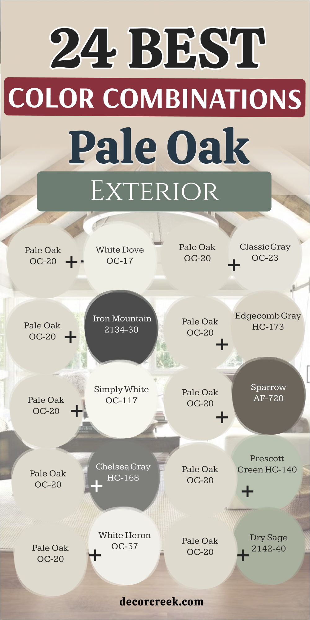
My Final Thoughts about 25 Best Colors that Goes with Pale Oak by Benjamin Moore
Choosing the right paint configuration can truly change how you experience your everyday home environment. This beautiful greige backdrop gives you the perfect foundation to build your dream look from the ground up.
Whether you prefer clean white trim boards or rich green accents, there is a matching choice for your personal taste. Always remember to test your paints on your actual walls before making a final commitment. With these combinations, you are ready to create a home that looks incredibly beautiful, structured, and genuinely welcoming for your family.
Testing your paint swatches under different lighting situations throughout the day is a highly critical step for success. You will notice how the changing sun alters the mood of your rooms from early morning until late evening. The right accent color highlights the architecture of your house and ties your furniture pieces together perfectly. Making these thoughtful choices saves you time and money while preventing frustrating mistakes down the road.
Your home deserves a cohesive look that brings a deep sense of pride every single time you open the front door.