As a home interior designer and staging expert, I know that the kitchen is the true heart of your home. It’s where your family gathers, where parties begin, and where all the important memories are made. Because of this, the color you choose for your kitchen walls is incredibly important—it sets the mood for everything that happens there.
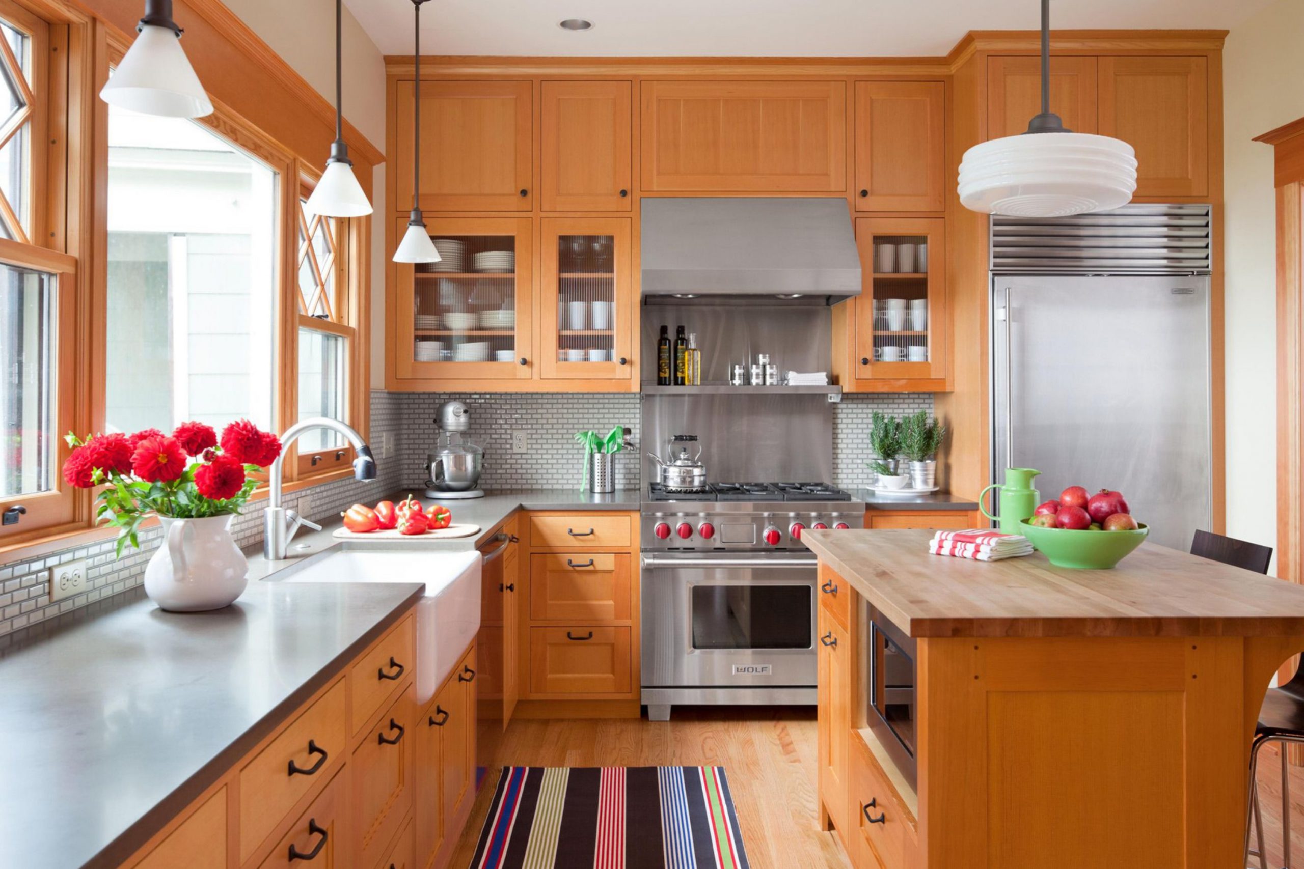
Many homes still have beautiful oak cabinets, and while they are warm and wonderful, their strong golden tone can sometimes feel a bit tricky to decorate around.
That’s why I’ve put together my list of the absolute best 36 paint colors that work magic with oak wood.
We are going to find a color that doesn’t fight the natural warmth of your cabinets but instead shows them off in a fresh, updated way.
Get ready to pick a color that will make your kitchen feel genuinely happy and brand new!
Why I Always Trust Sherwin-Williams and Benjamin Moore for Kitchen Paints Colors
When I choose paint for a room that gets as much action as a kitchen, I go straight to Sherwin-Williams and Benjamin Moore. The kitchen is a challenging room for paint—it deals with cooking grease, food splatters, high heat, and constant cleaning.
You simply need a paint that can handle it all without fading, peeling, or getting stained quickly.
These two brands produce products that are made to last and offer fantastic washability and durability, meaning your beautiful walls will stand up to scrubbing again and again. Beyond the quality, the colors they create are richer and more beautiful than any other brand I’ve worked with.
They have a depth that cheaper paints just can’t get, and they look stunning in all the different kinds of light your kitchen sees throughout the day.
Spending a little extra on this high-quality paint saves you the trouble of repainting too soon. It’s the smart and simple way to ensure your kitchen looks great for many years.
How I Choose the Perfect Kitchen Paint Color for Every Style
Picking the right color isn’t a random guess; it’s a careful balance, especially when dealing with prominent oak cabinets. First, I always look closely at the undertones of the oak. Is your oak very orange-yellow, or is it a bit lighter and more muted? The paint color must work with that specific undertone, not against it.
Next, I consider the countertops and flooring, which are called your “fixed elements.” If your counters have gray specks, a gray-based paint might be perfect; if they are warm brown, we need a creamy color.
Third, and perhaps most importantly, I think about the feeling you want.
Do you want a lively, cheerful color to start your day, or a softer, darker shade for a cozier evening kitchen?
I use these factors to narrow the huge list of options down to a few perfect shades.
By carefully balancing the warmth of the wood, the coolness of the fixed items, and your desired mood, we find the shade that just makes your kitchen sing.
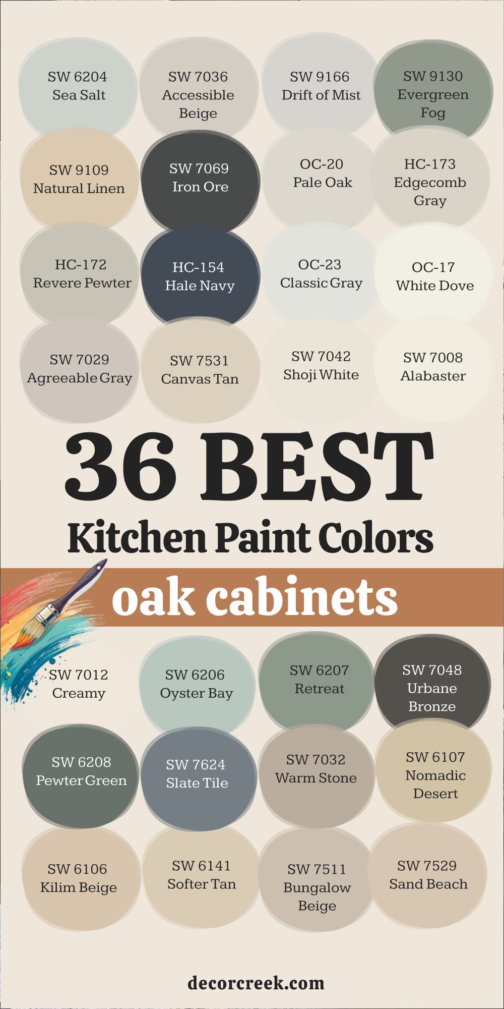
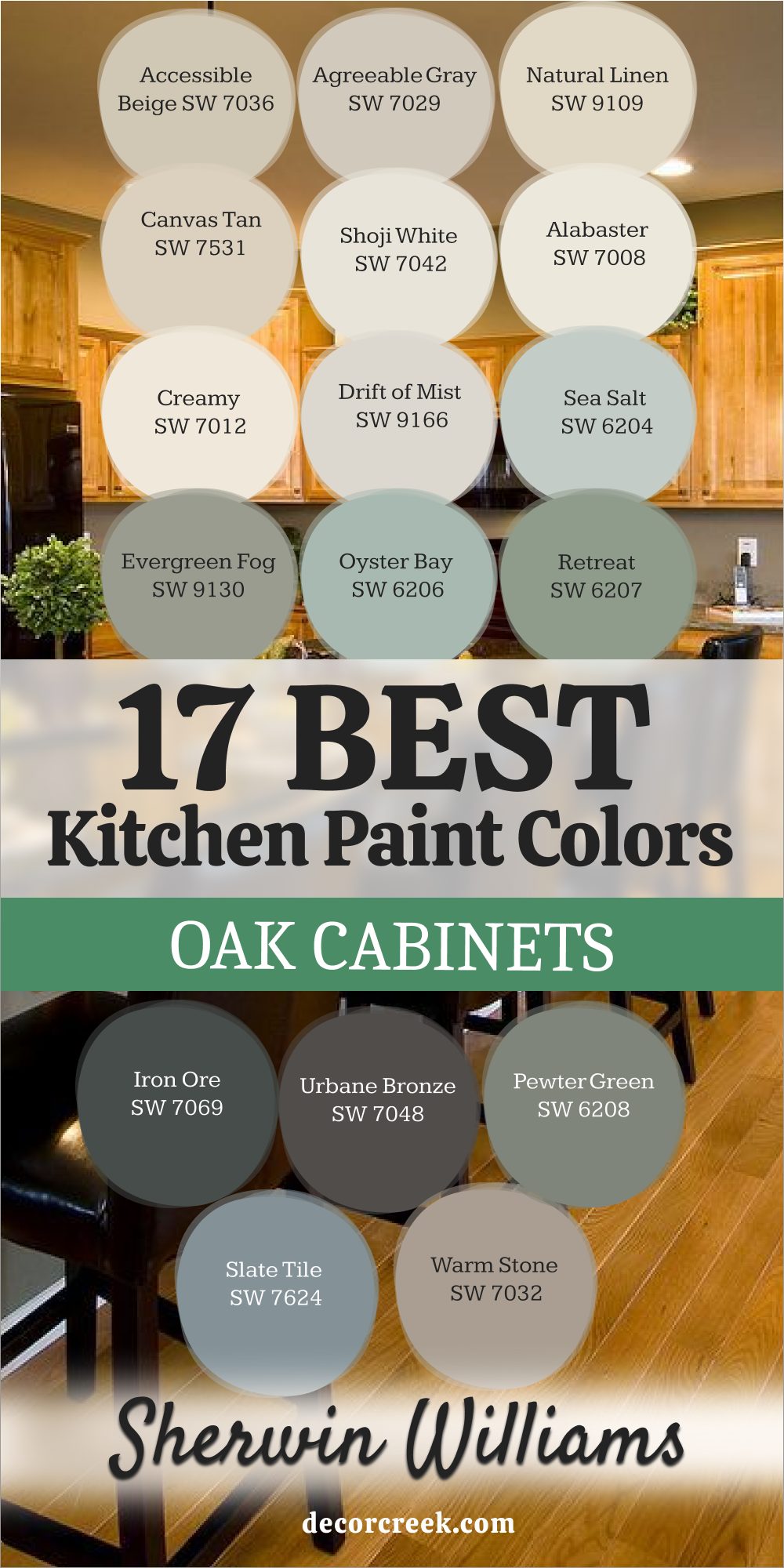
12 Kitchen Paint Colors with Dark Wood, Gray Walls & Oak Cabinets 🎨
Sea Salt SW 6204
Sea Salt SW 6204 is a light, airy color that brings a refreshing feeling of nature right into your cooking area. Sea Salt is a gentle shade that acts as a sophisticated gray-green, often feeling more gray in dimmer light and more green in bright sunshine.
Sea Salt works beautifully with the strong color of oak because it offers a cooling contrast to the wood’s warm, golden tone.
Sea Salt helps to neutralize the yellow in the oak, making the wood look richer and more intentional in the design.
Sea Salt looks exceptionally good when paired with white trim and black or stainless steel appliances for a very updated look.
Sea Salt is a fantastic choice if you want to introduce color without it feeling too bright or distracting in a busy area. Sea Salt is one of my favorite shades to recommend when people ask for a color that feels both cheerful and relaxing.
Sea Salt brings a wonderful coastal or garden feeling to your kitchen, making it a happy place to cook. Sea Salt is a consistently popular color because it simply makes everything around it look cleaner.
🎨 Check out the complete guide to this color right HERE 👈

Accessible Beige SW 7036
Accessible Beige SW 7036 is a highly versatile greige that beautifully balances the warmth of beige with the coolness of gray. Accessible Beige is a fantastic partner for oak cabinets because its slight grayness prevents the color from looking yellow or muddy next to the wood. Accessible Beige helps to gently lighten the room while still feeling substantial enough to contrast with white trim.
Accessible Beige is one of the most reliable neutrals you can use, working well with all different countertop materials, from dark granite to light quartz.
Accessible Beige provides a soft, warm background that feels very inviting and perfect for a family kitchen setting.
Accessible Beige is sophisticated enough to make your older oak cabinets feel instantly more current and fashionable. Accessible Beige works particularly well in kitchens that connect to a main living area painted a different color, as it acts as a wonderful bridge. Accessible Beige ensures your kitchen feels cozy but never heavy or dated. Accessible Beige is a choice that feels both easy and very refined.
🎨 Check out the complete guide to this color right HERE 👈

Drift of Mist SW 9166
Drift of Mist SW 9166 is an incredibly pale, almost-white shade that carries just enough gray to keep it from feeling stark or cold. Drift of Mist is a brilliant color choice for making a smaller kitchen feel airy and much larger than it actually is.
Drift of Mist provides a clean, bright contrast to the orange tones in oak, making the wood stand out beautifully without fighting it. Drift of Mist looks utterly sophisticated when paired with white subway tile and simple, clean hardware.
Drift of Mist works perfectly in modern or minimal kitchens where the focus is on clean lines and natural light.
Drift of Mist is a great way to update a kitchen if you want a lighter look but worry about using a basic, boring white. Drift of Mist has a beautiful, gentle depth that changes subtly as the light moves throughout your kitchen day. Drift of Mist is an excellent, light-reflecting color that makes the room feel fresh and tidy. Drift of Mist is a truly beautiful and delicate shade that is a wonderful stand-in for pure white.
🎨 Check out the complete guide to this color right HERE 👈

Evergreen Fog SW 9130
Evergreen Fog SW 9130 is a sophisticated, muted green-gray that brings a wonderfully earthy and grounded feeling to the kitchen. Evergreen Fog is a perfect choice for giving your kitchen a designer feel because it provides a rich, contrasting color without being too vibrant or bright.
Evergreen Fog looks amazing with the warm tones of oak, as the green notes pull out the natural richness of the wood grain.
Evergreen Fog pairs beautifully with brass or gold cabinet hardware, which instantly pops against the deep color. Evergreen Fog is a fantastic option for creating a cozy, welcoming feel in the kitchen, making it a perfect spot for gathering. Evergreen Fog is a statement color that still feels completely comfortable and natural to look at every day. Evergreen Fog works well with both dark and light countertops, which makes it very versatile for different kitchen layouts. Evergreen Fog is a color that feels very custom and high-quality, giving your oak cabinets a major style boost. Evergreen Fog is a rich shade that can handle being paired with lots of white or wood.
🎨 Check out the complete guide to this color right HERE 👈

Natural Linen SW 9109
Natural Linen SW 9109 is a beautiful, warm off-white that has a very gentle, comfortable beige undertone. Natural Linen is the perfect color for a kitchen if you want a bright look that feels much softer and warmer than a stark white. Natural Linen works well with oak because it connects with the warmth of the wood without making the cabinets look yellow or dated.
Natural Linen is an excellent neutral background for showing off decorative items, like pottery or colorful cookbooks.
Natural Linen is light enough to keep a small kitchen feeling open and large, but substantial enough to look finished on the wall. Natural Linen looks fantastic when paired with light wood floors and dark hardware for a lovely contrast. Natural Linen is a dependable color that creates a soft, very inviting atmosphere, perfect for daily family use.
Natural Linen has a delicate quality that keeps the room feeling fresh and cheerful throughout the day.
Natural Linen is a wonderful option for adding subtle warmth without making a bold color commitment.
🎨 Check out the complete guide to this color right HERE 👈

Iron Ore SW 7069
Iron Ore SW 7069 is a dramatic, deep charcoal that is so dark it looks almost black, providing an incredible graphic contrast. Iron Ore is a magnificent choice for a bold statement, often used on an accent wall or above the oak cabinets for striking effect.
Iron Ore creates a powerful contrast with the gold tones of the oak, instantly making the wood look richer and more intentional.
Iron Ore looks incredibly modern and crisp when paired with bright white trim and stainless steel or chrome fixtures. Iron Ore is surprisingly warm for a dark color, which prevents the kitchen from feeling cold or uninviting. Iron Ore is an excellent way to update a kitchen instantly, giving it a high-end, contemporary feeling.
Iron Ore works best when used with plenty of light, either natural or artificial, to keep the kitchen from feeling too heavy.
Iron Ore provides a strong, sophisticated backdrop that makes everything else in the room pop beautifully. Iron Ore is a confident choice that truly grabs your attention in the best possible way.
🎨 Check out the complete guide to this color right HERE 👈

Pale Oak OC-20
Pale Oak OC-20 is an incredibly light, airy greige that is one of Benjamin Moore’s most popular neutrals for good reason. Pale Oak is the perfect light shade if you worry about pure white looking too cold or stark in your kitchen. Pale Oak has just a hint of warmth that prevents it from feeling harsh, making it a very inviting and soft color.
Pale Oak works beautifully with oak cabinets by offering a gentle contrast that tones down the orange without fighting it.
Pale Oak is a sophisticated choice that makes any kitchen feel instantly brighter and much more polished. Pale Oak works very well with any color countertops and is a great option for an open concept kitchen.
Pale Oak ensures your kitchen walls look creamy and warm, even when the light is dim in the evening.
Pale Oak is a versatile shade that adapts to different metals and accessory colors very nicely. Pale Oak is a fantastic, light-reflecting color that makes the room feel open and easy.
🎨 Check out the complete guide to this color right HERE 👈

Edgecomb Gray HC-173
Edgecomb Gray HC-173 is a wonderfully balanced greige that sits perfectly between gray and beige, making it truly adaptable. Edgecomb Gray is a fantastic neutral that works with both warm oak cabinets and cooler elements like stainless steel or gray stone counters.
Edgecomb Gray has a beautiful, soft quality that makes the kitchen feel cozy without being too dark or heavy. Edgecomb Gray is an essential color for giving your kitchen an instantly custom and high-end look that decorators rely on.
Edgecomb Gray changes beautifully throughout the day, looking a bit warmer in the afternoon sun and softer in the evening light. Edgecomb Gray provides a gentle, sophisticated contrast to white trim and is the perfect backdrop for colorful kitchen art.
Edgecomb Gray is a great choice for connecting the kitchen to other rooms because it is so incredibly versatile.
Edgecomb Gray ensures your oak cabinets look warm and rich instead of yellow and dated. Edgecomb Gray is a comforting and reliable neutral that is a huge favorite among designers.
🎨 Check out the complete guide to this color right HERE 👈

Revere Pewter HC-172
Revere Pewter HC-172 is a hugely popular, deeper greige that offers a bit more richness and depth than lighter colors. Revere Pewter is perfect for grounding a kitchen and providing a nice visual weight that works well with heavy oak cabinets. Revere Pewter is sophisticated and feels very established, giving the kitchen a feeling of traditional elegance.
Revere Pewter works beautifully with a wide range of countertop materials, from dark granite to light marble.
Revere Pewter is an excellent choice for a large kitchen because the deeper color helps the walls feel connected and substantial. Revere Pewter looks wonderful paired with off-white trim and oil-rubbed bronze or brass fixtures for a classic look. Revere Pewter is rich enough to offer a clear contrast to oak wood without making the room feel dark or moody.
Revere Pewter is a strong, handsome neutral that never disappoints in a hardworking kitchen.
Revere Pewter is a dependable shade that can handle being paired with almost any color accessory you own.
🎨 Check out the complete guide to this color right HERE 👈

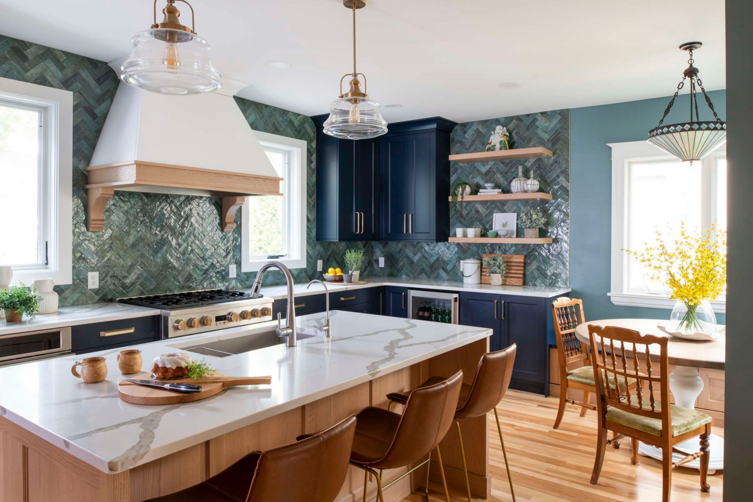
Hale Navy HC-154
Hale Navy HC-154 is a deeply classic, saturated navy blue that is completely gorgeous for making a dramatic statement. Hale Navy is a fantastic choice for a kitchen where you want to create visual interest, perhaps on an island or a small accent wall.
Hale Navy provides an incredibly sharp, beautiful contrast to the warm golden tones of the oak cabinets, making both colors stand out.
Hale Navy looks spectacular paired with bright white trim and stainless steel or polished chrome appliances. Hale Navy is a timeless color that carries an air of elegance and sophistication, instantly upgrading the feel of the entire kitchen. Hale Navy works well in well-lit areas because the deep color needs light to prevent it from feeling too heavy.
Hale Navy is a wonderful way to introduce a rich, vibrant color that still feels completely traditional and safe.
Hale Navy is a bold choice that shows confidence and makes your kitchen memorable and extremely stylish. Hale Navy is a perennial designer favorite for creating instant high-impact design.
🎨 Check out the complete guide to this color right HERE 👈
Classic Gray OC-23
Classic Gray OC-23 is a very pale, bright gray that reads as a warm off-white, making it ideal for creating an airy feel. Classic Gray is perfect for brightening up a kitchen that doesn’t get a lot of natural light, as it is highly reflective. Classic Gray is a fantastic background color that lets the texture of your oak cabinets and the details of your hardware be the main focus.
Classic Gray has just enough pigment to keep it from looking like primer, giving the walls a beautiful, gentle softness.
Classic Gray looks wonderfully crisp when paired with pure white trim and white subway tile for a very clean aesthetic. Classic Gray is a great choice for modern or simple kitchen designs where you want light and airiness above all else. Classic Gray ensures your kitchen always feels clean, fresh, and much larger than its actual size.
Classic Gray works well with stainless steel and chrome fixtures, enhancing its bright and modern look. Classic Gray is a beautiful, easy-to-live-with color that acts as a quiet workhorse in your design.
🎨 Check out the complete guide to this color right HERE 👈

White Dove OC-17
White Dove OC-17 is my absolute favorite, soft, creamy white that always makes a kitchen feel warm and inviting. White Dove is a gorgeous white that avoids the harsh blue or cold undertones that can make a kitchen feel sterile. White Dove has a subtle warmth that works wonderfully with the golden tones of oak, connecting with the wood rather than fighting it.
White Dove is the perfect white to make any colorful accessories, like fruit bowls or dish towels, truly pop.
White Dove is an essential color for creating a backdrop that feels effortless, bright, and incredibly clean. White Dove looks fantastic when you use it on both the walls and the trim, but in different sheens for subtle contrast. White Dove is a safe, dependable choice that brightens any kitchen and makes it feel entirely fresh. White Dove is a true classic that instantly gives a kitchen a high-quality, professional look. White Dove is a designer’s go-to color for bringing light and sophisticated softness to a room.
🎨 Check out the complete guide to this color right HERE 👈


17 Best Kitchen Paint Colors with Oak Cabinets by Sherwin-Williams 🧡
Accessible Beige SW 7036
Accessible Beige SW 7036 is a highly popular greige that provides the perfect balance between warm beige and cool gray tones. Accessible Beige is a phenomenal choice for oak cabinets because its slight coolness beautifully counteracts the wood’s strong yellow-orange hue.
Accessible Beige is light enough to keep your kitchen feeling airy and open but still has enough pigment to avoid looking washed out.
Accessible Beige works wonderfully with virtually any style of countertop, from dark granite to butcher block. Accessible Beige offers a sophisticated, neutral backdrop that allows the warmth of your oak to truly shine. Accessible Beige is a great color to ensure your kitchen feels current and updated without making a dramatic color commitment.
Accessible Beige looks stunning when paired with white trim and either black or brushed nickel hardware for a modern touch.
Accessible Beige is a dependable and easy color that adapts beautifully to different lighting situations throughout the day. Accessible Beige is a choice that feels both welcoming and very designer-approved. Accessible Beige ensures your kitchen walls feel soft, substantial, and ready for daily life.
🎨 Check out the complete guide to this color right HERE 👈
Agreeable Gray SW 7029
Agreeable Gray SW 7029 is another top-selling greige that is slightly lighter than Accessible Beige, carrying a gentle warm undertone. Agreeable Gray is fantastic for oak cabinets because it’s a perfectly balanced neutral that helps tone down the golden color of the wood.
Agreeable Gray is light and bright, making it an excellent choice for smaller kitchens or areas that need a lot of reflected light. Agreeable Gray is a great backdrop color that coordinates easily with different countertop colors and flooring materials.
Agreeable Gray works beautifully with either stainless steel or antique brass fixtures, making it incredibly adaptable to your style. Agreeable Gray ensures your kitchen feels light and airy while still having a grounding element of color on the walls. Agreeable Gray is a lovely color that makes white trim and backsplash tiles look incredibly crisp and clean.
Agreeable Gray has a widespread appeal because it is truly an effortless and comfortable color to live with every day.
Agreeable Gray is a sophisticated neutral that brightens your kitchen without feeling harsh or sterile. Agreeable Gray is a simple yet powerful way to bring a current, updated feeling to older oak cabinets.
🎨 Check out the complete guide to this color right HERE 👈

Natural Linen SW 9109
Natural Linen SW 9109 is a creamy, warm off-white that carries a wonderful, comforting beige undertone. Natural Linen is the ideal color if you want a bright kitchen but desire more warmth and less starkness than a pure white. Natural Linen works beautifully with oak because it complements the wood’s warmth, creating a cozy and cohesive look.
Natural Linen is light enough to keep the kitchen feeling open but substantial enough to look rich and finished on the walls.
Natural Linen looks fantastic when paired with dark hardware and light wood floors, creating a lovely layered effect. Natural Linen is a dependable, soft neutral that provides a sophisticated background for all your cooking activities. Natural Linen is a wonderful choice for creating an atmosphere that feels truly inviting and very relaxed.
Natural Linen has a gentle quality that makes the kitchen feel quiet and less frenetic than a super-bright white.
Natural Linen is a great option for adding a subtle, comfortable warmth without committing to a strong color. Natural Linen ensures your kitchen feels soft, bright, and ready for all your family gatherings.
🎨 Check out the complete guide to this color right HERE 👈
Canvas Tan SW 7531
Canvas Tan SW 7531 is a deep, creamy off-white that has a wonderfully rich, soft tan undertone, making it one of the warmest neutrals. Canvas Tan is perfect for kitchens that need an instant injection of warmth, especially if they have cool flooring or light-colored counters.
Canvas Tan works beautifully with the golden tones of oak, connecting to the wood to create a rich, cohesive, traditional look.
Canvas Tan is a great choice for providing a cozy, welcoming atmosphere, making the kitchen the true heart of the home. Canvas Tan is light enough to feel airy but has enough depth to look substantial and well-designed on the walls. Canvas Tan pairs wonderfully with traditional elements like oil-rubbed bronze fixtures and dark wood furniture.
Canvas Tan is a sophisticated shade that prevents the kitchen from looking too sterile or cold. Canvas Tan is a fantastic neutral that looks particularly beautiful when bathed in natural light.
Canvas Tan is a dependable color that creates a soft, very inviting background for cooking and eating. Canvas Tan ensures your kitchen feels immediately welcoming and perfectly tailored.
🎨 Check out the complete guide to this color right HERE 👈

Shoji White SW 7042
Shoji White SW 7042 is an incredibly popular, creamy off-white that has a distinctive warm, soft beige-gray undertone. Shoji White is the perfect choice for a kitchen where you want a clean, bright look that still feels very warm and inviting, never stark.
Shoji White works beautifully with oak cabinets because the warmth in the paint complements the golden wood color. Shoji White is light and airy, making it fantastic for opening up a small kitchen and maximizing the available light.
Shoji White is a sophisticated alternative to pure white, offering more character and depth on the walls.
Shoji White looks beautiful paired with light countertops and brass hardware for an elegant, modern aesthetic. Shoji White is a versatile color that looks rich and subtle in all types of light throughout the day.
Shoji White ensures your kitchen feels fresh, soft, and much more intentional than a basic white paint job. Shoji White is a wonderful neutral that acts as a quiet, beautiful backdrop for all your kitchen accessories. Shoji White is a dependable shade that truly brings a soft, refined look to any style of kitchen.
🎨 Check out the complete guide to this color right HERE 👈

Alabaster SW 7008
Alabaster SW 7008 is a lovely, soft white that has a gentle warmth, making it one of the most popular whites on the market today. Alabaster is perfect for a bright, clean kitchen look without the harsh, cold feeling that bright white can sometimes bring.
Alabaster works well with oak because its warmth connects to the wood, preventing the cabinets from looking too yellow.
Alabaster is a great choice for a modern or minimalist kitchen, where simplicity and light are the main focus. Alabaster looks stunning when paired with bright white trim for a subtle, layered effect that is very sophisticated. Alabaster is a highly versatile color that partners beautifully with both stainless steel and gold-toned fixtures.
Alabaster ensures your kitchen feels fresh, open, and incredibly inviting to everyone who walks in.
Alabaster is a clean and pure color that provides an excellent background for showcasing any colorful kitchen elements. Alabaster is a dependable white that brightens the room and makes the cabinets stand out elegantly. Alabaster is a brilliant choice for creating an atmosphere of lightness and refined simplicity.
🎨 Check out the complete guide to this color right HERE 👈

Creamy SW 7012
Creamy SW 7012 is a wonderfully warm white that has a distinctive, soft buttery undertone, making it a very rich color. Creamy is perfect for kitchens in older homes or for anyone wanting a genuinely cozy, slightly traditional feel on the walls. Creamy works beautifully with oak because it enhances the warmth of the wood, creating a rich, welcoming atmosphere.
Creamy is a fantastic color to use if your kitchen needs an infusion of softness and comfort, especially with cool tile or flooring.
Creamy looks amazing paired with dark wood cabinets and traditional bronze or copper hardware for a classic aesthetic. Creamy is a great choice for a kitchen where you want a white look that feels absolutely inviting, not cold or stark. Creamy is a dependable shade that softens the look of hard surfaces and makes the room feel much more personalized.
Creamy ensures your kitchen feels established, warm, and ready for long family gatherings. Creamy is a brilliant white that offers much more character and depth than basic, stark whites.
Creamy is a wonderful option for giving your kitchen walls a truly soft, luxurious finish.
🎨 Check out the complete guide to this color right HERE 👈

Drift of Mist SW 9166
Drift of Mist SW 9166 is a very light, nearly-white gray that carries a beautiful, gentle warmth, making it feel airy and open. Drift of Mist is an excellent choice for maximizing the feeling of height and size in a small kitchen with oak cabinets.
Drift of Mist provides a clean, very gentle contrast to the golden oak, allowing the wood’s richness to come forward without any fight. Drift of Mist is a sophisticated alternative to a pure white, as it offers just a hint of color and depth on the walls.
Drift of Mist looks beautiful with all types of white subway tile and simple, clean-lined hardware.
Drift of Mist works well in both contemporary and traditional kitchens, making it a very adaptable neutral. Drift of Mist is highly reflective, helping to bounce light around a dimly lit kitchen wonderfully.
Drift of Mist ensures your kitchen feels completely fresh, tidy, and effortlessly stylish. Drift of Mist is a truly beautiful, delicate shade that always feels bright and welcoming. Drift of Mist is a designer favorite for creating an open, airy feeling without using a cold color.
🎨 Check out the complete guide to this color right HERE 👈
Sea Salt SW 6204
Sea Salt SW 6204 is a beloved color that acts as a soothing gray-green, bringing a lovely natural feel to a kitchen environment. Sea Salt is a great color choice for balancing the strong, warm tone of oak cabinets, as the cool green provides a nice contrast.
Sea Salt is cheerful and bright but not overly vibrant, making it a comfortable color to spend time around every day. Sea Salt looks wonderful paired with crisp white trim and light stone countertops for a fresh, updated look.
Sea Salt is a fantastic color for creating a relaxed, friendly atmosphere, perfect for a kitchen where everyone gathers.
Sea Salt is a versatile shade that changes beautifully with the kitchen lighting, sometimes looking more gray and sometimes more green.
Sea Salt is an excellent way to introduce color without it feeling too bright or aggressive in your daily view. Sea Salt ensures your oak cabinets look richer and more intentional in the overall design. Sea Salt is a dependable color that truly makes your kitchen feel peaceful and inviting. Sea Salt is one of my top recommendations for a fresh, unique look with oak wood.
🎨 Check out the complete guide to this color right HERE 👈
Evergreen Fog SW 9130
Evergreen Fog SW 9130 is a wonderfully deep, sophisticated green-gray that brings a grounded and earthy elegance to the kitchen. Evergreen Fog is a perfect accent color for an island or a pantry door, or a beautiful choice for all the walls in a well-lit kitchen.
Evergreen Fog works beautifully with the warm tones of oak, pulling out the wood’s richness and making it feel expensive. Evergreen Fog looks stunning with brass or gold-toned cabinet pulls, which pop beautifully against the rich background.
Evergreen Fog is a statement color that still feels completely natural and cozy, perfect for a comforting kitchen design.
Evergreen Fog is a fantastic way to update a kitchen, giving it a high-end, contemporary and custom-designed look. Evergreen Fog works very well with light countertops and white subway tiles, creating a gorgeous contrast.
Evergreen Fog is a shade that provides a lovely sense of depth and sophistication to the entire room. Evergreen Fog is a deep, rich color that makes your oak cabinets look more purposeful and current. Evergreen Fog is a beautiful choice for a kitchen where you want to feel relaxed and completely at home.
🎨 Check out the complete guide to this color right HERE 👈
Oyster Bay SW 6206
Oyster Bay SW 6206 is a beautiful, muted gray-green that is slightly deeper and more saturated than Sea Salt. Oyster Bay is a fantastic choice for creating a cozy, nature-inspired feel in a kitchen with oak cabinets.
Oyster Bay works well with the golden wood by providing a rich, cool contrast that tones down the orange notes effectively.
Oyster Bay is deep enough to make white trim and light countertops stand out beautifully and look very clean. Oyster Bay is a sophisticated shade that feels utterly relaxing and welcoming, perfect for a kitchen setting. Oyster Bay looks wonderful when paired with natural materials like woven baskets, wood accessories, and stone accents.
Oyster Bay is a great way to introduce a rich color that still feels gentle and not too bright in the light. Oyster Bay ensures your kitchen has a designer touch that feels custom and thoughtfully put together.
Oyster Bay is a dependable shade that adds depth without making the room feel heavy or dark. Oyster Bay is a lovely, deep color that makes the kitchen feel grounded and connected to the outside world.
🎨 Check out the complete guide to this color right HERE 👈

Retreat SW 6207
Retreat SW 6207 is a deep, moody green-gray that has a substantial color saturation, offering a rich and very grounded look. Retreat is perfect for a kitchen where you want a truly dramatic and sophisticated color that feels deeply traditional and personal.
Retreat works beautifully with the warm tones of oak, creating a wonderful contrast that highlights the texture of the wood grain.
Retreat is a fantastic color for grounding a large kitchen or making a smaller area feel like a cozy, sophisticated jewel box. Retreat looks stunning with brass or copper fixtures and dark wood accents for a very high-end, layered look. Retreat is a statement color that still manages to feel completely comfortable and welcoming to family and guests.
Retreat is a great way to use a rich color that is still inspired by nature and feels naturally beautiful. Retreat ensures your kitchen feels expensive and thoughtfully designed, giving the oak a major update.
Retreat is a deep shade that pairs perfectly with bright white trim and light countertops. Retreat is a bold and absolutely gorgeous choice for creating a truly unique kitchen atmosphere.
🎨 Check out the complete guide to this color right HERE 👈

Iron Ore SW 7069
Iron Ore SW 7069 is a magnificent, nearly black charcoal that is a wonderful choice for creating dramatic, modern contrast. Iron Ore is excellent for making a statement, perhaps on the lower cabinets or an island, contrasting sharply with the golden oak wood.
Iron Ore works wonders by making the oak cabinets look incredibly rich and deliberate, rather than simply old or dated.
Iron Ore looks incredibly crisp and contemporary when paired with white subway tile and stainless steel or black matte fixtures. Iron Ore is a surprisingly warm dark color that keeps the kitchen from feeling cold or uninviting. Iron Ore is a fantastic way to introduce a modern, high-end feel into a traditional kitchen layout.
Iron Ore works best when the kitchen has good lighting to prevent the color from feeling too heavy or deep.
Iron Ore is a very bold choice that instantly gives your kitchen a feeling of drama and luxury. Iron Ore is a strong, handsome neutral that truly grounds the entire room’s design. Iron Ore is a dependable color for creating a memorable and visually graphic kitchen setting.
🎨 Check out the complete guide to this color right HERE 👈
Urbane Bronze SW 7048
Urbane Bronze SW 7048 is a deep, rich, moody brown-gray that feels absolutely architectural and beautifully sophisticated. Urbane Bronze is a fantastic color for creating a grounded, contemporary look, especially when paired with natural wood tones.
Urbane Bronze works well with oak cabinets because its warmth prevents the color from looking too harsh against the golden wood.
Urbane Bronze is a great choice for creating a strong focal point in the kitchen, like on an island or a feature wall. Urbane Bronze looks spectacular with natural wood shelves and soft lighting for a cozy, organic aesthetic. Urbane Bronze is a deep shade that still feels incredibly inviting and comfortable, perfect for a kitchen gathering area.
Urbane Bronze is a sophisticated neutral that gives the kitchen a high-end, designer quality instantly. Urbane Bronze works wonderfully with brass or gold accents, which truly shine against the rich background.
Urbane Bronze is a bold, modern choice that brings a unique richness and depth to the room. Urbane Bronze is a beautiful, dark color that makes your kitchen feel perfectly composed and styled.
🎨 Check out the complete guide to this color right HERE 👈

Pewter Green SW 6208
Pewter Green SW 6208 is a deep, traditional green that has a heavy gray undertone, giving it a sophisticated, muted look. Pewter Green is a fantastic choice for creating an elegant, classic kitchen atmosphere that feels both fresh and established.
Pewter Green works beautifully with the golden oak, as the deep cool color offers a lovely contrast that highlights the wood’s richness.
Pewter Green is a great color for a kitchen where you want a rich look but still want the warmth of natural wood to shine. Pewter Green looks wonderful with light countertops and white cabinets for a handsome, two-toned kitchen design. Pewter Green is a strong color that feels very grounding and substantial in a large or small kitchen.
Pewter Green is an excellent way to introduce a rich, nature-inspired color that still feels incredibly classic.
Pewter Green ensures your kitchen has a refined, traditional quality that never goes out of style. Pewter Green is a dependable shade that pairs beautifully with dark wood furniture and brass hardware. Pewter Green is a beautiful choice for adding depth and personality to your kitchen walls.
🎨 Check out the complete guide to this color right HERE 👈
Slate Tile SW 7624
Slate Tile SW 7624 is a gorgeous, deep, muted blue-gray that is much more interesting than a typical flat gray. Slate Tile is a perfect color for adding a touch of drama and richness to a kitchen, especially when used with white trim.
Slate Tile works well with oak cabinets because the cool blue tones help to neutralize the golden color of the wood effectively.
Slate Tile is a fantastic color for creating a crisp, clean look, especially when paired with white subway or marble tile. Slate Tile is deep enough to provide contrast but light enough that it won’t make your kitchen feel heavy or dark. Slate Tile looks wonderful with chrome or polished nickel fixtures for a very modern, sharp aesthetic.
Slate Tile is a great choice for adding a coastal or nautical feeling to the kitchen without being too themed or obvious.
Slate Tile ensures your kitchen feels instantly updated, clean, and beautifully sophisticated. Slate Tile is a versatile shade that works in both contemporary and more traditional settings. Slate Tile is a reliable, strong color that truly brings a richness to the walls.
🎨 Check out the complete guide to this color right HERE 👈

Warm Stone SW 7032
Warm Stone SW 7032 is a rich, substantial brown-gray that truly feels like a piece of beautiful, natural stone on the walls. Warm Stone is perfect for grounding a kitchen and introducing a wonderful sense of deep, earthy texture and warmth.
Warm Stone works beautifully with oak cabinets because it provides a rich, darker backdrop that makes the golden wood pop attractively.
Warm Stone is a fantastic color for creating a cozy, organic atmosphere, especially when paired with natural wood and woven accents. Warm Stone is a sophisticated neutral that feels very high-end and established, giving your kitchen a custom look.
Warm Stone looks wonderful with light countertops and brass or copper fixtures, creating a layered and inviting design.
Warm Stone is a great choice for providing a warm, dark color that doesn’t feel cold or overly dramatic. Warm Stone ensures your kitchen feels incredibly comfortable, welcoming, and perfectly composed. Warm Stone is a dependable color that adds a sense of substance and quality to the entire room. Warm Stone is a beautiful shade for making your kitchen feel grounded and effortlessly elegant.
🎨 Check out the complete guide to this color right HERE 👈

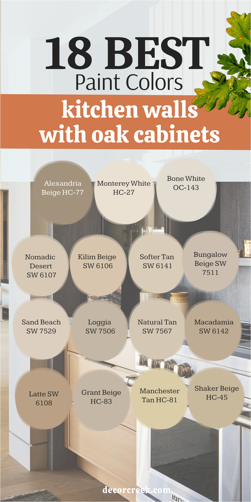
18 Best Paint Colors for Kitchen Walls with Oak Cabinets
Nomadic Desert SW 6107
Nomadic Desert SW 6107 is a rich, warm, sandy beige that brings a beautiful, cheerful feeling of natural sunshine into the kitchen. Nomadic Desert is perfect for creating a cozy, inviting atmosphere, especially if you have a traditional or rustic style of home.
Nomadic Desert works wonderfully with the golden tones of oak, creating a seamless, warm, and cohesive look.
Nomadic Desert is a fantastic color for ensuring your kitchen feels bright and welcoming, even on a cloudy day. Nomadic Desert is a sophisticated shade that gives the walls a substantial and expensive appearance. Nomadic Desert looks stunning with dark wood furniture and traditional oil-rubbed bronze fixtures.
Nomadic Desert is a great choice for a kitchen that needs an infusion of comforting, subtle warmth. Nomadic Desert is a dependable color that pairs beautifully with almost any accessory color you choose.
Nomadic Desert ensures your kitchen feels immediately inviting and ready for daily use and entertaining. Nomadic Desert is a beautiful, warm shade that is a wonderful update on typical, lighter beiges.
🎨 Check out the complete guide to this color right HERE 👈

Kilim Beige SW 6106
Kilim Beige SW 6106 is a very popular, warm, medium beige that is a fantastic, reliable neutral for a classic kitchen look. Kilim Beige is perfect for creating a cozy, comfortable atmosphere, especially in a kitchen that might feel too cold with a gray.
Kilim Beige works beautifully with oak cabinets, connecting to the wood’s warmth to create a traditional, seamless design.
Kilim Beige is a great color to use if your home has more traditional decor and you want the kitchen to flow easily. Kilim Beige is a dependable shade that offers a wonderful contrast to crisp white trim and light countertops. Kilim Beige is a very easy color to live with every day, as it is warm but not too bright or vibrant.
Kilim Beige looks handsome paired with dark wood accents and traditional light fixtures. Kilim Beige ensures your kitchen feels instantly welcoming and well-established in the home.
Kilim Beige is a sophisticated neutral that is a trusted choice among decorators for its versatility. Kilim Beige is a great option for adding a soft, rich warmth to your kitchen walls.
🎨 Check out the complete guide to this color right HERE 👈

Softer Tan SW 6141
Softer Tan SW 6141 is a beautiful, gentle beige that carries just a touch of gray, making it a much more current and sophisticated neutral. Softer Tan is lighter and airier than a typical beige, which helps a kitchen feel open while still providing lovely warmth.
Softer Tan works well with oak cabinets by offering a light, comforting color that doesn’t clash with the wood’s golden tone.
Softer Tan is a fantastic neutral backdrop that allows the wood texture and hardware details to be the main focus.
Softer Tan is a great choice for connecting the kitchen to other rooms because it is such an adaptable and pleasing color. Softer Tan looks beautiful paired with either white or creamy trim for a soft, cohesive look. Softer Tan is a dependable shade that brings a feeling of light, comfortable elegance to any kitchen.
Softer Tan ensures your kitchen feels inviting, bright, and completely effortless in its design. Softer Tan is a wonderful option for a subtle, updated warmth that feels very refined. Softer Tan is a popular color because it truly is an easy and beautiful neutral choice.
🎨 Check out the complete guide to this color right HERE 👈
Bungalow Beige SW 7511
Bungalow Beige SW 7511 is a beautiful, medium beige with a rich, earthy quality that is perfect for a cozy, grounded kitchen. Bungalow Beige is substantial enough to provide a clear contrast to white trim and appliances but still feels very light and warm.
Bungalow Beige works well with oak cabinets by complementing the wood’s natural tones, creating a traditional, layered feel.
Bungalow Beige is a fantastic color for creating a casual, inviting atmosphere, perfect for a family kitchen. Bungalow Beige looks great paired with natural materials like wood shelves, woven baskets, and stone elements. Bungalow Beige is a dependable shade that gives the kitchen a handsome, well-composed, and established look.
Bungalow Beige is a sophisticated neutral that ensures your kitchen feels warm and perfectly comfortable.
Bungalow Beige is a great choice for providing a rich, subtle backdrop that is easy to live with every day. Bungalow Beige is a beautiful color that adds depth without making the kitchen feel heavy or dark. Bungalow Beige is a wonderful option for a traditional or craftsman-style kitchen aesthetic.
🎨 Check out the complete guide to this color right HERE 👈
Sand Beach SW 7529
Sand Beach SW 7529 is a light, sunny beige that truly brings a feeling of cheerful light and coastal warmth into the kitchen. Sand Beach is a fantastic color for brightening up a kitchen that might feel a bit dark, especially one with darker oak cabinets.
Sand Beach works beautifully with oak by offering a light, gentle contrast that prevents the wood from looking too heavy.
Sand Beach has a lovely golden undertone that makes the room feel incredibly cheerful and very welcoming. Sand Beach is a great choice for a kitchen where you want a bright look that still feels soft and completely comfortable. Sand Beach looks wonderful paired with light countertops and brushed nickel or chrome fixtures for a fresh feel.
Sand Beach is a dependable shade that reflects light wonderfully, maximizing the sense of open feeling.
Sand Beach ensures your kitchen feels happy, bright, and ready for all your cooking adventures. Sand Beach is a sophisticated neutral that is a wonderful stand-in for a simple, bright white. Sand Beach is a beautiful, light color that truly warms up a room without being overly yellow.
🎨 Check out the complete guide to this color right HERE 👈
Loggia SW 7506
Loggia SW 7506 is a rich, substantial medium beige-brown that provides a wonderful feeling of depth, tradition, and sophistication. Loggia is perfect for grounding a large kitchen and creating a warm, elegant atmosphere that feels custom-designed. Loggia works beautifully with oak cabinets by providing a rich, dark backdrop that makes the golden wood pop with intentionality.
Loggia is a fantastic color for creating a luxurious, established feel, especially when paired with marble or dark granite counters.
Loggia is a great choice for a kitchen where a sense of permanence and depth in the design is desired. Loggia looks stunning with traditional bronze or copper fixtures and dark wood furniture accents.
Loggia is a sophisticated neutral that feels both classic and very well-composed on the walls. Loggia is a strong shade that makes the walls feel substantial and very high-quality.
Loggia ensures your kitchen feels immediately expensive and thoughtfully styled with a sense of history. Loggia is a beautiful, rich color that truly brings a traditional elegance to the room.
🎨 Check out the complete guide to this color right HERE 👈

Natural Tan SW 7567
Natural Tan SW 7567 is a very soft, light tan that carries a beautiful gray undertone, giving it a modern and incredibly fresh look. Natural Tan is a perfect, easy-to-live-with neutral that works wonderfully with the challenging tones of oak cabinets.
Natural Tan is a great color for keeping the kitchen bright and airy while still adding a very subtle, comfortable warmth.
Natural Tan works well as a versatile background that pairs easily with any style of countertop or appliance finish.
Natural Tan is light enough to keep a small kitchen feeling large but has enough color to avoid looking washed out.
Natural Tan looks lovely paired with both white and off-white trim for a soft, layered effect. Natural Tan is a sophisticated shade that provides a gentle, quiet backdrop that lets the wood grain stand out.
Natural Tan ensures your kitchen feels completely welcoming, modern, and effortless in its design. Natural Tan is a dependable choice that is universally pleasing and easy to decorate around. Natural Tan is a beautiful, soft color that truly works magic with the warmth of oak.
🎨 Check out the complete guide to this color right HERE 👈
Macadamia SW 6142
Macadamia SW 6142 is a rich, warm, nutty brown-beige that provides a cozy, comforting feeling in a traditional kitchen. Macadamia is a fantastic choice for connecting to the golden tones of oak cabinets, creating a warm, monochromatic, and inviting look.
Macadamia is a great color for grounding a kitchen and giving the walls a substantial, rich, and high-quality appearance.
Macadamia is a sophisticated shade that works wonderfully with darker countertops and traditional bronze or brass fixtures.
Macadamia is a warm and welcoming color that makes the kitchen feel like a truly cozy, gathering place in the home.
Macadamia looks beautiful paired with off-white trim and creamy tile for a soft, cohesive color scheme. Macadamia is a strong color that still manages to feel completely comfortable and easy to live with every day. Macadamia ensures your kitchen feels established and fully integrated into the home’s overall design. Macadamia is a dependable shade that adds a luxurious, comforting depth to the walls. Macadamia is a beautiful, rich color that makes the most of your oak wood.
🎨 Check out the complete guide to this color right HERE 👈
Latte SW 6108
Latte SW 6108 is a deep, warm, creamy brown that is perfect for creating a cozy, coffee-shop feel in your kitchen. Latte is a wonderful color for providing a rich, dark backdrop that makes the golden oak cabinets look brighter and more pronounced.
Latte is a fantastic choice for grounding a large kitchen and giving the walls a substantial and sophisticated appearance.
Latte is a great color to use if you want a warm, saturated wall color that still feels completely comfortable and inviting. Latte looks stunning with white trim and light stone countertops, creating a crisp, appealing contrast. Latte is a sophisticated shade that works beautifully with traditional, dark wood furniture and classic light fixtures.
Latte is a dependable color that adds a sense of luxury and depth to the entire room’s design.
Latte ensures your kitchen feels established, warm, and ready for long, cozy gatherings. Latte is a beautiful, rich brown that is a great way to add drama without using a cool gray or blue. Latte is a strong choice that truly brings a feeling of comfort and elegance to the kitchen.
🎨 Check out the complete guide to this color right HERE 👈
Grant Beige HC-83
Grant Beige HC-83 is a rich, warm, traditional beige that carries a hint of yellow-gold, making it a perfect partner for oak. Grant Beige is an excellent color for connecting directly to the warm tones of the oak cabinets, creating a very cohesive and inviting kitchen.
Grant Beige is a great choice for providing a substantial wall color that feels traditional and well-established in the home.
Grant Beige is a sophisticated shade that looks wonderful with creamy white trim and light stone countertops.
Grant Beige is a reliable color for creating a truly cozy, comforting atmosphere, perfect for a family kitchen.
Grant Beige is a strong neutral that prevents the kitchen from feeling sterile or overly cold with hard finishes. Grant Beige looks handsome paired with dark wood furniture and traditional bronze or brass fixtures.
Grant Beige ensures your kitchen feels welcoming, warm, and thoughtfully designed for daily life. Grant Beige is a dependable color that adds depth and richness without feeling heavy or dark. Grant Beige is a beautiful, classic shade that truly complements the richness of natural wood.
🎨 Check out the complete guide to this color right HERE 👈

Manchester Tan HC-81
Manchester Tan HC-81 is a beautiful, sunny, medium beige that has a lovely golden undertone, making it a cheerful color. Manchester Tan is a fantastic choice for brightening up a kitchen while still connecting easily to the warmth of the oak cabinets.
Manchester Tan is a great color for creating a light, airy feeling without using a stark white that might clash with the wood.
Manchester Tan is a reliable shade that ensures your kitchen feels happy, welcoming, and full of natural light.
Manchester Tan is a sophisticated neutral that looks wonderful with white trim and almost any color countertop material.
Manchester Tan is a classic color that offers a beautiful, subtle backdrop that is easy to decorate around. Manchester Tan looks handsome when paired with both light wood and dark wood accents throughout the room.
Manchester Tan ensures your kitchen feels inviting, bright, and perfectly balanced between warm and light. Manchester Tan is a dependable choice that truly brings a feeling of gentle sunshine into the room. Manchester Tan is a beautiful, soft color that gives your kitchen walls a refined, warm finish.
🎨 Check out the complete guide to this color right HERE 👈

Shaker Beige HC-45
Shaker Beige HC-45 is a classic, medium-toned beige that has a lovely, comforting depth and a subtle warm undertone. Shaker Beige is perfect for creating a warm, traditional kitchen look that feels well-established and incredibly cozy.
Shaker Beige works beautifully with oak cabinets, connecting to the wood’s color to create a seamless, warm, and inviting design.
Shaker Beige is a great choice for providing a substantial color on the walls that looks rich and high-quality.
Shaker Beige is a sophisticated neutral that looks wonderful with creamy trim and traditional dark wood accents.
Shaker Beige is a dependable color for ensuring your kitchen feels comfortable and ready for long family gatherings. Shaker Beige looks handsome with traditional fixtures in bronze or brass, enhancing its classic appeal. Shaker Beige ensures your kitchen feels grounded, warm, and beautifully composed for daily life. Shaker Beige is a wonderful color that adds a sense of history and quality to the entire room. Shaker Beige is a beautiful, traditional shade that truly complements the warmth of natural wood.
🎨 Check out the complete guide to this color right HERE 👈

Alexandria Beige HC-77
Alexandria Beige HC-77 is a rich, warm, deeper beige that carries a hint of gold, making it a gorgeous, saturated wall color. Alexandria Beige is fantastic for creating a cozy, dramatic, and sophisticated kitchen look, especially in a well-lit area.
Alexandria Beige works well with oak cabinets by offering a dark, rich backdrop that makes the golden wood pop attractively. Alexandria Beige is a great choice for grounding a large kitchen and giving the walls a substantial, elegant appearance.
Alexandria Beige is a sophisticated shade that looks stunning with creamy white trim and traditional lighting fixtures. Alexandria Beige is a dependable color that adds a sense of luxury and depth to the entire kitchen design. Alexandria Beige looks beautiful when paired with dark wood furniture and dark stone countertops.
Alexandria Beige ensures your kitchen feels immediately high-end, warm, and perfectly composed..
Alexandria Beige is a wonderful color that truly brings a feeling of established tradition and richness to the walls. Alexandria Beige is a strong, warm choice that pairs perfectly with the golden tones of oak.
🎨 Check out the complete guide to this color right HERE 👈
Monterey White HC-27
Monterey White HC-27 is a soft, creamy white that has a gentle, inviting warm undertone, making it perfect for a light kitchen. Monterey White is a fantastic choice for a bright, clean kitchen that still needs a feeling of warmth and comfort on the walls.
Monterey White works well with oak by providing a gentle, soft contrast that keeps the golden wood from looking too harsh. Monterey White is a great way to open up a small kitchen and maximize the natural light without using a stark, cold white.
Monterey White looks beautiful when paired with white subway tile for a clean, cohesive, and bright aesthetic.
Monterey White is a sophisticated neutral that is a wonderful backdrop for colorful kitchen accessories or art. Monterey White is a dependable white that ensures your kitchen feels fresh, airy, and completely welcoming.
Monterey White looks lovely with both stainless steel and brass fixtures, showing its versatility. Monterey White is a beautiful, soft shade that truly brightens the room and makes the cabinets stand out elegantly. Monterey White is a great option for creating an atmosphere of lightness and refined simplicity.
🎨 Check out the complete guide to this color right HERE 👈
Bone White OC-143
Bone White OC-143 is a very light, delicate off-white that carries a wonderful, subtle touch of soft gray and beige. Bone White is the perfect choice for a kitchen if you want the crispness of white but desire a much softer, more muted feeling.
Bone White works beautifully with oak cabinets by offering a gentle contrast that prevents the wood from looking too orange or brassy.
Bone White is a fantastic way to instantly update a kitchen, giving it an airy, very current, and sophisticated look. Bone White is a great color for maximizing light reflection, making the kitchen feel much larger than its actual size. Bone White looks stunning when paired with both cool marble and warm wood elements for a beautiful balance.
Bone White is a dependable shade that ensures your kitchen walls feel perfectly soft, clean, and never cold. Bone White is a beautiful neutral that acts as a quiet, refined background for all your cooking activities.
Bone White is a wonderful option for adding a subtle, high-quality touch of color without being dramatic. Bone White is a light, sophisticated choice that truly complements the natural texture of the oak.
🎨 Check out the complete guide to this color right HERE 👈
Winds Breath OC-24
Winds Breath OC-24 is an incredibly light, soft greige that is almost an off-white, carrying a beautiful, delicate warmth. Winds Breath is a fantastic choice for keeping a kitchen bright and open while avoiding the harshness of a true, stark white.
Winds Breath works well with oak cabinets because its slight grayness helps to subtly neutralize the yellow tones in the wood. Winds Breath is a great color for a clean, contemporary look where you want the light and airiness to be the main focus.
Winds Breath is a very subtle and sophisticated shade that changes beautifully with the natural light throughout the day. Winds Breath looks wonderful when paired with white trim for a soft, layered, and sophisticated monochromatic design.
Winds Breath is a dependable shade that ensures your kitchen feels fresh, inviting, and effortlessly chic.
Winds Breath is a beautiful neutral that provides a gentle backdrop for any style of appliance or fixture. Winds Breath is a popular color because it truly is an easy and incredibly light color to live with daily. Winds Breath is a brilliant choice for creating an atmosphere of lightness and refined airiness.
🎨 Check out the complete guide to this color right HERE 👈
Silver Satin OC-26
Silver Satin OC-26 is a very pale, light gray that has a lovely warm, silky undertone, preventing it from feeling cold or stark. Silver Satin is a fantastic color for creating a crisp, clean, and contemporary look in a kitchen with oak cabinets.
Silver Satin works well with oak by offering a cool, gentle contrast that beautifully balances the wood’s warmth.
Silver Satin is a great choice for maximizing light reflection, making the kitchen feel significantly larger and much brighter.
Silver Satin is a sophisticated shade that looks stunning when paired with stainless steel appliances and chrome fixtures. Silver Satin is a dependable neutral that ensures your kitchen feels fresh, tidy, and effortlessly stylish.
Silver Satin looks beautiful with white subway or marble tile, enhancing its clean and refined aesthetic. Silver Satin is a wonderful option for introducing a gray that is soft, airy, and never feels moody or heavy. Silver Satin is a popular color among designers for creating a chic, understated elegance. Silver Satin is a beautiful, light shade that truly makes the most of the available light in your kitchen.
🎨 Check out the complete guide to this color right HERE 👈
Horizon OC-53
Horizon OC-53 is a very light, soft, airy gray that has a subtle, almost watery feel, making it a lovely, gentle color. Horizon is a fantastic choice for a kitchen where you want a clean, bright, and very contemporary look that feels effortless.
Horizon works well with oak cabinets by providing a beautiful, cool contrast that balances the golden tones of the wood.
Horizon is a great color for maximizing light and making a smaller kitchen feel much more open and spacious.
Horizon is a sophisticated shade that looks incredible when paired with simple, clean-lined cabinetry and minimal hardware. Horizon is a dependable neutral that ensures your kitchen feels fresh, calm, and utterly sophisticated.
Horizon looks beautiful with white trim and light stone countertops, creating a crisp and elegant aesthetic. Horizon is a wonderful option for introducing a light gray that is soft and never feels too cold or intimidating. Horizon is a beautiful, easy-to-live-with shade that truly brightens the room and feels very modern. Horizon is a great choice for creating an atmosphere of lightness and refined, quiet style.
🎨 Check out the complete guide to this color right HERE 👈

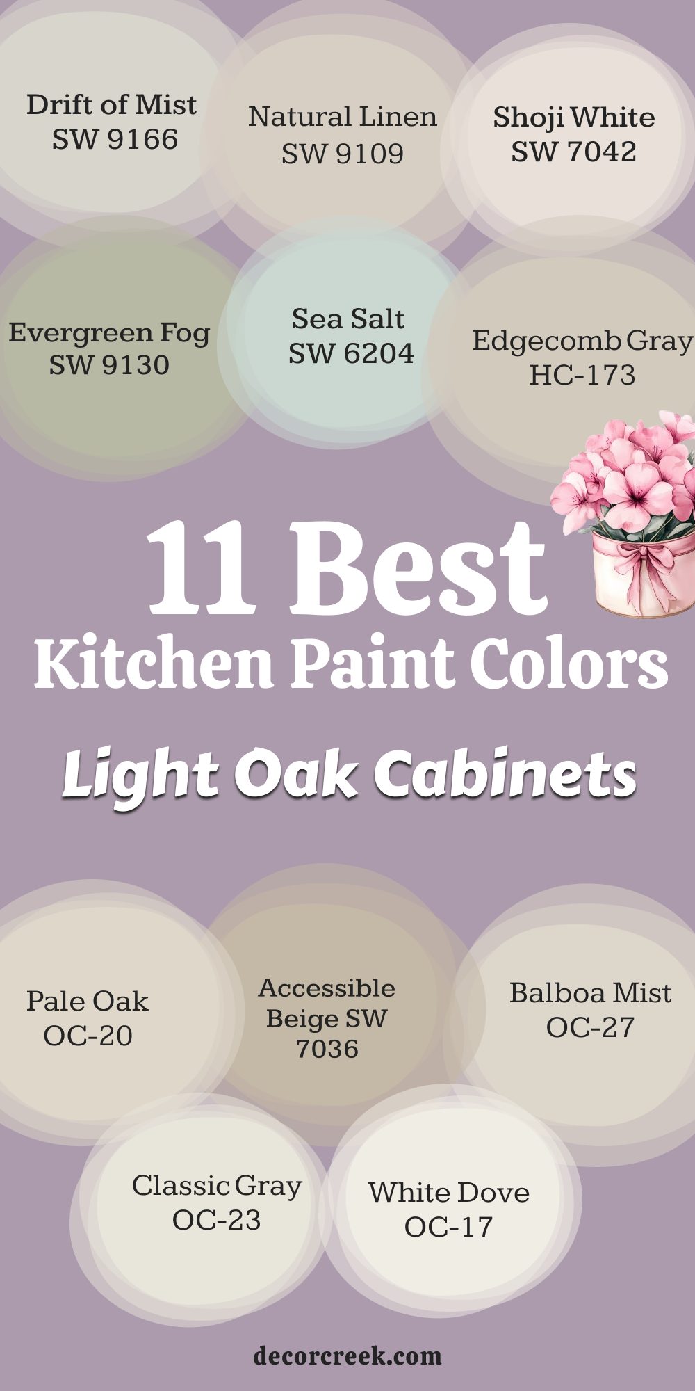
11 Best Kitchen Paint Colors with Light Oak Cabinets
Drift of Mist SW 9166
Drift of Mist SW 9166 is an incredibly pale, beautiful gray that reads almost as a warm off-white, perfect for light oak. Drift of Mist is a brilliant choice for creating an airy, open, and light-filled kitchen, maximizing the effect of the paler wood.
Drift of Mist works well with light oak cabinets because it offers a clean, gentle contrast without making the wood look muddy or harsh. Drift of Mist is a sophisticated alternative to pure white, offering subtle depth and character on the walls. Drift of Mist looks beautiful paired with clean white trim and light countertops for a soft, elegant aesthetic.
Drift of Mist is a fantastic color for reflecting light, making even a dimly lit kitchen feel brighter and more cheerful.
Drift of Mist ensures your kitchen feels perfectly fresh, tidy, and effortlessly stylish, making the space inviting.
Drift of Mist is a wonderful option for a modern or minimalist kitchen design where light and simplicity are key. Drift of Mist is a popular shade that works wonderfully with both cool grays and warmer beige elements.
Drift of Mist is a great, dependable color that makes your entire kitchen feel new and refreshed.
🎨 Check out the complete guide to this color right HERE 👈
Accessible Beige SW 7036
Accessible Beige SW 7036 is the perfectly balanced greige that connects the warmth of light oak with cooler kitchen elements. Accessible Beige is a fantastic partner for light oak cabinets because it provides a soft contrast that allows the wood’s grain to shine.
Accessible Beige is light enough to keep the kitchen feeling open but substantial enough to look rich and well-designed on the walls.
Accessible Beige works wonderfully with any style of countertop and is a great option for an open-concept kitchen layout. Accessible Beige offers a sophisticated, neutral backdrop that ensures your kitchen feels current and inviting to all. Accessible Beige is a great color to use if you want warmth but need to avoid the yellow or orange undertones of traditional beiges.
Accessible Beige looks stunning when paired with white trim and either black or bronze hardware for a modern contrast.
Accessible Beige is a dependable and easy color that looks beautiful in all types of light throughout the day. Accessible Beige is a choice that feels both cozy and incredibly refined for a daily-use kitchen. Accessible Beige ensures your kitchen walls feel soft, substantial, and ready to stand the test of time.
🎨 Check out the complete guide to this color right HERE 👈
Shoji White SW 7042
Shoji White SW 7042 is a wonderfully creamy off-white that carries a subtle, warm beige-gray undertone, making it soft and inviting. Shoji White is the ideal color if you want a bright look but desire a hint of warmth that stark white often lacks.
Shoji White works beautifully with light oak by offering a gentle, soft backdrop that complements the wood’s natural, light color. Shoji White is light and airy, making it fantastic for opening up a small kitchen and maximizing all available light.
Shoji White is a sophisticated alternative to pure white, giving the walls a beautiful, subtle depth and character.
Shoji White looks lovely paired with natural wood accents and light stone or quartz countertops. Shoji White is a versatile color that looks rich and subtle in all types of light throughout your kitchen day.
Shoji White ensures your kitchen feels fresh, soft, and much more intentional than a basic coat of white paint. Shoji White is a dependable neutral that acts as a quiet, beautiful background for your kitchen life. Shoji White is a great choice for bringing a soft, refined, and airy look to light oak cabinets.
🎨 Check out the complete guide to this color right HERE 👈
Natural Linen SW 9109
Natural Linen SW 9109 is a beautiful, warm off-white that has a very gentle, comforting beige undertone. Natural Linen is the perfect color for a kitchen if you want a bright look that feels much softer and more welcoming than a true white.
Natural Linen works beautifully with light oak because it enhances the wood’s warmth, creating a seamless, cozy look.
Natural Linen is light enough to keep a small kitchen feeling open but substantial enough to look finished on the walls.
Natural Linen looks fantastic when paired with light wood floors and dark cabinet hardware for a subtle contrast.
Natural Linen is a dependable, soft neutral that provides a sophisticated background for all your cooking and gathering. Natural Linen is a great choice for creating an atmosphere that feels truly inviting and very relaxed for the family. Natural Linen has a delicate quality that keeps the room feeling fresh and cheerfully bright throughout the day. Natural Linen is a wonderful option for adding a subtle, comfortable warmth without making a bold color commitment. Natural Linen ensures your kitchen feels soft, bright, and completely ready for daily use.
🎨 Check out the complete guide to this color right HERE 👈
Sea Salt SW 6204
Sea Salt SW 6204 is a light, airy gray-green that brings a beautiful, refreshing touch of color and nature into the kitchen. Sea Salt is a fantastic choice for balancing the slight yellow-gold undertones often found in light oak cabinets.
Sea Salt is a cheerful color that is still muted enough to be comfortable and easy to live with every single day.
Sea Salt looks stunning when paired with crisp white trim and light stone countertops for a fresh, updated aesthetic.
Sea Salt is a great color for creating a relaxed, friendly atmosphere, perfect for a family kitchen gathering area.
Sea Salt is a versatile shade that changes beautifully with the kitchen light, sometimes looking more gray and sometimes more green. Sea Salt is an excellent way to introduce a cool color that still feels gentle and not too bright or distracting. Sea Salt ensures your light oak cabinets look even richer and more intentional in the kitchen design. Sea Salt is a dependable color that truly makes your kitchen feel peaceful and incredibly inviting. Sea Salt is one of my top suggestions for a unique, fresh color that works magic with light wood.
🎨 Check out the complete guide to this color right HERE 👈
Evergreen Fog SW 9130
Evergreen Fog SW 9130 is a sophisticated, deep green-gray that brings a grounded and stylish elegance to the kitchen. Evergreen Fog is a perfect color for adding a rich accent to a kitchen island or a feature wall above the light oak cabinets.
Evergreen Fog works beautifully with light oak by providing a deep, rich contrast that makes the paler wood truly stand out.
Evergreen Fog looks amazing with brass or gold cabinet hardware, which pops beautifully against the rich green background. Evergreen Fog is a statement color that still manages to feel completely natural and cozy in the kitchen environment.
Evergreen Fog is a fantastic way to update a kitchen, giving it a high-end, contemporary, and custom-designed feeling.
Evergreen Fog works very well with light countertops and white subway tiles, creating a gorgeous, balanced contrast.
Evergreen Fog is a shade that provides a lovely sense of depth and sophistication to the entire room’s design. Evergreen Fog is a deep, rich color that makes your light oak cabinets look modern and purposeful. Evergreen Fog is a beautiful choice for a kitchen where you want to feel relaxed and deeply comfortable.
🎨 Check out the complete guide to this color right HERE 👈
Edgecomb Gray HC-173
Edgecomb Gray HC-173 is a perfectly balanced greige that is incredibly light, airy, and adaptable to different tones. Edgecomb Gray is a fantastic neutral that works well with the warmth of light oak and the coolness of modern kitchen fixtures.
Edgecomb Gray has a beautiful, soft quality that makes the kitchen feel cozy without being too dark or heavy on the walls.
Edgecomb Gray is an essential color for giving your kitchen an instantly custom and high-end look that is both easy and refined.
Edgecomb Gray changes beautifully throughout the day, looking a bit warmer in bright light and softer in the evening. Edgecomb Gray provides a gentle, sophisticated contrast to white trim and is a wonderful backdrop for all kitchen accessories.
Edgecomb Gray is a great choice for connecting the kitchen to other rooms because of its versatile and pleasing nature. Edgecomb Gray ensures your light oak cabinets look rich and current instead of simply old or dated. Edgecomb Gray is a comforting and reliable neutral that is truly a designer favorite for every room.
🎨 Check out the complete guide to this color right HERE 👈
Pale Oak OC-20
Pale Oak OC-20 is an incredibly light, airy greige that reads as a warm off-white, making it perfect for maximizing light and openness. Pale Oak is the ideal light shade if you worry about pure white looking too stark or cold in your kitchen with light oak cabinets.
Pale Oak has just enough warmth to prevent it from feeling harsh, making it a very inviting and soft color on the walls.
Pale Oak works beautifully with light oak by offering a gentle, sophisticated contrast that complements the wood’s natural color.
Pale Oak is a sophisticated choice that makes any kitchen feel instantly brighter and much more polished and refined.
Pale Oak works very well with any color countertops and is a fantastic option for a large, open-concept kitchen. Pale Oak ensures your kitchen walls look creamy and warm, even when the light is dim in the late afternoon. Pale Oak is a versatile shade that pairs nicely with different metallic fixtures and cabinet hardware. Pale Oak is a fantastic, light-reflecting color that makes the room feel open and effortlessly styled.
🎨 Check out the complete guide to this color right HERE 👈
Balboa Mist OC-27
Balboa Mist OC-27 is a very light, delicate gray that has a lovely warm, soft quality, making it an incredibly sophisticated neutral. Balboa Mist is a fantastic choice for a clean, bright, and contemporary look in a kitchen with light oak cabinets.
Balboa Mist works well with the light oak by providing a gentle, cool contrast that beautifully balances the wood’s warmth.
Balboa Mist is a great color for maximizing light and making a kitchen feel airy and much larger than its actual size.
Balboa Mist is a sophisticated shade that looks incredible when paired with white trim and simple, clean-lined appliances. Balboa Mist is a dependable neutral that ensures your kitchen feels fresh, tidy, and completely comfortable.
Balboa Mist looks beautiful with white subway tile, enhancing its clean and refined aesthetic perfectly. Balboa Mist is a wonderful option for introducing a soft gray that is never cold or moody on the walls. Balboa Mist is a beautiful, easy-to-live-with shade that truly brightens the room and feels very modern. Balboa Mist is a great choice for creating an atmosphere of lightness and refined, quiet elegance.
🎨 Check out the complete guide to this color right HERE 👈

Classic Gray OC-23
Classic Gray OC-23 is a very pale, bright gray that acts as a warm off-white, making it ideal for creating a super airy kitchen look. Classic Gray is perfect for brightening up a kitchen that doesn’t get a lot of natural light, as it is highly reflective and pure.
Classic Gray is a fantastic background color that lets the subtle texture of your light oak cabinets be the main focus.
Classic Gray has just enough color pigment to keep it from looking like plain primer, giving the walls a gentle, beautiful softness.
Classic Gray looks wonderfully crisp when paired with pure white trim and white subway tile for a very clean aesthetic.
Classic Gray is a great choice for modern or simple kitchen designs where you want maximum light and airiness. Classic Gray ensures your kitchen always feels clean, fresh, and much larger than its actual dimensions. Classic Gray works well with stainless steel and chrome fixtures, enhancing its modern and bright appeal. Classic Gray is a beautiful, easy-to-live-with color that acts as a quiet workhorse in your kitchen design.
🎨 Check out the complete guide to this color right HERE 👈
White Dove OC-17
White Dove OC-17 is my absolute favorite, soft, creamy white that consistently makes any kitchen feel warm and incredibly welcoming. White Dove is a fantastic white that avoids the harsh blue or cold undertones that can make a kitchen feel sterile or unfriendly.
White Dove has a subtle warmth that works beautifully with light oak, connecting easily to the wood rather than clashing with it. White Dove is the perfect white to make any colorful accessories, like ceramics or dish towels, truly stand out and pop.
White Dove is an essential color for creating a backdrop that feels effortless, bright, and wonderfully clean in the kitchen.
White Dove looks beautiful when you use it on both the walls and the trim in different sheens for a soft, layered look.
White Dove is a safe, dependable choice that brightens any kitchen and makes it feel entirely new and fresh. White Dove is a true classic that instantly gives a kitchen a high-quality, professional, and refined look. White Dove is a designer’s top choice for bringing light and sophisticated softness to a room with natural wood.
🎨 Check out the complete guide to this color right HERE 👈
My Final Thoughts on Choosing Kitchen Paint Colors for Oak Cabinets 💖
Choosing the right paint color for your kitchen is one of the most powerful decisions you can make to update your home. The colors I have presented here are all proven to work magic with the strong, beautiful tones of oak cabinets, transforming a potentially dated look into something fresh and current.
Remember that the perfect color is the one that makes you feel genuinely happy and comfortable every time you walk into your kitchen.
Do not let fear stop you from choosing a richer green or a deep blue, but always test the color first. Buy a sample of your top three choices and paint large squares on your walls near the oak.
Look at them in the morning light, under your cabinet lighting at night, and during the daytime. The color must work perfectly with the unique lighting and fixed materials in your home.
By selecting a high-quality paint in one of these designer-approved shades, you are investing in a kitchen that will be beautiful, inviting, and wonderfully suited to your family’s life for many years to come.