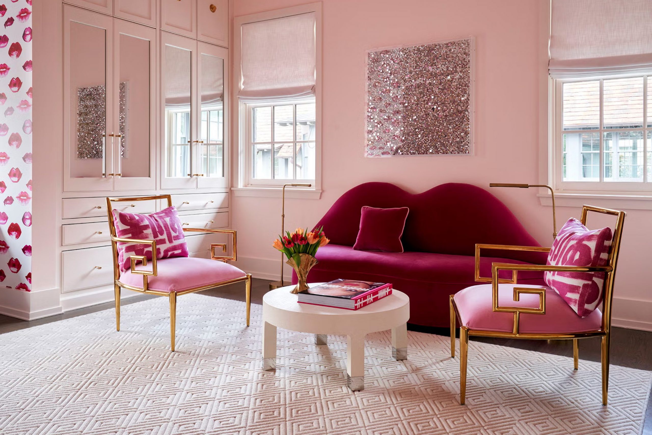
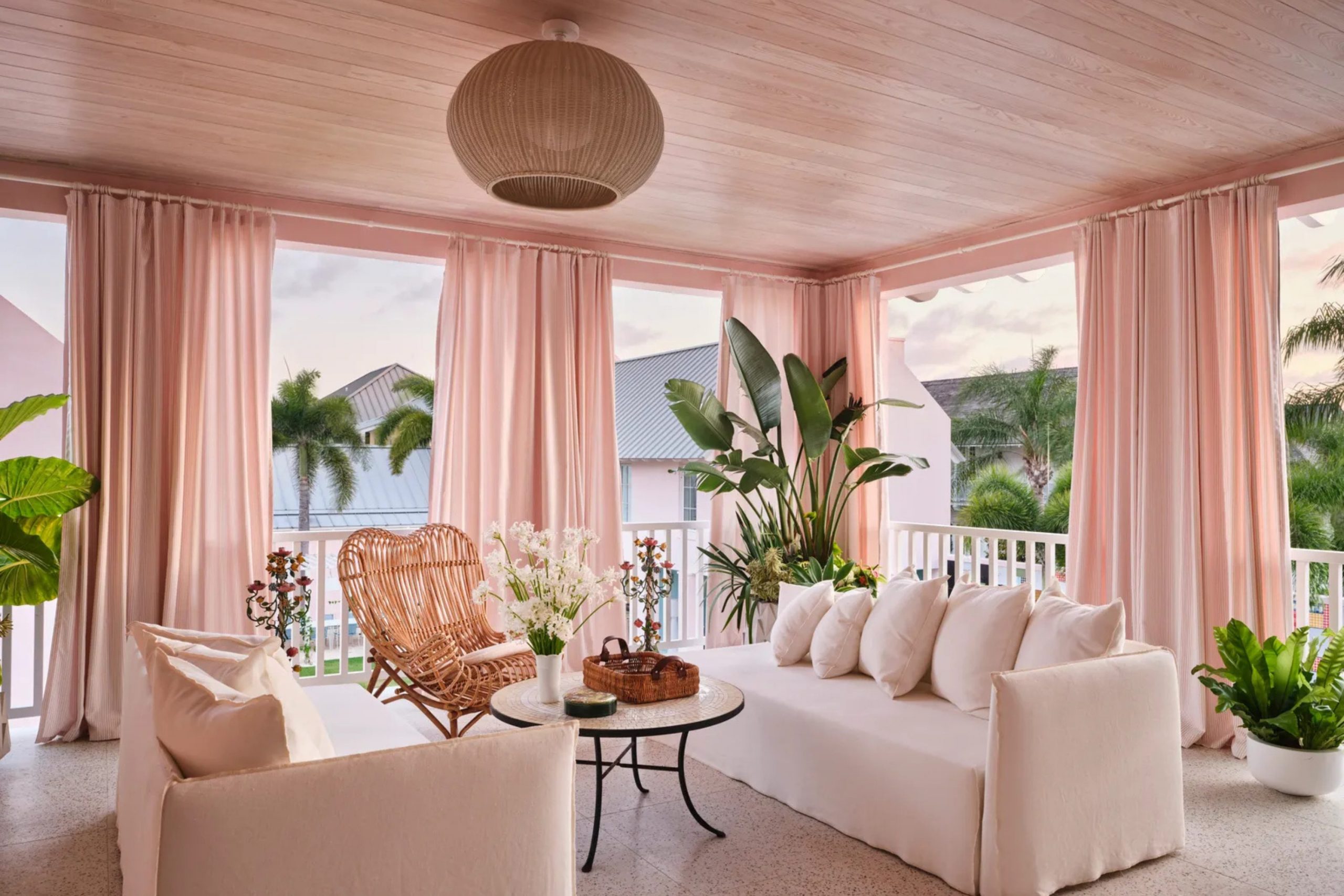
Pink is no longer just for a little girl’s bedroom. It has grown up and become a favorite choice for stylish homes. Choosing the right accent shade makes a blush or dusty rose backdrop look fresh and balanced.
Many homeowners feel nervous about picking matching tones because they worry about making their house look like a candy shop. This common fear keeps many families from trying beautiful combinations that could bring real joy to their daily lives.
My years of working with homes have taught me exactly how to balance these rosy tones. You can create a look that feels warm, grounded, and welcoming. Let us look at the finest options to pair with your favorite blush shades. When you learn how to handle these tones like a professional designer, you can turn any dark or boring area into a bright showcase.
Let us dive into the best strategies to make your favorite pink palettes work perfectly for your family.
Why I Trust Sherwin-Williams and Benjamin Moore for Colors That Go With Pink
These two major brands have mastered the art of paint formulas. Their pigments are deep and rich, which means the paint looks the same on your wall as it does on the small sample card.
I trust them because their color collections offer accurate undertones that prevent unexpected shifting under different lights. They spend years testing their products in real homes to ensure that everyday people get beautiful results without any stressful surprises.
When you mix pink with these professional shades, you get predictable results. You will not end up with a wall that suddenly looks green or yellow when the sun goes down. Their durable finishes also stand up to daily life, making your design investment last for a very long time. Muddy footprints, fingerprints, and scuffs wipe away easily from these high-quality surfaces.
Choosing a premium brand gives you peace of mind because you know the colors will stay bright and true for many years to come.
How I Choose the Best Paint Colors That Go With Pink
I start by looking at the temperature of the pink shade in the room. A cool blush with blue undertones needs a different partner than a warm peach-pink. I always hold large painted boards against the walls to see how the natural light changes the hue throughout the day. This simple step saves you from buying the wrong gallon of paint and helps you see how shadows interact with the colorful pigments.
My secret is to look for ground colors that balance the sweetness of the pink. Deep charcoals, crisp whites, and earthy greens are great choices because they add structure to a room. This method ensures the final look feels intentional and comfortable for the entire family.
By mixing strong neutrals with soft rosy tones, you create a beautiful visual weight that keeps the layout looking mature. It takes the guesswork out of remodeling and guarantees a friendly environment that makes everyone feel right at home.
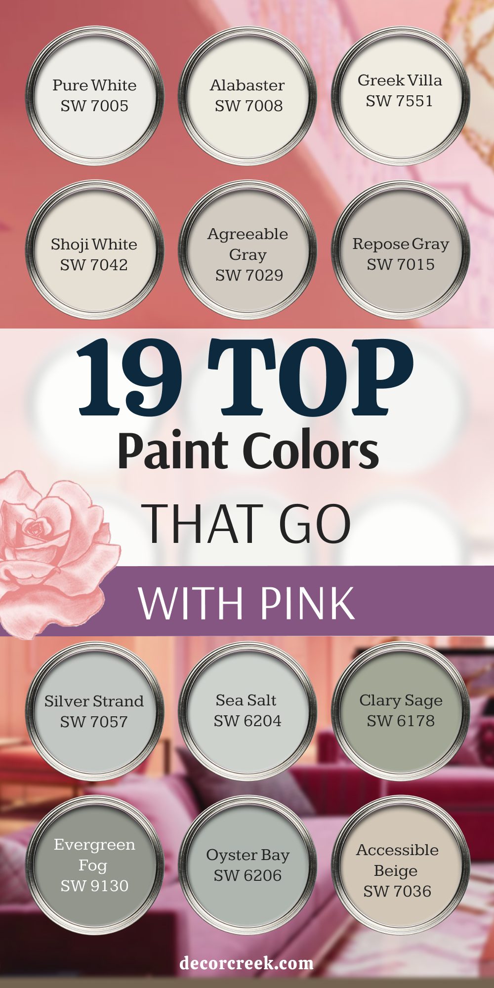
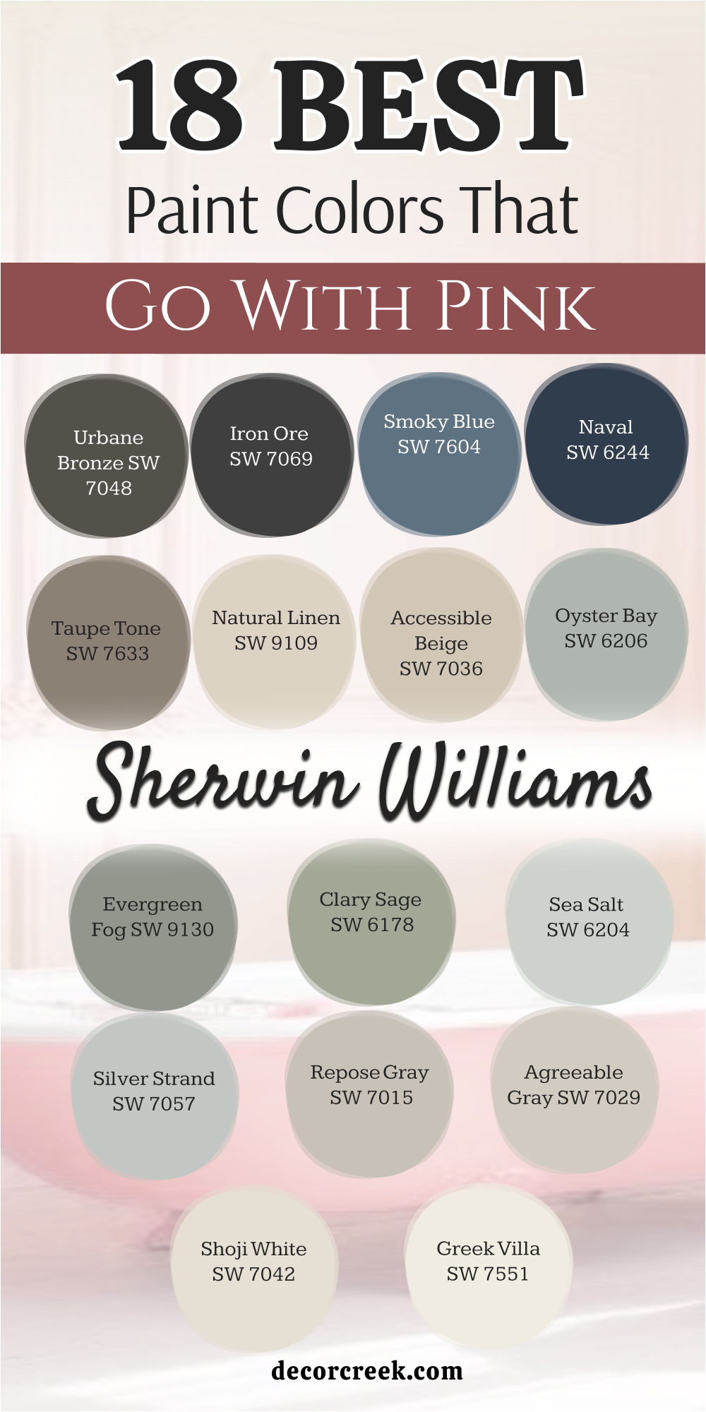
18 Top Paint Colors that go With Pink from Sherwin Williams
Pure White SW 7005
Pure White SW 7005 offers a clean canvas that lets your favorite rose tones stand out without looking harsh. This bright shade lacks any heavy yellow or blue undertones that might fight with a soft blush backdrop.
You will notice how it instantly brightens up a dim hallway when placed next to a cheery accent wall. My clients love this option because it makes a small room feel much larger and more open. It provides a crisp border on trim and baseboards to frame your colorful walls beautifully.
You can trust this clean choice to bring out the truest tones in your pastel decor. It creates a crisp contrast that looks neat and organized.
Best used in: living rooms, kitchens, hallways, bedrooms, and modern exteriors
Pairs well with: Iron Ore SW 7069, Agreeable Gray SW 7029, Natural Linen SW 9109, dark wood tones The key rule of this color for farmhouse style is to use it where you want natural light to feel kind, soft, and inviting throughout the day.
👉 Read the full guide for this color HERE 👈

Alabaster SW 7008
Alabaster SW 7008 provides a creamy warmth that softens the look of any bright rosy wall. This popular tone has a gentle beige undertone that keeps it from looking too cold or clinical.
You will find that it creates a cozy feeling in a nursery or a main bedroom. It catches afternoon sunlight beautifully and creates a comforting glow. Homeowners choose this shade when they want a comfortable atmosphere that does not feel stiff.
It bridges the gap between modern style and traditional comfort effortlessly. This hue grounds the playful energy of a pink room. It makes guests want to sit down and relax for a while.
Best used in: living rooms, kitchens, hallways, bedrooms, and farmhouse exteriors
Pairs well with: Iron Ore SW 7069, Agreeable Gray SW 7029, Natural Linen SW 9109, warm wood tones The key rule of this color for farmhouse style is to use it where you want natural light to feel kind, soft, and inviting throughout the day.
👉 Read the full guide for this color HERE 👈

Greek Villa SW 7551
Greek Villa SW 7551 features a rich, sunny undertone that pairs beautifully with warm peach-pink tones. This choice makes a room feel full of light even on cloudy winter days.
You can use it on the ceiling to create a seamless flow from your rosy walls. It brings a sense of comfort that simple bright whites cannot achieve on their own. I recommend this shade for family areas where people gather to talk and play.
It softens hard angles and makes the architecture look gentle. This paint selection creates an inviting background for your daily life. It feels like a warm hug whenever you walk through the front door.
Best used in: living rooms, dining rooms, kitchens, entryways, and traditional exteriors
Pairs well with: Urbane Bronze SW 7048, Repose Gray SW 7015, Taupe Tone SW 7633, medium wood tones The key rule of this color for farmhouse style is to use it where you want natural light to feel kind, soft, and inviting throughout the day.
👉 Read the full guide for this color HERE 👈

Shoji White SW 7042
Shoji White SW 7042 walks the line between a warm cream and a very light greige paint. This tone works wonders at toning down the brightness of a loud, energetic pink.
You will notice how it shifts beautifully depending on the time of day. It provides a sturdy background that keeps a playful room looking mature and grounded. Many people select this color for open floor plans because it connects different areas smoothly.
It prevents the eye from getting tired of too much bright color. This background tone brings balance to your home design. It makes your colorful accents look professional and well planned.
Best used in: open floor plans, living rooms, kitchens, bedrooms, and modern farmhouse exteriors
Pairs well with: Naval SW 6244, Clary Sage SW 6178, Accessible Beige SW 7036, natural wood tones The key rule of this color for farmhouse style is to use it where you want natural light to feel kind, soft, and inviting throughout the day.
👉 Read the full guide for this color HERE 👈

Agreeable Gray SW 7029
Agreeable Gray SW 7029 is a famous neutral that adapts to almost any pink companion you choose. This shade contains a perfect blend of beige and gray that prevents it from feeling chilly.
You will love how it tames the sweetness of pink ribbons and floral patterns. It works beautifully in busy living areas where you want a reliable, stable color. My clients find that it coordinates well with existing furniture and flooring easily.
It provides a modern touch without feeling distant or cold. This neutral acts like a good friend that supports your colorful design choices. It keeps the entire room feeling balanced and handsome.
Best used in: living rooms, family rooms, kitchens, entryways, and whole-house interiors
Pairs well with: Pure White SW 7005, Iron Ore SW 7069, Sea Salt SW 6204, dark stained wood The key rule of this color for farmhouse style is to use it where you want natural light to feel kind, soft, and inviting throughout the day.
👉 Read the full guide for this color HERE 👈

Repose Gray SW 7015
Repose Gray SW 7015 has a slight blue-green undertone that cools down hot, vibrant pink walls. This choice brings a sense of order and structure to a colorful playroom or bedroom.
You will notice that it looks rich and sophisticated under artificial evening lights. It works best when you want to create a tailored, clean appearance in your home. Homeowners appreciate how it hides minor scuffs and fingerprints in high-traffic hallways.
It contrasts sharply against white trim for a very neat look. This tone provides a cool balance to the fiery energy of magenta or coral. It keeps your home looking stylish and sharp.
Best used in: bedrooms, bathrooms, living rooms, hallways, and contemporary interiors
Pairs well with: Alabaster SW 7008, Naval SW 6244, Evergreen Fog SW 9130, light wood tones The key rule of this color for farmhouse style is to use it where you want natural light to feel kind, soft, and inviting throughout the day.
👉 Read the full guide for this color HERE 👈

Silver Strand SW 7057
Silver Strand SW 7057 is a whimsical mix of gray, green, and blue that loves pink partners. This paint choice changes its look with the weather to keep your room interesting.
You will see the green tones pop out when you pair it with a dusty rose. It creates a soft, misty look that feels very relaxing after a long day at work. I like to use it in bathrooms where you want a clean, fresh feeling.
It helps create an environment where you can easily unwind and forget your troubles. This color adds a magical touch to your interior design. It turns an ordinary room into a special retreat.
Best used in: bathrooms, bedrooms, laundry rooms, nurseries, and cottage interiors
Pairs well with: Pure White SW 7005, Smoky Blue SW 7604, Iron Ore SW 7069, weathered wood tones The key rule of this color for farmhouse style is to use it where you want natural light to feel kind, soft, and inviting throughout the day.
👉 Read the full guide for this color HERE 👈
Sea Salt SW 6204
Sea Salt SW 6204 brings a gentle coastal feeling that pairs naturally with soft blush pinks. This muted green-blue shade softens the pink tones and reminds people of beautiful summer gardens.
You can use it in sunrooms or dining areas to bring nature inside your home. It feels light and breezy even in rooms with small windows. Many families choose this option to make their gathering spaces feel friendly and relaxed.
It works beautifully with natural textures like wicker and linen fabrics. This color combination feels fresh and full of life. It makes your home feel like a permanent vacation spot.
Best used in: kitchens, bathrooms, sunrooms, bedrooms, and coastal cottage interiors
Pairs well with: Alabaster SW 7008, Shoji White SW 7042, Taupe Tone SW 7633, rattan and oak The key rule of this color for farmhouse style is to use it where you want natural light to feel kind, soft, and inviting throughout the day.
👉 Read the full guide for this color HERE 👈

Clary Sage SW 6178
Clary Sage SW 6178 is a soft, herbal green that anchors bright pink accents perfectly. This earthy tone provides a natural contrast that mimics a beautiful rose garden in spring.
You will notice how it brings out the warmth in dusty pink pillows and rugs. It keeps a colorful room from looking too childish or temporary. I choose this shade for home offices where you need to focus and feel grounded.
It connects your indoor rooms to the beautiful outdoor world seamlessly. This deep green adds a layer of maturity to your color scheme. It creates a handsome balance that you will enjoy for years.
Best used in: home offices, dining rooms, bedrooms, kitchens, and craftsman exteriors
Pairs well with: Greek Villa SW 7551 The key rule of this color for farmhouse style is to use it where you want natural light to feel kind, soft, and inviting throughout the day.
👉 Read the full guide for this color HERE 👈

Evergreen Fog SW 9130
Evergreen Fog SW 9130 brings a rich, dark green-gray tone that makes pink elements pop dramatically. This sophisticated choice adds a serious, grounded feeling to an otherwise sugary room design.
You will love how it acts as a stunning backdrop for velvet pink chairs or artwork. It creates a moody vibe that feels very luxurious and expensive. Homeowners love using this shade for accent walls or built-in bookshelves.
It makes a strong statement without feeling too loud or aggressive. This paint color gives your home an architectural look that commands attention. It transforms simple rooms into show-stopping spaces.
Best used in: accent walls, libraries, dining rooms, bedrooms, and modern exteriors
Pairs well with: Pure White SW 7005, Accessible Beige SW 7036, Natural Linen SW 9109, brass hardware The key rule of this color for farmhouse style is to use it where you want natural light to feel kind, soft, and inviting throughout the day.
👉 Read the full guide for this color HERE 👈

Oyster Bay SW 6206
Oyster Bay SW 6206 features a deep slate-green body that provides a crisp shield against pink sweetness. This color brings a stately, historic feeling to any room in your modern house.
You will see how it highlights the soft undertones of a pale blush trim or ceiling. It keeps its cool look even under warm, yellow incandescent light bulbs. I recommend this option for formal dining rooms where you want to impress your dinner guests.
It feels stable and rich, giving your home a sense of permanent history. This choice frames your pink decor with a touch of classic elegance.
Best used in: dining rooms, living rooms, entryways, bathrooms, and traditional homes
Pairs well with: Alabaster SW 7008, Sea Salt SW 6204, Iron Ore SW 7069, dark walnut wood The key rule of this color for farmhouse style is to use it where you want natural light to feel kind, soft, and inviting throughout the day.
👉 Read the full guide for this color HERE 👈
Accessible Beige SW 7036
Accessible Beige SW 7036 is a true favorite that brings a sandy warmth to pink interiors. This neutral shade does not look muddy or dull next to a lively rose hue.
You will notice how it keeps a bedroom feeling bright and cheerful all morning long. It works well with traditional wooden furniture and neutral carpeting perfectly. Families choose this paint because it makes their living spaces feel instantly welcoming and familiar.
It softens harsh lines and creates a smooth flow between adjoining rooms. This tone provides a gentle background that lets your pink accents take center stage.
Best used in: living rooms, hallways, kitchens, bedrooms, and open concept homes
Pairs well with: Pure White SW 7005, Urbane Bronze SW 7048, Clary Sage SW 6178, maple wood The key rule of this color for farmhouse style is to use it where you want natural light to feel kind, soft, and inviting throughout the day.
👉 Read the full guide for this color HERE 👈

Natural Linen SW 9109
Natural Linen SW 9109 mimics the texture of rustic fabrics and works beautifully with soft clay-pinks. This shade brings an organic feel that makes a home feel comfortable and unpretentious.
You will see how it warms up a cold northern room with ease. It provides a soft contrast that does not shock the eyes when you enter. I like to use this shade in guest rooms to create an immediate feeling of relaxation.
It pairs wonderfully with woven baskets, cotton throws, and handmade pottery. This color choice brings a touch of countryside beauty into your urban home design.
Best used in: guest bedrooms, sunrooms, kitchens, laundry rooms, and cottage exteriors
Pairs well with: Alabaster SW 7008, Shoji White SW 7042, Evergreen Fog SW 9130, pine wood The key rule of this color for farmhouse style is to use it where you want natural light to feel kind, soft, and inviting throughout the day.
👉 Read the full guide for this color HERE 👈

Taupe Tone SW 7633
Taupe Tone SW 7633 is a deep, muddy gray-brown that adds structural weight to a pink room. This choice prevents a pink palette from looking flighty or overly feminine.
You will notice how it anchors the base of a room when used on wainscoting or cabinets. It creates a striking contrast against pale blush walls that looks highly professional. Homeowners choose this shade when they want a strong, masculine element to balance soft decor.
It brings a sense of permanence and strength to your interior layout. This rich color ensures your pink home looks balanced and mature.
Best used in: cabinets, accent walls, studies, mudrooms, and exterior trim
Pairs well with: Greek Villa SW 7551, Accessible Beige SW 7036, Pure White SW 7005, brass fixtures The key rule of this color for farmhouse style is to use it where you want natural light to feel kind, soft, and inviting throughout the day.
👉 Read the full guide for this color HERE 👈

Naval SW 6244
Naval SW 6244 is a majestic deep blue that creates a classic, high-contrast look with pink. This bold color works like a dark night sky that makes rosy pink stars shine brightly.
You will find that it adds a regal touch to an entryway or a bathroom vanity. It stops a room from feeling too sweet by adding a strong punch of dark color. My clients love this combination for spaces where they want to make a big impression.
It feels confident and traditional at the same time. This deep blue provides a stunning frame that makes your blush choices look spectacular.
Best used in: dining rooms, accent walls, bathroom vanities, front doors, and library shelves
Pairs well with: Pure White SW 7005, Repose Gray SW 7015, Agreeable Gray SW 7029, gold accents The key rule of this color for farmhouse style is to use it where you want natural light to feel kind, soft, and inviting throughout the day.
👉 Read the full guide for this color HERE 👈

Smoky Blue SW 7604
Smoky Blue SW 7604 offers a medium-toned blue with rich gray undertones that love pink accents. This choice creates a dreamy, creative atmosphere that works wonderfully in a studio or bedroom.
You will notice how it softens the bright energy of a hot pink or coral shade. It reminds people of a foggy morning by the ocean, bringing a relaxed vibe. I use this paint when a homeowner wants color but avoids bright, loud tones.
It provides a handsome backdrop that feels interesting without demanding too much attention. This shade makes your pink decorations look thoughtful and artistic.
Best used in: bedrooms, home offices, creative studios, bathrooms, and accent walls
Pairs well with: Alabaster SW 7008, Silver Strand SW 7057, Natural Linen SW 9109, light oak wood The key rule of this color for farmhouse style is to use it where you want natural light to feel kind, soft, and inviting throughout the day.
👉 Read the full guide for this color HERE 👈

Iron Ore SW 7069
Iron Ore SW 7069 is a soft charcoal black that creates a modern look next to pink. This deep shade avoids the harshness of pure black while providing maximum design contrast.
You will love how it makes a soft pink sofa look like a piece of fine art. It defines the edges of a room beautifully when used on window frames or doors. Homeowners select this color to give their home a trendy, high-end boutique hotel appearance.
It cuts through the sweetness of pink instantly to add a serious edge. This dramatic tone brings a contemporary attitude to your colorful home.
Best used in: interior doors, window trim, accent walls, fireplaces, and modern exteriors
Pairs well with: Pure White SW 7005, Alabaster SW 7008, Agreeable Gray SW 7029, chrome fixtures The key rule of this color for farmhouse style is to use it where you want natural light to feel kind, soft, and inviting throughout the day.
👉 Read the full guide for this color HERE 👈

Urbane Bronze SW 7048
Urbane Bronze SW 7048 is a warm, earthy bronze-gray that pairs naturally with soft blush tones. This rich color brings a feeling of secure shelter and comfort to your family spaces.
You will see how its warm undertones catch the light and complement rosy fabrics. It makes a room feel grounded and connected to the natural materials of the earth.
I recommend this paint for main living areas where you want a cozy, protective atmosphere. It works perfectly with leather furniture, stone hearths, and wool rugs. This dark neutral gives your pink palace a warm, grounded foundation.
Best used in: living rooms, accent walls, trim, kitchen islands, and rustic exteriors
Pairs well with: Greek Villa SW 7551, Accessible Beige SW 7036, Shoji White SW 7042, warm leather The key rule of this color for farmhouse style is to use it where you want natural light to feel kind, soft, and inviting throughout the day.
👉 Read the full guide for this color HERE 👈

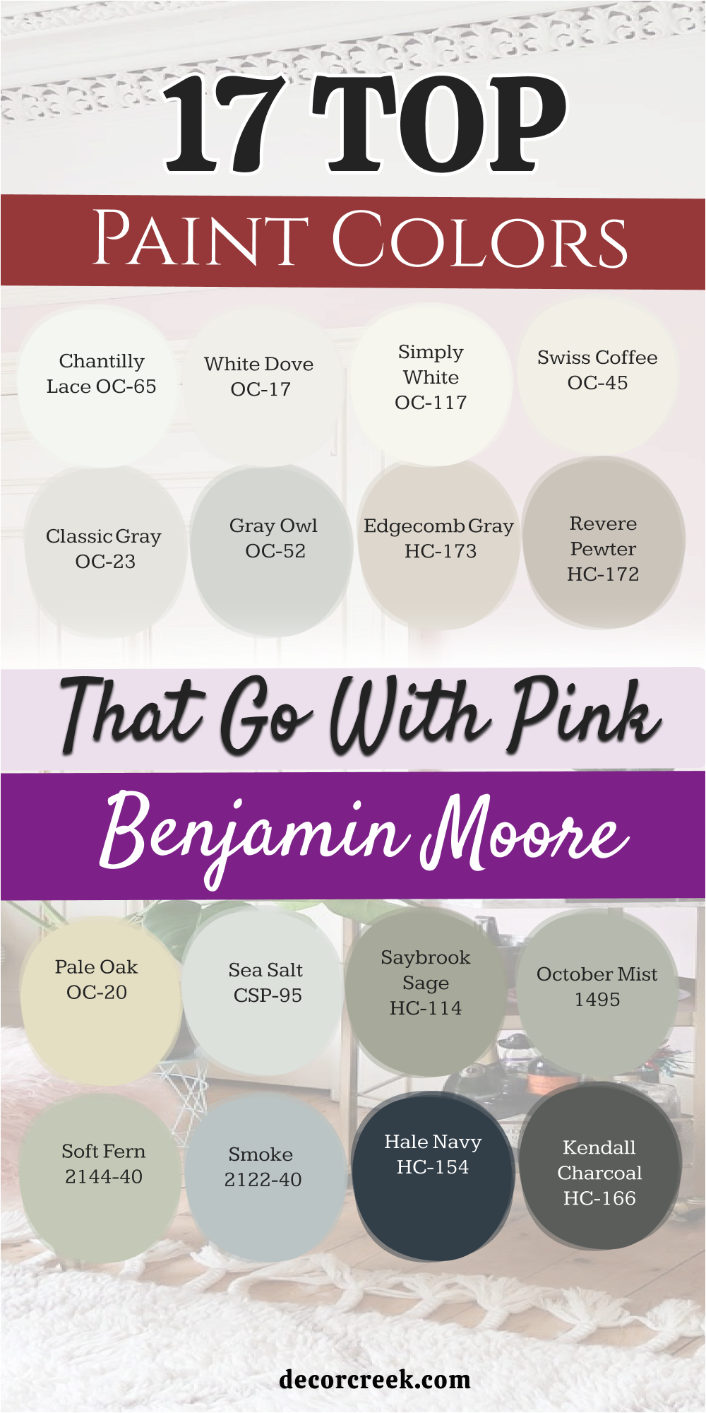
17 Top Paint Colors that go with Pink from Benjamin Moore
Chantilly Lace OC-65
Chantilly Lace OC-65 is a brilliant, clean white that acts like a spotlight for pink walls. This crisp color does not have any hidden blue or gray tones to muddy your design.
You will see how it makes a pale pink bedroom feel bright and cheerful. It provides a sharp look for trim, doors, and crown moldings throughout your house. My clients choose this paint when they want a clean, minimalist style that feels fresh.
It ensures that your colorful choices remain the main story of the room. This bright white brings a refreshing clarity to your favorite living spaces.
Best used in: trim, doors, ceilings, kitchens, and bright modern bedrooms
Pairs well with: Wrought Iron 2124-10, Revere Pewter HC-172, Pale Oak OC-20, bright pink tones The key rule of this color for farmhouse style is to use it where you want natural light to feel kind, soft, and inviting throughout the day.
👉 Read the full guide for this color HERE 👈

White Dove OC-17
White Dove OC-17 features a touch of warm alabaster dust that softens its bright white base. This classic paint choice creates a smooth transition when paired with dusty rose walls.
You will notice how it prevents a colorful room from looking too cold or harsh. It gives a creamy texture to the walls that makes your home feel loved and lived-in. Homeowners trust this shade for traditional molding and built-in bookshelves because it looks soft.
It works well under all kinds of lighting conditions without changing its friendly character. This gentle white adds an approachable elegance to your pink rooms.
Best used in: living rooms, trim, kitchens, bedrooms, and traditional home interiors
Pairs well with: Hale Navy HC-154, Gray Owl OC-52, Edgecomb Gray HC-173, warm wood tones The key rule of this color for farmhouse style is to use it where you want natural light to feel kind, soft, and inviting throughout the day.
👉 Read the full guide for this color HERE 👈

Simply White OC-117
Simply White OC-117 has a tiny hint of yellow warmth that makes it feel like pure sunshine. This bright color pairs beautifully with warm coral pinks and joyful peach tones.
You will find that it keeps a north-facing room from feeling dark or uninviting. It makes small spaces feel large and airy while maintaining a friendly atmosphere. I often select this paint for ceilings to lift the height of a colorful room.
It creates a happy, clean backdrop that cheers up everyone who enters the house. This sunny white brings a cheerful glow to your pink interior design.
Best used in: kitchens, ceilings, dark hallways, bathrooms, and modern living spaces
Pairs well with: Kendall Charcoal HC-166, Revere Pewter HC-172, Soft Fern 2144-40, natural oak The key rule of this color for farmhouse style is to use it where you want natural light to feel kind, soft, and inviting throughout the day.
👉 Read the full guide for this color HERE 👈

Swiss Coffee OC-45
Swiss Coffee OC-45 is a rich, creamy neutral that wraps a pink room in pure comfort. This traditional color has a soft, golden undertone that matches warm blush shades perfectly.
You will notice how it creates a relaxing background for a family dining area. It prevents a room with pink accents from looking too shocking or overly bright. Many people love this shade because it feels rich and substantial on the wall.
It coordinates beautifully with brass hardware and soft linen drapes. This warm cream adds a touch of welcome comfort to your colorful home layout.
Best used in: living rooms, traditional kitchens, master bedrooms, entryways, and cozy dens
Pairs well with: Saybrook Sage HC-114, Smoke 2122-40, Wrought Iron 2124-10, antique brass The key rule of this color for farmhouse style is to use it where you want natural light to feel kind, soft, and inviting throughout the day.
👉 Read the full guide for this color HERE 👈

Classic Gray OC-23
Classic Gray OC-23 is a very light, pale neutral that lets pink elements be the star. This color looks like a soft mist and keeps your rooms feeling open and bright.
You will love how it replaces boring white walls with something a bit richer and deeper. It provides a clean look that works well in modern or traditional home styles. Homeowners choose this shade when they want a whisper of color that does not compete with blush.
It reacts beautifully to natural sunlight, changing its depth softly through the afternoon. This pale tone brings a clean, polished finish to your design.
Best used in: open concept spaces, bedrooms, hallways, bathrooms, and bright living rooms
Pairs well with: Hale Navy HC-154, October Mist 1495, Chantilly Lace OC-65, dark walnut wood The key rule of this color for farmhouse style is to use it where you want natural light to feel kind, soft, and inviting throughout the day.
👉 Read the full guide for this color HERE 👈

Gray Owl OC-52
Gray Owl OC-52 is a cool, crisp gray that features a distinct green-blue undertone. This paint shade balances hot pink decorations by bringing a refreshing cool wave into the room.
You will notice that it keeps its clean gray appearance even in bright afternoon sunshine. It works wonderfully in home offices where you want a neat, orderly environment to work.
My clients like how it contrasts against dark wood floors and bright pink rugs. It cuts through the sweetness of pastel shades to add a modern touch. This color gives your pink home a clean, balanced feel.
Best used in: kitchens, bathrooms, home offices, living rooms, and contemporary spaces
Pairs well with: White Dove OC-17, Wrought Iron 2124-10, Pale Oak OC-20, polished nickel hardware The key rule of this color for farmhouse style is to use it where you want natural light to feel kind, soft, and inviting throughout the day.
👉 Read the full guide for this color HERE 👈

Edgecomb Gray HC-173
Edgecomb Gray HC-173 is a rich taupe-gray that brings a sandy warmth to pink spaces. This versatile color bridges the gap between cool grays and warm beige tones effortlessly.
You will see how it grounds a bright pink accent wall and makes it look intentional. It feels substantial and elegant, giving your home a high-end designer appearance.
I recommend this shade for main living areas because it feels welcoming to everyone who visits. It creates a beautiful backdrop for family photos framed in black or gold. This warm neutral ensures your pink color scheme looks completely grown-up.
Best used in: living rooms, entryways, hallways, dining rooms, and whole-house paint plans
Pairs well with: Simply White OC-117, Hale Navy HC-154, Soft Fern 2144-40, cherry wood trim The key rule of this color for farmhouse style is to use it where you want natural light to feel kind, soft, and inviting throughout the day.
👉 Read the full guide for this color HERE 👈

Revere Pewter HC-172
Revere Pewter HC-172 is a classic choice that brings a deep, grounding neutral tone to pink rooms. This rich greige color provides a sturdy frame that keeps pink from looking too bright.
You will notice how it adds a sense of structure and history to plain drywall. It works exceptionally well in older homes with traditional architectural features and moldings.
Homeowners love this paint because it feels secure, dependable, and very handsome on the walls. It balances the high energy of a bright pink door or accent piece perfectly. This dependable color gives your home design a solid foundation.
Best used in: family rooms, kitchens, finished basements, dining rooms, and historic homes
Pairs well with: Chantilly Lace OC-65, Wrought Iron 2124-10, Smoke 2122-40, rustic oak furniture The key rule of this color for farmhouse style is to use it where you want natural light to feel kind, soft, and inviting throughout the day.
👉 Read the full guide for this color HERE 👈

Pale Oak OC-20
Pale Oak OC-20 mimics the soft, elegant tone of weathered wood and pairs beautifully with pink. This gentle shade adds a layer of quiet luxury to a bedroom or a small bathroom.
You will find that it changes its character softly depending on your lighting choices. It creates a clean look that makes a busy room feel calm and orderly. My clients select this paint when they want a warm background that feels light and airy.
It keeps the focus on your pretty rose cushions and decorative artwork. This color choice brings a soft, sophisticated touch to your living space.
Best used in: bedrooms, nurseries, formal living rooms, bathrooms, and entryways
Pairs well with: White Dove OC-17, Kendall Charcoal HC-166, Saybrook Sage HC-114, light pine wood The key rule of this color for farmhouse style is to use it where you want natural light to feel kind, soft, and inviting throughout the day.
👉 Read the full guide for this color HERE 👈

Sea Salt CSP-95
Sea Salt CSP-95 is a unique blend of gray and green that loves the company of blush. This paint color brings a touch of outdoor beauty into your indoor living rooms.
You will notice how it reacts with a pink background to create a very fresh look. It prevents a colorful room from looking dark or heavy during stormy days.
I like to use this shade in kitchens where you want a clean, natural feeling. It matches beautifully with white stone countertops and soft pastel decorations. This choice adds a lovely organic layer to your pink interior design.
Best used in: kitchens, breakfast nooks, bathrooms, laundry rooms, and cottage homes
Pairs well with: Simply White OC-117, Wrought Iron 2124-10, October Mist 1495, butcher block counters The key rule of this color for farmhouse style is to use it where you want natural light to feel kind, soft, and inviting throughout the day.
👉 Read the full guide for this color HERE 👈
Saybrook Sage HC-114
Saybrook Sage HC-114 is a mid-toned green that brings a classic heritage feel to pink rooms. This earthy shade acts like green leaves that support a beautiful pink flower in nature.
You will see how it grounds a room and adds a layer of traditional style. It works wonderfully on kitchen cabinets or as a feature color in a study. Homeowners select this paint when they want a color scheme that feels timeless and rich.
It creates a comfortable atmosphere that makes people want to linger and talk. This handsome green brings balance and structure to your colorful home layout.
Best used in: kitchen cabinets, dining rooms, home libraries, entryways, and traditional exteriors
Pairs well with: Swiss Coffee OC-45, Hale Navy HC-154, Classic Gray OC-23, dark mahogany wood The key rule of this color for farmhouse style is to use it where you want natural light to feel kind, soft, and inviting throughout the day.
👉 Read the full guide for this color HERE 👈

October Mist 1495
October Mist 1495 is a soft, silvery sage green that softens bright pink highlights beautifully. This gentle tone creates an artistic background that feels modern and close to nature.
You will notice how it helps a pink accent wall look sophisticated instead of childlike. It works well in bedrooms where you want to create a relaxing retreat from the world. My clients love this color because it brings a soft outdoor feeling inside the house.
It pairs perfectly with natural wood tones and woven textile materials. This sage choice gives your pink home a gentle, balanced look.
Best used in: bedrooms, living rooms, home offices, reading corners, and modern cottage spaces
Pairs well with: Chantilly Lace OC-65, Pale Oak OC-20, Kendall Charcoal HC-166, linen fabrics The key rule of this color for farmhouse style is to use it where you want natural light to feel kind, soft, and inviting throughout the day.
👉 Read the full guide for this color HERE 👈

Soft Fern 2144-40
Soft Fern 2144-40 features a yellowish-green base that brings a joyful energy to pink rooms. This cheerful shade reminds people of fresh spring grass and sunny garden days.
You will find that it brightens up dark corners and pairs beautifully with light pink tones. It creates an active atmosphere that works well in playrooms or creative workspaces.
I recommend this paint for families who love color and want a happy home environment. It works beautifully with white painted furniture and bright natural light. This energetic green brings a refreshing splash of joy to your walls.
Best used in: playrooms, kitchens, sunrooms, craft areas, and children’s bedrooms
Pairs well with: Simply White OC-117, Edgecomb Gray HC-173, Slate Blue tones, light wood furniture The key rule of this color for farmhouse style is to use it where you want natural light to feel kind, soft, and inviting throughout the day.
👉 Read the full guide for this color HERE 👈
Smoke 2122-40
Smoke 2122-40 is a beautiful gray-blue that brings a misty sky feeling next to pink. This medium shade provides a cool contrast that makes pink tones look crisp and clear.
You will notice how it balances the warmth of a rose sofa or bedding collection. It feels rich without looking too dark or making the room feel small. Homeowners love using this paint in master bathrooms to create a clean environment.
It coordinates nicely with marble tiles and polished chrome bathroom fixtures. This blue tone adds a refreshing touch of beauty to your pink rooms.
Best used in: master bathrooms, bedrooms, living rooms, laundry spaces, and coastal homes
Pairs well with: White Dove OC-17, Revere Pewter HC-172, Wrought Iron 2124-10, white marble The key rule of this color for farmhouse style is to use it where you want natural light to feel kind, soft, and inviting throughout the day.
👉 Read the full guide for this color HERE 👈

Hale Navy HC-154
Hale Navy HC-154 is a deeply rich navy blue that provides a stunning ground for pink. This bold paint choice acts like a dramatic shadow that makes pink accents glow with life.
You will find that it adds a formal, upscale look to any room in your house. It keeps a pink palette from looking weak by adding a heavy dose of visual power.
My clients choose this combination for accent walls or formal dining rooms to make a statement. It feels traditional and very stylish at the same time. This deep blue frames your blush decor with absolute confidence.
Best used in: accent walls, dining rooms, home theaters, front doors, and kitchen islands
Pairs well with: Chantilly Lace OC-65, Classic Gray OC-23, Edgecomb Gray HC-173, gold hardware The key rule of this color for farmhouse style is to use it where you want natural light to feel kind, soft, and inviting throughout the day.
👉 Read the full guide for this color HERE 👈

Kendall Charcoal HC-166
Kendall Charcoal HC-166 is a dark, dramatic gray that brings a modern look to pink rooms. This deep tone offers a serious background that cuts through pink sweetness immediately.
You will love how it highlights a pale pink chair or a collection of rosy artwork. It makes a room feel tight, organized, and very architectural in style. Homeowners pick this shade when they want a high-contrast look that feels warm and rich.
It works well with modern metal light fixtures and clean lines. This dark gray brings a sleek, sophisticated edge to your colorful design.
Best used in: media rooms, modern living rooms, accent walls, cabinets, and contemporary exteriors
Pairs well with: Simply White OC-117, Pale Oak OC-20, October Mist 1495, industrial metal fixtures The key rule of this color for farmhouse style is to use it where you want natural light to feel kind, soft, and inviting throughout the day.
👉 Read the full guide for this color HERE 👈

Wrought Iron 2124-10
Wrought Iron 2124-10 is a heavy black-gray that acts like iron armor around soft pink. This paint choice brings maximum contrast and a bold attitude to your room layout.
You will see how a tiny bit of this color on a door makes pink walls pop. It stops a rose-themed bedroom from looking childish by adding a punch of masculine strength.
I recommend this shade for trim, window muntins, or a bold feature wall. It creates a high-fashion look that feels custom-designed and very expensive. This powerful color gives your pink accents a strong, modern frame.
Best used in: interior doors, window frames, trim, fireplaces, and modern feature walls
Pairs well with: Chantilly Lace OC-65, Swiss Coffee OC-45, Gray Owl OC-52, modern art pieces The key rule of this color for farmhouse style is to use it where you want natural light to feel kind, soft, and inviting throughout the day.
👉 Read the full guide for this color HERE 👈

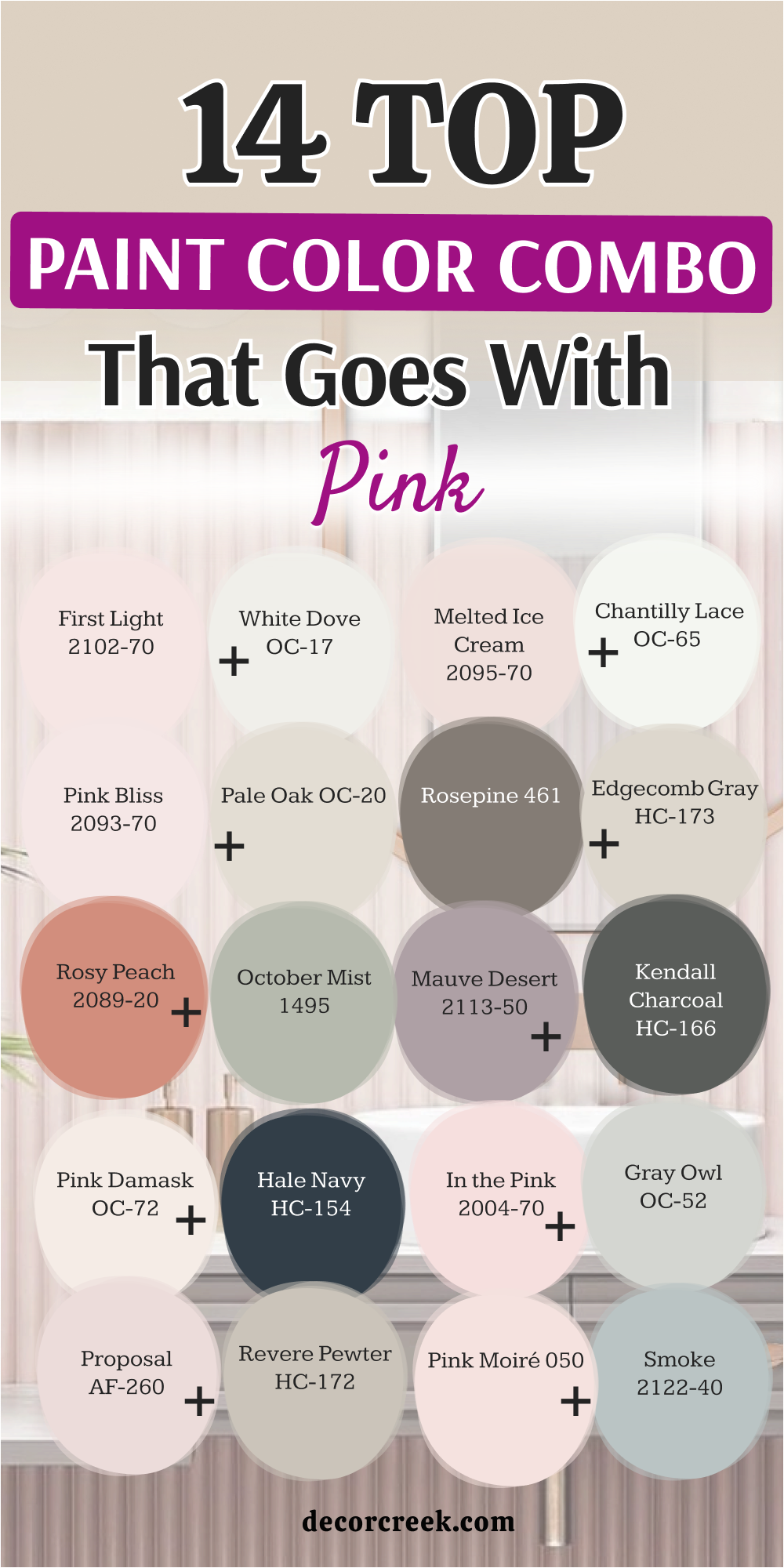
14 Top Paint Color Combo that Goes with Pink
First Light 2102-70 + White Dove OC-17
First Light 2102-70 pairs with White Dove OC-17 to create a happy and airy atmosphere. This mixture feels clean and bright, making it perfect for a sunny breakfast nook or bedroom.

You will love how the soft pink flows into the creamy white trim without any harsh lines. It creates a gentle contrast that makes the entire room feel light and fresh.
Homeowners choose this pair when they want a clean look that still feels warm. It provides a beautiful backdrop for your daily family activities. This combination makes your home feel bright and welcoming all day long.
Best used in: bedrooms, nurseries, kitchens, entryways, and modern cottage living areas
Pairs well with: light oak furniture, gold picture frames, linen curtains, soft white rugs The key rule of this color for farmhouse style is to use it where you want natural light to feel kind, soft, and inviting throughout the day.
Pink Bliss 2093-70 + Pale Oak OC-20
Pink Bliss 2093-70 joins Pale Oak OC-20 for a very quiet and upscale appearance. This combination works beautifully in rooms where you want a soft, neutral look with a hint of color.
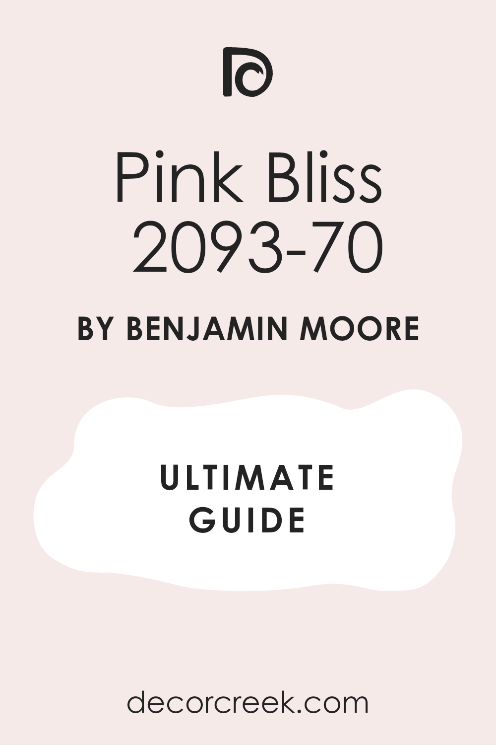
You will notice how the light greige tones down the whisper of pink on the walls. It creates an environment that looks polished and expensive without being loud.
I recommend this pair for formal sitting rooms where you want a clean look. It allows your fine furniture and artwork to be the main focus. This duo brings a touch of quiet luxury to your house.
Best used in: formal living rooms, master bedrooms, guest rooms, bathrooms, and elegant hallways
Pairs well with: polished nickel, white marble, grey textiles, dark walnut accents The key rule of this color for farmhouse style is to use it where you want natural light to feel kind, soft, and inviting throughout the day.
Rosy Peach 2089-20 + October Mist 1495
Rosy Peach 2089-20 meets October Mist 1495 to bring an organic, garden feel inside. This pairing combines a warm, deep pink-orange with a soft, grounding sage green tone.
You will feel like you are standing in a beautiful blooming orchard every time you enter. It balances the heat of the peach shade with the cool touch of the silver-green.
Families love this option for creative spaces or dining areas where people gather. It creates an interesting look that keeps your home feeling connected to nature. This pair brings a cheerful balance to your interior walls.
Best used in: dining rooms, craft areas, sunrooms, kitchens, and cottage style bedrooms
Pairs well with: natural wood, woven baskets, copper pots, terracotta decorations The key rule of this color for farmhouse style is to use it where you want natural light to feel kind, soft, and inviting throughout the day.
Pink Damask OC-72 + Hale Navy HC-154
Pink Damask OC-72 clashes beautifully with Hale Navy HC-154 to make a bold design statement. This combination offers a very pale pink white next to a deeply rich navy blue.
You will love the high contrast that looks instantly modern and very confident. It works wonderfully when you paint the walls pale pink and use navy on the cabinets.
This look stops a room from looking sugary by adding a serious dose of dark color. My clients pick this pair for spaces where they want to show off their style. It creates a striking balance that looks intentional.
Best used in: kitchens, home offices, entryways, dining rooms, and powder rooms
Pairs well with: brass hardware, white quartz counters, dark floors, modern light fixtures The key rule of this color for farmhouse style is to use it where you want natural light to feel kind, soft, and inviting throughout the day.
Proposal AF-260 + Revere Pewter HC-172
Proposal AF-260 balances with Revere Pewter HC-172 to create a historic, grounded feel. This mixture uses a soft, dusty pink along with a legendary, deep greige paint neutral.

You will notice how the rich gray gives the pink a mature and structured look. It feels stable and comfortable, making it great for older homes with classic style.
Homeowners love this choice because it feels traditional without looking old or boring. It provides a cozy backdrop that makes your family feel safe and relaxed. This pair ensures your colorful design looks balanced and elegant.
Best used in: living rooms, family spaces, master suites, historic homes, and long hallways
Pairs well with: antique furniture, traditional rugs, oil-rubbed bronze, warm white trim The key rule of this color for farmhouse style is to use it where you want natural light to feel kind, soft, and inviting throughout the day.
Melted Ice Cream 2095-70 + Chantilly Lace OC-65
Melted Ice Cream 2095-70 matches Chantilly Lace OC-65 for a crisp, playful appearance. This combination features a true pastel pink against a brilliant, pure white frame.

You will see how the bright white trim makes the sweet pink walls look neat. It prevents the pastel color from feeling messy or overwhelming in small spaces.
I select this duo for children’s spaces or joyful laundry rooms often. It brings a clean energy that makes doing chores or playing feel more fun. This pairing gives your home a neat, cheerful look that everyone loves.
Best used in: children’s bedrooms, playrooms, laundry rooms, walk-in closets, and bathrooms
Pairs well with: white furniture, bright artwork, colorful rugs, silver hardware The key rule of this color for farmhouse style is to use it where you want natural light to feel kind, soft, and inviting throughout the day.
Rosepine 461 + Edgecomb Gray HC-173
Rosepine 461 coordinates with Edgecomb Gray HC-173 to offer an earthy and mature color scheme. This pairing brings a deep pine pink-rose together with a warm, sandy gray tone.
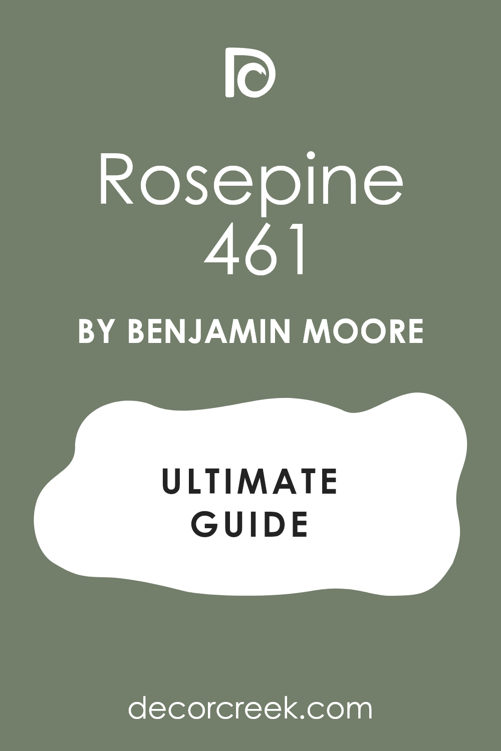
You will notice how the soft gray softens the deep, dark tones of the rose. It creates a rich atmosphere that feels very comforting during the cold winter months.
Homeowners choose this look for cozy dens or spaces where they watch television. It feels substantial and stylish, giving your house a custom designer look. This combination provides a beautiful balance of dark and light colors.
Best used in: dens, libraries, cozy bedrooms, accent walls, and formal dining areas
Pairs well with: dark wood trim, leather chairs, gold accents, heavy drapery fabrics The key rule of this color for farmhouse style is to use it where you want natural light to feel kind, soft, and inviting throughout the day.
Mauve Desert 2113-50 + Kendall Charcoal HC-166
Mauve Desert 2113-50 stands out against Kendall Charcoal HC-166 for a high-fashion look. This mixture places a dusty, purple-pink shade next to a dark, modern charcoal wall.
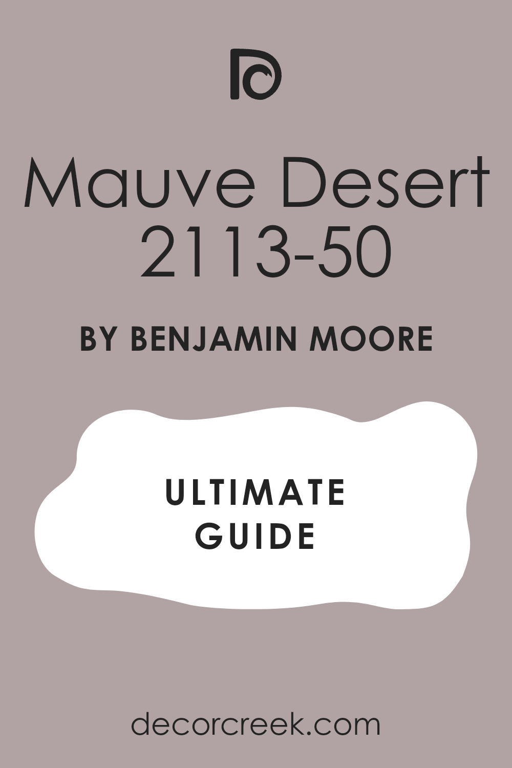
You will love how the dark gray cuts through the sweet tones of the mauve. It creates a dramatic appearance that looks like a high-end clothing boutique or hotel.
I recommend this bold duo for homeowners who want a trendy and confident room. It makes a great impression in entertainment areas or main living spaces. This pair brings a sleek, contemporary edge to your home decoration.
Best used in: entertainment rooms, modern living areas, powder rooms, and master bedrooms
Pairs well with: industrial metals, modern art, velvet textiles, black frames The key rule of this color for farmhouse style is to use it where you want natural light to feel kind, soft, and inviting throughout the day.
In the Pink 2004-70 + Gray Owl OC-52
In the Pink 2004-70 cools down next to Gray Owl OC-52 for a clean look. This combo uses a bright, happy pink alongside a crisp gray with green-blue undertones.
You will find that the cool gray neutralizes the high energy of the pink walls. It creates a balanced room that feels active but remains neat and organized. My clients love this look for home offices or teenager bedrooms where balance matters.
It provides a sharp contrast that looks clean under both sun and light bulbs. This duo keeps your colorful rooms looking smart and professional.
Best used in: home offices, teenager bedrooms, guest bathrooms, and creative spaces
Pairs well with: white trim, chrome accents, modern desks, simple pattern rugs The key rule of this color for farmhouse style is to use it where you want natural light to feel kind, soft, and inviting throughout the day.
Pink Moiré 050 + Smoke 2122-40
Pink Moiré 050 works with Smoke 2122-40 to create a soft, cloudy atmosphere. This pairing joins a very soft pink whisper with a beautiful misty gray-blue color.
You will feel like you are looking at a beautiful sunset over the water. It brings a very relaxing feeling to bedrooms where you want to sleep soundly.
Homeowners select this option to create a gentle escape from their busy daily lives. It coordinates beautifully with soft fabrics and silver decorative items in the room. This combination adds a dreamy touch of beauty to your private spaces.
Best used in: master bedrooms, nurseries, guest rooms, bathrooms, and quiet reading areas
Pairs well with: silver accents, white linen, gray carpeting, glass decorations The key rule of this color for farmhouse style is to use it where you want natural light to feel kind, soft, and inviting throughout the day.
Rosetone 2008-30 + Swiss Coffee OC-45
Rosetone 2008-30 gets support from Swiss Coffee OC-45 for a traditional, warm environment. This mixture blends a vibrant, deep rose with a rich, creamy white background color.
You will notice how the warm cream softens the strong impact of the rose. It creates a welcoming feel in dining rooms where families share their evening meals.
I recommend this classic pairing for traditional homes that need a splash of excitement. It keeps the space looking respectable while adding a fun personal touch. This couple brings a friendly warmth to your traditional home layout.
Best used in: dining rooms, entryways, kitchens, traditional living rooms, and guest spaces
Pairs well with: antique brass, warm wood floors, white dishes, traditional curtains The key rule of this color for farmhouse style is to use it where you want natural light to feel kind, soft, and inviting throughout the day.
Bella Pink CSP-520 + Saybrook Sage HC-114
Bella Pink CSP-520 complements Saybrook Sage HC-114 to mimic the beauty of nature. This pairing matches a clean, clear pink with a historic, mid-toned sage green paint.
You will love how the green tones balance the pink sweetness without using gray. It feels like a beautiful garden walkway inside your own modern living room. Families choose this combination when they want an interesting look that stays comfortable.
It works perfectly with natural textures like wood, wicker, and cotton materials. This natural pair brings a fresh balance to your family home.
Best used in: sunrooms, kitchens, living rooms, bedrooms, and cottage interiors
Pairs well with: wicker furniture, oak tables, indoor plants, light linen throws The key rule of this color for farmhouse style is to use it where you want natural light to feel kind, soft, and inviting throughout the day.
Pink Corsage 2008-50 + Wrought Iron 2124-10
Pink Corsage 2008-50 stands boldly next to Wrought Iron 2124-10 for dramatic contrast. This combo uses a bright magenta pink along with a heavy, iron-black accent color.
You will see how the dark black grounds the wild energy of the pink paint. It creates a high-contrast appearance that looks very stylish and custom-designed for you.
I like to use this bold pair in powder rooms or small entryways for surprise. It shows that you are not afraid to use color in a smart way. This combination gives your home a strong, modern fashion statement.
Best used in: powder rooms, entryways, accent walls, vanity areas, and modern bedrooms
Pairs well with: modern mirrors, gold fixtures, bold artwork, minimalist furniture The key rule of this color for farmhouse style is to use it where you want natural light to feel kind, soft, and inviting throughout the day.
First Light 2102-70 + October Mist 1495
First Light 2102-70 flows into October Mist 1495 for a soft and modern look. This combination joins a celebrated blush pink with a soft, silvery sage green shade.
You will notice how it creates an artistic vibe that looks clean and comfortable. It avoids looking too sugary or too dark, finding a middle ground.
Homeowners love this look for main living areas because it feels peaceful and new. It works well with light woods and modern minimalist decorations in the room. This beautiful duo brings a balanced lifestyle look to your walls.
Best used in: living rooms, open floor plans, bedrooms, home offices, and modern homes
Pairs well with: light maple wood, neutral fabrics, simple ceramics, matte black hardware The key rule of this color for farmhouse style is to use it where you want natural light to feel kind, soft, and inviting throughout the day.
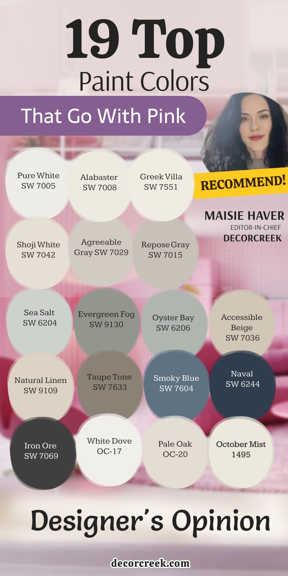
19 Top Paint Colors that go With Pink | Designer’s Opinion
Pure White SW 7005
Pure White SW 7005 remains my top choice when I want pink walls to look crisp. This color acts like a clean sheet of paper that keeps your design neat.
You will notice how it helps a bright rose color look organized and intentional. It works best on trim and doors to frame the room beautifully.
I recommend it to homeowners who worry about pink looking too messy or childish. This paint choice brings order and light into any room you choose.
Best used in: trim, doors, ceilings, kitchens, and modern living spaces
Pairs well with: Iron Ore SW 7069, Agreeable Gray SW 7029, Natural Linen SW 9109, dark wood tones The key rule of this color for farmhouse style is to use it where you want natural light to feel kind, soft, and inviting throughout the day.
👉 Read the full guide for this color HERE 👈
Alabaster SW 7008
Alabaster SW 7008 provides a creamy texture that softens bright pink walls with ease. This shade brings a comfortable warmth that stops a room from feeling too cold.
You will love how it looks in a bedroom next to a dusty rose blanket. It creates an inviting look that makes guests feel at home right away.
Homeowners love this paint because it feels friendly and very reliable under light. It adds a gentle touch to your colorful home design plan.
Best used in: living rooms, kitchens, hallways, bedrooms, and farmhouse exteriors
Pairs well with: Iron Ore SW 7069, Agreeable Gray SW 7029, Natural Linen SW 9109, warm wood tones The key rule of this color for farmhouse style is to use it where you want natural light to feel kind, soft, and inviting throughout the day.
👉 Read the full guide for this color HERE 👈
Greek Villa SW 7551
Greek Villa SW 7551 offers a sunny warmth that pairs beautifully with peach-pink colors. This selection makes your home feel full of light even on dark, cloudy days.
You will find that it creates a smooth look when used on the ceiling. It brings a sense of comfort that simple white paint cannot achieve alone.
I use this shade in family areas where people spend lots of time together. It makes your colorful accents look friendly and well planned.
Best used in: living rooms, dining rooms, kitchens, entryways, and traditional exteriors
Pairs well with: Urbane Bronze SW 7048, Repose Gray SW 7015, Taupe Tone SW 7633, medium wood tones The key rule of this color for farmhouse style is to use it where you want natural light to feel kind, soft, and inviting throughout the day.
👉 Read the full guide for this color HERE 👈
Shoji White SW 7042
Shoji White SW 7042 is a great neutral paint that tones down loud pink walls. This shade shifts its look beautifully from morning to night to keep things interesting.
You will see how it provides a sturdy background for a colorful room design. It works perfectly in open houses where rooms connect without doors or walls.
Many families pick this color to prevent their eyes from getting tired of pink. It brings a mature balance to your interior color choices.
Best used in: open floor plans, living rooms, kitchens, bedrooms, and modern farmhouse exteriors
Pairs well with: Naval SW 6244, Clary Sage SW 6178, Accessible Beige SW 7036, natural wood tones The key rule of this color for farmhouse style is to use it where you want natural light to feel kind, soft, and inviting throughout the day.
👉 Read the full guide for this color HERE 👈
Agreeable Gray SW 7029
Agreeable Gray SW 7029 is a reliable friend that matches almost any pink paint color. This tone contains a warm blend of beige and gray that keeps it friendly.
You will love how it tames the sweetness of pink floral wallpaper or rugs. It works best in busy living rooms where you want a stable backdrop color. My clients find that it fits with their existing wooden furniture very easily. It provides a modern touch that feels very comfortable.
Best used in: living rooms, family rooms, kitchens, entryways, and whole-house interiors
Pairs well with: Pure White SW 7005, Iron Ore SW 7069, Sea Salt SW 6204, dark stained wood The key rule of this color for farmhouse style is to use it where you want natural light to feel kind, soft, and inviting throughout the day.
👉 Read the full guide for this color HERE 👈
Repose Gray SW 7015
Repose Gray SW 7015 has a cool undertone that cuts through hot pink walls nicely. This paint brings a sense of structure to a colorful playroom or bedroom area.
You will notice that it looks rich and expensive under evening light bulbs. It works wonderfully when you want a clean, tailored look in your modern home.
Homeowners appreciate how it stays looking neat in busy hallways over time. It gives your pink walls a sharp, balanced partner.
Best used in: bedrooms, bathrooms, living rooms, hallways, and contemporary interiors
Pairs well with: Alabaster SW 7008, Naval SW 6244, Evergreen Fog SW 9130, light wood tones The key rule of this color for farmhouse style is to use it where you want natural light to feel kind, soft, and inviting throughout the day.
👉 Read the full guide for this color HERE 👈
Sea Salt SW 6204
Sea Salt SW 6204 brings a gentle garden feeling that matches soft pink accents. This muted green-blue shade softens the pink tones and reminds people of nature.
You can use it in dining rooms to bring an organic touch inside. It feels light and breezy even in small rooms with tiny windows. Many people choose this color to make their gathering spaces feel friendly. It works beautifully to create a balanced, fresh color scheme.
Best used in: kitchens, bathrooms, sunrooms, bedrooms, and coastal cottage interiors
Pairs well with: Alabaster SW 7008, Shoji White SW 7042, Taupe Tone SW 7633, rattan and oak The key rule of this color for farmhouse style is to use it where you want natural light to feel kind, soft, and inviting throughout the day.
👉 Read the full guide for this color HERE 👈
Evergreen Fog SW 9130
Evergreen Fog SW 9130 brings a rich green-gray tone that makes pink elements stand out. This serious choice adds a mature feeling to an otherwise sugary room design.
You will love how it acts as a backdrop for velvet pink chairs or art. It creates a moody look that feels very luxurious for your family. Homeowners love using this shade for special accent walls or built-in shelves. It gives your home a custom appearance that commands attention.
Best used in: accent walls, libraries, dining rooms, bedrooms, and modern exteriors
Pairs well with: Pure White SW 7005, Accessible Beige SW 7036, Natural Linen SW 9109, brass hardware The key rule of this color for farmhouse style is to use it where you want natural light to feel kind, soft, and inviting throughout the day.
👉 Read the full guide for this color HERE 👈
Oyster Bay SW 6206
Oyster Bay SW 6206 features a deep slate-green body that shields against pink sweetness. This color brings a stately, historic feeling to any room in your house. You will see how it highlights the soft undertones of pale pink decor items.
It keeps its cool appearance even under warm yellow light bulbs at night. I recommend this option for formal dining rooms where you want to impress guests. It frames your pink choices with classic elegance.
Best used in: dining rooms, living rooms, entryways, bathrooms, and traditional homes
Pairs well with: Alabaster SW 7008, Sea Salt SW 6204, Iron Ore SW 7069, dark walnut wood The key rule of this color for farmhouse style is to use it where you want natural light to feel kind, soft, and inviting throughout the day.
👉 Read the full guide for this color HERE 👈

Accessible Beige SW 7036
Accessible Beige SW 7036 is a true favorite that brings sandy warmth to pink rooms. This neutral shade does not look muddy next to a lively rose wall color. You will notice how it keeps a bedroom feeling bright and cheerful all day.
It works well with traditional wooden furniture and neutral carpet choices. Families pick this paint because it makes their homes feel instantly welcoming. It provides a gentle background that lets pink be the star.
Best used in: living rooms, hallways, kitchens, bedrooms, and open concept homes
Pairs well with: Pure White SW 7005, Urbane Bronze SW 7048, Clary Sage SW 6178, maple wood The key rule of this color for farmhouse style is to use it where you want natural light to feel kind, soft, and inviting throughout the day.
👉 Read the full guide for this color HERE 👈
Natural Linen SW 9109
Natural Linen SW 9109 mimics the look of rustic fabrics and matches clay-pink tones. This shade brings an organic feel that makes a home feel comfortable and simple. You will see how it warms up a cold room with great ease.
It provides a soft contrast that does not shock your eyes when entering. I use this shade in guest rooms to create a relaxing feel quickly. It brings a touch of countryside beauty to your urban house.
Best used in: guest bedrooms, sunrooms, kitchens, laundry rooms, and cottage exteriors
Pairs well with: Alabaster SW 7008, Shoji White SW 7042, Evergreen Fog SW 9130, pine wood The key rule of this color for farmhouse style is to use it where you want natural light to feel kind, soft, and inviting throughout the day.
👉 Read the full guide for this color HERE 👈
Taupe Tone SW 7633
Taupe Tone SW 7633 is a deep gray-brown that adds structural weight to pink spaces. This choice prevents a pink palette from looking flighty or overly sweet to guests.
You will notice how it anchors the room when used on cabinets or trim. It creates a striking contrast against pale blush walls that looks very professional. Homeowners choose this shade when they want a strong element to balance soft pink decor. It brings a sense of permanence.
Best used in: cabinets, accent walls, studies, mudrooms, and exterior trim
Pairs well with: Greek Villa SW 7551, Accessible Beige SW 7036, Pure White SW 7005, brass fixtures The key rule of this color for farmhouse style is to use it where you want natural light to feel kind, soft, and inviting throughout the day.
👉 Read the full guide for this color HERE 👈
Smoky Blue SW 7604
Smoky Blue SW 7604 offers a medium blue with gray undertones that love pink accents. This choice creates a creative atmosphere that works wonderfully in a studio or bedroom.
You will notice how it softens the energetic pop of a hot pink shade. It reminds people of a foggy morning, bringing a relaxed vibe to your walls. I use this paint when a homeowner wants color but avoids loud options. It makes your pink decorations look thoughtful.
Best used in: bedrooms, home offices, creative studios, bathrooms, and accent walls
Pairs well with: Alabaster SW 7008, Silver Strand SW 7057, Natural Linen SW 9109, light oak wood The key rule of this color for farmhouse style is to use it where you want natural light to feel kind, soft, and inviting throughout the day.
👉 Read the full guide for this color HERE 👈
Naval SW 6244
Naval SW 6244 is a majestic deep blue that creates a classic look with pink. This bold color acts like a dark night sky that makes pink stars shine. You will find that it adds a regal touch to an entryway or vanity.
It stops a room from feeling too sweet by adding a strong dark punch. My clients love this combination for spaces where they want big style. This deep blue frames your blush choices with beautiful confidence.
Best used in: dining rooms, accent walls, bathroom vanities, front doors, and library shelves
Pairs well with: Pure White SW 7005, Repose Gray SW 7015, Agreeable Gray SW 7029, gold accents The key rule of this color for farmhouse style is to use it where you want natural light to feel kind, soft, and inviting throughout the day.
👉 Read the full guide for this color HERE 👈
Iron Ore SW 7069
Iron Ore SW 7069 is a soft charcoal black that creates a modern look next to pink. This deep shade avoids pure black while providing maximum contrast for your design. You will love how it makes a soft pink sofa look like art.
It defines the edges of a room beautifully when used on doors or window frames. Homeowners select this color to give their home a trendy boutique appearance. It cuts through pink sweetness instantly.
Best used in: interior doors, window trim, accent walls, fireplaces, and modern exteriors
Pairs well with: Pure White SW 7005, Alabaster SW 7008, Agreeable Gray SW 7029, chrome fixtures The key rule of this color for farmhouse style is to use it where you want natural light to feel kind, soft, and inviting throughout the day.
👉 Read the full guide for this color HERE 👈
White Dove OC-17
White Dove OC-17 features a touch of warmth that softens its bright white base paint. This classic choice creates a smooth transition when paired with dusty rose walls. You will notice how it prevents a colorful room from looking too harsh.
It gives a creamy texture to the walls that makes your home feel cozy. Homeowners trust this shade for traditional molding because it always looks soft. It adds an approachable elegance to your pink rooms.
Best used in: living rooms, trim, kitchens, bedrooms, and traditional home interiors
Pairs well with: Hale Navy HC-154, Gray Owl OC-52, Edgecomb Gray HC-173, warm wood tones The key rule of this color for farmhouse style is to use it where you want natural light to feel kind, soft, and inviting throughout the day.
👉 Read the full guide for this color HERE 👈
Pale Oak OC-20
Pale Oak OC-20 mimics the soft tone of weathered wood and pairs beautifully with pink. This gentle shade adds a layer of quiet luxury to a bedroom or bathroom. You will find that it changes its depth softly depending on your light bulbs.
It creates a clean look that makes a busy room feel orderly over time. My clients select this paint when they want a warm background. It keeps the focus on your pretty rose cushions.
Best used in: bedrooms, nurseries, formal living rooms, bathrooms, and entryways
Pairs well with: White Dove OC-17, Kendall Charcoal HC-166, Saybrook Sage HC-114, light pine wood The key rule of this color for farmhouse style is to use it where you want natural light to feel kind, soft, and inviting throughout the day.
👉 Read the full guide for this color HERE 👈
October Mist 1495
October Mist 1495 is a soft sage green that softens bright pink highlights beautifully. This gentle tone creates an artistic background that feels modern and close to nature. You will notice how it helps a pink wall look sophisticated instead of childish.
It works well in bedrooms where you want to create a relaxing home retreat. My clients love this color because it brings a soft outdoor feeling inside. It pairs perfectly with your blush decor.
Best used in: bedrooms, living rooms, home offices, reading corners, and modern cottage spaces
Pairs well with: Chantilly Lace OC-65, Pale Oak OC-20, Kendall Charcoal HC-166, linen fabrics The key rule of this color for farmhouse style is to use it where you want natural light to feel kind, soft, and inviting throughout the day.
👉 Read the full guide for this color HERE 👈
Hale Navy HC-154
Hale Navy HC-154 is a deeply rich navy blue that provides a stunning ground for pink. This bold paint choice acts like a dramatic shadow that makes pink accents shine.
You will find that it adds a formal, upscale look to any room. It keeps a pink palette from looking weak by adding visual power to the design. My clients choose this combination for formal dining rooms to make a big statement. It frames your blush decor beautifully.
Best used in: accent walls, dining rooms, home theaters, front doors, and kitchen islands
Pairs well with: Chantilly Lace OC-65, Classic Gray OC-23, Edgecomb Gray HC-173, gold hardware The key rule of this color for farmhouse style is to use it where you want natural light to feel kind, soft, and inviting throughout the day.
👉 Read the full guide for this color HERE 👈
Decorating with pink can be a rewarding journey when you find the right matching tones. Do not be afraid to mix soft pinks with deep blues, charcoal grays, or herbal greens to give your home structure and style. The right background color will make your rose accents look mature, intentional, and incredibly welcoming.
Trust your feelings and look at your paint boards under different lights before making a final choice. With these professional shades, you can create a beautiful home that your family will enjoy every single day.
You can easily break away from boring design rules by trying out these wonderful combinations in your living spaces. Bringing a sense of balance into a colorful room gives your house a finished look that feels both rich and practical. My experience shows that balancing a soft blush wall with a deep, grounding companion tone changes how people feel when they step inside. Your house should feel like a safe haven where colors bring joy, comfort, and real pride to everyone who lives there.
Take your time picking samples, enjoy the creative process, and watch your rooms turn into something truly extraordinary.