When I design a bedroom, I always think about how color sets the tone for the day and night. Blue has a special way of shaping how a room feels — it can refresh you in the morning and help you relax in the evening. A soft sky blue can make a room feel bright and airy, while a rich navy adds comfort and a sense of protection.
I love how blue adapts to every mood and moment; it can be playful, calm, or deeply cozy depending on the shade and light. It also works beautifully with materials like wood, linen, and rattan, adding warmth to cooler tones.
Over the years, I’ve noticed that blue bedrooms tend to help people rest better. There’s something about this color that brings balance — it clears the mind while keeping the heart steady.
Blue can make a small room feel larger or give a big room structure and focus. Whether I’m designing a cottage bedroom or a modern city retreat, blue always fits in naturally.
That’s why I return to this color family again and again when helping clients create rooms that feel personal, soothing, and easy to love.
Why I Trust Sherwin-Williams and Benjamin Moore for Bedroom Paints
I’ve worked with many paint brands, but Sherwin-Williams and Benjamin Moore always stand out for their consistency and depth of color. Their blues are rich, dependable, and beautifully balanced — never too dull, never too harsh.
I’ve learned that their finishes also hold up wonderfully over time, which matters when you’re designing bedrooms meant to feel beautiful for years.
The pigments they use create layers of tone, giving even the simplest shades quiet character.
Both brands also offer incredible range. Sherwin-Williams blues like Aleutian or Naval create comfort and structure, while Benjamin Moore favorites like Hale Navy or Woodlawn Blue bring freshness and softness.
I also love how these paints react to light — they reflect it softly instead of glaring back, which helps make bedrooms look warm and inviting.
The texture of their finishes feels smooth and professional, turning even the most basic space into something polished. For me, they’re the two brands that always deliver beauty, longevity, and balance in every can.
How I Choose the Right Blue Color for a Bedroom
Choosing the right blue for a bedroom depends on more than just taste — it’s about light, feeling, and personality. I always start by studying how much natural light the room gets. If it’s a bright, sunny room, I lean toward cooler or deeper blues like Naval or Van Deusen Blue because they hold their color without looking washed out.
For darker or north-facing rooms, I prefer softer shades like Rainwashed or Woodlawn Blue, which keep the space light and open.
I also look carefully at what’s already in the room. Warm woods, gold fixtures, or linen fabrics can make a blue shift slightly in tone, so I test a few samples before deciding.
The texture of fabrics, the flooring color, and even the lampshade light all play a part in how the color feels. My goal is always to find a shade that feels natural and personal — one that supports how someone wants to feel when they walk in.
The right blue doesn’t just decorate the room; it changes how the room lives and breathes. When it’s the perfect match, you can sense it right away — calm, balance, and a quiet kind of joy.
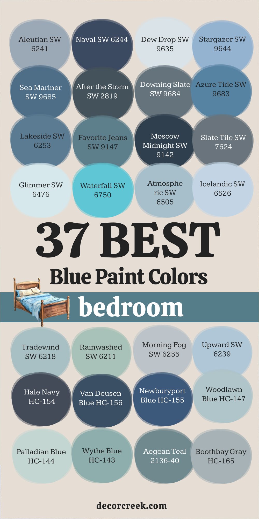
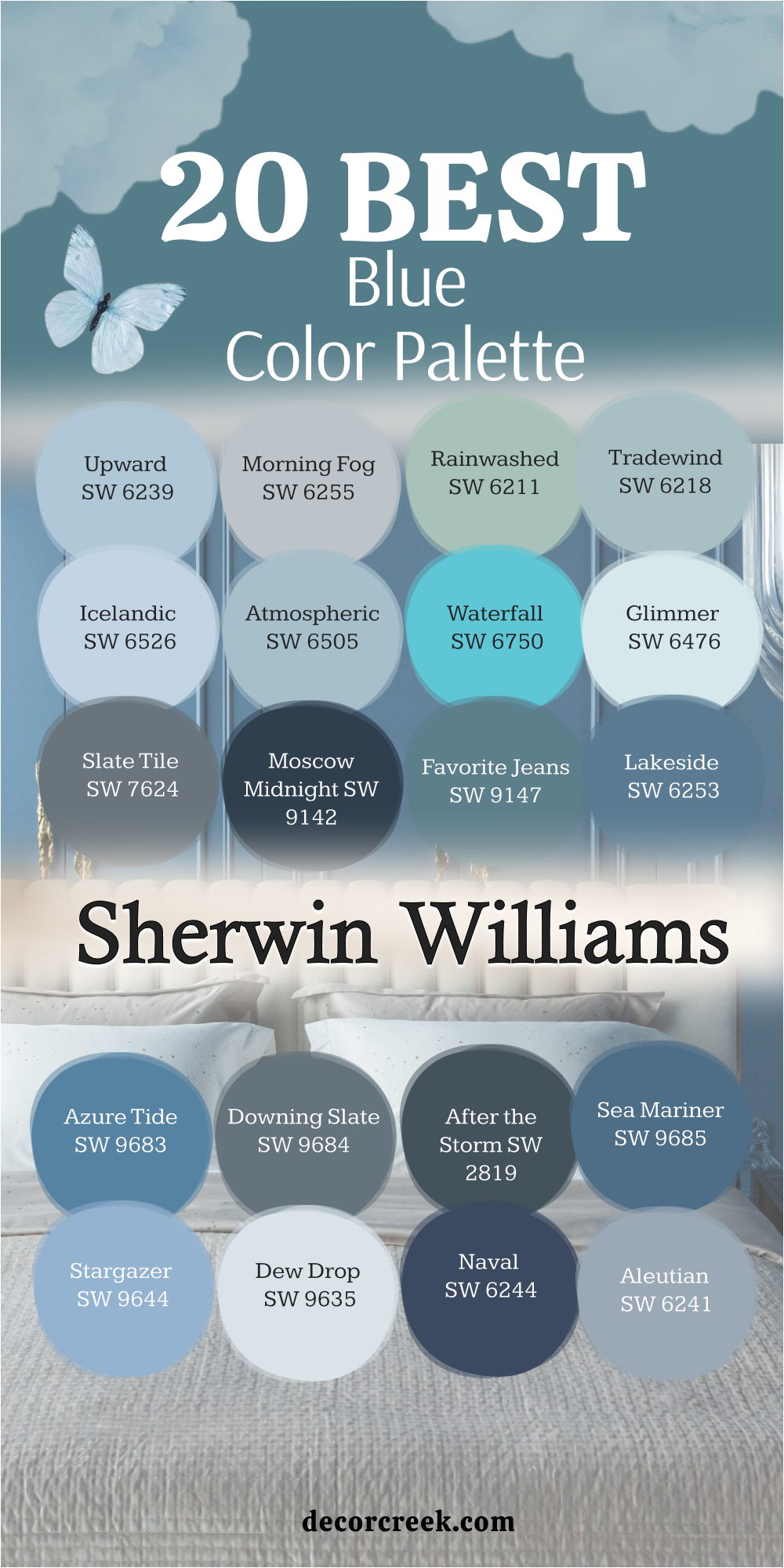
20 Best Blue Paint Colors by Sherwin-Williams
Aleutian SW 6241
Aleutian SW 6241 feels like a soft, comforting hug at the end of the day. It’s a medium blue with a hint of gray, making it gentle and easy to live with. I love using it in bedrooms where I want a quiet but welcoming look. In daylight, it feels open and fresh; by evening, it deepens slightly, wrapping the room in warmth.
This color pairs beautifully with creamy whites like Alabaster or soft grays for trim and bedding. It also works well with warm woods — oak, walnut, or maple — which bring out its cozy side. I’ve used it in both modern and traditional bedrooms, and it never feels out of place.
What makes Aleutian special is how balanced it stays in different lighting. It never looks cold or dull, even in low-light rooms. It’s calm but not flat, colorful but never loud. I often pair it with light linens, brass lamps, and natural textures to create a room that feels peaceful and inviting.
If you want a blue that feels relaxed yet polished, Aleutian is one of the best choices from Sherwin-Williams. It gives the bedroom a sense of calm order — the kind that helps your mind slow down and rest.
🎨 Check out the complete guide to this color right HERE 👈

Naval SW 6244
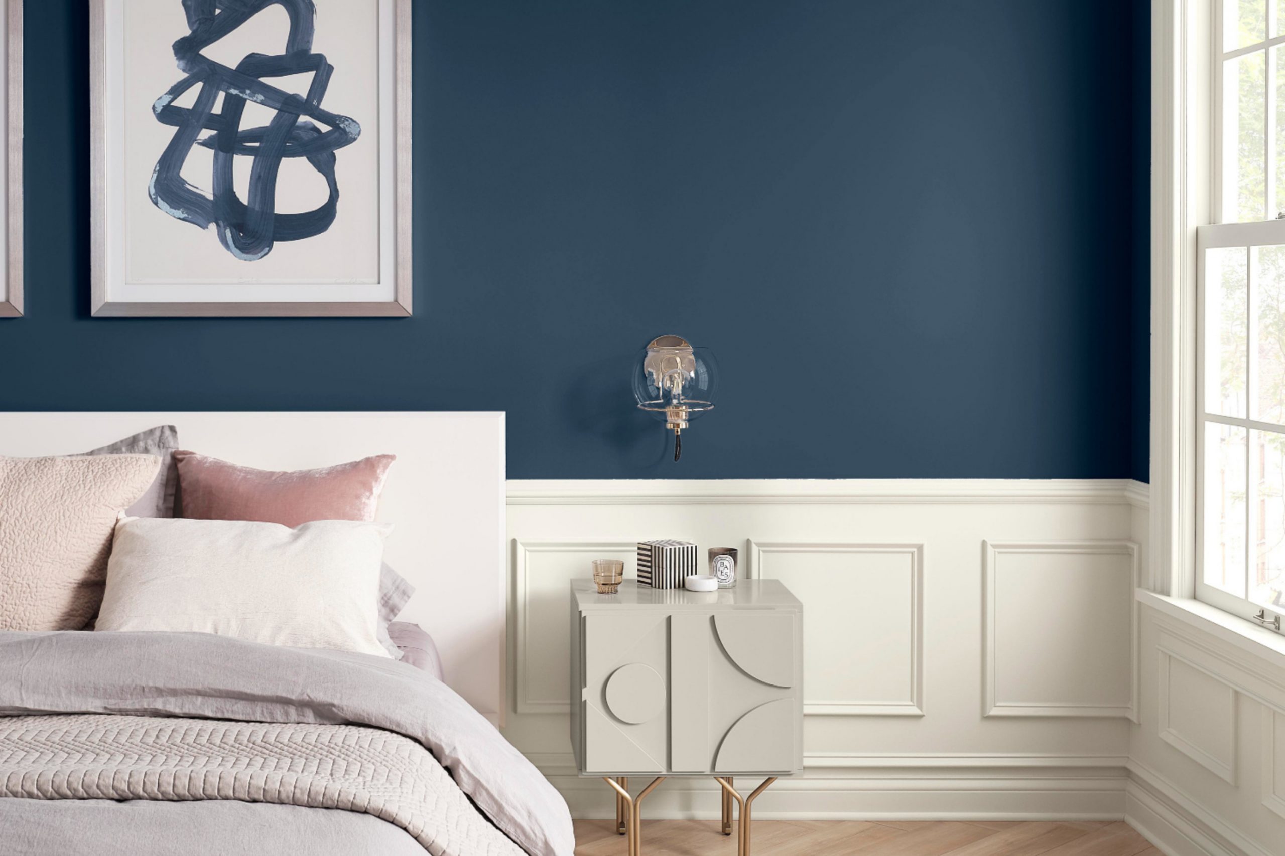
Naval SW 6244 is a deep navy blue that feels confident yet relaxing. It has just the right amount of depth to make a bedroom feel grounded without becoming too dark. I love using it when a room needs character — it adds richness and warmth in a simple, beautiful way. With white trim or crisp linens, Naval looks sharp and classic, the kind of blue that never feels dated.
I often pair it with warm brass lighting, beige rugs, or natural wood nightstands to bring a little glow into the room.
Those warm touches balance the coolness of the blue perfectly. In daylight, Naval feels fresh and strong; under soft lamps at night, it becomes smooth and cozy. It’s also a color that works in both large and small bedrooms because it feels deep, not heavy.
For me, Naval always gives a sense of quiet luxury. It fits as easily in a traditional home as it does in a modern space. If you want a blue that feels elegant, safe, and lasting, Naval is one of the best choices Sherwin-Williams offers.
🎨 Check out the complete guide to this color right HERE 👈

Dew Drop SW 9635
Dew Drop SW 9635 feels like a breath of clean morning air. It’s a pale blue with a soft green hint that gives the room a gentle freshness. I often use it in bedrooms that need lightness without going completely white. It brightens dark corners and reflects natural light beautifully, making any room feel more open. Paired with white bedding and light wood furniture, it creates a peaceful and tidy look that’s easy to love.
What makes Dew Drop special is its subtle balance — it’s cool but not cold, colorful but never too much. I like how it pairs with creamy neutrals and woven textures, especially rattan or linen. It gives a quiet, breezy energy that feels natural and calm. For smaller bedrooms or guest rooms, it’s a wonderful way to make the walls feel fresh without overwhelming the space.
🎨 Check out the complete guide to this color right HERE 👈

Stargazer SW 9644
Stargazer SW 9644 brings life to a room in the most balanced way. It’s a medium blue with a hint of teal that feels both cheerful and composed. I love using it when a bedroom needs a touch of personality without becoming too bold. With white or light gray trim, Stargazer feels clean and airy; with warm lighting, it takes on a soft, glowing tone that’s cozy and inviting.
This color pairs beautifully with cream, tan, or muted gold accents. I often use it in rooms that have woven textures or painted furniture because it brings them together with ease.
It’s playful but never loud — a perfect middle-ground shade that makes people smile every time they walk in.
🎨 Check out the complete guide to this color right HERE 👈

Sea Mariner SW 9685
Sea Mariner SW 9685 has the steady strength of ocean water on a calm day. It’s a medium-dark blue with gray undertones that keep it balanced and grounded. I like using it in bedrooms where depth and warmth are needed at the same time. Paired with white bedding or natural wood furniture, it creates a comfortable and sophisticated setting.
What I enjoy about this shade is how adaptable it is. It can feel coastal with soft fabrics and woven baskets or modern with dark furniture and black metal accents.
It doesn’t shout for attention but holds the room together quietly. In both bright and dim light, Sea Mariner keeps its honest, steady beauty.
🎨 Check out the complete guide to this color right HERE 👈

After the Storm SW 2819
After the Storm SW 2819 feels rich and moody, like a rainy sky turning clear again. It’s a deep blue-gray that adds a quiet sense of drama to a bedroom. I love using it on walls behind a bed to create a cozy, enveloping feel. When paired with warm white bedding or brass lamps, it brings balance and softness to the space.
The color works especially well in rooms with warm wood tones or textured fabrics. It makes lighter colors pop, giving the room depth without heaviness.
If you want your bedroom to feel peaceful yet strong, this is one of the best choices.
Downing Slate SW 2819
Downing Slate SW 2819 is the perfect blend of blue and gray, shifting beautifully with light. In the morning, it feels airy and clear; in the evening, it turns smooth and comforting. I love using it in bedrooms that have both natural and artificial light, because it always looks right. It pairs nicely with white trim, beige accents, and dark wood furniture.
What I appreciate most about Downing Slate is its quiet character. It doesn’t overpower a room, yet it gives everything around it a richer tone. It feels polished but still easy to live with — a true designer’s favorite for balance and comfort.
🎨 Check out the complete guide to this color right HERE 👈

Azure Tide SW 9684
Azure Tide SW 9684 feels bright, open, and full of life. It’s a clean blue that reminds me of clear summer skies — cheerful but still easy to relax around. I love using it in bedrooms that need energy or freshness. It’s one of those colors that instantly lifts the room without stealing attention from the rest of the décor. With white curtains, soft bedding, and a few natural textures, Azure Tide feels balanced and light.
It works beautifully in coastal or casual interiors and pairs well with sandy tones, creams, and even light grays.
I’ve seen it shine in small rooms where it creates a sense of airiness and calm. It also looks great with woven baskets or warm wood, giving the space a touch of nature. Azure Tide feels bright in the day and gentle at night — perfect for anyone who wants color that stays beautiful around the clock.
🎨 Check out the complete guide to this color right HERE 👈

Lakeside SW 9683
Lakeside SW 9683 reminds me of deep water reflecting an early morning sky. It’s a medium blue with soft gray undertones that bring balance and depth to a bedroom. This color is steady and thoughtful — ideal for anyone who loves a grounded, relaxing look. I often pair it with creamy whites or light grays to keep the mood soft and welcoming.
It also works well with darker furniture or black accents when you want a more refined touch.
Lakeside feels cozy but never closed in; it gives walls definition while keeping the overall tone calm. I especially love how it glows under warm lamplight, turning into a smooth, elegant backdrop that feels timeless and comfortable.
🎨 Check out the complete guide to this color right HERE 👈

Favorite Jeans SW 9147
Favorite Jeans SW 9147 is exactly what its name suggests — comfortable, familiar, and always dependable. It’s a medium blue with a subtle gray base that makes it easy to pair with nearly anything. I often use it in bedrooms that should feel warm and casual but still put-together. It looks lovely with white or beige bedding, brushed metal lamps, and woven textures.
This color fits both modern and farmhouse styles because it carries a lived-in charm.
It’s bright enough to feel cheerful during the day yet soft enough to relax under at night. Favorite Jeans has a way of making every room feel approachable, like a favorite sweater you never want to take off.
🎨 Check out the complete guide to this color right HERE 👈

Moscow Midnight SW 9142
Moscow Midnight SW 9142 is bold, rich, and full of personality. It’s a deep navy with a touch of teal, giving it an elegant twist. I love using it in primary bedrooms where drama and comfort can live side by side. Against white trim or gold accents, Moscow Midnight feels high-end and warm. It’s perfect for creating a cozy retreat that still looks luxurious.
Even though it’s dark, it doesn’t make a room feel small — instead, it wraps the space in a quiet sense of comfort. I often add warm lighting, cream bedding, or velvet textures to bring out its richness.
Moscow Midnight is for anyone who wants their bedroom to feel both strong and restful.
🎨 Check out the complete guide to this color right HERE 👈

Slate Tile SW 7624
Slate Tile SW 7624 is one of my favorite blue-grays because it always looks smart and balanced. It’s cool-toned but never icy, giving the room a steady, refined feeling. I love using it in bedrooms where simplicity is key — it lets textures and furniture shine. Paired with white trim, black lamps, and natural woods, it feels timeless and easy to live with.
This color works beautifully in modern, classic, or even rustic designs. During the day, it appears fresh and layered; at night, it softens into a smooth, welcoming hue.
It’s also a wonderful choice for shared bedrooms, since it appeals to many tastes without feeling too masculine or too soft. Slate Tile gives any space quiet style and long-lasting comfort.
🎨 Check out the complete guide to this color right HERE 👈

Glimmer SW 6476
Glimmer SW 6476 is one of the lightest and sweetest blues from Sherwin-Williams. It has a faint silvery tone that reflects light beautifully, making bedrooms feel soft and airy. I love using it when a client wants a room that feels open but not plain. Glimmer pairs wonderfully with white furniture, cream linens, and pale wood flooring. It adds just enough color to keep things interesting while still feeling restful and clean.
What makes this shade so charming is how it changes throughout the day. Morning light brings out its cool brightness, while evening lamps give it a cozy, gentle glow.
It’s perfect for smaller bedrooms or spaces that need a little lift. Glimmer has a freshness that never feels forced — simple, graceful, and always inviting.
🎨 Check out the complete guide to this color right HERE 👈
Waterfall SW 6750
Waterfall SW 6750 feels lively yet easygoing, like sunlight over clear water. It leans slightly toward turquoise, giving bedrooms a bright and happy feel without being too bold. I often use it to create cheerful spaces that still feel balanced. With white trim and sandy neutrals, it becomes playful but calm enough for everyday life.
This shade works beautifully in coastal-inspired rooms or modern designs that need a pop of energy. Waterfall pairs well with rattan textures, natural fibers, and crisp white bedding. It gives walls just enough color to make the space feel alive while keeping the mood soothing. It’s one of those colors that makes people smile as soon as they walk in.
🎨 Check out the complete guide to this color right HERE 👈

Atmospheric SW 6505
Atmospheric SW 6505 feels gentle and thoughtful, like the horizon on a quiet afternoon. It’s a soft, cool blue with a gray base that keeps it elegant and understated. I love using it in bedrooms that need a sense of stillness and order. It works beautifully with white trim, beige rugs, or simple wooden furniture. The combination feels clean and timeless.
What makes Atmospheric stand out is its adaptability. In bright daylight, it feels open and clear; under warm light, it deepens slightly, adding warmth and comfort.
It’s a wonderful choice for bedrooms meant to relax the mind without feeling too pale or too dark.
🎨 Check out the complete guide to this color right HERE 👈

Icelandic SW 6526
Icelandic SW 6526 is a light, icy blue that adds a sense of freshness and quiet beauty. It’s crisp but not cold, perfect for bedrooms that need brightness without harshness. I often pair it with soft white bedding and brushed metal lamps for a clean, modern feel. The color brings a subtle sparkle to the room, like morning frost catching light.
It works especially well in smaller rooms, reflecting natural light and making the space feel open and calm. Icelandic also pairs beautifully with natural textures such as linen and rattan, creating a perfect mix of softness and structure.
It’s a color that feels simple, modern, and endlessly comfortable.
🎨 Check out the complete guide to this color right HERE 👈

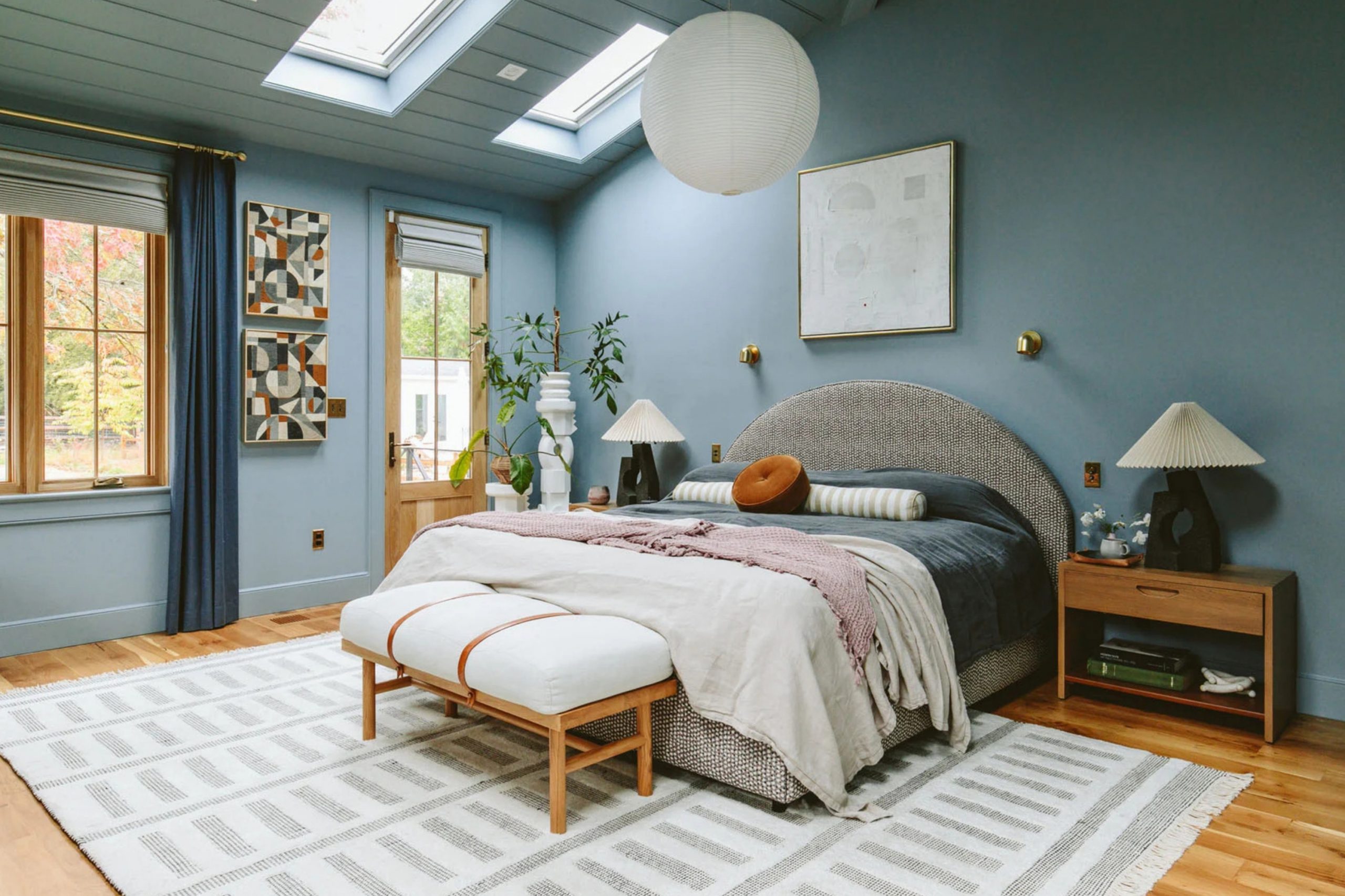
Tradewind SW 6218
Tradewind SW 6218 reminds me of a cool ocean breeze — easy, balanced, and refreshing. It’s a gentle blue-gray with just a touch of green that keeps it from feeling too chilly. I love using it in bedrooms that need a soft sense of movement. Tradewind feels graceful, especially with white trim, sandy neutrals, and natural fibers.
In bright daylight, it feels airy and open; under lamplight, it becomes cozy and intimate. It pairs beautifully with warm wood tones or even black accents for contrast. Tradewind is a color that makes a bedroom feel comfortable, put-together, and quietly stylish.
🎨 Check out the complete guide to this color right HERE 👈

Rainwashed SW 6211
Rainwashed SW 6211 is one of those shades that instantly brings a sense of peace to a bedroom. It’s a beautiful mix of blue and green with a gentle gray undertone, making it calm and natural. I love how it reflects daylight softly, keeping the room light but not empty. When paired with creamy whites, woven textures, or soft gray bedding, Rainwashed feels perfectly balanced and inviting.
This color fits many styles — coastal, modern farmhouse, or even classic traditional.
It pairs especially well with warm wood furniture and brushed brass lighting, giving a clean and cozy finish. In the morning, it feels crisp and refreshing; by evening, it becomes smooth and restful. Rainwashed is one of my go-to colors when I want a room to feel alive but still relaxed.
🎨 Check out the complete guide to this color right HERE 👈

Morning Fog SW 6255
Morning Fog SW 6255 feels like the quiet start of a new day — soft, thoughtful, and full of light. It’s a medium gray-blue that adds structure without feeling cold. I love using it in bedrooms that need color but still want to stay neutral. It pairs beautifully with off-white trim, beige textiles, and warm woods, creating a timeless and elegant feel.
Morning Fog works well with both cool and warm palettes, which makes it incredibly flexible. In rooms with plenty of natural light, it feels open and refined; in darker spaces, it adds cozy depth. It’s the kind of color that never fights for attention but always makes the room look finished and balanced.
🎨 Check out the complete guide to this color right HERE 👈
Upward SW 6239
Upward SW 6239 is a cheerful, airy blue that instantly brightens any bedroom. It’s clean and modern but still gentle enough to feel soothing. I often use it in smaller spaces or rooms that lack natural light, since it reflects brightness so well. With white bedding and natural textures, it feels fresh and easy to live with.
Upward pairs beautifully with light oak furniture, woven decor, and silver or chrome accents. It also works great with grays and off-whites for a soft, layered palette.
What I love most is how it feels happy without being loud — it gives a bedroom the look of morning sunlight even on cloudy days.
🎨 Check out the complete guide to this color right HERE 👈

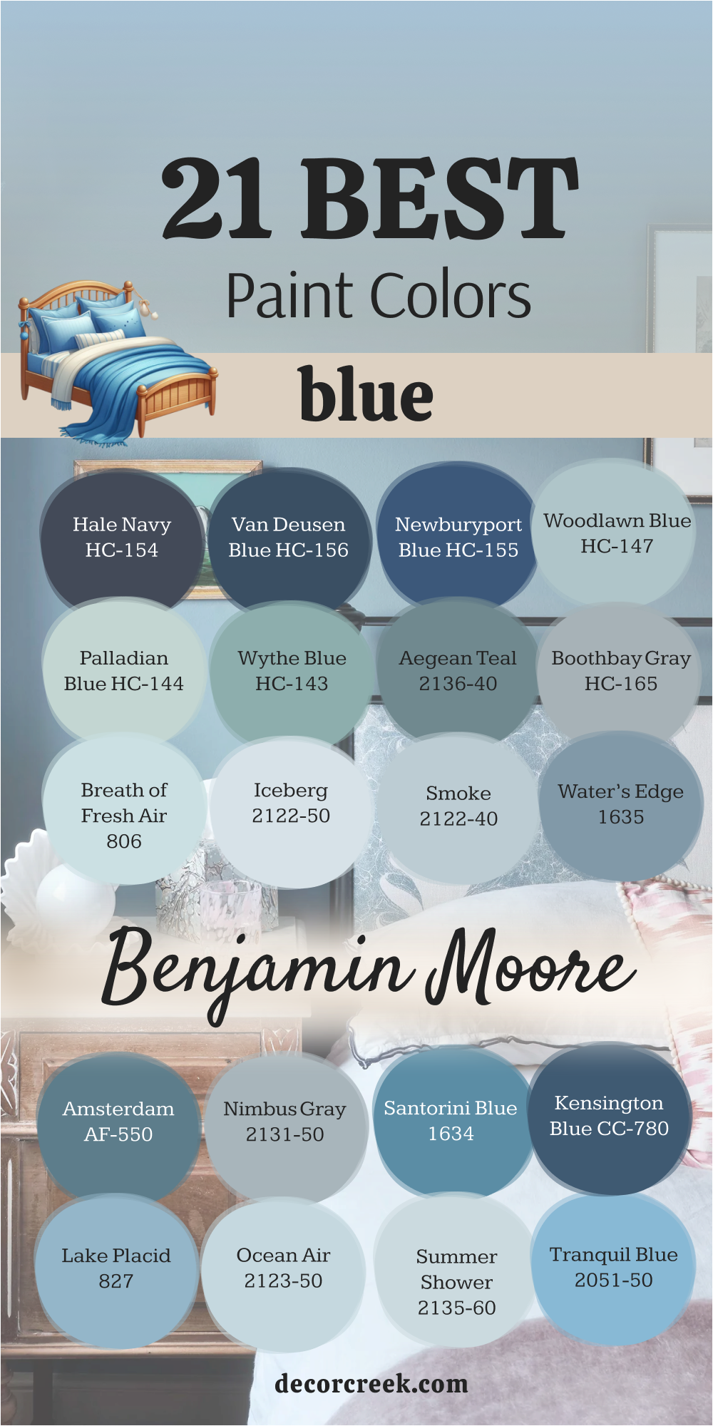
21 Best Blue Paint Color By Benjamin Moore
Hale Navy HC-154
Hale Navy HC-154 is a true classic in every sense. It’s a deep navy with just enough warmth to feel elegant and not too dark. I love using it in bedrooms where depth and comfort are equally important. Against white trim, Hale Navy looks crisp and confident; with warm lighting, it softens beautifully and feels rich and cozy. It’s the kind of shade that instantly adds presence to a room without overpowering it.
This color pairs wonderfully with brass accents, beige linens, and soft gray fabrics. I’ve used it to create statement walls behind headboards, and it always gives the space a sense of polish and quiet confidence.
Hale Navy works in both traditional and modern designs, offering sophistication that feels timeless and calm.
🎨 Check out the complete guide to this color right HERE 👈

Van Deusen Blue HC-156
Van Deusen Blue HC-156 is a strong, refined blue that feels balanced and full of depth. It sits perfectly between navy and medium blue, making it flexible for many bedroom styles. I love how it works with both warm and cool tones — ivory, gray, oak, or even black furniture all look great beside it. In daylight, it feels sharp and clean; in the evening, it softens into something peaceful and inviting.
This color shines in rooms that need structure without losing comfort. I often use it with matte finishes or simple fabrics to keep the focus on its beauty. Van Deusen Blue gives bedrooms a sense of quiet strength and classic charm.
🎨 Check out the complete guide to this color right HERE 👈

Newburyport Blue HC-155
Newburyport Blue HC-155 is a beautiful navy that feels traditional yet fresh. It’s a little softer than Hale Navy, which makes it perfect for bedrooms that need depth without darkness. I love pairing it with crisp white trim, brushed gold lamps, and linen bedding for a balanced, refined look. It’s the kind of color that makes a room feel put-together with very little effort.
Newburyport Blue is also wonderful for accent walls, especially behind upholstered headboards or against light flooring. It adds just the right amount of drama while keeping the overall look relaxed. This color feels steady, graceful, and full of quiet beauty — a designer favorite for years.
🎨 Check out the complete guide to this color right HERE 👈

Woodlawn Blue HC-147
Woodlawn Blue HC-147 has a gentle charm that feels like soft daylight on the walls. It’s a pale blue with a slight green undertone, giving it a soothing, natural look. I love using it in bedrooms that need brightness and airiness without going too light. With white bedding and warm accents, it feels graceful and timeless.
It pairs beautifully with warm metals, beige textiles, or even light gray furniture. The soft tone of Woodlawn Blue creates a sense of comfort that makes it easy to rest and relax. It’s one of those colors that always feels right — simple, balanced, and endlessly pleasant.
🎨 Check out the complete guide to this color right HERE 👈

Palladian Blue HC-144
Palladian Blue HC-144 is one of Benjamin Moore’s most loved shades, and for good reason. It’s a blend of blue, green, and gray that shifts gently with the light. In the morning, it feels airy and fresh; in the evening, it becomes soft and soothing. I love using it in bedrooms that need a natural and peaceful touch.
This color pairs beautifully with white trim, natural fabrics, and wood accents. It gives the room a clean, easy elegance without ever feeling flat. Palladian Blue is perfect for bedrooms where relaxation and lightness are the main goals.
🎨 Check out the complete guide to this color right HERE 👈

Wythe Blue HC-143
Wythe Blue HC-143 is one of those shades that feels instantly comforting the moment it’s on the wall. It’s a mix of blue, green, and soft gray that brings warmth and quiet balance to a bedroom. I often use it when a space needs a welcoming and natural look. In bright light, it feels fresh and airy; under soft lamps, it turns gentle and cozy. It’s versatile, classic, and full of charm.
This color pairs beautifully with white trim, woven rugs, and warm wood furniture. I love combining it with off-white or cream bedding for a soft, collected look.
Wythe Blue also looks wonderful next to antique brass or muted gold fixtures, which bring out its elegant warmth. It’s a color that makes every bedroom feel grounded, graceful, and lived in.
🎨 Check out the complete guide to this color right HERE 👈

Aegean Teal 2136-40
Aegean Teal 2136-40 is rich, balanced, and full of personality. It sits perfectly between blue and green, creating a cozy and sophisticated feeling in any bedroom. I love how it looks with natural light — deep but never heavy. With warm woods, brass, and cream fabrics, it turns into a color that feels both artistic and relaxed.
It’s a shade that works especially well in rooms where you want a sense of character without going dark. Aegean Teal can make even the simplest furniture look polished. I’ve used it in both modern and classic spaces, and it always feels current. It’s confident, elegant, and endlessly interesting — one of Benjamin Moore’s most versatile blues.
🎨 Check out the complete guide to this color right HERE 👈

Boothbay Gray HC-165
Boothbay Gray HC-165 is a gentle mix of gray and blue that feels sophisticated but easy to live with. It’s perfect for bedrooms that need a calm, balanced tone. I love how it adapts to light — appearing bluer in the day and slightly grayer at night. It’s a color that feels modern yet timeless at the same time.
This shade pairs beautifully with soft whites, brushed nickel, and light oak furniture. I often use it when a client wants something subtle but not plain. Boothbay Gray gives a bedroom quiet order, letting fabrics and textures stand out naturally. It’s one of those shades that never feels too cool or too warm, just right every time.
🎨 Check out the complete guide to this color right HERE 👈

Breath of Fresh Air 806
Breath of Fresh Air 806 lives up to its name — light, clean, and uplifting. It’s a soft blue that fills a bedroom with a gentle brightness. I love using it in smaller spaces or rooms that need a sense of openness. With white trim and pale linens, it feels airy and cheerful without being too pale.
This color works wonderfully with silver finishes, natural baskets, and light woods. It’s great for creating that breezy, relaxed feeling that makes a room feel simple and loved. Breath of Fresh Air always brings out a sense of ease, the kind that makes you exhale when you walk in.
🎨 Check out the complete guide to this color right HERE 👈

Beneath the Clouds 2131-50
Beneath the Clouds 2131-50 is one of those shades that sits right between gray and blue, offering flexibility and quiet charm. It’s calm, balanced, and incredibly easy to style. I often choose it for bedrooms where the goal is simplicity and comfort. The gray tone gives it a neutral base, while the blue keeps it soft and cool.
Beneath the Clouds pairs beautifully with natural wood, ivory bedding, and light stone accents. It feels modern without being cold and traditional without feeling dated.
It’s that perfect middle-ground color — steady, comfortable, and endlessly practical for any home.
Iceberg 2122-50
Iceberg 2122-50 is a delicate, frosty blue that gives bedrooms a clean and polished look. It has a soft gray undertone that keeps it from feeling too sweet or bright. I love using it for modern designs where simplicity is key. With white trim and natural fabrics, it feels calm, light, and balanced.
It’s also a wonderful choice for rooms with limited light because it helps reflect brightness gently. Iceberg pairs beautifully with chrome, silver, and soft wood tones. It has that perfect quiet presence — noticeable but never demanding. The result is a bedroom that feels refined, easy, and thoughtfully put together.
🎨 Check out the complete guide to this color right HERE 👈
Ocean Air 2123-50
Ocean Air 2123-50 is one of the most relaxing blues Benjamin Moore makes. It’s light, smooth, and carries a touch of green that keeps it natural and soft. I love using it in bedrooms that need a clean, coastal feeling. With white trim, woven fabrics, and natural light, it feels breezy and balanced.
This color looks especially lovely in rooms that get morning sunlight, as it brightens the walls without being too bright.
At night, it turns slightly muted and cozy, creating a perfect place to unwind. Ocean Air has a quiet confidence that makes every space feel thoughtful and easy.
🎨 Check out the complete guide to this color right HERE 👈

Smoke 2122-40
Smoke 2122-40 is one of those soft, dreamy blues that makes a bedroom feel instantly peaceful. It has a gentle gray undertone that keeps it elegant and never too cool. I love how it shifts with the light — pale and open in the morning, smooth and calming at night. It’s perfect for bedrooms that need color but still want to feel restful.
Paired with crisp white trim, beige bedding, or soft gray furniture, Smoke feels perfectly balanced. I often use it in homes where the goal is simple comfort with a polished edge.
It fits beautifully in both coastal and city spaces, adding quiet charm without trying too hard. It’s the kind of color that works anywhere and always feels right.
🎨 Check out the complete guide to this color right HERE 👈

Lake Placid 827
Lake Placid 827 reminds me of a quiet lake on a clear morning — bright, clean, and peaceful. It’s a medium blue with cool undertones that make bedrooms feel open and refreshing. I often use it in rooms with plenty of natural light because it reflects brightness beautifully. With white bedding and soft gray accents, it creates a gentle, airy feeling.
Lake Placid works well in homes that want a soft pop of color without too much intensity.
It blends perfectly with coastal décor, light woods, and silver finishes. This shade adds just the right amount of personality while keeping the overall look calm and polished. It’s easy to love and even easier to live with.
🎨 Check out the complete guide to this color right HERE 👈

Water’s Edge 1635
Water’s Edge 1635 feels elegant and serene with a touch of richness. It’s a medium blue that carries a soft gray tone, giving it calm depth. I love using it in bedrooms that have lots of natural light, as the shade changes beautifully throughout the day. In the morning, it’s crisp and fresh; in the evening, it becomes smooth and cozy.
This color pairs wonderfully with cream-colored fabrics, natural linen, and brushed brass. It’s great for creating that classic, coastal-inspired look or a clean modern retreat. Water’s Edge feels timeless and balanced, adding just enough color to keep a bedroom engaging yet peaceful.
🎨 Check out the complete guide to this color right HERE 👈

Amsterdam AF-550
Amsterdam AF-550 is a strong, sophisticated blue that makes a quiet statement. It’s deep but not heavy, carrying a refined energy that works beautifully in bedrooms. I like pairing it with warm lighting and natural textures to soften its strength. It also looks incredible with crisp white trim or ivory fabrics for a more classic touch.
The beauty of Amsterdam is its balance — it feels both modern and timeless. It gives the room character while staying elegant and steady.
This color works well in spaces that need depth, presence, and calm energy all at once. It’s a designer favorite for creating rooms that feel mature and composed.
🎨 Check out the complete guide to this color right HERE 👈

Santorini Blue 1634
Santorini Blue 1634 brings a touch of sunshine and sea breeze into any bedroom. It’s a clear, mid-toned blue that feels cheerful but still elegant. I love using it in bright rooms with white furniture or light floors because it adds freshness and movement. It makes the space feel open, alive, and full of easy charm.
This color works beautifully with soft gold accents, natural linens, and woven baskets. It gives bedrooms a gentle energy that feels relaxing yet joyful.
Santorini Blue is perfect for those who want their room to have color that lifts the spirit but still feels welcoming and comfortable.
🎨 Check out the complete guide to this color right HERE 👈
Kensington Blue 840
Kensington Blue 840 is rich, classic, and full of personality. It’s a strong blue with a touch of gray, which gives it depth without making it too bold. I love using it in bedrooms that need a feeling of comfort with a hint of sophistication. It looks stunning with white trim, tan fabrics, and warm lighting that softens the tone just enough.
What makes Kensington Blue special is its ability to work in both traditional and modern settings. It feels elegant beside dark wood furniture and clean next to light finishes.
During the day, it appears crisp and balanced; in the evening, it turns deep and relaxing. It’s one of those blues that always feels confident and never goes out of style.
🎨 Check out the complete guide to this color right HERE 👈

Summer Shower 2135-60
Summer Shower 2135-60 feels gentle and happy, like sunlight coming through a soft curtain. It’s a pale blue with a hint of green that keeps it light and natural. I love using it for bedrooms that need color but still want a calm base for fabrics and textures. Paired with white furniture, rattan, and linen bedding, it feels breezy and relaxed.
This shade is wonderful for smaller spaces since it makes them feel open and bright. It also works beautifully with brushed metal accents or soft wood tones. Summer Shower adds life to a room without overpowering it — just a quiet touch of freshness that lasts all year.
🎨 Check out the complete guide to this color right HERE 👈

Tranquil Blue 2051-50
Tranquil Blue 2051-50 lives up to its name — smooth, comforting, and balanced. It’s a soft mid-tone blue that gives a bedroom a sense of calm order and warmth. I love using it in rooms where simplicity matters most. With creamy whites, soft grays, and natural fabrics, it feels complete and peaceful.
What makes Tranquil Blue stand out is its honesty — it doesn’t shift too much with light, so it always looks reliable and gentle.
It’s perfect for people who want a blue that’s visible but not bold. It’s the kind of shade that makes a room feel lived-in, cozy, and quietly beautiful.
🎨 Check out the complete guide to this color right HERE 👈

Blue Danube 2062-30
Blue Danube 2062-30 is deep, vibrant, and full of energy. It’s the kind of color that gives a bedroom confidence while still feeling grounded. I love using it as an accent wall behind a bed or in rooms that need a touch of strength. Paired with white bedding, brass lamps, or natural wood, it feels polished and rich.
This color shines in spaces with good lighting, bringing a bold yet elegant presence. It’s not too bright, not too dark — just perfectly balanced.
Blue Danube adds a bit of drama in the best way, turning any ordinary room into a place with personality and style.
🎨 Check out the complete guide to this color right HERE 👈

My Final Thoughts on Choosing Blue Paints for Bedrooms
When I think about blue bedrooms, I always come back to how they make people feel. Blue has a special way of shaping emotion — it helps the mind rest while keeping the heart light. Every shade tells its own quiet story: pale blues make mornings feel brighter, while deeper tones bring comfort at night. It’s the one color family that works for nearly everyone, no matter their style or mood.
When I help clients choose a blue, I always tell them to think about how they want their bedroom to greet them each day.
A soft misty blue like Iceberg or Rainwashed can make the space feel open and gentle, while deeper colors like Hale Navy or Naval give the room strength and focus. There’s no wrong choice — only what feels right to you.
I also believe light matters more than anything else. The same blue can look fresh and airy in a sun-filled room or cozy and rich under warm lamplight. That’s why I always test a few swatches before deciding. Seeing how the color changes through the day makes all the difference.
In the end, blue will always be my favorite choice for bedrooms. It’s steady, comforting, and endlessly beautiful. Whether you love soft sky tones or rich navies, the right shade of blue can make your bedroom feel like your favorite place to return to — peaceful, safe, and full of quiet life.