When I choose paint colors for an entire home, I always start by thinking about connection. Every room tells part of the same story, and the colors should help those stories flow together naturally. The right palette can make a house feel steady, warm, and welcoming without needing bold contrast or heavy accents. I’ve learned that choosing colors for the whole house isn’t about picking favorites — it’s about creating balance and comfort in every corner.
I like working with colors that have warmth and depth, the kind that look beautiful in both daylight and lamplight.
Neutrals, gentle greens, and soft blues tend to carry through each room gracefully, helping the home feel open and peaceful. Whether the style leans modern, classic, or somewhere in between, these shades help build a sense of unity.
Over the years, I’ve found that homes painted with well-chosen tones feel more inviting and timeless — not because of the trend, but because they fit how people truly live.
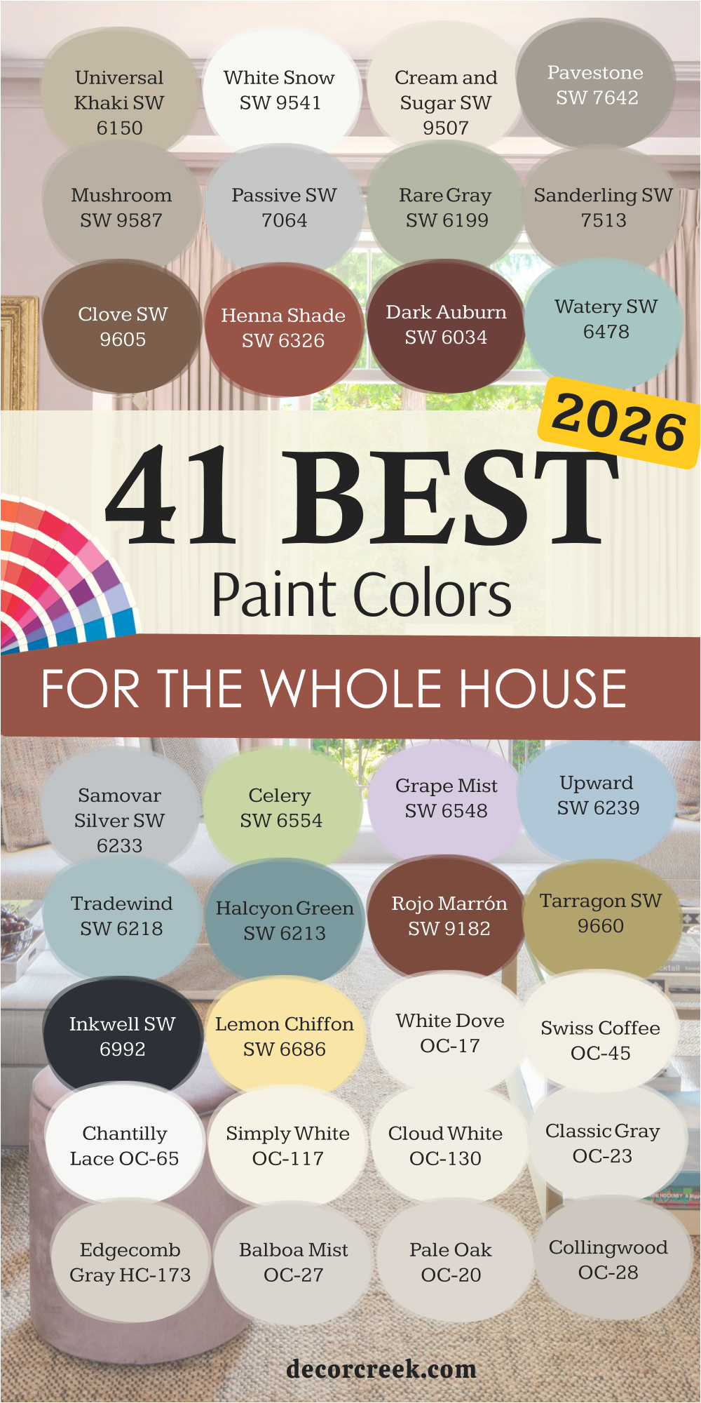
In this list of the 41 best paint colors for the whole house in 2026, I’ve gathered shades that make rooms feel connected, lived-in, and full of warmth from Sherwin-Williams and Benjamin Moore.
Why I Trust Sherwin-Williams and Benjamin Moore for Whole-House Paints
When I’m planning color schemes for entire homes, I always rely on Sherwin-Williams and Benjamin Moore. Both brands have been consistent for years, offering colors that stay true no matter the lighting or surface. Their palettes are full of shades that look soft in daylight, cozy under warm lamps, and beautiful next to natural materials like wood and stone.
That flexibility is what makes them my first choice for homes where every room needs to feel connected.
Sherwin-Williams offers smooth, durable finishes that cover beautifully and give each wall a professional look. Their neutrals and soft colors, like Universal Khaki and Cream and Sugar, bring warmth without overpowering a space.
Benjamin Moore, on the other hand, has an incredible range of classic tones — from gentle whites like White Dove to layered grays like Edgecomb Gray — that make coordination easy across open layouts.
What I appreciate most about both brands is how their paints feel “real” in a home. They don’t just look good in photos — they live well. The finishes resist wear, and the colors stay consistent over time, which is so important for rooms that flow into one another.
Whether I’m designing a calm modern home or a cozy family space, Sherwin-Williams and Benjamin Moore always help me create walls that feel complete and full of character.
How I Choose the Right Paint Colors for the Whole House
When I choose colors for a whole home, I always start by thinking about how people move through it. Every room connects — the hallway to the kitchen, the living room to the bedrooms — and color is what makes those transitions feel natural. I look at where the light falls during the day because that’s what truly shapes how paint feels. Bright, sunny rooms can handle cooler tones, while darker areas often need warmth to stay inviting.
I also study the materials already in the home — flooring, trim, furniture, and even countertop finishes. Those elements all have undertones that affect how a color reads.
A warm oak floor, for example, works beautifully with creamy neutrals or soft greens, while cooler gray floors might need beige-gray or greige tones for balance.
When I plan a palette, I like to choose two or three main colors that carry through most of the house, then layer in accents for smaller rooms or details. That consistency creates harmony without making every room look the same.
The goal is simple: every shade should flow gently into the next, making the home feel comfortable, personal, and easy to live in.
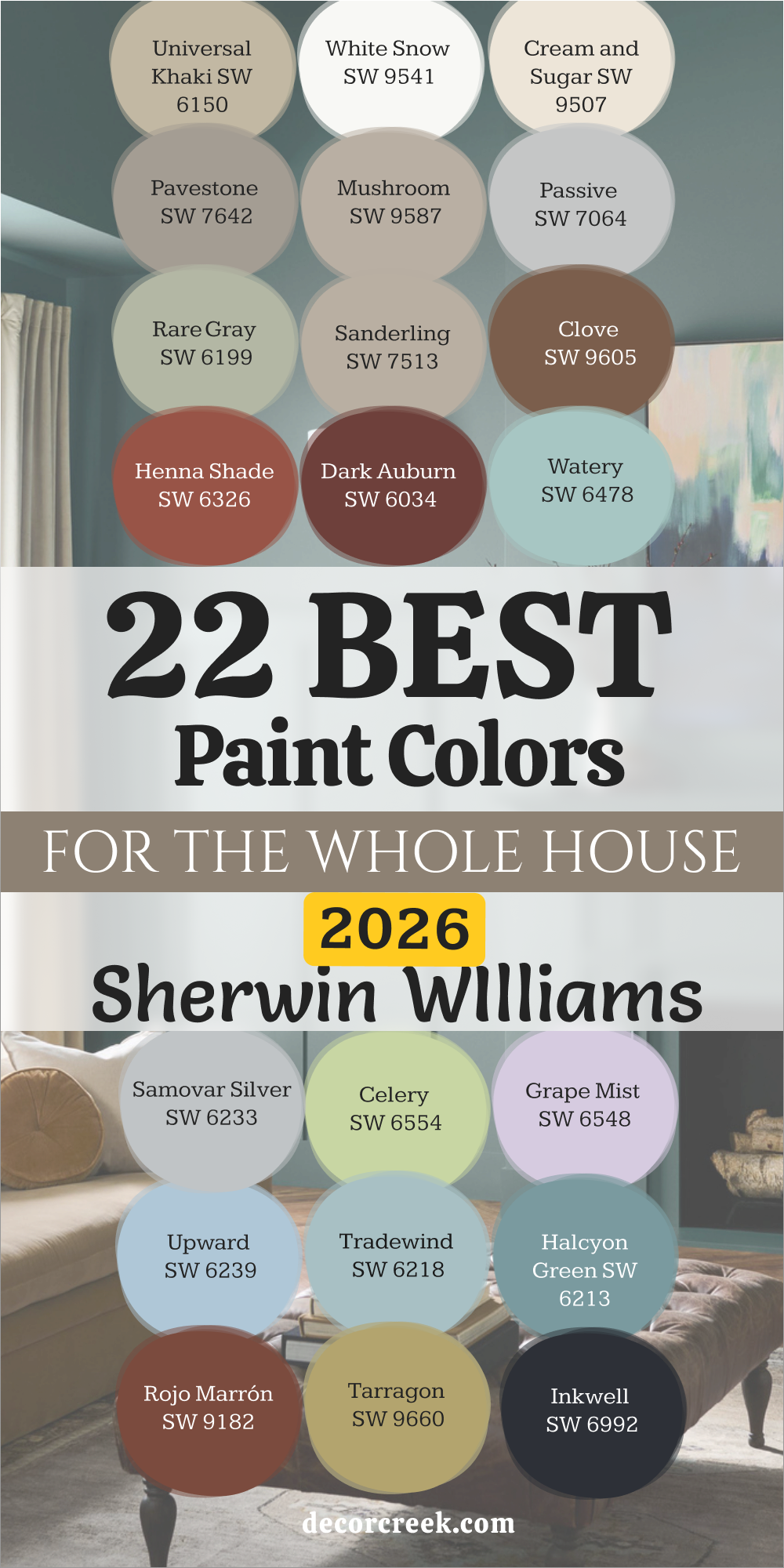
22 Best Paint Colors for the Whole House for 2026 by Sherwin-Williams
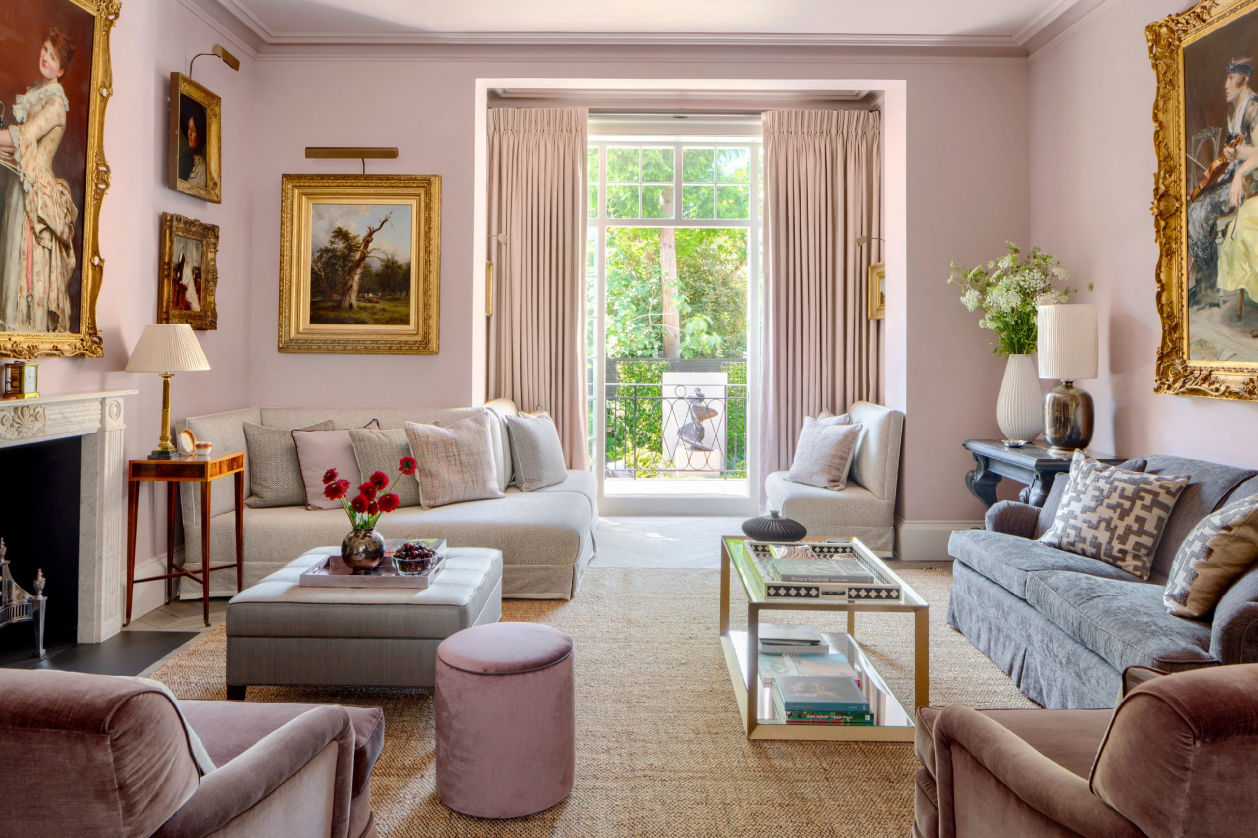
Universal Khaki SW 6150 is one of those rare neutrals that feels like home the moment it’s on the wall. It’s a warm greige that blends the best of gray and beige, creating balance and warmth in every room. I love using it when I want a single color to flow through an entire house, connecting open spaces without making them feel repetitive. In the morning, sunlight brings out its soft beige tone, and in the evening, lamplight deepens it into a comforting taupe.
This shade works beautifully with nearly everything — crisp white trim, rich black doors, or navy accents. It holds its own next to warm woods like oak and walnut but also pairs perfectly with marble, brick, or stone.
I’ve used it in living rooms, hallways, kitchens, and bedrooms, and it always feels right.
What I appreciate most about Universal Khaki is its ability to adapt: it looks sophisticated in a modern home and cozy in a farmhouse. It’s a steady, welcoming color that makes every room feel like it belongs to the same story — your story.
🎨 Check out the complete guide to this color right HERE 👈

White Snow SW 9541
White Snow SW 9541 is soft, bright, and endlessly flexible. It’s the kind of white that glows without being too sharp or too creamy. When I need a clean, airy background that still feels gentle, this is the shade I reach for. It brings life to darker corners and bounces light beautifully in sunny rooms. Unlike cooler whites, it has a faint warmth that gives every room an easy, lived-in comfort.
White Snow pairs perfectly with natural textures — rattan, linen, light wood, and woven rugs all shine against it.
It’s stunning on trim and ceilings, but I also love it as a full-wall color in open living spaces. In homes with a lot of light, it feels crisp and refreshing; in low light, it becomes soft and quiet. This is a white that helps every other color stand out while still keeping harmony across the house. It’s dependable, fresh, and timeless — a foundation that makes your entire home feel brighter and more connected.
🎨 Check out the complete guide to this color right HERE 👈

Cream and Sugar SW 9507
Cream and Sugar SW 9507 is a warm, inviting neutral that wraps a home in gentle light. It’s not too yellow, not too gray — just that perfect creamy tone that feels comforting and natural. I love using it when a house needs warmth but still wants a soft, open look. It pairs beautifully with white ceilings, warm wood floors, and light stone countertops. In bright light, it feels glowing and cheerful; at night, it takes on a soft golden tone that feels like candlelight.
What makes this color so versatile is its subtle balance. It can lean modern with black fixtures and sleek furniture or feel completely classic with linen drapes and woven baskets.
I often use Cream and Sugar in living areas and hallways to help rooms flow smoothly from one to another. It’s bright enough to lift a space but still cozy enough for everyday life. It’s a shade that brings calm energy to the home — easy, relaxed, and endlessly welcoming.
🎨 Check out the complete guide to this color right HERE 👈

Pavestone SW 7642
Pavestone SW 7642 is one of my favorite grounded neutrals — a medium gray with a touch of warmth that makes every room feel steady and complete. It’s a wonderful choice for homes that need structure but still want comfort. I use it often in open living spaces or entryways because it adds quiet definition without feeling dark. Pavestone looks elegant beside crisp whites and natural woods, and it pairs beautifully with soft blues and greens.
This color shifts subtly with light — cooler in bright daylight and cozier in the evening. It gives furniture and art a chance to stand out, yet it never competes for attention.
I love how it anchors a house with quiet confidence, connecting one room to another seamlessly. When paired with light flooring and creamy trim, Pavestone feels sophisticated and balanced. It’s the kind of shade that adds just enough depth to make the whole home feel thoughtful and beautifully put together.
🎨 Check out the complete guide to this color right HERE 👈

Mushroom SW 9587
Mushroom SW 9587 is a warm beige-gray that feels earthy, balanced, and full of comfort. It reminds me of natural stone — soft and organic, never flat. I love using it when I want a neutral with more personality than plain beige but less edge than gray. Mushroom looks incredible next to both cool and warm tones, blending them effortlessly throughout the house. It pairs beautifully with white trim, soft greens, and deep browns.
In homes with plenty of natural light, Mushroom feels open and inviting; in cozier rooms, it wraps you in warmth.
I’ve used it in kitchens, living rooms, and hallways, and it always brings harmony. It’s perfect for homeowners who want something simple but still rich in character. Mushroom has an understated elegance that stands the test of time — the kind of color that makes people feel instantly at ease, no matter what room they walk into.
🎨 Check out the complete guide to this color right HERE 👈

Passive SW 7064
Passive SW 7064 is one of those perfect grays that never feels cold or flat. It has a cool undertone but carries just enough warmth to feel comfortable and balanced. I love using it in homes where simplicity and light matter most. It flows beautifully from room to room, making open layouts feel connected and calm. In daylight, Passive appears clean and fresh; under evening light, it softens into a smooth, relaxing tone.
It pairs effortlessly with crisp white trim, black hardware, and natural oak furniture.
I’ve used Passive in living rooms, bedrooms, and hallways, and it always gives the home an elegant sense of order. It’s also a wonderful choice for pairing with bold accent colors because it supports them without competing. This shade has a way of keeping everything grounded and cohesive. Passive makes a home feel airy, thoughtful, and always easy to live with.
🎨 Check out the complete guide to this color right HERE 👈

Rare Gray SW 6199
Rare Gray SW 6199 is a soft green-gray that feels both natural and sophisticated. It’s one of those colors that bring a quiet touch of nature indoors without feeling too strong. I love how it looks in spaces that need subtle color but still want to stay neutral. In daylight, the green undertone comes alive gently, while in the evening it leans into a warm gray. Rare Gray gives depth to the walls while keeping the overall tone soft and balanced.
It pairs beautifully with creamy whites, muted blues, and natural wood accents. I often use it in entryways or living rooms to make the house feel connected to the outdoors.
It’s wonderful beside stone fireplaces or linen drapes because it complements every texture with ease. Rare Gray has a timeless charm that never feels forced — just calm, organic beauty that makes the home feel relaxed and refined at the same time.
🎨 Check out the complete guide to this color right HERE 👈

Sanderling SW 7513
Sanderling SW 7513 is a warm, earthy taupe that gives every room a sense of quiet comfort. It’s that perfect bridge color — soft enough for bedrooms but rich enough for open living areas. I love using it when I want warmth that doesn’t overwhelm. Sanderling pairs beautifully with off-white trim, deep charcoal accents, and brushed gold finishes. The result is a home that feels grounded yet light, like it’s been thoughtfully layered over time.
What I appreciate about this color is how it reacts to lighting. In the morning, it feels clean and airy; in the evening, it deepens to a velvety softness that wraps the room in warmth.
I’ve used Sanderling in modern, rustic, and traditional homes — it adapts easily to each. It blends beautifully with stone, tile, and wood, giving the entire home a unified feel. Sanderling is that dependable, comforting color you can build an entire palette around.
🎨 Check out the complete guide to this color right HERE 👈

Clove SW 9605
Clove SW 9605 is a rich, warm brown that adds quiet depth to a home’s palette. It reminds me of roasted coffee beans — deep, cozy, and full of character. I like using it in areas where I want the walls to feel welcoming and grounded, like living rooms, dining rooms, or entryways. Paired with creamy whites or pale neutrals, Clove becomes elegant and strong without overpowering the space.
It also works beautifully with brass fixtures, natural stone, and warm wood furniture. In daylight, you can see its earthy undertones clearly; in the evening, it takes on a more intimate and luxurious tone.
Clove is perfect as an accent in open-plan homes because it helps define areas while still feeling connected to lighter colors nearby. It gives the whole house a sense of richness and maturity. When you want warmth that feels natural and sophisticated, Clove is the perfect choice.
🎨 Check out the complete guide to this color right HERE 👈

Henna Shade SW 6326
Henna Shade SW 6326 is a beautiful reddish-brown that brings warmth and energy to any home. It’s bold but balanced, the kind of color that instantly makes a space feel inviting. I love using it in dining rooms, hallways, or accent walls where it can shine without overwhelming. Henna Shade glows in natural light, bringing out its red undertones during the day and deepening into a soft rust tone at night.
It pairs wonderfully with cream walls, golden accents, and dark wood. I’ve seen it transform ordinary rooms into warm, welcoming spaces full of life.
This color adds character and heart to a home, the kind that makes guests feel instantly comfortable. Henna Shade works beautifully with neutral palettes — it’s a lovely contrast that still feels cohesive. When used thoughtfully, it gives the whole house a soft sense of personality and warmth.
🎨 Check out the complete guide to this color right HERE 👈

Dark Auburn SW 6034
Dark Auburn SW 6034 is a deep, rich brown with a soft red undertone that gives it warmth and sophistication. It’s a color that instantly brings depth and comfort to any home. I love using it in areas where you want a bit of mood without the space feeling heavy—like dining rooms, reading nooks, or even bedrooms with warm light. Dark Auburn feels elegant with off-white trim and adds contrast to soft neutrals beautifully. It pairs especially well with beige, cream, or muted greens, giving a natural sense of balance.
In the morning, the red tones catch the sunlight, creating a gentle, cozy glow. By evening, it turns deeper and smoother, almost like polished wood.
I’ve used Dark Auburn to ground large open areas or to make accent walls stand out with quiet confidence. It’s a great choice for those who want color with richness but not drama. It makes a home feel stable, inviting, and full of understated charm.
Watery SW 6478
Watery SW 6478 feels like a cool breeze through an open window. It’s a soft blue-green that makes every room feel easy to breathe in. I love using it when I want color that’s gentle but still full of life. Watery looks fresh in bright daylight and turns cozy and calm under soft lighting. It pairs beautifully with warm whites, light woods, and brushed gold finishes. In open homes, it carries through multiple rooms without feeling too strong or too pale.
The best part about Watery is how naturally it works with other colors. It complements sandy beiges, crisp whites, and even darker shades like navy or charcoal.
It gives kitchens and bedrooms a cheerful, airy feeling while still feeling refined. Every time I use this color, it brings a light, coastal energy that makes people smile the moment they walk in. Watery adds freshness and grace in the most effortless way.
🎨 Check out the complete guide to this color right HERE 👈

Samovar Silver SW 6233
Samovar Silver SW 6233 is one of those calm grays that manage to feel bright and steady at the same time. It’s a soft, silvery gray with a faint blue undertone, making it perfect for homes that want modern simplicity without feeling cold. I often use it in hallways, kitchens, or offices where a light, polished look is needed. Samovar Silver pairs beautifully with crisp white trim and looks equally elegant next to brushed nickel or chrome finishes.
In natural light, it shows off its cool gray side; at night, it feels softer and more balanced. I love how it supports bolder accent colors like navy, dark green, or charcoal without competing with them.
This shade creates a beautiful backdrop for any décor style — from contemporary to traditional. It’s practical, calm, and flexible, making it one of my favorite neutrals for whole-house use.
🎨 Check out the complete guide to this color right HERE 👈

Celery SW 6554
Celery SW 6554 is a gentle green-yellow that adds brightness and warmth to a home. It feels cheerful but not loud — the perfect blend of energy and softness. I love using it in kitchens, sunrooms, and breakfast areas where natural light can bring it to life. Celery pairs perfectly with white cabinetry, woven textures, and soft beige tones. It adds that touch of personality that keeps a neutral home from feeling too plain.
In homes with lots of wood, this color adds a subtle contrast that highlights natural materials beautifully. In smaller rooms, it reflects light well, giving an open, airy feeling.
Celery is the color I reach for when I want a space to feel friendly and full of life without overwhelming the rest of the palette. It’s soft, sunny, and quietly joyful — the kind of color that makes mornings brighter and evenings gentler.
Grape Mist SW 6548
Grape Mist SW 6548 is a delicate lavender-gray that adds charm and elegance to a home. It’s subtle enough to act as a neutral but carries a hint of color that keeps it interesting. I love how it changes with the light — in the morning, it shows more purple; by evening, it softens into a misty gray. It pairs beautifully with white trim, pale woods, and brass details. I often use it in bedrooms, bathrooms, or small reading spaces where a gentle mood is needed.
What makes Grape Mist special is how balanced it feels. It brings color into a home without being distracting, and it works equally well in traditional and modern interiors.
It also pairs nicely with warm neutrals like beige and taupe, making it easy to blend throughout a home. It’s the kind of color that quietly uplifts the space — graceful, thoughtful, and unexpectedly versatile.
🎨 Check out the complete guide to this color right HERE 👈

Upward SW 6239
Upward SW 6239 is one of the happiest light blues I’ve ever used. It feels fresh and clear, like a morning sky. I love it in homes that need brightness and calm energy all at once. Upward pairs beautifully with crisp white trim, light oak furniture, and natural woven accents. It brings life to a space without taking over. In sunny rooms, it feels airy and cheerful; in shaded corners, it becomes soft and gentle.
This color works well across entire homes, especially open plans where continuity matters. It transitions smoothly between living areas, kitchens, and bedrooms, creating flow.
I often use it with deeper blues or soft grays for layered depth. Upward gives a sense of optimism and ease — it makes a home feel brighter, lighter, and full of quiet happiness.
🎨 Check out the complete guide to this color right HERE 👈

Tradewind SW 6218
Tradewind SW 6218 is a graceful mix of blue and gray with a touch of green that makes it beautifully balanced. It’s one of those colors that feels fresh but never overpowering. I like using it in open spaces that connect to outdoor areas because it naturally blends with nature. Tradewind pairs perfectly with creamy whites, sandy beiges, and warm woods. In bright light, it’s breezy and light; in the evening, it becomes more refined and cozy.
I’ve used this color in living rooms, kitchens, and even hallways where I want to add a bit of personality without clutter.
It complements everything from coastal to modern styles. Tradewind helps a house feel open, airy, and cohesive — a gentle connector between rooms that looks beautiful every single day.
🎨 Check out the complete guide to this color right HERE 👈

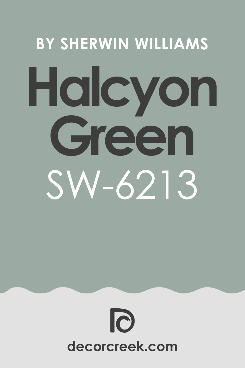
Halcyon Green SW 6213
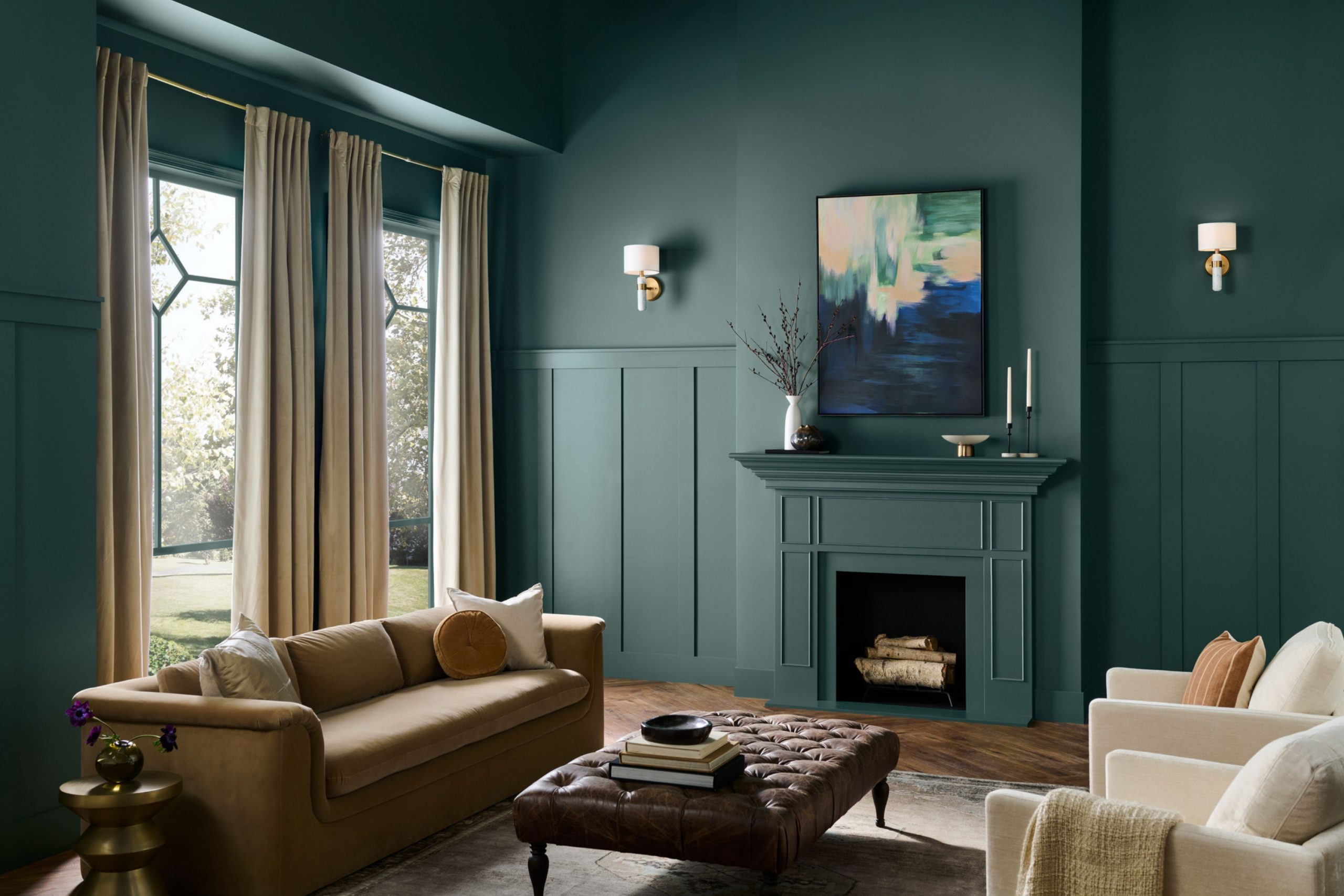
Halcyon Green SW 6213 is a medium-toned blue-green that feels rich, relaxed, and full of life. It’s a color that creates balance — strong enough to anchor a room but soft enough to flow throughout a home. I love using it in bedrooms, offices, and living rooms for its calming natural feel. It pairs beautifully with creamy whites, light grays, and warm wood tones. In daylight, it shows its blue side; under lamplight, it becomes softer and more green.
Halcyon Green has a natural depth that makes a home feel warm and connected to the outdoors. I often pair it with rattan, brass, or woven fabrics to bring out its organic beauty.
It’s versatile enough for any style — modern, classic, or rustic. It adds just the right amount of color while staying easy on the eyes.
🎨 Check out the complete guide to this color right HERE 👈
Rojo Marrón SW 9182
Rojo Marrón SW 9182 is a bold, earthy red-brown that adds character and depth to any palette. It’s perfect for homeowners who want warmth with elegance. I love using it as an accent in living rooms or dining areas where it can add richness without feeling too dark. Rojo Marrón pairs wonderfully with cream walls, warm wood furniture, and golden fixtures. It adds just enough energy to make a room feel welcoming and alive.
The tone changes beautifully throughout the day, glowing softly in morning light and deepening into a cozy, rich hue by night.
It also works well with neutral shades like tan or soft gray, keeping the look grounded and cohesive. Rojo Marrón has that classic, earthy warmth that gives a home a sense of comfort and belonging.
🎨 Check out the complete guide to this color right HERE 👈

Tarragon SW 9660
Tarragon SW 9660 is an earthy green that brings harmony and quiet elegance to a whole-house palette. It reminds me of dried herbs and garden leaves — warm, grounded, and natural. I love how it pairs with creamy whites, soft browns, and warm metals. Tarragon looks stunning in living rooms, kitchens, or hallways where you want a bit of color that still feels neutral. In sunlight, it glows softly; in evening light, it takes on a deeper, more restful tone.
This shade has enough personality to stand alone yet blends seamlessly with other natural tones.
It works perfectly in homes that use wood, stone, or woven textures. Tarragon adds gentle sophistication to any home, making it feel relaxed but refined. It’s that perfect balance between freshness and warmth that helps every room flow beautifully into the next.
🎨 Check out the complete guide to this color right HERE 👈

Inkwell SW 7513
Inkwell SW 7513 is a deep, striking navy-black that gives a home confidence and sophistication. It’s bold yet versatile, the kind of color that adds elegance without overpowering a room. I love using it to ground a whole-house palette — on doors, accent walls, or even built-in cabinetry. Inkwell has rich blue undertones that soften it, making it less harsh than pure black. It feels especially beautiful when paired with warm whites, brass lighting, and soft fabrics like linen or velvet.
In daylight, Inkwell reveals a subtle navy tone; in the evening, it becomes smooth, dark, and comforting.
It’s a perfect shade for balancing lighter neutrals in open homes, giving structure to a design without closing it in. I often use it in entryways or around fireplaces to create a sense of quiet strength. Inkwell adds depth and polish wherever it goes. It’s timeless, confident, and beautifully grounded — a color that gives the home presence and style in one simple stroke.
Lemon Chiffon SW 6686
Lemon Chiffon SW 6686 is soft, happy, and full of light. It’s a gentle buttery yellow that instantly brightens any home without feeling too bold. I love using it in kitchens, bathrooms, or hallways that could use a little warmth. Lemon Chiffon pairs beautifully with creamy whites, warm woods, and woven textures. It feels natural, cheerful, and full of life — like morning sunshine that never fades.
What makes this shade special is its subtlety. It’s not sharp or flashy; it’s delicate, wrapping rooms in a quiet glow.
It balances perfectly with gray or beige tones, helping neutral homes feel a touch more personal. In daylight, it sparkles softly; in the evening, it glows like candlelight. Lemon Chiffon is one of those colors that reminds people of comfort — welcoming, nostalgic, and endlessly cheerful. It’s the perfect final note in a warm, whole-house palette that feels alive and full of heart.
🎨 Check out the complete guide to this color right HERE 👈

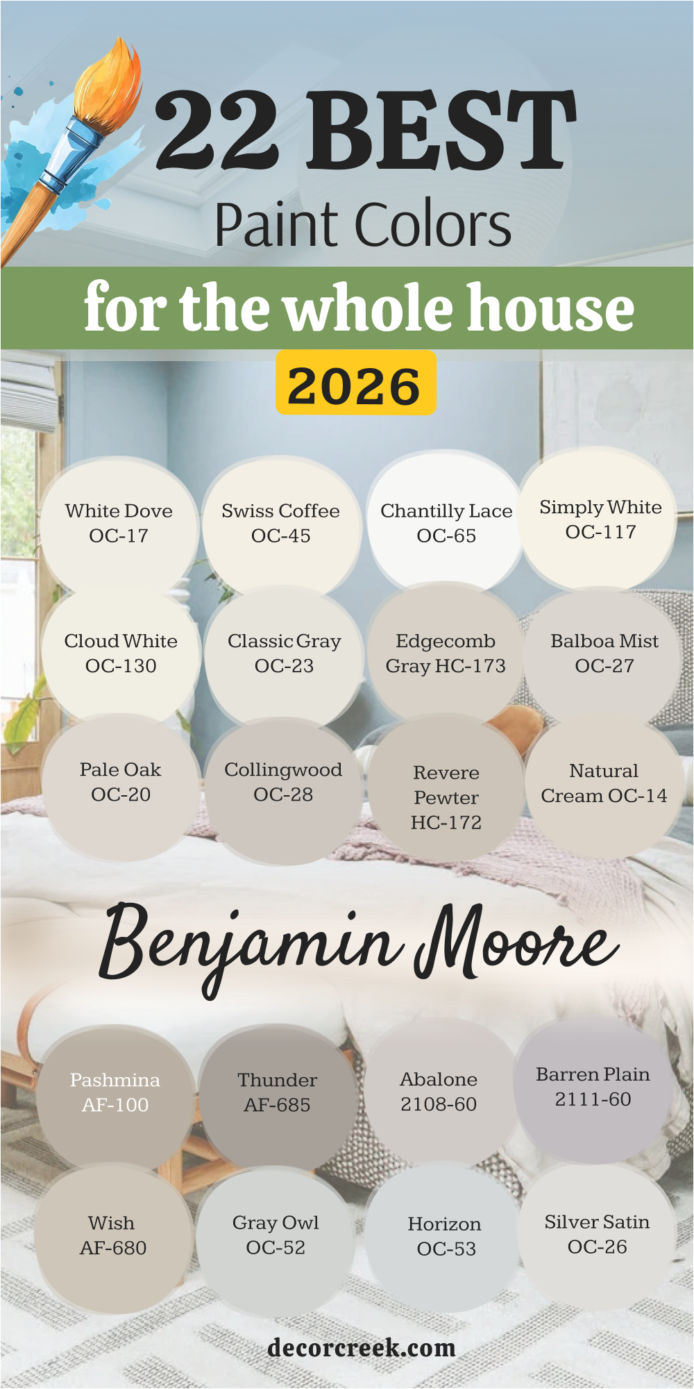
White Dove OC-17
White Dove OC-17 is my most trusted white when I want a home to feel soft, bright, and connected. It has the right balance — not too stark, not too creamy — which makes it work beautifully in every room. I love how it catches natural light and spreads it gently through a space. It has just a hint of warmth, which keeps it from feeling sterile, and it flatters every finish around it — from warm oak to cool marble.
I use White Dove on walls, trim, and ceilings when I want a clean background that still feels inviting.
It transitions seamlessly between rooms, which is perfect for open homes or hallways that link multiple spaces. Whether paired with bold colors or subtle neutrals, it always feels balanced. I’ve used this shade in dozens of homes, and it never loses its charm. White Dove is the kind of white that makes everything else look intentional — simple, beautiful, and full of quiet warmth.
🎨 Check out the complete guide to this color right HERE 👈

Swiss Coffee OC-45
Swiss Coffee OC-45 is a soft, creamy white that feels instantly comforting. It’s slightly warmer than a pure white, giving rooms a lived-in glow. I love using it in homes where the goal is brightness without losing coziness. Swiss Coffee looks wonderful in open floor plans, bouncing light from one room to the next. It pairs perfectly with warm grays, sandy beiges, and natural wood finishes.
In daylight, it feels clean and gentle; under warm lighting, it turns golden and welcoming.
I often use it for trim or ceilings when I want harmony with soft wall colors. It’s one of those shades that looks beautiful even without much décor — it carries a home on its own. Swiss Coffee makes rooms feel open and calm while keeping just enough warmth to feel personal. It’s truly one of those colors that feels like sunlight bottled into paint.
🎨 Check out the complete guide to this color right HERE 👈

Chantilly Lace OC-65
Chantilly Lace OC-65 is Benjamin Moore’s crisp, clean white — simple yet full of life. It’s pure and bright, but what I love most is how it reflects light without looking too cool. I reach for this color when a home needs a true white that feels natural in both modern and classic settings. It pairs wonderfully with dark floors, black accents, or colorful artwork.
This shade gives definition to every trim, ceiling, or door it touches. In open homes, it creates a sense of flow, keeping everything light and connected.
I often pair Chantilly Lace with soft beige or pale gray walls for contrast that still feels graceful. It’s perfect for homes with lots of natural light, where it can glow without glare. Chantilly Lace gives a sense of clarity and freshness that instantly makes a space feel renewed and thoughtfully designed.
🎨 Check out the complete guide to this color right HERE 👈

Simply White OC-117
Simply White OC-117 is one of the easiest whites to love — it’s clean, warm, and full of quiet energy. It adds light to every room without feeling sharp or artificial. I often choose it for homes that need brightness but still want to feel soft and inviting. It pairs beautifully with oak flooring, black accents, and creamy textiles. Simply White has a slightly yellow undertone that brings warmth into cooler spaces.
It’s perfect for whole-house palettes because it adapts to every kind of light. In bright rooms, it looks fresh and crisp; in darker spaces, it feels cozy and creamy.
I love using it on walls, trim, and cabinetry when I want one consistent color that makes everything flow together. Simply White always feels balanced — never too modern, never too traditional. It’s the kind of shade that makes a house feel clean, complete, and filled with warmth.
🎨 Check out the complete guide to this color right HERE 👈

Cloud White OC-130
Cloud White OC-130 is one of those classic whites that feels timeless and graceful in any home. It’s warm but not yellow, soft but not dull — the perfect middle ground. I use it often in spaces that need a welcoming feel but still want a clean, bright look. It pairs beautifully with neutral tones, stone accents, and natural textures like linen or oak.
In homes with lots of light, Cloud White feels soft and luminous; in dimmer rooms, it gives just enough warmth to keep things cozy.
I love it for kitchens, bedrooms, and hallways because it complements every finish. It’s especially pretty beside soft greens and muted blues. Cloud White gives homes a quiet foundation — it’s a shade that stays beautiful through every season and never feels too formal or too casual.
🎨 Check out the complete guide to this color right HERE 👈

Classic Gray OC-23
Classic Gray OC-23 is one of my favorite soft neutrals for creating a gentle, seamless flow through the home. It sits perfectly between warm and cool, which makes it work in almost any lighting. In bright rooms, it reads as a clean, airy gray; in dimmer corners, it takes on a soft, warm beige tone. I love how adaptable it is — it never looks out of place no matter the style or décor. It pairs beautifully with crisp white trim, natural oak, and brushed gold accents.
This color has a calm, even presence that helps connect open spaces together. I often use it as the main wall color in homes that need one shade to pull everything into harmony.
Classic Gray looks especially elegant with soft blues or creamy whites, giving depth without contrast. It’s perfect for creating that relaxed, lived-in feeling people love. Classic Gray makes every room feel easy to be in — graceful, light, and always balanced.
🎨 Check out the complete guide to this color right HERE 👈

Edgecomb Gray HC-173
Edgecomb Gray HC-173 is a warm greige that feels inviting, natural, and endlessly versatile. It’s one of those colors that adapts beautifully to changing light, making it a perfect choice for whole-house use. In sunlight, it feels soft and creamy; in the evening, it turns richer and cozier. I love how it blends the comfort of beige with the sophistication of gray. It works well with nearly every color scheme — whites, charcoals, greens, or navy.
Edgecomb Gray looks especially beautiful in open spaces, tying together rooms with different flooring or lighting.
It pairs nicely with both warm wood tones and cool metal accents. I often use it for living rooms, hallways, and kitchens because it feels both neutral and full of character. Edgecomb Gray brings quiet warmth and gentle refinement, making a home feel connected and calm. It’s the kind of color that always feels welcoming and lived-in.
🎨 Check out the complete guide to this color right HERE 👈

Balboa Mist OC-27
Balboa Mist OC-27 is a soft, elegant greige that gives homes a modern yet comfortable look. It’s light enough to feel airy but has enough depth to add interest. I love how it changes throughout the day — gray in the morning light, warmer and cozier in the evening. It pairs beautifully with white trim and natural textures like jute, rattan, or linen. Balboa Mist fits easily into any design style, from traditional to minimalistic.
In open layouts, it keeps every room connected without making things feel too uniform.
I often use it alongside soft whites and muted blues for a balanced, layered effect. The color’s subtle warmth brings life to spaces that might otherwise feel too cool or empty. Balboa Mist is one of those shades that simply works — flexible, refined, and always inviting.
🎨 Check out the complete guide to this color right HERE 👈

Pale Oak OC-20
Pale Oak OC-20 is one of Benjamin Moore’s most beloved neutrals, and for good reason. It’s a graceful balance of beige and gray that feels both soft and luminous. I love using it when I want warmth without heaviness and color without boldness. It has just enough depth to define walls while keeping the home feeling bright. Pale Oak looks stunning with creamy whites, soft browns, and natural woods.
In sunlit rooms, it feels elegant and glowing; in shaded corners, it turns calm and smooth.
This color is wonderful for connecting spaces — it transitions beautifully from kitchens to hallways to bedrooms. It’s also one of the easiest tones to pair with accent colors, from sage green to navy blue. Pale Oak gives the home a timeless balance, wrapping every room in warmth and quiet comfort.
🎨 Check out the complete guide to this color right HERE 👈

Collingwood OC-28
Collingwood OC-28 is a refined gray-beige with a slightly warm undertone that makes every room feel settled and relaxed. It’s not too light, not too dark — just the right middle tone to anchor a whole-home palette. I love how it adapts to both natural and artificial light, maintaining its calm character throughout the day. Collingwood pairs beautifully with white trim, brushed gold hardware, and soft textiles.
It’s one of my favorite choices for open-concept homes because it adds definition while keeping flow.
In brighter spaces, it feels clean and modern; in low light, it takes on a rich, cozy tone. I often use it with off-white ceilings and lighter wall shades nearby to keep everything connected. Collingwood brings structure without weight, giving homes a warm, sophisticated foundation that feels easy and natural.
🎨 Check out the complete guide to this color right HERE 👈

Revere Pewter HC-172
Revere Pewter HC-172 is one of those colors that never goes out of style. It’s a warm gray with a soft beige undertone that gives it a lived-in, comforting look. I love using it when I want a neutral that feels natural but still has personality. Revere Pewter changes beautifully with light — cooler and airy during the day, richer and cozier at night. It’s the perfect bridge between gray and beige, making it ideal for open homes where you want a smooth flow from one room to the next.
It pairs beautifully with crisp white trim, deep navy accents, or natural wood finishes. I often use it for main walls and balance it with lighter shades in hallways or darker tones in dining areas.
Revere Pewter adds just enough depth to make a home feel grounded without ever feeling heavy. It’s calm, reliable, and endlessly flexible — a classic choice for anyone who wants warmth and balance in every room.
🎨 Check out the complete guide to this color right HERE 👈

Natural Cream OC-14
Natural Cream OC-14 is soft, light, and wonderfully welcoming. It’s a pale beige with a touch of gray, which keeps it sophisticated and gentle. I love how it works as a whole-house neutral, reflecting light softly and creating harmony between different spaces. It’s perfect for living areas, bedrooms, and hallways because it always feels balanced and comfortable. In bright daylight, it feels creamy and luminous; at night, it glows warmly under soft lamps.
This color pairs beautifully with white trim, muted greens, and warm woods. It’s also a great companion for brass, wicker, and woven textures.
I’ve used Natural Cream in both traditional and modern homes — it always feels right. It brings that soft, comforting tone that ties everything together, making a house feel lived-in and effortlessly coordinated.
🎨 Check out the complete guide to this color right HERE 👈

Pashmina AF-100
Pashmina AF-100 is an elegant greige that feels both modern and timeless. It’s deeper than some neutrals but not heavy, adding richness and calm to the walls. I love using it in open homes that need warmth and sophistication without darkening the space. The tone has a cozy depth that pairs perfectly with white trim and light flooring. It works especially well in living rooms or bedrooms where you want color that feels subtle but strong.
In daylight, Pashmina shows its soft gray side; in evening light, its warm undertones come forward beautifully.
I’ve paired it with everything from navy to forest green, and it never clashes. Pashmina has that comforting, grounded quality that makes a home feel peaceful and mature. It’s perfect for creating a cohesive, inviting palette that carries throughout the entire house.
🎨 Check out the complete guide to this color right HERE 👈

Thunder AF-685
Thunder AF-685 is a medium gray with warm undertones that make it dependable and versatile. It’s one of my go-to choices for homes that need definition without drama. I love how it anchors open spaces, giving them quiet strength. It pairs beautifully with soft whites, warm beiges, and even muted blues or greens. Thunder has just the right amount of depth to add character while keeping everything balanced.
In bright light, it feels refined and smooth; in low light, it turns richer and cozier. I often use it to add contrast to lighter walls or as a main color in modern interiors.
It’s also stunning on cabinetry and accent walls, bringing elegance without distraction. Thunder is steady, comfortable, and endlessly livable — a true whole-home classic.
🎨 Check out the complete guide to this color right HERE 👈

Abalone 2108-60
Abalone 2108-60 is a pale gray with a faint violet undertone that gives it a sophisticated softness. It’s perfect for homes that want a cool, modern look but still feel warm and welcoming. I love using it in bedrooms, living rooms, or even hallways where you want a touch of quiet color. Abalone pairs beautifully with crisp white trim, soft taupe, or pale wood flooring. It gives a home a sense of refinement that feels effortless.
What makes Abalone special is how it shifts gently throughout the day. In sunlight, it feels airy and elegant; in dim light, it deepens slightly, adding warmth and texture.
It’s a great connecting color between grays, lavenders, and beiges. Abalone gives homes a smooth, graceful finish that feels carefully chosen but never fussy.
🎨 Check out the complete guide to this color right HERE 👈
Barren Plain 2111-60
Barren Plain 2111-60 is a gentle gray with a soft violet undertone that feels elegant and calm. It’s a shade I reach for when a home needs quiet sophistication that still feels approachable. In bright light, it looks airy and modern; in the evening, it deepens into a cozy, layered tone. I love how Barren Plain pairs with crisp whites, soft taupes, and brushed metal finishes. It’s refined but never cold, which makes it perfect for living areas, bedrooms, or open hallways.
This color works beautifully with both warm and cool palettes, helping bridge different rooms together.
It looks especially lovely beside marble, light wood, or woven textures. I often use it in homes that want a soft modern touch without feeling stark. Barren Plain gives every space balance — it lets light flow smoothly through the house while keeping the mood relaxed and graceful.
🎨 Check out the complete guide to this color right HERE 👈

Wish AF-680
Wish AF-680 is a warm greige that feels natural and comforting. It sits perfectly between beige and gray, giving every room a soft glow. I love using it when I want a whole-house color that’s subtle but full of warmth. Wish pairs beautifully with white trim, stone accents, and natural fibers like linen or jute. In sunlight, it brightens and opens a space; under soft lighting, it feels cozy and familiar.
It’s a beautiful background for both bold and muted décor, from navy accents to pale pastels.
I’ve used it in living rooms, kitchens, and bedrooms — it always creates harmony. Wish helps tie a home together, bringing that sense of quiet flow between spaces. It’s a color that feels gentle but grounded, perfect for creating a warm, connected atmosphere throughout the house.
🎨 Check out the complete guide to this color right HERE 👈

Gray Owl OC-52
Gray Owl OC-52 is one of my most dependable light grays — airy, adaptable, and always elegant. It has a soft green undertone that keeps it from feeling too cool, making it comfortable in any light. I love how it works as a neutral foundation for the entire home. In bright rooms, it feels clean and refreshing; in dim spaces, it gains a cozy, silvery depth. It’s beautiful alongside white trim, black accents, or natural textures.
Gray Owl pairs wonderfully with everything from navy to blush to wood tones.
It’s ideal for open layouts where you want subtle color that flows easily from one room to the next. I often use it for living areas and bedrooms because it feels both sophisticated and approachable. Gray Owl gives homes that effortless, light-filled beauty that never goes out of style.
🎨 Check out the complete guide to this color right HERE 👈

Horizon OC-53
Horizon OC-53 is a gentle gray with a touch of blue, giving it a breezy, open quality. It feels like a soft sky on a quiet day — calm and endlessly versatile. I love using it in rooms with plenty of natural light, where it stays fresh and clear. In the evening, it takes on a cozy, misty tone that feels soothing and elegant. Horizon pairs beautifully with white trim, soft neutrals, and brushed silver finishes.
This color works well in both modern and traditional homes because of its quiet charm. It reflects light beautifully, which helps make smaller rooms feel larger and more open.
I often use Horizon as a connector color, helping spaces flow naturally from one to another. It’s a perfect whole-home shade when you want something subtle but full of quiet character.
🎨 Check out the complete guide to this color right HERE 👈

Silver Satin OC-26
Silver Satin OC-26 is a pale gray with the slightest hint of warmth, creating a smooth, sophisticated backdrop for any home. It’s one of those colors that always looks polished, no matter where it’s used. I love how it reflects natural light softly, keeping rooms bright and clean without feeling stark. It’s perfect for walls, trim, or even ceilings in open spaces. Silver Satin pairs beautifully with natural oak, white cabinetry, and soft blue or green accents.
In sunny rooms, it feels crisp and refined; in shadowed corners, it becomes cozy and gentle. I’ve used it in homes that range from coastal to classic, and it always fits perfectly.
Silver Satin is easy to live with, adaptable to any palette, and endlessly graceful. It’s a shade that helps a home feel effortlessly pulled together and full of quiet warmth.
🎨 Check out the complete guide to this color right HERE 👈

Sea Salt CSP-95
Sea Salt CSP-95 is a gentle, balanced neutral with soft gray-green undertones that make a home feel refreshed and connected to nature. It’s light but full of depth — one of those colors that changes beautifully with the light. In the morning, it feels airy and clean; as evening falls, it takes on a quiet, warm depth that makes any room feel inviting. I love using Sea Salt in open spaces, kitchens, and bedrooms where natural light plays a big role. It pairs wonderfully with creamy whites, soft woods, and brushed gold accents.
This shade creates harmony between modern and classic design elements.
It works just as well with simple, minimal décor as it does with layered textures like linen and wicker. I often use it as a unifying color for entire homes because it carries a subtle elegance that never feels overdone. Sea Salt has that rare ability to bring freshness without brightness — it simply feels natural. Every time I use it, homes instantly feel more balanced, grounded, and peaceful.
🎨 Check out the complete guide to this color right HERE 👈
Smoke Embers 1466
Smoke Embers 1466 is a warm, medium gray that gives every home a sense of quiet confidence. It has just a touch of taupe, which keeps it soft and approachable rather than cool or flat. I love using it in open-concept spaces where walls need both definition and warmth. It’s beautiful with white trim, dark metals, and rich wood tones, giving a home an elegant, modern edge. In bright daylight, it feels smooth and refined; in the evening, it deepens into a cozy, enveloping tone.
Smoke Embers works wonderfully as a main wall color or as an accent against lighter neutrals.
It’s one of those shades that adapts gracefully to any style — from sleek contemporary homes to warm traditional ones. I often recommend it for people who want a neutral that feels strong but never heavy. It connects all parts of a home seamlessly, giving every room a sense of intention and balance. Smoke Embers feels timeless, grounded, and quietly beautiful — the perfect finishing note to a whole-home palette.
🎨 Check out the complete guide to this color right HERE 👈

My Final Thoughts on Choosing Paint Colors for the Whole House in 2026
When I help someone choose paint colors for their entire home, I always remind them that color is about feeling, not just design. The shades that work best are the ones that make you exhale when you walk through the door. Every wall, hallway, and ceiling connects — and when those colors flow together, the home starts to feel like one complete story.
Whether it’s soft beige, gentle gray, or a touch of blue-green, the right tones create comfort that lasts far beyond trends.
I’ve learned that balance is everything. Too much contrast can make a home feel disjointed, while the right neutrals can make rooms blend seamlessly into one another. I always suggest testing colors in real light — morning sun, afternoon glow, and evening warmth — because that’s when a shade’s true personality appears. A color that feels perfect in daylight might turn richer or softer as the sun sets, and that’s part of what makes a home feel alive.
Sherwin-Williams and Benjamin Moore continue to lead with tones that are natural, adaptable, and deeply livable.
In the end, the best color choice is the one that brings comfort every day. It should welcome you home in the morning light and hold you softly in the evening.
When your home feels balanced and true to you, that’s when paint does its most beautiful work.
