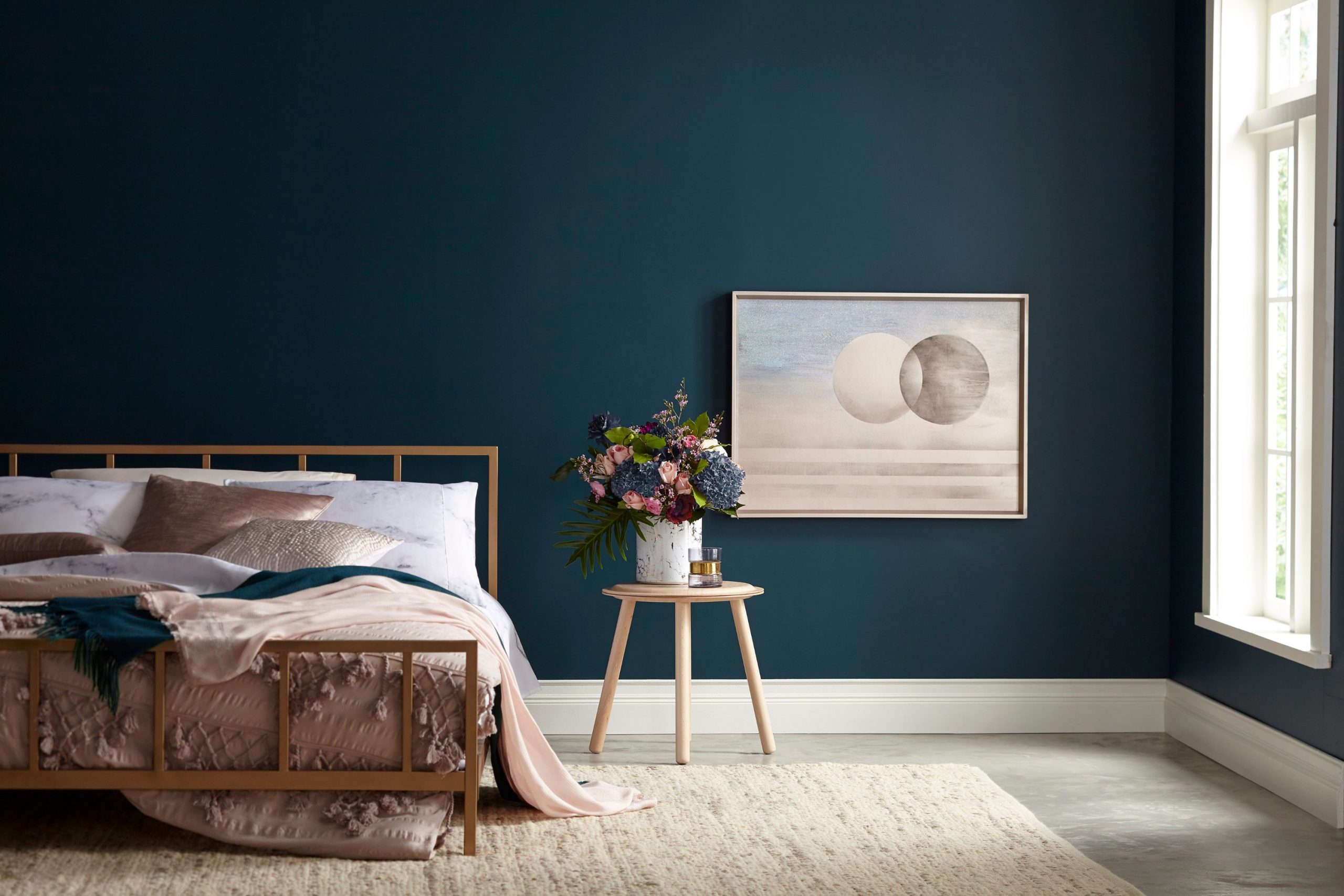
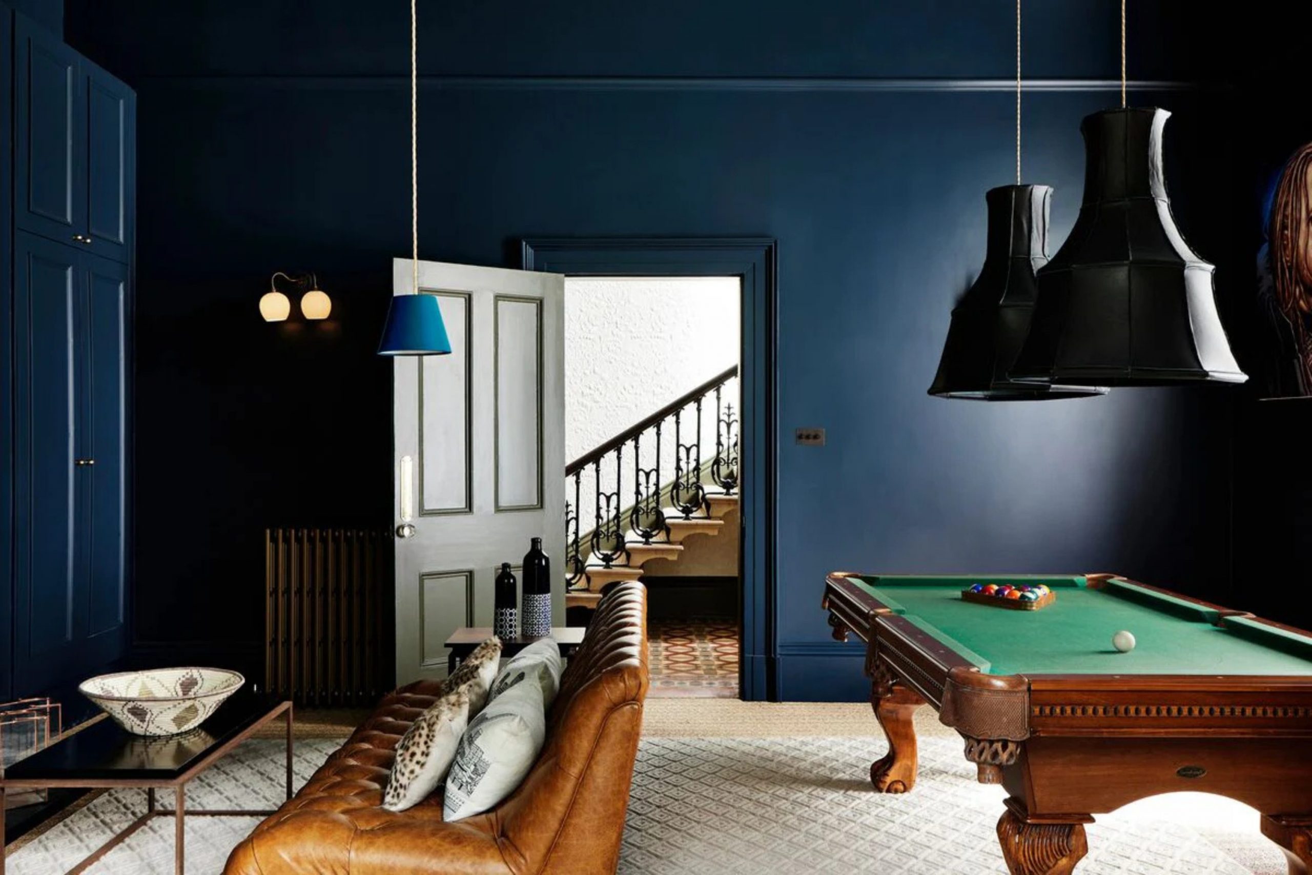
I have spent many dedicated years helping clients turn their basic houses into the stunning, atmospheric homes of their dreams. Over time, I’ve learned that selecting the perfect paint is easily the most critical and foundational part of my entire job. Dark blue remains my absolute favorite tool in my design kit because it has an incredible ability to make any house feel grounded, strong, and exceptionally expensive.
Most homeowners are initially hesitant, fearing that such a bold, dark color will make their rooms feel cramped or small. However, I am here to tell you from experience that the right shade of blue actually creates an optical illusion of depth, making your walls appear to recede rather than close in.
It provides your home with a sophisticated, soulful personality and a sense of architectural character that light, airy colors simply cannot match.
Why I Always Trust Sherwin-Williams and Benjamin Moore for the Best Dark Blue Paint Colors
When it comes to high-stakes projects, I strictly use Sherwin-Williams and Benjamin Moore. These two industry leaders utilize the highest quality pigments that stay remarkably true and vibrant even after the paint has fully cured on the wall. In my early career, I experimented with cheaper paint brands, but the results were often disappointing—they tended to look patchy, required too many coats, or shifted into strange, unattractive undertones under different light bulbs.
Benjamin Moore has a masterful way of formulating dark blues so they look velvety, rich, and almost like fabric on the walls. On the other hand, Sherwin-Williams offers incredibly durable, high-performance finishes that are perfect for busy hallways and can easily withstand the daily wear and tear from kids and pets.
When you invest in a project, you want a paint that looks exactly the same on your large wall as it did on that perfect little sample card. These are the only two brands I trust to deliver that professional, high-end result every single time.
How I Choose the Perfect Dark Blue Shade for Any Room
The process of picking the ideal dark blue depends heavily on the specific direction and amount of natural sunlight flowing through your windows. Before I even think about opening a paint can, I carefully evaluate the existing elements of the room, specifically the flooring and the large furniture pieces. If your home features cool gray floors or marble, you generally need a blue with a strong gray base to ensure the space feels cohesive and balanced.
For rooms filled with warm wood tones, such as oak or walnut, a deep navy with a subtle hint of green works wonders to create a cozy, organic atmosphere. I always advise my clients to paint a large piece of poster board with their top choices and move it to different corners of the room throughout the day.
This simple step allows you to see how the color transforms from a bright morning blue to a moody midnight shade in the evening. Ultimately, lighting is the “boss” of your interior, and understanding how it interacts with your paint is the secret to a successful transformation.
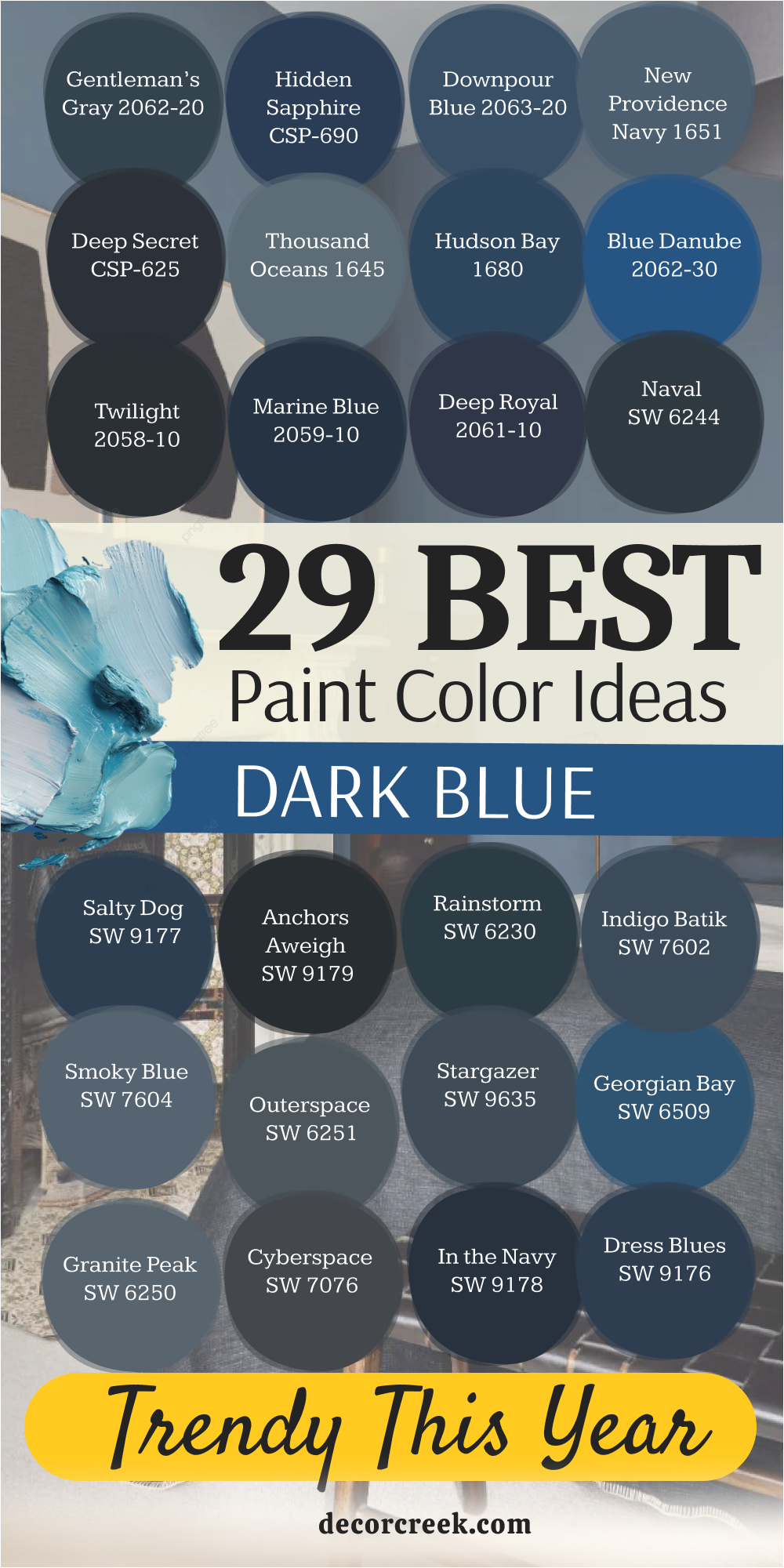
29 Best Dark Blue Paint Colors Trendy This Year
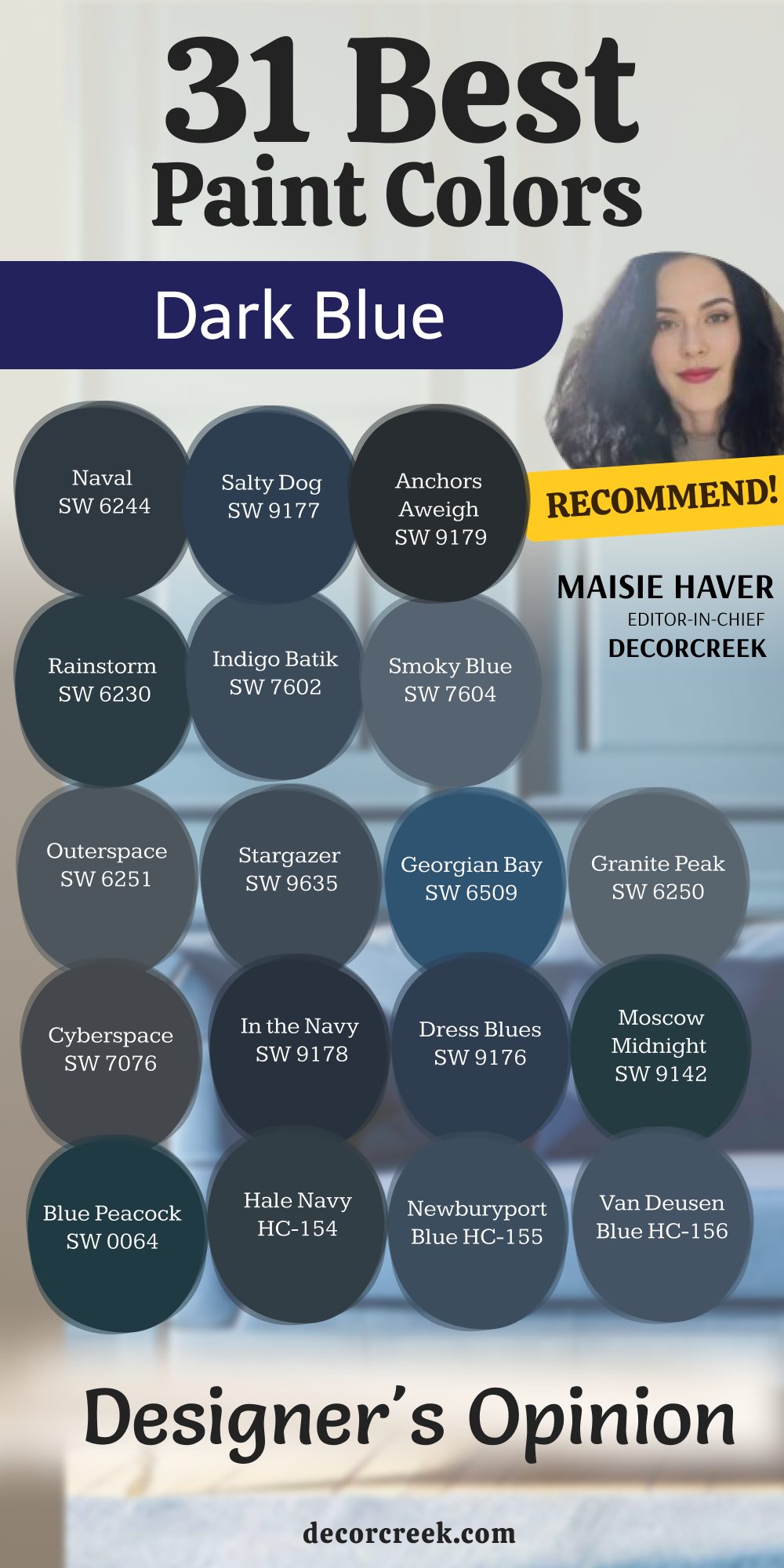
Naval SW 6244
Naval SW 6244 is the gold standard for anyone wanting a classic navy look in their home. This shade works because it does not have too much purple or green hiding inside. It feels very crisp when you pair it with bright white trim and gold hardware. Many of my clients choose this for their kitchen islands to create a focal point.
It looks very smart in a home office where you need to focus on your work. The color is deep enough to feel bold but remains very friendly to the eye. I find that it works in almost any lighting situation without looking like a different color. You can use it on a front door to make your entryway stand out from the neighbors.
It is a solid choice for a master bedroom if you want a cozy feeling at night. This paint is one of the most popular choices for a reason because it never fails.
Best used in: kitchen islands, master bedrooms, front doors, and home offices
Pairs well with: Pure White SW 7005, Carrara marble, gold accents, and light oak floors The key rule of this color for classic style is to use it where you want a bold look that still feels very clean and organized.
🎨 Check out the complete guide to this color right HERE 👈

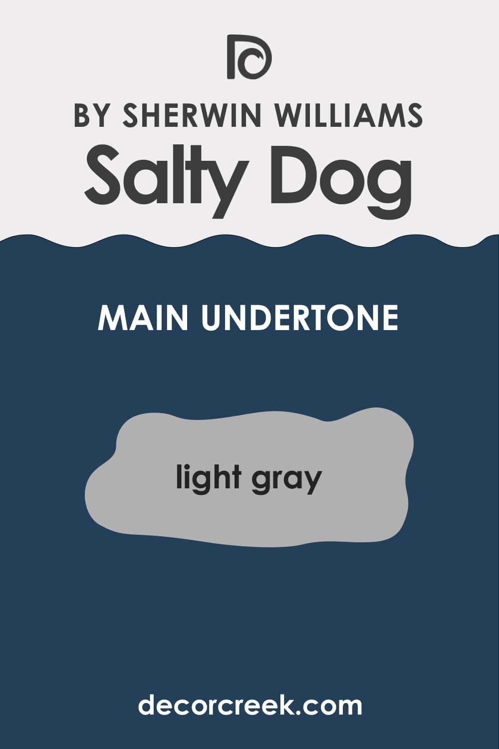
Salty Dog SW 9177
Salty Dog SW 9177 brings a fun and coastal energy to a room without being too bright. This blue has a bit more saturation which makes it pop against light-colored furniture. It reminds me of the deep ocean on a very clear and sunny day.
I love using this in a playroom or a laundry room to add a splash of excitement. The color stays true to its blue roots and does not lean toward charcoal or black. It creates a wonderful backdrop for nautical decorations or light wood accents. Kids really like this shade because it feels energetic and cool at the same time.
You should consider this if you want a dark room that still feels full of life. It works perfectly for a basement bar area where you want a moody but fun vibe. This is the kind of blue that makes people stop and ask for the name of the paint.
Best used in: laundry rooms, playrooms, basement bars, and boy’s bedrooms
Pairs well with: Extra White SW 7006, natural jute rugs, brass fixtures, and navy stripes The key rule of this color for coastal style is to use it in areas where you want to feel a sense of adventure and bright energy.
🎨 Check out the complete guide to this color right HERE 👈
Anchors Aweigh SW 9179
Anchors Aweigh SW 9179 is a very heavy and dark blue that almost looks like black. This shade is perfect for people who want the ultimate level of drama in their house. It has a very small amount of gray that keeps it from looking like a primary color. I often suggest this for a dining room where you want to host fancy dinner parties.
The walls will seem to disappear into the background when the sun goes down. It provides a stunning contrast when you have thick white crown molding near the ceiling. You need to have good lighting in the room so the color does not get lost in shadows.
It feels very expensive and high-end when you see it on a set of custom cabinets. This blue is a great alternative to standard black paint because it has more soul. I find that it makes a house feel very sturdy and well-built.
Best used in: dining rooms, library walls, kitchen cabinets, and accent walls
Pairs well with: Alabaster SW 7008, dark walnut wood, silver hardware, and velvet fabrics The key rule of this color for formal style is to use it in rooms with plenty of lamps to show off the deep blue pigments.
🎨 Check out the complete guide to this color right HERE 👈

Rainstorm SW 6230
Rainstorm SW 6230 is a moody blue that has a noticeable touch of teal or green. This color feels very lush and reminds me of a forest right after a big storm. It is not a traditional navy, which makes it feel very special and unique. I like to use this in a bathroom to create a spa-like feeling for the homeowners.
The green undertone makes it feel very organic and connected to the outdoors. It works beautifully with indoor plants and earthy textures like linen or wool. You will notice that it looks different as the sun moves across the sky during the day.
Sometimes it looks like a deep sea blue and other times it looks more like slate. This is a great choice if you find regular navy blues to be a bit boring. It adds a lot of character to a room without needing much extra decoration.
Best used in: bathrooms, cozy dens, reading nooks, and master suites
Pairs well with: High Reflective White SW 7757, leafy green plants, terracotta, and leather The key rule of this color for organic style is to use it in rooms where you want to feel a deep connection to nature and water.
🎨 Check out the complete guide to this color right HERE 👈

Indigo Batik SW 7602
Indigo Batik SW 7602 is a medium-to-dark blue that feels very comfortable and lived-in. This shade is inspired by global fabrics and has a very artistic feel to it. It is not too dark, so it works well in rooms that do not get a lot of natural light. I often use this in guest bedrooms to make visitors feel right at home.
The color has a soft quality that prevents it from feeling too sharp or aggressive. It pairs naturally with white linens and woven baskets for a relaxed look. You can use it on a vanity in a powder room for a nice surprise for your guests.
The blue is very balanced and does not shift into other colors unexpectedly. It reminds me of a favorite pair of blue jeans that you have owned for years. This is a safe and beautiful choice for anyone new to using dark paint.
Best used in: guest bedrooms, powder rooms, mudrooms, and accent furniture
Pairs well with: Westhighland White SW 7566, woven textures, light gray, and copper The key rule of this color for relaxed style is to use it in places where you want to feel a sense of comfort and ease.
🎨 Check out the complete guide to this color right HERE 👈

Smoky Blue SW 7604
Smoky Blue SW 7604 has a lot of gray mixed in which gives it a very dusty look. This color is great for people who want blue but are afraid of it being too bright. It feels very sophisticated and works well in traditional or modern homes.
I love how this color looks in a nursery because it is very soothing for a baby. The gray tones make the blue feel very mature and quiet on the walls. It does not demand all the attention in the room but supports the other furniture.
You can use it in a living room to create a backdrop that feels very steady. It looks wonderful with pewter or brushed nickel hardware and accessories. The color handles shadows very well without becoming muddy or dull. This is my go-to choice for a blue that feels like it has a history behind it.
Best used in: nurseries, living rooms, hallways, and home libraries
Pairs well with: Repose Gray SW 7015, brushed nickel, white trim, and soft wool The key rule of this color for traditional style is to use it when you want a blue that feels established and very professional.
🎨 Check out the complete guide to this color right HERE 👈

Outerspace SW 6251
Outerspace SW 6251 is a very dark gray-blue that feels like the night sky. This color is very mysterious and looks great in rooms used for relaxing at night. It leans heavily into the gray side which makes it feel very modern and sleek.
I use this a lot for media rooms or theaters where you want the walls to be dark. It helps the television screen stand out and keeps the focus on the movie. The blue is very faint but it keeps the gray from feeling too cold or industrial.
It looks very sharp on the exterior of a modern house with wood siding. You will find that it hides dirt and scuffs very well in high-traffic areas. This is a great color for a teenager’s room who wants something cool and dark. It feels very solid and provides a strong foundation for any design style.
Best used in: media rooms, home theaters, exteriors, and teenager’s bedrooms
Pairs well with: Snowbound SW 7004, cedar wood, matte black, and gray stone The key rule of this color for modern style is to use it where you want a dark background that feels very sleek and quiet.
🎨 Check out the complete guide to this color right HERE 👈

Stargazer SW 9635
Stargazer SW 9635 is a deep blue that has a very magical and dreamy quality. This color is part of a special collection and feels more custom than standard paints. It has a richness that makes a small room feel like a cozy jewelry box.
I like to use this on the ceiling of a bedroom to create a unique look. The blue is deep but has enough vibrance to keep the room from feeling gloomy. It reminds me of the moment right before the stars come out in the evening.
This shade works well with eclectic furniture and colorful rugs. You can use it in a small bathroom to make a big statement in a tiny place. It feels very creative and is a great choice for an art studio or craft room. The paint has a depth that makes you want to keep looking at it.
Best used in: bedroom ceilings, small bathrooms, art studios, and accent walls
Pairs well with: Eider White SW 7014, colorful patterns, gold leaf, and light oak The key rule of this color for creative style is to use it in small doses or unexpected places like the ceiling.
🎨 Check out the complete guide to this color right HERE 👈
Georgian Bay SW 6509
Georgian Bay SW 6509 is a bright and bold dark blue that is full of personality. This color is much more blue than it is gray or black. It reminds me of the deep water in a beautiful lake during the summer. I love using this on a front door to give a house a very friendly face.
The color is energetic and makes people feel happy when they walk into the room. It works very well in a kitchen with white cabinets and lots of natural light. You should use this if you want your blue to be the star of the show.
It looks great with white and yellow accents for a very cheery look. This shade is perfect for a sunroom where the light can really make it shine. It is a brave choice that pays off with a lot of style and fun.
Best used in: front doors, kitchens, sunrooms, and furniture pieces
Pairs well with: Pure White SW 7005, bright yellow, wicker furniture, and chrome The key rule of this color for cheerful style is to use it where the sun can hit it and bring out the bright blue tones.
🎨 Check out the complete guide to this color right HERE 👈
Granite Peak SW 6250
Granite Peak SW 6250 is a blue that feels as solid and strong as a mountain. This shade has a lot of slate gray in it which makes it very versatile for homes. It is dark enough to be bold but light enough to use on all four walls.
I often recommend this for the exterior of a house to give it a modern look. The color looks very professional in an office and helps people stay on task. It does not feel overwhelming even in smaller rooms with less light.
You can pair it with dark wood floors for a very masculine and grounded feel. The gray tones help it blend in with stone fireplaces and concrete floors. It is a very reliable color that looks good in almost any type of house. I find that people never get tired of this color because it is so balanced.
Best used in: home offices, house exteriors, stone fireplace rooms, and hallways
Pairs well with: Fleur de Sel SW 7666, dark walnut, stone textures, and navy blue The key rule of this color for grounded style is to use it when you want a blue that feels very stable and strong.
🎨 Check out the complete guide to this color right HERE 👈

Cyberspace SW 7076
Cyberspace SW 7076 is a very deep navy that has a heavy dose of charcoal gray mixed in. This color looks almost like a soft black when you see it in a room with low light. It is a great choice for a modern home where you want a very sleek and dark wall.
I love using this on kitchen cabinets to create a very expensive and high-end look. The gray undertone keeps the blue from feeling too bright or like a primary color. It works perfectly in a bedroom where you want to feel tucked in and cozy at night.
You will see that it provides a sharp contrast against light wood floors and white trim. Many of my clients love this for an exterior accent on shutters or a front door. It feels very grounded and strong without being as harsh as a pure black paint. This is a top pick for anyone who wants a blue that feels very mature and quiet.
Best used in: kitchen cabinets, master bedrooms, home exteriors, and accent walls
Pairs well with: Snowbound SW 7004, light oak, matte black, and marble The key rule of this color for modern style is to use it where you want a dark background that feels very sleek and quiet.
🎨 Check out the complete guide to this color right HERE 👈

In the Navy SW 9178
In the Navy SW 9178 is a very traditional and bold blue that feels very patriotic. This shade is a true navy that does not hide behind gray or green undertones. It looks very crisp and clean when you use it in a room with lots of white.
I often suggest this for a boy’s bedroom or a traditional home office space. The color is deep enough to be dark but it still looks very much like a blue. It makes a great statement on a kitchen island or a piece of painted furniture.
You should use this if you want a classic look that will stay in style for years. It feels very organized and professional when you see it on all four walls. The paint has a wonderful depth that makes a room feel very solid and well-made. I find that it works best in rooms that get a good amount of natural light.
Best used in: kitchen islands, home offices, boy’s bedrooms, and furniture
Pairs well with: Extra White SW 7006, brass hardware, red accents, and walnut The key rule of this color for classic style is to use it where you want a bold look that still feels very clean and organized.
🎨 Check out the complete guide to this color right HERE 👈

Dress Blues SW 9176
Dress Blues SW 9176 is a vibrant and royal shade of dark blue that is very regal. This color has a lot of energy and does not feel shy on the walls of a home. It reminds me of a formal uniform because it looks so sharp and well-tailored.
I love using this in a dining room to make the space feel very special for guests. The blue is rich and saturated which makes it pop against light-colored rugs. It works well in a hallway where you want to add a bit of drama and color.
You will notice that it feels very preppy when you pair it with gold or silver. This is a great choice for a front door if you want your house to look very smart. It adds a lot of life to a room that might otherwise feel a bit boring or plain. I always think of this as a very confident color for a bold homeowner to choose.
Best used in: dining rooms, hallways, front doors, and accent walls
Pairs well with: Alabaster SW 7008, gold leaf, crystal chandeliers, and navy rugs The key rule of this color for formal style is to use it in rooms with plenty of lamps to show off the deep blue pigments.
🎨 Check out the complete guide to this color right HERE 👈
Moscow Midnight SW 9142
Moscow Midnight SW 9142 is a deep blue that has a very strong teal or green base. This color feels very exotic and moody compared to a standard navy paint. It is a wonderful choice for a library or a cozy den where you want to read.
The green in the paint makes it feel very lush and thick on the walls of a room. I like to use this with dark wood and leather furniture for a very rich look. It changes quite a bit depending on the light and can look like a dark forest green.
You should use this if you want a color that feels very cozy and wrapped around you. It makes a stunning backdrop for colorful art or gold-framed mirrors in a hallway. The color is very unique and people will definitely notice how special it looks. It brings a sense of mystery and depth that is very hard to find in other blues.
Best used in: libraries, dens, powder rooms, and accent walls
Pairs well with: Pure White SW 7005, cognac leather, dark wood, and gold The key rule of this color for moody style is to use it in rooms where you want to feel a deep sense of warmth and history.
🎨 Check out the complete guide to this color right HERE 👈
Blue Peacock SW 0064
Blue Peacock SW 0064 is a rich and jewel-toned blue that is very elegant. This shade has a lot of depth and looks like a color from an old palace or estate. It has a bit of green in it which makes it feel very sophisticated and expensive.
I love using this in a master bedroom to create a very high-end and plush feeling. The color works beautifully with velvet fabrics and shiny metallic accents in a room. It is a bold choice that makes any small space look very chic and well-designed.
You can use it on a vanity or a dresser to give an old piece of furniture new life. The blue is very deep but it still has a glow that keeps it from looking flat. It feels very artistic and works well in homes that have a lot of personality. I find that this color makes a house feel very curated and thoughtfully put together.
Best used in: master bedrooms, vanities, formal living rooms, and accent walls
Pairs well with: High Reflective White SW 7757, velvet, brass, and emerald green The key rule of this color for elegant style is to use it in places where you want to feel a sense of luxury and fine detail.
🎨 Check out the complete guide to this color right HERE 👈
Hale Navy HC-154
Hale Navy HC-154 is a very famous blue that designers everywhere love to use. This color is the perfect mix of navy and gray which makes it work in any room. It is a very safe choice because it never looks too bright or too dark on a wall.
I use this a lot for kitchen cabinets because it looks very high-end and clean. The color has a soft quality that makes it feel very welcoming for a family home. It looks great on the exterior of a house with white trim and a wood front door.
You can use it in a nursery or a living room and it will look equally good in both. The blue stays very steady and does not change much when the sun goes down. It is a very reliable paint that I trust for almost every project I work on. This is the kind of color that makes everyone happy when they see the finished room.
Best used in: kitchen cabinets, exteriors, nurseries, and living rooms
Pairs well with: Cloud White OC-130, honey oak, polished nickel, and gray The key rule of this color for versatile style is to use it in any room where you want a navy that feels very balanced and soft.
🎨 Check out the complete guide to this color right HERE 👈

Newburyport Blue HC-155
Newburyport Blue HC-155 is a medium-dark blue that feels very nautical and fresh. This shade is a bit lighter than a deep navy which makes it feel more approachable. It reminds me of the ocean in a classic New England town by the water.
I love using this on shutters or a front door to give a house a very traditional look. The color is very vibrant and looks great when the sun hits it directly during the day. It works well in a bathroom with white tiles and silver fixtures for a clean vibe.
You can use it in a laundry room to make a boring chore feel a bit more cheerful. The blue is very classic and does not feel like a trend that will go away soon. It provides a great foundation for a room with lots of patterns and textures. This is a wonderful choice for someone who wants a blue that is dark but still bright.
Best used in: shutters, bathrooms, laundry rooms, and traditional exteriors
Pairs well with: White Dove OC-17, silver hardware, stripes, and light wood The key rule of this color for coastal style is to use it in areas where you want to feel a sense of adventure and bright energy.
🎨 Check out the complete guide to this color right HERE 👈

Van Deusen Blue HC-156
Van Deusen Blue HC-156 is a very popular blue that has a lot of gray and teal in it. This color is very historical and looks great in older homes with lots of character. It is not as dark as a navy which makes it a good choice for all four walls.
I like to use this in a dining room to create a very cozy and smart atmosphere. The color changes throughout the day and can look very different in the morning. It has a very soft and velvety look that makes the walls feel very touchable.
You can pair it with warm wood tones and gold accents for a very rich look. This blue is very sophisticated and works well for a professional home office. It is a very flexible color that looks good with both modern and old furniture. I find that it adds a lot of soul to a room and makes it feel very lived-in.
Best used in: dining rooms, home offices, hallways, and accent walls
Pairs well with: Chantilly Lace OC-65, warm wood, gold, and cream fabrics The key rule of this color for historical style is to use it when you want a blue that feels established and very professional.
🎨 Check out the complete guide to this color right HERE 👈

Gentleman’s Gray 2062-20
Gentleman’s Gray 2062-20 is actually a very deep blue despite what the name says. This color has a lot of teal in it which gives it a very moody and masculine feel. It reminds me of a fancy tailored suit or a private library in a big house.
I love using this in a den or a small room to make it feel very tucked away. The teal undertone makes the blue look very rich and interesting on the walls. It looks stunning with leather chairs and dark wood bookshelves in an office.
You should use this if you want a color that feels very strong and substantial. It works well as an accent wall behind a bed to create a very cozy focal point. The color is deep enough to be dark but the green keeps it feeling very alive. This is a great choice for anyone who wants a blue that is a bit more complex.
Best used in: dens, home offices, bedrooms, and library walls
Pairs well with: Simply White OC-117, cognac leather, dark wood, and brass The key rule of this color for masculine style is to use it in rooms where you want to feel a sense of strength and rich detail.
🎨 Check out the complete guide to this color right HERE 👈

Hidden Sapphire CSP-690
Hidden Sapphire CSP-690 is a very deep and glowing blue that is full of luxury. This color is part of a special collection that uses extra pigments for more depth. It looks like a precious stone and has a very rich and royal feeling to it.
I like to use this in a powder room to create a big impact in a small space. The blue is very dark but it has a brightness that makes the walls seem to shine. It works beautifully with gold hardware and white marble in a bathroom.
You can use it in a dining room to make every meal feel like a special occasion. The color is very dramatic and is perfect for a homeowner who loves bold style. It feels very custom and high-end compared to a regular navy blue paint. This is a wonderful choice for adding a touch of glamour to your home interior.
Best used in: powder rooms, dining rooms, accent walls, and furniture
Pairs well with: White Heron OC-57, gold, marble, and velvet textures The key rule of this color for luxury style is to use it where you want a bold look that still feels very clean and organized.
🎨 Check out the complete guide to this color right HERE 👈
Downpour Blue 2063-20
Downpour Blue 2063-20 is a saturated and deep blue that feels like a heavy summer rain. This color has a lot of pigment which makes it look very rich on any wall you choose. I love using this in a bathroom because it feels very clean and fresh.
The blue is dark enough to be bold but it still has a lot of life in it. You can pair it with white subway tile for a very classic and sharp look. Many of my clients choose this for a laundry room to make the chore feel more fun.
It looks wonderful with silver or chrome hardware which makes the blue tones pop. This shade is perfect for someone who wants a dark room that does not feel sleepy. It provides a great background for white towels and light wood accessories. I find that it makes a small bathroom feel like a very expensive and private spa.
Best used in: bathrooms, laundry rooms, kitchen islands, and mudrooms
Pairs well with: Chantilly Lace OC-65, chrome fixtures, white marble, and light oak The key rule of this color for fresh style is to use it where you want a dark look that still feels very clean and energetic.
New Providence Navy 1651
New Providence Navy 1651 is a classic blue that has a very soft and traditional feel. This color is not too dark which makes it very easy to use in a living room. It has a tiny bit of gray that keeps it from looking too bright like a primary color.
I often suggest this for a home office where you want to feel very smart and ready to work. The color looks very professional and works well with dark leather chairs and wood desks. You can use it on all four walls without making the room feel like a cave.
It provides a very steady and reliable backdrop for your family photos and artwork. This blue is very popular because it looks good in almost any kind of lighting. It feels very established and gives a house a sense of history and fine detail. I trust this color for homeowners who want a navy that feels very gentle and welcoming.
Best used in: home offices, living rooms, hallways, and guest bedrooms
Pairs well with: Cloud White OC-130, dark walnut, brass, and beige fabrics The key rule of this color for traditional style is to use it when you want a blue that feels established and very professional.
Deep Secret CSP-625
Deep Secret CSP-625 is a very dark and mysterious blue that belongs to a special paint collection. This color uses more pigments to create a look that is very thick and velvety on the wall. It almost looks like the deep ocean where the sunlight cannot reach the bottom.
I love using this in a master bedroom to create a very cozy and private feeling. The blue is so deep that it makes the corners of the room seem to disappear. It looks very high-end when you pair it with gold frames and white bedding.
You should use this if you want a room that feels very quiet and tucked away from the world. It works beautifully on a set of custom bookshelves in a library or a study. This shade is a great choice for adding a touch of drama to a small house. I find that people love how this color makes them feel very safe and warm at night.
Best used in: master bedrooms, libraries, powder rooms, and accent walls
Pairs well with: Simply White OC-117, gold accents, velvet, and dark wood The key rule of this color for moody style is to use it in rooms where you want to feel a deep sense of warmth and history.
Thousand Oceans 1645
Thousand Oceans 1645 is a medium-to-dark blue that has a lot of gray mixed into the base. This color feels very steady and reminds me of a stormy sea under a gray sky. I like to use this on the exterior of a house to give it a very modern look.
The gray tones make the blue feel very mature and it does not scream for attention. It works well in a kitchen with gray stone counters and white cabinets. You can use it in a basement to make the walls feel very solid and strong.
The color handles shadows very well and stays looking the same all day long. It is a very safe choice for someone who is moving away from light gray paint. This blue provides a very cool and quiet feeling to any room it is in. I often recommend it for hallways because it is very good at hiding scuffs and dirt.
Best used in: exteriors, kitchens, hallways, and basement living areas
Pairs well with: Gray Owl OC-52, stainless steel, white trim, and slate floors The key rule of this color for grounded style is to use it when you want a blue that feels very stable and strong.
Hudson Bay 1680
Hudson Bay 1680 is a very bold and traditional navy that feels very strong and sturdy. This color is a true blue that does not have any green or purple hiding inside. It reminds me of old ships and the deep water of a northern bay.
I love using this on a front door to give a house a very confident look. The blue is very saturated and looks very crisp against bright white house trim. It works perfectly for a boy’s bedroom where you want a color that can grow with them.
You can pair it with red and white accents for a very classic nautical look. This shade is deep enough to be dark but it never looks like black paint. It makes a room feel very organized and gives it a lot of structure. I find that this color is a favorite for people who want a blue that is very easy to understand.
Best used in: front doors, boy’s bedrooms, dining rooms, and shutters
Pairs well with: White Dove OC-17, red accents, brass, and navy stripes The key rule of this color for classic style is to use it where you want a bold look that still feels very clean and organized.
Blue Danube 2062-30
Blue Danube 2062-30 is a rich and vibrant blue that feels very artistic and full of life. This color has a royal quality that makes a room feel very special and fancy. I love using this in a formal living room to create a very beautiful backdrop for furniture.
The blue is deep but it still has a lot of glow that keeps the room bright. It looks wonderful with gold mirrors and colorful rugs that have blue patterns. You can use it on a piece of furniture like a dresser to make it a focal point.
This shade is perfect for someone who loves color and wants a home that feels very cheerful. It works well in a sunroom where the light can make the blue look very brilliant. I find that this color makes people feel very happy when they walk into the room. It is a brave choice that makes a house feel very unique and well-designed.
Best used in: formal living rooms, sunrooms, furniture pieces, and accent walls
Pairs well with: Chantilly Lace OC-65, gold leaf, colorful rugs, and light wood The key rule of this color for cheerful style is to use it where the sun can hit it and bring out the bright blue tones.
🎨 Check out the complete guide to this color right HERE 👈

Twilight 2058-10
Twilight 2058-10 is an extremely dark blue that almost looks like a midnight sky. This color is very heavy and provides a huge amount of drama to any room. I love using this in a media room where you want the walls to be as dark as possible.
The blue is very faint but it keeps the paint from looking like a flat black. It looks very sleek and modern when you pair it with silver or chrome hardware. You should use this on a tall accent wall to make the ceiling feel even higher.
It works well in a master bedroom for a person who likes to sleep in a very dark room. This color feels very solid and gives a house a very expensive and high-end vibe. You need to have good lighting so the room does not feel too heavy or dark. I find that this color is a great way to make a big statement with very little effort.
Best used in: media rooms, master bedrooms, accent walls, and home theaters
Pairs well with: Paper White OC-55, silver, matte black, and gray stone The key rule of this color for modern style is to use it where you want a dark background that feels very sleek and quiet.
Marine Blue 2059-10
Marine Blue 2059-10 is a very deep and powerful blue that feels like the heart of the ocean. This color is very dark but it still carries a lot of blue pigment that shows up in the light. I love using this on kitchen cabinets to create a very bold and custom look.
The blue is very crisp and looks amazing with white quartz countertops. It gives a room a very sturdy and well-built feeling that lasts for years. You can use it in a dining room to make the space feel very formal and important.
It works beautifully with natural wood floors and large windows. This shade is a classic choice for a front door if you want a very smart entryway. It feels very professional and stays in style no matter what the current trends are. I often recommend this for people who want a navy that is very dark and very blue.
Best used in: kitchen cabinets, front doors, dining rooms, and home offices
Pairs well with: Decorator’s White CC-20, white quartz, wood floors, and brass The key rule of this color for formal style is to use it in rooms with plenty of lamps to show off the deep blue pigments.
Deep Royal 2061-10
Deep Royal 2061-10 is a very elegant and dark blue that feels like it belongs in a palace. This color has a tiny hint of purple that makes it look very rich and expensive. I love using this in a small powder room to make it look like a little jewelry box.
The blue is very saturated and gives the walls a lot of depth and character. It looks stunning with gold hardware and a white pedestal sink. You can use it in a master suite to create a very high-end and plush feeling. This color is a bold choice that pays off with a lot of style and beauty.
It works well with velvet fabrics and shiny metallic accents in a room. Many of my clients love how this color makes their home feel very curated and special. I find that it brings a sense of luxury that is very hard to find with lighter colors.
Best used in: powder rooms, master suites, dining rooms, and accent furniture
Pairs well with: White Heron OC-57, gold, velvet, and marble textures The key rule of this color for luxury style is to use it where you want a bold look that still feels very clean and organized.
🎨 Check out the complete guide to this color right HERE 👈

16 Best Dark Bluepaint Colors by Sherwin Williams
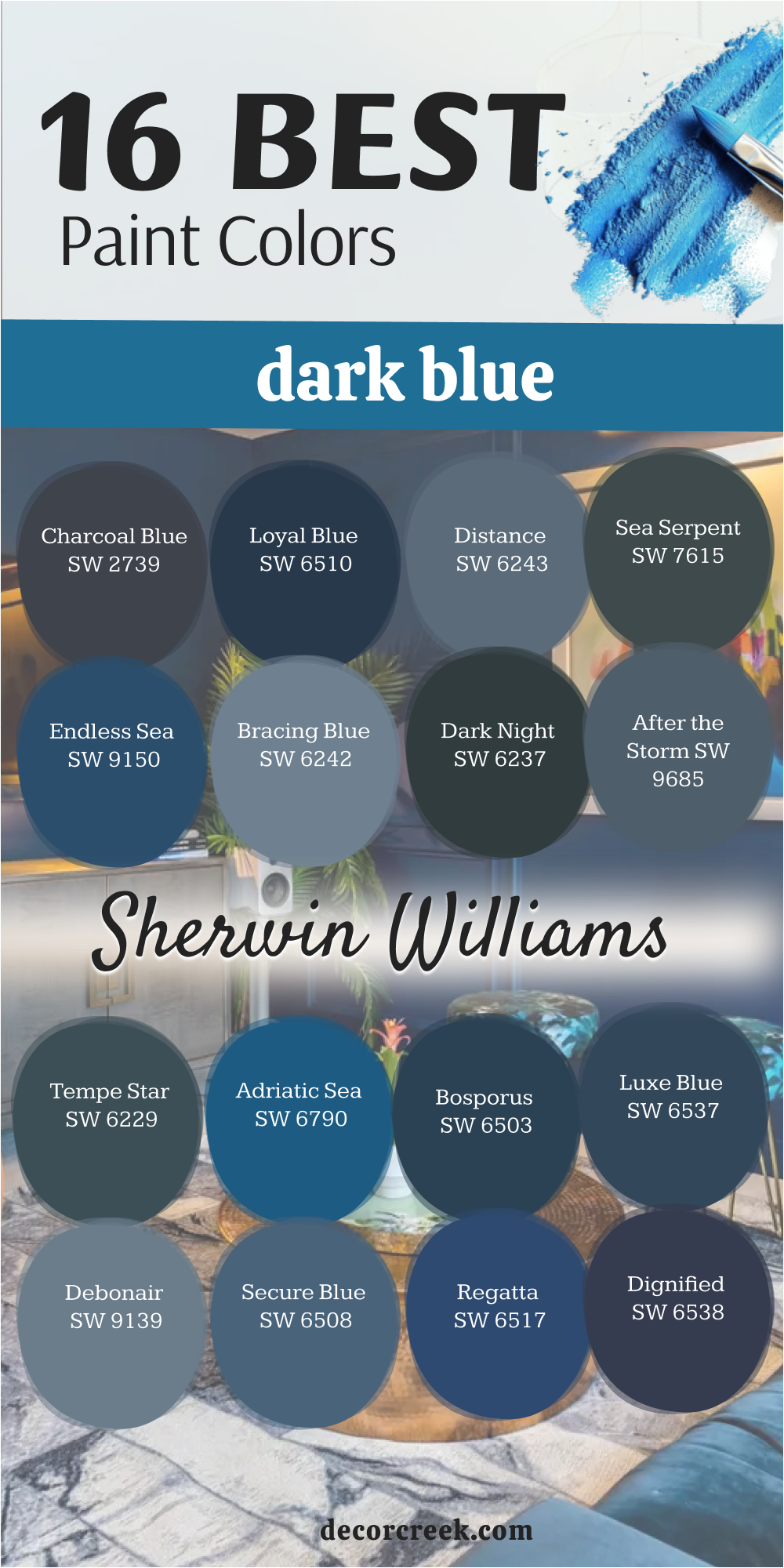
Charcoal Blue SW 2739
Charcoal Blue SW 2739 is a very dark blue that has a lot of black and gray in the mix. This color is very moody and looks very modern in a house with clean lines. I love using this on the exterior of a home to give it a very strong and bold face.
The blue is very subtle which makes the paint feel very sophisticated and quiet. It works perfectly in a bedroom where you want to feel very cozy and relaxed. You can pair it with light gray furniture to create a very balanced and cool look.
This shade is a great choice for a fireplace wall to make the flames look very bright. It feels very grounded and gives a room a lot of weight and importance. You should use this if you want a dark color that is not quite black but very close. I find that it makes a house look very high-end and thoughtfully put together.
Best used in: exteriors, master bedrooms, fireplace walls, and modern dens
Pairs well with: Snowbound SW 7004, light gray, cedar wood, and matte black The key rule of this color for modern style is to use it where you want a dark background that feels very sleek and quiet.
🎨 Check out the complete guide to this color right HERE 👈
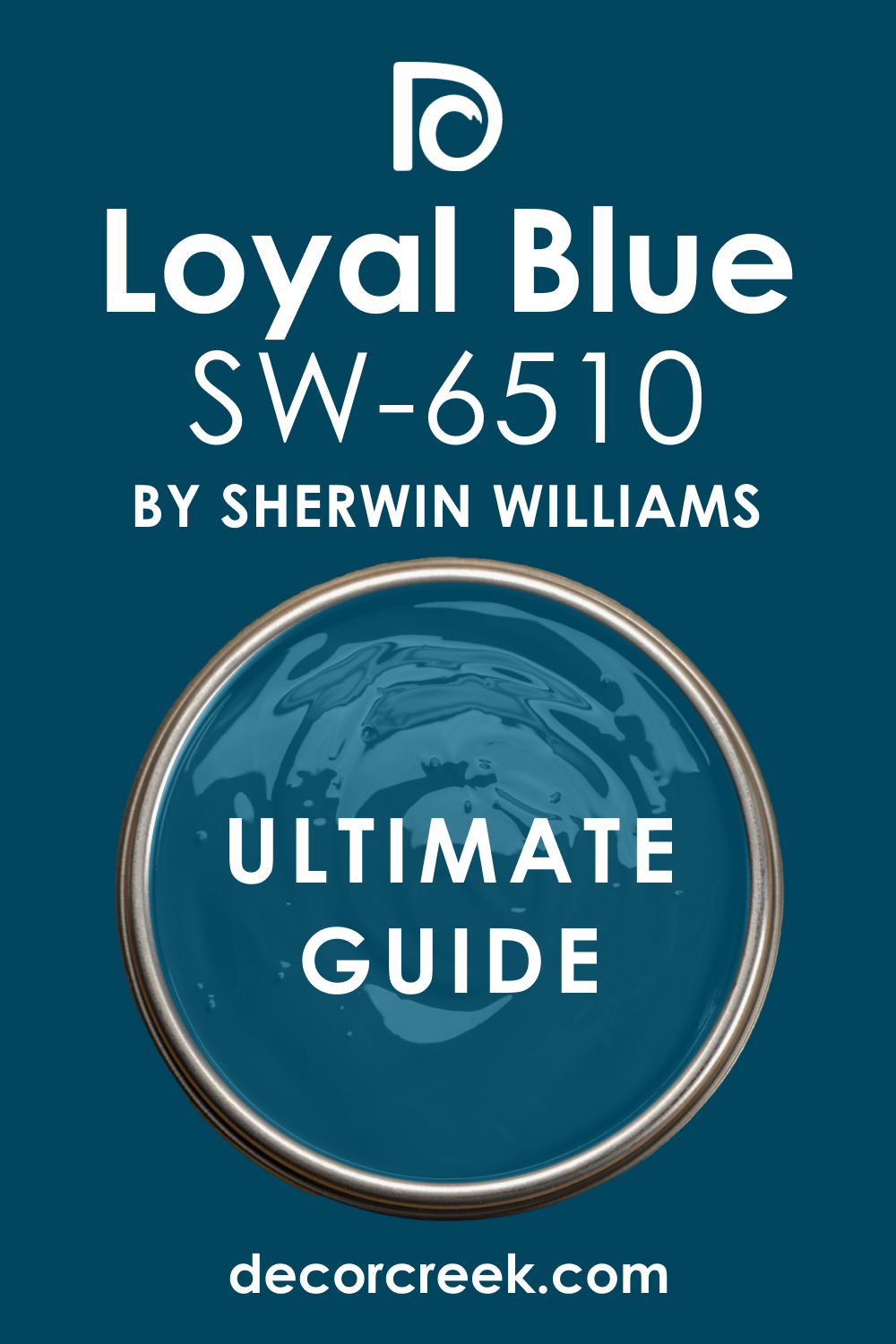
Loyal Blue SW 6510
Loyal Blue SW 6510 is a very deep and regal shade that brings a lot of dignity to a room. This color is a true navy that does not lean too far toward gray or green. I love using this in a formal study where you want the walls to feel very strong and steady.
It looks very expensive when you pair it with gold picture frames and white crown molding. The blue is saturated enough to show its true color even in a room that does not have many windows. You can use it on a kitchen island to create a sharp contrast with light gray cabinets.
It feels very professional and works well for a front door on a brick house. This shade gives a house a sense of being well-cared for and very solid. It is a great choice for anyone who wants a classic look that never feels out of date. I find that this color makes a space feel very organized and high-end.
Best used in: home offices, kitchen islands, front doors, and formal studies
Pairs well with: Extra White SW 7006, gold hardware, dark cherry wood, and cream The key rule of this color for classic style is to use it where you want a bold look that still feels very clean and organized.
🎨 Check out the complete guide to this color right HERE 👈
Distance SW 6243
Distance SW 6243 is a beautiful blue that has a heavy dusty gray quality to it. This color feels very soft on the eyes and does not feel as heavy as a true navy. I often suggest this for a master bedroom because it feels very quiet and peaceful at night.
The gray tones make the blue feel very mature and help it blend in with other neutral colors. It works wonderfully in a living room with light gray furniture and white curtains. You can use it in a laundry room to give the walls a bit of color without being too bright.
The paint looks very different as the light changes from morning to evening. It stays looking very sophisticated and does not shift into unexpected colors. This is a perfect choice for a homeowner who wants a blue that feels very steady and grounded. I find that it makes a house feel very cohesive and well-designed.
Best used in: master bedrooms, living rooms, laundry rooms, and hallways
Pairs well with: High Reflective White SW 7757, light gray, brushed nickel, and linen The key rule of this color for grounded style is to use it when you want a blue that feels very stable and strong.
🎨 Check out the complete guide to this color right HERE 👈

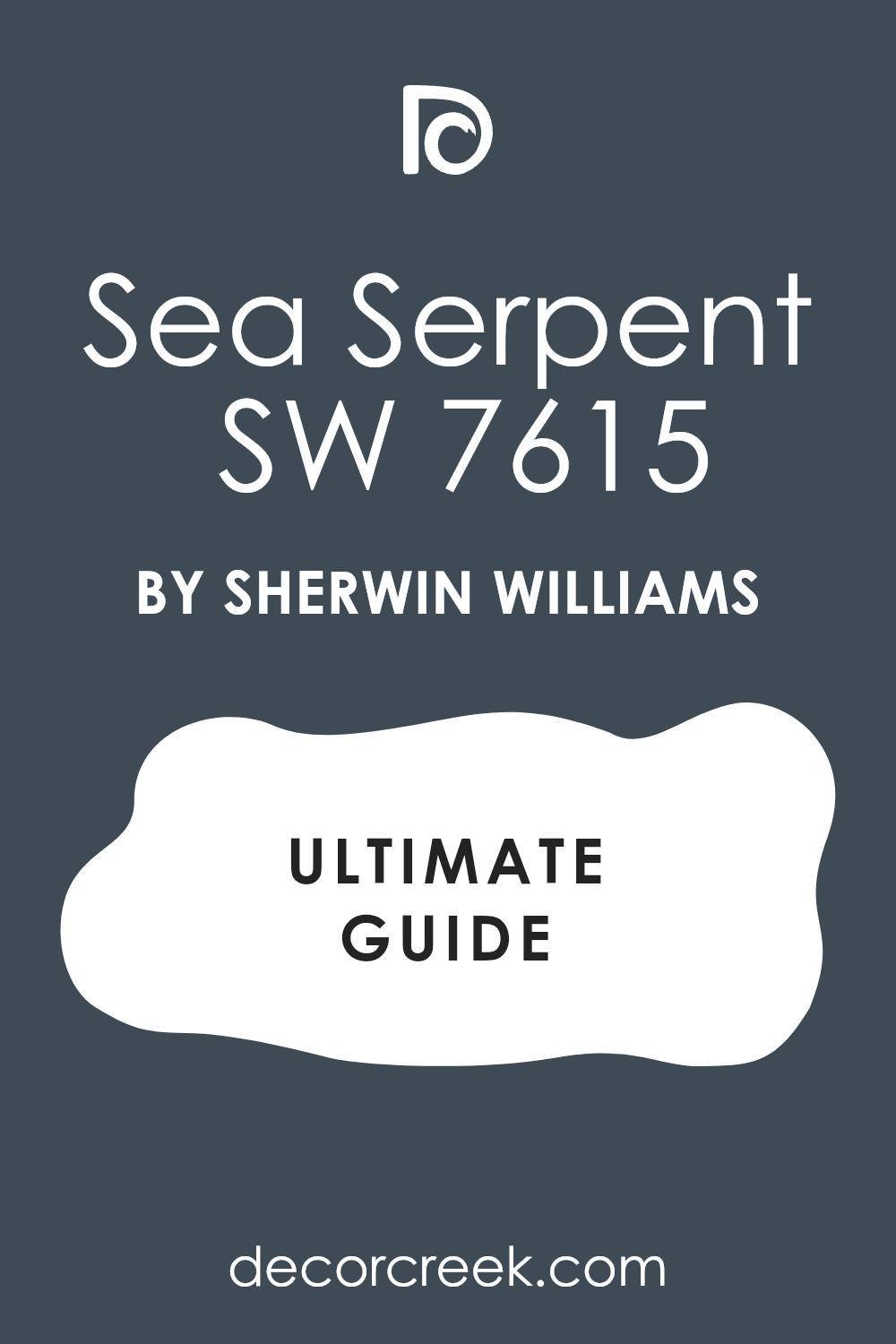
Sea Serpent SW 7615
Sea Serpent SW 7615 is a very dark and moody blue that has a hint of green and gray. This color is very popular for modern homes because it looks very sleek and expensive. I love using this on the exterior of a house to give it a very bold and custom look.
The green undertone makes the blue feel very rich and organic on the walls. It works perfectly in a dining room where you want to create a very cozy atmosphere for guests. You can pair it with natural wood elements to bring out the earthy side of the paint.
It provides a stunning backdrop for white art or light-colored furniture. This shade is very deep but it does not feel as flat as a standard black paint. It adds a lot of character and soul to a room that might feel a bit empty. I find that it makes a house look very high-end and unique.
Best used in: exteriors, dining rooms, accent walls, and kitchen cabinets
Pairs well with: Snowbound SW 7004, honey oak, matte black, and brass The key rule of this color for organic style is to use it in rooms where you want to feel a deep connection to nature and water.
🎨 Check out the complete guide to this color right HERE 👈
Endless Sea SW 9150
Endless Sea SW 9150 is a vibrant and deep blue that feels very energetic and full of life. This color is much more blue than it is gray which makes it stand out on a wall. I love using this in a playroom or a boy’s bedroom to add a lot of personality.
It reminds me of the deep water in the middle of the ocean on a very clear day. The color is very saturated and looks very crisp when you use bright white trim. You can use it on a piece of furniture like a bookshelf to make a big statement.
It works well in a basement where you want to add some excitement to a dark area. The blue stays very true and does not hide behind other undertones when the lights are on. It feels very brave and makes a house feel very fun and welcoming. I find that kids and adults both really enjoy how this color brightens up a home.
Best used in: playrooms, boy’s bedrooms, basement bars, and accent furniture
Pairs well with: Pure White SW 7005, bright yellow, silver hardware, and navy rugs The key rule of this color for cheerful style is to use it where the sun can hit it and bring out the bright blue tones.
🎨 Check out the complete guide to this color right HERE 👈

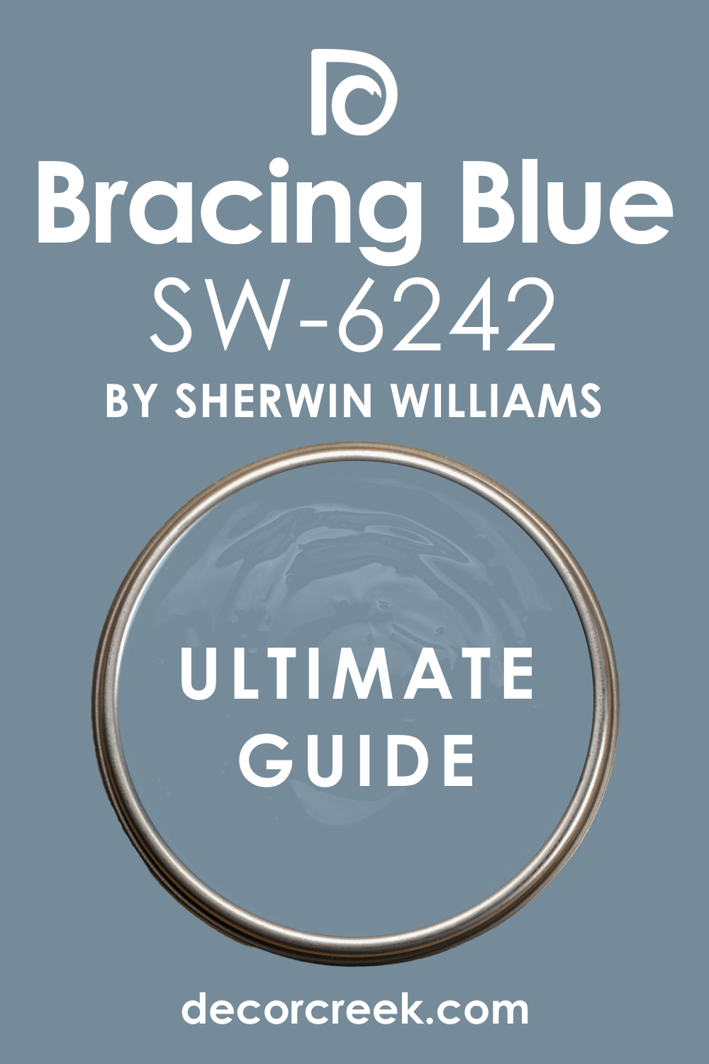
Bracing Blue SW 6242
Bracing Blue SW 6242 is a medium-dark blue that has a very cool and crisp feeling to it. This color has a lot of gray and silver tones which makes it feel very fresh. I like to use this in a bathroom with white tiles and chrome fixtures for a very clean look.
It is not as dark as a navy which makes it very easy to use on all four walls. The color feels very light and airy even though it is still a deep shade of blue. It works well in a guest bedroom to make visitors feel very comfortable and relaxed.
You can pair it with light wood floors for a very modern and soft appearance. The blue is very balanced and does not feel overwhelming in a small room. It provides a very steady and quiet background for your home decorations. I find that it makes a house feel very clean and very well-put-together.
Best used in: bathrooms, guest bedrooms, laundry rooms, and hallways
Pairs well with: Extra White SW 7006, chrome, light ash wood, and soft gray The key rule of this color for fresh style is to use it where you want a dark look that still feels very clean and energetic.
🎨 Check out the complete guide to this color right HERE 👈
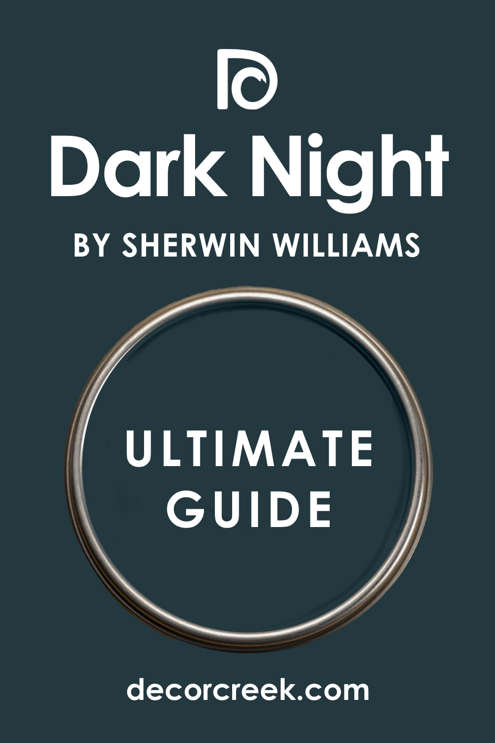
Dark Night SW 6237
Dark Night SW 6237 is a very deep blue that has a strong and beautiful green undertone. This color is one of my favorites for creating a very moody and cozy room. It feels very lush and reminds me of a forest in the middle of the night.
I love using this in a library or a reading nook where you want to feel tucked away. The green in the paint makes the blue look very sophisticated and very expensive. It looks stunning when you pair it with leather furniture and gold accents.
You should use this if you want a color that feels very rich and has a lot of heart. It works beautifully on an accent wall behind a bed to create a focal point. The color is very dark but it stays very interesting as the light moves through the room. I find that it adds a sense of mystery and depth to any house interior.
Best used in: libraries, bedrooms, accent walls, and dens
Pairs well with: Alabaster SW 7008, cognac leather, brass, and dark wood The key rule of this color for moody style is to use it in rooms where you want to feel a deep sense of warmth and history.
🎨 Check out the complete guide to this color right HERE 👈
After the Storm SW 9685
After the Storm SW 9685 is a deep blue that has a very soft and dusty quality to it. This color feels very quiet and reminds me of the sky after a big rain has passed. It has a lot of gray mixed in which makes it very easy to use in a living room.
I often suggest this for people who want a dark color that does not feel too aggressive. The blue is very subtle and supports the other furniture in the room without taking over. It looks very smart in a hallway with white trim and wood floors.
You can use it in a nursery to create a very soothing and steady environment. The paint handles shadows very well and does not look patchy on a large wall. It feels very established and gives a house a very professional and clean look. I find that it makes a room feel very balanced and very comfortable for a family.
Best used in: living rooms, nurseries, hallways, and home offices
Pairs well with: Eider White SW 7014, light oak, silver, and soft textures The key rule of this color for grounded style is to use it when you want a blue that feels very stable and strong.
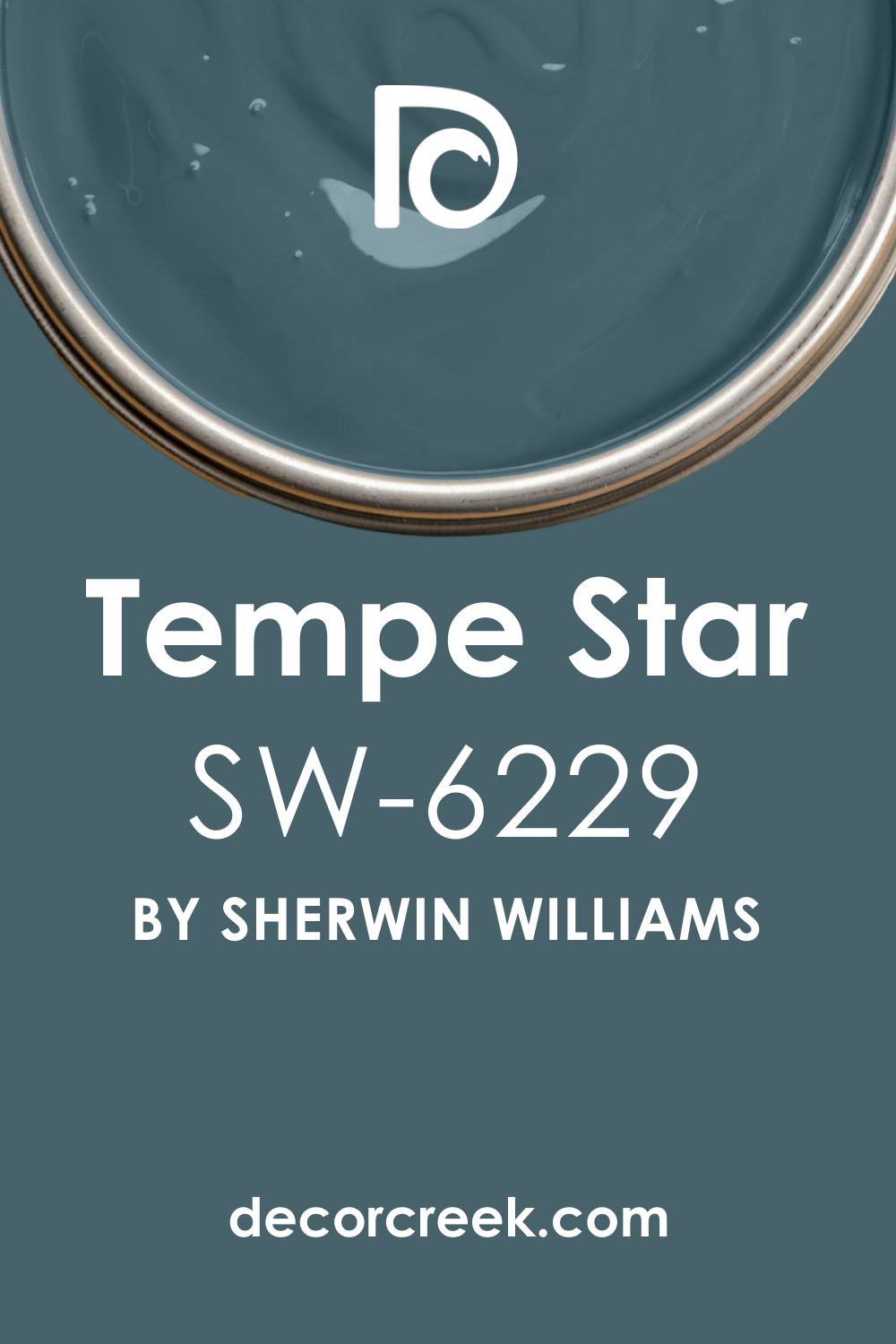
Tempe Star SW 6229
Tempe Star SW 6229 is a unique blue that has a very strong teal and gray base. This color is very popular for people who want a blue that feels a bit more modern. I love using this on kitchen cabinets to create a very chic and high-end look.
The teal undertone makes the color feel very alive and very deep on the walls. It works wonderfully in a dining room with gold hardware and white chairs. You can use it in a powder room to make a big statement in a small space.
The blue is dark enough to be bold but the green keeps it from looking too cold. It feels very creative and works well in homes that have a lot of art. You should consider this if you want a color that is a bit different from a standard navy. I find that it makes a house look very curated and very thoughtfully designed.
Best used in: kitchen cabinets, dining rooms, powder rooms, and accent walls
Pairs well with: Pure White SW 7005, gold accents, white marble, and walnut The key rule of this color for creative style is to use it in small doses or unexpected places like the ceiling.
🎨 Check out the complete guide to this color right HERE 👈
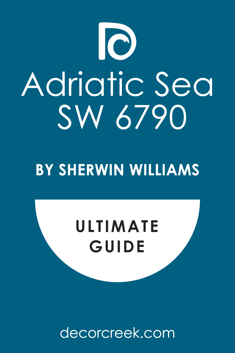
Adriatic Sea SW 6790
Adriatic Sea SW 6790 is a bold and bright dark blue that is full of vibrant energy. This color is very saturated and looks very much like a true blue on the wall. I love using this on a front door to give a house a very happy and friendly face.
It reminds me of deep tropical water on a very sunny and clear day. The color is energetic and works well in a kitchen with lots of natural light. You can pair it with white and yellow accents for a very cheery and bright look.
It looks great on a piece of painted furniture like a side table or a chair. This shade is a brave choice for someone who loves to see a lot of color in their home. It makes a room feel very fun and gives it a lot of personality right away. I find that people smile when they walk into a room painted with this blue.
Best used in: front doors, kitchens, furniture pieces, and sunrooms
Pairs well with: Extra White SW 7006, bright yellow, wicker, and chrome The key rule of this color for cheerful style is to use it where the sun can hit it and bring out the bright blue tones.
🎨 Check out the complete guide to this color right HERE 👈
Bosporus SW 6503
Bosporus SW 6503 is a rich blue that has a very traditional and formal feeling. This color is very deep and reminds me of a classic library in a big estate. It has a tiny bit of green that makes the blue look very thick and very expensive.
I love using this in a formal dining room to make the space feel very special. The color works beautifully with dark wood floors and silver table decorations. You can use it in a home office to create a very professional and smart atmosphere.
It looks very sharp against bright white trim and crown molding in a hallway. This blue is very steady and does not change much throughout the day. It feels very high-end and gives a house a sense of being very well-made. I find that it brings a lot of luxury and fine detail to any room you put it in.
Best used in: dining rooms, home offices, hallways, and library walls
Pairs well with: Alabaster SW 7008, silver, dark walnut, and navy rugs The key rule of this color for formal style is to use it in rooms with plenty of lamps to show off the deep blue pigments.
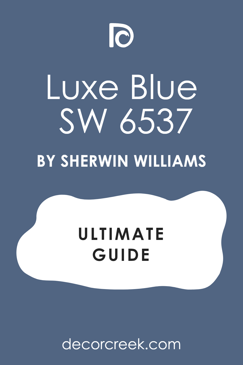
Luxe Blue SW 6537
Luxe Blue SW 6537 is a very deep and royal shade that brings a lot of dignity to a room. This color is a true navy that does not lean too far toward gray or green. I love using this in a formal study where you want the walls to feel very strong and steady.
It looks very expensive when you pair it with gold picture frames and white crown molding. The blue is saturated enough to show its true color even in a room that does not have many windows. You can use it on a kitchen island to create a sharp contrast with light gray cabinets.
It feels very professional and works well for a front door on a brick house. This shade gives a house a sense of being well-cared for and very solid. It is a great choice for anyone who wants a classic look that never feels out of date. I find that this color makes a space feel very organized and high-end.
Best used in: formal studies, kitchen islands, front doors, and home offices
Pairs well with: Extra White SW 7006, gold hardware, dark cherry wood, and cream The key rule of this color for classic style is to use it where you want a bold look that still feels very clean and organized.
🎨 Check out the complete guide to this color right HERE 👈
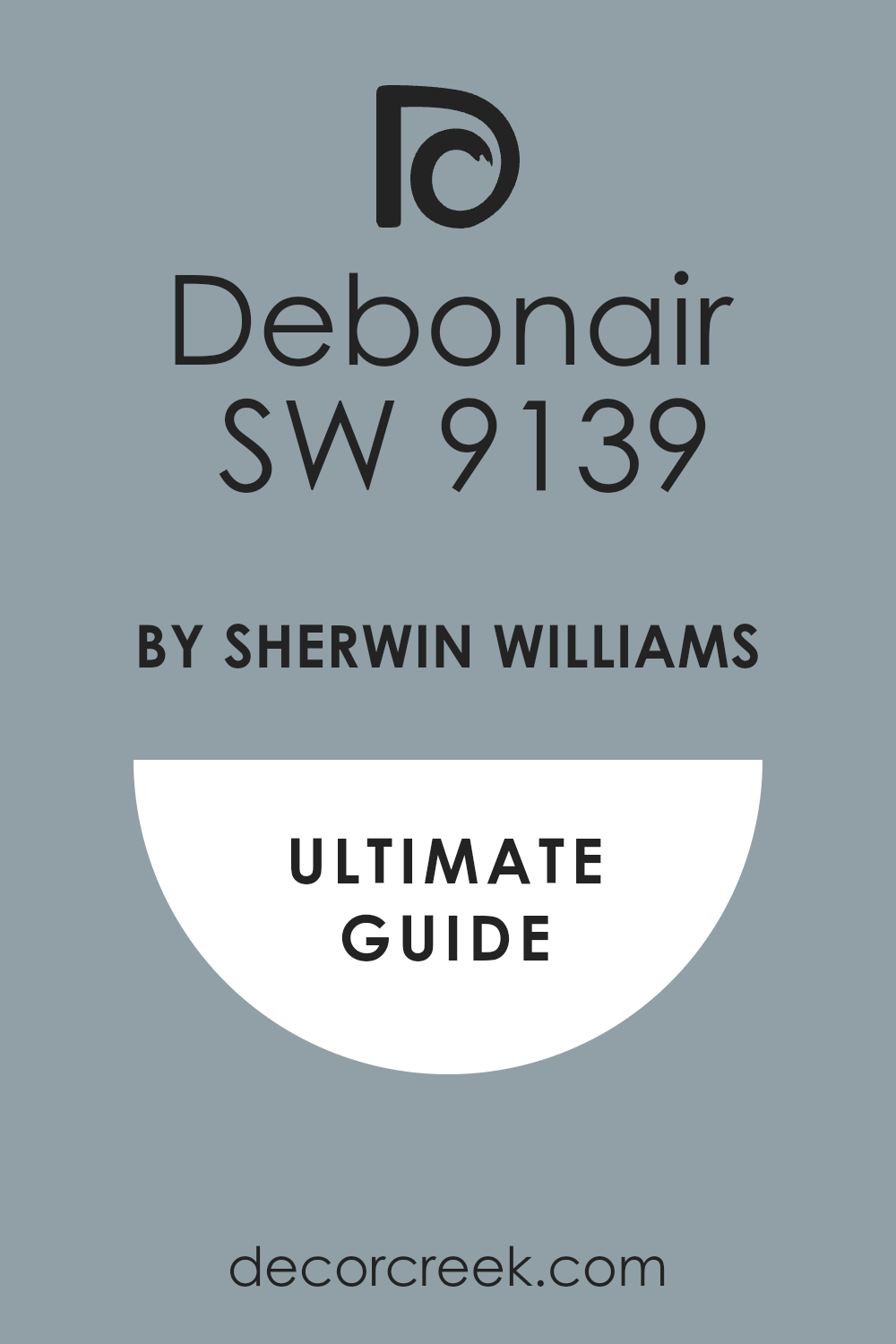
Debonair SW 9139
Debonair SW 9139 is a medium-dark blue that has a very cool and crisp feeling to it. This color has a lot of gray and silver tones which makes it feel very fresh. I like to use this in a bathroom with white tiles and chrome fixtures for a very clean look.
It is not as dark as a navy which makes it very easy to use on all four walls. The color feels very light and airy even though it is still a deep shade of blue. It works well in a guest bedroom to make visitors feel very comfortable and relaxed.
You can pair it with light wood floors for a very modern and soft appearance. The blue is very balanced and does not feel overwhelming in a small room. It provides a very steady and quiet background for your home decorations. I find that it makes a house feel very clean and very well-put-together.
Best used in: bathrooms, guest bedrooms, laundry rooms, and hallways
Pairs well with: High Reflective White SW 7757, chrome, light ash wood, and soft gray The key rule of this color for fresh style is to use it where you want a dark look that still feels very clean and energetic.
🎨 Check out the complete guide to this color right HERE 👈
Secure Blue SW 6508
Secure Blue SW 6508 is a traditional blue that has a very soft and traditional feel. This color is not too dark which makes it very easy to use in a living room. It has a tiny bit of gray that keeps it from looking too bright like a primary color.
I often suggest this for a home office where you want to feel very smart and ready to work. The color looks very professional and works well with dark leather chairs and wood desks. You can use it on all four walls without making the room feel like a cave.
It provides a very steady and reliable backdrop for your family photos and artwork. This blue is very popular because it looks good in almost any kind of lighting. It feels very established and gives a house a sense of history and fine detail. I trust this color for homeowners who want a navy that feels very gentle and welcoming.
Best used in: home offices, living rooms, hallways, and mudrooms
Pairs well with: Alabaster SW 7008, dark walnut, brass, and beige fabrics The key rule of this color for traditional style is to use it when you want a blue that feels established and very professional.
🎨 Check out the complete guide to this color right HERE 👈
Regatta SW 6517
Regatta SW 6517 is a vibrant and deep blue that feels very energetic and full of life. This color is much more blue than it is gray which makes it stand out on a wall. I love using this in a playroom or a boy’s bedroom to add a lot of personality.
It reminds me of the deep water in the middle of the ocean on a very clear day. The color is very saturated and looks very crisp when you use bright white trim. You can use it on a piece of furniture like a bookshelf to make a big statement.
It works well in a basement where you want to add some excitement to a dark area. The blue stays very true and does not hide behind other undertones when the lights are on. It feels very brave and makes a house feel very fun and welcoming. I find that kids and adults both really enjoy how this color brightens up a home.
Best used in: playrooms, boy’s bedrooms, front doors, and accent furniture
Pairs well with: Pure White SW 7005, bright yellow, silver hardware, and navy rugs The key rule of this color for cheerful style is to use it where the sun can hit it and bring out the bright blue tones.
Dignified SW 6538
Dignified SW 6538 is a rich blue that has a very traditional and formal feeling. This color is very deep and reminds me of a classic library in a big estate. It has a tiny bit of purple that makes the blue look very thick and very expensive.
I love using this in a formal dining room to make the space feel very special. The color works beautifully with dark wood floors and silver table decorations. You can use it in a home office to create a very professional and smart atmosphere.
It looks very sharp against bright white trim and crown molding in a hallway. This blue is very steady and does not change much throughout the day. It feels very high-end and gives a house a sense of being very well-made. I find that it brings a lot of luxury and fine detail to any room you put it in.
Best used in: dining rooms, home offices, hallways, and library walls
Pairs well with: Snowbound SW 7004, silver, dark walnut, and navy rugs The key rule of this color for formal style is to use it in rooms with plenty of lamps to show off the deep blue pigments.
14 Best Dark Blue Paint Colors by Benjamin Moore
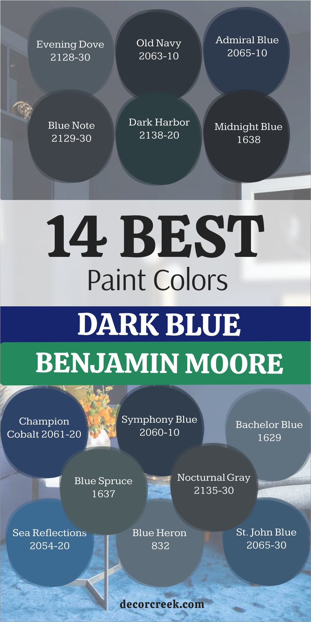
Evening Dove 2128-30
Evening Dove 2128-30 is a beautiful blue that has a heavy dusty gray quality to it. This color feels very soft on the eyes and does not feel as heavy as a true navy. I often suggest this for a master bedroom because it feels very quiet and peaceful at night.
The gray tones make the blue feel very mature and help it blend in with other neutral colors. It works wonderfully in a living room with light gray furniture and white curtains. You can use it in a laundry room to give the walls a bit of color without being too bright.
The paint looks very different as the light changes from morning to evening. It stays looking very sophisticated and does not shift into unexpected colors. This is a perfect choice for a homeowner who wants a blue that feels very steady and grounded. I find that it makes a house feel very cohesive and well-designed.
Best used in: master bedrooms, living rooms, laundry rooms, and hallways
Pairs well with: Chantilly Lace OC-65, light gray, brushed nickel, and linen The key rule of this color for grounded style is to use it when you want a blue that feels very stable and strong.
Old Navy 2063-10
Old Navy 2063-10 is an extremely dark blue that almost looks like a midnight sky. This color is very heavy and provides a huge amount of drama to any room. I love using this in a media room where you want the walls to be as dark as possible.
The blue is very faint but it keeps the paint from looking like a flat black. It looks very sleek and modern when you pair it with silver or chrome hardware. You should use this on a tall accent wall to make the ceiling feel even higher.
It works well in a master bedroom for a person who likes to sleep in a very dark room. This color feels very solid and gives a house a very expensive and high-end vibe. You need to have good lighting so the room does not feel too heavy or dark. I find that this color is a great way to make a big statement with very little effort.
Best used in: media rooms, master bedrooms, front doors, and accent walls
Pairs well with: Simply White OC-117, silver, matte black, and gray stone The key rule of this color for modern style is to use it where you want a dark background that feels very sleek and quiet.
🎨 Check out the complete guide to this color right HERE 👈

Admiral Blue 2065-10
Admiral Blue 2065-10 is a very deep and powerful blue that feels like the heart of the ocean. This color is very dark but it still carries a lot of blue pigment that shows up in the light. I love using this on kitchen cabinets to create a very bold and custom look.
The blue is very crisp and looks amazing with white quartz countertops. It gives a room a very sturdy and well-built feeling that lasts for years. You can use it in a dining room to make the space feel very formal and important. It works beautifully with natural wood floors and large windows.
This shade is a classic choice for a front door if you want a very smart entryway. It feels very professional and stays in style no matter what the current trends are. I often recommend this for people who want a navy that is very dark and very blue.
Best used in: kitchen cabinets, front doors, dining rooms, and home offices
Pairs well with: Decorator’s White CC-20, white quartz, wood floors, and brass The key rule of this color for formal style is to use it in rooms with plenty of lamps to show off the deep blue pigments.
Blue Note 2129-30
Blue Note 2129-30 is a very dark blue that has a lot of black and gray in the mix. This color is very moody and looks very modern in a house with clean lines. I love using this on the exterior of a home to give it a very strong and bold face.
The blue is very subtle which makes the paint feel very sophisticated and quiet. It works perfectly in a bedroom where you want to feel very cozy and relaxed. You can pair it with light gray furniture to create a very balanced and cool look.
This shade is a great choice for a fireplace wall to make the flames look very bright. It feels very grounded and gives a room a lot of weight and importance. You should use this if you want a dark color that is not quite black but very close. I find that it makes a house look very high-end and thoughtfully put together.
Best used in: exteriors, master bedrooms, fireplace walls, and modern dens
Pairs well with: White Dove OC-17, light gray, cedar wood, and matte black The key rule of this color for modern style is to use it where you want a dark background that feels very sleek and quiet.
🎨 Check out the complete guide to this color right HERE 👈

Dark Harbor CSP-720
Dark Harbor CSP-720 is a very dark and moody blue that has a strong hint of green. This color is very popular for modern homes because it looks very sleek and expensive. I love using this on the exterior of a house to give it a very bold and custom look.
The green undertone makes the blue feel very rich and organic on the walls. It works perfectly in a dining room where you want to create a very cozy atmosphere for guests. You can pair it with natural wood elements to bring out the earthy side of the paint.
It provides a stunning backdrop for white art or light-colored furniture. This shade is very deep but it does not feel as flat as a standard black paint. It adds a lot of character and soul to a room that might feel a bit empty. I find that it makes a house look very high-end and unique.
Best used in: exteriors, dining rooms, bathrooms, and kitchen cabinets
Pairs well with: Chantilly Lace OC-65, honey oak, matte black, and brass The key rule of this color for organic style is to use it in rooms where you want to feel a deep connection to nature and water.
Midnight Blue 1638
Midnight Blue 1638 is a very dark and mysterious blue that feels like the sky long after the sun has set. This color uses a lot of black in the base to create a look that is very thick and velvety on the wall. It almost looks like the deep ocean where the light cannot reach the bottom of the floor.
I love using this in a master bedroom to create a very cozy and private feeling for the homeowners. The blue is so deep that it makes the corners of the room seem to disappear into the shadows. It looks very high-end when you pair it with gold frames and crisp white bedding for contrast.
You should use this if you want a room that feels very quiet and tucked away from the world. It works beautifully on a set of custom bookshelves in a home library or a dark study. This shade is a great choice for adding a touch of drama to a small house interior. I find that people love how this color makes them feel very safe and warm at night.
Best used in: master bedrooms, libraries, powder rooms, and accent walls
Pairs well with: Simply White OC-117, gold accents, velvet, and dark wood The key rule of this color for moody style is to use it in rooms where you want to feel a deep sense of warmth and history.
Champion Cobalt 2061-20
Champion Cobalt 2061-20 is a vibrant and royal shade of dark blue that is very regal and strong. This color has a lot of energy and does not feel shy on the walls of a family home. It reminds me of a formal uniform because it looks so sharp and well-tailored in any light.
I love using this in a dining room to make the space feel very special for guests. The blue is rich and saturated which makes it pop against light-colored rugs and wood floors. It works well in a hallway where you want to add a bit of drama and bold color.
You will notice that it feels very preppy when you pair it with gold or silver hardware. This is a great choice for a front door if you want your house to look very smart. It adds a lot of life to a room that might otherwise feel a bit boring or plain. I always think of this as a very confident color for a bold homeowner to choose.
Best used in: dining rooms, hallways, front doors, and accent walls
Pairs well with: Alabaster SW 7008, gold leaf, crystal chandeliers, and navy rugs The key rule of this color for formal style is to use it in rooms with plenty of lamps to show off the deep blue pigments.
Symphony Blue 2060-10
Symphony Blue 2060-10 is a very deep and powerful blue that feels like the heart of a great ocean. This color is very dark but it still carries a lot of blue pigment that shows up in the light. I love using this on kitchen cabinets to create a very bold and custom look for the room.
The blue is very crisp and looks amazing with white quartz countertops and silver handles. It gives a room a very sturdy and well-built feeling that lasts for many years. You can use it in a dining room to make the space feel very formal and important.
It works beautifully with natural wood floors and large windows that let in the sun. This shade is a classic choice for a front door if you want a very smart entryway. It feels very professional and stays in style no matter what the current trends are. I often recommend this for people who want a navy that is very dark and very blue.
Best used in: kitchen cabinets, front doors, dining rooms, and home offices
Pairs well with: Decorator’s White CC-20, white quartz, wood floors, and brass The key rule of this color for formal style is to use it in rooms with plenty of lamps to show off the deep blue pigments.
🎨 Check out the complete guide to this color right HERE 👈
Bachelor Blue 1629
Bachelor Blue 1629 is a medium-to-dark blue that has a lot of gray mixed into the paint base. This color feels very steady and reminds me of a stormy sea under a gray morning sky. I like to use this on the exterior of a house to give it a very modern look.
The gray tones make the blue feel very mature and it does not scream for attention. It works well in a kitchen with gray stone counters and bright white cabinets. You can use it in a basement to make the walls feel very solid and strong.
The color handles shadows very well and stays looking the same all day long in any light. It is a very safe choice for someone who is moving away from light gray paint colors. This blue provides a very cool and quiet feeling to any room it is used in. I often recommend it for hallways because it is very good at hiding scuffs and dirt.
Best used in: exteriors, kitchens, hallways, and basement living areas
Pairs well with: Gray Owl OC-52, stainless steel, white trim, and slate floors The key rule of this color for grounded style is to use it when you want a blue that feels very stable and strong.
Blue Spruce 1637
Blue Spruce 1637 is a moody blue that has a very strong and beautiful green base hidden inside. This color feels very lush and reminds me of a forest right after a big rain storm. It is not a traditional navy blue which makes it feel very special and unique for a house.
I like to use this in a bathroom to create a spa-like feeling for the homeowners. The green undertone makes it feel very organic and connected to the trees and the outdoors. It works beautifully with indoor plants and earthy textures like linen or thick wool.
You will notice that it looks different as the sun moves across the sky during the day. Sometimes it looks like a deep sea blue and other times it looks more like slate. This is a great choice if you find regular navy blues to be a bit too boring. It adds a lot of character to a room without needing much extra decoration or art.
Best used in: bathrooms, cozy dens, reading nooks, and master suites
Pairs well with: High Reflective White SW 7757, leafy green plants, terracotta, and leather The key rule of this color for organic style is to use it in rooms where you want to feel a deep connection to nature and water.
Nocturnal Gray 2135-30
Nocturnal Gray 2135-30 is a very dark gray-blue that feels like the sky right before the stars appear. This color is very mysterious and looks great in rooms used for relaxing at night after work. It leans heavily into the gray side which makes it feel very modern and sleek.
I use this a lot for media rooms or theaters where you want the walls to be dark. It helps the television screen stand out and keeps the focus on the movie being played. The blue is very faint but it keeps the gray from feeling too cold or industrial.
It looks very sharp on the exterior of a modern house with wood siding or stone. You will find that it hides dirt and scuffs very well in high-traffic areas like mudrooms. This is a great color for a teenager’s room who wants something cool and dark for their space. It feels very solid and provides a strong foundation for any design style you like.
Best used in: media rooms, home theaters, exteriors, and teenager’s bedrooms
Pairs well with: Snowbound SW 7004, cedar wood, matte black, and gray stone The key rule of this color for modern style is to use it where you want a dark background that feels very sleek and quiet.
Sea Reflections 1664
Sea Reflections 1664 is a bright and bold dark blue that is full of great personality. This color is much more blue than it is gray or black when you see it on a wall. It reminds me of the deep water in a beautiful lake during the middle of summer.
I love using this on a front door to give a house a very friendly face for visitors. The color is energetic and makes people feel happy when they walk into the room. It works very well in a kitchen with white cabinets and lots of natural light.
You should use this if you want your blue color to be the star of the whole show. It looks great with white and yellow accents for a very cheery look in a bedroom. This shade is perfect for a sunroom where the light can really make it shine and glow. It is a brave choice that pays off with a lot of style and fun for the family.
Best used in: front doors, kitchens, sunrooms, and furniture pieces
Pairs well with: Pure White SW 7005, bright yellow, wicker furniture, and chrome The key rule of this color for cheerful style is to use it where the sun can hit it and bring out the bright blue tones.
Blue Heron 832
Blue Heron 832 has a lot of gray mixed in which gives it a very dusty and soft look. This color is great for people who want blue but are afraid of it being too bright. It feels very sophisticated and works well in traditional or modern styles of homes.
I love how this color looks in a nursery because it is very soothing for a small baby. The gray tones make the blue feel very mature and quiet on the walls of the room. It does not demand all the attention in the room but supports the other wooden furniture.
You can use it in a living room to create a backdrop that feels very steady. It looks wonderful with pewter or brushed nickel hardware and silver light fixtures. The color handles shadows very well without becoming muddy or dull during the night. This is my go-to choice for a blue that feels like it has a long history behind it.
Best used in: nurseries, living rooms, hallways, and home libraries
Pairs well with: Repose Gray SW 7015, brushed nickel, white trim, and soft wool The key rule of this color for traditional style is to use it when you want a blue that feels established and very professional.
🎨 Check out the complete guide to this color right HERE 👈
St. John Blue CSP-675
St. John Blue CSP-675 is a medium-to-dark blue that feels very comfortable and lived-in for a home. This shade is inspired by global fabrics and has a very artistic feel to it on the wall. It is not too dark so it works well in rooms that do not get a lot of sun.
I often use this in guest bedrooms to make visitors feel right at home when they stay. The color has a soft quality that prevents it from feeling too sharp or aggressive in a room. It pairs naturally with white linens and woven baskets for a relaxed look in any space.
You can use it on a vanity in a powder room for a nice surprise for your friends. The blue is very balanced and does not shift into other colors unexpectedly during the day. It reminds me of a favorite pair of blue jeans that you have owned for many years. This is a safe and beautiful choice for anyone new to using dark paint.
Best used in: guest bedrooms, powder rooms, mudrooms, and accent furniture
Pairs well with: Westhighland White SW 7566, woven textures, light gray, and copper The key rule of this color for relaxed style is to use it in places where you want to feel a sense of comfort and ease.
30 Evergreen Dark Blue Paint Colors
Hale Navy HC-154
Hale Navy HC-154 is a very famous blue that designers everywhere love to use for any project. This color is the perfect mix of navy and gray which makes it work in every room of the house. It is a very safe choice because it never looks too bright or too dark on a wall.
I use this a lot for kitchen cabinets because it looks very high-end and clean. The color has a soft quality that makes it feel very welcoming for a busy family home. It looks great on the exterior of a house with white trim and a natural wood front door.
You can use it in a nursery or a living room and it will look equally good. The blue stays very steady and does not change much when the sun goes down at night. It is a very reliable paint that I trust for almost every house I work on. This is the kind of color that makes everyone happy when they see the finished room.
Best used in: kitchen cabinets, exteriors, nurseries, and living rooms
Pairs well with: Cloud White OC-130, honey oak, polished nickel, and gray The key rule of this color for versatile style is to use it in any room where you want a navy that feels very balanced and soft.
🎨 Check out the complete guide to this color right HERE 👈
Naval SW 6244
Naval SW 6244 is the gold standard for anyone wanting a classic navy look in their home interior. This shade works because it does not have too much purple or green hiding inside the paint. It feels very crisp when you pair it with bright white trim and gold hardware.
Many of my clients choose this for their kitchen islands to create a strong focal point. It looks very smart in a home office where you need to focus on your daily work. The color is deep enough to feel bold but remains very friendly to the eye.
I find that it works in almost any lighting situation without looking like a different color. You can use it on a front door to make your entryway stand out from the rest. It is a solid choice for a master bedroom if you want a cozy feeling at night. This paint is one of the most popular choices because it never fails to look good.
Best used in: kitchen islands, master bedrooms, front doors, and home offices
Pairs well with: Pure White SW 7005, Carrara marble, gold accents, and light oak floors The key rule of this color for classic style is to use it where you want a bold look that still feels very clean and organized.
🎨 Check out the complete guide to this color right HERE 👈
Van Deusen Blue HC-156
Van Deusen Blue HC-156 is a very popular blue that has a lot of gray and teal in it. This color is very historical and looks great in older homes with lots of character and charm. It is not as dark as a navy which makes it a good choice for all four walls.
I like to use this in a dining room to create a very cozy and smart atmosphere. The color changes throughout the day and can look very different in the morning light. It has a very soft and velvety look that makes the walls feel very touchable and rich.
You can pair it with warm wood tones and gold accents for a very expensive look. This blue is very sophisticated and works well for a professional home office or study. It is a very flexible color that looks good with both modern and old furniture. I find that it adds a lot of soul to a room and makes it feel very lived-in.
Best used in: dining rooms, home offices, hallways, and accent walls
Pairs well with: Chantilly Lace OC-65, warm wood, gold, and cream fabrics The key rule of this color for historical style is to use it when you want a blue that feels established and very professional.
🎨 Check out the complete guide to this color right HERE 👈
Newburyport Blue HC-155
Newburyport Blue HC-155 is a medium-dark blue that feels very nautical and fresh for a home. This shade is a bit lighter than a deep navy which makes it feel more approachable. It reminds me of the ocean in a classic New England town right by the water.
I love using this on shutters or a front door to give a house a traditional look. The color is very vibrant and looks great when the sun hits it directly during the day. It works well in a bathroom with white tiles and silver fixtures for a very clean vibe.
You can use it in a laundry room to make a boring chore feel more cheerful. The blue is very classic and does not feel like a trend that will go away soon. It provides a great foundation for a room with lots of patterns and different textures. This is a wonderful choice for someone who wants a blue that is dark but still bright.
Best used in: shutters, bathrooms, laundry rooms, and traditional exteriors
Pairs well with: White Dove OC-17, silver hardware, stripes, and light wood The key rule of this color for coastal style is to use it in areas where you want to feel a sense of adventure and bright energy.
🎨 Check out the complete guide to this color right HERE 👈
Salty Dog SW 9177
Salty Dog SW 9177 brings a fun and coastal energy to a room without being too bright. This blue has a bit more saturation which makes it pop against light-colored furniture and rugs. It reminds me of the deep ocean on a very clear and sunny day at the beach.
I love using this in a playroom or a laundry room to add a splash of excitement. The color stays true to its blue roots and does not lean toward charcoal or black. It creates a wonderful backdrop for nautical decorations or light wood accents in a room.
Kids really like this shade because it feels energetic and cool at the same time. You should consider this if you want a dark room that still feels full of life. It works perfectly for a basement bar area where you want a moody but fun vibe. This is the kind of blue that makes people stop and ask for the name of the paint.
Best used in: laundry rooms, playrooms, basement bars, and boy’s bedrooms
Pairs well with: Extra White SW 7006, natural jute rugs, brass fixtures, and navy stripes The key rule of this color for coastal style is to use it in areas where you want to feel a sense of adventure and bright energy.
🎨 Check out the complete guide to this color right HERE 👈

In the Navy SW 9178
In the Navy SW 9178 is a very traditional and bold blue that feels very patriotic for a home. This shade is a true navy that does not hide behind gray or green undertones. It looks very crisp and clean when you use it in a room with lots of white.
I often suggest this for a boy’s bedroom or a traditional home office space for work. The color is deep enough to be dark but it still looks very much like a blue. It makes a great statement on a kitchen island or a piece of painted furniture.
You should use this if you want a classic look that will stay in style for years. It feels very organized and professional when you see it on all four walls of a room. The paint has a wonderful depth that makes a room feel very solid and well-made. I find that it works best in rooms that get a good amount of natural sunlight.
Best used in: kitchen islands, home offices, boy’s bedrooms, and furniture
Pairs well with: Extra White SW 7006, brass hardware, red accents, and walnut The key rule of this color for classic style is to use it where you want a bold look that still feels very clean and organized.
🎨 Check out the complete guide to this color right HERE 👈
Gentleman’s Gray 2062-20
Gentleman’s Gray 2062-20 is actually a very deep blue despite what the name of the paint says. This color has a lot of teal in it which gives it a very moody and masculine feel. It reminds me of a fancy tailored suit or a private library in a big house.
I love using this in a den or a small room to make it feel very tucked away. The teal undertone makes the blue look very rich and interesting on the walls of a room. It looks stunning with leather chairs and dark wood bookshelves in a home office.
You should use this if you want a color that feels very strong and substantial. It works well as an accent wall behind a bed to create a very cozy focal point. The color is deep enough to be dark but the green keeps it feeling very alive. This is a great choice for anyone who wants a blue that is a bit more complex.
Best used in: dens, home offices, bedrooms, and library walls
Pairs well with: Simply White OC-117, cognac leather, dark wood, and brass The key rule of this color for masculine style is to use it in rooms where you want to feel a sense of strength and rich detail.
🎨 Check out the complete guide to this color right HERE 👈

Cyberspace SW 7076
Cyberspace SW 7076 is a very deep navy that has a heavy dose of charcoal gray mixed in. This color looks almost like a soft black when you see it in a room with low light. It is a great choice for a modern home where you want a very sleek and dark wall.
I love using this on kitchen cabinets to create a very expensive and high-end look. The gray undertone keeps the blue from feeling too bright or like a primary color. It works perfectly in a bedroom where you want to feel tucked in and cozy at night.
You will see that it provides a sharp contrast against light wood floors and white trim. Many of my clients love this for an exterior accent on shutters or a front door. It feels very grounded and strong without being as harsh as a pure black paint. This is a top pick for anyone who wants a blue that feels very mature and quiet.
Best used in: kitchen cabinets, master bedrooms, home exteriors, and accent walls
Pairs well with: Snowbound SW 7004, light oak, matte black, and marble The key rule of this color for modern style is to use it where you want a dark background that feels very sleek and quiet.
🎨 Check out the complete guide to this color right HERE 👈
Old Navy 2063-10
Old Navy 2063-10 is an extremely dark blue that almost looks like a midnight sky on a clear night. This color is very heavy and provides a huge amount of drama to any room in the house. I love using this in a media room where you want the walls to be as dark as possible.
The blue is very faint but it keeps the paint from looking like a flat black color. It looks very sleek and modern when you pair it with silver or chrome hardware on doors. You should use this on a tall accent wall to make the ceiling feel even higher.
It works well in a master bedroom for a person who likes to sleep in a very dark room. This color feels very solid and gives a house a very expensive and high-end vibe. You need to have good lighting so the room does not feel too heavy or dark. I find that this color is a great way to make a big statement with very little effort.
Best used in: media rooms, master bedrooms, front doors, and accent walls
Pairs well with: Simply White OC-117, silver, matte black, and gray stone The key rule of this color for modern style is to use it where you want a dark background that feels very sleek and quiet.
🎨 Check out the complete guide to this color right HERE 👈
Dress Blues SW 9176
Dress Blues SW 9176 is a vibrant and royal shade of dark blue that is very regal and bold. This color has a lot of energy and does not feel shy on the walls of a family home. It reminds me of a formal uniform because it looks so sharp and well-tailored in the light.
I love using this in a dining room to make the space feel very special for guests. The blue is rich and saturated which makes it pop against light-colored rugs and wood floors. It works well in a hallway where you want to add a bit of drama and color.
You will notice that it feels very preppy when you pair it with gold or silver hardware. This is a great choice for a front door if you want your house to look very smart. It adds a lot of life to a room that might otherwise feel a bit boring or plain. I always think of this as a very confident color for a bold homeowner to choose.
Best used in: dining rooms, hallways, front doors, and accent walls
Pairs well with: Alabaster SW 7008, gold leaf, crystal chandeliers, and navy rugs The key rule of this color for formal style is to use it in rooms with plenty of lamps to show off the deep blue pigments.
🎨 Check out the complete guide to this color right HERE 👈
Evening Dove 2128-30
Evening Dove 2128-30 is a beautiful blue that has a heavy dusty gray quality to it. This color feels very soft on the eyes and does not feel as heavy as a true navy paint. I often suggest this for a master bedroom because it feels very quiet and peaceful at night.
The gray tones make the blue feel very mature and help it blend in with other neutral colors in the room. It works wonderfully in a living room with light gray furniture and white linen curtains. You can use it in a laundry room to give the walls a bit of color without being too bright.
The paint looks very different as the light changes from morning to evening in a house. It stays looking very sophisticated and does not shift into unexpected colors. This is a perfect choice for a homeowner who wants a blue that feels very steady and grounded. I find that it makes a house feel very cohesive and well-designed.
Best used in: master bedrooms, living rooms, laundry rooms, and hallways
Pairs well with: Chantilly Lace OC-65, light gray, brushed nickel, and linen The key rule of this color for grounded style is to use it when you want a blue that feels very stable and strong.
Sea Serpent SW 7615
Sea Serpent SW 7615 is a very dark and moody blue that has a hint of green and gray mixed in. This color is very popular for modern homes because it looks very sleek and expensive. I love using this on the exterior of a house to give it a very bold and custom look.
The green undertone makes the blue feel very rich and organic on the walls of a room. It works perfectly in a dining room where you want to create a very cozy atmosphere for your guests. You can pair it with natural wood elements to bring out the earthy side of the paint.
It provides a stunning backdrop for white art or light-colored furniture in a living area. This shade is very deep but it does not feel as flat as a standard black paint. It adds a lot of character and soul to a room that might feel a bit empty. I find that it makes a house look very high-end and unique.
Best used in: exteriors, dining rooms, accent walls, and kitchen cabinets
Pairs well with: Snowbound SW 7004, honey oak, matte black, and brass The key rule of this color for organic style is to use it in rooms where you want to feel a deep connection to nature and water.
🎨 Check out the complete guide to this color right HERE 👈
Dark Night SW 6237
Dark Night SW 6237 is a very deep blue that has a strong and beautiful green undertone hidden inside. This color is one of my favorites for creating a very moody and cozy room. It feels very lush and reminds me of a forest in the middle of the night.
I love using this in a library or a reading nook where you want to feel tucked away. The green in the paint makes the blue look very sophisticated and very expensive on the walls. It looks stunning when you pair it with leather furniture and gold accents in a room.
You should use this if you want a color that feels very rich and has a lot of heart. It works beautifully on an accent wall behind a bed to create a focal point. The color is very dark but it stays very interesting as the light moves through the room. I find that it adds a sense of mystery and depth to any house interior.
Best used in: libraries, bedrooms, accent walls, and dens
Pairs well with: Alabaster SW 7008, cognac leather, brass, and dark wood The key rule of this color for moody style is to use it in rooms where you want to feel a deep sense of warmth and history.
🎨 Check out the complete guide to this color right HERE 👈
Blue Note 2129-30
Blue Note 2129-30 is a very dark blue that has a lot of black and gray in the mix. This color is very moody and looks very modern in a house with clean lines. I love using this on the exterior of a home to give it a very strong and bold face for the street.
The blue is very subtle which makes the paint feel very sophisticated and quiet on the walls. It works perfectly in a bedroom where you want to feel very cozy and relaxed at night. You can pair it with light gray furniture to create a very balanced and cool look.
This shade is a great choice for a fireplace wall to make the flames look very bright. It feels very grounded and gives a room a lot of weight and importance. You should use this if you want a dark color that is not quite black but very close. I find that it makes a house look very high-end and thoughtfully put together.
Best used in: exteriors, master bedrooms, fireplace walls, and modern dens
Pairs well with: White Dove OC-17, light gray, cedar wood, and matte black The key rule of this color for modern style is to use it where you want a dark background that feels very sleek and quiet.
🎨 Check out the complete guide to this color right HERE 👈
Anchors Aweigh SW 9179
Anchors Aweigh SW 9179 is a very heavy and dark blue that almost looks like black. This shade is perfect for people who want the ultimate level of drama in their house. It has a very small amount of gray that keeps it from looking like a primary color.
I often suggest this for a dining room where you want to host fancy dinner parties. The walls will seem to disappear into the background when the sun goes down. It provides a stunning contrast when you have thick white crown molding near the ceiling.
You need to have good lighting in the room so the color does not get lost in shadows. It feels very expensive and high-end when you see it on a set of custom cabinets. This blue is a great alternative to standard black paint because it has more soul. I find that it makes a house feel very sturdy and well-built.
Best used in: dining rooms, library walls, kitchen cabinets, and accent walls
Pairs well with: Alabaster SW 7008, dark walnut wood, silver hardware, and velvet fabrics The key rule of this color for formal style is to use it in rooms with plenty of lamps to show off the deep blue pigments.
🎨 Check out the complete guide to this color right HERE 👈
Indigo Batik SW 7602
Indigo Batik SW 7602 is a medium-to-dark blue that feels very comfortable and lived-in for a home. This shade is inspired by global fabrics and has a very artistic feel to it on the wall. It is not too dark so it works well in rooms that do not get a lot of sun.
I often use this in guest bedrooms to make visitors feel right at home when they stay. The color has a soft quality that prevents it from feeling too sharp or aggressive in a room. It pairs naturally with white linens and woven baskets for a relaxed look in any space.
You can use it on a vanity in a powder room for a nice surprise for your friends. The blue is very balanced and does not shift into other colors unexpectedly during the day. It reminds me of a favorite pair of blue jeans that you have owned for many years. This is a safe and beautiful choice for anyone new to using dark paint.
Best used in: guest bedrooms, powder rooms, mudrooms, and accent furniture
Pairs well with: Westhighland White SW 7566, woven textures, light gray, and copper The key rule of this color for relaxed style is to use it in places where you want to feel a sense of comfort and ease.
🎨 Check out the complete guide to this color right HERE 👈
Downpour Blue 2063-20
Downpour Blue 2063-20 is a saturated and deep blue that feels like a heavy summer rain. This color has a lot of pigment which makes it look very rich on any wall you choose. I love using this in a bathroom because it feels very clean and fresh.
The blue is dark enough to be bold but it still has a lot of life in it. You can pair it with white subway tile for a very classic and sharp look. Many of my clients choose this for a laundry room to make the chore feel more fun.
It looks wonderful with silver or chrome hardware which makes the blue tones pop. This shade is perfect for someone who wants a dark room that does not feel sleepy. It provides a great background for white towels and light wood accessories. I find that it makes a small bathroom feel like a very expensive and private spa.
Best used in: bathrooms, laundry rooms, kitchen islands, and mudrooms
Pairs well with: Chantilly Lace OC-65, chrome fixtures, white marble, and light oak The key rule of this color for fresh style is to use it where you want a dark look that still feels very clean and energetic.
Midnight Blue 1638
Midnight Blue 1638 is a very dark and mysterious blue that feels like the sky long after the sun has set. This color uses a lot of black in the base to create a look that is very thick and velvety on the wall. It almost looks like the deep ocean where the light cannot reach the bottom of the floor.
I love using this in a master bedroom to create a very cozy and private feeling for the homeowners. The blue is so deep that it makes the corners of the room seem to disappear into the shadows. It looks very high-end when you pair it with gold frames and crisp white bedding for contrast.
You should use this if you want a room that feels very quiet and tucked away from the world. It works beautifully on a set of custom bookshelves in a home library or a dark study. This shade is a great choice for adding a touch of drama to a small house interior. I find that people love how this color makes them feel very safe and warm at night.
Best used in: master bedrooms, libraries, powder rooms, and accent walls
Pairs well with: Simply White OC-117, gold accents, velvet, and dark wood The key rule of this color for moody style is to use it in rooms where you want to feel a deep sense of warmth and history.
Smoky Blue SW 7604
Smoky Blue SW 7604 has a lot of gray mixed in which gives it a very dusty and soft look. This color is great for people who want blue but are afraid of it being too bright. It feels very sophisticated and works well in traditional or modern styles of homes.
I love how this color looks in a nursery because it is very soothing for a small baby. The gray tones make the blue feel very mature and quiet on the walls of the room. It does not demand all the attention in the room but supports the other wooden furniture.
You can use it in a living room to create a backdrop that feels very steady. It looks wonderful with pewter or brushed nickel hardware and silver light fixtures. The color handles shadows very well without becoming muddy or dull during the night. This is my go-to choice for a blue that feels like it has a long history behind it.
Best used in: nurseries, living rooms, hallways, and home libraries
Pairs well with: Repose Gray SW 7015, brushed nickel, white trim, and soft wool The key rule of this color for traditional style is to use it when you want a blue that feels established and very professional.
🎨 Check out the complete guide to this color right HERE 👈
Outerspace SW 6251
Outerspace SW 6251 is a very dark gray-blue that feels like the night sky. This color is very mysterious and looks great in rooms used for relaxing at night after work. It leans heavily into the gray side which makes it feel very modern and sleek.
I use this a lot for media rooms or theaters where you want the walls to be dark. It helps the television screen stand out and keeps the focus on the movie being played. The blue is very faint but it keeps the gray from feeling too cold or industrial.
It looks very sharp on the exterior of a modern house with wood siding or stone. You will find that it hides dirt and scuffs very well in high-traffic areas like mudrooms. This is a great color for a teenager’s room who wants something cool and dark for their space. It feels very solid and provides a strong foundation for any design style you like.
Best used in: media rooms, home theaters, exteriors, and teenager’s bedrooms
Pairs well with: Snowbound SW 7004, cedar wood, matte black, and gray stone The key rule of this color for modern style is to use it where you want a dark background that feels very sleek and quiet.
🎨 Check out the complete guide to this color right HERE 👈
Charcoal Blue SW 2739
Charcoal Blue SW 2739 is a very dark blue that has a lot of black and gray in the mix. This color is very moody and looks very modern in a house with clean lines. I love using this on the exterior of a home to give it a very strong and bold face for the street.
The blue is very subtle which makes the paint feel very sophisticated and quiet on the walls. It works perfectly in a bedroom where you want to feel very cozy and relaxed at night. You can pair it with light gray furniture to create a very balanced and cool look.
This shade is a great choice for a fireplace wall to make the flames look very bright. It feels very grounded and gives a room a lot of weight and importance. You should use this if you want a dark color that is not quite black but very close. I find that it makes a house look very high-end and thoughtfully put together.
Best used in: exteriors, master bedrooms, fireplace walls, and modern dens
Pairs well with: Snowbound SW 7004, light gray, cedar wood, and matte black The key rule of this color for modern style is to use it where you want a dark background that feels very sleek and quiet.
🎨 Check out the complete guide to this color right HERE 👈
Granite Peak SW 6250
Granite Peak SW 6250 is a blue that feels as solid and strong as a mountain. This shade has a lot of slate gray in it which makes it very versatile for homes. It is dark enough to be bold but light enough to use on all four walls.
I often recommend this for the exterior of a house to give it a modern look. The color looks very professional in an office and helps people stay on task. It does not feel overwhelming even in smaller rooms with less light.
You can pair it with dark wood floors for a very masculine and grounded feel. The gray tones help it blend in with stone fireplaces and concrete floors. It is a very reliable color that looks good in almost any type of house. I find that people never get tired of this color because it is so balanced.
Best used in: home offices, house exteriors, stone fireplace rooms, and hallways
Pairs well with: Fleur de Sel SW 7666, dark walnut, stone textures, and navy blue The key rule of this color for grounded style is to use it when you want a blue that feels very stable and strong.
🎨 Check out the complete guide to this color right HERE 👈
Blue Peacock SW 0064
Blue Peacock SW 0064 is a rich and jewel-toned blue that is very elegant. This shade has a lot of depth and looks like a color from an old palace or estate. It has a bit of green in it which makes it feel very sophisticated and expensive on the walls.
I love using this in a master bedroom to create a very high-end and plush feeling for the homeowners. The color works beautifully with velvet fabrics and shiny metallic accents in a room. It is a bold choice that makes any small space look very chic and well-designed.
You can use it on a vanity or a dresser to give an old piece of furniture new life. The blue is very deep but it still has a glow that keeps it from looking flat. It feels very artistic and works well in homes that have a lot of personality. I find that this color makes a house feel very curated and thoughtfully put together.
Best used in: master bedrooms, vanities, formal living rooms, and accent walls
Pairs well with: High Reflective White SW 7757, velvet, brass, and emerald green The key rule of this color for elegant style is to use it in places where you want to feel a sense of luxury and fine detail.
🎨 Check out the complete guide to this color right HERE 👈
Admiral Blue 2065-10
Admiral Blue 2065-10 is a very deep and powerful blue that feels like the heart of the ocean. This color is very dark but it still carries a lot of blue pigment that shows up in the light. I love using this on kitchen cabinets to create a very bold and custom look for the room.
The blue is very crisp and looks amazing with white quartz countertops and silver handles. It gives a room a very sturdy and well-built feeling that lasts for many years. You can use it in a dining room to make the space feel very formal and important for guests.
It works beautifully with natural wood floors and large windows that let in the sun. This shade is a classic choice for a front door if you want a very smart entryway. It feels very professional and stays in style no matter what the current trends are. I often recommend this for people who want a navy that is very dark and very blue.
Best used in: kitchen cabinets, front doors, dining rooms, and home offices
Pairs well with: Decorator’s White CC-20, white quartz, wood floors, and brass The key rule of this color for formal style is to use it in rooms with plenty of lamps to show off the deep blue pigments.
Bosporus SW 6503
Bosporus SW 6503 is a rich blue that has a very traditional and formal feeling. This color is very deep and reminds me of a classic library in a big estate. It has a tiny bit of green that makes the blue look very thick and very expensive.
I love using this in a formal dining room to make the space feel very special. The color works beautifully with dark wood floors and silver table decorations. You can use it in a home office to create a very professional and smart atmosphere.
It looks very sharp against bright white trim and crown molding in a hallway. This blue is very steady and does not change much throughout the day. It feels very high-end and gives a house a sense of being very well-made. I find that it brings a lot of luxury and fine detail to any room you put it in.
Best used in: dining rooms, home offices, hallways, and library walls
Pairs well with: Alabaster SW 7008, silver, dark walnut, and navy rugs The key rule of this color for formal style is to use it in rooms with plenty of lamps to show off the deep blue pigments.
Distance SW 6243
Distance SW 6243 is a beautiful blue that has a heavy dusty gray quality to it. This color feels very soft on the eyes and does not feel as heavy as a true navy paint. I often suggest this for a master bedroom because it feels very quiet and peaceful at night.
The gray tones make the blue feel very mature and help it blend in with other neutral colors in the room. It works wonderfully in a living room with light gray furniture and white linen curtains. You can use it in a laundry room to give the walls a bit of color without being too bright.
The paint looks very different as the light changes from morning to evening in a house. It stays looking very sophisticated and does not shift into unexpected colors. This is a perfect choice for a homeowner who wants a blue that feels very steady and grounded. I find that it makes a house feel very cohesive and well-designed.
Best used in: master bedrooms, living rooms, laundry rooms, and hallways
Pairs well with: High Reflective White SW 7757, light gray, brushed nickel, and linen The key rule of this color for grounded style is to use it when you want a blue that feels very stable and strong.
🎨 Check out the complete guide to this color right HERE 👈
Hidden Sapphire CSP-690
Hidden Sapphire CSP-690 is a very deep and glowing blue that is full of luxury. This color is part of a special collection that uses extra pigments for more depth. It looks like a precious stone and has a very rich and royal feeling to it.
I like to use this in a powder room to create a big impact in a small space. The blue is very dark but it has a brightness that makes the walls seem to shine. It works beautifully with gold hardware and white marble in a bathroom.
You can use it in a dining room to make every meal feel like a special occasion. The color is very dramatic and is perfect for a homeowner who loves bold style. It feels very custom and high-end compared to a regular navy blue paint. This is a wonderful choice for adding a touch of glamour to your home interior.
Best used in: powder rooms, dining rooms, accent walls, and furniture
Pairs well with: White Heron OC-57, gold, marble, and velvet textures The key rule of this color for luxury style is to use it where you want a bold look that still feels very clean and organized.
🎨 Check out the complete guide to this color right HERE 👈
Rainstorm SW 6230
Rainstorm SW 6230 is a moody blue that has a noticeable touch of teal or green. This color feels very lush and reminds me of a forest right after a big storm. It is not a traditional navy, which makes it feel very special and unique.
I like to use this in a bathroom to create a spa-like feeling for the homeowners. The green undertone makes it feel very organic and connected to the outdoors. It works beautifully with indoor plants and earthy textures like linen or wool.
You will notice that it looks different as the sun moves across the sky during the day. Sometimes it looks like a deep sea blue and other times it looks more like slate. This is a great choice if you find regular navy blues to be a bit boring. It adds a lot of character to a room without needing much extra decoration.
Best used in: bathrooms, cozy dens, reading nooks, and master suites
Pairs well with: High Reflective White SW 7757, leafy green plants, terracotta, and leather The key rule of this color for organic style is to use it in rooms where you want to feel a deep connection to nature and water.
🎨 Check out the complete guide to this color right HERE 👈
Loyal Blue SW 6510
Loyal Blue SW 6510 is a very deep and regal shade that brings a lot of dignity to a room. This color is a true navy that does not lean too far toward gray or green. I love using this in a formal study where you want the walls to feel very strong and steady.
It looks very expensive when you pair it with gold picture frames and white crown molding. The blue is saturated enough to show its true color even in a room that does not have many windows. You can use it on a kitchen island to create a sharp contrast with light gray cabinets.
It feels very professional and works well for a front door on a brick house. This shade gives a house a sense of being well-cared for and very solid. It is a great choice for anyone who wants a classic look that never feels out of date. I find that this color makes a space feel very organized and high-end.
Best used in: home offices, kitchen islands, front doors, and formal studies
Pairs well with: Extra White SW 7006, gold hardware, dark cherry wood, and cream The key rule of this color for classic style is to use it where you want a bold look that still feels very clean and organized.
🎨 Check out the complete guide to this color right HERE 👈
Deep Royal 2061-10
Deep Royal 2061-10 is an elegant and dark blue that feels like it belongs in a palace. This color has a tiny hint of purple that makes it look very rich and expensive on the wall. I love using this in a small powder room to make it look like a little jewelry box.
The blue is very saturated and gives the walls a lot of depth and character. It looks stunning with gold hardware and a white pedestal sink in a bathroom. You can use it in a master suite to create a very high-end and plush feeling.
This color is a bold choice that pays off with a lot of style and beauty. It works well with velvet fabrics and shiny metallic accents in a room. Many of my clients love how this color makes their home feel very curated and special. I find that it brings a sense of luxury that is very hard to find with lighter colors.
Best used in: powder rooms, master suites, dining rooms, and accent furniture
Pairs well with: White Heron OC-57, gold, velvet, and marble textures The key rule of this color for luxury style is to use it where you want a bold look that still feels very clean and organized.
🎨 Check out the complete guide to this color right HERE 👈
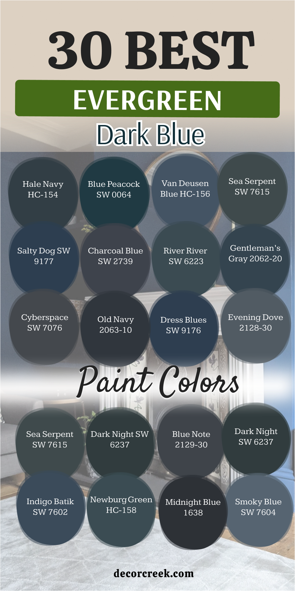
Choosing the perfect dark blue for your home can often feel like a high-stakes decision that carries a lot of weight. Because these colors are incredibly bold and deeply saturated, they don’t just sit on the wall; they actively react to the unique architecture of your space and the shifting natural light throughout the day. A navy that looks crisp in a sun-drenched living room might lean into a moody charcoal in a narrow, dim hallway.
However, from my professional perspective as a designer, I truly believe that dark blue is one of the most rewarding and transformative colors you can possibly choose for an interior. It operates beautifully as a “neutral with a soul,” offering a level of depth and character that standard grays or beiges simply cannot match.
By creating such a rich, sophisticated backdrop, it instantly elevates the entire room—making your favorite artwork pop, your furniture look more intentional, and the overall aesthetic feel significantly more expensive and curated.