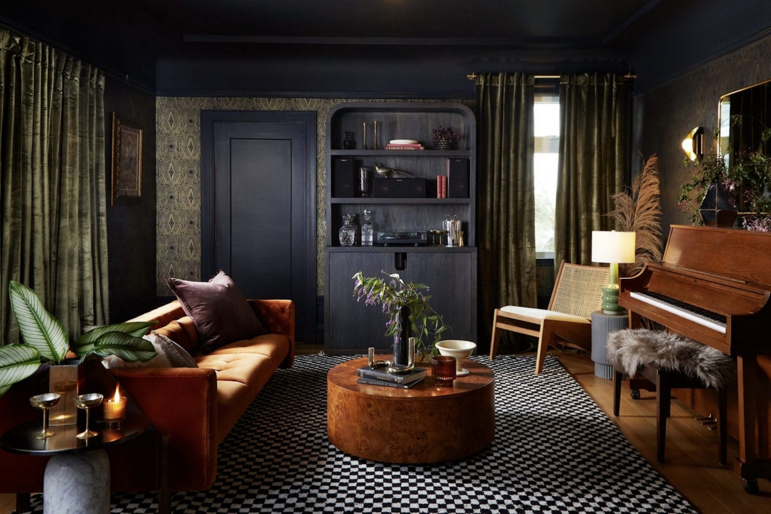
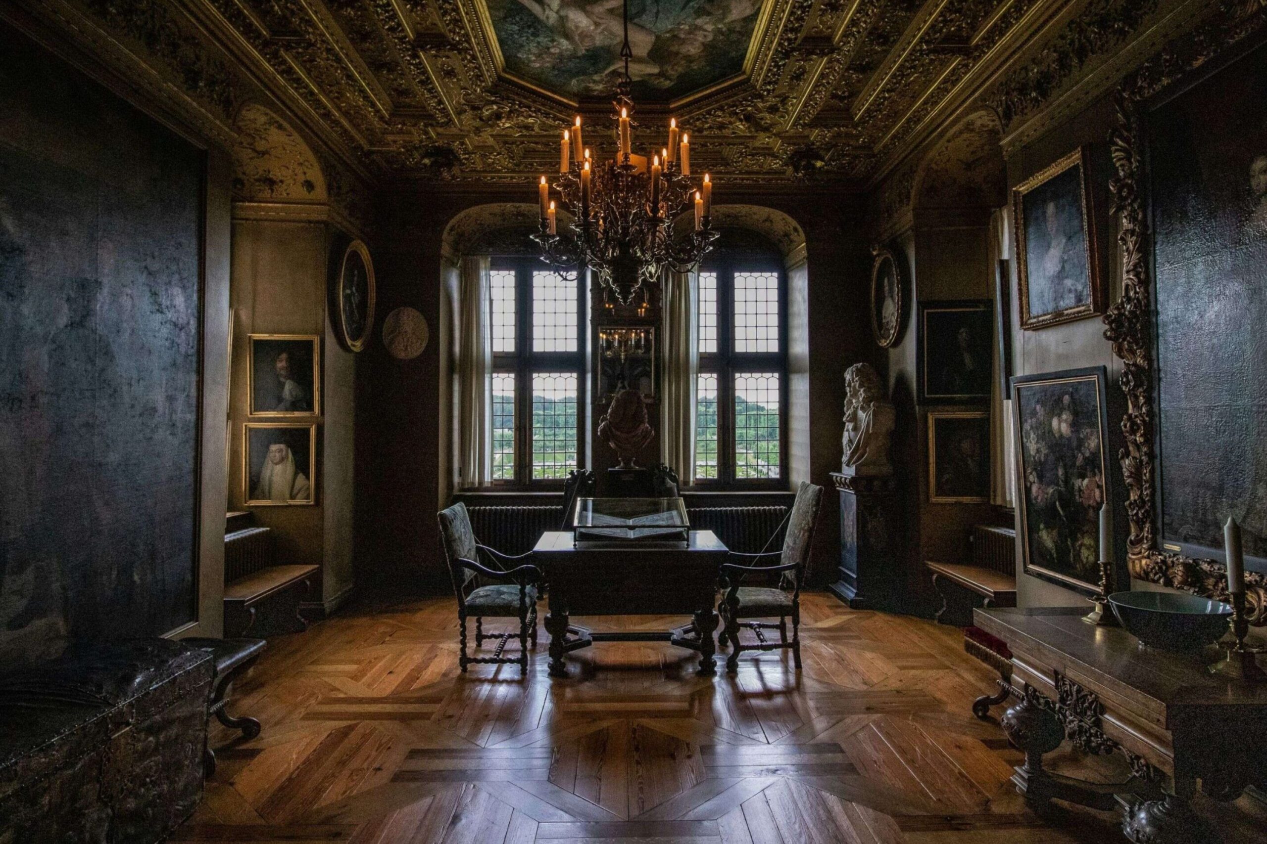
Creating a dark academia look in your home is all about capturing that cozy, scholarly feeling—think old, wood-paneled libraries, leather-bound vintage books piled high, and quiet, velvet-draped study nooks
This aesthetic transports you immediately to a historic university campus, and the foundation of achieving this atmosphere rests almost entirely on your paint choices.
This style relies heavily on rich, deep, and wonderfully moody paint colors that instantly set an educated, thoughtful, and established tone.
I’ve spent years as a designer working specifically with these dramatic, saturated hues, and I can tell you unequivocally that getting the right shade—one with complex undertones that shifts beautifully with the light—is the most crucial step in the entire process.
A flat, simple dark color can feel dreary, but a nuanced, moody shade feels sophisticated and enveloping. I’m thrilled to share my absolute favorite paint colors that bring this specific, antique aesthetic to life, ensuring your home feels wonderfully moody, grounded, and luxurious, never heavy or stark.
Get ready to find the perfect, intellectually satisfying shade for your own personal sanctuary.
Why I Always Trust Sherwin-Williams and Benjamin Moore for Dark Academia Colors
When I design a room, my paint choices almost always come from Sherwin-Williams and Benjamin Moore. It’s not just a preference; it’s about quality and consistency. These brands offer pigments that are richer, deeper, and more nuanced, which is essential for the dark academia palette.
A cheap paint might look flat, but these premium lines give the colors a certain depth that makes a room feel expensive and established.
Plus, their huge libraries of shades mean I can always find that perfect, slightly muddy, or wonderfully complex color that truly nails the dark academia mood.
When you’re dealing with very dark colors, you need a formula that applies smoothly and covers beautifully, and these companies deliver every time.
Trusting these brands means I can guarantee the final result will be as gorgeous and lasting as my clients expect.
How I Choose the Perfect Dark Academia Paint Shades for Every Room
Picking the right dark shade is a bit of an art, and I always consider a few key things. First, look at the natural light in the room. A room with very little light can still handle a dark color, but you might want one with a slightly higher Light Reflectance Value (LRV) to keep it from feeling like a cave.
Second, I consider the furnishings and textures you plan to use. Dark academia looks best when the paint contrasts with worn leather, heavy wools, and brass details.
The color should be a backdrop that lets those textures shine. Finally, think about the emotional purpose of the room.
A study might benefit from a deep green for concentration, while a dining room could take a powerful charcoal or navy for a dramatic, dinner-party feel.
It’s about creating a feeling with paint, so I choose shades that are complex—never just a simple black or brown, but one with fascinating undertones of green, blue, or violet.
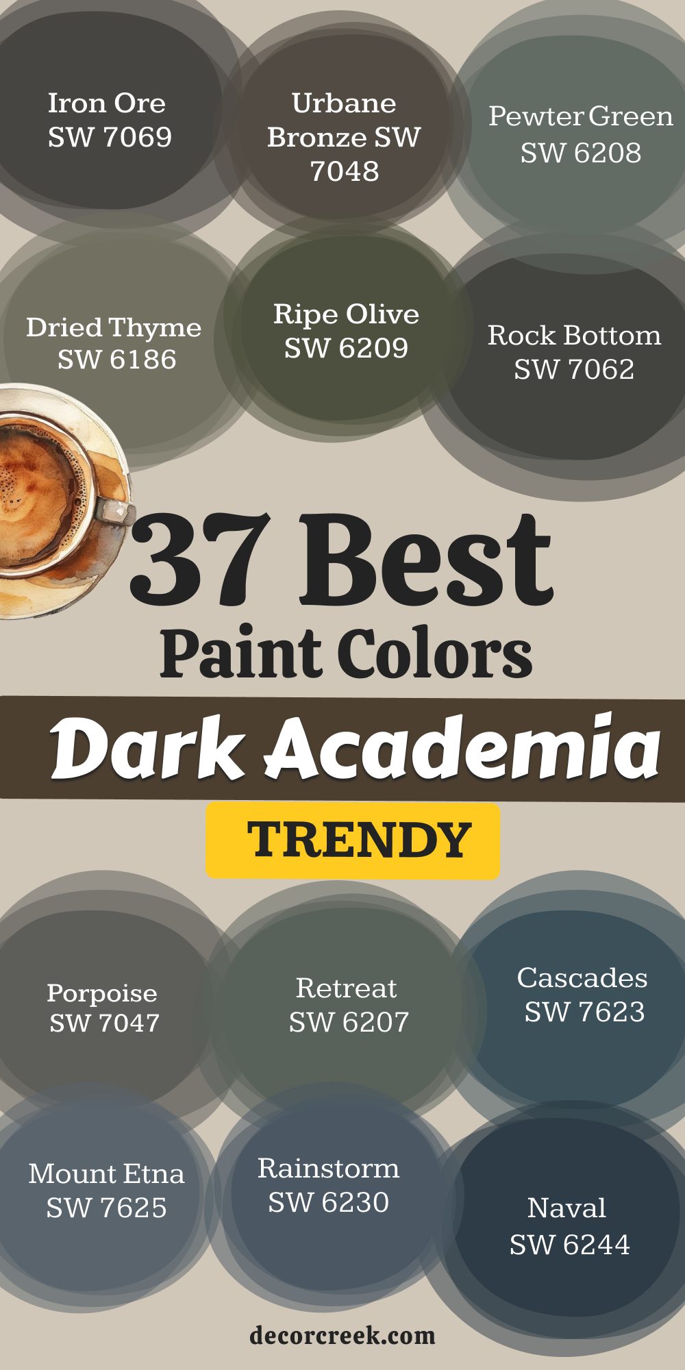
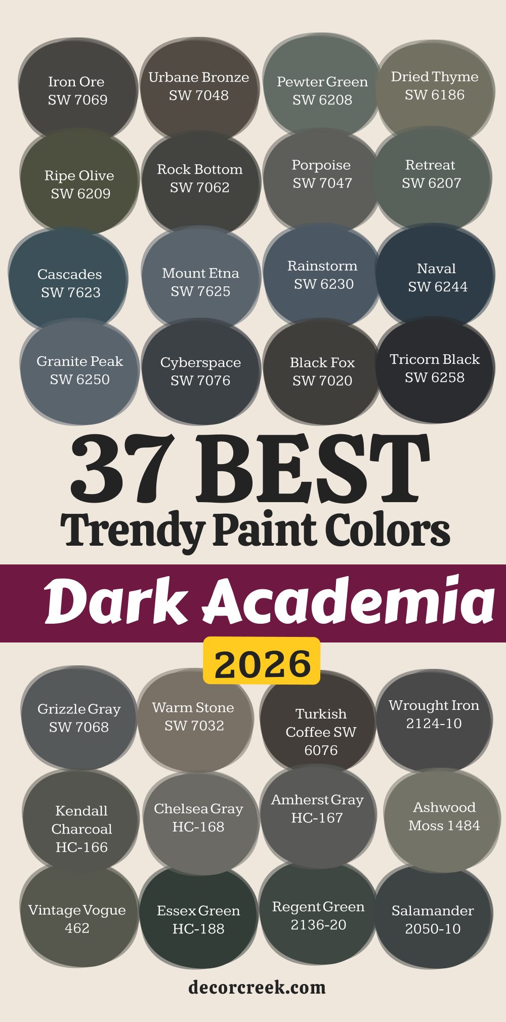
37 Best Dark Academia Paint Colors Trendy in 2026
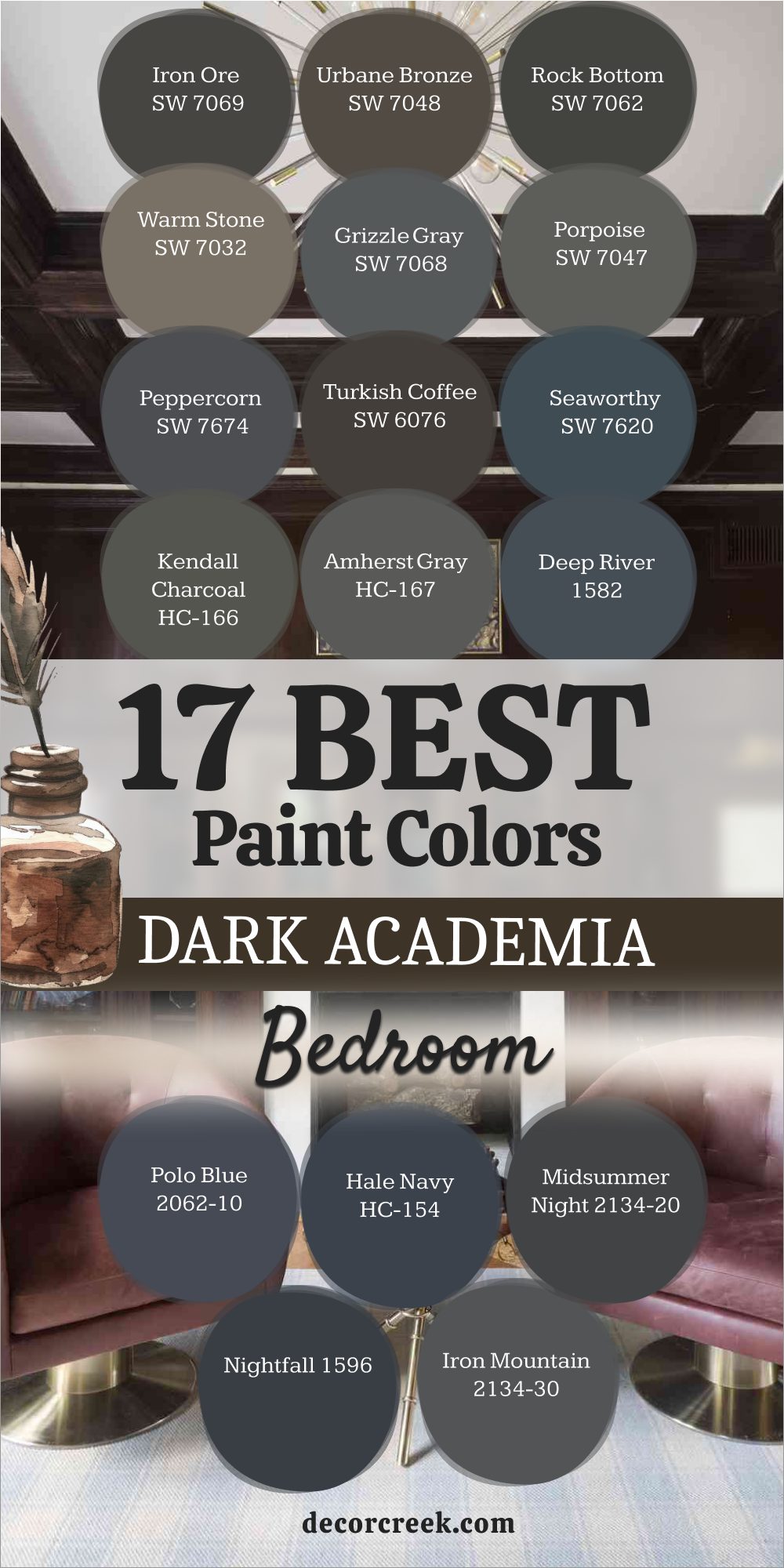
Iron Ore SW 7069
Iron Ore is one of my most requested colors for dark academia projects because it’s a wonderfully soft black with deep, warm gray undertones. Iron Ore acts like a charcoal pencil on your walls, giving a grounded and serious foundation to any room.
It has just enough gray in it to keep it from feeling stark or harsh, making it surprisingly cozy. This color looks stunning in a home library or on kitchen cabinets where you want a moody, sophisticated look.
It pairs beautifully with aged brass hardware and dark wood bookcases, really bringing that classic scholarly vibe to the foreground.
Iron Ore is truly a fantastic alternative to pure black, offering a gentler contrast to lighter trim.
It’s chic and instantly makes a room feel custom-designed and thoughtfully curated. This shade provides an excellent canvas for displaying vintage artwork or framed natural history prints.
I often recommend it for accent walls behind beds to create an anchoring effect.
Get the complete guide to this color right HERE ⬅️

Urbane Bronze SW 7048
Urbane Bronze is a complex, deep color that sits right between a rich brown, a warm gray, and an antique bronze. Urbane Bronze was Sherwin-Williams’ 2021 Color of the Year, and its popularity is still soaring in the dark academia world.
This shade is deeply grounding and has a comforting, organic feel, like the soil of an ancient forest. It is perfect for spaces where you want to foster contemplation, such as a home office or a quiet sitting room.
It works beautifully with natural materials like linen, jute, and heavily grained wood furniture. The subtle metallic quality in its undertone catches the light just right, preventing it from appearing flat. Urbane Bronze makes a powerful statement without being too dramatic or flashy. Use it to give your entryway or mudroom an immediate sense of richness and warmth.
Get the complete guide to this color right HERE ⬅️

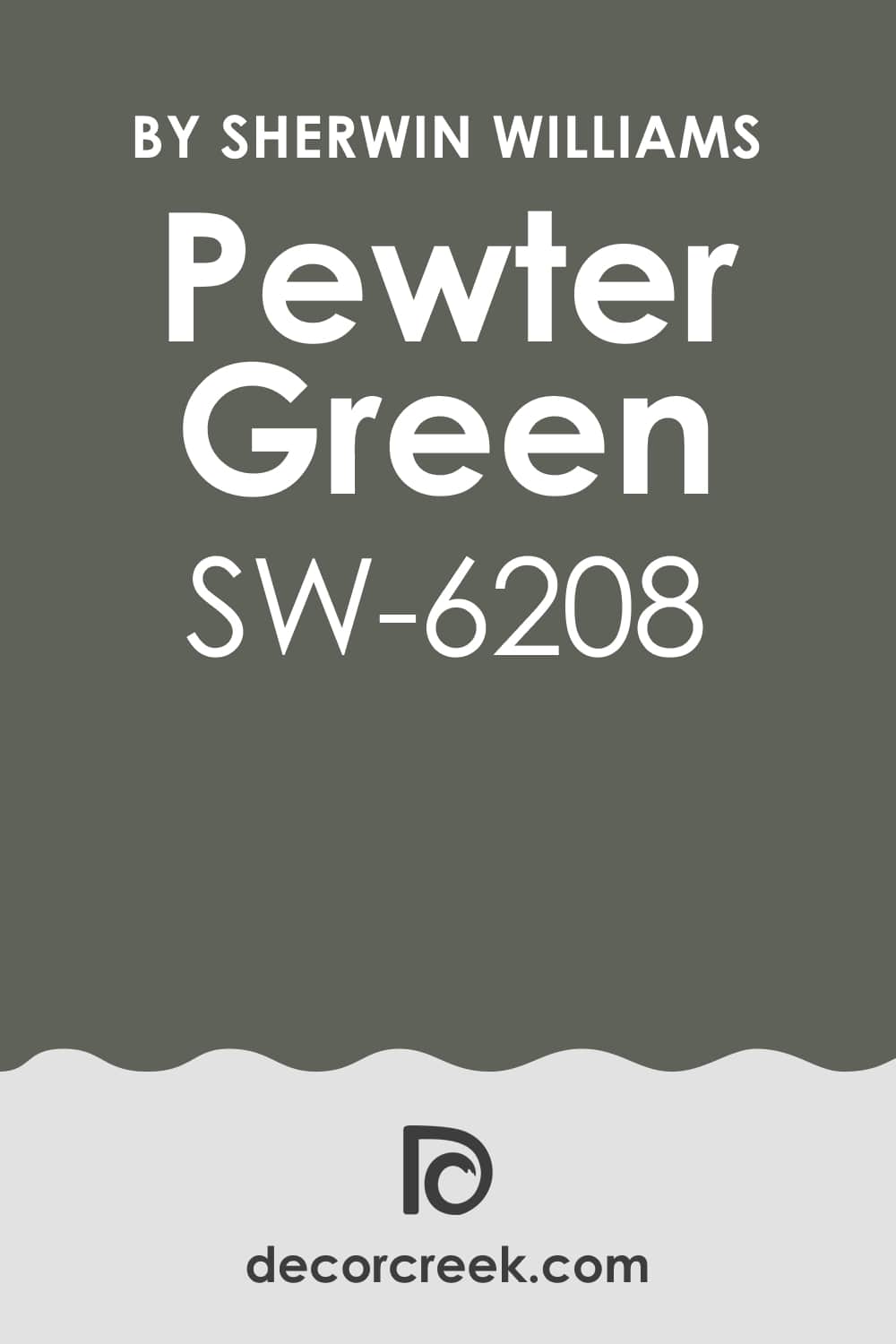
Pewter Green SW 6208
Pewter Green is a dusty, mid-to-dark green that has noticeable gray and blue undertones, giving it a beautiful, aged patina. Pewter Green reminds me of the tarnished metal on an old statue or the cover of a vintage textbook—it has history written all over it.
This shade is a wonderful way to bring a classic, academic green into a room without it being too bright or aggressive. It’s a fantastic color for dining rooms, creating an intimate and conversation-friendly setting.
The gray in it keeps it feeling wonderfully balanced and sophisticated in varying light conditions throughout the day.
I often suggest pairing it with creamy off-white trim and dark brown leather upholstery.
Pewter Green has a calming effect, making it suitable for a reading nook or a window seat area. It truly embodies the spirit of a traditional university study room.
Get the complete guide to this color right HERE ⬅️
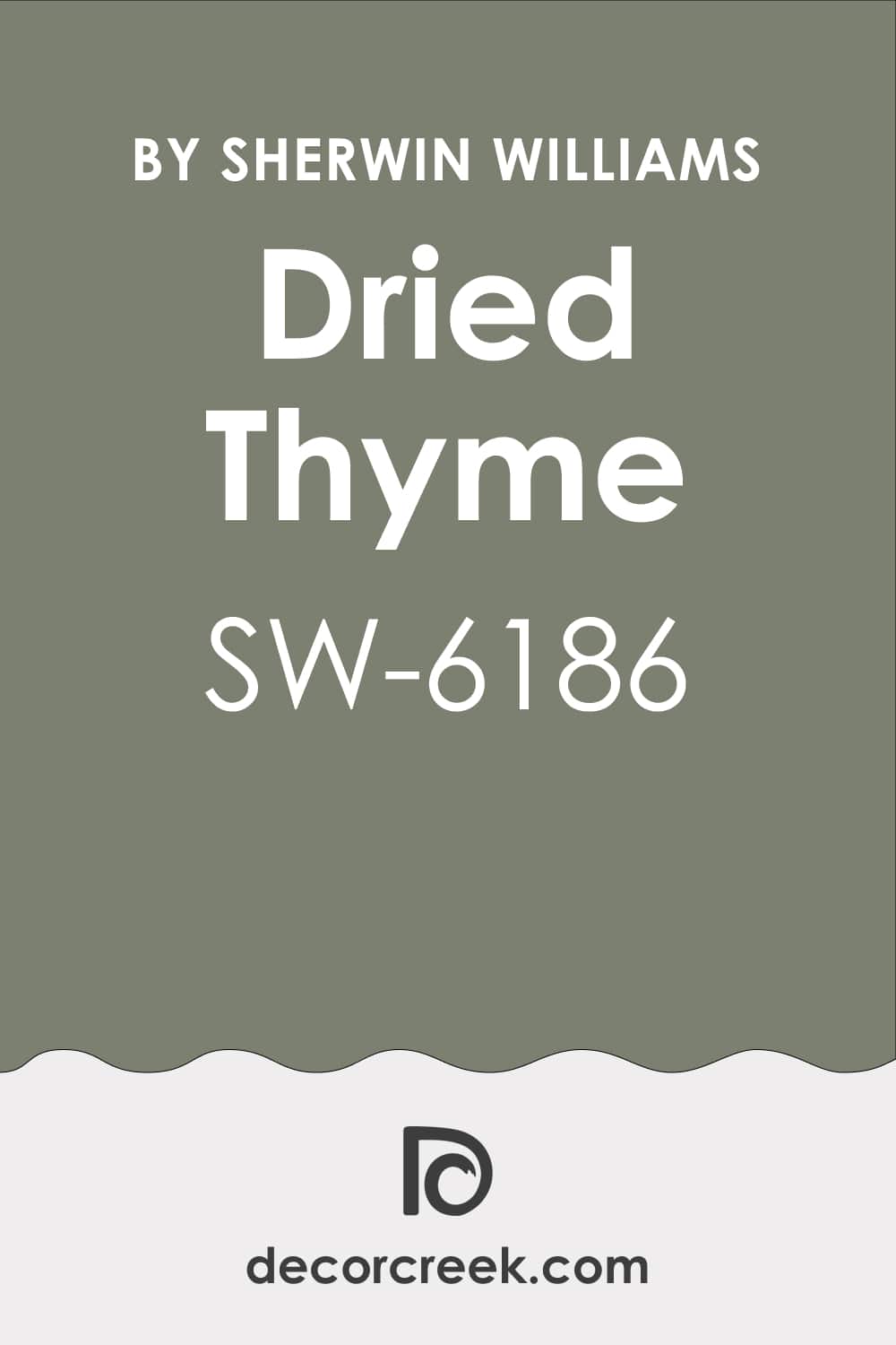
Dried Thyme SW 6186
Dried Thyme is a gorgeous, muted, grayish-green that evokes the feeling of preserved herbs and old natural history specimens. Dried Thyme is a perfect example of a green that feels antique and lived-in, not new or vibrant, which is key for dark academia.
This shade has a dusty quality that makes it extremely versatile, working well in both brightly lit and dimmer rooms. It’s a favorite for kitchen cabinets when a bold color is desired, but also works wonders in a bathroom or a laundry room.
The complexity of the color allows it to shift beautifully, appearing more gray in shadows and more green in direct light. Pair it with deep mahogany wood tones and antique gold accents for an authentic, scholarly aesthetic.
Dried Thyme is a comforting and wonderfully complex shade that feels grounded and very chic.
Get the complete guide to this color right HERE ⬅️
Ripe Olive SW 6209
Ripe Olive is a deep, true olive green that has powerful brown and black undertones, making it exceptionally moody and rich. Ripe Olive is a bold commitment to the green side of the dark academia palette, reminiscent of moss-covered stones or deep forest shadows.
This color is dramatic and feels incredibly luxurious, instantly creating a sense of drama and sophistication in any setting.
I love using it in a dedicated library or a formal living room with high ceilings to maximize its impactful quality. Because it is so deep, I usually recommend using it on all four walls to create a truly enveloping effect.
The brown undertones help it feel warm and inviting, even with its serious depth.
Ripe Olive makes an incredible backdrop for displaying vibrant art or colorful antique textiles. It’s a deeply satisfying color for anyone wanting a truly intense and scholarly green.
Get the complete guide to this color right HERE ⬅️

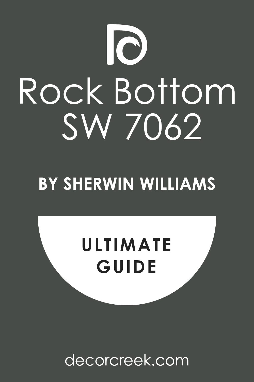
Rock Bottom SW 7062
Rock Bottom is a very dark, nearly black-brown-green that is incredibly rich and earthen. Rock Bottom is one of the deepest colors I use, and it’s perfect for creating a dramatic and powerful dark academia atmosphere.
This shade truly embodies the “bottom of the barrel” feeling, in the best way possible—it’s heavy, weighty, and commanding attention. I often use it in media rooms or formal dens where a very intense, moody environment is desired for relaxation and focus.
The slight hint of deep green keeps it from reading as purely black or brown, adding a subtle complexity that is quite sophisticated.
It pairs beautifully with creamy white trim to create a sharp contrast that makes the architecture pop.
Rock Bottom is best used in rooms that have either a lot of light to handle the depth or are intentionally low-lit for that ultimate cozy, mysterious feeling.
Get the complete guide to this color right HERE ⬅️
Porpoise SW 7047
Porpoise is a deep, medium-to-dark gray that has a definite warmth, leaning slightly toward taupe or a browned charcoal. Porpoise is a wonderfully grounding neutral for dark academia, especially for people who find pure black or navy too intense.
It has the serious, scholarly weight of a charcoal but the warmth of a comfortable flannel shirt. This shade is versatile enough for almost any room—it works well in bedrooms for a cozy, enveloping sleep environment, or in a hallway for a dramatic transition.
Its inherent warmth allows it to complement both cool and warm accent colors easily. Porpoise looks exceptional next to dark wood furniture and burnished metal accents, playing up the vintage feel. It’s a dependable, rich shade that provides depth without demanding all the attention in the room.
Get the complete guide to this color right HERE ⬅️

Retreat SW 6207
Retreat is a deep, muted green-gray that is both calming and sophisticated, offering a mature take on a natural color. Retreat is aptly named because it truly creates a sanctuary-like atmosphere, ideal for a home study or a quiet sitting room.
It’s a wonderful, complex color that can look more gray in cool light and more green in warm light, constantly surprising you throughout the day.
The intensity of the color is perfect for the dark academia aesthetic without feeling too heavy or demanding.
I particularly love using it in rooms with lots of plants, as the natural green tone ties the indoors and outdoors together beautifully.
Retreat is a comfortable and highly flexible color that lends a thoughtful, measured air to any interior space.
Get the complete guide to this color right HERE ⬅️

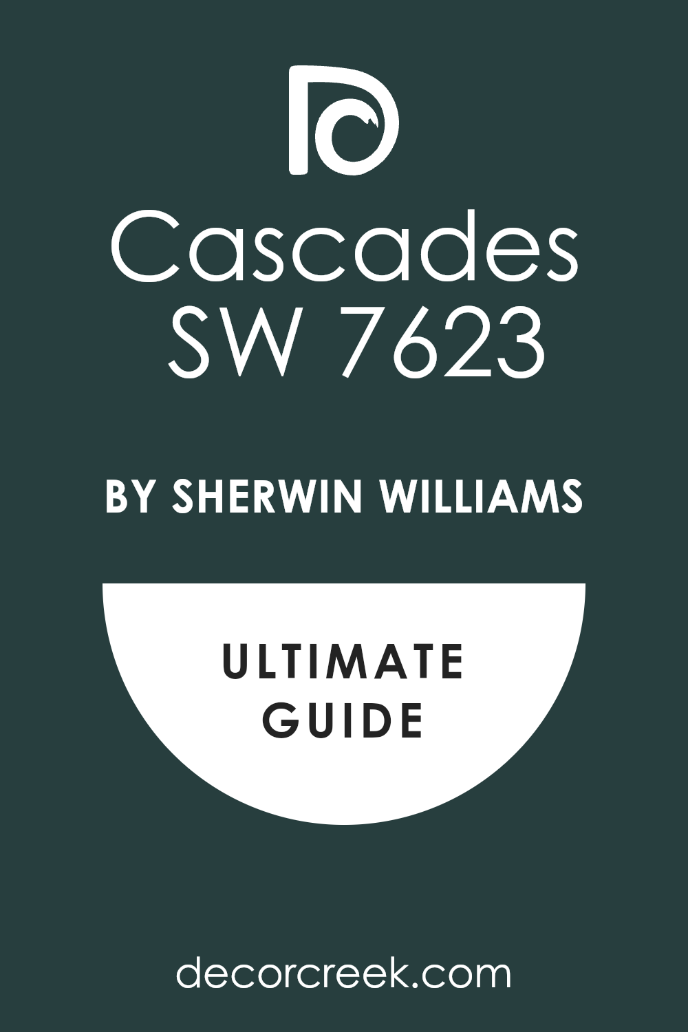
Cascades SW 7623
Cascades is a stunning, deep teal that is heavily influenced by both dark blue and dark green, reminiscent of deep ocean water. Cascades is a beautiful color to introduce a bit more richness and jewel tone to your dark academia palette.
This shade is intensely dramatic and works well as a feature wall color or even on all four walls in a small, intentionally moody room.
It looks incredible paired with dark cherry wood and rich velvet textiles, instantly upping the luxurious feel of the setting.
The blue and green mix gives it a depth that is constantly shifting and fascinating to observe.
Cascades is a confident and bold color choice for a library or a formal powder room.
Get the complete guide to this color right HERE ⬅️
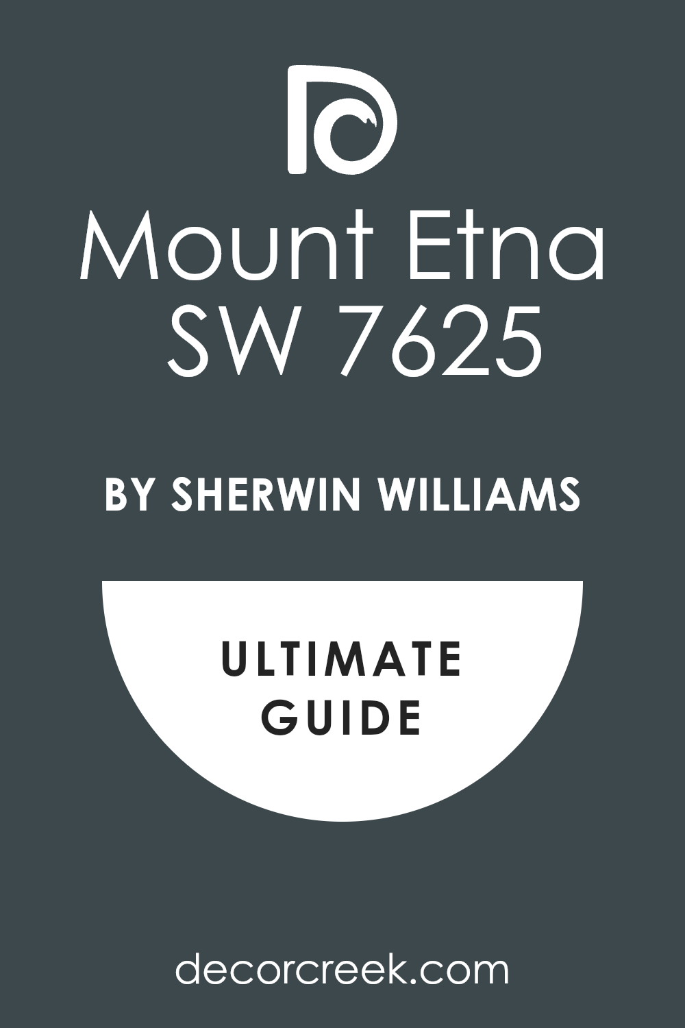
Mount Etna SW 7625
Mount Etna is a smoky, dusty blue with strong gray undertones, making it feel aged and established. Mount Etna is a beautiful and somewhat unexpected color for this style, offering a cooler alternative to the deep greens and charcoals.
The gray muddies the blue just enough to remove any childish or coastal feel, making it feel very sophisticated and academic.
This shade is lovely in a bedroom or a formal sitting area where you want a slightly brighter, yet still moody, backdrop.
It pairs wonderfully with brown leather and off-white trim for a classic, collegiate look.
Mount Etna is a unique and refined color that gives a cool-toned depth to any dark academia design.
Get the complete guide to this color right HERE ⬅️
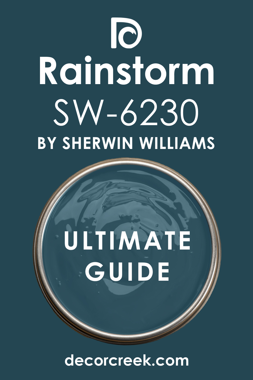
Rainstorm SW 6230
Rainstorm is a deep, slightly dusty navy blue with a strong gray element, giving it a weathered, stormy quality. Rainstorm is an excellent navy choice because the gray undertone makes it feel mature and quiet, not bright or cheerful.
It truly embodies the feeling of an intense, cozy afternoon spent indoors while a storm rages outside—perfect for reading and introspection.
This color is superb for formal living areas or a dramatic entryway, instantly signaling sophistication. It plays beautifully with dark mahogany furniture and gold-framed art. Rainstorm is a powerful and very traditional shade that adds immediate gravitas to any interior.
Get the complete guide to this color right HERE ⬅️
Naval SW 6244
Naval is a true, classic deep navy blue that is saturated, strong, and highly traditional. Naval is a foundational dark academia color, a reliable choice for a powerful, intellectual backdrop. This shade is perfect for library paneling or an entire home office, where its serious and grounding quality promotes focus.
It contrasts beautifully with bright white trim and ceiling paint, creating a crisp, academic border.
Naval is a very confident color that works well with all classic dark academia textiles, from plaid wool to rich velvet.
It’s a deep, beautiful blue that never goes out of style and always delivers a polished, sophisticated look.
Get the complete guide to this color right HERE ⬅️

Granite Peak SW 6250
Granite Peak is a dusty, mid-toned blue-gray that is incredibly versatile and feels like an aged piece of stone. Granite Peak is a gentler shade than a full-on navy, making it a great option for people who want a dark academia feel without fully committing to a black or deep navy.
It has a beautiful, natural quality that makes it easy to live with in any room, from a kitchen to a bedroom.
The gray keeps it feeling grounded and scholarly, avoiding any overly bright or light blue territory. It looks fantastic paired with dark wood floors and simple, classic furniture shapes. Granite Peak is a wonderful, balanced shade that provides depth without overpowering the room’s elements.
Get the complete guide to this color right HERE ⬅️

Cyberspace SW 7076
Cyberspace is a very dark charcoal that has subtle, cool blue undertones, giving it a sophisticated, nearly black appearance. Cyberspace is a modern take on a classic dark wall, offering the depth of black but with a softer, more complex edge.
This shade is wonderful for a formal dining room or a chic powder room, providing an instant sense of drama and elegance.
The blue in it keeps it from feeling flat, adding a slight shift in color depending on the light source.
It works beautifully with metallic accents like silver and nickel for a refined, library-like finish.
Cyberspace is a dramatic and moody shade that creates an immediate high-end feeling in any space it touches.
Get the complete guide to this color right HERE ⬅️

Black Fox SW 7020
Black Fox is a deep, dark brown-black that has a distinct, rich warmth, leaning toward a softened black espresso color. Black Fox is a fantastic, comforting color that provides an incredibly solid foundation for the dark academia style.
This shade is perfect for people who want a near-black that feels inviting rather than intimidating.
The strong brown undertone makes it feel organic and very natural, like rich, dark soil or old, heavily stained wood. I often recommend it for a moody kitchen or a comfortable, leather-filled study. Black Fox looks stunning with warm wood tones and creamy white fabrics for a wonderful textural contrast.
Get the complete guide to this color right HERE ⬅️

Tricorn Black SW 6258
Tricorn Black is a very pure, highly saturated black with virtually no undertones of blue, brown, or green. Tricorn Black is the ultimate dramatic shade for the dark academia aesthetic when you want a true, absolute black.
This color provides incredible depth and is best used when you want a sharp, strong contrast against trim and furnishings.
I often use it for interior doors, window sashes, or an entire powder room for a striking, chic look. Because it is so pure, it makes any art or object displayed against it truly pop with vibrancy. Tricorn Black is a confident, serious choice that instantly creates a high-contrast, intellectual, and serious atmosphere.
Get the complete guide to this color right HERE ⬅️

Grizzle Gray SW 7068
Grizzle Gray is a dark, heavily saturated charcoal gray with noticeable, cool blue undertones that makes it appear slightly stormy. Grizzle Gray is a dependable, deep gray that gives the weight and seriousness needed for a dark academia room.
It is a fantastic wall color choice when you want the drama of a dark shade but the flexibility of a neutral gray.
The blue undertone keeps it from feeling purely industrial, making it feel more cozy and complex. This shade works well in living rooms and bedrooms, providing a soothing, enveloping backdrop. It pairs beautifully with dark wood trim and soft, layered textiles like wool and cashmere. Grizzle Gray is a moody, reliable shade that anchors any scholarly design.
Get the complete guide to this color right HERE ⬅️

Warm Stone SW 7032
Warm Stone is a deep, earthy taupe-brown that is incredibly rich and comforting, living up to its name. Warm Stone is an excellent way to introduce a deep, natural warmth into the dark academia palette.
This shade is perfect for people who find the grays and blacks too cool, as this color brings a gentle, organic feeling to the walls.
It looks amazing in a hallway or a dining room, making the transition or the gathering feel very intimate and grounded.
The deep saturation gives it a substantial feel, even though it’s not a black or a navy.
Warm Stone pairs beautifully with natural materials like stone, wood, and linen, creating a very rustic-academic atmosphere.
Get the complete guide to this color right HERE ⬅️

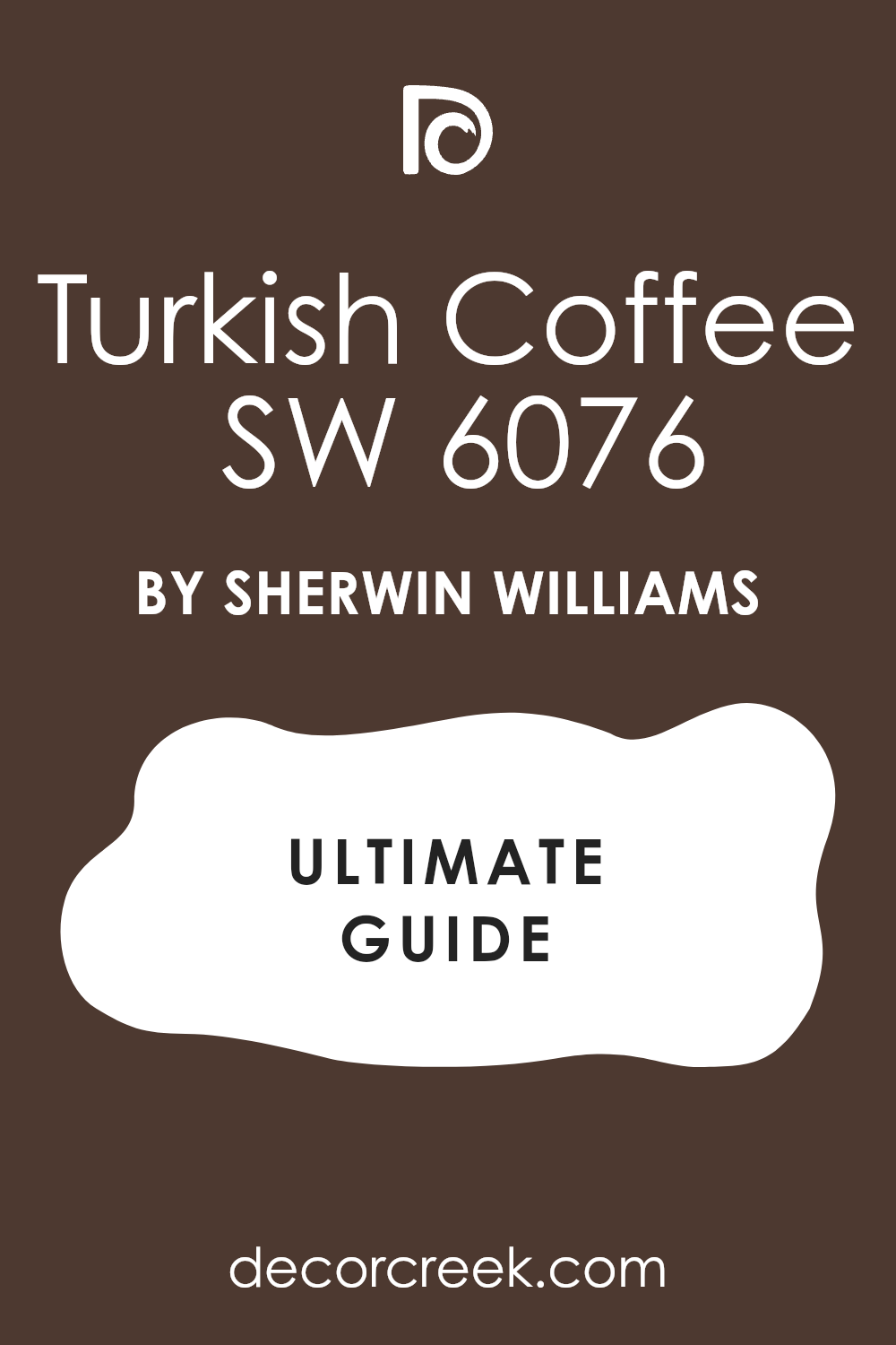
Turkish Coffee SW 6076
Turkish Coffee is a very dark, intensely saturated brown that is nearly black, like freshly brewed, strong coffee. Turkish Coffee is a wonderfully rich and decadent color that is perfect for creating a classic, wood-paneled-library feeling.
This shade feels incredibly cozy and established, like it’s been on the walls for a hundred years.
I often recommend it for a formal study or a room where the primary purpose is quiet reflection and reading.
The deep brown undertones make it pair perfectly with antique brass and deep red or gold accent colors.
Turkish Coffee is a deep, comforting color that exudes an air of classic, traditional sophistication.
Get the complete guide to this color right HERE ⬅️
Wrought Iron 2124-10
Wrought Iron is a very dark, complex charcoal gray that contains subtle blue-green undertones, giving it an antique metal look. Wrought Iron is a fantastic, versatile dark neutral that avoids the harshness of pure black while providing all the depth you need for a dark academia look.
It looks incredible on kitchen cabinets or as an accent color for trim and doors, adding a custom, weighty feel.
The complex undertones mean it shifts beautifully throughout the day, looking more blue or more gray depending on the light source.
It pairs wonderfully with classic white subway tile or creamy beige linen, creating a polished, antique aesthetic.
Wrought Iron is a sophisticated and grounding color that is an absolute staple in my design toolkit.
Get the complete guide to this color right HERE ⬅️

Kendall Charcoal HC-166
Kendall Charcoal is a classic, incredibly popular mid-to-dark gray with a distinct green-olive undertone. Kendall Charcoal is a truly balanced color—it’s dark and moody, but its slight green cast prevents it from feeling sterile or cold.
This shade is a workhorse, suitable for a living room, a bedroom, or even an exterior, maintaining its sophistication everywhere.
The green undertone makes it pair exceptionally well with natural wood tones and leather furniture, fitting the academic aesthetic perfectly.
It’s a wonderful choice if you want a deep color that is still highly livable and adaptable to different decorations.
Kendall Charcoal is a deeply satisfying, rich gray that feels wonderfully established and grounded.
Get the complete guide to this color right HERE ⬅️

Chelsea Gray HC-168
Chelsea Gray is a deep, warm, mid-toned gray that has subtle brown undertones, making it feel very cozy and inviting. Chelsea Gray is one of my go-to “Goldilocks” grays—it’s dark enough for drama but light enough to keep a room feeling airy and comfortable.
This shade is incredibly versatile and works in almost any room where you want a moody, sophisticated neutral backdrop.
The brown in it ensures it pairs beautifully with the warm, antique tones of dark academia furniture and brass accents.
It’s a dependable, rich shade that feels like a well-worn, comfortable blanket.
Chelsea Gray is a wonderful choice for people who want to introduce depth without going fully black or navy.
Get the complete guide to this color right HERE ⬅️

Amherst Gray HC-167
Amherst Gray is a dark, heavily saturated charcoal gray with a distinct, smoky blue undertone. Amherst Gray is a sophisticated and strong color that provides excellent depth, perfect for a library or a formal dining area.
The blue undertone is quite subtle, giving the color a sophisticated and slightly cool edge, reminiscent of a foggy morning.
It works wonderfully to anchor a room, especially when contrasted with bright white crown molding and baseboards.
This shade looks particularly stunning next to silver or chrome accents, though it also works well with aged brass.
Amherst Gray is a deeply intense and satisfying gray that truly elevates the scholarly atmosphere.
Get the complete guide to this color right HERE ⬅️

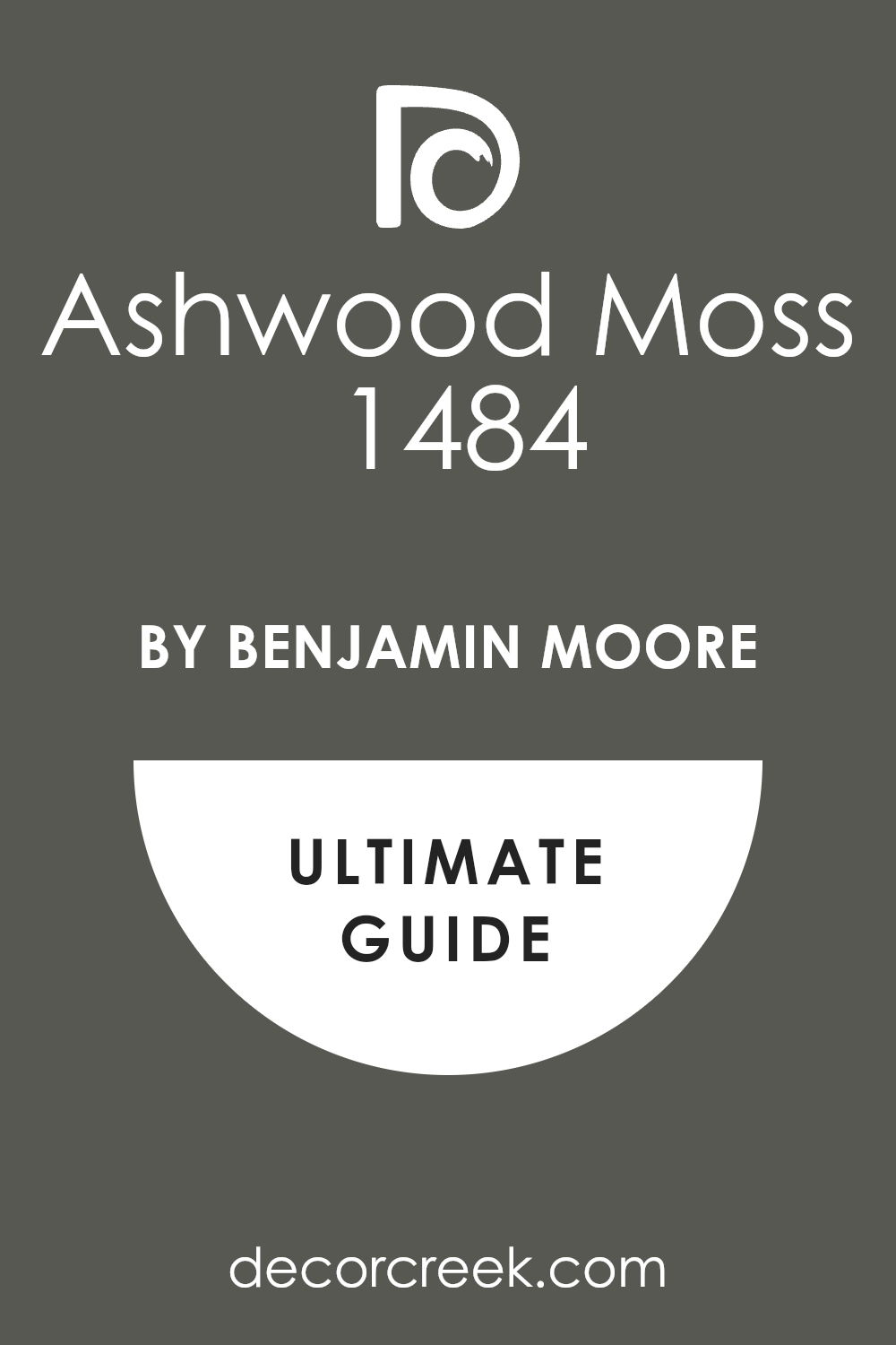
Ashwood Moss 1484
Ashwood Moss is a beautifully muted, medium-to-dark grayish-green that has a wonderfully organic, natural feeling. Ashwood Moss is a fantastic color to bring the feel of a centuries-old garden or nature collection indoors.
The heavy gray component ensures it reads as mature and academic, not bright or cheerful.
This shade is perfect for a study or a bedroom where a calming, reflective atmosphere is desired.
It pairs incredibly well with natural textures like linen, wool, and woven baskets.
Ashwood Moss is a subtle yet powerful color that provides an earthen, grounded feel to any dark academia interior.
Get the complete guide to this color right HERE ⬅️
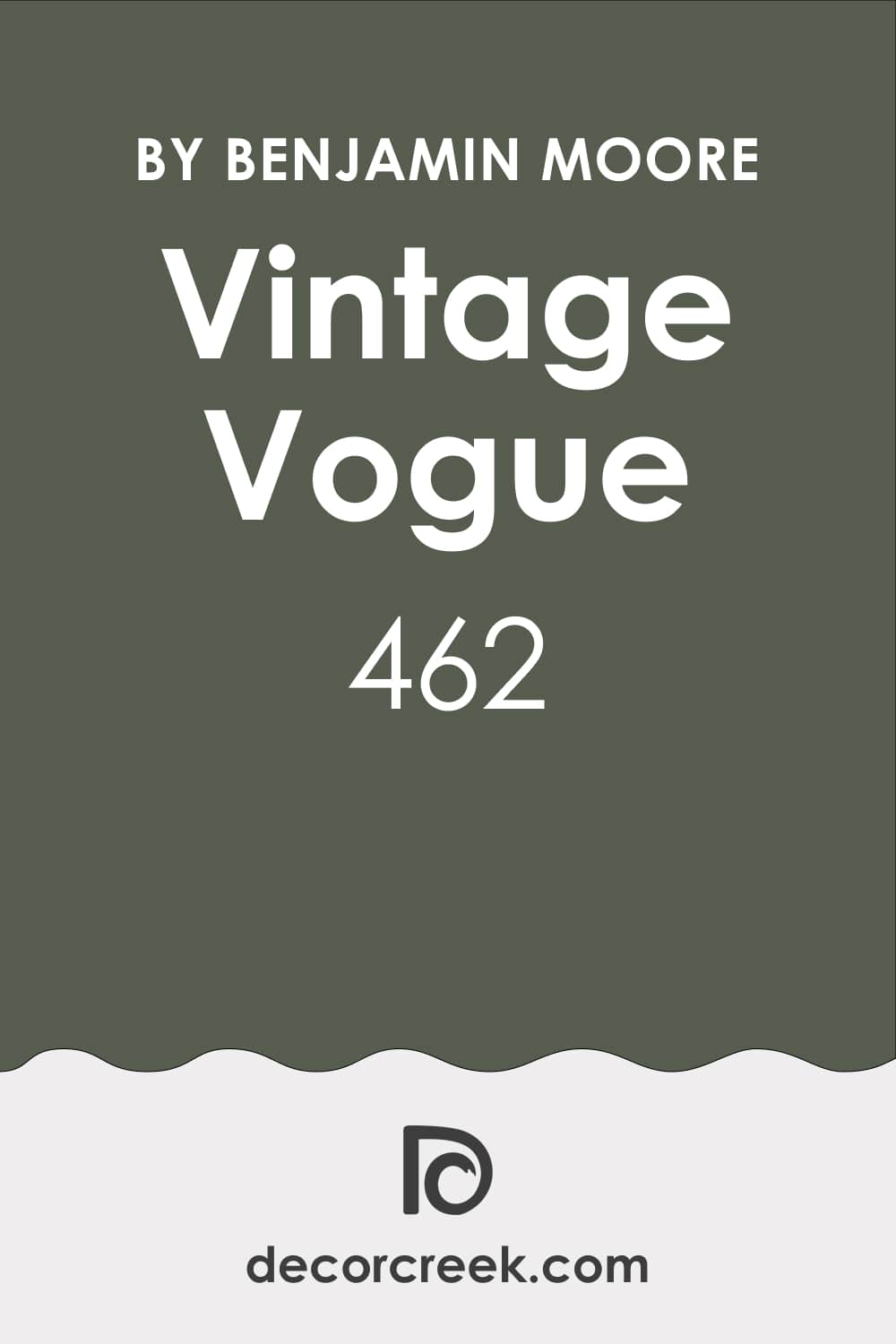
Vintage Vogue 462
Vintage Vogue is a deep, sophisticated olive-green that has a distinct black undertone, making it feel aged and established. Vintage Vogue is a wonderful example of a true dark academia green—it is intense, moody, and undeniably rich.
This shade is perfect for creating a dramatic and cozy atmosphere in a living room or an intimate powder room.
The black undertone gives it a depth that makes it feel custom and very high-end.
It looks stunning when paired with dark wood paneling or classic leather furniture.
Vintage Vogue is a commanding and beautiful color that perfectly captures the intellectual, old-world charm of the aesthetic.
Get the complete guide to this color right HERE ⬅️
Essex Green HC-188
Essex Green is a true, classic dark hunter green that is almost black, with a heavy saturation that makes it powerfully deep. Essex Green is a definitive dark academia color, immediately evoking the image of a traditional library or a formal British study.
This shade is incredibly dramatic and looks best when used on all four walls to create a truly enveloping and cozy feeling.
It pairs beautifully with rich, dark mahogany and traditional gold-framed portraits.
The intense depth of the color makes it a favorite for adding a serious, grounded sophistication to any room.
Essex Green is a bold and absolutely beautiful choice for a traditional, scholarly interior.
Get the complete guide to this color right HERE ⬅️

Regent Green 2136-20
Regent Green is a deep, rich, true evergreen that is full of color without leaning toward blue or black. Regent Green is a gorgeous, vibrant dark color that provides a slightly more saturated green experience than some of the muddier tones.
It has a beautiful depth that works well in a dining room or a focused workspace.
The richness of the color makes it feel luxurious and sophisticated, instantly elevating the look of the room.
It pairs wonderfully with classic dark wood tones and antique silver accents.
Regent Green is a confident and slightly more colorful dark green that is perfect for a statement wall or an entire library.
Get the complete guide to this color right HERE ⬅️
Salamander 2050-10
Salamander is a stunning, deep blue-green that has a heavy black undertone, giving it a powerful, almost iridescent, moody quality. Salamander is a favorite of mine when I want a dark color that has a hidden depth of jewel tone.
This shade is incredibly dramatic and works beautifully in a formal powder room or a chic, small study.
The blue-green comes alive when the light hits it, preventing the color from feeling too flat.
It looks exceptional with crisp white trim and classic brass lighting fixtures.
Salamander is a unique and commanding color that truly brings a sense of mystery and sophistication to any dark academia design.
Get the complete guide to this color right HERE ⬅️

Deep River 1582
Deep River is a very dark, saturated navy blue that has a noticeable gray undertone, giving it a slightly muted, aged appearance. Deep River is an excellent choice for a classic, intellectual blue that feels serious and established.
The gray keeps the navy from looking too bright or nautical, ensuring it reads as sophisticated and scholarly.
This shade is perfect for a formal living room or a large home office, providing a comforting and grounded backdrop.
It pairs beautifully with cognac leather and dark wood bookshelves.
Deep River is a reliable, rich color that perfectly anchors a dark academia interior.
Get the complete guide to this color right HERE ⬅️
Hale Navy HC-154
Hale Navy is a classic, deeply saturated, true navy blue that is one of the most popular dark colors for a reason. Hale Navy is a foundational, reliable, and perfectly balanced navy that works with nearly everything.
This shade is perfect for cabinets, accent walls, or entire rooms, providing an instant shot of traditional sophistication.
It has just enough depth to feel serious and scholarly without being a pure black.
It contrasts beautifully with every shade of white or cream trim.
Hale Navy is a true workhorse color that always delivers a clean, sharp, and highly intellectual aesthetic.
Get the complete guide to this color right HERE ⬅️

Newburyport Blue HC-155
Newburyport Blue is a deep, slightly grayed-out navy that is slightly softer and more muted than Hale Navy. Newburyport Blue is a wonderful alternative to a straight navy when you want a color that feels a bit more aged and historic.
The gray undertone gives it a mature quality, reminiscent of an old university building or a faded maritime chart.
This shade is lovely in a bedroom or a formal sitting room where a slightly gentler, yet still dark, blue is desired.
It pairs exceptionally well with antique silver and worn, dark brown wood.
Newburyport Blue is a classic, enduring shade that offers a beautiful, subtle depth.
Get the complete guide to this color right HERE ⬅️

Narragansett Green HC-157
Narragansett Green is a deep, highly saturated teal that leans heavily toward the blue side, feeling very complex and intriguing. Narragansett Green is a beautiful, moody color that gives a jewel-toned richness to a dark academia room.
This shade is perfect for a bold accent wall or a dramatic powder room, where its depth can truly shine.
The blend of blue and green gives it an active quality, constantly shifting and revealing subtle undertones in different light. It looks incredible with shiny brass fixtures and deep red or gold accent colors. Narragansett Green is a confident, dramatic, and intensely sophisticated color choice.
Get the complete guide to this color right HERE ⬅️
Dark Olive 2140-30
Dark Olive is a rich, warm, heavily muted olive green that has a strong brown and black undertone, making it feel very earthen. Dark Olive is a comforting and organic color that provides an excellent backdrop for natural materials and vintage finds.
This shade is perfect for a study or a living room where you want a moody green that feels absolutely grounded and mature
. The brown undertone makes it feel less bright than a true green, ensuring it maintains that established, old-world aesthetic. It pairs beautifully with warm wood tones and creamy white textiles. Dark Olive is a wonderfully subtle yet powerful color for a classic scholarly interior.
Get the complete guide to this color right HERE ⬅️
Silhouette AF-655
Silhouette is a very deep, highly saturated charcoal gray that is incredibly grounded and serious, with virtually no distracting undertones. Silhouette is a wonderful, simple, yet powerful dark gray that acts as a strong, neutral backdrop.
This shade is perfect for a gallery wall or a room where you want the focus to be entirely on the furnishings and artwork.
It provides all the necessary depth for the aesthetic without adding any color distraction. It pairs beautifully with every wood tone, from light oak to dark walnut. Silhouette is a dependable, high-impact dark gray that is a staple for a truly academic look.
Black Forest Green HC-187
Black Forest Green is a very deep, almost-black green that is highly saturated and incredibly intense, like the deepest shadows in a dense forest. Black Forest Green is a seriously dramatic color, one that is perfect for creating the ultimate moody, enveloping dark academia atmosphere.
This shade is ideal for a library or a formal den where a powerful, traditional look is desired. The intensity of the color makes it pair best with sharp, bright white trim to provide a clean contrast.
It is a fantastic backdrop for displaying antique botanical prints or classic portraits.
Black Forest Green is a bold and uncompromising color that speaks of history and depth.
Get the complete guide to this color right HERE ⬅️
Midsummer Night 2134-20
Midsummer Night is a very deep, almost-black charcoal with a hint of purple-blue undertone that gives it a wonderfully mysterious quality. Midsummer Night is one of the most sophisticated near-blacks in my toolkit, offering a complexity that pure black lacks.
This shade is perfect for a bedroom or a formal dining room where a truly dramatic and slightly unexpected mood is desired.
The subtle undertone only appears in certain light, making the color endlessly fascinating and rich. It looks incredible with antique gold or silver accents. Midsummer Night is a moody, elegant, and uniquely profound color choice.
Get the complete guide to this color right HERE ⬅️
Willow CC-542
Willow is a medium-to-dark muted green with a strong dose of gray, giving it a wonderfully dusty, established appearance. Willow is a lighter, more airy option for dark academia that still maintains a mature, sophisticated feel.
This shade is lovely in a bedroom or a sunroom, where you want a touch of natural color without the full drama of a deep forest green.
The gray keeps it feeling grounded and scholarly, avoiding any bright, cheerful tones. It pairs beautifully with light-colored linen and natural wood furniture.
Willow is a gentle yet complex green that provides a beautiful, classic academic feel.
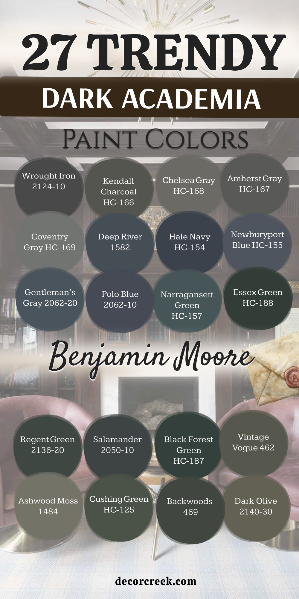
27 Trendy Dark Academia Paint Colors by Benjamin Moore
Wrought Iron 2124-10
Wrought Iron is a very dark, complex charcoal gray that contains subtle blue-green undertones, giving it an antique metal look. Wrought Iron is a fantastic, versatile dark neutral that avoids the harshness of pure black while providing all the depth you need for a dark academia look.
It looks incredible on kitchen cabinets or as an accent color for trim and doors, adding a custom, weighty feel.
The complex undertones mean it shifts beautifully throughout the day, looking more blue or more gray depending on the light source.
It pairs wonderfully with classic white subway tile or creamy beige linen, creating a polished, antique aesthetic.
Wrought Iron is a sophisticated and grounding color that is an absolute staple in my design toolkit.
Get the complete guide to this color right HERE ⬅️
Kendall Charcoal HC-166
Kendall Charcoal is a classic, incredibly popular mid-to-dark gray with a distinct green-olive undertone. Kendall Charcoal is a truly balanced color—it’s dark and moody, but its slight green cast prevents it from feeling sterile or cold.
This shade is a workhorse, suitable for a living room, a bedroom, or even an exterior, maintaining its sophistication everywhere.
The green undertone makes it pair exceptionally well with natural wood tones and leather furniture, fitting the academic aesthetic perfectly. It’s a wonderful choice if you want a deep color that is still highly livable and adaptable to different decorations. Kendall Charcoal is a deeply satisfying, rich gray that feels wonderfully established and grounded.
Get the complete guide to this color right HERE ⬅️
Chelsea Gray HC-168
Chelsea Gray is a deep, warm, mid-toned gray that has subtle brown undertones, making it feel very cozy and inviting. Chelsea Gray is one of my go-to “Goldilocks” grays—it’s dark enough for drama but light enough to keep a room feeling airy and comfortable.
This shade is incredibly versatile and works in almost any room where you want a moody, sophisticated neutral backdrop.
The brown in it ensures it pairs beautifully with the warm, antique tones of dark academia furniture and brass accents.
It’s a dependable, rich shade that feels like a well-worn, comfortable blanket.
Chelsea Gray is a wonderful choice for people who want to introduce depth without going fully black or navy.
Get the complete guide to this color right HERE ⬅️
Amherst Gray HC-167
Amherst Gray is a dark, heavily saturated charcoal gray with a distinct, smoky blue undertone. Amherst Gray is a sophisticated and strong color that provides excellent depth, perfect for a library or a formal dining area.
The blue undertone is quite subtle, giving the color a sophisticated and slightly cool edge, reminiscent of a foggy morning.
It works wonderfully to anchor a room, especially when contrasted with bright white crown molding and baseboards.
This shade looks particularly stunning next to silver or chrome accents, though it also works well with aged brass.
Amherst Gray is a deeply intense and satisfying gray that truly elevates the scholarly atmosphere.
Get the complete guide to this color right HERE ⬅️
Coventry Gray HC-169
Coventry Gray is a beautiful, medium-toned gray with a slight, cool blue undertone, offering a classic, mature neutral. Coventry Gray is a great choice when you want a deep, sophisticated gray that is not quite as dark as the charcoals but still offers plenty of moodiness.
This shade is very balanced, making it suitable for larger living areas or open-plan spaces where a dark color is needed to define a zone.
The subtle blue in it keeps it feeling clean and refined, not muddy or dull. It pairs wonderfully with bright white trim and dark wood furniture for a crisp, academic look. Coventry Gray is a beautiful, highly versatile, and established gray tone.
Get the complete guide to this color right HERE ⬅️

Deep River 1582
Deep River is a very dark, saturated navy blue that has a noticeable gray undertone, giving it a slightly muted, aged appearance. Deep River is an excellent choice for a classic, intellectual blue that feels serious and established.
The gray keeps the navy from looking too bright or nautical, ensuring it reads as sophisticated and scholarly.
This shade is perfect for a formal living room or a large home office, providing a comforting and grounded backdrop. It pairs beautifully with cognac leather and dark wood bookshelves. Deep River is a reliable, rich color that perfectly anchors a dark academia interior.
Get the complete guide to this color right HERE ⬅️
Hale Navy HC-154
Hale Navy is a classic, deeply saturated, true navy blue that is one of the most popular dark colors for a reason.
Hale Navy is a foundational, reliable, and perfectly balanced navy that works with nearly everything. This shade is perfect for cabinets, accent walls, or entire rooms, providing an instant shot of traditional sophistication.
It has just enough depth to feel serious and scholarly without being a pure black.
It contrasts beautifully with every shade of white or cream trim. Hale Navy is a true workhorse color that always delivers a clean, sharp, and highly intellectual aesthetic.
Get the complete guide to this color right HERE ⬅️
Newburyport Blue HC-155
Newburyport Blue is a deep, slightly grayed-out navy that is slightly softer and more muted than Hale Navy.
Newburyport Blue is a wonderful alternative to a straight navy when you want a color that feels a bit more aged and historic.
The gray undertone gives it a mature quality, reminiscent of an old university building or a faded maritime chart.
This shade is lovely in a bedroom or a formal sitting room where a slightly gentler, yet still dark, blue is desired.
It pairs exceptionally well with antique silver and worn, dark brown wood. Newburyport Blue is a classic, enduring shade that offers a beautiful, subtle depth.
Get the complete guide to this color right HERE ⬅️
Gentleman’s Gray 2062-20
Gentleman’s Gray is a sophisticated, deep blue-gray that is slightly softer and more complex than a straight navy. Gentleman’s Gray is a favorite for people who want a blue that is rich and masculine but not as intense as Hale Navy.
This shade is beautiful in a formal dining room or a home office, lending an air of quiet confidence.
The gray in it keeps it feeling grounded and academic, not bright or overly coastal. It looks stunning with creamy white trim and aged leather furniture. Gentleman’s Gray is a wonderful, complex color that feels established and very refined.
Get the complete guide to this color right HERE ⬅️

Polo Blue 2062-10
Polo Blue is a very deep, almost-black blue with a distinct violet undertone that makes it highly sophisticated and moody.
Polo Blue is a dramatic and unexpected color choice that provides incredible depth and a hint of intriguing color complexity.
This shade is perfect for a powder room or a small, intensely decorated study where you want a very memorable look.
The slight purple element makes it feel particularly luxurious and thoughtful. It pairs wonderfully with dark velvet and antique gold accents.
Polo Blue is a bold, high-impact color that truly elevates the dark academia aesthetic.
Get the complete guide to this color right HERE ⬅️
Narragansett Green HC-157
Narragansett Green is a deep, highly saturated teal that leans heavily toward the blue side, feeling very complex and intriguing. Narragansett Green is a beautiful, moody color that gives a jewel-toned richness to a dark academia room.
This shade is perfect for a bold accent wall or a dramatic powder room, where its depth can truly shine.
The blend of blue and green gives it an active quality, constantly shifting and revealing subtle undertones in different light.
It looks incredible with shiny brass fixtures and deep red or gold accent colors. Narragansett Green is a confident, dramatic, and intensely sophisticated color choice.
Get the complete guide to this color right HERE ⬅️
Essex Green HC-188
Essex Green is a true, classic dark hunter green that is almost black, with a heavy saturation that makes it powerfully deep. Essex Green is a definitive dark academia color, immediately evoking the image of a traditional library or a formal British study.
This shade is incredibly dramatic and looks best when used on all four walls to create a truly enveloping and cozy feeling.
It pairs beautifully with rich, dark mahogany and traditional gold-framed portraits. The intense depth of the color makes it a favorite for adding a serious, grounded sophistication to any room.
Essex Green is a bold and absolutely beautiful choice for a traditional, scholarly interior.
Get the complete guide to this color right HERE ⬅️
Regent Green 2136-20
Regent Green is a deep, rich, true evergreen that is full of color without leaning toward blue or black.
Regent Green is a gorgeous, vibrant dark color that provides a slightly more saturated green experience than some of the muddier tones. It has a beautiful depth that works well in a dining room or a focused workspace.
The richness of the color makes it feel luxurious and sophisticated, instantly elevating the look of the room.
It pairs wonderfully with classic dark wood tones and antique silver accents.
Regent Green is a confident and slightly more colorful dark green that is perfect for a statement wall or an entire library.
Get the complete guide to this color right HERE ⬅️
Salamander 2050-10
Salamander is a stunning, deep blue-green that has a heavy black undertone, giving it a powerful, almost iridescent, moody quality. Salamander is a favorite of mine when I want a dark color that has a hidden depth of jewel tone.
This shade is incredibly dramatic and works beautifully in a formal powder room or a chic, small study.
The blue-green comes alive when the light hits it, preventing the color from feeling too flat.
It looks exceptional with crisp white trim and classic brass lighting fixtures.
Salamander is a unique and commanding color that truly brings a sense of mystery and sophistication to any dark academia design.
Get the complete guide to this color right HERE ⬅️
Black Forest Green HC-187
Black Forest Green is a very deep, almost-black green that is highly saturated and incredibly intense, like the deepest shadows in a dense forest.
Black Forest Green is a seriously dramatic color, one that is perfect for creating the ultimate moody, enveloping dark academia atmosphere.
This shade is ideal for a library or a formal den where a powerful, traditional look is desired.
The intensity of the color makes it pair best with sharp, bright white trim to provide a clean contrast.
It is a fantastic backdrop for displaying antique botanical prints or classic portraits.
Black Forest Green is a bold and uncompromising color that speaks of history and depth.
Get the complete guide to this color right HERE ⬅️
Vintage Vogue 462
Vintage Vogue is a deep, sophisticated olive-green that has a distinct black undertone, making it feel aged and established. Vintage Vogue is a wonderful example of a true dark academia green—it is intense, moody, and undeniably rich.
This shade is perfect for creating a dramatic and cozy atmosphere in a living room or an intimate powder room.
The black undertone gives it a depth that makes it feel custom and very high-end.
It looks stunning when paired with dark wood paneling or classic leather furniture.
Vintage Vogue is a commanding and beautiful color that perfectly captures the intellectual, old-world charm of the aesthetic.
Get the complete guide to this color right HERE ⬅️
Ashwood Moss 1484
Ashwood Moss is a beautifully muted, medium-to-dark grayish-green that has a wonderfully organic, natural feeling. Ashwood Moss is a fantastic color to bring the feel of a centuries-old garden or nature collection indoors.
The heavy gray component ensures it reads as mature and academic, not bright or cheerful.
This shade is perfect for a study or a bedroom where a calming, reflective atmosphere is desired. It pairs incredibly well with natural textures like linen, wool, and woven baskets.
Ashwood Moss is a subtle yet powerful color that provides an earthen, grounded feel to any dark academia interior.
Get the complete guide to this color right HERE ⬅️
Cushing Green HC-125
Cushing Green is a deep, saturated forest green that has just enough black to keep it moody and seriously sophisticated. Cushing Green is a perfect green for a traditional, scholarly interior, reminiscent of the baize cloth on an old writing desk.
This shade is wonderfully grounding and gives a strong, intellectual foundation to a room.
It works well in a library or a formal living space, creating a rich and intimate environment.
The color is deep but maintains its green identity beautifully, a1voiding the look of a black.
It pairs perfectly with warm wood tones and antique gold accessories for a very classic look.
Get the complete guide to this color right HERE ⬅️
Midsummer Night 2134-20
Midsummer Night is a very deep, almost-black charcoal with a hint of purple-blue undertone that gives it a wonderfully mysterious quality.
Midsummer Night is one of the most sophisticated near-blacks in my toolkit, offering a complexity that pure black lacks.
This shade is perfect for a bedroom or a formal dining room where a truly dramatic and slightly unexpected mood is desired.
The subtle undertone only appears in certain light, making the color endlessly fascinating and rich. It looks incredible with antique gold or silver accents.
Midsummer Night is a moody, elegant, and uniquely profound color choice.
Get the complete guide to this color right HERE ⬅️
Backwoods 469
Backwoods is a deep, true forest green that has a strong blue-black undertone, making it incredibly dark and moody. Backwoods is a highly intense green, one of my darkest greens, perfect for creating a dramatic, enveloping atmosphere.
This shade is ideal for a small study or a reading nook where you want maximum coziness and depth.
The strong depth of color makes it pair beautifully with heavy wool textiles and dark leather seating.
It is a wonderfully organic and rich color that captures the feeling of a dense, ancient forest.
Backwoods is a bold and deeply satisfying choice for a scholarly, antique interior.
Get the complete guide to this color right HERE ⬅️
Silhouette AF-655
Silhouette is a very deep, highly saturated charcoal gray that is incredibly grounded and serious, with virtually no distracting undertones. Silhouette is a wonderful, simple, yet powerful dark gray that acts as a strong, neutral backdrop.
This shade is perfect for a gallery wall or a room where you want the focus to be entirely on the furnishings and artwork.
It provides all the necessary depth for the aesthetic without adding any color distraction. It pairs beautifully with every wood tone, from light oak to dark walnut.
Silhouette is a dependable, high-impact dark gray that is a staple for a truly academic look.
Dark Olive 2140-30
Dark Olive is a rich, warm, heavily muted olive green that has a strong brown and black undertone, making it feel very earthen. Dark Olive is a comforting and organic color that provides an excellent backdrop for natural materials and vintage finds.
This shade is perfect for a study or a living room where you want a moody green that feels absolutely grounded and mature.
The brown undertone makes it feel less bright than a true green, ensuring it maintains that established, old-world aesthetic.
It pairs beautifully with warm wood tones and creamy white textiles.
Dark Olive is a wonderfully subtle yet powerful color for a classic scholarly interior.
Get the complete guide to this color right HERE ⬅️
Nightfall 1596
Nightfall is a deep, highly saturated, almost-black navy that is intensely serious and wonderfully dramatic. Nightfall is the perfect color when you want a blue that is as dark and commanding as possible without being pure black.
This shade is incredibly grounding and provides an immediate sense of richness and sophistication in a home office or a formal entryway.
The depth of the color makes it pair beautifully with heavy, textured textiles and metallic accents.
It is a bold, uncompromising blue that anchors any traditional, scholarly interior with power.
Get the complete guide to this color right HERE ⬅️
Trout Gray 2124-20
Trout Gray is a mid-to-dark gray with a strong, clean blue undertone that gives it a subtle, silvery cast. Trout Gray is a great choice for dark academia when you want a lighter dark shade that still carries a sophisticated, moody feel.
This shade works well in rooms with less natural light, as the blue undertone helps it feel a little less heavy.
It’s perfect for a bedroom or a reading nook, offering a softer version of the dramatic aesthetic. It pairs beautifully with dark wood trim and creamy white bedding.
Trout Gray is a refined, classic gray-blue that feels wonderfully calm and established.
Get the complete guide to this color right HERE ⬅️
Sparrow AF-720
Sparrow is a deep, warm, heavily grayed-out brown that has an incredibly organic and earthen quality. Sparrow is a wonderful neutral choice for dark academia, bringing the warmth of brown without being too ruddy or bright.
This shade is perfect for creating a cozy, almost rustic-academic atmosphere in a living room or a formal den.
The heavy gray in it ensures it reads as mature and serious, not simply brown.
It pairs beautifully with natural stone and woven materials, giving a grounded, well-traveled feel.
Sparrow is a comforting and highly versatile deep neutral.
Get the complete guide to this color right HERE ⬅️
Iron Mountain 2134-30
Iron Mountain is a deep, highly saturated charcoal gray that has a slight, cool blue undertone, giving it a solid, metallic feel.
Iron Mountain is a commanding and serious gray that provides a strong, neutral backdrop for any dark academia design.
This shade is perfect for a modern take on the aesthetic, offering depth and sophistication without the commitment to a color like navy or green.
It works beautifully on cabinets or as a strong wall color in a study. It pairs wonderfully with crisp white trim and geometric metal lighting fixtures.
Iron Mountain is a dependable, strong, and deeply satisfying gray.
Get the complete guide to this color right HERE ⬅️

Graphite 1603
Graphite is a very dark, intensely saturated black-gray that is nearly black, with virtually no distracting undertones.
Graphite is a powerful, dramatic color choice for those who want the ultimate in moody, deep neutrals. This shade is perfect for creating a sharp contrast with lighter furnishings or for an entire room where a striking, modern-academic look is desired.
The pure depth of the color makes it a strong anchor for any artistic display or gallery wall.
It is a serious, uncompromising shade that delivers maximum impact.
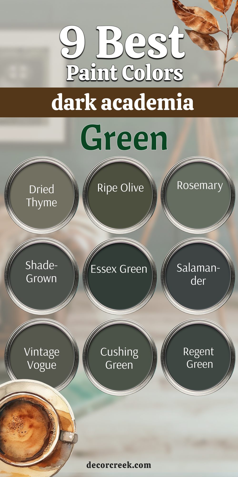
9 Best Dark Academia Green Paint Colors
Dried Thyme SW 6186
Dried Thyme is a gorgeous, muted, grayish-green that evokes the feeling of preserved herbs and old natural history specimens. Dried Thyme is a perfect example of a green that feels antique and lived-in, not new or vibrant, which is key for dark academia.
This shade has a dusty quality that makes it extremely versatile, working well in both brightly lit and dimmer rooms.
It’s a favorite for kitchen cabinets when a bold color is desired, but also works wonders in a bathroom or a laundry room.
The complexity of the color allows it to shift beautifully, appearing more gray in shadows and more green in direct light.
Pair it with deep mahogany wood tones and antique gold accents for an authentic, scholarly aesthetic. Dried Thyme is a comforting and wonderfully complex shade that feels grounded and very chic.
Get the complete guide to this color right HERE ⬅️
Ripe Olive SW 6209
Ripe Olive is a deep, true olive green that has powerful brown and black undertones, making it exceptionally moody and rich.
Ripe Olive is a bold commitment to the green side of the dark academia palette, reminiscent of moss-covered stones or deep forest shadows. This color is dramatic and feels incredibly luxurious, instantly creating a sense of drama and sophistication in any setting.
I love using it in a dedicated library or a formal living room with high ceilings to maximize its impactful quality.
Because it is so deep, I usually recommend using it on all four walls to create a truly enveloping effect.
The brown undertones help it feel warm and inviting, even with its serious depth. Ripe Olive makes an incredible backdrop for displaying vibrant art or colorful antique textiles. It’s a deeply satisfying color for anyone wanting a truly intense and scholarly green.
Get the complete guide to this color right HERE ⬅️
Rosemary SW 6187
Rosemary is a dusty, mid-to-dark grayish-green that has a beautiful, herbaceous, and aged quality. Rosemary is a wonderfully grounding green that provides a softer, yet still sophisticated, option for the dark academia look.
This shade is perfect for a home office or a quiet sitting room, lending an air of intellectual focus and calm.
It has enough gray in it to keep it from feeling bright, ensuring it maintains a mature and established appearance.
It pairs beautifully with dark brown leather and creamy white trim, creating a gentle contrast.
Rosemary is a comfortable, refined green that feels instantly historic and lived-in.
Get the complete guide to this color right HERE ⬅️

Shade-Grown SW 6188
Shade-Grown is a deep, dark, muted green that is heavily influenced by a soft black undertone, feeling intensely organic and earthen. Shade-Grown is an excellent green for creating a moody, forest-like atmosphere in any room.
This shade is ideal for a library or a formal dining room where a truly rich and enveloping color is desired.
The intensity of the color makes it a perfect anchor for a room with heavy, traditional furniture. It looks stunning with warm wood tones and heavy brass or gold accents.
Shade-Grown is a powerful and very traditional shade that adds immediate depth and history to an interior.
Get the complete guide to this color right HERE ⬅️
Essex Green HC-188
Essex Green is a true, classic dark hunter green that is almost black, with a heavy saturation that makes it powerfully deep. Essex Green is a definitive dark academia color, immediately evoking the image of a traditional library or a formal British study.
This shade is incredibly dramatic and looks best when used on all four walls to create a truly enveloping and cozy feeling.
It pairs beautifully with rich, dark mahogany and traditional gold-framed portraits.
The intense depth of the color makes it a favorite for adding a serious, grounded sophistication to any room.
Essex Green is a bold and absolutely beautiful choice for a traditional, scholarly interior.
Get the complete guide to this color right HERE ⬅️
Salamander 2050-10
Salamander is a stunning, deep blue-green that has a heavy black undertone, giving it a powerful, almost iridescent, moody quality.
Salamander is a favorite of mine when I want a dark color that has a hidden depth of jewel tone. This shade is incredibly dramatic and works beautifully in a formal powder room or a chic, small study.
The blue-green comes alive when the light hits it, preventing the color from feeling too flat.
It looks exceptional with crisp white trim and classic brass lighting fixtures.
Salamander is a unique and commanding color that truly brings a sense of mystery and sophistication to any dark academia design.
Get the complete guide to this color right HERE ⬅️
Vintage Vogue 462
Vintage Vogue is a deep, sophisticated olive-green that has a distinct black undertone, making it feel aged and established. Vintage Vogue is a wonderful example of a true dark academia green—it is intense, moody, and undeniably rich.
This shade is perfect for creating a dramatic and cozy atmosphere in a living room or an intimate powder room. The black undertone gives it a depth that makes it feel custom and very high-end.
It looks stunning when paired with dark wood paneling or classic leather furniture. Vintage Vogue is a commanding and beautiful color that perfectly captures the intellectual, old-world charm of the aesthetic.
Get the complete guide to this color right HERE ⬅️
Cushing Green HC-125
Cushing Green is a deep, saturated forest green that has just enough black to keep it moody and seriously sophisticated. Cushing Green is a perfect green for a traditional, scholarly interior, reminiscent of the baize cloth on an old writing desk.
This shade is wonderfully grounding and gives a strong, intellectual foundation to a room. It works well in a library or a formal living space, creating a rich and intimate environment.
The color is deep but maintains its green identity beautifully, avoiding the look of a black.
It pairs perfectly with warm wood tones and antique gold accessories for a very classic look.
Get the complete guide to this color right HERE ⬅️
17 Dark Academia Bedroom Paint Colors
Iron Ore SW 7069
Iron Ore is one of my most requested colors for dark academia projects because it’s a wonderfully soft black with deep, warm gray undertones. Iron Ore acts like a charcoal pencil on your walls, giving a grounded and serious foundation to any room.
It has just enough gray in it to keep it from feeling stark or harsh, making it surprisingly cozy. This color looks stunning in a home library or on kitchen cabinets where you want a moody, sophisticated look.
It pairs beautifully with aged brass hardware and dark wood bookcases, really bringing that classic scholarly vibe to the foreground.
Iron Ore is truly a fantastic alternative to pure black, offering a gentler contrast to lighter trim.
It’s chic and instantly makes a room feel custom-designed and thoughtfully curated.
Get the complete guide to this color right HERE ⬅️
Urbane Bronze SW 7048
Urbane Bronze is a complex, deep color that sits right between a rich brown, a warm gray, and an antique bronze. Urbane Bronze was Sherwin-Williams’ 2021 Color of the Year, and its popularity is still soaring in the dark academia world.
This shade is deeply grounding and has a comforting, organic feel, like the soil of an ancient forest. It is perfect for spaces where you want to foster contemplation, such as a home office or a quiet sitting room.
It works beautifully with natural materials like linen, jute, and heavily grained wood furniture.
The subtle metallic quality in its undertone catches the light just right, preventing it from appearing flat.
Urbane Bronze makes a powerful statement without being too dramatic or flashy. Use it to give your entryway or mudroom an immediate sense of richness and warmth.
Get the complete guide to this color right HERE ⬅️
Rock Bottom SW 7062
Rock Bottom is a very dark, nearly black-brown-green that is incredibly rich and earthen. Rock Bottom is one of the deepest colors I use, and it’s perfect for creating a dramatic and powerful dark academia atmosphere.
This shade truly embodies the “bottom of the barrel” feeling, in the best way possible—it’s heavy, weighty, and commanding attention.
I often use it in media rooms or formal dens where a very intense, moody environment is desired for relaxation and focus.
The slight hint of deep green keeps it from reading as purely black or brown, adding a subtle complexity that is quite sophisticated.
It pairs beautifully with creamy white trim to create a sharp contrast that makes the architecture pop. Rock Bottom is best used in rooms that have either a lot of light to handle the depth or are intentionally low-lit for that ultimate cozy, mysterious feeling.
Get the complete guide to this color right HERE ⬅️
Warm Stone SW 7032
Warm Stone is a deep, earthy taupe-brown that is incredibly rich and comforting, living up to its name. Warm Stone is an excellent way to introduce a deep, natural warmth into the dark academia palette.
This shade is perfect for people who find the grays and blacks too cool, as this color brings a gentle, organic feeling to the walls.
It looks amazing in a hallway or a dining room, making the transition or the gathering feel very intimate and grounded.
The deep saturation gives it a substantial feel, even though it’s not a black or a navy.
Warm Stone pairs beautifully with natural materials like stone, wood, and linen, creating a very rustic-academic atmosphere.
Get the complete guide to this color right HERE ⬅️
Grizzle Gray SW 7068
Grizzle Gray is a dark, heavily saturated charcoal gray with noticeable, cool blue undertones that makes it appear slightly stormy. Grizzle Gray is a dependable, deep gray that gives the weight and seriousness needed for a dark academia room.
It is a fantastic wall color choice when you want the drama of a dark shade but the flexibility of a neutral gray. The blue undertone keeps it from feeling purely industrial, making it feel more cozy and complex.
This shade works well in living rooms and bedrooms, providing a soothing, enveloping backdrop.
It pairs beautifully with dark wood trim and soft, layered textiles like wool and cashmere. Grizzle Gray is a moody, reliable shade that anchors any scholarly design.
Get the complete guide to this color right HERE ⬅️
Porpoise SW 7047
Porpoise is a deep, medium-to-dark gray that has a definite warmth, leaning slightly toward taupe or a browned charcoal. Porpoise is a wonderfully grounding neutral for dark academia, especially for people who find pure black or navy too intense.
It has the serious, scholarly weight of a charcoal but the warmth of a comfortable flannel shirt. This shade is versatile enough for almost any room—it works well in bedrooms for a cozy, enveloping sleep environment, or in a hallway for a dramatic transition.
Its inherent warmth allows it to complement both cool and warm accent colors easily.
Porpoise looks exceptional next to dark wood furniture and burnished metal accents, playing up the vintage feel.
It’s a dependable, rich shade that provides depth without demanding all the attention in the room.
Get the complete guide to this color right HERE ⬅️
Peppercorn SW 7674
Peppercorn is a very dark, saturated charcoal gray that is a touch softer than black, with a slightly cool undertone.
Peppercorn is one of the best dark neutrals for a bedroom because it’s incredibly grounding and helps create a restful, cave-like atmosphere.
This shade is deep and luxurious, perfect for pairing with crisp white bedding and heavy velvet curtains. It has enough depth to provide drama without feeling overly harsh or aggressive.
It works beautifully to anchor a headboard wall or can be used on all four walls for an enveloping effect.
Peppercorn is a sophisticated, reliable, and deeply moody color that promotes a sense of quiet.
Get the complete guide to this color right HERE ⬅️

Turkish Coffee SW 6076
Turkish Coffee is a very dark, intensely saturated brown that is nearly black, like freshly brewed, strong coffee. Turkish Coffee is a wonderfully rich and decadent color that is perfect for creating a classic, wood-paneled-library feeling.
This shade feels incredibly cozy and established, like it’s been on the walls for a hundred years.
I often recommend it for a formal study or a room where the primary purpose is quiet reflection and reading.
The deep brown undertones make it pair perfectly with antique brass and deep red or gold accent colors.
Turkish Coffee is a deep, comforting color that exudes an air of classic, traditional sophistication.
Get the complete guide to this color right HERE ⬅️
Seaworthy SW 7620
Seaworthy is a deep, moody teal with a strong green and black undertone, reminiscent of a deep, historical ocean or map color. Seaworthy is a beautiful, intriguing color for a bedroom, offering a rich and slightly unexpected alternative to navy.
This shade is perfect for creating a sophisticated and somewhat mysterious atmosphere, great for a restful mind.
The deep saturation of the color is enveloping and looks stunning with rich, dark wood furniture. It pairs wonderfully with neutral linens and dark green accents for a complex, scholarly palette. Seaworthy is a dramatic and satisfying color that gives a wonderful depth.
Get the complete guide to this color right HERE ⬅️
Kendall Charcoal HC-166
Kendall Charcoal is a classic, incredibly popular mid-to-dark gray with a distinct green-olive undertone. Kendall Charcoal is a truly balanced color—it’s dark and moody, but its slight green cast prevents it from feeling sterile or cold.
This shade is a workhorse, suitable for a living room, a bedroom, or even an exterior, maintaining its sophistication everywhere.
The green undertone makes it pair exceptionally well with natural wood tones and leather furniture, fitting the academic aesthetic perfectly.
It’s a wonderful choice if you want a deep color that is still highly livable and adaptable to different decorations.
Kendall Charcoal is a deeply satisfying, rich gray that feels wonderfully established and grounded.
Get the complete guide to this color right HERE ⬅️
Amherst Gray HC-167
Amherst Gray is a dark, heavily saturated charcoal gray with a distinct, smoky blue undertone. Amherst Gray is a sophisticated and strong color that provides excellent depth, perfect for a library or a formal dining area.
The blue undertone is quite subtle, giving the color a sophisticated and slightly cool edge, reminiscent of a foggy morning.
It works wonderfully to anchor a room, especially when contrasted with bright white crown molding and baseboards.
This shade looks particularly stunning next to silver or chrome accents, though it also works well with aged brass.
Amherst Gray is a deeply intense and satisfying gray that truly elevates the scholarly atmosphere.
Get the complete guide to this color right HERE ⬅️
Deep River 1582
Deep River is a very dark, saturated navy blue that has a noticeable gray undertone, giving it a slightly muted, aged appearance. Deep River is an excellent choice for a classic, intellectual blue that feels serious and established.
The gray keeps the navy from looking too bright or nautical, ensuring it reads as sophisticated and scholarly.
This shade is perfect for a formal living room or a large home office, providing a comforting and grounded backdrop.
It pairs beautifully with cognac leather and dark wood bookshelves. Deep River is a reliable, rich color that perfectly anchors a dark academia interior.
Get the complete guide to this color right HERE ⬅️
Polo Blue 2062-10
Polo Blue is a very deep, almost-black blue with a distinct violet undertone that makes it highly sophisticated and moody. Polo Blue is a dramatic and unexpected color choice that provides incredible depth and a hint of intriguing color complexity.
This shade is perfect for a powder room or a small, intensely decorated study where you want a very memorable look.
The slight purple element makes it feel particularly luxurious and thoughtful. It pairs wonderfully with dark velvet and antique gold accents.
Polo Blue is a bold, high-impact color that truly elevates the dark academia aesthetic.
Get the complete guide to this color right HERE ⬅️
Hale Navy HC-154
Hale Navy is a classic, deeply saturated, true navy blue that is one of the most popular dark colors for a reason. Hale Navy is a foundational, reliable, and perfectly balanced navy that works with nearly everything.
This shade is perfect for cabinets, accent walls, or entire rooms, providing an instant shot of traditional sophistication.
It has just enough depth to feel serious and scholarly without being a pure black. It contrasts beautifully with every shade of white or cream trim. Hale Navy is a true workhorse color that always delivers a clean, sharp, and highly intellectual aesthetic.
Get the complete guide to this color right HERE ⬅️
Midsummer Night 2134-20
Midsummer Night is a very deep, almost-black charcoal with a hint of purple-blue undertone that gives it a wonderfully mysterious quality. Midsummer Night is one of the most sophisticated near-blacks in my toolkit, offering a complexity that pure black lacks.
This shade is perfect for a bedroom or a formal dining room where a truly dramatic and slightly unexpected mood is desired.
The subtle undertone only appears in certain light, making the color endlessly fascinating and rich. It looks incredible with antique gold or silver accents. Midsummer Night is a moody, elegant, and uniquely profound color choice.
Get the complete guide to this color right HERE ⬅️
Nightfall 1596
Nightfall is a deep, highly saturated, almost-black navy that is intensely serious and wonderfully dramatic. Nightfall is the perfect color when you want a blue that is as dark and commanding as possible without being pure black.
This shade is incredibly grounding and provides an immediate sense of richness and sophistication in a home office or a formal entryway.
The depth of the color makes it pair beautifully with heavy, textured textiles and metallic accents. It is a bold, uncompromising blue that anchors any traditional, scholarly interior with power.
Get the complete guide to this color right HERE ⬅️
Iron Mountain 2134-30
Iron Mountain is a deep, highly saturated charcoal gray that has a slight, cool blue undertone, giving it a solid, metallic feel. Iron Mountain is a commanding and serious gray that provides a strong, neutral backdrop for any dark academia design.
This shade is perfect for a modern take on the aesthetic, offering depth and sophistication without the commitment to a color like navy or green.
It works beautifully on cabinets or as a strong wall color in a study. It pairs wonderfully with crisp white trim and geometric metal lighting fixtures. Iron Mountain is a dependable, strong, and deeply satisfying gray.
Get the complete guide to this color right HERE ⬅️
My Final Thoughts on Choosing Dark Academia Paint Colors
Choosing a dark academia color is about so much more than just picking a dark shade—it’s about selecting a mood, a history, and a profound feeling. A truly successful shade transports you to the atmosphere of an old university library or a philosopher’s study.
Remember that the key to this aesthetic is complexity and depth. You want a color that feels nuanced and multi-layered, like it has a story to tell, not a simple, flat shade.
These colors must feel established and thoughtfully chosen.
You should never be afraid to go truly dark. Often, the deepest and most saturated colors, like a near-black charcoal or a midnight navy, are the ones that make a room feel the coziest and most inviting, which is central to this aesthetic.
They don’t make the room gloomy; they make it enveloping and intimate, perfect for reading and reflection.
And most importantly, always, always test your paint colors. Apply large swatches on a board or directly on the wall in the actual room you plan to paint. Be sure to observe the color in morning, noon, and evening light to fully understand its subtle undertones—how it looks when sunlight hits it, and how it deepens in shadow.
Whether you land on a muted forest green, a warm, earthy charcoal, or a solemn, deep navy, the right dark color will instantly wrap your room in the sophisticated, intellectual charm of the dark academia aesthetic, creating a space that feels both luxurious and historic.