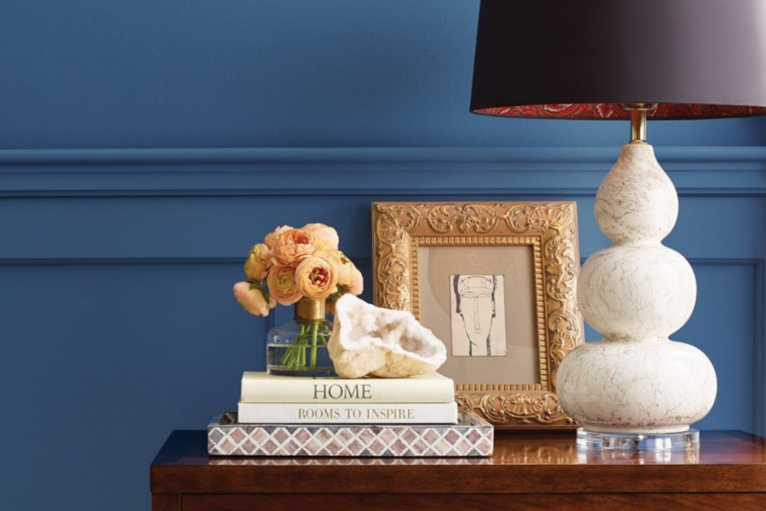
I’ve worked with so many colors over the years, but blue always stays close. It’s one of the few colors that can work in almost every room without feeling out of place. Some blues feel light and fresh, others feel deep and cozy. You can make a small hallway feel open with a soft blue. Or turn a large living room into something warmer with a richer shade.
Blue also works well with natural wood, white trim, brass, even black. I think that’s why so many families are drawn to it — it doesn’t fight with the rest of your home. It just fits in and does its job.
In this list, I’ve put together the best blues I’ve used lately — from Sherwin-Williams and Benjamin Moore.
Whether you’re painting one wall or a whole house, these colors are safe, beautiful choices that make real homes feel more comfortable, pulled together, and lived in.
Why Blue Is a Great All-House Color
Blue has something a lot of colors don’t: it makes people feel safe. And honestly, in a home, that matters. When I talk to clients about color, they often say they want something fresh — but not too bright. Something peaceful — but not flat. That’s usually when I suggest blue.
A study from the University of British Columbia found that blue encourages trust and calm thinking source. I see this play out all the time. People walk into a blue room and breathe a little deeper.
It also works with most styles. Whether your home is coastal, farmhouse, modern, or traditional, there’s a blue that fits. It doesn’t age fast. It doesn’t get too loud. It’s easy to match with fabrics, tiles, and woods.
That makes it one of the easiest choices when painting more than one room.
How to Use Blue Throughout Your Home
hen I’m planning colors for a full home, I look at how the rooms connect. Blue makes that easier.
You can shift tones — lighter, darker, warmer, cooler — and it still feels like it belongs.
- In the Kitchen
Dusty blues, blue-greens, or soft gray blues look great on lower cabinets or walls. They add just enough color without making the room too cold.
- In the Living Room
A deeper navy or slate blue brings warmth and weight. I’ve used it behind bookcases, around fireplaces, or on one full wall to help the room feel grounded.
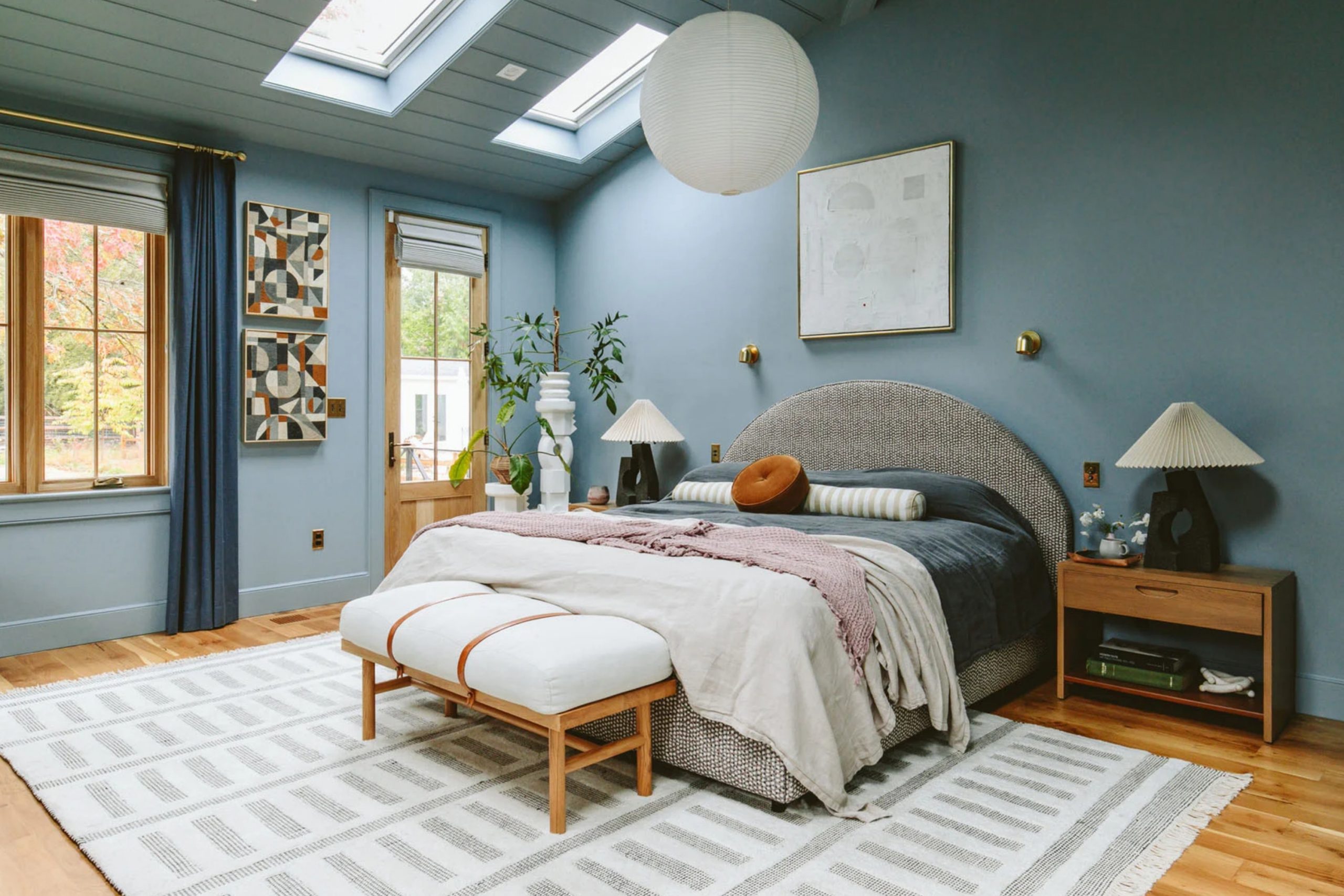
- In Bedrooms
Soft blue-gray shades work best. They help people relax. I also love using light blues on the ceiling — it gives the room a gentle lift.
- In Bathrooms
This is where I use the brighter, cleaner blues. Think of fresh water. It pairs well with white tile and brushed brass.
- In Hallways and Entries
I often go bold here. A strong blue can turn a simple entryway into something people remember.
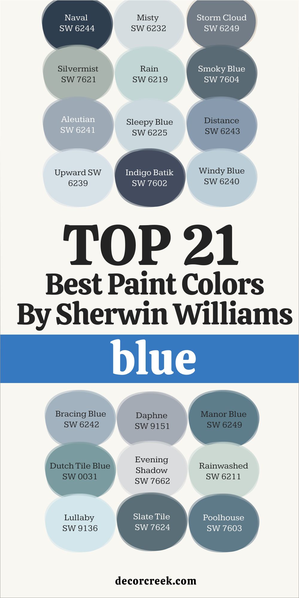
My Top 21 Best Blue Paint Colors of 2025 by Sherwin Williams
Naval SW 6244
Naval SW 6244 makes a bold statement without being loud. I’ve used it on front doors, bookshelves, and dining rooms. It’s deep, classic, and full of character. It also pairs well with crisp whites, soft creams, and natural wood tones.
It brings contrast to lighter spaces without feeling harsh. I often use it when a room needs more structure.
👉 Read the full guide for this color HERE 👈

Misty SW 6232
Misty SW 6232 is like a soft fog with a touch of blue. It’s calm and not too cool. I’ve used it in bedrooms and bathrooms where people want something clean but not icy.
It blends beautifully with pale wood and brushed nickel. It’s especially pretty in rooms with early morning light. It feels clean but still soft.
👉 Read the full guide for this color HERE 👈

Storm Cloud SW 6249
Storm Cloud SW 6249 feels strong without being dark. It’s moody in the best way. I’ve used it in living rooms where people wanted something cozier. It creates a grounded feel next to warm lighting and earthy textures.
It also works really well with leather furniture. It adds weight in a room without being too heavy.
Silvermist SW 7621
Silvermist SW 7621 is a soft mix of blue and green with gray. It reminds me of coastal homes but also works inland. It’s very livable and matches everything from walnut to white oak. In natural light, it shifts softly and adds a peaceful backdrop.
It looks amazing with natural woven materials. I’ve used it a lot in sunrooms and breakfast nooks.
Rain SW 6219
Rain SW 6219 is fresh and happy. It works best in laundry rooms, bathrooms, or kitchens with lots of light. It goes well with both warm and cool tones. It’s also a great choice for creating a breezy, everyday feel.
It looks clean without feeling sharp. Rain is a favorite when the goal is comfort and brightness.
👉 Read the full guide for this color HERE 👈
Smoky Blue SW 7604
Smoky Blue SW 7604 brings warmth to any room. I’ve used it in dens, guest rooms, and home offices. It’s cozy without being stuffy. It looks beautiful paired with rich wood tones and leather textures.
It has just enough depth to feel welcoming. I often suggest it for rooms where people want to relax.
👉 Read the full guide for this color HERE 👈

Aleutian SW 6241
Aleutian SW 6241 is a dusty blue with a hint of violet. It looks great next to cream, tan, and aged brass. A good choice for quiet color. It gives walls just enough interest without taking over the room.
It adds charm in traditional homes. I’ve even used it on bathroom vanities with gold hardware.
👉 Read the full guide for this color HERE 👈
Sleepy Blue SW 6225
Sleepy Blue SW 6225 helps bedrooms feel softer. It works with white curtains, soft bedding, and a calm morning vibe. Not too gray or babyish. It brings a rested feeling to quiet spaces.
It’s also nice in guest rooms and reading nooks. This one’s peaceful without being boring.
👉 Read the full guide for this color HERE 👈
Distance SW 6243
Distance SW 6243 is a mid-tone blue that’s well-balanced. I’ve used it on accent walls, mudroom cabinetry, and even ceilings. It has strength without heaviness.
Pair it with neutral flooring and white trim for a clean finish. It gives structure to open areas. It’s a confident but quiet color.
👉 Read the full guide for this color HERE 👈

Upward SW 6239
Upward SW 6239 feels like a clear morning sky. It’s perfect for bathrooms, ceilings, or small rooms. It adds lightness without too much color.
This shade works especially well in homes with lots of windows. It makes tight areas feel more open. It’s also very easy to coordinate with furniture.
👉 Read the full guide for this color HERE 👈

Indigo Batik SW 7602
Indigo Batik SW 7602 adds drama. I love it on kitchen islands or front doors. It’s bold but still tasteful. Pair it with aged brass and creamy whites for a classic contrast.
It holds up well in homes with traditional or modern style. It’s a great choice when the room needs a little strength.
👉 Read the full guide for this color HERE 👈

Windy Blue SW 6240
Windy Blue SW 6240 is breezy and casual. Great for family rooms or open spaces. It doesn’t clash with wood floors or neutral sofas. It feels natural in both daylight and artificial lighting.
I’ve used it in homes where comfort was key. It’s easygoing and very livable.
👉 Read the full guide for this color HERE 👈

Bracing Blue SW 6242
Bracing Blue SW 6242 is a cool, clear blue. Best in light-filled areas. I’ve used it in lake homes and farmhouse projects. It pops next to crisp whites and soft wood tones.
It feels cheerful but still grounded. This is a nice pick for kitchens and casual dining rooms.
👉 Read the full guide for this color HERE 👈
Daphne SW 9151
Daphne SW 9151 has a punchy tone with a slight violet cast. It still works as a wall color and pairs well with clean whites and deep browns. I’ve used it in modern dining rooms and accent walls.
It gives a fresh look with a hint of fun. Daphne brings a little energy to the room. It’s playful without feeling childish.
👉 Read the full guide for this color HERE 👈

Manor Blue SW 6249
Manor Blue SW 6249 is traditional with depth. I’ve used it in studies and formal living rooms. It gives a thoughtful feel. It fits especially well with antique furniture or traditional trim work.
Manor Blue pairs nicely with patterned fabrics. It feels sturdy but never stiff.
Dutch Tile Blue SW 0031
Dutch Tile Blue SW 0031 has a historic charm. It’s perfect in older homes with creamy whites and darker floors. I’ve also used it in powder rooms for a classic feel.
It has just enough depth to feel rich but not overpowering. It works well with subway tile and aged bronze. This one feels timeless in the best way.
Evening Shadow SW 7662
Evening Shadow SW 7662 is very pale and soft. Ideal for ceilings or small guest baths. Almost like a whisper. It can brighten tight areas without looking icy or flat.
It works great in homes with low ceilings. It gives a soft glow without drawing too much attention.
👉 Read the full guide for this color HERE 👈

Rainwashed SW 6211
Rainwashed SW 6211 leans slightly green. I’ve used it in beach homes and kitchens. It’s soft and inviting.
It works well with sandy tones, rattan, and light fabrics. It makes a nice contrast to bright whites. Rainwashed always feels friendly and easy.
👉 Read the full guide for this color HERE 👈

Lullaby SW 9136
Lullaby SW 9136 is a gentle light blue. Great in nurseries or home offices with pale oak and white trim. It adds a bit of sweetness to the room.
It never feels too young or too plain. I’ve used it with floral patterns and natural baskets. It brings warmth without being obvious.
Slate Tile SW 7624
Slate Tile SW 7624 is bold and modern. Almost charcoal in certain light. I love it in homes with strong contrast. It looks sharp with black accents and natural stone.
Slate Tile feels architectural and focused. It’s a color that brings seriousness in a good way.
👉 Read the full guide for this color HERE 👈

Poolhouse SW 7603
Poolhouse SW 7603 is a balanced mid-tone blue. I’ve used it indoors and out. It holds color well and feels steady. It fits with warm metals and neutral fabrics for a relaxed, clean finish.
It’s great for living rooms with mixed textures. Poolhouse gives a sense of balance that’s easy to live with.
👉 Read the full guide for this color HERE 👈
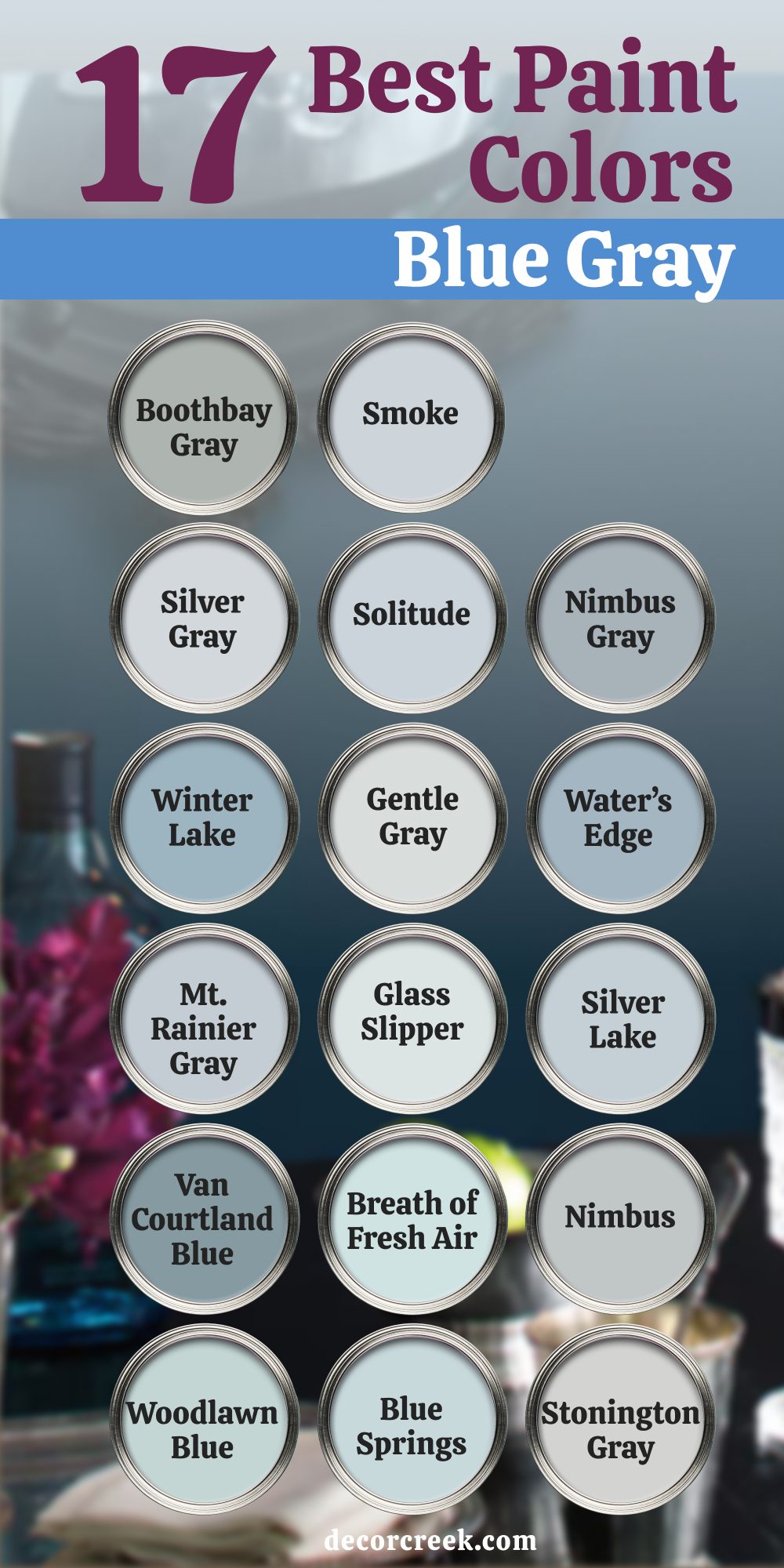
17 best blue gray paint colors by Benjamin Moore
Winter Lake 2129-50
Winter Lake 2129-50 has a relaxed, worn-in feeling that works beautifully in bedrooms. It’s the kind of color that quietly supports everything else in the room without trying too hard.
I’ve used it in coastal homes, but also in urban spaces where clients wanted something soft. It pairs nicely with ivory bedding, natural fibers, and cool stone. The blue tones come forward more in the afternoon light.
It’s reliable and always feels well-balanced.
Gentle Gray 1626
Gentle Gray 1626 is a light gray with a touch of softness that keeps it from feeling flat. It has just enough blue to keep it cool but still warm enough to work with creamy whites. I’ve used it in bathrooms, hallways, and kids’ rooms. It’s perfect when someone wants color but doesn’t want anything bold.
Gentle Gray is one of those “safe” shades that still has personality. It looks especially good with brushed nickel and marble.
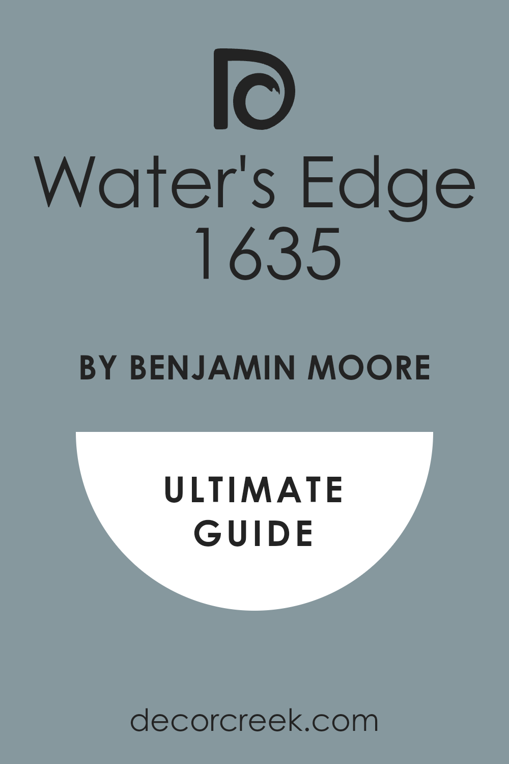
Water’s Edge 1635
Water’s Edge 1635 walks the line between a smoky blue and a gentle gray. It works really well in bedrooms and offices where you want a bit of mood. I’ve used it behind shelves and on built-ins, and it helps give the room definition. It pairs well with warm wood and matte black fixtures.
I also love how it looks next to natural linen and woven materials. Water’s Edge holds up through all kinds of light.
👉 Read the full guide for this color HERE 👈
Mt. Rainier Gray 2129-60
Mt. Rainier Gray 2129-60 is a quiet, clean color with a strong presence. It leans more blue in the morning light, more gray as the sun fades. I’ve used it in bedrooms where we wanted a hint of color that wasn’t too obvious. It looks great with white trim and soft neutral furniture.
It also adds just enough contrast to built-ins. This color makes small rooms feel fresh.
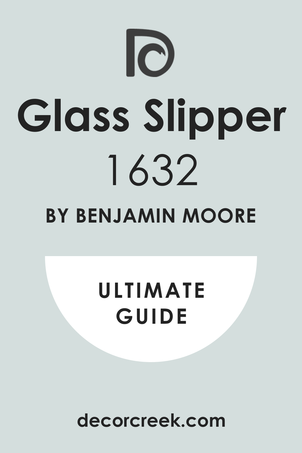
Glass Slipper 1632
Glass Slipper 1632 is one of the palest options on this list, but it still adds a clear feeling to a room. It feels crisp and a little playful. I like it for ceilings, bathrooms, and nurseries. It pairs beautifully with white tile, light wood floors, and simple textiles.
It works best in rooms that get plenty of natural light. Glass Slipper makes things feel tidy but not stiff.
👉 Read the full guide for this color HERE 👈
Silver Lake 1598
Silver Lake 1598 is a cool, clean shade that feels quiet without being boring. It’s great for modern homes or spaces with clean lines. I’ve used it in bathrooms and kitchens where we needed something light but not too stark. It pairs well with steel, chrome, and darker gray counters.
It’s also surprisingly pretty in natural light. Silver Lake is a great background when you want other details to shine.
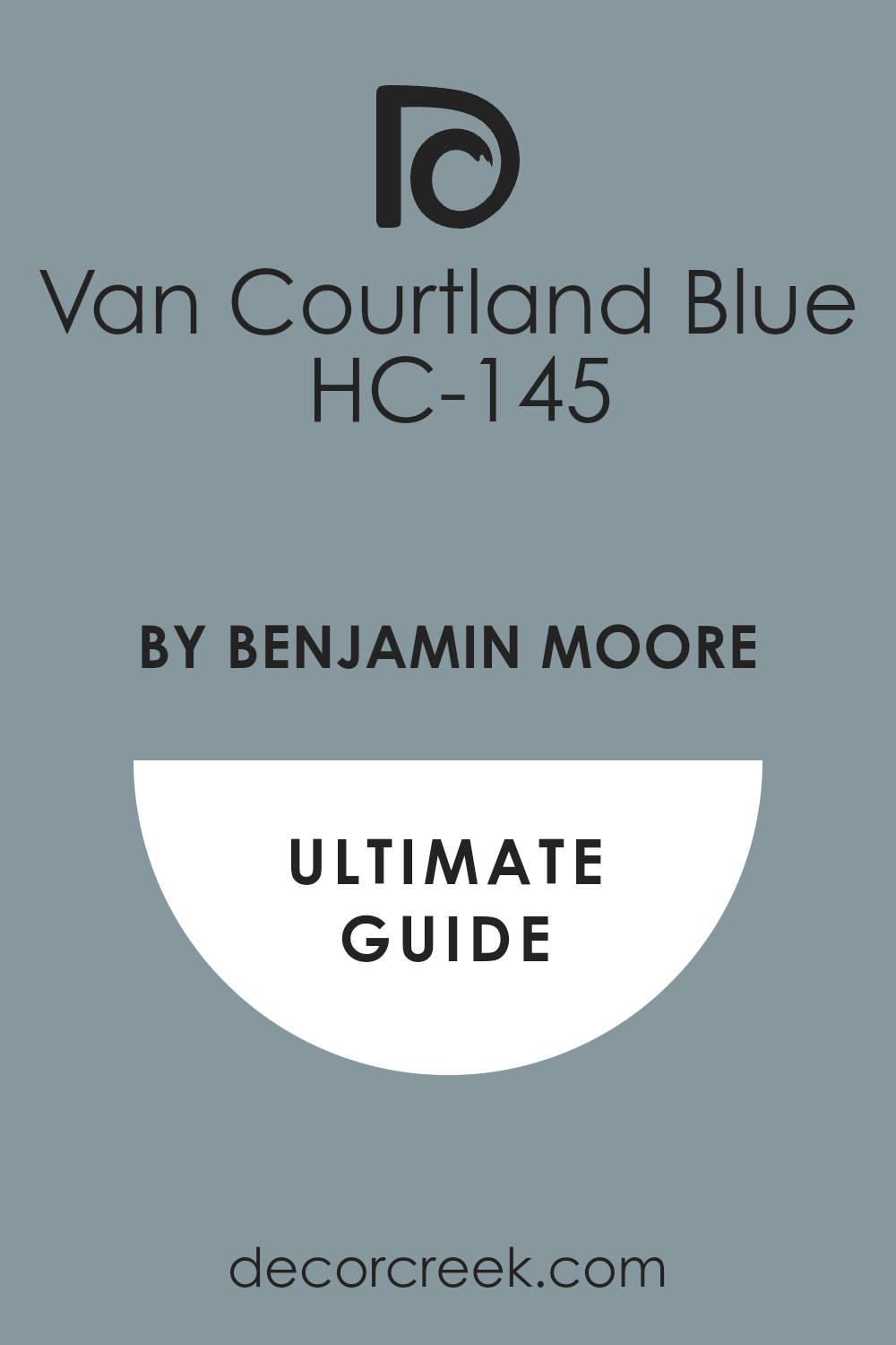
Van Courtland Blue HC-145
Van Courtland Blue HC-145 leans a little traditional, and that’s what I like about it. It has a strong personality but still feels comfortable. I’ve used it in formal dining rooms and libraries. It pairs well with cream, soft gold, and even deeper navy.
It has that historic feel without being old-fashioned. Clients always say it feels thoughtful and grown-up.
👉 Read the full guide for this color HERE 👈
Breath of Fresh Air 806
Breath of Fresh Air 806 is exactly what it sounds like — it feels light and refreshing. I’ve used it in bedrooms, laundry rooms, and once in a tiny entryway that needed lifting. It pairs really well with white trim and light wood.
It’s not too strong, so it doesn’t compete with other decor. I also love it with wicker and washed fabrics. It’s soft but never disappears.
Nimbus 1465
Nimbus 1465 is a great all-house color that quietly adapts to what’s around it. It leans slightly cool but has just enough warmth to avoid feeling flat. I’ve used it in open living rooms, entryways, and hallways. It plays well with natural wood and matte finishes.
Nimbus helps rooms feel finished but still casual. It’s one of my most-used background blues.
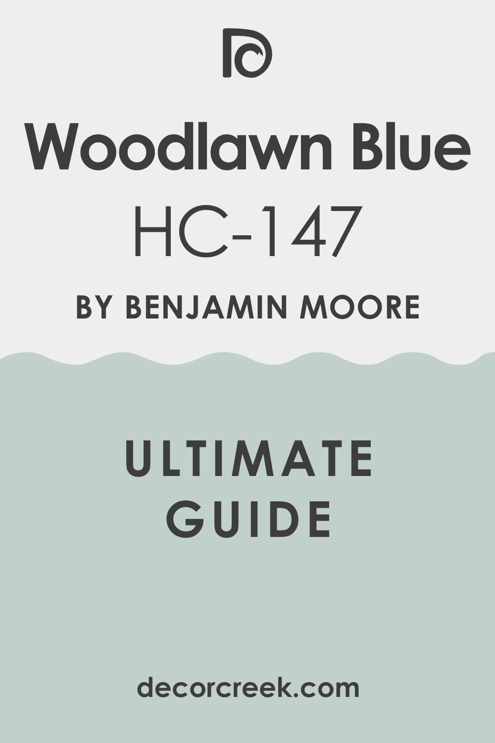
Woodlawn Blue HC-147
Woodlawn Blue HC-147 has a tiny bit of green in it, which gives it a soft, lived-in feeling. It works best in homes with lots of daylight and natural materials. I love using it in kitchens, sunrooms, and upstairs bedrooms. It brings a softness without feeling too sweet.
It’s also nice with brass hardware and soft white walls. Woodlawn Blue is one of those shades that puts people at ease.
👉 Read the full guide for this color HERE 👈
Blue Springs 1592
Blue Springs 1592 is a pale blue-gray that feels relaxed and welcoming. It’s great in guest rooms and shared spaces. I’ve used it in homes that needed a light color that wasn’t just another white. It pairs well with soft textures and weathered woods.
The gray tones help ground it, so it doesn’t feel too light. Blue Springs has a way of making rooms feel open.
Stonington Gray HC-170
Stonington Gray HC-170 is probably one of the most well-known grays for a reason. It has just the right amount of blue to keep it cool and interesting. I’ve used it in whole-house projects where we wanted flow without feeling too neutral.
It works in every light and always feels calm and clear. It pairs well with black, white, or wood. It’s a color you can build a full home around.
👉 Read the full guide for this color HERE 👈

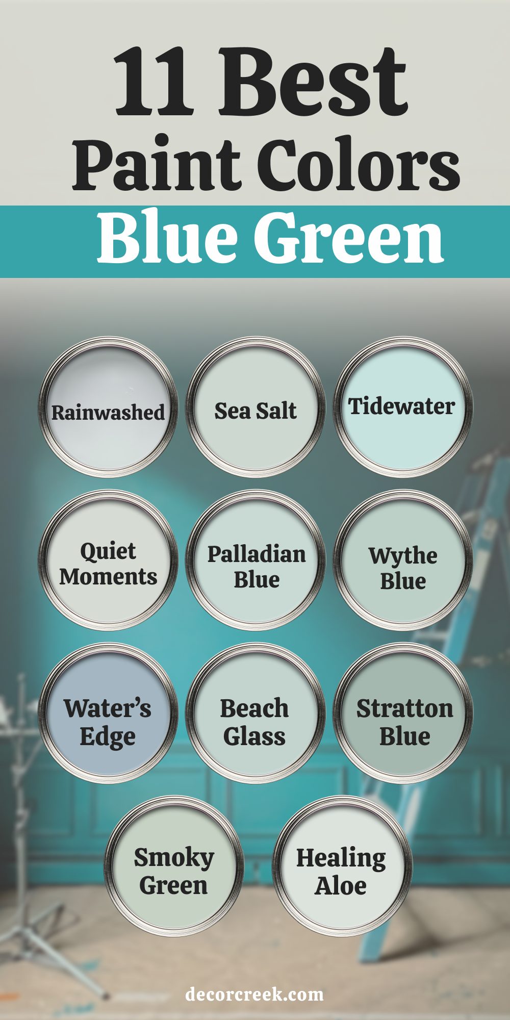
Top 11 Beautiful Blue Green Paint Colors from Benjamin Moore & Sherwin-Williams
Rainwashed SW 6211
Rainwashed SW 6211 is one of the most loved blue-green shades I’ve ever used. It’s soft, gentle, and leans slightly green in natural light. I’ve painted it in kitchens, laundry rooms, and even living rooms. It pairs perfectly with white tile, driftwood finishes, and sandy neutrals.
Rainwashed brings a soft brightness that makes a room feel lived-in. It’s a favorite for coastal and country-style homes.
👉 Read the full guide for this color HERE 👈
Sea Salt SW 6204
Sea Salt SW 6204 shifts between green and blue depending on the time of day. I’ve used it in bedrooms, bathrooms, and cozy reading nooks. It looks beautiful with matte black fixtures, soft gray linens, and rattan pieces. It never feels too sharp or too washed out.
Clients say it helps the room feel lighter. It’s a crowd-pleaser every time.
👉 Read the full guide for this color HERE 👈

Tidewater SW 6477
Tidewater SW 6477 is a cheerful blue-green that feels easy to live with. It’s just a little stronger than Sea Salt and works great in bright rooms. I love pairing it with white trim, brass accents, and natural light. I’ve used it in bathrooms, kids’ spaces, and even as a ceiling color.
It adds a gentle lift to any room. It always feels welcoming and soft.
👉 Read the full guide for this color HERE 👈
Quiet Moments 1563
Quiet Moments 1563 is a peaceful mix of green, blue, and gray. It’s one of the most balanced tones I’ve used. It fits beautifully in bedrooms, hallways, and relaxed living areas. I like to match it with brushed gold, soft cotton, and pale wood. It adjusts to whatever light you give it.
It brings a feeling of comfort that makes people want to stay in the room.
👉 Read the full guide for this color HERE 👈

Palladian Blue HC-144
Palladian Blue HC-144 is a historic shade with a gentle personality. It leans cool, but it never feels flat. I’ve used it in kitchens, mudrooms, and upstairs hallways. It pairs really well with white cabinets and warm floors.
It’s a great option when you want color without going bold. It always adds a light, airy feel.
👉 Read the full guide for this color HERE 👈

Wythe Blue HC-143
Wythe Blue HC-143 is deeper and more grounded than Palladian Blue. It has a touch of green that adds character. I’ve used it on kitchen cabinets, bathroom vanities, and even doors. It works beautifully with gold hardware and dark counters.
It adds style without being too trendy. Wythe Blue makes a room feel thoughtful.
👉 Read the full guide for this color HERE 👈

Water’s Edge 1635
Water’s Edge 1635 is a smoky blue-green that looks soft in every kind of light. I’ve used it in bedrooms, offices, and built-in shelves. It gives structure without being too bold. Pair it with warm wood, soft whites, and simple fabrics.
It works in both coastal and more classic homes. It’s a color that always feels settled.
👉 Read the full guide for this color HERE 👈
Beach Glass 1564
Beach Glass 1564 brings a faded, gentle energy to a room. It shifts between soft blue and green depending on what’s around it. I’ve used it in bedrooms, sunrooms, and casual dining rooms. It goes great with whitewashed furniture and woven rugs.
It never tries too hard. Beach Glass feels easy and lived-in.
👉 Read the full guide for this color HERE 👈

Stratton Blue HC-142
Stratton Blue HC-142 is rich and a little deeper than many on this list. It has strong blue-green tones that give it presence. I’ve used it in dining rooms and libraries where we wanted something more grounded. It looks great with traditional trim and antique wood.
It’s a statement without being loud. Stratton Blue works well in older homes.
Smoky Green CC-700
Smoky Green CC-700 has a soft green base with a hazy, quiet blue edge. I’ve used it in kitchens, bathrooms, and even stairwells. It’s great for clients who want color but nothing too bright. It matches well with pale wood, matte finishes, and linen fabrics.
This color holds its own in both old and new homes. Smoky Green brings a subtle calm without being cold.
Healing Aloe 1562
Healing Aloe 1562 is one of the most peaceful shades I’ve painted. It’s pale but not weak, and it has just enough blue to make it fresh.
I love using it in bedrooms and bathrooms with soft towels and white tile. It works beautifully with natural light and adds a touch of cheer. Healing Aloe feels gentle and light.
It’s one of those colors that makes people smile when they walk in.
👉 Read the full guide for this color HERE 👈

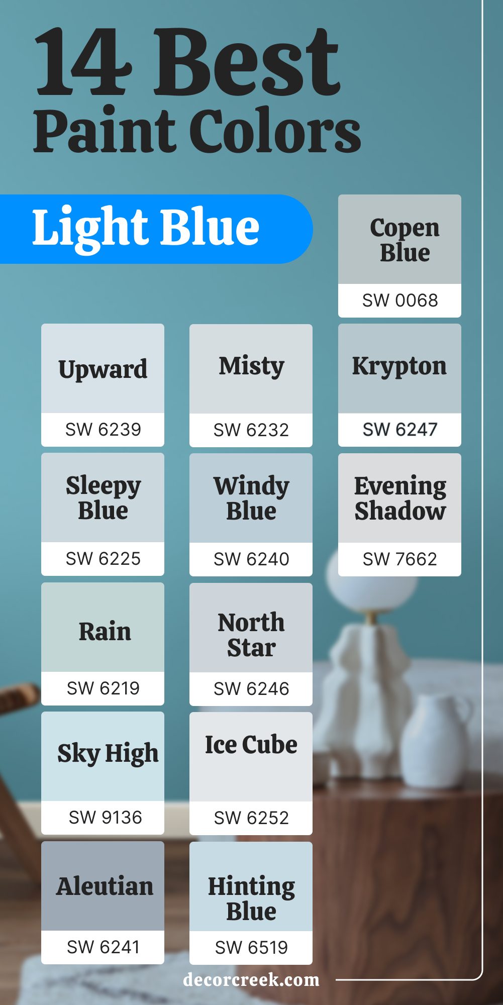
My Top 14 Picks: Sherwin-Williams Light Blues
Upward SW 6239
Upward SW 6239 is one of the easiest light blues to use in any home. It feels like a soft morning sky and works really well on ceilings or in smaller rooms. I’ve used it in bathrooms and laundry areas where the light bounces gently off the walls.
It pairs nicely with white trim and warm wood floors. It doesn’t feel too cold, even in shady corners.
Upward helps the room feel open and easy.
👉 Read the full guide for this color HERE 👈
Misty SW 6232
Misty SW 6232 is a pale blue with a hint of foggy gray. I love it for bedrooms where clients want something clean but not icy. It looks great with natural wood and soft beige accents.
I’ve also used it in hallways and small dens. It holds color nicely without drawing too much attention. Misty feels balanced and soft.
👉 Read the full guide for this color HERE 👈
Sleepy Blue SW 6225
Sleepy Blue SW 6225 feels relaxed from the moment it goes on the wall. I’ve used it in guest rooms and nurseries where we wanted something light but not dull.
It’s soft, smooth, and easy to pair with linen, white, or gentle pinks. It also looks great in the evening light. This is one of my top colors for cozy corners. It keeps things feeling light without being too pale.
👉 Read the full guide for this color HERE 👈
Windy Blue SW 6240
Windy Blue SW 6240 has a fresh, everyday feel to it. It’s great for family rooms, sunrooms, and places where people gather. It looks soft in both daylight and artificial light.
I’ve used it with white shiplap, light floors, and soft grays. It brings a laid-back feel that helps rooms feel more relaxed. Windy Blue always feels approachable.
👉 Read the full guide for this color HERE 👈
Rain SW 6219
Rain SW 6219 leans a little green but still feels like a true blue in most light. It’s perfect for bathrooms and laundry rooms. I’ve also used it in kitchens with white cabinets and gold hardware.
It gives off a clean but easygoing feel. It pairs well with warm wood and stone. Rain gives off just enough personality without being bold.
👉 Read the full guide for this color HERE 👈
North Star SW 6246
North Star SW 6246 is a cooler-toned light blue that’s great for clean, simple interiors. I like it in bathrooms, closets, and even entryways. It holds color well without looking harsh.
I’ve seen it look especially nice with white trim and dark floors. It brings a fresh, airy feeling to the room. North Star always feels steady and neat.
👉 Read the full guide for this color HERE 👈
Sky High SW 6504
Sky High SW 6504 feels cheerful without being too bright. I’ve used it on ceilings, in bathrooms, and once in a tiny sunroom where it looked amazing. It works best in rooms with lots of natural light.
Pair it with soft fabrics and brushed metals for a bright, clean feel. It also holds up well in kids’ spaces. Sky High lifts the mood of any room.
👉 Read the full guide for this color HERE 👈

Lullaby SW 9136
Lullaby SW 9136 is soft and sweet, but still feels grown-up. I’ve used it in nurseries, playrooms, and even a home office. It goes well with pale wood, white trim, and soft beige.
Lullaby doesn’t get lost in a bright room. It keeps things calm and friendly. This one is gentle without being dull.
Ice Cube SW 6252
Ice Cube SW 6252 is very light with just a hint of coolness. It works well in modern bathrooms or bright kitchens. I’ve used it when the walls needed a bit of lift but nothing dramatic.
It pairs well with stainless steel, light woods, and simple tile. Ice Cube gives a crisp, tidy feel. It helps the room feel clean without being cold.
👉 Read the full guide for this color HERE 👈
Aleutian SW 6241
Aleutian SW 6241 leans a bit violet but still reads as a soft blue. I love it in bedrooms and powder rooms. It has a vintage charm without looking dated.
I’ve paired it with antique brass and floral prints for a soft, layered feel. Aleutian works great with cream and blush. It feels cozy and a little creative.
👉 Read the full guide for this color HERE 👈
Hinting Blue SW 6519
Hinting Blue SW 6519 feels clear and easygoing. I’ve used it in stairwells, bathrooms, and even mudrooms. It plays well with both modern and classic styles.
It looks best with clean whites and soft grays. It doesn’t overwhelm, but it definitely adds freshness. Hinting Blue helps bring energy to quiet spots.
Copen Blue SW 0068
Copen Blue SW 0068 has a warm, vintage touch that I really like in older homes. I’ve used it on cabinets, doors, and once in a small library.
It looks great with aged brass and darker wood tones. It also holds up well in rooms that don’t get much light. Copen Blue adds softness without feeling thin. It’s gentle but grounded.
👉 Read the full guide for this color HERE 👈
Evening Shadow SW 7662
Evening Shadow SW 7662 is very light and cool. It’s great for ceilings or tight spaces that need to feel a little bigger. I’ve used it in powder rooms, hallways, and once in a small kitchen with white cabinets.
It reflects light gently without feeling sterile. Evening Shadow adds a soft breath to the room. It’s great for when you want just a touch of color.
👉 Read the full guide for this color HERE 👈
Krypton SW 6247
Krypton SW 6247 is a light blue with gray in it, which gives it a more modern feel. I’ve used it in offices, guest rooms, and open plan living spaces.
It looks especially good with matte black, pale oak, and warm white. It doesn’t shift too much in changing light. Krypton feels tidy, put together, and comfortable.
It’s a good bridge between cool and warm tones.
👉 Read the full guide for this color HERE 👈
Final Take From My Projects
I’ve painted a lot of rooms over the years. And I can honestly say — blue is one color I never get tired of. It fits into so many homes, so many styles, and so many moods.
Some clients ask for soft blues that help them feel more relaxed after a long day. Others want bold, rich blues that make the room feel strong and grounded. And the best part? There’s always a shade that works.
The colors in this list aren’t guesses. They’re the ones I keep coming back to because they work in real homes with real people. They hold up to changing light, different furniture, busy lives. Some of them look like a breath of fresh air. Others feel warm and steady. And that’s what makes blue so good — it doesn’t try too hard. It just helps the room feel better.
If I had to name a few I trust the most?
Upward by Sherwin-Williams is one of the easiest light blues to work with. Quiet Moments by Benjamin Moore fits in almost any room.
And Slate Tile brings drama when you need it. But truly — every single one of these shades has done a good job in the homes I’ve worked on. And I wouldn’t recommend them if they didn’t.
