As an experienced home interior designer and staging expert specializing in high-end properties, I recognize that the process of painting a penthouse goes far beyond a simple surface application. It is, fundamentally, about crafting a powerful and stunning backdrop that perfectly complements a luxury, aspirational lifestyle. The paint colors chosen must perform a dual role: they need to project an air of unmistakable sophistication while simultaneously embracing contemporary modernity.
Looking ahead to 2026, the dominant design currents favor a palette of shades that feel undeniably fresh and current, yet remain deeply grounded and timeless. These are the colors engineered to look magnificent regardless of the moment—whether they are setting the stage for a lavish social gathering or simply providing a serene canvas for someone enjoying a spectacular sunset view high above the city.
This comprehensive guide is a carefully curated and personal collection of the 37 absolute best paint colors available today. I have primarily sourced these shades from my two most trusted, go-to premium brands in the industry: Sherwin-Williams and Benjamin Moore.
Throughout this resource, I will meticulously detail exactly why I rely on the superior quality of these companies and, critically, share the precise methodology I use to select the specific hues that flawlessly align with the demands of high-end, luxury living.
Prepare to discover the perfect, winning color that will elevate and define your magnificent penthouse view!
Why I Always Trust Sherwin-Williams and Benjamin Moore for Penthouse Paint Colors
When advising on or executing a design project for a high-value, luxury property such as a penthouse, two non-negotiable elements are paramount: uncompromising quality and unwavering consistency. This absolute need for excellence is precisely why I place my complete confidence in Sherwin-Williams and Benjamin Moore.
Both of these industry leaders produce paints distinguished by their fantastic depth of color, a feature that is essential when dealing with the expansive, often brightly illuminated wall surfaces that are typical of penthouse architecture. Their product formulations consistently deliver superior, reliable coverage, which translates directly into needing fewer coats, significantly streamlining the application process, saving labor time, and ensuring an immaculate, flawless final finish.
Furthermore, the pigment quality within their formulations is exceptional, guaranteeing that the colors remain true and rich over time, fiercely resisting the effects of fading and beautifully maintaining their gorgeous appearance for many years. Both brands also offer extensive and thoughtfully curated color palettes, encompassing hundreds of sophisticated shades that specifically appeal to the discerning tastes of a high-end clientele.
Crucially, I can depend implicitly on the accuracy of their samples and color matches, which is a vital factor when presenting options and securing approval from my clients. To state it plainly, these two brands are consistently able to deliver the premium, lasting results that every luxury penthouse demands and deserves, providing a level of durability, richness, and overall aesthetic superiority that simply cannot be matched by lower-cost alternatives.
How I Choose the Perfect Paint Shades to Match a Penthouse Lifestyle
Choosing the right paint for a penthouse involves more than just picking a pretty shade; it requires a thoughtful assessment of the entire living experience. First, I carefully consider the natural light and the view. A penthouse often gets lots of sunlight, so I must select colors that won’t wash out or look harsh under intense light.
The specific direction the windows face—north, south, east, or west—dramatically changes how a color reads, so I always test large swatches on multiple walls. Second, I think about the architecture and existing finishes. Penthouse units usually feature high ceilings, premium flooring, and unique architectural details; the paint must harmonize with these expensive elements.
Third, I focus on the mood and function of each room. Is it a grand living room meant for entertaining, or a cozy private study? The color needs to support that function. I also always consider the client’s personal style, ensuring the final selection feels tailored and special, not generic. Finally, the colors must possess a sense of sophistication, using muted tones or rich, saturated shades that signal luxury.
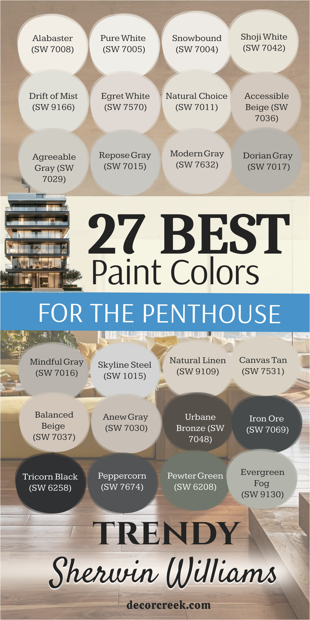
37 Trendy Paint Colors For The Penthouse
Alabaster SW 7008
Alabaster is a beautifully creamy white that feels soft and inviting, unlike stark, cold whites. This shade offers a gentle warmth that makes a large living room feel welcoming without losing its sophistication. It works wonderfully in spaces with large windows because it reflects light without a harsh glare. The color is a perfect go-to for trims and ceilings when you want a little more dimension than a pure white.
This creamy hue pairs beautifully with natural wood tones and rich metals like brass. It has a very slight beige undertone, which prevents it from looking sterile in any light. This color is consistently one of Sherwin-Williams’ most popular and versatile whites, which speaks to its wide appeal.
It acts as a fantastic gallery-style backdrop for showcasing high-end art and furnishings. This specific white keeps the overall look light and airy, an ideal aesthetic for high-rise city living. It helps connect different rooms in an open-concept penthouse with a unified, soothing color.
👉 Read the full guide for this color HERE 👈

Shoji White SW 7042
Shoji White is a highly sophisticated off-white that carries noticeable warm, beige-gray undertones. The color gives walls a wonderful richness that many standard whites cannot achieve. It looks beautiful when bathed in natural light, revealing its subtle depth and complexity. This shade works perfectly as a primary wall color in a spacious penthouse master suite or main living area.
It provides just enough contrast against a crisp white trim without creating too harsh a line. The hue pairs exceptionally well with darker accent colors like deep blues or charcoal grays. This off-white can make a modern apartment feel cozier and less starkly contemporary.
It is an excellent choice for staging because it appeals to almost everyone who walks into the home. This color has a certain quiet elegance that is absolutely fitting for a luxury environment. It avoids looking yellow or too cool, maintaining a clean yet warm presence.
👉 Read the full guide for this color HERE 👈

Drift of Mist SW 9166
Drift of Mist is an ethereal light gray that has a very gentle, almost invisible green or beige undertone. This paint is a fantastic color for creating a relaxed, yet expensive-looking atmosphere in a main hallway or dining area. It changes beautifully with the light throughout the day, looking cool and crisp in the morning and softer by evening.
This neutral provides a perfect, neutral anchor that allows colorful art and accessories to truly shine. The gray is a quiet shade that never dominates the room but always supports a chic design. It is lighter than many other grays, making it suitable for rooms that don’t receive abundant light.
This color works well with both warm wood flooring and cooler marble or tile selections. It is a contemporary choice that doesn’t feel overly trendy, ensuring long-term appeal. This shade is one of those colors that designers rely on for a sophisticated and subtle wall finish. It helps to visually connect indoor living areas with large outdoor balcony views.
👉 Read the full guide for this color HERE 👈

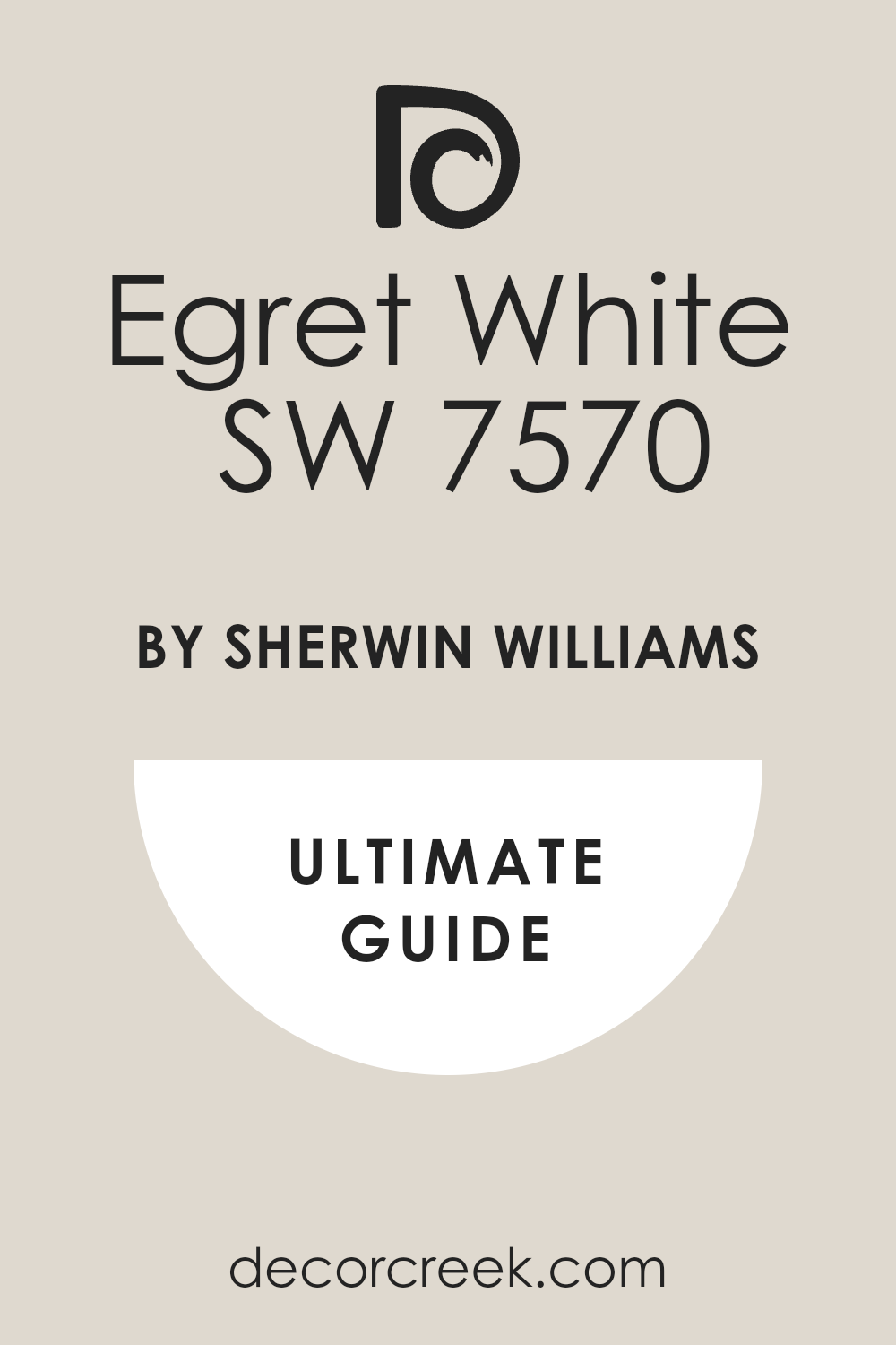
Egret White SW 7570
Egret White is an exceptionally soft white that shows a bit more beige and a touch of gray than a pure white. This paint is a great option for those who want a white wall but are afraid of it looking too cold or clinical. It holds up well in south-facing rooms where direct sunlight might wash out a less complex color.
The shade makes large rooms feel bright and airy while still maintaining a sense of luxurious warmth. It can be used on both walls and trim for a monochrome, seamless architectural effect. This color coordinates well with both light and medium wood tones, offering great flexibility in furnishing.
It has a maturity to it that makes it a perfect fit for a mature, well-designed penthouse. The white looks fantastic with textural elements like linen drapery or woven rugs. It helps highlight interesting architectural features without drawing too much attention to itself. This is a reliable and highly appealing neutral for any central living area.
👉 Read the full guide for this color HERE 👈
Accessible Beige SW 7036
Accessible Beige is a fantastic, popular shade that truly bridges the gap between beige and gray, resulting in a true greige. This specific hue has just enough warmth to feel inviting but is cool enough to pair well with modern finishes. It is a wonderful primary color for an entire open-concept living area, providing flow and continuity.
This color is an excellent alternative to gray for those who prefer a slightly earthier, more grounded feeling. It works with a vast array of furniture colors, from deep navy to soft creams and bright whites. This greige is a highly dependable neutral that rarely disappoints in varying lighting conditions.
It is often used in staging because it is non-offensive and feels very high-quality. The color pairs beautifully with dark wood furniture, offering a nice contrast. It is a great option for a library or study where a more cozy, rich atmosphere is desired. This is one of Sherwin-Williams’ top-performing, most versatile neutrals for a reason.
👉 Read the full guide for this color HERE 👈

Natural Linen SW 9109
Natural Linen is a warm, sandy neutral that brings an organic and highly sophisticated feeling to the walls. This color is a beautiful alternative to stark gray, offering a much softer, sun-kissed appearance. It works beautifully in rooms featuring lots of natural materials like stone, wood, and cotton.
This hue gives the feeling of walking into a five-star resort suite, making it perfect for a penthouse bedroom. The paint works well on all four walls, creating a cozy and luxurious envelope of color. It has a subtle depth that prevents it from looking dull or washed out.
This color is an excellent complement to white trim, providing a clean yet inviting separation. It is a calming color that still manages to feel refined and expensive. The beige looks especially good paired with dark bronze or black metal accents. It can easily transition between formal and casual areas of the home.
👉 Read the full guide for this color HERE 👈

Modern Gray SW 7632
Modern Gray is a warm, light greige that has a strong pull toward the beige side while maintaining the sophistication of gray. This light shade is a wonderful choice for creating a gentle, luminous backdrop in a primary living room.
It works well with bright, vibrant accent colors, allowing them to truly pop off the walls. This greige has a lovely balance that prevents it from appearing either too cool or too yellow. It is a dependable neutral that performs consistently in both artificial and natural lighting. This color is a sophisticated option for a guest suite or secondary bedroom in the penthouse.
It provides a very clean, crisp look that many luxury homeowners seek out. The hue is an easy color to pair with various types of marble or quartz countertops. It helps a room feel current and well-designed without being overly stark. This is one of my most recommended warm neutrals from the Sherwin-Williams collection.
👉 Read the full guide for this color HERE 👈

Repose Gray SW 7015
Repose Gray is a very popular, balanced gray that leans slightly toward a warm undertone, often reading as a pale greige. This gray is the perfect foundational color for a contemporary penthouse design that relies on texture and interesting furnishings.
It works well in almost any room of the house, from kitchens to bathrooms and living areas. This color is a true neutral that won’t fight with any existing finishes or fabric colors in the room. It has enough depth to provide contrast against white trim without making the room feel heavy.
This shade is a fantastic wall color for staging because it has broad appeal and looks current. It has a very clean and sophisticated appearance, which is important for a luxury residence. The color can sometimes show a very slight purple undertone, so it is important to test it in your unique light. It is a great choice if you want a true gray that doesn’t feel cold or institutional. This is one of Sherwin-Williams’ best-selling colors for a reason, offering reliability and style.
👉 Read the full guide for this color HERE 👈

Dorian Gray SW 7017
Dorian Gray is a gorgeous medium-toned gray that carries a slightly warm, earthy brown undertone, giving it great richness. This gray is an excellent choice for a dramatic accent wall or a very cozy, dedicated media room. It provides a nice, grounding effect that can make a large, open room feel more anchored and inviting.
The paint looks particularly handsome when contrasted with crisp white trim and dark wood floors. This hue has a sophisticated maturity that makes it perfect for a formal dining room or study. It is a fantastic color for highlighting artwork because it lets the colors truly stand out.
The shade has enough pigment to stand up to bright light without looking washed out. It works beautifully with metallic finishes, especially brushed nickel and chrome. This color is a richer shade than Repose Gray, offering a bit more drama and weight to the walls. It makes a room feel instantly designed and highly tailored.
👉 Read the full guide for this color HERE 👈

Urbane Bronze SW 7048
Urbane Bronze is a very deep, rich bronze that reads as an almost black, warm charcoal with deep brown and green undertones. This color is an incredibly impactful shade, perfect for creating a dramatic accent wall behind a fireplace or bed. It has a stunning depth that adds a sense of grounded luxury and sophisticated drama to any penthouse space.
This was a Sherwin-Williams Color of the Year, highlighting its on-trend status and versatility in high-end design. The bronze looks fantastic on kitchen cabinetry or a large, central island for a bold design statement. It pairs beautifully with light, creamy whites and natural textures like linen and leather.
This shade provides a moody, cozy atmosphere, making it a great choice for a private study or library. It is a powerhouse color that requires minimal décor to make a huge impression. This paint is an excellent choice for a contemporary or industrial-style penthouse aesthetic. It ensures the room feels instantly expensive and utterly unforgettable.
👉 Read the full guide for this color HERE 👈

Iron Ore SW 7069
Iron Ore is a deeply saturated, nearly-black charcoal gray that has a definite softness and sophistication. This color is a marvelous option for an architectural feature wall or for the walls of a dramatic powder room. It is a contemporary favorite that works extremely well in minimalist or highly masculine designs.
This charcoal has a slightly warmer feel than Tricorn Black, which prevents it from looking too stark or harsh. It looks incredible when used on interior doors for a sharp, defined contrast against light walls. This shade provides an incredible background for displaying vibrant, colorful modern art.
It works beautifully with brass and gold accents, creating an instant feeling of high luxury. This dark gray is a rich, grounding color that can help a large, tall room feel a bit more intimate. It is a fantastic alternative to true black when you want a similarly bold effect with more depth. This is one of those sophisticated, dark colors that always feels correct in a high-end setting.
👉 Read the full guide for this color HERE 👈

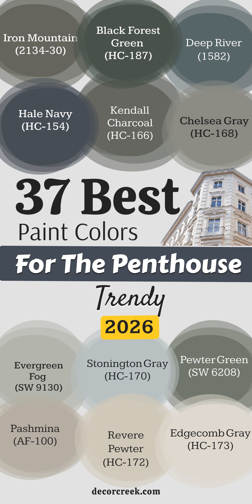
Pewter Green SW 6208
Pewter Green is a gorgeous, muted green-gray that has an earthy, yet very refined and grounding quality. This paint works beautifully to introduce a touch of nature’s richness into a high-rise city dwelling. It is a fantastic choice for a dedicated home office or a relaxing den off the main living area.
This shade has a certain vintage charm that can feel incredibly sophisticated and welcoming. It pairs wonderfully with warm wood tones and creamy white trim, creating a classic aesthetic. This color is an excellent choice for kitchen cabinetry, giving the space a unique and custom look. It is deep enough to feel rich but still has enough gray to keep it feeling current and neutral.
The green looks fantastic when used in a room with metallic light fixtures and leather furniture. It is a cozy, rich color that never fails to add depth and personality to a room. This hue brings a layer of grown-up color without being overly bright or distracting.
👉 Read the full guide for this color HERE 👈

Evergreen Fog SW 9130
Evergreen Fog is a soft, gentle green-gray that was Sherwin-Williams’ 2022 Color of the Year, showing its current appeal. This paint has a very soothing, organic quality that makes a room feel instantly peaceful and highly designed. It is a wonderful choice for a master bedroom or a reading nook where tranquility is key.
This color is versatile enough to work with modern furnishings as well as more traditional pieces. The shade can look more gray or more green depending on the time of day and the room’s lighting conditions. It pairs beautifully with brass hardware and light oak flooring for a fresh, sophisticated look.
This color is the perfect shade for introducing color without making a bold, attention-grabbing statement. It is a highly refined color that feels mature and well-considered in a luxury setting. This paint is a great choice for a bathroom vanity or an accent wall in a quiet living room. It is one of those colors that feels unique and memorable without being flashy.
👉 Read the full guide for this color HERE 👈

Sea Salt SW 6204
Sea Salt is a very light, almost pastel gray-green that has a distinct watery, coastal feel to it. This paint is a highly popular color for bathrooms and secondary bedrooms where a touch of whimsy and freshness is desired. It can look pale gray in certain light and a definite pale green in other conditions, making it an interesting color.
The shade works wonderfully with crisp white trim, giving the room a clean, cottage-like sophistication. It is a great color to use in a room that needs a little energy boost without using a bright or loud shade. This light hue is very light-reflecting, helping to make smaller rooms feel much larger and airier.
It pairs beautifully with natural textures and light wood finishes for an organic aesthetic. This color appeals to many because it feels gentle and not too serious or heavy. It is a fantastic choice for a guest bedroom or a sunroom in the penthouse. This light shade brings a subtle hint of color that is absolutely charming and uplifting.
👉 Read the full guide for this color HERE 👈

Grizzle Gray SW 7068
Grizzle Gray is a medium-to-dark gray that has a cool undertone and a noticeable depth and presence on the wall. This paint is an excellent choice for a dramatic focal wall or for the cabinetry in a sophisticated laundry room. It is a strong, handsome color that works well in a more masculine or industrial-style penthouse.
This shade offers fantastic contrast against bright white trim, creating a very sharp, clean architectural look. It has enough saturation to stand up to bright light without fading into invisibility. This gray is a rich, moody color that can help define a specific zone in an open-concept living area.
It works particularly well when paired with stainless steel or black metal finishes. This color is a very grounding shade that makes a room feel solid and intentionally designed. It is a darker, more dramatic alternative to some of the lighter, more popular gray shades. This hue gives a room a deep, custom look that is highly desirable in a luxury home.
👉 Read the full guide for this color HERE 👈

Peppercorn SW 7674
Peppercorn is a very dark, slightly soft charcoal gray that is just shy of black, giving it incredible visual weight. This color is a fantastic shade for creating drama in a powder room, entryway, or accent wall. It has a depth that feels incredibly modern and sophisticated in a contemporary penthouse.
This dark gray looks absolutely stunning on interior doors, contrasting sharply with lighter walls. It is a phenomenal choice for kitchen cabinetry, giving the kitchen a custom, high-end appearance. The shade works beautifully with metallic accents like gold and silver, making them pop.
It is a strong, powerful color that requires minimal effort to make a huge design impact. This paint is a great option for grounding a room with very high ceilings or bright, continuous light. It is a highly versatile dark neutral that pairs well with both warm and cool color palettes. This hue provides a deep, matte finish that feels very expensive and well-thought-out.
👉 Read the full guide for this color HERE 👈

Tricorn Black SW 6258
Tricorn Black is a true, unadulterated black that is free of any noticeable undertones, making it incredibly crisp and bold. This color is perfect for dramatic, high-contrast applications like accent walls, window frames, or interior doors. It provides the ultimate statement of modern luxury and striking architectural definition.
This pure black is often used on exterior trim, but inside, it can define spaces with unparalleled boldness. It works exceptionally well in a very modern, minimalist penthouse design. The shade can be used on a ceiling for a dramatic, low-ceiling effect in a media room or study.
It is the perfect partner for bright, clean whites, creating a timeless and impactful tuxedo look. This black is a designer favorite for adding high-end punctuation and grounding a large room. It is a strong, confident color that never fades into the background. This paint is perfect for those who want to be unquestionably bold in their luxury design choices.
👉 Read the full guide for this color HERE 👈

Naval SW 6244
Naval is a deep, rich navy blue that is highly saturated and conveys a sense of nautical, yet tailored luxury. This blue is an incredibly handsome color for a dedicated library, a sophisticated dining room, or a bold accent wall. It works beautifully with brass and gold accents, offering a classic, high-end pairing.
The shade can make a room feel intimate and cozy while still maintaining a grand, impressive appearance. It is dark enough to feel grounding, yet its blue hue keeps it from feeling overly heavy or somber. This paint pairs well with both warm wood finishes and cooler marble or quartz countertops.
It is a strong, confident color that instantly adds personality and depth to a penthouse. This color is a great choice for kitchen island cabinetry or a bar area in an entertaining space. It provides a wonderful, deep background for displaying colorful artwork and unique collections. This is a perennially popular deep blue that speaks to classic American sophistication.
👉 Read the full guide for this color HERE 👈

Rock Candy SW 6231
Rock Candy is an extremely light, almost white blue with a hint of gray, giving it a crisp, refreshing, and airy quality. This paint is a fantastic choice for a guest room or a bathroom where a light, fresh feeling is desired. It has a watery quality that can beautifully complement a penthouse with a stunning ocean or sky view.
The shade is a great option for those who want a hint of color without committing to anything too dark or saturated. It works wonderfully with bright white trim, creating a clean, almost cloud-like aesthetic. This light hue is very reflective, helping to make smaller rooms appear much larger and airier.
It pairs well with silver and chrome hardware, enhancing its cool, crisp feel. This blue-gray is a sophisticated pastel that avoids looking childish or overly sweet. It is a very light and charming color for a well-lit, quiet retreat area. This color brings a gentle feeling of space and light.
👉 Read the full guide for this color HERE 👈
White Dove OC-17
White Dove is an absolute favorite, a soft, creamy white that has a hint of warmth without appearing yellow or dingy. This white is the quintessential sophisticated white, often used by designers on walls, trim, and ceilings for a cohesive look. It works beautifully in large, sun-drenched rooms, where it maintains its soft, inviting character.
The color is a perfect partner to virtually any shade, allowing the furniture and art to take center stage. This hue is my reliable go-to for a clean, elegant backdrop that feels expensive and intentional. It is an extremely versatile white that works in traditional, transitional, and contemporary settings.
This shade provides a wonderful contrast against rich, dark wood floors and architectural elements. It is a clean, crisp color that makes any room feel instantly fresh and well-maintained. This color has a classic appeal that will certainly stand the test of time in a luxury penthouse. It is a foolproof white that brings a touch of softness to the typical coldness of a city apartment.
👉 Read the full guide for this color HERE 👈

Chantilly Lace OC-65
Chantilly Lace is one of Benjamin Moore’s purest, cleanest whites, possessing almost no discernible undertones. This white is the perfect choice for a very modern, crisp aesthetic where a brilliant, bright white is required. It reflects light beautifully, making rooms feel exceptionally bright and open.
The color is fantastic for trim and doors when paired with almost any other wall shade. It creates a sharp, clean contrast that defines architectural details with precision. This is a great white for gallery walls, letting art truly shine without competition.
The hue can sometimes feel a little stark, so it works best in rooms with plenty of natural light and texture. It is a very popular choice for minimalist and contemporary penthouse designs. This color is the ultimate clean slate, allowing for maximum flexibility in furnishings and décor. It is a refreshing, pure white that gives a room an instant feeling of high-end polish.
👉 Read the full guide for this color HERE 👈

Simply White OC-117
Simply White is a very bright, highly popular white that has a slight, almost invisible yellow-green undertone, giving it a luminous quality. This color was Benjamin Moore’s Color of the Year in 2016 and remains a top choice for high-end residential projects. It is a perfect white for walls and ceilings because it makes a room feel bright without being cold.
The shade works beautifully to brighten up a darker hallway or a room that doesn’t receive intense sunlight. It avoids the harshness of a pure white, maintaining a soft yet brilliant appearance. This hue is an excellent option for kitchen cabinetry, giving the kitchen a fresh, clean, and custom look.
It is an incredibly versatile white that plays nicely with both warm and cool color palettes. The color has a cheerful quality that makes a penthouse feel instantly inviting and well-kept. It is a go-to for a clean, modern look that doesn’t feel sterile or institutional. This is a fantastic white that feels consistently reliable and truly uplifting.
👉 Read the full guide for this color HERE 👈

Classic Gray OC-23
Classic Gray is a very light, delicate gray that often reads as an off-white with a very faint, warm undertone. This paint is a superb color for creating an airy, sophisticated backdrop in a formal living room or dining area. It is one of the best colors for achieving that expensive, barely-there look on your walls.
The shade has enough pigment to provide a subtle contrast against bright white trim. It is a beautiful neutral that changes wonderfully with the light throughout the day, showing its depth. This gray is an excellent choice for staging because it is soft, appealing, and feels very high-end.
It pairs beautifully with soft, luxurious textures like velvet and silk. This hue is a highly versatile shade that works in nearly any room in the penthouse. The color can sometimes flash a very slight purple undertone, so always sample it carefully in your space. This is a designer favorite for a refined and gentle wall color.
👉 Read the full guide for this color HERE 👈

Balboa Mist OC-27
Balboa Mist is a very light, warm gray that is a favorite for those who want a neutral that is neither too beige nor too starkly gray. This paint has a luxurious, gentle quality that makes any room feel instantly elegant and soft. It works beautifully in bedrooms and living areas, creating a peaceful and sophisticated atmosphere.
This is one of those colors that looks expensive and well-thought-out without being flashy. The shade pairs excellently with crisp white trim, giving a subtle but clear contrast. It is a wonderful choice for creating flow between different rooms in an open-plan living space.
This neutral can sometimes show a very slight purple undertone, so testing is always highly recommended. It works well with both light oak flooring and darker walnut or mahogany finishes. This is a highly versatile and dependable neutral for a high-end apartment setting. It is a reliable, soft greige that is popular among designers for its consistent appeal.
👉 Read the full guide for this color HERE 👈

Pale Oak OC-20
Pale Oak is a beautiful, very pale greige that has a warmth that leans toward a sandy off-white in certain lights. This paint is a fantastic choice for giving walls a gentle, luxurious wash of color that is barely noticeable. It is perfect for creating a sophisticated backdrop that lets architectural details and furniture shine.
The shade works extremely well in rooms that receive bright, direct light, holding its color beautifully. It is a highly versatile neutral that pairs wonderfully with rich fabrics and metallic accents. This color is a great option for a seamless look, using it on both walls and ceilings for a continuous, soft effect.
It is one of the most beloved colors for high-end residential staging due to its broad appeal. This greige has enough warmth to feel inviting but is cool enough to feel very modern and chic. The color is sophisticated and avoids the pitfalls of looking yellow or dingy. This is a consistently top-performing, elegant neutral from the Benjamin Moore collection.
👉 Read the full guide for this color HERE 👈

Edgecomb Gray HC-173
Edgecomb Gray is a highly popular, versatile greige that is a beautiful balance between beige and gray. This paint has enough warmth to feel cozy but maintains the sophistication of a true gray. It is a fantastic primary color for an open-concept living space, providing flow and grounding.
The shade works well with both traditional and modern furnishings, showcasing its great versatility. It is an excellent alternative to stark white, providing depth without a heavy feeling. This greige pairs beautifully with crisp white trim and dark wood floors for a classic, tailored look.
It is a dependable color that performs well in many different lighting situations throughout the day. The color is a very appealing neutral that consistently receives high praise from homeowners and designers alike. It is a go-to color for creating a warm, inviting, yet polished atmosphere. This hue has a subtle complexity that makes it feel expensive and intentional on the wall.
👉 Read the full guide for this color HERE 👈

Revere Pewter HC-172
Revere Pewter is a classic, medium-toned greige that is well-loved for its incredible balance and dependable performance. This paint is a slightly darker, richer choice than Edgecomb Gray, providing more presence on the wall. It is a fantastic choice for a living room, dining room, or a dedicated home library. The shade has enough pigment to stand up well in very bright or large penthouse rooms.
It works beautifully with almost all wood tones, from light oak to deep mahogany. This greige is a very grounding color that makes a room feel solid, comfortable, and well-designed. It is a great choice for traditional and transitional design aesthetics in a luxury setting.
This is one of those dependable colors that rarely shifts strangely in different lighting. It is a highly popular, classic neutral that gives a room a dignified and tailored appearance. This is a richer color that works perfectly to anchor a large, airy space.
👉 Read the full guide for this color HERE 👈

Pashmina AF-100
Pashmina is a wonderfully rich, warm greige that leans heavily into the earthier brown and tan tones. This paint is a fantastic choice for creating a cozy, sophisticated den or a deeply welcoming study. It has a luxurious depth that feels incredibly grounded and mature on the walls.
The shade works beautifully with natural materials like leather, wood, and stone for a very organic feel. It pairs well with deep jewel tones like sapphire blue or emerald green for sophisticated contrast. This color is an excellent choice for adding warmth to a room that faces north and receives cooler light.
It has a definite presence that makes a room feel instantly designed and complete. This is a great choice for a formal dining room where an intimate, rich atmosphere is desired. It is a wonderful medium-toned neutral that is incredibly versatile and dependable. This hue brings a sophisticated earthiness that is a welcome change from typical light grays.
👉 Read the full guide for this color HERE 👈

Gray Owl OC-52
Gray Owl is a very popular, light, cool gray that has subtle blue and green undertones, giving it a crisp, refreshing quality. This paint is a fantastic choice for a contemporary, airy look in a living room or primary bedroom. It reflects light very well, helping to make a room feel expansive and bright.
The shade is a perfect partner for bright white trim, creating a clean, high-contrast, modern appearance. It works beautifully with chrome and stainless steel hardware for a sleek, tailored look. This gray is a great option for a more minimalist design that focuses on clean lines and cool colors.
It is a refreshing departure from warmer grays, offering a decidedly cooler, crisper atmosphere. The color can sometimes flash its blue or green undertones, so testing is essential in your specific light. This is a highly sophisticated, light gray that feels current and utterly chic. It is one of Benjamin Moore’s most used and loved cool neutrals for modern homes.
👉 Read the full guide for this color HERE 👈

Stonington Gray HC-170
Stonington Gray is a classic, true medium gray that holds a definite cool undertone, often reading as a clean, sophisticated blue-gray. This paint is a highly versatile and dependable gray that looks excellent in almost any room in the penthouse.
It is a slightly more saturated choice than Gray Owl, offering more definition on the wall. The shade works beautifully with bright white trim and provides a tailored, crisp contrast. It is a perfect backdrop for showing off colorful art and richly textured fabrics. This gray is an excellent color for a home office or a hallway that needs a strong, grounding neutral.
It is a strong, confident color that never feels weak or washed out in bright light. The color pairs well with cool-toned marble and light wood finishes for a modern aesthetic. It is a sophisticated, traditional gray that appeals to a wide range of luxury tastes. This is one of the most reliable and classic gray paint colors from Benjamin Moore.
👉 Read the full guide for this color HERE 👈

Horizon OC-53
Horizon is an extremely pale, delicate gray that has a strong resemblance to a very soft, light blue or a highly diluted gray. This paint is a wonderful color for creating an ethereal, light-filled atmosphere in a living room or dining area. It is the perfect choice for those who want a hint of cool color without committing to a darker shade.
The shade works beautifully in rooms that have amazing sky or water views, complementing the natural scenery. It is a great option for opening up a room and making it feel much airier and more spacious. This light hue pairs excellently with crisp white trim, making the walls look like a soft, pale cloud.
It is a very soothing and gentle color, perfect for a peaceful primary bedroom. This gray is a highly sophisticated pastel that avoids any feeling of being juvenile or overly bright. It is a good choice for those who love the light, barely-there look on their walls. The color is a subtle shade that adds a refreshing, cool sophistication to any area.
👉 Read the full guide for this color HERE 👈

Chelsea Gray HC-168
Chelsea Gray is a very rich, classic, medium-to-dark gray that has a slight warm, earthy undertone. This paint is a gorgeous, grounding color that is fantastic for an accent wall, study, or sophisticated dining room. It has a depth that feels instantly expensive and adds serious sophistication to a room.
The shade works beautifully as a custom color for kitchen cabinetry, giving a high-end, tailored look. It pairs wonderfully with both warm brass and cool chrome or nickel hardware. This gray is a versatile dark neutral that looks fantastic with almost any accent color.
It is a perfect choice for creating a cozy, moody atmosphere in a media room or private den. The color has enough richness to stand up to very bright light without being washed out. It is a designer favorite for its consistent, elegant performance in luxury homes. This is a powerful, handsome color that truly elevates the feeling of a room.
👉 Read the full guide for this color HERE 👈

Kendall Charcoal HC-166
Kendall Charcoal is a deep, rich charcoal gray that carries a noticeable green undertone, giving it an earthy, complex character. This paint is a stunning color for a dramatic accent wall, interior doors, or a very chic powder room. It has a visual weight that is perfect for grounding a large, high-ceilinged penthouse room.
The shade is a perfect partner for light, creamy whites and natural textures like linen and jute. It works beautifully on kitchen or bathroom cabinetry for a custom, luxurious look. This charcoal has a sophisticated depth that makes it a highly popular choice for high-end staging.
It is a fantastic alternative to true black when you want a similarly bold effect with a bit more color depth. This is a strong, handsome color that makes a confident design statement. It is a very moody, powerful color that instantly adds tailored refinement to a space. This rich color works well with dark wood trims and rich leather furniture.
👉 Read the full guide for this color HERE 👈

Hale Navy HC-154
Hale Navy is a deeply saturated, classic navy blue that is one of Benjamin Moore’s most iconic and reliable colors. This blue is a spectacular color for a grand entryway, a dedicated study, or an impressive accent wall. It has a timeless, patriotic sophistication that always feels current and highly expensive.
The shade works beautifully with gold, brass, and silver accents, creating a high-contrast luxury look. It can make a room feel wonderfully cozy and intimate despite its strong depth of color. This paint is a fantastic choice for kitchen island cabinetry or a bar area in an entertainment space.
It is a strong, confident color that never fails to add drama and personality to a room. The color pairs exceptionally well with both cool gray neutrals and warm, creamy off-whites. It is a traditional shade that feels utterly contemporary in a well-lit penthouse setting. This is a perennially popular, truly stunning deep blue that commands attention.
👉 Read the full guide for this color HERE 👈

Black Forest Green HC-187
Black Forest Green is a very dark, deeply saturated green that reads almost black, offering incredible depth and drama. This green is a magnificent choice for a sophisticated study, a formal dining room, or a bold powder room. It has a lush, old-world feel that is both dramatic and incredibly refined.
The shade works beautifully with warm wood tones and rich, jewel-toned fabrics like velvet. It is an excellent color for kitchen or bathroom cabinetry, providing a custom, memorable look. This dark hue pairs wonderfully with brass and gold hardware, creating a luxurious, custom contrast.
It is a strong, confident color that instantly adds a layer of tailored design to the penthouse. The paint is a fantastic alternative to black for those who want a moody, dark color with more visual interest. It provides a dramatic, forest-like backdrop that can be very peaceful and sophisticated. This is a powerful color that feels expensive and intentionally designed.
👉 Read the full guide for this color HERE 👈
Deep River 1582
Deep River is a highly saturated, dark teal or blue-green color that possesses a striking, jewel-toned richness. This paint is a phenomenal choice for an accent wall, a dramatic media room, or a chic powder room. It has a depth and vibrancy that feels incredibly bold and modern in a luxury setting.
The shade works beautifully with metallic accents, especially brushed gold or copper finishes. It is a strong, confident color that makes a memorable, high-impact design statement. This hue is a wonderful choice for injecting personality and depth without relying on typical grays or neutrals.
It is perfect for creating a moody, intimate atmosphere in a room dedicated to entertainment or relaxation. The color pairs well with crisp white trim, which helps the rich shade truly stand out on the wall. It is a sophisticated shade that feels both current and incredibly tailored. This is a powerful color that gives a room a unique, high-end, custom appeal.
👉 Read the full guide for this color HERE 👈
Iron Mountain 2134-30
Iron Mountain is a deep, strong charcoal gray that has a slight, noticeable pull toward a warm brown undertone. This paint is an excellent choice for a dramatic, grounding accent wall or for custom cabinetry in a sleek kitchen. It has a richness that makes it a sophisticated alternative to true black or a standard charcoal.
The shade works beautifully with brushed nickel and chrome hardware for a sharp, contemporary look. It is a strong, handsome color that anchors a room and adds a layer of tailored design. This dark neutral is a highly versatile shade that pairs well with almost any accent color in the design.
It is a perfect color for creating a cozy, moody atmosphere in a private den or library. The color has enough depth to look powerful, yet its warmth prevents it from feeling too cold. This is a reliable, rich dark gray that feels utterly chic and intentional on the walls. It is a strong, confident color that provides a highly sophisticated backdrop.
👉 Read the full guide for this color HERE 👈


27 Trendy Paint Colors For The Penthouse By Sherwin Williams
Alabaster SW 7008
Alabaster is a beautifully creamy white that feels soft and inviting, unlike stark, cold whites. This shade offers a gentle warmth that makes a large living room feel welcoming without losing its sophistication. It works wonderfully in spaces with large windows because it reflects light without a harsh glare. The color is a perfect go-to for trims and ceilings when you want a little more dimension than a pure white.
This creamy hue pairs beautifully with natural wood tones and rich metals like brass. It has a very slight beige undertone, which prevents it from looking sterile in any light. This color is consistently one of Sherwin-Williams’ most popular and versatile whites, which speaks to its wide appeal.
It acts as a fantastic gallery-style backdrop for showcasing high-end art and furnishings. This specific white keeps the overall look light and airy, an ideal aesthetic for high-rise city living. It helps connect different rooms in an open-concept penthouse with a unified, soothing color.
👉 Read the full guide for this color HERE 👈
Pure White SW 7005
Pure White is an exceptionally clean and bright white that has very little to no noticeable undertone, making it a true, crisp white. This shade is a fantastic choice for trim, ceilings, and doors to make any other wall color really pop. It is a dependable white that works well in all lighting conditions without looking yellow or gray.
The color is perfect for a modern, minimalist penthouse where a clean, sharp aesthetic is desired. It works beautifully to reflect light and make any room feel instantly larger and brighter. This white is a go-to for a clean slate that allows art and furnishings to command full attention.
It is a great choice for kitchen cabinetry when a brilliant, classic white look is needed. The shade creates a high-contrast, tailored look when paired with any dark wall color. It is a highly versatile and reliable white that is a staple in my design toolkit. This is the ultimate choice for a clean, fresh, and consistently brilliant finish.
👉 Read the full guide for this color HERE 👈

Snowbound SW 7004
Snowbound is a bright, clean white that has a slight cool, almost negligible pink or purple undertone, giving it a unique crispness. This shade is a great option for those who want a bright white but find Pure White too starkly cool. It is a versatile white that works well on both walls and trim for a cohesive, refined look.
The color has a refreshing quality that makes any room feel instantly well-maintained and polished. It is a perfect white for a contemporary design that relies on texture and architectural detail. This white works beautifully with cool-toned grays and blues, enhancing their crispness.
It is an excellent choice for a well-lit living room where it will retain its bright, clean appearance. The shade is a great base color that allows high-end furniture and art to truly stand out. It is a consistently popular white that is often favored in luxury residential staging projects. This is a lovely, clean white that is soft, yet definitively bright and clear.
👉 Read the full guide for this color HERE 👈
Shoji White SW 7042
Shoji White is a highly sophisticated off-white that carries noticeable warm, beige-gray undertones. This color gives walls a wonderful richness that many standard whites cannot achieve. It looks beautiful when bathed in natural light, revealing its subtle depth and complexity.
The shade works perfectly as a primary wall color in a spacious penthouse master suite or main living area. It provides just enough contrast against a crisp white trim without creating too harsh a line. This hue pairs exceptionally well with darker accent colors like deep blues or charcoal grays.
This off-white can make a modern apartment feel cozier and less starkly contemporary. It is an excellent choice for staging because it appeals to almost everyone who walks into the home. The color has a certain quiet elegance that is absolutely fitting for a luxury environment. It avoids looking yellow or too cool, maintaining a clean yet warm presence.
👉 Read the full guide for this color HERE 👈
Drift of Mist SW 9166
Drift of Mist is an ethereal light gray that has a very gentle, almost invisible green or beige undertone. This paint is a fantastic color for creating a relaxed, yet expensive-looking atmosphere in a main hallway or dining area. It changes beautifully with the light throughout the day, looking cool and crisp in the morning and softer by evening.
This neutral provides a perfect, neutral anchor that allows colorful art and accessories to truly shine. The gray is a quiet shade that never dominates the room but always supports a chic design. It is lighter than many other grays, making it suitable for rooms that don’t receive abundant light.
This color works well with both warm wood flooring and cooler marble or tile selections. It is a contemporary choice that doesn’t feel overly trendy, ensuring long-term appeal. This shade is one of those colors that designers rely on for a sophisticated and subtle wall finish. It helps to visually connect indoor living areas with large outdoor balcony views.
👉 Read the full guide for this color HERE 👈
Egret White SW 7570
Egret White is an exceptionally soft white that shows a bit more beige and a touch of gray than a pure white. This paint is a great option for those who want a white wall but are afraid of it looking too cold or clinical. It holds up well in south-facing rooms where direct sunlight might wash out a less complex color.
The shade makes large rooms feel bright and airy while still maintaining a sense of luxurious warmth. It can be used on both walls and trim for a monochrome, seamless architectural effect. This color coordinates well with both light and medium wood tones, offering great flexibility in furnishing.
It has a maturity to it that makes it a perfect fit for a mature, well-designed penthouse. The white looks fantastic with textural elements like linen drapery or woven rugs. It helps highlight interesting architectural features without drawing too much attention to itself. This is a reliable and highly appealing neutral for any central living area.
👉 Read the full guide for this color HERE 👈
Natural Choice SW 7011
Natural Choice is a lovely, warm off-white that carries a definite beige-gray undertone, offering more color than a standard white. This color is a fantastic choice for those who want a very light wall color that still feels incredibly cozy and inviting. It works beautifully with natural materials and earthy color palettes for a grounded, refined look.
The shade has a quiet elegance that makes it perfect for a penthouse master bedroom or a soothing living room. It provides a subtle contrast against bright white trim, creating a soft but clean definition. This is a great neutral that is very dependable and rarely shifts strangely in different lighting conditions.
The color works well with a wide variety of furniture styles, from classic to contemporary. It is an excellent choice for staging because it feels high-end and broadly appealing to many buyers. This is a sophisticated alternative to pure white for a gentler, more lived-in luxury feel. The hue helps a room feel luminous while maintaining an undeniable warmth.
👉 Read the full guide for this color HERE 👈

Accessible Beige SW 7036
Accessible Beige is a fantastic, popular shade that truly bridges the gap between beige and gray, resulting in a true greige. This specific hue has just enough warmth to feel inviting but is cool enough to pair well with modern finishes. It is a wonderful primary color for an entire open-concept living area, providing flow and continuity.
This color is an excellent alternative to gray for those who prefer a slightly earthier, more grounded feeling. It works with a vast array of furniture colors, from deep navy to soft creams and bright whites. This greige is a highly dependable neutral that rarely disappoints in varying lighting conditions.
It is often used in staging because it is non-offensive and feels very high-quality. The color pairs beautifully with dark wood furniture, offering a nice contrast. It is a great option for a library or study where a more cozy, rich atmosphere is desired. This is one of Sherwin-Williams’ top-performing, most versatile neutrals for a reason.
👉 Read the full guide for this color HERE 👈
Agreeable Gray SW 7029
Agreeable Gray is a perennial favorite, a perfect, balanced greige that sits directly between the warmth of beige and the coolness of gray. This paint is one of the most widely popular and consistently reliable neutrals on the market, perfect for whole-house use. It works beautifully in almost any room and any lighting, making it a safe yet sophisticated choice.
The shade provides a gentle wash of color that offers definition without feeling heavy or dark. It is the ideal backdrop for letting colorful furnishings, art, and rugs truly shine. This greige is a perfect choice for staging because it appeals to the vast majority of people with its soft, neutral tone.
It has enough color to contrast beautifully with white trim and architectural elements. The color is a versatile shade that easily pairs with both warm wood and cool metal finishes. It is a great choice for creating a cohesive, flowing look throughout a large penthouse. This is a sophisticated neutral that lives up to its name by being universally well-liked.
👉 Read the full guide for this color HERE 👈

Repose Gray SW 7015
Repose Gray is a very popular, balanced gray that leans slightly toward a warm undertone, often reading as a pale greige. This gray is the perfect foundational color for a contemporary penthouse design that relies on texture and interesting furnishings. It works well in almost any room of the house, from kitchens to bathrooms and living areas.
The color is a true neutral that won’t fight with any existing finishes or fabric colors in the room. It has enough depth to provide contrast against white trim without making the room feel heavy. This shade is a fantastic wall color for staging because it has broad appeal and looks current. It has a very clean and sophisticated appearance, which is important for a luxury residence.
The color can sometimes show a very slight purple undertone, so it is important to test it in your unique light. It is a great choice if you want a true gray that doesn’t feel cold or institutional. This is one of Sherwin-Williams’ best-selling colors for a reason, offering reliability and style.
👉 Read the full guide for this color HERE 👈
Modern Gray SW 7632
Modern Gray is a warm, light greige that has a strong pull toward the beige side while maintaining the sophistication of gray. This light shade is a wonderful choice for creating a gentle, luminous backdrop in a primary living room. It works well with bright, vibrant accent colors, allowing them to truly pop off the walls.
This greige has a lovely balance that prevents it from appearing either too cool or too yellow. It is a dependable neutral that performs consistently in both artificial and natural lighting. This color is a sophisticated option for a guest suite or secondary bedroom in the penthouse.
It provides a very clean, crisp look that many luxury homeowners seek out. The hue is an easy color to pair with various types of marble or quartz countertops. It helps a room feel current and well-designed without being overly stark. This is one of my most recommended warm neutrals from the Sherwin-Williams collection.
👉 Read the full guide for this color HERE 👈
Dorian Gray SW 7017
Dorian Gray is a gorgeous medium-toned gray that carries a slightly warm, earthy brown undertone, giving it great richness. This gray is an excellent choice for a dramatic accent wall or a very cozy, dedicated media room. It provides a nice, grounding effect that can make a large, open room feel more anchored and inviting.
The paint looks particularly handsome when contrasted with crisp white trim and dark wood floors. This hue has a sophisticated maturity that makes it perfect for a formal dining room or study. It is a fantastic color for highlighting artwork because it lets the colors truly stand out.
The shade has enough pigment to stand up to bright light without looking washed out. It works beautifully with metallic finishes, especially brushed nickel and chrome. This color is a richer shade than Repose Gray, offering a bit more drama and weight to the walls. It makes a room feel instantly designed and highly tailored.
👉 Read the full guide for this color HERE 👈
Mindful Gray SW 7016
Mindful Gray is a mid-toned, slightly warm gray that is a little darker than Repose Gray, offering more visual substance. This gray is a great choice for those who want a gray with depth that doesn’t feel too dark or heavy. It works beautifully in a main living area or a kitchen where a slightly stronger neutral is desired.
The shade has a reliable balance that works with both warm and cool furniture and finishes. It is an excellent color for contrasting against bright white trim, creating a clear architectural definition. This is a dependable neutral that performs consistently in various lighting conditions throughout the day.
The color is a sophisticated shade that feels utterly current and highly intentional on the wall. It is a great option for grounding a room with high ceilings and extensive natural light. The gray works well with dark wood cabinetry for a handsome, tailored kitchen look. This is one of Sherwin-Williams’ most popular mid-range grays for its versatility and sophistication.
👉 Read the full guide for this color HERE 👈

Skyline Steel SW 1015
Skyline Steel is a very light, almost silver-gray that has a crisp, cool undertone, reflecting light beautifully. This paint is a fantastic choice for a contemporary penthouse design that favors cool, sleek, and modern aesthetics. It works wonderfully in a room that needs a light, airy feel but with more substance than a pure white.
The shade provides a subtle, metallic shimmer look that feels very luxurious and high-tech. It pairs perfectly with chrome, silver, and glass elements for a polished, tailored look. This gray is an excellent color for creating a feeling of height and openness in a large living room. It is a sophisticated neutral that complements bright, vibrant accent colors beautifully.
The color is a refreshing change from warmer neutrals, offering a clean, modern coolness. It is a great option for a home office or a kitchen where a clean, energized atmosphere is desired. This is a refined, light cool gray that feels absolutely correct for city penthouse living.
👉 Read the full guide for this color HERE 👈
Natural Linen SW 9109
Natural Linen is a warm, sandy neutral that brings an organic and highly sophisticated feeling to the walls. This color is a beautiful alternative to stark gray, offering a much softer, sun-kissed appearance. It works beautifully in rooms featuring lots of natural materials like stone, wood, and cotton.
The shade gives the feeling of walking into a five-star resort suite, making it perfect for a penthouse bedroom. It works well on all four walls, creating a cozy and luxurious envelope of color. The hue has a subtle depth that prevents it from looking dull or washed out.
This color is an excellent complement to white trim, providing a clean yet inviting separation. It is a calming color that still manages to feel refined and expensive. The beige looks especially good paired with dark bronze or black metal accents. It can easily transition between formal and casual areas of the home.
👉 Read the full guide for this color HERE 👈
Canvas Tan SW 7531
Canvas Tan is a lovely, warm beige that has enough gray in it to be considered a deeper, warmer greige. This color is a fantastic choice for those who prefer the cozy feel of beige but want the sophistication of a gray. It works beautifully with dark wood tones and rich, traditional furnishings for a classic look.
The shade is a grounding color that helps make a large, airy room feel more intimate and welcoming. It is a great choice for a formal dining room or a study where a sense of richness is desired. This greige has a depth that makes it stand up well to bright light without washing out completely.
It provides a warm, inviting backdrop that feels undeniably luxurious and well-appointed. The color is an excellent shade for contrasting against a bright, clean white trim and ceiling. It is a highly dependable warm neutral that avoids looking yellow or dated. This is a classic, enduring shade that offers both warmth and tailored sophistication.
👉 Read the full guide for this color HERE 👈

Balanced Beige SW 7037
Balanced Beige is a perfectly named color, offering a beautiful equilibrium between the warmth of beige and the neutrality of gray. This paint is an excellent mid-toned greige that is slightly richer and more pigmented than Accessible Beige. It is a great choice for creating a flow color throughout a large, open-concept penthouse.
The shade works wonderfully with both light and dark wood finishes, showcasing its great versatility. It is a sophisticated neutral that works well with a wide range of furniture colors and styles. This color has enough depth to provide a clear contrast against white trim without feeling too dark.
It is a reliable, warm shade that is perfect for a living room or a high-traffic hallway. The greige is a popular choice for staging because it appeals to a sophisticated, broad audience. It is a great option for a cozier feel than a true gray while maintaining a modern edge. This is a very dependable and appealing warm neutral from Sherwin-Williams.
👉 Read the full guide for this color HERE 👈

Anew Gray SW 7030
Anew Gray is a lovely, warm mid-toned gray that carries definite beige and brown undertones, classifying it as a warmer, richer greige. This paint is a great choice for those who want a color with more presence than the very light grays or off-whites. It works beautifully in rooms that have large windows, holding its color well under intense natural light.
The shade is a perfect choice for creating a cozy, yet sophisticated living room or master bedroom. It has a grounded, earthy quality that pairs nicely with natural materials and rich textures. This color is an excellent choice for providing a clean, clear contrast against white crown molding and trim.
It is a dependable and popular neutral that rarely disappoints in various lighting conditions. The greige works well with both traditional and contemporary furnishings, showing its great flexibility. This is a sophisticated, warm gray that is a fantastic foundation for a luxury home. It is a richer, more defined alternative to the lighter, barely-there neutrals.
👉 Read the full guide for this color HERE 👈
Urbane Bronze SW 7048
Urbane Bronze is a very deep, rich bronze that reads as an almost black, warm charcoal with deep brown and green undertones. This color is an incredibly impactful shade, perfect for creating a dramatic accent wall behind a fireplace or bed. It has a stunning depth that adds a sense of grounded luxury and sophisticated drama to any penthouse space.
This was a Sherwin-Williams Color of the Year, highlighting its on-trend status and versatility in high-end design. The bronze looks fantastic on kitchen cabinetry or a large, central island for a bold design statement. It pairs beautifully with light, creamy whites and natural textures like linen and leather.
This shade provides a moody, cozy atmosphere, making it a great choice for a private study or library. It is a powerhouse color that requires minimal décor to make a huge impression. This paint is an excellent choice for a contemporary or industrial-style penthouse aesthetic. It ensures the room feels instantly expensive and utterly unforgettable.
👉 Read the full guide for this color HERE 👈
Iron Ore SW 7069
Iron Ore is a deeply saturated, nearly-black charcoal gray that has a definite softness and sophistication. This color is a marvelous option for an architectural feature wall or for the walls of a dramatic powder room. It is a contemporary favorite that works extremely well in minimalist or highly masculine designs.
This charcoal has a slightly warmer feel than Tricorn Black, which prevents it from looking too stark or harsh. It looks incredible when used on interior doors for a sharp, defined contrast against light walls. The shade provides an incredible background for displaying vibrant, colorful modern art. It works beautifully with brass and gold accents, creating an instant feeling of high luxury.
This dark gray is a rich, grounding color that can help a large, tall room feel a bit more intimate. It is a fantastic alternative to true black when you want a similarly bold effect with more depth. This is one of those sophisticated, dark colors that always feels correct in a high-end setting.
👉 Read the full guide for this color HERE 👈
Tricorn Black SW 6258
Tricorn Black is a true, unadulterated black that is free of any noticeable undertones, making it incredibly crisp and bold. This color is perfect for dramatic, high-contrast applications like accent walls, window frames, or interior doors. It provides the ultimate statement of modern luxury and striking architectural definition.
This pure black is often used on exterior trim, but inside, it can define spaces with unparalleled boldness. It works exceptionally well in a very modern, minimalist penthouse design. The shade can be used on a ceiling for a dramatic, low-ceiling effect in a media room or study.
It is the perfect partner for bright, clean whites, creating a timeless and impactful tuxedo look. This black is a designer favorite for adding high-end punctuation and grounding a large room. It is a strong, confident color that never fades into the background. This paint is perfect for those who want to be unquestionably bold in their luxury design choices.
👉 Read the full guide for this color HERE 👈
Peppercorn SW 7674
Peppercorn is a very dark, slightly soft charcoal gray that is just shy of black, giving it incredible visual weight. This color is a fantastic shade for creating drama in a powder room, entryway, or accent wall. It has a depth that feels incredibly modern and sophisticated in a contemporary penthouse.
This dark gray looks absolutely stunning on interior doors, contrasting sharply with lighter walls. It is a phenomenal choice for kitchen cabinetry, giving the kitchen a custom, high-end appearance. The shade works beautifully with metallic accents like gold and silver, making them pop.
It is a strong, powerful color that requires minimal effort to make a huge design impact. This paint is a great option for grounding a room with very high ceilings or bright, continuous light. It is a highly versatile dark neutral that pairs well with both warm and cool color palettes. This hue provides a deep, matte finish that feels very expensive and well-thought-out.
👉 Read the full guide for this color HERE 👈
Pewter Green SW 6208
Pewter Green is a gorgeous, muted green-gray that has an earthy, yet very refined and grounding quality. This paint works beautifully to introduce a touch of nature’s richness into a high-rise city dwelling. It is a fantastic choice for a dedicated home office or a relaxing den off the main living area.
The shade has a certain vintage charm that can feel incredibly sophisticated and welcoming. It pairs wonderfully with warm wood tones and creamy white trim, creating a classic aesthetic. This color is an excellent choice for kitchen cabinetry, giving the space a unique and custom look.
It is deep enough to feel rich but still has enough gray to keep it feeling current and neutral. The green looks fantastic when used in a room with metallic light fixtures and leather furniture. It is a cozy, rich color that never fails to add depth and personality to a room. This hue brings a layer of grown-up color without being overly bright or distracting.
👉 Read the full guide for this color HERE 👈
Evergreen Fog SW 9130
Evergreen Fog is a soft, gentle green-gray that was Sherwin-Williams’ 2022 Color of the Year, showing its current appeal. This paint has a very soothing, organic quality that makes a room feel instantly peaceful and highly designed. It is a wonderful choice for a master bedroom or a reading nook where tranquility is key.
The shade is versatile enough to work with modern furnishings as well as more traditional pieces. The color can look more gray or more green depending on the time of day and the room’s lighting conditions. It pairs beautifully with brass hardware and light oak flooring for a fresh, sophisticated look.
This color is the perfect shade for introducing color without making a bold, attention-grabbing statement. It is a highly refined color that feels mature and well-considered in a luxury setting. The paint is a great choice for a bathroom vanity or an accent wall in a quiet living room. It is one of those colors that feels unique and memorable without being flashy.
👉 Read the full guide for this color HERE 👈
Sea Salt SW 6204
Sea Salt is a very light, almost pastel gray-green that has a distinct watery, coastal feel to it. This paint is a highly popular color for bathrooms and secondary bedrooms where a touch of whimsy and freshness is desired. It can look pale gray in certain light and a definite pale green in other conditions, making it an interesting color.
The shade works wonderfully with crisp white trim, giving the room a clean, cottage-like sophistication. It is a great color to use in a room that needs a little energy boost without using a bright or loud shade. This light hue is very light-reflecting, helping to make smaller rooms feel much larger and airier.
It pairs beautifully with natural textures and light wood finishes for an organic aesthetic. This color appeals to many because it feels gentle and not too serious or heavy. It is a fantastic choice for a guest bedroom or a sunroom in the penthouse. This light shade brings a subtle hint of color that is absolutely charming and uplifting.
👉 Read the full guide for this color HERE 👈
Naval SW 6244
Naval is a deep, rich navy blue that is highly saturated and conveys a sense of nautical, yet tailored luxury. This blue is an incredibly handsome color for a dedicated library, a sophisticated dining room, or a bold accent wall. It works beautifully with brass and gold accents, offering a classic, high-end pairing.
The shade can make a room feel intimate and cozy while still maintaining a grand, impressive appearance. It is dark enough to feel grounding, yet its blue hue keeps it from feeling overly heavy or somber. This paint pairs well with both warm wood finishes and cooler marble or quartz countertops.
It is a strong, confident color that instantly adds personality and depth to a penthouse. This color is a great choice for kitchen island cabinetry or a bar area in an entertaining space. It provides a wonderful, deep background for displaying colorful artwork and unique collections. This is a perennially popular deep blue that speaks to classic American sophistication.
👉 Read the full guide for this color HERE 👈
Cascades SW 7623
Cascades is a deep, rich teal-green that has a beautiful, saturated jewel-tone quality to it. This paint is a phenomenal color for a high-impact accent wall or for the walls of a dramatic powder room. It has a depth and richness that feels incredibly luxurious and very high-end. The shade works beautifully with metallic accents, especially brushed gold or copper finishes.
It is a strong, confident color that makes a memorable and bold design statement. This hue is a wonderful choice for injecting color and personality without being overly bright or distracting. It is perfect for creating a cozy, moody atmosphere in a private study or a reading nook.
The color pairs well with crisp white trim, which allows the rich shade to truly stand out on the wall. It is a sophisticated shade that feels both current and incredibly tailored in its saturation. This is a strong, beautiful color that gives a room a unique, custom, and luxurious appeal.
👉 Read the full guide for this color HERE 👈
21 Trendy Paint Colors For The Penthouse By Benjamin Moore
White Dove OC-17
White Dove is an absolute favorite, a soft, creamy white that has a hint of warmth without appearing yellow or dingy. This white is the quintessential sophisticated white, often used by designers on walls, trim, and ceilings for a cohesive look. It works beautifully in large, sun-drenched rooms, where it maintains its soft, inviting character.
The color is a perfect partner to virtually any shade, allowing the furniture and art to take center stage. This hue is my reliable go-to for a clean, elegant backdrop that feels expensive and intentional. It is an extremely versatile white that works in traditional, transitional, and contemporary settings.
This shade provides a wonderful contrast against rich, dark wood floors and architectural elements. It is a clean, crisp color that makes any room feel instantly fresh and well-maintained. This color has a classic appeal that will certainly stand the test of time in a luxury penthouse. It is a foolproof white that brings a touch of softness to the typical coldness of a city apartment.
👉 Read the full guide for this color HERE 👈
Chantilly Lace OC-65
Chantilly Lace is one of Benjamin Moore’s purest, cleanest whites, possessing almost no discernible undertones. This white is the perfect choice for a very modern, crisp aesthetic where a brilliant, bright white is required. It reflects light beautifully, making rooms feel exceptionally bright and open.
The color is fantastic for trim and doors when paired with almost any other wall shade. It creates a sharp, clean contrast that defines architectural details with precision. This is a great white for gallery walls, letting art truly shine without competition.
The hue can sometimes feel a little stark, so it works best in rooms with plenty of natural light and texture. It is a very popular choice for minimalist and contemporary penthouse designs. This color is the ultimate clean slate, allowing for maximum flexibility in furnishings and décor. It is a refreshing, pure white that gives a room an instant feeling of high-end polish.
👉 Read the full guide for this color HERE 👈
Simply White OC-117
Simply White is a very bright, highly popular white that has a slight, almost invisible yellow-green undertone, giving it a luminous quality. This color was Benjamin Moore’s Color of the Year in 2016 and remains a top choice for high-end residential projects. It is a perfect white for walls and ceilings because it makes a room feel bright without being cold.
The shade works beautifully to brighten up a darker hallway or a room that doesn’t receive intense sunlight. It avoids the harshness of a pure white, maintaining a soft yet brilliant appearance. This hue is an excellent option for kitchen cabinetry, giving the kitchen a fresh, clean, and custom look.
It is an incredibly versatile white that plays nicely with both warm and cool color palettes. The color has a cheerful quality that makes a penthouse feel instantly inviting and well-kept. It is a go-to for a clean, modern look that doesn’t feel sterile or institutional. This is a fantastic white that feels consistently reliable and truly uplifting.
👉 Read the full guide for this color HERE 👈
Swiss Coffee OC-45
Swiss Coffee is a lovely, warm off-white that carries a subtle creaminess, making it a very soft and inviting color. This paint is a fantastic choice for those who want a white wall with an undeniable hint of warmth and depth. It works beautifully in large, well-lit rooms, where it avoids appearing stark or cold.
The shade is a perfect partner to natural wood tones and earthy materials for an organic, refined aesthetic. It provides a gentle, soft contrast against bright white trim, creating a subtle definition. This is a highly popular, classic white that has been a designer favorite for many years.
The color is a great base shade for a relaxed yet very sophisticated living room or bedroom. It has a quiet elegance that makes it a highly appealing neutral for any luxury home. This off-white avoids looking yellow or dingy while still maintaining a beautiful, inviting warmth. It is a versatile, creamy white that never fails to look intentional and high-quality.
👉 Read the full guide for this color HERE 👈

Pale Oak OC-20
Pale Oak is a beautiful, very pale greige that has a warmth that leans toward a sandy off-white in certain lights. This paint is a fantastic choice for giving walls a gentle, luxurious wash of color that is barely noticeable. It is perfect for creating a sophisticated backdrop that lets architectural details and furniture shine.
The shade works extremely well in rooms that receive bright, direct light, holding its color beautifully. It is a highly versatile neutral that pairs wonderfully with rich fabrics and metallic accents. This color is a great option for a seamless look, using it on both walls and ceilings for a continuous, soft effect.
It is one of the most beloved colors for high-end residential staging due to its broad appeal. This greige has enough warmth to feel inviting but is cool enough to feel very modern and chic. The color is sophisticated and avoids the pitfalls of looking yellow or dingy. This is a consistently top-performing, elegant neutral from the Benjamin Moore collection.
👉 Read the full guide for this color HERE 👈
Classic Gray OC-23
Classic Gray is a very light, delicate gray that often reads as an off-white with a very faint, warm undertone. This paint is a superb color for creating an airy, sophisticated backdrop in a formal living room or dining area. It is one of the best colors for achieving that expensive, barely-there look on your walls.
The shade has enough pigment to provide a subtle contrast against bright white trim. It is a beautiful neutral that changes wonderfully with the light throughout the day, showing its depth. This gray is an excellent choice for staging because it is soft, appealing, and feels very high-end.
It pairs beautifully with soft, luxurious textures like velvet and silk. This hue is a highly versatile shade that works in nearly any room in the penthouse. The color can sometimes flash a very slight purple undertone, so always sample it carefully in your space. This is a designer favorite for a refined and gentle wall color.
👉 Read the full guide for this color HERE 👈
Balboa Mist OC-27
Balboa Mist is a very light, warm gray that is a favorite for those who want a neutral that is neither too beige nor too starkly gray. This paint has a luxurious, gentle quality that makes any room feel instantly elegant and soft. It works beautifully in bedrooms and living areas, creating a peaceful and sophisticated atmosphere.
This is one of those colors that looks expensive and well-thought-out without being flashy. The shade pairs excellently with crisp white trim, giving a subtle but clear contrast. It is a wonderful choice for creating flow between different rooms in an open-plan living space.
This neutral can sometimes show a very slight purple undertone, so testing is always highly recommended. It works well with both light oak flooring and darker walnut or mahogany finishes. This is a highly versatile and dependable neutral for a high-end apartment setting. It is a reliable, soft greige that is popular among designers for its consistent appeal.
👉 Read the full guide for this color HERE 👈
Edgecomb Gray HC-173
Edgecomb Gray is a highly popular, versatile greige that is a beautiful balance between beige and gray. This paint has enough warmth to feel cozy but maintains the sophistication of a true gray. It is a fantastic primary color for an open-concept living space, providing flow and grounding.
The shade works well with both traditional and modern furnishings, showcasing its great versatility. It is an excellent alternative to stark white, providing depth without a heavy feeling. This greige pairs beautifully with crisp white trim and dark wood floors for a classic, tailored look.
It is a dependable color that performs well in many different lighting situations throughout the day. The color is a very appealing neutral that consistently receives high praise from homeowners and designers alike. It is a go-to color for creating a warm, inviting, yet polished atmosphere. This hue has a subtle complexity that makes it feel expensive and intentional on the wall.
👉 Read the full guide for this color HERE 👈
Revere Pewter HC-172
Revere Pewter is a classic, medium-toned greige that is well-loved for its incredible balance and dependable performance. This paint is a slightly darker, richer choice than Edgecomb Gray, providing more presence on the wall. It is a fantastic choice for a living room, dining room, or a dedicated home library.
The shade has enough pigment to stand up well in very bright or large penthouse rooms. It works beautifully with almost all wood tones, from light oak to deep mahogany. This greige is a very grounding color that makes a room feel solid, comfortable, and well-designed.
It is a great choice for traditional and transitional design aesthetics in a luxury setting. This is one of those dependable colors that rarely shifts strangely in different lighting. It is a highly popular, classic neutral that gives a room a dignified and tailored appearance. This is a richer color that works perfectly to anchor a large, airy space.
👉 Read the full guide for this color HERE 👈
Gray Owl OC-52
Gray Owl is a very popular, light, cool gray that has subtle blue and green undertones, giving it a crisp, refreshing quality. This paint is a fantastic choice for a contemporary, airy look in a living room or primary bedroom. It reflects light very well, helping to make a room feel expansive and bright.
The shade is a perfect partner for bright white trim, creating a clean, high-contrast, modern appearance. It works beautifully with chrome and stainless steel hardware for a sleek, tailored look. This gray is a great option for a more minimalist design that focuses on clean lines and cool colors.
It is a refreshing departure from warmer grays, offering a decidedly cooler, crisper atmosphere. The color can sometimes flash its blue or green undertones, so testing is essential in your specific light. This is a highly sophisticated, light gray that feels current and utterly chic. It is one of Benjamin Moore’s most used and loved cool neutrals for modern homes.
👉 Read the full guide for this color HERE 👈
Stonington Gray HC-170
Stonington Gray is a classic, true medium gray that holds a definite cool undertone, often reading as a clean, sophisticated blue-gray. This paint is a highly versatile and dependable gray that looks excellent in almost any room in the penthouse. It is a slightly more saturated choice than Gray Owl, offering more definition on the wall.
The shade works beautifully with bright white trim and provides a tailored, crisp contrast. It is a perfect backdrop for showing off colorful art and richly textured fabrics. This gray is an excellent color for a home office or a hallway that needs a strong, grounding neutral.
It is a strong, confident color that never feels weak or washed out in bright light. The color pairs well with cool-toned marble and light wood finishes for a modern aesthetic. It is a sophisticated, traditional gray that appeals to a wide range of luxury tastes. This is one of the most reliable and classic gray paint colors from Benjamin Moore.
👉 Read the full guide for this color HERE 👈
Collingwood OC-28
Collingwood is a sophisticated, light gray that has a definite warm, soft violet-gray undertone, giving it a unique richness. This paint is a wonderful color for creating a soft, warm neutral backdrop in a living area or bedroom. It is a lovely color for those who want a gray that has a little more visual interest and warmth.
The shade works beautifully with creamy off-whites and natural wood tones for a harmonious look. It is a dependable neutral that avoids feeling stark or cold, even in cooler northern light. This gray is a great choice for staging because it feels high-end and softly appealing to many buyers.
The color has a beautiful, gentle depth that makes a room feel instantly designed and welcoming. It is a versatile gray that can easily transition between different styles of décor and furniture. This is a refined, light gray that feels tailored and quietly luxurious on the wall. It is an excellent color for creating a gentle, refined flow throughout the penthouse.
👉 Read the full guide for this color HERE 👈

Pashmina AF-100
Pashmina is a wonderfully rich, warm greige that leans heavily into the earthier brown and tan tones. This paint is a fantastic choice for creating a cozy, sophisticated den or a deeply welcoming study. It has a luxurious depth that feels incredibly grounded and mature on the walls.
The shade works beautifully with natural materials like leather, wood, and stone for a very organic feel. It pairs well with deep jewel tones like sapphire blue or emerald green for sophisticated contrast. This color is an excellent choice for adding warmth to a room that faces north and receives cooler light.
It has a definite presence that makes a room feel instantly designed and complete. This is a great choice for a formal dining room where an intimate, rich atmosphere is desired. It is a wonderful medium-toned neutral that is incredibly versatile and dependable. This hue brings a sophisticated earthiness that is a welcome change from typical light grays.
👉 Read the full guide for this color HERE 👈
Natural Cream OC-14
Natural Cream is a very light, warm off-white that carries a subtle beige or tan undertone, giving it a soft, earthy glow. This paint is a perfect choice for those who want an off-white with definite warmth and a natural, grounded feel. It works beautifully in sun-drenched rooms, where it maintains its inviting warmth without washing out.
The shade is a great color for creating a feeling of relaxed, organic luxury in a penthouse bedroom. It pairs excellently with natural wood, rattan, and linen textures for a highly refined aesthetic. This color provides a soft contrast against bright white trim, creating a gentle definition.
It is a dependable and popular off-white that avoids any hint of yellow or pink undertones. The hue is a sophisticated, gentle color that feels utterly correct in a high-end, comfortable setting. It is a versatile choice that can easily work in both traditional and contemporary design. This is a lovely, comforting color that ensures a room feels instantly welcoming and polished.
👉 Read the full guide for this color HERE 👈

Horizon OC-53
Horizon is an extremely pale, delicate gray that has a strong resemblance to a very soft, light blue or a highly diluted gray. This paint is a wonderful color for creating an ethereal, light-filled atmosphere in a living room or dining area. It is the perfect choice for those who want a hint of cool color without committing to a darker shade.
The shade works beautifully in rooms that have amazing sky or water views, complementing the natural scenery. It is a great option for opening up a room and making it feel much airier and more spacious. This light hue pairs excellently with crisp white trim, making the walls look like a soft, pale cloud.
It is a very soothing and gentle color, perfect for a peaceful primary bedroom. This gray is a highly sophisticated pastel that avoids any feeling of being juvenile or overly bright. It is a good choice for those who love the light, barely-there look on their walls. The color is a subtle shade that adds a refreshing, cool sophistication to any area.
👉 Read the full guide for this color HERE 👈
Chelsea Gray HC-168
Chelsea Gray is a very rich, classic, medium-to-dark gray that has a slight warm, earthy undertone. This paint is a gorgeous, grounding color that is fantastic for an accent wall, study, or sophisticated dining room. It has a depth that feels instantly expensive and adds serious sophistication to a room.
The shade works beautifully as a custom color for kitchen cabinetry, giving a high-end, tailored look. It pairs wonderfully with both warm brass and cool chrome or nickel hardware. This gray is a versatile dark neutral that looks fantastic with almost any accent color.
It is a perfect choice for creating a cozy, moody atmosphere in a media room or private den. The color has enough richness to stand up to very bright light without being washed out. It is a designer favorite for its consistent, elegant performance in luxury homes. This is a powerful, handsome color that truly elevates the feeling of a room.
👉 Read the full guide for this color HERE 👈
Kendall Charcoal HC-166
Kendall Charcoal is a deep, rich charcoal gray that carries a noticeable green undertone, giving it an earthy, complex character. This paint is a stunning color for a dramatic accent wall, interior doors, or a very chic powder room. It has a visual weight that is perfect for grounding a large, high-ceilinged penthouse room.
The shade is a perfect partner for light, creamy whites and natural textures like linen and jute. It works beautifully on kitchen or bathroom cabinetry for a custom, luxurious look. This charcoal has a sophisticated depth that makes it a highly popular choice for high-end staging.
It is a fantastic alternative to true black when you want a similarly bold effect with a bit more color depth. This is a strong, handsome color that makes a confident design statement. It is a very moody, powerful color that instantly adds tailored refinement to a space. This rich color works well with dark wood trims and rich leather furniture.
👉 Read the full guide for this color HERE 👈
Hale Navy HC-154
Hale Navy is a deeply saturated, classic navy blue that is one of Benjamin Moore’s most iconic and reliable colors. This blue is a spectacular color for a grand entryway, a dedicated study, or an impressive accent wall. It has a timeless, patriotic sophistication that always feels current and highly expensive.
The shade works beautifully with gold, brass, and silver accents, creating a high-contrast luxury look. It can make a room feel wonderfully cozy and intimate despite its strong depth of color. This paint is a fantastic choice for kitchen island cabinetry or a bar area in an entertainment space.
It is a strong, confident color that never fails to add drama and personality to a room. The color pairs exceptionally well with both cool gray neutrals and warm, creamy off-whites. It is a traditional shade that feels utterly contemporary in a well-lit penthouse setting. This is a perennially popular, truly stunning deep blue that commands attention.
👉 Read the full guide for this color HERE 👈
Iron Mountain 2134-30
Iron Mountain is a deep, strong charcoal gray that has a slight, noticeable pull toward a warm brown undertone. This paint is an excellent choice for a dramatic, grounding accent wall or for custom cabinetry in a sleek kitchen. It has a richness that makes it a sophisticated alternative to true black or a standard charcoal.
The shade works beautifully with brushed nickel and chrome hardware for a sharp, contemporary look. It is a strong, handsome color that anchors a room and adds a layer of tailored design. This dark neutral is a highly versatile shade that pairs well with almost any accent color in the design.
It is a perfect color for creating a cozy, moody atmosphere in a private den or library. The color has enough depth to look powerful, yet its warmth prevents it from feeling too cold. This is a reliable, rich dark gray that feels utterly chic and intentional on the walls. It is a strong, confident color that provides a highly sophisticated backdrop.
👉 Read the full guide for this color HERE 👈
Deep River 1582
Deep River is a highly saturated, dark teal or blue-green color that possesses a striking, jewel-toned richness. This paint is a phenomenal choice for an accent wall, a dramatic media room, or a chic powder room. It has a depth and vibrancy that feels incredibly bold and modern in a luxury setting.
The shade works beautifully with metallic accents, especially brushed gold or copper finishes. It is a strong, confident color that makes a memorable, high-impact design statement. This hue is a wonderful choice for injecting personality and depth without relying on typical grays or neutrals.
It is perfect for creating a moody, intimate atmosphere in a room dedicated to entertainment or relaxation. The color pairs well with crisp white trim, which helps the rich shade truly stand out on the wall. It is a sophisticated shade that feels both current and incredibly tailored. This is a powerful color that gives a room a unique, high-end, custom appeal.
👉 Read the full guide for this color HERE 👈
Black Forest Green HC-187
Black Forest Green is a very dark, deeply saturated green that reads almost black, offering incredible depth and drama. This green is a magnificent choice for a sophisticated study, a formal dining room, or a bold powder room. It has a lush, old-world feel that is both dramatic and incredibly refined.
The shade works beautifully with warm wood tones and rich, jewel-toned fabrics like velvet. It is an excellent color for kitchen or bathroom cabinetry, providing a custom, memorable look. This dark hue pairs wonderfully with brass and gold hardware, creating a luxurious, custom contrast.
It is a strong, confident color that instantly adds a layer of tailored design to the penthouse. The paint is a fantastic alternative to black for those who want a moody, dark color with more visual interest. It provides a dramatic, forest-like backdrop that can be very peaceful and sophisticated. This is a powerful color that feels expensive and intentionally designed.
👉 Read the full guide for this color HERE 👈
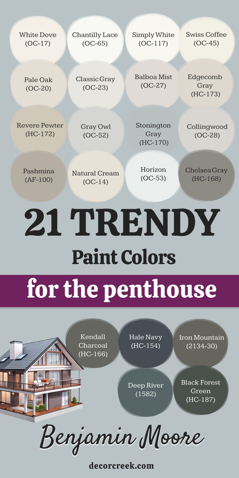
My Final Thoughts on Choosing Paint Colors for a Penthouse
Ultimately, the process of selecting the absolutely perfect color palette for a penthouse boils down to an artful and highly strategic objective: creating a cohesive, intentional, and deeply felt atmosphere of luxury that seamlessly complements the building’s impressive architecture and, crucially, enhances the property’s incredible, expansive views.
My decades of experience in high-end design consistently reinforce a fundamental truth: the very best choices for these residences are invariably rooted in uncompromising paint quality and a nuanced, expert understanding of the complex and dynamic ways in which natural light interacts with the chosen shade throughout the day.
It is paramount that you meticulously test all paint samples extensively—not just in small chips, but in large swatches applied directly to the actual walls where the color will be used. This step is non-negotiable for accurately assessing a color’s true appearance in your unique lighting environment. The 37 colors I have meticulously detailed and organized for you here, all of which are time-tested favorites from the elite collections of Sherwin-Williams and Benjamin Moore, are proven winners in the most demanding high-end design scenarios. They collectively possess the inherent sophistication, complex undertones, and necessary depth required to truly honor and elevate a luxury residence.
A single, carefully selected paint color is, without a doubt, the most cost-effective and powerful way to precisely define the emotional atmosphere of a space and guarantee that the property feels custom-tailored, bespoke, and unequivocally premium. While you should certainly trust your refined design instincts, always remember to anchor your final decision in the proven, unparalleled quality and broad, sophisticated appeal of these elite, designer-approved shades.