When I think about blue, I think about how it can completely change how a room feels — fresh mornings, quiet evenings, and everything in between. Blue has this way of setting the mood without being too much. In 2026, it’s one of the most-loved colors in design again, from pale misty tones to deep, confident navies. People are drawn to it because it feels safe, open, and full of personality.
I love how blue fits anywhere — in bedrooms where you rest, living rooms where you gather, and kitchens that need a bit of calm energy.
It works in sunlight and in lamplight, shifting beautifully throughout the day. This year, designers are mixing blues with soft whites, earthy greens, and warm woods.
The result is a look that feels both refreshing and deeply comforting.
Why I Always Trust Sherwin-Williams and Benjamin Moore for Blue Paints
I’ve tried many paint brands over the years, but Sherwin-Williams and Benjamin Moore always deliver the best blues. Their formulas are reliable, the finishes are smooth, and their colors hold depth and life even in low light. Each tone feels thoughtfully created — from clear coastal hues to moody midnight shades.
Sherwin-Williams gives me strong, balanced blues that anchor a space with confidence.
Benjamin Moore offers softer, layered tones that bring warmth and emotion. Both brands create colors that feel timeless but still modern — shades that look as good today as they will five years from now.
That’s why they’re always my top choice when it comes to blue.
How I Choose the Right Blue Shade for Each Room
Choosing blue is about more than picking a color card. I always start with light — how much daylight enters the room and what direction it faces. Northern light can make blue look cooler, while southern light brings out warmth. Then I think about what feeling we want: peaceful, airy, dramatic, or cozy.
Textures matter too. Linen, wood, metal, and stone all change how a blue behaves.
In bedrooms, I lean toward softer tones that soothe; in offices or dining rooms, deeper shades add focus and mood. The best blue is the one that feels balanced in every light — one that makes you breathe easier the moment you walk in.
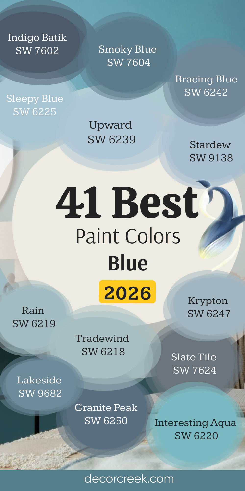
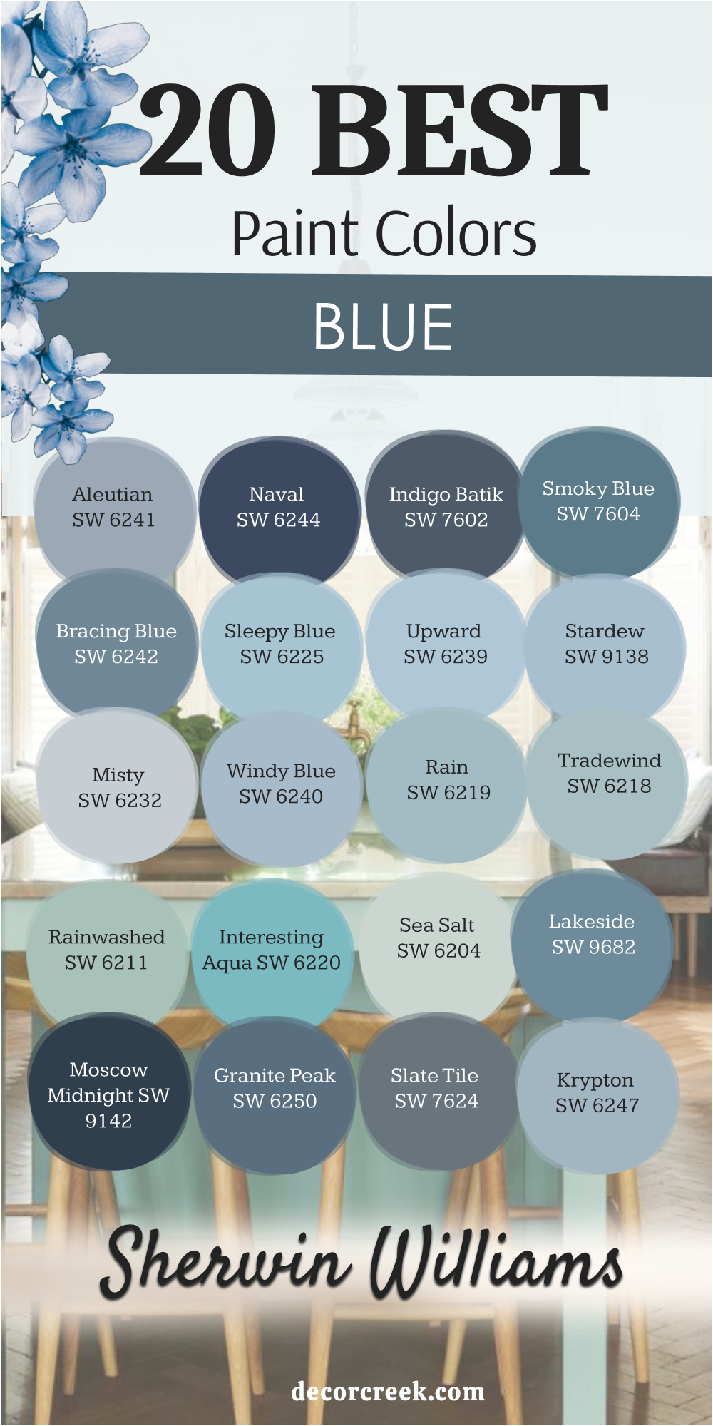
20 Best Blue Paint Colors by Sherwin-Williams
Aleutian SW 6241
Aleutian SW 6241 is a soft, misty blue with a touch of gray that makes it incredibly soothing. It feels like the color of the sky just before sunset — gentle and easy on the eyes. I love using Aleutian in bedrooms or reading nooks where calmness is key. It pairs beautifully with creamy whites, warm wood, and soft textures like linen or wool.
This color has enough pigment to stay interesting but never feels heavy. In bright light, it looks airy and open; under lamplight, it turns warm and cozy.
It’s perfect for creating rooms that feel relaxed but polished. Aleutian has that balance I always look for — peaceful without being pale.
🎨 Check out the complete guide to this color right HERE 👈
Naval SW 6244
Naval SW 6244 is one of my favorite deep blues because it’s bold yet timeless. It carries the depth of navy without feeling too dark or flat. I often use it as an accent wall behind a bed or in a dining room with brass lighting. It brings sophistication without losing comfort.
What makes Naval so special is how it interacts with light. During the day, it looks rich and strong; at night, it deepens into a velvety tone.
It pairs perfectly with white trim, soft beige, or tan leather. Naval gives any space a feeling of grounded confidence — elegant, modern, and endlessly classic.
🎨 Check out the complete guide to this color right HERE 👈

Indigo Batik SW 7602
Indigo Batik SW 7602 is a rich, mid-tone blue that strikes the perfect balance between color and depth. It feels sophisticated but still livable. I love using it in rooms where I want to create a cozy, intimate atmosphere without going too dark. It works beautifully with brushed gold accents and warm gray fabrics.
Indigo Batik changes with the light — brighter during the day, moodier by night. It’s stunning with both white and off-white trims.
The color feels layered, full of character, and elegant in every setting. It’s one of those blues that makes a statement quietly.
🎨 Check out the complete guide to this color right HERE 👈

Smoky Blue SW 7604
Smoky Blue SW 7604 feels like the perfect in-between of strong and soft. It’s deep enough to be interesting but light enough to keep a room from feeling closed in. I love pairing it with warm whites or soft cream bedding. It gives bedrooms and studies a rich, peaceful energy.
Smoky Blue also works beautifully with natural textures — oak, jute, and linen all bring out its warmth.
It’s a chameleon color that looks traditional in classic homes and sophisticated in modern ones. Every time I use it, people instantly feel at ease.
🎨 Check out the complete guide to this color right HERE 👈

Bracing Blue SW 6242
Bracing Blue SW 6242 is a medium blue-gray that feels clean, modern, and refreshing. It has a quiet energy that makes it perfect for bedrooms and home offices alike. I love using it in spaces that need a little lift without too much color. It pairs beautifully with white trim, brushed nickel fixtures, and pale gray fabrics.
This shade works especially well in rooms with natural light. It stays crisp and steady throughout the day.
Bracing Blue gives a space that lived-in, welcoming quality that feels effortless. It’s one of my go-to blues when I want something bright but still grounded.
🎨 Check out the complete guide to this color right HERE 👈

Sleepy Blue SW 6225
Sleepy Blue SW 6225 is as gentle as its name suggests. It’s a delicate, airy blue that brings a sense of peace to any room. I love it in bedrooms where you want to wake up slowly and rest easily. It pairs beautifully with white bedding, soft gray accents, and light wood furniture.
The color feels like a quiet morning sky — not too cool, not too warm, just balanced.
Sleepy Blue works beautifully in both modern and farmhouse styles. It’s perfect for creating that easy, breezy feeling that makes a room instantly relaxing.
🎨 Check out the complete guide to this color right HERE 👈
Upward SW 6239
Upward SW 6239 is a cheerful, modern blue that always feels refreshing. It’s soft and clean, almost like a gentle wash of morning light. I love using it in bedrooms, nurseries, and even kitchens. It pairs beautifully with white trim and natural wood accents.
In bright sunlight, Upward feels fresh and airy; at night, it takes on a cozy, silvery tone.
It’s simple, adaptable, and easy to love. This color has a way of lifting the mood of any room. It feels like a deep breath of fresh air — calm, inviting, and bright.
🎨 Check out the complete guide to this color right HERE 👈

Stardew SW 9138
Stardew SW 9138 is a beautiful mid-tone blue-gray with a soft, romantic quality. It’s light enough to feel open but has enough depth to give structure to a room. I love pairing it with creamy whites, taupes, and natural textures. Stardew creates a restful, polished atmosphere that feels timeless.
It’s especially lovely in bedrooms and bathrooms, where you want a clean but cozy effect.
The way it shifts with the light adds quiet drama without ever feeling bold. Stardew always makes a room look thoughtful, layered, and easy to live in.
🎨 Check out the complete guide to this color right HERE 👈

Misty SW 6232
Misty SW 6232 is a pale gray-blue that’s as soft as a morning fog. It has just enough color to keep walls interesting while staying neutral enough to blend with anything. I love using Misty in smaller bedrooms or hallways where I want the walls to feel open and airy.
It pairs beautifully with white trim and warm metal finishes like brass or bronze.
Misty reflects light in a way that keeps rooms feeling fresh all day long. It’s subtle, balanced, and soothing — perfect for homes that need calm without coolness.
🎨 Check out the complete guide to this color right HERE 👈

Windy Blue SW 6240
Windy Blue SW 6240 is one of my favorites for creating soft, inviting spaces. It’s a muted medium blue with a cozy undertone that keeps it from feeling icy. I love using it in family bedrooms or guest rooms where warmth and peace matter most.
Windy Blue pairs beautifully with beige, taupe, or creamy white.
It has a gentle, timeless quality that feels both classic and current. The color looks fresh in daylight and becomes velvety under warm lighting. It’s one of those shades that makes everyone say, “This just feels right.”
🎨 Check out the complete guide to this color right HERE 👈

Rain SW 6219
Rain SW 6219 is one of those perfect soft blues that instantly feels soothing and refreshing. It sits right between sky blue and gentle gray, giving it an easy, natural charm. I love using it in bedrooms and bathrooms where relaxation is key. It works beautifully with white trim, sandy beige décor, and brushed silver finishes.
Rain looks light and airy during the day, then softens beautifully under evening light.
It’s clean but never stark — the perfect blend of color and calm. This shade makes walls look like moving air, giving every room a quiet rhythm. Rain feels effortless, simple, and full of life, just like its name suggests.
🎨 Check out the complete guide to this color right HERE 👈
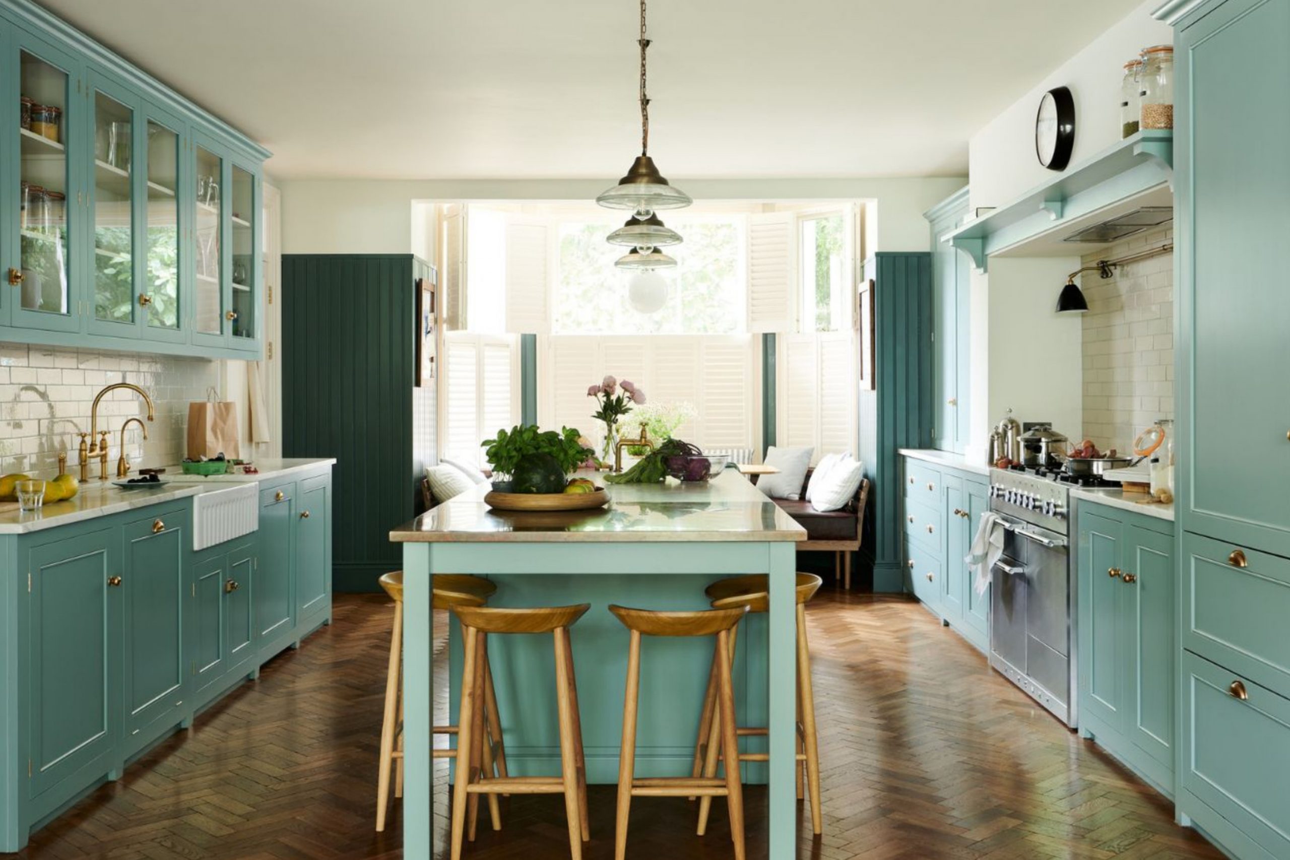
Tradewind SW 6218
Tradewind SW 6218 is a beautiful mix of blue, gray, and a touch of green — a color that always feels balanced. I love how it brings a soft breeze feeling into bedrooms and kitchens alike. It’s gentle enough to stay neutral but colorful enough to make a room feel fresh. Paired with white trim or light wood, it becomes instantly elegant.
Tradewind changes beautifully throughout the day, becoming warmer in soft light.
It gives spaces that quiet charm of seaside mornings. The tone has enough personality to stand out yet stays incredibly versatile. Tradewind always makes a home feel open, relaxed, and thoughtfully designed.
🎨 Check out the complete guide to this color right HERE 👈

Rainwashed SW 6211
Rainwashed SW 6211 is one of my go-to colors for homes that need warmth and freshness at the same time. It’s a delicate blue-green with a touch of gray that keeps it calm and graceful. I love using it in bedrooms or guest rooms where you want to create a welcoming, lived-in feeling.
This color works beautifully with white linens, beige accents, and natural wood textures.
In daylight, it feels cool and refreshing; by evening, it turns soft and cozy. Rainwashed gives every room a sense of balance and ease. It’s one of those shades that always makes people feel at peace the moment they see it.
🎨 Check out the complete guide to this color right HERE 👈

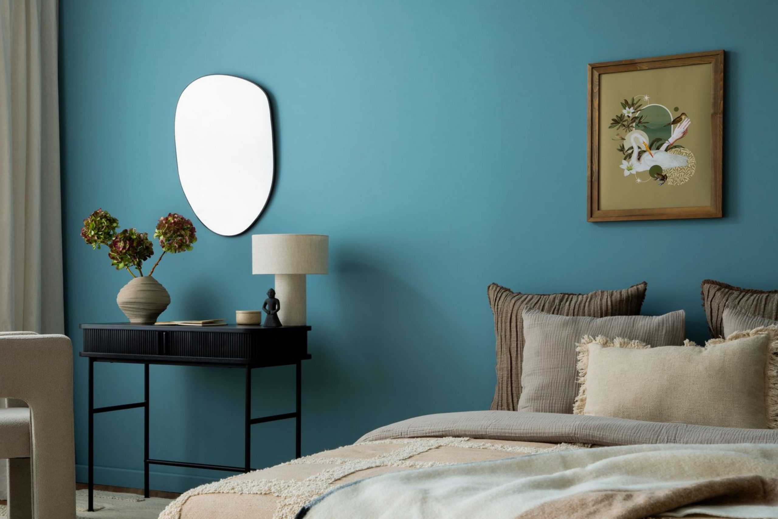
Interesting Aqua SW 6220
Interesting Aqua SW 6220 is cheerful without being loud — a happy blue-green that brings energy in a gentle way. It’s perfect for bedrooms that need a lift or small spaces that feel dark. I love pairing it with creamy whites or tan accents to keep it soft and natural.
The color feels bright but never bold, making it easy to live with long-term.
It reflects natural light beautifully and works in both coastal and modern homes. Interesting Aqua has a lighthearted quality that adds life to any room. It’s full of freshness and character while staying grounded and graceful.
🎨 Check out the complete guide to this color right HERE 👈
Sea Salt SW 6204
Sea Salt SW 6204 is easily one of Sherwin-Williams’ most-loved shades — and for good reason. It’s a delicate green-gray with blue undertones that feels perfectly balanced. I love using it in bedrooms, bathrooms, and even kitchens where a sense of calm and clarity is needed.
Sea Salt changes beautifully in different light — sometimes more blue, sometimes more green, always lovely.
It pairs perfectly with soft whites, beiges, and sandy tones. The color feels refreshing and natural, like ocean air after a warm day. It gives every space a soothing rhythm that feels effortlessly beautiful.
🎨 Check out the complete guide to this color right HERE 👈

Silent Ripple SW 9682
Lakeside SW 9682 is a rich, medium blue with just a hint of gray. It’s bold enough to add character but still soft enough to keep a room feeling restful. I love using it in bedrooms with large windows or in living rooms where it can play off natural light.
This shade pairs beautifully with creamy whites and warm wood tones.
In sunlight, it looks open and airy; in shadow, it turns deeper and more dramatic. Lakeside brings the perfect balance of color and tranquility. It’s elegant, relaxed, and full of depth — a beautiful choice for any home in 2026.
🎨 Check out the complete guide to this color right HERE 👈
Moscow Midnight SW 9142
Moscow Midnight SW 9142 is a stunning deep blue that feels rich, confident, and grounded. It’s perfect for creating intimate, dramatic bedrooms or cozy dens. I love using it as an accent wall paired with light bedding and brass lighting.
The color’s depth makes every space feel luxurious and calm at the same time.
It has subtle gray undertones that keep it from feeling too dark. Moscow Midnight looks especially beautiful in evening light when it deepens into a velvety navy. It’s one of those colors that turns a simple room into something unforgettable.
Granite Peak SW 6250
Granite Peak SW 6250 is a smoky blue-gray that feels sophisticated and steady. It’s ideal for bedrooms or home offices where you want focus and warmth in equal measure. I love pairing it with soft whites, camel tones, and metal accents.
Granite Peak changes beautifully with the light, offering both cool and warm moments through the day.
It’s bold but never harsh, making it an excellent choice for accent walls or cabinetry. This shade carries quiet strength — polished, grounded, and deeply comforting.
🎨 Check out the complete guide to this color right HERE 👈

Slate Tile SW 7624
Slate Tile SW 7624 is a cool, medium-dark blue-gray that feels effortlessly elegant. It’s one of my favorite colors for creating modern yet cozy rooms. I love using it with white trim and beige furniture — the contrast is stunning but still soft.
Slate Tile has enough depth to anchor a space but still reflects light beautifully.
It’s wonderful in both large and small bedrooms, bringing a sense of calm order. The color feels timeless but modern, and it layers beautifully with natural textures. Every time I use it, the room feels complete and composed.
🎨 Check out the complete guide to this color right HERE 👈

Krypton SW 6247
Krypton SW 6247 is a silvery blue-gray that feels light, airy, and clean. It’s perfect for bedrooms, bathrooms, or hallways that need brightness with a touch of color. I love how it pairs with white trim, brushed nickel, and pale wood.
In natural light, it looks fresh and bright; in the evening, it feels gentle and soft.
Krypton has a quiet sophistication that keeps it from feeling flat or plain. It’s an easy color to live with — subtle but full of personality. It makes any room feel crisp, open, and inviting.
🎨 Check out the complete guide to this color right HERE 👈
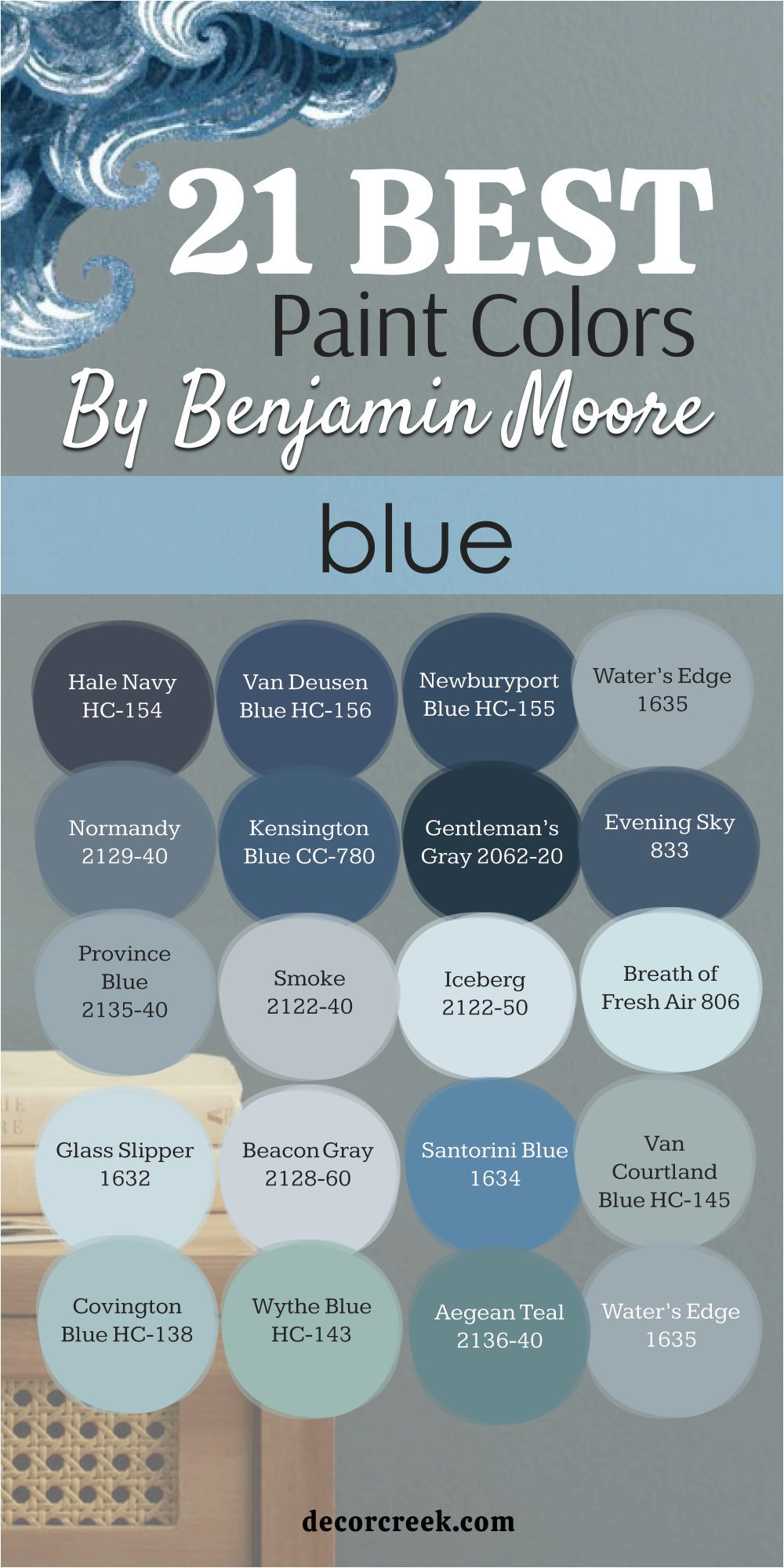
21 Best Blue Paint Colors by Benjamin Moore
Hale Navy HC-154
Hale Navy HC-154 is one of Benjamin Moore’s most iconic blues — deep, rich, and full of personality. It has the confidence of navy but carries a softness that makes it easy to live with. I love using it in bedrooms or dining rooms where a bold statement feels right. It pairs beautifully with crisp white trim, brass lighting, and natural textures like rattan or linen.
During the day, Hale Navy looks strong and classic; in the evening, it turns deep and velvety.
It’s the perfect shade for anyone who wants drama without darkness. The color adds instant depth to walls while keeping the space warm and grounded. Every time I use it, the room feels both elegant and comforting. Hale Navy never fails to make a home feel collected and timeless.
🎨 Check out the complete guide to this color right HERE 👈

Van Deusen Blue HC-156
Van Deusen Blue HC-156 is a balanced, confident blue that feels calm and sophisticated. It’s a little lighter than Hale Navy but just as beautiful. I love how it brings richness to bedrooms and studies without feeling too heavy. It looks stunning with white trim, brass fixtures, or natural wood tones.
This color carries a quiet elegance — bold enough to add structure, yet soft enough to feel comforting.
Van Deusen Blue works especially well in rooms that need focus or coziness. It glows in morning light and deepens into a rich, velvety tone by night. I often recommend it for accent walls or full coverage in well-lit spaces. It’s a true classic that never feels trendy — always balanced and timeless.
🎨 Check out the complete guide to this color right HERE 👈

Province Blue 2135-40
Province Blue 2135-40 is a beautiful blue-green with a soft, vintage charm. It’s a color that feels relaxed and natural, perfect for creating peaceful bedrooms or sunrooms. I love how it pairs with cream, taupe, and brushed gold accents.
This shade brings a nostalgic feeling, like a calm summer morning.
It looks airy and bright in sunlight but gains warmth in the evening. Province Blue has personality without being demanding. It’s fresh, refined, and endlessly livable. Every time I use it, the room instantly feels happier and more at ease.
🎨 Check out the complete guide to this color right HERE 👈
Newburyport Blue HC-155
Newburyport Blue HC-155 is the color I reach for when I want something traditional yet fresh. It has the character of old coastal homes but feels updated and modern. I love how it pairs with white beadboard, pale oak floors, and soft gray bedding. It gives rooms a comfortable structure — strong but never overwhelming.
Newburyport Blue looks brighter in natural light and more dramatic in dim spaces.
It’s perfect for bedrooms or dining rooms where depth and coziness matter. This color has a way of making a home feel grounded and classic. It’s the kind of blue that feels confident but never cold, full of personality and grace.
🎨 Check out the complete guide to this color right HERE 👈

Kensington Blue CC-780
Kensington Blue CC-780 is a bold, moody blue that feels confident and artistic. It’s a shade I love to use in bedrooms, offices, or entryways that need character. It pairs perfectly with creamy whites, rich wood, and gold hardware. This color brings structure and drama without overwhelming the space.
What makes Kensington Blue special is how dynamic it is — bright in sunlight, velvety in shadows.
It adds depth and emotion to walls while staying elegant and stylish. Every time I use it, the room feels instantly more polished. It’s one of those shades that makes a home feel thoughtfully designed.
Water’s Edge 1635
Water’s Edge 1635 is a soft, graceful blue with a hint of gray that feels elegant and calm. It reminds me of the quiet light reflected on still water. I love using it in bedrooms, bathrooms, or living rooms where you want airiness without coolness. It pairs beautifully with cream, beige, and brushed gold finishes.
This color works in almost any setting — modern or traditional.
In daylight, it feels open and clean; in the evening, it turns soft and intimate. Water’s Edge always feels personal, like it belongs to the home. It’s one of those shades that make every room feel peaceful and beautifully finished.
🎨 Check out the complete guide to this color right HERE 👈
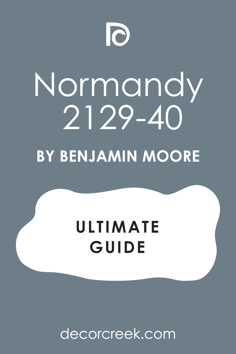
Normandy 2129-40
Normandy 2129-40 is a romantic, medium navy that feels both cozy and refined. It’s darker than most blues but has a graceful balance that keeps it from feeling heavy. I love pairing it with crisp whites or light gray fabrics. It’s stunning on accent walls, cabinetry, or full-room coverage.
Normandy has a classic charm that works beautifully in both vintage and modern interiors.
It holds light softly, creating mood without feeling dramatic. The color feels strong, composed, and endlessly comforting. Normandy turns any bedroom into a restful retreat with its gentle sophistication.
🎨 Check out the complete guide to this color right HERE 👈
Gentleman’s Gray 2062-20
Gentleman’s Gray 2062-20 is a deep, refined navy with hints of teal that add richness and complexity. It feels dramatic but never harsh. I love using it in master bedrooms or dining areas where I want a luxurious, grounded feel. It pairs beautifully with brass fixtures, tan leather, and crisp white trim.
In daylight, its blue tones shine softly; at night, its depth becomes more mysterious.
Gentleman’s Gray has a timeless quality that makes every space feel elegant. It’s bold enough to make a statement but balanced enough for everyday living. It’s the kind of color that stays beautiful no matter how you use it.
🎨 Check out the complete guide to this color right HERE 👈

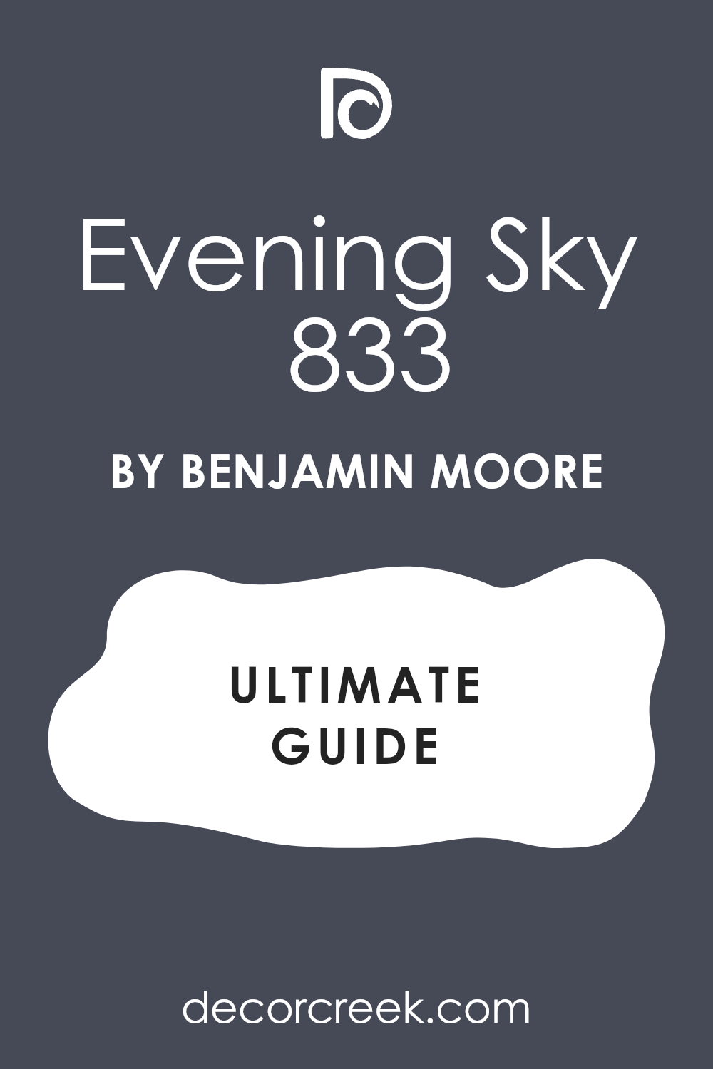
Evening Sky 833
Evening Sky 833 is a medium-dark blue with a soft, natural depth. It’s perfect for rooms that need mood without darkness. I love pairing it with ivory bedding, oak furniture, and silver accents. The color feels both modern and cozy, bringing balance to any space.
Evening Sky reflects light in a way that gives walls a velvety look.
In morning light, it feels open and fresh; by night, it becomes deep and relaxing. It’s ideal for bedrooms or offices where you want calm energy. Evening Sky makes a room feel thoughtful, warm, and welcoming.
🎨 Check out the complete guide to this color right HERE 👈
Smoke 2122-40
Smoke 2122-40 is a misty blue-gray that feels light, sophisticated, and clean. It’s one of my favorite choices for bedrooms that need a calm and gentle color. It pairs perfectly with white trim, silver fixtures, and pale linen fabrics.
Smoke feels like soft morning air — it’s bright enough to open a room but still cozy.
It changes slightly throughout the day, becoming more velvety as the light fades. This color works especially well in smaller spaces that need lightness. It’s modern, graceful, and incredibly easy to live with.
🎨 Check out the complete guide to this color right HERE 👈

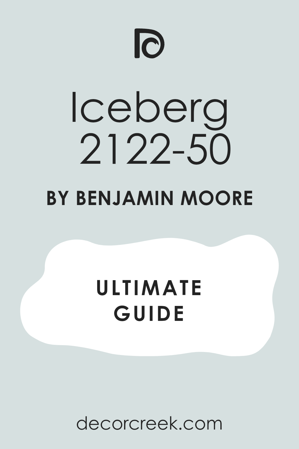
Iceberg 2122-50
Iceberg 2122-50 is one of the softest, most delicate blues I’ve ever used. It’s airy, light, and full of quiet energy. I love it in bedrooms, nurseries, or bathrooms where you want a feeling of freshness without coldness. Iceberg pairs beautifully with white trim, soft gray fabrics, and pale oak finishes.
In daylight, it feels crisp and pure; at night, it turns slightly misty and cozy.
It’s one of those colors that almost disappears, leaving behind a soft glow that makes a room feel calm and balanced. Iceberg works beautifully in small spaces that need brightness and softness together. It’s simple, elegant, and endlessly relaxing.
🎨 Check out the complete guide to this color right HERE 👈
Breath of Fresh Air 806
Breath of Fresh Air 806 lives up to its name — light, happy, and soothing. It’s a pale blue that brings energy to a room without ever feeling loud. I love using it in bedrooms or entryways that need an instant lift. It pairs perfectly with crisp white trim, light wood tones, and woven textures.
During the day, this color feels fresh and open; in the evening, it turns dreamy and soft.
Breath of Fresh Air is perfect for those who want a touch of color that stays gentle. It’s cheerful but sophisticated — a modern classic that makes every room feel full of light.
🎨 Check out the complete guide to this color right HERE 👈

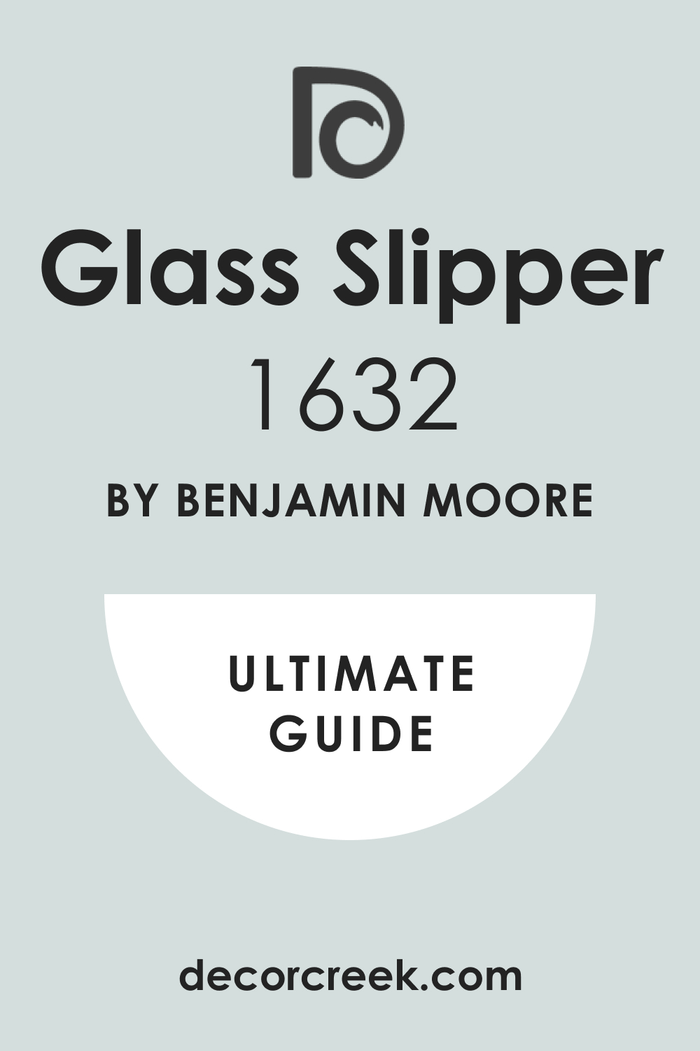
Glass Slipper 1632
Glass Slipper 1632 is a romantic, silvery blue that adds grace to any home. It’s one of my favorite shades for bedrooms because it feels both airy and elegant. I love pairing it with white bedding, soft gold accents, and natural fabrics like cotton or linen.
The color changes subtly throughout the day — cooler in the morning, warmer at night.
Glass Slipper feels like light reflecting off water: peaceful, clear, and endlessly soothing. It’s an ideal shade for creating balance between freshness and comfort. This color makes any space feel refined yet welcoming.
🎨 Check out the complete guide to this color right HERE 👈
Beacon Gray 2128-60
Beacon Gray 2128-60 is a cool, airy blue-gray that’s perfect for bright, open rooms. It has just enough color to feel interesting while staying wonderfully neutral. I love using it in bedrooms and living areas where I want a clean, polished backdrop. It pairs beautifully with white trim and light beige or tan accents.
Beacon Gray looks crisp in morning light and soft in the evening, adding depth to every wall.
It’s modern but never harsh, classic but never dull. The color feels gentle and steady — perfect for creating rooms that invite relaxation. It’s the kind of shade that never feels out of place.
🎨 Check out the complete guide to this color right HERE👈
Santorini Blue 1634
Santorini Blue 1634 is a lively yet balanced medium blue that feels joyful and elegant. It’s inspired by coastal tones but works beautifully in any style of home. I love pairing it with white or creamy trim, natural woven décor, and brushed brass accents.
Santorini Blue brightens up a room instantly without feeling loud.
It’s perfect for bedrooms, powder rooms, or sunlit spaces that need cheerful energy.
During the day, it’s crisp and clear; by night, it deepens into a rich, relaxing tone. This color always reminds me of ocean air and open skies.
🎨 Check out the complete guide to this color right HERE 👈
Van Courtland Blue HC-145
Van Courtland Blue HC-145 is a traditional blue with a soft gray undertone that gives it depth and calmness. It’s ideal for bedrooms, dining rooms, or studies where you want color that feels grounded and graceful. I love using it with antique brass, creamy whites, and dark woods.
It’s the kind of color that looks beautiful in every light — cool and airy in the morning, warm and rich at night.
Van Courtland Blue brings quiet sophistication to a room, giving walls a sense of texture and life. It feels classic, steady, and full of quiet charm.
🎨 Check out the complete guide to this color right HERE 👈
Covington Blue HC-138
Covington Blue HC-138 is a crisp, happy blue that feels refreshing and timeless. It leans slightly green, which adds warmth and a natural touch. I love using it in bedrooms, laundry rooms, or kitchens where you want a light, clean look. It pairs beautifully with white cabinetry and polished metal accents.
This color feels lively without being too bright. It opens up smaller spaces and brings a hint of energy into larger rooms.
Covington Blue reminds me of seaside mornings — fresh, inviting, and endlessly comfortable. It’s one of those shades that instantly makes a house feel like home.
🎨 Check out the complete guide to this color right HERE 👈
Wythe Blue HC-143
Wythe Blue HC-143 is one of the most versatile blue-greens in the Benjamin Moore palette. It has enough warmth to feel inviting and enough coolness to stay fresh. I love using it in bedrooms, hallways, and even entryways for a touch of color that never feels overwhelming.
Wythe Blue pairs beautifully with white trim, brass fixtures, and soft linen fabrics.
In daylight, it looks calm and balanced; in the evening, it deepens into a soothing, sophisticated tone. It’s a designer favorite because it fits every style, from traditional to modern. This color always makes rooms feel full of ease and personality.
🎨 Check out the complete guide to this color right HERE 👈

Aegean Teal 2136-40
Aegean Teal 2136-40 is bold, rich, and full of character. It’s the kind of color that instantly brings warmth and style to any room. I love using it in bedrooms, home offices, or accent walls where you want to add depth. It pairs perfectly with warm wood, gold accents, and creamy white trim.
This shade has a balanced blend of blue and green that feels luxurious and natural.
Aegean Teal changes beautifully in different lighting — more blue by day, deeper and moodier at night. It adds confidence and harmony to any space. This color has become a modern classic for good reason — it makes every home feel refined and inviting.
🎨 Check out the complete guide to this color right HERE 👈
Water’s Edge 1635
Water’s Edge 1635 is soft, airy, and endlessly elegant. It’s a gentle blue-gray that feels like mist over water. I love using it in bedrooms, living rooms, and bathrooms where comfort and light matter most. It pairs beautifully with creamy whites and light neutral fabrics.
Water’s Edge brings a calm sophistication to any room. It looks bright and fresh in sunlight, then becomes smooth and intimate as evening falls.
This color is a beautiful choice for anyone who wants a subtle blue that still carries presence. It’s refined, adaptable, and full of warmth.
🎨 Check out the complete guide to this color right HERE 👈
Yarmouth Blue HC-150
Yarmouth Blue HC-150 is a cheerful, coastal-inspired blue with a soft, relaxed personality. It’s light enough to keep rooms open but colorful enough to bring them to life. I love pairing it with white trim, rattan textures, and natural linen bedding.
In daylight, Yarmouth Blue feels clean and airy; at night, it takes on a cozy, welcoming tone.
It’s perfect for bedrooms, bathrooms, or sunrooms that need a hint of energy and brightness. The color brings freshness without being overpowering. Yarmouth Blue always makes me think of ocean breeze and calm mornings — easy, familiar, and endlessly charming.
🎨 Check out the complete guide to this color right HERE 👈
My Final Thoughts on Choosing Blue Paint Colors in 2026
Blue has always been one of those colors that feels both personal and universal — it connects people to emotion, memory, and light. In 2026, I see homeowners leaning toward blues that bring comfort and personality rather than perfection. These aren’t cold or sterile tones; they’re lived-in, emotional, and quietly confident. From the soft, misty hues that feel like morning air to rich, moody navies that anchor a room, blue continues to define warmth and expression in every home.
When I help clients choose the right blue, I always start with how they want to feel in their space. Do they want to feel refreshed? Grounded? Peaceful?
There’s a shade of blue for each of those moods. Light blue walls open a room and make it easy to breathe, while deep blues bring character and calm focus.
The trick is to test each color in your light and with your furnishings. Blue shifts beautifully throughout the day, from bright and airy in the morning to warm and cozy by night. That’s what makes it such a joy to work with — it moves, it breathes, it changes.
Both Sherwin-Williams and Benjamin Moore continue to lead with blues that balance depth and softness. They understand how we live — in rooms full of texture, warmth, and real life. These shades don’t just look beautiful; they make every moment at home feel easier, steadier, and more peaceful.
In the end, blue isn’t just a color — it’s a feeling. It’s the sound of quiet, the glow of morning light, the stillness before sleep.
The best blues of 2026 remind me why I love design so much: it’s not just about creating a look, but about creating a feeling that stays.